Transcripts
1. Introduction: Welcome to the studio. It's Froyle here, and
I'm so excited that you joined me for the
next exciting chapter in our creative journey. As a mixed media artist with over three decades
of experience, I'm passionate about
two things creating my own beautiful
layered artworks and encouraging you to discover
your own artistic voice. Welcome to class 10/100 Days of Collage Mixed
Media art class. This is the tenth chapter of our adventure exploring
Textures of Travel in Collage. We're going to be having
so much fun exploring the ways travel shapes memory, imagination and creativity. Together, we'll create collages that capture the spirit of journeys both real and
imagined using maps, souvenirs, postal artifacts, and the fragments we
collect along the way. Each artwork becomes a part
of a visual travelogue, a layered story of
where you've been, where you dream of going, and the beauty found in
the in between moments. We're going to be
traveling through days of 64 to 70 of 100 Days of Collage. Now, who is this class for? This class is for anyone wanting to develop
your creativity, whether you're a beginner
or a more advanced artist, you're going to be inspired and encouraged to really embrace your own artistic voice
and push yourself past the boundaries of
where you've been before with your
creative expression. Whether you're just beginning your creative journey or you've been making
art for years, you'll find plenty here to
inspire and challenge you. And I'll be guiding you
every step of the way, sharing the exact
materials, techniques, and creative prompts
that I use to help you create your own
stunning personal pieces. And if you're a more
advanced artist, this class will stretch
your imagination and help you deepen
your artistic voice. It's going to be so much fun. So where do you want to go? We're going to be
working through seven prompts and a
whole lot of techniques. We'll be working in an
art journal format, and I'm here right with you every step of the
way, cheering you on, encouraging you, showing you the exact materials
that I'm using, and how you can
create these proms as an expression of
your own creativity. I can't wait to
get started as we head off on our mighty
vied adventure, so let's gather our materials
and let's make art.
2. Material List: It's class number ten, so you should
definitely have all of the art supplies that you need for all of these
fabulous lessons. Pour them out of your cupboard. I haven't added anything
or more surprises extra to the material list for this class than from
the previous class. So you've got everything
that you need. Of course, we have our
fabulous art journal if you're using an art journal. Now, you don't have to. You could be working on paper. You could bind all
the pieces of paper together at the end and
create an art journal, or you might have made
your own art journal, or you might be working on
card stock or even on canvas. There's no hard or fast rules. I'm using an art
journal because I absolutely love having
all of the lessons and the classes in
one place where I can go back and look
through which I love doing and remember different techniques
or different tips or different color schemes or different textures that I might want to reproduce
again another day. It's like a treasure
trove of fabulous ideas. And of course, a selection of
my favorite acrylic paints. Now, you don't have to
use the colors I'm using. You can use whatever it is that you personally
like the most. You might have noticed I
don't use a lot of green, and you might like green. So pull out the colours that
you like and the paints that you really want to use to
explore these fabulous prompts. Now, I also have some
watercolor paints, and of course, it will
be jelly printing. It would be wrong not
to be jelly printing. So you'll need your favorite
jelly printing supplies, some stencils and some stamps, and maybe some texture
plates. They're really fun. Of course, we've
got to have paper. I've got my favorite Japanese
sketchpad rice paper. I'm also using wet
strength tissue and some watercolor paper. You need all the basics,
Brushes, watercolor brushes, a palette knife, maybe, a sharpie for doing a
little pen and ink wash. Some scissors, baby wipes, all of the standard
things that were used to create these
fabulous clases. I've also got some
stencil butter or the fabulous luna paste. This is one of my
favorite at the moment. It's really soft. It's
like stencil butter, just a little softer,
beautiful colors. And, of course, my
favorite spray gold mine. The zinc spray, which is getting harder
to get these days. So if you've got some of this, hang on to that, baby. Scrap bags, don't
forget the scrap bags. You might have some
prints leftover from the previous class that you want to bring into
these lessons. Easy, easy, make sure you
rummage through all of your craft supplies and pull out some extra little trinkets
and treasures because, baby, we're going travel. You can bring in some of your home memorabiliar,
some tickets, some receipts or some souvenirs from the different
places that you've been. It's going to be so much fun. I love the travel theme. I'm going to share
with you some of my own personal
travel experiences. And I know you're going to
really enjoy this class. So gather all your
bits and pieces, your art supplies,
your craft supplies, dig them all out, get
them all together because we're going to have
an absolutely fabulous time.
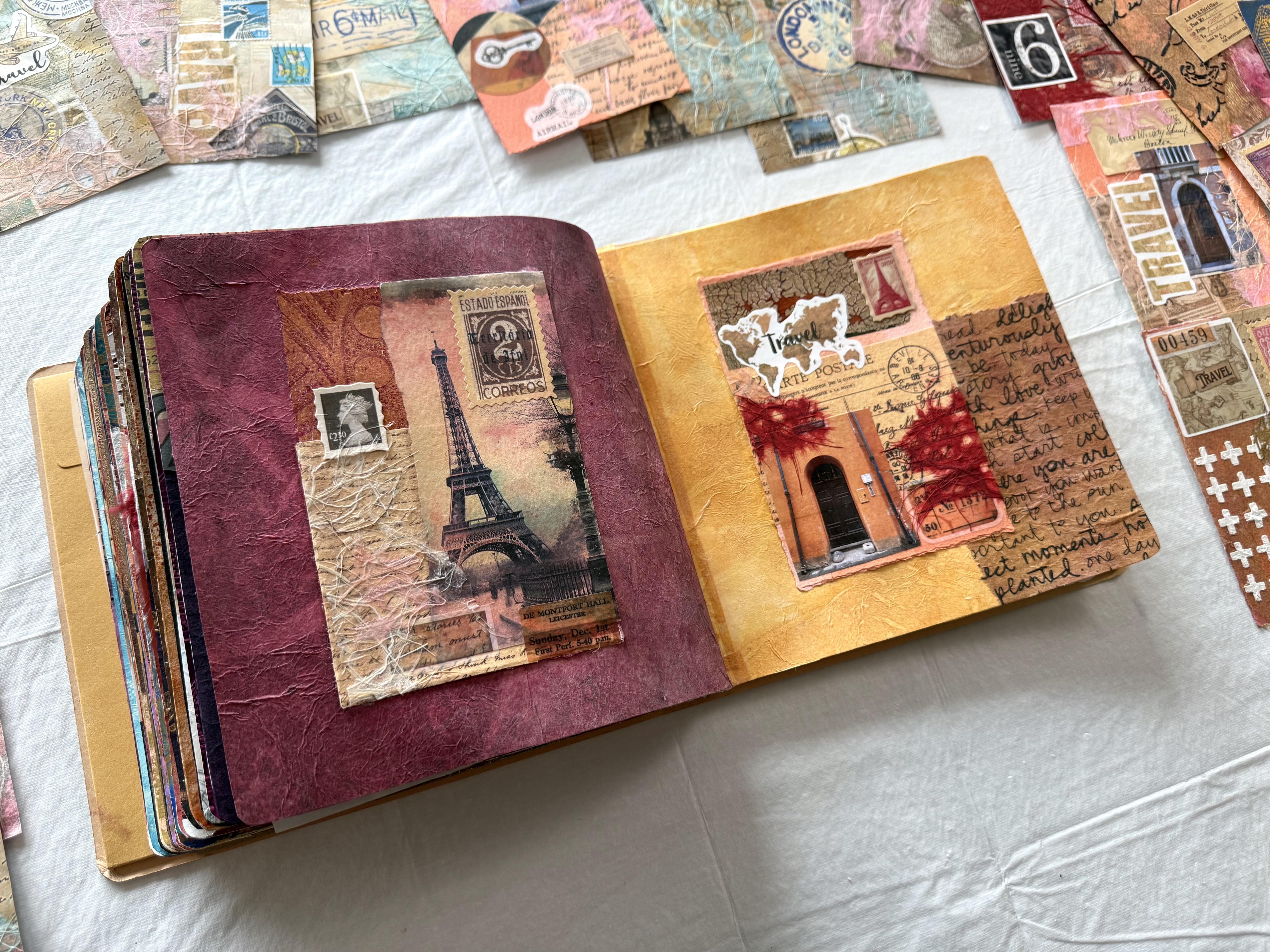
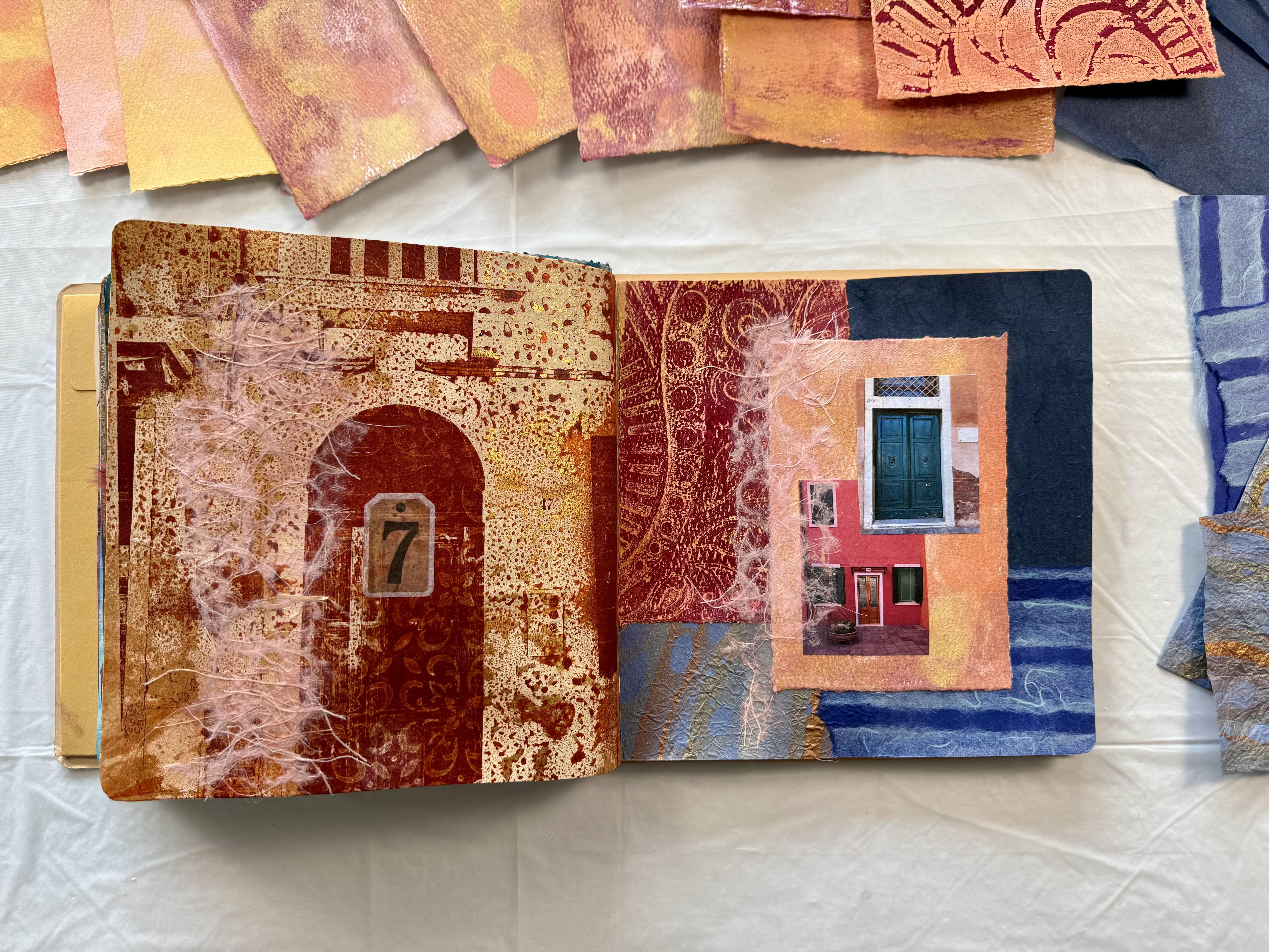
3. Day 64: Postal Artefacts: W Here we are in class ten for our
Travel inspired collages. And I'm so excited. I've really been
looking forward to this particular
theme because we can dream of faraway places, adventures to be had, and it's going to
be so much fun. Now, we're up today
64 Postal artifacts. Craft a collage using
old postage labels, counsiled stamps or
vintage envelopes. Incorporate these postal
artifacts to add a touch of travel and correspondence to
your artwork. So exciting. Now, I really hope you've been traveling
along and following this adventure
consecutively because you're going to have a lot
of the art supplies already. And with this theme, you can pull out a whole lot more from those craft supplies. I can't wait to get started, and I can't wait to show you my new obsession with
Gel Print collage. Right, so I'm so excited to
beginning our travel theme. I've got my 16 by 20
inch gel elf plate because I'm going to do
a gel plate collage. It's something I've been
experimenting with recently, and I'm pretty excited to
share this technique with you. First of all, I'm going to put a little splash of some
aquidone violet and my favorite iridescent
bronze fine on the plate just to put a little
bit of broken color. Because then what I'm
going to do is start with the smallest pieces and add them on the plate and then get bigger and bigger pieces until the whole
plate is covered, and then I'm going to
pull it in one big pool. It's very exciting. It's very experimental. As you can imagine,
you're working backwards. So you want to put your
smallest pieces down first, because they are the ones that when you turn
your print over, they're going to
be sitting on top. I've just put a little
bit of color on there because I find
that the color then unifies all of the
pieces together because they've all got a little bit of a shade of a particular color. So it's like creating the
background or the base coat. And then I want to start
with my smallest pieces. So I'm going to
start by putting on just a heap of postage stamps
because that's our theme. For our first lesson today, which is very exciting. I'm just going to put them on. I'm not going to stress too
much where I put them or how they're going to
look because we're going to build up our collage. Whoops. That one
fell down there. Okay. That go there. That one's going to go there. I'm mostly putting
them up the right way. I'm thinking, but it is all a little bit
of fun and you don't quite know what you're going to get until you finally
pull that print. Then I've got some of
these craft papers. Now, these are
actually stickers. What I like about them
is they're really thin. When you peel the backing
paper off, fabulous, nice and thin because we're building up a collage
here on the gel plate, I have found that it is
better to use thinner pieces. If you're wanting to
do quite a few layers. Next is the next size up, which is going to be this size. Then I'll add some more
craft paper on top as well. Now, you want everything
face down that you want to be turned over
when you pull the prick. Remember, we're
creating backwards. But don't get too stressed out if something ends
up upside down. It doesn't really matter. We're just creating
collage paper anyway. Then I'm just going to
build up the collage adding more and more layers and the pieces will just
get bigger and bigger. Now, where I've got a sticker, the next layer will
stick on easily, but where there isn't
anything sticky, I'm going to add
some gloss medium onto the plate so that it
sticks together the papers I'm putting down and so that
it all pulls off in a cohesive print once I'm finished layering
all the layers on. And then some more bigger
pieces on the very top. So whatever area didn't get the collage paper will
now get covered in paint, and that will come
through on the print. Now, I'm using
unbleached titanium to pull the final print. And I do like to do a
good coat on the plate, just so all the pieces of the
papers get stuck together, and also it fills in all
the little gaps that don't have any of the craft paper
or the collage paper on them. You want to be able to have a good coat so that
it all pulls off in one beautiful gel plant
collage masterpiece. And then I'm using one vaga
piece of wet strength tissue. Now I just have to
wait for it to dry, and I do like to give it a good amount of drying
time because you want it to be dry to pick up all of those different layers
and textures and papers. Ideally, I like to do this in the afternoon and then
leave the plate overnight to dry because that's how
I found I haven't been tempted to pull it up too soon because it doesn't
come off the plate. If you pull it up too soon, I know I've done it. It's much better to leave it
to dry completely and then pull up your beautiful one
pull gel plate masterpiece. So that's what I'm going to do. I'm going to leave it now
overnight and then we'll see how magnificent it
pulls up in the morning. Right, so it's now the next morning and
time for the big reveal. I have found that pulling the paper up off the
gel plate collars works better if I pull the plate off the paper rather than
the paper off the plate. So flipping it over and when
pulling it off this way, it just tends to work
a little easier. I don't know why, but it does. Look how well that's coming
up off the gel plate. We're getting no resistance. That's because I left
it all night drain. And it's now perfectly dry. It's so exciting, and it
creates this beautiful, big collage piece of paper
in one magnificent paw. Tara, Tara. Yay. It's so exciting. Look at all the fabulous
layers and colors. And what I like about putting
that paint layer on first, you can see the paint layer
here with splashes of color, a little bit of bronze,
a little bit of the violet, the caqudon violet. It creates an overall color. So you get that same
cohesiveness from the colour, the shade of that little bit of paint going through
all of the areas. So it doesn't look like it's bits and pieces made together. It looks more cohesive. That's what I like about it. And creating the collage
on the gel plate embeds all these beautiful little
pieces into the paper. Look at that. It looks like it's just been made as
one cohesive piece, which, of course, it has been. So I'm loving print has turned
out absolutely fabulous. What a great way to start. Now, I'm going to decide on which sections of
it I want to put in my art journal and
whether or not I want to enhance it
with anything else. Maybe a few more of
the postage stamps. I don't know, man, we're going
to have to think about it, but this is a beautiful print. I'm loving it. Didn't that page just turn
out so fabulous? I love it. I love this technique. And yes, once I get
started on something, I do get a little obsessed. So I had to make another one. Why make one when
you can make two? This time, I started with a Sebritza of the
Iaincs in gold mine, and then I'm adding the
stamps onto the gel play. I thought I might try not
doing the paint on it first, but just a little spritzer of the beautiful gold and
see how that looks. Then I added my little stickers
and my little shapes of my postage artifacts and started building up
the composition. It's the same process
as the first print. I'm putting on then layers
of the craft paper, and I'm using the
unbleached titanium, covering the plate fully with a nice thick layer and then putting on the
wet strengtissu. Now, yes, I did wait for
it overnight to dry. I really think that's a top tip. For this particular technique that has all of
the thick layers, you do really need
to wait until it's entirely dry before
you pull this print. And have a look at it. Absolutely beautiful. I do think it turned out just
as good as the first one, a little bit
different because it doesn't have those
initial paint layers, but it does have a beautiful
shine with the gold mine. I love them both. Which print do you like better?
I don't know, man. They're both pretty beautiful, and I'm going to use a section of each of them for
my collage today. So here are my two
beautiful prints. And the only problem is, this is my art journal. Which is a little bit
small, don't you think? Man, it's gonna have to do. Now, it's getting quite fat, as this is class
ten, how exciting? And I do think this
is the second one that I've been doing
in this series. I really hope you're continuing with me on this adventure. It's absolutely
fabulous. I love it. I love the exploration
of the techniques. I love the journey, and I love
that you're here with me. So I'm going to cut a
section of this page. And put it on there,
maybe where it's got travel the world or one
of these other ones. I don't know, man. It's
going to be hard to decide. And then I'm going
to cut a section of this one and put
it on this side. Now, I really don't I actually
need anything else on them because these beautiful
gel plate collages just turned out so great. But I do have some
stamps I'd like to use, and seeing this as postal
artifacts, I'm thinking. When I was sick a
few months ago, my beautiful patrons
sent me cards. It was just so beautiful. And this one with
the envelope came with these gorgeous
stamps that are on there. So I'm thinking it's
perfect for today's theme. And I'm going to put it
on one of the sides. I haven't decided which one. And what I love about it is the designs of the stamp
is absolutely beautiful. I love them, but also the
meaning, the correspondence, the love that I
felt from receiving the cards really did help me through some very tough days. So for me, these Postal
stamps are really about the connection of
my community and the love that was shown
to me on the days, especially when I
really needed it. So I'm going to do that, stick that on there,
stick a piece on there. These on. I might put a bit of Coso paper under them so they pop out and more of a
feature and a focal point. And I'm really loving that. Easy, easy. Yes, I'm very excited about
our travel things. Have a look at how beautiful
the pages turned out. I absolutely love my
highlighted area of the stamps. They mean so much to me. Now, make sure you have a good experiment with this
technique. It's really easy. You can't get it
wrong, and I can't wait to see what
you come up with. Ya. So let's move on now
to the next lesson. O
4. Day 65: Journey Through Memories: Day 65, Journey
Through Memories. Design a collage that revisits your favorite travel
experience from your journeys. Use photos, souvenirs,
and snippets of momentos to
reconstruct the sights, sounds, and emotions of
a specific adventure. Now, this is going to be
quite a challenge for me because I have so many amazing
memories to choose from. My first Viking cruise with my son was truly life changing. We started in Venice and
finished in Barcelona. We had so many fabulous
stops along the way, and the Viking ship itself
was absolutely magnificent. The beautiful luxury
and opulence. Oh, man, it was just amazing. But out of all of the
fabulous stops that we did make on this
particular journey, I'm thinking that
Venice was the one that captured my imagination and was the one that truly
inspired me the most. It was absolutely magical. I took so many photos
of beautiful buildings and doors and all of the
fabulous architecture, the colors, and the textures, even just of the walls
was absolutely amazing. So today for my journey
through memories, I'm definitely going to
pull the inspiration of the beautiful trip to Venice. The textures, the colors, the buildings, the doors, the absolute beauty of
this fascinating place. So first of all, I'm going to start with an image transfer
on my gel plate. I've got one of these doors from my digital collage papers, my doors of Italy, and I'm putting this down
with the muted violet. Then I'm using a stamp to
pull up the thicker areas of the space because
I want to break it up so the color can get
in with the next layer. Next, I'm rolling on my favorite transparent
red iron oxide, and I'm spraying it with water, creating that fabulous
textural look. I'm wanting to create
something that reminds me of the fabulous
textures of the walls, the way the plaster is
coming off and all of those layers underneath the
history and the colors. Then I'm adding some of the iridescent gold fine and spraying it again
with the water, creating another layer
of that organic texture. Remember, you do have
to wait for all of these layers to dry before
you do the next step. So when that layer
was completely dry, I put on the titan
buff golden paint, beautiful color, rolled it over, and I've pulled it
onto tea bag paper. I wanted to see how
it would print. I'm testing different papers. As I create, I'm always
testing something, and I wanted to see what
the te bag paper was like. It pulled up
absolutely beautiful. It's really soft, which
I do like about it because sometimes the
wet strength tissues are a little plastically, and it can crinkle. But the teabag paper
turned out pretty good. The only problem is with this paper is it's
frightfully expensive. Now I've got the beautiful
print of the door. The colors are glorious. What am I going to do next? Well, along the
adventure in Venice, we went to Brno, which is one of the islands, and the colors of the
buildings were just amazing. It was such a fabulous story. My son and I wandered along the street laughing and talking and having
an incredible time. So I'm thinking I need some more of these buildings and
some more of these colors. So I've pulled out
some little pieces of watercolor paper and some of these beautiful pastel tones. I've got pastel coral, naples yellow, and
naples yellow, reddish, with some
gold, as well, and I'm just brushing it
on my watercolor papers. I'm not sure what I'm
going to do with it, but it does make an absolutely
fabulous background. So I did a few of them, but of course, it
wasn't too long before I pulled
out the gel plate. So now I've got the fabulous little five by seven gel plate, and I've pulled out one
of these texture plates. The texture plates are basically just a piece of plastic with sculpted textures or patterns or marks in them, fabulous,
absolutely amazing. I put a link in your notes if you want to find out where to get them from. Or you can really very
easily make your own. Pushed it onto the
wet paint Terataa, it makes a great mark. And then when that was dry, I rolled on the
fabulous pastel colors and pulled the little print. It looks absolutely fabulous. And then with the next print, I'm using one of my stamps. Same thing, pushed it into the wet paint,
allowing it to dry. Pull the print. Now I've got some fabulous little
miniature paintings on watercolor paper
to put in my collage. But of course, I
couldn't stop there. I I had to keep experiment. I did a couple more prints
with the texture plates, and then I just went
off on a tangent, putting the beautiful colors
on the little jelly plate, and then putting the paper
down and pulling the print, adding more colors, rolling it out, pulling another print. I let all the colors just
build up on the plate. And it looks absolutely
fabulous cause the little pieces of watercolor
paper with the build up of the layers of the texture and the stunning paint colors look like my walls
of the buildings. So this was a much
better texture to create what it was
that I was looking for, even though I didn't
really know in the beginning what
I was looking for. That's a really good lesson
for us to think about. I started with one idea. It developed into another idea, and then I ended up creating
these beautiful prints from the rough texture and layers of the paints that I
absolutely love. They definitely remind
me of the colours and the feel and the textures of
my fabulous time in Venice. So now I've got all of these beautiful little paintings
on the watercolor paper. I've got my image transferred. Hmm, I think I
might pull out one of the prints from
my doors of Italy. I better go and grab the art
journal because now I have a ton of paper to start with
for this fabulous collage. All my little paintings are dry now on the watercolor paper. That was a whole lot of fun. And what I found was when I
printed them a second time, it created another layer or
another texture on the top, and they just look
better and better, so so if you are trying this idea and you
don't like the first print, just wait for it to
dry a little bit, and then put it back
on the plate again. I absolutely love these. I love these ones the best. I like how it's got
the little bits of patchy paint sections on it. I think they're nicer
than the ones I painted. Although these are
really pretty as well, but I'm loving the Venice
fell of these ones, all this glorious
texture and paint. Peeling paint off the walls. Look at that. These
are really good. I'm really happy with these. These were the first
prints I took with the texture plate
and the stamps, and they turned out fine. Nothing wrong with them. I'll definitely use
them for something. But today, I'm thinking
that I really like these ones better for what I want to create with my
feelings of Venice. So I've got these to
use in my journal. I've also got the
fabulous image transfer. That's going onto one
page for short for short. Then I'm going to add some bits and pieces out of my scrap bag. I've got some really
nice coso paper in here. Definitely, they're going to have to pull out some of that. Oh, maybe some other
jelly prints that's going to go in with the
colors as well. And I have some of
the other doors, the fabulous doors of
Italy printed out. These are absolutely gorgeous. Oh, I just loved it.
Have I mentioned that? So if you want to join me
in my Venice obsession, then I'll put one of these pages as a digital download
in your notes, and you can print out one of
these and cut out some of these if you want to put them in your aunt doo because
it is a bit of fun. So, have a look in your
notes if you want to use some of these
beautiful doors of Italy. So I'm definitely going to
put some of those in as well. And we'll see, we'll see how much I actually
fit on the page, 'cause my art journal
really is not that big. I'm not even really going to be able to fit this
whole print on there, but I will definitely
use some of it. Not sure which section
of it I might use. Do I want the top
with that texture, or do I want to have more of the whole door on it?
I don't know, man. I'll have to think about that, and which one of these
shall I put on this side? They're really not gonna
fit that many on the page. Oh, man, oh, that's
gonna match really well. Maybe I will use the one with
the texture plate print. You never know till
you start creating what you actually
might decide to use. That looks really nice with one of these other
colors as well. So maybe I will do that. I'm liking that next to that. Right. So then I've just got
to pull out some coso paper and decide on which one of these doors I want to put on it. The one with the
orange background, that's going to match fabulous. This one's going
to work, the red one's going to work, that
one's going to work. One with the yellow is going to They're all actually going
to work in the colors, but I'm just going to have
to make some decisions. So what do you think of my decision to
bring in the blues? I absolutely love it. I'm so glad I did. I pulled out one
of my scrap bags and Hanna look and decided I really liked the
contrast against the beautiful, soft orangy tones. And this print here, this one from the texture plate. Once I put it down on
the page and put it together next to the image
transfer, I had to have it. I just had to have it. Even though when I printed it, I think I liked it the very
least. Isn't that amazing? So remember that when
you're printing. Sometimes you create
something that at the time you don't think is very good or it's
not a big deal, or it's not what you wanted. But if you put it aside, it might really work later on. You just don't know. I
absolutely love this. And when I first printed it, I thought it was a shambles. I didn't make it. I was going to print over it, but I ended up leaving it, which I'm so pleased I did. I think the blues are absolutely stunning
next to these colors. Now, these are all
pieces of coso paper, and don't forget in
your class notes, you will find discount
code for Coso. I'm thinking my pages
look beautiful. I might just add a
little something. I was thinking about adding
perhaps a little bit of the Agura lace
onto, onto the page. I think that would
look stunning, and also it dissolves
really, rather beautiful. So you just end up
seeing these fibrous, beautiful threads of paper pulp on the page once it has dried. So I might do that. I think that finishes that
page off really nicely. And what about this side? Well, I could add a
little bit on this side, as well, or I could
add something else. I mean, it's really
quite endless, what I could put on it. And it was quite funny trying
to decide on which image I was going to put on because I could have really
used any of them. And I had to have two because
why would I only have one? But any of these beautiful
little pictures of the doors would work really well with these colors
and these textures. That one would work really well, too, with those colors. So it was quite a
tough decision, but I did like the
turquoise there. Of that door, I thought it went really well
with the blues that I ended up putting into the collage, pretty
happy with them. I think the pages are
looking beautiful. That one would work as well. So don't forget, I'll put a
page in your notes if you want to put any of these into your collage that
you're working on. And where are you
headed on your travels? That'll be so fun to see. So perhaps a little
bit of the Coso paper. Maybe, baby, I haven't
fully decided. And I might even
pull out some of these stickers that I'm
thinking about putting on, but I'm not too sure. I haven't fully decided if
that's really what I want. I wanted to add
something maybe on here. I thought about a key, but I've done that before. So I didn't want
to do that again. I wanted to do something else. I'm not sure if I want to just put something
like that on there, that kind of works or
even just a number. Lucky number seven. Could work. I don't mind that idea. Or perhaps something
with a bit more bling, do we want to pull out something that's got a little
bit of gold on it? That kind of works.
That's not too bad. One of these coming back
to lucky number seven, and I'm definitely going to put the Coso Agura lace
on there as well because I think the
texture is really beautiful and it kind of
connects both sides together, loving these, loving the colors. But then you do know how much I did love my
time in Venice. This has been an
absolute pleasure today. I'll give you a close up when it's dried and
then we'll be on to the next spread in our fabulous art journal
of Travel Moments.
5. Day 66: Passport to Imagination: Day 66, Passport to Imagination. Craft a collage that illustrates a destination
you've never been to, but dream of visiting. Use your imagination and
visual references to create a collage that
captures the essence of a place you've
only dreamed about. So where do you want to go? How very exciting anywhere
anywhere in the world. Where do you want to go? Well, when I was
on my Europe trip, we were supposed to
stop in at Paris, but we didn't was actually
riots at the time. We couldn't pull into the port. We didn't get there.
Oh, man, so sad. So I'm going to have to
go back another day. So today, I'm creating a
collage with dreams of Paris. Patty, patty, how very exciting. And I've got two fabulous
stencils that I've picked up. Have a look. They're glorious. They both have the Eiffel Tower and some words and some
textures of paddy. That is so, very exciting. So, of course, I've pulled
out my favorite luna paste, and the first one I'm doing is in the fabulous refined copper. I'm putting it straight down
onto a piece of craft paper. I'm liking the vintage style, background color of the paper, straight over with the
lunar paste so super easy. But when I pulled it off, I'm thinking I don't know, man. The texture of the
background is really nice, and I really like it, but I think it's distracting
from my stencil. So then I pulled out some
coso paper, beautiful, soft handmade
texture coso paper, using the same refined
copper in the lunar paste, straight over with the stencil. Absolutely beautiful. I love the texture paper and the glorious
color of the stencil. But then I put it onto a
piece of black Coso paper. Oh, man, I'm instantly
in love with this idea. Look how glamorous it is and
how much impact there is with the refined
copper against the black, beautiful textured paper. So totally loving this
idea then I pulled out the second stencil
and decided to put that on some copper Coso paper, so it would blend well with the black one that I'm
now totally in love with. And I'm using the stencil butter in black, super super easy. You open the tub,
you pull it out. You push it through the
stencil, you're done. It's so easy, peasy. So I did a couple
of these prints, one on the beautiful
copper paper and another on a fabulous
piece of Coso paper, and I've got all of these
beautiful prints to use in very dramatic black
and copper colours. I'm loving them. I think they're
absolutely glorious. So that's going to make the collage for one
side of my page. I'm not sure if I'm going to use the whole piece or if I'm going to rip up some different
sections of the stencil. So that was why I
decided to print a few because I couldn't really decide what I was
going to do with them. My other inspiration
today came from these fabulous craft papers with the glorious Eiffel Tower, and we are in France. Whew. They're absolutely
beautiful. They look great. I like the vintage style, and then some of them have some very moody colors,
which I'm liking. I can't decide which
one I like the best. Oh, that's the problem with
getting a pack of something. But I'm loving the autumn tones. I think I'm liking this
one with a little bit of violet and some of the
muted pink it looks like, but that one looks pretty good, as well. Oh, man. I'm only going to fit
one of these on my page, so I will have to
decide which one. But these colors is what led
me into my next technique and application to create some papers because I need
some background papers. So I pulled out my 16 by
20 fabulous gf plate. I love this and decided to squirt some of the
fluid acrylic paint on it in the beautiful deep violet and in the magenta
and in the gold. And I'm pushing it around
with a silicon brush, because what I want to do
is just get it really wet. I'm even spraying it with some water to get that movement. And then I've picked up a
piece of tea bag paper. I've put it straight
onto the gel plate, so it sucks up all of that rich and luscious
wet paint surface, and then I've pulled
it off straight away. I'm not letting it dry. I'm not technically
printing with it. I'm more absorbing
the paint into the beautiful natural fibers of the paper and creating
an organic pattern. So then I just pushed the paint around the gel
plate a little more, added some more water, and took some more prints. Now, you don't
have to use one of these fancy silicon
paint brushes. I think that's what
they're called. You could use a credit
card or a gift card or a piece of plastic or a
catalyst tool or anything, just to push that paint around on the plate, give it a spray. The paper down, ta, ta. Look how stunning these
papers are looking. I really can't call them prints because we're not technically
pulling them off the plate, but they kind of are a print. They're an organic
mark making technique that is quickly becoming
one of my favorites. And look at these beautiful,
rich, luscious colors, which were inspired by the little craft pieces of
the fabulous Paris images. Now I took quite a
few of these prints. The thing is you do have to have a fair amount of drying space. So I had laid down
a plastic sheet, one of my plastic
tablecloths onto the floor. Over there behind
me in my studio, picked up the paper
and literally turned around and put
it down on the floor. I'm using wet strength tissue
and the tea bag paper, and both these papers have
worked out really well considering how wet and covered
with paint I made them. You could do this with
ordinary doll store tissue, but it would tear very fast
when it becomes this wet, so you'd have to be very quick and not let it sit on
that paint for too long. But if you'll notice I'm putting the paper down and
pushing it and poking at it to create more of that organic line so that the paper sucks
up all of the paint. You can't do that with
ordinary dolls or tissue because if you go
to pick it back up again, it will disintegrate
and nobody likes that. So, you do have to use a
little bit tougher tissue. But I laid them all
out on the floor. They look absolutely beautiful. The colors the colors are magic. And the organic patterns
and shapes, I mean, I couldn't hand paint those
shapes in even if I tried. Now, once I was
finished filling up my floor space with
beautiful papers, I rolled on the paint
layer on top of the gel plate and then put down a piece of wet
strength tissue. I did leave this to dry
completely then when it was dry, I pulled it up because
what I wanted to do was clean off my gel
plate of all that paint. Also, now I've got another
beautiful full sheet of the wet strength tissue to use as background paper.
I'm winning today. It's all glorious and it's all glamorous and it
looks fantastic. Now, when the papers
were a lot dryer, I picked them up, put
them back on my table, and I pulled out my watercolors. I wanted to just put a
little bit of tint onto the white areas just so it blended all of those shapes
and textures together, just so it wasn't such
a stark white contrast between the painted areas
and the paper in between. They look beautiful. I'm just using
ordinary watercolors, a little bit of
pigment and a lot of water and just
filling in those spaces. It's really
therapeutic. In fact, if you just lightly spray the paper and drop
in the pigment, it spreads really
quick and really easy. I'm adding beautiful colors, and I'm trying some
with more pigment and then less pigment and some
with just mostly water. Then I pulled out the fabulous
metallic watercolors, and I was doing the same just touching the white areas
with some pigment, allowing it to run through
all of the crevices. I'm loving these papers. They look fantastic. And this technique
is so super easy. You can't get it wrong.
You can't muck it up. They're absolute
individual mono prints. You can't reproduce
them, even if you try. It's so spontaneous
in the application, and it creates such
incredible organic textures and marks that you
just can't reproduce. So, have a look now at
all of the dried papers. Aren't they just beautiful Ops. Floating away. Some of them I put more paint on and some of them I put less, and I love all of them. You can see the beautiful bronze and the gold that I
had put on the plate. And then here is the faded areas where I've
put a little bit of pigment, lots of water just so I could merge all of
those shapes and colors together to make more of a cohesive application of paint. Oh, that's the wet
strength tissue. You can hear how crimply it is. This one's the T bag paper. I think today I'm
really enjoying the tea bag paper
because it is so soft. The wet strength tissue does look just as good and
holds up just as well. Nothing wrong with it. Look
how beautiful that is. That's got some of the copper. Now, remember all of the colors I'm using will be in
your class notes. If you want to have a
look, I've got magenta, my favorite quinacridme,
violet, copper, gold, bronze. My favorite colors, basically. And then the watercolors, I'm just touching it with
a little bit of red, and this one's got the
metallic watercolors on it. You can see it shine. Now, in some of the
papers, right at the end, I pulled out my favorite zinc in gold mine and
had a little spray. Now, this really is a gold mine, if you've got some because
it's being discontinued. Heartbreak. It's my
favorite gold spray. So it's getting
harder to find it. But I did spray a little
shimmer. Oh, there's some there. I can see it there. On
some of the papers, a little shimmer of
gold mine spray. It looks beautiful. I think I'm really
loving this one. I love that organic pattern. I love the mix of the
bronze and the copper, and then the subtle color of
the watercolor in between. Yes, this one's my
favorite. Okay. Now, this is the paper that I haven't touched up
with the watercolor. See the white of the tissue, which does look quite
good in the contrast. So depending on what
you want to create, sometimes leaving it
completely white looks just as good as touching it
up with some watercolor. You see the difference there. This has got the stark
white of the tissue, and this has got the soft
blended look of the watercolor. Both are absolutely beautiful. Now, what you can do with your pieces that you leave
and you don't fill in color, that the tissue or the tea bag paper will actually dissolve when you
glue it into your collage. So when you put this
these areas here are going to show whatever
layer you've put underneath. So if you put something pattern or something text or something
strong in another color, those areas are going to show through because of the
translucency of the tissue, which is fabulous, and it makes beautiful layers
in your artwork. So remember that, if you're
trying this technique, leave some perfectly white. Try some with a little
bit of tint or tone or color of some watercolor
and see which ones you like better or just so
you can have a whole heap of papers and a variety of options when you're
creating your collage. Right. Now, I think I have enough papers to fill my
very small art journal. Oh I loved making these papers. Oh, I made me so happy. It's so easy to do. You can use any colours, throw them on the plate, move them around and
drop the paper down. Baby, it doesn't get much
more easier than that. So I'm going to use one of
these or some of these. This is definitely
my favorite one. But then I have to
decide which one of the Paris images
I'm going to use and which one of these
beautiful stencils. Look at that. Look at
all of these together. That is making
fabulous inspiration. Right, so now comes
the hard part deciding what to put in
my in my art journal. I love how these
papers turned out. I think they're
absolutely beautiful. And I would like to experiment
some more with leaving the white tissue paper there and putting another
texture underneath. If we have a look even
at this one underneath, you can see that texture
coming through. Hmm. Maybe text, Book text would
look good or music sheets. Oh, that would work really well. I think that's another idea for the future because it just looks like a
beautiful painting. Love that. That one's
worked really well. Fact, they've all worked
really well. Don't forget. You need a lot of drying
space when you pick them up off your gel plate
and lay them on the floor, make sure it's on plastic. And when I was doing the touch
ups with the watercolors, I also had them on
a piece of plastic, like a file folder. It's called an l
pocket in New Zealand. It's just a plastic
folder that I like to cut in half and then have
a nice plastic surface. So that was really
good for putting the paper on and touching up
with the watercolor brush. Still in love with
this one, what can I do? I just
have to have it. That's all there is to
it. I think I would just stick the whole
thing on that side. Like that. Beautiful.
Looks like a painting. So that decision has been made. Next decision is, which one of these am I going to choose? This one looks nice. They actually all look nice. That one looks nice, a
little bit of green, and it kind of goes well with the bronze,
don't you think? That's got a nice highlight
of the Eiffel tower. I'm loving the warm tones
in that one very autumn. That one's probably my least favorite. It's a bit too blue. This one was my original
inspiration that determined what colors I was going to make the
background paper. So that's got a high
chance, not that one today. And that's okay, but no,
we're going with that one. So do I want to tear it so it's not the entire page and maybe put something
else on the page? That's quite possible. Or do I want it to take
up the whole space? Hmm. I might pull
out my scrap bag, perhaps add something else
to the page, as well, but not too much
because I don't want to cover up my
beautiful background. Now, on this side, I absolutely fell in love with this print
when I printed it. I think it's the drama of the black and the
beautiful copper. Just like that, I
could cut that off there and put that whole
piece on there. Tra tra. But do I want to do that, or do I want to add some of this beautiful
stunning one, as well? Oh, man. Too many choices. This would look good
and it would work well. But if I put anything
else on here, it's going to cover
up the stencil. And I don't think that I really want to
cover up the stencil. I could add some of
the white on there, but I don't know, man. I think it would detract
from the actual beauty of this particular
stencil and the drama of the black and the
fabulous copper color. So, such dilemmas. Tough decisions to be made. But that's where
I'm going to start. I will pull out my scrap bag. I might add a little bit of
something. Not sure yet. Usually, I don't
know till I actually get in the process of making it. So the papers are down, and don't they just
look beautiful. I love this print. And have a look at how beautiful this one is
on the other side with the glorious refined copper
of the luna paste so easy. It's got a beautiful
raised surface on the fabulous Coso paper. It looks glorious.
Now, I thought about adding other pieces to it. I pulled out my scrap bag. I had to look through, but to be honest, it's so beautiful
and it's so nice. Even the composition I
really like that I'm thinking I'm just going
to leave it as it is, because it's such a stunning
page all by itself. Maybe if it was a
bigger size page, I could then add some of
the stencil on the white, which would look stunning
or some on the copper. That would be great
if it was bigger. But if I put some of these
elements onto this page, I'm thinking it's just
going to take away from the simple beauty
of the stencil. So I'm going to leave it alone, but I am going to mark it in the back of my
mind for another day. I'm thinking I could
create something on a bigger canvas with these beautiful stencils
on these fabulous papers. So note to self, try
and remember that. And this side, I'm
definitely going with my original inspiration, which was this one here
because these colors really dictated what paint
I put on the gel plate. So let's stick with this idea. I'm going to tear
around the edge so it's not so hard and stiff. And then I'm going
to think about how much of the image do I want on my page because it takes up the whole
space at the moment, and I don't really want to
take up the whole space, even though it's a great image. Because I'm really
loving my background. So then the question is, do I want to bring in
any other elements from my scrap bag? Because, you know, I have so many copious amounts
of fabulous scraps. So there's the picture there. How much do we want on the page? Maybe that much, okay. I'm being brave now. I'm just going to tear it. And see what we got.
Oh, I like that. Now, again, if the page was bigger or I was doing
it on a canvas, I would probably add
some written text to the page or something else
to add some more elements. Baby, baby, let's have a
little rummage in here. I'm really liking
the idea of adding some written script
onto the page. I'm not sure why I
just want to Okay. So I'm going to pull out. Now, this was my stamp of
my fabulous palm script. It looks fantastic. Stamped on in the bronze, iridescent bronze
fine, of course, my favorite onto ordinary
dolls store tissue. So the tissue dissolves some, and then you just see the
fabulous bronze script, and it looks beautiful. So let's put some
of that on there. I also have some of this
absolutely beautiful Coso paper. It came in a new pack
of the Agura lace. And look how stunning
this one is. It's really quite amazing
how different they are, and you know that's
because they're handmade. So I might put a little piece of the pink on there
because we are in pay. The colors have to be beautiful. So I'm thinking a
little bit of this. Yes, that's going
to work. I like this idea. A little bit of this. On the top edge, under
or over is the question. I'm thinking maybe over
the edge like that. And then on the
bottom here as well, I really do like the look of it because of it being
on the white tissue, it will dissolve a little, and you'll see some of that background colour
coming through. No room for any more. Do we want a little
bit of the pink? You know, I really do
because it's just so pretty. What about if we put the pink Agura lace on the bottom and change
that out like that. Maybe some of this
texture on here. Like that. I think that's
looking pretty beautiful. And just like that,
it's all stuck down. Looking absolutely beautiful. You'll see once
it's dry how much the white tissue dissolves
into the background, and you can see those glorious
colors coming through. It just has a little bit of texture with the script stamp. It works so well
with the background. It's looking fabulous.
I'm loving it. There's my Eiffel Tower. Off, we go to Paris. Right, so I'm going to
leave the other side just how it is because I don't want to add anything else to it. And I think it
compliments really nice the pretty textured layered
patterns of this side. I love both the pages. I love the thought of
dreaming of going to France. That's so exciting. I'll give you a close
up when it's dry and we'll be traveling on
to the next adventure.
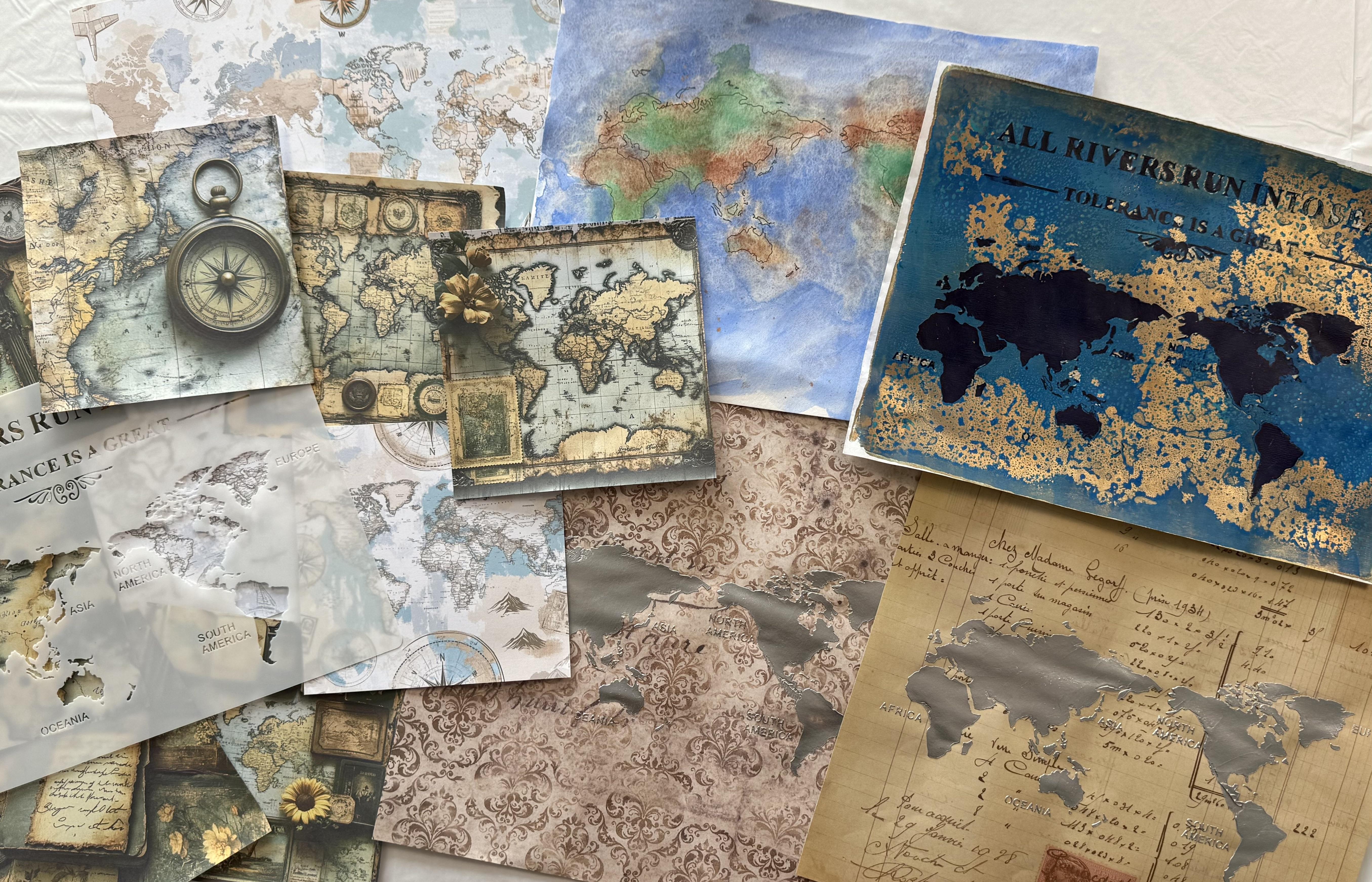
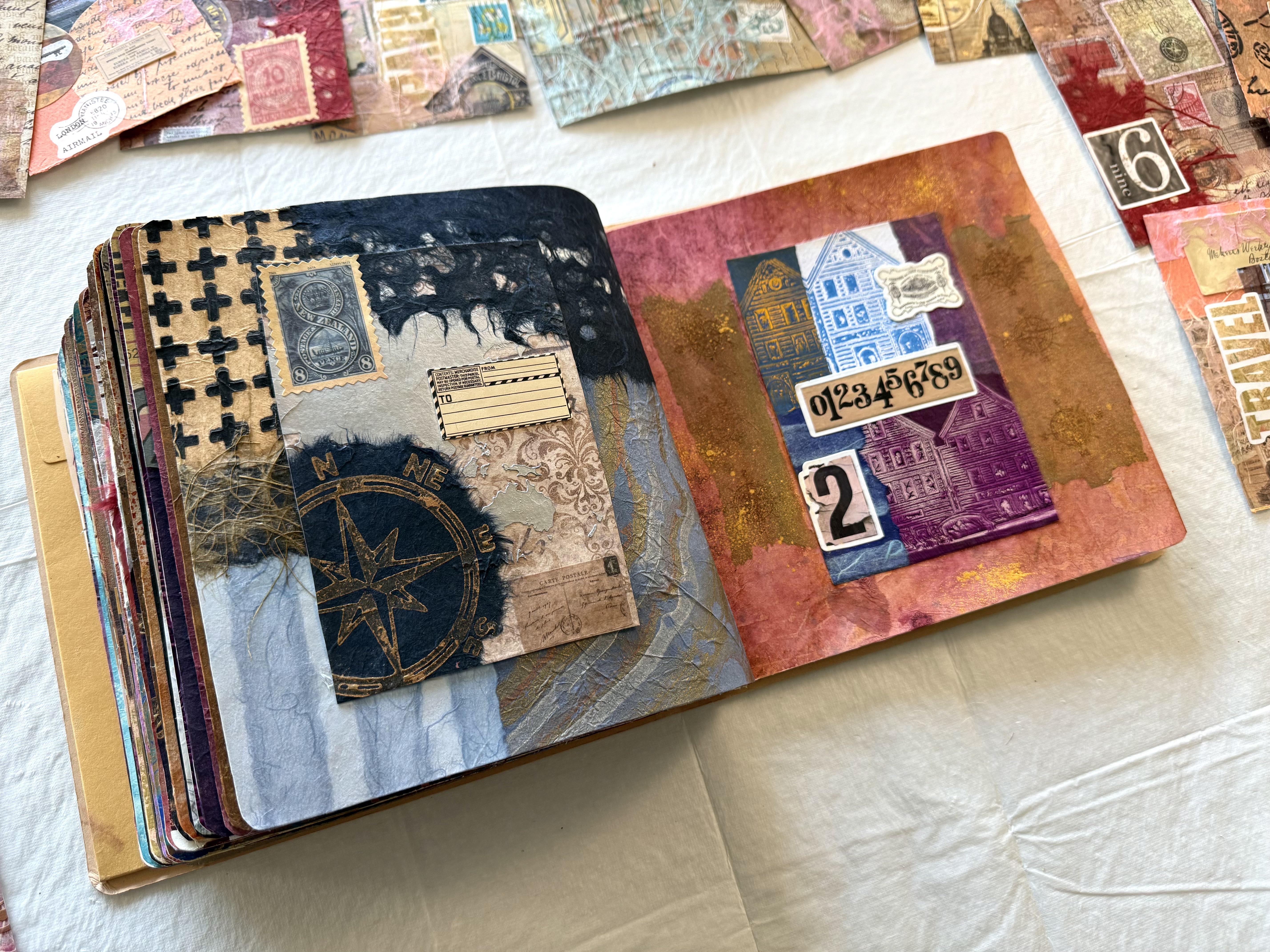
6. Day 67: Map of Wandering: Day 67 Map of Wandering. Create a collage using fragments of real
or handmade maps. Highlight imagined
routes, pathways, or borders to symbolize
the journeys we take both outward into the world and
inward into ourselves. Sounds pretty exciting
using old maps. So I'm going to start with this absolutely fabulous stencil that I found of the world Map, and I've put it onto some. It's not actually
watercolor paper. It's a printer paper, but it's a beautiful
textured paper, and I'm drawing around the
map with a sharpie pen. Now, this is a really, really easy technique drawing
around the stenciled areas. I wanted to have a little play, pull out some watercolors, splash some paint around
and think about what I might want to create
with this map idea. So because the maps
quite detailed and my beautiful little
sharpie pen is so fine, it gave me quite a
bit of time to think about as I'm tracing
around the map. Then I splashed on some
blue or watercolor paints. I didn't really know
what I wanted to create. I just wanted to
enjoy the moment. It's quite therapeutic with the little pen and
wash technique, and I wanted to just
play with some colour. The blues looking
rather beautiful. Then I pulled out some
copper to add some brown, toned pigment to the
landmass and some green, of course, we've got
to have some green. So I played around
with the watercolors. I even put a little bit of
metallic copper into it, and then I pulled out
my fabulous zinc spray, gave it a little
spritzer of bronze. I wanted to create some texture. I didn't want a
perfect painting. I'm not really good
with the realism. I'm more of an abstract
expressionist, so I just wanted to splash
the watercolors around. Now, I did say this
wasn't watercolor paper, so it could buckle in the playing of my paints.
It doesn't matter. It's just the first
textured paper that I'm creating today for
this fabulous collage. I think it dried up pretty good, considering it's
on printing paper and not watercolor paper, I like the washy
mix of the colors, and I like the texture that's spraying it with
a little bit of water, a little bit of easing Bronze. Kind of created. I bought a bit of a motliq texture on it. Love it. Now, you can use this
technique in so many ways. Just make sure you're
using a waterproof pen. So I used this one,
this sharpie pen, and it didn't bleed when
I splashed on the water. So that is always helpful. Then, of course, I pulled
out my favorite lunar paste. How could I not and spread it across this
fabulous stencil. I'm putting it on some craft
paper, silver lunar paste. Look how stunning it is. It's just beautiful. Of course, I
couldn't do it once. Yes, I did it on two
different pieces of craft paper because it
just looks so great. I'm loving it on
this piece of paper, this textured craft paper, and the silver shines beautiful. You know what I love
about this stencil? D. Well, 'cause I live in
the country of New Zealand, which is this little slither
of land mass right there, it's usually on this
side of the map. Like if I look at this map here, this land mass is
always on the right, and that land mass
is on the left. But on this sencil here, it's the other way around, which means New Zealand
right in the middle. I'm in the middle
of the universe. Did you know that the
country of New Zealand is the country that is
most left off well mapped? Because we're at
the bottom here, the bottom of the planet, it looks like on
a map like this, we often get left off. But this map here with this densil New Zealand's
right in the middle. It's just so fun to me. Fun, trivial fact
about the maps. So anyway, this
turned out beautiful. I love it, and this one
turned out great, as well. I think it's a little too
much pattern behind it, but you have to
try these things. You have to try your ideas, try some different papers, try some different textures, 'cause you don't
know until you try. So then, of course, I had
to pull out the gel plate. It'd be wrong not to. We can't go past a lesson
without jelly Brendi. So I put the stencil on the gel plate with the
beautiful Prussian blue. Waited for that to dry and then splashed on
some cobalt teal. Gorgeous colour.
Sprayed it with water. I think it was a little bit
too much water, not to worry. Then I put on some
serleimb sprayed it again. I really wanted that texture, watery spray, especially
in the ocean. So then I pulled the print with my favorite iridescent
bronze fine. And look how fantastic
it came out. I'm loving this print. I love the watery texture that it creates
from spraying it. Remember, you do have to wait for each of these layers to dry. And then we've got the
glorious bronze. Oh. Yes, it's one of my
favorite colors. I'd love to buy it in a bucket. So, here I am. Little Old New Zealand.
You can hardly see me. I think this print
turned out beautiful, loving the colors,
loving the texture. So I've got all of
these prints now. I also have some of
this craft paper with some fabulous map
type themes on them. Oh, there I am. I'm
there. I'm on that one. It's a little hit, Miss. But I've got these, as well, and they're all in the
beautiful blues and turquoise and little bit of ochery brown
color on that one. This one's pretty nice. So, what am I going to do? I better pull out
the art journal and decide which of these
I'm going to start with, I might actually rip them
up and put a couple of the pieces of the different
land masses together. Why not? Right? We
can do anything. Right. Well, I really like the
blue and the bronze today. I'm thinking those colors
is where I'm heading. So I have to have
some of this print. I really like this one, as
well on the craft paper. That's fun, but clearly, I'm not gonna fit
everything on my page. I do really like my pen and
ink wash Map of the world. It came out better
than I expected. So I don't know, but if I can fit it all on, so maybe not, but I do like a little bit of
this craft paper. So perhaps I might tear some of the different land
masses and put some of one of these on and
some of the other. What about that?
That's not a bad idea. I think it's going to
just have to be a matter of trying and deciding
as I go along, I do tend to create
my collages in a spontaneous kind of
intuitive approach. I like to create them as I'm moving along and playing
with the papers. So I don't think the world
has to go any one way. It is a globe. We are
all the way around. So I think I can put these
land masses wherever I want. And I kind of like New
Zealand being in the middle instead of at the bottom of the planet that
everybody forgets about. I like this side, too. So I'm almost tempted to even
put this one on this side, because the colors
are just beautiful. The print turned out
absolutely fabulous. And, of course, I also
have my scrap bag, and I do want to put some of
these beautiful coso papers, these fabulous
textures on there. I've got some of them in the beautiful blue
colour handmade, glorious pieces that
I'm pretty sure I'm going to have to have
on my collage today. So that's where I'm headed. That's what I'm going to do, and I really won't know until I start putting the pieces together as to whether or
not I really want them. So I'll have a little play. I'll glue some things down, and then we'll see
where we're at. Well, that is a great start. I'm loving my pages. I love the colors. And I repeated some of the
shapes of the land masses. I know that they're not
in the right places, but I'm creating
an abstract design based on the theme
of the world map. So it doesn't have to be
completely realistic. Let it go. Allow yourself to freely create without having
to make the picture perfect. The colors are fabulous, and the combination of
the craft paper and my printed decils here with the map have
worked out really well. I'm definitely adding some
of the fabulous Coso paper. On here, I'm thinking like, how far do I want to
go? I don't know, man. I don't know. I'm going
to just tear it down this way and put some on here. I'm thinking like that. And then maybe a piece up here. That could be nice.
Yes, I'm liking that. Well, maybe it should
go a bit further. C need a bigger piece? Maybe a bigger piece. To go across like that, maybe not that big, just a matter of tearing and ripping and deciding what
shape you really want. Then once you glue it on and
you've made that decision, you can make the next decision. That's what it's all about
with intuitive collage. You put down a piece,
you think about it, and then you put another piece down in reaction to
that first piece, and that's how it
slowly develops. I'm thinking I want
to add some of this beautiful layered
coso paper over the top. I'm not sure how much I want to add until I start
putting it down. And then that will
help me to make the decision of what I want
to use for the next piece. Just like that, perhaps, perhaps, do I want
it to go over there? Not sure. And what about
this side? Do I want to add? Maybe, baby, just
a little piece, this beautiful cosot paper. It dissolves really well
when you glue it down. So you'll just see the beautiful fibers
of the handmade paper. You can still then also see the colors and the
textures that's underneath it. So let's put a piece
here like that. And you'll see all of those
fabulous soft blue fibers. On that side. Yes. And yes. That's all I can say. We'll put this beautiful piece here. Then decide if I want
to add any more of it, I'm definitely putting
a piece up here. And just like that, we have the next
layer on the page, beautiful, fibrous handmade coso paper looking rather glorious. So, what else do we need? Do we need anything else? Maybe because I'm a little bit excited about all this
beautiful texture. Maybe I might just add a little piece up
here in this corner. Now, I do have some
fabulous Travel stickers. These ones I actually got from Timo really cheap in a pack. If you want to have a
look on that website, just type in Travel stickers
and you'll get so many. You won't know what to
do with yourself, man. So I bought a pack of these. Oh, they're so much fun, and they're so easy to put on, and they were really cheap. So I think I'm going to add a couple just to make
my pages more fun. Which ones do I want? Well, I like to explore. Mm. I like this one
there. That's an option. But then I like
this one, as well. So Oh, man. Now I'm going to have to decide. Maybe I could put
that on this side. We're exploring both sides? What about an airplane? I like the airplane idea. Oh, yes, I do like that idea.
That could go up there. I do like the compass
idea, as well, but I don't want to put too much on it because I don't
want to distract from what I've already got on the page ca I'm
really liking it. So I'm thinking maybe not that. And I did like this
one over there. So I'm going to put those on. Then I'm going to let it dry, and I'm just going
to think about if I want to add
anything else to it. I'm pretty happy with it. I think it's really beautiful. It's got all the different
parts of the world. I like that it's abstract. That makes me happy. Do I want some more of
this down here? You know, I possibly could. We could add a little bit of this continent down the bottom just to continue that color. Oh, I got ripped off. Bye bye, New Zealand. You're off the map again. So I'm liking the color of this. I think I might finish this side by putting
that down there. Just like that. Have a look at how beautiful
the pages have dried up. I'm so excited. I'm really happy with my round
the world adventure. Where are we going? Round
the world in 80 days. Wouldn't that be amazing? We could hop all over the
different continents. I think it's looking beautiful. I absolutely love the Czo paper. See how well it dries
up and you see all of that beautiful
fibrous textures. My little stickers
are pretty fun. They add just a bit of pop of color and a
different texture, and I'm absolutely loving this stencil with the
different continents on it. The colors are good.
I'm really happy. It's looking
absolutely fabulous, and I had so much
fun creating it. I can't wait to see
what you're going to do with your absolutely
fabulous world maps. Right. So where are
we off to next?
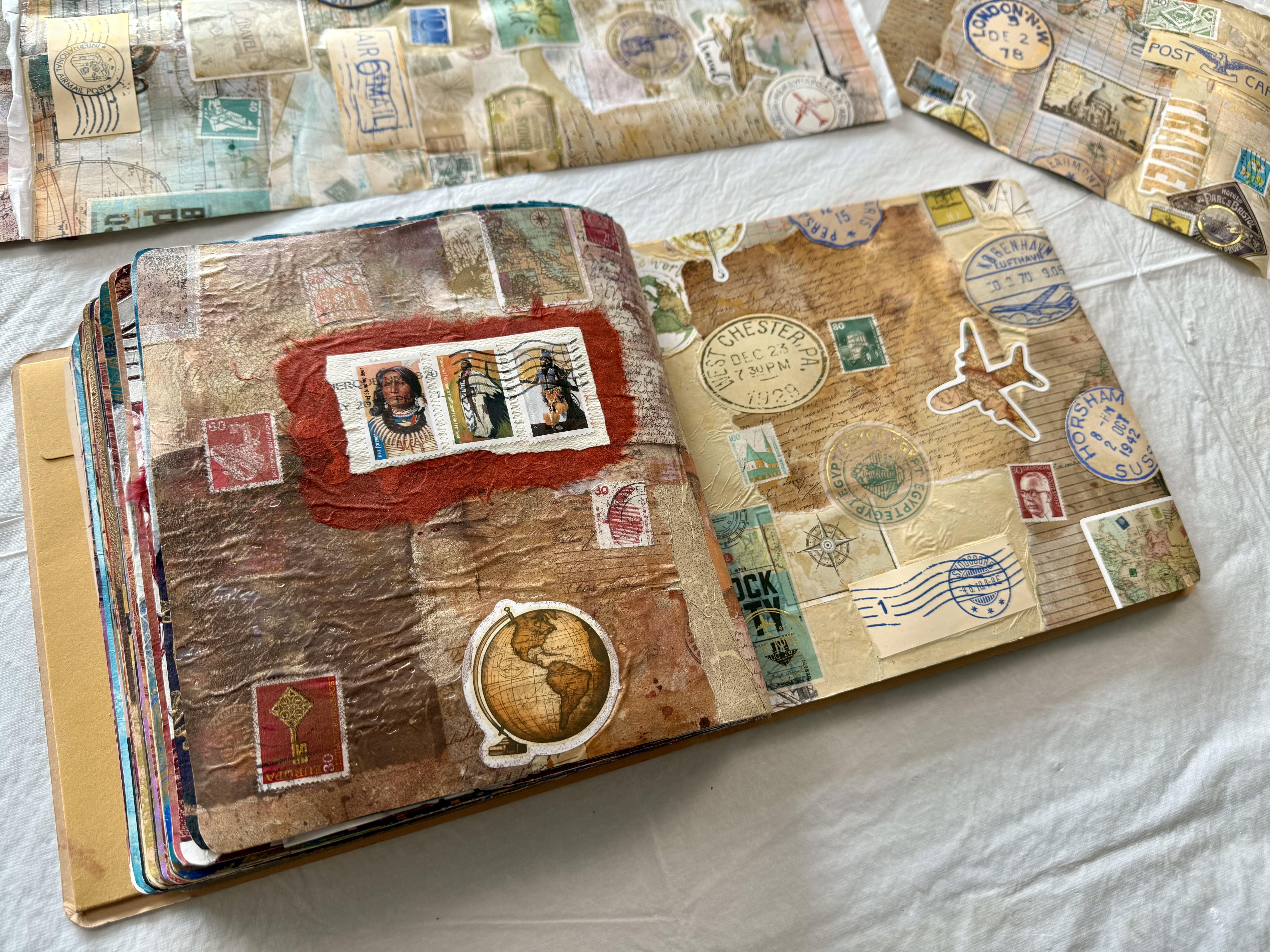
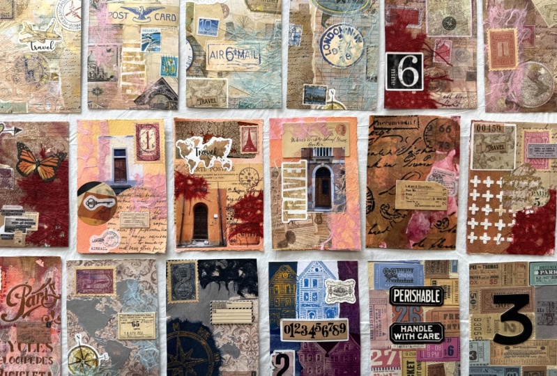
7. Day 68: Souvenir Stories: Day 68 souvenir Stories. Now, today's prompt says to base your collage on a single travel
keepsake like a postcard, a coin rubbing, a
brochure fragment, or even a menu, build layers around it
to recreate the memory. But how am I supposed to choose? From all of these
fabulous treasures that I've collected
along the way. These souvenir stories came from my second Viking cruise that I went on with my beautiful
little treasure. We started in Barcelona, what a stunning city. Then we went to a
few more ports in beautiful Spain and
traveled on to Portugal. The incredible cultures and
textures and patterns and inspiration of this trip has really given me so
much to create with. In Fo Mouth, England, we went to St. Michael's Mount, and what an absolute, incredible destination this was. Whole trip really was a bucketless experience
because from there, we went to Portsmouth in
England and visited Stonehenge, something that I
always wanted to do. We were supposed to stop
in France and visit Paris, but we missed out
because of the riots. We pushed on to Belgium and spent a day in
the Netherlands. Of course, we had to
go and visit Vincent. Van go is one of my
absolute favorite artists, and what an incredible
pleasure it was being able to see his paintings up
close and in the flesh. From there, our fabulous
cruise finished in Bergen. Look at the fabulous
colored buildings. I was absolutely fascinated. We had such a fabulous
time walking around here, and I did, yes, get a little obsessed with all of the little
colored buildings. I went from shop to shop and ended up with quite
a huge collection. So I'm thinking today I should use some of
these fabulous, little Bergen buildings and
create some jelly prints. Do you think they would jelly
print? I don't know, man. I'm thinking they
might. They got a really nice texture on them, and we can only try. So I'm gonna pull
out the gel plate, pull out some fabulous colors, and see if I can
create a print from these glorious little
souvenir stories. I'm starting with deep
violet on the plate, absolutely beautiful color,
one of my favorites. And I decided to use the fluid paint because I'm
thinking that a thin layer of paint might be
able to pick up the texture of the little
I want to say houses, but they were actually shops. Of the beautiful little
Bergen buildings. Then I rolled on some
yellow, some orange, and some blue
because I wanted to have the look of the
fabulous colors. And I've printed it onto
wet strength tissue. It doesn't look too bad. Thing. I think it's
a whole lot of fun. You can really see
the little buildings. You can see the
windows and the doors and the textures of how
they're constructed. And it's a whole lot of fun. It's not a perfect print. It's not brilliant, but
it's our first one, so I'm going to give
it another try. The next one, I started
with cilian blue. I'm still using the fluid paint because I'm still thinking that a thin layer of paint
might work best on the plate. Pushing the little buildings
down into the plate to get a nice textural mark and let's
see how this one prints. I've decided to use some cobalt turquoise in the middle of the
yellow and the orange. And this one I've printed onto my Japanese
sketch rice paper. It's printed quite
well, not too bad. It's a whole lot of fun, and I do really like the
colors coming through the texture mark from what
are actually fridge magnets. It's working pretty well. There's really not
a whole lot of texture on the fabulous
fridge magnet. So that's why I thought the
fluid paint might work best. And it's not too bad. You can actually see the
textures of the buildings. It really is a whole lot of fun. But what I liked even
more was the stamping. So when I put it
on the gel plate, of course, it got absolutely
coated in the fluid plate. So then I turned it over and stamped it onto paper just to basically clean off
the fridge magnet so I could try to get
on the gel plate. But I'm loving the stamping. I think the stamp looks even
better than the gel print. So the next one I took, I used the quinacotVolet,
my favorite. And when I pushed the fabulous little fridge
magnet into the gel plate, I stamped it on some
much better paper because the stamping
is looking amazing. This time, I pulled the
print with some ozo yellow, and you can see
that fabulous color coming through next to
the quinacoto violet. It's pretty nice. It's pretty fun. Then I
thought maybe I should try the full body paint
perhaps I could get a clearer print out of it if
the paint's a bit thicker. So in this one, I'm putting on the muted violet and trying to see if it's
going to print any better. I had a bit of trouble
with this print. I really don't know why, but when I put the paper on it, it didn't seem to absorb or
stick to the paint layer. I had a beautiful layer
of iridescent gold. That was my idea. But
I don't know, man. Something went wrong
with this print. So I pulled the
paper straight off, and then I put another layer of paint straight over the top, one of the beautiful yellows, because I wanted to pick up
the rest of that print layer. So it kind of looks
a bit weird as I had pulled some of the color
off by pulling the paper, but it's not too it's
a whole lot of fun, and you do have to keep trying. You have to get on a bit of a roll when you're
jelly printing. Sometimes it goes really well and sometimes
it just doesn't. And I'm actually
thinking I still like the stamping even more
than the gel prints. So with this print, I decided to focus more on the stamping than worrying
about the printing, by now, I've decided that's
what I liked better. So I've got the beautiful
deep violet on the gel plate. I'm pushing on the fridge
magnet and stamping it onto a really nice piece
of printing paper. Tada, tada. Look how
fabulous it looks. I'm loving the little
houses are slash shops. They were originally houses. I was chatting to one of
the gentlemen in the shop, and he was telling me the
history of his family, how they had lived in that particular building
for generations, and it was originally a house. Aren't they gorgeous? They're
so cute. These buildings. This print I pulled
with the Titan bath, it looks pretty nice. It's got some really
nice shape to it. I think I like
this one the best, and this was the one
that I tried the least because I was more
focused on the stamping. So now I've got two
beautiful papers of the fabulous stamped
little buildings on them, and I pulled out my watercolors. I'm putting in some beautiful
colors in warm tones, and I pulled out the metallic
watercolors, as well. They look absolutely beautiful. I had a whole lot of fun at
dropping in the watercolors, and I added a little bit of ink, a little bit of
metallic, as well. And, of course, I had to spritzer it with a
little bit of gold mine. Everything's always better with a little spritzer of gold. Have a look how beautiful
these pages are. You can see the glorious
metallic watercolors and a little spritzer
of the gold. I ended up doing the same
colours. I wasn't going to. I must have just
been in the zone for these colors because they've
ended up both the same. So now I've got all of
these fabulous prints. I definitely liked the stamping. I thought this was far more successful than
the jelly prints. Oh, even though this one
turned out quite good. So what am I going
to do with them now? Mm, I'm going to have to tear them up to put in
the art journal. Not sure exactly what kind of composition I'm
thinking about. And I think I'll pull
out my scrap bag, maybe some coso paper, and let's put something
together with these fabulous, little cute little
Bergen houses. I do think this really
was a fun idea and such a great way to use the souvenirs that I came home with so many little houses. So I'm thinking, what about if I ripped a few and put
them on that side? I like the idea of
tearing them vertically. Like, so maybe something
like this down this way. I could do something like that. Perhaps, perhaps perhaps put
a couple of them on there. Maybe on the other side, I might put the beautiful
stamping yeah, I like this. A couple of them because I really like the bright
colors of them. They're absolutely fabulous. And the whole area was so
beautiful and so fascinating. So we have to have some of these beautiful, bright
colored houses. I just don't know how
many I can actually fit onto my original
binge. Same old story. How much can I bet on the page? Do I want them to be
beside each other? I don't think so. I think
I'm going to alternate them. So it's more of an
abstract type design. Oh, I have to have some of
this one cause I really like the yellow on the blue
and Zi. Turquois. That looks really good, too. So perhaps some of
this one, as well. Then that has some of that
fabulous bright color. Or we might put it,
something like that. Something like that on that
side. Not sure. Not sure. I've got some of
this one, as well. Then there's that
one which got stuck, which is really
quite interesting. And then I added some extra ink onto the
page that I had pulled off. And it's a little patchy, but I really like it. And I'm thinking
that this would make a really good background
for a different collage. But you can see some of the
little buildings there. I don't know what
happened to that print. You know, do you have that? Sometimes something just
goes a little upside down? So I'm putting one of
these. I'm not sure. They both ended up the same
colors, which was hilarious. That one's probably got a
clearer image of the stamp, but I think I'm liking the
swirly patterns on that one. So I'm going to put
some of this one. Not sure if I want to
fill the whole thing. I don't mind it.
It's pretty nice. Or I can fill some of it and add some hose paper
from my scrap bank, which, of course,
I have tons of. So I think oh, even some of that would be
nice with the script writing. Yeah, I like that idea. Maybe I'll stick it
down first and then put a few pieces of
something else with it. That could be a good plan. Anyway, however I
stick them down, I definitely have enough prints. So what do you think of my cute little beautiful
Bergen colored houses? I think the collage turned
out absolutely fabulous. It's a whole lot of fun. I really enjoy
jelly printing with the fridge magnets just to
try something different. And my collage has come
together pretty well. So now what am I gonna do
with all the other souvenirs?
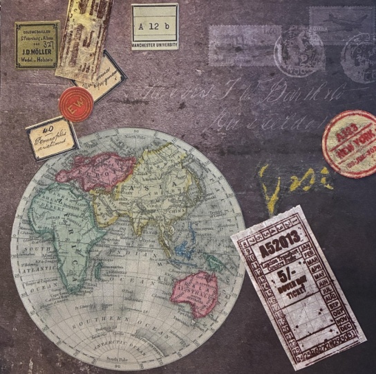
8. Day 69: Found Along the way: Day 69 found Along the way. Create a collage from
travel finds and fragments. Think of this piece
as a collection of things picked up
along the journey. Ticket stubs, leaflets,
patterns seen only in passing. Combine textures, text, and torn edges to create something
that feels like it was gathered from
many places and pieced together to
tell a textured story. Now, doesn't that sound
like so much fun? These bits and
pieces that I have, these ticket stubs
and travel bits from along the way actually
wasn't from my recent trim. I bought this packet from Timo. And how fabulous is it? It has the most
amazing collection of tickets that I've ever seen. So I was so excited to
have this packet of ticket stubs that I
decided to pull out my 16 by 20 inch gel elf plate, and I'm going to do
a gel plate collage, one big pool with some
wet strength tissue. So I line up the little tickets. On the gel plate, I go vertical and horizontal. Was actually quite therapeutic sticking them all
on the gel plate. Because it's going to be
a gel plate collage pull. You don't actually quite
know how it's going to look because you're
putting everything face down. I did pull out the ones that I thought the colors would
match better together, but I still wasn't exactly
sure how it was going to work, if it was going to work, or if it was going
to look any good. I'm loving this
technique at the moment. I think it's so
fascinating and there's so many possibilities
for what we can create. So once the ticket stubs
were all down on the plate, I pulled out the liquitex unbleached titanium
and I started brushing it over the tickets because I'm thinking if I
roll it with the brayer, it could actually pick them up and roll them off the plate. So I'm brushing it with a brush, and I was quite happy with it, but it was a little bumpy and the texture
wasn't so smooth. So once I spread out the
paint a little bit further, I did pick up my brayer and
roll it across the tickets. And, yes, it did exactly
what I thought it would do. It picked up a ticket and
took it off my plate. So then I had to peel
that off the brayer, wipe away the gel plate, put it back on, and continue. I do think the brushing was more successful in keeping
the tickets in place, but I did want to
smooth out that paint, so I couldn't out myself. I had to brayer it, even though it was a little
bit of a hassle. Once I got it all covered, I then put on my fabulous
wet strength tissue. Smooth it all down.
I'm so excited. I can't wait to see
how it's going to look because I had in my
mind how it might work, but you don't quite
know, do you? Until you pull up that gelprint
how it actually looks. So I left the whole
plate drying overnight. I didn't want to pull
it up too quick because I didn't want to lose
my fabulous tickets. Ah. So I did this lesson in
the afternoon so I could pull it the next morning I wouldn't get impatient and
pull it up too quick. So it was the next morning that I decided to
pull the print, and I turned my plate over. I have found that if you roll the gel plate
off the paper, it's more successful than trying to pull the
paper off the plate, especially for this kind of
gel plate collage technique, where you've got a lot
of multiple layers and papers and textures
on that gel plate. And tara tara it came off
the paper really easy, super easy, much better than
I expected it would come. It looks absolutely fabulous. I love it. What a great idea.
I'm going to do this again. I think the ticket stubs
look absolutely wonderful, and I do like the
balance of the colors and the contrast of the blues and greens
with some mutual colors. And, of course, all of
those fabulous warm tones. Now, when I put the
ticket stubs on, I started in the center, and then I worked around and out further
and further and further. I just thought it might
make a better pattern. But of course, you could
start from one side and cover your plate going over to the other or from the
top and work down. It really doesn't matter. But I do like the way
they're sitting together, both vertical and horizontal. I think that makes them
pretty interesting. So, what am I going to
do with this beautiful, big piece of collage paper now? Turns out quite good doing
this jelly plate collage. I'm thinking to put it in my
art journal, which is here. I'm definitely going
to have to cut it. So I'm thinking I
would really like to cut maybe a circle shape. Because that would be
a whole lot of fun. And then I could put that on the page with some
background behind it. What am I going to
do with that side? I'm not sure exactly, but I don't want to just cut it square and stick it on
'cause that's boring. We need to have some
multiple layers, and am I going to put
anything on the top? Hmm, that's another question. Although I really do like
this beautiful collage piece, so I don't want to
add too much to it. I don't want to cover it, but I want to add a
couple of layers, maybe some different shapes. And where will I start?
I don't know, man. There's so much to think about when you've got
such a beautiful, big piece to put on such
a small little space. Think I'm going to go
with my circle idea and then see where
I head after that. Right, so I pulled
out my circle makers, very high tech circle
makers that I have here. And I've pulled out
some Coso paper to put maybe baby in the
background because I want to have another plain
color underneath so that my fabulous little ticket stubs are shown off to the best. Now, I really like
the way I started in the center here and
then created around it. So I'm thinking I'm going to use that right there, like that. Then what I might do is
use the section that I cut out and create
the other side on the other page with
maybe that round shape. I'm thinking. It's
just a thought. I'm not sure until I
start creating the page, what I actually want to
create or how it might work. I've got this other shape, and I've got some smaller
circle makers, as well. But I think I'll
start with this idea. And then I guess we'll just
see as we get moving along. It's pretty easy to cut. It's not too thick.
Which is good. I really like this gel
plate collage idea. I think I might try it with
some more different kind of textures and papers because
I do love the one big pull. That's really fun.
You do have to think about your composition
backwards. That's a bit of a
trick. But once you get used to
thinking backwards, then it's really not too hard. I know I picked the middle piece of this and it's probably the most ineffective
way of using the paper. Oh, my. But I really wanted
the middle piece. So, whoops, that's
what I'm doing. I'm cutting it out
because I want it. Then I'll see what I can do with the leftover
pieces as well. Right. First circle
cut like that. So if I get my fabulous
art journal back, it's going to fit
very nicely on there, and then I'm thinking maybe some black with this
little gold fleck in it. That's coso paper, of course. Absolutely beautiful. I could put that on the
background, just like that. How super easy is
that and put that. Look how dramatic it
looks with the colors. They just pop against
the black background. Look at that. That's going to be cut like that.
Yes, I'm doing it. And then I don't
think I actually want to add anything to
it because I just want the ticket stubs to be my focal point and the whole
purpose of the collage. I love the red one in the
middle. That makes me happy. Right. So that's going
to go on that side, and then what will
I do on this side? I was thinking of using the section that was cut out and putting some
background underneath it. So I might do that
just like this and then put some of the so
paper underneath it. I've got these beautiful
colors in the so paper, so that would work
under there like that. Maybe, baby, not sure about
that, but loving this. So I think I'll start with that and then think
about that side. Well, that was a whole
lot of fun, maybe. These pages. I think my ticket stubs look
absolutely fabulous. I mean, they could be tickets
to all the things I went to on my travels,
but they're not. But they resemble the feeling of going to all the
different places. And I did go to quite a few. Don't they look fabulous. I love the consistency
of the size, and I like that they're
vertical and horizontal, and I like my little cutouts. The background looks great with the black on this circle piece. And that's the center
where I started. I'm really happy with them. I think the pages look fabulous. Now, am I finished?
That's the question. Well, I'm thinking that I
don't really want to put anything over this because
I just love the tickets. Look at them. Cinema tickets. D one. Admission. That's so fun. But I would like to put a little something in
this section here. And I've got these stickers. So I'm thinking
something like that, but maybe not that. I don't know, man. It's gonna
be difficult to decide. Anything could work really
of these fabulous stickers. Oh, I do like that one. I do like the number
three pointing that way. That's fun. Alright, put
that in the maybe pile. Number ten looks good,
colors look great, the same kind of font
style of the numbers, so that works really well. Oh, man, there's so
many here to choose. What do you think? Should we use that one or I did
like this one, too. That was kind of fun with
the arrow. Maybe that one? Yeah, maybe, baby. Oh, man. I can't decide. I can't decide. Do I want the arrow or
do I want the color? Mm. The arrow. Okay. If you voted
for the arrow, you must be hearing me 'cause I'm gonna
go with the arrow. Now, on this side, I'm not
going to put one of these, but I might put a trinket. These are stickers,
how cool eight? So super easy. If you find that
they don't stick, you can't always
put a little bit of the mat medium under
sometimes I do that, sometimes I don't just depends, but that's stuck down right.
That looks beautiful. Now, I'm thinking, maybe,
baby, one of these. I bought these when we
did our seam punk class. I ended up with a whole heap of trinkets 'cause I
do get a little carried away with the themes and get lots of options
for our collages. So, oh, look at that one. I ended up with quite a few. That's maybe a bit too chunky. But I would like to add maybe
one of these keys there. Why? I don't know, man. I just think it would be fun. Ooh, or going down like
that, that's kind of fun. I like that idea. Just a
little something on the page. Maybe Oh, that one's flatter.
That one might be better. Maybe, maybe too. Maybe, baby. There's so many to choose from. Yes, I did get carried away
buying little trinkets. But I loved that lesson, and that class, it
was so much fun. So I'm going to decide on which one I'm going
to put on there. And then I'll let the pages dry. I'll give you a close
up when they're dry. And then moving on to our
last lesson for this class, didn't that come round so fast? I loved this Travel theme. I think you might
have noticed that sharing with you all
my fabulous journeys, I love those Viking cruisers, both of them pretty
keen to do another one. The next lesson,
I'm using leftovers of the different print and papers from each of the lessons, and we're creating miniature
collages as postcards. So I'm pretty excited for that because we get to use
lots of leftover, bits and pieces, and I
do like using leftovers. And I love creating miniatures. So once I actually decide if
I'm putting on one or two, I do like the two of them. I'll glue that down. Let it dry. Give you a close
up and n yippee. We're on to making
postcards never sent.
9. Day 70: Postcards Never Sent: Day 70 postcards never sent. Now, I'm pretty excited
about this class. Our prompt says to make a
collage in the style of a postcard from a real
or imaginary journey. And what I thought
was to use some of the papers and prints
and bits and pieces that we've collected from
all of the previous lessons and create fabulous postcards
with all the leftovers. Now, I did get a
little carried away, but I had the best time. I absolutely love making
miniature artworks. I find it really therapeutic that I can stop and
be a little bit more still and just pull out fabulous little bits
from my scrap bags. And I had so many papers to use. From the first lesson, I had the fabulous
jelly plate collage, which I had pulled with all of the fabulous postal artifacts. I loved these. Print
actually made two of them, and my gel plate
was 16 by 20 inch. So it's pretty big. I had
a lot of paper to use. I had to use it all up. It was so super easy
making postcards with these leftovers because I just cut a section of the gel print, glued it straight onto a piece
of the watercolor paper, and then I added a bit of Coso. Easy, easy. Oh, I also added a couple of stickers to enhance the
composition some more. But it was so super easy, and I had so much of that fabulous jelly
print collage that I made a whole heap. It was just so super easy to add a few more stickers with the background of what
I had already made, stuck it on some
watercolor paper. Or some card stock. Whichever one I
had laying round, that one's watercolor paper. And a little bit of coso paper. Oh, man, I ended up
making all of these from that fabulous gel print
collage leftover piece. Aren't they absolutely fabulous? And, you know, I could
send these as postcards. I actually could put a name and address and a stamp on
it. Wouldn't that be fun? I really do think
it would be fun. A little bit of coso paper, a few stickers
with my gel print. And look how many
I ended up with. Then I pulled out the
fabulous leftovers of the little Italian doors. You know, I had to use those. And from the second lesson, I had the fabulous painted, little six by four
watercolor papers. Also, I had the ones with
the jelly prints on them. So I already had a fabulous painted and
textured background. I'm already ahead. So I made a few of these, put the beautiful little
Italian doors on, some Coso paper, and they turned out
absolutely beautiful. It really didn't take much to add to the fabulous
painted background, super, super easy, and
that was really fun. A few of my scrap bag pieces, the fabulous picture of
the door and a stamp. Don't forget the stamps. A few bits and pieces, some of my travel
stickers, some scrap bag. And I really love making these. They would be so much fun to
send or I could put them in a little frame and make a little miniature
artwork out of them, or I could send them as a gift
or even a thank you note. Love making these miniatures. Now, in the third lesson, we're off to pay. I'm using some of
the fabulous paper that I had with the
beautiful Eiffel Tower. Those colors, the colors in
these papers are beautiful. Putting it with some more of my fabulous
little stickers and some off cuts from my scrap bag and some
Coso paper and voila. Woah. Within a few minutes, I have a stunning little
beautiful miniature. Work. These turned out
absolutely beautiful. I made a couple of them with
a fabulous patty paper. But then I pulled out that
fabulous tea bag paper that I had painted
on the gel plate. Oh, man, this is so beautiful. So I cut sections of
that up in the size of my fabulous little six by
four watercolor paper piece, and I've used them
for the background. Then I'm adding some of the stencil that I
had printed out. I have so many leftovers, so many bits and pieces. I think this was a great
way to finish our class. Maybe I'll do this
again next time. Because I love using up all of the bits that
I've already made, and I absolutely love being able to focus on
that size of the miniature and really
create something beautiful and texted with
the multiple layers. I created quite a few
with the Paris theme, and look how stunning that
background paper work. You know, I think
I might have to do that again with that
particular paper, painting it like that
on the gel plate, and then maybe we'll put it on a canvas and create
a bigger artwork. Wouldn't that be fun?
I think it would work really and it
looks so stunning. It looks like a painting in the background when you
glue it down on something. And then with the fabulous
stencil over the top, a few little stickers
and a stamp. And Walla we have a
postcard from Paris. Even though I haven't been
yet, but this is the one. The lesson that we
said, Where do you want to go? Maybe next year. The next one was the map
of wandering and I'm using the fabulous leftovers
of the globe that I had the world map on the
craft paper. I'm loving it. I ended up being a
fabulous background, a few little bits and
pieces on top and Walla. Absolutely beautiful. And, of course, I got to
change up the colour scheme, added a little bit of
blue 'cause it really went well with the silver. And this one, I pulled
out a piece from my scrap bag with a
compass piece on it there, a little bit of Coso paper, some of the fabulous
map, some stickers. And, of course, this is
actually a New Zealand stamp. It's not a real one,
but it does make me smile when I think of my beautiful little New
Zealand down there. I really like these. They do make great postcards. It's a whole lot of fun. Have I said that yet? The next lesson was the one with the fabulous Bergen houses. Now I only made one
postcard from there because I figured I
was just going crazy. Maybe I should woo up. But the buildings look fabulous. I have some off cuts from there. I pulled out the off
cuts, tore them up, put them on with some beautiful background
paper and my Coso paper, and they looked great. I wasn't happy with these
prints when I first made them. But when you do
things like this, cut up sections of them and
create little miniatures or put them together as collage with other
bits and pieces. The fact that they didn't
print absolutely perfect, it doesn't even matter. Look how good they
look as a postcard. I'm actually quite excited. I could have made a few more, and I do have more
of those scraps. So, you know, I just might. But I was a little busting to move on to the
next one because I had so much scrap paper left
from the fabulous tickets, and I absolutely love
the ticket stub, jelly print collage that
I pulled off the plate. I think it turned out so good. The colours are beautiful. The size of the ticket stubs, I really like, and it worked out way better than
I thought it would. So I cut some of the leftover
piece of the gel collage, cut it into the size of
the watercolor paper. Easy peasy, glued it on tra
tra. It's already done. That was so super easy. And then I just added some
of these little pieces. Here, I think this one looks
so good, and it's so fun. Adding a little bit of graphic
to it. Love the big three. The background looks
beautiful with those receipts and ticket stubs. What a great idea that was. I think we should do
that one again, too. I'm absolutely loving them. They look like postcards. All ready to go. You could write an address on the back
and put them in the post. Or I could actually put them in an envelope and
post them that way. So many options. And I just might do that. Absolutely loved making
these postcards. I really hope you enjoy this
as much as I'm enjoying it. Music or your leftover
bits and pieces, your gel prints, if you bought stickers and ticket
subs and stamps. And travel bits
from your journey. It really is a whole lot of fun. So I'm going to choose
a couple and I'm going to put them
in my art journal. Now, my art journal is
on to the end of it, so I'm going to put extra
postcards in it just to fill up some pages because the
next class class number 11 in this series, I'm going to start with
a new art journal. I bought three when we first
started because I knew that I would need that
many to get through 100 day. 100 is a lot. But it's such a
fabulous journey. I'm loving making these classes. I really hope you're
enjoying them as much as I am because I'm stretching myself
and learning so much and really experimenting
with these techniques. Now, the hard part
is going to be deciding on which ones I want
to put in my art journal, cause clearly, I can't
put all of them in there. And I really might actually send some as gifts
or thank you cards. So I'll think about which
ones I can't live without. Pull out my art journal. I'll put a couple in there. I'll show you when
those pages are dry, which ones I chose. And then, oh, man, then we're going to be
on to the final words. Which lessons did you like? The best? Which techniques
have you enjoyed? Oh, man, I loved making
these postcards. But then I loved all of
the lessons of this class, so I'd have all of these
papers to make the postcards. I knew this class
would be one of my favorites because I am
dreaming of traveling. So where are we going? Now, I've pulled
out my art journal, and let's have a look. See how there's only
a few pages left till the end of the second
one in my series. How bad it is. I love
working in the art journal because it's such
a treasure trove of incredible
techniques and ideas, besides all the
beautiful artwork. And I was thinking I wanted to put two postcards on each page, and then I could put
a whole heap on here, but it's actually
not going to fit. They're not going to
fit two. Oh, man. Maybe on this side, but then I don't like that
they're so squashed. So I'm not going to fit two. I'm only going to fit one. And then what I think I'll do is put some beautiful
colored tissue or coso paper or whatever I can find underneath first on
the background like that. And then I'm going to put
just one postcard on there. It looks pretty good,
don't you think? I think it looks pretty good. I might put this one like that and then that
one like that. So that's pretty nice
for the first page. And then I'll have
to find some more. I was really keen
for these ones. I love both of these.
They would work, too. Yes. There's a whole heap
I can't live without, and I do like these
ones as well. So what I think I'm
going to do is pull out some background papers
and glue those down, and then I'm only going to
fit one beautiful postcard, which makes it a bit
special, don't you? I might add some more, but I'm not sure if I want to add any other pieces around it or if I'm just going to put
the postcard on by itself, I probably won't know until I start putting the
pages together, but I am going to do a few. I'll put these two on. I'll let this dry, and then
I'm going to continue and do a couple more pages because I'm going to use
up the rest of this. Probably not all
with the postcards. I might then add some
digital college papers just to finish the book so
that with the next class, I'm going to start
with a brand new one. So that's the plan.
Haven't fully decided which ones I want and what color
backgrounds I want. I'll probably just make
that up as I go along, but I will definitely
show you once I actually make the decisions
of which of these stunning, beautiful miniature
artwork slash postcards, I'm going to you.
10. Let's Celebrate: Well done. You've made it
to the end of Class ten. What a huge achievement. I really hope you've enjoyed Textures of Travel in
Collage as much as I have. I really love this travel theme, and the prompts
were so much fun. And I particularly enjoyed sharing my own stories with you. I can't wait to see what
you're going to create, what trips you've been on, and what you're going to
share from your adventures. So don't forget to post a
pick in the project section and show me what collages you've been making
and where you've been. Have a look at the class. Notes for more information
on the art supplies. But remember, you don't
have to use all of the art supplies that I've
used or even the same colors. You can use the ones
that you are inspired by and definitely what
you have at home already. But the information is
there if you want to know exactly what I've
used or where to get it. And that can always
be so helpful. Don't forget the treasure maps
also in your class notes. I think it's a bit of fun. You can take off
which classes you've really enjoyed or even
circle which lessons and prompts you've liked the best because then you can always return to them and create from that inspiration
again another day. I also just really like seeing a map of where we've been
and where we're going. It's so exciting.
We're really going to have to celebrate
when we get to 100. Now, if you are looking for paper and products from
my recommendations, don't forget to have a look for the discount codes
on your class notes. And if you have any questions, you can email me
directly frol at frol.com or find more
information on my website. And don't forget you can join
me in my Facebook group, creative adventures,
making art and show me all of your
fabulous classes. I'd love to see your photos. So which of these
prompts or days or themes you enjoy the
best from this class? I don't know, man, if I can
actually nail it down to one, because I really
enjoyed all of them. I think the travel theme
for me was so much fun. And Paris, yes, I will
be going one day. Now, as this was class ten of our series of 100
Days of Collage, Day is 64270, my art journal
is actually now four. Well, it's full enough for
me to have finished it. I have found that I can get five classes in each of
these fabulous art journals, and I bought three of them
when I started this adventure. So this is the second journal with class six to ten in it, and it is quite full
and quite thick, and I absolutely love it. What I love the most about the art journal experience is it becomes a
treasure book, really. You can look back
through it and you can see what you created, the techniques you use, the colors you use, the different papers,
and what inspired you. So you can return
to it another day. You know where to find
it if you want it. And it just keeps all of the
fabulous ideas in one place. Now, this was the last lesson that I put the postcards in. I really could have kept
going with those postcards. I had so much fun. In fact, I ended up with
quite a few that I'm going to turn into gifts or
even thank you notes. So then I put in some
of these papers. This was a leftover from
one of the lessons with that beautiful paper that we made on the wet paint
on the gel plate. That was a lot of fun. And I kept going with the leftovers from this
class and put them in just to finish the
last few pages of my journal because class 11, I'll be starting
a brand new one. This is a leftover from
another class and, of course, image transfers. I always have so many because
I just love making them. More image transfers. Some gel plate printing. And I'm just finishing off
my fabulous journal right to the very end with my leftovers and bits and
pieces from the lessons. Oh, it's just
absolutely fabulous to look back through this
wonderful treasure trove. So many great ideas or so many
beautiful textured papers, and now we're at the end. Look at that. Look
how fat it is. I'm actually quite
impressed that the journal has held
up as well as it has. Art journal number
two of our series. Now, if you've missed any of the classes
and don't forget, you can actually go onto my
profile and have a look there and find the ones
you haven't watched yet because it's a
fabulous series. We continue all the
way through from the beginning and each class
builds on the next class. And each of the lessons, we're creating
different techniques. We're trying different
applications of paints and papers. And don't you love
the deco foil? I love to the deco foil. So what I love about this
adventure is the exploration. I've learned so much and
I've really enjoyed so many of the prompts that
I don't think I would have normally
sat down and created, especially with
class number five, when we got to the
outer space one. Did you like that one? Are you traveling along
with me? I'd love to know. Leave me a comment
and let me know if you're traveling along
with me in this journey, have you been through
all the other classes? That's the question.
More Deco foil. Don't you love that one? So don't forget to keep all
your papers and prints. You might want to use them for another class
or another lesson. I've repeated a
few of my papers, especially at the
end of the journal there where I wanted
to fill it up. Of course, you don't have
to use an art journal. You can use separate
pieces of paper. Or even on canvas or cardstock, smaller pieces or bigger pieces, the idea is for you to
create with no pressure, with no stress in a
way that's really going to empower you to enjoy
your creative expression. You're learning fabulous
techniques along the way. Wonderful tips and tricks
for your arts practice. And I know that when
you're finished 100 days, we're both going to be in a whole different
place creatively. Right. So that is my second fabulous
journal of this series. Don't forget to check
out the other classes. If you've missed any of them, you can check the
treasure map to find out which ones you've done and you haven't done that. And we still have a mighty
fine adventure to continue. So I hope you're going to continue with me on
to the next class. That one's going to be just as creative a whole heap of new different techniques, and I so look forward to seeing
you for class number 11, keep up the good work
and happy creating.
 Froyle Davies, Mixed Media Artist