Transcripts
1. Introduction: I invite you on a journey
of creative Discovery, 100 days of college. Welcome to the studio.
It's Foyle here. I'm a mixed media artist, and I've been painting
and exhibiting for over three decades. Now, I'm passionate
about two things. One is creating my own
beautiful, opulent, amazing, mixed media, collage
and acrylic paintings. And number two is to inspire and encourage you to develop
your creativity, to allow yourself to
really express who you are and how you want to create with mixed
media techniques. This is class seven, and we're crafting dynamic
story telling with collage. In this class, we
will use the art of storytelling to create
dynamic collage within our art journals. What I love about
using an art journal is the total freedom of
expression it allows. Your art can be
personal, expressive, without the fear of other people's judgments,
criticism, or expectations. I love this art
class because it's about you and me
creating together in the beautiful intimacy of an art journaling
experience with an absolute abundance of
mixed media techniques. Starting with a
particular moment in time to begin our
storytelling process, and then we'll be
using words and wisdom for inspiring
our deepest beliefs. In the next lesson, we're being challenged with
a monochromatic collage, telling the story of a
one color composition, and then we'll be on to the excitement of
an urban adventure. We'll explore the energy of abstract expressionism with
soundscapes in collage, and then you can dig deep
into your own story. We'll finish the class with a combination of techniques
with the full story, and I know you're going to really enjoy this
inspiring chapter. What stories have
you got to tell? And how are you going
to create them with our fabulous jelly
printing and paint and ink and collage and
mixed media techniques. You'll be inspired by
these new techniques and encouraged to
create art that you may not have considered before. Every project you
undertake will reflect your own individual style
and personal interpretation. The prompts are a
stepping off point, a jumping board
into the abyss of possibilities,
especially with collage. And you can be as inventive and creative as you allow
yourself to be. I'll be encouraging and inspiring you every
step of the way. This class is for anyone
wanting to develop their creativity using
mixed media techniques. It's really about you
expressing from your own heart with a few tips and
tricks and art supplies along the way that will help you create beautiful works in an art journal experience that I know You're going to
treasure forever. This class is perfect
for beginners because I will take you step by
step through each lesson, each technique, and show you exactly the art supplies
that I'm using. Or if you're a more
advanced art maker, then I'm sure you're going to thrive in the creative
environment that's going to push your
boundaries and see you create beyond
where you've been before. There's so much to learn
and so much fun to have. So let's gather
around materials, and let's make art.
2. Material List: Class seven, how exciting. Now, you're worth this could look a little
something like mine. We'll be using all of the fabulous favorite
art materials from the previous classes. Of course, our favorite
acrylic paints. I love both the liquid text in the full body and the basics. I have my absolute favorite
colors in both of these. Of course, there's always
beautiful googless America golden paints.
Love them too. And I was using some of the fabulous high flow acrylics and some of the
fluid paint as well. I know I've got so many different types
because I love it. So get into your cupboard and your drawers and your art
space and pull everything out, especially if it's
been sitting in there a while because it's not
going to last forever. Of course, I've got some
fabulous liquid texts, inks. I love these. They're
very highly pigmented. Recently, I bought
some Amsterdam in Bronze and some PBO in gold, and I'm loving both of
these at the moment. But remember, you
don't have to use the same paints and
mediums that I'm using. You don't even have to
use the same colors. Use what you have and
what you like the most and create your
beautiful art journal pages, exactly how you want them to be. Now, I also have the
fabulous sprays. I really like the
Dan the Weekly gloss sprays because they are a
fabulous acrylic paint. And I have a few of the
other sprays as well, a Tim Holt spray, and some of Linda's gang. I also have my favorite
inc bronze shimmer. Oh. Everything's better
with a bit of bronze a We are splashing around
with a little bit of these beautiful FW inks, making some fabulous
collage paper. How could we not?
It's so much fun? Oh, and I'm also using some
of the acrylic markers. This one here, which is a different brand that
I found on Amazon. It's got some metallic
colors in it, and the Posca pens, as well. Of course, I even pull
out the big moa posca. And splash that onto the paper. It's got to be fun or
I don't want to play. So if you have some of those, pull those out as well. Now, the only thing really
different that I've added to the materialist of this
class is the spray paint. I've got some liquid tex,
ridecent, antique gold. What's special about
this spray paint? It's an acrylic spray paint. It's not an enamel, and it says compatible
with acrylics. So we put that to the test. See how well it works with
the other acrylic mediums, and we're adding
this to the mix. You know, the only thing is, once you get a can
of spray paint, you tend to spray
a lot of things. But we can add it into our
fabulous artistic toolbelt. You might want to use
it again next time, and you're going to love how easy it is to create
with the stencils. So, of course, we
need some stancils, lots and lots of stencils, all different patterns
and textures and designs. I also have some of
my beautiful stamps loving these they're absolutely glorious from PMR to Studio. You probably have
a whole heap of your own stencils that you absolutely love and have to use. Pull them out, get them ready, because this is going to
be a whole lot of fun. Oh, I also have the deco foil. This beautiful mixed in one of the gold leaf mirror
mirror brand, I particularly like the best. I find it works really
well, really easy. It's stunning, especially
with the gold. Oh, yes, I had to
have some of that. Although I brought that into the art materialist
with the last class, so you should still have some. Have we used the jackard before? This paints quite different in that it's really,
really stringy. It's like the string gel
that we tried in class four. But it's not. It's a paint. So it's a really different
kind of texture. We use this to create some beautiful sound and
some abstract expressionism. You see how much fun
this is going to be? I don't think there's too
many other different paints or inks that I haven't
thrown on the table here. Have a look what you've
got in your cupboards. Pull them out, get them ready, 'cause we're going to
have a lot of fun. Of course, we're going
to be jelly printing. I love jelly printing. We make so many beautiful, fascinating prints
with the gel plate. Lots of glorious
colors and textures. We're also going to be using some craft paper and a
few layer copy prints, as well, creating some
fabulous geometric designs. You are going to have to do a little rummage through
your cupboard to pull out some personal items
because we're creating beautiful collage
of our own stories, using things that
mean a lot to us, symbolic colors and textures that tell our tale
of who we are, where we come from, and how we want the world
to perceive us. So have a little dig through your own drawers and cupboards and see what
you come up with all. And don't forget The scrap bag, we always need the
scrap bag full of beautiful treasures and bits and pieces for just that right spot, the cherry on top. Now, when it comes
to the art journal, I'm still using my fabulous dilutions creative art journal. 20 by 20. Center Meters is
holding up fairly well. It does get really
fat by the end, and I did buy three when I started this journey of
100 days of collage. But it is handling the
pages pretty well. I do like to use Mat Gel medium to glue my
collages into the pages. Now, you don't have to use this. You can use any
other medium that you prefer or even a glue stick. So I have a full
extensive materialist on your class notes, but remember, I'll say it again. Don't have to use all of
the items that I'm using, and you don't even need
to use the same colors. Use what you have in
the art supplies that you've already got and
the colors you prefer. Right. Now that we've got
everything out on the table, Time to make a big mess. Let's get going,
and let's make art.
3. Day 43: Crafting Dynamic Storytelling: Day 43 crafting
dynamic storytelling. How incredibly exciting to
be studying the next class. I just absolutely love it. This class is going
to be all about the narrative and
storytelling and writing, and there's so many
different papers we can use and so many different
techniques to play with. Right, so we're going to
create a collage that tells a story or depicts a
different moment in time. Explore how layering
different elements in a collage can convey depth
and complexity in a story. Begin by choosing a theme
or story you want to tell. Use a combination
of images, texts, and textures to
build layers that reveal different aspects
of the narrative. You could use book,
texts, words, magazine, images, and
even your own writing. It could be real or
imagined or even nostalgic. There's so many possibilities. Now, when I start a project, especially a new class, I really like to make
some new papers, do some jelly prints,
because what it does, besides creating fabulous
papers to use a new collage, it gets the creativity flowing. It gets you moving, it gets you touching
your supplies, and it gets you thinking about what it is you
might want to do. So beginning by jelly printing, using stencils or
stamps or creating different textured papers
is such a good way to start and make sure you
keep all your papers, because even if you don't
use them in this lesson, you might want to use them in the next one or the
one after that. Because all of the lessons are going to have a writing theme. So, to start, I pulled out my fabulous dance
moves stencils. I love it. This is my own
original, unique designs. It does have a secret code, and it can have messages. I started with jelly printing these stencils onto
some beautiful, soft, and very
luxurious rice paper. The pats just get sucked
up into the shape, and it just looks
beautiful in these colors. So a few of these
prints got me going. Of course, I had to use my
favorite ridscent bronze find, and I was also using
some Amsterdam bronze, which is a new paint
that I bought recently. Then I pulled out
my palm stencil. Now, if you've been following along in the order
of the classes, you're going to know
what my palm stencil is and what it means. But just in case
you've forgotten, pretty sure I should share it
with you again. Dream big. There's nobody like you. You are unique, one of a kind,
irreplaceable, Beautiful. Cherish who you are. Love out loud and allow
yourself to shine, be kind, generous, and
know that you are loved. Darling, you are a work of art. So this is my own poem. It's in a fabulous sencil. It's more of a mask actually, and Jelly printing with this on the plate creates fabulous
textured backgrounds, and then the ghost print is
what looks really beautiful, and you have all of
that script writing. So not only are my papers
fabulous and textured. They also have deep and
meaningful significance, but you can't quite
read that in the print, and that's what I
really like about it. So, I created a few
of these pages, some with colors, some
on the rice paper, and some on just white tissue. Because what I like about
pulling the ghost print on white tissue is you can put the text writing
into the collage, and it will dissolve into the background because
it's on the white tissue. It's really good. It
works really well. So if you've got some
written script stencils or stamps or anything that's
in the writing format, pull them out, pull them out, get going, get your paint
ready, get your colors out. Jelly print like a crazy person. And make some fabulous papers. Of course, you don't have
to use the gel plate. I pulled out some
acrylic spray gloss, and I started spraying
on the stencils. It doesn't create the most
crisp or clean marks, but that's what I like. I like the flowy kind of fluid looking pattern
that it creates. And if one print doesn't work, you can just grab another
sencil and spray over it again and create multiple
layers on that paper. I also flipped the sencil over and wiped it on the back so I could use up all of that wet acrylic spray that
was all over the stencil. That creates another
texture on the paper. It's just a whole lot of fun. See, it's the best
way to start a class. Jump in, get messy, create papers, and have
a whole lot of fun. Then I pulled out my stamp. This has the same text as my palm stencil,
absolutely fabulous. A lot smaller
writing, of course. And then I was stabbing like
a crazy person all over the paper because what I'm creating is some
background texture. I want to just be able to have that texture in my collage
in different areas. So I stamped it on a
few different colors cause I'm not sure
what I might use. But remember, you want to keep these papers for
the next lesson, or the lesson after that. Nothing goes to waste,
put it in a box, and you'll have more papers for the next time you're
looking for them. Now, I did this stamping on white tissue ordinary dollor
tissue and recycled tissue. Stamp all over it with the beautiful iridescent
bronze fine, because again, the white tissue dissolves
into the background, and you just have that
fabulous texture of writing. Because our things all about
writing in this class, See how many different
ways you can create some marks
using writing scripts, and then you'll have so
many different options when you're putting
your collage together. Once some of the
prints were dry, I took some of them and added some stencil butter through the fabulous dance
moves stencil, right over the top,
it looks fabulous. I love layering prints. I also put some stencil
butter onto this gel print. Doesn't it look beautiful? I think this combination is
one of my absolute favorites. The benefit of the stamping
is that it can go over any of the prints that you didn't think really
worked out that well. This one I'm stamping on here
was actually a ghost print. I was cleaning off the gel plate after doing all that stamping. And then I added
some more layers. You can always add more layers, especially once they're dried. You can sencil over
them, stamp on them, jelly print over them again. It's absolutely endless. So don't be afraid to
have another go at one of your prints and add
some more colors or a little bit more texture. Right. So I think I have
enough beautiful papers. I'm going to grab
the art journal. Now, what am I gonna
use for my focal point? What story do I want to tell? Now, besides all of the
fabulous jelly print, of course, I have a
heap of texture papers. And always weigh
more than I need. Then there's always
the scrap bag with little pieces of treasures
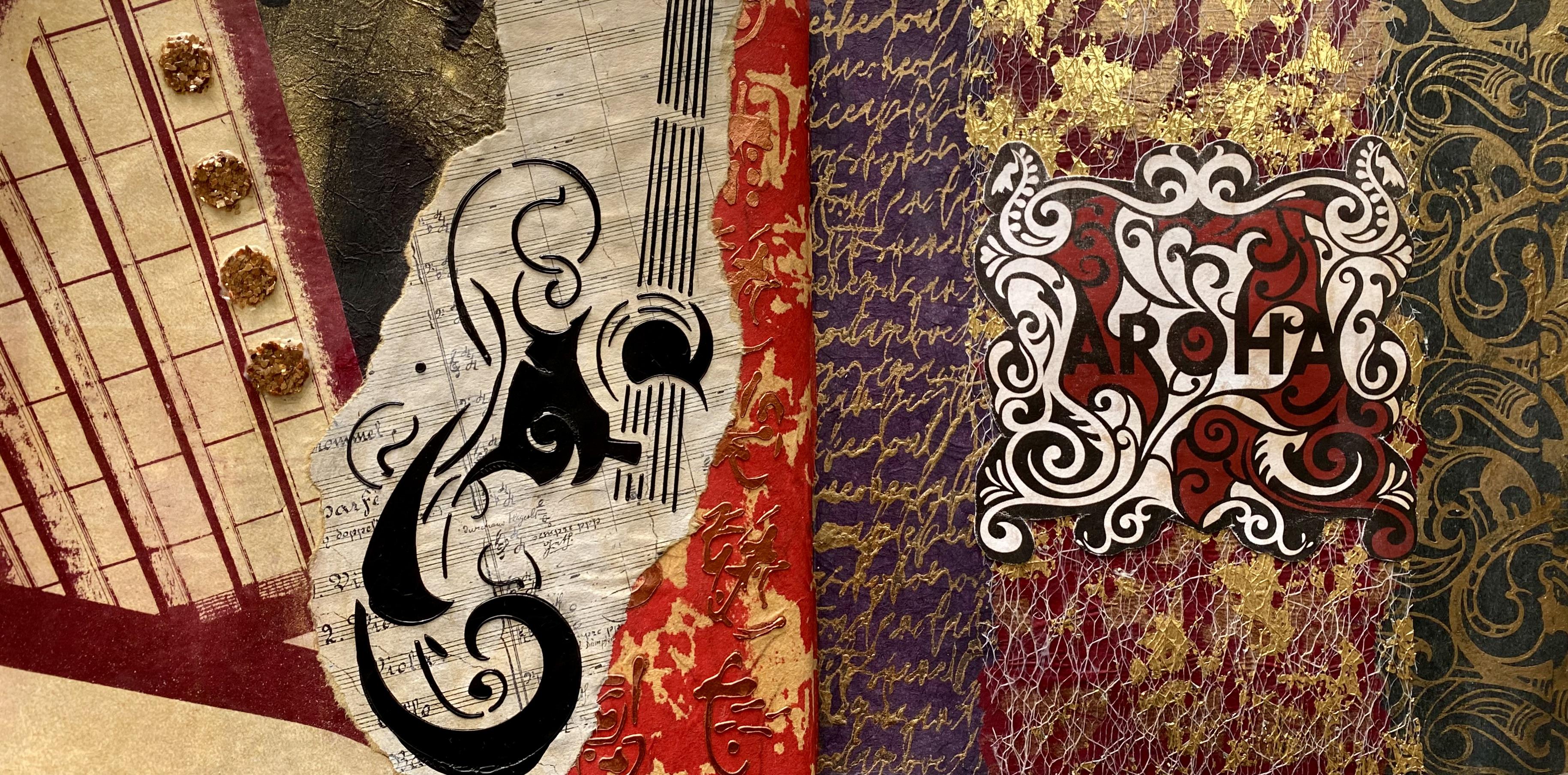
that I can also draw from. So Where are we gonna start? What's going to be my story? I've got this fabulous
scrapbooking book from Alfren Mucha, his designs. I love his designs. They're very ornate.
They're art nouveau. And I love art deco, as well. So the whole theme
and the beauty and the opulence of the
pictures really inspire me. I think I'm going
to use one of these today for my heroine
of my story. Now, if you want to
join me in this, I'll put the link in your class notes for where
I got this from Amazon. Also, if you don't want to buy this particular
scrapbooking book, then you can go on to
the public domain site with all of Alpro Mucous images, and you can download them free. And there's nothing more
affordable than free. So I'll put that link
also into your notes in case you're inspired by
these beautiful images, and you just might
want to add some into really any of the
lessons of your class. Aren't they absolutely glorious? I love the images. She's pretty nice.
What's her story? That's what we're going to be making up. I don't
mind that one. That one could work really well. Mm. That one looks
like she's praying. That one looks like she's
about to cast a spell. Maybe not. Oh, she looks
a bit sad, doesn't she? Yes. That one looks pretty nice. I'm liking the colors. It's really gonna come
down to the colors and the design that I'm feeling
like I want to do today. And you know every day is always different
when we're creating. Today, I want
something from here with my glorious
colors and textures. Which one is the question? I'm thinking Or maybe her. She looks alright.
She's kind of dreamy. What's her story?
Is she waiting for her lover to arrive or
has he abandoned her? I don't know, man. But we're gonna be making up something. That one or this one
back here, I'm thinking. Probably this one. Yeah,
I'm liking this one. And because this is
a scrapbooking book, it has a blank page
on the other side, so you don't have to worry about ripping out one
and losing another. Pretty fun, really. Pretty easy. There's my image, ta, ta. That's my heroine for the story. Now, what is she
going to be doing? What will we put with her? I'm thinking I'm liking
some of my poem script. I like this color. That's working well with
that. These are really nice. These textured papers could definitely sit on top
in another layer. Definitely. That could work. I like my stamp on this color. Yes, I think that
would work with her. We could put that behind her. I could cut that out. On
a roll now, here we go. I definitely want to add
some of the gold or. I could add some of this my
palm script on the black. That's pretty dramatic. Maybe the purple, not sure now. Now I've got too many options. Oh. What about some of
my dance move shapes? Yes, I'm loving this color. That color works really well. That one works well as well. So either of those or both, I don't mind, and some of that. And then there's the texture
paper in the scrap bag. Oh, we should add
some deco foil. I think that would
work really well. Actually, I've got some
prints I already deco filed. So I think I might go
and hunt them up and find them because she definitely needs a
little bit of bling. She's not too sad and lonely, so her story is not tragic, but she's definitely
waiting for someone. So the question is,
is he gonna turn up? Isn't that always the question? She's waiting for her
lover to turn up, but she's not totally sad, so he hasn't abandoned her, which is very nice. That's my story today, and this is a pieces and beautiful papers that we're
going to put together. Right. So now I've
got this side sorted. She's looking rather beautiful. What are we going to
do over this side? I really like the color of this with my
fabulous dance moves. I also like that one. So I'm going to put some of both of those papers on there. And then I'm going to
have to find something for a focal point of some sorts. Maybe some of this
color, perhaps, all the color works really well, but we don't want any
more dance moves. So maybe I'll pull out
something from the scrap bag. Oh, man, that's so
totally possible. So, I pulled this page out of a stampero scrap balking pad. I was using this pad in the previous class at the class
before that, I think, so. I'll put the link in your notes where I
got it from Amazon. I like these pads 'cause
they're really big. They're really interesting. They've got fabulous textures
and colors and images, and I have used
them over and over. So I think it's well
worth buying them, and they're not too expensive. So what I'm loving about, this one is all of this
texture here and the imagery. And of course, the writing. You can use book pages
into the collage. Easy, peasy. I just have so
many fabulous papers to use. So I'm going to add some of this because this is going to
contribute to my story. She's waiting for
her lover to arrive. He hasn't abandoned her because
she doesn't look too sad. So let's put in maybe this
section here where it says desire or some of this writing or
maybe some of that. Han't quite decided what shape, or something with a curve. I think I might
started on that edge there and cut a semicircle
like that onto there. Because then it mirrors
that shape there, and I think right there would work really well.
That's my theory. Then I'm going to
put some other of these beautiful textured papers, the ones that you
can see through. Onto here, just to add a
little bit of texture, a little bit more layering pool. And I forgot my deco foil one. I have to pull
that one out, too. So, I've got this piece
of jelly print with the deco foil already
on it. Easy, Paz. I just have to decide now, what shape I want to add. Do I want to add a strip or
across that way or a circle? Or do I want to add
some over here? Oh, man, it's not easy. Trying to decide
which way to put it is a bit of a challenge because
there's so many options. But I love it. It has to go on. I've used a piece
before, clearly, and it's a beautiful color, the textures glorious, and
we have to add deco foil. So I could put a
strip down there, or I could put a
section on there. So I'll try and decide, cut out a shape and
stick those pieces on. I think I'm adding
my final piece, but You know how
these things go. It's quite possible I could add another piece on tomorrow
when it's all dry. But I'm figuring that for today, that's the final piece. I'm adding some of
the beautiful texture Lacy paper from a fabulous Coso. I do really like
the texture of it. I like the additional
layer of the collage, and it's looking
rather beautiful. Now, I added the fabulous
deco foil piece there. But then I thought, Hmm. I'm going to add
a clock face onto it because it's contributing
to my narrative. She's waiting for somebody. Is he going to
come? The question. There's the desire. I love it. It's just so much fun. And then I put a little bit of the black script
over on this side, same poem script
because she is hopeful, but there's always
that little seed of doubt in the
back of your mind. Is he going to show
up? Is the question? Also, compositionally, it actually just balances out
the black from that side. It's looking rather
good and glamorous, and the story is a
whole lot of fun. I'm going to let it dry. I don't think I'm
adding any more to it. So have a lot of fun
with this first lesson. It's all about the narrative, what story are you
going to create? What little bits
and pieces can you put together to
create that story. Make some jelly prints or some texture papers or pull
out some book pages or magazines or really any to create your beautiful
art journal page. I really hope you have
a great time doing it, and I can't wait to see what
stories you come up with. Oh.
4. Day 44: Words and Wisdom: Day 44 words and wisdom. So we're getting a
little bit deeper now into our fabulous class. Looking at what
makes you giving you an opportunity to really
express yourself. So what's your favorite quote? Do you have a personal mantra? Today we're going to be delving
a little bit deeper as we integrate meaningful or
phrases into your co. We're going to be using a
variety of textures and layers to create interesting patterns and dimensions in our artwork. So why is your quote
your favorite? What does it mean to you? Well, I always have a few, depending on how I'm feeling. And today, this one is
what I'm all about. Just be yourself. Let people see the real,
imperfect, flawed, quirky, weird, beautiful and
magical person that you are. I love this quote
because it cuts to the quick on who
we are as a person. Not even just as an
artist, but of course, as a creative person, we can really express
ourselves. So freely. And I do think in today's
society with social media, we get really pressure to
have to create according to other people's perceptions or beliefs or the way other
people like to do things. And sometimes we get
a little stifled in the creativity of who we
are and what we're about. So today, I'm going
to express to myself. What does it really mean
to just be yourself? That's really quite
a good question. If you stop and think about it, what do you like to
create just for you? Today, I want to create
some new papers, and I'm going to pull out the bottles that
have a little bit of paint left in them and the ink bottles that
are almost finished. I absolutely love creating
collage papers this way. It's one of my favorites. I think because I get to use up all the paint
in the bottles, it also makes me
scrounge around through my drawers and my cupboards and find what needs
to be used up. That increases your creativity. That makes you stretch more. It definitely makes you grab for things you wouldn't
normally think about. I started with this
beautiful red fluid paint. It's a golden paint. There's a little bit of
pigment left in the bottom. So the thing is you want to spray lots of water
in it and fill it up. Give it a really good shape because you want to get
all that pigment out. I splashed it on the paper. I'm using wet strength, tissue because I want it to hold up under my copious
amounts of layers. Pushed it around with one
of my catalyst tools. I then splashed on some
beautiful bronze ink. Now, everything that I'm pulling out needs to be emptied out, so I'm filling them with
lots and lots of water. You can use ordinary
dollar store tissue, and I've used it quite often. It works perfectly well. You just have to make
sure you leave it entirely to dry before
you try and move it. So I've splashed on more inks, and then I put water in this little black
fluid paint bottle and scribbled all
over the paper. Then at the last minute, I pull out one of the Lindis gang powdered pigments shakers. They're tiny little shakers. It's like putting
salt or pepper on your dinner. I love them. It's an absolutely
fabulous invention. Anyway, sprinkled it
all over the paper. I just wanted to see
what it would do. Gave it an extra spritzer of
water and left it to dry. And look how absolutely fabulous the beautiful
paper has dried up. It's got quite
marble a fft on it, and that's because I poured
so much water on it that you can see a little bit
of the powdered pigment. See the wet strength tissue
handles things really well. If you get it in the light, you can see that the
powdered pigment has a little bit of a
metallic shine to it. I like the textured
element of it. I like creating the
multiple layers, and I just like the way it's got the movement
and the texture. It looks really good. Now, you need to
leave these papers on your table to dry
before you move them, or they'll tear to pieces. Oh, and I forgot to add, I had plastic
tablecloth down first. This was a bit of a
spontaneous idea. I didn't quite realize
that I would end up in quite a creative
frenzy when I started. I had the thought, and
I just wanted to use up all these inks and bottles
of almost finished paint. And I always start with
my favorite color. Now, you don't have
to use these colors, but I do encourage you
to use this technique. Pull out of your cupboard, all of your inks or
paint or bottles, or something that's got
a little bit left in it. You know how it gets annoying
when it gets to the end, and you can't be bothered Pulling it out. So
fill it with water, give it a really good shake, and then splash it on the paper. Now, this second one, I
started with nickel zo gold. It's the end of that bottle, and you just may know that they're not making that anymore. So I tried really hard to
get all of that big made. I'm still using up some of the red bottle,
splash that around, pushed it about, sprayed
it with some water, and then I pulled out
this beautiful gold. Now, if you look as I'm swirling it on the paper,
it's a lot thicker. It had a lot more paint
left in the bottle, so it ended up holding
its form and its shape. Then I sprinkled it with some of the beautiful
powdered pigment. Have a look at how it's dried. It still has the fabulous swirly swell shapes
that I put on it, and you can see the
glorious powdered pigment in little textured areas. I'm really liking it. It's a beautiful rich color, and I love being able to use up both of the paints
in those bottles. Now, this next one, I continued
on my warm theme pulling out the reds and the oranges and some of
the sprayings, as well. Because when I start
doing this and throwing all of the beautiful paint
and sprays onto the paper. I like to pull out
of my drawers, bits and pieces that I might
not have used for a while. All that just needs
to be used up. So I've covered this piece of paper in the beautiful paint, but then I pulled out a
liquitex spray paint. Now, this spray
paint that I'm using is this one here the
iridescent antique gold. It's a liquidx spray paint, and it's an acrylic spray paint, not an enamel paint and acrylic. Spray paint, and they do boast, if you can read that
writing on the back that you can use it with
other acrylic products. So of course, once I
pulled out the spray can, We then continue with a few more papers using
this fabulous tool. I threw some of the
pounded pigment onto this one out of one
of those little shakers. It looks like I'm adding pepper. And look how it's dried. Not too bad. It's
really interesting. Now, this paper is a
Chinese rice paper, and it was a leftover
piece of paper that I had used for something else that didn't
really work out. So now I get to
recycle it into this. That's another point, too. Pull out your papers. A. You might have some
jelly prints that didn't really work
out the first time. Pull them out and splash
some paint over them, get your sprays out
and your acrylic inks and see what else you can
create with another layer. This paper is much better for
all the attention it got. And the textured elements
of the powdered pigment, I really like the look of it. Okay, so, of course,
you know what happened. I've got the spray can
bottle in my hand. So So I've pulled out this beautiful senil slash
mask from P Marta Studio. It's a Mandela one, and had a look at
the fabulous pattern that has created.
Yes, I love it. It's in the beautiful
antique gold, and it looks glorious. Look at the texture
on this paper since I've added it
over something else. Clearly, Recycling the paper, using up the paint, and having a little splash around
with some spray paint. I had so much fun. Of course, now I'm going
crazy with the spray paint. I pulled out my dance move
stencil, which I love. I put it on this piece of paper. Now, the paper was very wet because I already
sprayed it with paint, splashed water around, added all the other bits and pieces
that I was already doing. Yes, I was in the frenzy. So when I put the stencil
on and sprayed it, it's a little more smogy, You can't see it entirely clear, but I really like it, because when you look
at it on an angle, that's when you can actually see the gold shapes
of the dance move. So it makes a really
good background. It'll make a fabulous piece for collage because I can
always add over the top. I could ride over the top or add some stencils or anything. I could put my
clot over the top. It's a fabulous
background, piece. So remember, if
you're using stencils and the spray paint
with dry paper, it's going to make a much
clearer and crispy mark. If your paper is wet, because you've just saturated it with water and
inks and sprays, it's going to have less
of a distinct mark, but a fabulous
background texture. Oh, there's so many
possibilities. So the next one, I pulled out some of the turquoise colors, and then I started pulling
out some of the blues, spraying them on the paper. And yes, I did go a little crazy then with the fabulous
mandel shape. But isn't it beautiful? Hasn't it got fabulous colors? I think this one is also a piece of the
Chinese rice paper. It feels very textured. It looks glorious with the beautiful antique
gold spray on it. I think this is the
medium of my moment today is my liquid
tex bra paint. I'll put the info in your class notes if you want to
find out more about it. I had so much fun with it. But I'll warn you it's a little addictive and you end
up spraying everything. The next one has
the beautiful blues with the glorious dance moves. You can see them more
on this one because the paper must have been
just a little bit drier. I absolutely love it. The colors are glorious. I was having so much fun. After I sprayed the dance
move stencil on this one, I flipped it over and put it
onto this piece of paper. Basically just wiping off the spray paint that
was on the sencil. And look at the marks
that it's made. I absolutely love it. I also added one of the beautiful mandela
shapes there as well. The fabulous circles
with the dot. I really like this. That
turned out so well. So this piece is actually
one of my favorites. I love the texture of that, and it's just basically
the overspray. On the paper, It worked
really, really well, so don't forget to do that if you're spraying your
sencil, flip it over, wipe it on your paper, 'cause it might just make
absolutely fabulous texture. Now, these papers here
are my absolute favorite. Besides my other favorites. This is one of my favorite
ways to make collage paper. I'm using the wet
strength tissue, but of course, You can
definitely use ordinary tissue. First of all, I started by
pulling out the posca pens. I'm putting a little bit of
the bronze onto the paper. They weren't working
as well as I wanted. It wasn't flowing as fast
as I needed it to flow. So then I pulled out
the mopper posca pen. You know, the really big one that has all that flowing pate, and I put that on my paper. I threw on the bronze that
I had already been using. I just kept spraying
the bottles with more water so that
I kept flowing, pulled out the inks, and I finished off a few of
these bottles, actually. I'm using deep violet with muted gray and a
whole lot of water. What I love about this technique is you put it on the tissue, you spray it, and then
you just let it run. And because I had the
poscapens underneath the ink was really interesting how the
colors merged together. And have a look at how glorious the beautiful papers are
when they're soaking wet. They're absolutely fabulous. Look at all the
rich lush colors, and then they've dried
up really beautiful, I'm really happy
with the colors. And also, what's really
interesting about these ones, if you look at the back, you can see the posca pen
marks on the back. It's quite fascinating. The way the colors
come through and how they respond. Have
a look at this one. You can see all the
marks of the posca pen, the white that's underneath
all of those beautiful inks. So if this side is too strong or you don't like the
color, Have a look, turn it over, and you might find something else on the back
that you even like more. It's a two for one deal. What I love about these
particular papers is they're so free flowing. And the shapes and the
lines are so organic, and the colors are so beautiful the way
they merge together. So, you have to stop
the video right now. Go to your cupboards and your art drawers,
pull everything out. And find the bottoms
of your bottles, or your paint bottles, or your inks, or
your posca pens, powdered pigments,
or spray paint. Have you got any spray paint? I also used the acrylic
spray loss as well. Bring it all out,
get armfuls of it, set it up on your table, and just have an incredibly
beautiful, creative time. Remember, your colors don't have to look the same as mine, because depending on
what you've got in your cbd and what
you need to use up. It's a really fun way to start. It makes incredibly
creative, beautiful papers, and then you'll have
a whole heap to choose from as we put
our collage together. Now, I have to go and get
my way to small journal, decide which of these
beautiful papers am I going to start with? I think I might start with this one because I'm really
loving these colors, and why make one piece
when you can make two? Remember, you can use ordinary
dollar store tissue or the wet strength tissue or leftover paper or leftover
prints or recycled paper. It's so endless and
anything is possible. Today is the day to really allow yourself
to create, freely, to express who you are, to have a lot of fun and
just enjoy yourself. Right, so I've got
my art journal, and I've got my quote. What I love about
creating this course in an art journal is
nobody else has to see it. You can create exactly
how you want to be, how you want to
express yourself. You don't have to show anybody. I mean, I do love
seeing what you create, but you don't have to show
me if you don't want to. So it's really a very
free and liberating way to create and express yourself. I absolutely love it. I also love that we end up with such a fabulous collection. Of beautiful collages that we can flick through and think, Oh, I remember when I did that
or I loved that technique. Oh, that was such
a great prompt. I might try it again. It's a fabulous tool. It's like a treasure
chest of ideas, techniques, and also days when
you're creating something. Because when you're looking at your artwork on another day, you might remember how today was all about you just being you. And that's a really beautiful
and valuable thing. So I've got my quote, but I'm not going to
stick it on my page because basically it'll
take up my whole page. And we can't have that. But it is going to
be my inspiration. Just be yourself. Let people see the
real Imperfect. Yes. Floord. Definitely.
Quirky. Mmm. Weird, absolutely. Beautiful and magical
person that you are. That's my quote. That's
what I'm sharing with you. Maybe you might like
to take on my quote. You can absolutely,
or you might have something of your own quote that's really
inspiring you today. So I've got my quote. I've got some jelly prints. I've got some
fabulous coso paper. I've definitely got Me scrapbag. And I'm starting with one
of these beautiful papers. I really like this section here. It's quite fascinating to me how the posca
pen came through. You can actually see it
here underneath the ink. That's the first time I've tried putting the posca pen on first. Although you probably want
wet strength tissue to do the posca pen because it would
tear on ordinary tissue. But if you're just wanting to throw the inks and
the colors on, then you can use
ordinary tissue. I'm loving this section. It tears really well. It's definitely one of my absolute favorite ways of creating collage paper.
Where will I put it? I'm thinking I'm gonna
start on this side. O on this side. I don't know. Maybe we'll
start over there on that side. It's just so beautiful. I don't want to cover it. Can I just like stick it
on I've also got this one. This is another
painted tissue piece. It's a recycled tissue. I get a lot of things
that arrive in the posts, especially as I order them
from different places. And they often come
wrapped in tissue. I like to recycle the tissue. You can hear how
crinkly this one is. That's a recycled tissue. I think I'll put it on here
just as the background color. And then I'm going
to think about what else I want to add to it. I've got some fabulous
jelly prints around me, and, of course, my scrap bag. I might put some of
this print here, which is from my stencil
that I designed. That would be really
good seeing as, you know, it's all about me. Oh. I'm thinking some of that on it because that
colors going to match well. But then I would really like a bit of because
I'm so like that. Definitely gonna have
a little bit of. Maybe Czo paper. It's so beautiful. But then I've also got some really nice
jelly prints as well. How am I going to fit this
all on? I really don't know. I think I'll just start
and then see how far I get with this plan. Thank. So, what do you
think of my collage? I love the colors. I love the textures. It's definitely real. Imperfect. Floored, quirky. Weird, beautiful, and magical. I think the collage is embodying all of
those fabulous words today from my inspirational
Loving the bling. This is actually part of an image transfer from a photo that I took
when I was in Venice. Ah. Beautiful, Venice.
Love these shapes. They're from one of my stencils, and they're in the
fabulous stardus gold of the stencil butter. Loving these colors
and my print here, little sneaky peeks of all of these little things that
mean so much to me. Love the deco foil. It's just pretty.
And on this sign, I've got the beautiful
gold, the glittery paper. I put this over here that I tore off there because I like the
balance of the composition. Loving these papers, textures, the glorious colors, all of it makes me really,
really happy. So I've got to let it dry, trim off the side. I'm thinking about maybe writing some of the
words on there, but I'm not sure I
haven't decided. So We'll let it dry. I'll decide then. I'll give you a close up, and you'll be able to see if
I added the words or not. Now, I can't wait to see
what you're creating. I really hope you
enjoy this lesson. I hope you really let
yourself express freely who you are and what you want to create because it's
in an art journal, your in as space. What have you got to lose? We'll see whether
or not I add any more when I give
you the close up.
5. Day 45: Monochromatic Collage : Day 45, On color conversation
monochromatic collage. Have you ever created a
collage with one color? I can honestly say I never have. So today, we're going to
create a collage using one color family and see what impact it has
on the artwork. What can you say or
express with one color? Which color will you choose? And how many ways
can you express this color with
tints and shades? It's a really exciting exercise because of the
boundaries that you set, it's one color, you have
to get really creative. We're going to add white to that color to create
lighter shades, and you can always use another color to
create deeper shades, but you have to stick to
the same color family. Sometimes I think
doing exercises with such serious restrictions can really makes you stretch
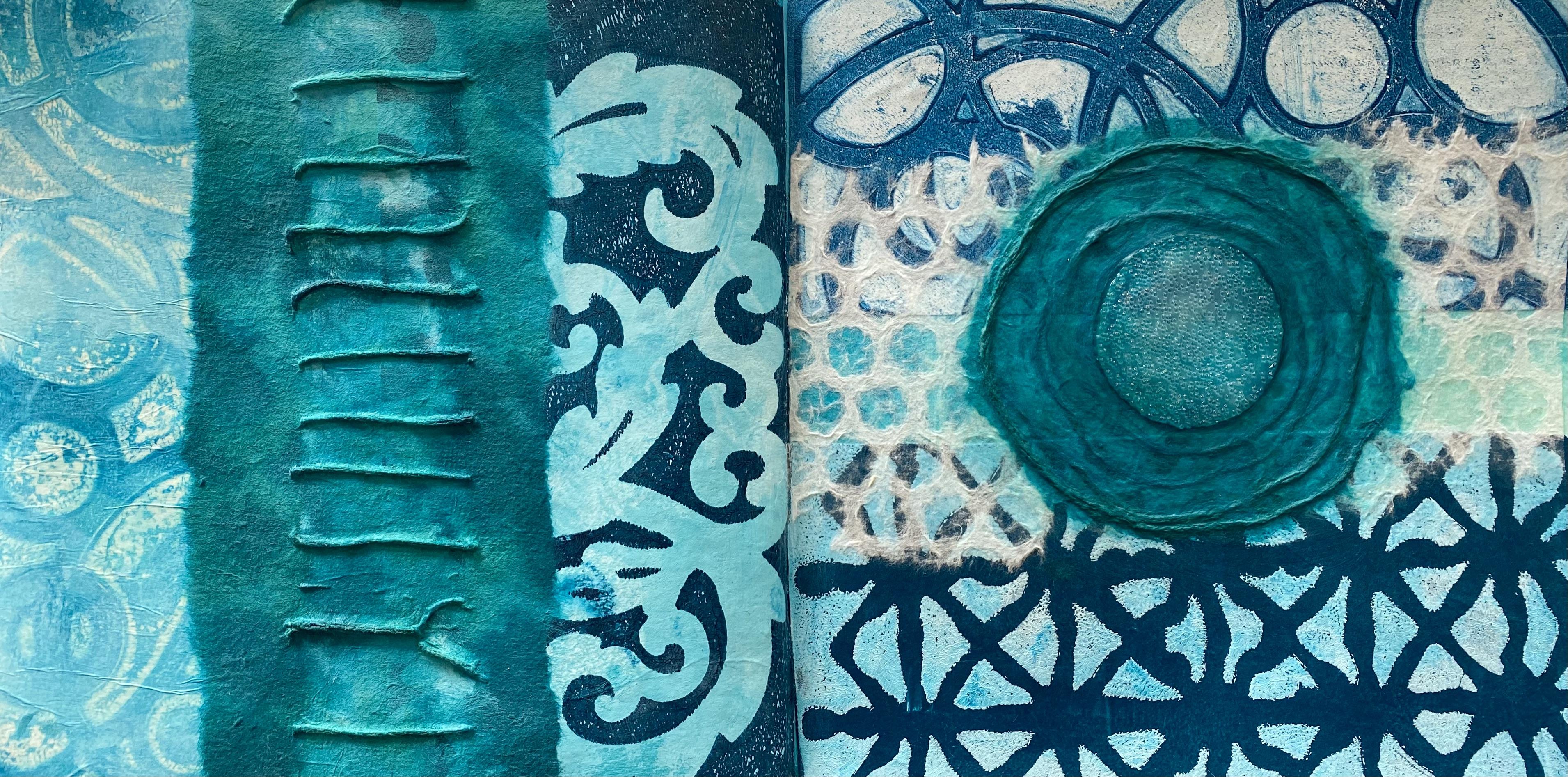
your creativity. Right. So for me today, I'm going to use the
color turquoise. So I've pulled out all
of my turquoise paints, and I have liquitex in
bright aqua turquoise blue, and then I have some
antila paints in thalo turquoise and
a pastor aquamarine. I also have a liquitex
in the muted turquoise, and this one's going to
be the darkest color. And then I've got some
fluid paint in cobalt teal. And thalo turquoise as well. I'm pulling in some
white so I can create those tints and shades
and tones of this color, and I think it's going
to be really fun. So I pulled out
my color palette, put down the white and the
turquoise and started mixing. It's very easy to create
tints of the color, just adding a little
bit of white. So I'm putting down some
swatches on the paper to see how many different shades of thethalo turquoise I can create. And of course, that turquoise
is a really deep one, so it can create whole heap of lighter tones and mid tones, and it really was a lot of fun. Then I used the other
turquoise paints in those colors and
brands I just showed you and mixed those with
each other and some of the turquoise and created some more beautiful
little swatches. Now I have a whole
palette full of beautiful tints and shades
of glorious turquoise. Look how many
varieties there are. So, of course, first of all, I'm pulling out the gel plate, doing a few prints on
that because it's fun, and I love using
the jelly plate. I'm starting with some dark plain color background pieces in the deeper tones because
then I'm going to want to add some stencils and
some second layers on top. So I pulled a few of the prints, the darker one, mid tone one. I didn't clean my brayer off, and I didn't clean the
plate because I was letting all of the
bits and pieces and the mixes of the turquoise
stay there because it creates a really beautiful abstract
pattern on the next print. I'm loving this one with
the really light shades. Pulled a fabulous
abstract mark on that print because it's now
building up on the plate, and we've got all sorts of little leftovers and
bits and pieces. I did have to wait a bit longer for the prints to sit on
the plate to actually pull up all of the ghost
prints because as you start printing and you start building up that
paint on the plate, you're going to need to
let one of the prints stay there longer to grab
all of that ghost print. And then I was using one of my absolute favorite PM artist, studio, stencils.
I love this one. It's a really nice pattern, and it works so well
for what I wanted. Roll some of the lighter
shades of the turquoise on, put the stencil on
and pulled it on of my darker pieces of paper
that I just printed. They're only just drying. But they're dry enough to pull a second print
with the stencil. It looks fabulous. I love this pattern. Then I used another
favorite stencil of mine with the
circles circle circle. They are PM artist
studio stencils. Now, don't forget in your notes, you'll find that there's a
discount code if you want to go to the PM artist website
and have a look at stencils. They've got hundreds. So discount code, don't forget in your notes. Of course, I had
to keep printing, because once you
start jolly printing, it's a little obsessive. So I made another print
with another stencil, and then I pulled up all
of the ghost prints, and they created really
nice texture marks on some wet strength tissue. The first paper I was using was the Japanese rice paper pad. And then the wet strength
tissue I find is absolutely fabulous for pulling up that ghost print because it's got a lot stronger resistance, and it pulls all that
paint off the plate. Also, I find if you leave the Japanese rice paper
longer on the plate, once you've finished
your printing session and then pull up
the ghost print. It pulls up all of the paint, and it leaves your
plate nice and clean, which I love doing. So Once I finished,
jelly printing, I decided I wanted to
create some more papers. So I pulled out some inks with the fabulous turquoise color
and some of the coso paper. Man, this paper is
beautiful, gave it a spray. The coso paper is so
absorbent and soft. It sucks up all of
that beautiful color. And it's so quick and easy. I used a whole range of
different inks in my drawer, whatever I had that was
in the turquoise tone, came out onto the
table to be used, put some more water in
them, splashed them around. I was spraying the cosot
paper on top of one of the Japanese rice
paper pad because the cosot paper is going
to bleed through entirely, and I wanted to catch all of that glorious ink on
the paper underneath. And yes, my idea worked beautiful cause when I
pulled up the cosot paper, there's another beautiful
pattern on the paper underneath It just needed another little bit of a
spritzer and a spray. So I had two beautiful
prints, two for one. Because it absorbs all
of that glorious ink. Also, you can spray it with
a little bit of water, and that will bleed
through also to create more patterns on
the underneath paper. Now, this one is so fun. It's a jackar paint
in turquoise, started up with the back
of my paint brush and drizzled it onto a paper
that I already sprayed. It's quite an interesting paint because it dries quite glossy. And as the beautiful stringed
line hits that wet paper, it kind of spreads
out some more. It turned out beautiful. It's a fabulous pattern, and it worked really well. So you need to experiment, pull out whatever you have
in your chosen color, and splash it around on some different types of paper and see what
you can come up with. I sprayed some more of
the beautiful coso paper. This is one of the
brand new coso papers. Oh, don't forget there's a discount code for
coso paper as well. Make sure you read your notes. There's lots there. So this one looked fabulous, I sprayed it, I threw
some of the ink on it, and then I sprayed some
white because I'm thinking if I put the turquoise ink on first and then
spray some white, it will absorb, and it will
blend more into the paper, cause this paper
is very absorbent. I'm pretty sure my idea
worked really well. It looked spotty to start
with when I sprayed it, but it did get absorbed
into that ink, and the paper looks stunning. The piece of paper underneath this print looked spotty
from the ink coming through. I loved it. But my
bottle was nearly empty. So I filled it with some water, gave it a good shake, sprayed it on. I love it. The techniques are
so easy, so quick. They're a little messy. I had covered my
table in brown paper. I love paper packaging because it just means
you've got it free. You can make a mess, splash your paint
and ink all over it, and then roll it up and
throw it in the bin. You can't keep it if
you created something fabulous on your paper
packaging underneath papers. Because that makes good
collage paper as well. So I sprayed the water on, then I added some more white ink to the piece because
I just wanted to create different textures and different layers of
the turquoise color. These papers were turning
out absolutely beautiful. Now my floor is
completely covered in turquoise, wet
turquoise papers. W all over the place
in different shades. So to finish up my
creative frenzy, I decided to spread my work
table with white tissue. Now, this is paper packaging, recycled tissue. I love it. You can't get more
affordable than free. Love paper packaging. Spread it out on the table, pulled out all of the inks that I had in the turquoise color. And splash them on. What I love about this
particular technique for creating collage papers is that you get to use up all the little bits and pieces that's in the ends
of the bottles. All the spray bottles
and the ink bottles. Sometimes the spray bottles get stuck and they don't work, which is so annoying. So when they get down a bit, I fill them with water, splash them on the tissue, spray water on top of them, so they all spread out. I absolutely love it. These different shades of
turquoise look fabulous. This one I'm using is
an acrylic gloss spray. It's just beautiful. So I decided to push it around a little
with a paint brush. You can't get too rough with it because this is recycled tissue, so it's not as strong as the
wet strength tissue. But Handled it pretty well. I was pretty happy with
how it turned out. Then I gave it a spritz
with some white. I'm loving the way the whites of getting absorbed
into the turquoise and creating different tints and tones within the
one piece of paper. They're looking
rather beautiful. So now my floor is completely covered
in turquoise papers, and my table is
saturated as well. I have to tiptoe out
of my studio space, stepping over all of the beautiful papers
covering every flat surface. But it sure is so much fun. I love using the
paper packaging, recycled papers, using up all the bits and pieces of
the inks and the sprays. So Pull them out of a drawer, pull them out of a cupboard. What color are you going to use? Oh, I can't wait to see what
color you're going to use. I'm really happy that I chose turquoise
because I ended up with so many different
shades and beautiful papers. And the ones with the
inks and the sprays have a different texture and
layering to the jelly prints. So that's so much fun. All of the same color yet
incredibly different papers. You could use all sorts
of different papers. You could pull
out, even covering some craft papers or
some music sheets, or some dressmaking paper. Really, it's endless
what you can do, because the different papers are going to have a
different response, and they'll give you
different textures. So I absolutely loved my printing and painting
and spraying frenzy. Now I'm literally drowning in turquoise covered
page papers. What am I going to
do with it next? I'm going to pull
out the art journal, and I'm going to have to decide, 'cause clearly I've got
way more than I need. Hmm. Think I'll just
have to pick out my absolutely favorite pieces
that I can't live without. Turquoise is a real blue, green mix of color, and that's what I
absolutely love about it. So depending on which brand or which paint or which spray
or which ink I was using, I have quite a variety of
beautiful shades of turquoise. Have a look at this
one. It's quite a lot. Blue one, because this
was the mutant turquoise. Oh, love that color. It's absolutely one
of my favorites. This one here, the print was pulled with the halo turquoise. So it's got more green in it. But have a look at this one. This is the glorious cosot
paper that I sprayed, and it's got a little
bit of sparkle to it. It was a turquoise spray, but it's so different to the other shades of
turquoise in these prints, which is really fun, I think. And it means that I could
use little pieces of these prints to create a really beautiful collage.
I'm loving this one. I also love some of these
fabulous ghost prints. That's a beautiful ghost print. And this one I just
loved by itself. Once I pulled this
print just left it. I didn't put another
stencil over it because as an
abstract painting, I think it's beautiful. And I wanted to use it, but I don't think I will
because I'm likely to cover it. And I really like it. I like the subtlety of the different shades of the
turquoise in the paint layer. Oh, man, I'm just
gonna leave that for another day because if
I put it on this page, as you can see, there
isn't a lot of space, and I'll end up covering it. Oh, I really like this
Coso one, as well. That spray are beautiful. And then there's the
ghost print of this one, which looks really fascinating. So I'm just going
to have to decide. Loving this one with the ghost
print, it's a real soft, pale turquoise tone, and
it looks beautiful, also. Some of the beautiful
tissue that I sprayed. Look how glorious this came up. It's just beautiful. It's got all sorts of patterns from the
water and the spray. And there's different tints
and tones of the turquoise. Oh. No two pieces look the same. That's what I love about it. And it's all on, Yes,
recycled tissue. Now, I did have to wait a whole day for
the tissue to dry. And don't forget if you're
doing this technique to make sure you're putting it
on plastic tablecloth, so you can peel it
off really easy. The gel prints, I
did pretty quickly, they dry really fast,
but, of course, when you're drowning
paper in water, it does take that little
bit longer. Be patient. Don't move it until
it's completely dry, or it will tear to strength, especially being on
ordinary tissue, doll store tissue,
or recycled tissue. You don't want it,
tearing. Don't move it. Right. So, I have to
decide. Oh, this piece. That was the under piece. That was the piece
of paper under the print when I've
sprayed it and picked it up because I wanted
to catch all of that absorbent, beautiful ink. That's a really nice,
subtle background. Mmm. I could maybe
start with that one. I no, man. There's
so many choices. Oh, that's the scribbly paint that I put on when
the ink was wet. Look, how fabulous that looks. It's a really interesting
paint that one. And it always is kind of
really stringy like that. Like the string gel
that we've used before, this particular brand and paint has this
tendency to do that, which is really fun. So that is that, Oh, man. Rho, I'm gonna have to
make some hard decisions. I really like the Coso paper, and I love this decel one of my favorites besides my other
favorite circle decels. So that one or that
one, or that one, or maybe some of this
with the circles on it. Perhaps I just have to decide. And the fa and the and the fa. So, what do you
think of my choices? I picked out my favorite
collage pieces. I had to have this one. I just loved it. And this
particular stencil design. I absolutely loved it when
I was printing with it. This one's my favorite. That one's my favorite. They're all my favorites. And I put a piece of
white cos paper over it because the white paper goes quite transparent when it's dry. So I knew I'd be able to see the different beautiful
layers underneath. Is that cheating,
adding white paper? I don't think so. I
think that's allowed. It's still monochromatic.
That's for sure. It didn't add any other colors, and it does highlight some
beautiful textures underneath. Now, the beautiful turquoise, handmade roses looks fabulous. Now, if you are spraying any of the zo papers with
dye based inks, then you have to remember it's going to come off in your hands. So when you're putting
your papers on, you might just need
to be mindful that perhaps some of the dye
based inks might bleed. I didn't have any
problems with these ones. These jelly prints, of course, they're not going to bleed,
that's acrylic paint. I did spray the zo papers, but they haven't
really bled too badly. So I'm pretty happy with that. But it is something to remember. You can always spray it with the spray gloss
varnish in a can, spray your papers, if
you want to seal them, if you're worried about them bleeding onto your other papers. I'm thinking it's
all turquoise, baby. It's all good. I can't wait to see what color you
chose for your collage. Pretty happy with it. It's
my favorite patterns, so you can't complain. I still have a ton of
paper here to use, and I'm definitely going to put something in
the middle here. But I think I'm
happy with this one. I love this textured paper. Well, look, there's a little
psis there. Not to worry. It's an art journal after all. I actually really enjoyed the exercise more than
I thought I would. I thought it might be too
limiting because usually I like lots and lots of colors
and lots of contrast. And I don't even have
any gold or bling on it. But but I've been very pleasantly
surprised that you can create quite a lot of papers with one
single color family, different styles, different
types, different textures. Can't wait to see what
you're going to choose. I could have kept
printing quite happily. And especially printing the
dark turquoise and then putting a stencil over it with something really
pale or vice versa. All are putting a
few different shades of the turquoise
on the gel plate. That pulled up beautiful. Yes, I could have kept printing all day and all
tomorrow as well. But I do have quite a few. The spraying I really enjoy, always enjoy spraying the papers and splashing the inks around. They always come up really good. And also, they're
great for putting in the art journal because
they're nice and thin. Right, so I'm going to let
this dry trim the edges, and then I'm going to find
something for the centerpiece. Now, I had a little rummage, and I've pulled out one of these beautiful acrylic skins
in the glass beads medium. We created these
skins in class four, and I have a nice folder full. That's what I love
about this class. I I love that it compounds, and you keep all your papers
and you bits and pieces, and we can use them
again in another class. It's so much fun. I have a folder full of
the skins ready to go when I need something for a focal
point in a collage like now. So that's not adding
any colors to it, which is part of the
monochromatic deal. And I'm putting it
on with some of the mat medium that
I like to use. It's going in the
center there of my fabulous Coso
paper handmade roses. That's going to look
beautiful. When it dries. It does take a bit to dry
with the glass beads. It probably won't be
dry until tomorrow. So I'll give you a
close up when it's dry. It's just going to
add a little circle, Another element,
something sparkly when the light catches it. Just beautiful. Finishes
my page off really well, and I'm really happy
with how they look. Right. That has to
drive till tomorrow. Now I'll start thinking
about the next class. It's pretty exciting. We're moving on to
an urban story. That's gonna be a
whole lot of fun.
6. Day 46: Urban Story: Day 46 urban story. I love using the
influence of architecture to create art because there's
so many possibilities. There's fabulous graphic
shapes and lines and curves, and there's so much
inspiration to draw from. So today, we're going to develop a featuring urban landscapes
and architecture. This can be real imagined
or even an abstract design. You can draw your own or
find interesting shapes and architecture from
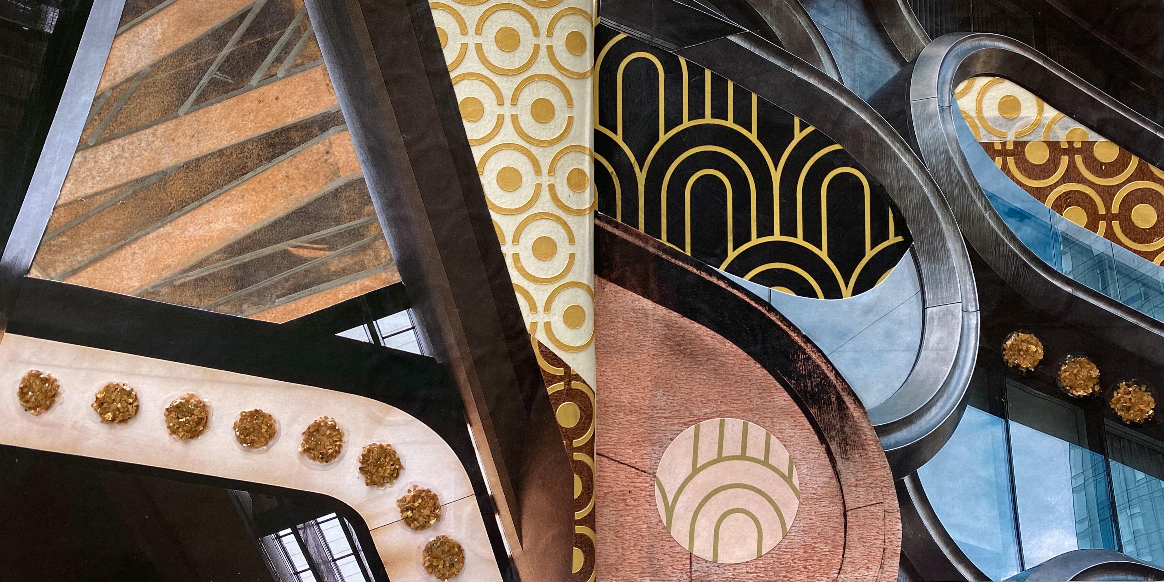
magazines and photos. So first of all, I started
with fabulous unsplash. It's my go to Royalty
Free website. You don't have to use that one. You might have your own personal royalty free website
that you like. I am just particularly drawn
to the images on that one. So I've pulled out these ones. I printed them off, and they're looking
absolutely fabulous. I'm loving the curves
of the shapes and also the strong
angular directions of this architecture here. Look at this one. It's got
both curves and straight. I've also pulled out one of my favorite photos from Naples. You can use your own photos, your own architectural shots, or any design element that
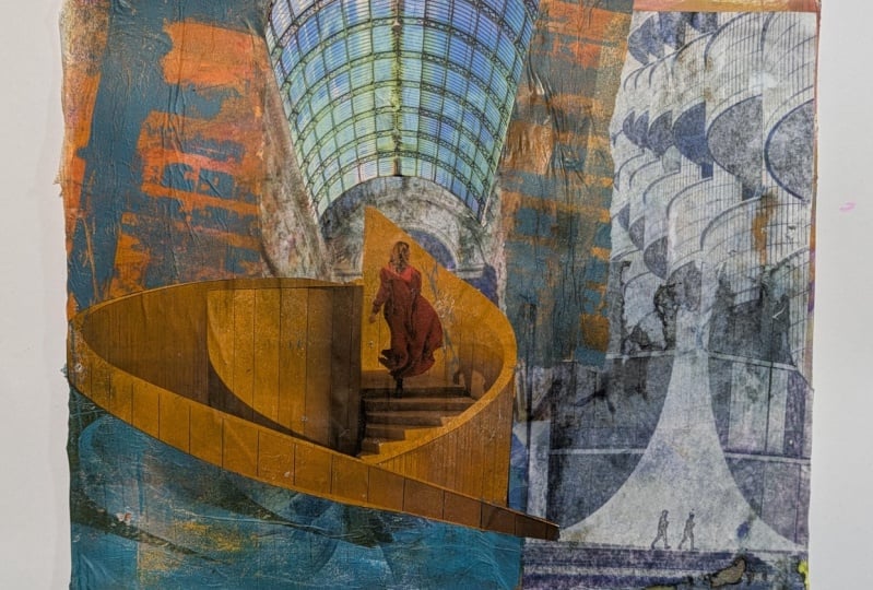
you find really inspiring. Now, what are we going to do? Of course, I would lean
straight away towards an image transfer because
these prints are fabulous, and I'd really love to see how these lines are going to
print up on the gel plate. So yes, let's start
with the gel plate. Do some image transfers, have a look at the prints, and see how we might
want to embellish them or what we
can add. So, Hmm. I'm going to start with my
favorite Naple shot first, and I'm using
beautiful rich gold, putting it on the
plate and pulling it onto ordinary black tissue. Now, Dollar store tissue
doesn't like to have a lot of paint on it 'cause
it will tear to pieces. So make sure you pull that
print off straight away. But look how fabulous it looks, especially in the rich gold. So I had the beautiful print, and I'm looking at the copy, and I'm thinking, I wonder
if I could do that again. So I tried it. It was just an experiment. I used the same print
copy on the plate, and it pulled a print. Okay, it's not a perfect print. It is a little smogy,
but it worked. So if you are doing image transfers with
your print copies, have another go with them. See if you can get
a second image. Even if it's blurry or smogy. It really doesn't matter
because we're using the lines and the
architectural elements. So if it's a little
grungy, well, you might like that anyway, and it might contribute
to the print. I'm pretty excited about
that second print idea. I'm going to have
to try it again. Now, this one is looking
absolutely stunning. I'm printing it with the
liquitex Muted violet. I'm also going to be using the muted pink and
the muted gray. I love them. They're
beautiful colors. They always work
for my transfers. And then I pulled it with
the Amsterdam in Bronze. Look how beautiful it is. I love the clean
graphic lines of it. Actually, I think I pulled this one in the rich
gold. I don't know, man. But these were the colors I was using and I was having
an amazing time, and they came out
absolutely fabulous. Now, you can do touch ups
on the print. Of course. When you've pulled
up the print copy on the plate and your
transfers on there, you can always touch it up with a wet wipe or a damp cloth to clean out some of
the areas that you might not want to
have the paint on. It works really well, especially
for these graphic lines. Some of the prints I
left the grungy marks on because I thought
it would create more texture on the print. That works really well too. It depends on each print and it depends on your preference
on how you want it to look. But don't be afraid
to do some touches or change some things or
even to add some more paint. Oh, Awesome stamps,
Awesome stamps or Really, with jelly printing. The possibilities
are so endless. I was only going to pull
a couple of prints, but, yes, I did get a
little carried away, and I just kept printing. Now, this one, I
used the muted gray. Look how graphic
these lines are. It transferred
absolutely fabulous. It looks great. I'm
just loving it. I could cut up pieces
of that print. Or I could add another layer
to the print. Oh, man. And then I ended
up pulling it in a metallic silver.
Looks beautiful. I'm loving it. I
wasn't sure about this image transfer because
it was a lot darker. It didn't have that
strong contrast of dark and light areas. So it might have been
a little more blurry. But it printed quite well.
I'm quite happy with it. And I used paints
gray for this one, and then I pulled it in
the Amsterdam bronze, and it's quite a nice print. The thing is with these prints, we can add to them later. So I ended up pulling
out this chrome pen. It looks fabulous. It's a mirror effect. Pen. Well, that's
what it says, anyway, 'cause I decided I wanted
to highlight the lines of the print and create stronger
shapes with the chrome pen. It looks great. It was
actually really therapeutic, and I had a lot of fun
putting in the lines. This print has a lot
more grungy texture on it because I didn't
clean out the areas, but I really like it. I think it really
contributes texture to then adding the
chrome lines on it. It's pretty nice,
pretty happy with it. Now, this print with the
fabulous curve shapes. I was really getting
dramatic with it. I pulled out the carbon black. Oh, yes. It looks fantastic. It printed really well. And then I pulled it with a
new color. It's a liquitex. Same brand. It's
iridescent rose, gold. Look how beautiful it is. Oh. Anything that's iridescent
or medallic, and I'm in. The print looks fabulous. I love it. I'm thinking
with this one. I could even cut
sections of it out and put some other different
colors underneath. This is what I'm thinking
about as I'm printing. I'm thinking about how am I gonna use these prints
for the collage. Hm. And then I just spurs me
on to create another print. So, this one here, I also pulled with the
iridescent silver. Look how good it looks. It's so graphic and sharp. Telling you, these images
made fantastic transfers. But what's really fascinating as well is the second print copy. I mean, I never really
thought about it before. I don't know why. This one
here is a second print copy. And, yes, it is very
blurry and very smogy. But does that really matter? I can still see the fabulous
graphic mark on it. And I think it
printed really well. Considering it's a
second print off the one laser print copy,
which is pretty cool. This one I pulled onto the
black ordinary tissue. Also is a second print copy. And then this one, yes, I did get a little carried
away with this one. I did a second print with the lather copy on the
gel plate in gold, and you could barely see it. So I thought, why not
we add some numbers? It's graphic after all. Pulled out my number stamp, stamped all over the plane. Completely covered it. I pulled it with a
beautiful red violet color, which looks glorious,
but you've kind of lost the gold of the
initial second print. It is there slightly, but it was a really
interesting exercise, and I like trying new things. So that was quite fascinating. You can always add more
layers to these prints. Try some ideas, experiment. Push the boundaries of
where you've been before. Especially if fugeli printing. There's so much
more to discover. There's so many
more ideas to try. So don't be limited by just putting your
print copy on once. Try it again. And
see how it prints. Of course, I
couldn't stop there. I decided I wanted some
more numbers because the numbers one got me all excited about the
graphic of numbers. So I pulled out some coso paper, beautiful, brand new coso paper, this one, in the numbers. And it's very absorbent
and thick and beautiful. So I pulled out my gold, spray, the liquitex one, gave it a spray with
the antique gold, looking rather glamorous, but
you know I couldn't stop. I pulled out some black
tissue and one of PM artist's new stencils that I had because it's
also quite graphic. It's got numbers and hash
tags and and symbols on it. Put it on some black
tissue, gave it a spray. Look how good it looks. I'm rather liking
this one as well. Look how chunky
these numbers are. You could probably use it
to print on the gel flame. But I think I'll probably
keep it in the glorious gold. This is just fun, spraying it on the black tissue really quick, really easy. And then, of course, I've
got the spray can out, so I decided to
pull out the white. And I had a little
spray on some pieces of craft paper because I'm
really liking the symbols. I'm thinking I could
use some of these in my collage because they
just look fabulous. They spray it up really well. And it just adds another
texture and another mark. Something I may or
may not use today. But you've seen the size of
my art journal so clearly. They're not all going to fit. And I was also thinking about using some of
the actual prints. Had two copies done when I printed them out at
warehouse stationery, which is my favorite
place to go. Because I'm thinking
you could use some of the actual
prints, the photos. You could cut some sections
of those out and add them in the collage or add them into the collage next
to the chansfers. That could work really well. So lots of options,
lots to think about. What am I going to use today? Let's get out the art journal. Right. So tough decisions are
going to have to be made. So this is what I
was talking about. Using your original images if you've printed something out. I could actually
cut shapes out of this image and use
that in the collage. I could put that
down. I love this. I think it's so cool, and
I love this shape here. Very tempted to do that. I could then put some of the prints under
the piece of paper, and you could see them through the areas that you've cut out. That'd be pretty cool.
This one's pretty nice. You could cut a
whole section of it and maybe just
have a part of it. Yeah, I'm really
tempted with this idea. Or this one. I absolutely love this one with
its curved shape. I could put it on this side, cut out that shape there
and put another color or pattern or print or
something underneath it. So it's just going to be
a matter of deciding, which is not easy because I have all of these
beautiful prints as well. Look, how good this looks with the chrome lines on
it. I just love it. But then I love anything shiny. That would go really well
with that print there. This one looks fabulous. This is actually the image
transfer print of that one. Oh, man, how am I gonna decide? And these look really
cool? I really liked them. They were so easy
to spray up just on craft paper. Easy, easy. Right. What are we gonna do? Where are we gonna start? That's the question. I have
so many amazing papers. And don't get me
started on this one. Look how cool this looks. Dolls sort tissue. I'm telling you it mags
fabulous collage paper. You can also do that onto recycled white tissue that comes wrapped around
your packages. So I get lots of them, may turn up on my doorstep. I also have some coso paper, I have my scrap bag, and I have some jelly prints as well that I was
thinking about using. So it's going to just be
a matter of deciding. I'm thinking I'm going
to go with the idea of using one of these
original prints, cutting some sections
out and putting maybe some of the other
print or some jelly prints, or some coso paper behind it. I love them both, actually. They're pretty cool.
They're very graphic. And I'm really
feeling that today, so maybe I'll start with that. Baby or that one. Well, that really was a
bit of a jigsaw puzzle. I absolutely love my pages. I loved putting the
printed laser copy image amongst the jelly
print image transfers. I think that's really fun. I repeated some of the
shapes like in here. I had this piece of paper of art deco paper looks beautiful. And that shape there, which is the same
jelly print transfer as my original copy love it. You might have noticed
I did a little psies. I was really sure I had the piece in exactly
the right place. I held it in position and put the glube under
it and put it down. But when it comes to
putting my main piece on, Oh, man, it wasn't
in the right place. H. And then it was too late. The piece was already stuck.
I couldn't rip it off. So I just added another
little piece on top of it. Which doesn't look too bad because it does
mirror this piece, color and pattern from this side over to there.
It's not too bad. So if something goes wrong or your collage doesn't go
exactly how you want, or you stick a piece
in the wrong spot. Don't panic. Don't
worry about it. Don't get all flustered. Just change direction.
You can pivot. You can add something else. I added that little piece in there on top because I
could have moved that one, and I think it
looks pretty good. It connects with the other
side, pretty happy with it. I think my Matt gel
medium has made my chrome lines a little
less chromy, which is sad. But that's how it
goes. That's okay. It's all stuff down
really nicely. I'm loving the repetition of
these curves on this side, and I do like that it's only got a couple of little pieces. Now, I want to add
something there, and I'm thinking of
pulling out these. I created these in class four, we were doing acrylic skins. And this was the
gold mica flake. And I basically just
put the gold mica paste through a piece of paper or mesh or whatever
you would call this. I don't know, man. Think I
got it in a taperology box. But I put this on a
piece of plastic. Make sure you use plastic. Put that on, put the gold
mica flakes through it, and when it was completely
dry, pulled it off, and then I have all of these fabulous
little gold buttons. I think they look
like gold buttons. So I'm going to
put someone here. We had a fabulous time in class four making acrylic skins. And because we keep everything, don't we from each class and each lesson in a box
where you can find them, then you can add them further on down the
track to something. Gals. Yes, I'm definitely adding my gold mica
flake buttons. I think they look fabulous. How many do I want heaps. I want heaps. So, I'm going
to put them on here. I think. That finishes it
off really nicely. Also, it's mirroring the shape from over there,
the circle shape. That's going to
work. That one is a bit wonky. Let's
get a better one. Let's put on that one.
And Maybe that one. Baby, loving that, giving it
a three dimensional element, Loving everything
about these pages. It was really fun.
A little tell ding. But fun. So I think that
side's done as well. Do I want to add any
over here? Maybe I do. Maybe I want some micro flake
buttons over on that sign? Yeah, How about just there? Okay. Let's add some there. And then I think I'm pretty
done. One, two, three. You know, we have to have three. Okay, which is the better one. Some of these buttons
are better than others. So It was a really fun way to
create these acrylic skins. I loved it. And then
you've got them, right? For future brilliant
ideas, easy. Right. So I think I'll stick
those there like that. And those on there. Pretty happy. It's
looking beautiful. I've finished it
off. Let it try. Give you a close up. And then. What are
we on to next? Oh. You'll just have to wait and see. Oh.
7. Day 47: Soundscapes in Collage: Day 47 soundscapes in collage. I love using music themed in my artworks and for textures
or images. It's so much fun. So today, we're going to
create a music theme collage using pages of sheet music
or instrument images. And there's so many
ways to create this. You need to go
into your cupboard and into your drawers and pull out all the bits and pieces
that you might have. Know I've got some music
books from the thrift store. The second hand shop is always a great place to
find music books. They sell them very cheaply, and the pages can
sometimes be old. But you can spray them, which is what I did first. I pulled out my music book, tore out some pages, and pulled out the springs. I pulled out ones that
I wanted to use up. I wanted to experiment
with some colors. And first of all, I started with this beautiful deep purple. Now, this was a particular
dye based spray ink. So I find rubbing it with a wet one or a cloth gets
it into the paper. The music pages here seemed to have a bit
of a coating on them, and that was repelling
my water based dye inks. But if you give it
a bit of a rub, it embeds the color
more into the pages. And it also actually creates an interesting texture
because when I sprayed on some more
of the acrylic inks, it kind of made a really
good water remark that I actually liked. Course, you can't
just do this once. I pulled out some beautiful
blue dye spray in, sprayed up the pages, and then added some white. I think it was a dilusions ink, which sat nicely on top. Now, I ended up
covering my pages, so you couldn't really see
the music notes. I know. I always do get a
little carried away, but easy to fix, you just dab it with a tissue, wipe some of the spray ink off. And tra ta you can see
the music notation again. Really easy to change things or fix things as you're
moving along. Little bit of a tissue here, a bit of a dab there. Pull out what you've got. Always use what you have first. So I did another round of
these beautiful colors with some of the Dana
weakly acrylic spray inks. I think I like these ones the best because they put more of an acrylic paint onto the paper and not so
much of a die spray. But I did spray on some of
the beautiful bronze in the sinks because a little bit of shimmer always looks amazing. So I've got these beautiful
colored music pages, and then I'm thinking, Hm. I need some instruments. So I rammage through my stencil collection and pulled out this one
of this guitar. It's a great shape, very
contemporary looking, and I scraped out what I had
left on my stencil butter. I put it onto a music page. I pulled these out of my jaw, and these music
pages already had like a white kind
of light coating. I think I must have been jelly printing with them
on a different date. They looked perfect for
adding the guitar on. So of course, I did it in black, and then I did it
again in copper. Doesn't that look beautiful. I did the stencil one way, and then I flipped it over
and did it the other way. Just so I've got variety. I always like to have a choice when I'm putting these
collages together. So have a rummage
through your drawer. Find your stencils with any
kind of musical instruments. It's just so much fun. I love using a music theme. Now, when I was rummaging through my collection
of stencils, I found these ones from P Mata studio that I had forgotten. I had. They're caught
funky strings. They're actually a mask
and not a stencil, and they're made
out of upo paper. So instead of jelly
printing with them, I thought I'm going to put
some alcohol inks on these, color them up, and
then use them as actual collage
pieces into my page. So if you're going to
do something like this, make sure you put it on
like a piece of plastic. I was using a file folder
to put them on because then you can drop the alcohol inks on them and
just leave them, and they're not going to stick. If you do this on paper, it will stick to the paper, and then they tear when
you pull them off. Ask me how I know. Oh, that's
'cause I've done it before. So any shapes that you
have in the UPO paper, put them on plastic, drop some alcohol inks on them. It's really a lot of fun. A little experimental,
hope for the best. Now, my alcohol inks
weren't the best quality, and some of them had dried
out in the cupboard. Some of them had leaked
in the cupboard. Now, I know I've
said this before, but use what you
have, because truly, it's not going to last in your cupboard or in your drawer. Pull it out every
chance you get for the techniques
that we're working on and the ideas and the themes, pull out what you
have and use it up. Some of these inks were
really in a bad way, so I was happy to
have a look at them, shake them, drop them, see how they're going, and some of them had
to go to the bin. The instruments are
all looking fabulous. I just dropped the color
on the shapes really easy and then dropped this
beautiful brass color on it. Of course, I had to have
the metallic bling. I kind of separated with the inks. The colors
are beautiful. I hope they dry really well
because I'm definitely using one or maybe two of these
in my collars today. And then I thought Mmm. I'd really like to use
some of my own designs. I have some fabulous
digital collage papers in the music theme because
I love the music theme, and I've got some great celos. So I pulled that out of
from my computer and decided I was going to
print it onto white tissue. Because when you print onto the tissue, it's
more transparent, and it sits as another layer in your collage. Looks fabulous. You could always put the
music notes under the tissue, and it would come through
because of the transparency. Now, if you're going
to try this idea, make sure you tape the white
tissue onto a carrier sheet. So I'm using a piece
of card stock. I'm putting my tissue out, and I'm taping around the side. Actually, I was using a piece of tea bag paper
because I have some, but ordinary dollar store
tissue will work just as well. Make sure you tape it. Don't skimp on this part of it because it's really,
really important. If you don't tape it, it can get jammed
in your printer, and I'm not being responsible for your printer getting jammed. You only have to tape
the three sides, not the top where you put it in, but you do have to tape it. I would have used narrower tape if I had some, but
I didn't have any. I only had this stick wide tape, which was a bit of a drag, but it still works. Put it in the
printer, push print, and out she comes
looking beautiful. Now, you can be patient and
peel off the low tech tape to get your print away from the carrier sheet or
you can just cut it. I usually do both depending
on how patient I'm feeling. So now I have a
fabulous piece of printed tissue or t bag paper, which is very thin
and transparent. I've got some beautiful
colored music pages, some fabulous instruments, going to pull out the scrap bag, definitely some coso paper. And I'm so excited
for the collage. Oh. Love using music theme. Now, I also have one
more exercise for you. Which I'll be showing you
at the end of the lesson. It's going to be so much fun. Right. So I have all my papers
all dry and ready to go. Look how beautiful they are. You can still see the
music notes through them. But, I am glad that
I dabbed at some of this one because you wouldn't have been
able to see it then. Oh, these ones are a
lot lighter in color. You see the texture on this? It's like the page had some
kind of coating on it. And when I sprayed it
with the acrylic ink, it kind of got a watery
effect, which is pretty fun. And I like the shiny quality
of the acrylic inks. I think these ones are my particular favorite
when it comes to the inks. Besides the bronze and the
gold and the zinc, of course. These look fabulous, these
wonderful looking instruments. I'm glad I did them each side because I'm not sure
which way I want them to go. But I really like them, and I like that they the
music notes as well. I think I might pull in some of the paper from lesson two. The colored tissue because the colors are going
to work really well, and I just love it so much. And it's so easy to work
with in the art journal. And, uh, Look at the
fabulous instruments. They just look wonderful. Oh. Look at that. Look
at the texture of it and the color from the alcohol
inks. Aren't they great? The shapes of them
are beautiful, but just the really
interesting texture. Don't forget. You need to use
up what you have. Oh, man. I was so surprised
at how they had deteriorated and even
leaked in the cupboard. So, these all look beautiful. I love the patterns and the
texture on them, the colors. They just look great. I'm definitely using
one or two of them, and my fabulous tissue
printed he bag paper. Now you can use ordinary
dollar store tissue to do exactly the
same technique. It works really well. And you
can also spray the print. Once it comes out
of the printer, you can give it a
little spray with the gloss varnish in case you're worried about the
printer ink leaking, which it can do, it can bled when you're
putting the matt medium on it. So a little spray,
and we're done. This is one of my own
collages that I love. I've created quite a few music themes both paintings
and collages in my time. It's been one of my
absolute favorite themes. And this one here, one of my favorite paintings. So then I turned it into
a digital collage paper, and I just get to re use it. It's so good. If you want to
use some of this as well, have a look in your
class notes because the information will be there
on where you can find them. So they are the pieces
I'm going to use, trying to pull out
the fabulous journal. Yeah. What are we
gonna start with? So I'm definitely
going to use some of my colored tissue because
I think it's so beautiful. And maybe I'll start over here. On that side, I might even
continue it onto there. Does that look good, too. Then, should we
have the copper of the beautiful guitar shape or
the black one. Mm. Copper. Yes, going with the copper. And I might just put it on the page like that.
Right, right. That means that this
side of the page is going to have one of
these instruments, the guitar or the
bigger electric guitar, or that shape, which
is very cool, indeed. And I definitely think we need
that little shape as well. Okay. So one of them, maybe not that one because
we've got that one over there. That one, mainly
that one 'cause it's a really different
shape. That's fun. It's getting lost behind there, so I think I'll have to
find some pozo paper. Let's get the coso paper in
the beautiful rice paper, put it behind these instruments, so they stand out more. That's going on there. I really
like that idea on there. I think it's beautiful. It
just loses the top bit. Oh, well. That's how it goes. And this one, I think
we have to put in somewhere because it's one of my favorite all time paintings. So I'm not sure how
that's going to work, actually, but But
it has to go on. And I'm not sure. But
all of that's going on. I've got the fabulous Matt
Gill medium and my brush. Find some scissors. Y. Now, music has been used to tell stories since
the beginning of time. So many different cultures
around the world have such a strong emphasis of
storytelling through the music. I absolutely love it. What's your favorite music? I can still remember musical lyrics from songs
I listen to as a teenager, like in the 80s. Lyrics are so easy to remember. It's why we put them to rhymes. When we're young, we
learn how to remember different sequences through
musical application. It just seems to stick in
our brain a lot better. It's the movement
and the melody, and it's just such an
incredible way to express your emotions and to really
illustrate movement. Have a lot of fun
with this idea. You don't have to do it
exactly like my collage. You can come up with all sorts
of ways of being able to express music or
storytell through music, using the beautiful
rhythm and movement. Besides the notation
and the instruments, there's so many ways to really express this medium and theme. So I changed my mind about the shape I wanted to use
because I do think that this standard looking
acoustic guitar will work better for my page. So that's the thing. You can start in a direction of where you think you're
going to go with your page, put some papers on,
move things around. But ultimately, you have
to really work with the composition and
with how you're feeling on the day and
what you want to create. And if it changes, then allow yourself
to make the changes. Because this kind of creative collage
application really does come together
in the process. It's the journey of creating the art that determines
the outcome, and that's when I particularly love about this
style of creating. You start in a
general direction, but you might change your
mind as you go along. You might find different
elements to add, or you might not even put on the first pieces that you
thought you might put. All of it's right.
There's no wrong. It's just the creative process. So allow yourself to experiment, to try different ideas, to try different elements, to push things around. I put a piece of music
paper underneath there. It was from the same
jelly printing batch that I had created
that one with. And I know that it
was because I had them all together in
a file in my drawers, and that makes
them easy to find. So that worked really
well for underneath, but I don't know
about the color. I might even change the color. I might wipe on some other
color, haven't really decided Exactly. But the
guitar is now on, and I just love the shape of it. I love the color that it is, and it works really well for
my beautiful music theme. Right, so the guitar
is stuck down. All the elements are in place. I'm pretty happy with my
beautiful instruments. And the music note paper. Now, I might give
it a little spray with my favorite bronze shimmer, just for a little bit of shine. It came out a bit much. And that's why we
have wet wipes. I love having these on hand, because if you do
that kind of thing, or it comes out too
much, too fast, easy, easy, hit it with a wet wipe, and it's all fixed up. I don't mind that
one. I think I'll put a little bit of
spray over here. I just want to warm up
the pages a little. The beautiful rich tones of these instruments,
look so beautiful. I just want to add a little
bit of shimmery texture. Yeah. Right. So that's
looking beautiful, pretty happy with my pages. I love painting music. I know I've said it a few
times today. What can I say? Right. So, the other thing I wanted doctor
to lead that one. I like that bit of
splatter there. Because music has movement and texture and line and
passion and sound. So, we have to have a little bit of spray and a little
bit of movement. Oh, let's create some notes. Okay. Let's do that. Now, have you tried
this particular paint? It's called Jackar. No Plaque. A, no
man. It's pretty. Well, it's old for
me in the cupboard, but What I like about this particular paint brand
is it's very stringy. It's like the string
gel that we used in class four when we were doing the
textures and the mediums. Look at that. It's just crazy. How stringy that is. Just by itself. Without
any texture medium. I actually love using this
particular pat for creating fabulous music shaped
scribbly marks on the paper. Now, if it does get a
little thick in the jar because it's been sitting
in your cupboard too long, then spray some water
in it and get it moving so you get a
beautiful flow like that. Much better. String.
Here we come. And then flick it on
the paper. I love it. I don't know why this paint
does that, but it does. Look how fabulous it looks. It's great for creating
notation marks, creating textures. Yeah. Right. So that's the paint
that does this. The neo plaque. And I think
I might add some to my page, but maybe not in white. White's a little stark, so I think I'm going to
find a warmer color. This one is the russet. Oh, it's brand new. Oh,
look at that color. Oh, man. That's just beautiful. Definitely rust looking. So, it's a bit thick, too. Oh, look at that,
baby. Look at that. Look at the way.
It's so stringy. Yes, that'll be fine. Now, maybe a little bit, not too much. I do tend to get a
little carried away. Let's put a little here. Yes. That's so fun. And then we'll bring that
line down this side here. We're creating notes. We're not just scribbling. Okay. There's a note. Maybe I'll make it a little clearer.
There you go. Then we could take it across to there and put one at the
bottom of that page. Now, if you don't like
it or you did an psis or it's not going the
way you want. We wipes. A your best friend. You could just wipe
it off straight away. You want to be quick before
it gets hard. Right, I? I think that's enough because
the page looks beautiful. But now I've got that flowy
kind of movement happening, maybe a little bit up there, and that makes me a lot happier. Yeah, we just add one
little man up here. One little middle movement
scribble, like the sound. It's traveling across. Oh, yes, I love that. Alright, putting
it away from me. So I'm going to
give you a close up when this beautiful page is dry. And then you have to keep watching because
after the close up, I've got another
exercise for you to do. I want you to experience
painting the sound. Oh, it's incredible.
It's so much fun. So get out a really
big piece of paper. I was using a big piece
of watercolor paper. Pull out your favorite colors, get a palette knife,
squeeze on some paint, and just allow yourself to create like an abstract
expressionist. Turn the music up really loud
and just feel the sound and move in the painting with the beautiful texture and the colors in response
to the sound. Oh, it's so fabulous. It's so liberating,
and it's so much fun. And then put on your s marks, and you'll have incredible, beautiful papers to use in this collage or
another collage. Or the next collage, it really doesn't matter. Close up of this page, and then the final exercise
of abstract expressionism, painting the sound, and then we move on
to the next lesson. What does it feel
like to paint music? Well, why don't you try it? Pull out a collection of
your favorite colors. That is always a
good place to start. Put on your favorite music
and turn it up loud. Put the paint on and
allow yourself to feel the sound. Stop thinking. What does it feel like? That's what it's
all about. It's all about how it makes you feel. Feel the colors and
flow with the music.
8. Day 48: Your Story: Day 48, your story. Today we're going to create a collage that tells
our own story, and it can be as personal or as simple as you want it to be. You can keep it for
yourself very personal in the art journal or you
can show the whole world. How do you want the
world to perceive you? What do you want them to know? Where do you come
from? Who are you? And how are you going to create your narrative in
the collage today. It can be realistic, symbolic, or even abstract. You can't get it wrong. It's your personal story. It's completely up to you
and how you want to tell it. So, of course, for me, I started with Jelly printing. It's always a good
place to start. It gets me flowing. It gets my creativity moving. I love touching the paint, and I'm using my own
personal stencils. Such a pleasure to design
your own scels and to see those patterns there on the plate and then
pulling the print. Now, these dencils are
actually in three parts, and they're called
the journey home. I created these sencils
with PM artist studio, and they were so fabulous to deal with and helped me
get the designs right. Now, the stencils come
from this painting here. It's quite a long painting, and that's why they're in
three different parts. Of course, I wanted to use all the different parts
to create my prints. So I printed a few out. In some of my favorite colors, so I would have them
today for my colors. I'm loving these colors. They're absolutely beautiful. Of course, of course. They printed up
absolutely fabulous. And then after I was finished pulling them on the
plate, I thought, Mmm. How about we get out that
fabulous liquid tex gold spray and give them a little spray. So, these are the ones here that I sprayed with
the liquid text. This is on the Coso beautiful
handmade rice paper. It's absolutely glorious. It soaks up the
paint really well. And I gave the stencil
a total saturation with the paint
because I wanted to then use it for a
collage element. Have a look at this,
sprayed up with the paint. Isn't it fantastic? Mariah sent me some extra
stencils when she sent me them, and she said they
were imperfect. I can't see any
imperfections in them. So I get to use
them for collage. I sprayed it up, and I could cut some pieces
out of it and then stick it in my collage because these tencils are actually
made of UPO paper. I did the same with
the black spray. It's the liquitex
spray again in black. I sprayed the sencil. Look how fabulous it looks.
I'm loving the black. It actually went Matt, which was quite a surprise. My paper turned out all right, but I was more excited
about spraying my senil. So I've got the
beautiful jelly prints. I've got some fabulously
sprayed up prints, and some sprayed up sencils, which look absolutely perfect. And I'm really keen to cut out some elements and use
them in the collage. I also have my
fabulous stamping. Does this look wonderful. Now, this stamp is exactly the same design as the stencils,
smaller, of course. So I stamp it all over the
black tissue dovetl tissue. Easy, peasy. And now I've got
a beautiful piece of that. I might put that in as well. Can't really decide. Just yet, what I might want to put in. Now, these patterns and
swirls and designs are really significant to me
because I only found out where I came from
seven years ago. My best friend harassed me
into finding my birth family. I was adopted at two weeks
old to the m that I have now that helps me with the inspiration packs every
month for Patriot. She's absolutely wonderful.
And all my life, I had grown up with
an abandonment issue being an adopted person. I didn't know where I
came from or who I was, and it really messed
with my identity. So my girlfriend decided it was time for me to find
where I came from, who I was and what
tribe I belonged to. My mother was White, New Zealander, or Pakeha, and my father was Mali. So we actually found my birth mother a
few public records, and then I had to meet her. Yes, it was terrifying
so that she could give me the name and
photo of my birth father. Long story short. We found his side of the family. He had died a long time ago, but I did find out
where I come from, what tribe I belong
to, who I am. It impacted my life so much. It just changed everything. I had been living in
Australia up to then, and I Ed up the lot, moved
over to New Zealand, and I wanted to find out more about this identity and culture. So I crossed the seas and I have a whole different
sense of identity. It has empowered me as a person, just the knowledge to know who I am and
where I come from. It's really important, deeply satisfying and validating
just the information. Whether or not my biological
family want to meet me is irrelevant to the knowledge and the power of that knowledge
that I've gained. So that's the significance
of my story in a nutshell. Of course, it's a lot
more involved than that. Today, I'm looking at
my fabulous densels, deeply satisfied for the
journey that I've been on. Where I am now, I feel the most comfortable I have ever
been in my own skin. So, I have a few more bits and bobs to put together
for my collage. I've got some of the
beautiful power shell. When I was a kid
and I returned to New Zealand every few
years to visit my dad, I would always go home
with power shell. I absolutely love the color. The beautiful, iridescent
and pescent colors. So I have to put a piece of
this in my collage today. I've picked up a
feather along the way. It's quite significant
in molt culture. And that's a whole other story. I'm going to put that in. I also have some cards that I've picked up from around the
place at different galleries. Aohart, which in
Mali means love, isn't that a beautiful design? I'm really liking that. I'm not sure which I'm going to use because I've
got so many pieces. This is a flyer
from an exhibition that I had not long
after when I arrived. Six years ago, this wasn't
And if you'll notice, it's actually got the
Kuru symbol in here, which is the same symbol
that's in my stencil. Of course, it is when
I met my brother, he actually gave me a pendant
that he had carved himself. He also gave me
my ****** popper, which is the genealogy of our family that
travels right back through Multiculture
to the first Walker that arrived on New
Zealand Shores. So I told you it's a story. So that symbol there is quite
significant of me finding my history and validation and identity as a
person and who I am. So that was in my exhibition. I did a whole heap of beautiful paintings based on the theme of the journey home. I know. It was fun. So that could possibly go in it. I also have this beautiful card that I picked up from
the Gallery Museum. That's a beautiful Mau
woman from years back. And I just like
the significance. I liked the honor that she
has, the huia feather. That's in her hair, there is a symbol of status and honor. And we won't go into the club. The tiki and the uku
that's on her chin there. They're all symbolic
and they're all status of value and identity. So I'm going to put
some of these symbols, some of the beautiful
jelly prints. Definitely some of the stencil that I sprayed. I
really like that. Haven't quite decided which color scheme
I want to go with. Do I want to go with
the turquoise and blues or with the orange
and the warm tones? But I really do like
this piece that I sprayed up the other
day with the turquoise. That was really
fun in that class when we did the mono prints, and I was totally
in turquoise zone. Maybe her or maybe just
the symbol in itself, or how about a bit of love. Okay. So go and get
the art journal. I'll have to decide, finally, which ones are going
to fit on my space. And I hope you're thinking
about your story, how much do you want to share? Are you gonna tell me? I hope so. And I
hope that this is a really beautiful
time for you where you can celebrate your own
sense of self worth, your own identity, and
really empower yourself. Self acceptance really is the best gift that only
you can give yourself. Right, Let's get
the art journal. So I'm thinking,
maybe I could do warm colors on this side.
Maybe with that one. Mm perhaps some of this one, and the cool colors
on this side, that one or some of that one. But I really do like that one as well and just a little
bit of stamping. So. So besides that, do I want to cut a
piece of the gold? Or? Do I want to be dramatic and cut a
piece of the black? Or I could just use that
from my exhibition. Oh, man. So many questions,
so many options. Now, we're going to
have to narrow it down. I'm liking the
black. I'm thinking. Maybe the black on top of
that orange could look nice, and do I want to put my
beautiful Wahini in there? I'm actually thinking
that perhaps I could. Maybe I could cut her round her and put her on this background. That could look really nice. She would suit that.
Loving this portrait of the beautiful Multi woman
from Gottfried Linda, 18 78. Now, that's a while ago. I absolutely love the portrait. He's very famous
artists did a lot of beautiful portraits of
Mali from that time. So we might put her on there, although I do like
this piece, too. And I was thinking I could put this piece on and some of
the beautiful parlor shells. I think that could work, yes, I'm really liking that idea, so that's got to
go on that side. But what else do we want? Which one of these prints? Oh, man, they're all beautiful. I'm thinking this one could work well with this
one on that side. So I think I shall start
in that direction, maybe put this on Somehow
with some of these. Maybe, baby, that's
where I'm going to hit. Now, it's a really good
idea when you're putting on a thick piece like this
is quite thick this card. To keep it just away a
little bit from the edge because as your art
journal gets bigger and f, it tends to really
mound in the middle. So if you can keep the
thicker pieces just a bit, it helps the pages to be able to open and just a tiny bit ei. Now, I do really like the
shape of this because this shape reminds me of the
Mai or the meeting house. And the Maori Mai is where I
actually was so inspired by their artwork and saw all these beautiful
shapes and fi fi designs. So I think that this
is making me happy, and it's working really well. It just has to stick. I'll have to give it a
few minutes so it can stick down on that
page before I decide, what else am I
going to put on it? So what do you think
of my beautiful pages? Everything's wet.
And they're all a little thick as far
as the elements go. So Yes, my art
journal does never actually shut once I get through all of the
fabulous classes. It doesn't really worry me. I have to have what
I have to have. Choosing the power shell
was rather difficult. I do have quite a
few to go through, and they're all really
beautiful pieces. I've used PVA to glue them down, and that will dry
perfectly clear. Loving the colors of
them, loving the shapes. They're still very
wet, as you can see. This went down really well. The sprayed up stencil, and I'm really loving it on top of the jelly
print underneath. It's all looking beautiful. I might add a few more of
these pieces down here. I haven't actually decided
if I'm totally finished yet, and you know what
always happens. I tend to let things dry and then have a little fiddle
and add some more to it. It's quite possible. I don't mind that piece there. I might have to
put that on there. I was going to add some more
to this side of the page, but at this stage, I'm thinking of
leaving it alone. Oh, what about my feather? I did like this gold feather. Okay, we might put the gold
feather on because I like the space and the shapes of my beautiful designs
there with the fi fi. I like the shape that she's in, and I don't want to add
any other colors to it. Maybe the feather,
I haven't decided. It could be quite nice. So there it is without it and
add it. What do you think? Add it? 00 in. Yeah, I'm thinking in,
it looks pretty nice. So might add that
and add that there. I'll have to let it door dry, and I'll give you a close up, so how you going
with your story. I hope you're gonna
share it with me. You know you don't have to. You can get really personal
in your art journal. It's such a safe space, and it's such a great way to
do an artwork that's really personal and meaningful and entirely symbolic
and just for you. So I hope you enjoy this lesson. I really enjoyed sharing
my story with you. And I'm absolutely
loving my pages. So the next lesson is the
last one for this class. And what I love about the
last lesson is that we get to use all of the papers
that we've already made. And I made a bunch of it. Every lesson for this class, I was making papers. So I can't wait to pull them
all out and to see what I might feel like tomorrow when I'm creating that collage. What colors are we going
to use? What shapes? Oh, It's just so much fun. Oh.
9. Day 49: The Full Story : Day 49, the full story. I absolutely love the last
lesson of each class, because we get to use all of the previous papers and prints and trinkets and
bits and pieces, and all of the fabulous props, any of the lessons that we've
already done in the class, we can use again. So, which lesson did
you like the best, Which prompt or theme were
you really inspired by. Which one created the
most amazing prints? That's the questions.
And what story are you going to tell today? I've got a fabulous selection of beautiful prints and papers from the different
lessons this week. Oh, man, I'm loving it, and it's going to be hard pressed to really
choose a favorite. I loved my writing in the first class and stamping with my
beautiful palm stamp. Love that so much. But then I also really
enjoyed the musical themed one with
soundscapes in collage, maybe I use one of these
fabulous instruments today. And then I do have quite a copious amount
of turquoise paper. Lots and lots of
turquoise paper. And I really like this one. This one was the overspray of
the stencil onto the paper. I just really like
the texture of it. The bronze on the
turquoise is beautiful. Although yesterday's
spraying the stencil worked out much better
than I expected, so I could use a piece of that. And then maybe maybe I should start with a
little bit of love. I I'm really not sure. I absolutely loved the
geometric patterns when I was doing these image transfers
and cutting out the shapes. I really enjoyed that lesson. But I am a little tempted
with purple today. So Oh, man, I'm gonna
have to narrow it down, choose some of these
beautiful papers, and see what I'm
going to create. With so many options, it really doesn't matter. What you choose it always depends on how you
feel on the day. I'm thinking today on
feeling a little purple. So I'm loving this piece of beautiful Coso
handmade rice paper with my fabulous
stamping of my pom. I know what it means. It's significant to me. I'm feeling that
is a good start. Now, I'm really liking
this love idea. With Autoha. Perhaps we
do something with that. Do I want it in a square
Or I cut round it. That's the question,
probably cut round it. But it's looking rather regal on the purple,
don't you think? And then, I don't know, man, but I absolutely
loved this lesson here with the geometric shapes way more than I thought I would. And I really did like
cutting those shapes out of the papers and putting the
extra pieces underneath. That was really fun. This
could work in the coloring. Perhaps. Or this one, I really like this one, too. Maybe, maybe we put some
of this one on there. This one could be a
really nice contrast for the flowy side, which this side could get a little flowy with
those patterns. Maybe we'll put this one over
on the flowy side there, and this one there. And do we want to
be dramatic? Yes. We do. So maybe some
of that I'm there. This was when I sprayed
the dance mouse, first of all, which, of course, if you spray a liquid acrylic
spray through a stencil, it's just going to
be Smoogy pattern, which I really like. And then I put the
fabulous stencil butter in copper penny over the top. Loving that, that worked well. Maybe that could go with that. It is all looking a
little contrasting. But I think I'm feeling
like contrast today. Or what about the guitar? Oh, that's pretty nice, too. I don't mind that idea, but we need to separate
these two colors. Do we have maybe some black? Maybe some of this black on it? No, that's not working. What about some of this one? See, that's why it's good
to have so many options. This one might work on
that and it might not, as well. H, man. I want something, but I
don't know what I want. So I'll have to have a
little rummage around. I do like the idea of
putting this somehow. Although it is a bit big, I might have to cut it down. And then, no, I want this one. Oh. Or do I just want
the black one? Oh, man. No, I want that one. I
just want it to work. So I'm gonna find something
to put it on that contrasts it with
these two because I do like those two patterns, even though they are
a little clashing, I'm liking it today, I'm feeling a little clashing, So that's where we're
going with that. Or maybe some of that. This side, we're definitely
starting with the purple, maybe some of my
beautiful sencil or even perhaps some
of it in the gold. That might work. That's
a good place to start. T T T. Well, I'm off to a great start. I'm really loving how the
page is coming together. I decided on the black with my fabulous stamping instead of the blue because it worked better with this
particular coloring. And I ended up putting
that beautiful piece of red violet with my pom
sencil right underneath it. So it highlights a beautiful
deep red in my center piece. But it's looking a little dull. I think I need a
beautiful bling. So where else do we go about the scrap And I've got some of this fabulous
textured. I don't know, man. You can't really call it paper 'cause it's kind of a meshing, but paper fish type actually get this one in a roll from
Timo. It's really cheap. You get a nice roll full, and I just love the beautiful
bling of the color. So I'm thinking that it needs a little bit of highlighting
in my focal area. So I'm going to put that
on there like that. And this one on there like
that under that piece. Oh. See, I just comes alive. What you do that. A little
bit of bling always works. It'll look absolutely fabulous,
Brighten everything up. And then it just needs
to dry 'cause it's a little dull here today
in beautiful New Zealand. So it's going to take a
little bit longer for my saturated pages to
dry. Not to worry. Once they dry, I'll give
them trim. Straight on. So easy, easy. Love this paper. That's going to look good, and then that's going
to go in on like that. It's just gonna have a
little bit more in. Right. Onto the next page, I think I'll start with
those underneath papers. And then I have to
decide on this guitar. I'm hesitant on this one
because it's so big. So I may even tear
out some of that. And then I found some
beautiful pso paper because I want to add a little bit of dramatic black in between
those two color tones. That's what I'm thinking until I start tearing and
putting the papers down, and then I often change my mind. So we'll see, put the
background layers down first, and then I'll decide
on the guitar. Okay. Turn T Right, so the background
is all stuck down my three beautiful
colored textured papers that are a little clashing. But that's how I'm feeling today that we're going
with the clashing. Oh, what story are you
telling with your final, beautiful collage
lesson for this class. I can't wait to see what
it is that you're doing. So what do you think? Sho
I put the big guitar on, which I really love it, but it is a little too big. Or I'd like to put
the black guitar on or actually If you're
looking at it like that, there is this one as well, but I'm not feeling that one today. So it's down to these two. I think what I like about this particular
guitar shape is that this swirly line here is mirroring this beautiful
swirly line here, and in here and the Blacks
working well with that sign. So I'm thinking that, even though I really
love this piece, and I'm busting to use it. It's going to have to be for Another day because this
guitar is winning as far as suiting the overall
composition with the textures and the colors can't have it all
clashing entirely. Some things got to
match a little bit. So the guitar is going to match. Okay, then, I
really like the way I printed this on the note. Paper, how far do
I want to go up? Well, not too far,
because I don't want to cover all of my other papers. Do I want to put
that piece on it? Maybe. So maybe we'll
rip it like that, and then we can
decide if we want to have that full extension
of that piece or not. Not sure yet, I'll just
have to keep ripping. Sometimes you just don't
know what you want until you start putting it together
or tearing it apart, or however it's going. Because you have an
idea in your mind, and it doesn't always work. But once you start
moving and getting those ideas on the
paper and on your page, then you can work out pretty quick what's working
and what's not working. Loving the black of the guitar, I love that it's
mirroring that shape now. How do I want it to sit? I have a tendency to work
in that kind of diagonal, but on my page at the moment, my diagonals going that way. So do I want to clash my composition as
well as my colors? I Maybe not. Actually, it's not
bad like that. That's an option. Don't know if I'm in love with that option. What about that way? That's never going to happen? It could happen like this. I don't mind that
option. I think. So it's still slightly
on that angle, but it's kidding
though point there, and it's touching
that point up there. I think I like that idea. And I do like the way it connects with that side
of the page, right. I'm putting it on
just like that. And I don't really think I want to add anything
else to the pages. Pretty happy with
how they're looking. They're a little intense. The colors are all
a little deep. But after sharing
my story yesterday, perhaps I'm feeling a little contemplative. I'm liking it. And that's what matters. A long as you're liking
what you're creating, it's for you anyway. And it's in your art journal. So You know, you don't
even have to show anybody. Right. I'm sticking that down
like that cause I'm pretty happy with it sitting
in that direction. Like that. With the
black peeking through, the dance moves there. I love that print of
the geometric line. And then this side's all very flowy and pretty and blingy. It's looking pretty good. I don't think I'll
add anything to it, but I can't guarantee. I might find something else when I'm cleaning up or when
the pages are dry. So have a look at the close up, and you'll see if I
added anything else. And then the dense lesson
is the bitter sweet. We get to celebrate the incredible class that we've had and the wonderful lessons. But then it all comes to
an end until next time, which will be class eight. Absolutely love it. I'll give you a close up, and you can see if I
added anything else. Oh.
10. Let's Celebrate: Class seven is now complete, and it's always such a
bit of sweet moment. Congratulations to
us around the floor? Invited to another
ethic adventure. And I really hope you've enjoyed the class
as much as I have. Thank you so much for joining me and being on this
journey together. I absolutely love it. I can't wait to see what
it is you've been creating and how you've responded to the different
prompts and themes. So don't forget to show me. I want to see pictures. Which of the prompts
did you like the best? Which techniques did you enjoy? I really loved the urban story. I was quite surprised at
how much I enjoyed that. And I hadn't tried that
technique before of cutting out the laser copy print and putting other
papers underneath. That was a lot of fun. You can always show me your beautiful collage
in my Facebook group. And don't forget to check the class notes for
more information, supply lists, and
discount codes. There's always discount codes. You'll also find the
fabulous treasure map. I know it might be
a little silly, but I really love making them. I think we could tick off
the lessons that we've done, or you can actually highlight
the ones that you really enjoyed and that you might want to return to and try again. I think we could do
the prompts again, and we would create so many
different responses to them. Mmm. We could do 200
days of collage. Now, if you're
having any troubles, you can contact me directly
with my e mail and have a look at my website for more amazing
creative adventures. Don't forget to keep all
of your prints and papers, and even the memorabilia, or the bits and pieces, or the fabulous found objects, because you might
want to use them for the next class or even
the class after that. Each class combines,
and we keep using different techniques and
papers from previous classes. I absolutely love that. I love that we're building up our creative and
artistic toolbox. Right, so next we'll be on to Class eight transformative
power of shapes in collage. That's going to be
a whole lot of fun. I look forward to
seeing you again in class number eight,
Happy creating. Have a lot of fun, and
don't forget to show me.
 Froyle Davies, Mixed Media Artist