Transcripts
1. Hello! Let me introduce you to Trace Monotype...: Ideas. Where do they come from? Are they something we need to
actively seek and uncover? Or do they find us when
we're not looking? Of course, the
answer can be both, and one of the best
ways to combine them and to start searching without really seeming to is simply
through play. [Excited exclamations as I lift prints - They're glowing! Oh, my gosh. Ooh. Whoa!] Printmaking is a way
to do just that, especially through the
gloriously simple technique that we'll be focusing on today. In this class, we're diving into the abstract world
of trace monotype. I think you're going to love it. If you've not tried
printmaking before, trace monotype is a great
way to dip your toe in because it's a speedy
process with very few rules. The basics are these. We roll down some ink, we put paper on top. We get creative with how
we press that paper down, and then we peel up a print. In today's class, we're
going to be focusing on pure, free and
easy abstract play, using the trace
monotype process to create surprising textural,
beautiful prints. I cannot promise you
any particular result. And that is the absolute key
to joy in this exercise. The exploration and surprise
are part of the ride. By the end of this class,
you will have learned how to create your own trace
monotype prints at home; techniques for creating, exploring and layering
textures and colors; and that it's okay to jump right in and figure
it out as you go. My name is Gemma, and I'm going to be your
art buddy today. Together, we're going to enjoy a printmaking session,
and we'll play. We'll mix color as we go. We'll try out different tools to see what effects they have, and we'll peel up some prints that we are utterly
surprised by. Along the way, you'll
be finding out what textures and contrasts
you enjoy and creating a collection of prints that can inspire
you into the future. Because no print is ever wasted and can be used
to create collages, digital textures, and brushes or backgrounds
to draw on top of. All kinds of creative coolness! For now, though, don't
think about the ending. This class is all
about the present and enjoying a half hour of “Oh, I wonder what happens if
I do this?” kind of energy. Embrace your creative
curiosity and let's play. In the next lesson,
we'll be talking about the class project in a
little bit more detail, so I will see you there.
2. Our Project: So let's chat about the project because it is super
straightforward. For this class, your
project is simply to record your
printing playtime. Now, when I say record, all I mean is two things, and you can do one or both. The first method is to make some notes as you go along
about what colors you chose and the types of tools and pressures that you used
to create that print. You could write this
on a separate sheet of paper in your sketchbook or you could jot it down on the bottom or on the back
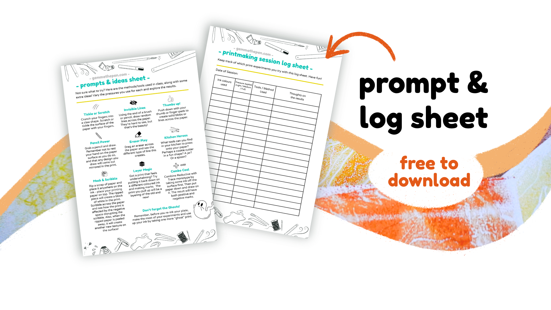
of the prints themselves. There's also a prompt sheet you can download from
the resources tab, which lists the ideas that we'll try in class and which has a log sheet included for noting down which
things you try. So feel free to use
that if it helps. This is helpful because
it will give you a way to remember how you created
each print later on. When you're in the flow
of a printmaking session, acting on whims and impulses, it's easy to create
something special, but it's also easy
to breeze on by it. If you ever return
to a print in future and want to try and
create a similar effect, your notes will tell
you how you got there. The second method is to
have a phone or a camera nearby so that you can take photos of your prints
when you've made them. You can take a photo
immediately after each one, or you can have a
little photo session at the end where you
do them all at once. Alternatively, if you
have access to a scanner, once the prints are all dry, you can scan them
into your computer and save them that way. Having photo versions of your
prints is useful because it gives you the freedom to play with your
originals further. You may wish to print
on top of a print, to explore layered textures or cut a print up to
create a collage with it. Having a digital version of the original means that you can make changes on your
paper versions, but still be able to look back at where that
print started. Digital versions
also come in handy later on if you'd like to
utilize them for digital art. Now you can absolutely keep these records purely
for yourself. But if you're happy
to share any of your print adventures
in the project gallery, I know I would love to see them, and I'm sure your fellow
classmates would, too. Go to the Projects
and Resources tab, click on submit a project, and then you can upload any photos and notes that
you're happy to share. I'd love to know which of
your prints surprised you most and which ideas
you enjoyed trying out. And so on we go to
the next lesson. Let's chat about the materials that we're going to be using.
3. The Materials You'll Need: There are a few things
you're going to need for this
printmaking session, so let's go through them now. Firstly, you'll need
a shiny surface. In class, I'm using a glass
pane from an old photo frame. But there are lots of
other things that you can find which have smooth,
shiny surfaces. You might have a plastic
dinner tray that you don't mind donating
to your art supplies. Or maybe you can save a piece of plastic from
some old packaging. An old mirror would
work really well. But you would have to look at yourself as you are printing, and that might distract you. If you have a table
surface which is non porous and which you don't
mind having to clean, then you can simply work
directly on that, if you wish. Take a look around and see
what you have to work with. Next, you'll need
some printing ink. There are both water based and oil based options out there, but I recommend using
the water based for this kind of laid
back play session. Water based inks are
easy to clean away afterwards and are often a
little bit more affordable. In class, I'm using Essdee
block printing ink. I use it because it is easily available in my area
and affordable. But there are various other
brands that you can explore, such as Speedball,
Adigraf and Schmincke. If you can't find
block printing inks, you can experiment
with acrylic paints, BUT - and there is a
little but - you will need to add some kind of extender
or retarder to the mix. Otherwise, the paint
will dry too quickly on the plate and the
print won't transfer. And also, it might possibly stick your
paper to the plate. I'll have a tray for mixing inks because it's easier for
you to see on the screen. But if you have space to the
side on your shiny surface, then you can simply
mix your inks there. A roller, which can also
be known as a brayer. You don't need anything
fancy for this. If you can spot an
affordable one that's roughly this kind of
size, that will be fine. However, if you
cannot get your hands on a roller, do not fret. You can explore
spreading inks with a piece of plastic
or card instead. Your ink surface will
not be quite so even, but you will still get to create cool abstracts and
fun surprises. You'll need a small bundle of pages which are easy to grab. I have about 12 to 15
pages in my stack, and I like to work
in A5 size, so I rip A4 pages in half. Now, there are no
hard and fast rules about which paper to use. So definitely experiment
with what you have. But I have found that a lighter to medium weight
paper works best for me. In class, I'm using a basic
smooth white printer paper at around 100 GSM. A palette knife or
something similar to mix the ink with and smooth it
around. Stuff to press with. Yes, this is a vague category, because it's where you can
get curious and experimental. To give you a starting point, in this session, I'll have
these things within reach. A pencil, a brush, a spoon, a jar, a crinkly edged wooden
knife-thingy, and an eraser. All of these things
are optional. They just happened
to be things I found as I mooched
around the shed. But hopefully, they'll give
you ideas about how you can push down onto the paper
in lots of different ways. So when you come to have a go, grab a few random things
from your space and put them within easy reach
so that you can grab them whenever
the whim takes you. So now we know the things we
need, let's go set them up.
4. Setting Up Your Print Session: Now, before you begin
your printmaking session, it's a good idea to set up
your space so that you've got everything you need within easy reach and ready to go. This is especially helpful when you're using water
based inks, which, although they have a
longer drying time than acrylic paints, they can still have a
shorter working window, depending on what temperatures
you're working in. Because in this session, we're aiming for a
speedier process, focusing on impulsive
mark making and breezy experimentation. We don't want to
waste time in between inkings searching for our
tools or prepping our paper. We want to ink, plop the paper on, and immediately see where our creativity takes us without
having to think too hard. In my setup, I have three areas. I have my inking space, which is where I have
my shiny surface, my mixing tray and pallette knife, my inks and my roller. I have my tools space, which is right next to
my inking area and is where I collect my paper
and random pressing stuff. This is also where you
can keep a notebook or camera so that you can keep
track of your experiments. And I have my print drying area, which in my case, is the floor. You just need somewhere
that you can lay your prints down flat
or hang them up with pegs so that they can dry out of the way while you
carry on printing. Of course, this is just what works for me in my
particular shed space. As you go along,
you'll find out what systems work best for
you in your space. With all that being said,
I do believe we have reached what is known
as the juicy part! Next lesson is the demo session where we can start
creating our prints, and I cannot wait because I really love these
types of sessions. And I hope you will, too. Take my hand, printmaker. Let's go print stuff.
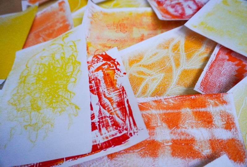
5. Let's Print! Print Session - Part One: So I've got two ink colors here. I've got my bright yellow
and my deeper red, and I'm going to start with
my brightest color here. I’ll just give it a
quick shake. Always give your tubes a shake if they look a little
bit like [the ink] has separated. I'm going to put quite a hearty
dollop - because this is my main color
that I'm going to mix in small amounts
of my red with. So now I'm going to take my red, and I'll just pop a little
bit of that down here. We can always add more as we go. So we could do our first print
just with this as it is. I'm going to give this
a little mix up again, just in case it's separated
at all in the tube. And we could go straight in and use that as our first color. But because it's a little
bit light for the demo, I'm just going to take
a tiny bit of red and mix that in.
And when you're mixing, try and scoop
it up and fold it over, and mix it around and do
the same on the other side, scoop it up, mix it over. So if you've got a
palette knife or a bit of card or a piece of
plastic that has a little bit of bend
to it, so that you can push it right down onto the
surface and scrape that up, then that will make
it a lot easier. Now I'm going to scoop
quite a good chunk of that, as you can see on there. And I'm going to
move this to the side. This is my inking area here. So I'm going to put a
dolop of that straight across, which is roughly the
width of my roller. And also, that is roughly the size of my piece of paper that
I'm going to be using. So, the more of
these you do, the more you'll start figuring out how much ink is too
much ink, or how little ink. But on this very first one, I feel like you can go
that little bit thicker, not worry too much because
you're just getting a sense of what the process is, and we're just laying a
foundation for future. So I'm just going to pop
my palette knife down, and I'm going to grab
my trusty roller, and we're going to put the roller into the
ink here and then pull back on that roller to
drag it down the surface. So as you can see,
at the moment, it looks like it's
kind of slid down the surface in a
kind of gooey trail. So that's okay. That means that we've got plenty
of ink on there. And again, it might be too much, but that's okay at this stage.
We're just getting going. So yes, this sounds very gooey at the moment. Can you hear how
it sounds really sticky? As I go along, yes, it's a little bit too
sticky, I would say. But again, this is the very
first time we're inking, and it's fine. It's okay. In general, when you're rolling, if you do a couple [of rolls] and then lift, and then a
couple and then lift, and as you lift,
you try and spin the roller a little bit.
When it's this sticky. you’ll find that it doesn't
really spin that much, and that's totally okay. So as you can see, because
this is so sticky, this here already has quite
a lot of texture going on. So that is definitely going to show up on our first print. And because this is so thick, I'm just going to plop
a bit of paper on top and I'm not actually
going to do too much with this. I might just very
lightly go across it. But essentially, I'm
going to pull that straight up and just take off
some of that excess ink. And Ooh that's nice
in itself, isn't it? Look at that. Oh, it's like
tree bark or something. That is a really
good way - If you feel like you've got
a bit too much ink on your plate and you need to
smooth it out a little bit, then just plop a piece
of paper on top. Don't push down too hard, but just let the paper
take that excess away. And, you get quite a lovely
little bit of texture there. I'm going to plop that
down in my drying area. So straightaway, I'm now
going to use this as it is. I'm not going to add
any more on there. And I'm actually quite enjoying that texture
from the other one. So I'm not going to use my roller and smooth it out just yet. I'm going to pop another piece
of paper on and so here is where the basic elements of trace monotype
come into play. Any pressure that we put onto this piece of
paper is going to be relayed through the paper into how much ink we take
up from the surface. So if I put my thumb
here, and press down, we can assume that a print
similar to the one we did before would have a strange kind of lump in the middle there, a kind of dot, thumb
shaped.in the middle. And I could put perhaps
another one up here. Maybe if I make a jaggedy line. Across the center, perhaps that will give us
something extra, as well. So let's just see. That is not very much
that I've done there, but just for the purposes
so that you can kind of get the idea of what's going on
here, let's pull that up. Oh, yes, you can see
the difference there. So there we go. That's the difference.
So we've got our texture that we had
before on the first one, this lovely kind of
bark-like texture. But if I can just
turn that round so you can see it
a little better. This here is where we did
our diagonal line going up, and these are my two
thumbprints on the side there. So you can see - you'll always get some kind of texture just from the ink itself connecting to the paper,
regardless of pressure. But the way you can
get experimental with it and creative is by pressing down on the paper in different ways to try and
get different results. So that is our first one, which just shows the
basic technique. And now we can go to town
and enjoy ourselves. So I'm going to go
back to my roller here quickly because this has got excess ink on
there, as you can see, from when we had too
much on the plate, I'm going to use that to put a little bit more
back onto the plate. And can you hear the noise now? That is a little bit of a healthier kind of
printmaking rolling sound. Where there's not too much ink, but just enough that you've got stuff which is moving
around on the plate. So this is where
you can push it up and the roller will spin, push, spin so that different parts of the roller hit the surface
in different areas. You can move your roller to go sideways if you don't feel like it's covering
quite as well. And back the other way. Now, this is what the
roller looks like now. Can you see it's kind of
evened out a lot more. We've just got that
grainy texture on there, which is very nice, not too much, not too little. I'm just going to pop
that to one side. So as you can see,
the same grainy, kind of fine texture is what
we now have on this plate. So let's go ahead and pop another piece of
paper on top there. Lovely. Let's get a little
bit more experimental. Let's just use our hands first to see what different
marks we can make. I'm going to take
my hand here and I'm going to
focus on my fingertips, and I'm going to crunch my hand up and then plop it
straight in the middle. And then let's kind of scrunch our fingers around. Almost like you're
tickling the surface. Or use your nails, kind of the backs of your
nails, to scratch around if you don't like the
tickling motion. And just scribble,
scribble around. I'm pressing a medium amount here. I'm not pushing really hard. And I'm not super light. Okay, I feel like that's
probably enough to get the idea. So let's see whether or not that has given us
anything interesting. Oof. Look at that. Ooh! I feel like maybe
I did a little bit too much there because I really like these bits on the edges here where
it's not quite so dense. In the middle, we kind of lose a little bit of textural
interest, let's say. But yeah, these sections
are really nice. So I'm just gonna
pop that one to dry. Now, before I go and put a
next layering of ink on, because it's starting to get
to the stage where there probably isn't that
much left to pick up. However, when you get to
this stage, at any point, before you do your next inking, it's a really cool idea to
just have one last print. And this is the ghost print. This is where you pop
a piece of paper on, and you don't necessarily
do anything extra to it, we're not
going to do anything particularly creative with it. All we're going to do is put as much pressure
on it as we can. In a firm, even way. So we're just taking
the base of our hand and pushing from the bottom
to the top or top to bottom, however works for you best and work your way from side
to side across the paper, just giving it nice,
firm, even pressure, really pushing down because
what we're going to try and do is just take as much of
that ink away as possible, but also utilize
the textures that we've already been
creating on that plate. And just see what happens.
Sometimes with ghost prints, you hardly get anything
at all come up. So don't be disappointed if it looks really
faint and sad. You can always use that
piece of paper again, pop it onto a new surface and reprint over the
top of it. That's fine. But you just never know, and that's why we do it because you don't want to miss out on something that might
be really cool. Okay, so I put quite a bit of pressure on there.
Let's pull that away. Oh, it is delicate. Very delicate. But oh, yes. Can you see there's kind
of little echoes of where the ink was taken away through the
nails experiment. You can kind of see those
little tiny bits that are a little bit like lightning, like little white scratches
in the texture. So that would actually be a
lovely background to just draw a scene on top of because it looks a
little bit…I don't know. It's just grungy. It looks
a little bit like a sky. Yeah, I think that will
be useful in the future, so I'm going to pop
that down to dry. Okay, then, let us move along. So I'm going to take my
ink and I'm going to put a little bit more red into that. That might have been a bit
too much. I don't know. Let's try mixing it up and see. I don't want it to be too dark. What I'm aiming for in
this session is just to keep going in gradients,
a little bit darker, a little bit darker
towards the red, and eventually end up with
a strong orangey color. But this is already
quite orange, so I might have put a
little bit too much in! But that's okay.
We can always add more yellow later if we
feel like we need to. And you could at any point, you can clean this
off with water and a soft cloth and just
start from fresh again. So if you feel like it's
becoming a bit too gloopy, a bit too much on the plate,
you can always wash it off. But when you're doing
it in a kind of quick session like this is, you can just go straight over the top and you sometimes
then end up with some really fun dynamics of some of the color from underneath coming back through
in other prints. So that's why we're doing it
this way because it's fun. Okay, we're going to
just pull that down. And start creating a
little orange patch. Okay, can you see I'm missing this little bit
in the middle there? I've got this triangle,
so I'm just going to turn my roller and wiggle it down that way so
that the edges pull it down. It's because this is not
a very expensive roller, and therefore, it has
little bits which are perhaps a little bit
uneven, but that's okay. We can get around that. We're going to grab our piece
of paper and plop it down. Alright, I have a
little brush here. You can use the bottom of
your brush just as a way of adding very intense
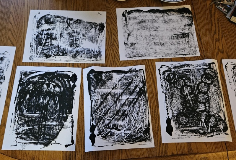
lines line work on here. So let's do some scribble marks. Whoo. Like cracks going down
the center of the page. Or across to the other side. Nice. And another one
going this way, perhaps. Lovely. And then perhaps I'll do one going across this way. So I often find that when I've put fresh ink on the plate, the first print that I
do can often be the most thick and contrasty one and
perhaps a little bit gloopy, depending on how much
ink you've got on there. The second one tends to
be the one which is the most intricate and
perhaps successful. I don't want to say
that necessarily because that's not
always the case, but it's often the one where
you can get most creative. And then the third one, the ghost print is where
you're just taking up any kind of leftovers and
seeing what they give you. So let's see on this
one. Let's pull it up. Oh, my gosh. Look at that. Oh, my goodness.
Whoa. Look at that. That's very cool because
what we've got here is that because we've put
really hard pressure on, we've burrowed down to the first layer of
really bright yellow. So this is what we have picked up on the inside of those lines. However, the edges
of those lines are the deeper orange
that we've put on top, which didn't get quite
as much pressure as the very center of the line. So that is really cool. It looks like lightning or definitely cracks, perhaps like, you know, lava, cracks, like molten… there's something
going on under the surface. That's what this reminds
me of very much. So yes, very pleasing, indeed. All right, can you see
that we have very clearly taken off this ink from
our linework before. And this now is, in essence, that is a reductive monotype, because it is a surface where the ink has been taken
away to create a design. If we were to place a piece
of paper straight on top of that and take a print now
a bit like a ghost print, we would have white lines going across the
surface of our texture, and we will definitely do something with that in a second. But we might want to add
something extra to it. So let's grab a
piece of paper and pop that straight over the top. Lovely. Alright, I'm going to bring
in this little thing, which is a jar of elastic bands, but that is irrelevant. All I'm interested in is this interesting circular
shape on the bottom, which has texture in
the ring of the glass. So I'm going to use
that straight on here to add some kind
of circular marks. So I'm just going
to push down quite firmly to leave an imprint
of a perfect circle. Let's put another one down here. Let's push straight on there. Lovely. And if you wanted, you could do a kind
of twisty movement. So I'll just hold that still. We're just going to swish it
round so we'll get a curve, and perhaps we'll do
another one of those across the top here. Fun. Let's see what that has done. Oh, you know what? Not a lot
at the moment in terms of definitely the circles have
come out very strongly, but the rest, not so much,
so we've had a little peek. . I'm going to push
that straight back down and then put
pressure on it and just push down with the broad
palm of my hand to give it an even pressure
to see whether we can encourage some of the rest of the
textures to come out. It'll probably make the
circular impressions very dark, which might not work so well. But I don't know. I really want some of that other texture
from the background to pop through, too. So I'm willing to take the risk. Let's just give this a go. Let's see if that's
made it any stronger. Oh, definitely. Ooh, yes. Okay, so this is what I mean about the
reductive monotype. So trace monotype is when you're putting a pressure
on. So that is here. And you get positive marks on
there, which are colorful. Reductive monotype
is when you're taking the ink away and
then taking a print. So that's where you
get negative marks, which are white on the paper. And combining the two
is really quite fun. So here we go. This is I mean, that there, can you
see that there, where it looks like the inside of a tree
is my point there, which is very cool. And similarly, over here, actually, that one's
done a similar thing. Yeah, but funnily enough, pushing through to get this has pushed back
these smaller circles. You can still see them, but
they are not quite as dense. But we're also
getting speckles of this orange on the surface, although it's gone back
more to the yellow now and only these are
picking up the orange. We do have these speckles
in, which is rather nice. Okay, let's leave
that one to dry. Okay, I'm going to take
one last bit of this off from this pattern
before I do a new inking, so I'm just going
to do one of those ghost prints again
really quickly. I feel like this is
going to be quite faint, indeed, so I'm just putting
as much pressure on as I can. And this may or may not
have anything on it, but it just means
that we're giving ourselves a nice
clearer surface. Oh. Oh. Now, I wasn't expecting
much at all from that, but, oh, my gosh, look. Those little circles have
come into their own. Oh, how lovely and delicate,
but look so clear. And actually, these are a lot clearer, as
well, these rings. Oh. That's nice. Oh, that actually might
be one of my favorites.
6. Let's Play! Print Session - Part Two: Right. Let's add a little
bit more of this red in. Smooth it all
around. That's nice. I mean, I'm not too
worried if it doesn't fully combine because
this is a play session. If we get a little bit of unevenness in the
color, to be honest, I'm quite happy about that because it leads
to fun surprises. Okay, so let's grab some of that and plop that down on
top there and roll. So as you can see, although I'm popping this on top
and rolling it out, we can still see
the impressions of those really deep lines that we carved out a little bit earlier. And that's totally okay. We may never completely
get rid of those. And this is the stage where if you did want to really get rid of them and you just didn't like them, you
wanted to start afresh. This is when you
could just clean off the whole thing and start
from the beginning again. But I quite like having these sneaky little
patterns lurking underneath in a
session like this because you just never know when they might come into their own. Okay, let's put a
new piece of paper. On to the top there. Let
us use our Trusty pencil. So you can just simply
draw a design on here. Remember that any pressure
you're putting on here, you are going to create a mark. So if you rest
your hand right in the middle and draw
something beautiful here, you'll probably get
that beautiful thing, but you'll also get
this gigantic smudge in the middle where your
hand has been resting. So really pay attention to that. If you're going to draw, try and keep the weight of
your hand over here, you might have to kind of use more looseness in your drawing because you can't
put that pressure on the middle of your page. So let's just see. I'm just going to do something really straightforward
like leaves because I don't need to have
too much control over those. So let's just start
from the beginning. And I'll draw a
stem up the center. And that's very similar to what we did with the end
of the paintbrush, where we just dragged
it down in a line. But this time, I'm going to add some leaves onto
the side there, very loose ones which don't need don't need too much detail. Now, you can push really hard. On those ones, I was
pushing quite firmly, and I'll do some in a different pressure behind them in a second
so we can compare. Let's do another vine
in the background, but I'm going to do a really
faint pressure on that one. And I'm really not
pushing down hard at all. Hopefully, you can see
that it's a lot lighter. And we'll do another one over here just to balance
that out, I think. Hopefully, we'll get
something interesting. Let's peel that up and see. Oh, yes, that's very
chunky mark making. And as you can see,
this center one is what I used very
firm pressure on. However, these side ones, I really didn't put that much
pressure on them at all, and yet they are still so very strong and bold
in their mark making. And they are still even
pushing down to that yellow, which is right at the very base. You can also see coming
through those little cheeky, reductive monolines that
we created earlier, those cracks in our ink,
which are very cool. But because this was
the first inking of that this is the
sort of chunky one. Let's try another one
straight on top and just see whether we get a more
delicate version of this. So as you can see, these are all the lines that
we've taken away, and let's pop that
straight onto the top. And because that first one was quite a thick
ink coming off there, I'm not going to push all
the way at my firmest down here a little bit of pressure
that's going everywhere, but I'm not putting my
whole weight behind it. And we can always
sneak a little peak. At an edge just to
see how this is going to see whether we need to do more. So
let's just do that. Let's take a little sneak peek. Yeah, that's totally
enough, I would say. Enough pressure. Oh,
they're glowing. Oh, my gosh. Look at that. Oh. Oh. Oh, look. That is just glowing
off the page, those lines! I’m just kind of staring at that for a moment because it's so cool. I'm really enjoying that. So I'm just gonna
leave that to dry, and I think we might
even go again. Let's go again. Let's
go straight on again. And this time, put
all the pressure on. Let's see whether that's gonna
give us anything. It is. We've got something, at least. Oh, yes. A more kind
of yellowy version. And oh, look, that's
interesting, isn't it? Now, can you see on this one, we have very
distinct white lines on the leaves on this one. But what's interesting
me is that these lines, which were our previous
reductive lines from the past, are now coming back
to us in orange. Which is really interesting. The ink has pushed into those negatives to pull
them into color scape. Lovely. You know what? I feel like because that's
come out so dense, we might even get
another out of there. Mm shall we try that again? Maybe, yes. One more time. And this is really just useful because you're getting to use as much of this ink
that you've put down. You're getting to use as
much of it as you possibly can without having
to wipe it away. And you're getting lots of fun papers to be
able to use later. And I love it. I think
it's really cool. Is that gonna give us anything? Let's take a little peep? That is delicate, but
there is something coming. I'm gonna give it one more, but then I think I'll
leave it delicate. There we go. Okay, so as we can see, not quite so bold and bright,
but still interesting. And again, that might be a
good one to print on top of, because it's delicate,
so we will keep that. Let's just embrace the red now. Ooh. Embrace the red. Okay, let's try and scoop
as much of that up as we can and get that on there. And pull it
out. There we go. Alright, let's pop
this down on here. And what about this thing? Yeah, let's try this.
So this has got kind of like a ridged edge going on. And I'm just
wondering if we were to just push straight
up with that. And then perhaps we'll use
we've got an eraser here. Let's give that a little
jaggedy pocket over here. We'll wiggle that along
in a jaggedy line, and let's try our spoon
out because let's just put everything on this one and
just see what happens. So let's just make some
rocking marks over here. I don't really know
what that's gonna do. Oh, yeah. Interesting. Oh. Okay. Well, the lines
sort of worked. This was the eraser, which is a kind of similar mark
to this, but softer. You're not pushing so
deep down in the center. It's got a more even
pressure going along, so that's useful to
know for future. Now, this is weird. Oh. Let's take a look
at that together. Look at that. That is
the spoon rocking. And it is sort of
interesting because look, it's got kind of little grains in the center of it
where it's like, pushed the ink into little
pools or something. Um, yeah, interesting. Okay, let's pop
that straight down, and we'll go straight back
in and take another one. Okay. I'm just going to do a little bit of
light pressure all over. With this one, I might
just use my thumb, start in the middle
and just push upwards, and then perhaps start slightly
down and push upwards, slightly down, push upwards. So I'm doing a kind of step with some lines.
Let's take a peek. Okay, so we might want
to put a little bit of pressure on this side where
I haven't put those extra. But really, I'm not putting
hard pressure on this. Okay, let's see what we've got. Oh. Oh Oh, look. Mm. I don't I don't know. There's bits I like. There's
bits that I kind of go, mm. Yeah. I mean, I do quite like the ghostly spoon is interrupting
the new thumb lines. And yet, we're getting the very strong previous
knife line going through. We've got lots of
lovely little scratches and scrapes from other
previous things. Okay. Let's do another
ghost one real quick. This one I'm putting all
my pressure back on. Who, we have got something. Yeah, look at that. You know what? That is
a very cool background. If you put it up
this way, ooh, now, doesn't that look kind
of like a landscape, 'cause you've got
your horizon line. That could be like a
big cloud coming in, got perhaps lightning going
across the surface there, or perhaps that's a
mountain range. Ooh. Yes. Well, there's all sorts going on in there when
you start staring at it. And look at all these kind of speckly red bits
which are going on. Very interesting. I actually like that. The more I stare at it, the
more I like it. Okay, so I've come pretty
much to the end of my inky dolllop and it's been roughly about half
an hour this session. So all I'm gonna do now
is just try and use up as much of this ink as I
can so that it's not wasted. So I'm just gonna grab that
extra little bit there. Gonna pop that on, and
then I'm going to use this and just be a
little bit more. Ooh. Experimental. Let’s
just put some patches of this down onto what
we already have. And I really like the fact that the different colors
are not quite merged. As you pull them out, you
can see little bits of yellow through the
red, which is cool. And let's just push
some of them that way, push some of them that way. And this is the way
that you could, if you don't have a
roller to be able to pull your ink
around on the plate, if you've got a piece of plastic or a knife like this that you can use to just sort of smooth it around then you can still have
a really good play with this technique. I'm gonna pop that
straight on there. I might just go with
my hands and we'll do some lines, but come off. Like that, maybe. Let's just see if that does
very much at all. Not too much, but it's a
really cool texture. Whoa. Look at that. Because this is such thick dolops
that we've pushed on, at the end there,
we've mainly got that. We haven't really noticed any new pressure
putting on there, but that's okay because look, Oh. That's a beauty. Back another piece of
paper straight on. And let's just try
again in terms of, let's see whether this picks
up any extra pressure. Oh. Nice. Okay, just
sticking that down. We might just do a
little bit of mark making just with the
end of our pencil. So I'm just gonna do some lines. Actually, I'll do
it with the pencil, so it's a little
bit easier to see. Let's just put some
pockets of these in. Let's see. There we go. Yeah, those lines have showed
up quite nicely on there. And I think on the next one, I'm definitely gonna give
it far more pressure now because we're getting
down to the lesser inks. And I'm speeding up slightly on this last bit because the ink by now is starting
to get a lot drier. It's not dried out
fully by any means, but I'm starting to feel
that there is less kind of, like, squishy
movement in the inks. We'll do that one as a straight print and
just see what we get. Okay. Mm. Nice. So for this very last one, 'cause I do feel like this is going to be the last one now, I'm just going to use this one. Do you remember this one
right from the very start? This was our very
first ghost print. And because there's not
too much going on in it, I'm going to use this as
our final print here. So let's put that
straight on there. And I'm going to give it
really firm pressure. Try and get as much of that
texture up from the plate and all as much ink as we can
get up on this final one. And then we might also just do some sort of mark making
and pattern making. So like we did with
the stripes before, but I might just do
put some circles on there and perhaps just lots of dots together dashes
in lines together. Perhaps we'll go straight across with some lines
at the top there. And let's just do some
kind of shapes together. I don't really know
what these are. These have turned into
sort of little rectangles. Let's put some squiggles
down the bottom here. Who knows whether this
will be anything? This could be the finale of finales or something
quite underwhelming. But let's see together. Here we go. Okay, well, we've definitely got a print. And m. What do you think? Definitely, it shows
you can still get if you're using your
very firm pressure from something specific, like a pencil, you're definitely gonna still get some ink up. It's quite nice
having that yellow coming through in
the background. It definitely is getting
harder to peel up now. And if I show you, if I just use this
piece of cardboard to just take away some of this. So you can see the
consistency of this ink now. This is about half an hour gone. And you can kind of see that it's I don't know if you can see in
the texture here. It's kind of crunchier. Can you see it's
kind of crunchy? It's not blobby anymore. It's definitely drying. And it's harder to scrape
that away from the plate now. As you can see, it's
not really coming off. So it's definitely
drying out now, which is why we're
not getting quite so much, definitely crumbling. So this, for me, is going to be the
end of this session. So now it's time to clean up.
7. Cleaning Up: So to clean this up,
I'm just going to put a little bit of water
on there, not so much that it's
going to go everywhere, but just enough that it can
start spreading across. I'm also going to put a
little bit on my cloth, and I'm just going to start
moving that over my inks. There we go, getting
the moisture back into them, so that we
can lift them off. There we go. On those bits which have definitely dried the most, you'll feel a little
bit of resistance. But if you just smooth the
water into those inks, it will start to feel like it's loose on the surface again. And once it starts looking
like paint like it is now, you can get a cleaner part of the cloth and start removing it. With these bits, I'm just going to take them
straight to the sink and use some warm water
to clean them off. Always make sure
you do clean off your roller really well
because you don't want any of that ink
getting gunked up and stuck in there, so that
when you come back next time, it's nice and clean
and ready to go.
8. The End. Or is it?: Hey, come on in. Get comfy. Tell me, how did you get on? Did you enjoy the process? Did you find it challenging? Were you surprised by
anything that you created? Having a floor full of prints
is a satisfying feeling. That's evidence of a lot of
creative energy right there! But also, you might
be wondering, what do I do with them now? It's a good question. Here's a few things to
consider in the future. Firstly, did you take photos of your prints as
you went along? If not, go do it, because even if you're not too fussed about them right now, you may find them
helpful in the future. I cannot tell you the amount of times I have come
across an image on my computer sometimes years afterwards and thought,
“Oh, that's cool. I could use that as a
background on this project.” “That texture is just what
I need for this collage.” So take some photos, store them in an
album or a folder, and save them for
a rainy inspo day. Next, lay your dried prints all out in front of you and take
a really good look at them. Which ones are
calling to you most? Pull out your favorites
and see what you can identify about
why you like them. What is it that's working in them that makes them
more appealing to you? Is it something
about the colors? Perhaps they're merging or contrasting in really cool ways. Is there something
about the values? Maybe the lights and the shadows are creating
interesting dynamics. Take a look at the
different textures that create each one. Why are those particular
textures singing to you? Is it their chunkiness
or delicacy? Is it their regularity
or randomness? Noticing all of these
different things is a really helpful exercise. It encourages us to spend time on looking and
interpreting what we see, not judging it,
but evaluating it. Through doing this, we start
figuring out what art we personally respond to and how it correlates to
what we enjoy making. Lastly, choose whether or
not they become artworks in their own right or whether they become materials for
artworks in the future. The prints that you identify as favorites are ones
which you may want to keep as they are safe in your sketchbook or even
framed on the wall. However, you will inevitably have some prints which feel a bit less impactful and which you don't enjoy as
much. That's okay. Remember, we said no
print is ever wasted. You can use these prints
as means to other ends. Printed papers make excellent
collaging materials, so don't be afraid
to cut them up, rip them into new shapes, then combine them with each other and create
new compositions. You can use printed papers
as backgrounds to draw onto. Perhaps try painting something
more figurative onto your abstract background
or draw around the edges of the textures to
explore shapes and doodles. You can digitize textures
and use them in digital art. Grungy textures are useful in digital art for creating
depth and visual interest. By using your scanned images
or photos of your prints, you can create digital
brushes or stamps for use in programs such as
Procreate or Photoshop. There are lots of classes on Skillshare and beyond which
can show you how to do this. So let your
imagination run loose! Before you go, let me
say a big thank you for taking time out of your day
to join me in this class. I really hope you've
enjoyed it and that it's given
you a nudge to try this really fun
printmaking technique with the pressure off. I'd love to hear your thoughts, so please do consider
leaving a review. Your reviews help me to keep
learning and improving, and they also give
your fellow students an insight into whether they
might enjoy this class. Writing a review, you may spark somebody else's curiosity
to try something new. Remember, if you're happy to share your experiments with us, the project gallery is
available for you to do so. We all create in
such different ways, and getting to see
how everyone's ideas take flight is one of
my favorite things. Also, if you leave
your Instagram tag in your project description, I will take huge joy in sharing
it to my Instagram, too. The Discussions tab
is also available if you have any questions
or just want to chat. If you’d like to catch up with
me elsewhere on the Internet, you can find me at gemmathepen.com, where I create art
and craft blogs and on YouTube @gemmathepen, where I share regular videos for anyone with a cozy,
creative streak. You can also join my free
Pen Diaries newsletter for monthly updates on what I'm currently
making happy with. I do have a few other classes
that you might enjoy. Especially “Swoosh that Ink”, which focuses on
reductive monotype, which is very closely
related to trace monotype. And if you'd like to hear
about my new classes, you can click Follow on
my Skillshare profile, and you'll receive
notifications. Thank you so much for spending your precious creative
time with me. It means a lot, and I really hope that we'll
meet up again soon. Stay curious. Stay creative. Keep making happy, and
I'll see you next time.
 Gemma the Pen, Making to Make Happy!