Transcripts
1. 0 intro : This video, we're going
to learn how to create this advertising
design from scratch. We will start with
the basic idea, going to finding
the proper images, and then going to make the background,
putting the product, blending everything to be a cohesive final
advertising design. So without wasting
any more time, let's dig into business.
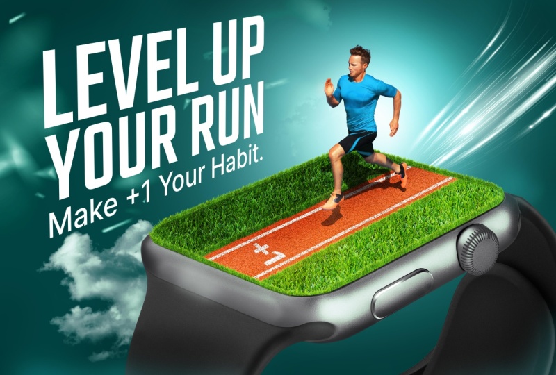
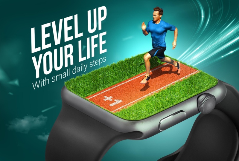
2. 1 The idea & The proper images: Okay. Let me tell you guys
what we're going to do today. It's going to be like an
advertising sue for Apple Watch. The main idea was that
I want to show that Apple Watch will be your friend
in your daily practicing, doing any kind of sport. I wanted to show the product. I want to put the focus on it, and at the same time, I want to show someone who is doing sport. That's why I made
the watch this big because I want you to focus
on the product itself. The same time, you can find this man running and
the watch in his hand. And the text level
up your life with small daily steps.
This is plus one. And that's it, by. Okay. This
was about the idea itself. Then started to find proper
images for the design. So I just went to Shutterstock
and right Apple Watch. And I got a ton of
images in Shutterstock. It has a huge library as
you can see right now. Okay. So I searched for
proper images until I get this one because it has
the angle that we want. It needs some tweaks, but it has a proper angle. It has a very, of course, a very high resolution, and the quality of the image
and the lighting is great. Secondly, I searched for
an image for this guy, and this was a little
bit tricky because the angle is not something
you see every day. This is like a top angle. Okay. So I just wrote
men running top angle. Searched for the images until
I found a proper image. I found this image, and it's very good. It has the angle that I want, and of course, has this
shadow which we will use. These were the main two images, and I found some grass images, some texture for the
track, and that's it. Let's jump into Photoshop and let's start
making the design.
3. 2 The Background: Let's create a new
file. Maybe let's choose something
around 30002000. Something like this
and then ps create. This is a good size. Let's start by creating
the background. How can we do this? You will find all the images
that I'm going to use in the link in the description so that you can
follow along with me. This is the best
way you can learn. Let's start by creating
the background. I'll do this by creating a simple solid color
adjustment layer, and it's going to be
like a dark teal color, something like this
maybe and then press. Then let's create another one. But this time it will be
bright teal desaturated one. Something like this, press. Then press control I to invert its mask and using
the soft round brush, I'm going to make
one touch like this. Press control T,
let's make it bigger, this will be the
main background. Let's go to the images.
4. 3 Adjusting the watch perspective: Et's start by the
image of the product. Let's open it into
a new project. Using the select subject tool, I'm gonna select it like this. Boom, select it, and
then create a mask, and right click convert it into a smart object because we want
to work non destructively. Let's bring it into
our composite. Ps and press control T, and then let's make it a little bit smaller,
something like this. Maybe we can make it small like this because I want to tweak its prospective
a little bit. I want it to look
like it's more flat. I don't want it to
look like this tilted. Want it to look like
flat like this. How can we do this?
We can do this by basically going
to edit prospective. Then let's define the planes
of the watch and the way we are going to define
it is by simply imagining a box
around the watch. Let's imagine like it
has a box like this. This is the box that is
containing the watch itself. We are going to define its planes to reshape
it a little bit. I don't want to make it
complicated for you. Follow my steps, go to
edit perspective work, and let's make one
plane like this, another one right here, and another one right here. Now, let's follow the
lines of the watch itself. I want this line of the watch to be
parallel to this line. Let's just tweak it like this. This one, and this one. This should be barrellel to this and this should
be barrellel to this. Then let's go to wp
from here and press wp. And now I can't weak this
side to be more flat. Something like this, I
don't want to change the perspective too much because the image
will be distorted, of course, but this will
be, I guess enough. Then let's press this right
button and we're good to go. Here's before and here
is subtle change, but it will help us in creating
the effect that we want. Let's make it bigger, and let's put it maybe right
here, it a little bit.
5. 4 Putting the grass: Very nice. Now let's go to the next part which is
creating the grass. I'm going to do this
by simply selecting this area of the watch and putting a grass
texture inside. We will see this in a moment. But let's start by selecting
this using the pen tool. I suppose that you know
how to use the pen tool, so I'm going to skip this
part and get back to you. Want you to focus on something. I don't want you to
select this part. I just want you to
start with this edge, the black part because this is going to make
it more realistic. Let's select it and
get back to you. All right. That's very nice. After making a selection
using the pen tool, we will go to solid
color and create a solid color with any
color you want, just press. Now you have a shape with this shape that we
painted using the pen tool. You can even edit it by the arrow tool because
it's a shape basically, so I can just select this
part and edit it as I want. That's very nice. Now
let's go and bring the next image which
is this grass image. I wanted to choose a picture
that has these edges, sharp edges, as you
can see right now. We are going to select this
using the color range. Let's go to select
and color range. Let's choose this
white background. Maybe we can increase or
decrease the fuzziness, something like this, and then press then we can
simply create a mask. Oops press control item invert the mask, and
we are good to go. So let's right click, convert it into a smart object, and let's bring it
to our composites. Let's make it smaller because we want the texture
to be realistic. For example, if I just
keep it like this, create a clipping mask, this doesn't look
realistic because the texture till
our brain that this is huge in relationship with the man size that
we will put later. We want to make this
small something like maybe something like this. Will be okay. That's very nice. And let's make a clipping
mask by pressing Alt and pressing between the
two layers or right click, create a clipping mask. So let's put it right here. And the next step, maybe you can
increase the size of the Canvas because
when I'm zooming in, the resolution is not the best. So I press Alt Control I, and let's make this f 5,000. If your PC is not
powerful enough, you can just keep
it as it was, ok? This is good when I zoom in. We have some details. The next step is
that I'm going to duplicate this to
fill the whole area. I'm just pressing
out and dragging it and putting it right here. But the main problem is
that we have some edges that doesn't look
good right here. We can simply erase
it using a mask and any grass or plants brushes,
something like this. I'm just going to paint
over these edges. Maybe you can use the
soft ended brush, any brush just to
blend the edges, and now we are good to go. Let's see here as before, and here is after
that is very nice. Let's tick another copy
and put it right here and another final one to put it
right here. That's very nice. Next we can select all these images and just
press out and duplicate them, put them right here and another duplicate to
put it right here. Simple as that, we
have now the grass. Of course, it's not
100% realistic yet, but it's well in
the next sections.
6. 5 The Running Track: That's very nice. Now,
let's bring the track. For the track, I'll
use this image, test the texture of
the track, then press. But let's deganize, put
everything in a group. Let's name this grass. Let's name this the
watch. That's very nice. Let's hide this for
a moment and let's select the rectangle tool
to create the track. I'm going to create
like track like this, just a simple rectangle, and then press
control T rotate it, make it something like this, maybe make it smaller or
taller, something like this, and then press
control and try to manipulate these points to
get the shape of the track. Something like this. Then let's put this here and this one. I want to make sure that this line is barale
to this line. This line is ara to this line. Let's see, I guess this
needs to be longer. Something I guess like this, let's see. That's cool. Next part is to bring
this beyond the texture, and then let's create
like clipping mask. Something like this,
and we are good to go. We have now the track. But the main problem now is
we don't have dimension. It looks like it
is a flat surface. We need some parts to
get out of the product because we want to
make the illusion of the depths in the design. We will start with the track because we will
tweak the texture, somehow like this,
something like this.
7. 6 Giving depth to the grass: And then let's go to this image and we can bring
it and put it right here. Let's press control T.
Let's make it smaller, the same size as this grass. But this time, I
will press control to tweak its
orientation like this. Let's make it a bit smaller by pressing and pressing
into one of the corners, and let's put it
maybe right here. L et's just erase these edges, press shift to erase it. Something like
this will be okay. Maybe you can soften
the edges using any grass or any plants brush. So this is not bad. Let's just duplicate it
and put it right here. Maybe we can rotate it a little bit to match
the perspective. We will do the same
steps into this edge. I will just select
these two layers, press t and drag
to duplicate them, and then press control
t to reshape it. Press control and
go to the corner. Let's just try to
match shape with the shape of the angle,
the watch itself. Then we can bring
these two layers, press out and bring them here. Let's change the
angle a little bit to match the angle of the watch. I guess you got the point. I'll just make the same steps again to the other parts
and get back to you. That's very nice. Of course, you can take your time
to get the best results, but I guess this
is good for now. Let's just go to the
next step which is painting some lines into the track to get the feeling
of a track, of course. I'll do this using
the line tool. I'll just draw a line like this. Let's give it the struck
a color and with no fell. Let's increase the size to something like 20 or 18 pixels, and then put it above
everything. That's very nice. Can now note that it is not realistic because
it's complete white. We want to remove some
parts from this to give it the sense of painting
in the track itself. We will do this
using blend F. I'll double click into
the layer and go to the underlying
slider from here and remove some parts from the
shadow parts from the track. Something like this, maybe
press to split the cursor, and now let's make it
something like this. Now, I guess this is much more realistic. That's very nice. Can then duplicate
this by pressing out and dragging it
and put it right here. Maybe we need to
change its shape, so let's press A to bring the arrow tool and then
let's change it like this. That's nice.
8. 7 Putting the man: Now it's time to bring the
main character to the design. Let's bring the image this man, open it into a new project, and I will select it using
the object selection tool. It's basic selection. Just press on it, and that's the nice.
Let's create a mask. And we can do another thing. Cross Control J to duplicate
this layer because we will need it later to take the
shadow from the image. I will just convert the top
image into smart object, but the bottom one,
I'll not do anything. This is the background, and this is the man. That's very nice. Let's bring the two images into the design. Put it right here, and then let's put it above
everything and make a group. First Control G
let's name this Mt. Foss Control T, right
click, flip horizontal. Let's make it smaller,
something like this. P. How we can extract the
shadow from this image. It's basically by turning the blending mode of this
layer into multiply. But now we have the shadow, but we have other
weird colors as well. We can get rid of these
parts by pressing control, and then trying to manipulate the levels until we are only having the shadow. Something like this, press. Another thing we can do is b is to desaturate the color
of the shadow because it has some blue colors and just press control and
desaturate something like this. I guess this is
better then press. I guess we need to play
around with the levels again. Try to get the best results.
Something like this. Press control L to bring
the levels as a Very nice, there's some weird
part right here. We can remove it by turning the blending mood
of the layer into normal, and then we can just
clone stem this part. Then change the blending
mood again to multiply. That is very nice. Now, we have the man,
we have its shadow, and we are good to go. Et's bring right here. That's very nice.
Maybe we can bring the plus one text right here. Let's just type plus one, something like this, and the
font is called proxima Nova. Change its color into
white, press control T, M it smaller and
let's just tweak its shape because we want it to look like it
is on the ground. Let's bigger, and then press, and we can do the same
effect we did into these lines using the
blend if sliders. Something like this
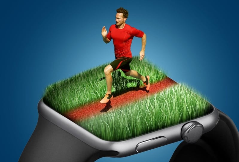
would be okay. That is very nice. Next, we will change the
colors of his shirt. I don't like this red color. It doesn't look good with
the color of the track. I will change it into blue. How can we do this is by simply creating a hue saturation
adjustment layer, create a clipping mask. Choose this buttons,
licked these reds, and then let's change its color to somehow blue
desaturated color. Something like this,
never mind about changing the skin color
because we will mask it. It something like this, maybe we can increase
the size, the reds. That's very nice. Then
we can press control I, and then we can use the brush to paint over
the red parts all. Next weekend, let's
make everything bigger. Something like this
because we want to focus on the message itself. I guess something like this.
9. 8 Light and shadow: R That's very nice. Now everything is in place. But it is completely flat. The colors are not good. The skin tones are not the best. There is no dodging and burning. The form is not the best. We will do the effects that
will make the design pop, and we will start
with the background. I will just create
another layer, and empty one and then using
the soft rounded brush, I will make it something
maybe like this, and then change its
blending mode into overly. Press control T, and let's
bring it behind the man. Something like this, and we can change the position of this
one until we are satisfied. Maybe we can make it
That's very nice. Secondly, as you
can already tell, there are some sharp
shadows right here. The source of light
is in the front top, and it's casting some shadows. These parts will be lit, will be bright, and these
parts will be in shadows. We will do this using curves. Let's go to the grass
part and then create a curves adjustment layer and let's make it
dark like this. Maybe we can put this
above the track. Well, yeah here, and then
make it dark like this, and then press control I. Maybe we can create
a selection around these parts and using
the soft rounded brush, I will paint some shadows
over these areas. Let's make it bigger. Some soft shadows like
this will look nice. That's very nice, Let's
create the same thing, but using another curve was
brightening these parts. Create a curve, press control, then let's create a mask using the same selection and
using a soft round brush, I'll just paint some lights let's paint some
lights like this. This is not bad. These lights and the
shadows are very extreme, so let's just
decrease its opacity, let's see as before and here is
10. 9 Fixing the skin tones: After. That's very nice. The next step is to
correct the skin tones. The colors of the man
doesn't look good. So let's just go to the man and we can correct it
using selective color. Let's create a selective
color adjustment layer, create a clipping
mask to the man, and selecting the reds. I will just add some, some maybe greens, which is
the opposite of Magenta, and some yellows would help. Maybe we can make him. Brighter, then let's
go to the yellows. Let's do the same
thing, add some reds, and maybe here, some
magenta and some yellows. We want basically the
skin tones to be rich, to have some color. Maybe here we can decrease
the brightness of a little bit. That's very nice. Zoom ad, let's see, here is
before and here is after, it's now way better.
11. 10 Product dodge & burn: So the next step is to
create dodging and burning to the product itself
to make it pop more. If you don't know what's
dodging and burning. I've explained it
into another video, you will find it in
in the description. But it's basically making
the dark parts dar, making the bright
parts brighter, to make the image look
more three D. That's it. I'll do this into the watch
using also the curves. Let's create curves
adjustment layer. This one we will use to
burn and press control I, of course, create
a clipping mask, and another one to dodge it. Another one like this. Create a clipping
mask, press control. Using the soft rounded brush, I will just paint
over these areas. The areas that should be dark. Some parts like this, try to be subtle, don't over do it. Something like this will be k. Let's see here before
burning and here's after. Let's go to the dodging part, let's make a brush
bigger and Let's give a touch here per shift and give it another
touch right here. Maybe we can make it smaller. One touch here,
another one here. Let's fade the edges, and we can paint over
this here as well. And maybe on chair. Basically, we are trying to make the image of
the product pop more because it's the main focal
point, something like this. Let's see here as before, here is after before and after. That's very nice,
I was very flat, but now we have more depth.
12. 11 Man dodge & burn: We'll do the same thing
into the main image. So let's do the
same process again. I guess we can speed
up the process of this part because it's
actually the same thing. There is the result of
burning before and after, and now let's go to the dodging. Let's do the same thing
trying to give the man. That's very nice. Let's see. Here is before,
Dodging and burning, it's kind of flat
and here is after. Of course, when you take more
time in dodging and burning and giving attention to
the smallest details, you will get better results, but for the sake of this tu, we'll just keep it like this.
13. 12 light trails & some effects: That's very nice. The next
step is we are going to bring these light trails and then change its blending
mode into screen, and I'll put it
behind everything. Let's put it behind the watch
into the background part. So firstly, change its color. I'll press control U, and then it's press colorize. Let's choose some color,
something like this. Maybe change, increase
the saturation, k, and then press control L
to remove the edges from it. Something like this
would be okay. S then press control t, and now we can tweak its shape. I want it to look like it's
coming out of the track, it's just something
that looks good. That's it. Doesn't have some logical
meaning or something. We can as well
bring this overlay. I guess we have
used this before to the orange juice video, I guess. Let's just put it right here, change its blending
with it to screen, press control L to remove
the bright parts like this, and then press control U to change its color
to desaturate it. Something this will be okay. Then we can lower the opacity and then create a mask
and mask everything, put some texture into this area. That's it. I don't want
it to be too much. That's enough for me. The next part, we can
bring some clouds, maybe using clouds overlay, but for now, I'll just
use Clouds brush. You can find any Clouds brush in the internet
or something like this will be k with
the white color. Just a subtle touch. We can put it right here. Subtle touch and
reduce its opacity. Something like this.
14. 13 Adding the text: Now let's go to the next part, which is the text, which is level up your life. Bigger. For this, I
will use BBA font. It is a very good font for
these bunchy tag lines, and let's make it bigger. Like this, Let's
change this text, and let's make it smaller
to match the same size. For this, I will
use another font, maybe the same proxima
one, like this font. For this, remove
this old caps part. Let's make this smaller,
something like this. That's very nice. Maybe
we can make this regular. That's very nice. I like
how it looks right now, but I think if we tweak its
perspective will be better. Let's bring all the ticks to the top and then maybe
we can duplicate it, right click, convert
it into a smart object and hide the bottom one
and press control t. Let's start tweaking
its perspective to match the perspective
of the watch. This will blend it into a
better way with the design. Maybe something like this. I guess will be. Then make it bigger and we can
then put it right here. That's awesome. I like outlooks right
now. That's bad.
15. 14 Final touches & Color grading: The final step is to
create color grading. So Let's start by creating a
new selective color maybe. Let's start with
selective color, and let's try to
give it a good look. Let's increase the
red into the red and maybe some greens
and maybe some yellows. Let's make this brighter. Something like this, Let's
go to the gen, the yellows. Let's increase also the reds. Maybe increase the greens a
little bit and the yellows. Maybe we can make this
a little bit darker. Let's go to the greens. Let's try to make
them more sanish and brighter by removing the
magenta and maybe yellowish. Let's go to the cyans and let's see, increasing the cyans. What about increasing
the greens? Let's just leave it as it was, and just a touch of
blue. Make it brighter. That's. Let's then
go to the whites. Let's try to add maybe
touch of cyan and green. Yeah, this greens looks amazing. My touch of yellow. Nice and let's make it brighter. Look at this. Let's go
I guess this is good. I don't want to play
a lot with colors. This is really nice. The final step is to create a glue bloom effect
around the highlights. I'll do this creating
a new layer, it's a blending mood and screen, and using the soft
rounded brush, I'll just pick some colors. Maybe from here, decrease
the flow of the brush. Then just paint
some glow effect. This art, for example,
it's too much. Zoom out when you create
these glow effects, maybe here as well. I just pick one color
and paint over this. I just maybe this is
giving us a great Effect. Let's pick color from here
and another glob effect. Here, some touches right here. This is too much. Try not to exaggerate
this effect because we can easily exaggerate in
this effect or me at least. Here as well. This is giving it some maybe the big something like this. Finally, we can
reduce the opacity. One final thing is we can simply create a vignetting effect around the edges,
something like this, press control I, and then ing the soft brush
make the edges. Yeah. That's it. Here
is the final result. Here is before and here
is after. All right. If you got to this point, I want to congratulate you because you want
to learn something. The next step, if
you didn't already, you should apply it yourself. Don't just watch it. You need
to practice it yourself. Try making the same idea
with different images. Maybe. This will help you
increase your skills a lot. Thank you, guys. See you in
the next classes, please.
 Nour Art, Digital artist, Youtuber