Transcripts
1. Intro: Like this photo compositing
photo manipulation thing is complicated and you don't
know how to master it? Well, here's my promise to you. At the end of this video, you will learn how to master photocositing by simply
following some principles. It's not rocket science. It's just simple steps together, build your own composites. Without wasting any more time, let's dig into business. Okay.
2. 1 What is photo manipulation: All right, guys. If you
don't know what it's photo compositing or
for a manipulation, it's basically combining and blending images together
to create one message. It can be used for a book cover. It can be used for
a movie poster, gaming panter,
advertising designs, or even just for your own fun. Any sort of artwork.
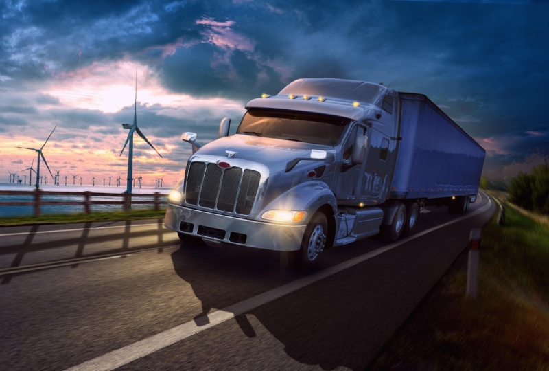
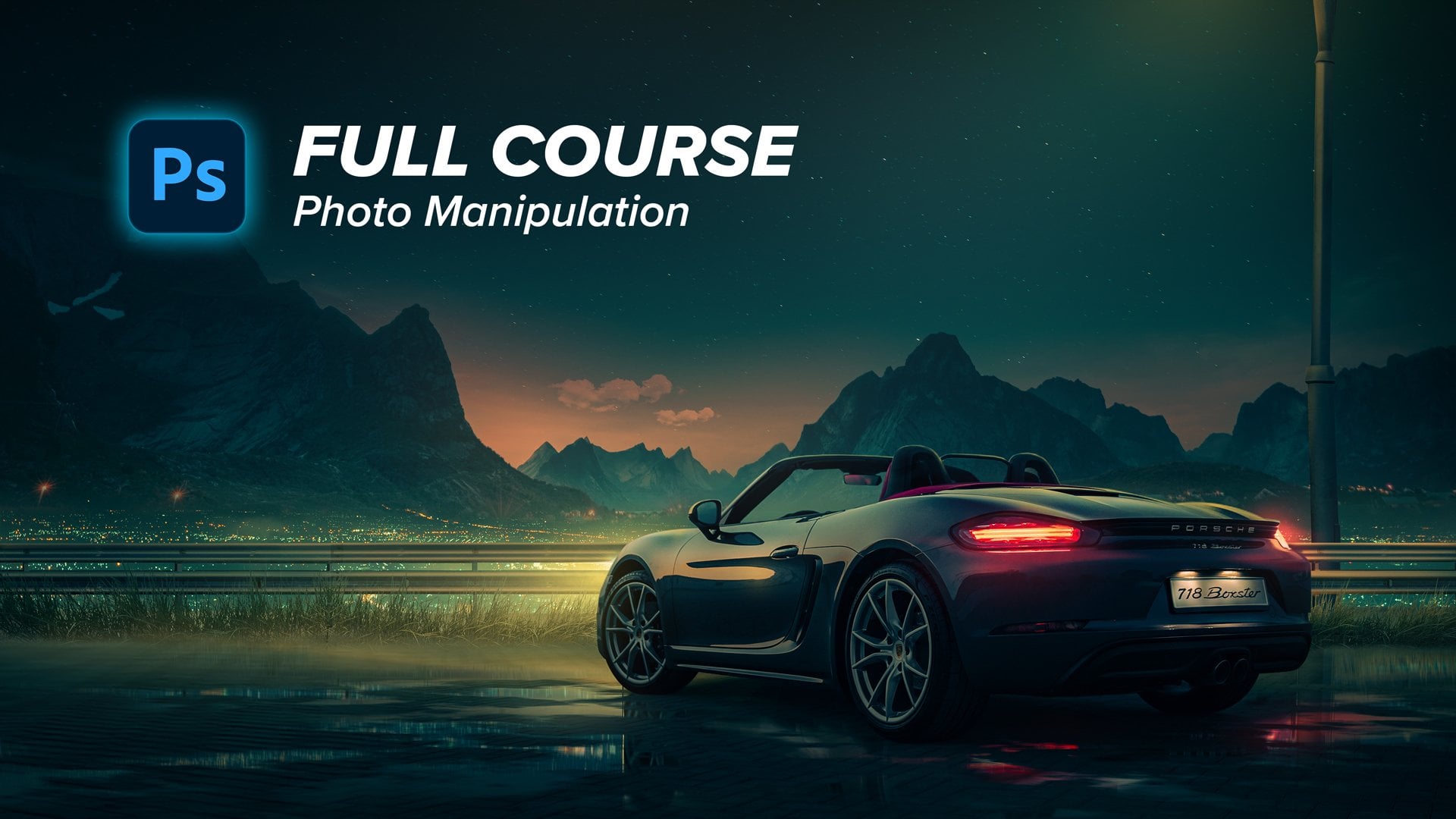
3. 2 The Idea: I usually start with the idea, gathering the references,
gathering the mood board. The main idea in creating this composite is
creating a beauty shot, so the shot itself should
be esthetically pleasing. It should look good, I should represent the car in a powerful way.
This is number one. Of course, it should be
realistic to seal the idea, and it should convey
the message that this car is powerful
and speed on the road.
4. 3 The References: So how did I start?
Basically, every time I start any sort
of photo composite, I go to Pinterest and be hands to create
like my mood board, my main mode for the design. So what I wrote is
just truck car ads. And then started to
gather the reference, the angle of the car, the mode, the color
palette, all this stuff. So I decided to
go with this mode in coloring, this sunset sky. And the overall colors
are reds in the shadows, some yellows in the highlights.
5. 4 Choosing the right images: So after gathering
some references, I go to the next part, which is finding the
proper images to use. And for this, I use Adobe
Stock and Shutter stock. Those are paid websites, but they have a very
good library of images. So type anything you want and you will find
a good picture. But if you want a
free alternative, you can always go
to websites like Pizza B and maybe free pick. You will find very
good stuff as well. Here is the images
that I'm going to use. What I wrote basically
is just road. Sorry to look for
a proper image. That will be suitable
for my composite. In choosing images, you
need to be careful to choose proper images
that will work together. Because some images will
never work together, you cannot blend them. For example, if
you want to create sunset soft lights
into the composite. You should avoid an image
like this because it has very harsh shadows,
very harsh light. It's in a noon time. You'll put a ton of effort to make the images
match each other. Instead, you can go with
an image like this. It had already soft lights. The shadows are not harsh, and these reflections are
good into your composite. And that's why I
chose this image. And for the sky I just
wrote sunset sky. I started to browse
all the images. I'm here looking for a sky some level of details. So, for example, an
image like this will not be suitable for my design
because it is very bright. It doesn't have
so much contrast. And at the same time,
this one will not be suitable at all because it
has very high contrast. So I'm kind of looking for
an image that has depth, and at the same time, it has some level of contrast. So something like
this would be good, or something like this as well. So I ended up with this image, and this one, I will combine both images together
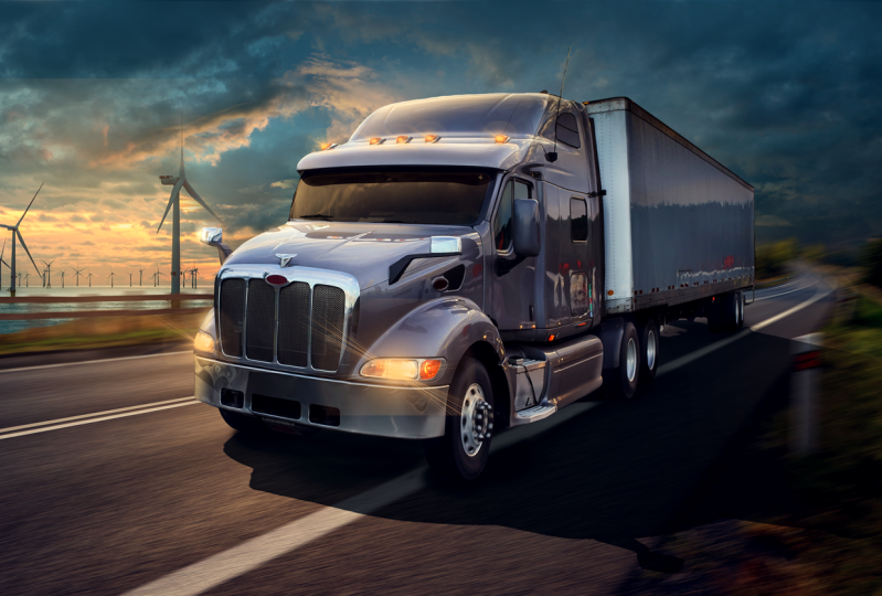
to create the sky part. And finally, I tried to find a proper truck image
that has the same angle, the same perspective
of the road. Because if they are not
matching in perspective, you will put a ton of effort, and it will not look
good at all at the As you can see here, the car has this 45 maybe degree perspective and the road has
almost the same angle. Maybe we can tweak
it a little bit, but overall it looks matching. This is the first part which
is finding proper images.
6. 5 Putting images together: So let's open photoshop and start by creating
the project. For this, I will go with
four k size to give me flexibility in zooming
in and zooming out and be giving
attention to details. And I will go to
16 bit coloring to give me flexibility in
coloring, of course. And if you don't
have a powerful PC, you can use eight bit, and then press. All
right. Let's start. You will find all the images
that I'm going to use in the link in the description so that you can
follow along with me. This is the best
way you can learn. Just watch me what I'm doing
and then apply it yourself. So let's start by bringing the images
that I'm going to use. I will start by bringing
the road and the car, let's put them into our canvas. And then let's start by
selecting the sky of the road. So for this, I'll go to
select and select sky. This will use AB AI to
select the sky in seconds, and then press into
this mask button. Press control it to
invert the mask. And here you go. You
have the road selected, press Control T to make
it a little bit bigger and to fill the canvas.
Something like this. The main thing I want to start with is creating a
good composition. So what is composition, mainly, the composition is the
arrangement of the elements into the composite to deliver specific message to
focus on a focal point. So, for example, if
you notice here, the car itself is a little
bit shifted to the right. Why, why it's not
symmetrically into the center. It's because I want to give
it some space to the eye. I want to give the viewer some space to look
at its destination, which is something good
for the eye, you know? And at the same
time, I want to show the relationship of the car corresponding to
the environment. So I'm now showing the car, showing the surroundings showing everything in a pleasing way. And that is called
the rule of third. It's basically dividing your composition
into three sections, and you should put your main focal point into
one of these four points. Okay? So the center of this
car is kind into this line. Let's go to the car, and
let's start to select it. I will use select subject
tool to select it. I guess it's going to give
us very good results. So let's try press into the car and then go and create a mask. Give us good results. It needs minor adjustments. So for example, this area
needs some refinement. So it's basically bringing
the brush and activating the mask and then starting to paint over here, and maybe here. Okay, that's very nice.
Obviously, the car and the road are not matching in
terms of the perspective. Let's try to rotate it by
pressing control T and try to rotate it to match
the same horizon line.
7. 6 Perspective correction: Even if we did so,
it's not matching. There's something off here. That's because the focal lens of the camera that
took the picture of the car has a wider angle than the lens that took
the image of the road. So how can we fix this? Let's start by defining
the horizon line. So what is horizon line? Horizon line is
basically the level of the eye that is seeing
the object again. If you have a camera, and you are taking a
picture of something. Then the horizon line is
the level of this camera, and it's how far is
it from the ground? So this is the horizon
line of the camera. This is the horizon
line of my eye. So if we have two images that are taken in
different situations, so you maybe have one image that has a lower horizon
line than the other. So The way we are going to
match these two images is by bringing this horizon
line and matching it, okay? So how can I define the
horizon line of an image? I will look for something
that is called leading lines. What is the leading lines? I don't want to
overclicate it for you. Basically, if we draw some lines of the parts that are
parallel to each other. So, for example, this line
of the road is supposed to be barrel to this because the road should be
like two barrel lines. So the intersection
between these two lines is defining something that is
called the vanishing point. This is the vanishing point. The horizon line is basically a horizontal line that is intersecting with
this vanishing point. This is the level of the
camera that took this picture. That is very nice. This was for the road. What about the car? We
will do the same thing. Let's try to find
some leading lines. Another line here. This should be the
vanishing point. Then we can bring
the horizon line for the car, should
be somewhere. Here. That's very nice. So if we hide all these lines, we should have two horizon
lines of the two images. What I'm going to
do is basically try to match these two
horizon lines. So now the horizon line of
the two images matched. That's very nice. The next step, if I want to make this
car a little bit smaller, I'll just select the car layer, press and control t and then press and press into
the horizon line. This will put the anchor punt of making the car
smaller and bigger, which will maintain
the same perspective. I will put it somewhere
like this and pros. That is very cool. Maybe we can just play around with the shape or the
perspective of the car. I will do this by right click, convert the layer
into smart object of the car and then go to
edit and prospective work. So let's try to define the
perspective of the car. So what I'm looking
for now is trying to draw barrel lines to
the lines of the car. So let's put this like this, stoler the perspective,
and at the same time, this line is not straight. So as you can see right now, we should make it the
same direction as well. And secondly, I will draw
some parts here. As well. So something like this. After finishing,
I'll go to work and then start to tweak the car
perspective a little bit. I'm going to just
make it a little bit or longer,
something like this. Zoom out. Something
like this will be okay. Let's see before and
after he is before, and here is after I think it's matching in a
better way right now.
8. 7 Sky & fence placement: That's very nice. So let's just remove this
part of the road. I'll select the mask
and using the brush. I will just paint
over this area. That's very nice. And I'll try to refine these
edges using grass brush. So any grass brush
you can find online, something like this would help. And then painting on
the mask itself, Here, I'll just reveal some parts, but with this grass brush. Something like this
would be okay. Let's increase the
flow of the brush. That's better.
That is very nice. Now let's go to the next part, which is the sky image. For this, I got
these two images. Let's bring them here. Right click, flip this
image horizontally, and the other one
will be here as well. Let's put them behind our
road, let's hide this, and let's start to match the horizon line
of the sky image. So do you remember
this horizon line? We should match it
with the horizon line of this image of the sky. Of course, the horizon line
can be defined as the line that is separating between
the sky and the ground. So if you have an open area, like a sun or an ocean. This is the horizon line. It's predefined.
It's easy to find. So what I would try
to do is just put it here and now
everything is matching. Let's hide this line.
That's perfect. And the reason why
I got this image of the sky that I like how
the warm orange looks. So let's just press control to right click flip horizontal, and let's put them here. I will just take this
part from this area. Let's make this a little bit. Bigger, something like this, and then create a mask and
using the soft rounded brush, I will just erase some parts. Let's make the brush
bigger this part, and we should be good to go. That is very nice.
The next step, I'm going to put a fence
or any wooden fence here. Let's just open it here. Let's select it using polygonal lasso tool or pin
tool or whatever you like. It's straightforward,
but it's time consuming. I will just speed up the process of the selection
and get back to you. Here's the final image
after making the selection. Let's make it smaller. Right click flip horizontal, and let's try to match it with the perspective
of the road. Press control to distort
it a little bit. Press enter and let's
put it behind the car. First, the prospective
lines are not matched, so let's press control t again. Maybe we can convert the image itself
into a smart object. Try click, convert it
into a smart object, and then press control
t and then let's start pressing control and start
to tweak the perspective. Maybe we can select
these lower parts or mask them using
the same grass brush. So I'll just go to the
layer of the fence, create a mask and using the same grass brush
with the black color, I'll just paint over
here, and to here.
9. 8 Correcting Lightness values: That's very, very nice. Now, everything in place, what we are going to
do next is to put all the magic to blend these elements together
to bring it to life. So let's start by
creating a solid color, anything that is gray
or black or white, anything that has zero
saturation of color, and then turn its
blending mode into color. I'm doing this to only focus
on the lightness values. So what is lightness values is basically how dark
the elements are. So, for example, if we created
curves adjustment layer into this sky part and
created clipping mask. And then if we make it
very bright like this, you can notice now that there
are huge difference between the lightness of this image of the sky and this
image of the sky. What we will try to do is to match the brightness
of the two images. Let's have a look and see. This image has more dark clouds. Let's go to the curves, and let's try to make this
image a little bit darker. Don't forget to create a
clipping mask to this layer. As you can see, it's now
matching in a better way. I'm now shifting the
brightness of the mid tones. Something like this.
I guess we'll work. At the same time, maybe we can brighten this part
of this image. We will do this by another
curves adjustment layer. Let's just open up
the absolute shadows, something like this, and then press control
eye to invert the mask. Using the soft rounded brush, I'll just paint
into the mask here. It's now matching
in a better way. Let's see before
curves here is before, and here is after. It's now seamlessly blended, and that is good enough.
10. 9 (Sky) Correcting Saturation & color: So let's just hide
this image and see. Of course, it's not
matching in terms of saturation and color. So let's start by
matching the saturation. And what is saturation? It's basically how
vivid the color is. So for example here is the red color in the
scale of zero to 100. This is the saturation
of the color. I'll simply go to saturation and desaturate the whole
image until satisfied. And then I will try to match the color tone using
color balance. Let's go to adjustments and
create a color balance layer, which is the next step
matching the colors. Let's analyze the picture. What is the difference
between this and this? Let's go to the shadows, which are the dark
parts into an image. In this image of the sky, It only has very canish bluish
colors into the shadows, some gray bluish colors
into the mid tones, and into the highlights, we have somehow bright
yellowish orange colors. And that is exactly what we will try to shift the colors
to match this image. Let's do it step by step. I go to the shadows. As I've already told you, we want it to look
cyanish and bluish, so we will add cyan and blue. And if we want to
balance this color, we will need to get rid of some agenda component
in this color. We'll do this by
increasing the greens. If you want to decrease
specific color value, you can add an
opposite color to it. Let's see some blues or yellows. I guess here in this image, we can add some yellows. And you can always use
your eye to judge. It has no rule here because this is art and everything
is possible, actually. It's not bad so. Let's go to the mid tones, and let's try to add some Ns maybe greens or
maybe some blues. Let's see. We can now
unhide the layers. Let's see, maybe we can desaturate the
shadows a little bit. Let's go to the shadows and
desaturate it like this. Next to go back to
the color balance, go to the highlights, and maybe add some, maybe
some greens and some blues. Can actually fade this part a little bit because I
don't like how it looks. It should be something like
this, and at the same time, let's make it a little bit
brighter from the curves. It's a process of going back and forth until you
get the best results. Maybe we can add an
overall look to the sky, by simply creating a color
balance above everything, and maybe we can add some
warmth to the midtones, some green shift, and some blue. Let's go through the shadows. One last thing, maybe we can brighten the
sky a little bit. Using curves, we
can make the sky a little bit brighter
because it's very dark. Maybe we can decrease
the brightness of this part of the sky
using also curves. Let's create a curves adjustment
layer, press control, and using the soft
rounded brush, we can just paint
over this area. Now it looks better. Very nice. I still don't like this part. So before matching the car, we can do some matching
here manual matching. So I will do this using a
solid color adjustment layer. And then choose some
color from the sky, maybe this desaturated
blue and then press press control to invert the mask and using
the soft round brush, let's decrease the
flow of the brush. I'll just paint over this area. Okay. I want to
unify the colors. Maybe you can choose this
color. This is better. Let's try to just
paint over here, and we can then press double
click into the layer, remove this color
from the highlights by removing it from this slider. I'm now removing the color
from the absolute highlights. Something like this. Let's see it's before. I guess this is better. Maybe we can decrease
the opacity. But this is more consistent. We need to increase
the blues here. It's not one time process, this color matching thing. It takes some time,
back and forth because it's easy to your
eye to be deceived. I'll just into the midtones. I will add some blues and some sans Maybe a
touch of green. Let's see. It needs
more blue and s. Yeah, it looks better. Now, let's see before
and after, yeah. Now it's matching
in a better way.
11. 10 (Road) Correcting Saturation & color: Okay. Next, let's
go to the road and let's try to blend its colors. I will start with the
lightness values. So let's create a curves
adjustment layer. Let's make the road darker. Something like this
in the mid tones, and maybe we can darken the highlights a little
bit, something like this. What about the shadows? Maybe we can leave it as it is. Something like this before. After, Next, we can
go to the saturation. Let's go to saturation. Maybe we can decrease the
saturation of this green color. Let's select the greens and let's decrease the
saturation a little bit, and maybe we can shift its color toward more of a magenta color. Something like this
would be good. Very nice. Now let's create another color balance
to match the color. Okay. And for this, I will just give it
a touch of red in the mid tones and
maybe a touch of magenta and some touch of blue. Let's go to the shadows. Let's try to give it
some touch of CM, maybe magenta and blue. And maybe let's
reduce this magenta. Something like this would be. Good. Let's go to
the highlights. I think the highlights are good, but we need to remove
some agenda from it, so let's increase the
greens and they are good. Maybe add some blues
and we are good to go. Let's see before, after after
subtle, yet very effect. Oh, so let's go to
the next element, which will be this fence, and we will leave
the car to the end. So this fence will be easier to match because it
doesn't have a lot of color. So I will just make
it dark because it's in the opposite direction of the sun, something like this. And using color balance, I'll just give it a touch of hoops let's create
a clipping mask. I'll give it a touch of red. So maybe magenta, and maybe some yellow
or blue. I guess blue. Here we can add green magenta. Let's go to the shadows. This will get this scale
just by intuition, doing and matching a
lot of images together. You will know which color you should add it at each situation. Okay? So for now, I'm satisfied. Here's before and here's
after. Let's bring the car.
12. 11 (Car) Correcting Saturation & color: Okay. And for the core, I don't like it's native color. So I'll just shift
the color completely. I'll do this using U saturation. Let's create a U saturation
adjustment layer, create a clipping mask, and then press colorize. I'll give it a color
of maybe blue, Sanh blue, something like this. And I guess this
is a good color. I will remove this color from the absolute highlights
and the absolute shadows. So press double click
into the layer, remove it from the absolute
shadows from here. You can see now. Let's just make this very saturated because I
want to notice it. So let's remove it
from as you can see, I'm now removing it from
the absolute darks. Splitting the courser to make
the transition smoother. Something like this
and remove it from the absolute highlights
or something like this. And then press. Let's get the saturation back. Then using the brush, we can remove the
color from some parts. For example, from the
car lights itself, from the tires and
from the bottom parts like this using the brush from these metallic
parts as well. That is not bad. Maybe we can make it darker. Something like this will be better and I look a
bit more saturated. But I want to make
this part darker. I will go to curves and create a clipping
mask, of course. Let's make this whole
part darker like this. I don't like how it
looks when it's white. I'll make it darker,
press control, I to invert the mask. Using the brush, I can
paint over this part. Simple as this. So let's make the color
darker like this. Maybe we can go to the
properties of the mask and feather it a little
bit because I don't like how sharp is this. Let's make it a
little bit father. Maybe we can bring this curves adjustment layer
below the saturation. Now this is looking better. Let's just remove
the effect from here using the brush and
maybe from the stop lights. That's very nice. I think we need to
shift the colors of the road into more
canish colors because now the overall look is
more bluish canish color, so let's try to match this
to the midtones as well. Yeah. That is better. Okay.
13. 12 Painting the Highlights: Now, we need to care about painting the
light and the shadows. So how can we paint it? For the highlights, I will use a solid color adjustment layer. Let's just pick any color, create a clopping mask. And then I will pick
the color from the sky. So let's choose some orange reddish
desaturated color like this, and then change its
blending mood into screen. Next, I'll double
click into the layer, remove this effect from the absolute darks and press out to split
the cursor like this. Something like
this will be okay. This is the layer with which I'm going to paint
the highlights. And then press control it
invert the mask and now I'm going to paint the
highlights using the pen tool. Why the pen tool because this is a very reflective metal surface. So we should avoid
painting highlights using soft rounded brush
like this because it will give us not great results, flat lighting and
all this stuff, especially in these areas. It looks so amateurish. So for example, we will
select this area using the pen tool and then press control enter to
turn this into selection. And using the brush, I'll just paint the
lights like this. Press Control D. Now the
lights look more realistic. Let's paint the
highlights for this part. I assume that you know
the basics of photoshop, so you know how to use pin tool. Just try to separate the car
parts into specific planes. Something in this area, and then brush
control enter using the soft rounded
brush making it big. I will just paint high
lights like this. These are the lights coming
from the sun. Let's see. Here is before, here is after. Maybe we can fade these
edges a little bit. Something like
this will be okay. Let's do the same thing to different or various
parts of the car. Maybe I will speed
up the process of this part because
it's time consuming, but I guess you got
the point. Okay. That's very nice. So
let's see here is before, and here is a before and after
it gave us great results. And the next step, we will just put some
final specular lights. We'll do this by simply bringing the maybe orange or more
saturated color like this. And paint, give it
one touch like this. Change the blending
mood into screen, and I will start to just press
shift to change its shape. So let's try to put it here. Maybe we can warp it from here, so like this, To match
the shape of each part. Something like this, I guess. Give us this shyness
into some parts. Let's press to bring it here. Maybe we can shift
its shape again. Depends on the surface, its shape, and its
reflection characteristics. Let's bring it and put it here. So that's very nice.
Let's put all this into a group and let's
see before and after, before and after.
That is very nice.
14. 13 The Shadows: Now it's time to
paint the shadows. So how can we paint the
shadows for the car? It's basically consists of
two parts of the shadows, the cast shadow and
the contact shadow. What is the cast shadow? It's basically the shadows that's resulting from the
main source of light, which is the sun
hitting the car, and it should create
some shadow like this. But the ambient shadow is the shadow that's resulting from the colors of the sky,
the surroundings. Okay? So let's start
by the cast shadow. I'll do this by pressing control and pressing into the
layer of the car. This will give me a
selection around the car. Then let's create a solid color adjustment
layer and the press. Let's put this solid
car behind the car. So here is the
solid color layer. Firstly, let's choose
the color of the shadow. I'll firstly change
the blending mode of the layer into multiply, and then change this color into some color from
the ground because the shadow is basically the absence of light that
is hitting the ground. Let's choose some
color maybe like this. That's good. And then press okay. And then press Control T, right click flip it vertical. Let's try to match the
shape of the shadow. So let's analyze how
the shadow should be. So it's basically
here is a source of light and it's hitting the car. And the car is banning the light from reaching
to the ground. So the shadow should
be something like this because the sun
is now in a low angle. So let's try to mimic this present control
and start to distort the shape of the shadow to match the perspective
that we want. Press. Let's see.
That's not bad. The next part, I will
decrease its opacity. Let's go to blend. Double click, remove
the effect of the shadow from the
highlights like this and split the cores to
give it more realistic shape. You can see you cannot it here. Can you see it now. Something like this would
be great. Then press. Now, that's very nice. Maybe we can fade or soften
the edges a little bit. Of course, it
should be sharp but not as sharp as it is now. I'm going to go to the mask and feather the mask like
this, a tiny bit. This is the main shadow. Of course, we can also
soften the edges. Soften some edges like this, maybe erase it from here. You can see that, this
is a good shadow, but you think something is off. It's not realistic,
and the reason for this is that there
is no contact shadow. The contact shadow is
the shadow resulting from two elements
touching each other. For example, this element, when it touches another element. There should be some dark
pixels between them, and that is exactly
what is contact shadow. So how can I paint it? I will do this by creating another solid
adjustment layer, and let's choose some
color from these colors, something like this and press
control to invert the mask. Using the soft brush, I'll just change its shape to make it more
elongated like this, decrease the flow of the
brush to something like 10% and let's try to paint
the contact shed. I'll just paint it like this. Paint over these areas, this color should be more canish shift colors and maybe darker,
something like this. Here, it should be very
dark and it should be faded away in the areas that are
not touching each other. Something like this, good. Let's go to this part, increase the intensity
of the shadow here, this part because the tire
is touching the ground here, but now we can feed
these parts like this. Let's do the same thing here. We can decrease its opacity, or maybe we can play
around blend to bring some details into
the shadow areas because it doesn't have
any details at all, so something like this, I guess will be okay. So let's see here is before
contact and here is after. Here is before any shadows and here is after. That's very nice. One last thing I'd like
to do is to create another layer here and pick any color from the
bottom part from here, and then let's create
a clipping mask. Then I'm trying to get some color from the ground
and paint over the tires. This is making the to images
matches in a better way. It's very nice.
Before, after, after. It's now blended
in a better way. That's cool. Now,
let's try to paint some cast shadows
from this fence. So I'll just do it the same
way we did with the car. So maybe something like this and then change its blending
mode into multiply, decrease its opacity. So like this.
15. 14 Car lights & glow: The next part, we
will try to give the lights some lights. Of course. I'll do this
using again, solid color. Maybe this time it will be saturated orange,
something like this. Press control to invert
the mask and using any lens flare brushes. Maybe something like
this will be okay, increase the flow
of the brush and change the blending mode
of the layer into screen. Let's try to give it a
touch, something like this. Let's see, another one here. This color is very saturated, so let's just make
it less saturated, something like this, and we can paint it again,
make this smaller. Let's go to these slides, make this very small,
something like this. Smaller I want it to look
subtle not that harsh lights. Maybe as well, we can give this. This is very bright,
small tinier reflection, something like this.
One final thing. Let's create a glow around this, using a saturated color and the same screen
blending mode. Press control using the soft
rounded brush this time. I'll just give it some touches, but let's decrease the flow of the brush or
something like this. Make this bigger.
Let's give this one. Another one. Let's see here is before and here is
after. That's very nice. Next, we should paint some shadows to the car
again using curves. At this time, I will just
paint the shadows into the surfaces that are
not facing the lights. Here we should have some shadows and here
and here as well. So I will do this
basically by just selecting these parts
roughly using the pin tool. So this part. And this part as well. Press control enter
to make a selection, create curves adjustment layer, and let's try to make this dark, create a clipping mask force, and then we can make this mask softer from
the feather right here. Of course, we can lower the effect by
reducing the opacity, where it's before and here's
16. 15 Motion effect: After. Now it's time to bring some motion to the composite. So if there's a car that is in a road and it's very speed, the road itself will
have sushi and bluer, but the car will be very sharp. The wheels will have
sushi blurre but the far parts will not have
this motion blur effect. The farther you go in destince. For example, these
elements doesn't have this blur effect because it's
far from the car itself, as well as these
parts of the tree. Of course, the sky as well. So we want to avoid making
ushmblur everywhere. We will just make it into these parts that are
closer to the core itself. So how can we do this
is by simply selecting the ground area only. So let's select the ground
with everything above it. But we will not
select the shadows. Just select the elements and
the adjustment colors of it, and then press control, Right click and then
press merge layers. So we have now a merged layer. Here we can play with. Let's press convert
to smart object. Let's go to filter bluer gallery and something
called Path Blur. And here we want to match the shape or the
direction of the car. So the car is running
into this area. So I'm going to draw some arrows into the
same perspective lines. So I'm putting one point
here, another one, and then press scape and
do another one like this, another one here, and
another one here. Because if I didn't do so, the shape will be distorted. So for example here, I will change the shape
to something like this. You can now see the distortion that is
happening right here. You know that motion effect coming from far distance
and going to here and maybe we can reduce
the length of this part because I want the
effect to look like this, something like this, I guess. Yeah, that's very nice. Maybe we can draw one final
here. That's very nice. Let's remove the center of
the blur and let's decrease the speed to something
like 25, maybe or 20. That's nice. This motion
effect is bringing it to life. So let's have a look
before and after. So here is before and
here is after after. One final thing, I guess we miss we're missing the
shadows of the fence. So let's put this there behind the shadows
of the fence here. Maybe we can father these
shadows a little bit to match the motion effect. Here and this one as well. Okay.
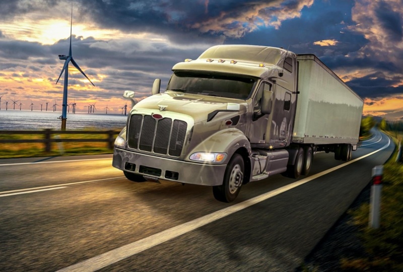
17. 16 Final Touches & color grading: All right. We are here
into the final stages. What we're going to
do next is to create a bloom atmospheric
effect in this area, and then we can go to
the color grading. That is the last thing. Let's start by creating sw
solid color adjustment layer, and then of course, it will not be clipped
to this layer. Let's change its color
to somehow saturated, maybe 50% saturation orange
color, something like this. Then let's put it behind
everything maybe here. Let's change its blending
mood into screen. First control I to invert
the mask and we can do this glow effect by simply using the soft rounded
brush with a low flow, something like 30% and make the brush big,
something like this. Maybe let's decrease the
flow, something like this. We can create a glow
effect around the car, which will separate it
from the background and it will put the focus on it. Some glow effect like this, maybe this is too much, we can race it from some parts. There you go. Let's
see here is before, and here is after.
That's very nice. Next we can put some lens flare
effect from this picture. Let's bring it and put it
above everything at the top. Let's change its blending
mode into screen. Control T, make it big, make this very big. I just want just a tiny touch of the lens Something like this. Maybe press control to desaturate it because
it's very saturated. Something like this would be. Maybe we can mask this part out. One final thing I like to do is to select everything
and press control T, and I think we can rotate
the canvas a little bit. This gives the visual
more interest. It's something called
Dutch, I guess, angle, which is when the horizon line is now tilted a little
bit, has some angle. It's not completely horizontal. This gives it more interest and look better. That's perfect. Now, let's go to color grading, the most exciting
part in which we bring everything together
to get the final look. So we can do this using
camera row filter. But what I like
more is to create an empty group and
put everything on it. And I'd like to make
color grading using adjustment layers because
that gives me more control. If I want to edit
anything into the car, for example, it will be applied the whole
image automatically. So I start with creating color balance adjustment layer and start to tweak the color. Start with what I think it's settled down and I already know, which is the highlights. I'm sure that I wanted to look like more yellowish and reddish. That's why I started with it
because I'm not sure what I like most in the
mid and the shadows. But the highlights,
I wanted to look warm and somehow reddish
yellowish colors. That's why I started
with the highlights. Then let's go to the shadows. Maybe the shadows
needs some Yeah, I like how it looks
when adding reds. Let's add some reds. What about greens or
magenta? Let's see. I guess Magenta gives
it a good look. Maybe some yellows or blues? No, the yellows are better. Just preference. It's just your taste, you know, something
like this is okay. Maybe the highlights
is very reddish, so let's decrease this
red a little bit. That's okay. What
about the midtones? I guess the midtones should be somehow neutral salt,
increase the greens. Maybe give it a
touch of something. And maybe a touch of blue. So let's see here is before and here is after it's
now more crisp. And next, I guess we should
give it more contrast. So I'll do this using brightness contrast
adjustment layer. So let's just give it
contrast like this. What about the brightness? Yeah. I guess this
looks nice as well. That's awesome. The next part is I'm going to shift the highlights
and the mid tones. But this time, I'll
do this using curves. Let's just go to
the red channel. Let's add to the highlights. I'm just adding a
little bit of C. What about adding some reds
into the shadows. The great. Let's go to the greens see
some greens to the highlights, and some Yeah, some
agenda to the shadows. Let's go to the blues, adding some maybe a
little touch of yellow, what about the shadows? Maybe. I should add some yellow. Let's see here is before everything color grading
and here is after. That is really nice. All right, guys. That
wasn't it. I know. But if you want to
create amazing results, you need to put a lot of effort. There's no shortcuts. All the AI tools, the automatic tools
are okay, are good. They are increasing
your efficiency. But if you want
ultimate results, the best results, you need
to practice a lot actually, and you need to know the
tools, the techniques, how to create
everything manually because you will have to do things manually.
Believe me, guys. See you in the next
tutorials, peace
 Nour Art, Digital artist, Youtuber