Transcripts
1. Introductory Video: I don't know if
you've heard of AI, this thing called AI, but
during the last years, AI has completely transformed all of these different niches, all of these
different categories, anywhere from healthcare
to communications, the way that we interact
with each other, the way that we
interact with software, AI has completely
changed the scene here. Now, one of the niches, one
of the categories that has completely changed
and completely benefited from AI is
online graphic design, illustrations, and
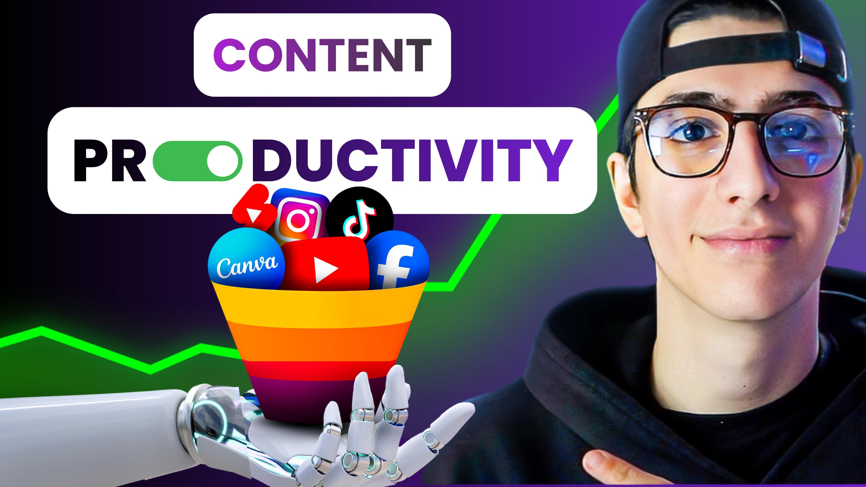
anything related to a creative career online. So I created this course
right here to talk about eight different artificial intelligence tools that have completely changed the
way that I work in both my personal
and professional graphic design works online. This course is aimed
for creatives that are not exactly professional
graphic designer illustrators, and they
don't exactly know how to work on the professional
software out there, and they want to maximize their productivity by leveraging
those eight AI tools. So the A tools we're going
to be analyzing are, of course, TAUPT Mid journey. We're going to be talking
about Dali two, Chroma, Font Joy, Auto draw, Let's hands, and remove dotbG. Again, all of these
tools will be so beneficial and will streamline
your creative process in a way that you
will literally not believe how you weren't been using a lot of
these tools before. So thank you much for I'm sing the first lesson
of the course.
2. AI Tools for designers class project: Denlemen, thank you very much for enrolling in this course. Before we start with
the first lesson, I'm just going to be elaborating
on the class project that you're called to complete
by the end of this class. Now, the class
project involves you submitting in the class
project description below the title of the design project that you're working
on and how you will be utilizing each
and every one of these A tools that
we're going to be elaborating on in this
course right here. So, for example, you're going to say Fon Joy and I'm
going to be using Fon Joy for that or Atojoy I'm going to
be using Autojoy for. Right. So again, mention
the title of your project, right, of the design
process you're creating, mention how you're
going to be utilizing each artificial
intelligence tool and share your project in the class
project description. Now, we'll be personally
reviewing all of these projects, and just going to be
a cool way to inspire both me and other
students of the scores to follow the instructions
in the scores and actually utilize those
AI tools, right? So, thank you very much Sing the first lesson of the scores.
3. Using ChatGPT for your Projects: So welcome everybody
to the course in which we're going
to be analyzing and discussing about artificial
intelligence tools designed to aid the
work of designers. My name is Lambros
and I'm going to be the instructor of the course. And we're going to dive
in this first lesson, we're going to start the course by analyzing an amazing and a very widely known artificial
intelligence tool, hA GPT. Now, the main function
of HAGPT for designers, as we're going to be discussing in this
lesson right here, is going to be on brainstorming
actually creative ideas. So pretty much, in this lesson, I'm going to start
by analyzing what is HAGPT and what
is their function? What is a do we
input information on this artificial
intelligence model and how do we get the results
that we want? Then we're going to dive
into the applications of HGVT especially for designers. And finally, we're
going to close this lesson with a test, a real life test in which
I'm going to be firing up AGBT and I'm
going to be seeing. And I'm going to be
demonstrating on real time again how designers can utilize the power of JGBT to brainstorm creative ideas. So welcome to Discourse, welcome to the first Lesson
of the Scorse. And let's launch
this presentation. Welcome again to this
presentation on HGPT which is one of the most widely known
artificial intelligence models. So let's start this
presentation by analyzing what is HGPT. So as we said, HGPT is an artificial intelligence
language model which is developed by OpenAI. And OpenAI is the company
that have constructed HAGPT. So JBT is proficient in natural language
understanding and generation. This means that HGP can
understand the inputs, the language that we give it, and it can generate
back responses. So also, HGPT can engage in human like conversations
with users, offering instant and
coherent responses to a wide range of
queries and prompts. This is extremely important for us designers because
it all comes down into the information
that we give HTPT to get back the
information that we want. This is what a
language model is. This language model,
HGPT is all about giving the correct information
to the program to get the correct information
out of the program. So we're going to be
discussing about what a prompt is because
this is, of course, of key importance if we want to utilize the whole power of aGBT. Now, HTP is trained on vast
and diverse text data, and it enables it to provide valuable assistance in various fields,
including education, research, writing,
and problem solving, another field that's
going to be very helpful in this part. Of our course is going to
be creative brainstorming, which is the field that we're
going to be discussing and analyzing at the
end of this lesson. Okay, so HAHPDs capabilities
make it a versatile tool for students and researchers
revolutionizes communication and
knowledge sharing. So obviously, we share
knowledge with HAHPT again, it all comes down to the input and the prompts that we give. So this is a very
important slide because hachPT can engage in human life
conversations with users, offering instant
coherent responses to a wide range of
queries and prompts. So the key word here
is the word prompt. So now we need to analyze what a prompt is in
order to understand how to utilize
again the power of JAGVD so what is a prompt? Right here, you can
see the message bar of HGPT and pretty much how this Artificial Intelligence
program works is that we input something
as a chat, right? As a message, we write something
there, we press Enter. This goes into the chat, and it is analyzed by the artificial intelligence
algorithm, right. And then text human
like responses are generated again by this
artificial intelligence model. So a prompt is pretty
much what we input, the information that
we input to HAPT. So ha PGPD prompts are input
queries or statements given by the users to engage in conversations with the
artificial intelligence model. Okay, it is very
important for you to remember that the prompt that we give to the program is going to
be directly proportional, okay to the information
we're going to receive. So, the more targeted that
we are with our prompts, the better information
we're going to receive and the more we're going to
utilize the power of HAGPT. So prompts can take the form of natural
language questions, incomplete sentences or
specific instructions, which is going to be guiding the artificial
intelligence response. Okay, users can use prompts
to seek information, ask for explanations or
generate content just as we're going to be
generating brainstorm ideas, okay, tailored to
their specific needs. So this is a very
important slide because our specific needs, in this case, is going
to be brainstorming creative ideas for designers. So this is exactly
what we're going to be asking JTBTi generate content. Now, as we said, the
quality and relevance of the AS responses are influenced by the clarity and specificity, of the prompts provided. So this could be the
most important sentence of this whole
lecture right here, okay, the quality and relevance
of the AI's responses. So the information that we're going to be getting from the AI are influenced by
the clarity and specificity of the
prompts provided. So they're heavily
influenced by the prompts, okay, that we are going
to be giving HGBT. So it is very, very important, okay, to give the
correct prompts. So those are some
tips to remember. As we said, JTPT
is context aware. This means that it can
retain information from previous interactions within
the same conversation. And as we're going to see,
once we launch HAHPD, when we launch this program, every time that we start a new conversation
with the program, it's going to pop up
as a different window. This means that each window in each conversation we
start with JTPTJHBT can actually recall all of the previous chat that we have within again the
same conversation. So we don't have, again, to say things twice
or three times. I remember so we can keep again a dialogue type of
chat with HAHBT. Now, another thing to
remember is that the prompt influences hugely the responses
that we get from GBT. So I really, really want to focus on this point right
here because it is very important for you to
understand this if you want to understand HAGBT. So again, the way the prompt is framed significantly
impacts the AIS output. Okay, users can find
tune the responses they receive by adjusting the wording and tone
of their prompts, ensuring more precise
and tailored answers. So I think by now, you
understand how important it is to give the correct
prompts to HGPT again, to receive back the
correct answers. Another thing to remember
is that we might have potential biases
in the response, and this is pretty much the last thing that I want
you to remember when it comes to HGPT that it
is a biased program. It is an artificial intelligence program designed by humans. Okay, and it might have, okay, those artificial
intelligence powers. But again, it has been
designed by humans. And as it says here, despite
its remarkable capability, HGPT may sometimes
exhibit biased responses, Okay, due to the data
that it was trained on. It has a huge dataset, a huge algorithm of
data that it grabs data from and generates
those human like responses, but all of those data were input there by people so again, keep in mind that it has
potential bias in the responses. So users need to be aware of this and carefully
frame prompts to avoid reinforcing any,
again, existing biases. This is not going to
be that important for us once we're just going
to use it to generate, again, creative ideas when
it comes to designing. So again, what are the applications of
this tool in design? How can designers benefit from this artificial
intelligence program? Okay, the answer to
this question is that JachPT is amazing and actually, as we said, creative
brainstorming. So to put this to the test, to actually utilize and see in front of our eyes
the power of JachPT, let's run this test
scenario right here. So I want you to
imagine that you're a designer working for a consumer goods
company, for example, and you've been
tasked with creating an innovative and eye
catching product packaging, Okay, concept for a new line
of organic energy bars. Let's say that this
is the test scenario. The company wants
the packaging to convey the products
health benefits. Okay, eco friendliness and appeal to a health
conscious target audience. So we're going to be
using JAGVT to brainstorm and generate creative ideas for the product
packaging concept. Okay, and align with
the company's goal. So we have a very
specific goal that the company wants us to
deliver as designers. So let's now fire HAGBT and actually showcase in front of your eyes how I would do it. If, for example, I was in
this test case scenario. So I'm going to see you
once we launch HAGVT
4. Hands on: ChatGPT: Ladies and gentlemen is
the interface of HAGBT. So I'm going to provide you for a brief introduction
to what we see, and then we're
going to dive into the test case scenario we discussed in the
PowerPoint presentation. So the first thing is that
on the left side, okay? So right here, we have all of the different conversations
that I have opened with JGBT. And as we discussed
in the PowerPoint, again, slides, HGPT
is context aware. This means that in each
and every single one of those different chats that
I have opened with JGB, HGPT recalls all of
the information that I've provided and again,
each different chat. So don't Okay. So again, in each different each and every single
one of those chats, it remembers what we
have been talking about. So we can scroll down to all of the different chats that I
have with AHP as you can see, I utilize this program
a lot in this side, and we can either start a new chat from
here just as I have done in this chat that I'm going to be demonstrating in the
fire right here, or we can just
close the side bar. So for now, let's
close our side bar, and let's move this to
the middle of our frame. This is the new chat that
I started with AHPT again. For this test case scenario. So let's see, and let's review the first prompt that I gave. So the first thing is
that I typed right here. Okay, this is the search bar in which we type our prompts, and I typed this big prompt, which is an information
based prompt. This means that I gave CHATPT the correct information
that I want again to receive the
correct information from this artificial
intelligence model. So I said, Imagine you're
a designer working for a consumer goods company
and you've been tasked, Okay, with creating
and innovating and eye catching
product packaging. Concept for the new line
of organic energy bars. The company wants
the packaging to convey the products
health benefits, eco friendliness and appeal to a health conscious
target audience. Now, as you can see, I
didn't ask anything. Okay, back from HVD I just
input this information. So I pressed space to enter this prompt, and
this is what I got back. So without even asking for it, it gave me a title, a concept, and some color palettes, for example, some imagery,
eco friendly materials, window cutout, interactive
elements, all of that stuff. I gave me some
predetermined information that I haven't even asked
for again for this product. So let's go ahead and
analyze what HBT told me. So, again, the
overall title would be Nature fuel organic
energy bars again, and the subtitle would be
Revitalize your Adventure. The concept embraces
the challenge of designing packaging that resonates with health
conscious consumers and captures the essence
of organic goodness. Okay, so then again, it goes and gives me suggestion for a Earth
inspired colored palette. Okay? So utilize a coming
and earthy colour palette that reflects the organic
nature of the product. Incorporate shadows
of leafy green, warm brown and subtle hints
of variant oranges and yellows to evoke the energy and vitality that
the bars offer. Again, nature infused imagery feature captivating
imagery of lush forests, okay, rolling hills
and sand dapped meadows to align the product with the beauty of
the natural world. Illustrations of organic
ingredients like nuts, seeds and fruits can highlight the wholesome composition
of the energy bars. So as you can see, it gives really interesting feedback on what we suggested and
what we asked for. And this all comes down to the quality of the
prompt that I provided. I provided a great prompt, Okay, with all the description and the information that HGPT needs, again, to give me those answers. So after that, after suggesting
me all of that stuff, so QR code for
sustainability info. Okay, seal of organic
certification, adventure driven design. It says, incorporate
subtle elements like compass icons or winding paths to evoke a sense of adventure. This ties into the idea
that the energy bars are not only a source
of physical vitality, but also a companion for active and exploratory
lifestyles. So minimalistic back design, all that stuff, and then
gives us a conclusion. Merging natural imagery,
sustainable materials, educational elements, and
a sense of adventure, the nature fuel organic
energy bars packaging concept will stand out on shelves, Okay, resonating deeply with health
conscious consumers who value both their own well
being and the planet. Okay, so after that, I actually asked Judge
B to generate, creative ideas for the
product packaging concept that align with the
company's goals. So those are, again, all of the creative ideas
that they generated. Okay, after all
of this big text, okay, the aligned with
the company's goals. So it says, plantablePackaging,
for example, design the packaging
using biodegradable paper infused with wind blower seeds
or DIY nutrition tracker, Eco or art collaboration, Adventure inspired
packaging series, Oiga inspired
wrapping experience. So all of those great ideas have been brainstorm with HAHPT with those two very basic
and simple prompts. And again, because
HGPT is context aware, as you can see, I wrote right here with
the company's goals. I didn't have to restate all of the company's goals
because HHVD knows the company's goals from the
first prompt that I input. This is what means
when we say that JBT is context aware, right? So those are all of
the different again, Packaging concepts
that GPT suggested. And those are many. Those are more than 11 packaging concepts. So, for example,
outdoor adventure map wrapper, nutritional
puzzle packaging, natural fiber pouches, augmented reality discovery, sustainable, collectible tints. Okay, all of that stuff
are very, very cool. And it would take
a lot of time to brainstorm this with a team, for example, people, and it wouldn't be of
that high quality. But look at how easy
it is with JAG PT. So after all of
that, I wanted to focus deeply into
more specific things. So it said, Let's focus more
on the color suggestions, for example, for the packaging. And it says, absolutely. Color plays a significant
role in conveying the desired messages
of health benefits, eco friendliness, and appealing to a health conscious audience. Here are some color
palte suggestions that are aligned
with those goals. So, for example, it's
suggested to use as colors, fresh greens and airthons. Okay, so shades of leafy
greens from vibrant to muted, evoke a sense of
freshness and health. Compelling these greens warm complement these greens with warm air tones
like sandy browns, okay, soft terracotas
and natural wood colors. Okay, then harmonious
blues and greens, sunrise and sunset hues, okay, neutral with pop up vibrant.
Again, all of that stuff. So how color that and then I ended this prompt with saying, What do you think would be the optimal size for this package? Okay? So we brainstormed
up until this point. Okay, creative ideas
for product packaging, creative ideas for
color suggestions, and why it also
suggested those colors. So we didn't even have
only color suggestions. We also have, the reason behind why HTPD gave us those
color suggestions. Okay? And finally, I asked for the optimal size
of this package. So let's see what HTPD answered. It says the optimal size
for this package of your organic energy bars will
depend on several factors. Including the size of
the bars themselves, the desired amount of
product per package, the packaging design elements, and any specific goals
you have in mind. However, I can provide some general
guidelines to help you determine a suitable size. So the first one
is the bar size. It just consider the dimension
of your energy bars. The package should comfortably accommodate the bars without
excessive empty space, which could lead to shifting
during transportation. So again, the product quality. This also determines the
size of the packaging. So decide how many energy bars you want to include
in each package. Common options are single bars, packs of two, or
even variety packs. So all of those different stuff. So JACPT closes by
saying, ultimately, the size should strike a
balance between practicality, aesthetics, and the
values of your company. It is a good idea to
work closely with your design and production
teams to determine the most suitable size for your product packaging content. So this ladies and gentlemen
was how briefly and how easily with three or
four very basic prompts, we were able to brainstorm all
of those different aspects again of the design process with JAPT and this
is pretty much, again, how to
utilize in its 100%, again, purpose JAD GPT. And it all started with
this amazing prompt that we inputted in the
beginning of our chat. Trust me, if we didn't have this amazing and very
informative prompt at the start at the
beginning of our chat, the answers that we
have gotten from SHPT wouldn't be the targeted
and wouldn't be so good. So again, you can
take something from the station right here
is that the amount and the quality of your prompts are directly proportional
and directly related to the amount and
the quality of information you're going to be getting
back from hat GBT. So this concludes our
real world example on how to utilize the
power of hat GBT. So in the next lesson, we're going to be discussing
about a very, very interesting artificial intelligence model
for designers, which is called Mid journey. And what Md Journey
is, and we're going to be discussing
obviously about that. In the next lesson, it is an artificial intelligence
image generation module. So more information on that on the second lesson
of the scores.
5. Midjourney and its Features: Come back to the second
lesson of the scores. I'm very happy that you're here. And in this lesson right here, as we discussed in the final
part of a first lesson, we're going to be analyzing this amazing artificial
intelligence tool called Mid journey. Now, throughout the second
lesson of the scores, you're going to be seeing
and listening to me, compare Mid journey with Dali. And the one thing that Mid journey and Dali
have in common, and you're not familiar with
either Mid journey or Dali, you will be familiar
in the next lessons. But the one thing that they both have in
common is the fact that those image generative,
artificial intelligence models. So AGPT is one thing. It is an artificial
intelligence language model, and Mid journey and Dali and some of the other programs
that we're going to be analyzing are image
generative models. So let's dive into
what Mid Journey is, how we can utilize its power as designers and what are
its main features. As we discussed in the
first lesson of the course, the outline of this lesson is going to be that
we're going to start with some basic general information about mid journey. Then we're going to dive deeper
into its applications for us designers of how
we're going to utilize its power and its
potential as designers, and we're going to
end this lesson with a test case scenario after we
have launched this program. So welcome again to this lesson, and let's dive into the
PowerPoint presentation. So let's start by analyzing
what is mid journey. Now mid journey is
the most common artificial intelligence
based image synthesis and generation website. And again, it might
be a website, but as we're going to see in the next slide of this lesson, it is actually a
discord server which has build in artificial
intelligence bots that again, visualize the prompts
that we give it. So this service allows
users to generate images based on
textual descriptions, creating a wide range
of art forms, again, from realistic to
abstract styles. This is a very common theme
in artificial intelligence. Art forms, again, we can
create pretty much anything we input the prompt any
prom that we input, we can create it
as a visual image. So again, a huge range of art forms from realistic
to abstract styles. Now, Mid Journey's
Artificial Intelligence is especially known
for its high quality, well structured and
detailed images. And this is the first point of comparison between
Mid journey and Dali. Okay? Mid journey creates
a bit of higher quality and better structured
images than Dali. More details into how to create detailed images in the
final lesson of the course. Okay, so when it comes
to high quality images, Mid journey is known for
producing well structured, defined and realistic images, making it a strong
again competitor among other artificial
intelligence tools such as Dali and
stable diffusion. So Dali, as we said,
and stable diffusion, are other artificial
intelligence, tools that create images. And those are some
examples of, let's say, some imaginary states and images that have been generated
with mid journey. So, in this case, right here, you can see that this is the
image that was generated, and we can actually visualize
and think of the prompt that was used again to ask
for this image right here. So the prompt could
be, for example, generate an image of let's say, a house in an imaginary
world, again, with flying fishes, and all of it was
enclosed in a bubble. So those type of prompts again, create those type of images. Another thing with mid Journey is that it creates very
high image resolution. So this is again an image
of very high resolution. You can see the whole
file right here, but mid journey can generate images with resolutions
up to again, full HD, right, full pixels, allowing more space and detail, again, in the images
that have been created. So this is actually a
huge pro of mid journey, again, when compared to
Dali and stable diffusion. Okay, another thing is that Mid journey provides
a premium model. And what the premium model is is pretty much that
you have a free trial, and then if you like
the free trial and you like the free opportunities
that it provides, then you can upgrade
to the premium model. So this is, again, an
asset of R Journey. Now, it offers a limited number of free image
creations, as we said, allowing users to
test the service before committing
to a paid plan. So obviously, it provides and it requires power in
order to function so. Obviously, they charge us after a certain amount
of time of usage, just like most artificial
intelligence programs, and paid plans offer
faster processing, additional features, and
greater imaging capabilities. Okay, in addi to that, it is a fairly easy to use platform. We all know how
to use this coord and even if you don't
know how to use discord, you can pretty much very easily learn how
to use this cod. We're going to go through the steps in this
sts right here. So mid Journey works
through again, discord, a widely
used chat platform, and users can interact with the artificial intelligence
but using simple commands, making it accessible
even to those with absolutely no
coding experience. So this is a huge plus. You need absolutely no coding
experience to interfere with mid journey
through their discord app. Finally, we have a
point in customization, which is a huge thing
in mid journey, provides a variety of
commands and parameters to help users fine hue
their image creation, and this is going
to be especially very important for us designers, allowing for grading control over the final results.
So this, for example, Is an image that has
been manipulated many, many times before it reached
this result right here. So we start again with
a set image, and again, we fine tune the results
that we get through the Discord app to reach
our desired outcome. Now, the final thing with Mid
Journey is that Mid journey has a very, very
active community. The Mid Journey Discord
server provides an active community where users can share their creations, ask questions, and
receive help from both other users and
the Mid journey team. And the Mid journey team is divided into
two subcategories, which we're going to
be analyzing again in the hands test case
scenario of the lesson. The Mid journey team
as we will see, okay, it's divided into two teams
the Mid journey, bots, artificial intelligence
bots that create all of those images after we
input again the prompts and the actual moderators of the discord server to keep things as moderated as possible. So again, this is a very,
very cool image that I found that was generated
again from mid journey. You can see in this
pink atmosphere planet, those elephants that have
grass leaves on them, and they look
realistic, but you can see that it is from
a fantasy world. So I found this very,
very, very interesting. So the question is, how can Mid Journey be
used by designers. Okay? We can obviously think
of many applications of Mid journey because it is obviously an image
creation model, we give it input,
we give it proms. Again it designs images. So there are many application
actually in designers. So let's put it to the test. Okay? Let's say that this
is our case scenario. You're a graphic designer, okay, called to create a letter
based logo for a company. So let's actually put, again, mid journey to the
test with a logo, a letter based logo
for a company. Okay, so let's see how we can utilize the power of
mid journey to do so. This for example, is a logo
based on the letter G. Okay, so the first step would be
to create a discord account. You're going to need a discord
account in order to access again the artificial intelligence
model of Mid journey. After you go ahead and create a Discour account
and you actually can create a Discour account
through Mid journey website, as we're going to see in
this lesson rate here, then we're going to join the
Mid journey Discord server. This is a server with more
than 1 million users. So this is a very, very,
very known server. Okay. After that, we're
going to access a channel. So inside the Discord server, as you can see, we're going to have many
different channels. So once we're
inside the servers, we're going to look
for the channels with the name newbies. Okay? This is where we can type actually commands, and when we say comds again, artificial intelligence,
we refer to prompts, and those prompts will be transformed into
images later on. So again, those commands
will act as prompts, and will give us the results
that we're looking for based again in the creation of
this letter based logo. So for example, the
command that we would write is to start
generating an image, okay? Type the command slash image. So after slash image, as we're going to visualize
again in this case scenario, it's going to be what's going
to give us a space in which we're actually going to describe
the image that we want. For example, in this
case right here, I typed slash image, beautiful sunset
on the beach with pondries and this is what I got. So the AI processes
again your request, I processes your prompts, and it generates an image based on the description
that you provided. So the final step out of this is to interact
with the results. As we said, we can
tweak the results to fine tune them as
much as possible. So Mid journey will present multiple variations of
the generated image, and you can choose to
generate new variations, refine an existing image, or scale up a selected image
using the available buttons. So enough with the talking, I think there was a
fair introduction on Mid journey and
its capabilities. Now let's move into
actually launching the discord server and navigating
through this ecosystem. So thank you very much,
and I'm going to see you in the second part
of this lesson.
6. Hands on: Midjourney: This ladies and gentlemen is the website inside Mid journey. And as you can see, in the
top left okay of the website, we have all of those tabs. First of all, you get
the logo right here, home, community showcase,
manage sub health, help and frequently asked questions about
career notifications, and our again, profile here. So before we dive into
the discord server, I just want to show you
something very, very cool. In the home page of the
Mid journey website, you can see all of
those images that have been generated
from other users, again, using artificial
intelligence. And the coolest part Okay, from this and you can
actually navigate through them from recent ortop. So let's press stop here, okay? And the coolest part of this is that you
can actually also see the prompts that
were used and were asked to generate those images. So, for example, here, you can see that this is
the Da Bora system, Yoda teaching LHi Walker, okay. And all of those again
different image. So this is one of
the most top, again, created from top graded images from the community
showcase of Mid Journey. So this is the internal glow. This is called internal glow. This, for example, is the
flatulentia clonaris, right, or perhaps
imaginary creatures. So if you go to recent, you
can see that this, okay, the input that was given into the artificial intelligence
model to generate this image is 50s style women comic style,
Frank Miller style. And this is what was generated. Al right here,
carry me Home with trusted balloons,
colorful surrealism. Or this a charcoal
portrait, okay, drawing of Jesus Christ with a crown of thorns
by Jeremy Mann. Or a gorgeous ghost
in the chain Giza, esoteric coded overlay.
So how cool is that? It can literally generate
anything that you ask for or a vector illustration
of a beautiful Indian woman, okay, fetching water
from the pond, close up shots, Babu style. So we can either describe what we want
to have in the image, we can describe the type
of drawing or the type of picture that we want
and the style of drawing. So let's see this is also very interesting.
This is interesting. Here, we say a wood sculpture, a heart shape in the palm of a raised hand odd
fellow's symbol. Again, or here. Black animal male with
braided hair in a ponytail, wearing dark lens shades, wearing Japanese style
street clothing. So how cool is that? So we can go through this for ages. This is also
very interesting. From a detail of an
antique compass in a sailor's hand to a wider
view of the sailboat, okay, of the sailor on a boat in the middle of and it just
continues with the prompt. So you can see all of those
were generated with AI, and this is a moralistic one. Okay, so you can see, craft
a top down photograph that captures the pristine
beauty of sunnyside eggs, their their yolks glistering. So again, those are
just extremely glow. I found them very, very
amusing or this picture of crying Donald Trump in orange prison overlays,
again, court of Law. Okay, so once we
go to home, okay, you can see that
this is my profile, we can join the discord
to start creating. And once we press, join the
discord to sound creating, start creating, we navigate it through the actual
discord server. So this is the discord server, and we have all of
those different communities and rooms to enter. So we can either
press chat again to go to the general
discussion which we can share for advice if you have obviously permission to write
here or we have a prompt chat again to chat
with prompts and actual bots. So what we said, we have
community updates and statuses. So all of those different
community pages that we can join and what we said in our presentation in
order to generate, again, an image, we go
to the New Biz room. So you either going to go
to New BIS 37, Ub seven, UBI 67, NUBIS 96, 97, all that stuff. So let's go to New
BIS, for example, 97. You can see that people
generate inputs, right, people input prompts, and the
bots give us the pictures. Okay, so all of those are
different pictures that we can ask and we can
press to view better. So, for example, right here, it said someone entered
this prompt right here. Unique news ten
Brostl characters. So those are ten new
Brostl characters that were generated from this prompt. Now, as we said, in order
to generate a prompt, Okay, on mid journey, what we're going to do
is that we're going to go into this bar right here, press slash, and
then from slash, we can ask all of those
different things. So describe, blend,
ask, fast, help, and what we're going to
press afterward is image. Okay, so slash image. Let
me do this one more time. Slash. Image.
Imagine, I'm sorry. I said, create images
with Mid journey. And this is a prompt. So
we press slash Imagine. Then we have the
prompt, and this is where we type a prompt. So in this case, we
would type a logo, okay, logo of a OFE company. Okay. Based on the letter, let's say, G. Okay, or we could say the letter A. And then we press space. Now, in this case, I actually can't
utilize the power of this Amazing official
intelligence program because I have a
free trial and I haven't paid for
the full version. But to get the point, if you have the full version, if you have the full version, we could generate images
like the Son here or pretty much any image
that we ask for. So for example, those are some amazing images that
have been generated. We went through them
in the beginning, and you can get actually great
ideas before you purchase the full plan of Mid journey from these images right here, different prompt
ideas to generate the best and the best images. So this pretty much
denen concludes the website navigation
of Mid journey. So now that we're done
with Mid journey, and we've analyzed the first artificial intelligence
image generative model and tool of the
scores site here. It's time to a comparison
of mid journey, right? And this is another
tool that people very much compare with Mid journey. And this is Dali too. So in the next lesson,
we're going to be actually analyzing the power, the main features and
a test case scenario of how to utilize the
power of Dali, too. So thank you very
much. I'm going to see you in the next
lesson of the scores.
7. Generating AI Images with DALLE-2: So now we discussed
about mid journey, and we have a basic general
first view into what is an artificial intelligence
image generative model. It is time to move to perhaps the most
common and the most important artificial
intelligence image generative model out
there. And this is Dali. And more specifically, in
this lesson right here, we're going to be
focusing on Dali two, which is the second most
improved version of Dali. Now, what Dali is is
pretty much, again, a image generative artificial
intelligence model. So pretty much input,
again, prompts, and we get images back with two very basic and very important differences
from Mid journey. The first one is that Dali is
developed by OpenAI, again, this company that has developed
AGPT and is very, very, very ahead in the artificial
intelligence game. And the second one is that Dali, more specifically Dali
two also gives us the opportunity to
further manipulate the images and further
fine you the images that have been generated using
artificial intelligence. So this lesson, again, ladies
and gentlemen is going to follow the very basic guide
of all of the scores. We're going to start with some
general basic information on Dali it is, how can it be utilized
by designers, and then we're firing up this artificial
intelligence program. We're generating images,
and we're going to be fine tuning them
again using the build in fine tune again services that this artificial
intelligence model has. So welcome again
to the statin and let's dive into the
PowerPoint presentation. So Dali and Dali too, before we start with
this presentation, does this icon right here
remind you of something? This is the same icon with JGBT and this is
because OpenAI, again, the company that has
developed JGBT has also developed Dali
and Dali, too. So Dali is, again, the artificial intelligence
image generative. Again, platform of OpenEI
which has developed HGPT and is very heavy head in the Artificial
Intelligence program. So Dali is a generative artificial intelligence
technology that enables users to
create new images, again, completely
original images with text to graphics prompt. Again, those are text
to graphics prompts. GPT, as we said, is an artificial intelligence
language model, but Dali and Dali two is
a text to graphics model, so we input prompts using text and gives us graphics back. So functionally, Dali
is a neural network, and it is able to generate entirely new images
in any number of different styles as
specified by the user's prompt. So many, many
different styles of images can be generated
with Dali two. We can have paintings,
picture like images, sketch like images,
charcoal like images, all of the different styles
that have ever been noted in the humanity Dali and
Dali two can generate. So Dali was developed
by AI vendor Open AI, and first, it was launched
in January of 2021. So it is a fairly new
artificial intelligence tool. The technology uses
deep learning models alongside the JBT
large language model as a base to understand natural language user prompts
and generate new images. So this is actually very, very interesting with
Dali and Dali, too. Again, just like Open
AI owns JGBT and Dali, Dali has an incorporated inside language
processing model, so it has JGBD built
inside of it so it can understand the prompts that you give to it and
generate images. So it is pretty much JGB in steroids that can actually
also create images. It has a build language
model, obviously, because it needs to
understand the prompts that we give in order to
generate those images. And this, for
example, is an image that was generated with Dali. It is a cowboy riding in
the sunset with the source, and it is a very dynamic image. So as a generative artificial
intelligence technology, there are a wide range of possible use cases for Dali to help individuals
and organizations. And those are some of
those applications. So the first application of Dali is in creative inspiration. The technology can be
used to help inspire a creative person to
create something new. It can also be used
as a supplement to an existing creative process. So if you have something
in your mind and you can somehow communicate
it through a prompt, through words, Dali
can actually help you harness this creative
energy to create images. Dali can also be used in
entertainment purposes. Okay, images created
by Dali could potentially be used
in books or games. Dali can go beyond the
capabilities of traditional, again, computer
generated imagery. Okay, because the prom system is easier to use in order to
generate those graphics. And again, those graphics
are generated fairly fast. So this is also a
huge asset of Dali. In addition to that, Dali can
also be used in education. So teachers and educators can
use Dali to generate images to explain different
concepts that could be hard to
grasp just with, again, text or voice
to their students. So a teacher could actually use Dali to write something
that he wants his students to visualize
and make it easier for his students to visualize
it through Dali. Of course, Dali can be very much used in
advertising and marketing, and this is a very, very important niche
for us designers. Okay, so the ability to create entirely unique and
novel images can be very useful for
advertising and marketing. This can open new doors in the world of designing,
advertising and marketing. And obviously, Dali is very, very, very big in
product design. So a product designer
can use Dali, okay, to visualize something new just with the use of text, okay, in an approach that can be
significantly faster than using traditional computer
aided design technologies. So those are two very big points when it
comes to utilizing the paved visual intelligence
and Dali in design. The first one is that
it is very, very fast, and the second one is that due to the fact
that it is online based, those servers are
located online, you don't have to download
those huge programs in order to generate CGI, right? This is of extreme importance because you can run
Dali into very, very low CPI computers. Finally, a Dali can also
be used in art, right? It can be used by anyone
to create new art to be enjoyed and even be displayed. So let's talk about the
general benefits of Dali. What are the general
benefits of Dali? So the first one
is extensibility. Dali can help an individual
to extend an existing image by remixing it or by allowing it to be reimagined
in a new way, and we're going to
be diving to this. I'm going to be demonstrating this amazing function of Dali in the test case
that will follow. The second one is iteration. New and existing images can be iterated quickly with Dali, allowing users to generate
multiple iterations to images. You can upload actually
one of your images that hasn't been generated
with AI into Dali, and Dali can expand this
image again by harnessing all of the creative power of artificial intelligence
that it possesses. Okay, another benefit is
speed, and this is a huge one. In a very short period of time, often in less than a minute, Dali can produce an image
from a simple text prompt. Okay? Speed is of
key importance, especially if you're a
designer and you're on a very rough again time frame
to deliver what you need. Customization is a
big benefit of Dali, as we said, because
based on a text prompt, a user can create a
highly customized image of really anything
that can be imagined. So this is extremely cool. And, of course, accessibility
is a huge plus of Dali. Okay? Requires natural
language text, and it is relatively accessible to users and does not require any extensive training or
specific programming skills, which is a huge limiting belief for many
people that want to dive into utilizing the power
of artificial intelligence, but they're afraid because they think that you're going to need some programming
skills to do so. So now let's move into actually discussing about the limitations of Tali because Dali
obviously has some benefit, but it also has
some limitations. So the first limitation
of Dali is copyright. The issue of copyright on
image creating by Dali, as well as whether
it was trained on copyrighted images
remains a concern, right? Because Dali is created by
Open AI, and as we said, open AI has also created HGPD, but it is biased and it
is created by humans. So this is a thing that
we need to have in mind. Also, the legitimacy of the generated art is also a thing that we need
to have in mind. There are some, okay, that also question the
legitimacy and ethic of artificial intelligence
generated art and whether it displaces humans. So keep also this in
the back of your head. In addition to
that, also, dataset is kind of a limitation of Dali. Even though Dali was trained
using a large dataset, there is still vastly more data for images and descriptions
that is available. Such a user prom can
potentially not generate an intended image as the model lacks the foundational
information. So again, Dali datasets and Dali two datasets are not that huge. They are large, but they could
be improved in the future. Some other limitations
could be also realism. Okay? So as we said, Dali two has dramatically improved the image quality
of generating images, but some images can
still have quality that doesn't make them look
real again for some users. So this is an
example of an image. It was prompted to look
kind of pop artsy. But again, we have a
problem with Dali that can't create that
realistic images. And obviously, the
context is an issue, as we said, to get the
right image in all of those artificial
intelligence platforms. We need to have a
clearly defined prompt. If the prompt is too generic
and lacks any context, the image generated by
Dali may be inaccurate. So this was the
introduction to Dali. I think that now
it's time to put Dali and Dali to to the test. So let's take this
case scenario. Let's say that you're
a designer called to design and create a
logo for a company. Okay, and we have those two
descriptions for logos, and we want to utilize
Dali to generate logo designs based on those
people's descriptions. So the first description
is that we need a modern minimalist logo for a tech startup that represents innovation
and connectivity. And the second
description is we want a playful and vibrant logo
for a children's toy company, featuring a friendly
animal caracter. So let's see how Dali
and Dali two can put up to this test in the
next part of the slash.
8. Hands on: DALLE-2: Come again to Dali
and Dali to website. As we said, Dali and Dali
Do are powered by Open AI, and you can see their
logo right here. And the website is pretty
much as basic as it gets. We got this search
bar right here, and this is going to
be the prompt bar when we're referring to
artificial intelligence. And in this prompt bar, we
actually input our prompts. So as we said, the first prompt would be
in this page right here. We need a modern
minimalist logo for a tech startup that represents innovation and connectivity. Okay, and I press generate. Okay. And once you pretty much enter the prompt
and press generate, you get those four images. So in this case, again,
a minimalist logo for a tech startup represents
innovation and connectivity. We got one, two,
three, and four, and those were the artificial
intelligence suggestions again for this prompt. Now, we're going to take an image of those
that we like more, and this is pretty much how
we find tune using Dali. We take one of those images. Let's, for example, take this one right here that I like more. It's called McraNRk. This is how he wanted
to name this company, and we can do three
to four things. The first one is save
the image, obviously. The second one is
share the image, and the two more things that we can do with this image to
manipulate it even more, they're very, very,
very interesting. So we're going to
start with edit the second one is variations. Start with edit. Okay, the
first thing is that we can actually detach some
aspects from the image. So, for example, we can
erase these and we can ask to generate something else
in the spot of those two. Or we can erase these
three, for example, and ask for this program to
generate something else. Okay, we can pretty much
decrease the size of this tool also from here or increase the size of this
mask tool from here. We can also undo our spots from this undo or
redo part right here. Now, the next thing we can do is to add a generation frame. We can add generation
frames here, for example. We could ask generation
frames here, and we could ask, okay, for it to generate something for us in
this generation frame. So let's ask for something
in this generation frame, and I'm going to
ask for, let's say, a relaxing color to match
this logo, a press generate. And now it's going to
generate a relaxing color to match this logo right here. You can see this search bar. Okay, this bar right
here indicates the processing power
of Dali and Dali too. So let's see what
it comes up to. Again, this is the
interface of the program, and this is pretty much
what it came up to, okay? And this is not
cool. We can check the other variations from here. I'm going to give you a
huge and great example on how this works, this fine tuning tool works. In another example
because right now we're creating this logo, so it's that again,
approachable. So this was the first
example of prompt that we gave into Dali and
gave us those four logos. Now let's move into
the second example of logo that we gave to AI, which is a playful
and vibrant logo for a children's toy company featuring a friendly
animal character. So once we gave
this prompt here, those are the four
logos that we got. Okay, and those are
100% original logos generated from a
difical intelligence, so there is no cooperate issue
whatsoever in those logos. We got toys, toilets, toys, tony boy toy and toy toys. Okay? So let's say, in this case, okay, that I like out of
those four logos, this one the most, okay, I like toy toys. So what I would do if
I want AI to suggest me more logos exactly
like this one right here, I would press on the
variations button. And I actually did press
on the variations button, and it showed me
those five actually, and those four more variations from this image right here. So I press again this
image variations, and it gave me those
variations of the same image. And this is how we can actually
move into perfection and fine tune into perfection while utilizing the power of Dali
and artificial intelligence. So now we got more alterations
of this image right here. For example, we got this,
this, this, and this. So actually, very much like
this image right here. And if I would take it to add
it as a logo of a company, I would just click Save
right here and download it. So this is a brief introduction on how to utilize
the power of Dali and Di two to generate
original images and original logos for
those companies. We gave two companies example, one of an innovative
tech company and another one of a
toy company for kids, and now it's time to move to the next lesson of the scores to the fourth lesson
of the scores, in which we're going to be analyzing an amazing
artificial intelligence tool, which is called chroma. So thank you very
much, and I'm going to see you in the next lesson.
9. Khroma for Perfect Colors: Hello ban, welcome to the
fourth lesson of the course. I'm very happy that you're here. And in this lesson,
we're diving into a completely different artificial intelligence
tool designed, again, for designers than the previous ones
that we've analyzed. Up until this point,
we've analyzed hGPT the artificial
intelligence language model, Dali and Mid Journey, which artificial intelligence, image generative again, models. And now moving into
analyzing chroma. Now, one of the most important
jobs as designers is obviously to choose the correct
colors for our projects. We know that different projects need different colors
and different colors convey completely
different emotions to the customers of our clients. So it is of key importance
as designers to know which colors to
utilize correctly, which color palette
to choose based on different projects
that we are assigned to. So this is exactly where
chroma comes in. Pretty much. Chroma is an artificial
intelligence model that help us helps us collect the correct and choose the correct colors
for our projects. So this lesson right
here will have the completely same outline
like the previous lessons. We're starting out by
analyzing what is chroma, and features of Chroma and
how it can benefit designers. And then we're launching the
program to demonstrate on a real time test key scenario how to utilize this
amazing program. So welcome to the fourth
lesson of the course, and let's dive into
the presentation. Right here, ladies and gentlemen
is the logo of chroma, let's dive into analyzing
what chroma really is. So as we said, Chroma is an artificial intelligence
powered color tool designed for designers, allowing them to
quickly find and save color combinations and
palettes that they love. With the help of a
personalized algorithm, again, focus on the
personalized algorithm. Chroma learns which colors
users prefer and generates limitless palettes based on their preferences all within
inside the Chroma browser. And this is a huge
point because, again, Chroma and all the
other AI services that we discussed about don't
need to be downloaded. They're all web based. We can stream them online. So again, Chroma learns
which colors you prefer, and it generates limitless, so unlimited palettes
based on your preferences. Okay, so by selecting
a set of colors, users can train the
neutral network algorithm to generate
preferable colors and filter out the colors
that they don't like. So the more you
use Chroma, okay, this is the way that this artificial intelligence
model learns about you. You can input a prompt. Okay, but you can give information to this
program by using it. So the more you use it,
the better it becomes. This tool also provides
an infinite number of color combinations which users can view as typography gradient, palette, or as a custom image, and we're diving
this in the test case scenario
inside the website. So Chroma has learned
from thousands of popular human made palettes
across the Internet, so it has access
to a huge database to produce this great combos. So users can search and
filter the generator by hue, tint value, color, as well
as hex, and RGB value. So all of those values
can be tuned again to have the best
result out of chroma. In other words, if you're not sure which colors match well, Chroma can give you
suggestions to make your projects look better
and more balanced. It could be as simple as that. So how can Chroma actually
benefit us designers? So we have actually many, many different points in which Chroma can
benefit designers. The first one is color harmony. Chroma can help designers find color
combinations that work well together and create
harmonious visual experience. This is essential, obviously
for any design project, whether it is a logo, a website, on a interiors space. So again, color combinations
is a huge plus of chroma. It is very good at finding color combinations
that match well, and it's also great
at presenting those color combinations
in our eyes so we can actually see how
they match on real time. In addition to that, chroma
is very time saving. Instead of spending
a lot of time experimenting with different
color combinations, designers can use chroma to quickly generate a
range of options. So this saves time and
allows designers to focus on other aspects of their work rather than just trying to
find the perfect color, which can be a very, very
time consuming process. In addit to that, and this is a great example for example, this is an image generated by Chroma in which
we can see how this color impacts this
shape of a pineapple. Okay, so chroma is huge
on inspiration because sometimes designers
might get stuck in a creative rat when it
comes to choosing colors. So Chroma can provide fresh and innovative color ideas that designers might not
have thought on their own sparkling again
new creative direction. So pretty much it suggested it suggests new colors which
can help you when you have, again, this creative rat. Consistency is a big one because for branding and
marketing materials, as we know, consistency in
color is very important. And Chroma can actually
help designers select a consistent color palette
across various designs, which ensures a unified and recognizable
look for a brand. So this is very, very important. And Chroma actually provides a consistent palette of colors
if you select one color, which you can see in the
website demonstration. Accessibility is also a big one. Designers need to consider the accessibility
of their designs, especially for people
with visual impairments. So Chroma can suggest
color combinations that meet accessibility
standards, which help designers create inclusive designs and
client presentations. So when presenting design
concepts to clients, again, having well thought
out color combinations can make designs more visually appealing
and easier for clients to understand
and appreciate. So what do we get from
this presentation, we get that chroma doesn't only show you some colors on
the screen, and this is it. It suggests colors, and
it tweak its results based on how much
you use it and what you want to utilize
this chlosom. In addition to that,
Experimentation is a huge benefit from designers
when it comes to chroma, because designers
can use chroma to experiment with
different color palettes and combinations without the
fear of making mistakes. Again, this freedom to
explore can lead to innovative and exciting
design solutions. Finally, we have cross
platform design with chroma, and different platforms again
web, print, mobile apps, et cetera, have varying
color again requirements. So Chroma can help designers choose colors that work well
on different platforms, ensuring a seamless
user experience. Now, enough with all those information when
it comes to chroma, we're going to see this and
we're going to put this into practice once we launch
this presentation. I think that it is time to put chroma to the test. And how
are we going to do this? Let's say in this test case scenario that you're a designer, okay, tasked with creating a website for a new restaurant. And the claire wants a visually
appealing website with a colosseum that reflects the restaurant's
brand and ambience. And this right here
is a restaurant. Let's say that it is
a restaurant based on the city and we have
these wood based tables, those wood beds, chairs, and some plants
from the ceiling. So they provided you with the logo and some images of
the restaurant's interior. For example, this
is an image that they provided you with the logo, and you need to create this color palette again from this new website
of the restaurant. So let's actually go ahead and launch Chroma and
see how I would do it if this was a test case scenario
that I was called to do. So I'm going to see
you in the website.
10. Hands on: Khroma: This ladies and gentlemen
is the chroma website. Inside the Chroma website, we have all of those different
aspects that we can tweak. So first of all,
if we scroll down, we see that we have all of those color palette suggestions. Okay? So those are
pretty much endless. I can scroll down for years. Okay? It's going to generate more and more and
more and more colors. But the thing that
I want to focus on and especially for this
test case in rate here, are those different
tabs out up here. So we got the type button, the poster button,
the gradient button, the image button, and
the palette button. So let's go ahead and see each and every single one
of those and what it does. So the type button, for example, once I
press the type button, you can see that it gives me color suggestions in
addition to text. So we see the difference between colors in
text and background. So we can see all of those different again,
color suggestions. And if we like
something, for example, and we think that it matches the vibe that
we want to achieve. For example, in this
test case scenario, which is this restaurant, okay, we had colors such as brown, such as some harmonious green. So let's actually like some of the colors.
So I like this. Okay, I like this, which is
a harmonious green again. Perhaps this, but it has yellow. I don't know. I like
this, the swamp green I like. Okay,
we got all of those. So we just go ahead. The more we interfere again
with this program, the better results we get. So as you like more things
while scrolling down, they will appear more and more. Frequently, I like
this sepia skin. Okay, I like the shadow,
for example, an almond. I like this gray suit. Okay, and we can move
into the poster, for example, and see
different posters. Okay, this is a
color that would fit the restaurant that we're
instructed again, to advertise. This is also one of the colors. Okay, and I scroll down. Again, I like the colors
and I move along. This is actually very,
very relaxing, also. Then we can move
into the gradient. So those are gradients
that you can use for Instagram posts for the
restaurant or for posters, the restaurant, this gradient, I like this gradient I like. This is also a
gradient that I like. Okay, this is a very subtle
gradient that I like. This one right here is a
gradient that I also like. So all of those are gradients
that can be used in the restaurant that were
called to again, advertise. Those are images, and we saw this in the
PowerPoint presentation. How can, you know, a color blend with an image? So those are some
other great examples. This is a great blending
pattern for the restaurant. This was also another one. This is a good
one. Again, all of those match again, the
type of the restaurant. Then we have the palette
and we analyze the pale at the beginning of this lesson. Of course, it needs to generate the palettes, and
this takes time. This takes computing
time. But still, it is better than having to
download this application. So those are the
different color palettes. So you can see them here, this
would fit the restaurant, you know, with more, let's say, children, not that
saturated colors, this one, this one, this is also great. So once you've played
with this software bit, you can go into your favorites, and you can see that
we have developed our own color palette based
on the favorite colors. So those are the colors. Okay, that we can
actually export and see their information
and their details. So those are the
details of the solar. Those are details of this color. Okay, we have the
hex code, the RGB, the bias code, all
of that ratio, and the WCAG ratio. Okay, so all of that stuff, we have the information of
the colors and we're going to export this information to provide it to another software, for example, if needed. I also love this
grading right here. This gradient is also amazing. And this is how you navigate
through chroma this program. And again, what this program is, it also has a search beret here. So, for example, we could ask we could search brown, okay? And then we can have all
of those different types of brown in text, all of those different
types of brown in poster. Okay, all of those different
types of brown ingredient. You can ask for green. We got all of those
different types of green. So you can either ask for it
in the search bar, right? So I like the green. I like this green right here.
I like this green. Okay, I like this color, so everything can be
found in the favorites. So we have two ways to navigate through this
website, as we said. The first one is just scroll like what we're interested in. And then we'll have more
suggestions into those colors. And the second one is
to directly search for what we want to
again, dig into deeper. And in this case,
of the restaurant, it would be better for
me to just search brown, green, white, let's say, yellow because we have
the lamps and it will fit the color and the overall
vibe of the restaurant. So this concludes our
lesson in Chroma. This was a very interesting
artificial intelligence tool because it was completely
different from all the different and previous artificial intelligence tool that we analyzed for designers. Now it is time to move into our next artificial
intelligence tool, which is going to be font joy. So I'm going to see you
in the fifth lesson of course in which
we're going to be again analyzing
the power of fontjoy.
11. Choosing the Best Fonts with Fontjoy: Ladies and gentlemen, welcome to the fifth lesson of the scores. Now that we're done with
analyzing Chroma and this artificial
intelligence tool that utilizes the power of artificial intelligence
to suggest new color palettes and new color templates
for our projects, it is time to move to the next artificial
intelligence tool which we are going to be analyzing
in this lasser here, which is Funchoy. And Fon Joy is very
similar with chroma, but Fon Joy analyzes and suggests us different fonts
to use for our project. So as you can imagine,
fonjoy is very, very important and very widely
used tool for designers. Okay, so again, just as
Croma specializes in analyzing our patterns and suggesting us new
colors to work with, Fon Joy is specialized
in analyzing our templates and our usage of fonts and to
suggest us again, new fonts for our work. So let's launch this
presentation again. This presentation
will follow our very commonly used lay mark. Again, this presentation
will follow our very commonly and
widely used outline, and the scurs' going
to start by analyzing some general information
about Fon Joy. Then we're going to
move deeper into how fonjo can be utilized
for designers, and then we're diving into a real world test to test fonjoi with a
test case scenario. So thank you very much, and let's launch
this presentation. So we're going to start
this presentation by analyzing what is fonjoy. And Fonjoi is a tool that
helps designers and creatives discover harmonious font
pairings for their project. So Fon joy doesn't only suggest
new fonts for us to use, but it actually suggests
font pairings, right? So combinations of
different fonts, and it actually works
perfectly in the website. It uses an algorithm to suggest combinations of fonts
that work well together, taking into consideration
factors like contrast, style, and overall
visual balance. As we're going to see,
in the font Joy website, once you find a font that works for you and you like
it, you can actually lock it. So next time that you generate this artificial
intelligence model to come up and brainstorm
with new phones, you will have the
font that you like, and all of the other
phones that you need will disappear and
be regenerated. So phone joy makes it
easier for users to find complementary
phones that enhance the aesthetics and
readability of their designs, whether it's for
websites, presentations, poster or any other
creative work that involves typography. So how can designers actually
benefit from font joy? Obviously, as you can
imagine, there are many, many applications for Fon
joy to be used in design. Okay? Of course, it
is very efficient. It has this amazing and very
efficient font bearing mode. So Fonzoi as we said, saves designers time and
effort by automatically generating font
pairings that are visually appealing
and harmonious. Okay? And how does fonjoy know that those pairings
are harmonious? Because it has a huge dataset of different fonts that have
been proven through times, again, from different
websites and other sources to work perfectly. So instead of manually
testing multiple fonts, designers can quickly explore combinations that
work well together. In addition to that, Ponzoy
provides visual consistency. Okay, so consistent typography enhances the overall look
and feel of a design, and Fonzoy helps designers
select font pairs that maintain a consistent and
cohesive visual style, improving the professionalism
of their work. So again, Font joy really helps us have a consistency
throughout our fonts. And obviously, once we
pair font joy with chroma, we have the ultimate
combination, again, of harmonious colors
and harmonious fonts. Another way for designers to benefit from Fon
joy is, of course, due to the aesthetic enhancement that the funds in Fon
Joy are provided with. So well matched funds contribute to the aesthetic
appeal of a design, and Fon Joy's suggestions ensure that the chosen funds
complement each other, creating a more visually
pleasing and engaging design. So once you log a fund, for example, in Fon Joy,
next time, as we said, that you're going
to be generating new funds below the fund
that you have locked, it's going to analyze
the font that you like, and it's going to
suggest, again, visually pleasing and engaging funds to complement the
one that you saved. Of course, we have readability
and accessibility. Obviously, font pairing affects the readability of the text, and font joy considers
factors like contrast, legibility and helps designers
choose phones that are easy to read and meet
accessibility standards. In addition to that, obviously, designers benefit
from the creativity that fun joy applies. So designers can experiment with various font
combinations without the fear of mismatched or again, clashing funds
because all the funds that are generated by Fonzoy are proven to match again the funds that
we have saved, for example. So this encourages
creating exploration and discovery of unique
typography combinations, and we have a very
broad font library. Okay, so fun joy
typically offers a wide range of fonts
to choose from, including both popular
and less known typefaces. Then the thing is
that we not only can generate different
fonts in fonjoy, we can actually click
on a font and see a huge selection
of different fonts that we can actually manually
select to replace the one. So we don't only randomly
generate new phones, we can actually select from
a huge catalog of fonts. Okay, then we have the broad font library that
we discussed about. Fon Jo typically offers a wide range of phones
again to choose from, including popular and
lesser known type faces. Okay, and this
exposes designers to new phones that they might not have encountered otherwise. Okay, moving on, we have user centric design and in design projects such
as websites or app. Selecting appropriate phons enhances the using experience. We know this, and fonjoy
aids in choosing phones that resonate with
the intended orient and the projects goals. So again, this is an artificial
intelligence model and we can input prompts, we can input more
information to get the better fonts from Fonso and we're going to be
demonstrating this in the test case that will come. Of course, in client
presentations, obviously, funs can be very,
very useful because when presenting design
concepts to clients, using ponzi generated font
pairings can help showcase different typography options and receive client feedback
more efficiently. So again, we have balanced
designs and actually, Fonzoi can be very helpful
for non designers. When it comes to
balance designs, font combinations from
fondoi and designed to maintain a balance between
headline and body text. Okay, ensuring that neither
element overpowers the other. Now, enough with information
about Fon Joy, okay, it is time to put
it to the text and actually dive inside
the website to see how the interface of this artificial intelligence
program really looks. So let's have this test
case scenario right here. Let's say that you're
a designer, okay, tasked with creating a logo and business card for
a new coffee shop. Okay. And the client wants a modern and
inviting design that reflects the cosy
atmosphere of the shop. Now, they provided you
with a shop's name, a brief description
of their style, and a sample image
of their interior. And you're called with this information that you have for the coffee shop to design, again, a logo and business
card for this new coffee shop. So let's actually go
ahead and launch Fonjoy and see how we would tackle this test case
scenario right now.
12. Hands on: Fontjoy: So here we are inside the
website of Funga again, this is the interfaces you see once you enter the website, and there are a few things that you immediately, you know, make very much sense in
the Okay, let's say. So this is ladies and gentlemen, the interface of Ponzo, and right off the bat, we have some very, very
interesting things. The first thing is that
we have the text here, a title, a subtitle, and the main theme of the text. Now, as you will see, and as we will be discussing about
in this lesson right here, you can actually write more
stuff in the text, right? And this text can
be manipulated. You're actually encouraged
to change the title, the subtitle and
the main text to the text that you
want to provide, to match the fonts
with the type of writing that you want to match. Okay, and we're
going to be doing this later on in this video. But now let's go
ahead and analyze some more stuff that we
see in this interface. So here you can see those
s. And once I press this, Okay, this is the
look for the title. This is the look
for the subtitle, and this is the look
for the main text. Now, once I press this log, if I press generate, which obviously generates
a new pair of font. Okay, let's press
generate without the log. Okay? So once I press generate, you will see that it just
completely changes the fonts in fonts that it things
that match together. So let's press again
generate, for example, if you don't like this
font combination, we have new font combination. Then again, new
font combination. So we also get the name
of the fonts right here. Okay? And we can actually
have this contrast slide. So, for example, if we
slide this cursor to here, we have high contrast
between the fonts. Okay, let's generate
with high contrast. You can see that this
is more harmonious, this is more, let's
say, industrial. If we move the slide
towards the right, we have more contrast, balanced contrast,
more similarity, and very, very similar. So for example, if we generate the see that all of
the fonts are very, very, very similar together. Here again, very, very similar. Both the title, the subtitle and the main text are very,
very similar together. And if I put this to the left, it's going to have a
huge, huge contrast. You can see that
this is more fancy. This is, again, a very
let's say strict font, and this is again a
very strict font. So let's that's that I
actually like this fancy font. I press Log and I
can generate again. So this fancy font right here
will stay exactly the same. And the other fonts will
be again regenerated. So let me say very
similar, for example, I will generate and
as you can see, all of the sub title, and this main text right
here became fancy, just like the one
that we have locked. So this is very interesting. Now, let's go ahead for, again, the test case that
we're analyzing right here and let's input the title, the subtitle and the main
text of a coffee shop, okay, right here, to match
the font that we like. So how did I come
up with a title, a sub title and the main
text of a coffee shop? The answer is the language generative artificial
intelligence model chat GBT. So I input this prompt
here which says, generate a title, a subtitle, and a description
for a coffee shop. So we have title
Aroma heaven cafe. We copy this. We
paste it right here. Okay, subtitle where every
sip becomes a journey. We copy this, we paste it
right here, and main text, step into the inventing world of Aroma Heaven cafe where
the enhancing okay, blend of rich coffee,
smoothing ambience, and warm hospitality creates
an unparalleled experience. So we go ahead and
actually copy this. Can we paste it right here? So this actually helps us
visualize again the title, the subtitle, and the main
text that we want to have. So there are many ways that
we can go through this. For example, if I'm creating
a card for this coffee, I would have this very, very similar because I
want both the title, the subtitle and the main text to blend together
in an amazing way. So one thing that we could
do is actually press again regenerate
to see new fonts. So this is, for example, a font. I wouldn't really have
this for a coffee. So let's generate another one. This is, I think, better, and I really like the
font in the subtitle. So what I could do
is that I could lock this and regenerate. Okay, so we have
this, for example, title right here is a bit
more arty than I like. Let's regenerate it. Okay, this I think
looks very good. So we can lock also
the title and we can regenerate to have a
different description. Okay, so this is
one description. This is, let's see,
description number two. I like this description. Let's see description
number three. So another thing, if the generate button
doesn't work for us, we can actually go ahead and manipulate directly the phones. And how can we do this?
We can do this from here? So once I press this,
you can see that all of those different phons come
up from which I can choose. So let's chose this, for
example, which is very, very abstract.
Okay, so how this. Okay? I can actually
change it to this. This looks even better.
So actually change it. I don't know about fonts,
but we got a huge, huge, huge variety of
different fonts to choose. We can actually choos this
font, which is interesting. Let's say this one, for example, it looks like
it was written by hand. So this is actually
cool. Let's go generate some more to see what else
we got. This is cool. This looks good,
and we can actually had to high contrast to
see what's gonna happen. Hmm. This is actually good, and I like the combination
of those fonts. I don't like that it is
that bold, the sub tile, so perhaps I lock this one
and I change the sub tile. But the thing is that I don't
want to lose this font. So I think that in
this case, this title, this subtitle and this
description match perfectly the coffee shop
vibe that we want to have. So what would I do
from this point? I would remember the
names of the phones. So we got David Libre. Okay, we got Bitter,
and we got Arvo. And once I click on those
phones, as you can see, I click and it goes to Google Phones so I
can download them, for example, okay,
right from here. So again, I'm here. I
press on RvO this font, and it directly moves to Google Phones in which I can download this family of fonts. Okay, and I can have this
card right here very easily manipulated and done
elsewhere in my program. So this was the
interface of fonts, again, a very fun interface, a very fun artificial
intelligence tool that helps us match
titles, descriptions, and main text for pretty much anything and any designing opportunity
that we have. So now, ladies and
gentlemen, that we're done with Punjoy, it is time to move to a
completely different category of artificial intelligence
tools for designers. And this next tool is
actually one of my favorite, one of my absolute favorite
tools if you are a designer. And this is going
to be Auto draw. So more information
about Auto Draw in the sixth lesson of the scores, and I'm
going to see you there.
13. Create Endless Illustrations with Autodraw: So, ladies and
gentlemen, welcome to the sixth lesson of discourse. And arguably the lesson in which we're going to be
discussing about one of the most crazy concept of artificial intelligence
tool for designers. And this concept is
going to be auto draw. Now, in very basic terms, the tool that we're going to be analyzing in this lesson right here has this amazing feature. Just as the name suggests, it automatically draws what you start by drawing with
your mouse cursor. So let's say that I'm start, I start drawing a guitar, right? It analyses using
artificial intelligence that I'm trying
to draw a guitar, and it suggests different
guitar illustrations that I can take and
import into my project. So this was a very, like, broad example of
what Auto dro is and what Auto Do is
capable of doing. So let's further and more
deeply analyze Again, the extent of this artificial intelligence program
in this desinR here. Obviously, we're
going to start with some general terms about Auto
draw, who manufactured it, what is its main features, and then how it can be applied
to the work of designers. At the end, we're following this complete pattern that we have in this
course right here, and we're actually having a
test case with Auto draw. So enough of the talking, let's dive into this presentation. So let's dive into
analyze what Autodrow is. So what is AutoDraw auto draw is an artificial intelligence
power drawing tool, which was actually
created by Google, and you can see the
Google colors right here. It uses machine
learning algorithms to recognize and predict
what you're drawing and then suggests a more polished and
professionally designed version of the object or shape that
you're trying to create. So again, you try to draw
something with your cursor, and it suggests a
polished and personally, professionally
designed version of the same object or shape that
you're trying to create. So essentially, Auto draw helps people create
visual content, even if they're not
skilled artist, Okay, by providing smart suggestions based on their rough sketches. And obviously, you
don't need to be a designer to have a successful experience
with Auto draw. You don't need to
have a writing pad. You don't need anything. You're going to see how
simple it is to actually generate illustrations
while using Auto draw. It is a user friendly tool, that makes drawing and creating visuals more accessible and enjoyable for a wide
range of individuals. So one thing that I need you to know when it
comes to Autora and I want you to remember
is that you don't need to be a skilled
illustrator. You don't need to be a skilled
artist to use Auto draw. Autodow is an amazing Okay, artificial intelligence tool
that helps anyone that has no idea on how to sketch
and how to draw whatsoever, create, again, professionally designed shapes and objects. So how can designers
benefit from auto draw? Well, the first thing
is rapid prototyping. Designers often need quickly
sketch out ideas and concepts during
the initial stage of a project, and you
probably know this. So Otros suggestions, okay, can help them create
recognizable representations of their ideas without spending too much time on
detailed drawing. So again, with a simple
swing of your arm, you can have a pretty much professional illustration again, without spending too
much time on details. Obviously, this saves us time and time efficiency is a big thing when it
comes to Autodro. Auto's intelligence
suggestions, okay, save designers time by offering a refined version of
the rough sketches. And this is especially
useful when creating basic shapes, icons, and symbol. So it all comes down into
Adro's intelligent suggestions, and this is where
artificial intelligence is applied into Auto draw. This is where Audro
utilizes the power of artificial intelligence to
give us this amazing result. Okay, then we have
visual communication. Designers can use Auto draw
to create visual elements, even if they're not
skilled illustrators, and this is a huge
point of Auto draw. This enhances their ability to communicate ideas to clients, team members, or stakeholders
more effectively. So it also is a tool to communicate ideas again,
fast and effectively. This is an example of a violin that I
sketched in 3 seconds, let's say, in auto draw. You can see how
detailed it is, okay, and I wanted to sketch a
violin and look at how fastly and detailed I
was able to do this. Also, Auto Dow has a wide range of suggestions
for various objects, allowing designers
to quickly find and incorporate appropriate
results into their designs. So the diverse library
of Outro makes it an amazing tool
for designers. In addition to that, we
have enhanced creativity, which is a huge plus on Oddo. The providing
alternative options for drawings
AutoDraw can inspire designers to explore
new ideas and concepts they might not have
initially considered. So one thing that you're
going to see once we launch AutoDraw is that in order to generate those shapes that
we match with our mouse, it actually suggests more shapes that could be what
we're trying to show. So, everything's gonna
make sense when we launch on don't stress about this. But a very cool thing with
Alder that you start shaping something and
artificial intelligence gradually understands what
you're trying to shape, so it suggests more shapes that could match what
you're trying to convey. In addition to that,
Outro can help designers maintain consistency in visual elements
throughout their designs. Again, by suggesting
refined versions of icons or symbols that match the overall style of this whatever we're trying
to create with Addo. On top of that, Auto has a very accessible design
because designers can create inclusive designs by easily incorporating
recognizable symbols and icons that convey meaning
to a broad audience. Of course, the designs that
are illustrated by Odro come from the huge dataset of information that Google has. So again, they're widely appreciated from a
very broad audience, and Udro can facilitate collaboration amongst
designers and, of course, non designers. So non designers can create basic visuals that designers can then refine and incorporate
into the final design. So as you can
imagine, Auto draw is also an amazing tool
for a collaboration, perhaps between designers and not designers bringing
those two worlds together. Of course, Auto is
also a learning tool. Designers can use
Autodro as a tool to learn and improve their
drawing skills over time, as they can see how
the tool refines the rough sketches in the
more polished versions. Finally, Auto draw
allows designers to quick iterate on
design concepts, experimenting with
different visuals without the need for intricate
drawing skills. So this is the major concept that I want you to know
when it comes to Audra. Without having any
drawing skills, you can very fast
create illustration while using this amazing tool we're going
to see right now. So now it's time to put
this tool to the test. Let's put AutoDraw to the test. And let's say in this test
key scenario that you're a designer working on
a mobile lab project, and the app requires
a set of icons to represent various
features and actions. The icons need to be visually consistent and easily
recognizable by others. So let's demonstrate how
AutoDraw can assist you in quickly creating icons
for this mobile app. So now let's launch Autodro and let's dive
into this interface to showcase the amazing
functionality of this artificial
intelligence tool.
14. Hands on: Autodraw: Right here, ladies
and gentlemen, is the main interface of this
amazing program Auto draw. So again, we can see
this is our project. This is our paper, if you will, in which we're going
to be importing all of the different illustrations that we're going to be
creating with Auto draw. And all of these right here are the different
tools that we can use. So we have the AutoDraw tool. Okay, we got the draw tool.
We got the type tool. We got the field tool, the
shape tool, of course, different colors
that we can check, zoom in, do delete. So if we wish to start by utilizing the
amazing powers of O Dro, we press on the Oddro button, and guess what we do,
we start drawing. So for the sake of
this demonstration, we are trying to create illustrations that would
work with a mobile app. So, again, I have no
idea on how to draw. I'm drawing with an Apple Magic
Mouse. So let's try this. Let's try to do this gear button if you want to enter the
settings, for example. I would go like this, you know, just trying to make
these settings gear. So let me close this. And as you can see up here, it actually suggests
what I'm trying to do. So it gave me some
clouds, some trees. And right here, as you can see, I have the gear. So this is exactly the gear. If I want to move it somewhere, I press the selectol. I select, I make it smaller. Let's move it in the
top left corner. So let's try to draw
something else. Let's try to draw, for example, music to
turn the music on or off. I would go like this. And this. So this could be music.
Here it is. Exactly. Music. Turn music
on, turn music off. So let's press Select again, select it, make it smaller. So what else could be
used for a mobile app? We could use a phone. So let's try to actually draw a phone. I could do this. This and perhaps have a circle right
here, this is a phone. Here it is exactly. Boom, an iPhone. So how cool is that?
I can literally create as many illustrations
as I want. We got a phone. Okay, we can actually
select both of those, or we can select only
this one, got the phone. We got this music sign. Okay, let's decrease
the size a bit. So let's try to create
another illustration. Let's try to create
for the sake of this demonstration a dog. I would go like this and
then I would go like this, and then I would go like this. Okay, and perhaps the tail. The eyes, the ears. Let's see. So what we got. We got a dog right here.
So how cool is that? It literally recognized the
worst type of painting, which is just the painting
of me painting with a magic mouse. And
it created a dog. Let's try to do a race
car, for example. So this could be like a car, wheel one, wheel two. Let's see how fast gonna recognize it with
my bad drawing. So this is like the doors. I don't know. So we
got a school bus. We got those buses, but I think my drawing was too
bad on this one. Let's see the other
suggestions that we have. Okay? So I think this is the
closest to we got to a car, which is fine, you
know, which is fine. Let's try to do a
camera, for example. So we're gonna go here,
try to create this camera, the lens, right? We
got the flashlight. Right here, this is
it? Here you go. Camera. So this is pretty much how we can utilize the power of Audra to
create illustrations. Look at how fast I was
able to draw, okay, draw, if you will, with
the aid of Audre, of course, all of those
different illustrations. So I'm very fascinated actually with the artificial
intelligence program. And once we're done with
choosing our illustration, we can actually manipulate
the color of them. So let's delete those
illustration right here. Okay, let's just
keep the camera. So let's make the
camera bigger, okay? Let's make the camera right
here. Now, we can change. Actually, we can fill the
camera with different colors. So let's say that I want, for example, my
camera to be gray. I can fill this with gray. And I can make
this, for example. Let's say I want to
make this black. This one right here.
Oh, I'm sorry. Feel. Okay, I make this
black right here. So it's black and
I'm going to make the flash flash side
I can make yellow. So this is pretty much
how you can manipulate the colors of those
illustrations even more. So this was everything that
Aldro have to provide, especially in the test case
scenario we discussed, which would be to
create the icons for a now, ladies and gentlemen, that we're done with Otro, it's time to move to
the seventh lesson of the course in which
we're also going to be discussing about an artificial intelligence tool that has never been discussed before previously in the
course right here, and we haven't even analyzed anything that was close to it. And this tool is going
to be let's enhances. So in the next lesson,
we are going to be talking about let's hands. Thank you very much, and
I'm going to see you.
15. Turning Low-Res to 4k with Lets Enhance: So, ladies and
gentlemen, welcome to the seventh lesson
of the scores. Now, the artificial
intelligence tool that we're going
to be analyzing in this lesson right
here was, you know, a wish of people, okay, people used to wish to have this artificial
intelligence tool for years and years
and years to come. And here we are in 2023 with
this tool in our hands. Let's enhance DIO
is pretty much, if I could describe
it in one sentence. Is an artificial
intelligence tool that takes low
resolution images. And while utilizing, again, the power of artificial
intelligence and understanding on how
image composition works, it enhances the
quality of images. Back in the day, if you would ask me, for
example, back in the day, two, three years ago, if this would be possible, I would tell you, 100% not. But here we are with
artificial intelligence, being able to enhance the
quality of bad images. And you can imagine
how revolutionary this is for photography, for videography, and for design. So enough with
this introduction, let's launch this Par
pone presentation, and let's dive deeper
into this very, very amazing and useful
artificial intelligence program, lets enhance dot IO. So let's enhance dot IO. What is Let's Enhance? Okay? Let's Enhance is an online platform and
software tool that uses AI to enhance the
quality of images. This sentence right here, if you described
it to someone two, three, five years ago,
they wouldn't believe you. It is designed to improve
the resolution, clarity, and overall visual quality of photos by applying
advanced algorithms, again, advanced
artificial intelligence, algorithms that have been developed through
trial and error. Users can upload their
images to the platform, and let's enhance AI technology, analyzes and processes
those images to produce enhanced versions with more detail and
improved aesthetics. So how cool is that
you upload your image, and it pretty much
improves very much. It's visuals and you can see a presentation of what I'm
talking about right here. So this is the before,
and this is the after. Look at the sharpness,
look at the quality, look at the vibrance of after. So this tool is
particularly useful for photographers,
obviously, designers, and anyone looking to
improve the quality of their images without
manual editing, which would probably be
impossible back in the day. So this is what lets enhance is. Now, how can Let's Enhance
be utilized by designers? Okay? There are many
obviously applications of a visual and picture
enhancing tool for designers, but let's dive even deeper. So the first thing
is that designers often work with images for
various projects, right? So lets enhances can enhance
the quality of those images, making them more
visually appealing and suitable for use in design. So obviously, the improved
visual quality that is provided by Let's Enhance is
a huge plus for designers. Obviously, the details is another huge point why lets enhance is
great for designers. When dealing with
images that have, for example, intricate details, lets enhance can bring
out finer elements, which is crucial for
designs that again, require high precision when
we're working with them. So this is another
huge point for lets hands when it
comes to design. On top of that, lets hands will create better
print materials. So if you have a print
design project, for example, high resolution images
are absolutely essential. So Less hands can actually
increase the resolution, okay, ensuring that printed materials maintain their quality
and their clarity. And I know that for designers, this is of very, very
huge importance. How many time you
have a project and the client wants to print it, but he's not able to print it because the
resolution is too low. Less enhance takes
actually care of this. Addi to that, refined
photography is a huge point for lets hand
because designers who use photography in
their work can use lets hands to enhance the
quality of their photographs, making them more striking
and professional looking. So again, a huge
point for lets hands. Okay, obviously, for
client presentations, this is another
big point when it comes to working for less
enhanced for designers. When presenting design
concepts to clients, okay, using enhanced images can make a stronger visual impact and effectively communicate
design ideas. We never want to have a
presentation with low, okay, quality of images. And this is completely history. This is past when
we're utilizing the power of let's enhanced. Obviously, another huge point
is image restoration, okay? When we work with old or
damaged images, okay, we can use lets enhances to
restore and rejuvenate them, presenting the historical value or sentimental aspects
of different images. So this is not exactly
tailored for designers, but this could add a lot of value to someone that wants
to enhance and again, rejuvenate an old
image that they have, which is of low resolution. Okay, in this to that, we have digital art enhancement. Okay, digital artists can
benefit from let's enhanced by refining their ad words detail and making it more
visually impressive. And obviously, social
media graphics can hugely be enhanced
by let's enhanced. So designers creating
graphics for social media can ensure that their images are
of higher quality, improving user engagement,
brand presentation. Of course, we got those big
three points right here, and those are the final three
points for lets enhance. We have Let's enhances
for ecommerce design. So when we're talking
about ecommerce websites, we know that high
quality product images are absolutely crucial. So Let's enhance actually helps designer enhance product photos, leading to better sales and
better user experience. So this is another way that
you can sell yourself, for example, as a designer
to an ecommerce website. You could say that
you can increase their sales by offering better visual experience through lets hands and
through your photos. Obviously, it is
extremely time efficient. Okay, let's enhance automates the image enhancement process, saving designers
time that they can allocate to other design tasks. And we have diverse
design projects. Okay, so whether it is a
web design illustration, branding or any other
design project, let's enhance elevates
the quality of images used across
various contexts. So those are just some of the applications of this amazing artificial
intelligence tool, right, Ls hands for designers. Now, enough with all of the information in the typical nature of the scores right here, I think it is time to put
less hands to the test. So this is the
test case scenario for this lesson right here. Let's say that you're
a designer, okay, working for any commerce company that sells fashion accessories. Now, your task is to enhance the quality of product images before they're uploaded
to the website. So let's say you're
actually designer, but the photographer has taken very low resolution of the images that you want
to use for the website. So the images need to be sharp, detailed and visually
appealing to attract potential buyer
for this website. So this is where
we come into play, and this is where we utilize as smart designers the power
of artificial intelligence and let's enhance to save
the day when it comes to this ecommerce fashion,
selling accessory company. So let's launch Let's
enhance and let's actually dive into how to utilize
this amazing program.
16. Hands on: Lets Enhance: We are inside let's enhance IO. Now, let's enhance actually
has a beta version of image generation using
intelligence which we're analyzing further along
in this video here. But we're going to start
with the image enhancement to end the task that
we have completed, which is again to enhance some images that we got
for the website itself. Julie. So for video
right now of and again, images that are of bad ooli. For example, this,
let's say right with this image
which is very bad oli and you want
to make it bigger or this image not bad ol, but it's very, very small. Okay you want to make it bigger and better
and the same flies. So the mens right here. So per grab and screaming salt. I just google jewelry, right? And we have this image of
jewelry. Okay, let's see. Let's see this to
be better quality. So let's take a
screenshot let it even more decreases the quality. Okay, and this screenshot, what we're going to do
right now is that we're going to take it and drag
and drop it right here. So this we drag and drop
our images to be processed with the image enhancement
tool inside let enhance Dario. So once the screenshot is here, and you can see actually
the lion it's going to give us and the
input that we gave. So the input is very, very low. It is ready to process. So
let's start processing. Okay, so now it is processing, and it is down
here with the rest of the images that
have been processed. Now, as this is processing, let's go and analyze the results that we have
from Ls hand to Radio. So once I click this, Okay,
it automatically download. So now let's open
download that we have. And this is the result
for exam that we had. This was the
screenshot that I got, and this is the result that
I had from Ls hand to radio. So you can see the huge
difference in the size, the huge size
difference that was able to be generated from
let's hand to radio. And if I zoom in,
as you can see. Zooming, you can see the
difference, okay, of quality. I wouldn't be able to recreate this without
artificial intelligence. Zooming my screen
is very, very bad. But in this case, you can
see that you can zoom more and more because the
Cinemas has been very, very much upgraded using
artificial intelligence. The same applies to the seems right here at the lower end. Okay. You can see from here, this is what has been generated from this
screenshot right here. So look at the screenshot. Okay, and I look at
the images generated. Let's put them side
by side to coat them. So look at how better okay, the quality of the intelligence generated photograph is in comparison with this
image right here. So this is very,
very interesting. Obviously, it has some
rough edges, right. So for example here or here, the last the information
that the providing, obviously, the results
we're going to have is not that amazing. But still, I see enhanced image here and a
very bad image right here. So let's see the yage here. For example, this lady. So let's open it. And this is the
result that we got. This right here is the
result that we got, and this is the
image that we gave. And as you can see, this is
a image of very bad quality, and this is a better
enhanced image. So again, great job
in enhanced rail. Let's actually compare
now the screenshot. Let's upload this
image which is ready and compare it with the
screenshot that we got. Okay? So this right here is
the screens that we got. And let's open now the
image that is ready. And I can see I can
already see that this is of way better quality
than you can see them right here side by side. So image A, Image B. And image B, you can see that
it is just way, way better. Look at the details
in this ring. Let's actually zoom in the
ring of our screenshot. Look at the difference between the details on the ring right here in the ring
of the screenshot. So again, huge huge difference. And this is the image
generating effect and the image enhancement
effect of less enhance. Ayo. So let's go
ahead and analyze the image generation effect from less nhanaoR here, this
is the prompt bar. This is the text,
picture prompt bar that let's enhance
dot IO providers. So right now, we can pretty much ask for anything we want, just as we did with
Dow for example, two, and we're going to have a image generation right here. Let's take this prom
vtable as a prom. I want a drawing of a dragon spilling fire. So a drawing of a dragon sailing fire
that's what we're gonna do. This is a generating cursor. So again, when this is done, our photo will be generated. And let's see what
Lesso comes up with. So this is a history of different illustrations that
I had actually created. So these were the drawings
that they were generated. You can see, it's
not that accurate, but perhaps I needed to
see more information. So this is a bit more accurate. Foto is a bit more accurate. It's actually right here,
a car I'm going to say a illustration of a car racing racing. Let's see if it's been territd. So again, this is a big version. Obviously, it's not released
to the public that broadly, and again, testing something. So don't expect this to be as
good as Dolly for example. But these are esistrons
of our racing. This right here. This
right here right here, this hasn't been generated yet. But again, let's not deviate from our main task. Right here. Let's enhance dot IO is an amazing tool which
enhanced our screenc. This was the quality, Okay, in which we were working with, and we managed to output
this type of work. Again, this is very, very, very interesting actually
the screenshot of the rings. So this is where we started, and this is what we got from Les Enhanced AO and this is a part in which I want
to focus even more. So because the selling
point of Les enhanced A is the fact that it
enhances our photographs, it enhances our images, and it did an actual amazing
job in this jewelry line. So, ladies gentlemen, this
was Let's enhance DEO, again, a new artificial
intelligence tool, which does pretty much
magic at this point. It takes a low resolution image, and it enhances it with the aid of
artificial intelligence to meet our standards
and meet our criteria. Now that we're done with
Let's enhance the Rio, it's time to move to
the final lesson of this Artificial Intelligence
tool for designer course, and this is going to be about
analyzing remove dot BJ. So I'm going to see you in the final lesson of the course.
17. Remove.bg: Fastest Background Remover: Welcome everybody to the
final lesson of the scores. Last but not least
in the list of the artificial intelligence
tools tailored for designers, we're going to be
analyzing remove dot BJ. Now, remove dot BJ provides a very specific service regarding pictures
and photographs. In one sentence, okay, remove dot BJ removes
the background out of any picture that we input in this artificial
intelligence suffer tool. So it utilizes the power of artificial intelligence to
separate the foreground, the midground, and
the background and obviously the
subject of the image. And we can remove in the sense of one click the
background of the image. So let's dive into this part
presentation and actually analyze how removed dot big
can be utilized by designers. So again, walk into the
final lesson of the course, and let's dive into
this presentation. So let's start by analyzing
again what is remove dot big. Remove dot big is an
online tool, as we said, that utilizes artificial
intelligence to automatically remove the
background from images. It is designed to quickly and accurately separate
the main subject in a photo from its background, leaving only the subject in focus and completely
diminishing the background. So as we said, in a picture,
there are four elements. Okay, the foreground,
the midground, the background, and the subject, and remove dot BJ uses
artificial intelligence to identify each one of those four elements and
remove the background. This can be especially useful for designers, photographers, and anyone working
with images as it allows them to
easily isolate objects or people from their
backgrounds without the need for manual editing
or complex software. So this couldn't be more simple on what
remove dot BJ does, and this is
absolutely beautiful. Now, how can remove dot
big be used for designers? And by the way, this
right here is an image that has been generated
by removed big. As you can see, remove
dot big didn't only, didn't only remove
the background. I analyzed the foreground,
the midground, and the background, and it
also removed the foreground. So you can see the toy is done, the foreground is done, the background is done, and
we only keep this cute dog. So how can remove Dot big
be utilized for design. First thing is that we have
efficient object isolation, not only background removal,
but object isolation. Remove dot BJ streamlines the process of removing
backgrounds from images, saving designers time and effort compared to manual background
removal techniques. I have been in this
space around for enough time to actually had the opportunity to
remove background by myself, and I can assure you
that in this case, of this dog d here, it would be almost impossible to remove
the background and retain the details that it has in its ears, for
example, with its fur. So this is absolutely
amazing and could only be recreated with the aid of
artificial intelligence. And this is why Remove
dot BJ is such a cool, artificial
intelligence tool. At this, we have versatile
design elements, okay? Designers can isolate objects, people or subjects from their backgrounds and
incorporate them seamlessly, okay, into various
design projects such as posters, websites,
and advertisements. So how easy would it be to incorporate different
elements in your websites, in your posters in your
advertisements if you could with one click remove the background and make
things even cooler. So this is what
remove dot big does. In addition to that,
it is consistent. It provides consistent
product presentations. For e commerce or
product focused designs, remove dot BJ is absolute
money in the bank. It ensures consistent and professional looking
product images with clean, isolated
backgrounds. So you don't have to
stress by creating a huge and perfect environment
studio with white light. You can just press three clicks and isolate all of the
products that you need, and this is absolutely bump. Of course, we have easy image composition
with remove dot big. Designers can easily
combine objects from different images to create composite visuals
without worrying about, you know, background
inconsistencies. Again, you don't have
to stress about having a huge designated studio for capturing
product photographs. This can easily be done
with remove dot big. And this, of course,
is very, very cool. And we also provide
quick mockups, okay? Mo dot Bj facilitates the
creation of quick mockups by allowing designers to place isolated subjects into
different backgrounds, helping clients visualize
design concepts. So this is a huge point
actually for removed on BG. I'm going to stand in
this point for a second. You not only can
remove the background. Okay, you can actually replace the background with different
backgrounds and set the product that you
have isolated from background in
different backgrounds, again, to help visualize different scenarios
and even color match the product
you've isolated with a wide variety of
different backgrounds. So this is again, very, very. Finally, we have enhanced
creativity with removal BJ. Okay, because with hassle of background removal,
completely eliminated, designers can focus more
on creative aspects and experiment with various design ideas firstly because, again, we completely eliminate this hassle of
background removal, which back in the
day would be some of the worst times because usually you don't
need to be creative. It is just a manual labor job
that you need to be focused for hours and hours to
successfully remove the background of a
very elaborate image. Okay, so moving on, okay, for social media
graphics, for example, designers can use remove
dot big to create attention grabbing graphics for social media by featuring
isolated subjects, Okay, against
striking background. So this again, a huge point, the fact that we can
actually not only remove but replace the background when we're working with
remove dot big. Okay. And we can also create
custom illustrations. So by isolating
elements from photos, designers can incorporate them
into custom illustrations, info graphics, and
other visual assets. So this is, again, a huge plus for remove dot bij. In that, we have
user centric design, so isolated subjects can be seamlessly integrated
into designs, enhancing user experience and drawing attention
to key elements. And when presenting design
concepts to clients, designers can use isolated
images to showcase ideas in a cleaner and more
visibly appealing manner. So look at this image
right here, for example. This is an image of Em
Cooper in its garage, and you can slide this
cursor inside the website inside the remove big website that we're going to be
analyzing to again, show the difference between before and after the
background removal. And you can see
that it almost also kept the shadows
of the car, which, trust me, back that day,
this just wouldn't be possible without the aid of
artificial intelligence. Finally, remove dot Bj helps brands retain
their consistency. Okay, it helps maintain a
consistent visual style by ensuring that isolated
subjects blend well, okay, with the overall design because once you isolate
the subject, okay, it is very easy to blend it
with different subjects and different elements to create a compelling story
or a brand identity. And finally, remove dot big is extremely helpful for
photography enhancement, okay, designers who use photographs in their work can
enhance their images, okay by focusing on the subject without any background
distractions. So those were the main points that I
wanted to point out when it comes to remove dot
big for designers. So now, ladies and gentlemen, it is time to and test remove dot big with
this scenario right here. So let's see that
you are a designer and you're tasked with creating a magazine advertisement
for a new tech gadget, and the client wants a product
to be the main focus of the ad without any distracting
background elements. So they've provided you with
high resolution images of the gadget against
various backgrounds that you just want to
completely remove. So our task here is
to demonstrate how remove big can be to completely isolate the product and create a clean and focused magazine
ad for remove dot big. So let's go ahead and
launch this website. Let's enter remove dot big, and let's see in
first world example how we would approach this
test case scenario right here. I'm going to see you
inside the website.
18. Hands on: remove.bg: Camera body to remove dot big. And the thing with this
website is that it is simply as basic and as
simple as possible. There are not many things to
go through in this website. It pretty much guides us
to what we should do. It says, upload an image
to remove the background. So we can either upload
an image or drop a file. In this case, let's
say that we're testing some headphones,
for example. So let's go ahead and
actually drop some files. So I dropped this file of this person right here.
Let's drop this file. Of this person, let's drop
this file of this person. So as you can see, it completely removed the background before I even pressed any button to this one, this
one, and this one. Okay, so this was
extremely easy. The background removal
was extremely easy. Now, there are many
things that we can do with those images once the
backgrounds are removed. The first thing is download the high definition version or download the symbol
version of this image. Now, let's actually go to
this image right here, and let's press on this
button which says edit. Okay, and now this
window pops up, which we can zoom
in or zoom out. Okay, and we can either further
erase or restore things that we might not have been satisfied after artificial
intelligence have tweaked it. But I want to stand on
this panel right here. So the first thing
is that, of course, artificial intelligence identified the background
in this image, and it removed it.
But check this out. We can actually apply blur
in the background and morbler and mobler and morbler. So this is pretty much
artificial intelligence blur in the background,
which is cool. And it also helps, you know, separate the subject
from the background. So this could also be an option. Another thing we could do is that we could
completely, as we said, in the presentation,
replace the background, okay, with a
different background. So look at this.
Okay, right here, and we can blur this background
more and more and more. So we can apply different
backgrounds into our images. So this, for example, could
be a scenario for this image. Couldn't this be an
image shot, naturally. So you can see we have all of those different backgrounds, a brick background,
a bridge, okay? And we can have it
completely un blurred or this beach right
here or the sun. Okay, or, for example,
this sunset environment. And this could be,
of course, an image. This right here could
be an image with a blurred sunset environment. So how could use that?
And on top of that, we can have different colors.
So look at this color. Look at this color,
this color, okay? We can have many, many
different colors and many, many alterations
of the background. We only we not only can remove this background
with remove dot big. So I think this is extremely
cool with this program. So let's not save those edits. Actually go to this
image right here. Again, the same can be applied to this image.
So look at this. Couldn't this be a
test case scenario? Couldn't this be like an
actual image generated? Or, for example, let's see. I think this could be
also an image generated. So it really looks like
this was a photo taken, Okay, from a camera
in this place. So this actually looks like a genuine photograph. I'm
very, very impressed. And press download and we actually download the
image that we have created. So to actually go ahead
and open this image, you can see that
this image is fairly of a good size regarding the
screenshot was this big. So from this image, we get this image out of remove dot BG, and this could actually be very, very beneficial for designers,
as you can imagine, and people that design
thumbnails for courses, YouTube videos, and
all that stuff. Same can be applied here. We can change the edit in
high resolution, okay? So change the edit.
Let's say we can press set the slate in this
environment right here, o in this environment,
right here. And we can actually
upload our own background to have this lady on, so we can actually choose a background and
upload it and very, very easily replace the
background. So look at this. This could be like an image by itself. Let's blur it a bit. So you can see, those are the
functions of remove dot BJ. So I am very, very
satisfied and very, very happy out of the results that we got.
Look at this image. This could easily be an image
caught again in the desert, so taken in the desert. So this was remove dot BJ. I hope that you learn some
stuff from this lesson right here and we're going to see you in the thank you
message of the scores.
 LAMZ, Creative Internet Pioneer