Transcripts
1. Introduction: I Hello. My name is Jessica and I've been painting with watercolor
my whole life, if you count finger painting. I developed a style a
very long time ago, which is not a traditional
loose watercolor style, and I call that style
Tight Watercolor. Everything these
days seems to have to be quick and easy and loose. This class is for the folks that think maybe
it would be interesting to spend a little more time and a little more
effort and learn to use watercolor in a way that you don't just leave
it up to the watercolor. You have it do what
you want it to do, although it keeps
its own personality and does what it
wants it to do too. However, if you know the
tips and the tricks and the techniques to bend
watercolor to your will, you can make paintings that
look not like photorealism. They still look
painted by an artist, but they look like the
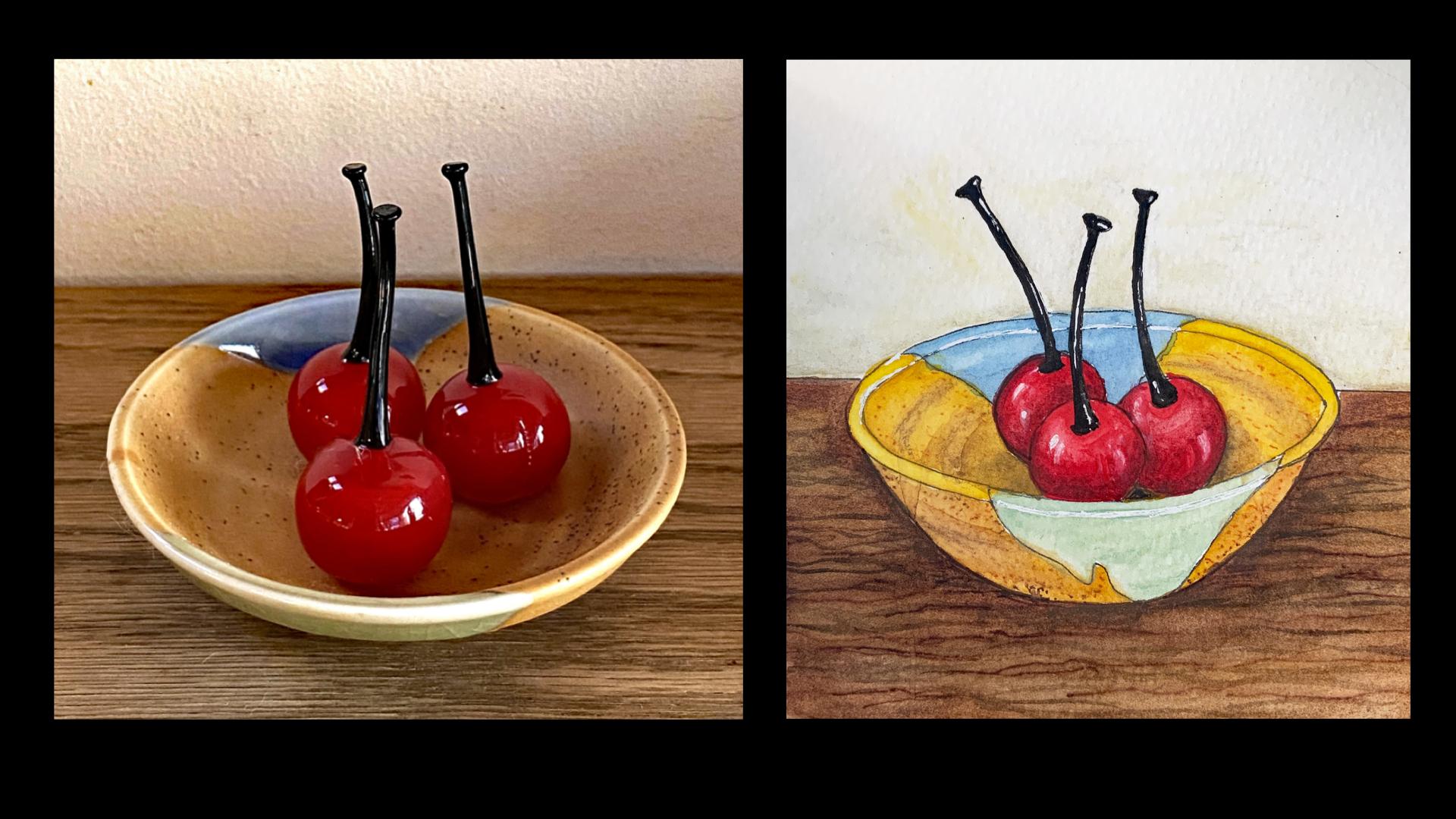
subject that you're painting. I also have a class
on Skillshare about still life where we actually
drew we picked the subject, arranged it, and we drew
this bowl of glass cherries. That class ended when
we had completed an ink drawing and we
were ready to paint. This class is all
about the painting. Now, the drawing lesson is also included here and you can skip that if you took
the other class. Now, I've included
a photograph of a subject for you to
print and work from and included a completed ink
drawing that you can trace if you're not interested in doing the drawing
part of this class. I really encourage
you to set aside some time and to go
along with me as I give you all my pointers and explain the thinking behind all of the brushstrokes that I
make in this painting. Once you have that, I am pretty sure that
you can go off and do other projects
in a similar style. I would love to see the
project from this class and any others that you go
on to paint in this style.
2. Supplies: A our supply list starts
with our watercolor paper, and this is the most
exacting of them. I want you to use a 100% cotton watercolor paper to achieve results just
like I do in the video. It's a more expensive paper, but the behavior
differences between it and a wood cellulose based paper are significant and you can use
a non cotton if you want to, but know that if
you're not getting the results that I'm getting
it's the paper's fault. It's not your Okay, so I'm using a sketchbook
actually for this and it's a very affordable one that you can find on
Amazon for about $17. It's a two Mata, TMU ARTA I really
love the paper. It's 140 pound, it feels
heavier than that. It does not buckle and it has a velvety feeling is
just really nice. Our second supply, if you're
doing the drawing part of this class is a pencil and
eraser, and a fine liner. I use the H grade pencils because they make a light
line and they erase very easily when
I do my sketching and this happens to be a
three which is my favorite. Next is a fine liner. My favorites are the
favorite Castle pit pens. They have a waterproof
pigment ink that dries almost instantly. This is a 0.3 millimeter
and also called a small. That's for the drawing
for the painting part. Obviously we need watercolors. Paper towel, some water. This happens to be a set of mostly Snelie which
I really like. It's honey based and I'm in
Santa Fe where it's very dry. Anything we do with
a broad range of colors so that you can choose a neighborhood of
colors that I'm choosing to try to match
up with our photograph. Mixing palette is good. I use the cover this Brushes. For the most part, I always use synthetic pointed round brushes. I like to protect animals. I used to use sable. I don't anymore. This happens to be a Princeton Snap brand. In the video, you'll see
me using Ascota Versatil. Those are my two favorites. There is more snap to the snap brushes and the Versatil are softer and have more gifts. I
go back and forth. I work mostly with a number two, but having a four and
six around are good for this size of a project. Now, since this class is directed at intermediate
and advanced students, I'm going to assume
that you have some of the
miscellaneous supplies around that I will show you
how to use in the video. You don't need them,
you can fake it, but I'm just going to tell you
because when they show up, you'll know that
I mentioned that one is a water soluble
colored pencil. This happens to be a
gold one Carin dash and that's going to be
for my background wall that color can be appropriate
to anything like that. This is ab, fine tipped marker. It is not waterproof and
that is a good thing. I don't know what
I think it's 0.7. I could be wrong, it
could be smaller. Anyway, their fine
tip, the number 88. They have a 68
with a fatter tip, but 88 is what I'm
going to be using. This is a water brush,
holds water in the body, wicks it to the tip, and it's really good for
vignetting backgrounds, which we'll be
doing, but you can use a regular paint
brush instead. I often bring in a soft Filbert brush to help me with my
lifting techniques. They do it better than anything, but your pointed round
brush will do it also. And I have Cigna, white pen and the ink is
water soluble as well. I use this for
highlights the fact that it's water soluble means that if you overdo
the highlights, you can use a damp brush to take it back to where
you want it to be. That's basically
it. I don't want to if you don't have some
of these displays and you don't if you don't have some of these supplies
and you don't want to invest until you see if you like tight watercolor
painting, that's fine. Just use whatever
you have and know that if it's not perfect,
it's not your fault. Now let's just get to it.
3. The Drawing Stage: I'll be using what I always
use my pencil to start out and a fine liner and then
add color with watercolor. So that's the supply list
at hand at this moment. I always start in roughing out. And remember, this photo is
in your project section, if you want to work
with me on this photo. But I start on roughing
out the major clumps, if you will, or shapes
in there still life. And so this bowl that the cherries are sitting
in is the main shape. And I'm doing the top
of it is an oval, and ovals aren't that easy
to just plain and draw, but I feel my way around the shape with these
sketchy lines, which I'll be able to erase because this is a hard pencil, and I'm using it very lightly. But this way, I hunt and I find the good oval
that is there. Now, we're looking we are seeing a top ledge of the bowl cause
we're looking down on it. We see that a little
bit up there and a little bit in front. We're not seeing a
whole lot of the bottom of the bowl because we are
looking mostly at the top. I want to add a little, though, because the actual
bowl is textured, and I really like
the color of it. It's a speckled stoneware kind
of thing, like the inside. And so I'm going
to allow my bowl just to sit a little
deeper than the photo. And then we're looking into it so far that we are seeing
in the actual picture, we're seeing the horizon
line sitting here. But I've changed my
perspective just a little bit, and so I'm going
to make my horizon line just a little bit
lower here as well. Alright, so those are the
big shape areas right here. And then the next thing I
have to do is the cherries. And that front one
is the biggest one. And it is about that big
compared to the size, the interior of the bowl. And then another one sits
right behind it, right here. And I can see it going that far. And the other one is almost completely sitting by
itself at the right. Any of this bores you, you can, you know, speed ahead. I am not a fast sketcher. The stems are pretty
odd on these cherries, just because they're
blown glass, and that was a little
procedure that had to happen. They're interesting, though. And they come out
of the cherry in a curved kind of you
know, joined right here. And then we wouldn't see that. And a nice smooth
curve to the top. And then they're
kind of capped with a little a little end like that. That's what makes them
a little unusual. It's actually a
flattened circle there. So that stem goes there. I'm going to make a little
bit of change from my photo. I don't like how the
stem action is here. It's just not very good
for my composition. So I'm gonna just move
this one slightly this way and that one slightly that
way to adjust for that. So this one will have
it come out of here. And I'm first just putting in my line of the thing
without drawing all of it. And then back here
we have a stem, I'm gonna take off this way. That way, nobody is bumping. It's all still
pretty interesting. Okay, and then I can
enlarge this stem. And I'll be cleaning this
up with the fine liner. As is always my procedure. That's a little I don't like it. It's a little too straight. It needs to be for
me to like it. It needs to be a
little more curvy. This is why I use
pencil and eraser when I compose things 'cause
it never happens. Then I don't use that eraser
to move things around. And I think it's a big
part of creative process. So I don't mind at all. Okay. And then this one I do like I do like the
curve on this one. And it will get thinner
as it comes up here and gets its little Top. All right. What other major areas
do I think about? I have mostly the
stomer color in here. It's kind of a white glaze here, which I don't think
I'm gonna do that because it will confuse
the drying, I think. Okay, but back here, we have a beautiful blue glaze that's coming down and back up. Behind these cherries, and
it's such a pretty blue, and I think it's gonna
be really good looking. So I am keeping that. I'm not gonna put the white
in this area. I don't think. I might, if I can get, you
know, get away with it, I might fake another piece of blue over here 'cause
it's up to me, you know? It's artistic license. So, okay, I am going away
to clean this up. And when I get this cleaned up, I'm going to go over my
good lines with this. This is a 0.3. It's a pit pin. They also call it a
small and I like that, and I'll be back with the
drawing at that stage. I wanted to stop back
in at this stage, just to show you how far I
refine before I go to ink, and, you know, everybody
doesn't work like me, so everybody won't
find this interesting. I just wanted to be
able to show you that I have in my mind, perfected my shapes, rounded out where I wanted to
round out, cut in oops. I still wanted to do more there. And it gets to be a dirty mass, and this is a really good
reason for using a three H or four H pencil because it's not going to have as much
smearing possibility. But anyway, at this stage, when I haven't cleaned up this much is when I go to my ink line because I have now decided where I want all my
ink lines to be. So here is my final ink
rendition of my still life. And I work differently
than a lot of people. I am not loose sketcher and
loose watercolor artist. And someday I will
write something about how I do
watercolor my way. I've never seen anybody else, like, do it that way. But all of that being said, what I do is create basically a coloring book for
myself to paint. And that's the stage
that we're at right now.
4. The Painting Stage One: I have a thing about trying
to match ceramic glazes. So this is the real dish
from my still life. And this is a speckle clay. So I want to get
that golden tone, and I want to get the speckle. Also, by getting the
dish itself out, I realized this wasn't a
white glaze going down. It was a beautiful sage. And I thought, Oh, that
would look good here. And so I put that
glaze in this area, and the beautiful blue
will be back in this area. And all of this
will be my speckle. In the next lesson,
I will show you a trick that I sometimes
use to get that effect. When I'm painting ceramics, I'm driven to get as close
to the glaze as I can. Lately, I've been using
handmade watercolor paints. These are from red bud pigments. And they have a color
called Good as Gold. And I look at that, but that's pretty, you know, given that the
specs are missing, that is pretty darn close. But there is a brighter
one over here. This is from Sedgwick
and Addison. You can find on. As I love their paints also. This is called gold
and Delicious, and I want a little
more light in it, at least in this top part, and I might switch to the
goodest gold for the underside, where I want it just a little
bit darker and less lit. So I'm going to set my bowl right here
so I can look at it. I am going to first
lay down a wash of the color and I'm
going to let that dry. And then I've added
a little tool here. This is Sobelo 88. They are a semi permanent
water based marker. And you'll see what
I mean by that. They will smear to an extent, but you don't lose the actual
line that you put in there. And so, it's really good for
basket weave drawings and all that kind of stuff because that line stays there
and you paint over it. I don't I don't want to start with the dots
first because I want to get this brighter
gold color in place first. And then we'll be
putting the spots over the dry and then rewetting to see what
happens from there. So just a mm, little thicker than coffee, I guess, is what
I try to go for. And this paper is
just in this book. I love these books
because of the texture. I'm really granulation person when it comes to watercolor. And so, and this just moves and lifts really
beautifully on this paper. I'm gonna also add the wash to the other
inside part of the bowl. This paint is so rich, by the second time you
go back to the pan, you have a very thick mixture, so I'm gonna have to water
this down just a little bit after I get it on here. There. I'm happy with how this lit. Um, now I'm coming back to add a little darkness to the outside of this one
so that we have a match. Now I'm going to
let these two areas dry and then try my experiment. While I have the
dark paint here, I can just do this darker
area inside as well. This is going to be blue glaze. I'll be coming back
to do this rim, but not while this is wet. I may as well get
all my gold glaze washes in while I'm at it,
looking for drying time. So I'm going over here
to this goodest gold. Yeah, I think this just adds the perfect touch of shadow
that I'm wanting on the bowl. It's just not quite as
brightly lit as that, and that makes it perfect. Real time painting is
it's always fun to watch. It's not easy to
record because you are filling silence with
many times nonsense because you want
to keep talking, and otherwise,
it'll be so quiet. But I think sometimes being quiet is a
little bit better if you don't really
have something to say during the whole
time that you're doing. This DbloPen the 88 is 0.7 tip, so it's nice and small. And I'm going to bring
you in a little bit. So you can see that it is making just the size of specs
that I want in this clay. Now, this has to be random. Hold a marker really loosely and basically just let it hit. Randomly because that is
what is going on in here. If you find that
you have overdone the dots and you don't
have a real subtle look, you can take a brush
barely damp brush. This is a Filbert. I love them because they
really do this job well. And you wet it and
you damp it off, so it's barely damp. And you can go in and you can
soften to look at the dots. Now, this will also
spread the color of the dots themselves, which is why we have
gotten a little darker, kind of more orange
tone down here. It kind of semi
dissolves the dots, and then when you keep
going, these bristles actually have some
color in them. And so you are just watch. You're getting really
subtle changes in techniques, and
it's kind of cool.
5. The Painting Stage Two: Next up is the clay rim, the unglazed rim that
we are going to want to be a little bit lighter
than the inside as well, because the light is hitting
right on top, you know, on the rim on like, you know, inside where there's
a little bit more shadow. So what I do, same kind
of consistency of paint. I let my brush go into
the into the pan. Let me show you here. And I go on top. Like I said, this
is very rich paint. And so by the time I even
come back a second later, it has a lot more pigment in it, 'cause it rewets
very, very well. So this is a number two brush, and I just pointed round brush. And I just cover the rim in
even wash to begin with. And that doesn't matter that
I went out there because I can correct that, and
you will see how. I'm going back with a
damp with the brush damp, no pigment on it, and I'm lifting color from
the rim to lighten it. I always have to turn the boat
to do this kind of thing, and so it doesn't work
with video so great, but it's okay. It's okay. It's a little white
spot happened there, and I don't want that.
But there we are. I think that pretty
much is I'm going to put a little bit of ridges, because the real bull has
this kind of thing going on, these guys, and I don't have
that accounted for here. So here's a little trick to get those ridges suggested that are in here and not be
To obvious about it. And the trick is a
watercolor pencil. This happens to be
a museum brand, which is the best there is
mostly for their subtlety. And I have to figure
out this is here, then it's probably here. And there's probably
a ridge here. But I can't I can't be too much. And I am not going to
take a really wet brush, like a water brush
to liquidate that. I'm going to take
dampness on Len. For that, I'm going
to get my what also a great
blender, my Filbert. Because I want to be
very, very subtle here. And you see that watercolor
pencil is so rich that it becomes so much more obvious
when water is added to it. And that's why I want to
have my blending tool at hand here to lessen that
boldness as much as I can. I'm going to even
try lifting here. Watercolor pencil does not lift as easily as watercolor itself, but you do what you can. Okay, that's getting
more subtle. And, uh, subtle is what I want. This down here is just gonna
be barely Barely there. Okay. And over here, gonna try the same thing. You notice, I haven't gotten
back to get any more water. I'm just working
with the dampness I've got to fool around. And in this one. And
this one actually is more shadow than ridge. I think I have I would consider a pretty good
rendition of that bare clay. I might even try
to lessen it a bit more with a paper toe. This one down here is a
little bit dark, still. And there would be
a little shadow under that glaze, as well. We won't really take
it out of here. We'll do that
separately after we get the light color of the glaze and so this was going to be
a beautiful sage green, and this was going to
be that beautiful blue. So it looks to me like in
the in the redbud colors, I have a sage, and the sage is really pretty, and it is a lot like what we have going
on in the actual glaze. It's a little lighter. Uh I have to try to figure out if
it's best. Here's this one. This has a green that is
a little more yellow. So I could try toning
this down with that, which is what I might do. Let's see how it works out. I want clean water. Me and my multi little
cup watering system here. Alright. I've got my uh oh, I think it's a number four. It's number four, number
six pointed round. And I'm going to go for this one first
and see what we get. And then if we have to
yellow it up a bit, we'll go into that other one. I'm coming down here right
up against The clay color. And right under that
rim, it will be darker. And, of course, we're
gonna have to see how it dries because watercolor often dries a different color than it was when it was wet. I don't find that to be true
with most of them, honestly. But that's what they say, so so you can always think it
and see if it turns out true. I'm really liking
this by itself. I'm putting a little
dark under the rim, and then I am gonna come in, and this is a ridge, a sticky out ridge in the clay. So I am going to pick that up because the
glaze would pick that up. And there is probably another
one more subtle though, probably in this area. Now, I think that's
too much highlight. So, again, I'm gonna
grab my Filbert soften. I just want to
suggest that ridge. I don't want to make
a big old stripe out of it, if you
know what I mean? No, I am still not
totally happy. Alright, I like that. I like that a little dry a little bit, and then I'm gonna do that area. Meanwhile, I am looking for the right blue for that
glaze right there, and that's a pretty cold one. Here's one that's
kind of interesting, but maybe, it's not quite as
ultramarine as it has to be. But, I mean, I don't have to completely obey
reality, either. So I think I'm gonna take
a chance and just see what that looks like. Good job. Card the way. All my palettes have swatch card so that I
can know what I'm doing. See, I mean, this you have to look at how
dark that looks. Like, you wouldn't know
what color that was. I'm trying a real small area, and I want a very
little bit of paint. Um, I'm gonna grab one of my little mixing
palettes here, just a tiny one. It's one of my glass
mixing palettes. And I'm going to
put some of this in here and see what it is
that we think we have. Mm. That's kind of pretty. It's kind of greenish, too. I don't know. Okay, I'm pulling out one of
my mainstay studio palettes, and this one is mostly Snelle. It's got sneer blue, and I think a tiny bit
of that might give us just the edge that we need
here to be a little more. Kind of ultramarine. I'm gonna put more
of this in 'cause I'm going back for more
of the other blue. I'm gonna need a little
more wash than this. This is what I love
about its why I made my glass palettes
because I can do this, and I can squint. And you can find my glass
palettes on my website anytime. Um, I am thinking I'm
pretty darn close there. And so we're gonna see and
hope we have enough, too. I said I was gonna bring in a little more of this
flue, didn't I? Yeah. Alright. Alright. And a little more water. I think we should have it here. Yeah, I'm gonna clean that brush off 'cause I got a lot
of dark paint on it. From picking things up. That's a really important
thing to remember. When you're mixing color and you've got
something you like, then you want to get the brush
cleaned off because what was on that brush is the real dark paint that
we picked up over there. This is why people have a
really hard time making washes that are smooth. Because the brush is carrying a whole bunch pigment that you're not expecting
to be there. Not in this case,
because in this case, I cleaned the brush after I did the addition of the
pigment from the pan. Alright. Again, that's a
light area in here. We're not gonna see
the other light area. Well, I like how
subtle that was. So here I am messing
with it, right? Alright, and just a tiny bit we need is all for that area, a tiny bit more for this area. And this area. Hmm. Being quiet again, you can
probably hear me thinking. So I can come back here now and put the ridge on
the green our sage. Just enough to do the rim. This has white in it. And so it's pretty cool because
it goes on a little more opaquely and it would hide the sharp edge of
the ink line there, which is not as sharp
when you look at the glaze edge and the clay
edge, it's not as sharp. And so that works perfectly, having the white in it. I'm happy with that. Finally, put the rest of the blue glaze edge in,
it's a little dark. I don't think the shadow on
there would be that much. And one more little bit. And the blue turned out perfect. The color. I like it a lot. Alright. I think we're
happy with this part. And now, those cherries. The pizza resistance, right?
6. Painting the Cherries: It's time to check back in with our source
photograph again. This red is gonna have to
be really red and bright. And in my Snell studio palette, I have a bright red hair. Um, which is very bright red, and I usually shade it
with the maroon Perlin. Yeah, I think it's gonna work. We're just going to
see how it's gonna go. We can start on one of our cherries and see
how that works out. We don't have to be very careful
of this stem join in any of them because it's gonna
be black over top of that. Starting with clean water. I want that red to be bright. Is my usual procedure. I take a brush to the paint
in the pan and work at it. If I don't have a
pan and it's a tube, I just put a little dot of that and do the
very same thing, come in with water at the edge until I get
the thickness I like. And what I usually like is milk. Not skim milk, regular milk. Now, I only have to luckily, deal with this part here because the stem
divides it for me. So I can just test on
this part of this cherry. And there's not too much
accident room there, either because red
is red, right? So if I go off that edge,
we're gonna be alright. This is our bright red. And we want to make sure
we've got a bright as we can. Then I'm going to pick up the highlight area
with this brush. And I do that before
I put the shading in because it removes some of
the moisture from the area, meaning that the
shading might stay put. It's going to be a real hot
highlight this is glass, but I'm getting the area lightened up up there
where it needs to be. And then I'm going to
go into this deep, deep maroon, and I'm going to just feed it
right at the bottom here. Where it would be behind
anything else, don't worry. I'm not going to let it
bleed all the way up. That's not what we want either. And notice the
subtle brush touches here because people say, How do you get those blends to be smooth and
perfect? That's how. Here we're going to be
actually very little of this and go right for the maroon, right over top of that. There. In this backside
also always move. You know, any time that
your hand is the least bit uncomfortable for any
reason, whatever, move it. We move the stuff that's
in your way or move the move and turn the book
or whatever your hand, that's your best tool. And so it needs comfort. Needs to be babied, it can be spoiled and
just tell you what to do, and you do it. Because
it's important. Alright, and in that case, I am going to be turning
this upside down so I can make that line clean. I can't really do that
from the other direction. I do it best from direction. So therefore, books
not glued down, and I can turn it
so I'm comfortable. Now, we are going to have quite a bit of maroon
down here because this guy's being shaded
by a number of things. And up here it's going
to be the lighter area, but we don't want anything
dark again and into the dark Okay, now that has to dry
for a minute because I can't go in here
without making trouble. Okay, I think we can do this. So bright red again. Like I said, not too much
to worry about where the stem join is because
it's going to be black. Careful times are quiet times. That is when your mouth should not be
interrupting your brain. Okay, one more time,
we have to come in and lift our lighter area he. The cleaner and drier brushes, the more it will
pick up for you. See, all of watercolor
is about subtlety, unless you're a
splashy watercolorist, which I love that look,
too, but it isn't me. But otherwise, it's a
lot of fiddling around, for sure. I don't know. I think I should
probably do something different there 'cause it's
just a feeling that you get. You go na that's not right. And that's okay. I never call that any kind
of inner critic. That's my my guide. It's my little brain that
knows that that's not right and tells me in
time. So I can fix it. Okay, I'm just scumbling in here a little bit just
to smooth that out. Now I'm gonna go back
clean and dry off. Let's see how subtly I can, uh, make this transition. So, see, this one. This is what it takes to
do this kind of thing. It's not like slapdash. You can't, Oh, ten minute art or the name
of a video that I saw. No effort art. That was really the name of it. And it makes you wonder
why in the heck, if no effort is your
goal, what are you doing? You know, why don't you
go do something else? Take a picture. I don't know. But if you're gonna make art, then expect to put some effort, 'cause that's what it takes. So without putting my harsh
highlights in that's pretty much I'm gonna stop with my
cherries and they're shading.
7. Painting the Tabletop: It's time to put my tabletop in, and I'm chosen a color by Daniel Smith called
Mommy boxite, which is right down here. And it's not stuck
in the half pan, of course, because it never is. Daniel Smith drives dries up
in everything around here. I tell you, it is dry here. But other paints can do it. I mostly paint with honey
based paints because of that. But I do use the Daniel Smith because of the colors. I really like him. Got to have contrast
with the bowl. So I'm using a quill brush, sometimes called a mop brush. I don't think it's
called a mop brush. It's called a quill brush or something else.
Maybe a mop brush. But it holds it's got a very, very big belly, and it holds
lots and lots of paint. And so it covers a big area and you don't
have to reload that often. I like that this paper is
really forgiving, too. It doesn't it doesn't
tend to want to um, do cauliflowers or
backwash stuff. And I'm thinking the
sizing has to do with it that it is soaking up a
good deal of the paint. And so it's not just running
around on top of the sizing, which is if you ever noticed on hot
press paper and so on, it's a lot more difficult
to fight that problem. And that's because most of the paint is sitting
up top on the paper. They don't tell you any
of this stuff, you know, you have to learn
it by doing it. I put some wood grain into
into my table surface. And I am not including the video of that
because it was ridiculous. It took me like more than
20 minutes, I think. I was fooling around, and I was blurring, and I'll tell you what I did, but I wouldn't make you sit
through that for anything. I could hardly stand it. I use three different
things here to help me out. The same Sabi marker that we
used for our dots before. And then this is a special
kind of paint brush. It has several names. This is a Princeton,
and it's called a grainer and silver brushes, they call them grass brushes. And there are versions
that are less expensive and more crude
in their bristles. And they're I don't know
what they're called. I think maybe comb brushes. But anyway, I did a
little of that it was too regular and I needed
more variety. So I got this little brush out. I just got this recently. I'm not sure how
useful it is for how much water it holds
or paint it holds. And this is called
a pointed Filbert, and this is just a number two. But what it does until
it runs out of paint is it makes a very
lovely little line with a lot of control because it's a short handled brush and
it's very small. Tip. So I did some of that. And then I thought
it was too much. And then I came
with a damp brush, and I picked up some
background color. I added back more
wood grain, and, oh, my gosh. Anyway,
here we are. And I have, three
more things to do. I have to put a
background in here. I have to paint my stems black. I have to go back and
put in the highlights and shadows that final touch.
8. Painting a Vignette Background: To do this background, I'm going to use a trick
that is real common for me. And I use a watercolor pencil, and I use a water brush, and I basically use
the pencil lead as a palette and scumble it into the background
and blend it out. Now why a waterbrush? Water brush constantly
wicks moisture to the tip. That's why you
never squeeze them, especially over your artwork. Squeezing is for cleaning,
and it blobs out. And you might want to
do that when you start over a paper towel because it, you know, gets it all going on. But usually, you just
pick this up and take the cap off and you
have nice dampness. See, already happening, it
just does its own thing. But because of that, as I
work out with the color, you're going to see I'm
going to be able to vignette that color
into nothing. And you can't really do that with a brush that you
have to keep dipping back into water because it's going to pick up too much water and make a cauliflower or it's going
to do a a run back or, you know, there's
a lot of danger. So I use these, and I, as usual, turn the book around. I'll show you how that goes. I sometimes this is a Carin dash super coolor
too and it's colored gold. Doesn't look gold at all. But these are the things you
discover in this journey, it does look like
exactly the color with a wall behind my piece. Now, this application that
I'm doing dry is really, really light because
it's not you don't want lot of paint
floating around when you're going to
blend it out into white. So I'm going to put this in my left hand in case I need
more pigment, and I will. And I'm going to start
right up at the edge here. And I'm going to
liquefy I'm liquefying the watercolor pencil,
which is lovely. There's a lot of
control to this. And the reason is that
the pigment particles are really big and
it's not Gumrabic. It's something else that
enabled the binder, something else that enabled
them solidification, you know, into the
lead, if you will. And so it just
moves differently, and you'll see
that, but it moves differently in a good way
for what we're doing here. So now I'm going to move to using the pencil
lead as a palate. Keep this going on. It's okay. It disappears as
it comes up here, if it's a little deeper there. Which it will be, because
I had a little pencil down in that area. We're just going to bring
it up and let it disappear. It's not much, but neither
was the white wall, but it settles the bowl and the drawing onto the page so they're not they don't
have that floating feeling. Which I don't care about float. I like the floating
feeling, and I do it a lot, but some people like to ground their illustration
by making sure that a background is
holding it in shape. So we're gonna add I want more over here in this
real bright area. Okay, when you do
this, you can do this on a wood cellulose paper. Like, I do it in my Stillman and burn sketchbooks and stuff, but I have to be very light
there because a little bit of this too much picks
that paper apart. But this book has 100%
cotton rag paper. So it takes a beating and
keeps on being happy. So overall, that's not
a good blend there. I'm gonna let that
be the background. For now, anyway, if I feel like I'll go in later
and make it dark, but I don't think so.
9. Painting the Glass Stems: Okay. So next, I
wait for that to dry enough to do
paint my black stems. Now, if you're not really good with a fine
tip paint brush, I usually use a number two
for this size of a thing. If you don't feel really
confident with it, you can use a fine liner. It just makes a
really dense black. A lot of people say you never
use black watercolor paint. But I do because I can put it on and pick it up and do my shading like I want to. So I use them. I use it very often.
I admit to it. So this is a black
that happens to be over at the corner
of my Snellie palette, and I can't remember what it is, and I didn't put
it on the chart, so I don't know what
to say about it, but I believe it to
be an ivory black. An Ivory black is a little
bit warmer than a lamp black, and so I think
that's what that is. If you've got either one
of those, it will do, and so a fine line or do. And so I am about to
start a second one here. I've got my little nearby, little cup of water that I don't have to
reach too far for. We've also got a
paper towel over here because I always like
to if I'm really trying to get a brush with kind of a lot of paint on it,
and I want too much. And so I usually tip
just touch the tip to a paper towel case there's excess water
running around. And I'm gonna be
quiet while I do this because I want to concentrate. A That's not easy, you know, so you mess it up. Don't get upset with yourself. It takes learning to
be able to, you know, know just what pressure
to keep, you know, just the tip, and
it's just practice. So if you don't feel good about it and you
don't want to wreck, the whole picture you did, use a fine liner to do that, I might even go back with
a fine liner just to get a couple of bumps out of here after I get
the last one done. We'll see. And, um, I looked at my reference
picture in order to see whether these had any
value runs in them and, you know, mid tones and so on, and they don't because
they're glass probably, and they will have
some white highlight. But with something that I
wanted to show values on, I would ordinarily go back
with my same number two brush, but just damp and do a little picking up in areas that I thought would
be a little lighter. You saw me doing that
with cherries and so on. This is just doing
it in a lot more narrow of a space, but Um, I want to stay a little bit
true to these being glass and so I'm not going to pick
up any values out of them. They're just a dense black,
and they'll have high
10. Warming the Tabletop: Now while I was at it, and while I was thinking about putting some shading in here, it bothered me that I
think that this brown is not warm enough
for this picture. And so this is all dry now
and it's all wood grained. I'm going to do
something that takes a pretty big chance,
but I'm going to do it. I'm going to get a warm Mmm. Asiena maybe. Just brown, you know, but with some yellow to it. And I'm gonna try to put a wash over here and see
if we warm this up. This is Daniel Smith's
Monte amiata raciena. And I'm making a
wash of it here. I don't want it real dark. I am just gonna be and I want it kind of watery 'cause
I'm just gonna be going over those painstaking bookshelf top that
took me so long, cleaning the brush, but I'm
not gonna use this brush. Remember that I'm
taking you along on all of the process all the
thinking that's going on here. And that's a little
over the top sometimes, and I hope you still
enjoy it because these are the touches in
the way of thinking that make for a really
good Tight Watercolor. And so this is dangerous here.
I'm real scared to do it. I have chosen a flat wash brush, and for two reasons because the stroke is nice and even and
you can move fast. The other reason is
that the body of the brush does not hold
that much moisture. It's not like a quill brush or a pointed round in that you have all kinds of
paint and water in here. I don't want much water. I don't want to move what's
already dry very much. So this is going to
be an adventure. I'm thinking about where
to start the stroke. I think it's not intuitive, but I think what I'm going
to do is start over here. So I'm going to dip
this brush in my wash, and I'm just going
to move quickly. And we don't know yet what
it's gonna do when it's dry, but it looks like now it's doing exactly what
I want it to do, which is warming up that wood. Boy, I'm gonna run right out of my wash just a perfect amount. Not that I knew that, but it just sometimes turns
out the way you want it to. And this did another nice thing. It gave me more subtlety
in my wood grain. So I really like that. I wish I had a little
more yellow for here. But I think overall, that I can call this a success. I could make a little
bit more wash, but I think that I could be making trouble
if I do that, too. And I like the warm look that it
11. Shadows and Highlights: So this more yellow
wood turned out lovely, and now we are down
to just dealing with shadows that we need
and highlights. So I'm using a dark
brown pencil here. This is a museum, Castle
brown Castle Earth. But sepia a dark brown
of any kind would do. And I'm just using the lead, and I shouldn't be holding it over the artwork in case
there was any splattering. That's a way to do
splattering, by the way, get a lot of water going on
and just do that over top. So your work. So this is all This has
to be pretty subtle here. I don't want it to
extend too far. I want it to have an edge. I don't want it to
have a hard edge. It does give me a lot more contrast with the
edge of the bowl, though, and I like that. Logically, there will also
be some shadow in the bowl. We had kind of a lot of it. I don't want to put a lot of it, but I'm going to just try to be subtle and suggest that instead of filling the
whole bottom of the bowl. So I'm using the
dark brown again, but it is very dark, so I need to be careful
what I do here. This would be the darkest area. And then in here, it would be shadowed in a
round way by the cherries. But I don't want to do
too much and obscure my, you know, the ridges
and the pottery. Got to be darker down in here. I'll just let that feed
out into the damp area. I end up drying softly, I hope. The deepest darkest corner. And then the other area that's deepest darkest
is right here. Go, I should have put
that little wetness out here like I did on the
other side, but I forgot. So now I got to tweak it. It looks pretty good.
Instead of pencil, I'm gonna go to a
dark brown watercolor and not have very much paint. It's a tiny space. And that's a burnt tiger
eye by Daniel Smith. And I'm just don't
want this light. So this brings us
to highlighting. And highlighting soft highlights
aren't always a problem, but hard highlights are, and it's because of the lack of wonderfulness of white pens. I have a gel pen
right here a Cigna. A lot of people swear by them, don't press hard on them
or they will stop writing. The good thing is,
if it's too stark, then you can take a damp
brush and you can soften it. Whereas the I don't know
if I have any here. The acrylic white pens, I do have them, and they're
just not right at hand. The acrylic white pens, if they're too stark, too bad unless you're there right
away to soften them. The first place I'm
going to go is this rim. So I'm going in here. And see on rough paper, this doesn't necessarily
flow like it ought to. So I genuinely go over to
that little pad and and, you know, get it going again. The other place that the glaze has a soft edge is this one, 'cause this is a
very shiny glaze. The clay is not as shiny. I don't really want to reach for the acrylic
pin, though yet. If I need to, I will. And now I'm going
to get up close and personal with this
photo so I can really study where the highlights are back down a bit
so that look at this. This is what accumulates at the side during
Tight Watercolor. I'm going to do the most
obvious thing first. So that is that
highlight right there. And I've got over here two little squares and
no little rectangles. And over here, it's
light from the window, I think, and another
little one there. This is working a
bit better now. So here we have a little square and a little dot further on. Dot up here, even. This one has a
highlight right here. I'm just looking at the photo
and trying to interpret. And then we have, again, a thinner and a fatter
little block down here. Now, to my eye, these are too stark. So on coming back, I think I'll use
mine number two, and I'll just have it be damp. And I'm just gonna soften
this a little bit, maybe make it a
little more real. It just isn't reading
like I want it to. Grabbing a Kleenex,
picking it back up. See, that's the beauty of having used something water soluble. M. This is a tough call. The reason is the glass. You know, you just don't know. It looks sharp sharpness of the highlights looks
good in the photograph, but I don't think it looks
so great right here. So I'm softening it. I'm also I can see that
I'm gonna come back in with a little red, too. There. This entirely too strong. And these are too strong. I wish I liked this
effect more than I do. I might just be leaving
that kind of mobby. However, I am going to
pick up my sine t again. And have a little of it to feed back some deep
red where it needs to be. Wipe that highlight entirely. I just didn't like that. This one's a little better. I want some nice
red back in here. I here. I think
we're getting there. Little tedious, isn't it? But if you want to know
how this stuff is done, this is how it's done with
trial and error, always. I'm still really not happy here, so I'm thinking of totally
getting rid of that. With a little red. And then, not maybe not totally. Okay, it's not a
bright highlight. And then I might
go back with the tiniest this it'll even do it. I want to When that's
a little drier. I want to put a tiny
hot spot right there. And now for the stems, this is, like, really scary. This one just see, I made my stems go in
different directions, too, so it's not just like I
can't copy it exactly. So I'm just gonna fake it. Oh. Now, that did not work. I'm gonna need black pen
to put the edge back in. I could do this with
white paint, too. It's not any easier, though. But if I can get
some light in here, I can go back with my
fine liner and fine tune. Around these highlights. Okay. Getting there, I
still don't like that. I don't know what I'm
gonna do about it, but I'm gonna do something about what I
can do something about, which is to get back here and make that highlight smaller by bringing
the white back. This one I'm so
close to the edge. It's gonna be a very
subtle highlight. I am still I'm still not happy with
this right here at all. So I'm still going to
de intensify that. With some red and maybe just just leave one of
the highlights behind. That's better to me. The double
highlight is not working. Alright, I might be done. At least for this class, I'm gonna be done before
you all decide that I am really hopelessly
picky, which I am. But can we go. We have a really nice
little bowl of cherries, and I am gonna call it quits. One of the greatest
things to learn is when to quit. And that is now.
12. Cherry Final Thoughts: Closing, I just want to
say that if you paint it along and if your result
is not amazing, it's okay. This is not the
kind of thing that you run through once
and you've got it. This is a relationship
with watercolor, with your humidity where
you live with your paper, with your brand of
paint, with your brush. Watercolor is a relationship on all those levels.
It's a dance. I like to call it
a dance because all those things affect
each other and all of those things affect the look
of your watercolor also, like with anything else, practice is what makes
you better and better. Like I said, I've been doing
this for 50 years or more. I am learning every day. Every painting that I do, something else comes along from the personality of watercolor,
that surprises me. And so the learning never stops, but the results get better and better and better and you
get happier with yourself. Don't do any judgment on the first project that
you made with this class. Just use it as a total
learning ground. Also, if you would
like more ideas about still life possibilities to take these techniques
and use them, you can check out my other Skillshare class
about the cherries. We did the drawing in it, but what we also did is a pretty big exploration of
the genre of still life. In art and about how to go
about getting interested in basically the stuff of
your life that makes very good subjects for
putting together Still Life. You can find that class on Skillshare and I showed you the title up in
the introduction, but it's called Still
Life from your Life and it'll be listed along with my other classes on
my profile page. I really encourage you
to upload this project, any other project you do in this style because I would just love to see it.
Until next time.
 Jessica Wesolek, Artist/Teacher