Transcripts
1. Introduction: Hello and welcome to the first class in the water collects series. My name is Jenna. And in this class we are going to be drained is beautiful, but using what are Kayla's admitted class, really simple. So that whichever stage you're at in your watercolor, Johnny, you may be able to attempt to fall along side to encourage you to get out your water colors and get ready to get into the class. I'll show you the whole procedure on how to sketch the bad. How to select your colors, how to lay them down, and how to even refine the details at the end. A faint watercolors to be really relaxing. And the unpredictability of how the colors mean, merge and blend together make the process even a lot more interests. And the final outcome may end up being something that you did not really expect. But isn't that the joy of using watercolors? So I hope you're ready. And let's get into this class.
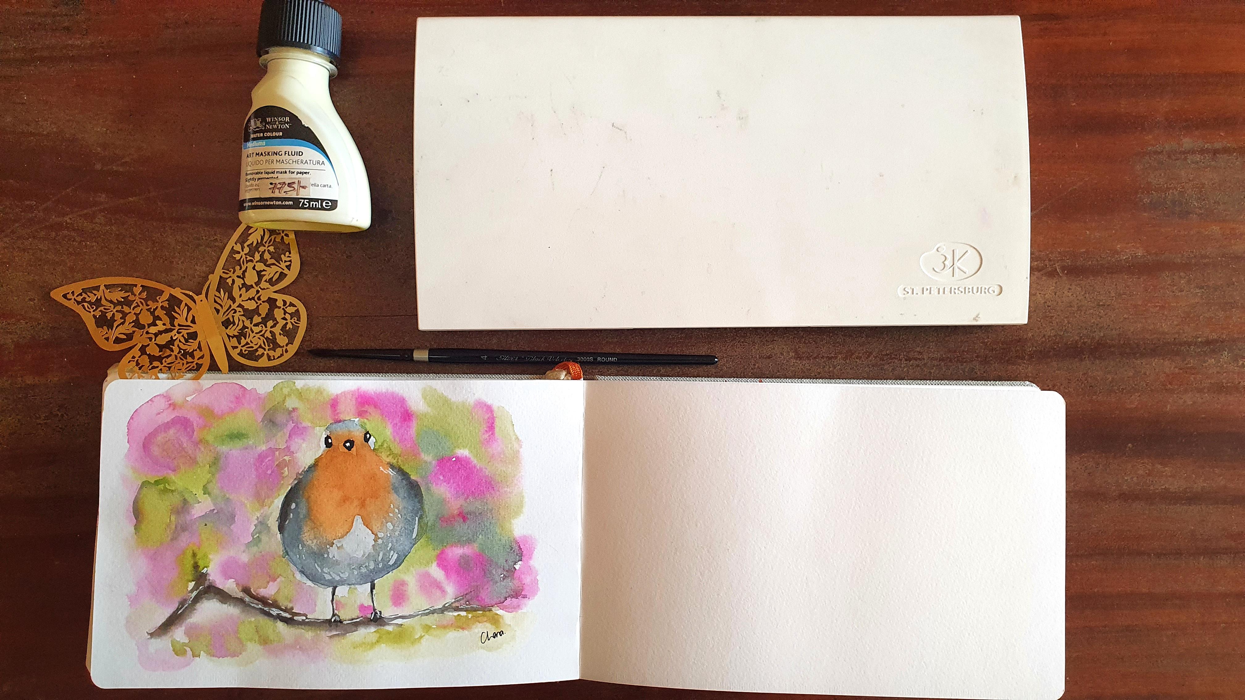
2. Materials and Class Project: Now we'll be getting into the materials that you'll need for this class. As well as talking about the class project. You want to need too many materials for this. But of course, the first thing that you need, what are colors? I have been using these white pine. What are colors for about four years now. And they really loved them so far. And if I told you can get your hands on this set, I'd really encourage you to give it a try. If not, you can become any water colors that you have available. This set of y's nights with our colleagues also come together with a palette. And I've been using this pilot instead of using a standalone pilot. The only con that I've found to the pilot is that it stains the dark colors. So you can see my knees pretty stained. So a coin that have found, but I don't like in my process with some of the colors is that our phone that some of the colors tend to granulate and which I'll talk about that a little bit later on on what to granulation means. Of course, you also need a paper towel, or in my case, I like to use this cloth towel to blood off the extra water that comes from my brush. You also need a set of brushes. I'm going to be using a number four and number eight and number one, detailed brush. But depending on the size of your canvas, you may just use one brush when round pointed brush for the entire project. You also need some water. I just took this old plastic bottles and cut them in half and use them as my containers. You also need some people that you shall use for your drain. Mate comes to paper. There is a wide range of watercolor paper available in the market. For, depending on what you have easily available to you, you may pick it up and use that had been using this watercolor journal for a couple of years. The only con, one of the biggest cons that are found with it is I typically Padres really quickly, so it makes it difficult to perform wet on wet techniques. Of course. You may also need us Pepys of watercolor paper that you shall use to test out your swatches of color. Other than that, you need a pencil and an aerosol so that you may be able to lead on your sketch. I needed erisa is really good when it comes to picking up the excess graphite. You'll also need an ink pen and a white gel pen for this drain. But if you don't have them, we can find a way to work around that. For this drain, you will not need masking tape, but in most watercolor drawings, you may need masking tape to create your borders. So the alternative to having our waste gel pen is having some masking fluid and to use masking fluid or use it in conjunction with soap so that he doesn't destroy my brushes because trust me, have district so many brushes in the process of using masking cleared. So slope is I really good hack that you should use. So this is just a closeup of all the materials that you'll need for your project and lead to further along to the class and all the steps that we take in drink there. But and also post your finish creations. Creations at any stage in the class project section. If have any questions, please drop them in the discussion area.
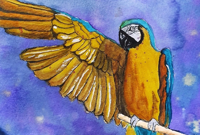
3. Laying Down the Sketch: So now we're going to go through the process of LinkdIn us catch. Put that, you'll just need your pencil and your paper. I have detailed method of how to draw the sketch easily in case you don't have the sketching skills. And I detail that in my class on how to draw chuckled Papi. So if you'd like to know that procedure, you kind of go check out that class and link it down below. Otherwise, reject the major shifts that you've seen a drink and lay them down, approximately where you think they should lay on the paper. The good thing about drink animals is that it doesn't have to exactly match what you're seeing on the people under 30 friends image rather, in comparison to any dream people whose features are actually known completely by their loved ones or even by a casual observers who are seeing it, which comes to any motif. And Jesse, This is a different tiny model matching what you are seeing the reference. Which so yeah, that's one of the advantages that have seen rate comes to drink anymore. So it's just a really simple sketch. Check the media features and made them donate your pencil. Once you're done, years I needed to pick up the graphite. This step is really important because you don't want the pencil strokes to show true. Yahweh is quite. So if you don't pick up that graphite and meet your sketch relate, you'll find that the pencil strokes will show through.
4. Masking the White Areas: So in this section we are going to be masking the white areas must include in what our color, just two files to liquid form of LaTex that's drains down into our proof film. So that allows you to lay down on top of it and around that area. But once you remove that liquid latex rather than Musk, include, you'll find it, but your pizza is still the original color down below. If you propose weight, once you remove the masking fluid, the weight of the people show true. If you'd lay down a certain color either bought on, before link down your masking fluid. Once you remove that must include that color will show true. So in this process of drawing this, but what you want is some of the areas that are white to remain being white once we remove the masking fluid. So to use the masking fluid, you'll take your tiniest brush, but you have a 01 or two round brush, we'll be fine. Then I'd like you to depict dip your brush in the water and then dip it into soup, whichever liquid soap that you have. If you have a solid block of so you can just run your brush along the solid block of soap to make sure that all the bristles are covered by the so there is an hour doing this is that once the mask include dress down on your results of your brush, it is pretty much impossible to revive that brush and make it usable again. So the soap creates some kind of a barrier between the results of your brush and the masking fluid. So that's the masking food at the end can easily wash off. Your brush can be used up. I have destroyed so many brushes by just using the masking fluid directly. So what you're going to do is we're going to put some of that masking fluid around the bottom center of the breast of the bud. And we can see a few of those white light Tish runs. And then also I think some little dots twice decides where we can see some of the areas that are a bit later. You don't necessarily have to use masking fluid. And alternate team is using a weight gel pen. At the end. I shall show you that procedure. And another alternative is a painting around the areas that you want to remain later. And another option is lifting up the color with a clean wet brush in the areas that you want to remain later than the surrounding areas. And that procedure, I shall also show you in the process of doing this, but it may sound a little bit complicated. But trust meters, and now you see once you've washed off our brush, it is back to how it was. And considering how expensive, what are collaborations are. You do not want to destroy your brushes just by using masking Floyd. And this is how your drawing should look at this point.
5. Colour Selection: The next step in our process is in selecting the colors that you will need. Set aside the sketch to let them must include, try until it is dry and a little bit tacky touch. As I mentioned before, abusing their St. Petersburg White Nights 36 set. And on this screen you can see the color selection that I have in my pond. You don't have to have the exact set of colors, but I shall guide you on how to select your colors. As I mentioned before, some of the colors in this, what I tend to, which means that once you lay them down on the paper and mix them with water, some of the pigments that tends to separate and seem to be a little bit an event to the eye. You can Google watercolor granulation to see examples of what that means. And some pietas usage to add texture to their drink. Experimental your water colors and mix them up with water and see how they behave on paper so that you can tell whether you notice any granulation or not. So now, when it comes to our color selection, the first color that we're going to come up with is our quinacridone rows. We're going to use this color mainly for the flowers that you can see in the background behind the bad. So if you have any light red rose looking color that kind of fit quite well. So that's their quinacridone draws for me. Then next color that are going to pick up is some sepia plus some Payne's gray. And this comes up with dulled brownish color that kind of suits the branch on which the Abide is standing on. That's the color we're going to use for the branch. Takes some time to examine your colors and make sure that the columns that you're selecting and going to fit the vision that you have in mind. Next, I'm looking at the breast of the bad, considers a light, or there is an orange color of other. So for that particle going to use the raw sienna mixed with a bunch Sienna to come up with a deep rich, brownish, orange. But quite much as what I can see, the reference image. Your colors may not look exactly the same as mine, even though they might have the same name. So it is good to have a few swatches like I do, and that you can refer to and see what you need. So I am going to use some indigo and pins CRI, but the light blue feathers that you can see at the edge of the bads body and at the top of the head. So when they wanted that color to be white, light and when to use more tab and Pete, As you can see, you can actually use your paint and make it seem really light just by adding more water. So I'm going to use that Indigo plus pins grey for the feathers and the sides of the bad spotty. Next, when it comes to the beak of the bird and the darkness of its eyes, I prefer to use a combination of different colors to form my dock. Dock, you could call it, rather than just going for the plane blood that comes into rota color pine. And for that I'm going to use a combination of Payne's gray and indigo, mixing them up together to get my dock and lock in quotes. And I'm way to compare that with neutral block, the block that comes in my pile. And you will see that the block that comes into the pie is not as big meant it as maybe you would like it to be. So when it comes to the flowers and you can see that some of the flowers are a bit more pigments, not the light rose colored. So if you want to be a bit more pigment, it can use more concentrated. The IP of the quinacridone grows. So you can see over here, I am actually depending my rows and you can see it's actually a bit more pigment. It not as light as it was before. And if you want to also in some of the reasons to be a bit of a different color. You can also mix, mixing a few more colors that I'm going to end up missing my quinacridone, rose plasma, quinacridone, lilac to get a bit more of a purple tinted hue. In my pink. You can competitive past two switches and you'll see that the second one is a, has a bit more of a purple, plain black hue to it. And if you want to make a color that is even deeper, you can meet seen some quinacridone rows to get together with some violet and some ultramarine to get uneven Deepa papel que of the rules of the color that you can use in your background. So now my ultra Marine is one of the colors that granulate. And it, and I can actually see it on the paper, but it's getting a little bit. So now I'm just showing you an up-close view of my swatches and how they look and have come up with my class electrons for each and every section of our painting. And the green that I did not indicate over here, but you shall end up ideally Tyrone. For that. I just used the olive green together with the green mixed together, bomb my background leaves and then the background foliage. Depending on the types of palettes that you have, just select colors that come close to what you have in mind and what you want to achieve on pizza and experiment with economic thing. That's why I have actually a piece of paper, as you can see, my people over here on the side where I laid out all the swatches of my colors. And I've gone through a lot of experimenting and mixing or may different colors to see which color appears once I've mixed to this plus this, or this plus this. Because what you think in your head isn't always necessarily water, honey appears on PIPA. So take some time to just experiment and mix them together and see which kinds of combining combinations that you may come up with. Your colors will be warm or cool. Or even if you end up mixing some to kinda they'll end up with a muddy texture and color, but you did not even expect to have fun with it.
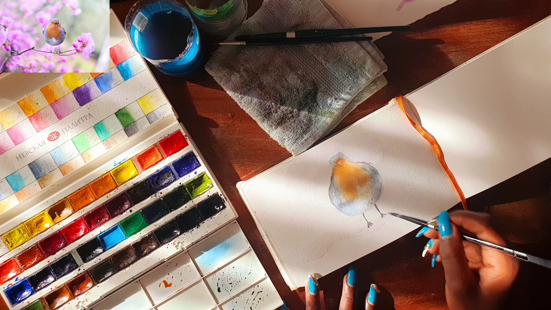
6. Bird's Body- First Layer: So now we're making column moves. The laying down the bads body passed layout the bats body. So first of all, we're going to lay down an even layer of water. But this is actually called the wet on wet technique, where you first of all wet your paper. Then now you put the pigment or the paint on top. As I mentioned before, maybe penetrates really, really fast. You'll see me acting quite bust and missing my colors really fast. And sometimes having to blend together are subtends, some edges with the water. And I'll show you how I do that. So I'm mixing my integral together with my pains query to get the color of the feathers at the edge of the bats body. So I'm going to use just dilate strokes in the direction diatom, I can see the feathers maybe grain twice, which has done it, doesn't really matter, but it would be good if you do that. And pick up really little pigment with MAY brush. And over here I'm using my number foreign brush to do that. As you can see, I'm actually softening some of those edges at the bottom. I'm trained to leave the bottom center of the body upbeat later, as I can see in the drawing, even though I had actually already covered it with masking fluid. So next we are going to the center of the body, and then we're going to mix in my raw sienna as well as my band Sienna. And I'm going to start with around the base, around the topographies and moving down the bots body. I don't if you can notice that my paper has actually already dried and my orange is into blending together with the blue that had already laid down. And that was actually my intentionality to blend. So what I'm doing is I'm my brush and pulling it down along those edges so that I can just soft pandas edges and make the paint running to the blue paint that had laid down before. So you have to walk around your paper. The high-quality, really high-quality people takes quite some way, some time to dry. And as much as it is really good for my purposes, and it is otherwise really good pizza. It dries really fast, so I have to walk around that weakness. So next I'm going to put the blue at the top of the bat's head. But indigo plus beans grew that had already mixed together. But at the top of the bads head. Then I blend out those edges with a clean brush that had the tailwater. You can really see that but is actually coming together. There's a really simple exercise that you can do and a really fun way to just draw the x. And when we went to the feet and mixing together, my pain scraped together with my sepia. And I'm going to use that to draw the legs. Created an app called Beat the bads legs. And just straight at the bottom where the kid called in clause where the closer clean my brush between each and every application, I can see that it's actually starting to get quite dotty. I guess it is laziness. You're supposed to use clean water every time that you clean your brush. But as long as I'm not laying down any of that, that you are now in my paper and I can see that it's not really laying down any data pigment. I can continue to use it. So now I'm going back again to the sides of the body. Has pretty much dried. I That's extra time laying down a second layer again towards that side. And then I write at the end of the edge of the abides body we can see some dark feathers so far that have picked up some of the sepia, mixed it together with dark sepia laterality mix before it had around that edge and moving that color right down to the bottom of the bats body. Now and when we went to the other side, putting down that blue pigment for their feathers. Whenever you see me web team my brush and putting it back on the people without picking up any pigment and trying to soften those edges so that they'll collapse, may blend out and have a soft Larry, ethereal edge. Monotony had edges. As I said before, in honor of my next classes, I'm going to explain all the fundamentals and the different techniques that you can use when it comes to what aka. And now again, I'm picking up some of that sepia color for the anthropods, pretty complete edge back and see a few ground colored feathers. Now we're going back to the center of the body. That orange color, that treadmill, before going on down the breast of their butts. Again. By here I'm just using making wet brush to soften the edge between the orange and the blue, as well as at the top and also around the bottom of the old edges. I want them to be soft and I went to collect blending together. Now when I talk about it, but I'm almost out of May, blue color that had mixed. And I'm just putting that at the top of their buds body at the top of the bytes head Driver.
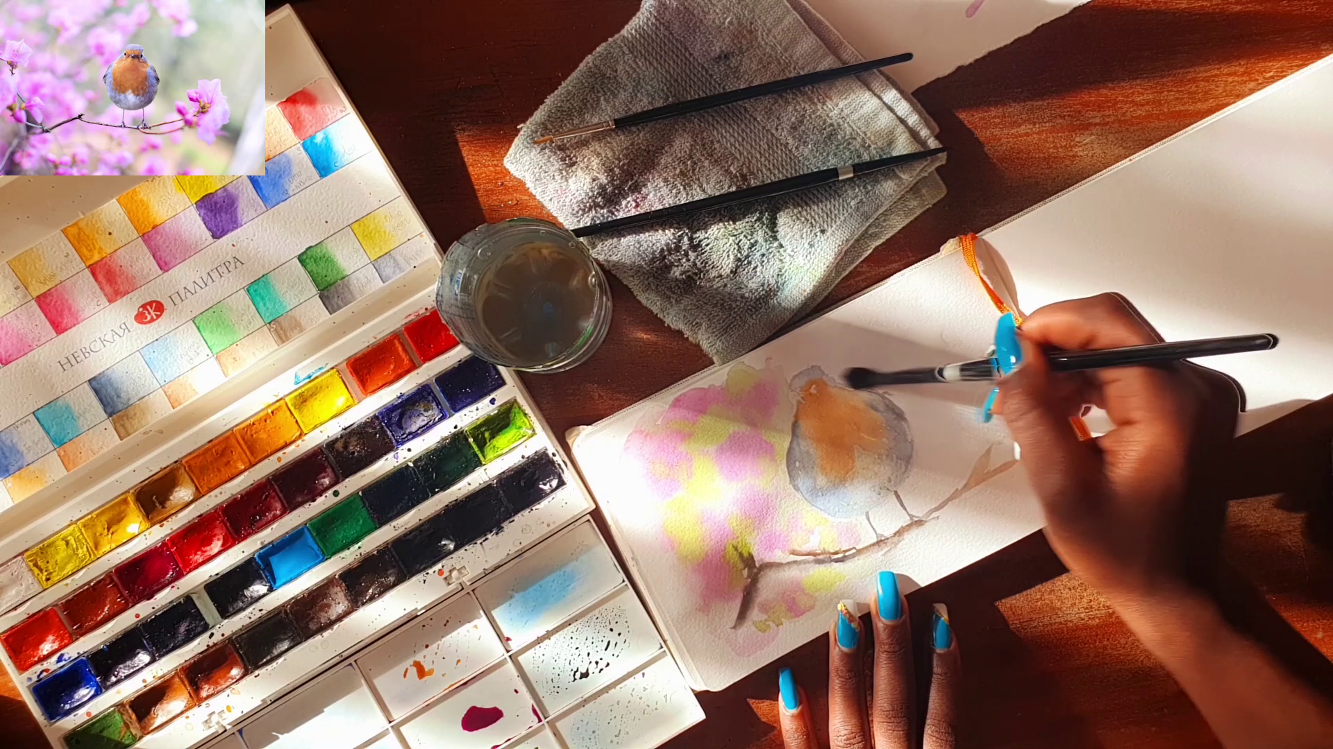
7. Painting the Background: Now next we're going to start painting that background possible setting with a branch on which the body is standing on. That as we said before, we went to mix our pains create together with us sepia. And also we're going to add in a little bit of indigo to make it even darker in some of the sections. So Passover Lamb wetting the paper in the direction that I can see that branch is growing back and have a bit of a wet in wet technique. So being up that color and just going in random directions that I can see that branch is going to add the edge towards the end. I can see that my lighter collates. I've picked up a little bit of the orange and lady down. Then also again using the sepia brown color that had laid down on top of that. Towards the other end. I'm totals at the bottom of the branch where I want it to be darker. I'm using the, the dark mixer that had mixed before. The CPR pins creates and the integral to make that shadow. Next. By now starting on the roses that we had seen before. And for that we're going to use the quinacridone rows. And to connect with and violet and green are going to use the olive green. And so for the background and P up my larger brush, which is maintained by a Tron brush. Noticeable wetting the whole piece of paper in one, on one of the sides. Ideally, you'd read the whole of the background on both sides. But I know that my people on the other side will have tried by the time I got there. They're Cranach drew on rows, diluting it with some water. Then I'm patting it gently into the background in random patterns. You don't have to go exactly by what you're seeing in the reference image. So next time picking up my olive green as well as migraine and mix them together. And then putting that into the sections between the peaks that have put Radio on the paper. Continually pant that creep and putting it in random patterns. So next, we took the violet together with rows and quinacridone lilac to create random areas. In my background. You don't have to pick. As I said before, you don't have to pick the exact color that I'm pitching. You can just create a nice contrast with the pinks and violet and reds that you have in your pilot. Again, Also dampening some of those green sections. Maybe pi has already started to dry at this point. So some of those edges will be a bit malachite and tied, but also tease him to buy a blend of hydrogens on soft edges. Now again, I'm mixing Some of the branch color, which is the sepia, together with a paint gray and darkening my branch. And I can in my branch towards the bottom I can see I've become a shadow out at the end. If you make any mistakes, walk around and walk into your mistakes, incorporated them into your drawing. And now you can see my what has become pretty nasty and I'm putting it aside and now taking my second cup of clean water and using that to wet my background and the other side. Wetting the Pbar ANOVA. Even between the bad sleds. And now again, we're mixing the connected and rose and putting it in random sections in the background. If you want to lighten any harsh colors that you put down, just whet your brush in the water and top off the excess water. Soviet 409A. Clean up the edges. Also again, putting it in my cream mixture that had mixed before. As you can see, I kind of put a little bit too much of the connected Andrews on the right side of the background. But still, as I said, it doesn't have to match exactly what you're seeing in your reference image. You can soften the edges of some of the colors just by whetting your brush and the water and wiping off excess water. And now you're blending beautifully. Now I am doing is actually just appending the edges a little bit on that Brown to make fuel the branches between the suggestion of a few of the branches. And now I'm going to mix it together, make cream together with me, pins to make a dark, dark gray. To create I become a contrast in the background. Still softening and blending in together those colors with a clean wet brush. A clean damp brush rather. And I'm still going to go on to the side that Hungary dread. And now over here you're going to see how I am going to blend in those colours up close. Let's see that right now the edges are really hard. I wet my brush in the water. And then now I am just dragging it along the edges of those colors that have been laid down. And now they're really blending in together with the colors are already laid down before on their paper. Becomes to whatever color. It's a process of experimentation. And you can end up with really beautiful results at the end. Though, also at the same time, you can end up with really ugly results. And i have also ended up with really nasty looking results at the end. But it's another process of planning and also experimentation and having fun. So have fun with it. I'm also still adding fuel to the left side of my drain to bring in some saturation to outside and still softening the edges with a clean damp brush. At this point, the background, my background is pretty much di looks and I hope you'll post photo class project section.
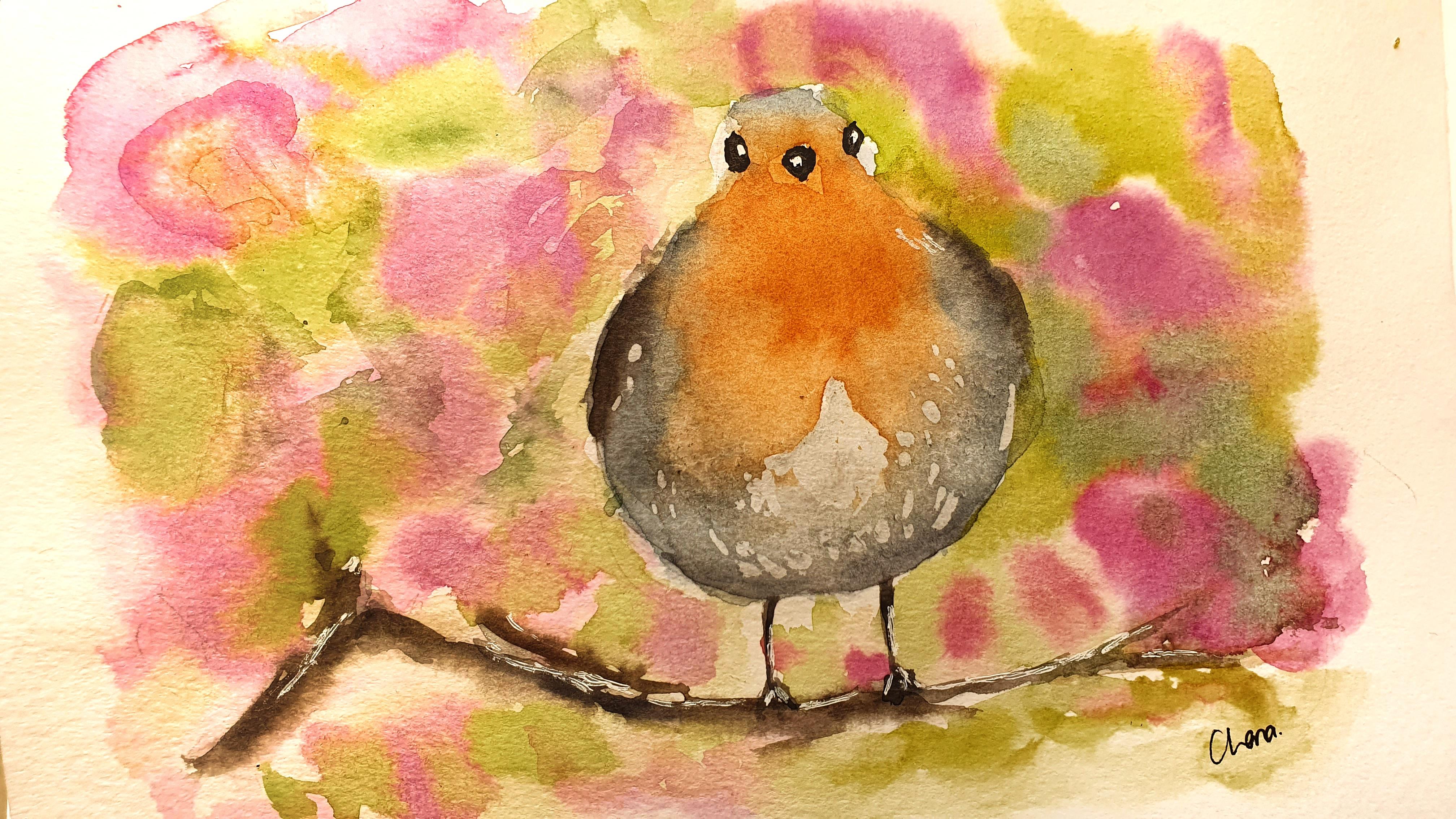
8. Deepening the Colours: Next we are going to be depending the colors on the bytes body. So to do that, we're going to start with the same colors that he used before. Using a more concentrated color right now. But there are sienna and a bunch Sienna mix together. First of all, setting by wetting the whole Santa section of the bite, the buds body. And talking about color and laying down the cholera bacteria. For the edges that we need to be solved. And we're going to use the same procedure that we used before, quitting our brush in the water and dragging it along the edges. So now we are waiting the entire section of the blue and the bats body. So now we're going to use a little bit of the blue color, indigo color. I dispatch I only use the indigo, which cannot sum still mixed the indigo together with the pin screen. I use the indigo alone so that I can make the blue or that section to be a little bit more saturated. And not guys down by that, by the pans. And now we're using that mixture that reduced for the branch which was the pins career with the CPI and the indigo to decant side of the feathers twice the edge. Again, rewriting the other side of the blue and link down there blue indigo mixture that we'd mixed that with deep down in our part on our pilot. Again, picking up that Dr. mixture, that dark color to darken the side of the body, the feathers. When you lay down too much color as I did just again, pick it up with the brush, as you can see me doing over here. And now moving to the top of the head, softening that color with I dumped brush. When you lay down collage in a section that you don't want to go anyway, do I take to be just pick it up with a brush. Now using that dark mixture, that dark color to again repaint over their legs. Again. That can in some sections of the branch on which the body standing on the edges of the pinned down chandra painting and see where you need to go a bit more saturated. So now towards the bottom of the bytes body and like to put a little bit of a shadow because that section is in shadow. So for that, I'm just going to pick up my, my pins and lay down on my palette, just my pins korea alone. Then I'm going to pick up that Payne's gray that are mixed on my palette in lead down at the edges of the body, towards the bottom, I can see a little bit of a shadow. Can see how just by adding that shadow, you're making their bad seem a lot more three-dimensional. Just by adding that shadow that at, that is at the bottom. Again, the lower section of the buds, tarsal, the breast going downwards. You can see that the orange isn't a bright orange all the way through. There is a part of rhetoric that is also in Chido. So for that we're just going to use a little bit of black paint Cree and laid down on top of that orange. Just loyal at saturation. And bringing a little bit of contrast to make it seem the body is actually rounded and that there are some sections shadow. And just like that, we are done with refining among the parts of the body.
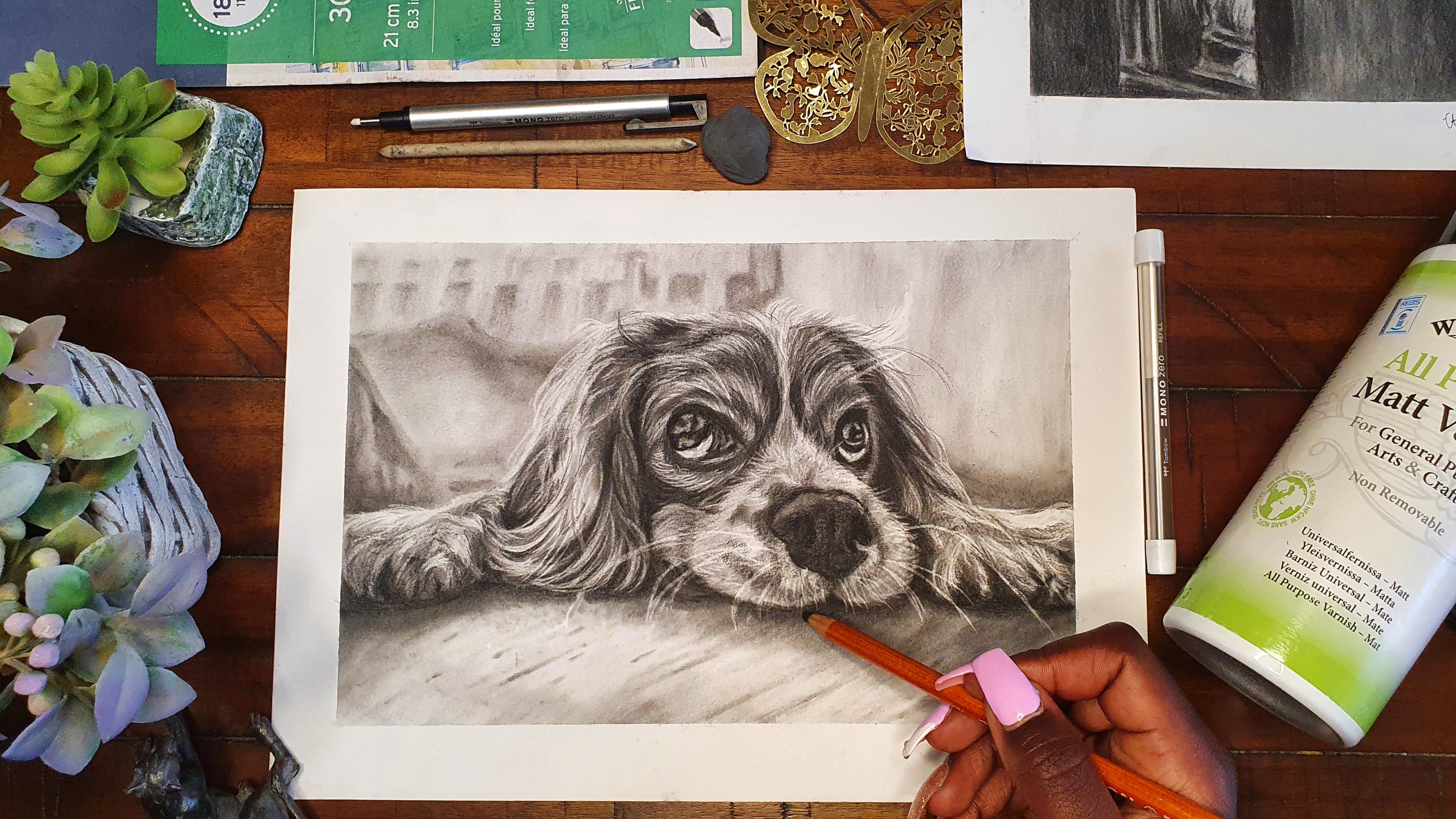
9. Refining the Details: Denying the home run. And we're going to just be refining the details. They're cutting in the eyes and the peak. So to do that, we can use the command color combination that I talked about before, which was a CPI plus scri plus the indigo metabolic. I actually use the sepia, Payne's gray. I learn. And you can see that you'd actually need a really dark color that suited the eyes as well as the beak. Masking. To make highlight, as well as the highlights of the eye. And on the next step is just body rubbing Italy, just like that. In the meantime, the black paint that we put out, the I and the beak is drained out before it can remove the masking tape that was there. So you can see how it looks. Once we remove the masking tape there, I took the paper. It's actually showing through the weight. It's a little bit too jarring when you look at it directly. So we're going to take a little bit of that Indigo, that trend mixed on the palate and take a really diluted butyrate, very little of it, as you can see, I'm not really tapping into R3. And then we just take really lately all those whites who transact rehab on their, on their paper because it isn't a bright, bright weight. Even when you look at the reference drain is just that those sections are lighter when you compare them to the areas that hair on them. But just taking a really diluted and little amount of that, of that Indigo and going over all those weights, actions that are covered by the masking. This is why I said before that you kind of get area just by lifting up the Colossi of painting just to leave those sections are bit lighter than the surrounding sections. You don't really necessarily need to use the masking through it. And I can see the difference that is made. The next step would be in removing the masking tape that is at the peak and the I wait until that paint that we had put down has has drained completely. Then just use your kneels to lick it off. Have really long meals. So if you don't want to use your nails, you can also use an eraser and that will help you in getting out that masking tape. And here's how the bad looks once you're done with everything.
10. Final Thoughts: Congratulations. And now you're done with drain your bad. Using what accolades. So the final steps are optional. But if you have an ink pen, you can use such to dock and some of those areas like around the eyes and the beak to make them a little bit more defined. Again, as I said, completely optional. There's actually not much to do with the pen. If you have OH, gel pen, you can use that to either a few more highlights. The company here I'm adding a few highlights around the bipeds legs. To indicate which side there is a highlight. Again, you can choose to add a few highlights on the buds body. If you see the highlight is our Mitch to jarring to you. Just use your finger to blotted out and make it a little bit more defused. Again, adding a highlight to the branch, to the top of the branch. There isn't really much to do with Gelug pens and the increments in this string. But in the future there might be more that we need to add in your watercolor drains using the above tools. So of course, don't forget to sign your drain. And I really hope that you've enjoyed pulling along to this class. But you've learned something. And please don't hesitate to ask me any questions, if you have any. Into post your paintings into class project section, feel free to post them on social media. And you can talk me at article 25A. May handle is in my skill share profile. Really hope that you enjoy and see you again in a future class.
 Chena, Artist