Transcripts
1. Course Preview Trailer:
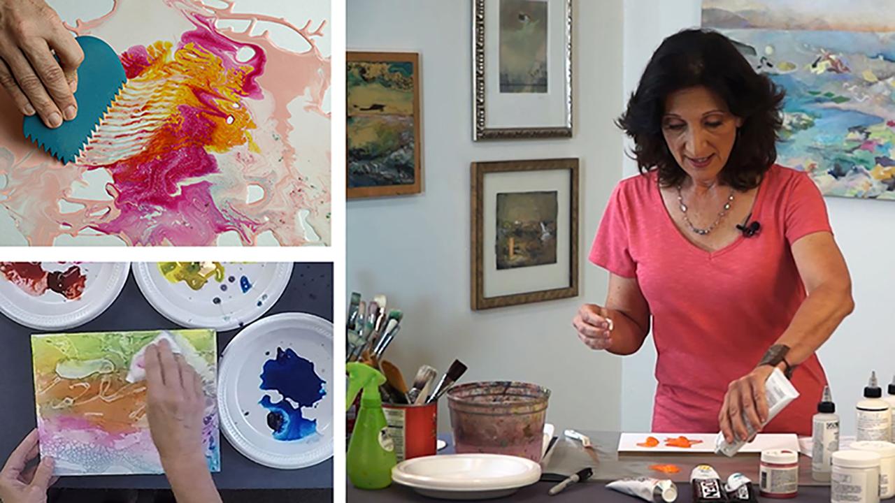
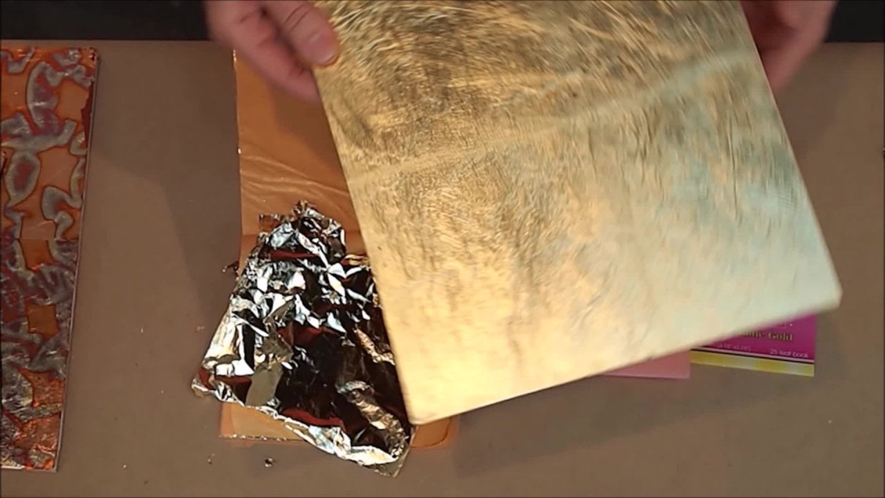
2. 1 Introduction: Welcome to the best acrylic painting course. I'm Nancy Reyner. I'll be guiding you through this course which includes all the information you need to make acrylic painting your new best friend. Let me tell you a little bit about myself. I have a bachelors in fine arts from Rhode Island School of Design. I have a master's in fine arts from Columbia University and I worked for many years for Golden Artists Colors, which is one of the best acrylic painting companies in the world. And what I did for them was I traveled around the western part of the United States and demonstrated all of their new inventions. So I was in direct contact with the chemists there and I have very accurate information which I am happy to share with you in these sets of videos. I wrote several books on painting mostly on acrylic. The first book that I wrote which I wanted to talk about here is Acrylic Revolution. And I wrote this several years ago. For many years it has been the number one best selling acrylic painting technique book. And so I'm I'm including that in the course as a pdf but these videos are going to be so much more helpful than just the book because I am updating a lot of the information and also demonstrating it for you visually with these videos. The best way to take this course I think and of course you can take it any way you want. You can jump around from video to video you can read the books first and then watch the videos. But my recommendation is that I created these 30 videos in a very linear structure that I think will maximize the learning. So my recommendation would be to start with this first one. So if you're here that's great. And keep going, Number two, three, four, all the way to the last on Number 30. When you're finished all the videos then read this book Acrylic Revolution. And this book has over 100 techniques and you can actually do each technique one at a time and really get a lot of comprehension about acrylic. And then the second book that I wanted to include in this course is the Acrylic Illuminations book. This has a more in-depth coverage of some very interesting and popular aspects like pouring acrylic and the gold leaf and metallic paints - all kinds of things that go more in depth at as I recommended before going from number 1 to 30 with the videos is what I would suggest. However I wanted to add that when it's possible as I'm talking about these videos and demonstrating, each video has a completely different focus. And at the end of each video I make suggestions on things that you might practice to allow all that information in that previous video to get incorporated into your, what I call, body knowledge. Let me just take a moment and talk about this. When we paint we are actually painting, not well everybody paints differently, but most of the time we're painting from our gut or inspiration or our heart and if we're painting out of our head a lot of times the paintings get more analytical and they don't express what we really want to express with ourselves - the emotion, working with the paint, a kind of a sense of beauty. That comes from more what I call a body knowledge rather than an intellectual knowledge. So as I'm when you look at the books and you're looking at the videos, a lot of that knowledge comes into our head analytically. So if you watched video 1 all the way to 30 without actually taking the time to dip your hand into the paint and paint brush and get your hands dirty and really try what I'm talking about it's going to feel a little overwhelming at the end of 30 videos full of information - then where do you start. So what I recommend is that after each video when I do mention and suggest some practices that you could do to take that information and make it go from your head into more of a body knowledge I definitely recommend that. So to end this introduction what I want to do is I want to talk about the general products that you're going to need for almost any technique. Again I have 30 videos and each video presents almost a completely different technique. Acrylic is so versatile as you will see that there's so many different ways of using it, but there are some things that I recommend to have as a basic starter kit. And so let's go through those right now. Let's start with paint. So with acrylic paint there's a lot of different choices. The main two choices are what's called a heavy body or a thick paint and a fluid paint. So let's just start with the thick paints and I really believe that you're going to need both kinds. I am going to tell you what I think you definitely need and then we'll talk about optional because I know that many of us have to work with a budget so I'm not going to tell you to buy every paint available. You don't need it, but I will tell you what I think is the essential kit that you're going to need to do just about any technique that I talk about. So the first thing is we're going to need paint. So let's start with the heavy body paint the thicker paint and we really only need a certain basic set of colors. And I recommend two reds, two yellows, two blues, and a white and a black, and they come in different sizes. This is a 2 ounce tube. This is a 4 ounce. They come in jars. They come in tubes and this is still the same paint. So you can get this exact same paint in different containers and also in different sizes but I recommend and by the way in the middle of the 30 video course I talk about color mixing and how you can take these just these six colors plus black and white, and make any color you want. So this really is a basic kit to start with - two reds, two yellows, two blues, a white and a black. And my favorite, if you are picking these six would be the Quinacridone Magenta and Pyrrole Red for your two reds. It's a cool and a warm. Again I talk about why you need a cool and a warm of each primary color in the middle section where I talk about color mixing. You'll need two yellows - a warm and a cool yellow - or I like Hansa Yellow Medium and Hansa Yellow Light. My two favorite blues are Phthalo Blue (green shade) and Ultramarine Blue. And then you'll need a white I like Titanium White. It is a pretty heavy duty white and I use Carbon Black. So with these six colors plus black and white - 8 total - that's all the tubes of the heavy body paint that you're going to need to start with and you can get anything any results you want with these eight colors. So these are the heavy body or the thick paints and I also recommend getting this same set of eight in what's called the fluid paints. And that they come in bottles. Now I want to mention that I'm using Golden brand for this entire set of 30 videos for 3 reasons. One is that that's what I use myself. It's a very professional grade paint. It's probably the best brand that you can use in the country and maybe even the world. And that's because I think I just want to share this with you a few years ago several of the acrylic main acrylic paint companies were starting to add fillers and decrease the quality of their paint to save money because a lot of the ingredients were getting more and more expensive and Golden sat down with everybody and really thought about it and said no they're going to they're probably going to lose some customers but they're going to remain the best and using the best ingredients. So that's what I use with all these techniques. If your paint isn't good you're just not going to be satisfied with the results. So I recommend the Golden but there's also lots of other paints that you could try and see if they work for you. You don't want to go to the hobby quality because then you're just not going to get good results with the filler and the less quality pigments. So I am using Golden and I'll be using their terms for their paints. But please feel free to find your own brand that you like and substitute that for here. And again these colors will have different names with different brands but when I talk about color mixing a few videos after this and then you'll see that there are some substitutes you can make. But these are my favorite eight. So I get these exact same colors in a fluid form and the fluids come in bottles. That's how you can tell the difference. Let me just show you quickly that here is the difference. Here's the fluid paint. And here is the same. Here is the same blue color in the thick paint. And I want to go into this a lot further in subsequent videos but I just right here wanted to show you there's a big difference between these two lines of paint the thick paint and the fluid. So I totally recommend getting the same 8, that's 6 colors plus black and white in the thick paint, the heavy body paint, and also the same in the fluids which come in the bottles. The next thing you'll need after paint is Gesso, which is a primer to prime your surfaces and you'll also need some mediums, and the mediums come in 3 forms and I'll be talking a lot about this in subsequent videos. But you're going to need three types of a medium. You're going to need what's called a medium and a gel and a paste. So I have gloss and matte medium - we're covering both bases - gloss and matte. I also recommend a gloss and a matte gel. So we have mediums, gels and pastes. Those are three different what's called binders. I will get into all of this very soon in depth but we want, like I said we want 2 mediums gloss and matte, we want 2 gels - a gloss and a matte, and then we have what's called a paste. And I like the Light Molding Paste. There's also a couple other things that I recommend. One is called Acrylic Glazing Liquid. It is a slow drying medium and I really like that because I live out here in Santa Fe, New Mexico and everything dries so fast that I tend to use this medium because it's a lot slower drying. I'll talk about this in another video where I talk about mediums, gels, and pastes, but if you live in a humid climate you might not need this. You might want something that's a little faster drying. So we'll get into all of that but I think these are very important to have. Polymer Medium is a basic medium and retarder will slow down the drying process. So when you want to take more time to paint you might want to add some retarder into your paint. OK so we covered paints and we covered mediums, gels, and pastes, which we also call binders and now we're going to move on to surfaces. I have a couple of examples of some surfaces or we call them substrates that are great to paint on but with acrylic you can paint on your wall, you can paint on your furniture, you can paint on yourself, although I wouldn't recommend it. I have small versions of everything so that I can handle it well but you're free to pick any size you want. This is a canvas you can see the stretcher bars on the back and it has a nice fabric feel to it, it's already primed, so you can get something that's already primed and ready to go. And here is the same thing but on the back it's just a piece of cardboard covered with the canvas and primed and both of these have a fabric texture to them. So this is really about what you prefer. And I'll talk more about surfaces as we go through all the videos. Here's just plain old cardboard - that works too - different sizes. And here is my personal favorite. I like having a panel. I like working on something that's rigid and strong. It doesn't bend like canvas and it has sides on it. So it props up the panel, the board, from the table so it's easier to work on. I also like the surface. It doesn't have that canvas feel I like the smoother surface. And so these come gessoed and ungessoed. I'll talk about all of these products in subsequent videos but just to give you an idea of some supplies you'll need that I recommend. This is from Ampersand. It's a Masonite board and then they prime it with a really good quality gesso. So this is a panel that is just plain wood. It's completely unsealed and unprimed. I actually sell these with my own brand. They're called Nancy Reyner Custom Artist Panel and they're sold in Artisans Art Store here in Santa Fe, New Mexico and you can get them online as well. And basically it just uses a very lightweight board because I like to put my own primer on it so that I can really control the quality of it. But any of these boards are fine - cardboard, canvas whatever you like to work on. The other thing you'll need are palettes. And palettes are meant to mix up your colors and they're very important. I use plastic plates for the fluid. Remember I talked about the two types of paint - the fluid paint versus that thicker paint. The fluid paints are really great in plates, and I actually save them once they're dry I can reuse them which is a great idea - saves money and the planet. And here it is plain without any color on it and they're really fun to use for those fluid paints when I want to add water and they swim around it kind of has sides that holds in the paint. The other thing that I like to use is just a plain palette you can use a piece of glass you can use a piece of I have this right here. It's a piece of what's called HDPE plexi or high density polyethylene is the full name and you can get them about this thick. They make great palettes because you could actually peel the paint off - the paint will not stick to this. So this would be the one thing you don't want to paint on for your painting. You want to use it for a palette. And so when you want to clean up you just spray it with water. I will show you how to clean up on the palette really easily. You just spray water and the paint just comes right off. So these are great palettes. And I have them - I go to a plexi or plastic store and they'll cut them to size for me. So you can actually get one that's as big as your table that you're working on and they're great. Another type of palette that you can use is called a gray palette. Several companies make them. This is a very small one. I would rather work larger than this. They come in different sizes and they're just disposable sheets of this smooth almost like freezer paper but gray so you can see your colors really well and they're just great. So I'll I'll be using these. Plus the HDPE plexi sheet that I showed you as well as these plastic plates. I use all three depending on how I'm using the acrylic paint. So I think that's important to get several options for palettes. Oh by the way freezer paper is a wonderful way of saving money because you can buy a whole roll of freezer paper. Now this is not wax paper. Those are two different products. This is freezer paper you find in your grocery store and you can just rip off the size that you want and cut it and tape it to your table and these - the paint will just come right off of these. They make great palettes too, so you can use this on your table right directly on your table. So those are all your palette options. You will need a palette knife and I highly recommend this version instead of this version. This version has a step to it as you can see. And that way you can actually mix a color without getting your hand in the color unless you want to get your hand in the color. But here with this flat knife I never use these because it's almost impossible to mix a color and not get your hand in it too. So I recommend these with the step version for a palette knife and the plastic ones are fine. They should be pretty inexpensive and get a few of them sometimes they break after a while. You'll also need some kind of a spray bottle. Spraying water on your acrylic is something that I'll do a lot to keep it from drying and for other effects that you'll see. You will need a bar of soap. Here's Ivory, it's my favorite. I will show you in one of the videos how to clean your brushes properly. And I like using Ivory soap and a big bar, and I just mash the brush in and it really gets it clean. You'll need a container for water. And I as you probably figuring now I'm very picky about what I use and I really like containers to be lower not a high bucket and pretty wid. That way I can just throw things in without paying a lot of attention. If it's a long narrow bottle like this it be hard to aim all the time. And I like them low because then it's easy to reach. So you'll see as I work that I'm using these almost the whole time for my water bucket. Then you'll need a can to hold your brushes - it just makes your painting table a lot more convenient and neat to have everything altogether in a bucket. As I use them I just leave them in the water bucket and this way I know that everything in the can is clean. If I have brushes all over the place they all get paint all over the handles and the bristles and it's really hard to keep focused on your painting when you have a lot of mayhem going on. So here in this bucket I've got a few things I've got but basically I just wanted to show you you need a variety of brushes. It's really hard to say you're going to paint everything you want to paint with one brush. So let's see I've got these are one of my favorites. They're the cheapest. I get them at home improvement stores and they're just a 1" chip brush they're called. I use them for a lot of things. This is a very bristly brush whereas this is a very soft brush so you want some things that are soft some things that are bristly. The soft ones and I will explain this later they apply paint in a nice even way, and the bristly ones kind of pick up the paint when you want to get some texture. So two types of bristles. And then you have different sizes - big and small. You've got flat and you've also got some round ones. I pretty much use flat for almost everything I do. Here's a round one. So you want to just go to the store. You don't have to spend a lot of money on brushes for acrylic. Anything goes so you can get some. These are like a dollar each pretty cheap at your home improvement stores and I don't spend a lot of money. The really expensive brushes are usually made with Sable and they're meant for watercolorists. You don't want to use them with acrylic. You just don't because after a while acrylic will - I'm going to show you how to clean your brushes really well - but if you miss a couple times and if it's a really expensive brush you could ruin that brush. So I don't spend that much on the brushes but I do like a variety. The other thing you're going to need is some kind of varnish to protect it at the end. I will have an entire video on varnishing. I recommend for now the easiest one to use as a Polymer Varnish it is diluted with water and easy clean up. You don't need a mask and spray equipment. It's very easy to use and this will give your painting UV protection at the end and you could pick your sheen. So I'll talk about that in a much later video. So this is your basic supply kit that you're going to need for almost everything that we do. From here every time I do a video that has a special technique that we're doing. We might add one or two things but this will really get you far.
3. 2 Acrylic Paint is a Different Animal: So what is paint? Let's look at paint. Paint is basically two things. It's pigment and some kind of binder that takes these particles of pigment, pulls it together and turns it into a paint. So oil paint is pigment. And this pigment, by the way, can be used with all different binders to make any type of pain. It's the binder that makes the difference. So let's just look at some pigment, which with this pigment alone, this is called iron red light. So this pigment alone, you can't paint with it. It's like little bolder particles, and it depends on the way that I bind these. That's why it's called Binder. What I add to this to bind these particles together to create a paint is what makes the paint. So if I had oil and I poured it over here and mixed it up, I of oil, paint and oil paint is fairly easy to make on your own. If I have egg, yeah, like an egg in your kitchen, and I broke it, whether it's a little more difficulty in making a temporal. But if I added egg as my binder to this, I would have a temperature. If I add now. Watercolors tricky. Some of you may know what the binder is for. Watercolor, It's not water, It's gum Arabic, and there's a new watercolor out now called Aqua is all. I'm sorry the binder is called aguas all, and if you added the AUC was all or the gum Arabic to this, you have water color and let me talk about water because you might think that water is a binder. Remember, words saying binder plus pigment makes paint. So if I take some water and I added to the pig men here, it looks like it might be a paint I have. Arroyo's out here in Santa Fe, New Mexico, and when it rains and we have dirt that looks a little like that. When it rains, it looks like paint. But then when it dries, when the water evaporates, you have dirt again or pigment. And so this water is not a good binder, because when it dries up, it goes back to the pigment form. Ah binder is something that when you mix it in with the pigment and it dries, it remains in a paint form. So with acrylic, we have. The binder is so water is not a binder, and with acrylic, the binder is called polymer. It's a plastic, so with the acrylic you have polymer or krilic added to the pigment to create acrylic paint . The only difference is acrylic paint is unique. The polymer does not bind with the pigment like oil and pigment were like egg and pigment or, like the gum Arabic or the ah quiz, all with pigment for watercolor. It won't combine. They sort of repel each other. So all of the other mediums you can actually make your own quite easily. But with acrylic, it's very difficult to make your own. So that's why I'm gonna recommend not making your own and using a brand that you like to make your own acrylic. What golden does is they actually add soap into the mixture of pigment and the polymer, which is the binder for acrylic. And by adding soap, it allows that ah, pigment and binder to connect. Then it drives and like a paint film. But it has all that soap in there, and if you think about it, soap as bubbles, you don't want to paint and have all these bubbles. So a good quality paint company is going to spend time and effort in removing the soap once the pigment and the polymer have have, bind it together to create a paint. So you're better quality companies take more time and effort to remove that soap so that when you're painting, you don't have all these bubbles. Now you can never remove all of the soap. So I just want to warn you that when you're working with acrylic and you start to use a brush like this, that's very bristly, and you're going to be really beating it up. You might get bubbles no matter what the quality of paint you use, but the better quality paint will have less of this bubbling. There's also a lot of other ingredients that go into acrylic. There's a freeze thaw stabilizer. Believe it or not, acrylic. Don't leave it out in your shed or your garage in the cold winter. If you live in places that get very cold in the winter time, it will. It can freeze and then thaw three times before it's no longer a ah, good paint. So, um, the freeze thaw stabilizes air in there. But you don't wanna keep your paints in a place where they're going to get frozen and then saw more than three times. Ah, the other ingredients. There's a Ph stabilizer. There's also a d former. So because acrylic and let me repeat this because acrylic and the polymer, which is the binder, don't really connect happily without this soap. Added to it, You have a complex paint, a chemistry. So you've got all this other stuff going on in there, and that's why it's a little more difficult to make it on your own. So acrylic is basically pigment with polymer, and there's about 150 polymers available in the industrial market, and Elmer's glue is a polymer. Um, your home improvement stores sell paint. That's a polymer. There is many, many different types of polymers, but they're not the same. They're all different qualities now. As painters, we usually want our paintings the last, and so we want, Ah, high quality polymer. And that's why you don't want to use Elmer's glue as a glue in your work or some of the commercial paints that you get in the home improvement stores because they aren't meant toe last. Now let's think about it. Elmer's glue is meant for usually Children's projects, so why spend a lot of money if it's a Children's project and you don't care about it lasting? So there is polymers available at a low cost. For those purposes, home improvement stores sell paint, and they consider the pain is going to be on a rigid surface like a wall so they can cut corners with the flexibility of the quality of the polymer that they're using. We as artists are gonna work on canvas or panel. We need the flexibility even on panel, which is rigid as the painting starts to ah, move with different climates and different humidity. You want that flexibility to be high quality in your acrylic paint. So that is why you're spending the money that you are on a higher quality fine art paint because they're using better pigments, and they're also using better polymer or better a binder. The binders are very important because if you did use Elmer's glue and mix it with pigment and create your own paint, you could call it acrylic paint. But Elmer's glue isn't meant to be flexible. Soon as you put it on a surface. As it moves according to climate, it's gonna crack. So what we want when we're painters if we're going, especially for interested in the commercial aspect and selling our work, we want to make sure it lasts, and most of the pain and products are tested to last 500 years or more. That's called archival. So if you use a good quality, paint a company and paint products like Golden, you're going to be assured that the paint can handle a certain amount of flexibility without cracking off and is and is a good quality. So that, said, acrylic is now considered the most archival paint that you can get. An acrylic is going to last longer than watercolor and caustic oil and any of the other mediums, but I'd like to give you throughout the whole 30 videos. I want to give you as much information as I can for you to use theocratic in the correct way so that you get that maximum archival long lasting quality. I have an interesting analogy that I like to use to talk about all the other mediums in comparison with acrylic. I like to say that acrylic is to all other mediums, like photo shop is to a typewriter. Let me explain that we all know that weaken type a letter on a typewriter and then if we move up to something like photo shop, which is a very big ah machine that you can use on your computer to create photographs. If you use that to type a letter, you might have a little trouble. Yet. Photo shop is this huge machine. It goes way beyond the typewriter. It could do images on text and type, but you have to learn to use it differently. That is actually how I compare Ah krilic toe all the other mediums, watercolor and caustic oil paint you name it. Acrylic has this huge broad range, which makes it a fabulous medium to use. But it also gets a little confusing because there's a lot more to learn with oil pain. I remember when I was learning how to pay with oil paint. It didn't take me long. I squeezed out the paint and started painting, and after a few trial and error days, I felt like I could kind of get there. And as a beginner and paint with oil paint with acrylic. Here's the trick, and I'm hoping that the rest the videos will show you this huge machine that acrylic really is. When you work with acrylic, you have the ability to imitate oil paint in every aspect. Here, I'm replicating oil paint. I can paint with the acrylic and fool anybody and tell them it's oil pain. I can also do the same thing by imitating watercolor. I can use acrylic and imitate watercolor so that you can't tell The difference here is, um I made this with acrylic and I was replicating watercolor effects. And you can see the nice bleeding and look at those soft edges so I can replicate watercolor effects very easily. Using the acrylic, I can also imitate in caustic and which is a wax using wax as a medium, and no one would be able to tell the difference. Acrylic can create a very unusual, uh, effects that no other medium can match. And here is something that I don't think any other medium can replicate except acrylic. So here we have a, um ah, poor and I do demonstrate one whole video I dedicate to pouring. It's very interesting process, but look at this kind of effects. You wouldn't be able to get that with watercolor or oil. So acrylic, as I said, can imitate all the other mediums. But it also has, ah place where it creates very unique effects all on its own. Here's what makes Acrylic the big photo shot machine. Um, it has three different types of binders. It has medium's gels and pastes. Those are the three categories now, you might say, Well, I'm in oil painter. I can use safflower oil. I can use, um, linseed oil. I have different oils, but they're all oils thes three categories that I mention as the binder. Possibilities for acrylic, medium gel and paste are completely different. Have totally different properties from each other. And by adding those into your acrylic paint, you can change the quality of acrylic paint tremendously. You can create like I said, not only imitate those other mediums, which you can create effects that have never been seen before, so it's almost like an inventor's tool, and the inventions are really created out of understanding the binders, the medium's gels and pastes. So that's what I'm going to go into next. It's really giving you a comprehensive look at what those mediums, gels and pastes can do to create this huge. Uh, like I said, Photoshopped, this huge machine that can create any effect you want. By the way, I want to take this opportunity to define the word medium because it can get very confusing . The word medium in the art world has actually used for two completely different things, and it can get confusing. Medium could be the discipline that you're using. For instance, the medium of watercolor versus the medium of pastel versus the medium of acrylic mediums are the type off paint that you're using or the type of materials that you're using to create your art. But the word medium can also mean the binder that is combined with the pigment, as I talked about in the beginning with acrylic, the medium is polymer, so here's Here's a funny sentence that will, you'll understand. Um, I'm using the medium of acrylic to paint, and when I use the medium of acrylic paint, I have a variety of mediums that I can use to mix in with the acrylic paint. So you see has two different meanings. So one last thing that I'd like to say about acrylic in this video before we move on to the next is that acrylic has an enormous amounted of advantages over other mediums. Oil paint has a very particular, um, set of order that you need to practice. It's called fat over lean principle, so those of you that are familiar with oil paint know that you have to start with the paint . No fat, which meat and fat is the medium, like oil is fatty. So if you think about oil pain squeezed right out of the tube at some turpentine to it, that's a very thin, lean paint. You have to start with the lean paint, and then each layer that you work on over has toe have just a little more flexibility. In other words, it has to add a little more oil to it. So you actually, if you don't do that and you reverse it, you put something that's very flexible and oiling on the bottom. Then you put something without the medium on the top. It's gonna crack Ah, lot quicker. Oil paint will almost always crack anyway, but it's gonna crack a lot quicker. And so you really have to be very careful how you layer oil paint, whereas with acrylic, you can put any layer on any other layer in any order, and you will never have that issue. You will never have one layer pulling the other layer up and cracking, so that is a really good advantage. With acrylic, you can add mediums on one layer. You can add water on the next layer. You can then go back to adding more mediums and making it more fatty eso. You have much more flexibility. The advantage of acrylic over water color is that those of you that use watercolor know that watercolor never dries permanent. It's always water soluble, so when you put a layer of watercolor on and you're painting once it dries, you can actually take a rag with water and wipe it off. The difference between that and acrylic is that when acrylic dries, it drives waterproof, which means that you could keep layering without disturbing the layers underneath. So it's a whole different way of painting
4. 3 Paint Viscosities: I'd like to start this video by talking about three main basic paint lines that you can get with acrylic. There is the heavy body paints, which are in tubes or jars, and these were the heavy body paints. There's also the fluid paints, and they come in bottles. And there's 1/3 uh, that I wanted to talk about, which is very new. It's called high flow, and it comes in bottles also with appointed top, and you really need to shake them. I'll look at these three together, we'll compare them. There are other paint lines, and I will be going over them in the in subsequent videos. But I wanted to look at these three and compare them because they're really sort of the main paint lines that you would want to use when you're painting with acrylic. And here is heavy body. So here is ah, permanent green light in a heavy body paint. They have a lot of texture, a lot of body and texture. Now let's compare that with a fluid paint, so this is the quinacrine own red fluid. You could see that it doesn't pour very easily. It's almost like molasses rather than something very thin, but it does move differently than this thick paint. So again, here we have the thick paint that you can manipulate, and it creates a lot of texture. And here is the fluid paint, which isn't like watercolor. It still has quite a body to it. But there's a difference between the thick texture and this one, and the sort of a fluid texture in this, these air called fluids and this is called a heavy body. Now let's compare these two main lines to 1/3 new line called the High flow, and these have, ah, feed inside of them and shake them up. I don't know if you can hear the bead, but, um, look at the difference in ah, inconsistency between these three paint lines. We have this thick paint here called the Heavy Body the fluid, and now I've put on something called This high Flow, which were formerly the airbrush colors. But now they're called high flow, and they've slightly reformulated them. Look at the difference in the thickness. Now which one do you think it's gonna give you texture? If you like texture in your painting, this one's gonna give you lots of texture. This one will give you a small amount of texture and this one none. So we can compare the three. And just to show you how fluid thes high flow are, it just goes right into the bucket. Here. It's almost like an acrylic ink. Let's look at these three a little more closely so that you can tell when it would be advantageous for you to use the thick paint, the fluid or the high flow. I made this charge just to show you something. This is the fluid paint in a fellow blue. Here is the heavy body paint in Othello blue, and if you see, they both have the same intensity of color. So I just wanted to show you that the fluid pain is not a diluted version of the heavy body . So often people think that the thick paint is the pure paint, and then anything thinner is has toe, have water added to it and that is not true. And to show you that here is, um, the heavy body paint adding medium and here it is adding water. So once I add medium in water, it turns into these diluted versions, whereas you could see the fluid maintains a very strong color next to the heavy body. So let's start with heavy body that is a very thick paint, very thick as we have seen, and so I can take a knife and I can really work with it with a knife and I can scrape through and I can get a really interesting texture going, and I can use a brush to and still get a different type of texture. There's a brushwork texture, and this is a knife texture. Even if I add a little bit of water to it, it still has a pretty thick texture. What I'd like to show you is that you can work very easily wet and wet, like an oil painter using these thick paints again, they come in the tubes and the jars in all the full range of color. So right now I'm going to just take this yellow and I'm going to apply it as a second layer over this'll green, which is wet. So I'm working wet and wet, and I have the yellow over the green, and now I can scrape back and get the green and I can also see smear them together. So it's an interesting way to work wet and wet, using the thick paint, which takes a lot longer to dry than the thinner paints the fluid or the high flow. So with the thick paint or the heavy body, you can use it straight out of the tube, as I just did. You can also add a little bit of water to it if you want. Here's some water on the brush, and it will still hold its texture. It still has pretty thick texture. If you wanted to get washes or watercolor, look, you would have to add a lot of water to this. As you can see and when you're working with it, it has a feel like oil paint. Now let's talk about the fluid paints. The fluid paint comes in the, as I said, comes in a container in a bottle. And what's fun about being in this bottle like this and it's a little bit ah, thinner than the thick paint is that you can actually create effects right out of the container by pouring it. It's just more poor herbal than the thick paint, which is squeezable, and with this I can I can manipulate it with a knife. I can also take a brush with a little bit of water, and I can actually create almost like a watercolor effect with a less water than I would have had to add to the thicker paints. So, as you can see, using the fluids is going to give you much more of a watercolor effect or the ability to create watercolor by just adding a little bit of water. And it's still going to maintain a nice, strong color. So, unlike watercolor, you can use this thickly and thinly in the same painting. Now let's look at the high flow paints. They're highly pigmented, and they act a lot like inks. So let's look at this one. The quinacrine on red. I like toe shake it anyway. Here's the high flow and look at how thin they are. You could see that, and if I wanted a watercolor effect, I don't have to add much water. In fact, I can take all the water off my brush, and I can still move it around, and it looks a lot like watercolor. If I add more water to it. I'm now reducing the intensity of the color. But the's make great watercolor effects. The high flow, the high flow have some extra qualities that I wanted to show you. And one of my favorite is that you can put them in what's called a refillable container. These are found in hobby stores, and when you take the cap off, they have a needle nose to it. You know, if you can see that and I can work with them just like inks. They have a retard er in it, so they're slower drawing than the other two that I demonstrated. And so, um, this was sitting in this container for months, and it still comes out nice and wet by using a brush without any water. Here's a dry brush. It can create a look like ink. If I add water to it, and I can, I make it even more diluted so that you can also use them to pour out like this. By the way, I love to use these to sign my work. So that's nice. Needle nose point. You can just use it to sign your work on your paintings, and they really are lovely. The the high flow paints can also be added to airbrush, and you can spray your paint very easily because of the retard. Er, it's slow drying. And as I as you saw, I can put it in markers and pens. There's a lot of refillable they're called, and you could just put the ink in there and use them. And one more thing about the high flow. They are really great to use on fabric.
5. 4 Exploring Acrylic Binders: in this video. I want to talk about the binders. Paint is made of pigment and binder with acrylic. We have three different types of binders and they are very different from each other. We have a mediums, gels and pastes. So I want to show you how different they are from each other in this video. I have a sheet here and I painted it black because acrylic binders are actually white when they are wet and they dry clear, and that can be a little confusing. So I put a black paper cause I'm gonna be pouring out the mediums, the gels in the paste, and I wanted you to be able to see it. Now there isn't just one medium, one gel in one paste. These are three different categories. And in each category there are many mediums to choose from many gels and many pastes. But all binders, that is anything that doesn't have pigment in it. Anything with pigment is a paint without pigment. You have the's binders and so we can look at them even though there's many, many binders in three separate categories mediums, gels and pastes. First, let's look in a medium and I want to mention to that, uh, right at the time of making this video, Golden changed their labelling and you'll see the blue golden is the newer version, whereas the older containers have the black golden, so you'll see a little of both. You'll see the new version and the old version in these videos just wanted to let you know . So here is a gloss medium. This is our basic polymer medium. It was called polymer medium. They changed the name as well as the labeling, and it's your basic medium. Let's look at what it is now. I'm gonna just pour it out here and then let's just move it around a little bit and see it's not watery. It's got substance to it, but it does run a little bit. That's a medium. And that was just called gloss medium, formerly called polymer medium gloss. Now let's look at a gel and compare it with the gel. So here I have something called a regular gel gloss. Now the gels come in soft, regular, heavy and extra heavy, and basically the regular, which is here. The regular gel gloss is the same consistency to remember in the last video when I squeezed out the heavy body paint the thickest paint. The regular gel gloss will match that thick paint. The soft gel will be softer than that, and the heavier will make it heavy so you could see it's almost like being a scientist or a creative artist. You can change your paint any form you want. You could make it more transparent. You could make it less to make it thicker. Thinner. Ah, you could make it string. You can make it gloppy. So that's what's fun about acrylic is that you can work with the binder and make it in many different forms. And that is very different than any other discipline. Medium, like oil paint, watercolor and in caustic. So let's look at this gel. This is ah, gel. And do you remember when I had the thick paint next to the fluid next to the high flow? This is very similar in terms of, this is kind of moves a little more. This doesn't move at all. I'm turning it around so I can go like this without a dripping, and the gel has a lot of of texture. What's deceiving about this? Is that both of these air going to dry, completely clear, and that affects a lot of the process of painting that I'm going to be talking about. So this is Polly. This is gloss medium. It looks a little bluish and white. There's nothing in there making it bluish and white. It's actually ah, bubbling that creates that white ish effect. And as it drives, the bubbling goes away and it becomes totally clear. The same thing happens with the gel. Ah, this is even whiter than this because it's thicker to Joe, and this will also disappear and turn clear, however, with the pace that's very different. So here is light molding paste. Remember there several versions off mediums, several versions of gels and several of paste. I'm just picking one for each of the categories so we can talk about them. Here is light molding paste, and it's very thick. It's great for texture, just like the gel. However, one big difference. The paste is going to dry just like this white, whereas the gel, the white is that bubbling that I was talking about, that disappears and turns totally clear, so I made a dry version of this here is the medium when it's dry, so here's the medium. When it's wet, I'll overlap them, so it's a little easier to see the's air. Both mediums, they're both the same medium here. The medium is wet and the bubbling that looks white hasn't disappeared yet. Here, look in this area right here. Here. It's very clear. Here's the gel. When it's wet, it's white, and when it dries it, the white disappears because it's a bubbling effect. There's nothing white in there. Uh, here is the white paste and this stays white when it's dry, and if we can get this really in our heads, it will really help the acrylic painting. Because this is the This is the key. This is the big machine. Off acrylic is the fact that there's three different categories off binders that we can use now. I also put a patch here and here of Matt, um, medium and a Matt Joe. And what happens with the mat medium and the match? L is, um, this is matting agent. Right here. It's a C. It's a white powder, and this white powder is added to the gloss mediums and gloss jails to create what looks like a foggy Matt version. So here is the photo shopped to our typewriter. Here is the big Machine. We have mediums, gels and pastes, but we also have transparent and opaque. We have gloss and matte, but we also have gloss and matte choices in each of the categories. Except for this one, this one is gonna I know. Actually, the in the paste category there are there is one pace called molding paste, and that's a little more shiny. And this is called light molding patients, very air rated and very mad. Let's say you have a thick paint. If you add the medium to it, you make it thinner. If you have a thin paint and you add the gel to it, make it thicker. And if you have thin paint and at pace to it, you're making it thinkers. You can change the consistency of it. This as a medium, and you can see that it's thinner than this thick gel. If I have a thick paint and I want to make it thinner, I add medium. If I have a thin paint and I want to make it thicker. I add the gel if I have a thick paint and I don't want to make it thinner, but I want to make it more transparent. I will add if it's a thick pain, I will add more gel, so I keep the consistency the same. But the gel is going to change the transparency of it. If I have a fluid color and I want to make it more transparent for more see through, I would add more medium. I will keep that consistency of that fluid paint but make it more transparent. The paste. This is the one that's white when it's wet and white when it's dry. So if I wanted to make something opaque and obliterate on underlying layer, I could make some color in with the paste. So each one of these is totally different in terms off their transparency. Transparent, transparent, opaque fluid. Thick, thick. This is fast drying. I didn't mention this, but this is fast drying and this is slow drawing. So if you had some paint and you added gel to it, you're slowing down the drying. If you add pace to it, you're speeding up the drying. So here is a simple landscape, and it has one coat of paint on it. I used the fluid paints and without any water, so it's sitting on top. It doesn't have a watercolor effect. And But when this dried, I added Matt gel on top of it. Can you see the difference between the two? Look at the difference. Here is playing paint in one layer. Here is another layer. And when I say the word layer, I mean, I'm waiting until this dries and then I'm putting something else on top of it. I made the same painting twice as you can see. But on this one, it has two layers. It has this painting underneath and on top. It has Matt Gel, Look at how it pushes the space back. I will be demonstrating in one of the videos how I did this. But for now, I just wanted to show you the difference between the mat and irregular paint. It really pushes back and creates a whole different space. Then I took 1/3 of this. So originally I painted three under paintings on this one. I put the mat gel and on this one I put the match L. And when it dried, I then repainted the trees in the front. So can you see how? Let's just compare these two. Let's see if I put it like this if you compare these two. This is creating a whole different type of space, so using gloss and matte can really shift how the painting appears. At the very end. Let's look at the three types, the medium gel paste in terms of transparency. Here is a gloss gel, and I put black lines down first, and then I put gloss gel on top. You can see that when the gloss gel dried when it was wet, it was white. When it dries, you can see the black lines completely through, so it's drawing transparent. Now let's compare that to a mat gel. I put the mat gel over the lines. It was equally white and opaque when it was wet, but when it dries, it dries what I call translucent. You can sort of see or it's almost You could call it veiled. It's shows the lines, but very subtly. And if you're talking about spatial effects, which we will be talking about in the future of these videos. This one brings the black lines forward, and this one kind of pushes them back in that illusion of space that painting creates. Then, ah, here is the paste, which is opaque and covers the stripes completely. So using these binders, we have the choice of having it totally transparent, semi transparent or or translucent and totally opaque where it obliterates the underlying layer within the category of mediums just wanted to show you what pure polymer looks like without any thickener added. This is G A C, which stands for Golden Artist Colors 100. This is your basic binder that has nothing done to it. Nothing added to it. Look at how thin it is. So in the category of mediums you have a choice. You can actually work with a paint and make it thinner by Instead of adding water, you can add a thinner medium makes a big difference because if you're adding water, you're diluting the binder, and then it's like water color. What if you want to make the binder little thinner but not have it turned into a watercolor ? That's when you use the thinner binder. So I just wanted to mention them here, and then I will show you how we use each one as we go through the course G a C 200 I'll just mentioned the rest briefly is a hard, hard dinner. It's Ah, you added to your paint to paint on glass or for outdoor work. Um, the G A C 400 is meant for fabric. It will stiffen the fabric. G A C 500 is like 200. It's a hard dinner. I use it for taping, and I will show you some really fun tricks with its one of my favorite G. A C 800 is pouring medium. We're gonna have a lot of fun with that, UH, later on, when we do pouring G. A C 900 is meant for fabric, and you can make the paint by adding the G A C 900 to it. You could make the paint more permanent with washing wear fabric, so we'll be using some of those g A sees. You don't have to get them all. Ah, there really specialty purpose mediums
6. 5 Acrylic is the Inventors Toolbox: So we've discussed binders, mediums, gels and pastes, and we've discussed the acrylic paint lines, just three of the main ones. The heavy body, the fluid and the high flow. Here is the big crux of the whole photo shop to typewriter system. Here is what makes Krilic such a big painting machine. We are going to combine the paint with the binders in many different ways, and this is really the key video to show you how you can invent and be the inventor with acrylic paints and the binders that come with it. So let's start with the idea of mixing. So here we have the paints. Here we have the binders, and I wrote fluid, heavy body and high flow. And over here, mediums, gels and pastes. That's this is our toolbox, is my drawing of a toolbox. And basically, uh, why don't we start with taking paints and mixing them into binders to make mixtures? Then we're going to talk about paints over the binders and paints under the binders. Those are the three big ways that acrylic is the invention, the inventors tool. So let's just start with paints. So when I say paint that means color with binder. So any type of paint, a fluid paint or the thick paint that's in the paint category and anything that doesn't have pigment in it and isn't really used for the color but used for slowing down the drawing, quickening the drawing, making it thicker, making it thinner, making it more transparent, making more opaque. This is the inventors part of the toolbox, these air called binders. We've talked about them before. Mediums, gels and pace. So what we're going to do is start with the first of three ways that we can use paints with binders, and that is just mixing them together. So let's just start with uh, saying Let's see. I think I'll start with putting right in the middle of this gray palette. I'm going to put medium and remember I said that with mediums, gels and paste. These air categories Miss Jellison Pace, and there's many varieties of mediums, many varieties of gels and many varieties of pace. But if we look at this toolbox like this, it really simplifies our ability to say I'm Here's what we can do with acrylic, So the medium's air, usually in containers like this horrible, and I'm gonna put the medium in the middle and I'm going to put a gel next to it in a gel usually comes in a jar. Remember, I said, it comes soft, regular, heavy, extra heavy, different strengths. And the gel is really for texture. It's thick, whereas the medium is to make something that's textural little thinner. Now we have our third component of binders, which is paced, and I'm gonna be using the light molding paste. But there are several versions. This happens to be my favorite, So here we go, and it's you'll see how I use it a lot in the next videos. So here we have our three options for binders, medium gel and paste, and with pain. I have the the heavy body, the high flow in the fluid. So I think for the sake of this, I'll just use this exercise here. I'm just gonna use to the heavy body and fluid. So here is the heavy body in the tubes also comes in jars. And here is the fluid version of viral red here, and I think I'll just put some other colors out, too, just to make it a little more colorful. I do have a favorite way of setting up a palate, and I have a special video just for you in this course that talks about my favorite way of setting up a palette. But for now, I just want to show some colors with the three types of binders. And again you can use any type of paint, the fluid or the heavy body, or that high flow that I talked about before with what I'm doing here. So here we're doing one of three ways of using these together, which is Just mix them together and anything goes. This is the great thing about acrylic. It doesn't matter. Remember I talked about oil paint? You have to start off with the oil paint with no mediums and then gradually add mediums on top. There's a way that you have to actually layer, whereas with acrylic it doesn't matter. You could do anything so I can mix this medium with the thick paint and, uh, pretty obvious it's going to get it thinner. If I take this thick pain and add this medium that's thinner, it's gonna make it thinner. If I take this fluid paint here and I add the medium. I keep it the same, but I'm making it more transparent because now there's a less ratio of pigment in there. But if I take that same fluid paint and I add a gel to it now I am changing. It's it's quality. It's now thicker. Now notice it's getting lighter because this gel is white here while it's wet, and this is the tricky part. I'm adding gel to this color. It looks like I'm adding white, so it's getting Pinker here, and actually, when it dries, it's going to dry as dark as the red, because this white is going to disappear. Remember I said that it was a um, it's kind of like a bubbling effect that's happening when it's wet, and when it's dry, it drives totally clear. Then the red won't be affected by the white as it is in a wet form. Now, with this paste, it's a whole different ballgame. The paste stays white when it's dry, even though it's white when it's wet and I can take some color and I can mix it in and it will stay just like that color. So these these batches here are going to shift in color as the white, medium and gel. The white disappears, whereas in this case, the white pay stays the same when it's wet when it's dry. So this color is gonna look exactly like that here the mediums and the gels air going to slow down the drying. So if I want more time to pay, I can add medium in jail. The paste quickens the drying, so if I want a layer to dry faster, I can add paste into it. So it's like a whole science where you have these three big, heavy hitter type of binders, and by adding them in, you can completely change the drying times, the quality, the transparency and anything goes. I can take any color in any gel in any paste and mix it together. I don't know what I'll get, but whatever it is, it's archival. It's not gonna flake off. It's not gonna yellow, Um, and this The paste makes things really opaque, So let me just show you something if you have a color. Here is a fellow blue. Now, when I talk about color mixing, I go into much more detail about color. But if we look at this fellow blue, it's very rich in its of straight form. When I add a little bit of pace to it, look at how I bring out the flavor of the color. So the paste is lovely because it also makes it opaque. This is a very transparent color on I'm briefly covering this, but I go over it a lot more when I talk about colors. But here is very transparent blue. Soon as I add the pace to it, I make it opaque so I can actually change. I can actually take color and add medium and make it more transparent and add paste and make it more picks. So this medium gel paste, these binders here combined with the paint give me a tool box where I can create anything. I can change any aspect of the paint. So now I'm gonna get rid of this and show you the second way. So the first way is just combining the paint the binders. Now what I want to do is show you how we can use the binders as a separate layer underneath the paint. And that I find is a fascinating aspect of acrylic. One thing that I don't have on this board is water, and I just want to put it over here. Um, because that looks a little light. I don't know if you can see it. Let me had some black here. So by using any of these binders, mediums, gels and paste into any of these paints, that's what I was just showing that you can change all the qualities you want of the paints by using these. And I wanted to show you that water was not in this. I concept. Water is a whole different aspect. And often artists run into problems by constantly adding water into their paints. And it really decreases TheStreet Inc that you have by having these three different binders . These binders air, not water. Water is out here. We can use water, and I will. But I make sure that I have paper towels under my water buckets so I could get rid of the water when I don't want to use. It's very important to make sure that you regulate when you need water and when you don't. So I put water over here and there's something else I want to put outside of our acrylic toolbox. And that is primer Ah, primer is me right primer. Here primer is meant specifically for coating the surface of your painting surface. The other item so primer is not to be mixed in with pain and binder. It's to be used separate directly on your panel or your canvas. Whatever surface you're working with, the second item that I would like to keep outside of this toolbox acrylic toolbox is a varnish and a varnish varnishes to be used. At the very, very end. I will have a whole video just on varnishes. It's a way to protect your painting from UV damage, and it's also a way to change the sheen at the very end to gloss matter satin. It has a lot of uses that it's something that I highly recommend for professional painters , especially who are showing in galleries. So I've got primer, which is your Jess Oh, or something that you use in the beginning. I've got your varnish, which is really something you use at the very end. And then there's 1/3 item that I'd like to put here, which is called Additives whoops ran out of room there, but additives are There's only two really that I know of that I was meant for painters, and that is retard er and flow. Release those air, the two types of additives that I wanted to put these three things here because they're really outside of our toolbox that we're talking about. So let's go back to this toolbox and say, Well, we just combined them together paints, plus binders. So I'm going to write that on the board paint plus binder whips. And now I want to show you, um, paint over binder. So paint over finder. And that means instead of mixing them together, I'm going to put them in two separate layers where one is dry, and then I put the 2nd 1 on. So let's look at some examples. So the first thing I want to talk about it is when you use a binder over your substrates. So ah, substrate is if whatever you're starting to paint on, it could be. Would, as I mentioned before, it could be canvas. It could be anything. Let's say, here's an ampersand panel. It's a wood panel that's primed already with Jess Oh, let's say this is my my painting service or my substrate. I can apply the binders separately so I can use mediums, gels or pastes. Put it on the surface, and it will change how the paint then looks on top of that. So let's look at an example Here is, um here is three different, uh, products that I put on first. So here's I don't know if you could see the gloss peeking out here. So here was a gloss. Here was Jess. Oh, just primer. And here is something that gives an absorbent surface a product called absorbent ground. So I put those on first. Can you see how I added water to the paint like a wash? I call it a wash, and I put it on these three different surfaces and look how different the paint looks when it's applied on different surfaces. So here I mean separating the binders from the paint, and I'm putting the binders on first to create either a glossy surface or an absorbent so that the pain will look differently on them. Let's look at some examples here, is an absorbent surface first and then washes on top and it looks a lot like watercolor. So here is how you can replicate watercolor effects by using acrylic. Here's another example. Take this out. This is using light molding paste, and here look at the difference here. This is a glossy surface. Then I put the washes or lots of water in the paint. So here are two examples. Washes in other words, water in the paint on one surface and on another. And look at how different they are and they match this. This is on a slick surface. It's gonna beat up and do weird things. And on an absorbing surface where the, um, tooth of the surface very even you get a nice, even watercolor wash effect. Let's look at some other examples. Here is another example, and we can see it looks like water color. So that means that I used in absorb int product underneath and then added lots of water to the paint to make it look like water color. And then we're going to cover this later. But I just wanted to show you it's one of my favorite ways of using acrylic, and that is to create an entire surface just using the binders. So this has mediums, gels and pastes, and I was trying not to create an image, really, but just to put the different products down. And then I painted. I let this dry and then a different layer I painted with using water in the paint. Then, when you use surfaces like this, you add water into the paint so that it can. It doesn't just cover it over, but it actually enhances it, so I don't know if you can see. But here's how all the different products were. Binders underneath created this painting and let's compare it to the same painting without the products underneath. So here you can see this is a painting done in two layers, and this is a painting done in one layer. Same painting, same colors, adding water to make it like a watercolor. But this one had the different products underneath that show through the paint. To get this so you have much more of a tactile feel and a much more interesting painting it , in my opinion, let's look at another example of that same aspect. Here is, um, first step step one. I put products again, mediums jealous and paste, and there's a lot of them on. I just took a bunch and put them on the surface. I'm changing the quality of the surface so that when I do a wash or use watercolor effects lots of water in the acrylic paint and I put that on top, Then you can see it's almost like the paint, and this become asshole separate layer together. So here is the paint, the paint by itself. This on this equals this. So look at the difference in the quality of how the paint looks. There's a much richer quality. It evokes an atmosphere. It looks like land and sky a little bit, and this just looks like paint on a surface. So if you're going to add water to your paint and use it like a watercolorist, then you really need to consider. I think, what goes underneath that wash to then perk it up and give it a lot more, um, strengthened to it. Here's another example that I wanted to show you. I basically put the products on first in little sections so that you can see the difference . This is a glossy gel. This is glass be gel. This is a molding paste. This is a fiber paste. This is the light molding paste. And I put over the hole board Ah, wash of ah, of using quinacrine own burn orange and you could see how it looks totally different on different surfaces. And now we're gonna do the 3rd 1 which is binders over the paint. So here is a painting that I made using washes so lots of water in the paint over a promise gel ground. So first I put the promise gel on, let it dry. Then I put this painting on, and then over top of that, I added, um, some gel so you can see that it's a match gel and it pushes the painting back. Look at the difference between see if I can look at the difference during the two paintings one when it has this kind of translucency over it and it looks very waxy. So that's one of the reasons that we can use binders. Medium shells and pace over a painting is to change its overall quality. So let's look at another way why we would put a binder over a painting. So let's say I have this painting here and I don't like the top. I want to change the top so I can now take something that's going to be white when it's dry , and that would be a paste. So I'm gonna take the light molding paste, so if I want to cover it, I can take the paste and I can apply it over it, and I can manipulate the paste to put it in just some places. I can have it thin in some places and thick and others, and I can do one of two things. Now I can let it dry to be a whole layer by itself and then apply washes on top, which is watered down paint. Or I can work with paint right now directly into this. So let's see what that does. You're some fellow blue. I can take this, and while it's wet, I could just kind of work it in so I can change whole areas quite easily off my painting. Just by applying this sort of interesting white out, it's not really white out, but it's an absorbing quality, and I can kind of change it and scrape it off and apply it somewhere else, too. So this is, Ah, wonderful way of changing a painting that keeping some areas that you like and changing areas that you don't like. Another reason you might want to apply a binder over a painting is, let's say there's a texture that you don't like, what you like, the colors so you can take a, um medium and pour it over to smooth that out. And so I have this some pouring medium, and I have a couple videos dedicated just a pouring. But just to give you a feel is this is a medium that dries fairly clear. And if I just poured it over and moved it around when I could take the knife and that it helped me, I could completely eliminate textural areas. So so far, I'm just introducing you to this idea that the medium's gels and pastes can change any quality of the paint by mixing it together. It can change any quality of the painting once the painting is done by adding stuff by adding mediums jail space over the painting, and you can also change it by putting it first and then painting on top. So this gives us the photo shop to the typewriter that I've been talking about. There's so many things Weaken Dio and I just wanted to introduce that in the beginning. And then as I introduce all these different techniques, everything that I talk about and show in this video is gonna be one of these three things. It's going to be either paint and binder mixed together to create an effect. Paint over the binder or find her over the paint. And where it starts to get really interesting is when each layer uses a different type of combination of that, so get ready for some really fun techniques.
7. 6 Classic Style Painting with Acrylic: so the previous five videos covered different aspects about acrylic, which shows how different acrylic is from other paint lines like oil paint, watercolor wash and here we finally get to start painting. So, um, I decided to start with a classic style painting, which, to me, is painting like an oil painter. So let's see how we can take acrylic and use it just like an oil painter would use oil paints. So the first thing we're gonna do is talk about slowing down the drawing of the paint, because that's the biggest difference. Oil paint stays wet for while depends on the color, but colors can stay wet from one day till three days on your palate, and so you can work very slowly as an oil painter. But you're pretty much gonna be working on one layer because everything's wet with acrylic . We want to slow down the drying, not so much so that we have to just work in one wet layer because with acrylic we can do much more than that. So I would like to slow down the drying somewhat so I can blend and push and pull the pain around and play with it more doesn't dry so fast, but I don't want it to dry so slow that I can't tomorrow. Put another layer on top. So let's start by looking at the different types of paints that we have. We talked about the heavy body, the fluid and the high flow. All three of those have a different consistency, from thick to kind of a medium honey like to something more ink like. And now we're gonna look at the paints in terms of their drawing times. All three of those paint lines that we talked about before. Heavy body, the fluid and the high flow are all fast drying, relatively speaking, fast, you know, in the way acrylic it's. But if we want to take our time and lay out a palette like an oil painter and take all day to manipulate the paint, then we want to find a way to slow down the drawing. Now there's several ways to do that. The first thing we can do is add what's called retard er, and I have that here. Here's the retired er. I can add re charter to any of those three paint lines that I talked about Let's forget about the high flow. The high faux already has retard er in it because it's actually meant to go through air guns. So let's just for the sake of this argument, let's just talk about the heavy body under fluid, those to paint lines. We can take those pains, and we can make them slower drying several ways. The first thing we can do is add re tartar on. The second thing we can do is add, um, a slow drying medium, which is acrylic glazing liquid. On the third thing Weaken Dio is we can just use a slow drying acrylic, and this just came out. It's pretty new. There's a new line of paints called open. It's pretty obvious they're open, um, the open. And they use the word open because, uh, some artists like to say the open time of paint is how much time it stays wet. So an open time of pain. If you want to extend that open time, that's what we're trying to do. Make the paint stay wet longer. We could just instead of adding retard er and adding cruelly glazing liquid to the fast drying paints, we can just use the Open. Now I have, ah, whole special video just on the open and how to work with it. But in this case, I'm just going to use it for a quick palette to show you just a way that we could replicate oil painting with acrylic. So more on what I just mentioned later in the course. So for now, I'm just going to take some of this pain. Well, actually, I'm going toe here is the regular line of pain to see the difference. Um, the open have a big black bottom. It says open. And then hopefully they won't change the containers of these by the time this comes out. But, um, and here is the more fast drying thicker paint. Um, again, I will talk about the open much more. I have a whole video just on that, but here's the difference. This is fast drying, and this is slow drying. So if you don't want to by the separate golden open line, you can actually take the regular paint. And let's talk about how to slow it down the drawing. Because if I want to paint like an oil painter, what I want to do is I want to lay all my colors out and then work with them on the painting. And if I do that with the regular acrylic and some of you might be living in a more humid climate. But out here in Santa Fe, New Mexico, by the time I lay my sixth or seventh pain out, the first ones already dry. So that's why I talk about set up so much in this course. But here is hands a yellow medium in a regular paint line. It's the heavy body stick and this paint, Um well, dry up pretty quickly, so, um, I can do a couple of things. I can take this. Ah, retard. Er and I can add up to 15% to that, and I can mix it up, and now it'll stay wet for about three hours. But if I used the open paints, I have, um, over over 24 hours. So for this demonstration, I wanted to show you how acrylic can imitate oil paint, and so I'm going to be using the open. But again, you can opt to not by a slow drawing, acrylic. And instead, use what you have and just add some retard er to it. You can also use, um, the acrylic glazing liquid, which will also slow it down to about three hours. And these one more thing that slows down acrylic because it's so much so many times we want to slow down the drying, but there's also so many times you want to speed it up, too. So the open acrylic medium is also something you can add to your paints to make them dry slower what I'm gonna do now. So this was the yellow. This was regular pain, and I added a little bit of re tartar. Instead, I could do the acrylic glazing liquid where I could do the open medium. Either way, I have a few hours, but I'm using the open acrylic so I can lay my palate out. And I have all day. So, um, these air the open with the black lines and I have a tube opener, which helps. So what I'm doing here is I'm making a set up to replicate oil painting, and you'll notice that every time I do a video depending on what I'm doing, I will have a different set up so, uh, state peeled for that, I'm just gonna put a few colors out. But normally I like to put out at least two yellows. Two reds to blues are black and white, and, um, there is a video that I have on color mixing, and it talks specifically about the best type of palette that you want to set up. I'm just putting out sort of a mini version. You should at least have one yellow, one red and one blue, always and white and black at another red. What I want to do is I want to mix my own colors. If you just stick with the colors that air here on the palate, you're really limiting yourself. And it's also a great idea, with acrylic to premix. Some colors because acrylic does dry fast, even though we've slowed down the drying. So what's fun is to just, uh, instead of sticking with color right out of the tube, take a moment and just play with mixing color. It's really fun. In fact, it's one of my favorite aspects of painting is just mixing color, and what I'll do is I put the colors out in a rim from the tubes and then in the middle is where I make my mixtures. And it's really fun and a great way to get to know the colors and get to know painting is just to take a palette knife again. This has the step. Makes it really easy to mix and just play with adding different colors together. Color combinations on what would happen if I mix the two reds together. Let's try that. Make my own custom read at a little bit of white in it. So I recommend once you set up to really just have fun, mixing some colors and here is black might be kind of boring by itself. But what if we added some colors to it? Made it a cooler blue or black a little white to it, See what we get. So have some fun with color mixing. I do have a whole video on this so that you can match any color you want very easily with that video that's coming up in a little bit. But let's say then you put your colors out and you mix premix some colors that you like, and then you have your painting surface now I recommend if you don't have the painting surface that has the, um the edges toe, raise it above the surface. You can take little jars like this and lifted off the surface. The reason I do that, I highly recommend it is because while I'm painting, if you don't raise it up, there's a tendency to stop the brush about half intense around the border. And it kind of looks funny to have that that border. But when you raise it up, then you're free to allow your arm to really swing and move and go off the edge. So now I'm all set. I've got my painting up on some props here. I've got my paints out. I know they're not going to dry on me in this painting session because I'm using the open or I mixed in the retard er like we talked about. I've premixed some colors so that I'm not just going right from the tubes. I've got some favorite colors that I'm working with. Now, over here, I have, um, a bucket of water and I only fill it half way. That's because when I dip a brush in, if I feel the water all the way up, then I constantly have water rolling into my paint. And if I'm not painting like a watercolorist, using the acrylic painting like an oil painter using the acrylic, I don't want water to constantly flood my palate. So it's really important to put paper towels underneath. I fold them separately, and then I can just flip them up to get a clean area when I want. And so when I dip my brush in the water, I can just right away, get rid of the water. What I see is, sometimes I'll see friends or artists or students they'll have, the paper tells here, the water here, the pains here and there all over the place and usually in the passion of painting will completely not bother to get rid of the water on the brush and will end up with watercolor when what they wanted was an oil painting effect. So I think it's really good toe. Have the paper towels right under the water. Now there are just hundreds of ways of making a painting, so here's just a couple ideas. Some artists, like Teoh, carefully draw out sort of an idea drawing before they start painting. And I often if I want to do that instead of using a pencil on having this pencil line in there. Sometimes I'll just take water and do a very washy of sketch using washi paint, just the kind of decide what I want to paint and and where, and you can outline that way. Eso you doing a wash first, and then you can overlay it with thick paint. And then there's artists who like to have reference material. They have a photograph that they like to use for painting. I always recommend at least three photographs using pieces from each photograph. If you just have one photograph in front of you, it's easy to 10. Just copy that and not make it more inventive for yourself. So here we go. You can also just dive right in and start with thick paint instead of doing a washing. Preparing. You could just say I wonder what will happen if I take this paint and then washing my brush out. And then I get rid of the paint on the paper towel, dip into something else. Move that around and it stays wet for a long time so I can push it around. I can also take the palette knife and manipulate the paint with a palette knife. That way, when I'm put it on, I can also take it off and scrape it off. And so sometimes it's fun. Teoh have a reference material say, Am I really want to make a landscape? Or I just want to make an abstract and see what happens. And sometimes it's fun to just say I'm just gonna play with the paint and see what comes up . What happens if I take this white and start to manipulate it in here? And so this starting to look like oil paint? Because it doesn't have that washy feel like I did over here, So basically, there's so many things you can do with the paint. You've got all these colors, but you can also take wet paint and mix it into wet paint. Then you can scrape it off and put it somewhere else. You can mix it right on the painting, get some interesting grays, or you can actually use this, um, mixing palette to mix up colors, custom colors that you want and apply with a knife or dip your brush in getting rid of the water first, By the way, Ah, good idea is in this plastic container. Instead of just sort of delicately hitting it with water. The paint still stays on the bristles pretty well. I jam it down into the bottom like that, get rid of a lot of the paint that way. Then I get rid of the water on the paper towel here, and then I have a kind of a just a damp brush. It's always good to have a damp brush dipping into acrylic. It makes it easier to clean later, but you don't want a drippy unless you want the watercolor effect. So if you don't want the watercolor effects, make sure you have paper towels where you can just dry off that water, and then you can just dip it into the paint, loaded up and unload on me. Basically, painting is loading and unloading. That's a simple way of of looking at it. We had some more white here, and I think it's fun to just if you're new at painting, I think it's fun to get the slow drawing acrylics because it gives you so much time to just play around and then see what happens when you move one color into a into another with the brush and then try it with the knife because they do totally different things. Try mixing a color separately on the palate. This gives more control. You can get a nice, um, consistent color, and then you can apply it more solidly on your painting surface. And I want to say one more thing about painting. I would say that there's so many definitions of painting in so many ways to paint, but to me, painting is about putting one color next to another color and seeing the type of space that happens. This is the illusion of painting if you take one color and you put it next to another color . If you notice I'm using up a lot of colors, you've got to refresh your palate. Uh, often if you put it next to another color. That's where the magical happens is one color comes forward. One goes back. Ah, hard edge versus a soft edge, and we'll be talking about thes as we go along the different videos. But I would say for your first assignment for your first project. I really recommend finding a way to slow down the drawing of the acrylic, using several of the any of the ways that I talked about used the open paint if you want, or just add acrylic glazing liquid or the retard er to your paint, not water, because you want to use the substantial the paint in a substantial way, like an oil painter, and then lay out a palette for yourself. Mixed some colors and just apply it onto any surface just to see what happens and how you feel about the different colors next to each other and again. Really, painting is about one color next to another color. And what happens? Something comes forward. Something goes back. You're really creating this illusion or sense of space with a painting. The focus of this exercise really is just to get used to a palette used to your knife used to your set up. Notice that everything I have, I'm right handed. Everything I have is on the right side. This is really important. I've got my water, paper towels and my paint, and if you notice it's one very easy circle I take the white eye makes it into the blue. I can put it on the painting. I take it off the paper towel. I could dip my brush or my knife in the water and that I could go back to the paint. So there's a nice easy not wasting a lot of energy with this set up, and then I can actually get it on here, So why don't you give it a try? Uh, find a way to slow down the drawing so you could work like an oil painter using acrylic. Get your water, bucket your paper towels, get your whole set up and just put out some colors. Make sure you haven't least a red, yellow, blue white in a black and then play with the knife. Play with the brush and just apply the paint on there. Like I said, the definition of painting really is. Put paint on, take pain off, and, uh, don't be afraid to take it off, too, because when you scrape it off and you can remix it and turn it into a whole different color and put it back on. So just have a really fun and just play with the pain and see what you can come up with.
8. 7 Oil Effects with Acrylic: the last video we looked at how to change the acrylic paint by adding retard er or using the open acrylic to imitate oil paint set up. We could have the pain out for a long time without drying and use it just like an oil painter would use oil paint. I want to extend that thought by talking a little bit about how to make the painting using acrylic look like oil paint. Now, oil paint and acrylic are very different paints. Yet you can make a painting and fool anybody using acrylic or oil. They won't know the difference because acrylic can imitate oil paint. Exactly. And so, other than the set up that we just talked about in the last video, I wanted to talk about some differences between oil and acrylic and how we can compensate and make acrylic look just like oil paint. The way that they're similar is that just like most paints, they're made of pigment and binder. Yet oil paint is pigment with Boyle as a binder, and acrylic is pigment with polymer or acrylic as a binder. Now the pigments can be the same, depending on the quality of the paint In other words, ah, high quality oil paint company is gonna use high quality pigments. The same pigments as a high quality acrylic paint company will. So pigment aside, let's just look at the binders. Both oil and acrylic dry, clear so they could look very similar. But there is a difference. Oil paint. When you have the oil in the pigment, it has a certain refraction, and that is the light that is hit onto the pigment to illuminate that pigment and give the color a certain glow to it. Acrylic has clear Finder also and does the same thing, except that acrylic shrinks down in volume as it dries by about 1/3. That's a lot. So you have oil paint here and acrylic here and acrylic shrinks down when it shrinks down, you have less refraction off the binder on that colored pigment, so there are ways to compensate and have the acrylic looking exactly like the oil paint. And that would be to increase the amount of mediums that you put in because that's the refraction. So let me show you a couple ways that you can work with the acrylic and have it look and match oil paint? Exactly. So the first thing I want to show you is when I first started using acrylic because I was originally trained as an oil painter for many years and went to school using oil paint. It was when I was a painter that decided to try acrylic. It was a very different paint at the time for me using it as an oil painter. What I wanted to do was used the acrylic exactly the way I was using oil paint. And so I tried an experiment and I did on this in oil paint. And then I said, Oh, I'll just match this with acrylic. Well, I did, but it was very indifferent and a little bit difficult for me at first, and now I've learned a lot from that. What I learned is that I could make acrylic look exactly like oil, but I had to change the process. I painted this oil painting very differently than I painted the acrylic. The oil painting was done in one layer, and then I varnished it with gloss. At the end. The acrylic was done in multiple layers, and then at the end, I varnished it with gloss. So that's how come they look so similar. I have to change the process according to the paint, because the paints are different. First, I want to talk about the concept of refraction refraction. The best way to think about refraction because that's what the oil is doing to the pigment and the acrylic polymers doing to its pigment and acrylic paint. Let's look, think about when you're on the beach and you see rocks and shells in the water or you're in a river and you see rocks and you think, Oh, they look so beautiful, these rocks and shells when they're wet. Then you take them home and you wonder what you saw in them. Now they're this big gray blob. What happens is that the water is is adding refraction to the color in the rock and shell and bringing it out and making it look much more gem like when it's wet. But unlike water that dries, and then you lose that refraction in the color. Acrylic and oil both stay glossy over the colors, or it mixed in with the pigment, and they add that refraction even when it's dry. So use that's why I like to say using water with acrylic is very different than using mediums with acrylic. Same with oil paint. Using oil with the oil pain is very different than using Terps with the oil paint. In both cases, you have ah, binder that's adding the refraction and the that's the oil and of the polymer. And in both cases you have the what what dilutes it and takes away the refraction. It's turpentine with the oil pain in its water with the acrylic. So that's why I like to separate. Talking about what? The water versus the polymer? Because they do separate things. So if we look at the case of the shells and the rocks in the water and then the water disappears, they lose their glow with oil paint and acrylic. We get that glow by using the gloss mediums. So the more gloss mediums, the more you bring out the flavor of those colors. In the beginning, we talked about just a little bit in the first video about the difference between gloss mediums and matt mediums, and I don't know if you remember, but just to remind you, Matt mediums have a white powder in them that's going to decrease the refraction gloss without the white powder. In other words, not semi gloss. Not sent. Not Matt, but just plain old gloss doesn't have that white powder in it. It's gonna give you maximum luminosity, maximum refraction of the pigmented color in the paint. So that said, oil paint on the one hand stays the same. It doesn't reduce in volume, so you have this nice glow between the oil and the medium that you're using, the oil paint and the pigment with acrylic. You have medium, the polymer and the pigment. But as it decreases in volume as it dries, remember I said, by 1/3 that's a lot. You're going to decrease that amount of refraction. So all we have to do is add more mediums and add more gels. Either one gels give you the texture. Mediums are more thin. You can add mediums or gels to your paint mixtures. And then as it shrinks down, you'll still have mawr off that percentage of that glossy medium that's gonna add the refraction. And what it does is it intensifies the colors, just like I talked about looking at the shells in the water and the rocks in the water and then you take it home. Water disappears. Color goes to like pretty much gray. So if we want to enhance the color in our work and we want to match oil painting looks with acrylic, we want to enhance that refraction so we could do it two ways. We can either add more gloss mediums or gels into the paint mixtures as we paid. Or when the painting is finished, where a layer is finished, we can just add ah, whole layer of gloss, medium or gloss gel over it. Let me show you those two ways of adding refraction toe are krilic to match the looks of oil pain. Here is a board that I will work on and in my usual way. I like to prop up the board so that my brush strokes can fly off instead of getting tight around the edges. And so here I propped it up. This is just a prime piece of cardboard and I just want to show one of the two ways of adding enhancing the pigment, adding refraction to your paint layer s so the first thing I'm gonna do is, just pick any color, so I have two colors in front of me. I can use the fluid. I can use the heavy body. I can use the high flow. It doesn't matter any paint that has pigment and a color you can use. So I've got a natural red light. And here is a cobalt blue, and I can use them with a knife or with a brush, just to remind you there's lots of ways to apply. Paint doesn't matter. In this case, however, I apply it. What I wanted to show you is that there's a big difference between using paint straight and adding mediums to it. So here's paint straight when I apply it straight and we will get into this Maurin Another video. There's two different types of pigments that are used organic and inorganic, and I call them modern or mineral and thes. Two types of pigments, two categories of pigments. Every paint is one of those and us most of the mineral ones dry in general dry Matt and the modern ones or the organic pigments dry, glossy, naturally. So most times your painting is gonna have a mixture. If you're using mineral and modern colors or organic and inorganic, you're gonna have gloss and matte sheens on your paint. Um, the gloss is what enhances the color. So of depending on which pigment you're using, You can still add more gloss, medium or gloss gel to those colors and enhance the colors that way. So I just put on this cobalt blue and then apple red light without adding anything to them . And this one's going to dry. Pretty Matt. Actually, they will both dry pretty Matt. So, um, I can remedy that by taking these paints here and adding something glossy a medium or a gel . Here's acrylic glazing liquid gloss. I like to use this more than the gloss medium, because I live in Santa Fe and everything dries so fast. But gloss medium would work to, and I can add a pretty good amount of this medium to them, and I'm gonna mix it up and it looks like the color is getting lighter. But that is it is getting later, but the color itself will dry back to its original color. Just wanted to remind you that these mediums air white when they're wet, but when they're dry, they dry, glossy. So I'm mixing them up and it looks like I'm making tinted versions or I'm adding white color to the paint. But I'm not okay. Now that I've added gloss medium to both of these, I can put these here. They still have quite an intense color. You don't have to be afraid of adding mediums and gels and weakening your color. For some reason, I don't know the the chemical reason why, but you can add large amounts of mediums and gels two year paint without really sacrificing the color. I will get into glazing in a later video where if you want something transparent, it's almost like 90% medium and 10% color. You have to actually go that far. So, um, here the colors look a little lighter, but that's an illusion, because they will get to be that same darkness. But now they're actually gonna dry slower, which is nice, but they're actually gonna have more gloss in them. So when they drive, these will be glossy and these will be mad and the glosses going to enhance that color, just like we talked about the rocks and shells in the water. But when they dry, they stay wet looking. They stay glossy. I could do the same exact thing with a gel if I like texture. Here's a gel. This is regular gel gloss, and I can take the paint. Here I Here's the paint and I added the medium to it, and here's the same paint, but I'm adding gloss gel. I don't have to be afraid of adding too much gel. This is almost a 50 50 gel gloss to paint, and it's basically going to be really substantial coverage there, but it will be glossy. So this is one way of replicating oil paint with acrylic, and that is to just ADM or gloss. And you're not gonna be decreasing the intensity of your color because with acrylic, unlike oil with acrylic, you can add these mediums in, and they really are still a substantial color. The other thing you can dio with this instead or in addition is you can, instead of adding the gloss medium and gel into the paint and then painting with it, you can wait until you finish painting and just apply a glossy layer over it. So, um, this is just the experimental board, not a painting. I'll get into painting a little bit later. Right now, I just wanted to talk about the color. But here is a just a spare painting that I had and let's and you can see there's some Matt areas and some gloss areas. That's naturally gonna happen. As I said, every pigment has. It's either a modern or mineral. In other words, a, um, organic or inorganic pigments and organic pigments are glossy and inorganic, or the mineral ones are mad. Naturally. Eso ah, you're gonna end up when you're painting, usually with a mixture of ah min of shiny and Matt areas. And again it's the gloss or the shiny areas that accentuate the color. And that's what we're doing. So with this, all I have to do is say, Well, this is the first layer. Um, before I put my next layer on, I'm just gonna paint gloss over it, and I can use a medium this glazing medium, or I can use a gel, and I could just put it right on there. I could get a nice wide brush. I'm going to. I always do this. I dip my brush in water. And then I get rid of the water that two important things. I dip it in the water so it's damp because then it's easier to wash. Otherwise, a dry bristle will grip color. And then I get rid of the water because I don't want to dilute this. Ah, and now all I have to do is spread it out. It's white now. It's gonna dry, clear and glossy, and it's gonna add, Ah, whole layer of refraction. So if you think about it, sometimes I have eight or nine layers on a painting, and a layer is nearly the way I define a layer is you put paint on or something on and you let it dry. That's one layer. Then you put something else on top of it. Now it's a new layer, and so I've just done a new layer off medium gloss medium over this what I call an under painting cause it's not finished yet, and this gloss here, um, is going to clear up right now. It's white. It's little foggy. Don't worry. It's going to clear up, and then when it dries, it adds a whole layer of extra fraction then I can paint again. Some areas put more gloss on top, so basically I if I don't can't think of what to do in my painting, I just paid on gloss layer. It actually really adds to that refraction and makes the color much more gemlike. The other thing I wanted to note is that I don't know if you can see the all the brush strokes in here, and a lot of times I'll see some students. They're trying real hard to smooth it out. Remember, I said, acrylic shrinks down by 30% so these brush strokes are gonna go away on their own. So once you start working with acrylic, you'll get used to the fact that you don't have to keep smoothing everything out obsessively, it will automatically shrink down and smooth out on its own. I have an idea for you about this concept of refraction, especially if you're used to adding a lot of water into your paint and mediums. I recommend trying an experiment. Make a painting in duplicate, make two of the same painting, the first painting, try painting and don't add any um, mediums at all. Instead, add water as This is good for you to see the difference in adding water versus medium, so add water to loosen it up, add plenty of water, paint the painting next to it, paint the exact same painting, but make sure that you wipe off your brush with all the water off and then dip it into the paint but had mediums or gels into your paint. So one and then compare the two when they're dry. One painting is gonna be mad when you add water to your paint. It just goes Matt. So you're really losing a lot of that refraction that the color can have the other painting . Don't put any water into it. Just use the mediums and gels and see what happens with the exact same colors and the same type of painting. For that experiment. I think it'll be really helpful, and it might help with your habit off, because I see a lot of people constantly putting water into their paint. So they're really not getting that glossy quality in that refraction that they can in the paint. And in this way you'll be able to replicate oil paint if you're always adding water into your paint, you'll be able to replicate watercolor effects, but not the oil paint. So I just wanted you to try that on, and I want to make another con. It is fine to you. Add some water and some medium into your paint. That's I do that all the time. What I wanted you to do was try this experiment where one just has water and no medium, and one has medium and no water, so you could really see what the two of them do. They do such different things. So then, when you can find, then you confined your own happy medium of using the medium in the water together. There's one other thing that I want to talk about, which can help. An acrylic painting looks just like an oil painting, and that is even if you don't put mediums and gels into your paint. Even if you don't apply them separately as a separate layer, you can, at the very end varnish it, and when you varnish it and use a gloss varnish, you're actually creating that refraction as well and making the acrylic painting look just like the oil paint. So those air several ways of trying, and basically they're all related to this idea off using gloss with which refracts the light and enhances the color underneath it.
9. 8 Perfect Color Mixing: last year, I made a very comprehensive video on color mixing and I think color mixing so important. It's about an hour and 1/2 long, and I'm inserting it right here in this spot because I think it's a perfect place to really get to know how you can mix colors. And it's not hard. Just a few concepts that I present and you'll be mixing color and matching color just the way you want it. So I'm just putting this introduction here and right after this I'm just gonna attach that hour and 1/2 long video of all you want to know about mixing color. Enjoy. Hi, I'm Nancy Rainer. Thank you for joining me for this video, where we will learn how to mix and match color. I think color matching is so much fun. It's a major part of my painting, and it helps resolve issues, and it also adds visual interest to my painting. I don't think I could live without it. It's my number one tool, and this whole video is a one section off my new book called Create Perfect Paintings. I want to show you a couple of examples of why I think mixing color is so important. Let's look at this painting. Here's a painting in process had already started, and it's a nice tropical seen tropical landscape. But if we look at the bottom here, there's a lot of repetition. There are many, many red flowers that are very similar. It kind of gets jammed up the bottom. What I want to do in this painting is create a sense of space. Breathe ability, and right down here it feels too dense. So my solution would be to get rid of or remove some of these red flowers. Not all. I like them, but there's just too many. So how would I do that? How do I remove some flowers? Well, the first thing you might think of is white out and not really white out, but taking white paint or primer and just taking a brush and whiting it out. I would not recommend that. And here's why. If I take white paint and let's say I want to get rid of this flower first, if I just put white paint on now it stands out and it's a real distraction. It's not helping me to make this painting look better and more breathe herbal, so that's not a good solution. And some of you might think, Well, how about sanding? I like sanding, but if you took some sandpaper and sanded that flower out, then you would have the same problem. You would have a distraction. There'd be a sanded area. They're the best solution for this is to mix and match the colors in the background behind the flower, as if the flower was suddenly removed with a magic wand. What would be there would be this dirt color That's that's right here, behind on either side of the flower. So the best thing I think to resolve this issue of removing this flower would be to match this brownish, orangey color behind so I can. And I'm gonna do this pretty quickly because the rest of the video is going to show you exactly how to match a color. Exactly. But if I come kind of close, so here's an orange color, and so many times we just want to take the shortcut and say, Oh, that's sort of close. It's not exact, but it's okay if it's sort of close and not perfectly matched. it will stand out just like the white glob or sanding that we talked about before. That's not a good solution. So again, what we really have to do to remove something in a painting is to match the exact color that we want it to be. And that would be that exact color. So this color looked a little bright. I'm gonna dull it down a little bit. And while I'm matching the color, you may notice that I am using this whole array or most of it is not all of it. But I'm gonna just put a little dot here to see it's close, but not close enough. I'm going to still work on it until it gets perfect. And every time I add a little bit more color, I'm just gonna put it down and see if it works. These little green. It's a little more orange color. Matching is very fun, I think one of my favorite parts of painting green. Once you know the ins and outs of color matching, you could do this pretty quickly. Now I'm mixing the color with a brush so that I can get kind of a dirty mix and there I couldn't got most of it out. I'm going to start removing this flower here and my background clothes getting more orange . If it looks like I'm making it easy and doing it too quickly, don't worry, it is easy. But all you need is this video and a lot of practice. And you could do it this fast too. But I'm not explaining what I'm doing because I'll be doing that in the rest of the video. What I want to do is just show you how much we need to be able to match color exactly to remove and make things disappear. Like this one benefit of matching color. Okay, so I'm gonna keep working on this, and I'm going to start to remove a couple of other is the problem. When you become a perfectionist, you still I want to go at it a little bit. Okay, so I'm gonna keep working on this, and I'm gonna remove a few more flowers Now. I finished removing several of the flowers in here. Let's go back and compare this final piece which I'm liking a lot better. There's a lot more breathe ability in the bottom not more space doesn't feel cramped up like wallpaper. And let's compare it to the original. Before I started making the corrections and see the difference between the two. So color matching gives us the one big important tool, which is that we can remove items that we've already painted. Let's look at another example. Let's say you were painting green grass in a realistic landscape or you were painting a green square in an abstract painting if I took green straight out of the tube, here's permanent green light right out of the tube and just took green and painted either green grass or a green square. Let's green square and a blob. Here's the green. It's very flat and solid one green. No variation in the color. It's a green square, not that interesting. But if I want to create a sense of space and my paintings even an abstraction, I need to vary the color and varying. The color will add much more visual interest to the painting. So how do I do that instead of taking a color straight of the tube? If I took this green color and I made six variations, so here's the color. I would add white to one to make it lighter. I'm gonna add yellow toe one to make it lighter and yellow er good. Add blue toe another make it a richer blue I'll add the opposite of green. We'll get into that later to make it dollar. And a little later. In other words, I'm gonna add a little black toe one, and I'll make this a little brighter here. They still look kind of similar. So I'm gonna play with them a little more so that I can get six greens that all look like they're part of a family, but each one different. So here I have. Instead of one green out of the tube looking the same, I have six different greens, and while I paint this square, I can start to vary the green. And I have all these options to use to make the square much more interesting. Hopefully. So now here's the difference between the green squares. One. It's a flat square, no sense of space. And here, as soon as you try to vary your color, you could see the brushstrokes a little bit more because you have a variation in color. It's just much more interesting. Same thing with, say, green grass I could. Still the same idea holds that if I change as I'm painting the grass, I keep changing the color. It looks much more interesting than the same color repeated over and over again, creating a pattern. Let's look at this in a painting. Here's the same situation since we're talking about green squares and green grass. Here is a painting by Gauguin and let's look at the bottom here. This whole bottom foreground is a grassy hillside, and Gogan obviously did not use green straight out of the tube. It's fascinating is what makes his work really interesting. One of the aspects that makes his work interesting is having this variety of green and I Photoshopped and altered it as if Goguen used one tube of green. And now we have a much more boring foreground. So if you look at the difference between these two, this one has much more variety and much more interest than this one, where the color is very uniform. So let's get started. The first thing we need to do is make our palate. Now I want to define palate because palette has two different meanings and can be very confusing. The word pal. It could be the actual surface or material that you're gonna use to put your paints on and mix. The word palate can also be an arrangement of how you place your colors in the best way for you to mix and match colors. So it's either the material that you're actually using. And it could also be the arrangement that you're doing, and I use it both ways, so hopefully it won't be too confusing. I'll try to make sure I clarify each time I use the word. So first, let's start talking about the actual material, the palette as a surface that you're gonna use to mix and match pain. You want to make sure it's smooth so that as you're mixing paint, you don't get globs of something else coming up. You wanted to be smooth. It should be easily clean herbal, and it should be non porous, which means it should be shiny or glossy so that the paint won't sink in and absorb into the surface. So I like to use a plexi. This is called Um, H d P E E, which stands for high density polyethylene plexi, and that is a nice palate. But you can also use a piece of wood that sealed. You can use a piece of glass. You can use a freezer paper. Now. Freezer paper is not the same as wax paper, but if you can get freezer paper and you just rip off, a sheet comes in rolls and you can tape it to any kind of a board. A piece of cardboard. Your table freezer paper works really well. Another type of palette that I like to use, especially in workshops, is a gray palette or gray pad. Um, there are many different types of palettes like this. They're disposable. That means that the when you're using the page when you're finished or it gets crowded, you can just ripped the page off, and there's another one. So I like that in workshops. You can just keep using the same pad and renew its page easily. The other thing I like about it is that it's gray and gray. Color is perfect for color matching, so I love using these in videos and workshops, although it's not big enough for me for this video, often in workshops I'll put to together and use it that way. But in this work in this video, I'm going to choose to use this. It's just bigger and without a seam, going down the middle with two of them. Another option is a store bought palette that comes of there's several different brands, and they come with a, uh, top on it a lid so that if you're working outdoors landscape painting, you can put your paints in and put the cover back on. And if it tilts or something, you won't have the paint spill out on something else. Um, I like thes, but I they come with a foam in them and I don't like the foam. I don't like bouncing pallets. Some people do, but without the foam, it actually is. HDP e the high density polyethylene plastic and works very well as a palace. Okay, once you pick your favorite type of palette in any of those options are great once you pick your type of palette. Now, let's use palette in the other definition, which is how are we going toe arrange our colors and what colors air we're gonna pick weather's hundreds, hundreds of colors. When you go to the art store or the craft store, wherever you're going to buy your paints, do you buy hundreds of paint that would cost a lot of money? What I want to tell you is that you only need six colors, plus white that is it to make what I call a full palette. Ah, full palate is basically your primary colors and all define that little later red, yellow and blue. But with just one red, yellow and blue, it's not gonna make it for you. You're not gonna be able to match every color, however, if you got a warm and a cool read a warm in a cool yellow, a warm in a cool blue that six plus white. That seven I like toe add black, even though you can match. You can mix your own black with those colors, so my full palate is 86 colors. That's two of each of the three primaries, plus white and black. Let me go into this a little further. Let's look at primary colors. Okay, here are two reds to yellows, two blues. If we look at red, yellow and blue and say What would be the perfect read the perfect yellow and the perfect blue for us if we just wanted one of each. The perfect red, yellow and blue don't exist in physical form. That's I don't want to sound to metaphysical. But if we think of the perfect red, yellow and blue in our ideal, it comes down to us and the physical world in paints that are little warmer and a little cooler of your ideal. So if you can picture in between these two reds is your perfect ideal read that doesn't exist in pain form. Same with the yellow and same with the blue. But as painters, we can cover our bases by getting a warm and cool off each color. What do I mean by warm and cool? Well, if we look at these two reds, this is like a cadmium red. This is like a quinacrine own red, and I'll explain what those names mean. Soon if we look at this, I would call this warm this red here, and I would call this red cool. This looks like a tomato red. That's like a warm red. And think of big Sorry think of being Cherries as your cool red, and the words warm and cool get a little confusing for some folks. So instead of warm and cool, I like to use the terms leaning towards yellow and leaning towards blue. So if you look at this warm red, you could say that this red leans towards the yellow. This red leans towards the blue, and it works that way for all the colors. So this blue here, this one right here and leans towards the red, and this blue leans towards the yellow. Same with the two yellows. This one leans towards blue. It's like a slightly greenish yellow, and this one leans towards the red. It's a slightly red or orangy yellow, so that's our full palette, a warm and cool off or leaning towards one of the other of the three primary colors. So let's pick our colors and squeeze the about on the palate. Here is the white. Here are the two yellows that I'm gonna use. By the way, I'm using this slow drying paint from Golden called open, so that once I put the the paints out on a pallet, they will stay wet for the whole video. And I will talk later about other types of arranging the palate for using Watercolor Inc and fast try acrylic. But for now, let's just assume for oil painters and slow, dry acrylic. This palette is gonna work. So I've got my white and my two yellows. What do you use to blues? And I'm gonna use these two reds and a black. The black was optional, but I like having that. So here are my eight colors. All you need is eight colors for what I call a full palette, which will enable you to mix and match any color. And I mean any color as long as they're the right warm and cool color. So let's go over that first titanium. White is a good white because it's very opaque, and I like toe have a workhorse white. So I am going Teoh, move the tubes out of the way so that I can arrange my palette here. I'm using the word palette in terms of an arrangement. We'll start with the white now. What I want to do is squeeze the mount in an arc like this. I don't want to put paint right here in front of me or I'll be dragging my clothes through it and everything else. So think of an arch with no bottom. And I'm gonna start with the white. I like to go from light to dark, so I'm gonna start with white, then go yellow, red, blue and black. So here's my white lips, and then I'm gonna use a cool yellow for a cool yellow. You can use hands, a yellow light or cadmium yellow light. And there's some other new paints on the market. But those are the two ones that are the most common and easily, too easily attainable in the cool yellow. You want something that looks lemony or almost greenish? This is a warm yellow. This is called Hansa Medium hands, a yellow medium. You can also use cadmium, yellow, medium, and those are the only two that I know that are easily attainable for reds. The first I want to put down is a warm red. Now there is a lot of options in warm red. Um, notice I'm at. I'm saving some space in between the colors because I'm gonna be adding later some other colors and mixtures. So you don't want to put your colors so tight that you can add things in between. Leave lots of space for warm red. This is a pie roll read. You can also use natural, red light or medium can also use cadmium, red, light or medium. There's a lot of warm red choices, but with the cool red, there's only one. And this is it. Quinacrine on magenta. If you don't have quinacrine on magenta, you will not be able to mix decent purples and many other colors, too. So quinacrine. Oh, magenta is a must for cool. Read some people like a lizard in red, but it's also darker, and then you would be missing out on your capability of matching color. So we've got white. We got are two yellows. We've got our two reds, and now we'll have to blues for the cool blue or the blue that leans towards red. I'm going to use ultra marine blue, and another option would be anthro. Quinn known blue. It's hard to say, but it's a beautiful, cool reddish blue and for my yellow blue, my blue that leans towards the yellow. I am gonna use fellow blue green shade and there are no substitutes for this. Yellow blue green shade is a must. And then I've got black. And again I said black was optional cause I could mix ah, yellow, red and blue together and get a really nice black. But I like having it out of the tube to now that we have our colors spread out on the palate, we have our arrangement. Are palette arrangement on the palate? I want to take a moment and talk about the difference between two categories of paints. The chemists call them inorganic and organic, and this is based on the type of pigment that's used in the paint. This is going to sound a little bit, Ah, scientific, But it's very important to understand that these two categories of paints act very, very different from each other. And I've got them here. I've got both categories represented in this palette instead of organic and inorganic. I like to say modern and mineral just easier to say. So I'm gonna call organic paints the modern colors, and I'm gonna call the inorganic paints the mineral colors. And let me just explain the difference between the two about 60 years ago, all paints were made from natural sources bark soil, dirt, rocks, beetles And they were all, um, they sound like names that you might. It's sound familiar, like burnt sienna, cadmium, ultra marine blue, those air colors that you would imagine someone like Rembrandt would use. That's all the colors that were available up until about 60 years ago. And right about then, uh, some of the sources started. Teoh get depleted, for instance, Ultra Marine blue was made from Lapidus, and that was getting kind of expensive. So some scientists got together and said, How can we synthetically reproduce ultra marine blue instead of using Lapidus? How can we make it cheaper and make it synthetic? And they did on this technology, so ultra marine blue? Most of your ultra marine blue is now synthetic, but that new technology, it created a whole different type of pigment. Uh, if you can imagine, a cadmium is a mineral pigment in a microscope. It looks like a dusty dirty boulder and suspended in the binder, in this case acrylic for using acrylic. Whereas this new technology produced pigment that looks like in a microscope, little pieces of stained glass suspended in the binder. So in a might in a microscope, they look totally different, and that makes them act very different. Let's compare to, and I'll show you. I am going to compare quinacrine on magenta with the cadmium red. Now, if we just look at the names of the colors, that's a good clue. But it's not always correct. But in this case it will help us decide which one is modern, in which ones mineral. If we look at the word cadmium that sounds familiar, it sounds like something Rembrandt would use. It sounds like something that's been around for a long time, and that's true. A cadmium is a mineral color, and it's probably still made from natural sources, whereas the word quinacrine own sounds very modern and it is a modern color. Any fellow or quinacrine own our modern colors. Some of the other names you can't really tell. But in this case we can. So we know the cadmium is mineral and the quinacrine Otis Modern. Let's look at the two together. I am going to take a magic marker. It's one, and I'm gonna put black lines down because I want to show you something about the transparency of the two colors. So here's some black lines at the top of this one. I'm going to put the cadmium red, and at the top of this one, I'm going to put the quinacrine own magenta. Okay, so we have the two reds at the top of this board. It's just a piece of Jessica cardboard. I just want to show you the difference between the two reds. I'm going to do what's called a draw down. I'm gonna take my palette knife and draw down over the black lines. What do you think? Do you think that's opaque or transparent? The word opaque means that you can't see through it, and the word transparent means you'd be able to see the black lines underneath. That's pretty, pretty opaque to me. I can't see any of the black lines now if I take this Quinacrine are magenta and this one is a mineral color. Mineral colors in general have good opacity like that. If I take this one and I'm putting it the same way I drew down that you can see it. Not only is it transparent, but it's also very streaky, and this is pretty much the definition of between the two. A mineral color has pretty good coverage and evenly applied, whereas a modern gets kind of streaky. Now, why is that? Well, let's look at some characteristics of the two paints. A paint has what's called a mass tone and an undertone that's m a SS mass tone and undertone. Ah, mass tone is where the color is thick and an undertone is where it's kind of thin, and you can scrape it to get it thin. Or you can rub it with a paper towel is what I'm trying to do here. If I rub it now, I have a mass tone in an undertone of the cadmium, and there they're different. Obviously, this one's more transparent, and that's more opaque, but they're still kind of the same color, whereas with a modern color. When I get a thin version of it next to its thick mass tone, it's very, very different. And that means that as I painted out, it's gonna have a streak equality, because there's a big difference between the mass tone in the undertone. Let's look at what happens when we add white, so if I take some white paint, and in the old days they basically said, Don't add white. If you want to make something lighter, put it next to something darker because, adding white, does this watch? If we look at this color, it has a certain I don't know. I like to think happy quality or brightness to it. As soon as we add some white, it gets lighter, but it also gets a little chalk year. You could say kind of limp, not so intense. The color gets a little bit boring in a way, whereas with the modern color it gets, it's pretty dark in a mass tone. And when you add a little bit of white, it really brings out the flavor of the color almost matches the undertone here. So when you're using modern colors, it's really good to know that you need a little bit of white to bring out the colors, and I use the word pop. Uh, most people call something a tent. When you add a little bit of white, you're making a tent. But in the case of a modern color, when you add a little bit of white, you really kind of turning the light on underneath that color and making it bright. Now, if I keep adding white to it, it will just turn into a tent. It'll start to get chalky, so maybe it'll make more sense when I look at my palate. So with this palette, there are some colors on there that are pretty dark. Here is the quinacrine own magenta, and here is the yellow blue, and they both look very, very dark. You could even think that this blue is black. So what I like to do when I set up my palate first thing I want to do is I put a little bit lips. It's important to have a clean palette knife when you do this. What I want to do is take a little bit of white and put it next to each color. It's like having a little white tail, and this will tell me whether it's mineral modern because I'm gonna give it its little a tent here. So let's see. Here is the quinacrine own magenta with a little bit of white, and that really gives me a visual clue how different it is when I add some white to the original color. And here's the ultra marine blue, which is a mineral color. You can see it's getting very chalking right away, whereas look at this fellow blue, because how that pops, it's that little bit of white. It's like turning a light on and even the black. I like to see what it looks like when you add a little bit of white to it. Added a little too much black. Here we go. So for me, a full palette when it's finished gives me full visual indication of what these colors conduce. Oh, so I'm almost finished. Just gonna look at these yellows. Okay, so I have my paints in an arc in the order that I like. This is all I need to match any color I want, and I've given each one what I call a little tail, a little indication of what they really look like when they add when I add a little white, that shows me what the color could really be. Otherwise, I just everything could look like black, all these modern colors. We are now going to match three colors, not all together, but separately. We're going to start with a secondary color, then a primary color and then a tertiary color. If you don't know what those terms are, don't worry. I will define them all as we go. So let's start with a purple color. And, uh, by the way, this is the best way to practice. Matching color is to go to your paint store and get these free paint chips. Hopefully, they won't get angry at me for saying this, but these paint chips are great. There's nice, big area of color that you can you can match. So that's what the's air from. Here's a purple from the pain store, and a purple is a secondary color. What is a secondary color? It's basically ah, color that's made from two other colors. So remember I talked about primary colors red, yellow and blue. Primary colors are colors that cannot be obtained through mixtures from other colors. They are your basic baseline colors red, yellow and blue. When you combine any of those to red with yellow yellow with blue red with blue, you come up with a secondary color. Let's look and one of those is gonna be purple. Let's go back to this chart that I had of primary colors. We move this over so you could see it. Remember? I said there are three primary colors red, yellow and blue, Even though we're using two of each. The category is called red category blue category yellow, So three categories of primary colors. Now there's three categories of secondary colors orange, green and purple. Here they are. So each one of these colors is made from two of these categories. So if we look at purple, that will be the first color we're gonna match. It's made of red and blue. So what kind of put it like this? In fact, I'll just make life really easy. Here we go. Red and blue makes purple and yellow and red makes orange. I'm gonna have trouble with the line here. Yellow and blue makes green. So we've got our three secondary colors in three primary. Now we are going to mix this particular purple, and, uh, remember I said that I wanted to give you the skills, the tools to be able to match perfectly. So we're not just gonna match any purple? We're gonna match this purple Exactly. And that will strengthen our eyes. I think of our eyes as muscles and this exercise that we're gonna go through where we're gonna match this purple. Exactly. It's really lovely exercise to clarify and strengthen your eye muscles, which I have to say. It's more than just color matching. I use I strengthening muscles in the way that I look at my work and figure out how to make it better, how to improve it and to analyze it so back to what we're working on, which is matching purple. We know it's made of red and blue. Okay, so I'm gonna move this chart out of the way. So it's made of red and Blue. But here's our first dilemma. I've got two reds and two blues which read and which blue are gonna make me the best start for this purple. Now, the way to start matching a color in general is to start with the brightest version of that color. If this is a purple, we want to make the brightest purple first and keep changing it until it becomes this particular purple. So it's a lot easier to start bright and get dollar darker, more muted, and move into this purple than it is to start with something that's dark and dull and try to get brighter. So, by the way, this system that we're doing with this purple can be used for any secondary color. Green, orange, purple So let's start with the brightest version of this purple and we've got How many choices do we have? We have two reds into blues. So the way that I start the first purple that I start to mix I have four choices this red and this blue this red in this blue this blue With this read this blue with that red side four choices and how to start And it makes a big difference in how I start. Let's go back to the tubes. This is the fellow blue. This is the ultra marine blue. This is the quinacrine on magenta and this is the pirate red. Okay, which one's gonna make us the brightest purple? Here's how we think about it. This purples made a red and blue and there's one primary color that's missing from that. That would be yellow. So we have red and blue in here and we want to avoid yellow. Well, you could say Hey, Nance, that's easy. I just won't put yellow into my mixture. Ah, but here's the trick. Is that one of thes reds? And one of these blues has a small amount of yellow? Not not. It has a small amount of a yellow, uh, lean towards it doesn't actually have yellow pigment in it, but one of these reds is a little warmer Orleans to the yellow, and one of the blues is a little warmer Orleans to the yellow, and you might not be able to see it in the color, but it's in there. And to prove it to you, I'm gonna mix the brightest purple and the Dulles purple from different combinations just to show you. So if I take this red, which I don't know if you could see but it has a little bit of yellow in it. I don't want to mislead you. It doesn't have yellow paint. It just leans towards the yellow. So if I used this red with the blue that leans towards a little yellow, that would be this blue and I mix it together, put little more in there. Now you notice it's very, very dark. One of the colors. The fellow blue is a modern color. And to really see what the color is, I'm gonna have to pop it or give it a little tale of white just to see what that color is. And you could call that a purple. But it looks pretty dull, especially compared to when I use the correct pair. This is the red that has no leaning towards yellow. And this is the blue that has no leaning towards yellow gonna mix it together. This has a modern color in it to Therefore I will have to add a little bit of white not to the whole pile, but just a little tail so I can visually see what I've got. Here's a little bit of white, all right, these air both made from blue and red. But look at the difference between the two. One looks like a very pure purple on the other. Looks like a very muted, grayish neutrally purple. And I made this chart here to show you what I just did. Uh, here is the yellow blue with the pira red, the original two mixed together. Here's their mass tone and their undertone or a thick version and a thin version of the color. And here it's popped or tinted of a little bit of white to show you that this blue and red has just made a lovely gray. Whereas the ultra marine blue here and the quinacrine are magenta mixed together thickly, here's its mass tones. Very dark. I did a thin version. Here's the undertone or the thin version is very bright and a pop version looks like purple , so you could see that how you start is very important. So now we know we want to start with the brightest purple. We're going to start with the ultra Marine blue. I just realized I could use this pile, but we'll start again here. Okay, so here is how I'm going to start matching this color. The first thing we did was pick the correct pair to make the brightest that we can. And the next thing we're gonna dio is not Look at this wet color here and compare it far away from the card. But I'm actually gonna take a piece of it on my palette knife. This is very key to the whole matching system is don't match four feet apart. You want to put it directly on your swatch like that? Uh, I'm sorry. I'll call this the Swatch so we don't get confused and I'll call this the paint chip that I got from the pain store. And immediately when you put it on, you can see that it's too dark. So the first thing we do is say it's too dark. The opposite of dark is light. We want to make it lighter. We're gonna add some white, take some white, mix it in, and every time I do something, I'm going to put a swatch on this paint chip until it matches perfectly. And it's easy to say, Oh, I can tell from this glob of paint. I just need to add this this in this, but it's better to do it one at a time. There's no awards for fast mixing. What we're trying to do is exercise. Are I? Every time we put a swatch on this pain chip card are I records that amount of pain in this mixture on this, and then, pretty soon after practicing, you can. While you're painting, you can mix and match without doing this watch, but for now, so that made a big difference. It's getting closer now again. The trick is to stare at it and stare at your swatch on the paint chip until you can see a difference between the two. Now there's six ways that this swatch can differ from the paint chip. There's only six. It can be lighter or darker. It can be warmer or cooler in this case, redder or bluer or brighter or dollar only six. So if you get confused and say they look close eye, I can't see a difference keeps staring. The more you stare, your eyes will actually shift them to more Contrast you so you can see the difference more clearly. Your eyes are really wonderful muscles, so the more I stare at this, it still looks a darker, so I'm gonna add more white. Now you can mix ah with a brush if you don't remember before. When I did that first example in the introduction, I used a brush to next color. Now I'm using a palette knife, and it's very important to know the difference. Ah, brushes meant to hold paint and a palette knife is meant to release paint So if I want to match a color and have enough of it to paint with, I'm gonna want to use the knife. If I mixed this with a brush would all end up on the brush, and I wouldn't have a pile of paint here. T match. Notice that each time that I make a difference in this batch of paint, I wipe off my knife so it's clean and I get a clean glob of paint. Swatch and swatch it. MM. Looks like I went a little too far lighter. That's OK. It's all fun exercises for your eye. So now I'm a like a little bit lighter. Uh, I can go and add more of that same purple, and I have some up here. This was same purple, but I can also see that it's a little bit brighter and the swatches dollar. So if I want to make a dollar, I could do two things. I can add what's called its complement, and that is the opposite of what's blue and red. We talked about that in the beginning. If the purple is made of blue and red, what's the one primary that's missing? Is yellow that's also called its complement. And that's what we want to avoid if we want to make the brightest purple. But we want to add it in if we wanted to get dollar, so if I added a little bit of yellow and doesn't matter which yellow, uh, nobody yellow and let's put it in. So I added a little more purple and a little yellow this time to make it a little darker and a little dollar, and it's really important to mix it very homogeneous. Lee, instead of leaving it all marbleized so you can see what your color is doing. Somebody dip it in to my new batch and notice. I'm putting them lining them up, not just putting them everywhere so I can really see the succession of what I'm doing. It's getting better, but it still needs a little bit more of both, so I'm gonna go
10. 9 Surface Appeal: in video. Five. We went over the three different ways that we can combine binders with paint. We can actually take the binders, and remember binders or mediums, gels and pastes weaken. Take one or any of those and mix it directly into the paint to make a completely different type of paint. Dry, slower, drive faster, make it thicker, thinner all kinds of ways of customizing your paper. The second way was to add binders over the paint, and I'm gonna be showing you lots of ways to do that in subsequent videos. This one is about how to use binders under the paint, and here is where we're starting to get into all the innovative things that acrylic can do and no other medium can do. So this is one of my favorite using binders, mediums chosen pace to customize our painting surface before we even add the paint. So let's start by looking at how binders under paint can really change the way the paint looks. I showed thes same painting boards in a previous video in this course, but I wanted to bring them out again to remind you that this is what I'm talking about. is on a surface. I put down mediums, gels or pastes, and in this case I put a lot. And then I put a painting. Here's the painting on plain cardboard that I painted over this and came up with this. And so if you see, this is a really nice way to use binders and put them onto your surface to change the quality and the way that the paint is intercepted over this thes different mediums, gels and pastes. And just to remind you again, I did. The 2nd 1 here is here is the surface with the binders on it with no paint yet. So I'm customizing my surface. Then when I put this painting over it, I get this. And so you've got this really interesting tactile quality. I'd like to explain the difference between how we see how we perceive tactically and optically. It is very interesting in terms of being painters and how we paint. So our eyes are meant to see in two different ways most of us see in both of these ways, optically and tactically. So the best example I can give is if we walk into a gallery and we see paintings. What are you attracted to? If you walk up to a painting that has high contrast darks and lights and bright colors, then you're probably optically preference to. That means that you can see tactically an optically, but you prefer the optical. So even though we have both ways of seeing, usually we prefer one over the other. So with if you're in that same gallery and you find yourself walking up them, I wonder what this painting looks like up close. It has a lot of texture. Then you're tactically preference, too. So it be interesting to go to a gallery and see what are you more attracted to things that have high contrast, bright colors or things that have a textural, tactile feel to them now. This painting was actually very smooth. There's no texture in it, but it looks like it has texture. In other words, it has optical texture versus physical texture. So when we're talking about texture, we're talking about tactile feel of a painting. You can create a painting with a tactile quality that doesn't have any, um, to any texture to it. It can have a visual texture to so our I has thes two abilities. It's like the I is attracted to either the light and color or the I acts like it has little hands that come out and want to touch the surface. So that's the tactile versus the optical, and it be interesting to find out which one you are normally. Preference, too, because as painters, it's very important. I feel toe have both qualities considered in your painting, both optical and tactile, so that you can attract a larger audience. If you're only the optical and you're worried your your very focused on lights, darks and bright or dull colors and looking at the painting that way you're going to attract an audience that's optical. But if you don't consider the tactile part of the paint and the painting, you're going to miss out on those of us, and I'm a tactile who are tactically preference. So as painters, I would think that were creating paintings because we want to communicate something to someone else. We probably want to have a wider audience possibilities by including both optical and tactile in our work. Now it's I find this interesting because optically the brights and the darks and lights, they show up photographically the tactile doesn't show up very often in attack in a photograph. So when we get usedto looking in catalogues at paintings and, uh, versus looking in real galleries and museums at Riel artwork, then we won't notice it too much. But if you go into a gallery, check out where your eyes go. There's usually a bunch of paintings, and it's interesting to me. I try this all the time. Where is my I attracted to and see if it goes for the high contrast or goes for the tactile , and that's your preference. And then, as a painter, we need to work on the opposite. So optically preference painters I feel need to start to develop the tactile part of their work and vice versa. The tactile artists really need to consider the lights and darks and brights and what that does. And for tactile, especially tackle preference artists you're gonna miss out because almost all the shows and all the, um, contests and selling your work almost everything is through photographs these days, and your work will show up best optically in a photograph, and the tactile sometimes gets a little bit buried, so it's important to look at both aspects. We talked about color mixing, and that's really gonna help the optical. So here in this video, I would like to talk about the tactile qualities that you can encourage in your work with tactile qualities. The most important thing to understand is that surfaces have and absorbency or non absorbency. In other words, there's a range of absorbency for that surface, from very, very absorbent like watercolor paper to super non absorbent, like something slick like glass. So in the whole range of absorbency of our surface is what's going to help Ah, and give us the advantage of creating a tactile quality in our work. So let's talk about absorbent and non absorbent surfaces. Here is a perfect example to wed surfaces. One is absorbent, one is non absorb in. We could also say what's pretty obvious. One is Matt and one is glossy. When we have a glossy surface here in a microscope, the surface would look like this straight across. Whereas this Matt surface has tooth and the surface in a microscope would look like this, it would have hills and valleys the glossy surface when light hits the glossy surface. The light bounces off like this, and we see it as gloss. When you have tooth in a surface, that's Matt. Are any match service has to? Now you have a surface that goes like this. The light refracts off of it differently, and we see it as Matt. So anything that has a smooth surface we're going to see is glossy, and anything that has to to it we're going to see is Matt. So that's a great clue as to what our surface contains. A tooth or super slick, Whether it's matte or glossy, this is very important. So anything that's mad is also absorb int because it has hills and valleys, and it has places for the paint to collect. Anything that's slick and glossy is non absorbent, and again we have a surface like this. As the pain tries to dry on this slick service, it's gonna puddle up, and it's gonna look more uneven. So here is a board that I showed before, and if we look at this, this is ah, watercolor effects, where I added lots of water to the paint to emphasize the fact that this is a glossy surface under here. This is Ah, Jessa, which is kind of in the middle between glossy and Matt, and this is something called absorbent ground, which is a great tooth to it. And you can see that the same brush stroke of watered down paint looks totally different on the's different surfaces, non absorbent or glossy versus absorbent or Matt so we can get the maximum amount of tactile, and you can thes look very tactile. We can get the maximum amount of tactile quality in our work by understanding this idea of gloss and matte or absorb into non absorbent. And that's what I did in thes pieces. If we go back to here, if I flicked through this in the light, can you see the glossy areas? There's glossy area here, glossy area there, and let's look at what the paint looks like on it. Here we go and wherever, um, the paint. I applied the pain with lots of water, and it beat it off these glossy areas, and it's sunk in nice and evenly where there wasn't the glossy area. So in these may I call these mixed surfaces because they have gloss and matte, So I just apply the paint on it. And it makes all these interesting effects because I have, ah, varied surface absorbency. So here we have two completely different absorbency is gloss and matte, or we could say non absorbent and absorbent. And the way I did that was that these were both painted red. But this has a gloss over it, and this has Matt over it. So you can, actually, no matter what kind of painting you have, you can change its surface at any time by applying an overlay or over layer off gloss. Or Matt, let me just show you unexamined all of using washes or overly diluted paint on these two different surfaces. Very glossy and very Matt. So you can see according to the reflection that one of them is non absorbent. Our glossy and the other is very absorbent, and I used something called fibre paste to apply on here to make it to make this surface have that that interesting texture. So let's just look at a very simple example if I use some fluid paint because I'm gonna be adding water, so I might as well start with something that's already more fluid instead of using the thick paint. And I'm gonna take this quinacrine own magenta fluid paint and put it on a plate because I will be adding lots of water. If I did it on this gray palette, it would just swim all over. So I'm going to add some water to this, and I'm gonna take it from my bucket. Gonna be adding a lot of water and I'm going to take a palette knife and mix it up, and you can see how much water is in this paint. Call this a wash when it has so much water. Very swimming. If you don't add a lot of water to your paint, you won't be ableto have the paint reflect the difference in the surface, so it's very important to understand that washes on surfaces on custom surfaces. It's a two parts you need to make the surface, and then you need to add so much water to the paint that it then starts to show off the qualities of these services. If I used straight paint right out of the bottle or tube, I'd be covering this equally, and they wouldn't have as much emphasis on this tactile quality that we're going for so I can take a brush. And if I dip it into this paint, it's going to do a whole different thing on this glossy surface. Then it is on a mat or textural surface, and here I can keep playing around with it. It has more of uneven quality to it, and here it's pretty wet now. But as it dries, it starts toe coagulate into different places. And if we remember this board, if we look at this to see how it starts to get dark and light in different places as it dries and resists on this glossy surface, and that's what this is going to be doing in the next few minutes. But what I want to do is start to show you how to create these different customs surfaces. I'm going to be using this hardboard. It's already just sewed, and I'm going to prop it up on some jars, and the choices are vest. We have any medium gel or paste we can use by itself. We can combine them, we can mix them together. Every product has its own particular absorbency, the ones that dry Matt are going to be the most absorbent. The ones that drive gloss will be the most non absorbent. So what I like to dio I'm gonna show you how to apply one product over the whole thing. And let's start with the light molding paste one of my favorite products for an absorbent surface. And let's just talk about how to use the light molding paste so it looks a little bit like whipped cream. It's it's actually air rated ceramic balls is these Acrylic is quite inventive, I think, in their products. So I'm gonna put it on now. This may look like I'm using a lot of product. Guess what it is a lot of product. Guess why? Because all acrylic shrinks down by a good 30%. And so if I want a surface absorbency and I use a small, skimpy amount, it's gonna shrink down to nothing. So the other good thing to know is that, um, all the mediums, shells and pastes are a lot less expensive than buying paint with pigment in it. Pigment is where you spend your money, so when you're buying paints, this is where the money is. But when you use the medium's gels and pastes in conjunction with the paints, you're gonna be saving a lot of money for yourself. So this may look like a lot, but this is a lot less expensive than anything that has pigment in it. So now this is called the light molding paste, and I'm gonna spread it out all over. I'm picking it up so that I can also work with it on these jars that I like to put on. And remember I said that if you don't lift up your surface, there's a tendency to just create this funny border around. So I like to either pick it up or put it on those jars, and I'm really spreading it out hard to see cause it's all white. So there's really three ways I think of to apply a texture, and that's what I'm doing. I'm applying a texture, so actually I'm applying absorbency and texture to things. This is gonna dry, Matt, and that means it's gonna be very absorbent, and it's also ah, thick paste so I can create some texture in it. Now, as I apply it, it kind of has its own natural texture. That's one way of applying texture. Just apply it and let it be. I also I don't wash windows when you're applying ground. It's very important. It's just like painting. Everything you do is indicated in this. You don't want to just be boring and wash windows, or you're gonna have that throughout all your layers of paint. You want to kind of move in different directions so that it doesn't become a visual hindrance when you actually apply your image on it. So this is one way of applying ah product, and there's so many different products you can choose. I like light molding. Pace is pretty much my go to favorite, but I have several other ones here that I wanted to show you. Um, the other way of approaching texture is, let's say you were going to do a landscape. Uh, you could actually create the landscape with this Paced by, Here's your land. Ah, here's a tree you can actually put mawr on if you want some areas to stand out more, here's your tree. Here's your land. Looks like a Popsicle. That's what happens when you paint while you're talking and you can put in clouds. In other words, you can actually draw in the hole diagram of what you're gonna paint. Um, as long as you know you're gonna stick with that because it's there. It's in your bottom layer, and there you go. You can have a whole landscape, and then you can keep changing it. It's like drawing. It's really kind of fun. Put another tree in whatever you want to dio, and then when it's dry, then you have this indication. It's almost like a drawing of where you're gonna put of your trees and landscapes. So that's the second idea of working with texture. The first was just kind of an overall organic texture. This one was actually putting a picture directly in with, ah, relief. And the third is one of my favorite, and that is a very contemporary concept, which is working with this idea of opposites. So let's say you're going to paint a landscape instead of actually putting in a landscape in texture like I just did. What if you did something that was totally different? For instance, what about a grid? A grid isn't a landscape, so if I put a grid in, let this dry, then painted the landscape over it. Now I have this conflicting imagery going on, and that's what makes it more contemporary and more interesting. Sort of. Ah, uh, hi. Ah, high tension type of painting. So three ways And what's funny is that I recommend trying this. Just get aboard and pick a product of Gela paste whatever you have. And just try to think about three ways of applying a product as a surfacing tool. That's really what we're doing is we're changing those qualities of the surface, and we're changing. Quite a lot will change in the absorbency of changing the texture. Um, some of the products are gray like Promise gel. You can change the color, so there's a lot of things you can do to customize your surface right in the beginning. So now what I'm gonna do is I'm going to let this dry for, ah, whole day, and the reason I do that is because every product has a little bit of water in it. Naturally, And if I tried to put pain on this now, it wouldn't hold the paint like a good piece of watercolor paper if I let it dry, it fully cures, and then I can. It'll hold more of the washes thes wet, diluted paints. However, there's no reason why I can add paint while it's wet. Um, I won't work with washes. If I did apply a wash while it's wet. What happens is you can get a little bit progress, but then it starts to mix in with the paste and do all kinds of things. Not a bad idea. If you're an abstract artist, you can kind of mix it in and work with it while it's wet. Look what happens when you put color directly on without water onto the light molding pace . It has such a rich quality, so this still has attacked, will feel to it, even though I'm not waiting until it dries. But I usually do like to put on a ground, let it dry, keep it white, and then when I put the washes on, then I have a lot more leeway. It soaks up in a whole different way, but there's no reason why you can't use texture and use it on a wet and wet technique like this one. So this was the light molding paste and I just want to show a couple other products because each product has its own unique character and then would change how I might apply it. But again, I'm gonna be talking about thes as applying the product, letting it dry for about a day and then painting on it. And that's what I call creating a ground. You're actually changing the surface, letting it dry and then using it as a different surface. So I'm gonna get another surface. Same type of surfaces suggest sewed. Ah, hardboard. This is one of my favorite products called acrylic ground for pastel. I think that they just might have changed the name to pastel ground. If so, it's gonna be the same thing, and this is a great way to create an interesting absorbency grit. It's a little bit gray, as you can see, and I'm still getting some texture. I'm gonna do half of it with texture and half a different way to show you. So here it is, and I'm not applying this as thickly as I did that light molding paste, the light molding paste. I wanted it to be kind of thick, and it's still shrinks down this will shrink, but I'm really looking for just the kind of ah ah, one layer thin layer grit on it. So I don't know if you can see this, but here I'm to split it right here. Here it has some texture. I can take this same acrylic ground for pesto and I put it on a plate and I'm going to add a lot of water to it. So I'm gonna spray some plain water on it, a lot of water, and I'm gonna mix this up. This is the pastel ground and water, probably making a terrible noise. And I'm going to add enough water, maybe a little more so that it's so thin that it's not gonna create an additional application texture. It's just gonna be its own texture or grit. So now, instead of applying it with a knife, I'm gonna take the brush, and it's very kind of watery, and I'm just gonna apply it down here. Then I wanted to show you that the same product can be applied in a thin manner, and now it's not gray, but it's got an interesting grit to it that is very absorbent and would be quite beautiful when I add the washes on top of it when it's dry. And I can also use the same product undiluted with no water and get some texture. And so this past, Oh, ground has quite a range of ways that we can use it, but you can see that I'm using this very differently than I would be applying the light molding paste. So every product you kind of get used to, how you're gonna apply it and why. The next product that I wanted to talk about is crackle paste. It's a really interesting one. And, uh, it's just like the light molding paste, except it cracks overnight, so I'll just do half of it with the crackle paste on. The other half will use a different product. Um, just like the light molding paste. I need to add a good amount of this because if you think about it, a crack goes like this, and if it's too thin, you won't see the crack. So I'm just going to do it on this half here. The crackle paste. I really like it. It's very interesting. Um, if you if you make your knife go like this. Then, after it dries, the cracks will go like that, and if you work it in a more organic way, you'll get more organic cracks. It's very interesting type of product, and you can still scratch through it and create all kinds of texture. If you want this one, you really need to let it dry to see the cracks. But you can paint over it and then have it crack differently. So if I applied paint like this, then it will crack and I'll have white cracks where I can wait till it's dry and I can paint over it. And then the cracks will get the color. So I will show you that shortly in another video when we work on top of these on right now , I just wanted to show you how to apply the grounds. So this is the crackle paste, and there's lots of other products. Of course, Pomace gel is very interesting and a glass bead Joe and ah, as you feel like it, just try different products and basically you're applying them. This is a little bit dry, so I'm gonna add some water into the promise gel. Mix it up and when I add a little bit of water, it'll go on a little bit smoother. And so this one is really interesting. How would the paint absorbs on it So you can be really innovative and just try all different products mediums, gels, pastes. Anything goes here is polymer, medium gloss and they changed it. Teoh gloss medium. But here it is in a squirt bottle. So if I actually put this on top, can you see where the gloss is? Making these rings that is going to create an interesting resist over the absorbent surface . So when this dries all, apply some paint over it. And I just want to mention that thes videos go along really well with the two books that I've inserted into the course. The acrylic revolution and acrylic illuminations and acrylic revolution has an entire section on creating grounds and surfaces in this way. But I wanted to just demonstrate for you just a couple of them. But feel free to go to that book. If you're interested in this and try out all the different ways of creating a textural tactile surface for your painting
11. 10 Pigment and Paints: [Music] foreign In this video, we'll talk about the difference
between modern pigments and mineral pigments. I find this so important, for not just acrylic
painters, but oil painters and watercolorists as well. Because pigment is pigment. It doesn't matter what type of paint you're
using, we still have to deal with the fact that there are two categories of pigments. When those pigments are used in the paint,
the paint acts very differently. So I wanted to take a moment and show you
the difference between those two categories. First I want to talk about the terms modern
and mineral - are the terms I use, whereas chemists use the terms organic and inorganic. It kind of gets confusing if you think about
organic as natural and inorganic as non-natural. That's not the way it works. Chemists use the opposite phrases. So organic actually relates to synthetic pigments,
whereas inorganic goes with the natural pigment found from natural resources, like bark and
beetles and dirt. So let's look at two examples. And there's a lot of information about modern
and mineral pigments in both of the books that I included in this course. So I just want to breeze through this a little
bit to talk about it because we'll be using these concepts for the rest of the videos
in this course. So let's just look at these two paints. This one is called Cadmium. All Cadmiums are mineral colors and this is
called Quinacridone. All Quinacridones are modern colors. That makes it nice and neat and easy. All Phtalos are also in the modern category
as well. Unfortunately for some of us, on the tubes
there is no indication of whether the color is a mineral or modern, so I just want to
give you a couple of tips on how to tell and then we'll talk about how and why we would
use a mineral, and why we would use a modern. So let's look at these two. Now right off the
bat on the tubes we can see that this one has
a little more coverage than this one does because it's applied over black lines. I'm going to do that in a bigger way here. This is the Cadmium Red and this is the
Quinacridone Magenta. My handy cap opener. When they're thick like this it's called a
mass-tone, and we can look at their mass-tone thickly and there's really not much difference
yet other than they're different colors but they're still very thick and rich in color. It's when we spread them out thinly and I'm
going to put some black lines here with a sharpie marker so we can see what the coverage
is like. It's when they're applied thinly that really
makes the difference. Here is the modern color and here is the mineral
color, and you can see that the mineral color has good coverage whether it's thin or thick,
whereas the moderns have a very different feel when they're thin. And to show you even more I'm going to take
a brush here, and I'm just going to scrub this. No matter whether this is thin or thick it
still looks like the same color, but over here, and I'll use a lousy brush here, you
can see that because it has such a difference between its mass-tone and under-tone it is
always going to have a streaky feel. So when you use the modern colors I recommend
either adding some white to it. So here's some Titanium White. And here's the big difference between mineral
and modern. In addition to this mass-tone under-tone,when
I add a little bit of white to this modern color it brings out the true flavor - the
brightness. It's like a nice bright color and it's even,
it's not streaky, and now it has good coverage. It's almost like adding a little white
turns it into a mineral. When I add white to a mineral this immediately
goes chalky and you lose your brightness. I don't know if you can tell here. So you're going to handle the paints differently,
and the next video talks about washes or replicating watercolor effects. And this is where when we do that, is where
we really need to look at whether we're going to use the mineral or the modern. So one more thing I want to do is show you
when I apply water. So when I make a wash with this it's now going
over white it's going to get chalky just like adding white into the paint. But the moderns, and this is what I really
wanted to emphasize, when you add water to the moderns is where that bright color almost
like a light goes on under the modern so you get this nice rich color right away by adding
water or adding white. Here you go chalky when you add water or white. So let's look at the most important thing
about this. When we use washes, and again that's adding
lots of water to the paint, look at the difference between these two boards. This is pumice gel applied on cardboard and
I left the cardboard here in a margin so that you can see this gray pumice gel. Here I've used three - a red, yellow and a
blue, all mineral colors. Here I've used a red, yellow, and a blue - all
modern colors. And trust me I used the exact amount of water
with each one. I didn't over dilute this one more than this. And you can see that you really lose your
color when you use mineral with washes. So every time I try to replicate watercolor
effects, I'm going to only use modern colors. My favorite ones are listed in the first video. But these are my big three: Quiinacridone
Magenta, Green Gold and the Phthalo Blue, and that's what I used to create this effect
on a gray pumice. As a recommended practice to understand the
difference between the mineral and the modern, I suggest taking a scrap piece of cardboard
or painting surface, and I like to prop it up, and you want to take some modern colors
and some mineral colors. You can put them on different sides if you
want. So I'll put modern colors on one side and
mineral colors on the other. And I'm just going to I'll just put a few colors out just so you
can get the idea. Notice I'm using fluids and heavy body paints. It doesn't matter, the pigments are still
the same in them. So here is my grouping of mineral colors and
here is my grouping of modern colors. And it's really fun to use a palette knife
and a brush, and try applying the mineral colors plain. Look at how nice and bright they are, and
look at the modern colors. They come on real dark, but as soon as you
add white - I recommend adding white to your palette - as soon as you have white mixed in with this modern color you can start
to see this whole variety that happens, as the modern colors get the white mixed in with
it. Whereas this one starts to get chalky, so
just play around with any of the paints. Put them on and mix them up. Mix them together and see what happens when
you add white to the modern versus white to the mineral [Music] [Music] foreign [Music] [Music]
12. 11 Amazing Watercolor Effects with Acrylic: This may be one of my favorite videos because it's a technique that I use almost all the time in my work, and that is that you can take acrylic and you can imitate watercolor effects perfectly, except that when you use acrylic to imitate the water color effects you can actually doom or than by using watercolor. So I want to show you I'm very excited about this. Now, instead of using a regular traditional palette like I've been using before, which is the gray paper or a piece of glass or plexi, I am gonna be using these plastic plates because to imitate watercolor, I'm gonna be adding a lot of water, and they'll all be swimming around if it's a flat palette. So instead of a flat palette, I'm using these plates, and I always paint with a minimum of six colors, and in this case it'll be two reds to yellows, two blues and I won't need white because I have surfaces that I'm working on that will give me the white. The more water that I add, the more of the white surface that shows through the color so I don't need white, but I do need to reds to yellows. Two. Blues The best way to replicate watercolor effects is first, use the correct palette, and I'm only gonna add two colors in each plate. If I add three, they start to become a money mess. The second idea is to Onley. Use the modern colors and I talked about the difference between modern and mineral colors in the last video, So we'll Onley be using the modern colors. Why? Because when I add water to the modern colors, even a lot of water, I still have a very intense color. If I use the mineral colors when I add a lot of water, I just end up with a faded trace of the color and not the bright color that it was before I added the water. I'm using the modern colors. The third tip is instead of the heavy body or the thicker paint I'm gonna be using. The fluid makes sense. It's already in a liquid form, so I need to add less water to get the water color effects than if I started with the heavy body pain. And the last tip I have for replicating watercolor effects is to customize your surface and make it absorbent or non absorbent somewhere in between, or a mixture of all of them. That's what makes Acrylic much more interesting. The watercolor with the same type of effects. So in the previous video, I showed you how to apply products mediums, Jellison pastes on boards to create some interesting customized surfaces. And basically what we're talking about is smooth or texture and absorb it or non absorbent . So this is very glossy and textural. Whereas this is very Matt and textural, this is gonna be absorbent. This is gonna be non absorbent. And if you remember from the previous videos, I mentioned that when you put a wash or a watered down version of acrylic over different surfaces, and this has gloss under it, this has just so and this has something called absorbent ground. The paint looks very different, so, yes, you could use watercolor paper using the acrylics to replicate watercolor effects. But it's so much more interesting, I think, to customize your surface first. Now, all of these surfaces were the products were applied, and they're dried for it, least overnight. That makes them fully cured for the process that we're using, which is overwatering the paint to create washes. So the first thing I'm gonna do is put my palate out. So this is quinacrine own magenta and quinacrine on burnt orange Those were the two reds that are my favorite a cool in a warm red in a modern fluid And I'm gonna have a cool and a warm yellow So have a green gold and nickel eso yellow doesn't come out And then here I have ah, fellow blue green shade as my green or blue and the red or blue I use either the halo blue red shade But I really like best is the answer Quinn own blue So now I'm all set I have two reds to yellows, Two blues I'm going to take thes cups and I'm gonna pick one of my surfaces And I think I'm gonna pick Ah, mixed, which has uhm crackle paste here it has gloss on places and it has absorbent. So this is my favorite is when I have a bunch of products. Probably likes five or six or on here in different places. And as I apply the washes on it, you can see the paint change as it goes over different surfaces. So a wash is adding a lot of water and notice. I'm not adding it to the whole lump of paint. Just, um, I'm pulling it out and creating a little puddle next to it. I'm just going to do that to each one to remind me not to dip my brush into the thick paint but to instead dip my brush into the wash on. The reason I don't turn the whole lump into a wash is because this way I can get more color if I want to get more intense, or it can add more water to it if I want it less intense. So here is my palate, all set, and now with this surface, I have a choice. I can apply water. The water has gotten a little blue from washing my brush out in here. I can apply water in some places. I can spray water. In some places. I Kenly someplace is dry, and that means that as I pick one of the colors and I'm noticed, I'm going into the color and into the water cause I want a nice rich color to start with as I apply it over where it hits a wet surface, it starts to bleed. I could even throw the paint, and what I'm gonna do is just try toe, get a bunch of paint on here just so you can see how cool it is. When the paint changes, I can even just take water and start to spread some color out by adding more water. I'm getting these different dilutions and let's try some of this. I can fling it. I can take paper towel and I can pick it up in places, getting even more of a range of value, dark and light of each color I can take Make mixtures of some of these colors, make a mess out of my palette. It's fine. It's always start out with a neat palate, and then I go, They'll crazy and I can even manipulated and move it around. I can spray it again and really pour some pain off. It's really part of my painting processes just to play and see what happens. Every layer the first layer was thes different products, and ah, sometimes don't even have an idea in mind. Noticed the crackle paste, the washes are the best way to start using these The crackle pace because the water makes the paint just sink right in, swim around. And, um, now I could leave it like this. I could keep working on it. If I leave it like this, it'll change. As it dries. It'll actually get lighter, and then I can decide what I want to do as a second layer, and I'm gonna show you some of my ideas as a second layer. But first I want to sell you that. There's a concept that's going to be coming up, called Pouring and Pouring is really fun to do in washes. I can just pour the pain over it. It looks like I'm back in kindergarten, doesn't it? But isn't that the point of painting? We should just be able to play, and then I can just kind of move it around and add some of these colors. If you have some of these surfaces just hanging around your studio when you finish painting and you have extra paint, it's really fun to just put it on notice how it just keeps changing as I keep putting pain on and taking it off. So now I might decide. Well, it's hard to stop now. I might decide to just let this dry, knowing I don't have to create Ah whole painting on the first layer with acrylic. It's great to be able to layer. And just one more thing before we move on to the next video is here is a dried version of this'll was just on light molding paste. So this is still wet and it's gonna take a while for it to dry, so I can't really do much to it now. I'm just gonna put it over here, let it dry. But I wanted to show you that when you have a layer that's dry and I applied these just like I did the other one, except that it only has one product on it instead of mixed. Now, what I can do is I can do the same thing I did there. But start toe, add a different another layer of washes. You could just keep going. Same thing pouring, wiping it out, uh, flinging paint, pouring it on so you could keep playing on different layers until you're you're finished with it. One thing that I really enjoy doing is sanding back. Ah, layer. And I'm just going to show you that with the sandpaper, I use the waterproof sandpaper. This is a 220 grit. I dip it into the water and I can pick an area notice. I don't have any white of the board left. I've really covered it with color. This happens often, and by doing this you can actually pull back that original color from the first layer, and you can even continue to sand to get to the white of the surface underneath. So I just wanted to show you that when you're doing your first layer, you don't have to worry. Just play around and let it go. Let it dry, and then you can. If it needs more color, add more pain on top. If it has too much color, you could stand it back. So I recommend trying this yourself. Get either just watercolor paper if you haven't made some grounds yet for yourself. But I really recommend going back to the video where I talk about surface customizing your surface, apply some different products on it, let it dry overnight and then set up your palate with the fluids on the modern colors and just play around and see what you can come up with.
13. 12 Truth About Over Watered Acrylics: one of my favorite techniques to use in acrylic is adding lots of water. And I noticed that on YouTube there's a video that where the woman talks about how you should not add more than 40% water to your paint. And I just wanted to mention that that is totally wrong, that I add up to 80% sometimes 100% water, if that's possible to my paints. And I get most interesting effects. And I actually called Golden's Tech Department to double check, and I just wanted to share with you what they said. So first of all, uh, let's look at how why I would use water in my paint. I get all these really interesting effects. Look at these interesting effects you can get when you try to replicate watercolor by adding lots, not just a little bit of water. Here. You can see them all swimming around on these different surfaces. Here's another one. Then, when I use glossy surfaces, I get even more interesting results. And look at this one. Here's some fluid paint and I'm gonna add about, um, this is like, you know, 10 or 20% and everybody says that this is okay and it's a little bit fluid, but it's not going to get these interesting effects. I like to add so much water that it's about, I would say, 80% water, and now it's so fluid that when I apply it over different grounds and surfaces, I get these interesting effects. And so because there's some videos out there that say you shouldn't add more than 40% I wanted to talk about this if you're adding a lot of water like 80% and that's what I define as a wash to your acrylic paint. According to Golden, if you use their paints, which are high quality, you will have no problem. You will not get delamination of that layer and you won't have. That means that the paint would flake off. Everything's gonna be fine. So here are three tips that you can use if you're worried about using a lot of water and you're worried that the paint won't hold up if you're using a good quality paint like golden, you don't have to worry. If you're using a cheaper quality brand, there's a couple things you can dio. Here's an example of a wash lots of water in the paint on this surface. And if I'm unsure about the quality of the paint and I want to make sure that I don't have a problem, all I have to do is take a gloss medium and put a layer of glass medium on top. Just pour it on here, take a brush, get rid of the water and just apply it. Now I'm really ceiling that whole layer, and I don't have to worry. There's nothing that's gonna happen to that washy paint underneath. Of course, I wait until it dried the paint before I applied the gloss medium. So the first way is high quality paint. The second way to make sure that you can use lots of water in your paint without any problems is to just apply a gloss coat over it. Now I can just keep painting on it if I want, and the third way is to apply a custom ground or make sure you're using an absorbent surface like watercolor paper, even an inexpensive paint brand. When you add lots of water and you put it on an absorbent surface, then it'll sink into the surface and the surface will help to protect it. And so here I put a wash of a quinacrine on burn orange over six different products that were applied first and let dry, and you can see that the paint sinks into the absorb it ones and sits on top on the gloss ones. So if you're using an inexpensive paint, I highly recommend that if you're having this effect where you're beating up the paint on a glossy service and it's sitting on top to apply the gloss medium over it. But if you have these absorbent surfaces, the paint is really in there. It's not gonna be at all defective. So I just wanted to make sure you knew that one of my favorite ways of working with acrylic , adding lots of water I use all the time with no ill effects. And here are some examples of my work where I used this process in the video that I had watched that gave that misleading information about not being able to add more than 40% water, she recommends instead, once you add that 40% water, if you want to thin the pain to use a thin medium, such as air brush, medium or airbrush transparent extender. They do not have water in them. It's a thin polymer. And so I want you to know that when you're using a medium to thin your paint versus water to thin your paint, it's a whole different ballgame. And here's an example of, um, washes using water to dilute the paint on on watercolor paper. And then I did a second layer, adding mediums to the paint where it sits on top. When you add medium to your paid, it's gonna sit on top. It's not gonna be fluid. Even using this fluid medium, you'll never get thes watercolor effects that I've gotten unless you add Ah lot of water. And again it is so okay toe. Add a lot of water to your paint
14. 13 How to Make Acrylic Dry Slower: acrylic naturally drives fast, and that is very helpful for many techniques that we're doing glazing and blending ease in color mixing and subtracted techniques where we put one layer over another and we subtract that layer, leaving remnants so the other one comes through. So the first question that might come up is well, how long does it take for acrylic to dry? That's a good question, and I remember visiting Golden's Factory. It's in New Berlin, New York, and they had as a joke, but it wasn't really a joke. It was riel. They had this huge banner and must have gone 50 feet, and the title of it was How long does acrylic take to dry? And it had every single different factor that changed the quality off drawing times. For instance. I taught a workshop one time in Hawaii, and I brought my trusted acrylic glazing liquid. If you've been following along the videos so far, I use this a lot because I live in Santa Fe, which is very dry, and acrylic dries so fast you could barely use it if you sport it out on your palate. So I like to use the acrylic glazing liquid, and I'll talk about that because it has retard er in it, which slows down the drawing of this medium. So when I got, um, a teaching job in Hawaii, I brought what I'm used to using now why he's very humid. And so I had a weeklong class, and this is what all the students were using and nothing ever dried ever so it was a little frustrating, and I learned my lesson. That climate makes a big difference. So wherever you live, you're going to have different drawing times than somebody in a different humidity. So humidity makes a big difference. The other thing that makes a difference is how thick you're applying it. If you're adding water, what type of mixture and what type of paint? These are all factors that make a big difference in how fast a paint layer that you have just applied will dry. So the first thing we can talk about so this video is really about how to slow down the drying of your paint so some of you living in Hawaii might not care, but, um, you might want to slow down the drawing just so that you can paint slower and that you can manipulate the paint for a longer period of time. So the first thing is to change your environment, and I don't mean you have to. Everyone has to move to Hawaii, but you can add a humidifier in your room where you're painting and just adding more humidity in your room is going to slow down the drawing of everything that you dio. The second idea to slow down the drawing of your paint and or mediums so that you can work in a slower pace would be to add what's called retard ER, and that's an additive. I talked about that a little bit before. Retard er here is a bottle of retard er retard er is not an acrylic product. It is an ingredient that you can add into acrylic to slow down the drying. When I first found this out, a living in Santa Fe I said, Why are they holding back? Why don't they add more retired or to the pain and slow it down even more? And then I learned that other people have the opposite problem where it's just not drying because they live in such a humid climate. So there's a little bit of retard er in all acrylic paints, but you can add more now. The trick with adding retard er is that you can really hit a maximum where your paint will never dry, and so 15% is about the most retard er you should add to your paint. Here is a cadmium orange heavy body paint, so it's the thick paint in the tubes, not the open, not the slow drawing. It's just the regular acrylic paint. And why don't we say as an estimate? Because, remember, I said, it's really difficult to tell an exact time. This lump in this size in this size room, when it's raining out or dry, will dry and exactly X amount of minutes. It's almost impossible because, as I said, there's so many factors that go into the drawing time of acrylic. But let's just as a as a a theory as an idea. Let's just say for ease that this lump of this pain, and by the way, every paint has a different drawing time. Because remember, I mentioned there were organic and inorganic paints when we can call them modern or mineral paints and the modern paint colors have less pigment in them, And the, um, mineral colors are highly packed with pigment on. That means that they're going to dry faster. They dry with a Matt finish, whereas the moderns dry with a glossy finish. And the moderns are going to take longer to drive in the mineral. So you can't even generalize about the drawing times of acrylic because every paint has a different drawing time. So let's just look at this cadmium orange, and we'll put it down in this amount here in Santa Fe. In this type of room, let's just to make it easy, say, um, one hour that this is this will dry in one hour. Now if I take that same exact paint, it's a nice color, isn't it? If I take this same paint and I add retard er and I add, the maximum that I can add in the maximum is 15% because again, this is not a medium, it's an additive, and it has a limit so that if I added more than 15% it may never dry so that you want to really caution yourself when you're using an additive like retarded, so I can pretty much estimate like, Okay, let's say that's 15%. Then if I mix it up, this will now. So remember I was saying in our theoretical situation that let's say this will take an hour to dry. This will now take three hours to dry, so that increases my open time, the amount of time that the paint stays wet. So there's other things I can do instead of retard. Er and ah, one thing that I like to do is I like to use the retard er in a jar. Um, I will just estimate 15% in the jar itself mix up the jar and then I like to get a marker, and I put a big X on it. And that tells me that I've already added the retard er and when I add so I don't add anymore And now I know that I can actually just keep the lid off and it won't dry out. Um, I wouldn't leave the lid off too long. Um, if I'm painting with that, I leave it open. And then as soon as I stopped painting, take a break, I'll put the lid back on. So the retard er can really help slow down the drawing by three times as much instead of one hour drawing and now have three hours now. One thing I want to say is now that we're changing the paint to make it slower drying, there's an interesting phenomenon. Um, I said that this would dry in about an hour if I, uh, painted it out or knifed it out thinly. So I don't know if you could see this is pretty thick about 1/2 an inch thick, and this is very thin. This is going to dry in minutes, even though this lump here is gonna dry in an hour. Remember, I said there were so many variables in terms of drawing times, so a soon as I brush it out thinly minutes and in its thick blob form, it's maybe an hour if I blow dry this seconds. So this one lump without adding anything into it, can go from an hour, two minutes, the seconds depending on how thick it is, how thin it is, and if I decide to blow dry it, which will quicken the drying time. So here I've added up to 15% retard er to the same paint in a nice tight little glob, which I tend to keep on my palette. I like toe put it together like this in a nice glob because it stays wet longer when you push it together. If you're smearing it all around, it's gonna dry quicker, so I'll put it together in a nice little need. Glob. This has 15% retard er, so instead of one hour drawing time in its thick globs form, we have three hours drawing time. However, when I spread it out thinly minutes and I can blow dry it seconds. So even though I'm adding retarded to slow down the drawing, it really only helps in a kind of, ah, lump large quantity. So let's look at some other aspects about slowing down the drawing instead of trying to estimate 15% now in here where I put the X, I added 15% retarded and I started up, and I know that I don't want to add any more retarded to that, and that was easy. But let's say I have a bunch of colors on a palette, and as the day progresses, I'm adding re charter to this. I'm adding the charter to that. And I How am I going to? If I had 20 colors all spread out, how am I going to Oh, that blew an hour ago. I think I added the most 15%. It's really hard to estimate when you hit that 15% when you have 10 20 colors out and you're just squeezing whenever you want. So when I'm working with a palette unlike the jar, then I like to use a different product. I like to use theocratic glazing liquid. The acrylic glazing liquid is the same as, um, your gloss medium. Let's see, I don't have that here but the regular gloss medium, which used to be called polymer medium gloss. And they just changed the name like last week to gloss medium so a polymer, medium gloss or gloss medium, depending on whether you have ah product you've bought before or recent. Um, if you take that and add 15% retard er, you have acrylic glazing liquid so you could make your own. Take the gloss medium, add 15% retarded and get this. Now this is so This is, you know helpful because it's already measured. Thing with this is that no matter how much you add to your paint, you always have that additive retard her with the medium. So you never, no matter how much you add, you never extend past that 15%. So if I'm just using retard er, I have to actually be careful off when I hit that 15% mark. But here I don't have to worry. The only thing is that the more that I add, the more transparent the color gets. But I won't have to worry about adding too much meat tartar. So the acrylic glazing liquid is what I like to add on my paints as I have them them out here. So, um, on a pallet, when I have paint like this, I have two choices. I can just put the acrylic glazing liquid on top like this. And by the way, this is a really great trick. If your plan air painting and you don't want your paint, that means you're painting outdoors and your don't want your pain too dry too quickly. You can actually, and you don't want to make it more transparent. You could just put this little couple of drops of the acrylic glazing liquid on top. It's sort of protects. It gives it like a protection cap, and you can just go under there to get the paint. And your paint is pure not mixed with that, and it really keeps it wet for longer. Ah, the other thing is to actually mix it together like I did before. And when you mix it together, you now have, um, a slower drawing time. So what I'm gonna do is, um, use the same color just to make it look good. I'll go back to this. Let me put it on here because I like orange today. It's going all over. Okay, so, um, here is the cadmium orange plane we said one hour drawing time. Thinly minutes. Blow dryer seconds. Here is another glob of the same color, but I added 15% retarded, the maximum I could add thinly minutes and blow dry it seconds. Here I'm adding acrylic glazing liquid, and here's the acrylic glazing liquid. It's retard, or 15% plus medium so that I never go over that. And if I mix it up just like this here it is, um, make it look good. Here it is. Three hours painted thinly minutes blow dry it seconds. So we still have the same issue that it's still a fast drying paint when it's used thinly when you're working with it. But in your on your palate, you can slow down the drawing by adding retard er or adding the acrylic glazing liquid, which is the retard er with a medium. The other idea you can dio is too, Um, take the, um, paint and work with the open acrylic medium and I mentioned open before. The open acrylic medium is a very special medium, and I will talk about it shortly. I just want to do this range. I'm going to show you the whole line of open, which is naturally slow drying, Um, and you can add the open a medium to this just like here. And because you're adding the open to regular acrylic paint, it'll pretty much act like this. It will slow it down for a few hours, and then if you painted thinly, it'll still dry quickly. Now there's one other way to slow down the drying, and that would be to use gloss gels Notice. I'm not talking about Matt medium Zormat gels because Matt mediums and gels have a matting agent like a white powder and mentioned it before. And that's actually more absorbent. And that's gonna make a dry quicker. So it's gloss gels, Onley not and gloss medium, not Matt medium or match shells. So there's one more concept I want to put on here, and that is to add a gloss gel instead of what we did before. So let's try it again. I think on the label these just so we don't get confused. So this is plain and this I added, I'll put plus retard er and I'll put Max 15% here. I added acrylic glazing liquid. If you don't mind, I'll just put a G l acrylic glazing liquid that has 15% retarded to the other 85% of polymer medium gloss. And so that's I'll just put acrylic glazing liquid, and here I'll put plus a critically liquid here. I added the open medium, and I'm gonna talk more about open because it's a really great way off working slowly and here I'm going to add gloss gel. I'll put plus gloss Joe. So I'm gonna use this soft gel gloss. But I could use regular gel gloss, heavy gel gloss, extra heavy job loss. And if I add the gel to it and mix it up running out of room here, um, what's here? We go mix it in and guess what? It's the same thick about three hours with our comparison here. Thinly, minutes blow, dry seconds. So it's really the open here that gives us the maximum versatility because with open, it's a whole different ballgame. Um, and I'll let me pause for a second and talk about this more fully in the same video. Um, but I wanted you to see that basically, what we have here is the ability to slow down the drying, but only for a certain amount of time. Whereas the open paints well here. We just added open medium to a regular paint when we use the whole line of open is where we have a whole different drawing time available to us. So here is just a, uh, just the idea of many suggestions on how Teoh slow down the drawing. If I added a little bit of water, I wouldn't affect the thickness of it or the textural quality. But I would also add a little bit more time that it would be wet. So that's another option. In addition to the mediums and the gel that I added to add a little bit of water, just show you a trick that I really like that uses theocratic glazing liquid that we have here in the middle. And, uh, that is here acrylic glazing liquid. You have all these different options for slowing down the drawing of acrylic. Um, with this, let's say I'm gonna prop up this painting here. Here is how I made a soft edge between the blue and the pink. I'm going to put the orange up here, and I would like that orange to have a soft edge or gradual going from orange to this pink background. And one way to do it, other than adding the glazing liquid to the paint and having it slower drying would be to actually take the acrylic glazing liquid and put it right where I want the paint to become a soft edge and I'll take my use. This brush I like flat. I like flat, soft brushes here is right where I want the orange start to gradually get a softer and softer edge. So if I start with the orange on the top, it's really hard to get a soft edge with acrylic, because it'll just I'll just keep painting that hard edge all the way down. But if I get rid of the paint on my brush here, just get rid of most of it. Now I start toe work into that, um, glazing liquid. You could see how the glazing liquid helps to, um, melt that edge or soften that edge. So the acrylic glazing, which it doesn't have to be put right into the paint. You can actually apply it on your painting first and then move the pain into it to create some soft edges. That's another reason having soft edges that you want tohave a slower drying paint. So all of these ideas are great for slowing down the drawing of fast acrylic painting. So now I would like to talk about that separate paint line called Open that is meant to be slow drawing. So the open is a special line of paint, and we already talked about the medium that comes with that paint, but here are some examples. It only comes in a thick paint. It comes in different size tubes, but it says open and open refers to the amount of time it takes for it to dry. And that's a bigger window with these with these particular paints. And I want to talk about them because there are other slow drawing acrylic paints on the market, and they're basically just adding more retarded, So the most that they could do is they pump it up with retard er. They really can't push it more than, say, four or five hours. But the open are made totally different. Instead of using retard er to make them slow drawing there actually a whole different polymer and, um, regular acrylic, the regular krilic, whether it's fluid or the thick paint, uh, they dry from the outside in. So think of a blob of think of a blob of paint. The first thing that the outside of the paint crusts over with regular acrylics first, and then it slowly dries on the inside as it shrinks down. And I mentioned this before all acrylic shrinks down by about 1/3 with the open. They actually the polymer is very different. It dries from the inside out, so it allows the paint to stay wet for much longer time. So it's a whole different polymer, yet you can still mix open with your regular paint, so let's just look at the open for a second. Um, here is the open yellow. These come in handy to open containers. There's a open yellow, and its consistency is a little softer than the regular acrylics in the heavy body line. So here is a nice soft, um, open yellow color. So this paint is going to last 24 hours or more wet in this lump. And when I spread it thinly, about six hours and I'm talking about out here in Santa Fe, New Mexico, so in Hawaii and might be the longer. And if you blow dry it it's not going to affect it. It won't speed up the drawing, so this open acrylic is a little bit different than the other options that I talked about. Here's the open option, but here was adding, um, gel gloss, acrylic glazing liquid, Um, retard Er, and here it is plain, um, this open here I was using regular paint and adding the open medium, so I put it in this row. But here we're talking about using the open paint. The open paint is a whole different ballgame. It drives from the inside out of this lump of paint rather than the outside in. Now I can mix, so here's open and here is regular paint the orange. I can mix them together, even though they're different polymers. I can mix them together. So let's look at, um, this again. Here is regular heavy body paint. Let's say three. Our drawing time Here is the new open paint. Let's say in this glob is 24 hours. If I make a 50 50 mixture like I did here, I don't know, I might have six hours. I might have eight hours. It depends on your climate and your environment, but I'm making my own mixture here. So, uh, there's a huge amount of leeway now in terms of drawing times. If you want to do a plan air painting, I recommend using the open because you'll have all day you put your palate out. It's just like oil painting you'll have all day with those paints. Pretty wet one. I don't want to show you one trick that I like about the Open. I just brought this on the table because I wanted to show you that, um here is a no open color called Permanent Maroon. And I'm gonna put this out right here right now, but I wanted to show you that I put this same color out 24 hours ago, and it's still ah, wet. And here is two hours ago, and it's also still wet, but it has a whole different consistency. And this is really gooey. So the's actually feel like totally different paint lines on. All we're doing is waiting for them to slowly start toe cure or dry. Um, so this has a 24 hour drying time, and this is 24 hours, and it's still pretty wet. So I just wanted to show you that this open paint really does last a long time to stay wet a long time. And, uh, when you work with the open, some people like it really soft like this, and some people would rather have it a little stiffer. So I know some friends of mine will put out their whole palette using the open colors and then go out to lunch. Come back an hour or two later, and it has a little bit of a stiffer quality to it. So that's an interesting trick that you can do with the Open. And there's another trick that I like with the Open. And that is that even when it's dry for about 24 hours, you can actually we resuscitate it on, Let me show you. This is a board that has, UM, it had an orange paint underneath it, and I put blew open of the open line on top of it about six hours ago, and it's still a little bit of wet here. But what I wanted to show you is that I can take this, um, open medium, and I'll put some out here, and if I brush, apply the open medium over this dried, you could see it's dry, open paint and let it sit for a little bit. And what it's doing is it's softening that layer of open because the open isn't quite cured yet, and I have about up to about a day after I apply paint the open paint to we, um, rework it, and so you can see that as it sits there, it's softening this blue layer, and I can start to do subtracted work and work through that one layer into the other was a fun, fun trick. And if you do it and it doesn't work, it's dried already, then just pain on top of it, so you can keep layering. One thing you don't want to dio is, um, put the regular acrylic paints over the open before the open have cured, and it takes two weeks to cure. So if you're doing some plan your paintings with the open, I'll put a little posted on the back with the date that I worked with it and I wait two weeks before then I can use the regular acrylics on top of that. So that's a really interesting paint line, especially for plant near painters, people who want to paint outdoors. Uh, the regular acrylic, even with the retard er, even with the acrylic glazing liquid, isn't gonna give you that open time that you need when you're painting outdoors that the open will. So if you're interested in slow drying acrylic. You might want to try these this open line. So what I recommend is to try some of these ideas one or more of slowing down the drying of your krilic and then try to make some soft edges some gradual shifts from one color to another. By using some of these methods, it's really going to help your toolbox idea of acrylic. To be able to slow down the drawing, mix the colors you want, get soft edges and just have a lot of special effects that you can get when you can slow down the drawing.
15. 14 Blending and Soft Edges: I think that blending is one of the most important techniques that you can have up your sleeve for oil painters, watercolors, acrylic paint. It doesn't matter which medium you're working in, but to be able to manipulate an edge from, ah, hard edge to a soft and back again is very important, especially for the idea of creating a sense of space, the illusion of depth in a painting. Let me show you some examples. Here is a fairly hard edged, all rave around. The pepper is hard edged, and if you look at the background is a soft edge, so the soft edge tends to go back in space and the pepper comes forward because of the hard edge. Let's look at a different example and compare it. Ah, here is a pepper that's created the same type of pepper, same size on the page, same soft edge in the background. But now the pepper itself has a softer edge, so hard edges and soft edges are so important in creating this type of background form coming forward, receding space. Let's see what happens if we completely outlined the pepper with a sort of a hard edge that doesn't feel like it's part of the painting. Now we feel like the peppers cut out. So ah, hard edge isn't necessarily applying a black line all over. Let's go back and look at the hard edge of the pepper and compare the 21 looks much more realistic. The other looks more cartoony. If you're going for a cartoon look than a hard edge outline works. Let's look at this painting here. It's an old classic painting by a classic master, and we can see that he's used and this is oil paint. He has used a variety of hard and soft edges. Just check out the outside of a pair and we can see, um, how it changes from hard edge to a soft edge and then back again to create volume. So now we're talking about edges being so important, creating illusion of space and also the feeling of volume. We can do that with acrylic to the differences that oil paint is a stays wet for a long period of time, and that enables a very easy way of blending colors together. Acrylic dries fast generally, so the easiest way toe work with acrylic four blends is to use a slow drying paint like the open. The other thing you can dio is add retard or to your pain to slow down the drawing. Now I have a whole video off all the ways that you can take acrylic and customize it to make it slower drying. So instead of using the open, slow drying paint line, you can take whatever paint you have and make it dry slower so that you could enable yourself to create these soft edges. Let me just show you a fun trick that I like to dio to turn hard edges into soft. Probably the easiest way to get a soft edge blend between two colors is to use a wash on absorbent surface, and I showed that in previous videos. But what if you wanted to make ah blend between two colors that didn't have a lot of water in it that were pretty substantial coding paints or opaque paints? So here is an example of two colors together in a sort of a ground sky, just two colors together with a hard edge between them and here I have softened it slightly , and here I've softened it all the way, It almost looks like an airbrush. Look. How did I do that? I just wanted to show you how I did that. So I'm going to start with the first board that has theme two colors of the purple and the brown. And I'm going Teoh, prop it up. And I have these two colors premixed. One of my favorite things to do with acrylic is mixed my own custom blend. I put a little water. I start with the heavy body paint, little water, little acrylic glazing liquid. So it's a little slow drawing not as long, slow drawing as the open paints, but shorter, but long enough for me to get a nice blend. And so I swatch the tops with the actual color. The first thing I'm gonna do is pick a soft, flat brush and I'm gonna pick this one. It's soft and flat, and I'll be able Teoh work with this edge here. So the first thing to do is I already have a hard edge place down. And now I'm gonna dip into this paint and this pain again. It has water and acrylic glazing liquid to slow down the drawing a little bit and I'm just gonna put it right here at the edge. Now notice there's a difference between this color and this, and that's just because this is wet. This is dry. So that's why it makes the color in a jar and used it as a background. And now I'm using it to smooth this out. I know that it's the exact colors on Lee Have to put it here. If I didn't mix, this is that color. I'd have to repaint the whole thing. Gonna take the pain off the paper towel. Get rid of the pain in the water, get rid of the water. It's very important to get rid of the water if I take water and added to hear, it'll turn into a wash and start to swim, and I'm using an opaque painting technique here for the blend. Now I go into this purple and I'm not being skimpy with the paint. I'm really applying a nice, thick layer of paint, and it's good. I propped it up so that I can go all the way out again. I'm gonna wipe off the excess paint on the paper towel, get rid of the paint, and I really Jan my brush down into the water. Get rid of the water. Now, I use this flat brush without any pain and without any water eso that I'm gonna run it right along this edge, the edges right, gonna be in the middle of these. This bristles and you could see I go like that. Now I'm gonna go back this way. I don't want to flip my brush because then I'm flipping the color. I'm gonna go back this way and I'm gonna lips. I think I just did that. I'm gonna go back and forth and I I do this two or three times letting it dry each time to get it nice and soft. So there it's Ah, pretty soft. And I'm not gonna work it to get it perfect, because it's already starting to get a little tacky. That's when I stopped going to smooth out this lump right here and then I'll let it dry. I can quick dry it with a blow dryer. Well, let it dry. And then I can just keep doing the same thing over and over. However, when I do my next layer, I am going to Ah, that's still wet. So I'm not gonna work on it. But my next layer, I actually start a lot further out from the edge, and I do the same exact thing that I just did. But I'm not right on the edge. I start right here and then I take one, and I just move it all the way up to the other and move it all back here. Now, in this case, this is just the second layer, so you can actually see the hard edge there. But if I did this technique when this is dry, I would get this final airbrushed look where you have just the total hard edges gone. It's all soft. So as a suggestion, take a couple of colors like this and premix them and try what I did. Start with a hard edge, let it dry, and then apply the paint again right at the edge. Use a nice, flat, soft brush and see if you could come up with a super soft edge
16. 15 Transparency and Glazing: I think in this video I want to cover the concept of transparency and glazing very important again for all paint mediums, watercolor oil, paint and acrylic. Depending on the medium that you're using, you're gonna be creating transparency and glazing very differently. So let's look at how we would do that with acrylic. First, let's talk about why we would ever want to use a transparent layer. Let's say you're painting a realistic portrait and it's a commission very important for someone. So you really want to do a great job and you paint the portrait. And here it is, and its two yellow. Let's say that the portrait you're painting is full realism and very smooth, not textural. We have to be very specific here because each case we would, uh, apply a transparent layer differently. So in this case we have a smooth layer. This is obviously a photograph, but here is a painting that I made to emphasize. I took the detail out, but I wanted to emphasize the two yellow face. So here you have this situation where you have the face to yellow and let's pretend that it has a lot of detail on it because obviously, if it was this, we could change the color pretty easily just by remixing the color. But let's say we worked on it for months, has all this detail, and we just want to shift the entire face last yellow. We want to neutralize the yellow, while the best way to do this is a glaze and all we have to think about is if it's too yellow. We look at the opposite of yellow, which is purple. There's two. There's three sets of pairs of opposites yellow, purple, green, red, blue, orange. So if something was to blue, you add an orange glaze. In this case, it's too yellow. I'm going to add a purple or violet glaze, so let's make a glaze. Let's apply it and see what happens to the yellow. We're trying to neutralize it, so to make a glaze, the most important thing is to use a slow drying medium, and we have lots of choices. I have a video that I've made coming up that talks about all the ways to create your own slow drying medium by adding the gloss medium and retarded together, or by purchasing the acrylic glazing liquid, which is that mixture already made for. You could always use the open acrylic medium. And, uh, those are lots of ways of using a slow drying medium. We're not going to use water. This is not a wash, a case where we need to use a watercolor effect. We want an evenly coated, transparent layer of color and that the only way to do that is to not use water and use a slow drying medium. So my favorite is the acrylic grabbed the wrong one. My favorite is the acrylic glazing liquid, and I'm using gloss uh, for reason. I always use gloss when I'm creating a painting and I'll talk about Sheen's at the very end . In terms of varnishing, I can always change machine at the end. But for now, I'm gonna use acrylic glazing liquid gloss to make a glaze. I start with the medium, and remember I said I wanted to make a purple glaze, so I have my dioxins in purple. I can use any purple color or mix my own by mixing a red and a blue together, and, um, I only need a small amount of color, and this is a modern color, so it looks black, but it's actually a really lovely purple. I'm going to take a knife and I'm going to mix up my glaze with a knife. Let me take a moment here. Some of you might be in the habit of mixing all your colors with a brush, but you have two ways to mix color. Brush your knife. A knife is meant to mix and deposit the paint in a pool off color that you can then use. A brush is meant to hold paint. If I mix this together with the brush, I would end up with it all. Kind of Unho modernized on the brush, and I wouldn't be able to dip into a consistently, evenly mixed Ah purple blaze. So for glazes, I usually go for knife application. Look at the small amount of purple I'm adding to this medium. If I try to add medium to the purple, I'll end up using the whole bottle to get it transparent. I don't know why it works that way, but it does. You want something transparent. Start with the transparent component, which is the medium. So I like to push and Smush I push it into a pile in the middle. If I put it all the way out here over and I'm trying to mix, it's hard to get it all homogenized. The idea is, I wanna even layer I don't want a streak of purple toe happen over some feature on the face . And so here is a nice, um, homogenized mixture of the glaze. Now I always dampen my brush. It allows me to clean the brush much more easily at the end, but I have to get rid of the water. So fortunately, I put these paper towels right here. Get rid of the water. If I add water into here, will be to swimming, and it won't evenly code it like I want it as a glaze. By the way, when I add ah water to make a color transparent, I call it a wash. And when I add medium to make a color transparent, I call it a glaze. So here we are with this purple, and we're just gonna test it out, and I'm going to apply it over the face and it's very, very subtle. So I have two choices I can, but you could see it starting to neutralize the yellow. I can go back to this mixture and I can add more purple to give it a little more punch or and this is the choice that I usually go for. But I'm gonna show you this one, too. I like to apply things very, very subtly and do it in layers. So what I would do is use it this subtle and I would blow dry it and then apply it again using the same subtle mixture. But here, I just wanted to that would take a long time. And here I just wanted to show you what happens when we really do apply something more substantial. Now look at how streaky it is the way that I get it on streaky, cause that looks pretty bad. I'll lose my commission. The way that I get it smooth is by taking the paint now off the rush. So I load up the brush, put it on, and then I have to take that paint off the brush. And now I have an, uh, more clean brush that I can keep moving and noticed. I'm going in different directions. Instead of washing windows in the same direction, and I'm continually thinning it out and smoothing it, thinning it not by adding water, but by continually brushing and pushing the paint. And it's still pretty streaky song Gonna dry off my brush and get rid of whatever is on there and keep going until I get a completely smooth area. I'll just stop at the neck for speed steak, and now you can see that it has really changed. It's pretty much neutralized from the bright yellow down, and I can keep going. Like I said, I can do this in layers and I can keep adding more and more of the purple glaze. So this was an example of using a very subtle glaze. It's so subtle that you can't even tell there's purple on their. It just looks like the yellow has shifted. So by using such a small amount of paint in a lot of medium, I'm working with a subtle glaze, and this is a great way to shift subtly shift the color of your um, under painting. You can also use glazes, form or intense shifting of colors, and I want to show you an example. Here is an example of a pair that, uh, I'm making a painting and I'm using all hard edge and pretty bright colors just a block out the color scheme. This is a fun way to work with acrylic because we can work in layers. So I start with a very bright layer on top of that. Now I can add, um, some glazes and noticed this orange here compared to the original, that's a pretty intense glaze all I did with ADM or of the quinacrine on burnt orange into the medium instead of sticking with very, very small amount like I did with the purple. So by making a more intense glaze, I and then I brushed it, um, in the pattern to create more volume with the pair. I also added in a glaze, a shadow here, and I started to work with glazes to break up this hard edge here. So the background has glazes, the Paris glazes, and so does the table. And here is Ah, Step three or the third layer, where I put another layer of more intense glazes. So a glaze doesn't have to be a subtle as I used on the yellow face It can also be very intense where you use it to shift that underlying background that you set up for yourself. Let me show you one more thing related to the idea of glazing Here is just a plain old piece of Jess owed cardboard and I'm going to prop it up and I'm going to mix a glaze to start with a red quinacrine are magenta. I have the paint. I'm gonna use my acrylic glazing liquid. Here it is. And this time I can add a little more color cause I want more of an intense glaze. What's? And I'm still mixing it with the knife, getting it all homogenized. But what I'm doing differently here is I'm going to actually take the glazing liquid and put it where I want the color to stop because I want to create this. I'm trying to work with red in the corner and I'm gonna slowly have it disappear. So I'm gonna put the acrylic glazing. They're going to put a little too much there where I want the red to stop. Now I take the glazing liquid off my brush. I dip it into the glaze and I start in the corner where I wanted the darkest. And then as I moved out and hit that glazing liquid, I can create a softer edge with the glaze and get some more intense color. And I want to show you how I built this up in layers. So this was the first, uh, first layer, and I did it just the way I explained. Then I did this with, um yellow in this corner on, and this was dry. Then I added the orange in this corner, so same technique, just in different layers. Now I added the green in this corner, and I ended up with, um this abstract color field painting. So glazing is a lovely way to really work with color field and have the color express itself rather than a pair or a face. So as a suggestion, why don't you try taking any kind of painting you have lying around and find an area of color that you'd like to change? You want to make it redder, you want to make it blue or you want to make it darker. You want to make it lighter and mix a glaze for how you wanted to shift, make it very transparent. And try applying an even layer off that glaze over the area that you want to change. You can also try my suggestion of making more intense glazes. Mix up a few of the intense glazes on your palate, get a brand new canvas and just play around how it feels to paint with very transparent color. So I've been asked to show how I paint my, uh, white waves. So I'm gonna do a small demonstration here. I'm going to start with a couple of blues. I've got the fellow blue green shade and I've got the Prussian blue hue and I'm using the fluid paints. I don't have to use the fluid pains. They're just pretty easy for a demonstration. I'm also gonna put some titanium white down. And what I'm going to be showing you is how I need, um, something like this. This is going to be a kind of the end result of this demonstration, and this only was three layers. Most of my work uses about 10 or 15 layers and gets a little more complex. But I use the same techniques that I'll be demonstrating. So I'm starting with just a piece of cardboard that's primed with Jess. Oh, I usually do not paint on this for my own work, but it works well for this demonstration. And I'm going to start with just mixing a loose blue color for the sky. And I'm gonna add a little bit of this acrylic glazing liquid that golden now has different bottles for this. This is an old bottle, but I like the old bottle. So I buy the new in a big gallon and I poured in here, and this will keep it a little bit, um, slower drawing. And I'm just going to running across the top where I had my sky and add a little more white . And here in Santa Fe, it gets pretty, um, dry quickly. So I'm adding a little bit more of the acrylic glazing liquid. You can see that I tend to not. This is white paint here. And this is the acrylic glazing liquid just making the color a little bit lighter. And I'm adding the glazing liquid to make it a little bit. Um, it's more slower drawing. Oops. It's hard to talk and pain at the same time. I keep making it too dark. There we go. Okay, So here's my sky area. You can read it the paint here on the brush so I can just smooth it out a little bit. I think I'd like to just I like to very color a lot rather than have one color straight across. I'm just gonna make it a little bit lighter on the, um, bottom area of the sky. Just so it varies a little bit. Okay, here's my sky. Now. I'm want water down here on the bottom half, and I want to be adding later. White waves. So if I want the white waves to show, I'm gonna need ah, dark color for the, um, under painting. So I'm going to take this blue B two blues together, and I'm to start by painting, um, wave forms, and I'm just gonna use these blues and whites. I usually don't use such a minimum palette, but I'm just trying to get a dark blue background. So here, here, trying to move my brush like a wave instead of painting flat across, which won't really help much. I'm trying to create the idea of a leave, and it looks still looks kind of light to show off the idea of white waves. So I'm gonna go back in here and try to add some accents of some darks. All right, this is the first step. And now this is my under painting. My first layer and layers really are just adding one, Uh, just adding one thing on top of another. And so now I am going to let this dry, and I can blow dry it so it dries and very fast in a minute or so, but I happen to have one already prepared. That's pretty similar and dry. So, like a cooking show. I'm gonna replace this wet one with this dry one so I can keep going with the video. Now, I'm gonna add my first, not my first layer of paint. This is my first layer. My underwear. I'm gonna add a second layer, which would really be my first layer of the waves. Just get the blue off my hands here. Okay, so now I'm gonna use a different plate. Saved this one for later. I'm gonna put some white titanium white fluid paint on my plate, and I'm going to take the acrylic glazing liquid, and I'm just going to apply it in the area where I'm going to put my waves and I'm gonna take this palette knife and notice the palette knife has a step on it so that I can, uh, put the knife parallel like this and just do a glide e um, Lyddie layer of it. Now this I'm just gonna put a little more on. I don't want too much and I don't want to skimpy. I want just enough to give me a layer that I can a wet layer that I can drag the white waves through. Now this is white, but it's the medium, and it's going to dry clear, and that gives me probably about here in Santa Fe, about 10 to 15 minutes, where it will stay wet. Now this was the white paint. White pain is white when it's wet, dries white. This is white when it's wet and dries clear. So I'm taking the white paint and I'm going to be moving it through this wet, clear medium. So I'm gonna try toe also use ah wave like motions, and my my object here is not to cover the blue completely, so that's plenty of paint. This is actually more paint than I usually use. I'm I like very, very subtle layers. So I'm going to take the palette knife and wipe it off on the paper towel. And now I can play around with this small amount of white that I have on here, and, um, I can sort of scrape through and I can, uh, manipulated, and I can also. So the knife makes these interesting lines, and it also cut us, moves out some of the paint into that glaze and makes it look transparent. But I'm looking for is a variety of opacity and transparency with that white. Now, I can also take a dry brush. This is a flat, a soft brush, and while it's dry, it has no pain or water on it. I can actually just come in, and I can just make these little, um, wave forms just in a couple places. Now that's all I'm going to do. And then I have to let this dry before I do the next step. So again, I have a the word here that is the same process. I didn't do the brushwork on this one like I did here. I just used this knife with the white paint in the acrylic glazing medium, and I came up with this and notice how in some places, the white is opaque and in some places is very transparent. You could see the line that forms from the use of the knife, and so this needs probably a whole day to dry before I do the next step. And so I'm gonna put this aside, I have this already prepared for our next step. So Step one was the under painting. Step two was the glazing liquid with the white to create my first layer of waves, and my step three is going to be to sand it back. Now, you might think this looks fine as is, and so I could stop right here if I want this effect too. And if this works for me for a foamy, wavy effect, but I'm gonna show you a couple other tricks that I use, and every time I do waves, I do them in different amounts of layers and I add different things to it. So, um, I'll just show you a couple more things. What I like to do is sand some of this off, and so I I'm gonna have it flat here so I can put pressure on, and I'm gonna use this sandpaper. It's a wet, waterproof sandpaper. The back says 2 20 That's the grit is usually black for waterproof sandpaper. And I'm gonna rip off a piece here. Here's my piece of sandpaper, and I'm gonna use this spray bottle of water and I'm gonna really heavily spray this now. This is why I said for this second step to let it dry long enough up so that I can stoop to something like this without the paint coming up. So for this third step, which is sanding, I'm glad that I let this dry for a long time. Now I'm going to take the sandpaper and just little piece, and I'm gonna use circular motions and I'm just gonna lightly sand. Sometimes I only sand part of it. Sometimes I sand the whole thing depends on how much paint eyes there, and the important part of sanding is to wipe off what you've just sanded, because when you stand it, it still stays there until you wipe it off, and, uh, I could do it again. If I do it again, I want to re spray. It's important to have the water between the sandpaper and your paint. And I can actually instead of circular motions, I can create wave like forms if I want. Okay. And here I am with the sanded version, and you could see that it starts to fragment the white, and it it just creates a different look from here. I can If there was too much white and they didn't want to sand more, I could actually do what I just did with the glazing liquid. And instead of white waves, I could bring the blue back in. But instead, on this one, I'm going Teoh dry it off and I'm gonna do another layer the same way that I did the, um, white leaves before I sanded them off and put my little jars back on so I can prop it up. I like to prop it up so that I can work outside of the edge easily and I'm gonna repeat, I'm going to take the glazing liquid, squeeze it out here. It's good to let this dry after sanding. I'm just gonna keep going on it. Um, it's not too wet for the sake of the demonstration. Will keep going. So again. Same thing that I did before. Um, this time, instead of just doing the white which you've seen on the video, I just did that. I'm going to go get a couple other colors. Sorry for glean here. I'm gonna try some turquoise, stay low and some carbon black along with blue. Just give me more choices. Each time I do a repeat step, I try to vary the colors a little bit. And here's the fellow blue green shade again And the pressure blue. Sometimes I use ultra marine blue or another favorite is the anthro Quinn own blue. Now I can take the different blues And just like I did the white I could start to come in like this and I could take some black and I could come in like this. Lips. It's a lot of black, so I take it off my knife, come in and scrape it back a little bit. It's how you handle the knife slips getting pain all over my fingers. Here. Um, notice how loosely I hold this knife. I can also bring in some more white, too. Now, the trick is to not have too much paint on this layer because each layer you want to have a good amount of transparency so that your end result has multiple layers. All shone through each other. And again, I can take a, um I could take a brush to it, could start to roll it and, um, flick it if I want to create this kind of effect. And I can go back in and do similar things that I did before with a dry brush creating this kind of effect. And then there's always that knife to create those interesting lines. Then I'm gonna let this dry and then I will end up with after just these few layers, something like this. You can see where I have the brush strokes. Here's the lines from the first layer of the white. Here's some black lines from the second layer that I just did with all those colors. Here's another version. Each version looks different with the same process. And again, this is, um, I'll move this wet one out of the way and we'll look at this dry version here. I can still work on this. I can say my really want more white or I want less white. I can still take the acrylic glazing liquid. Put it out year and again go back in if I wanted more white and, you know, not put too much color again. I mean, I'll remind you again, and there we go. I could be something as simple as that. Let it dry and then see what happens when it's dry. Then you can make your next decision. So that's how I build up, using many, many layers of the A Kriel acrylic glazing liquid with different paints, black greens, blues whites. I used the knife. I use the brush, and, um, sometimes I even take paper towel and, uh, flick it like that, and it creates some interesting edges. You can take your paper towel and dip it in the white and put it in that way. There's all these different ways of really manipulating the paint to create different types of, um, variations of blues and whites, and it really does end up looking like a really fun ocean. So there you go
17. 16 Layering: way. Talk about acrylic paint. We tend to hear the word layer and layering a lot. So what is a layer? Well, it's very simple. It's basically one application of a product or paint over another application of a product or paint. And acrylic is perfect for layering because it drives pretty fast so you can put paint down . And then, when it dries, apply more pain on top. Basically, every technique that I can think of with acrylic uses layers, but let's look at a few specific situations where layering can really help. So let's start with the idea of just using paint in solid shapes. I just made a simple example here, and we can see that I applied the paint and I used opaque colors. But the opaque colors still have some streaks, and you could see how I applied it. What if I wanted it super solid and very clean looking? Well, here is the same exact painting, but I used another layer. I just painted the exact same thing that I did here, on top of it to create a much more glowing color and a much more solid gemlike peace. Now, if you want your colors to glow. Just apply it twice. That's just very simple and apply it in two layers. Okay, so basically I applied Ah, wet paint over a dry paint, but you can also apply wet over wet and create those kinds of layers. Let me show you some examples of that. Here is an under painting that I made now I did these paintings in several stages so that I could show you what each layer looked like by itself. I don't usually paint in ah, sequence like this, but here is the under painting. It's a little landscape with some floral suggestions. Here it is where I put a gloss gel over the underpinning and worked with paint in it in a wet and wet layer. Then I decided to paint 1/3 layer, and I think I killed it. But I wanted to show you that sometimes with layers you need to stay transparent. And this time, this last layer I went a little too opaque, and I covered. Ah, this sort of nice thing that's happening here, where you can see one layer over another. Let me show you how I did this wet in wet layer. So here is my under painting, and I'm going to prop it up. And first time I have this under painting is dry, so the first layer is gonna be a wet on dry, and I'm going to use some blas gel. So here I have a soft gel gloss and I'm going to use a knife, and I'm just gonna pour it out. And I could do this because this under painting is dry. Now, this is gonna look like I'm using ah, lot of gel, and I don't know if you'll remember, but all paints and products shrink down by about 30%. So if I applied it very skimpy and thinly, when's it dries? There would be nothing there. So I'm gonna take this and ah, boy, he really is a lot. Okay, so I'm gonna spread it out all over, And the funny thing is that it's white now, but it's going to dry. Clear. Remember what I showed you. This is what I'm creating here. Here is the under painting, and here it is with this much gloss gel. But I also worked with it wet and wet. And the way I did that waas. I have a pallet over here, and I'm going to get some fluid paint and apply it in there. And I'm going to do this by, uh, taking a few of the paint colors, putting them out on a pallet, if you like surprises. This is a great way to work. Put a layer of gel, cover your under paining you won't even be able to see what you're doing. Um, so this is for the brave of heart. So, um, I sort of remember that there's some flowers in here now I can take paint, and I can apply it on the top, And I can also kind of mix it in to this layer to make a soft edge here is gonna be a hard edge. And if I want to take the blue and put it on So what's funny is that this whole, um, jealous gonna clear up, and you'll only going to see these colors. But now you'll have an interesting texture, too. So this is how I applied that second layer. Then I let it dry. And then, as I had mentioned, I did 1/3 layer and I did a little too much and what I should have done with this third layer is really work transparently by applying the gel and very small amounts of paint. Now, if you look at this, if I covered this with paint, that's how I get it too much. Uh, it is easy to do because you think that you're working on a white surface with the gel that's white, but I recommend thinking of a strategy and saying, Well, I'm gonna put just 20% paint on this whole surface So this is about 20% paint, then let it dry, and then, if you still want more, do another layer so you don't want to overkill when you're doing a wet and wet like this. And let me just show you one more idea. Here's a little under painting instead of working wet and went like I just did. I wanted to push it back in space by using some mad gel and the mat gel. Look at the way the mat gel. This is an application of match L over this painting. Look at the difference in the way the space is presented here. The trees look forward and the sky looks back and hear everything. Looks like it's back in space. So as 1/3 layer, I repainted the trees. So here's the background. Here is the background with the mat gel apply. That's a second layer, and this is 1/3 layer. And if you notice, all I did was paint the trees. A layer doesn't have to cover the entire image. And now the trees look at the difference between the original and this one. I've created a much different type of space between the trees and the sky than in the original Ah, background. I just want to show you how I did that. All I did was take the background, and I used a heavy gel mat. All Matt mediums and Matt gels have a white powder in them, so that when the gel dries, there's still a remaining remnants of that white powder, and I put it on just like I did with this gloss gel. You could see how it covers it, just like that does. But this is going to clear up like this. Let's compare it. It really does clear up a lot, but it just leaves a remaining. Ah, film on it that you can use if you ever want to create space going back. So I would finish applying the mad gel over here, and then I could either paint the trees again on top of the wet. But I would rather let it dry so that I can see the trees again and be a little more careful painting it. So as a suggestion, I would like you to try this idea of layering. You've probably done it already because it's a natural way of using acrylic. Start with a background, pain anything and let it dry and then decide. Do you want to just apply the same colors on top to intensify the colors? Try that in some areas. Try adding a gloss gel and working wet and wet in another area and try using a mat gel in another one where you want to push the space back, give it a try and enjoy
18. 17 How to make Acrylic Dry Faster: way. All know that acrylic naturally dries fast, but sometimes we might need to speed up that drying time even more. Let's say we're in a hurry. We want to get a liar dry, and we don't want to stop working and wait for it to dry. So there's several ways of speeding up the drying of acrylic. The first thing is to avoid using anything that will slow down the drying of your paint, for instance, adding more water, adding re tartars any glazing liquid, we're using a slow drying paint. These are all going to be more difficult to speed up the drying. Additionally, having a humid climate will slow down the drying. So if you have a reckoned ish inning or some way of minimizing the humidity in your studio , you will also have a much faster drawing time with your krilic. Having any type of circulating air like a fan doesn't have to be on you and on your work. That can get a little frustrating, but if it's in the room and circulating the air, that will also dry it faster. Other ways of speeding up the drying are to apply the paint thinly or and or use a blow dryer, and all you have to do is take some paint. Apply it. Stanley. You don't have to add water. Just apply it thinly and in a matter of seconds, we can make this layer dry. Blow dryers air Really helpful for fast drying your layers. One of my favorite ways of slowing down the drawing, other than using a blow dryer, is to mix a paste in with my paint, and my favorite pace to do that is the goldens light molding paste. They actually say it's made of ceramic balls filled with air, so it's very air rated sort of like a whipped cream whipped cream with a blender. And here's the light molding paste. So what I wanted to do was show you a way of creating a pallet where you using the paste, mixing it in with all the colors, and then it dries superfast. We'll use the same surface here. I'll just put a couple of colors around, and I can use any. I can use the fluid, the heavy body. I'm not going to use the open. By the way, the open paint will not speed up the drying with a blow dryer. The blow dryer does not affect the open paints at all, so it's really hard toe speed up the drawing of those guys. Okay, so here is my palate with the light molding paste in the middle, and I'm gonna make little batches of these colors and mix them with the paste. One thing I like is that the paste, which is white now and will dry white so the color will look exactly like it is in this mixture. That's kind of fun if it gets frustrating where your color is constantly changing when it dries. Um, so I really like adding the light molding paste the color. It also gives a nice body a nice texture to these colors. Notice I'm not really getting a chalky color with this light paste. If I added se titanium white, a white paint to some of these colors, look at this rich purple. The titanium white would create a chalky color and the light molding paste in addition to drying fest. In addition to giving us some texture, it actually lightens and brightens the color when you add the light paste into it. So here is my mixtures, and now I can just apply them and look at the difference between the plane paint. And when I add the light molding paste, it was just such a beautiful Um, I can use a brush to apply it. I tend to use knives when I have ah, thick textural mixtures, but no reason I can't mix it in. And then I could scrape it away and I can keep applying it. And that's really quite fun. I can make mixtures. It's kind of a neutral mixture. I could scrape and create textures, so this light paste changes the whole quality of the pain, and this is gonna dry pretty quickly. Okay, I'm just gonna work on this for a little while. Have some fun and creative painting. Why don't you try this to try using the light paste? It doesn't work the same when you use molding paste, which is made of marble dust very heavy, and it would slow down the drying, but the light molding paste will quicken the drying. Another suggestion is to just make an under painting the way you normally would, and try blow drying it and see how fast it takes for that layer to dry
19. 18 Acrylic Painting Made Easier: E. I've been painting with acrylic for many years and have come up with some really good tips that I'd like to share with you about how to make painting with acrylic easier. First, let's look at the fact that it's fast drying, so the best tip is to make your set up. We talked about the set up before, but to make your set up as easy to work with as possible. I have my water here, the paper tells here. I have my palate set up and I'll have my painting right here, the painting surface so that everything is right here. I have to keep reaching over here and over here for something. The pain could dry before I get a chance to blend it, so the set up is very important. Another aspect of acrylic that trip some people up sometimes is the fact that acrylic dries a different color than when it's wet. We saw that in washes. When we apply a lot of water to the paint and put it on the surface, it actually drives lighter. But when we use the paint without water may be adding some mediums and using it in a more opaque manner, like an oil painter would. Then it actually drives what looks darker than when it's wet. That's because the paint has pigment and binder in it, and the binder goes from white when it's wet to clear. So what you're seeing is when it's dry, it has its true color when it's dry and when it's wet, you're looking at the illusion of that finder being white and looking like a little bit of a tent of that color. So when you're working with acrylic in an opaque manner, you're basically working with a slightly lighter version. Then that color will be when it's dry. So one thing that I like to do is when I pre mix my colors. I, um, put I swatch on the top, and if you look at the swatch compared to the actual paint when it's wet, it looks totally different. So then when I'm ready to paint, I can just reach for you could see they're all different. I reach for what I see as the color that I really want. If this is a close color and I want to change it, make it lighter or darker. I just open it up and I add other colors to it. I mix it up and I, Reese, watch the tops. You could see there's lots of different swatches under each other, but it's just a nice way of making sure that you're picking the right color. The other thing I like to dio is if I don't want to pre mix the color in a container, and I want to just work off my palate. So I like to use index cards. I'll take a, um, sampling. Let's say I make a mixture of a color here, and I want to know what it's gonna look like when it's dry. So all I have to dio is mix it up, homogeneous Lee. I'm gonna wipe this off the knife because it's got a little bit of a mixture of the components. I take some of it, and I put it on an index card, and then I take a blow dryer and a blow dryer. Now I can see what the color looks like. I can hold it up to my painting if there's a place that I'm trying to match, or I can just look at it and say whom I'd like to change a little bit. But while I'm mixing colors on the palette while sometimes do that so that I know exactly what the color is gonna look like when it's dry. Another aspect of acrylic that I'd like to share a fund tip is opening jars and tubes. While you've probably seen me in previous videos using this gripper lid gripper. And it's really great for those lids that get stuck. But the larger containers get a little tough, sometimes to open. And so, um, what I'll do is I have two tricks. One is I take Vasselin and I will, um, take off the lid and run the Basilan along the outside. Now you want to make sure that you don't get of as a lean in your product. I'm sure it won't help that product, and then you close the lid, and every time you want to open it, that Basilan keeps it from dried little bits of dried paint, making the lid stuck. If you don't like using the va xylene, because let's say it's a more of a fluid type of product, and you don't want the Basilan to get in you can always take some plastic wrap and line the product container with the plastic wrap. Then put the lid on these air always off, making sure that it's easier to open your lids. Another thing that I like to do is when I have some products that are my favorite, like clear tar gel, light molding paste, soft gel gloss, these air sort of my go to gels and paste. I like to buy. Ah, large gallon. They I don't think they come bigger than gallons. I'll buy a gallon and all by a small container, something more portable and easy to handle. By buying the gallon, you end up saving money because when you buy more quantity, it just turns out to be cheaper per per ounce of the product. But what I'll do is I'll start by using the small container. When the small container gets a little bit low, I'll take the big container, pour it in and keep refilling it as it gets low. You have more air content in there, and the product could dry out. So I like to keep this as full as I can, and then when the gallon is kind of low. I will find other containers and just empty the whole gallon and pour it in smaller containers. There's another trick where you can. I haven't tried this with acrylic, but I think it will work. A painter commercial painter that I know told me this trick that when you're gallon gets low, you blow up a balloon and you put it in and it fills up the airspace and doesn't affect the product, so it won't dry it out. I know that works with commercial wall paint. I'll have to try it with acrylic. But so far this system works for me is refilling my small container. And then when this gets halfway or low, I poured in other small containers and eventually and I end up keeping these gallon containers. They make great water buckets. So there you have it. Some tips to make acrylic painting even easier than it already is.
20. 19 Pouring Acrylic Part 1: very popular technique used with acrylic painting is called pouring. Maybe you've heard of it, but basically it's a very simple thing. We can apply paint with a brush we can apply pray with a knife. We can squeeze out paint from the tube. But now that we have these more fluid pains, we can actually pour them out of containers. And so I usually pour them onto our palate. But what if we just poured them right directly onto our painting surface? And so this is what his new craze is dealing with is using paints and pour them directly onto your surface. Once they're there, they're not going to move very much because the fluid still are pretty substantial. But you could then manipulate them with a brush or a knife. And if we go to the high flow paints, which are the former airbrush colors, they have a little ball in them, and they're very, very thin. They're not very diluted with water. They're just using a thin polymer, and if you see, I can pour these out and they start to move around. So by using the fluid in the high flow, you could get some interesting effects by pouring. Now, let's go a little further into this because there's some interesting tips and tricks that I'd like to show you. So this presentation is on pouring techniques using acrylic, and we're filming this Live at Artisan in Santa Fe, New Mexico, and I want to start by thanking the staff and owners of Artisan. They are truly amazing and wonderful to work with, and I've been working with them for I think it's been 20 years now started teaching life drawing in their Canyon Road store, so I really, really I'm bond of everyone here. I also want to thank Golden artist colors for all the products that I'll be using today and also ampersand art supply, who was generous to give me panels, and we'll be talking about how, when you're pouring, you really do need a sturdy surface. So it was helpful to have all these ampersand panels to work on. The pouring is basically, um, taking something that's fluid and pouring. There is a poor, and basically it's applying paint or acrylic in a without using tools without using brushes or knives. And that's it. It's pretty simple. So now you can go home because no, actually, there's a lot of tricks and tips that I'd like to tell you, so that you don't waste a lot of products and get you can get a perfect, you know, look, with a lot of the tips I'll be talking about today, let's talk about products and tools that are helpful. I mentioned the ampersand panels and I I I have poured, done. I have created poor techniques on canvas, but what happens is that, um, when you pour it on canvas, it sinks down canvases flexible. You have to prop it up. That's not a bad thing. But here's why. I don't use Candace anymore. Is that if you prop it up and you stick cardboard and all kinds of things and you get it nice and level, then you pour. It has to sit there for a day or two, and that might be your main working area. So I liked panels because I can move them around easily. One side pour it there just a little easier to work with. So here's some panels from ampersand one. Is this Jess aboard. This is flat, and this has a cradle to it. These are really easy to use because you can hang them up, and also they come up off of the off of the table little bit. These boards are already staying sealed and primed, and I didn't realize they were stained sealed. But I took one of these to prove to you a stain. What a stain looks like. And here is one. So this side has a stain sealer underneath the Jess. Oh, and this side does not. And I put paste here and a gel here, and you could see this yellowing happening here. What's happening is it's not the acrylic that is turning yellow. I guess it's kind of a semantic thing, but it's the acrylic is act like a vacuum cleaner, and it pulls impurities from the substrate into it. And the more acrylic you put on a surface, the more this yellowing happens. So if you're working really thinly, you may never see this. But when you start pouring, you're getting thicker layers and you will instantly see. I think they call it staying in juice discoloration. Golden calls it that when you put acrylic on a substrate canvas maze tonight, anything that has water soluble impurities, so acid free doesn't matter if you don't put a stain sealer first, uh, it will turn yellow pretty soon, like within that day. So if you don't see it yet, you're okay if that's the end of your painting. But if you suddenly went home and poured over one of your paintings that didn't have stain seal, it would turn yellow. So I just wanted to make sure you knew that. So the first thing I was going to start with was taking this board and putting a stain sealer on it. And prime ing it says the first thing you have to dio. And so I started working with these to show you the stain, and I didn't find one. So I called up Anderson, and I said, I'm not getting a stain and he thought I was complaining. He's like Dana, the technical guy. I talked to you and I said, Why aren't I getting a staying? And then he told me that these are already prepared. So I really like working with ease. And I just put in a big order because I used to do them all myself, you know, stained ceiling and prime ing. But if you're not using these ampersand boards, let's look at what you can dio. So when you know you're gonna be working with acrylic in thick layers off like pouring, you need to first a stain. Seal it so Home Depot cells kills. Some of you have painted your walls and there were stains on there. And so you know what a stain sealer it keeps the same from seeping through all the layers of paint. Golden has one that's called a G A C 100 g A C means golden artist colors. One day they're gonna give these user friendly names like stain sealer. But what I would do with this one, So this is the G A C 100 and basically, um, I always damp in my brush first. Basically, I'm just going to the first thing I'm gonna do is apply a thin layer of this G A C 100. So I'm doing it pretty sloppily. I mean, but it's working, and this is a very absorbent board. So it's really soaking in when this dries. And about, I don't know, 20 minutes I might put another coat on, but one is usually usually plenty. So when this dries and I could blow dry it pretty quickly, so we'll just pretend that's all dry. So when this is dry, the next thing I would do is prime with Jess. Oh, so basically, I would apply one layer of gesso over the dried stain sealer and one coat of just it was enough for acrylic. You're really just applying the primer to adhesion. You're not applying primer like an oil painter would to create a barrier between the oil and the substrate. So there we are. Now we're ready to do anything we want. We can paint it with color. We can put a painting on there and poor we can just start pouring right away. I just wanted to make sure I mentioned that because you might get surprised when you don't know that to find it yellowing. But now anything I do won't get any stain on it. What's the difference between mediums, gels and pastes I'm gonna use This is polymer medium gloss. So remember how fluid that G a C 100 was think about is pure polymer. Then they're gonna add a little bit of thickener to create a workable medium. This is polymer, medium gloss. Do you see the difference in how it's running? Are you guys able to see that in the monitor? This has a little bit of thickener in it to create some brush stroke and give it some body . So this is polymer with a little bit of thickener, and it's called a medium. Now I'll use a gel here. Soft gel gloss. Look at the difference between the gel and the medium. So here we have a medium that looks pretty poor herbal. We're probably going to stick with mediums. Gels give us what texture. Yeah, this has lots of texture. Now both of these air white when they're wet and dry, clear and glossy, here's a medium. Here's a gel, and now let's look at the third and last category, which is paced, and I'll use this light molding paste. That's probably not gonna pour, either, and this is a pace that's white when it's wet and dries white. So it's opaque, whereas thes two are gonna dry transparent, So medium gel and paste is it when it's dry. Same board medium gel paste and you can add gels, mediums and pace to paint to extend them and change the quality. But you can also use them as grounds and as in between layers and as pouring pouring layers . So I'll pass this around and it says, Ah, media majella paste, polymer, medium gloss, soft job loss and the light molding paste. Okay, so I not be talking about all of them as we go through this. So let's talk about pouring mediums. Just because something's fluid does not mean it's going to be a good pouring medium. Here is something that doesn't look so good. This has a big crevice. I don't know if you can see it. This was a poor with color, so pores can you know, as long as you have a pouring medium, you can add color to it or have it clear, and this has a big crevice in it. What happens is some mediums when when you do a poor and you have a puddle, the acrylic shrinks down in depth by about 1/3. So most I don't know if you've noticed this, but when you're painting thickly and you come back the next day, it looks kind of thinner. That's because it does reduce in volume by a good third. So if the top crusts over first and dries and then it sinks back down, that's what causes a crevice. Those guys in Hawaii and East Coast probably don't know what I'm talking about. They could pour anything into look great, and I tried to create a Kravis for you guys. I had to dig this one up in my old old box in the bottom. I tried five different times to create a Kravis to show you, and I couldn't because it's wintertime. And in the summer, everything crevices for me. It's not funny that the weather, the temperature, the humidity, everything effects that. So what I want to tell you is that if you have something that is fluid and you want to know if it's horrible, try it out. Try it out. Try it, Finley. I'll show you a thin poor. Try it thick and see what happens, and I know we all have access to Golden products here, but I often get e mails from people in other countries. It's it's actually fun to get enough for people in other countries, and they say I can't get golden. What should I do? They will use what you have an experiment with it. So whatever you've got, if it's horrible or fluid, try it out. But I just wanted you to be wary of of this in the summer time. Um, I can't pour anything that's more than than a thin, thin, thin layer without getting this crab it, So I'll pass this around So my three favorite pouring mediums that I'll be using today are three G A C 800 again G A. C stands for golden artist colors. It's a specialty medium made just for pouring, and it does not crevice, although I have to say I did manage to crevice at one time again. If your speed drying this you know anything thick that's a poor. If you try to put it in the sun or speed, dry it. You'll get the Kravis if the top layer crusts over or dries fast and then it drinks down in depth in volume. That's what the crevices from so but the G a C 899.9% of the time I use it no matter what the weather is, no matter what season it is. It doesn't crevice. It won't. Bub, Buckle, crack all kinds of weird things that happen. So I like this one the best. There are times where I will not use this one because it has a slightly cloudy look to it. And I'm gonna show you different thicknesses. A thin poor. I can't see the cloudy nous, but a thick poor I can then the other two that I like to use our the clear tar gel and self leveling gel. These are called gels, but this is I would call it self leveling medium. And remember what I just said about mediums and gels, mediums or portable on gels have that thickener in it. These are the only two exceptions here is the clear tar jail. That's pretty horrible, isn't it? So but they call it a gel. I don't know why they're ruining my definition of the same thing with this. So these are both. They look just like pouring mediums, but they're called gels. So I just didn't want you to get confused. All the other gels air thick and gloppy and create texture. So I'll be using all these three in different, different techniques. The other things that are helpful toe have our spreaders. Even though I said pouring doesn't use tools, it's nice to have some. And if you're working large, here's some things you can use. This is a silkscreen squeegee, and this is a got this in a kitchen supply store. Um oh, this is a drywall. Sorry. Yeah. Thank you. This is the kitchen supply. This was for cakes and icing Our cake. I don't cook. Bake. Sorry, I have to admit, but it's for I guess, an icing spreader. Where cake scooper. Doesn't anybody cook in here way? Paint instead? Right? Okay. And then, you know all these fancy things. I was really trying my hardest to try different things. But, you know, I have to say I really don't use these very often. I mean, they look like, wow, I could do great things with these, but I pretty much reached for this most of the time, and it is a small piece. I just use a regular palette knife because the poor, I'll show you the poor creates a puddle, and then I'm just working at a very small amounts on the outside, so I'm going Teoh. But this looked good on the table. Didn't. Okay, so want to do something called a cell? Pouring and basically sell. Pouring is when you're using mediums with alcohol and the paint to create a very special mixture that when you pour it, it allows the paint to move around and create cells. Let me show you an example. So here is one example and this actually crevice to because even though I used the G A C 800 I added alcohol and paint and a lot more paint than I normally do, and it got crevice. But I kind of like the texture. Let me show you a couple more examples, this one. And here's this one, and you could see that the paint is moving in interesting ways. Let me show you how to do that. First thing I'm gonna do is give myself a set up, because pouring tends to be very messy. So I have a tray where covered in and out in aluminum foil, it's gonna collect all the paint, and I will prop up a board. This is a Jess owed cardboard, I recommend. I'm just going to use this for the demonstration. But what happens is that when you pour, it takes a while for it to dry. And if you're using something that's this thin and flimsy, it might curl up. So I recommend using something more substantial, like 1/4 inch hardboard or something even thicker than that. What I don't recommend using is the card were, but also canvas. If you have stretched canvas, the canvas is going. Teoh droop down with the weight of the poor, and you will be able to get in even layer. So you want to use something that's a rigid surface. You want to prop it up and then you want a level it. So while it dries, it stays the way you like it. So just get a leveller. They're pretty easy to use. Once you get the leveller on, you can see that it's a little bit towards that way. So I'm just gonna take paper, child or index card and put it under the cuffs, lifted a little bit and keep going until this bubble goes smack in the center. The next thing I'm gonna do is make the pouring mixtures, so I like to use cuts. Some artists like to use an equal amount of paint, alcohol and, um, pouring medium. But I find that too heavy with the paint. And so my favorite proportion is to take the G A C 800. Pour that in, and I like to be mostly the pouring medium and then all of used paint. Now, what's really fun is knowing that every paint has a different weight. Each pigment has a different pigment weight, and the paint themselves have different weight. So a high flow paint like this, I'm gonna put a little squirt in there. A couple drops is gonna have a different weight in this mixture than a fluid will And a, um, and iridescent is gonna have a different weight than a modern or a mineral. So it's nice to to make a mixture using a little of all the different types of paint. So did this one, this one. So here I'm making combined mixtures and putting quite a few colors in and in here. I'm just gonna add one color so pouring you can actually mix it well and make one color poor, whereas these I'm going to leave them on mixed so that they kind of move around on the surface. Now I'm gonna add the alcohol, and I'm just gonna I tried to measure out scientifically different proportions, but what I found was it's really hard to predict with pouring if you go online. There's whole lot of videos that talk about different types of proportions to the alcohol paint and the medium. Just play around with different proportions and find what you like. But like I said, it's really hard to get a set principle. I'm always gonna use a certain amount. If you do get a certain ratio that you like, you can use something like this and measure out equal amounts of each one. But I find that to scientific and it's it ruins my playtime's. So anyway, here we have a mixture and you mix it up. So this is the alcohol, the paint and the medium, and I'm gonna pour it on there. And if I mixed these up just slightly to get the alcohol in there and pour it over it, look at how they swim around. You could see why I'm using this tray with aluminum foil, and there's lots of ways to do this. But What's happening is the alcohol in this mixture wants to move very fast from the bottom of the layer all the way to the top, and it brings paint with it. So that's what happens is it's it's moving. And even though I just poured this, the reason it's moving is not because of the liquid nature of it, but because that alcohol in there is kind of coming forward and like an erupting like a volcano, and it's pushing these colors around, it's almost impossible to tell what this is gonna look like. You can manipulate it somewhat. You can actually move it around, and you can still add colors on top, and they may actually sink down and get buried while other colors come up. So it's just a really fun way to make a whole painting. Rarely do I find this pouring to be something satisfactory to be a whole painting, but it makes a lot of great under paintings that then I can add some things on top. So this is called cell pouring, and again it's just adding alcohol to your pouring mixture. You do not have to add the alcohol. The alcohol makes that movement happen a lot quicker,
21. 20 Pouring Acrylic Part 2: most of us think of a. I call it a surfboard finished with a pouring technique that gives a very high gloss, Super smooth brush lists rich layer of clear or color over a painting. That would be my definition of pouring. This is the same board with what color did I use a red iron oxide fluid paint? And this is the same red iron oxide paint with I pour on top of it, and it really brings out uh, well, it it creates a whole different look very contemporary, but it also brings out the flavor of the colors. So those of you that have been to the beach, I guess everybody's been to the beach. But when we see shells or rocks under the water and we think all this the most beautiful thing I've seen and we take it home and it dries out and it looks like a gray rock s Oh, this is doing the same thing by putting something glossy on top. You're really enhancing the pigment in there and changing the quality off the surface and the color so I'll pass these around. First thing you want to do is where can you pour, that's gonna be out of the way that you can leave it. You don't want to have to move it. The second thing is put plastic down cause it's pretty messy. You want to be able to just slosh it over the sides without worrying about getting it all over something. And the next thing I do is I like to prop everything up, so I just use little jars. So here's a couple of jars and let's see all poor. So I made a little painting. Little landscape painting. This is it, dressed with the paint on. And now I have another one, Um, general paint in multiples. It's really fun. Actually, I did paint entities for this. All right, so here is one without the poor. Then I'm going to show you one with the poor, and then I have it already dry. It's like a This is like a cooking show. Okay, so here's Here's the painting dry. So it's up on these, um, jars with plastic, and I am going to use the G A C 800. Why? Because it's the easiest one to use on. They never have to worry about it. So I'm gonna go with this one. The other two I have to add water to, and I have to apply them very thinly. But the G A C 800 you can do any. It's pretty hard to mess this up. Okay, so here's the G A C 800 and before I pour, I'm gonna make sure I have alcohol in a spray bottle close by. You don't. When you do a poor, you have a small window of opportunity to spread it and then spray the alcohol to get rid of the bubbles. So if you have to walk across the room by the time you get back, we'll show you. I'll show you that. That'll be fun. All right, so let's start with the GSC 800. Make sure everything's in the right spot. If you're working large, you really need to make sure everything before you pour it. Everything is there because you don't have that much time, and the big ones air harder than a small one. But so basically, I'm just gonna pour a puddle in the middle, and this is a small one, so I'm just gonna use this palette knife now. I can moving around like this. I like toe use knives and things as little as possible. And I think I need a little bit more report more so you can just do this and not use any tools and get a really, really smooth poor or you can just work fast. And can you guys see this on the okay? You can work fast and just, you know, manipulate it out. This is why I like having it propped up on the on the cups. If I didn't, it would just sit in its own. You know, it would swim in there, and picking it up would be kind of a mess. Okay, So once I met with it, it it's still kind of moving around, so that's good. But if it was a large piece, I'd want to really work fast. And I started with that puddle in the middle. And then I work out like a spot, you know, spokes on a wheel and then really fast. And then so do you see the little bubbles here, take, um, alcohol. I just used regular isa proposal alcohol, and I put it in a little misty spray bottle and I just spray it lightly and that all the bubbles disappear. So if I waited about another couple of minutes and I did that with the alcohol, Um see, now it's nice and smooth. Did you see the? I'll do it again. See the little pits that form. Then they disappear. It's starting to set up the G A C 800. So if I wait another minute and do that, they won't necessarily fill in. So you've got a little bit of a time window there. So far, so good. Yeah, straight alcohol. I just use them. I even brought the bottle. We're visual, right? I just poured this in the spray. Nice spray bottle. If it was too harsh a spray bottle like those water sprayers. Some of them are really harsh. Then it would might not Philly and again. So that alcohol is a really good good thing. What I'm trying to show you is how to get a flawless. Did everyone see that red board? That was pretty good, huh? Yeah. No Kravis ing. No cracking, no bubbles. And all I did was just like this. In fact, here is, um, this one with the poor on it and you could see there's a little bit of texture, and that's because I put a separating paper on it. They're pretty delicate surfaces, so this was supposed to be nice and flawless, too. But at least you could see the difference in what that poor does to the quality of the surface and the and the color. Everything. Well, you know, that's a good question. And you know that flawless, beautiful red board that I passed around by the time I brought it here. It had this stuff happening on it, so I just stuck it over there and did another poor on top. That's how it looks so good, cause I carried no nothing touched the front surface. So when you do pores and you love that surface, it's a tricky thing. Teoh ship and handle the Onley thing. I reckon the only thing that I found is Teoh have a box that has phone that's higher than the painting people cardboard over, so nothing touches the surface. It is. It is a problem if you varnish it on top, that will create a different type of surface, but it'll be a little more easy to handle. It is a delicate surface because it's so perfect, you know. So here is a pretty thin, clear poor, and this is what it does. Remember, I said, the G A C 800 is slightly yellow and cloudy, so I don't know if you can see it. It's a little bit. Just want to show you how subtle that yellowing is. Here is an under painting, and here is the same under painting where I poured the G A C 800 over it. Do you see that slight look at the area here? It's slightly yellow. It just does. That is the one that's not dry yet, and I hesitated to bring it. But it was the image of your hair, and it was a deep, deep form and show you how to do this. It's like 1/4 inch, so but you can see the outside edges are clear. This middle is going to clear up. I just didn't want you to get confused. The juicy 800 will not look like this, but when you look at the edges, it does look a little bit yellow and cloudy. Anybody does this remind you of any other medium. Yeah, so the G A C 800 that little bit of cloudy, that little bit of yellow looks like and caustic. This is that you want to do something that looks like and caustic, used to U C 800 all. A lot of the first techniques I'll be using used this and then you can just as you layer them and pain in between. You could create some really, really nice effects. So does everybody. Yeah, this is two weeks already. So does everyone get that? The center is a little bit cloudy because it's still wet, even though the top layer dries first. Then it shrinks down. It's got a little more shrinking to go, and then this will clear up. You could see the edges are are Yeah, that's a good question. That's why I'm gonna pass it around. But look at this edge here. That's dry and clear. Look at the difference. Good question. Yeah, And I really wanted to show you that subtle yellow And but look at this. This is just one thin poor, So don't be afraid of the GSC and hundreds. Just such an easy product to use. But I wanted to let you know that in thick pours it will go cloudy and yellow, whereas here, a thin poor. It's just a very slight. If you wanted to use the GSC 800 in a thick poor without having this yellow, can anybody think of an alternative? I could tell we got a smart group here, so I figured I'd let you answer it. There's a what? It's not gonna change. That's good. Anything on top of this is not going to change this quality of this layer. Several thin pours using the other products, and I'll show you where on top of, say, metallic. I don't want any yellowing in any cloudy, and that's where I'm gonna go to these other two products. But how can I use this product? Let's say I love this product and it won't crevice. It's so great, but I want a thick poor. I want it smooth. So here's the hint. Take a gel, put the jail on. The jail is gonna look kinda gloppy, right? Put the gel on it because you want, and then do a thin poor of the GSC 800 on top, just trying to get you to think about how toe work with different. All right, so I'll keep this up here again. I'm gonna do a deep poor and then I'll pass them all around. Does everyone get what I'm passing around? Here is the original painting with nothing on it. And here is the same painting with a poor, thin poor, the G A C 800. And here is the painting of a thick poor that I'll show you how to get it this thick by building up the sides on its not quite dry in the center. Well, I actually had one for you guys. That was twice this thick, and it's just I can't Even so I'm thinking, um, I month for this one and a couple months for the other one. So for a week it was sitting on a table in the middle of my studio and I was thinking, I'm gonna really make sure I tell you guys to plan ahead and because I one of them, I did move after a few days and the whole thing shifted in in the level. So let's do a deep pore and that poor that has been going around on that painting member that with the cloud in the middle, it's still not dry. That's what I'm going to demonstrate next. How did I do that? Okay, so here's yet another of the same paining. And I'm gonna put my, uh, put my cups here, and I'm gonna put this on. And what did I forget last time? That's really important now. Hey, Okay. Yeah. So I'm gonna try to make it as level as possible, but come to think of it, when I did that one, I gave up because I use the level a little bit. But it was so hard to tell that I ended up doing something else, but the level works pretty good. I just I like the push pin. That was what I developed last week was tryingto um So here's what I do. First thing I'm gonna dio yet levels important, but I'm gonna do it after I pour. I'll level it like this. All right, So the first thing to do is take duct tape, just regular duct tape from Home Depot, and I'm going to, um, build a wall. I'm not gonna build. This is just putting it on build sounds too complicated. I'm just putting it on. Not having the sides of these cradled boards is really helpful. I've done it with the thin, but this is really great and I'll wrap it around. I guess I'll do the whole thing. It's really hard to have is prepared and come here with all these boxes and have it not fall apart. But, oh, it's pretty simple, right? Just take duct tape. Can't leave this works. I love tricks that really work. Someone told I heard this somewhere about duct tape. It was like, Let me try this and I Yeah, the acrylic doesn't stick to it. For some reason, it looks like a little casserole dish. Doesn't all of a sudden with the painting in the some New England casserole dish. All right. Now, what do you think the problem is going to be if I pour in that leaking out? Okay, so I'm gonna take a gel, a gloss gel, and I'll use a stiff one. They come soft, regular, heavy, extra heavy. Who's even a high, solid Jill? I already Here's high solid gel. It's like the thickest one I think exists. But any gel work, and I just take the jail. And, um, I was using anything, work, a brush, a work. I was using this shape or tool, but can you see if I and that I can hold it up to I'll hold it up and put it down? I just put the gel in the Are you guys used to the fact that it's white when it's wet and it dries clear. Okay, good. I just want to remind you, and I ran it all along the edge. Hi. I could use I could use it. They all are. All of the gloss gels are clear gloss. Matt, I'm not using mad in this because the mat gels are gloss gels with a matting agent, like a powder in it, and that would not dry. Clear. Matt is another way to get that in caustic or waxy look, But I think the GSC 800 tops it all that, don't you think? When did you see it up close? Doesn't look really waxy. Okay, so I won't bore you with going all the way around, and then I'll actually get to see if it really does leak so important. But so you get it? I put the gel all around and I don't even have to let it dry. It's so thick, it stays there in that in that seem And when I pour, it won't get disturbed. So once I put it all the way around, I always get nervous that as we're all visual, if I don't do it, you guys want to its But you get it right that you now using the G 800. And that is the Onley one that can go in a deep pore, the other to the clear tar Joan itself leveling you will never get them even in Hawaii. Sticker. I'm thinking thicker than 1/4 of an inch. They're gonna crevice. And the only way to use those I'll talk about those in a little bit is to add water and lots and lots of thin layers. Or like we talked about before, put gel on first. But G A. C and hundreds, the only one that I know that will go in this without crevice ing. Um, all right, so basically, you're just gonna pour the G A C 800 in here, but before I pour it in I want to mention that you can use this opportunity to embed objects. So let's say I want to in bed. I just found this one. I found a butterfly. I have no idea. Must be from a gift package or something. But let's say I wanted to put this on this painting instead of just sitting in there and pouring. It would float to the top. I will take the jail just like I did on the sides. I'll take a little bit of Joe. I was looking for shells, actually, but didn't find any this morning. So the butterfly will have to do. I just put some gel and I'll stick it there and then all poor again. I don't have to wait for it to dry that jealous so stiff that it will keep it down in the poor. So this is an opportunity for you if you want it in bed. Things, uh, that you could do that. And then we take the G A C 800. One of the tricks you can do is take gasoline and put it around the outside edge. And then, if you're careful, it's hard. When you're poor, you don't want to get the vasselin in your product, but it helps keep the lids loose. Another thing is putting plastic wrap and then putting the lid on. Okay, So then, um, can everybody see this is where I can't pick it up and then I'll just pour it over it. Now I'm gonna have to remember that it's gonna shrink by 1/3. So if you want to put a mark, you know, on your tape, where how far you want to go or you could take a pushpin. Here's one of those big metal pushpins and you can stick it in and see how deep it is. And this is where I I had the two of them to show you one with the quarter into moment, 1/2 inch the half inches if you see me in two months, it. But that one I wanted to I took the push because I wanted to see if one was, in fact, thicker than the other, because I wanted to show you two different thicknesses. And that's where I got the idea of Hey, this is a great way of seeing how its level because I had for gotten level it, but what was great as I could like, put it in the corners and I could say, Oh, it's deeper here And then I could take those little pieces of paper and push it under, So that's what it looked like. It had all these little pieces of paper in different places, and with the push pin, I could see what I did do. That was a big mistake. I minus will just tell you because I'd like to save you from all the mistakes that I need. One of the things I did was I noticed they were both the same thickness, and I wanted want to be thinner than the other one to be picked one. So I got really lazy. I knew I should have scooped it out with a little cup, right? But no, I got lazy, and I just picked it up and poured it out. And that was a big, big mess because then it started to leak. Then that Joe didn't hold and it started to leak. It was being eso Also, when I took the duct tape off, there was this kind of a rim happening, so don't do that Okay, so But you get the You know, actually, this is interesting because it's not leaking where I didn't put the jail, but I don't know if that will hold up in a couple of days. It's gonna be wet for a couple of days, so I think the gel is a worthy. Otherwise, you waste all that product. Any questions about this? The deep poor? No. Good. Okay, now let's move on. Yeah, sure. Does it matter? Yeah. Now, let's say you have things that are from nature. Live like a butterfly wing or ah, seed pod. Sometimes the color well, steep. Because it takes so long to dry, the color will seep out in. So let's say you put a trying to think of something I did. Where I've learned this lesson. A rose petal. I put a rose petal in the middle. And then after a couple of days, there was like, this red trail, you know? So what you could do is you take a medium a gloss, medium like polymer, medium gloss, paint the rose petal, first let it dry, then glue it in, stick it in, and then it holds the coloring. Thank you. for reminding me when I showed you that alcohol spray, I wanted to say that you should do that each time and that I was just gonna probably forget . But yeah, here it is again. Thank you for reminding me once Ideo, do you Can you see this in the monitor? The big bubble. It's really exciting. You know, when you're working by yourself in the studio, these little exciting moments are really right. All right, so here we go. Okay. See, They just pop. And then so, yes, I forgot to mention thank you for reminding me. The alcohol is good all all the time. That a sharp edge? Yes. And did you notice the that deep poor had us weird edge to it. I hacked away at it. I could have done a neater job with a razor blade, so I took a single edge blade and I it sort of went up in a It went up in a little point. I don't know why I think this was the one that I poured out, so it went up higher, and then it was really easy. I just took a blade and went like this and just so you could do a neater job then that here's the I'll just pass this around. This is another on deep poor. Before I knew about the duct tape, I was building a wall with gel, and it's kind of a weird look, but this is a Unfortunately, I don't have the original painting that you can compare it, but I think you can start to see that yellow and cloudy in a picked force off. Thank you for reminding now. I mentioned this before, but it's good to repeat thes possible disasters any time you you have a tick big layer of a poor. Any time you try to hasten, what do you think is gonna happen? Crevice ing? Yes, because the top is going to drive fast, and then it's going to continue to shrink down in depth by 1/3. Now, jails air different Those gels. The high solid gel, the soft job loss that I talked about, general strength down without crevice ing. They're just made you. Can I? Still, if it's more than 1/2 an inch thick, I don't try to speed dry it. So that's why I work on 8 to 10 paintings at the same time, because I do. One little thing like this takes what this could take 20 minutes. Then there it is, and I have the whole day free. So oh, so I work on several at the same time, so I don't because if I didn't, I would do things like forced dry or try to push it or play with it, cause I wanted to keep working. But that piece needed to sit most of my work. Each layer needs at least a day or two to drawing in between. So that's why I work on many same time. In addition to getting that clear, glossy, smooth brush list rich layer, it can create some really interesting techniques. And, um, here's a poor. While several pours, each poor is a different color. This is a transparent colored pores, and here is a poor that I did on top of a crackle paste, so with a crackle paste, it gets a little bit, um, sometimes it flakes off, and it's not a stable, and so a poor can stabilize some of these unstable products. In addition, you can also smooth out textural services by by adding a poor And here's another example, and I'll be showing you a lot more than this. But just in the beginning to show you that there is a wide variety off things we can do with this idea of pouring, and this is another poor, I'll be showing you this later. It's a pour over glass bead gel, so I first put the textural ground on again. I'm just summarising, but I will be going over these. I put a textural ground on, then put washes of fluids to get to enhance that texture. Then I didn't want the texture anymore. I poured to smooth it over why, so that I could then continue painting without keeping that textural patterning happen. And I'll explain this more. If that seems confusing to you, it won't be later when I talk about it. Now, let's talk about textural surfaces, taking advantage of those with paint and then smoothing them out afterwards. So I've got three texture products that I was gonna use, So there's a lot of textural products, a lot of gels and paste that give you texture. This is pomace gel, and it gives a really beautiful, gritty texture. This is glass bead gel. I put it over color, otherwise you wouldn't be able to see it. So first I painted, I left the sides. I don't know if you could see it. I left the sides without the glass. Be jealous. You could see the difference. Then I put the glass bgl on top. And here is a crackle paste. All three of these air grounds. In other words, I applied a product like here is the Here's the course. Promise, Joe. That's what I used on that. And here's the surface and I took the product and I applied it. This is kind of dry. I would add a little water to this, and I applied it and let it dry overnight. And then it becomes a ground or a layer that has changed the way the substrate well except paint and let's see what that means. So I like I like grounds a lot in my work. I'll use them almost all the time because they get really cool effects. So with these grounds, I'm gonna use, um, hold on, get some water here. I'm gonna use the fluid paint, and most of there's really two kinds of paint there's the see if I have Ah, there's the paint that comes in bottles that's very fluid. And then this is the same color in a thick paint and comes in tubes and jars and pretty much for everything I'm doing today, I'm gonna be using the fluids most. There's a misconception that the fluid paint is a diluted version of the thick. But remember that first G a C 100. I poured out how fluid that was. And I said, It's not diluted everything. Think has thickener added to it. So this is really pure polymer with pigment. This is the same thing with thickener added to it. So thistle is has the same intensity of color as this one does. So I'm going to start with the fluids. I'm gonna be using those in a wash So that c can you, um I drive enough room on the monitor that you could see this. Okay, great. So I'm gonna grab a couple of of ah fluid paints. I'm putting one in each plate because I'm gonna be adding a lot of water is gonna turn into a puddle. And when I want what I dilute the paint like this, It will emphasize the the promise I like toe wet first. So first I'm gonna wet it. And then when I put the pain on, it has different effects than if I would paint on a dry surface without the ground. Let's look at this glass bead, Joe. They're really fun to play with these different types of grounds. When you apply the paint on, it just creates a different different look. So same with the crackle paste. I'm really just doing a very quicky thing here. I want to move on to the poor on top, but you get the idea that by using washes diluted pain, you could take advantage of this texture. Then here are the paintings that I did on this thes textures. Never enough room. So here's the original promise Ground. And I did a painting on the promise. Okay. And I couldn't get this effect if it was on just a plain old Jess owed board. And here is the ground of the crackle paste. And here I did just stains on it. And here was the glass Be Joe and I put a little sort of a little landscape on there now, I guess the reason I'm doing all this is because I wanted to show you how. Why would you go through all this trouble and then pour on top? And that's because you get different painting effects with different surfaces. So I start with the ground to get this and then I pour on top of it. So here is the promise with the image, and here it is poured with a poor on top. So two reasons I would pour on top of, ah, ground. An image that is one is because I don't want the texture at the end. I just wanted the texture to use for the painting process. And the other is that I want to maybe applied glazes or smooth brush strokes on top, and I'll never be able to do it on here. So I'm changing the quality of the painting by by applying. Ah, poor on top. Does that make sense? Okay, that's why I went through all this. Trouble is like, Well, they're gonna go. Why? Why go through all that work? Because some of these grounds create techniques, create a look that you could only get with them and then you can get rid of the texture if you don't want it. But this perfectly fine too. And the painting Here, in other words, all just choices. Okay, so I'll pass this board around with this, right, and I'll pass around this board with this. So I'm changing a lot. And in addition to changing the surface and smoothing it out, I'm filling in the cracks and making it it here better because acrylic is glue. So you really reinforcing it seeps down under. And then on this one, I went a little further. Here is the glass be Joe over. So the original had just these stripes of color paint. Then glass bgl is a ground. I let that dry for a day. Then I did a wash image, and here it is. And then I poured the G A C 800 on top on. Then I continued to paint. So if you just look at the sky here, I get this quality, you know, with the glass bgl. And then I pour on top. And then I put ah, bronze color on top in a wash to get something else. So when you look at it, it's got a really interesting depth to it. So here we have a poor in the middle layer. Am I losing anybody? Are you guys good? So in addition to a poor on top, now we have pores in the middle. Yeah, good question. Acrylic loves to stick to itself. You never have an adhesion problem between acrylic layers, whether it's diluted with water, whether it's got medium innit. Gel paste. Whether it's playing paint, fix in doesn't matter. Wet on wet, dry on wet weight on drug any acrylic. Your first layer is the most important where the paint is. The first layer of paint goes on your substrate, and that's why you prime, because it helps the adhesion at that. At that point, that's good, because a lot of what I'm doing is just mixing techniques, a different technique on every layer and that I think aside from pouring, if you change your technique on each layer and each layer is more transparent than the one before you can create the finished, the end result can be something that no one's ever seen before. I mean, there's so many different techniques, and that's what I like to play with is this? Each layer is a chance to do something different. Yeah, so it's It's huge. So thank you for saying that because okay, here is here is paint with the glass Be joe with paint on top again, right? Let me just says now I can put if I don't like half of the painting. I can now take paste and I can because paste dries white. So it's almost like creating a whole new surface. I can take this and I can put it in some areas. Can you still see this on the monitor? I mean, I know making a mess up here, but you get the concept that I can now put a ground Let that dry put washes on that, or I can paint wet and wet on it. I mean, this is the beauty of acrylic is that you can work in any anything goes on any layer. So far, so good. Okay, I'm just really going through a variety of things you can do with pouring. And then for some of you, there might only be one thing that I talk about that works for your work. But that's what I'm hoping is if I can get you inspired with one thing. Okay, here is a photograph. This was actually in my first book, but it's a good example, so I wanted to show you. So here's a photo and here is a colored poor, So with color, we can add a small amount of color and keep it transparent. Or we can add a lot of color and make it opaque. So with the transparent, it's almost like a glaze. So I wanted to show you the difference between a brush applied glaze and a poor in the middle. And here's the original photograph. So anybody that needs me to demonstrate the difference between a glaze and a poor glazes just adding a lot of medium and a little bit of paint and brushing it on, and I put to brush coats of it. But look how rich the poor just gives you an instant rich, luscious layer of color, that glazing, I might have to do 10 layers of glaze to get this look. Here's another example of a photograph. I used to own this. It's a Kodak advertisement when I was in New York and ah, it was fun because It was real big, like, two feet by three feet. And then one day I didn't want it anymore. And I love New York, cause you just put it out on the stoop. And five minutes later, it was gone. Some someone claimed it, but I couldn't use it in my book because I couldn't find the original copyright person. So this is But this would be a good example, cause it's like an old piece. And here is too much color in the cup, and I want to show you what too much color is. This is one drop in two ounces of the G A C 800 this is two drops. And so this is why I'm But it demonstrated because it's really easy to overkill and put too much color on. I'm going to start coloring the medium. I'm gonna add paint to the medium, and and we're still working with the GSC 800 so I haven't switched to those other two yet. But which paint you think coming to use the thick pain or the fluid? Yeah, sure. Here is, uh, original photograph, and I am going to put an antique poor on this. So I'm gonna take a cup and I'll add the GSC 801st. And this is about Let's see, this is a four ounce cup, so half of it is two ounces and I'm gonna use Thea quinacrine own Nicholas. Oh, gold fluid paint. I like this one. The quinacrine. Oh, Nicholas, So cold is a really nice melo warm, You know, gold color here is one drop. I just meant, you know, a drop from a fluid bottle, not a scientific thing. One drop and I'm gonna mix it in now because the G A C 800 is white. When it's wet and dries clear, it looks like nothing at all. And this is where it gets tricky. When you start adding color, you have to add very small amounts of color. Can you see the color of the cup in the monitor with this dark? So go lighter. Because guess what you can always do to like, If this isn't dark enough, you can pour again on top of it. So with this poor, I'm gonna mix it really well and I'm just gonna pour over it. And just as you had asked, I can cover the whole thing, or I could make a shape out of it. And there it is. And that's gonna dry, just like of the board that's being passed around. I took regular fluid paint and poured it into shapes, and in the summer these would crevice, but they their little bubbly and crevice e. But that's OK. You can either take the G A C 800. So these air opaque colors right, unlike the one I just did. This one is very transparent. So if I added, say, four drops of color again, you don't have to overkill 1234 and mix this up. That's a pretty substantial color pouring. I mean, when you use mediums, you're really saving a lot of money because the pigment is what costs you a lot of money. So this looks really light. But that's gonna be a very deep, rich color like this, so I can take the GSC 800 if I don't want any crevice ing, and I want a nice and add color and pour them on. This is freezer paper. It's not wax paper, but plastic wrap or freezer paper will work, and these shapes will peel off everyone following suffer, and then you can re glue them. I just simply put him on a black surface and make a composition out of them. So pouring shapes is really fun. You can pour it directly on a painting like I just did that transparent and taking the photo. But you can also pour it on a removable surface and use them as collage items. So I'll pass these around these air removable you feel feel free to pick them off and and play with them. I wanted to also show you this board again. I showed you in the beginning. By the way, I don't as I pass it around. There's a crevice in here, so you know, crab missing sometimes just adds a little effect. It's just part of the painting. It's not necessarily a bad thing. You just have to decide if you want to, avoided or not. The way I did this painting Waas. Same as this. I took a cup of the 800. I put a couple drops in one drop in two ounces to keep it transparent, and I started with these two and let them dry. Then I did this and let it dry. And then this That makes sense. Or you can just do this. I'll just make another color. Here's green. Um, so here's two collars. I could pour one out and I can kind of get a shape. This is how I did that other one. Then I let it dry, and then I put this one on top. But instead of letting it dry, I could also do wet and wet and watch them move together. And I can even start to work in them and they start to create different. And then I could pour a new color on top of this. So I just have this one mixed in about six hours or overnight, cause it's thin. I'm not. Once, so does that make sense? Wet and wet creates a whole different idea. What? One more fun. This one of my favorites. You take the G A C 800 this is called a dirty, poor, dirty, mixed poor. You take a drop of different colors, so I'll do the brown Do the green. I'll do an orange. OK, Do you see that in the monitor? It just has his three drops of color,
22. 21 Translucency atmospheric: Ah painted image usually involves some form off depth of space, some type of illusion of creating a sense of space in the image. And there's several ways to do this. Think about if you were looking out of a window and you were looking at a distance, trees and mountains in the distance, let's say you would find that those colors would be muted. There would be soft edges outside the mountain and the trees. And then, if we think about fog settling in on that landscape, it would look almost like there was a vale of white created over the image. And we call that veiling or translucency, So their several ways to do this and this idea of translucency or veiling can be readily used, whether you're painting something realistic or whether you're painting something abstract. Let's look at one of our old masters Turner and look at one of his paintings. And in this painting of a landscape, he's covered it all. He has muted tones. He has soft edges. He has a kind of a foggy look to it, and I would venture to say that he didn't use any fancy tricks. He's using color mixing and painting. So let's look at the first easiest way to create the sense of space and the illusion of depth going back like Turner but using it with color mixing. So let's start by looking at a color green. Most of the colors that come out of tubes regular colors as instead of, say, especially mixed colors. Ah, here's permanent green light. It's fairly bright. Most colors are fairly bright, right out of the tube or jar or bottle. If we take this color and we gray it if you think about it, Greg is usually made with black and white, so if we add a little bit of white, a little bit of black to it, I think I usually add more white, less black so that I'm not darkening it too much. And boy does that mute the color. And so in a painting. If we used this next to its original color, or even surrounding it with the neutral, we can see that this a green color appears to be coming forward, while the muted version of itself looks like it's going back in space. So the idea is take a color and gray it by using little white and black to mute the color and have a go back in space. There's one other way of muting that I want to mention, because I use it quite often. In addition to black and white and turning adding gray, you can use the colors complement and that mutes it often without going darker, too. So the opposite of green is red. There's only three pairs of opposites green, red, blue, orange, yellow, purple. And you can use these to mute each other so the green the opposite of green, is red instead of adding black and white, if I take a little bit of this read or it's more like orange orangey red and add it. Look at how that mutes the color. I had a little bit more. You did even more, and then I can put it next to this green, and you can see the difference just by adding the compliment. It muted in this case, it made it a little bit darker, and I can always add white and play with white black, and the compliment can addle three and just get the type of muted color that you really want and I have this chart that I made just to demonstrate this concept a little further, and here it is. You can see that, um, here we have a blue color by adding its complement orange or black or white, we end up with a muted version of itself. So on this side are all the bright colors straight out of the tube. And on this side you have these colors with these additions, creating a muted version of itself. So by using both sets of colors, the original bright color and it's muted version. Here's a little painting that I made just to show you how it can create the sense of space by having both types of the colors in the painting. As you can see, here's the bright blue in its muted version, right from the chart. Here's a bright orange and its muted version here is, um, the pink and it's mute, muted version. And if you look at this, everything that's bright really comes forward, whereas everything that's muted goes back in space. So that's a great way, just using good old fashioned color mixing like Turner to create this illusion of space. Some of the other ways of creating space we covered in previous videos. I just wanted to bring us back again. Ah, here we have a pepper that has a hard edge overall with a background that has a soft edge. And so this background is enhanced by allowing it to create even more depth of space between where this edge breaks and the pepper by having that soft edge so soft edge compared with hard edge is also a way to create a depth of space. Another way of creating translucency and atmosphere and veiling is we saw this one before I painted a an under painting, and on top of it, I put a mat gel. The mat gel, as I mentioned before, has a white ish powder in it, and when it dries, it really mutes your whole paintings. So Turner didn't have this available, but it's something that we can use by merely putting a layer, as I showed in a previous video, a layer of the match gel over and under painting, Um, and it really does present a translucent, foggy, veiled, a type of a vision. Here's another instance where I used, um, this type of idea Veiling is, Here's a painting that I made, and, uh, I'm going to show you a comparison off the first layer and then the second layer where I poured. So let's look at the two together. Here's the painting at one stage, and then I took an iridescent pearl fluid paint. I added it to a pouring medium, and I poured it over. You can see where it breaks at the bottom of that, uh, canyon mountain, and right before the tree line between the mountain and the foreground, you can see that it really sets it off. The whole upper half looks like it's pushed back in space. Ah, lot more as compared to the under painting. And one more idea about translucency, veiling and pushing things back in space. And that is to use that G a C 800 which is a pouring medium that we talked about in the previous pouring videos. I wanted to show you an example off what that G, a C 800 looks like when it's poured very, very thickly. So here it is, over and under painting, and it has a yellow quality to it, almost like wax. So anything that looks like an encaustic or wax has that antique, yellowish and cloudy feel is going to push something back in space. Here's an example of the same thing, but with an even thicker and even thicker layer, and you could see it's almost obliterating the under painting. It's so thick it's probably about ah, half an inch thick, dried, so it was probably poured close to an inch thick, and I already demonstrated how to pour this. But I wanted to show you again in this context, with translucency and pushing things back in space that the G A C 800 does that as well. So to practice this idea, I recommend picking one of the suggestions that I made either working with soft edges, muting your colors, putting Matt gel over an under painting or just pouring the G A C 800. And then maybe when it's dry, painting something else on top. As soon as you have things coming forward, it emphasises those things that you're pushing back. So see if you can play around with this idea of creating the illusion of depth of space with your paints
23. 22 Reflective Paints: for those of you that want to put some sparkle in your paintings, there are what's called reflective paints. And there's two categories of reflective paints. There's what's called iridescent, and then what's called interference. They're both very different. For instance, here is iridescent silver, and here is interference Violet Ah, both of these iridescent and interference coming fluid that come in the thick form. But let's talk about why you would use one over the other and what you can do with these types of paints. So first, let's look at the iridescent. Now. The iridescent bronze is one of my favorite. When you, uh, take it, I'm gonna use the fluid here and squeeze it out when I add water to this. When I had some water, it will break up into its two main components, which is mica chips. That's what gives it its reflective quality and paint color, so this is not really bronze. The iridescence. There's some iridescence that are made faked by using the mica chips and color, and there are some iridescence that are made with real metal, like stainless steel is made with real stainless steel, But this bronze is simulated by using, as I said, the mica flakes and color. And I'm gonna add a lot of water to it and make a wash, and that is gonna break down the binder and allow them the two components to sort of separate. And when this dries, it looks really interesting. Here is a dried version. I'll just keep it in the plate here, and by the time I finished talking, it'll probably already separate. But here I put the bronze. By itself, this green color sleep seeping out on the edges is not. I didn't add that green. It's part of the way that they're simulating the bronze. So by adding lots of water on this watercolor paper, it's separated Here. I added it over a light molding paste, giving it an absorbent surface but lots of texture. And look at how that paints separated much more. Here on the textural surface, here is the iridescent bronze by itself, and you can see this plate if I bring it over Now, you could start to see the green color separating from the mica chips, so that is a really fun. I love this effect, and I use this quite often by taking the iridescent paints, whether the rial or whether they're simulated and adding lots of water in a wash. Let's look at it when we're not adding water and diluting it. And here is a board that has a real gold leaf. Here is the imitation iridescent gold. So I'm not talking about the bronze anymore. That was iridescent bronze. This is iridescent gold. Ah, here is the iridescent gold bright. It comes in a few different flavors. And, um, I wanted to show you that even though it's an iridescent, a reflective paint, it's not as glowing and shiny as actual metal leaf here. So this is really gold leaf. This is the iridescent gold paint, and next to it I'm putting a, um, gold Oakar paint so you can see that it's kind of in the middle. The iridescent still have quite a nice, reflective quality, not when compared to gold leaf, but when compared to paint they dio. So some of the iridescence that are made from real metals are these two stainless steel and , um, I cautious iron oxide, and they're both very beautiful and have lovely, reflective quality. Now let's compare the iridescent to interference the interference are very, very different. Uh, the the As I said the iridescent remained with this mica chips plus color. Now the interference were actually invented by the automobile industry to make flashy cars , and what they did is came up with a pretty cool invention. The interference used the microchips, but they coat the's in a trademark process with a titanium white and depending on the coatings thickness. Depending on how thick that titanium white is, it actually refracts different portions off the color spectrum to create a color. So the interference have no pigment color in them except that titanium dioxide that acts as a layer to refract. So let's look at what that means. Um, so here is a piece of paper that I coated with a black Jess. Oh, because I wanted to show you that the interference looked very different on a dark background and on a light background. So here is some Jess owed with white background. And here is interference. Violet, these air tricky, tricky animals, but really fun to play with. They come in a variety of colors Blue, gold, violet. So here it is, and it looks kind of pearly when it's applied thickly, it actually. When it dries, you can flip it and it does a complimentary flip. It goes violent yellow, and it looks the same. Uh, not really. But let's look thickly over white and over black. Ah, when I scrape it thinly is where it really starts to make a difference. I've scraped it thinly on the white, and you can barely see it. But over a dark color, it doesn't have to be black. It could be dark blue or dark green. It shows off that color refraction again. There's no so odd. There's no violent paint in here. It's really refracting part of the color spectrum, so the these special effects are only obtainable with light. In other words, if you look at your painting in the dark, you won't see it. But I doubt that would happen. Theo Interference are really interesting paints, and I have this comparison here that I made. Here's the iridescent over light or dark. It doesn't change, and here's the interference over large, light and dark. It really does change, and especially when it goes from its mass tone to its undertone. And I made, uh, some videos on iridescent and interference that I already have. So what I've done is I just wanted to give a little introduction of the difference between the two. So right following this introduction, I'm going to insert this other video that I made, which talks about all the different things you could do with interference. It actually creates a painting using layers with the interference and then to the same video. I'll attach this other one that I created, which uses the mic Asia's iron oxide to create a really interesting drawing surface metallic drawing surface. So stick around and watch the next two videos that are attached to this introduction and have some fun. Play around with the interference in the iridescent. Make a painting using both, and you'll really get a chance to feel the difference between the iridescent and the interference. Interference Paints are very unusual. Paints. Usually a paint has color because of a certain pigment that's used, say burnt Sienna is a regular paint color. It uses burnt sienna pigment in a binder to create burnt sienna paint, but the interference are unusual. They do not have pigment to create the color. Now, interference come in ah, variety of colors. Here is ah, interference red interference gold inter prints violet and these all say different colors on them, but there's no red gold or violet pigment in the making the color. Instead, the interference are made of, um, do you see the mica chips here? They're made very, very microscopic small pieces off Mike, a chip that are coated with titanium dioxide toe that is a pigment, but they're all coated with the same titanium dioxide. It's the thickness of the coating that will make the color. It makes it. It refracts different portions of the color spectrum, so an interference Violet is microchips coated with titanium dioxide with a certain thickness that refracts the violet portion of the color spectrum. And that's a very unusual type of paint. Some of you might have seen them on cars. Actually, the interference were developed by the car industry to attract us to buy new cars. So sometimes you'll see a car. It has a quality where the colors flip as they the car moves or you move away from the car . So I'd like to take their several techniques in the book that use the interference this one in particular, The I called it embedded pearlized color because I found that when the interference is used thickly, it creates a very interesting, beautiful, pearly magical quality. So let's just look at the interference first. Here is just a board with some black paint on it and white because I wanted to show you how the paint looks very different on a dark surface or light surface. So here's the interference violet. It also comes in in a fluid form. This is the interference blue in a fluid eso. This technique will work with the fluid paints or the thick paints, but let's just look at the interference first. Here is interference violet, and when you look at it very thinly, so either scraping it or rushing it with a brush very thinly we're rubbing it with a rag. We have what's called an undertone and a math tone. The undertone is where the color shows very vibrantly on a dark surface, and this could be black or dark green or dark blue. But anything dark, it really comes up. And if I take this violet and put it over the where the black and the white meat you could see it's very transparent Finley. So if I use it thickly, though, look what happens. It's not only not only does it turn opaque, but it also has a very beautiful quality to it, so the interference can be used thinly over dark, thinly over light or thickly over dark or thickly over light. Those four ways all give very different effects. And, ah, here is an example of interference. Blue. I did a, um, a brushstroke of interference blue and a brushstroke of interference. Gold. Here's the blue, and here's the gold and it's over dark and light background, and it's thick and thin. Just so you can, um, see the quality changes. Interference are very interesting to work with because they need access to the light. To create this effect, I recommend not using any Matt products Matt Medium, Matt Varnish Because they amat medium and Matt varnish have ah, white powder white particles in them that would cloud or put a veil between this paint and light, and then you won't get this this effect. I Also, when you're working with the interference, you can mix paint colored paint in with the interference. But the more paint you add, the more you might affect. How that paint, how the interference is refracting the color spectrum. Here is the interference violet. Here is the interference violet thinly over black, and I'm moving it to shift it. And I don't know if you could see this in the monitor, but I'm moving it so that you could see that the quality of the color really changes. For this technique, you'll need the following materials. You'll need a surface, and here I have a white surface, but you can also choose to use a dark surface. As you could see, It will totally change what you're doing because even though it's very opaque when use a thickly, it still will show the, um, background or the surface through. You'll also need several fluid paints. I recommend the fluid pains for this, um, de mons for this technique, so I have a bunch of these fluid pains. You can use the thick paint, too, but you'll see I'm gonna be putting a drop of paint down, and it's easy to swirl when they're in the fluid form. The other tools you'll need are some kind of a mixing knife and plates or cups with lids to mix, and then the general painting tools such as, um, water in a container and paper towels. You'll also need some type of textural tool to create some texture. And I've been having fun with the's catalyst tools of they come in ah, long handled or short, and they have these interesting patterns to them. You know, if you could see there, you can do this technique with pure straight interference paint, but you could save money by taking a gel of gloss, Joe Member said. Try not to use Matt gels. This is regular joke loss gels or a lot less expensive than anything with the pigment or this these microchips in it so you can make any kind of ah mixture you want you can take Ah , 50 50 mixture of gel and the interference. Um, that will still give quite a powe a punch to the interference color. I'm gonna start with this white surface and because it doesn't have any sides on it, I like toe lifted up, so I have these little jars to lift it off the surface so that I can work off the edge and Now I'm going to make a mixture using the regular gel gloss and any interference that I want. Uh, but the idea with this is going to be that I want a very, very thick layer. So I'm gonna need a lot If you just use a thin amount of this, you're not going to get that magical pearly uh, quality that you could get when you use it thickly. So that's why I like to save some money by extending it with the Joe. Gels come in different thicknesses. You can use a soft a regular heavy, extra heavy, depending on what kind of stiffness you want. And any gel will work for this demonstration. Except for Matt Gels. You don't want to use Matt quarter inch thick or more. So that's why you're gonna need something about this much for this small surface. So here's interference, red, and that's probably about a 12 I don't know. This looks like more like one part interference to three parts gel. It'll all work. The gels are white and they dry, clear and glossy, allowing that interference to then do its magical thing. So I'm gonna mix up now. You don't have to mix it too homogenous, Lee, you can make what I call a dirty mix. We can kind of keep it like that so that the interference has different qualities in there where you can mix it up, Uh, nice and homogeneous, Lee. And I'm just gonna like baking cooking show. Thank. And now I'm gonna spread it out and see it's really helpful when you prop it up because you can spread it out a little bit, See if I have enough Acrylic shrinks down in volume by 30%. So if you only did 1/4 inch, you're gonna end up with still pretty thin, thin layer. So if you spread it out and you don't have enough, then just mix up another batch. This is going to stay wet for a long time because gloss gels take a long time to dry. Okay, so here it is. For me, this is a little skimpy. I would like to do twice as much, but this will still work. And here's why. I'm gonna now add drops of color and I'm gonna move them and swirl them in the gel. If it's too thin a layer, you're just gonna be scraping the bottom and it won't be as fun, and it won't look is interesting. So what I'm going to do is take a few drops of color that this is quinacrine own, burn orange. And here is a fellow green yellow shade. Should have cleaned my paints before I notice I'm not putting a lot of color, just a small amount. This is quinacrine own magenta, and I wouldn't put any more than that. That doesn't look like much color, does it? Can you guys see? It's not much color, but it. The colors are pretty powerful, even in the fluid form, and now I'm gonna move them and swirl them through, and this will turn into I told you this was a cooking show. Here it is dry, and when the job the white of the gel goes clear, then you could start to see how it does that kind of magical shifting. I'll I'll do it for the monitor, and I don't know if you could see this, but the interference when it's without color added just the plane. This is the interference red course when it's over a light color and you move it. It does a complimentary flip this So the court. The red is gonna go red, green. And if I used interference violet in the gel, then it would go violent yellow and the other complementary pairs blue orange. So for the next layer on this, somebody gets that. This is the what I just did dry, which might take about a day in Santa Fe, where it's dry or a week on the East Coast. Words wet. Um, so now it's dry and also look at how it looks almost flat. There's a little bit of texture. It's not very textural lookout, textural. This is when it shrinks down by 30%. You don't see all the lumps as much. So don't meet as, um worried with too much texture cause it's keep shrinking down, and when you keep putting layers on top, you keep smoothing over the texture. So I'm gonna use the same regular job loss, and I'm going to mix this time the interference gold into it, and with my knife, I'm mixing it up and again. You conduce a dirty mix by mixing a little bit and letting it work like that, or you can mix. Keep mixing until it's all homogenized, and then you put it on top of this layer. Take the knife and I'm spreading it out. There's other. I use this palette knife, but you can also use some fancier catalyst tools to smooth them out. See, that's not enough. I think I'd like more, but it'll work for the demonstration. This is about the least amount of gel you can use to get an interesting effect, and now I can use other could. This is iridescent gold, so I'm gonna do the same thing and swirling around. Now it looks like the this layer is completely covering the other layer, but that white gel goes totally clear. It's a fun painting with acrylic because you're always surprised when it's dry. And now I'd like to use, um, one of the textural tools. The catalyst tool works. You can use combs, credit cards, anything that has texture in it. And if I run this through and create some texture, I can then come back with the knife and smooth out some areas. Try it again in different ways. Scrape this off, put it back on and again, it looks really glob. e and looks like pretty opaque. But this becomes this sorry and look at how it looks like. There's no way that this painting dried to this because this looks so gloppy, an opaque. Here, I'll put them next to each other on the monitor, but this shrinks down by 30% and clears up. So that's why the end result is always very, very different than in its wet form. Here is Thea um finished dried board and used as a background for the butterfly. I'm really taking advantage off the unusual qualities of the interference paint and using them very thickly and saving money, using ethically by adding the gel in with it and working with it in separate layers. And I think that the trick is to not put too much color in it, so that you still have that transparency and some areas where you have just the interference on that white board without any color in it. When you look at the butterfly and you flip it, that's how I tell us. Some things. Got interference on it. You move it and shift the light on it. You could see the blue here has blue interference paint on it, so I don't have to use interference pain. But since I have interference underneath and then it painted the butterfly pretty much with black paint, then I put some interference on the top. I like to do that when I layer. I like to repeat certain techniques and certain types of pain in different layers, so that when you look at it, it becomes more of an integrated mystery, you know, rather than O interference on the bottom with a painting on top. Again, the book really emphasizes thes eye catching effects, interference paint, metallic paint, the iridescent paint. Remember, I put iridescent gold in this too metal leaf, and when you start combining them all, it starts to get very exciting and playful and fun. The materials you're going to need is a painting surface, some kind of a substrate. This is ah, hardboard that's primed with Jess. Oh, you can do this on canvas. You can do this on any surface, and, um, you'll need either a an iridescent paint or a metallic paint that we're gonna mix with Matt medium. Or you can use a metallic powder that you can mix with the mat medium or too many choices. That's the from. Or you can use a metallic paint that has particles in it that are going to create a tooth that will work by itself, withdrawing materials and I'll I'll demonstrate that I have my cases. Iron oxide is one example of a fabulous iridescent paint that by itself makes a beautiful drawing service. In addition to the those and your substrate, you'll need a mixing knife palette knife for mixing knife and either palette or cups and lids to mix. Make the mixture and you'll need a brush or rag to apply it to your substrate and then the usual painting materials, bucket of water and paper towels. You'll also need drawing materials, and you know there's quite a range of drawing materials. There's this is chalk pastel, and there's colored pencils. There's a charcoal, uh, water, water soluble pencils, oil pastels. There's a whole range of drawing materials, and what we're trying to do is create a surface that has enough tooth that will show off these drawing materials. If a service is too slick and glossy, then you can try some of the materials on top, and they just kind of glide off and they don't really stick. So we're trying to give it a tooth now when when you have metal paint or iridescent paint, it needs to be to have access to the light for its reflection. And so, working with Matt medium it. Matt Medium has that white powder matting agent in it. Matt Medium is something you don't want to use with iridescent paints, however, it's the only way we can get. Ah, grit. So we're gonna compromise. This is the end result of the technique. It still has quite a lovely reflection to it. It's very beautiful. It's not as highly reflective or glossy as if I used. This is actually, uh, iridescent copper paint with Matt Medium. If I used the plane iridescent copper paint, it would be much more glossy and reflective. But it wouldn't handle drawing materials on there. And you could see that if I take one of these chalk pastels, it's just luscious and gorgeous, and this would not look like that if it was just plain copper paint. So we're kind of compromising. We're cutting the glare and the gloss off the iridescent paints a bit and putting them at medium in their, um, there's another product. When I wrote the book, I really wanted to stick with generic products as much as possible so I would say gloss medium instead of, ah, particular, like Golden's polymer medium gloss. And there is one product that Golden makes that I don't find anywhere else. It could be, uh, sometimes they call it a clear Jess. Oh, anything that has a grit in it that's clear. You can use that instead of the mat medium in the mixture. But there is one product that I find really works well, and it doesn't cut the glare as much. And that's Golden's acrylic ground for pastel. But for the book, I'm using the mat medium because it's a lot easier to find in some stores, and some other countries don't even sell Golden. So that's why I'm trying. OK, so again, what we need is our substrate, and then your decision, your choice of how you're going to what you're going to use to make your mixture and I'll go through the choices again. But let's just just to look at my cases iron oxide, this one particular product, um, you could just take it as is and apply it and you don't have to apply it thickly, just thinly. And it has quite a beautiful quality to it. Here it is dry to see that, um, it's like a beautiful silver gray black, and this makes by itself. So you basically apply it with your knife, let it dry overnight, and then we'll take the same blue and maybe a red. You could see it just is a gorgeous by itself. So that's easy. And then we could say, Well, that's the end of the demonstration. Just grab my case in Sinai side. But there's other ways to to work with this type of grit with a metallic flavor to it. I'm gonna start with this piece of hardboard here, and I'm gonna take some jars and put it down underneath, because if this had sides on it, that by itself would raise from the level of the table, and I like to prop everything up. So I have room to go off the sides. And now I'm gonna make my metallic mixture with a grit, so I could use, uh, these lovely metallic pigments. But you really need to be careful there, ground so fine that the powder, the fineness of powder is toxic. And so you need to wear a mask when you use this. So instead of in front of you shaking it out and creating this dust cloud, I'm going to suggest that as an option. But for this demonstration, I'm going to use a, um, an iridescent copper light fluid paint. I could use a thick, heavy bodied metallic paint. I could use the bronze, the gold, but so there's lots of choices. But here I'm just choosing the iridescent copper light and in my mixture, See, uh, I could use thes cups and lids and then stored for later. But for this demonstration, I'll just put it right on this pallet paper here. What you can do is test it for yourself. Is do we want Start with a 1 to 1 mixture, one part of your paint. And again, if I just used the paint by itself, it wouldn't give me the grit. So now I need something for grit. And if you do have access to this one, I would definitely use this one for the grit. This one dries pretty much clear. with a grit. It's a little translucent, but instead I'm gonna use Matt Medium, and that's about 1 to 1, and I'll mix it up, and in this case, I'm gonna mix it very well. And then I found that I could apply it with the knife for texture. But I found that it makes up for me a better drawing surface if I take a nice, flat, smooth brush and apply it thinly over the board, so it really helps when it is propped up from the table. I can really move out, and it is good to make it in the cup because then you have the extra. Now it's got some streaks to it. So when this dries, I could do a second coat, or I could, and I could blow dry it now to make it dry fast and then put a second coat on and it ends up looking like this. The really changes when from wet to dry. And so this is the wet one. Here's the dry, and now I could try Here is ah, colored pencil. Here's charcoal, and, um, here's thes chalk pastels. You really takes the drawing materials very well. right now, the drawing materials air pretty delicate. And if you wanted to seal them, the best way to do it is to get a spray and just spray it. But I like Teoh do something else. This is polymer, medium gloss, and what I like to do is just, um, squirt out a good amount of it over the whole thing. Using a clean knife, I'm gonna glide over, so I'm being very careful. You don't hear me scraping the bottom. I'm gliding over. If you don't have enough product, it's easy to hit the bottom. So put enough on remember, acrylic shrinks by 30% down, so you don't worry about it looking gloppy. But if you really careful, you could spread it out without affecting the drawing materials. And then so I'll spread that. Also it's nice and smooth, and then I let it dry and this white, medium polymer medium gloss turns clear, and then it's sealed, and then I can glaze or paint or collage or do anything I want on it. Without the drawing materials, smearing spraying is a really good way to do it, but I like to avoid spraying because it's often toxic. So I like to do this and it's really quick. It'll dry in a couple hours
24. 23 How to Save Money: It's always good to know some ways that you could save money because, as you know, as an artist, we have a lot of things to buy surfaces and paints. So why not find out some ways where you can save money in the paint category? First, you want to buy the best paints possible. You don't want to buy cheap paints. Cheap pains could turn yellow When you mix them, they get muddy, and they may flake off the painting. Eventually. It's better to start with good quality paint and use some of these tips that I'll show you to save money later. So the first thing is that when you spend money on paint, you're mostly paying for the pigment pigment and good quality Pigment is expensive, so if you remember, we talked about binders, mediums, gels and pastes. Those don't have pigment in it. So per volume compared to say, ah, pint of cadmium red compared to a pint of ah gloss gel gloss gel is gonna be a lot cheaper . It just doesn't have that cadmium pigment in it. So using mediums, gels and pastes in addition to your paint is going to help you save money. Um, and you might think Well, if I add mediums, gels and pastes, I might reduce the quality of my color. But no, If you're using good quality binders, you're actually keeping that quality color in there. So that's the first thing is, and my favorite is ah, acrylic glazing liquid. For the medium and regular gel gloss, the regular gel is actually the same thickness as those tubes. The heavy body tubes and jars paint that's pretty thick. Um, if you add regular gel gloss to it even up to 40 50% you won't notice the transparency in color. You won't notice a lack of color. It'll still be a strong color. You'll be saving money, and in addition, by picking soft, regular, heavier, extra heavy, you can change the whole consistency of the paint so it enables you to customize as well a safe money. And my favorite paste is the light molding paste. So I would say, um, just start with these three a media Magellan A paste, and play around with adding them into your color before you start painting, going to save money, as I say, Uh, the gel. I mentioned this before in a previous video. When you add gloss gel to a color, it actually slows down the drying. And that will save you money, too, because you won't have so many pains wasted that you put out and didn't get a chance to use them. In addition to this, another way to save money is to just by the paints that you need to buy. You don't need to buy every type of paint color. The video that I had called perfect color mixing shows you that by having a basic six. Ah, warm and a cool red, a warm in a cool blue of warm and cool yellow, white and black really is going to get you everywhere you want to get to. And then as you have more money and you can buy more paint, you can buy some of your favorite colors, and you don't have to remix them all the time. So that's also a way to save money just by your basics. Basic color. Now what happens when a color dries out? Well, in the case off this course promise gel. If I look at it, it's it's getting a little dry, but it's still pretty wet. I could still stir it. It's still a usable product, so I can actually take water. And usually for this. When I'm adding it directly to a product, I'll use a, uh, filtered water, and I'll add a little bit of water only a little at a time. I'll stir it. I feel it. And if it feels better, I've revived it. I'll stop and I'll use it. If not, I'll just keep adding a little bit more water at a time until I can get this product feeling as soft as I want it again. But what about the case of this crackle paste? Um, I didn't even use it very much, but it's already very stiff. You can barely move it. Adding water to this is just not gonna help, and unfortunately, I'm going to have to throw it out. So some products we can revive with water and some we cannot. What I tend to do is if I open a product and it looks like it's starting to get dried out, that's when I add the water can also add some thin medium, like the airbrush medium that will help revive it, too. But again. Some of them. Just forget it. You're gonna have to throw him out. Um, I mentioned this in a previous video Is that I like Teoh by one large and one smaller container. I saved money by buying the large, and then I can use this as I work, I'm opening a smaller amount each time. And then I can refill it from the larger container. That is a really great way of saving money. And one more thing that I found really helpful. Ah, lot of the bottles of mediums and some of the glossy gels. Uh, I found that if I take some black electrical tape and wrap it around the between the right where the lid and the jar meat wrap it around once or twice and cut it off, this actually helps keep the product wet longer. So some of the ones, the fast drying ones like pastes like the crackle paste on light molding paste You might want to as you use them. Just replace this black electrical tape when you put it away again, and to really help to save your products. So there you go. Several ways to help you save money when you're painting with acrylic paint
25. 24 Mixed Media and Collage: mixed media is a great area to talk about for painting. It's really fun to mix materials like fabric, different kinds of paper, photographs, drawing materials along with paint. And it's something that's very contemporary and very fun and playful. So I wanted to mention that in this video that acrylic is perfect for mixed media, mostly because acrylic is glue. All of the polymer in the binder is actually what is used in most glues, so we could consider anything that we're using. Paint mediums, gels, pastes. All of those can be seen as glue. In other words, if they're wet and we put something down on their the A button or a piece of paper and let it dry, it's going to glue and stay on their. But let's look at some tips on gluing and how we can work with a collage type of idea, adding paper to a painting. So I have, ah, just a little surface here with some pain on it. I have a piece of paper, and I'm just gonna glue it right on here and just want to show you a couple tips for gluing . The first thing is you need to get everything ready before you glue. And that's because the most important thing about gluing is that the glue, whatever you use, stays wet before you put the one object on to the other. And that could be tricky. If you're using a thin medium like polymer, medium gloss or acrylic glazing liquid, any of those thin mediums, they're gonna dry pretty quick. So I always use a gel. I'm gonna use soft gel gloss. It's my, uh, go to gel for gluing. And, um, here's the soft gel gloss. Now I'm gonna use a palette knife to apply to the back of the paper. I could put it on this board, but because the paper smaller I'll end up with a lot of wet gel. It's gonna be pretty messy. Instead, I can just put it on the paper. I'm going to use this phone book to apply the glue, and then once I put it down, here's where I need to have everything ready. I need to put a piece of plastic wrap over it, so I'm gonna rip that and get it ready. And then I need a piece of paper to put over the plastic and I'll show you why. And then I'm gonna rub it flat in place, and that will give me a nice, flat, clean gluing job. So I think we're ready. We've got everything here. Um, once you get going, if you have to run to the kitchen and get your plastic wrap by the time you come back, it may be too late and the glue may be dry. And when you put this down and you have dry glue, that's when you start to get bubbling and edges peeling up and it looks like a bad glue job . So here we go. Soft gel gloss. Here's the phone book. Phone books are just great for gluing and what now? The truth. So here's the gel, and you want to put enough on that, you don't have any dry spots. So what I'm gonna do is hold it down and I'm gonna move it all the way out. You could see that I'm going way far out. I'm not just stopping short at the edge, because then it does things like that, and I'm smoothing it out and making sure the knife is much better than a brush. I'm gonna pick it up. Close the phone book, Put it over here and I'm gonna put it down. Now, If I was smart, I would have indicated where I want to put this, but I don't really care at this point, but if I really wanted to get an exact position, I could put pushpins in at the four Corners and mark where I want to put it. Let's say this is where I want to put it, so I'm not gonna worry about it now. I'm just going to take the plastic wrap, put it right over, put the piece of paper on it. And the reason I do the plastic wrap and the paper is because the plastic wrap helps because some of this gel is going to squeeze out. And the paper helps because if you try to rub plastic wrap, it's gonna ball up. So these two layers really help protect it? Some people like to use a Breyer to go out. You want to go from the center out on all corners and sides. I really like just using my hand. I feel like I can really get in there. And then here it ISS and I missed a corner, but you can see that it drives really flat. A lot of times, folks think that if you're using a gel, it's thick. It's not gonna dry flat. It's actually the opposite. If you use a medium, it's gonna dry wrinkly. If use a gel, it'll dry nice and flat. If you have a large area to glue down, let's say a big piece of paper. You want to glue it on a large wooden panel. Let's say then you want somebody to come help you, and that person is going to hold the paper up like this. And as you put it down, you're gonna apply the glue and then smooth it in sections like that. And so it's a little harder to glue large pieces, but it's the same process. If I wanted glue something, that's an object, then instead of the soft joke loss, I'm going to upscale to a thicker gel, and let's say I want to glue this gem here on it. I could use the soft job loss, but instead I'm gonna use the heavy. It's just stiffer and thicker. I'm gonna put it on there. It's gonna look silly. This pain. You look silly. Some using it is a demonstration, but this ah gloss will then dry clear. So right now it looks kind of messy, and then I can pour a medium over it and have the whole thing embedded. So all kinds of things you can do with mixed media. One thing I want to mention is something that's fairly new, and that's called digital mixed media. That is a great way to combine photography and printing with paint. This is a really fun process called digital mixed Media. On Golden came up with a really very innovative product. Let me explain this, but on their website, they have a ton of videos explaining this a system called digital mixed media. First, I want to start by saying you can buy paper in lots of different types and paper. This type of paper. It's not your usual type of paper You would put in a printer, but you could actually have a print or some kind of an image that is on your computer, and you put pretend this is a richer. I put the paper in, I engage it, and then I can tell the computer to print on this and it will print on this paper, so that's kind of a fun idea. But that's because the papers absorbent. However, you might never think that you could print on something shiny and glossy like this piece of aluminum foil. But you can. All you have to do is apply one of the three choices of digital grounds that Golden has one is called Digital Ground for non porous surfaces. Which is this a digital ground for digital ground? Clear. And then there's a digital ground white. So obviously I wouldn't put white on this because I would might as well just use a white piece of paper. But, um, you want to pick out which digital ground is appropriate for the surface, and then I use a phone brush. I apply the medium, let it dry drives pretty quickly, and then once it's dry, I can actually run this through printer and believe it or not, the medium that I've put on will accept the ink jet prints. Now, this is for in jet prints, not laser printers. But instead of using store bought paper or aluminum foil, you can actually make your own skin here is some tightened buff fluid paint, and I put it on these report covers that you get in office supply stores trying to fill it up here. You could see it's a skin and it peels off while it's on here. I can put the digital ground. Then I can peel it off. Then it's not gonna go in the printer this way. Gonna actually have to attach it to a piece of paper. The tape again. These videos on Goldin's website show you how to do that, and I have an example here. There's all kinds of skins. Here's an interference. Violent skin Here is a clear skin. Here's ah, interference gold skin, all kinds of skins. Okay, so that's what's fun with acrylic. You can just use any product paint medium gel paste and apply it on something removable and then add this digital ground to it and then put it through a printer. So here is an example. Here's a print that I made out of the printer using regular printer paper, and here is the same print on a clear skin that was coated with the digital ground. So now what do I do with it? Well, it's up to you. You can cut it up. You conglomerate on your painting. You can apply paint on a background and then glue this on and using the soft gel gloss as your glue. Ah, here's an example of what the skin looks like. Here's the skin. It's coated. It was taped using blue tape in just two sides. I put it in the printer like this, and my printer grabs here. And as I came out of the printer, it printed right on here. And then here is the same skin removed. Here's my friend Patti Brady at her prom. Here's just a photograph, so you scan it in your computer and then you have it in your computer and then on a clear skin coated with the digital ground. I printed this on the clear skin, and on the back of it, I painted it so that instead of being black and white, it is now has color. Then here is just a example of the crackle paste with the bronze wash on it. So you know what that is? If you've been following along these videos and then as you can see, I'll just show you. Here's the image one layer over another. So now I'm layering using the digital mixed media and grounds and washes so you could start to now take everything you're learning in all these different videos and start piling up together in interesting ways and create your own innovations. So digital mixed media is really very interesting, and I hope you'll try it. One more thing with mixed media would be using drawing materials, and I have lots of information on that in the books that I have attached to the course. So there you go. Acrylic is the perfect medium for mixed media dries fast. It acts like a glue. You could do all kinds of fancy things that you can't do with any other medium, like the digital mixed media. So have fun. Play around and see what you can attach an ad and glue and layer with your paintings.
26. 25 Acrylic and Gold Leaf: the last video we covered. Mixed media Gold leaf is part of mixed media, but I like it so much. And I wanted to extend the video demonstration to include how to apply the gold leaf as well as how to combine acrylic paint with the gold leaf. So I actually have footage that I've already created to explain all about gold leaf, and so I just wanted to introduce it briefly. Here, insert it right here next to mixed media and hopefully you'll be as excited as I am about using the gold leaf in your work. Hi, I'm Nancy Rainer with a step by step instructional video on how to apply Gold Leaf. I'm a fine art painter living here in Santa Fe, New Mexico, and I have behind me. Ah, few of my paintings that use gold leaf. Here's one where the gold leave is used as a background on the foreground is mostly paint. This painting uses a wide variety of techniques. You could see the gold leaf peeking through in a couple of areas, and then here we have acrylic paint and different techniques. I also glued it onto another panel, and I leave that with a copper leaf. This painting you can actually see the squares of leaf put on. You could see the gold leaf peeking through, and then this has, ah, high variety of other painting techniques, and I love using gold leaf. It's so fun to use and really has a illuminated quality to it that I enjoy. Painting with. This video will teach you all the tips and tricks to get a really good gold leaf application. My next video, and I'll have a link for that. At the end of this one, we'll talk about all of these different painting techniques that you can do on this gold leave surface. So with this video today, we're going to end up with a gold leave panel. Just like this, it'll be all sealed and varnished and ready to paint on. Everything I demonstrate in this video is also in a book that I wrote called Acrylic illuminations. This book has a comprehensive section on gold leaf metallic paints, other metal leaf and other refractive and reflective techniques. Very unusual techniques. If you're interested in purchasing the book, I have a link right here, and I have a link at the end of the video. What is gold leaf? Well, let's look at it. Here is a pack of leaf sheets. They come in rolls or impacts like this, packed with tissue paper in between each one. And here it is. This is one sheet of gold leaf. It's gold that's hammered into a very, very, very thin sheet, and it's so thin that even the lightest breeze will send it airborne. So you want to make sure when you're working with it, that you don't have any fans on or open window right next to where you working or somebody next to you that's sneezing or breathing heavily. Gold leaf has lots of applications. You can use the gold leaf on objects on walls in your home on clothing, so it has home decorating and craft applications as well as for fine art painters. One thing that I love about gold leaf is that has been used throughout history all the way back to ancient Egypt. Ancient Asian screens, Eastern Christian icons, and it's been used in paintings from the Byzantine Period all the way to Michelangelo. Some of you are probably familiar with the German expressionist Gustav Klimt and even a contemporary artist, Damien Hirst, has used it in this work. Gold leaf comes in two basic forms. Rial, gold leave or imitation gold leaf, sometimes called composite gold leaf. Let's talk about the difference because it's easy to get confused between the two, so here is really gold leaf. The real gold leaf is very expensive. The price fluctuates with the price of gold, and it says 22 carat genuine gold, whereas when you get composition or imitation gold leaf often it just says gold leaf on the cover. Let's look at the difference. If we look at this gold leave here, it comes in sheets about 5.5 inches by 5.5 inches. This one sheet costs about 20 cents. Now prices do change, but often not with the composite gold leaf. This is made of real metal, so it's called metal leaf, but it's made of copper and zinc, and different companies make different proportions. This is about 80% copper and about 20% zinc, and that's why they call it composite gold leaf and also imitation gold leaf. Because it's using copper and zinc and a combination to imitate the gold. Here is the real gold leaf. You don't find these on shelves, you have to ask, and they have to go back in a safe or theft might be an issue. This comes in about Ah, three inches by three inches plus or minus, and when I bought this, this was $10 a sheet. It's a lot more delicate as well, so this cost $10 whereas this cost 20 cents in this video and for all of my work, I use the composite gold leaf, and I'm going to explain why I choose that. You probably think, Well, that's obvious if this is 20 cents and this is $10 but that's not the only reason. Because as a fine art painter, I am going to be applying paint on top of this and doing a lot of different techniques, like sanding and pouring. When it has brushstrokes underneath and on top, and I'm using imitation gold leaf. It just feels like it's gonna be integrated more with the paint. In this video demonstration, I am going to be using imitation gold leaf with a water based adhesive, which is like a glue. It's very easy to do and also non toxic. Whereas the real gold leaf it's going to show brushstrokes underneath, and it's not going to show its full glory. Here is real Gold Leaf Marty Horowitz is an expert in water gilding, using real gold leaf. He has a shop in Santa Fe called Gold Lee Frame makers, and I wanted to show you how gorgeous real gold leaf looks with, and I want to emphasize this with, ah, water gilding process that is a very complex application process for gold leaf. It goes back hundreds of years without ever changing, and it gives you this super super beautiful shine. So water gilding application with real gold leaf makes sense. If you're going to do a frame and have it show its full glory without covering it with paint and doing all kinds of techniques on top, here's an example off ah board that has really gold leaf on one side and the imitation gold leaf on the other. Real gold leaf has a little bit more imperfections because it's so delicate, and by the way, gold leaf riel or imitation comes in different color, you can get warmer or cooler. This section costs about $30 this cost about 40 cents. Paint comes in metallic colors. You can get metallic gold paint. I wanted to show you the difference in the refraction. This is the imitation gold leaf over here, and this is a metallic gold paint. I'm gonna move it around so you could see the sheen. That's quite a difference. Leaf metal leaf comes in many different varieties and the demonstration that I'll be doing using the imitation gold leaf you can substitute other leaf varieties. Let me just show you because some of them are quite lovely. Here is a silverleaf, same size as the imitation gold leaf. This is an imitation silverleaf made of aluminum. It's also very inexpensive and good for artists to use. Here's a board that has the silver leaf on top of it could see there's quite a difference between the gold leaf and the silverleaf. Here. I wanted to show you a finished painting that I made with the imitation gold leaf and another painting to the right off painting. That's very similar landscape painting that uses the silver leaf, and you can see that by using the gold or the silver you have a warm or cool undertone for either painting. Here's a copper. It's very beautiful. It doesn't have as glossy a chyna's the gold, but it still has a nice, warm quality. Here is the copper leaf on a board, another variety of metal leaf that I like a lot is called variant gated leaf. It's the imitation gold leaf blow torched to create these interesting effects. Here is a board that I made using a combination of leaf. Here's Silverleaf on the top, and then here is the variegated on the bottom. And here's another combination. Here is a gold leaf here, and then here is two types of variegated, a blue and a red variegated leaf. There's a lot of different things you can do with just the leafing, so we're ready to start. The first thing we need to do is clear our area and get all our supplies together. So here's a list of the supplies you'll need For all the steps in applying the gold leaf, the first thing we're going to need is a surface to leave. So I'm going to use for this demonstration. I hardboard by ampersand. It's an eighth inch thick flat panel, and I like using the hard panels much better than canvas. In fact, this is a stretched canvas, and I wanted to show you what it looks like when I gold leave the canvas, and some of you might like this. I personally don't like having the texture of the canvas showing through like that Ah, gold leaf so thin that it takes on the quality of your surface almost identical to your surface. So this smooth hardboard is going to allow the gold leaf to shine even mawr. When you have a little bit of a texture, it mats the shine or mutes the shine a little bit. In addition, a lot of my painting techniques are more unusual. Instead of just using a brush or a knife, I use pouring mediums. I will actually poor mediums directly on the gold Leaf panel. I will also use an electric sander, and in that case, a canvas is very flexible, and it's hard to support it underneath for sanding and foreign techniques. So for my purposes, the panel works really great. You can also get panels that are pre primed. This is primed with Jess. Oh, and here's one of my personal favorites, Ah, textured board. And here you could see the leaf on the texture, and I'm going to show you how to do that, too. Next thing we need is leaf I will be using for this technique. Ah, company called nationality. It's Italian Company makes a very lovely imitation composition. Gold leaf, a water container, paper towels. We're going to be using a water based leaf adhesive. As I had mentioned before. It's non toxic and very easy to use. There's many companies, and I've tried them all, and they're all really good. Ah, what I recommend is making sure that you read the label and follow the instructions on the label. Some of them say Shake vigorously. Some say different temperatures. I happen to have a set leaf gilding size. This came in a kit. Sometimes it's nice if you're just starting off to get the whole kit, and I've poured it in a ice cream container. I love having empty containers because they have a wide mouth, and it's just easier to use. So I'm not painting with this. Ice cream will also need a soft rag. Uh, I like to use cheesecloth we'll need a mixing knife or palette knife. Ah will need some molding paste. I use this molding paste for the texture board. If you're not interested in texture, you don't need this. Then we'll need some kind of a mixing palette to mix up colors, and we can use thes plastic plates. But I'm going to use something else. It's called a gray palette. I like using this gray palette, especially for video, because it has a great paper. And when I use the white mediums, then you can see it. You're going to need one sheet of wax paper, maybe two or three. We'll also need to use some brushes. We'll need three different brushes. A small flat brush with a soft bristle, Ah larger, flat soft bristle brush and then a very stiff, very small bristle brush. We're also going to need some colored paint. This is optional. If you're using a white primed board, you're going to want to painted a color underneath, and this is one of my favorite colors. Red oxide. It looks like a traditional play that's applied underneath the gold leaf. But here's some other fun colors that all would work really well under the gold leaf. We're also going to need a couple of products to seal the gold leaf at the end. Really, gold leaf does not tarnish but imitation gold leaf. Remember, I said it was made of copper and zinc. Copper does tarnish, and it tarnishes in two ways. It tarnishes from air. When it's exposed to air, it will turn green or dark brown. The other way is through ammonia. And, you might say, Well, who would put ammonia on the gold leaf? Ford? But there is a small amount of ammonia in the acrylic paints. And so there's certain painting techniques that really need, ah, good seal at the end of the gold leaf to keep it from turning green or brown. So, uh, I like to use two different products to seal, and the 1st 1 I uses this golden's archival varnish gloss, and I'm going to explain why I use gloss and not Matt When we get to this stage and then on top of that, I like to seal with something else. This one is Golden G, A C 200. It's a specialty medium, super fast drying and super extra heart, so it'll help adhesion between the paint layers on the gold leaf. And, uh, I'll talk about substitution is when we get there. In the meantime, I just want to point out I have put the G A C 200 in another ice cream. You can tell my favorite ice cream, another ice cream container, so that I can dip a brush in a lot easier. And that's it for the total supplies Will need to adhere. Are gold leave to a surface. The first thing we're going to do is prepare our surface I'm going to be using. As I mentioned this hardboard surface. It has a dark color, and it's very smooth, and that is my favorite type of surface toe have underneath the gold leaf. Remember, I said, the gold leaf takes on the quality of whatever is underneath, so it's very important to take a moment and think about what you want to do. Underneath their gold leaf, the smoother the surface. When the gold leaf goes on, the glossier and the shiny er it gets, the more texture you have. The less the shine, the more Matt the gold leaf gets. Let's say that you have a surface that's white. Now, the problem with white underneath the gold leaf is that when you apply leaf and you could see that whatever's underneath comes through in little imperfections. Now, I, uh, exaggerated the imperfections here to show you this had black paint underneath the gold. But look at how dramatic it looks. It doesn't look like a mistake here. Very small amounts of the dark brown underneath this texture are coming through the gold leaf. So again it looks intentional rather than a mistake. For some reason, in my opinion, when you have a white service and you just glued over the white surface without painting in a color first those little white imperfections that come through look like mistakes. So the first thing you might want to do if you have a white board is pain to color. So we're going to do that. Now. I like to prop up everything that I work on. Here's some empty containers that I've saved, and I'm going to place them down. And then I put my board on top, and that gives me lots of room. So when I'm painting, I can actually go off the edge and ah, not affect my table, but also not affect my smooth brushstrokes. So here I have a white surface. I want to make it a color. And ah, this red oxide is going to give you the classic ah, color underneath gold. But again, sometimes I'll use black, which remember, I showed was very dramatic. Ah, bright red, bright blue. Anything you want, it's it on. Lee comes through in very small amounts. Unless you do it on purpose, you miss the gold leaf to show the color underneath. Acrylic paint comes in a lot of different forms with. Basically, it comes in a thick form, usually in tubes and jars or in bottles that comes in a fluid form. You could see how fluid this is you can, for all the things that I'm demonstrating you can use either paint the fluid or the thick paint thing with the fluid is it's going to give us less brushstroke, whereas a thick paint would give us ah thicker breastroke. So if you like brush strokes, go over the thick paint, the first thing I'm going to do this is a dry bristle brush. I'm going to dip it in water and wet the bristles. And then I'm gonna get rid off the excess water. I don't want to water down the paint, but I do want to dampen the bristles. When you dampen bristles before you put it into acrylic, it really helps to clean up afterwards. Otherwise, if this was dry and I dipped it into the paint, that paint would really gripped the bristles. So here I'm dipping and you could see the fluid. Pain is just very lovely and luscious. It's not watery, but it's also not thick, so it's going to give me a little bit of a breast stroke. But, uh, not a very thick one. So all I'm going to do is paint the entire surface with this red paint, and I really like having it lifted off the surface so that I can just continue my breast strokes out. Otherwise, we tend to just go like this and make these strange borders on things. Now acrylic shrinks down in depth. All acrylic shrinks down in depth by about 30%. What does that mean? That means that what you see here, these little ridges and these this texture is going to be reduced by 30% almost 1/2 so I can try to smooth it out now that I've applied at all. But I really don't have to worry about it too much because it's going to reduce in its thickness if I put brushstrokes underneath the gold leaf. The gold leaf has a painterly quality to it, and that helps integrate subsequent paint layers on top. So now that I'm finished painting, I like to take my brush, and I like to get rid of the paint on paper towels. This is ecologically better than taking pain and just keep loading it into your water bucket. When paint dries and it's on a paper towel on, it's put into a landfill. It doesn't affect our environment much at all, but putting paint into our water system does so. What I'll do is I'll get rid of the pain here, and then I put my brush in here, and I'm going to leave the brush in the water until I'm ready to wash it correctly, which means washing it with soap and water. If you take your brush with paint in it and leave it, it's going to dry and ruin your brush because acrylic dries pretty fast and pretty hard. For now, I'm gonna leave the brush in here, and I'm going to show you a second alternative to a surface underneath the gold leaf. Remember earlier I showed you a board of gold leaf over a texture. And I use this a lot. I love texture. So I'm going to show you how to get the texture using a molding paste that will put underneath the gold leaf. So I'm gonna use another hardboard. I'm using Golden's molding paste, and I'm going to put some on the palate. Okay. I think that's about enough to cover this board. It looks pretty gloppy, and it looks like a lot. But remember, I'm trying to make a texture, and you can't make a texture with a thin layer of anything. So this is my molding paste. Now I can add a color to it. I can add the red. Um, I can add the black. I think I'll just add the red. Stay consistent, and I'm gonna mix it up. If I don't add color to the molding paste, then I'm working with a white paste. Remember when I said that white underneath the gold leave tends to look like mistakes, and that still looks pretty light. So I'm gonna mix in some of this red that I have from the last painted surface. This still looks pretty light to me. Adding color to a white molding paste means you really lightning the color as you add it. So I'm gonna add a little bit more That looks much better. And now I'm going to apply it onto this board, and I'm gonna play kind of thickly if I take it and I'm scraping and I'm not getting any buildup. So I like to take my palette knife and I think about as if there was a little ball, a little BB underneath, and then I can smooth it out and still get some thickness. Now I like to vary things, so I am not going to apply it over the whole board. I'm going to just apply it in places there. Now that has some kind of a texture underneath, and it may not look like much, but when the gold leaf goes on top of it, it's really gonna be emphasized. This is the same board in a dry for my made it. Before that, I made the video so you could see it when it's dry and it drives kind of Matt and it dries a little bit darker. And so here is a board that's ready to leave in a few hours. This will be ready to leave, but if you lived in a wet climate, it might take all day. Now we have three options for gold. Leafing in her next step, we have the original hard board that is unpainted. We have the Jess owed board that was white, that we painted red and then on another board. We applied the paste with the color to create some kind of texture, and now we're ready to leave all three boards Thesis step to applying the adhesive. Now there are two basic categories of adhesive. There's an oil based adhesive and a water based adhesive, so the oil based adhesive has solvents and is toxic. So I am choosing the water based adhesive, and one important point I want to make is that when it says on the bottle that it's a water based adhesive for leaf application or they also call it gilding, then it's made specifically for this process. And that means that when you apply it, it has ah long tack time. That means that it's going to stay tacky or sticky for the gold leaf for up to 24 hours. That is a special purpose, acrylic. So I recommend Onley using a product that is very specific to adhering gold leaf. So this is my water based adhesive, and I've put it in this ice cream container so that I have more room to dip my brush. So the first thing I'm gonna do is get a smooth, flat, soft brush, and the object is going to be applied this adhesive onto the board, but applying it in a very thin layer, We don't need to glop it up, you know, if you remember, but I'm going to dip this dry bristle into the water so that I have damp bristles to work with. And then I need to get rid of the excess water or I'll be diluting the adhesive and you don't want to dilute the adhesive. I've got damp bristles, and now I can dip it into this adhesive, and I'm just going to start in one corner and I got a little too much on this brush, so I'm gonna wipe it off. What I want to do is just get this corner nice and thin without jumping all over the place . That way, I can really get a nice thin area in this one section. So you see how thin that gets on. Let's this one application is really getting a large distance. So see how far you can pull that adhesive before you dip back in. Could how much area I got just from that one brush amount. Now, you can see that on this hardboard. It's soaking in really, really fast. When I work on the hardboard in general, I need to do two coats when I use. Remember, we made this other alternative board was a just sewed board and we painted it red. So now when I apply the adhesive on this, I'm gonna dip my brush in a little less. This time I'm going to start in one corner and I'm going to really stretch that corner out again instead of jumping all over. I'm just going to see and this is really sticking in a whole different way. I'm just gonna move from one area to the next. And this is so fast drawing to the next stage the tacky stage that you can see. If I drag my brush over this, it would really pull and create some weird texture that I might not want. So once I get it in an area, I leave that alone and move on to the next area again, very thin. And don't keep going back to old places because it'll get all tacky. So this one is sitting on top in a different way than on this hardboard. And so, Ah, one coat is plenty for this board. Then our third option was this textured board, and here it is dry. Make sure that your molding paste is dry. I like to touch acrylic, and if it feels cool, it's still in a curing phase. It's still drying. So again, I'm gonna dip the brush in the adhesive, going to start in a corner. And if you notice that I like to go in different directions instead of just applying it like this, I call it washing windows. I like to work again, a small section in different directions, and that's really helpful for the texture where it's where it's puddling up. I'm trying to smooth it out, and if there's a place that you missed, then the gold leaf will not stick. The gold leaf will Onley stick toe Whatever has adhesive on it, This water based adhesive, it is very difficult to get out of your brush. Remember, I dampened the brush first and got rid of the water so it's gonna help. But boy, does it stay on that brush. So I recommend washing it really good with warmer hot water and lots of soap. But it takes a lot to get it off. Now we have to wait. This is an important step. If you apply the gold leaf right away and it's still watering wet, then it's not gonna work. It has to reach a certain stage, so it's called the tacky stage. Tacky would be a word for the back of the Scotch tape. If it feels like the back of Scotch tape, this should be a subtle tacking, almost like your Scotch tape is a little old and losing its tack. It's the knuckle test. You take your knuckle and you put your knuckle on it and it stays on the board and it feels like the back of Scotch tape. Then it's ready to be leaved. Read the label of your particular brand of water based adhesive that you chose that he's have also comes in a spray, and this might be good for very high relief texture with a brush. Applying the adhesive on a high relief texture would be more difficult, and you'd get puddling up so the spray adhesive would be good for that. So now we're ready to apply the gold leaf. And before I take out that package of gold leaf, remember, the leaf was so thin it would float in the air. I want to make sure that I don't have any adhesive in puddles on my table or still stuck on my hands. Makes it very difficult to apply. So the first thing I'm gonna do is wash my hands. So from water, get rid of the adhesive. You might think that I'm a clean freak, but actually, you'll see if you have any adhesive around in this next step. It really makes it difficult. So I'm gonna take the paper towel and I'm gonna wipe away any puddles. Here's a little spot, and also I'm going to take the board that was propped up on those jars, and I don't need it propped up anymore. In fact, I like it flat on the table, so I'm bringing it back down to the level of the table, and now I'm ready to leave. So here I have my panel. It has theater, he Civ. The adhesive is ready. It's nice and tacky. Here is one pack of my imitation gold leaf, and it has the tissue, which really helps keep each leaf separate. By the way, some brands of imitation gold leave have a sticky side on the back of the leaf, and I found that that actually was not easier to use. And the glue that was stuck onto that leaf had a pattern that I didn't like. So here's my leaf, and I have no windows open, no fan on. So it's staying put. Take a piece of wax paper and I lower it down onto the gold leaf, and then I use my soft part of my hand to rub between the leaf and the wax paper, and it uses static, and it holds the leaf onto the wax paper. You can pick it up and you can try to put it down, but it's really going to be hard to place it and get it nice and smooth. Now, I can just really easily bring it over to my board. And also I can see through it before I lower it too close to the board. I'm hovering about 45 inches above and I'm going to try to get that corner. But I'm gonna try toe, overlap the corner. I don't want to try to get the corner. Exactly. I want to overlap it. So here I drop it down. Do you see how I overlapped it? It goes about 1/4 an inch or half a niche outside of the edge. Then I just take my hand and I wipe that down and I pick up the wax paper and it's stuck on there, and it does have the excess flapping over. And that's great. You want excess and I'm gonna show you how to get rid of that. It looks messy now, but it'll look great when we're finished. So then I go back to my a pack of leaf I'm going to show you a couple of common mistakes that happened. But mistakes are all part of the process. I'm using this as a background for painting, so I like the mistakes. Happy accidents. That's what artists like, right? OK, so by the way, there's no right side of wrong side to the gold leaf. I could start from the back of the pack or the front. So here I have my second square on the wax paper and I'm hovering over the board about 34 inches above, and I want to overlap again. It's really hard. Don't tryto be exact, and it's actually better to give a little overlap. So here I do. I'm dropping it down, rub a little bit. Okay, When this happens, it means that this needed a second coat, so there's not enough adhesive. Remember, I was saying, this is a very absorbent board, and right over here, it didn't get enough, and he's it, so I will show you how to fix it. What I want to show you is that you don't have to be so perfect. There's ways to fix this really easily. In the meantime, I'm gonna do the rest looking Now I can take some of this excess and I just pull it off like this. And with my hands, I can put it in the areas that didn't get the leaf. I am going to go to the next step and burnish this. And then what I need to do is put adhesive back in those areas and relief it. Take your soft rag or a piece of cheesecloth and you want to press really hard wherever the leaf ISS and I need to press everywhere. So I'm doing it in a specific pattern. I'm doing each leaf separately. Okay, this one's finished a this point. I'm going to leave the other two boards and then I'll come back to this, put some adhesive on and show how easy it is to fix glitches like this. So let's take this next board, which has the red paint on it, and this is much more tacky because this is less absorbent. Now let's say I really want that read to come through. So instead of being neat about the squares, I could be kind of messy and just sort of put it on like this and put it on in different ways so that more of the red is going to show through. This one was done that way. It had a black underneath and you could see how I put the squares down in a random way. I want to show you a couple of common problems that happened with the leaf. So here's the 1st 1 is fear of the leaf and going down really, really slow and ups? Oh, no, no, no. How do I get it off? So the best thing to Dio is to brave it and you want to keep it level and just drop it down . And then there it ISS. If you find that you're lifting your wax paper and the gold leaf isn't statically clinging to the wax paper, it could be two things. One is that you're not really rubbing every area of the leaf because, as you rub, it is where the static makes it cling or your wax paper is getting so old. So change your sheet of wax paper. Here's another square again. We're doing a random pattern here. And then instead of using a new square again, I can take off the excess and with my hands. Maybe I like this ripped edge. Try the ripped edge over here. Also, some of the gold leaf is stuck onto the wax paper and I can use that for areas. When you've finished applying the leaf, then you need to to the next step, which is burnish. One thing you don't want to do is furnish without the wax paper. If you do that, you're gonna scratch up your leaf. It's very delicate. The stage. If I'm going all over the place, I won't know that I've actually burnished every single square inch. So I like to think of things divided into squares and do the bottom square here. And I moved the wax paper up okay, And we'll leave this one to dry. And now we have our textured surface and I'm going to apply. Leave the exact same way that I applied the other two. I have believed. Take the wax paper, drop it down, rub it gently. When a hover over the corner, drop it down, Rob again. Gently lift the wax paper up there. It issue could see this adhesive is really holding a lot better in one coat. Then, on that absorbent surface that I did first. Now this one, I'm gonna I'm not going to do random. I'm just going to try to get it all covered. See, I don't worry if it crinkles up in places, it just gives it more character. One more piece to get that last edge. So there it is. And if you see any little areas that are missing, it's easy to just take the excess from the edge or to take it from your wax paper. And you could save this for your next project. Start in one square, really burnishing, really putting a lot of pressure in this. Now everything is leaved, except this one. Lets say I don't want the's big areas showing, and I really do want the leaf on there. Then all they have to do is go back and get my brush. Make sure all the water is gone. Get my water based glue adhesive, dip it in and I don't have to worry about overlapping. I'll just glue right over. I can even glue over this whole square there, there. Then I let it dry the proper time to get the right tackiness, and then I can take the, uh, squares of leaf and put them right on top. So if we look at our leaf ford, it looks pretty messy. But it's really easy to get that excess off now. The gold leaf is only going to stick to where it is put on top of that adhesive. I always do this step outside because, well, it's fun to watch the gold leaf fly in the wind. It's really hard to get this out of your studio or out of your home when all these little pieces air flying around it also gets on your hair and clothes. But it is about 12 degrees outside, and the cameraman and I do not feel like going outside, so you could also do it over a large trash can. The trick is to use a very small, very bristly brush, very stiff bristle. And if I took a brush and just went like this all over, I'd get scratches all over. Remember I said that the gold leave is still pretty delicate, so I'm getting a very small brush and I'm first going to the edges. I'm gonna get it off the edges. All right, so now I got the edges. And now I'm going to get the inside, uh, where the two squares met and notice. I'm gonna use the smallest part of this brush and just flick to get it off with doing the least amount of bristle damage on the leaf. So some areas, you just have to work more. But this area here has all of this stuff. There's no way I'm gonna be ableto lightly pick. So here, I'm just going to go for it and it'll get a little scratched. But I like little textures. So here I'm being a little brutal, And, uh, I wouldn't do that in other areas. Here again, I can go in really delicately and just flick the pieces off. Then at some point, I can take this cheesecloth and very lightly. I'm not even rubbing it. I'm just gliding the cheesecloth over to get rid of the little extras and then on the side and look at how pretty. Now that we've seen the whole process, I want to go back and say that there's a couple of fun alternative ways of applying the adhesive. So on this board, you could see that the gold has taken on an interesting design, and the way that I did that is I used a small brush to apply the adhesive. I dip it into the adhesive, and I'm painting with just the adhesive on the board. The design that I want. Then I let it dry for the correct tacky phase. And then I take the leave sheets, just like I did before. Each square wanted a time overlapping, so the whole thing was covered with gold leaf. But when I cleaned off the excess instead of picking out each design, I just took a whole brush and brutally wiped off the excess. And I ended up with this. And another way of getting some fun effects with the gold leaf is to apply the adhesive with a turkey baster. So same thing squirted out with a turkey baster. Let it dry to the appropriate tacky phase. It was thick, so it took a little longer. And then I put gold leaf on. All the sections of the whole thing was covered, took off the access, and there we go, and one more. This was done just with drips. I just took a palette knife, dipped it in the adhesive and just dripped it over the board and applied the same process to it. So just want to show you some more innovative ways of using the gold leaf. We have completely finished the gold leaf application process, but there's one more step that I wanted to make sure that I talk about in this video, and that is sealing the gold leaf. So we have to lyft boards. We have our smooth board, and then we have our textured board, but it is exposed to air. And remember, I mentioned that imitation gold leaf is made of copper and zinc, which means that it will tarnish. Copper will tarnish two ways with exposure to air and also with exposure to ammonia. When it's exposed to air, it takes about a year, sometimes to tarnish. When it's exposed to ammonia, it can tarnish right away. Now, I mentioned before, there's a small amount of ammonia in acrylic products, paint mediums, gels, pastes, whatever you're going to use on top, and I use all of them on top. The thin applications of paint or mediums gels, pastes, will dry fast on the ammonia won't tarnish it, but when you start using thick applications of paint. It will tarnish it right away.
27. 26 Important Preparation Steps: as artists, we could put a lot of time and effort into making your paintings. So wouldn't we be concerned that the painting should stay the way we want it to stay for a long period of time? Not everybody's interested in what's called archival, and so archival means some products and processes that you can add to your whole painting process to make the paintings last longer. So I've divided it into two. This video is about the things that you could do archival e to your painting surface before you start painting, and the next video talks about archival processes you could do when your paintings finished . Two of my favorite painters, Jackson Pollock and Albert Pinkham Ryder, both used paints that were very low quality. A Jackson Pollock used car paint for his his, uh, types of work. This is his early work, and most of you are familiar with the poured paintings of the later works. And museums are having ah, lot of trouble keeping thes paintings from doing all sorts of things and allowing the painting to stay the way Jackson Pollock meant it to stay. He didn't varnishes paintings. That's the next video and he also didn't prepare. The canvas is properly so they are shifting in time again. Some artists don't care. I don't know if Jackson Pollock knew what was gonna happen if he used the car paint. But that is one instance where it's a shame that those paintings aren't gonna last the way he wanted them to forever. Albert Pinkham Ryder. It's even more sad story. His paintings, none of them exist in the way that he originally meant for them to be. Three only pictures that we have are already browned, yellowed, pretty deteriorated. They realized they were going fast and started creating catalogues of his work. Other cracked. He was very poor when he was painting and he used coffee. He used his stew that he was eating. Ah, so when you use bad quality paints, they're definitely not gonna last. So that's one thing we can do is just use the best quality we can afford for our work. But here's a couple things that will really help. First, I work on rigid surfaces. I used to work on canvas on stretch of ours, but I no longer do that. I really use thes rigid surfaces and That's because a rigid surface will bend and warp less than canvas will, so you'll have less likelihood that your paint will crack. So the first thing I want to do when I pick my substrate and you can still work on canvas, that's fine. But I do like to choose the panels instead is to stain seal. This is a process that is Onley required with acrylic paint. Oil painters do not need to stain seal. That is because acrylic has an extremely strong pull. When you apply any acrylic paint mediums, gels, pastes as it's drying, it has this almost vacuum like pull, and it pulls water soluble impurities from any surface. All surfaces have them canvas panel paper. It'll pull it into the acrylic layers. The more acrylic you put on, the faster it happens, and it usually happens within 20 minutes, half an hour. So if you don't have that strange staining happening, then you're probably OK, as long as you don't plan on adding more layers of acrylic. Like I said, the more you put on, the more it will draw. I have an example here on the same hardboard I put I don't know if you can see the gloss here. This was the first thing I did was put a stain seal on. Then I put primer over this whole area to show you that Jess Oh, primer does not keep that stain from coming through here. I put gloss gel and here I put light molding paste. The gloss gel is the worst. Look at how dark yellow it is over just the primer and then the hardboard. It's pulling those impurities into it, causing the yellowing here not so much. What I would need is more layers of this stain seal toe. Have it stay totally clear. The light molding paste isn't too bad. So depending on what you're using and you might not see this happen, But I stained seal all of my paintings because I never know what I'm gonna decide to do. By the time you put on that varnish at the end, that's another couple of layers, and that might push it over the edge and have that vacuum effect pull in the yellowing that goes through all the layers. So stained ceiling is very simple. Uh, G A C 100 is your main stain sealer. Now I think there's some commercial brands like Kills, which you can find in home improvement stores and that will work on a rigid surface, but not on canvas. And that is meant for walls. If you have something that's saying oily substance that keeps coming through all your layers of paint, you'll use kills on your wall first. And then, um, it won't. It'll hide that stain. But I really recommend using fine art products for fine art rather than commercial products were fine art because fine art products are tested for archival purposes and they use the number 500 years. So if something is gonna last 500 years or more, that's what they use the word archival for. So all these processes are gonna help you work last probably longer than you will. But if you're selling your working galleries and your, uh, hoping to get into museums where you're already in museums, you're gonna want your work toe last and all you have to do is take this G a C 100 I can kind of be messy and just put it right on here. You want to take a nice flat brush I always wet my brushes first. Then I get rid of the water and you just want to spread it out. Maybe not the best idea to take product. It is poured on your surface, but it certainly seems quick and easy here for the demonstration. Normally, I will put them in larger containers that I could just open the lid and dip my brush in kind of easily that that So this has some excess. Once I let it dry and it drives pretty quickly. Then I'll see if it needs another coat and it Lauret. He looks like it's seeping into this hardboard pretty quickly because it's kind of absorbent. So I probably put two or three coats on just to make sure that I don't get any of that stain coming through the layers of acrylic. Once this is dry and I've put on enough layers of the stain seal, the second most important thing is to prime with age eso, and there are many different Jess owes available. I really want to make this point that here is not where you want to skimp and save money. There's many different brands of Jess owes, and they range from $10 a gallon to 70 or $80 a gallon. What's the difference? Well, let me tell you, all of the cheaper Jess owes are perfectly fine for oil painters. Oil seeps down through layers in a different way than acrylic does. Acrylic kind of sits on top. It might sink in a little bit. It doesn't have that saturation that oil paint does now. I heard this from Gambling, which is a great oil paint company, and Robert Gamblin during a lecture, said one coat of Jess. Oh, it's not enough to protect the surface from the harsh qualities that oil paint can do. Oil will not only seep through layers, but it'll eat through your surface. So you must, as an oil painter, prime with Jess. Oh, and not just one coat, but five need at least five coats to keep the oil paid from harming the substrate. And the reason I'm bringing that up is because it's a whole different story with acrylic. So even though Jesse's air all called acrylic just by the way the old Masters used adjust, it was very different. It's called Jess. Oh, but it was made with rabbit skin, glue, lead, white, all kinds of stuff, and you can still buy that now. But I really recommend using the acrylic Jesse's that are available now, so the cheaper Jess owes are fine for oil painters, as long as you do five coats, the expensive Jess owes, and here's the difference are made for acrylic painters, and this is why acrylic will not harm your surface. You can apply acrylic onto any surface, and it's gonna be fine. It's not gonna eat through the surface like oil will. However, it doesn't have as strong adhesion as oil paint. It still has a pretty good adhesion. But what if you were going to use something like Promise Gel, which is the binder is what is gonna be adhering? Promise Gel has a lot of promise in it, a little bit of binder. If you put that on first, it might not be able to seep in enough. And if your painting goes through different changes of temperature, different types of humidity, it's shipping. It may actually krakoff there, so the primer, the most important reason to use a primer is to add adhesion at that first layer, where acrylic attaches to the substrate. Once you do the primer and then you apply your first layer of paint. Acrylic loves to stick to itself. You never have to worry about one layer of paint, uh, moving or breaking apart from another layer. This is your most critical part is once you put the stain sealer on, instead of just putting on your gels, pastes or your paint is to apply one coat of a good quality, Jess. Oh, and that is fine. You don't even need five coats like an oil pan. So instead of five coats of cheap acrylic for an oil painter, you want to use one coat of inexpensive. The reason that it's so expensive is that it has a high percentage of pigment in it. Remember, I said back a few videos ago, you're paying for the pigment. Pigment is the most expensive thing in all of these products that the high load of pigment means that it has in a microscope. You have, like little clause of the pigment holding on to that first layer of paint. So that's what's giving you that extra adhesion. So normally I would just finish just doing this and one coat would be enough. As you can see, it's got some of that brown dark brown is making it look little streaky. So if I wanted it all white, I would let this dry finish it off, let it dry, and then put another coat on. So for me, the second coat of just was only important as an aesthetic, but you don't need it functionally. So a couple other things that will help your work. B'more Archival, uh, one is, since I just talked about the difference between the cheaper Jesses and the more expensive when you buy pre Jess owed canvas or pre Jess owed surfaces almost always there using the cheaper Jess. Oh, and if you're working with acrylic paint, you really need to get either unpriced aimed canvas if you're gonna stretch it or an un primed hardboard. Now, ampersand is the only company that I know of that actually stain seals and uses the high quality Jess. Oh, so ampersand is a little bit more expensive, but you can save yourself this whole process by buying pre Jess owed pre stained sealed boards from ampersand. The other thing is, I always talk about using the highest quality paint you can, and that is really gonna help the archival quality of your painting. So there you go. Lots of choices before you start painting in terms of selecting your panel, selecting your paint stained ceiling prime ing and then just go ahead and paint. You don't have to worry. Everything's gonna be full proof. You're not gonna have layers peeling off. You're not gonna have any yellowing. And then the next video I'm going to talk about once your paintings finished some things that you can do to make it even more archival at the end.
28. 27 Important Finishing Steps: Once you finish your painting, I highly recommend considering a layer of varnish over the whole painting as your last coat , and let me explain what varnishes it gets very confusing the word varnishes used in all kinds of places. We have varnishes in our home improvement stores that are meant for would porches outdoors , and that is not what we would use on a fine art painting. We also have the word varnish used in hobby and craft stores, which merely mean machine. So they're basically selling varnishes as a Matt or gloss sheen. And that's basically a matter gloss medium. That's also not what I'm talking about as a varnish for your final coat on your painting. Ah, varnish. That's fine art. Archival quality means that it's removable, and I know that might come as a surprise because, as I said, the word varnish gets very confusing, and another reason it gets confusing is that oil painters use varnish in their mediums, so the word varnish can be confusing thinking it's a medium. It's not the word varnish for art. For artists that are using the acrylic paint, the varnish is removable, and there's two different types of varnishes. One is removable by ammonia and one is removable by solvents. The one that's removable with ammonia is called polymer varnish and is non toxic. The one that's removable by solvents is toxic, and it's called M s a varnish. Let me show you the two types of varnishes. Now, here's the polymer varnish. It's water soluble, but once it dries, then it's on Lee, removable by ammonia. The reason it needs to be removable to be archival is this. When you have a painting and let's say, uh, let's say, Let's say Here's your painting and, um, all paintings are flexible. Even panels will move over time, especially when it changes environment, humidity and temperature. So all the cannabis will obviously warp and move a little bit more than a rigid surface. But dust will collect on the top surface of everything. And as it collects on the top surface of your painting, and as the painting slowly moves in time, it's going to actually absorbed that dust into its top layer. How do you clean that dust out of the top layer? Well, if you haven't applied a removable clear coat, you will not be able to clean it. So artists There are some well known artists that have not added varnish over their paintings. Jackson Pollock is one, and so the museums are having a hard time. They have to constantly clean the painting. I don't know how they're doing it, but to keep the dust from changing that painting and making it go bad. So what we can do is artists is we can make. The decision to put that removable varnish on is the last coat. Once your pain and get sold in museums wherever it goes, somebody can't apply varnish to it. Then they're changing your painting, so you're the one that has to decide whether you're going to apply the varnish or not. So let's talk about, uh, the two different types of varnishes why you would use one over the other. I use the polymer varnish as much as I can because it's non toxic. I don't like using toxic materials, and so the polymer varnish suits me just fine. You follow the directions on it, you have to dilute it. It's made. It needs to be diluted. It's made extra strong for storage purposes. You never want to use either varnish of pure without diluting it all. Both varnishes that see the other varnishes here, this is the M s, a varnish. And this is the polymer varnish. These are the two varnishes. Now, you might notice this orange X sign and wanted to talk about that, uh, that acrylic you. Usually we consider acrylic to be non toxic, and most of the products are, but some are not. And A S T M is the name of one private company that tests products the way that a private company tests it is. They take a product a certain size. It could be 10 gallons or a small container like this. They leave it open for half an hour or an hour, and it's in a small room where a big room it has ventilation or it doesn't. So there's so many variables to testing. What these private companies do is they test according to the labels and what they consider average use. So Golden thought that that wasn't good enough, and they did their own testing, and what they want to do is give you fair warning when they think something might be considered non toxic, but still has might have some health hazards, and so they use this orange X to mean read further. They have some more material. It might be an eye irritant that's in this case. It might be a inhalation irritant, and when you're using this, you need to use proper ventilation. You need to use a mask and gloves, and so there's lots to consider between using these two varnishes. But both varnishes are really a good quality. They are both removable, and they both come in gloss matte or satin. So the benefit of using a varnishes that you get to pick your sheen as well as create an archival last coat. The old masters mostly used a varnish called Damar. Now Damar is removable, so they used it, knowing that they wanted to also be able to clean their paintings. But Damar only comes in a gloss. It's also very yellow, and that's why a lot of the old masters works. If you go to museum, you'll see them yellowing. You also see a cracking. That's what oil painters naturally does. Eso acrylic really is considered the most archival of all of the mediums you can use. But even though it is very archival as a medium, it's still helpful. Toe add this last layer. Both of these varnishes, unlike Damar, have a UV protection. That means that your colors won't fade at all if you use thes. So this toxic one I'm gonna make everybody not want to use this one because I keep saying the toxic one. But, um, I when I have large areas of dark black, let's say dark areas. I won't use the polymer varnish. Sometimes it shows a little streaking, and this is the best looking varnish if you can do it and get the mask and gloves. This same varnish also comes in a spray. It's the exact same product, but they call this our Carvel varnish, and it comes also in gloss matter satin. And just like this, it has the UV protection. So if I have a painting that has a lot of texture on it, I will spray. If I use either of these brush applied, then, if the texture is has a lot of hills and valleys, I might have an uneven applied varnish, so I tend to use this for texture. Golden on. Their website has an enormous amount of material about using all these varnishes, so I'm not gonna demonstrated here. However, I do want to say that Golden recommends before you put your varnish on to apply what's called an isolation coat. You can read about that on their website, but I wanted to introduce the term here. Basically, here's the concept. If you have a painting that has mixed sheen, this has a mad area and gloss area has a mix chain. If I apply, um ah, gloss varnish over the whole thing, the gloss varnishes going to sink into the absorbent surface and sit on top of the gloss. It's not a bad thing in terms of aesthetics, but it's not gonna be removable once it sinks into an absorbent surface. So what you need before you apply a varnish is a totally glossy surface, and that's when in isolation codus for and they recommend taking a soft job loss and a filtered water in a uh, I like to start with a 50 50 mix. I forget what they recommend, but I mix it up in a separate Jara. Call it isolation coat. Ah, and I use it, actually, not just under the varnish but I'll use it in between layers to get some extra gloss going in my painting. So isolation coat first. Then pick your varnish and, uh, pick your sheen. You'll have UV protection. It'll be removable, and it just makes the painting ah, lot more valuable. In my opinion, I want to talk about drawing times. I find this is very important, regardless of whether you're using a varnish or not, is that acrylic actually takes two weeks to fully cure. And let me explain what that means when we apply paint on a painting. Uh, first is very wet. Then it starts to get a little tacky, and then it's dry to the touch so we can layer easily once it's dry to the touch. But that layer is not fully dry, and what I mean is, here's the molecules. Here's polymer molecules, and when they're wet, they're just moving around. And as they connect, once they connect, it becomes dry to the touch, and you can easily over layer that, but it still hasn't fully cured once it's cured. What that means is, the molecules have locked into place once they lock into place. That means there's no way that you could ever remove the paint. And so some people say, Oh, we take some alcohol. You can remove the paint, but that only works within that two week period in that two week period. If the temperature of your space or your painting gets below 55 degrees, it may never fully cure. That's a problem. Then you'll have some defects happening with your painting, and I just want to mention while I'm talking about this fully curing oil paint, I find this interesting. Oil paint never, ever fully cures hundreds of years go by and it's still slowly moving. And that's why acrylic is considered one of the most archival mediums over oil paint because it does fully cure. And if you allow that two weeks to ah, have some air ventilation, don't wrap up your painting as soon as you finish it. Allow that two weeks where it sits there and gets air circulating and also gets to fully cure. Now that work is really archival, So I hope this video gave you some ideas on how you can take your work when it's finished and make it more archival. Make it last a long time, the way you want it to last
29. 28 Care and Cleaning of Brushes: E would like to share some tips with you on how to keep your brushes looking their best. First, let's talk about brushes. You can buy super expensive, stable brushes and spend a lot of money on it, and I highly recommend not to do that, especially for acrylic. The sable brushes a really meant for water colorists. Water never fully dries, and so your brush won't get wrecked by having remnants of the paint in it, whereas for acrylic, acrylic will dry eventually permanently and will change the way your brush looks. So this brush once paint dries in the Farrells. Here, it will be all splayed out like that and ruin its shape. So the way to keep your brushes looking their best is when you're working with acrylic. Leave it in the water once you use it, then leave it in the water until you're ready to properly clean it and using just plain water won't clean it. You're gonna need some soap. So while you're working, just get used to keeping your brushes in the water. And that's why you don't want to use the expense of sable brushes because they will get ruined by being in the water for a long time, whereas the less expensive brushes. I don't spend that much on brushes, but I use the synthetic and synthetic are perfectly fine for acrylic. So were the natural ones. But the synthetics tend to be less expensive, and, um, they really hold out for a long time. This is a natural bristle brush. It's Ah, hog's hair, and these are very cheap. I get these in the home improvement stores, and I use these all the time, so you don't have to spend a lot of money on brushes now, once they're in the water, Once you've painted them and they're in the water, leave them in there. And when you're ready to take a break and wash them out properly, this is the way you do it. You want to use a bar of soap. I like ivory. You don't need anything fancy and, um, pretend this is a sink with the faucet. What I'll do is I use warm or hot water. That's the best, because hot water will allow the acrylic to kind of melt out of the Ferrell's, which is that area right there where they're glued in and I like to dig them into the soap . I don't just delicately go like that. I really dig them in so that the soap gets in that feral place that I was talking about like this. I scrub now. I usually have about 10 or 15 brushes that I have to clean at a time. So if I did this, I would start to get pretty rough hands. So I use gloves. So I put a glove on and then I jam it into my hand like that. And then I'll rinse it off in the sink and I'll do it twice and three times. So basically, I'm doing a total of three times, and I don't even bother looking to see if there's paint missing. Because a lot of times I'm using the brush with just mediums that are clear, and I cant tell if they're really stuck in there. But once I do it three times just like that, I'm pretty sure that everything is gone in the paint brush. So that's a good way. Teoh. Keep your brushes looking their best. The next thing that I do, once I clean it out and it's all, um, clean I don't put it vertically, I will rest it on its side, and my sink actually has a little lip, so it's actually slightly downward. That is the best position to allow your brushes to dry once you've cleaned them off something else. If you want to ah, really get this shape looking its best and keep it best you can. Once you clean it, you can put it back in this soap and just shape the brush the way you want. Let it dry the way that I said horizontally. And once it's dry, then it'll really kind of mold that shape back when you want to use it into the paint you want to use. Dip it into the water first to get rid of that soap and then dip it into your paint. So it's a good way to keep your brushes Great. There are a lot of products out there. Special brush cleaner, special brush conditioners. I don't use thumb. I just used the ivory soap and water, but I make sure that I don't leave. My brush is so soaked with paint out, I always leave them in the water. Once I used them in paint, Let's say by accident your brush gets left out with a lot of pain on it. And when you come back the next day, it's pretty gloppy. You can actually still revive it. And here is a process that I've tried and it works. What you do is you need almost boiling water, so get some water in the kettle, bring into almost a boil and then put it in a pot. Take your brush and just here we'll pretend this is the pot. You want to dip it into that hot water for only a couple seconds and then lift it out and keep doing that. If you leave it in, it's gonna deteriorate the glue and you'll lose all your bristles. So you just want to be careful and just kind of dip it in and bring it out. Do it two or three times. Some of that paint is gonna come off. And then, uh, you want to leave it in a container of soapy water for the next day. The next day you do the same thing. I had a brush that was not mine. It was the neighbors, and I decided to try this process, and it worked. But I had to do it every morning with the hot water in the soap and then leave it in soapy water and it took a whole week. But eventually that brush got to be almost brand new. So this this system really works with the hot water, the soap and then leaving it in soapy water until you can do it again the next day. So that's a great way to revive those old brushes. But when your brush really goes out of control, it makes great texture. So save those out of control. What looks like destroyed brush for some interesting textural effects. I hope this helps you keep your brushes looking their best because we don't want to spend a lot of money buying brushes over and over again. We might as well take good care of him.
30. 29 Pulling it All Together: Now's our chance to start pulling it all together. I've explained lots of different ways of using acrylic. The most important is the idea of layering. As an example, I want to show you how I got to here. I just painted a realistic lemon on a purple table with a green background. And the way I did it if I was painting this with oil paint I would do it all in one layer. But with acrylic, it's a lot easier to do in multiple layers. First I started with the background, and a hard edge. Then I painted with white where the lemon is going to go. Then you notice when I put the yellow over the white it glows more. If I had put the yellow directly over the background, the yellow is such a light color even though it's an opaque paint, it would still show that stripe through. So layering is really a great way to work. Once I did that then I applied glazes in different patches. Knowing that I could smooth them out later. So this has all these patches showing, going warm and cool and light and dark because I really wanted to vary the background and the lemon. Then I went in with even more glazes and softened all those hard edges. So here's a painting made with several different techniques each in a different layer. There's another example that I wanted to show you and I made it in a video several years ago. It's about creating a painting from the very first beginning of picking your substrate, stain sealing, priming, putting on the paint, and different layers. It has 10 different layers. Each layer is a different technique and then varnishing at the very end. So that's really going to pull it all together for us. It's demonstrating from start to finish a complete painting and I'm going to just attach it right after this introduction here. An artist and painter for over 30 years. Nancy Reyner currently lives in Santa Fe, New Mexico exhibiting her paintings and teaching art workshops, worldwide. Nancy enjoys a broad range of talents from creating costumes and sets for theater and film to writing painting technique books. She received her bachelor's and fine arts from the Rhode Island School of Design and her master's in fine arts from Columbia University. Her recent book Acrylic Revolution is a nationwide bestseller and displays her expertise in acrylic. Nancy continually invents new painting effects and styles in her work, and readily shares these with students and colleagues through her workshops, books and DVDs. Hi, I'm Nancy Reyner. Thank you for joining me today. It's been quite a journey creating all the paintings for this gallery opening. Here we are at my opening reception, here in my hometown Santa Fe. One of the fun things about painting is having an opening after finishing a series. Celebrating with friends, family, wine, music. That's the end of the journey - a gallery opening. Now let's go to my studio where we get to start from the beginning, creating a painting from start to finish. Welcome to my studio. Today we get to paint, and this is the finished painting that we will create in today's video. It's made entirely with acrylic and in the process of creating it we're going to go through a wide variety of acrylic painting techniques. The video is in four parts. The first part is how to prepare our surface. And acrylic, one of the cool things about acrylic, is it's so versatile it can actually imitate other mediums. So in part two we're going to be using the acrylic to imitate watercolor techniques. Part 3 we imitate oil painting techniques and then our last part four we do our finishing sheens. So I want to bring up my book Acrylic Revolution. It's a pretty good companion piece to this video. It has over 100 techniques. I wrote it like a recipe book. Each page has a different technique and what I had in mind was that artists could pick several techniques that they liked and combine them in their own way to create a painting that's never been done before. We're going to pick about 10 from the book and put them all in one painting. So this painting that we're doing today is a perfect example of what I had in mind of how to use this book. You don't need the book for the video but as we make the painting I'll be referring to several pages in the book for those who are interested. I'm going to show you several other examples of paintings that I made that look completely different from the painting we're making today. Yet they use the exact same process. Let me show you. Here's a very simple abstract painting with circles. The circles in the background are using a watercolor technique. The circles coming forward are using an oil painting technique. Notice the washes, the muted tones, the soft edges. That's from the watercolor techniques. Here we have a more intense color, opaque color and hard edge. By using the two in the same painting we create a contrast and it creates a space. These go back these come forward. That's my definition of painting - is creating the experience of space. Let's look at another example. Here's something more figurative, more realistic. Can you see the difference? Can you see the watercolor washes going back in space and the oil painting techniques on the face. I used glazing - an old masters glazing - and opaque paint, like oil painters would use in the face and you could see it's coming forward. And here's one more. This is an abstract painting that uses the exact same process again. In fact I want to remind you this is all with acrylic. It looks like watercolor in the background and oil painting in the front. But it is all acrylic. And I wanted to show you these three examples because they're all so different and yet they still use the same process. So I want to encourage you to make as many changes as you can - make it personal, make it yours. As I go through all the techniques, change the color, change the tools, change the products. Make it a different style, a different image. Really make it yours and have some fun. We start by picking what surface we want to paint on. I love painting on these hardboard panels. It's made of wood but it's not just a piece of wood. It's cradled or framed on the back. This makes it really easy to hold and move around, from table to wall to easel, which is how I like to work. It's very different from the stretched canvas that most of you are probably used to. It's springy and flexible. When I work on the hardwood panels it really makes it easy to build up in layers or work thickly with acrylic - both of which we'll be doing today. The first thing we need to do is clean it off. I like to use a lint free rag. I dip it in some water. Just get it damp and wipe it off. It gets all the dirt particles off that I don't want in my painting. Now if I was using something that I found in the garage - an old piece of wood - not a fine art product I would probably want to use something stronger like denatured alcohol or a stronger solvent. I would wipe it off with that instead of water and lightly sand it with a sanding block and then wipe that off afterwards. But I don't need to do this with this hardboard made by Ampersand. They're just really well-made and they're made for painting. The next thing we're going to do is something that most people don't know about. It's called stain sealing. I like to use Golden's GAC 100. It's a product made especially for stain sealing. I highly recommend doing this step. When you're an acrylic painter and you're using acrylic very thickly or in lots of layers like we're doing today, often any water soluble impurities can come up through the acrylic layers creating a staining. So we're going to avoid that today by putting one coat of this GAC 100. So first I'm going to get an empty container. This is too narrow to dip my brush in. So I need to pour it into a container, and I don't like bubbles so I'm pouring it very carefully. So I'm going to use - these are my new favorite brushes. I get them in home improvement stores. They're nice and wide and soft. I like to use a soft brush. If you use a bristle brush you're going to create a lot of bubbling on your surface. We don't want any bubbles. We want it nice and smooth. I don't want it to glop up in puddles so I'm going to take some of the excess off and I'm applying it very thinly, and if you notice I'm using a real variety in my brush strokes. I don't like to do mechanical verticals or mechanical horizontals because I'm making a nature painting and I don't want a mechanical pattern in my painting. Even though this is the bottom layer I just make it a practice that everything I brush apply uses this more organic type of brushwork. OK. I'm going to make sure everything's covered. And now I can quickly dry it using a blowdryer. I would say in about a minute this will be dry. Now it's dry. You decide if it needs a second coat. All you need to do is look at the dried layer. If it's a little bit glossy like this one then it's OK. The stain sealer is sitting on top and it will act as a good barrier, a good protection. Now we're ready for our next step. Priming. I'm using Golden's acrylic primer. Priming does two things. It helps adhesion which means that the paint layer is going to stick really well to our surface and it also turns this dark brown color into a nice bright white allowing our colors to also stay bright and clean. I'm going to use the same brush that we used with our stain sealer step before, this three inch flat soft brush and I'm applying a thin layer. Notice I'm using the same multi-directional brush stroke that I used in the stain sealer step. By the way I highly recommend before you apply the primer to take a wooden stirring stick and test your Gesso to see if it needs to be diluted. This feels like heavy cream so it's OK. If it felt like mayonaisse I'd want to add some water, thin it out, and that will help me apply a thinner layer. I just want to take a moment and talk about taking care of your brushes. With acrylic you need soap to get the acrylic fully out of the bristles. Dipping it in water isn't enough. You need to take a bar of soap and jam the bristles in, scrub it around, rinse it off and do that a few times and then you'll have a clean brush. I'm going to take this over to my sink and finish it up. Now we apply an absorbent ground. To get that watercolor look we need two things. We're going to take the acrylic and dilute it heavily with water. And the second thing, this is the important one, the key element in these watercolor effects, is an absorbent surface. This surface that we have so far with the Gesso primer isn't absorbent enough - it doesn't have enough tooth. It's not thick enough. Here are a large variety of choices. Any of these products would work. And I made a little sampler board here of all these different choices, different colors, different textures. But if you notice all of them are matte. That's the key. They all have a tooth and they're all matte.A nything that's shiny and glossy will not work for this technique. If you can't get your hand on any of these choices, here's some other alternatives. You can take tissue paper and you can glue it down or watercolor paper and glue that on your surface. Anything to create an absorbent surface that's more absorbent than the Gessobord.
13:00.710 --> 13:05.600
I'm going to choose this Light Molding Paste by Golden. It's one of my favorite products. Just open it with a screwdriver. Here we go. Pretty gooey. And now I have a choice of tools to use. Anything works even a credit card. You just need to get it on the surface. So all kinds of strange things you can get at home improvement stores or here's some interesting rubber shaper tools. I like to use a regular plasterers knife about this size. I'm going to dip it in the Light Molding Paste. You know a friend of mine made a birthday cake for me the other day and it was a coconut icing - reminds me of this. And I'm applying it using the same multi-directional strokes that I've been using with each layer and I'm applying it very thick. It's very important to know that acrylic shrinks by 30 percent. That's a huge amount. It shrinks down in volume. So even though this looks really thick and gloppy it's going to shrink down quite a lot by the time it's dry. There we go. Everything's covered with the Light Molding Paste. Feel free to go crazy and create all kinds of cool textures. I like it like this sort of an organic texture and I'm going to let this dry naturally. I'm not going to quick dry it with the blowdryer. Anything that's about a quarter inch thick with acrylic I tend to let it dry naturally. So now we just concluded our first part, preparing our surface, and we're ready to move on to actually apply paint. By the way more information about absorbent grounds can be found in my book on Technique #22. This is the Light Molding Paste dry and you can see how it leaves little peeks and things off of the edge. So I like to take the sanding block and sand it off just lightly a little bit all over just to get those raw edges and those mountain peaks. And then I take a damp cloth just to wipe it down. Now we're ready for our first layer of color. So let's take a moment and look at color. You could think about pigment, color pigment, in two categories. I like to call them modern and mineral. The scientists call them organic and inorganic, but modern and mineral makes sense to me. The modern have names that sound really bizarre like Quinacridone and Phthalo. The mineral ones have a normal sounding names, the names that we hear from the old masters - Ultramarine Blue, Burnt Sienna, Yellow Ochre, Cadmiums. Let's look at these two categories of paint because they act totally different. Let's just take this board for a minute. I'm going to put some black lines on it. And this way we can look at the opacity and transparency of the two different categories. Let we move this board out of the way for a second. Here are two different colors representing two different categories. We have the Quinacridone Magenta, sounds modern, and we have the Cadmium Red. This sounds mineral. Let's look at the two. I'm just going to put a glob of paint out of each. And I'm going to take a pallet knife and I'm just going to do a layer of paint so we can look at it. Now the modern colors are very very bright and they also have a big difference between their mass tone and under-tone whereas the mineral pigments are pretty solid and heavy and opaque. We're going to be using these as washes. Let's look at the difference in terms of what they do when they get diluted. When this paint gets diluted it gets very very bright. This is the modern colors. When the mineral colors get diluted they get kind of chalky and lose their brightness. So my first layer of paint for this painting, I'm going to choose modern colors because I'm going to heavily dilute the paint and I want to maintain the intensity of color. So I'm going to start with three colors all modern pigments. For the sky I'm going to use a Phthalo Blue. And then I'm going to have a little bit of a pink tone after that. Right as it enters the horizon line. And then for the water it's blue also. But I want to just use a different blue just to create a difference in the sky and the water. So I'm going to use the Anthraquinone Blue. And I'm going to be adding a lot of water. So I'm going to make a plate for each one. All I need is a little bit of paint because I'll be adding a lot of water. I know I keep repeating that but it's important. Acrylic is made of plastic or polymer and we want to get rid of that binder with lots and lots of water. So here's some water. Now a little bit of water doesn't do much. I'm adding about 80 percent water to 20 percent paint and I'm going to add that much water in each plate. Now it looks a lot like watercolor and I've gotten rid of a lot of that plastic that polymer that's in the acrylic paint. So the first thing I'm going to do, is find some clean water. These buckets are pretty tinted. Here's some clean water and I'm going to cover my entire surface with water. That's because I want all the colors to bleed into each other - all soft edges. OK. Now I have water over the whole surface and it's a little bit puddley. Im just going to blot it a little. Now it's just damp and I'm going to start with my first color the Phthalo Blue. And here's my sky area up here. I want the color most intense at the top then I want it to disappear, bleed into the pink. So I'm going to start at the top where the color is most intense and you can see as soon as the color hits this wet board it just starts to bleed, and create this beautiful soft edge. I can even take a paper towel and blot it to get it even softer if I like. And then I'm going to go into the red. The Quinacridone Red, which is going to be a really nice pink and I'm not going to attach the pink to the blue I'm just going to let them bleed into each other slowly. For the water I'm using Anthraquinone Blue, and the water is going to be almost the opposite of the sky. It's going to be very intense at the bottom and slowly disappear into the white ground. So if it's most intense at the bottom that's where I'm going to start with my first brush stroke. Here we go and I have a nice soft bleed going into the ground there. Here I have three bands of color. Two for the sky, the Phthalo Blue and pink, and the darker blue for the water. I'm going to let it dry on its own before I put on the next layer of color because it's so wet. The board is still damp. This is very swimmy. Anything I add now is just going to blur and bleed into each other. So I'm just going to let it go, for the next layer. Here the colors have dried and you can see they're a lot lighter. That's really interesting because usually people think of acrylic drying darker. That's when it's on top in opaque areas. When we use the watercolor techniques and it sinks into the surface it actually gets lighter. Now I'm going to intensify the colors and I'm going to add that horizon, that tree line in the horizon, and then our set of trees at the bottom. So first I'm going to use an odd type of pallet - an ice cube tray. It's great for lots of colors and adding lots of water. We're still using watercolor effects. So let's see what I've got. I'm going to add color in each of the ice cube compartments. Here's Quinacridone Burnt Orange. Nickel Azo Yellow. These are our modern colors you can tell by the name. Green Gold. Here's a great name Quinacridone Nickel Azo Gold, and Jenkins green, Alizarin Crimson Hue. This is a mineral color. You don't have to always use modern colors when you're using watercolor effects. And Carbon Black. I like to have some rich blacks in there for some contrast. OK. I have all the colors in the compartment. Now I'm going to add a lot of water. Just like before. Only instead of in the plate I'm adding into the ice cube trays, at about 50:50. A little bit less water than before. Remember last time I did 80 percent water and 20 percent color, now I'm doing about half and half. OK. Remember last time I wet the entire surface and I had all these colors do a beautiful soft bleed. This time I'm only going to add water where I want it to bleed - like a controlled bleed. This is my horizon line I'm just going to put a wet with water stripe going across for the tree line. And stop right there. I'm not going to do it all the way across. I want to give a little bit of an angle to make it look natural. Now I'm going to add the colors and you can watch how fast they bleed. But they stop right at the border where the water stops. I'm just going to add all these colors in in different places and just have them bleed into each other. You can even splash some colors on. As they dry they start to blend into each other and create some interesting effects. Remember I had a clump of trees on the bottom on the left and on the right. So I'm going to repeat the exact same thing take some water first put it in the shape of the trees that I want. Here's my left one, here's my right one. Now I know that my colors will bleed and they will stop wherever the water stops. And some green and some black. I'm going to add a little yellow to this. Have some fun.Just because trees are green doesn't mean you can't add red, yellow, or blue to it too. Everything in nature has almost all the colors in it. And sometimes I just fling them in and let them swim around. You can take a paper towel blot some edges if you want. Create a little more soft edge. All right. Now how are we going to do that reflection. The reflection on the tree line here. This is a fun trick. I'm going to take the water and just put the shape in mirror form of these trees on top and just because they're still wet I don't have to add any color they're just bleeding by themselves in. And if I just let it sit these colors are just going to all bleed in and create a nice reflection. OK. We've intensified the color and we're ready to move on to our next step. To get oil painting effects we want to deal with refraction. We want the paint to glow. Picture pebbles or rocks when they get wet, and the color just illuminates. That's what we're going to be doing only we'll be working with, instead of water, we'll be working with gloss gels and mediums. We can use those two ways. We can add the gloss gel and medium into the paint. I call that extending the paint. Or we can coat this absorbent surface with a gloss gel creating a barrier or an isolation coat. That's what we're going to do next. I'm going to use Golden's Soft Gel Gloss to create an isolation coat and cut the absorbency of our surface so far. So that then everything else we do is going to sit on top of that glossy surface. So I'm opening up this Soft Gel Gloss. It's going to look a lot like that Light Molding Paste except - see it's white? All acrylic in its natural form is white when it's wet, and goes clear when it's dry, whereas the paste that we use stays opaque and white when it's dry. Now I'm going to really glop this on. I'm going to get a layer about a half an inch thick of this Soft Gel Gloss all over the surface. Remember I said acrylic shrinks by 30 percent. I'm going to put on a good half inch thick coat and it looks like I'm just completely obliterating my painting so far, but this is going to dry clear, and give ourselves a nice clear glossy coat on top. So just like I did the Light Molding Paste I'm going to be putting this right on. Looks very similar doesn't it? But two completely different products doing completely different things. I'm using the same plaster knife. So anything glossy is going to work. Anything matte is going to create an absorbent surface. And we're trying to create a non absorbent surface. So here we go. We have this incredibly gooey coat of Soft Gel Gloss all over. And I'm going to take advantage of this wet gel and I'm going to add a little bit of color and bury it in the gel, right at that tree line where I want most of the attention and focus to go. So I'm going to use a couple of dark colors; Carbon Black and Burnt Umber Light, Alizarin Crimson Hue and Burnt Sienna. Just to add a little punch to that tree line and I'm going to a half inch brush. I don't know if you noticed but as we're working on each successive layer, I'm getting smaller and smaller brushes. Not a rule but something that's happening here I wanted to point out. I'm going to take the paint in the brush and I'm going to drag it through that horizon line. But I can't find where that horizon is, it's being covered. So I'm going to take this palette knife and just peek around. There it is. Now I know where it is. And I'm going to take some color and just run it through. Now notice there's one important thing that I'm doing. I'm taking the wet paint and I'm running it through the wet gel. Instead of holding my brush vertically and picking up the gel so that it comes completely off the surface, I'm holding my brush at a very low angle like this. So I'm allowing myself to run the paint into the wet gel and still leave that gel there. Notice there's quite a big brush texture that's being created into this gel. All right. There we go. Now I'm going to do something pretty weird. Because I don't want this texture to be so prominent I want a smooth layer for my next step. I'm going to bury this in more gel. So I'm going to go back to my gel and throw some globs - glob is a technical term - on top. Here we go. And now with the palette knife I'm going to just lightly run this gel over the color. Burying it in there. Embedding the color in the gloss. This is really going to pick up that refraction and make the color completely different than the washes underneath. Now there's nothing to do but wait till it's finished drying and that's going to take about six to eight hours. I'm not going to quick dry with a blow dryer. Remember I said if it's thicker than a quarter inch I let it dry naturally. So here we are waiting for our next step. What a surprise. Here's the gel dried. Remember that big white thick layer that we put on top of the painting it dried totally clear revealing what's underneath and adding a layer of refraction. Look at this area over here where we added the wet paint into the wet gel and then buried or embedded it back into more gel and remember how gloppy that gel looks? It doesn't look so thick right now. Remember it does shrink by 30 percent. Now we're going to take advantage of this glossy surface by doing resist washes. Yet another fun technique that will add a new element to the painting. A resist wash is very similar to the watercolor washes we did before. The only difference is instead of on an absorbent surface we're working on a very glossy non absorbent surface. So we're going to get all this kind of weird beading up. First I'm going to take the brush with plain water just like we did before and I'm going to wet the entire area of the tree. horizon line and the reflection. Now I'm going to take about four colors; Burnt Umber Light, Burnt Sienna, Carbon Black and Jenkins Green. I just splashed on my painting. This is still wet and I'm going to be adding a bunch of water into the paint, just like the watercolor washes. But look what happens when I put it on the gloss. It really beads up - creates a very unusual effect. All right. I'm just going to leave it alone to let it dry. It's going to bead up and do weird things in the next hour. And while I'm working on this glossy surface, I'm going to take a small brush and put in some fine branches in the bottom tree area. I'm going to use the same colors and just run some fine lines. This resist wash technique can be found in my book Acrylic Revolution as Technique #20. And now we're ready to move onto the next step - glazing. That is Technique #88 in the book. Glazing is a technique that goes way back. The old masters used it with oil paint. Right now we're going to be using it with acrylic paint. What is a glaze? It's transparent and it's an evenly applied layer of color. Our painting is pretty far along right now. You can see we have quite a lot. And all I want to do now is just tweak it, just shift things a little bit to make it even more powerful. So let's start with how to make a glaze. Well we can start with any color. I'll use Ultramarine Blue and put it on the palette. And now I need to use a medium. Do you remember when we were making washes? The proportion was 80 percent water to 20 percent paint. We'll be doing a similar proportion but this time instead of water we'll be using medium. Any medium will work. This is the Acrylic Glazing Liquid which is a slow drying medium, and I'm going to be doing an 80 percent medium to 20 percent paint to create this glaze. Now notice I put them separately I didn't just add this right in because I'm not sure that this proportion is going to give me a good glaze. I'm going to take a little bit of this and make a third pile using my 80:20 proportion and I'm going to mix it really well with a palette knife so that it's homogenized rather than unmixed. And I'm going to test it over these black lines to see. Now here I am applying it over black lines. Look at how subtle it is and how transparent. You can see the black lines very well. But it's just slightly tinting the white to a light blue. This is a pretty good glaze. While I have the Ultramarine Blue glaze mixed I'm going to use it in the sky right at the top to intensify the color. So I'm going to turn the board around to make it easier for myself so I can work right here. I'm going to be using a soft flat brush. If it's like a blush brush, something that you wouldn't mind putting on your face, It's soft enough. If it's real sharp and bristly you're not going to get an evenly applied glaze area. It's got to be soft. So now I'm going to dip it into the Ultramarine Blue glaze that we mixed and I'm going to start at the top where I want the color most intense. And I'm going to go back and forth just at the top. Now I want it to slowly disappear. So I'm going to get rid of the excess on my brush and then keep brushing back and forth so that I'm really just subtly shifting, making more blue the top of the sky. Now I'm going to blow dry it because I want to put another glaze on top. And once the glaze starts to dry and get tacky you don't want to touch it. So I want to dry it all the way. So I'm going to quick dry it with the blowdryer. One of my favorite things is having one glaze over another glaze. Instead of trying to get the exact effect you want in one glaze try building up in a few layers. So now I'm going to shift blues. I'm going to use a Cobalt Teal in exactly the same formula that I used for the Ultramarine Blue to create a glaze. I have 80 percent Glazing Medium to 20 percent color. This looks a little dark. I'm going to add some white. You might hear some drizzle. It's raining and I've got a metal roof. That's rare in Santa Fe - rain. OK. So here is more of a green blue. I'm going to put that here and I want to emphasize the pink here a little bit more. So I'm going to also mix a pink glaze. So to make a pink glaze I have the Alizarin Crimson with some white and my Acrylic Glazing Liquid. I'm going to use the same formula 80 percent Glazing Liquid to 20 percent of the paint. I'm mixing it up with a pallet knife. That's a good habit. Mixing it with a palette knife. If you mix it with the brush it just ends up all glopped on the brush and it's real hard to get it mixed evenly. OK. This time unlike the Ultramarine Blue where it was just one color, we let it dry. I'm going to have one color blending into the next. So I'm going to have my Cobalt Teal glaze here. I'm brushing it across and I'm going to clean my brush, dip it into the pink glaze, put it down here, get rid of the paint on my brush, so that with a clean brush I can then blend the two colors together. Glazing is a beautiful way to intensify the colors without changing much underneath. I'm going to do the same thing on the bottom. For the water I'm going to mix a different glaze - Phthalo Blue and Titanium White first down here. Here's my Phthalo Blue. I think we're getting the hang of making this glaze. Phthalo Blue and Titanium White and then 80 percent Acrylic Glazing Liquid. I'm mixing it up with the knife. Make sure it's a nice and clean mix. Now before I put this blue on I'm going to think about how I want it to disappear. And I think I want it to disappear into a white. I'm going to lighten this area a little bit. So I'm going to mix a white glaze. Titanium White paint. You got it. And 80 percent Acrylic Glazing Liquid. So glazing is a way you can make things darker, lighter, brighter - just slightly shifting it. So here's my Ultramarine Blue glaze. I'm going to put it over the trees too. The whole thing. To darken that whole bottom area. And as it's working its way up I want the water to get lighter, so now I'm going to clean my brush and dip it into the white glaze. Now the good thing about using Acrylic Glazing Liquid is that it's slow drying so the blue that I put on is still wet and I can easily blend the two - the white and the blue glazes together. There we go. Now while I'm at it I might as well add some glazes to the trees. They're getting a little faded out so I'm going to do something a little different. Here we made standard glazes. I'm going to make a dirty mix glaze - that's taking the Glazing Liquid here, and taking a few colors. I'm going to take the Raw Umber and the Jenkins Green and instead of doing that formula the 80:20 I'm just going to on my brush take a little bit of the color and a little bit of the Glazing Liquid, and this is why I call it a dirty mix, I didn't cleanly mix it. And then I'm just going to tap to make it look like tree foliage. And I'm going to take a little bit of the green. Same thing with the Glazing Liquid and I'm just kind of rolling it in my hands like this instead of brushing it evenly I'm creating a little texture. So I'm going to do that in both areas of trees not over the whole thing just maybe in 20 percent of the area. Just to add a little bit of umph to the trees. Just a few more touch ups here. I like this rolling action it really creates an interesting texture. Now we're finished with glazing and ready to move on to the next step. For this last painting step we're going to add just little touches here and there in the tree line area here and the trees here, just to bring some things forward. Since I'm using very small highlights I'm going to use smaller brushes. I've got my number zero and a half inch brush. And I'm going to be using opaque paint. Basically I'm going to be using paint straight out of the tube or jar without adding any water or any medium. So I have a very intense color. So I picked out a few colors and all I'm going to be doing is putting some highlights on each area that I mentioned. Here's some Cadmium Yellow Dark. Here's some Vat orange. By the way this is a thicker paint. And the ones that I've been using so far are fluids. Either one works for any of these techniques. And this is Diarylide Yellow and Hanza Yellow Medium. I'm picking some real bright colors to add those highlights and then some extra darks; Raw Umber, Alizarin Crimson Hue, and Jenkins Green. Those three colors we've used before but in washes with water and in glazes with medium and now we're going to use them straight. I'm also going to use some white. I forgot the white. It's down here. Sorry. Here it is. And I like to use a thick white when I do highlights rather than the fluid white. And on this palette, I know it's pretty small, but I can still mix up some colors. I'm going to mix up a couple of different light values. There's a light orange and a light yellow. Here I am getting some nice mixtures and I'm just going to put in a couple little highlights in places. Some light whites and light yellows are really going to perk it up. I'm using some of the same brush movements that I used before with the dirty mix glaze. Remember that? I'm rolling the brush like this, because I'm still working with the tree texture and right where the water meets the tree line I'm going to add a little bit of a highlight line. Now instead of using the same color going all the way across I'm going to keep changing the color as I move across. That way it doesn't just look like a line stuck in there but it looks like a real horizon line. So I'm working my way across and I'm going to darken above it and darken below it. Here we go. And now using this thin brush I'm just going to add some more branches, but with this opaque paint they're going to come forward. So with a bit of Alizarin Crimson and orange just for a nice couple of highlighted branches in both areas. We don't need too many just a few to bring out those highlights. And we're finished. Before we go celebrate let's talk about finishing sheens and varnishes. We should be proud of ourselves. We worked hard on this painting. We have lots of layers and lots of techniques and we made it to the end. After it dries for a couple of days, I like to put on a finishing sheen. By putting on a finishing coat we get to do two things. One, we get to pick our final sheen; gloss, matte or satin, and make the whole painting uniform. The second thing is we get to pick an archival varnish that has UV protection if we want our painting to last longer. An archival varnish has one important quality and that is that it's removable. Paintings often get dust in their top layer, even if they're oil paintings. Any kind of painting needs to be protected, and the only way to remove dust or film from the top layer of a painting is if you've put a removable varnish on the top. So I'm going to get both in one product by picking an archival varnish and picking the sheen that I want in this case I decided I'd like gloss. I get to have the sheen that I like plus long lasting, and a removable finish, which makes it able to be cleaned. So here's the gloss varnish. I'm going to pour it in making it easier to apply. And now I'm going to add some filtered water that I have in this container, about 40 percent. And I'm going to stir it up and there's my varnish solution. I'm going to grab a nice wide flat brush, dip it in, and apply a thin layer of varnish over the whole surface. There we go. We have finally finished our painting. We have a nice archival varnish on the top and all we have to do is find a great spot in our house and hang it up. Thank you so much for joining me today. It's been a real pleasure. Please visit my website. www.NancyReyner.com. You can contact me, give me comments, read my blog, buy my book, and it would be lovely to be in touch with you. Thank you so much.
31. 30 Conclusion: way. Well, we've reached the end of the 30 videos. Thank you for sticking it out with me through all these different techniques and processes , and I hope you've been painting along with the videos, if not start painting right away. It's a lot of information, and I have referred several the techniques that I've done to the two books that I've included in the course, the acrylic revolution and acrylic illuminations. So what I recommend is after these videos, and after you get a chance to practice a lot of what I talked about in the videos, then I would go to this book first. Acrylic revolution on each page is a different technique. There's over 100 techniques, so this could take you a while. But it's a lot of fun, and you could actually pick different techniques and pile them, layer them in different orders and perhaps create ah, whole new look that nobody else is created before. So, really, this is about an inventor's book, so I really hope you enjoy this one. And this book goes in more depth over some of the popular techniques, such as gold leaf pouring the iridescent and interference so if you like any of those. This book has us whole sections on them. More techniques to try. So here we are at the end. I've attached a slide show of some of my work with this video and I hope you enjoy it. Best of luck to you in all your painting.
 Nancy Reyner, Fine Art Painter, Author, Instructor