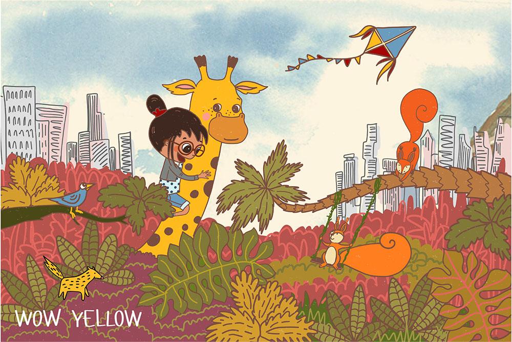
Transcripts
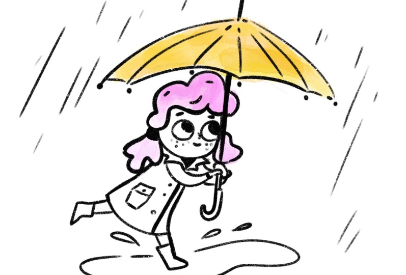
1. Intro: Cute Characters: Hi, my name is you've gained about about from
while yellow.com. I'm a professional
illustrator and surface pattern designer
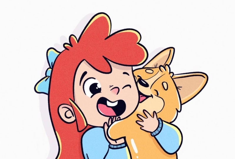
based in Bragg. Here's Publica, my
Boston Terrier. Some of you liked hearing
the previous videos. So here she is again, helping me with the subject
of my current class. Because this time we will
be drawing cute characters. Over last six years of
my Illustrator per year, I've done a bunch of fun Keith related projects
like picture books, coloring books, character
design, clothing, print patterns, and some
totally unexpected projects. Besides that, I've got a master's degree in
child psychologists, so yes, that's right. I'm a professional in
studying cute stuff. I wanted to tell you, drawing cute things. Is king. Why you may ask, well, besides, people go, Oh, when we see acute stuff, it has some major benefits
for your creative. Here to, here in just a few
markets closely related to Q, if characters, logotypes,
let's cut design, locates, t-shirts and gloving
prints, kid comics, cute family portraits,
and of course, board books, coloring books and picture books for children. And the list can go on and on. In this class, you'll learn
how to identify what is cute. And we'll draw and the original cube
character of your own. We'll study the
character part by part from body to
head proportions, moving to facial features. And Bill finished with lethal but so important
details like hands and feet. And then I believe you
will feel encouraged create your own super
cute character. In this class, I will be using human characters to explain
you the basic of calculus. But stay tuned because I plan to make another one on
animal characters.
2. Cuteness Formula: Let's keep in mind that even though we draw stylized
illustrations, not realistic, every picture on the Internet is
subject to copyright. I don't recommend to base your
art on references heavily. Just observe general features, get inspired and look at many
photos at the same time, rather than focusing
on just one image, you most likely
won't get in trouble if you use the reference
for educational purposes. But in commercial illustration, it is vital to pay close attention to what
you base your drawings on. Now, let's talk about
the kidneys formula. In the 40s. Conrad Lorenz
found out the baby's schema. It's a set of features to
find Q to cross species, no matter if it's
a human and animal or perhaps even fish. Big rounded head, big
guys, rounded body, large forehead, overall
cabinets, and smooth skin. In this study, they manipulated
the photos of babies and animals to make them appear
presumably more cute. And then measured the
brain response was proven, but people are more
willing to take care for more cute characters. We have this subconscious needs to care for
cute creatures. You can even ask
yourself the question, how likely do I care
for this little thing? It's a nature survival
mechanism because the baby's survival depends
on adults caring for it. So everything including
babies and animals. So if they're above features, the process is kicked. See the summary of the
key features again. As I use my dog paprika
as a status object, they can live in
large foreheads. Other alternatives.
This little skin doesn't have it so that it's
okay. I like that anyway.
3. Body to Head Proportions: So how do we know if the character illustrated
is a child or adult? Normal, realistic,
grown and body consists of eight or nine hands, while kids are usually anything between
four and 7.5 heads. Now I will draw very
schematic and doubt. Please don't laugh at
my clumsy drawings. This is just a demonstration. I'll talk about the arms
and feet a bit later. So this is a normal
adult character. Then let's draw the kid something in the middle,
about six heads. So remember one thing, the head stays very
similar in size throughout the life while the body grows and changes
the overall proportions. So this is a kid and
a very small child. Probably a toddler would be
let's make it foreheads. I have was helping lines behind. So the hip line would be somewhere in the
middle of the body. Please note how hens are reaching a little bit
below the hip line, but for illustrated
character so they can go, they have shorter limbs. It within Paris. Now when the capture the
overall proportions, I want to mention what an illustration I
like to exaggerate things and we can amplify
some specific features. Nobody can forbid
us from doing so. So if you want to play with
the scale of the proportions, you can make the
head even bigger. You can ask how much bigger? Well, let's see. What if I do head size
of half of the bargain. Then I remember the hip line
is somewhere in the middle. And kids are normally have shorter and softer limbs and
tiny feet and tiny hint. Okay, how about that? Now, I want to mention a
few things to keep in mind. Here's the obvious one. If you draw a kid
next to a doubt kid, it will obviously be
much smaller in size. Second one, this headstands
very similar in size. Throughout the life.
The body grows. The third one, whichever style you use to draw
the legs and arms. Remember what were
smooth, rounded, and usually tiny
overall shape of the body for babies and kids is softened and
round and smooth. On the contrary,
you can think of teenage characters who can have disproportionately
long glimpse. And body shape is kind of
all energy and angular. For drawing legs and arms, you can just drop the joint and draw wonky kind
of limps overall. Or you can just go four sticks, or even just
geometrical figures. But remember what oval
and rounded shapes overall might be looking
more cute and childlike. In the distillation, It's
all about the contrast. Now, you can use them to underline the features of
your cute little character. In the next class, we will
talk about facial features and proportions of the
character's face overall.
4. Facial Features: Being asked, here, I want you to think about if you're
drawing the eyes or the eyes and the
pupil's eyes could look very cute and minimal but circular Eyes brave the
pupils are all eyes. Allow a little bit more space for interaction between
the characters. Look at my example. Plan looks like what's two characters communicate
with whichever. Second feature.
Usually the face child is either oval or circular. Very smooth and grounded. On the contrary, think of an
adult illustrated characters face the more pointy and Angie. This guy looks older
than the character. Just because his chin
is pointing Angular. Of course, even when you
illustrate children characters, you can try drawing triangular
or square shaped heads. But consider steel softening up the edges so it wouldn't
look too sharp. Here's one that's always trick. For children. Facial features are
usually squished together. In the middle of the face. Also where usually placed at
the bottom half of the head. So if you draw two
crossing lines, horizontal and vertical in
the middle of your circle and place the face in the bottom half.
You can't go wrong. Another thing to remember is that eyes and
nose and the mouth, they are very close
to each other. Child, for an adult
person IS would be somewhere in the
middle of the hand and nose and the mouth
would be further away. I just wanted to say
with eyes placed on both sides of the head could
also be perceived as cute. Please keep in mind
the specifics of your individual drawing
style and trace this information just as
overall recommendations. Now let's talk about the
nodes and child nodes would be very tiny
and NADH To defined, especially if we draw in
the character in profile. So it wouldn't be
sticking out too much. That's more characteristic
of a doubt. Instead, it would be sticking
out just a little bit. Another node on the profile of cute character is what it's
usually not very defined. So let's say for an adult, it would be very curvy
and nose would be showing up more and the chin
would be more pointy. For a child, we would keep the definition of
it very minimal. The chin would this
soft and rounded. The nose would be tiny and
not showing up too much, and the forehead would
be large and curvy. Let's go through it again. The gene would be
rounded and smooth. The nose would be
non-defined and tiny. Eyes, on the contrary, would be being including
the large pupils. Face of all is
smooth and rounded. Features of the face
overall as squished together in the bottom
half of the face oval. The definition of the
profile is minimized. And of course, don't forget
that you are totally allowed to break the rules
and do your own thing. Now, I want to share the most guarded secret
of all the illustrators. How do I add the extra
cuteness, their character fast. You can just add the blushes to the character's
face. That's it. Now you know as well. In the next lesson, we will talk about falls
and the figure dynamic. Stay tuned.
5. Pose and Dynamic: Even though the main focus of our class is how to make
the character cute, I like to give you
a few quick tips about the character's pose. Usually, when we learn
to draw, redraw, everything is
symmetric and stiff, but the stick figure does
not look too natural. We normally don't stand
symmetrically with our arms stretch along
with the body, right? So why does it make sense
to make dynamic poses? It captures the movement
of the character. To capture character's
personality through a specific
way they move. It helps to tell the
character story. Also, it might be boring to
look at the static objects because the viewer's eye doesn't travel
around the drawing. Here are a few practical tips how to add dynamic
to your character. First, to make sure the
finger does not fall, make sure we have to
wait under the hip. Then the easiest way to add
the dynamic to the false is to tilt the characters x is
in relation to the Canvas. Make a diagonal, e.g. if your character is running, the more tilted it
is to foster Durand. Look at this example where I
demonstrate running finger. This first-person is
jogging quite relaxing. The arms and legs
are bent versus this upper figure is
running furiously supervised and its body
axis is almost parallel to the ground versus their arms and legs are almost
completely stretched. Next thing you can do is
to make the body S-shaped. Note how the body shape
is round if there's an accent to the bottom part. We talked about it in lesson number two about
the body proportions. You can straighten and
bend the opposite. Hands and legs, don't
counterbalance. And I've made a few quick
examples of how this principle, my work in action. Also, if you're a nerd like me, try searching Michelangelo's
counterbalance on Google to find out more about
this fascinating topic. So the key takeaway from his glass is to remember
about the dynamic. But also you don't have
to go over the top, given the tilt of the
character's head, adds a lot of points
to your drawing. So keep experimenting with it and find out what
works for you. Back. In the next video, we put together all the knowledge
from the previous lessons, and finally put together a
cute character of your own. Stay tuned.
6. Drawing the Character: The final character, I will
be using my under sketch, the clinic, because
I draw on my iPad. I got them benefit of using multiple layers
on top of each other. So now I'm creating
a row sketch. I do those supporting
lines vertical one, horizontal one for the ground. And now I liked me start
marking the main part. The character goes on
to handle the body, the legs, the arms. I decided to throw
a younger kid. So the head is roughly as
big as the whole body. For simplicity, I also
divided the head to house and I drew two symmetrical eyes in the bottom half
of the claims. Now when all-important
five sine place, I can focus on the
facial features. Hydraulic tiny nose, little
eyebrows, very tiny mouth. Now, I drove big pupils because the character
is very young. It's a baby or
perhaps that toddler. Now, it seems like my
rough sketch is done. So I could create a new
layer on top of it. If you draw digitally, feel free to do the same. I increase the opacity
of my brush to draw a cleaner version of the same character
on top of my data. I'm using, my draft is
in place and then throw cleaner and more details
lines on top of it. Meanwhile, I've decided what my character is going to
be a girl with pigtails. Little trick here is to add a little bit of volume
for the hairstyle. For deliverability. Make the character a
little bit more guarding. I decided I didn't
highlight top eyelid, make it a bit darker to create
the effect of eyelashes. But it's very important
to not overdo it. So your character wouldn't
look too cartoony. Now I'm just throwing
big dark pupils, once again, adoptive
with the color. And using the eraser tool, I will add the
sparkle, the horizon. Now, all that's left is just to outline the body
using cleaner lines. There'll be adding
accessories and dressing up our characters
in the next lesson. So I'm not focusing
on it for now. I'll just quickly finish the feet and hands
his character. And then I can draw another one in more
of a dynamic pose. Here I will speed up the
video a bit for you. Basically I'm going
through the same steps, starting with supporting lines, going from overall shape of
the body towards the details. Supporting lines are
there to help us. So please don't
hesitate to use them. And remember what we
have as many attempts, as many layers as we need
to create a result we like. I see you in the next video
where the accessorize our characters and add a little bit more of a
personality to them.
7. Accesoiries and Personality: Accessories help us
to tell the story. This is very controlled. Shine and show off your
character's personality. I placed my artwork from the previous lesson and
lower the opacity of it. So I, there'll be drawn
into accessories on top of the base I created. Previously. I decided I give my girl character acute
warm sweater and scarf. For how balls I thought, I will add just a little
bit more dynamic. So I will draw her as if
she's waving her hand and I will bend her legs
and labeled data as well. Because I drew her
hands are very tiny. I don't focus on the
fingers in this case. I just keep them short
and the whole hand tiny. Just to make it look
more interesting, I decided, and they'll dress. It goes hippie style,
bell-shaped genes. I don't have the need to focus on how faith and
her shoes too much, simply because they
have very little. So I didn't have a lot of
room for expression here. Now, I will utilize her face hairstyle
and how head overall. I am repeating my lines, pour ice and our
facial features. I think I will give her cute cat ears niche I saw
keeping straight wire. Or even better, perhaps
a unicorn head band. Yes, it's small fun. Now I will try to add
some nerdy glasses. Kinda start to live the
overall funny nerdy local. Her wanted to add more and messy hairstyle hair. I'm thinking I will just add
cute little cross party, tiny purse and she
will be good to go. Now, I will add details and accessorize my
second character. To make it more inclusive, I decided to turn this
character into a boy. So I will just change
the hairstyle. I thought I will dress
him up and then jumps in. And I gave him a basket
full of adults to support the narrative of the apple hanging
off a tree branch. Now I will speed up the
video a little bit for you because I'm using exactly the
same principle as before, clarifying lines and making the whole illustration
looking more clean and neat. So now that my characters
are finalized, I honestly cannot
wait to see yours. Please share it in
the project section. I'm looking forward.
8. Outro and Thank you!: You've made it.
Congratulations. We've covered everything from body
to head proportions, to facial features
to dynamic pose. And two, how to personalize
your character. And what features
of the character make them appear as cute. And how little details can help you show the young
age of the character. If there's one thing you take away from this class
is what we've create. Cuteness comes great
responsibility. Just kidding, just keep drawing. You really get better
with practice. And you grow faster when you observe the world around you. To really reflect on
the things you create. Remember the basic
cuteness formula, but feel free to
experiment with it. I dare you to go and
check your pet or your favorite Disney character for these markers. So cuteness. Upload your project to the class gallery so we
can all take a look. I really cannot wait to
see what you come up. Please review this class
to help more people find out about it and let's be
friends on social media. Shelby, definitely not miss an update about my next classes. Go to my website and
subscribe to my newsletter. I will be very happy
to see you there. Thank you again for watching. I'll see you in my next
classes and stay creative.
 Evgeniya Pautova, Drawing happy things