Transcripts
1. Intro: Hello, my name is
If Gina Padova. I'm an illustrator with teachers
degrees based in Prague. My creative brand is Wow Yellow. I do a range of commercial
illustration work starting from Tissirt
design to web illustration, to surface print, coloring books and even a series
of travel posters, which I've done just recently. I travel a lot and I love sketching awesome
things around me. I sketch for probably
last ten years, I've done about 1,000 of sketches in over 20
different countries. I like to travel light and I want to have it easy
when I pack for a trip. I needed freedom and mobility
in my sketching as well. That's how I ended
up sketching on pad. I found out in my
years of drawing, what it should be very easy to begin to self yourself
up for success. You need to make it very simple. If the project
looks complicated, the brain will do everything
to avoid even beginning it. I go do it, join me for a of relaxed and efficient
drawing buildings and even the whole cities. I'm simplifying drawing
the buildings step by step so it doesn't look
scary or complicated. Because it is about the
joy of drawing after. All right, Right. In the next video
I'll tell you more about the class
project statuned.
2. The Class Project: Drawing buildings
is for everyone. You don't need any
prior experience. You don't need to learn
the perspective or any complex theory to just enjoy the urban
sketching fabrica. You want to be in the video, look at the camera there. All you need is your
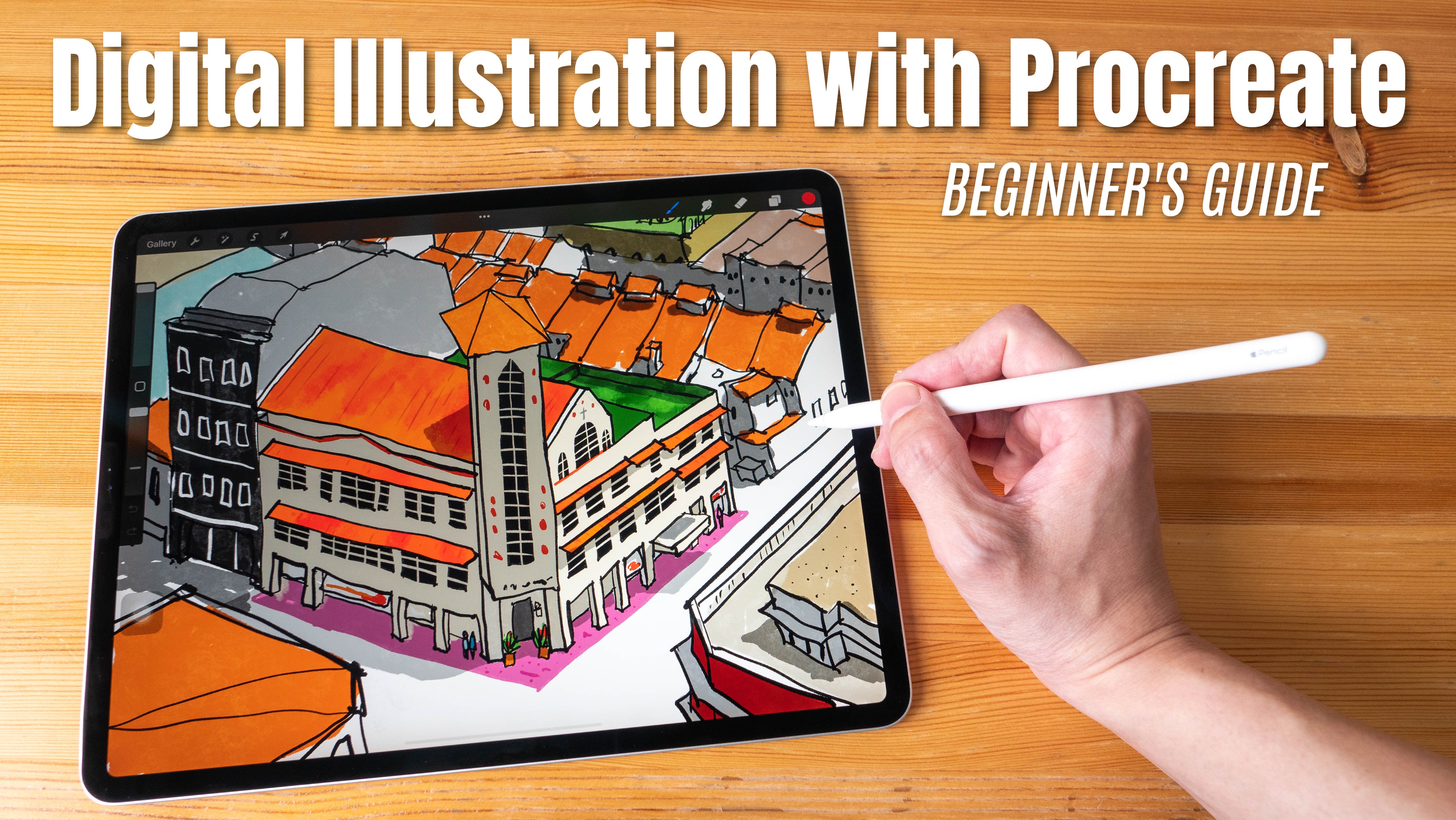
ipad and Apple pencil. I will be using Procreate app. However, you are free to use any other drawing
software on your tablet. If you still want to go
analog, that's not a problem. Just prepare some paper
and then ink brush, pen or any graphic drawing tool which allows you to vary
the thickness of the line. The class resources, I prepared some procreate brushes and
reference photos for you. Also, you can find
all the drawings and prep materials which I
will be mentioning later. Class continues my
first drawing class called The Power of Line, where I go through
line properties. Feel free to check it out. However, in this class, I will be explaining
everything step by step, so you can stay here
and start right away. We start with how to
look at the building, we continue with the importance of the shapes and silhouettes, and then move on to the
building blocks of the houses, like windows, doors,
roofs, and others. We end up with organizing all the many elements we see on the picture into a simple
and comparing sketch. By the end of the class, I believe you will feel
encouraged and brave to take your ipad out and
throw the city around you.
3. How to use References: I start by opening procreate, and then I will create a new file by clicking this
plus icon in the corner. And I will choose
the screen size. I have it on top of my list, but you might need to
scroll down to find it. This is our new file. I want to start by showing you
how to use the references. There are two ways I use. The first one is building
right in procreate. To bring up the reference photo, you need to click
here the Actions, then Canvas, Then you switch
off the total reference. Here I have mine saved in
my photo app on my bed. I choose the image,
import image. These are all my last
photos and I will choose a photo of the
building I need here. You can zoom in or out
for better visibility. Also, if you hit
Knob in the middle, you can move it around. It doesn't cover
your image draw. Or if you hit it by the
corner, it might be hard. But if you hit it by the corner, then you can change the size of the reference pop
up window itself, which could come in handy. But for this purpose, I will use the second
way of using references. Let's close this window now. The second way comes
with every ipad. I prefer it because
it helps me to switch between different
references more easily. I make sure that my photo app is also open in the
applications panel. Now I go to procreate. I hit the bottom edge of the screen without
releasing it. I pull it up. I pull up the open apps
when I tap the photo app, and without pull it up into
my screen because I'm a left, I will put it to the
right side of my ipad. But if you're right handed, then you can pull it here. It doesn't mess up
with your drawing. I put it here only after
that I release it. Now we, in two window regime, we need a little bit more
space for our drawing. I will hit this element here in the middle on the border
without releasing it. You need to be precise. Without releasing it, I adjust the size of my reference window.
4. How to Look at Buildings: Before we begin drawing, I want to talk to you
a little bit about how we look at the buildings. How do we see things when we
first look at the building? I prepared an example for you
here at the first glimpse. The building looks
quite complex, but any building could be simplified and imagined
as just a set of boxes. Now if we look at this building, let's choose some
contrasting color. This is essentially a set of
building blocks or boxes. Box number one, a
horizontal one, then another box, a tall
narrow box stacked next to it. Then on top of it, we see
a little triangular block. Can the block be triangular? Then three tiny
squares on top of it. Those towers, I would say was a narrow upstream triangles. Any building, even
the most complex, could be simplified to
those basic shapes. Let's strike with
another example. This building is a long, horizontal low box with a square box attached
on top of it. Another horizontal box. This is half a circle, a square, and the triangle. This detail here is a square and the semicircle number square. This is easy like that. I suggest you choose a reference and try to analyze it
in terms of boxes. Feel free to create a new
layer and draw on top of it. And it will help you
to practice viewing complicated shapes as a set
of simpler shapes like this. I would love for you to share your results in the comments so I could see your analytical
processes looking forward.
5. Buildings' Silhouettes: Now when I have my references available here on
the right side, I will choose one house for
practicing our silhouettes. I can also, by pinching it in and out, I could zoom it in. And just the size
for my comfort. Let's choose a black color. I will be using my ink brush, which you can find
in class resources. Stride on. I want
to go ahead and adjust the
stabilization a little bit because I don't really need the app to
smoothen up my lines. I want to be more in control. You can look at it again
and copy my settings. How do I look at the building? First of all, I ask
myself questions. Is this building tall or low? Is it wide or is it narrow? Its width is larger. When it's height, then
I look at the roof. Is there anything specific, any elements which pop out
of the silhouette here? We have this little
spikes, then pipe, maybe fireplace, and then
a few more spikes here. And we see what the roof is sticking out compared
to the wall. And we're going to
consider that as well. While drawing our silhouette. I start from the
bottom line baseline. I just look at the
building and copy, trying to copy the shape I see. Here I see some bushes
which I will ignore. The straight wall when
the roof sticking out. I continue to draw the
spiky things fence, the little spike with
fingers sticking out. I'm not zooming in on purpose
because I want to keep my focus on the overall
silhouette to keep recognizable. I don't want to get lost
in tiny little details. I don't want to be like
extremely potter realistic, but because there's
photography for that. But I still want to preserve the image of the building
to keep it recognizable. With my eyes, I scan
the shape and I pay extra attention to the line
where the two surfaces touch. And the surface of the
building is touching the surface of the sky in
this case, or the Earth. Okay, here we come to the tower. And then the top
of the tower has this element which is also
showing through the wall. We connect those lines. This is our first silhouette. I got the privilege
of drawing digitally. I will just put the
silhouette out of the way. Here, I make a new one. Let's see, what else
do we have here? I want to find
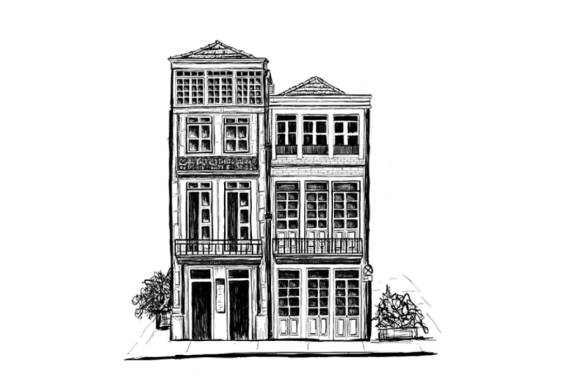
just one building. This is a nice house
I will consider with two houses sticking together
as one just for fun. I believe it's a
port wine house. In port, I will start
from the baseline. I will ignore the chairs
and the parasols. I will just try to guess where the fundament of the
building goes here. It goes a little
bit deep inside. I will reflect it in my baseline and this should be
relatively straight. Let's see, here starts the
second little building. It's taller than
the left building and it has a balcony
sticking out of the silhouette. Continue up. When I reflect the
roof in my drawing, notice what this line
is uneven because of the roof tiling. I reflect it as
well here the roof, because we stand
down and look up, the roof line goes down. How can we reflect it or make sure it is similar
as in reality, we take our apple
pencil or any pencil. If you draw it
traditionally you can just put it on the
drawing like this. Then without changing the angle, you copy this line, you transfer it to your
drawing at any moment. You can also check
your angles like this. This is the easiest way without knowing anything
about perspective. The easiest way to somehow
stay on the perspective. This roof, it's just
a little bit rough. Again, I don't go
into details here. Here, the roof is sting out and the line is going down
because the building, the angle is quite sharp. Notice those little elements
sticking out, fine details. That's what make the
building look unique. I try to pay attention to it, even though I want to
get obsessed with it. I want to keep it believable. Here's our second silhouette.
Let's move it away. Let's draw another one
here. This building. It seems like a lot is going on, but if you look at it, just the outline of it, it's just a simple block. It's square and a somewhat cut off
triangular shape as a roof. And then a rectangle
on the right. Let's draw it. I start
from the bottom, it's always nice to get
the building grounded. First, it doesn't hover
above the ground. Then here we see a little unevenness
because there are doors. I'm just trying to
reflect it in my drawing. Okay, there is
architectural elements sticking out of the wall. Then I see a little
cultural element. The roof continues
up an arch thing. When was the first hour? I can see what it's placed above the the front right
corner of our building. It's great if I hit
the right spot. If not, it's okay. Nobody is going to go and check to the location if I
drew it correctly, but it's an extra point. If it is placed on the spot, then I see, I think who
towers behind the building. I'm not interested in that. I see another tower
similar to the right one. Don't get into details, we're only looking at the
outline at this point here. This is sticking out element a balcony and
we connect the line. Look, we draw a silutte of this complex building and
it's relatively simple. Now you try drawing
those three silhouettes. You take the reference
photos in your materials. Under the video, I suggest you choose two
of your own references. Whatever you like, you draw two more silhouettes at the end. I would like you to draw
three silhouettes with me, plus two of your own, just to practice seeing
objects as a whole.
6. Buildings' Structure: Now let's break down our silhouettes into
structural elements. I will start with a
silhouette of this building, which is technically two
buildings glued together. I look at the main vertical
and horizontal lines. I divide the building
into the component. This is our main vertical
dividing two buildings. It's located here. I go around the roof and I
mark this vertical like this. Now I want to separate the
roof from the walls like that. I want a straight line here. In the upper roof here, I can see the double line which I also bring to my
drawing here as well. Now I bring up more
important verticals. This border on the left and on the right is important as it's a key element
of the building. I make little breaks for my horizontal borders
which will come later. And the same on the right. Now let's bring it
down horizontally, a border dividing the floors. I go around the balcony because it's not just
a straight line, it has a little bump. The ground floor and
the first floor, It's marked the
balcony here as well. I'd like to connect the lines where the surfaces enter each other because this is where
we focus our attention, usually when looking
at the picture. When the lines enter each other, it's good to pay a bit more attention to
those connecting points. Now, there's another
boundary on top of the building,
a narrow border. I want to pay attention to
this element, a portal. It starts roughly in the middle, a little bit less
than in the middle. I just look at the shape of it, the silhouette within
the silhouette. I try to bring it
onto my drawing. Now we need to mark the
ground floor window or second door portal like this. Notice the little
bumps on the top line. Now let's look at
the right building. I want to mark this frame
around the windows. We will work on the windows
in the next lesson. Now, another group of windows which ends
up with the balcony. I can see now the balcony
takes a bit more space, but it's okay to make mistakes. I will mark the line
of the balcony. I will this Maria over
the ground floor. Now it's your turn. Take the
building silhouettes from the previous lesson and break it down into structural elements.
7. Drawing Windows: Let's talk a little
bit about windows. Before I get into street sketching and
into drawing cities, I probably would be
drawing windows like this. A square and the cross, It's a representation
of the window. It's true, but it's more
like a symbolic icon. It happens because early in life we identified the object, we looked at it,
and we placed it in a category when we
just forgot about it. Now when we think window, we just imagine this. It happens to everyone. But now I offer you to get interested in
looking at windows. Again, let's sum on this photo. This is quite a classy windows. We need to consider
a few things. First of all, we usually sketch at the daytime or for
the purpose of this class, we assume it's the daytime and
the sun shines from above, like this, windows deepening into the surface
of the building. The sun can't reach it so much windows in most
cases will be dark. Even if we reflect the
sun and we look white, you can't go wrong with drawing them dark, like look at this, look at the contrast
between the frame of the window and the
actual glasses. Because sun cannot reach
inside the building easily, we see them dark. Second of all windows, we have different
kind of construction. We have some thickness in the
frame. It's not just flat. Each window has a debt, and the frame of the
window has thickness. They all look different. Each window has its
own unique personality and doesn't look like the hours. Let's just try and draw
this window together. I will be drawing this one. Let's move here. For the sake of this example, even though it's a gloomy day, I will imagine what
the sun is shining from the left top angle. I will consider
it in my drawing. You might look into
it more if you take my previous class on line drawing called
the Power of Line. I started with the window seal, which is the darkest
and the figest line, and it doubles actually. For this drawing, I
would need a little bit of stabilization of my line. I will just take adjustments
a little bit higher. It's around 25, 30%
for each adjustment. Yeah, this gives me a
little bit more stability. And the line will
be more straight. The sun goes from here, which means this
line will be darker. When this line, I do it by pressing harder on
my apple pencil, and this one is lighter. I keep an extra attention on connecting the
lines on the corner because we can the objects
on the perimeter still, if lines enter into each other, it creates the sensation of
the wholeness of the object. This is my frame
with my window sill, which also has a thickness. I'm going to mark
that all my lines on the right will be thicker
when the lines on the left. Because I decided what, that's where the
light is coming from. This is the inner frame. I believe it goes like that. We decide what to do with
the plant later. It's okay. Sometimes if it takes
you multiple tries to make the line you like, you just cancel it with
double tap. You try again. We have time. This is
the window itself. Now I look at it has the six sections and the top two are separated
from the bottom four. Here, the light, I'm not drawing the frame like the breaks
between the window, but I'm drawing the
glasses itself. And the white frame appears as a counter
form within them. Now, is it perfect?
By no means not, but. It's sketching and learning. I'm quite content with it. I keep zooming into the details. Now I have a structure of the window, but
there's more to it. Here's some dead
and here as well, because it's double glass
probably or triple. Now I want to make it dark. I will. I don't want
to just paint it. Blow, paint it. I want
to make sure that it's still interesting and
it's versatile as a sketching. This is the darkest part because the sun doesn't go here at all. This part could
be a bit lighter. Here I can play
with different ways of feeling the shape
with the strokes. I specifically don't aim for
it to be identical because it's boring for the eye to look at the six identical squares. I can play a little bit. I leave a little bit
of space between my lines for the added interest. The glasses, the
surfaces are never, even if you look into
it in each darkness, here's a little bit of
light in the lights, a little bit of darkness
like the young concept. Now I see, what else
can I add to my window? I see the depth of this architectural element
decoration around it. I'm trying to bring
it onto my drawing. If you need a perfect line, occasionally you
know what to do. You draw the line. You hold onto the pencil
until it straightens. You can even adjust
it like that little. Sometimes it's nice to
combine a perfect line with the organic,
loose, sketchy lines. That creates a nice effect here. I can fix this a little
bit, I can see what. When I draw and make a
bit of adjustment here, then there are still
more tiny elements here. I don't want to be
very literate here, but I want to make a hint
that something is there. This is our first
sketched window. Now let's draw another
one. Maybe with one. Let's try simpler versions. Sometimes we don't
have time to zoom in and focus on each window. I will draw this window
in a more simplistic way. Still, I start with
the overall shape. For the sake of experiment, the sun will be coming
from the same angle. Notice the curve on top of it. Notice what my shady
side is still get darker and thicker
line. I can adjust it. Then there's an
architectural element. You see this dark, It's because the sun doesn't go underneath this
decorative element. I will probably emphasize
this line as well. The top line could be lighter. Okay, then there's some
decorative element underneath. Now, I will take a fier brush, just a little bit of thicker. I will just squint my eyes and I look at just the
dark elements. I look at them not
as the window, but as a combination of dark, rectangular shapes
within the bigger shape. I don't even have to
count them specifically. I just aim at roughly
similar mode. I just little rectangles close
to each other like this. Because the frame between those glasses is so
thin it would take me eternity and much more
energy to droid like this. It's just annoying.
We don't want it, we don't want to be annoyed. Take a thicker brush. Just draw it is a series of little rectangles
arranged close together. In sketching, we
aim at combination of looseness and being relaxed. But we don't want to be ignorant about the subject as well. We want to respect
it and we want to pay attention and look
at it with the interest. Then our audience is
also interested in it because we are interested
in maybe finer brush, and I take just a little
hint of the brick elements. Again, I start from
the darker part. I release my lines closer to the end to imitate the light
and imitate the shading. Here's our window number two. If you zoom in, yes, it's loose and a bit clumsy. But if you zoom
out, this is fine. Probably, I will need
more windows like that as part of the building.
It will look all right. Let's try to stylize
it even more. Let's find another window which would fit. Maybe this one. We won't even zoom in too much, because sometimes
it's a big building with lots of windows. We just don't have time
and it doesn't make sense to really look closely
at each individual one. Look at this window,
don't zoom in on it. If you don't zoom in,
it's just a series of six dark shapes, not even shapes, but like a figure lines
arranged together. Our brain combines them together and unites
them into a window. I take a figure brush and I'm just drawing
to dark shapes, trying to repeat it, where's a curve upstairs. And then when there's a
free rectangles down there, then if I want, this is already enough to
believe it's a window. But if I want, I can also unite them by thinner line because
you can't even see it. But I believe there's like a frame and decorative element. I'm uniting them. This is our window. What I want from you is to draw three
windows together with me. Then choose two more
windows, and altogether, just draw five windows to practice different
levels of sterilization.
8. Final Project: Silhouette: Now let's draw the
whole building from, start to finish together
following the steps. In my previous videos, I started with the silhouette, first the ground
line, the walls. I outlined the shape of
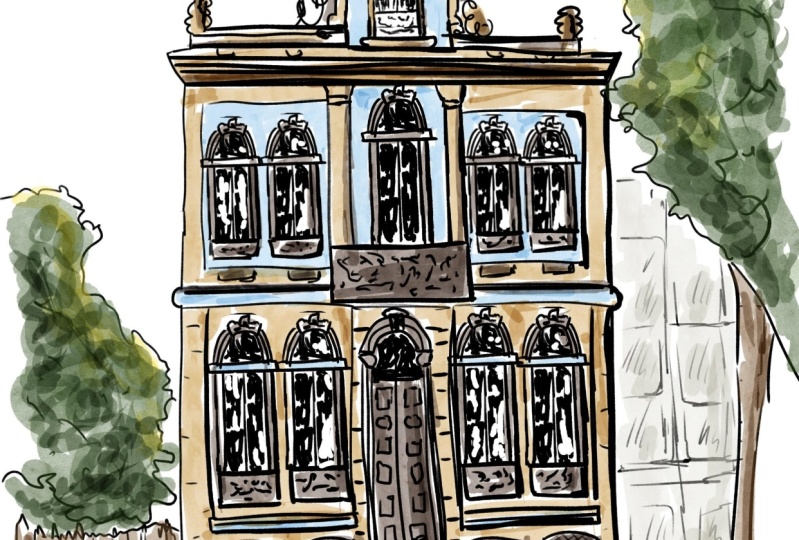
decorative elements in the roof. This is a building in
Portugal, by the way. Another square on top
of a bigger square. Smaller decorative elements. I'm not afraid to
make a mistake. I keep it travel loose
because it's sketching. I want it to look
like the building, but I don't want to
be too literate. It's more of my impression
of the building here. We see the bump in the roof. This line is also not straight because there's
this relief here. Actually, I might
go back to the wall and reflect the roof
child here as well. Now we're done with the Lit. I want to highlight
the ground line to make the building
really stand on Earth. In the next video, we will bring it down to structural elements.
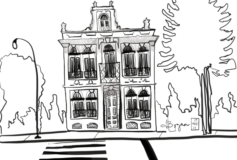
9. Final Project: Structure: Now let's break it down to smaller structural
elements separating the roof, other roof line. I make my brush smaller. Then this building is divided
by border with the balcony, which is in the center
of the building. My secondary lines are
thinner and less black than the main silhouette lines
here goes like this. Another line, where are borders around those
groups of windows. Two windows, one window,
another two windows. A large door with the height of the whole floor and decorative elements surrounding these two
groups of windows. Then I want to
separate the base of the building from the main
floor. Let's do that. Start from the base. The
border is already here, so I just connected the
border for the second floor. Those lines end up in a
decorative capital of the column. It won't be straight separating the window groups like the. Okay, what else is important? But we must break it
down a little bit. On the top, there is a double layer of
decorative Sem columns, which I want to
reflect in my drawing. A little bump here. I want to mark the door already at this stage because it's such an important
element of the building, it's very visually bold. And contrast line,
I bring it up, then we broke it
down to elements, it starts to look a little
bit like the real building.
10. Final Project: Windows and Doors: Now let's add our windows
to the drawing by window. I mean all the surrounding
decorative elements as well. For the first one, I
will actually zoom in to make sure I want to
miss anything important. This is at the top
of the building, also in the center
of our composition. I think we could focus more of our attention here
on a central line. And then maybe go
a little bit more rough on the edges
if we want to. Starts right at the border, maybe slightly thinner brush. This decorative element
looks quite complex. But if we simplify it just
to the basic outline, to the shape of it, then we don't really need to know
what's going on there. Zooming, it just looks like an abstract, curvy curly shape. That's how I decide to capture. It's the thickness here, a little bump, the borders, there's the thickness
of the frame. Don't forget about the light. I decide what the
light comes from. The left up, of course,
it's a sunny day. All my lines on the right
will be thicker and darker. When my lines on the left, there's a little fence here. Now, as we remember,
the windows are darker. This will be the
darkest point here. I will fill it up
with the strokes. I try to keep my strokes
in the same direction, In this case it's vertical. I just fill up the darkness of the window glass with organic, chaotically
structured strokes. Now let's look at these details. Within the border, there is also multiple
decorative elements to it. I will make a few lines within the sculptural shape
on top of the window, Break down the little
columns a bit. Now, I want to mention the corridor element
underneath the window. I didn't leave too much
space underneath my window, but that's not a problem. I will just mention something. Is there like a squared shape? It's darker on the bottom and on the right to suggest
the perspective, Then something is going on here. I mentioned those
elements as well. Now, I want to bring down the
decorative balcony fence. It may look quite
complex if we zoom in, but in fact, if I
squint my eyes, it's just a bunch of dark abstract shape
combined together I will in this white space and just add a little bit of seely elements. It looks like something
is going on there. My first window is done. I go the same about the
rest of the windows, but I try not to copy with particular rhythm and not to
copy with particular shape. It's okay if we all look a little bit uneven.
I'm fine with that. Another reason I start from the central windows in
case if I run out of time. Let's say I'm sketching
on the street and I have to go
about my business. After that, I start from the
most important elements. This way, my sketch will
look more complete, even though not every
element is really defined. I'll continue my
drawing starting from larger, more important, and darker elements when looking within the shape and
utilizing it to my liking. Perhaps with central window, we will be quite detailed. I really look at
what's going on there. But the rest of the windows, I will go a little bit
easier on myself with that. Here. I know that is a
group of two windows. I go moistzed in
terms of the details. Maybe even take a smaller
scale of my drawing, so I can't get into the details too much and
it won't take me forever. If there are different level
of stylizing the drawing, I would say the
central elements or the most important
elements we get. Grade one stylizing
the secondary things, this is grade two. At the bonus class, we will add the
surrounding elements, which will be very stylized
and very simplified. Because this way we can direct the attention of our
viewer by making them look into more detailed
area of the building first and not get distracted
by the surroundings, by non important objects. I will speed up my drawing
video for you a little bit, but you understand
the main principle. Now I want to focus on the
door a little bit more. First of all, there's a nice framing
sculptural element here. And then there is this nice
stone portal around it, which I also want to reflect. The door itself is
quite decorative. However, I don't want to
spend hours on drawing it. Doors are basically windows. The same principles
applies to it. It's usually dark because it's deepened inside
of the building. We draw them the same way, make sure there's usually an entry step or the
stairs. It's rather simple. In our example, I break down the door structure
into basic elements. Then I don't need to count
every little detail and repeat it Here I see what
is divided into squares, various size squares,
ovals, circles. I fill it up with combination
of squared elements. This part is very dark, there's no need for me
to really look into the darkness and draw all
these complex decorations. I just fill it up with black, maybe a few squigly
lines just to suggest what there's some metal
tested element like that. When I fill up my door
with shapes semicircle, a little circle, this is
oval, then something square. Don't forget about
the light source. This is another
opportunity for us to suggest the light and the air perspective. Done.
11. Final Project: Details: Let's see what's left behind. I like how my building looks like and I don't
want to overdo it. But I just suggest a couple of little details
here and there. We can easily omit them.
It's our decision. But I see under the roof
here, it's very dark. Dark lines here, figure brush like this. Then decorative group here, there's some relief here. I want to bring it up. Decorative elements, they don't really
stick out too much. Maybe just add a few strokes suggesting that
something is there. We don't see the
top border of it because it's
highlighted by the sun. I just draw the shadows
underneath shapes and break down the door group and suggest to us bricks,
stone bricks here. And then the other fence in the ground floor
may look very dark, but they're actually
smaller when they appear. In my case, I don't
want to bring up the black holes into my drawing. They look dark, but I
will keep them light and I just add a couple
of squiggles here. It lines, everything
is just lines. Then I get back to
the fence central. It's important I will add a couple of organically
looking strokes within this shape,
but I keep it light. I don't want to overdo it. I want to suggest, but there is a nice iron balcony decoration, but it's too small for me to really look
into the details. Then it's your turn now.
12. Outro: Congratulations on finishing
the class and thank you so, so much for taking it. I really appreciate it. So far we've covered the
building blocks of the houses. How important it is to
look at the silhouette, how to simplify the
building for yourself. How to draw windows and doors. What details to
pay attention to, what is important
and what is not? In drawing the houses. One thing I would like to
tell you in conclusion is drawing buildings doesn't
have to be complicated. It's not for the
few selected ones. It's about joy of capturing the beautiful things around us and bringing home memories. With practice, it
will become easier to draw the buildings and
even the whole cities. Right now, I can draw my city
prag probably with my eyes closed because there are some typical features and elements and I know
how they look like. Now I ask you to go and applaud your project into
the project gallery. I honestly cannot
wait to see it. I'm so curious. I really look forward to
giving you some feedback. I also want to ask you
to review this class, other students can discover it. It is very helpful and I
would really appreciate it. If you want to stay in touch, feel free to follow me on social media and reach
out through my website. Thank you again and see
you in the next classes.
13. Bonus: environment: In this bonus class, I want to show you how to place the building in
an actual environment. Let's take this particular
foot reference. We didn't see much
of surroundings, but we still want to make
it look like a city, not as an individual building. But building is our
main object here. We focus on the attention on that and the
rest of the object, we just draw with
a vague silhouette with the attention of the
outline of the object, but without really going
within the silhouette. I just want to take a
medium thick brush. Like this. And I just
look at the silhouette, the outline of the tree, and I just try to
copy it with kind of vague relaxed and
organically looking line. Like this. And I imagine
this is our three branch. I just focus on the silhouete
Now I'm drawing three, so everything's not three
is not interesting for me. On the left side, I
start from the building, I look where house
connects to it. So I start straight
from our wall, and I just repeat the
shape of what I see. Just a suggestion that
something is there, some environment is enough for us to focus our attention
on the main building, but to show some
other objects around. Here's cool fence which is
part of the city as well. Okay. So I suggest
something is there. Now, I look what's in
front of us in front of the building and to make it more convincing
for the viewer, I will draw another line of pedestrian part of
the road two lines. Like that. And if I want, I will make a
suggestion of a zebra. Very, very rough lines. If I want to, I can bring
up just the outline of the windows of the
building next to us. Just to show what there's
some kind of architecture, not just the emptiness
on the right, and the ground floor as well. Okay. Like this. Also separate with building. Separate with building from
the greenery around it. This is just enough level of details to show what your
building is standing in the city but without distracting our
attention from the main object. I hope it was helpful and you
feel inspired to bring it out to the streets and to try your own buildings.
Thank you very much. A
 Evgeniya Pautova, Drawing happy things