Transcripts
1. Intro: Hi, my name is Valerie and welcome to Premium
Effects collection, a series of focused After Effects courses
where I teach you the most useful effects
you need to know to elevate your projects
and get the premium look. And what makes these
effects truly special is that no AI tool
can replicate them with the same level
of perfection and customization you get when you build them natively
in After Effects. I've learned and practiced
each of these effects to the point where I can teach them in the simplest
way possible. No plugins, just After Effects. This is an intermediate
level course. So to follow along, you
need to know the basic After Effects fundamentals
like keyframes, precons, strike meds,
and the basic tools. Alright. So in this course, you are going to learn how to create a perfect shine effect, and to make sure you
get the most out of it, you will learn how to set it up in three different
scenarios on simple shape layers to create a beautiful shiny light
projection scen on precoms with UI design animation inside to make the UI look just awesome and on text layers making your three scenes
look truly cinematic. Along the way, you will see what issues you might encounter, how to fix them, and how to build the setup to avoid
them in the future. We will also cover
some important topics you might have missed in
your After Effects journey. By the end of this course, you will have the
confidence to create scenes that take your projects
from boring to premium, fully customizable and
100% native After Effects. No plug ins needed. So if you are ready to level
up your motion skills, join the course and
let's get started making your project
shiny. See you inside.
2. Setting Up the Shiny Screen: Hi, and welcome to the course. First, as always,
please don't forget to download the main
folder for the course. Inside, you will
find three folders. The first one is named AE. Inside, we will
save our project. Then we have the Assets folder with all
the assets we will use in the course and
a folder named Finals. Inside, you can save
your final renders. Now before we begin, if this is the first time you watch
one of my courses, I just want to mention the
small note you will see in the bottom left corner
saying, Let's do it together. When you see it,
it means you need to follow along
and get to action. But when it changes
to watch and listen, make sure you stop working and pay attention
to my explanation. All right. And now let's
open After Effects together. I'm using the Beta version so I can have all the new
features you might have since you will watch the chorus in the
future after I upload. All right. And now let's start by making sure we
are all on the same page. First, let's make sure we are using the same
panels layout. Let's go to Workspace and select the default layout in case
it still looks different. Just reset this layout
by clicking here. Once that's done,
let's make sure our software preferences
are matching. I'll go through
every preference, and you make sure to
match my setting. Especially in the memory menu, make sure to lower the RAM
for other applications. So After Effects, we'll get the most of the RAM for
a better workflow. Okay, with that done, let's now click here to get
to the project settings. And here, make sure
the bit depth is set to 16 bits per channel. This way, the gradients
and the glows in the project will look
much better. All right. And now we will start
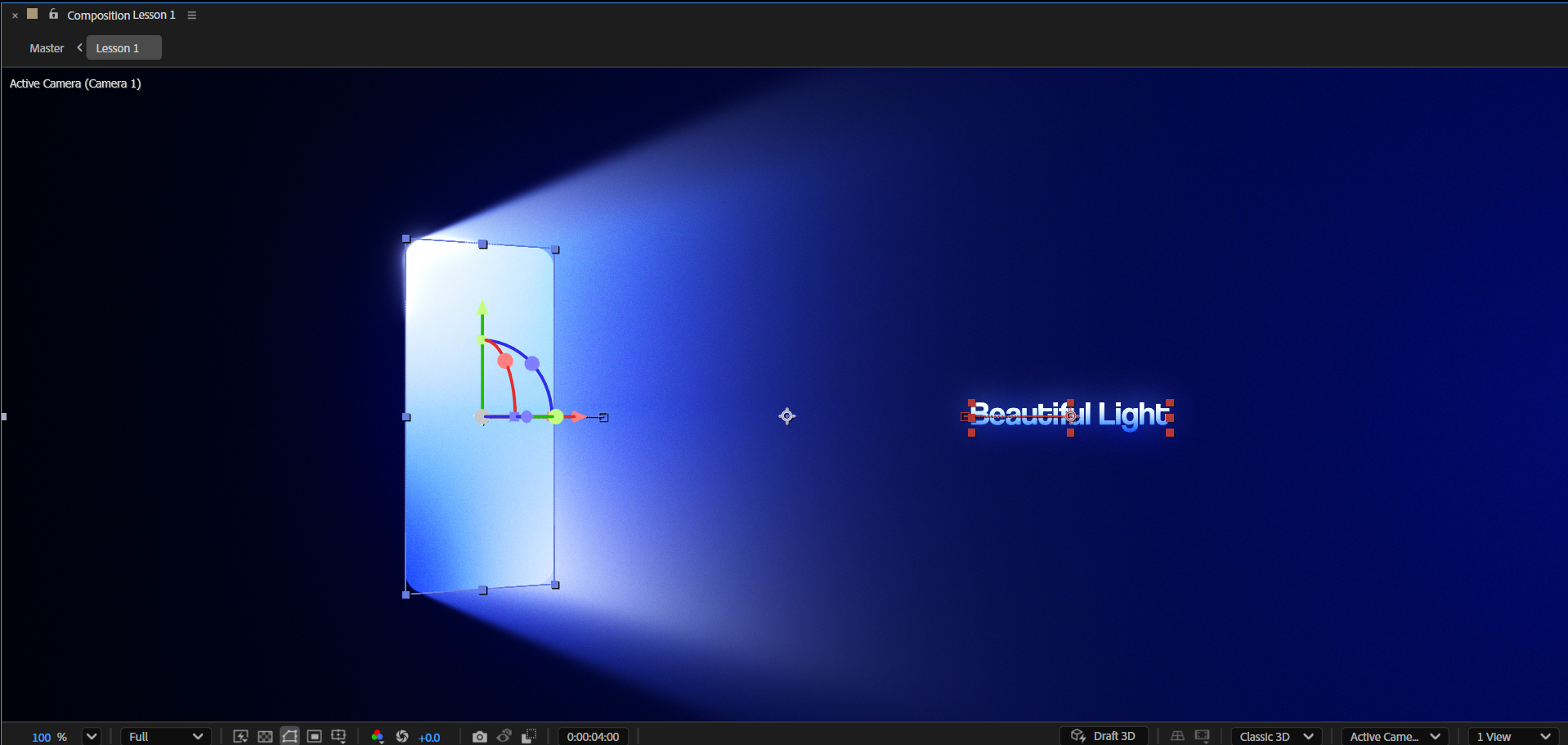
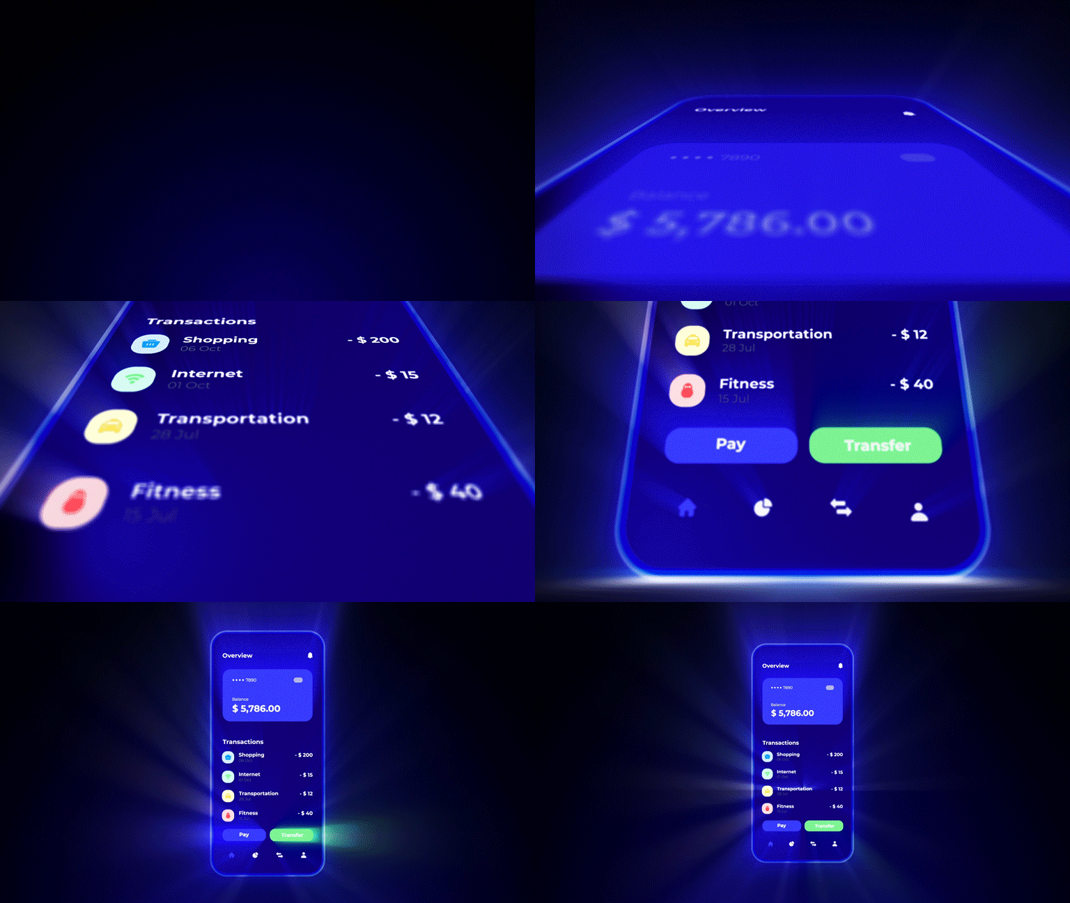
the course by creating this beautiful animation,
and along the way, we will understand the main idea behind this technique and what the steps are to reach that
beautiful shine effect, which you can use later in UI animations or text animations. We will start with a relatively easy animation so we can grasp the idea better and then move on to more advanced ones in
the following lessons. Okay. So let's begin with
creating our first composition. Let's call it Lesson one. Then choose the social media
landscape preset to get that full HD resolution with the frame rate of
30 frames per second. For the duration, you can
set it to 20 seconds, and for the background
color, set it to black. Awesome. And now let's begin
by setting up the scene. In my case, I decided
to create some kind of iPhone screen that
projects a big light. So to start, we first need to
create a cell phone screen. Let's decide that we will use
iPhone 17 Pmax dimensions. For this, let's double click on the rectangle tool to
create a new shape layer. For the fill color,
set it to white, and for the stroke, turn it off. Now, for the correct
dimensions of an iPhone, I use Cloud. Back to the project, and first, let's click the chain icon to unlink the size proportions. Next, let's set the
width to 13 20, and then the height to 28 68. Now we got the
correct proportions. But as you can see,
the shape is too big, to properly scale it down
and save the proportions. Let's now link the
dimensions and then divide one of the
properties by two. This way, we get a smaller shape with the correct proportions. Now, to scale it
down a bit more, we can use the scale
property of this layer. You could also keep changing the shape size dimensions.
It doesn't really matter. I just love the option to scale up my layer
in the future, in case I would need to
using the scale property. It's a bit simpler. All right. And finally, to give it
that modern phone look, let's increase the
roundness to, let's say, 90, and then press Enter and
rename the layer two screen. Awesome. And now let's start
working on the shine effect. To get better results,
it's better to give our shape a little
bit of different colors. Soon, you will understand why. For now, let's search for the four color gradient effect in the Effects and Presets. I'll press Control
or Command Enter to use the new Quick
apply feature. Great. Once the
effect is applied, we now need to make sure
the gradient points are in the correct place and they
are following our shape. As you can see, when
I move the shape, the points stay in place. To fix that, we will use a simple expression
on the points. Hover over 0.1, hold
Alt or Option on Mac, and click on the stopwatch
to open the expression box. Inside Type two, then
select the expressions. Next, in the
parentheses, type value. Okay, now let's click outside the expression box to apply it. Great. And now let's repeat this process for
the rest of the points. What this expression
does? Every layer has its own little
coordinate world, and the composition
has its own too. The tocomp expressions asks, Where does this point on the layer actually
show up on the screen? So when our shape moves,
rotates or scales, the gradient point now
knows to follow along instead of staying glued
to one spot in the comp. In simple words, tocomp tells the gradient
point to follow the shape wherever it goes on screen instead of staying
locked in one place. All right, once done, let's now select the effect and zoom out to see all the points. Now, let's select each of them and drag them to
the correct place. Now, as you can see, no matter
where we move the shape, the points will follow
it, and the gradient will look persistent every time. All right. Let's now align the shape to the center
and change the colors. This time, I will go
with blue colors. It's important to remember
that to get the best shine, it's better to use
bright colors. I'm usually setting the left
upper color to a bright one, and then the right upper
corner to a bit darker color. For the bottom part, I
do the reverse thing, dark on the left and
bright on the right. Okay, that looks nice. And now it's a perfect
time to save the project. So let's press Ctrl or
CommandS and now enter the AE folder in the
main course folder you downloaded from me and
save this project. Let's name it perfect
shine. All right. And now our next
step in setting up the shine effect is actually
creating the shine. To do that, we will
use a simple effect named CC Radial Fast blur. So find it in the Effects tab
and apply it to the layer. As you can see, this
effect also has a point that decides the
direction of the blur. In our case, we want it to
follow our layer as well. So to do that, let's
use the expressions, once again on the center
property of this effect. Great, Let's now bring the point to the
center of the layer, and now we can scale up
the amount of the blur, and it will give us
that shine effect. Let's set it to 90 for now. Then we can change the Zoom
property to brightness. This will make the
effect give information based on the bright and
dark colors in the layer. This will make the shine
look a bit better. All right. So now
once that's done, we can improve the shine
we created by adding a simple glow effect
to the layer. As you can see, it affects
the layer drastically, so make sure to adjust
the glow values. I usually set the
intensity to 0.5. Then I play around with the
threshold in the radius to see what is the best combination between the two that
will work the best. It's important to mention that these values may be different
for us because you might have used different
colors for the gradient. Maybe you picked brighter
colors or darker ones. That's why it's important to test different variations for the globe before you decide to set the values
exactly like mine. Okay. So once you finished
with the glow effect, you can now adjust the gradient points to see if you can get
a bit better look. I'm just showing you
this so you know that there is a lot of customization that can be done using
the setup All right. So now, once we are
good with the shine, we need to create
the object from which this shine or
light is coming. In our case, we need
first to duplicate the layer we have here and delete the shine effect from it. So we remain only
with the gradient. At this point, I
usually love to change the gradient look a little
bit from the shine layer. And once we are done with it, let's now set the name for
the upper layer to screen, and for the bottom
layer screen shine. Great. And now
before we move on, let's open the rectangle
path properties of the screen layer and parent the properties
of the shine layer to. Parent the size, the
position, and the roundness. This way, whenever you want
to change your main shape, the shine layer will be
adjusted accordingly. Great. And now let's add one final design touch to the setup before we start
animating the scene, and it's adding a
nice sweep effect to the setup. Let me
show you what I mean. First, let's duplicate
the main layer, and then change the
name to screen stroke. Next, delete the gradient
effect and turn off the fill. You can hover over
the fill color, and while holding Alt
or Option on Mac, click on the color to toggle the fill options until
you turn it off. After that, turn on the stroke and set
the color to white. For the stroke width, let's
set it to ten for now. Now let's make it look
like a nice sweep or beam, whatever
you want to call it. For this, we need first to add the trim paths effect
to this shape layer. Then we need to
shorten the stroke by adjusting the end property. Let's set it to 15. Now, let's adjust the offset to place the beam on the
left side of the shape. And now to make it look better, we need to adjust the taper
property of the stroke. Let's open the stroke menu
under the layer properties, and then open the taper menu. Now, set the start and
the end length to 50%. This will give the stroke
a sharp edges look. Once done, let's
add a glow effect. For the glow radius, I found the best portion is to
set the glow radius to 20 and then duplicate the effect and set the
radius here to 40. And now to soften the beam, we can add a fast
box blur effect and set the blur radius
to some low value. We can set it to
two. And finally, to make it all blend together, I found that changing
the blending mode of the stroke layer to add will make the
beam look pretty shiny, which fits a lot with
our shiny setup. In case you want to soften
the beam a little bit, you need to play around with
the fast box blur radius. In my case, I'll
leave it on two. Once we are done
with the stroke, we can now finish by setting the blending mode of the
main layer to overlay, which will make the setup
colors look more vibrant. With that, we have
finished setting up the shine effect, and
to summarize shortly, to achieve this effect,
the main idea is to have one layer as a shine layer and one layer as
the main object. We will repeat this process in the following lessons
on other elements. But for now, we have finished
setting up the design, and we are ready to animate it. And we will do that in the next lesson.
It's going to be awesome. So see you there.
3. Animating the Shiny Screen: Come back. So after we finished
setting up the design, we are now ready to
animate the scene. The first thing we need
to do before animation is parent the shine in the stroke
layer to the main layer. This is because we want
to control the animation only from one layer for
obvious convenience reasons. Now, to get that nice three
D angle of the light, let's convert all the
layers to three D layers. Make sure you are using the classic three D renderer and not any advanced
three D renderers. Great. And now let's create
a new camera in the scene. Will use the one node camera. In case you don't
know the difference, the one node camera
is a simple one. When you move it to the
sides, it moves regularly. On the other hand, the two node camera has
a point of interest, which is a kind of anchor
point for the camera. So wherever the point of
interest is positioned, the camera will always look at that direction no matter
how you move the camera. All right. Now for
the focal lens, let's use a 35 MM lens. The difference between them is that the lower the lens number, the more extreme
angle you will get. The dimensions of the
elements in your scene will feel more
exaggerated, okay? So once we got the
camera in the timeline, let's press P and move
the camera backwards. At this point, we can use
the action safe grid. Let's set the camera Z
position axis to -3,500, so we will all be
on the same page. Great. And now let's select our main layer and press R to
open the rotation property. Now, let's adjust the
Y rotation axis so we can get that nice angle.
We can set it to -45. Okay. And now let's hold Shift and press P to add
the position property. Let's now move the screen to the left somewhere
around here. All right. And now to create that beautiful
shine or light illusion, let's select the
shine layer and then adjust the center point of
the radial blur effect. Move it to the left
until you get that nice light look that looks like it's coming
from the screen. It also looks like some kind of door that light is coming from. Alright, now let's start
animating the scene. Make sure you are at the
beginning of the timeline, and then create a first keyframe
for the exposition axis. We can set it to 500
and create a keyframe. Now let's move to let's say second four and move
the screen to the left. We can set it to 200. Now let's press in
to the workflow area here to better see what we are doing later when
we need to check the motion. But for now, let's now select the shine layer and animate
the radio blur effect. In the beginning
of the animation, let's bring the point closer to the screen to get
the bigger light. And then at the end
of the animation, let's drag it to the left so
we can get a smaller light. As you can see, it already
starts to look pretty cool. To make it look a bit better, let's also animate
the blur amount to make the light be more noticeable by the end
of the animation. We can animate it 90-95. Looks nice. And now there is another thing we can animate to make it look a bit
more interesting, and it's the stroke or
the beam we created. And we can do it by animating
the trim paths offset. So in the beginning
of the animation, let's start the beam
from the bottom part, and then at the end, let's bring it to the upper
part of the screen. As you can see, because
of the blending modes, we get that shiny
look to the beam. Great. So now, once we are
done with the animation, we can now adjust the
colors of the main shape. I love to do that at this
point of the animation, since now I can see how the
final scene will look like. And now I can, for sure, decide the final colors I
want my main shape to have. In my case, I want to
make it a bit brighter. It looks great, in
my opinion now, but I think we can
move the camera a bit backwards even more. Let's set the Z axis to -3,800. Great. It looks pretty nice. And now to give the scene
a bit of a three D feel, we can now animate the
rotation of the main layer. Let's go to the beginning
of the animation and open the rotation
property once again. Now, let's set the Y
axis to, let's say, -55 and then move to the
end of the animation and set the Y axis
to, let's say, -35. All right. So everything looks pretty good
and at this point, I love once again to make sure that my colors
are looking good. For this, I'm adjusting the screen gradients to
a bit brighter colors, especially the
right upper corner. In your case, you
don't have to do that. It's just a color preference. Okay. So now I'm good with
the initial animation. And before starting
improving the motion, we can try to make
the light look a bit more natural by
animating its opacity. For this, let's select the shine layer and press
T to open the opacity. Now let's create a new
expression for it. This time we will use
the wiggle expression. Inside the parentheses, set
the first number to two. It's the frequency, which means how many times
per second it changes. For the second
number, set it to 50. It's the amount, which means
how much it can change. So your opacity
will randomly jump around its current
value, let's say, 100%, by up to 50, about two
times every second, you'll get a flickering
effect bouncing between roughly 50% and 100%. This kind of animation
can be easily used in an explainer video or inside
a long form YouTube video, and usually it works perfect
with text beside it. So let's finish up this
lesson with adding a nice text animation
here in the scene. In my case, I'll type
beautiful light. Let's now scale
the font size down and choose some
simple font style. In my case, I'll go
with Helvetica regular. Next, make sure the
paragraph is centered. Then center the anchor point. There's a lot of ways to do it. And this time, I
want to show you a quick tip you might
not have known about. You can hover over the
anchor point tool, then hold Controller Command on Mac and double click on it. All right. So now
let's improve the look of the text by adding a
gradient ramp effect to it. Let's now adjust the points and then adjust the
colors of the gradient. I'll go with the
same blue colors. We can bring this point
down a bit to get more of the bright
color. All right. And now let's add a glow effect and adjust the parameters. I don't want the glow
to be super noticeable. I want to create a gentle glow. All right. This looks good. And now we can start
animating the text layer. First, let's align it to
the center horizontally. Now, since we didn't
use the tocomp expression on the
gradient points, we will need to adjust the
gradient for the text a bit. In this case, let's skip the expression and
just animate the text. Since I'm not going to
move it up or down, I will move it from
left to right, and this will not change
the look of the gradient. Alright, so once we are
done animating the text, we can now make it
blend with the scene by parenting the opacity of the text to the opacity
of the shine layer. And because the shine
layer opacity has the flickering animation we created using the
wiggle expressions, the text opacity will also be
flickering in the same way. And that will make the
scene feel more connected. Great. So now we can save the project and move
on to the final steps. The first one is creating
a background for the scene for this. Let's create a new solid.
We can name it BG. Now let's use once again the gradient effect and
add it to the solid. But this time, let's
use the radial ramp and flip the colors. Now let's move the bright
point color to the right side, and then the dark point
color to the left side. Now for the darker color, let's choose some
very dark blue color. And then for the brighter color, choose some nice blue color. Not too bright. Awesome. So now, once we are done
with the design of the scene and we also finish
the initial animation, we can now open up all the keyframes and
improve the motion. Make sure no layer
is selected and then hit to see all the keyframes
on all of the layers. Now, let's easy ease them all and then go to
the graph editor. Here, make sure you are
using the speed graph, and then select all
the keyframes on the right side and drag
the handles to the left. This way, as you
may already know, the motion will be fast in the first seconds and then slow down toward the
end of the animation, making the scene feel
nice and elegant. At this point, I love to check the animation and see if I
need to adjust something, maybe change some colors, maybe adjust some key frames. In this case, I'm good
with what we created, but I do want to show you how
you can improve the look of the scene a bit more
to give it that nice, cinematic, polished look, and it's making some
color corrections. I'm showing this almost in every course because I
want you to get used to making it and not
rendering the scene as it is, especially when you
are dealing with dark colored scenes with
glows, shines and lights. All right, let me
show you what I mean. First, let's create a new
adjustment layer above all the layers and change
the name to color filter. Now, let's add the first effect. We will start by adding
the noise HLS effect. Set the hue, lightness
and saturation to 1%. Next, let's add the curves
effect and adjust the graph. We can grab the
graph from here and pull it down to darken
the dark areas. And then from here, pull it up to brighten the bright areas. This will make the scene
look crispy and cinematic. Lastly, we can add the hue
and saturation effect. This effect will help you to adjust the color
tone of your scene. By adjusting the master hue, you can decide to change the
entire look of the scene. In the following
lessons, this effect will be more useful
than in this case. So later, you will
get what I mean. For now, I will bring
it back to zero. Let's now watch the
animation a few times to see that
everything is good. I think it looks great. And before wrapping up, I want to mention and
show you what you need to do in case you feel that the flickering
is a bit too hard. First, let me adjust
the curves effect real quick because I think the
brighter areas are too bright. We don't want the
scene to be burnt too much with bright colors. Okay, so now for the flickering, first thing first, let's
select the shine layer. And now we need to see
the expression box we have for the opacity here. For this, we need to
press the E key twice. This will show all the expressions
we have on this layer. Now, let's scroll
down until we see the opacity wiggle
expression and click on it. Now change the second number, which represents the amount of the opacity to
some lower number. Let's try the 30.
Now, the layer will not reach 50% opacity. It will reach 35% at top, which will make the flickering
animation be more gentle. Awesome. Everything looks great. And with that, we have
finished this lesson. We can now save the project and move on to the next
one in which we will learn another example
where you can use this cool shine setup, but this time it will be on
a much more complex scene. It's going to be awesome.
So see you there.
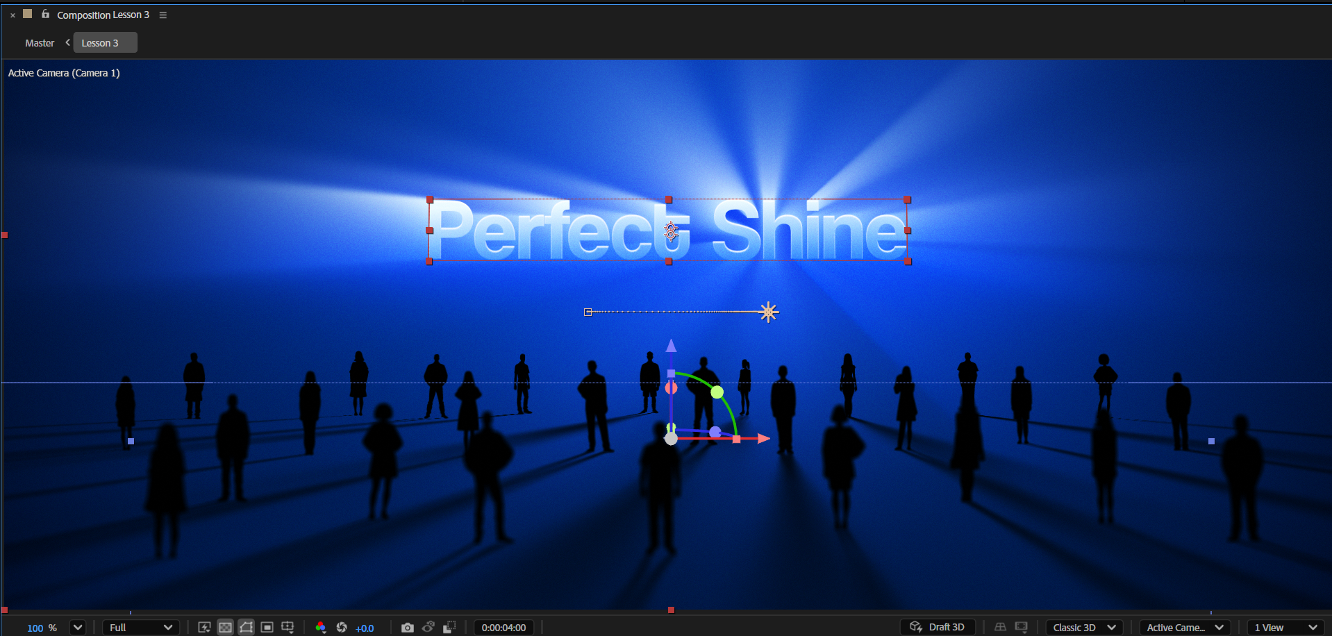
4. Setting Up the Shiny UI Screen: Come back. In this lesson, we are going to create this
beautiful shine effect that comes from
the iPhone screen, making the UI design stand
out and feel premium. It can easily be used in SAS explainers or any
other projects when you want to present the UI design in a glamorous way. All right. So to begin, let's
press Catrol or Command N to create
a new composition. Let's call it Lesson two. Leave the rest of the settings
as they are and hit Okay. And now we will
start by designing our iPhone screen and
preparing the setup. First to save some time, instead of creating the
iPhone from scratch, let's use the shape we created
in the previous lesson. Let's go to the Lesson one comp and copy the screen
layer from here. Back to our project.
Let's paste it here and press you to see all the keyframes
to delete them. Let's also convert it back to a two D layer and then align it to the
center of the comp. Great. And now, once we got
the iPhone screen reset, let's now add the UI design that you might have got from the client or design yourself. In our case, open the assets
folder you got from me and drag the Illustrator file
named PayApp to our project. We will import it
as a composition, since we have the
layers separated, and for the footage dimensions, we will choose layer size. Since we want the
layer boundaries to fit the design dimensions
the layers have, it'll be much easier to
animate the layers this way. Alright. And now we need to add the design to our
screen in the scene. But instead of dropping
all the layers we have here into the main scene, let me show you the best
approach for setting up scenes with UI design
elements involved. First thing, first, let's go
back to our main scene and now precompose the screen
layer we have here. We can delete the number
one and hit Okay. Now, let's enter the
new pre comp and hit Ctrl or Command K to open
the composition settings. It's better to adjust
this comp's dimensions to fit the iPhone screen. If you are using the newest
After Effects version, you can select the layer,
then go to composition and click on Crop Comp to
selected layer Bounds. This will automatically crop
the comp to the screen size. Okay. Once that's done, let's now go to the
app comp and copy all the layers starting from
the first one to the last. It's important because
the way you start your selection will affect how
the layers will be pasted. For example, if I start to select from the last
one to the first one, when I paste the layers, the
last one will be on top. The layers order will
be the opposite. But if I start selecting from
the first one to the last, after pasting them, the order will remain
correctly. All right. So now let's go
back to the screen precomp and paste the layers. Now, to align them to
the center altogether, let's select all the
UI elements layers and parent them to
the background layer. Now we can select
the background layer and align it to the
center of the comp, and the rest of the
layers will follow. This will also allow us
to scale the layers all at once to fit our
screen dimensions. Let's set the scale
to 90. Awesome. So now we can turn off
the background layer and create much more interesting
colors for the background. In my case, I want to use the dark blue color from the original design
of the background, so I'll turn it on and
sample this color just to have some nice starting
point for the gradient. Okay, now let's turn this layer off and keep adjusting
the gradient. At this point, I'm
just trying to create some nice dark blue
gradient for the design. What's most important
here is to make sure all the text in the design
is visible and readable. So make sure not to choose
two bright blue colors. Great. And now let's
also not forget to adjust the points of
the gradient to get a bit better results
for the gradient. All right. That looks good. And now before moving on, let's select all the Illustrator
layers and make sure we activate the collapse
transformations or continuously
rasterized switch. It makes After Effects see the original data of a
layer or a pre comp. In our case, Illustrator is a vector based
software that is not using pixels and that makes the layers in
Illustrator B sharp, no matter the scaling by collapsing the layers
in After Effects. After Effects now sees that
vector based information, and that makes the layers
B in the highest quality, no matter the scale here, in After Effects as well. It will keep these layers in the highest quality
in case we will scale this pre comp
in the main comp. And for this to happen, we also need to collapse the precomp here
in the main scene. Awesome. So now when we have finished
preparing the design, let's now move on
to the next step in setting up our shiny screen, and it's starting to work
on the shine effect. As I explained in
the previous lesson, for achieving this effect,
we need two layers. One of the original design and the second one is for
applying the shine effect. In our case, the pre comp we got now is the
original layer design, and now we need to have
the exact same one so we can apply the effects on
it to create the shine. Therefore, the next
step we need to do is to duplicate this layer. Let's change the name
of the bottom layer to screen comp shine. And now, as we did in
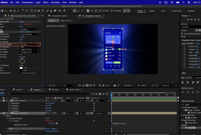
the previous lesson, let's add the radial fast blur effect to create the shine. Great. Now let's first
adjust the amount. We can set it to 95 for now. Next, let's make sure the center property will
follow the position of the precomp by adding the to Comp expression as we did
in the previous lesson. Now before moving on, make sure you select
the effect and position the center
of the effect to the center of the precomp. As you can see, this
effect looks very good on the brighter
parts of the design. It looks like some kind
of premium glow effect combined with a nice shine. Okay. And now,
before we move on, I just want to mention
why we didn't put the Zoom property to brightness as in the
previous lesson. As you can see, this option
doesn't fit every design. It depends on the colors and on the layer types you have
in the precomp. All right. With that mentioned,
I'll bring back everything to normal and we
can keep designing our scene. At this point, if you remember,
in the previous lesson, we changed the blending mode
of the main screen layer, so it could be blended better with the shine effect below it. So now we need to
do the same here. But in this case, since
we have the UI design, we don't want to blend
them with the shine, since we need them
to be noticeable. So in that case, what we need to do is enter the screen comp and change the blending mode only for the background layer
with the gradient. And since we copied this layer
from the previous lesson, the blending mode here
was already on overlay. But let's say we want to
test other blending modes. And we don't want to
always go back to the main scene and
check how that looks. In this situation, what
I love to do is to lock my main comp and then
enter the screen precomp. Now I can drag the screen precomp view
panel to the right of the preview panel
and create for me two views in which
on the left side, I see the main scene
and on the right side, I see the current
precomp I'm in. And since the main
scene is locked, the timeline we see here
is of the screen precomp. That means we now can
do adjustments here. And we will see how that
looks in the main scene without going in and out
all the time. Alright. So after some checking, I decided to go with soft
light blending mode. I think it looks great. Awesome. And now with that done, let's improve the design
even more by adding a nice stroke layer. Let
me show you what I mean. Let's duplicate the screen layer and change the name
to screen stroke. Now let's turn off the
gradient effect in this layer, and then turn off the fill
and turn on the stroke. For the stroke color,
set it to white, and for the width, let's
set it to ten for now. As you can see in the main
scene, it looks very good. Almost making the
iPhone look in three D. Let's try to set the width to 20 and see how that will look. Yes, that's better,
in my opinion. With that done, let's
now keep setting up our setup before starting
animating the scene. At this point, let's close the precomp preview and then
unlock the current preview. This might bring us
back to the precomp, so just ignore it and go
back to the main scene. Great. And now, since we want to create a nice three
D animation here, we need first to convert the precomp we have
here to three D layers. But before that, let's not forget to parent the
shine precomp to the main screen precomp to control the animation
only using one layer. Great. And now let's convert both layers to three
D layers and make sure we are using the regular
classic three D renderer. After that, let's now select
the main screen comp and press R to find a nice
angle for the iPhone. But as you can see, the rotation is not affecting
the iPhone at all, and it happens because
the layers inside this precomp are
not three D layers. Since the precomps
are collapsed, After Effects sees the original
data inside the precomp, which means it sees
the illustrator layers as they are there that
are in two D state. To fix this, all we
need to do is enter the precomp and make
sure all the layers here are three D layers as
well. Back in our main scene. Now After Effects, we'll see
the three D layers inside, and we will be able
to animate it in a three D space here
in the main scene. Okay? So once we have
that all in place, let's finish the setup by
adding a glow effect to the shine pre comp to get
that extra shine control. First, let's set
the intensity to 0.5. I might adjust it later. For now, let's play around
with the threshold and the radius to find the best variation for
the design we have here. If you use different colors
or different UI design, these parameters might
be different for you. So play around with it until you find something
that fits your design. Okay. So with that, we have finished the
design and the setup, and we are ready to start animating the iPhone
together with the shine, and we will do that
in the next lesson. So see you there. It's
gonna be a fun one.
5. Animating the Shiny UI Screen: Hi, and welcome back. So now we are ready to start
animating the scene. To make it a bit
more interesting, I want us to animate the UI
elements inside the precomp. So let's enter it and create a simple intro animation
for the layers here. I want the layers to enter the screen one after the other, starting with the main title, followed by the rest
of the elements here. To achieve this, I
first suggest you to reorder the layers in the layer stack to fit the idea of one
following the other. This way, it will be
much easier to create the delay between the layers. Let me show you what I mean. Since the title
should enter first, let's make sure this layer
is first in the stack. Next, I want the bell
icon to enter the scene. Therefore, let's make sure
it's second in the stack. Next element will be the card. It's already in the correct
position in the stack. So let's move on to
the second title. This should be number
four in the layer stack. After that, we need this
layer to enter the scene. So let's find it in
the stack and bring it to be number five in
the layers stack. Let's do this for the
rest of the layers. Once in a while, I love to select the layers and watch
the stack to see that everything is in place. All right. Once that's done, let's select the background layer
that we turned off and shy it from
the layer stack. We don't need to see it here. Great. And now let's
start animating. Let's select all the
UI layers and press P. Let's decide that the
animation will last 1 second. And since we know that
the layers should be at the current position
at the end of the animation, let's go to second one and
create a keyframe here. Now, let's press Shift T to add the opacity property
without closing the position. Once done, let's now go to the beginning of the animation
and bring the layers down. At this point, let's also set the opacity of the
layers to zero. Okay. So now we have
the initial animation. But with that, we
have a small problem. Look at the bottom part
of the screen here. We can see the layers
coming up from the bottom, which in the main scene
might look a bit weird. To fix that problem, all we need to do is use the
main screen shape layer we have inside the pre comp as a
mask for all the UI layers. For this, we will use
the Track Matt function. We need to select all the
illustrator layers and drag the track mat pick whip to
the main screen shape layer. This will make the screen
shape layer act as an Alpha layer for
all these layers, which will make the
layers visible only within the screen
shaped boundaries. Just don't forget
to turn back on the screen layer
once you are done. With that done, we have
now fixed this issue, and everything looks
great in the main scene. Now we can move on to improving the motion and press
F nine to ease them. On Mac, you need to press
the Fn and the F nine key. Then let's enter the
graph editor and adjust the motion to start fast and
slow down toward the end. Great. And now it's
a perfect time to create the delay
between all the layers. For now, let's decide that the whole animation will end at second three. So
let's stand here. And now let's first select
the first layer in the stack. Since this is the layer
we want to enter first, then select the last one. Now let's hover over the layers
in the timeline and hold control and Alt or command
and Option on Mac, and then drag the
layers to the right. With that, we created
a perfect delay. Let's see how that looks.
I think it looks great. Let's leave it for
now and go back to the main scene to start
animating the iPhone. Later, we will time both of
the animations together. For now, let's focus on creating a nice three D animation
here in the main scene. For this, first, let's
create a new camera. We will use a one node
camera with a 20 MM lens. It will give us
that extreme angle. Soon, you will see what I mean. Now let's start working on setting up the camera
to get that nice angle. To start, let's stand at
the point in time where we have the animation inside the pre comp already finished. Then let's switch to
work with two views. Click on the left view and make sure to set
it on left view. And then for the right
view, select it and make sure it's set to active camera. So we can see how that looks
in the final render, right. And now let's bring the
camera closer to the iPhone. We can place it
somewhere around here. Now we need to open up
the rotation property of the camera and use the
rotation axis to make the camera we can press Shift P to add the
position property and adjust the Z axis to lower
the camera a little bit. Soon we will use
the Y position axis to animate the camera
going backwards, and it will create this
cool camera motion. For now, we can set the
X rotation axis to -80. And then let's bring
the camera down a little bit more and then use the Y rotation axis to bring the camera forward until
we don't see the iPhone. Don't worry about
the fact that you can't see the shine effect. Soon, we will deal with it. For now, just bring
the camera forward. Great. Let's now create the first position keyframe and place it in the beginning
of the timeline. Now, let's decide that all this animation will
take 4 seconds, so let's stand at
second four and use the Y position axis to
bring the camera backwards. Et's place it
somewhere around here just before we see the
bottom part of the iPhone. Now let's move 2 seconds
forward and adjust the Z position axis to move the camera further
from the iPhone. All right, so at this point, we also need the camera to look at the iPhone
while moving backwards. For this, we need to create
a keyframe for the rotation. As well, in this case,
let's stand at second four and create the first keyframe
for the X rotation axis. Now, go to the end of the
animation and set it to zero. At this point, we can
adjust the position of the camera manually by dragging the camera
in the left view. We need to move it
backward and up until we see the iPhone placed in the
center of the composition. So while you move
the camera, watch the right view with
the active camera. Let's now move another 2 seconds forward and bring the camera
backward a little bit more. To have that continuous motion. All right? And now to
work a little bit faster, let's change the preview quality to third and see what we have. Right now, the camera
moves in a very sharp way, but we can fix it very easily. For this, long press the Pen tool and select
the Vertex tool. Now, click once on this point to round the position
path of the camera. Then press V to switch back
to the selection tool, and let's adjust the handles to have a nice rounded point. We can also move the entire
point manually to adjust the camera position
path. All right. I see that the
position path is okay, but the rotation
starts too late. To fix this, let's bring
the first rotation keyframe to the beginning
of the timeline. And at this point, at
second number four, let's create a keyframe
with the X rotation of -30 degrees. Let's
see how that looks now. Okay, I think it looks
better. We can now move on. Now we can focus on this area of the camera position
path and round it a little bit to have
a bit smoother motion. For this, we will use the
Vertex tool once again. So let's click here once and then adjust the handles
using the selection tool. All right. Now we can watch the animation and see if the path needs
additional adjustments. At this point, I'm scrubbing through the timeline
while focusing on the right view with active camera to see how that
looks in the main scene. I think we can lower this
handle a little bit. But the problem when I do it is the second handle also gets adjusted automatically, according to the left handle. To avoid it, we need to
select the right handle, and while clicking
the left click, hold the Alt or option key and then keep
adjusting the handle. This will unlink the handles, allowing us to adjust
the right handle. In my case, I just want
this position path to be straight in this area. I want the camera to
move backwards on a straight line. Okay, great. So now let's keep watching
the animation and keep adjusting the path if needed until we get
something that we like. It's very important to
note that it's important to recheck the entire animation after
you adjust the path. I'm constantly scrubbing through the timeline and watching the active camera view
to see how that looks. I think we can lower this
handle a little bit. I think the camera starts
rotating too early, so I will place the
first rotation key frame at second two and see
how that will look. In this case, I need to bring
the camera forward so I don't see the iPhone
in the beginning of the animation. All right. So now, once we are happy with the initial
camera animation, we can now go back to work with one view and animate
the shine effect. Let's stand at second four, where we can see the
iPhone and bring the blur effect to
the bottom part by adjusting the
center property. Don't forget to create a
keyframe at this point. We can press to see
the keyframe we just created on the pre
comp in the timeline. Now let's go backward
in the timeline and adjust the blur at this point
in time so we can see it. The radio fast ler effect doesn't operate correctly
because this is not a three D effect that fits three D layers
in three D spaces. Therefore, the effect
behaves a little bit weird, but this is not a problem because after adjusting
the center property, we can find the
correct values for it to see it throughout
the entire animation. Let's now move to
almost the beginning of the animation to the
point where we can still see the upper part of
the iPhone and adjust the center property
at this point in time so we can see the shine effect. Then let's place this keyframe at the beginning
of the animation. In case you still can't
see the shine effect, just move a few frames
forward and adjust the center property once
again until you see it. Then we can delete
the first keyframe and place the new
one instead of it. All right. So now we see the shine effect in the
beginning of the animation, and now let's move to second six and bring the
center property up a little bit to get
the shine effect to keep moving throughout
the entire animation. We can place this
keyframe at the end of the animation. All right. Let's now stand at second
number nine and press in to shorten the workflow area to this point in
time to make After Effects a little bit easier
to preview the scene. This is also a great time
to save the project, to secure everything
we have so far. Okay. Once we are done with the initial animation of the
camera and the shine effect, we can now start working
on improving the motion. Let's start with
the camera first. Let's begin by selecting all the camera keyframes
and easy ease them all. At this point, we can set the preview quality a quarter
to make After Effects, preview the scene a bit quicker. Now let's select
the shine keyframes and easy ease them as well. So now because we ease
the effect keyframes, the timing of the camera and the effect is a
bit different now. Therefore, we don't
see the shine effect in the beginning
of the animation. To fix this, all we need
to do is once again stand somewhere at the beginning of the animation and adjust the
blur effect center property. In this case, let's stand
at second one and create an additional keyframe for
the blur at this point in time until we see the
shine effect, right? And now let's watch the
animation we created a few times to see what adjustments need to be
done to the motion. After checking the animation, I feel that it's better to make the camera move faster in the
beginning of the animation, to make the intro of the iPhone a little
bit more interesting. For this, let's select
the position camera, keyframes and using the speed graph editor,
make the intro faster. So let's select the
second keyframe and drag the handle to the left. Let's see how that looks.
Alright, the intro looks great, but there is a weird
pause after it. So let's deal with it right now. It happened because at
this point in time, the speed of the camera is
at zero pixels per second. Let me explain that to you real quick with a simple example. Be more accurate,
this is actually not one keyframe that
we are talking about. This keyframe represents
the outgoing motion of the first keyframe and the incoming motion of
the third keyframe. So now here in the
speed graph editor, we can see the speed of the
keyframe throughout the time. In our case, we can see
that the outgoing motion of the first keyframe and
the incoming motion of the third keyframe
is set to zero, which creates this
stop in the animation. All we need to do in
this case is just move up these two motions to be above zero pixels per second. But instead of moving
them one by one, trying to set them
at the same speed, there is a way to move
them both together by setting them to
continuous motion. Let me show you what
I mean. To do it, we need to select this
keyframe and double click on it to open up the
keyframe velocity panel. Here we can check
the continuous box, which will lock the
outgoing motion to the incoming motion that
I explained earlier. This will allow us to grab one of the handles
and lift them up, and both of the motions will
be at the same speed level. As you can see, in our case, the speed right now is
91.81 pixels per second. So that means at
this point in time, the motion of the
camera will not stop, and it will keep moving until the next keyframe. It
looks much better. Now, let's do the same with the next pause moment we have here. Quick note, if you don't want the handles to move
in a snappy way, you can uncheck the magnet icon, and it will allow you to move
the handles more freely. Let's adjust the handles
a little bit more to create a nice
and steady motion, and then let's check the
animation to see how that looks. I think the position animation
of the camera looks good. But in my opinion, there is a
bit extreme rotation motion we have here that we can
adjust a little bit more. The end of the
animation looks good, but there is something
in the beginning that I feel doesn't
look so good. So let's try to
see what that is. And the best way to do it is
to test different options. For example, let's try to delete the middle rotation key frame
and see how that will look. I think the camera starts
rotating a bit too late. So let's try to see how the
animation will look if we place the first rotation key
frame at the beginning of the animation. All right. I think it's starting to
look a little bit better, but the camera goes too low towards the end
of the animation. To fix this, let's use
the two views once again. And using the left view, let's adjust the handle of the position path we have
here for the camera. I'm showing you all
these actions to explain that you
never can know for 100% sure how your keyframes and the motion should be set up. Animation is a trial
and error thing, and you should not
be afraid to test different keyframes and adjust the motion
throughout the way. What's important is to
start with something. Start with the initial
animation, and from there, adjust the motion according
to what feels right to you and what looks
better. All right. With that being said, let's take a few minutes to adjust the
shine animation we have here. To be honest, I
don't think we need the radio fastler
keyframes to be easy ease, and it's because I want
the shine animation to be fluid without any pauses
throughout the animation. Let's select them all. Hold controller command
and click on one of the key frames to
bring them back to regular linear keyframes
and see how this looks. All right. I think
it looks better, but in my opinion,
at second four, we can adjust the blur keyframe to make the shine fit better the angle of the
iPhone by dragging the center property
down a little bit more at this point in time. I want the shine to be
angled up a bit more. Let's now go to
second two and adjust the blur keyframe here as well until we get the shine
angled up here as well. Great. And now let's
move to the keyframe at second one and adjust the blur at this point
in time as well. Okay, so now we barely can see the shine in the beginning
of the animation. So let's bring the
center property up a little bit more in the
beginning of the animation. And once again, I'm showing
you this process so you can understand how the setup works and what
adjustments you need to do in case you want to improve your shine
according to the motion. All right. So now, once we finished animating
and adjusting the motion, we can now start adding
special effects, starting with adding a depth
of field to the animation. I suggest you always
add the depth of field only after
you have finished and you are satisfied
with the animation first and only then start applying these heavy
effects to the scene. Okay. So first of all, let's open the camera options and turn the depth of field on. Then let's set the
aperture to 100 pixels. And now we will start animating
the focus distance to the side where we want the focus to be throughout the animation. For now, let's stand at second two and create
the first keyframe. Just so we can select you to see all the
keyframes we have here. This way, we can time the
camera position animation with the focus distance
animation we will create right now. All right. So at this point, let's try
to change the focus distance until we see some focused areas at this point of the animation. In these types of situations, when we have unique
camera angles and close up animations, it's better to use the two views and see where the elements in
the scene are placed. This white line is representing
the focus distance. So as you can see, it's
too far from the iPhone. Our goal is to bring
this line closer to the iPhone precomp so we can get the iPhone being in focus. Great. So now we can switch back to work
with one view and start deciding where
we want the focus to be at this point
in time, exactly. At this point, I want
the focus to be on the card in the upper
area of the iPhone, so I'll set the focus
distance to 400. All right. Now let's go back to the beginning of the
animation and try to decide the best position for the focus distance to be
at this point in time. We can set it to
200 and place it in the beginning of the animation and see how that will look. I think it looks great. Now
let's move on to second four and decide where we want the focus to be at
this point in time. Let's make the buttons area
to be in focus, in this case. We can set the focus
distance to 300. Now let's move to
second six and make sure the camera is focused
fully on the iPhone. To see where the iPhone is placed relatively to
the camera focus distance, we can use the two
views once again. Great. Now, let's adjust the focus distance
until we see it placed perfectly with the
iPhone position. Great. That looks good. Now let's move to
the last keyframe and adjust the focus distance
at this point in time. Awesome. So now let's go
back to One view and see the animation from
the beginning to the end to see what we have got. Because of the depth of field and the shine
effect together, the preview render times
might be very long. Of course, it depends
on your computer power. But in any case, be patient and just wait for the preview to finish to check the animation before moving on. All right. So first, in my opinion, the depth of field
is too exaggerated. To fix this, let's press the A key twice to reach
the camera options. And here, lower the aperture. We can set it to 50 since the camera is very
close to the iPhone, too much blur makes the scene
look weird, in my opinion. But with aperture of 50, the blur looks more
natural. Alright. And now I also notice that we don't see the animation
we created inside the screen comp for
the UI design layers. And it's probably because the animation inside
is happening before the camera sees the entire
iPhone. Let's try to fix it. First, let's enter the
screen comp and select all the Illustrator layers
we created animation for. I will scale the
timeline panel so I can see all the layers. Alright. So once they
are all selected, let's at frame 15, move them all to start
from this point in time to see if it will look
better in the main scene. Our goal is to time the
animation happening inside the screen comp with the camera animation
in the main scene. I'm trying to create a situation where during the
camera animation, we can still see that the UI elements appearing
one after the other. For now, I still can't
see it happening. So I'll enter the screen
comp once again and try to start all the animation
inside from second one. Let's see how that looks
in the main scene. Okay. So from what I
see now, it's too late. I'll start the animation inside the screen comp from frame 25. I think it will be
the perfect timing. If your computer is struggling
to preview the animation, I suggest you first
lower the preview render quality to
quarter and then open up the preview tab and make After Effects skip one frame in
the preview rendering. This will significantly speed up your preview render
time. All right. And now let's watch the
animation a few times and see if there is anything
else we need to adjust. In my opinion,
everything looks great, but I noticed that the
shine effect stops moving before the end of
the camera animation. Therefore, let's open up the first blur keyframes and move the last keyframe to
the end of the animation. Great. And now let's finish
up this lesson with adding the background layer and the color filter effect as we
did in the previous lesson. To save some time, let's
enter the first lesson. And first, let's copy the background layer we have
here and then go back to our lesson and paste the layer there and make sure
it's below all the layers. Great. And now,
once that's done, let's go back to Lesson one comp and copy the adjustment
layer we have there. Back to our lesson.
Let's paste it here and make sure it's
above all the layers. Now we can adjust the filter by playing around
with the curves and seeing how the
scene looks throughout the different points in time
throughout the animation. At this point, I'm
just trying to create a nice and crispy look we can also try to play around with
the master hue of the hue saturation effect to see if we can reach
better results. In my case, I'll
set the master hue to ten degrees to get a
bit darker blue colors. When you do color corrections, it's important to
check the look of the scene throughout
the entire animation to see that the color
correction you're using in this timeline fits every point in time throughout
your animation. Okay, I think we can now give After Effects
a few minutes to render and see the animation in full quality before we
render the final piece. In my opinion,
everything looks great, but I think we can
increase the depth of field effect a bit more by
setting up the aperture to some higher number to get a bit more dominant blur areas
throughout the animation. I think we can set it to 80.
I think that looks great. And with that, we have
finished this lesson, and we are ready to move
on to the next one where we will learn how to
create a shine effect, but this time on a text layer, we will also learn a few
tricks on how to properly set up complex three D scene with live shadows and lights working together with
the shine effect. It's going to be
very interesting, so I'll see you in the next one.
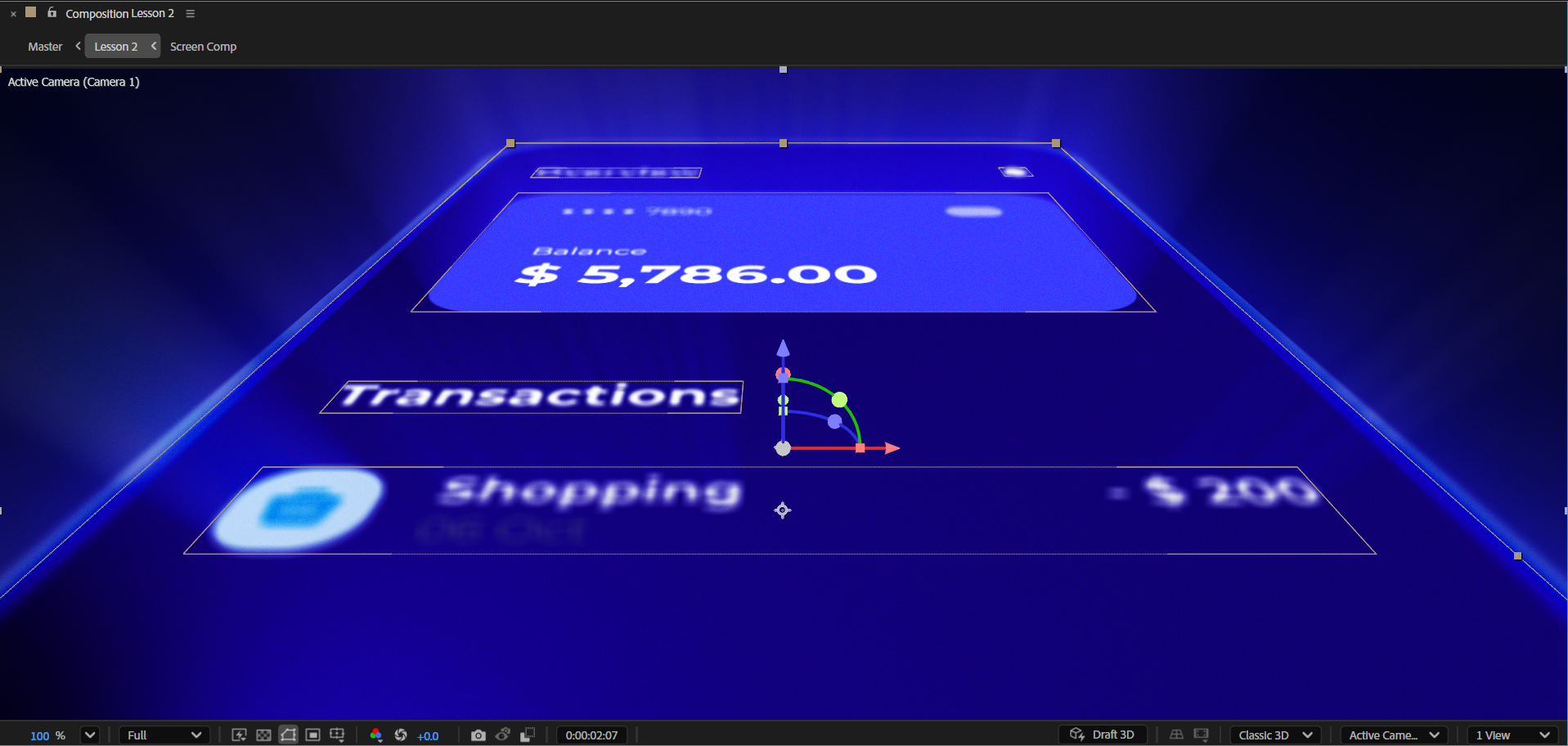
6. Setting Up the Shiny Text Scene: And welcome back.
In this lesson, we will create the shine effect, but this time on a text layer. We will learn how to build
the right setup for making the text shine in a
really beautiful way, but not only that, we will also build an
advanced three D scene with lights and real shadows following the light direction. Eventually, our goal
will be creating an illusion that our
shiny text is lighting the scene and effecting the shadows of the elements
in the scene. All right. With that being said, let's now create a new composition by pressing Trill or Command N. Let's call this
comp Lesson three. And leave all the settings
as for the previous lessons. Great. And now,
as always, first, we need to start working
on the shiny text setup. For this, let's first create a new text layer and type some
title like Perfect shine. Now let's use the text Properties tab or
the character tab to adjust the font size
to let's say 100. Then change the font
weight to bold and make sure to center
the text. All right. And now let's center the anchor point by hovering over
the anchor point tool, holding controller command on Mac, and double clicking on it. Great. Now let's go back to the selection tool and start working on the
design of the text, starting by adding the
gradient ramp effect. Once done, let's now make the gradient points
follow our text using the expressions for the start and the end
of the ramp properties. Okay, let's now zoom out
and adjust the points once again. All right. And now let's swap
the colors and adjust them to get a nice blue
gradient color text. Awesome. With that being done, let's now create the shine by adding the radial
fast blur effect. Let's set the amount
to 90 and this time, do use the brightness in the Zoom menu to get a
more brighter effect. Next, let's now add the glow effect to make the
shine look more impressive. At this point, I suggest
you play around with the first three properties
of the glow effect to find something that fits your design and your colors because you might be using
a different font in a different gradient color. Great. So now, once we
got our shine layer, as I explained in the first
lesson, to finish the setup, we now need to have the main design layer
of the shine layer. In our case, we need
to have the text layer without the shine effect on it. So let's now duplicate it. Then we need to delete
the blur effect and the glow effect to get rid of the shine effect
on this layer. And now, as you can see, the setup doesn't look so good. To make it look better, we need to slightly change the colors of the gradient
of the main layer. We can also do that by
adjusting the gradient points. This will already make
a difference between the gradients of the two
text layers we have here. Great. Now we can slightly
change the colors. For the blue color, I'll go
with a bit more dark and saturated blue color to make them even a
bit more different. We can also play around
with the gradient of the shine layer Great. And now, to make the setup
look even more interesting, let's add a nice and elegant
highlight to the text. Let me show you what
I mean. Let's right click on the main text layer, go to Layer Styles and add
the innershadow effect. Now, let's open up the innshadow effect
properties and first change the color to white, then set the opacity to 100. Now, to see the white shadow, we need to change
the blending mode of the effect to screen. So it blends better
with our text. Now let's zoom in in
the preview panel and start adjusting the rest of the properties of the
inner shadow effect. First, let's add a
little bit of noise, so the highlight we
are creating will look more natural and not too sharp. But pay attention
not to scale up the noise too much because
it will start to look weird. In our case, we can
set the noise to 5%. After that, let's
scale down the size of the inner shadow to make it
look a bit more elegant. Once done, we can now decide the distance and see what
fits the design better. I don't want the
highlight to be big, so I lower the distance
to let's say two. Finally, let's adjust the
angle of the highlight. In my case, I don't want
the highlight to be at the bottom of the text.
I want it to be on top. So I'll set the
angle to 90 degrees. Awesome. So now our setup looks very good and we
are almost finished. Before moving on, let's save
the project. All right. And now I want to mention a small problem with this setup. Let's say, during the project, you need to change the text. As you can see, if I do it right now and change the
main text layer, the shine effect will not
be adjusted accordingly. There is an easy fix to
it. Let me show you how. First thing, first, let's open both of the text
layers and the text menu so we can see
the source text property on both of the layers. Now, all you need to do is
parent the source text of the shine layer to
the main text layer. Now, whenever you
change your main text, the bottom text layer will
be adjusted accordingly. The name of the layer will not be adjusted, but it
doesn't really matter. What matters is
that the setups now working perfectly and
everything is synced together. All right. So let's press
Control or Command Z to undo the action if you also change the text so we can bring everything
back to normal. And just in case if you
undo too many steps, let's parent the
source text once again to make sure we got
them both sync together. Awesome. With that being done, we can now switch back
to the selection tool. And before moving on, let's not forget to parent the shine
layer to the main layer. So we will be able to animate this later using one layer only. Okay. So now, when we
finish up our setup, we can now save the project
and move on to the next step, creating that beautiful
three D scene with live lights and
shadows. All right. So to begin, let's
first turn off our text layers so we can
focus on building the scene. Now, let's go to the
Project panel and add the silhouette pack
Illustrator file. You have in the assets folder
you downloaded for me. Let's drag it to
the Project panel and import it as composition
with layer size. This Illustrator file
includes a lot of people silhouettes
that we will use soon to create that beautiful
cinematic scene where we see a lot of people in
front of the main title. What truly makes this scene special is how the
shadows react to the lights in the scene and how we get the illusion that the light is coming
from the title. But what makes it
more interesting is how without even having
a visible floor, we can still see the shadows perfectly aligned and
creating the illusion, like we do have a
floor in the scene. It's an interesting look
that makes the scene feel large like it's some kind of huge room that we don't see where
it starts or ends. So let's learn how to
achieve this look, starting with designing
the scene from scratch here in After Effects. To begin, we do need to
create a floor layer. For this, let's make
sure no layer is selected and select
the rectangle tool. Now, double click
on it to create a shape with the
size of the comp. Let's make sure no
layer is selected. Okay. And now let's turn on the fill and choose
a simple gray color. Next, let's turn off the stroke. Let's rename this
layer to floor. Once done, let's convert this
layer to a three D layer, and then open up the
rotation property and use the X rotation axis to
make it look like a floor. For this, set it to -90 degrees. Next, let's lower it down
and place it somewhere around here in the bottom
part of the composition. Great. So now when we
have our floor ready, we can now start adding the
silhouettes to the scene. And now I want you to press wide to switch to the
anchor point tool and bring the anchor
point to the bottom part of the silhouette, somewhere around the ankles
area. Let me explain why. If the anchor point stays in the center, when
we scale it down, we will need to
adjust the position, so the silhouette will be placed at the level of the floor layer. But when the anchor point
is in the ankles area, it's going to be much easier for us to adjust the
scale of the layer later in case we need to
scale it down. All right. And now let's convert
this layer to a three D layer and drag it down until we see it aligns
with floor layer. Don't worry if the legs are
going through the floor, because if they do not
touch the floor fully, then the shadow will
look very weird. So in our case, it's better for them to touch the floor and even go
inside a little bit. Next, let's scale
this layer down because we don't need the
silhouette to be so big. We are trying to
create a wide shot and create the illusion like we
are in some very large space. In our case, we can
set the scale to 50. And finally, let's not
forget to collapse this layer to get it in the
highest quality possible. Awesome. And now we need to bring the rest of the
silhouettes to the scene. But instead of repeating
the process for each silhouette and placing
them manually on the floor, we can do something
smarter instead. Let me show you what I mean.
First, let's duplicate the silhouette
layer we have here in the timeline and
move it to the right. No. While this
layer is selected, hold down the Alt or
the option key on Mac and drag the next silhouette on top of it to
replace between them. Let's do that one more time. But this time, move
the new layer to the right and replace it
with the next silhouette. Let's do it two more times for the right side and
for the left side. All right. That's enough
silhouettes in the scene. We can now start
working on the shadows. For this, first,
we need to create a new point light
layer. All right. And now set the color to white
and the intensity to 100%. And now for the fall
off, set it to smooth. Fall off controls how light intensity decreases with distance from the light source. And here is the difference
between the three options. None. Light stays at full intensity no matter how far the surface
is from the light. Unrealistic but predictable. Smooth. Light fades
gradually over distance. Using the radius and fall
off distance values you set gives you manual control over where the fade starts
and how soft it is. Most useful for
stylized motion design. Inverse square, clamped,
physically accurate fall off, intensity drops by the
square of the distance, the way real light behaves. Most realistic but
harder to predict. Alright, back to the project, set the rest of the
options as I did, and soon we will play
around with them all to understand each
of them much better. For now, let's just hit Okay
and move on. All right. So as you can see,
we are already starting to see how this
light affects the scene, but we still can't see the
shadows for the silhouettes. Let's keep working
and see why is that. First, let's activate
the action grid and place the light in
the center of the comp. Now, let's use the two
views to see where the light layer is positioned relatively to the silhouettes. To see what we are doing better, let's select the left view and change it from
left to top view. Now we can see that
the light layer is placed behind the
silhouette layers, so let's place it
in front of them. For convenience, let's select the right view and turn on the transparent
background mode. As you can see, we still
don't see the shadows, and the main reason for
that is actually not the position of the light layer, but something related to
the silhouette layer. Let me show you what
I mean. Let's open up the material options of
the first silhouette layer. Here we can clearly see that the cast shadows
option is turned off. That means this layer will
not cast any shadows. But once we change it to on, we can finally see
the shadows. Great. So now we can move
the light layer and see that it's affecting
the shadow angles. For now, let's place it in the center and go back
to work with one view. Now, we need to turn on the cast shadows option for all the silhouettes,
but don't worry. You don't need to
do it one by one. You can select all
the relevant layers and turn on cast shadows
for one of them, and all the selected layers
will also get this action. Awesome. So now, as you can see, we are starting
to get a bit more interesting look to the scene. Now, we can keep working and adding more silhouettes
to the scene. And to make that
process much easier, let's create a new
camera in the scene. We will work with a one node
camera with a 20 MM lens. Once we got the camera,
let's now move it backward so we can have more space to add
the new silhouettes. But before that, we can select all the current
silhouettes layers and parent them to the floor so we can now move
the floor down, and all the silhouettes
will follow. Let's place it here.
Now, let's use the size property of the shape layer and scale the floor up. You can add the kamike in type two to multiply the
current values. Let's multiply it
by one more time to get an even bigger floor. We will need all that space to spread the rest
of the silhouettes. And we will do that
in the next lesson, together with
animating the scene once we finish designing it.
See you in the next one.
7. Animating the Shiny Text Scene: I'm back. At this
point, we need to add more silhouettes and then randomly spread them
across the floor surface. But before we do that, let's do something to see
the scene better. Right now, the
scene is too dark, and I can barely see
the silhouettes. Fix this, we can open
the material options of the floor layer and turn off
the accept lights option. This way, the floor will
present the shadows, but will not be affected
by the light. All right. So with that being done, our
next step will be to add more silhouettes and randomly spread them across
the floor area. And here is a quick tip
to spread them randomly, but still have a balanced scene. Instead of starting to place
them in random locations, we will first create
three straight lines of silhouettes and only then start adjusting the position to create
the random look. Let's start working, and
you will get what I mean. First, let's create another
duplicate on the left and the right side and replace
them with new silhouettes. Awesome. Once that's done, let's now select all the
silhouettes and duplicate them. Then move them up in the
timeline above the current ones. Let's also tag them in different color to have a
more organized timeline. Great. And now let's
move them all backwards. Now let's start replacing these duplicates with new silhouettes. E All right. Once done, let's now select the first line silhouettes and
duplicate them once again. This time, let's
move them down in the layer stack and tag
them in different color. This time, let's now drag
them forward in the scene, placing them in front
of the first line. Somewhere around here.
Great. Now let's zoom in and isolate these layers to
see what we are doing better. And now let's start replacing
them with new ones. Awesome. So now we can turn
back on the floor layer, and let's zoom out with the camera to see the entire scene. Also, make sure that
the depth of field is turned off for now,
so we can work smoothly. Later, we will turn
it on. For now, let's save the project
before moving on. At this point, we can
start randomizing the position of the silhouettes. We can use the custom
view one for this, or even the better
option, use the top view. Let's first start dealing
with the first line. All we need to do is slightly move the layers to
the left or right, and up or down to create
that random structure. Try not to place the layers
too close to each other, but also not too far. The goal is to create a random look but yet
have a balanced scene. All right. So now
we have finished the first step in
randomizing the layers. Now we can go back to the active camera view and keep adjusting the position
of the silhouettes here. For example, we can select all the silhouettes of the third line and
move them backwards. We can also move the middle line backwards a little bit, as well. Now, let's keep
adjusting the position, so we get each silhouette to
have its own little space. I'm trying not to collide between silhouettes to
get that clean look. A Okay. So now with that done, we can unlock the
floor layer and move on to the next step,
adding the background. To save some time, let's copy the background layer we used
in the previous lesson. Let's paste it in our comp and make sure it's below
all the layers. Now, let's select
the gradient effect on this solid layer and
adjust the gradient here. Let's switch between the points. I want the darker area to
be at the bottom and the brighter one in the upper part.
Let's see how that looks. I think we can bring the
bright color to the center. It will be a better idea
because this is the place where the shiny title
will be placed soon. And now to make the
gradient a bit brighter, let's drag the darker
point to the left. To finish, let's adjust the colors to get a
bit brighter gradient. For the bright color, let's pick this brighter blue color, and for the darker
color, let's set it to a bit brighter color. Great. And now let's save the
project before moving on. At this point, let's now
make the floor not visible, but keep the shadows visible. Let's see how to do it. For this, we need to open the material options
of the floor layer. And for cast shadows, we can leave it turned off
because we don't want the floor to cast shadows
on anything in this scene. Next, I want to talk about
the except lights option. We can turn it on or off. There is no difference
for us for this property. The most important
thing to do here is to change the except
shadows property. We need to set it to only. This will make the floor
layer present the shadows only without showing
the shape layer that is the floor we
have in the scene. Great. So that already starts
to look more interesting, but as you can see,
the scene is too dark. Let me show you an easy
solution for that. First, let's make
sure no layer is selected and then select
the Ellipse tool. Now, double click on the Ellipse tool to
create a new ellipse, and then make sure to choose
some bright blue color. Once done, add a fast
box blur effect to this ellipse and set the blur radius to a high
number. Let's try 150. Great. Now let's
change the name of this ellipse to floor light and place it above
the floor layer. And now, all we need to do is to adjust the position
of the ellipse and its dimensions to create the illusion that there is a light source that is
pointing to the floor. We can now bring this layer
down a little bit more. And to see the shadows, we must place this layer
below the floor layer. As you can see, this
simple solution made the scene look much better. I wanted to show you this
so you understand that sometimes a simple solution
beats a complicated one. In this example,
instead of adding more light layers that would
slow down render times, we used a simple effect
and got great results. With that said, we can now
move on to the next step. But before that, I just
want to mention that if we zoom out a bit
more with the camera, we will see that the
shadows are cropped, and it's because they reach
the end of the floor layer. In our case, I don't want to scale up the floor layer
more because I want the camera to reach
this point in the final animation,
not further than that. But in case you do want to adjust your shadows
and go for that, all you need to do is
to play around with the position of the light layer we have here in the timeline. And to see what you are
doing a bit better, you can use the top view and keep adjusting the
position of your light layer. Let's place it here
for now. I think it looks great
because I wanted to reach a look of long
and dramatic shadows. And that's exactly why I dragged the light layer further
from the silhouettes. So with that done, we can use this opportunity to adjust the silhouettes one final time. I don't want the
shadows of these layers to be two centered, so I'll move some of
the silhouettes to the sides. All right. And now, to keep the scene a
little bit more realistic, I feel that the silhouettes in the middle line need to
be a little bit smaller. So let's select them all and
scale them down a little. We can set the scale to 45. Alright, I think everything
looks okay, but if you want, you can zoom in and adjust
other layers if you feel so. For now, we can save the
project and move on. At this point, let's
try to improve the shadows by adjusting the light layer
settings for this. Let's double click
on the point light we have here and see what will happen when we change the properties below
the fall off menu. Let's start with the radius. By changing that, we will be increasing the
radius of the light, and this makes the shadows
look a bit more aggressive. In our case, we can set
that radius to 300. And now let's talk about
the fall off distance. Fall off distance is
the distance over which the light fades from full
intensity down to zero, starting from the
edge of the radius. In simple words, this
makes the light be softer, which will create
the distant shadows to appear more soft. In our case, after
some checking, I think 8,000 is the
best option for us. Next is shadow darkness. There is nothing
to explain here. It's just makes the shadows
darker or brighter. It's like the opacity
of the shadow. We can set it to 90. Finally, let's talk about
the shadow diffusion. Shadow diffusion controls how soft or blurry the edges
of the shadow are. In our case, we can
set it to 100. Great. So now, once we are good with
the look of our shadows, we can now play around
with the position of the light to get the
results we are looking for. In my case, as I
told you earlier, I'm trying to create
long shadows, so I'm trying to move the light up or down and back
and forward in the three D space to see what is the best position
to fit my goals. Alright? So once we are good with the light
position and the shadow angles, let's save the project and
move on to the next step. Now is the time for
us to turn back on our shiny text layers and
blend them with the scene. To begin, let's bring the text layers above
all the layers. Now turn them on and convert
them to three D layers. At this point, you might not see the shine effect you
created for the text, and the reason for that is
in the material options, the lights and shadow
properties are turned on. In our case, we don't need this text to be
affected by the light, nor casting shadows
or accepting shadows. So let's turn off all
these three properties. Let's do the same for the shine
layer as well. All right. So once that's done, let's now deal with
the position and the scale of the text in the
three D space we have here. To see what we are doing better, let's work with two views, and using the top view, we can see clearly where
the text is positioned. In our case, we want the text to be placed in front
of the silhouettes, so let's drag it
using the Z axis. Great. And now let's select the main text layer
and scale it up. We can set the scale to 200. Okay. Now we can go back to work with one view to
see how that looks. I think we can scale it to 300. Let's try 400. Yes,
that's better. With that done, let's now bring
the text up a little bit, so it will be positioned more or less in the
center of the scene. While I moved the
text, I noticed that the shine effect doesn't follow
the position of the text. And it's happening
because we didn't use the expression on
the center property of the radial fast pler effect. So let's do it real quick. All right. And now let's zoom out and adjust the position
of the center property. Place it somewhere in
the center of the text. It doesn't matter for now too much because we will
animate it in a minute. For now, let's make
the shine a bit more noticeable by scaling
up the amount to 95. Great. And now, with
that being done, we are ready to animate it. First, let's make sure we
are in the beginning of the animation and now create a first keyframe for
the center property. At this point in time, let's
start it from the left side. I suggest you not move
it too much to the left because we are not trying to
create a crazy disco effect. We are trying to get a
nice, elegant shine. Okay. And now let's decide that this animation
will last for a second. So let's stand here and bring the center
property to the right. Let's place it somewhere
between the S and H. Okay, now let's go back
to the beginning of the animation and drag it a
little bit to the left more. Now let's set the
preview quality to quarter and see what we got. Alright, I think it looks okay. We can now save the
project and keep working. But I suggest you set
the preview quality to have to work faster. At this point, we
can start working on the illusion that our shiny text affects the silhouettes shadows. And we will do that by animating the light
layer we have here. So first, let's
make sure we are at the beginning of
the animation and now open up the
position for the light. At this point in time,
let's bring it to the left while watching
how the shadows look. I think the shadows look
pretty good this way. Next, let's move to the end of the animation and drag the light to the right. Let's
see how that looks. Great. I think it
looks very cool, and we got the illusion
working perfectly. All right. So now, once we are done
creating the illusion, we can now start working
on the camera movement. In our case, I just want to create a simple
Zoom out animation. So first, let's go to the beginning of the timeline and open up the position
for the camera. Let's decide where we want the camera to be positioned
at this point in time. At the beginning
of the animation, I want to focus on the title. So let's bring the
camera closer to it. Now let's create a keyframe
with the current values. Next, let's go to the end of the animation and move
the camera backward. Somewhere around
here. All right, with that done, let's now select all the keyframes
and easy ease them. Then in the graph editor,
to keep it simple, let's just drag all the
right keyframe handles to the left to start the motion fast and slow
down toward the end. All right, I think the
motion is very good, and we can move on
to the final steps. At this point, we can now add the color filter we created
earlier in the course. So let's go to the
second lesson and copy the adjustment
layer we have here. Back to our lesson, let's
paste it above all the layers and adjust some
parameters so we can get this filter to fit
our current scene. To start, I will
play around with the hue saturation effect to see if I can get a
bit better results. In my opinion, our scene
is too blue for now. So let's set the master
hue to minus ten degrees. Once done, let's now
play around with the curves effect and soften
the crispiness of the scene. That's better. Now, I
feel that the light we created for the
floor is too large, so let's select this layer
and make it a bit narrower. I think it looks much
better this way. One last thing I want to
adjust is the shadows. In my opinion, the shadows look too straight and not natural. To fix it, let's find
the point light layer we have here and double click
on it to open its settings. Now, let's adjust the
shadow diffusion to make the end of the
shadow area be softer. We can set it to 150. As you can see, the shadow
now looks much more natural. Alright, so with that done, we can now finish the lesson
by adding a nice depth of feel to the scene to get
that extra cinematic look. This time, we will learn
how to set the focus to one specific layer
automatically. Let me show you what I mean. First, let's open the two views, and now I want to bring
the focus distance of the depth of field
to the position of the text layer because
I want the text to be in focus and the
rest to be blurry. So first, let's select
the camera and press the A key twice to open
up the camera options. Now let's turn on
the depth of field. Next, let's adjust the
aperture and set it to 100%. And now, what we would
do regularly is bringing the focus distance
to the text position and animating the focus distance according to the
camera movement, so we can always get
the focus distance to be in the area of the text. But instead of
doing it manually, I want to show you
a quick tip on how you can do it automatically. So let's delete the
keyframe we created. And now all you need to
do is you need to select the camera and the layer you
want the camera to focus on. In our case, it's
the text layer. So we can select the main text, and then you need to
click on the camera, then open the camera
options and here, select link focus
distance to layer. But as you can see, it's not working, and After
Effects tells us why. It's because we are
using a one node camera. For it to work.
We need to change the camera to two node camera. So let's double
click on the camera. Change the type to
two node camera. Now, let's repeat the process once again and it
should work perfectly. So now the focus distance will be synced with
the text position. Even if the camera
goes backwards, the focus distance is still
staying at the text position. Now, since we changed the
camera to two node camera, we should check if it didn't affect the motion of the camera. To check it quickly, let's
first lower the quality of the preview to quarter and
now check the animation. Everything looks perfectly fine. But since we now using
the two node camera, we can make the
motion of the camera a little bit more interesting. Let's open the camera keyframes and stand at the first keyframe. Let's now adjust the Y
position axis to get a little bit more
interesting camera angle at the beginning
of the animation. The two node camera has
the point of interest, which makes the camera look at the direction where the point
of interest is positioned. In our case, it's
positioned in the center. So when we adjust
the Y position axis, the camera doesn't
just move down, but it kind of moves down
while keeping pointing to the title which makes the
camera angle more interesting. You can now recheck your
animation and adjust the second camera keyframe as well to get maybe
better results. In my case, I want the camera to end when it's positioned
lower in the frame, so I'll adjust the
last keyframe. And for the beginning
of the animation, I want the camera to start
from an upper angle, so I'll move the camera
up at this point in time. Let's see how that
looks. I think we can bring the camera closer
a little bit in the end. At this point, we can watch the animation and
adjust the position of the silhouettes to make them all be in the frame by the end
of the animation. I'm showing you
this process so you understand that motion design
is not a linear workflow. We start with
designing the scene, then creating an
initial animation and then improving
the animation, and after that, adjusting the
design and the composition. All right. Once I am good with the design of the
composition and animation, I feel like we need to have
a little bit more depth of field effect in the scene. So let's open up
the camera options and set the aperture to 200. I think it looks much
better this way, but note that your
render times will be larger significantly when
you use high aperture. So now I basically finished
with the animation, but I want to make a
very small adjustment to the silhouettes
in the first line. You see this layer is kind of looking to the left,
and in my opinion, it looks a little bit
weird, so I will find this silhouette in the timeline. And I will flip it horizontally so it will
look to the right. Let's see if there are any
other silhouettes that need this adjustment. All right. So the silhouettes
layout looks great, but I feel that
the bottom part of the scene is taking
too much attention. My goal is for the title
to get all the attention. This is happening
because the floor light we created is too bright. Let's find this layer in
the timeline and change the color to some darker blue color and see
how that looks. As you can see,
this already starts to look much more interesting, and it kind of
feels that it fits more the shine effect
we have from the text. We can maybe also
lower this layer down a little bit and
see how that will look. In my opinion, it looks
much better this way. So now we have finished
the animation, and we are ready to check
it before the final render. For this, let's
stand at second four and press in to shorten
the workflow area. Now, depending on
your computer power, we need to wait until
the preview will finish. And sometimes when
you are creating heavy three D scenes with lights and shadows
and glow effects, After Effects might show you some errors throughout
the preview render. When you face these issues, first save the project
and then go to edit and purge all
memory and disk cache. This will clean the
data that After Effects accumulates during the
workflow behind the scenes, and it will probably solve the preview rendering
issues. All right. So now let's see the animation. I think it looks very good, and there are plenty of
situations you can use this scene in your
explainer videos, especially when the script talks about things about society. Or group of people. And
with that being said, we have finished this lesson. The next lesson will
be our final lesson, and it will be super short. There we will
organize our project, and I will show you a
quick way to create a beautiful lightning
transition that can fit these types of
scenes with lights and shine effects.
So see you there.
8. Bonus: The Light Transition: Hi, and welcome back. Let's first start organizing our project panel to
have a clean project. It's very important to do, and I want you to
get used to it. That's why I'm teaching
this in each of my courses. First, let's create a new
folder and name it assets. Now let's select
the folders we have here created by the importing of the Illustrator
files and drag them both to the assets folder. Next, let's create
another new folder and name it precomps. Inside, we will bring
all the pre comps we created during the project, leave the main comps
out of it, so you can reach them quickly
later if you need. Once done, I love to
click here on type. So After Effects,
we'll reorganize the files I have here
in the Project panel, which will make
the project panel look even more organized. Great. And now let's save
the project and move on. In this lesson, I want to
teach you how to create a beautiful light transition
that fits scenes with shine, lights or glow effects inside. You might feel that you
already know how to do it, but I'm pretty
sure that there is one trick that you
probably don't know about, which will make this
transition feel more premium. So let's start working on it, and you will understand very
soon what I'm talking about. To start, let's first create a new master
comp that inside, we will add the
three lesson comps so we can create
transitions between them. So first, let's press Ctrol or Command N to
create a new comp. Let's name it master and leave all the
settings as they are. All right. And now let's start adding the
lesson comps inside. But before we do it, let's crop the comps to
the point where the animation ends in each comp, starting
from lesson one. We can crop the workflow
area at second four. Moving to the next comp, we can crop the workflow
area here at second nine. Now, let's move on
to Lesson three and crop the workflow area
here at second four. With that done, let's go back to the master comp and bring
all the lesson comps inside. Now, we need to place each lesson after the other
in chronological order. I love to have the next
comp above the first one, so I'll bring Lesson two up here and then move it to second four, where the first
lesson comp ends. Now for the Lesson three comp, I'll bring it above
all the comps here and start it
from second 13. And now we can start
working on the transition. First, we need to create
a new white solid layer. So let's do that real quick. We can leave the name as it
since it says white solid, and that's exactly what we need the name of the solid to be. Now let's zoom in
in the timeline and crop the solid
layer at frame 20. Once done, our next step is creating a new
adjustment layer. We need to place it
above the white solid, and let's also crop
it at frame 20. Finally, let's
change the name of this adjustment layer to blur because later we will add here the blur
effect. All right. And now we can start
working on the transition. First, let's make sure we
are at the beginning of the animation and now create animation for the opacity
of the white solid. In the beginning, the
opacity will be zero. Then at frame ten, the
opacity will be 100, and at frame 20, the
opacity goes back to zero. Great. And now once that's done, let's select the
adjustment layer and add the Fast
Box Blur effect. Let's turn off the white solid so we can see what we are doing. Now, let's go to the beginning
of the animation and set the blur radius to zero and
create a first keyframe here. Then let's go to frame ten and set the blur radius
to some high number. Let's try then maybe 20. I think 30 will be better. Yes, that looks
great. All right. And now let's go to the
end of the animation and set the blur
radius back to zero. Great. And now,
once that's done, let's select all
the key frames for the adjustment layer and the white solid and easy ease them. Let's now turn back on the white solid and
see what we got. Great. So we are already starting to get something,
and we are ready to move on. Let's now select both of the
layers and precompose them. We can name this precomp
blur transition. Awesome. And now let's
collapse this precomp. So After Effects, we'll see exactly what is
inside this precomp, and it will act as
if the layers were here in this master comp. And now, to make our lives
easier in the future, let's stand at frame
ten and create a new marker here so
we will know where to place this precomp when we want to create the transition
between the two scenes. All right. And now, let's use this precomp to be the transition for
Lesson one and two. Awesome. So now let's duplicate the transition
precomp and use it as a transition for Lesson
two and three scenes. And now, for the trick I talked about in the beginning of the lesson, let me
show you what I mean. Let's enter the
transition pre comp. And now let's select
the white solid and change its blending
mode to add this way, instead of just watching
the white solid appear, the white solid now blends with the colors
of the scenes below it. And as you can see,
this looks much better than just leaving it
as a simple white solid. Awesome. And with that, we
have finished this lesson. We can end the workflow
area at the end of the animation here and then tag the blur transition pre comps in different color. To have a more
organized timeline. And before watching the entire
animation we did so far, let's go to the Project
panel and bring the blur transition precomp
inside the preComps folder. And with that being done, you can now check
your animation. And I hope you learned that to achieve a premium
look for your scenes, you can use native After
Effects Effects and techniques without struggling to
deal with paid plugins. Awesome. And now,
for your home task, I want you to change
the colors of the scenes and create
different animations. You can maybe animate the camera differently
or the elements inside, or maybe the shine
effect differently. My goal with that is
for you to try out different animations and
for you to figure out how to adjust the shine effect
in each of the scenes accordingly to the changes
you do in the animation. With that said, thanks a lot for watching, and I
see you in the next one.