Transcripts
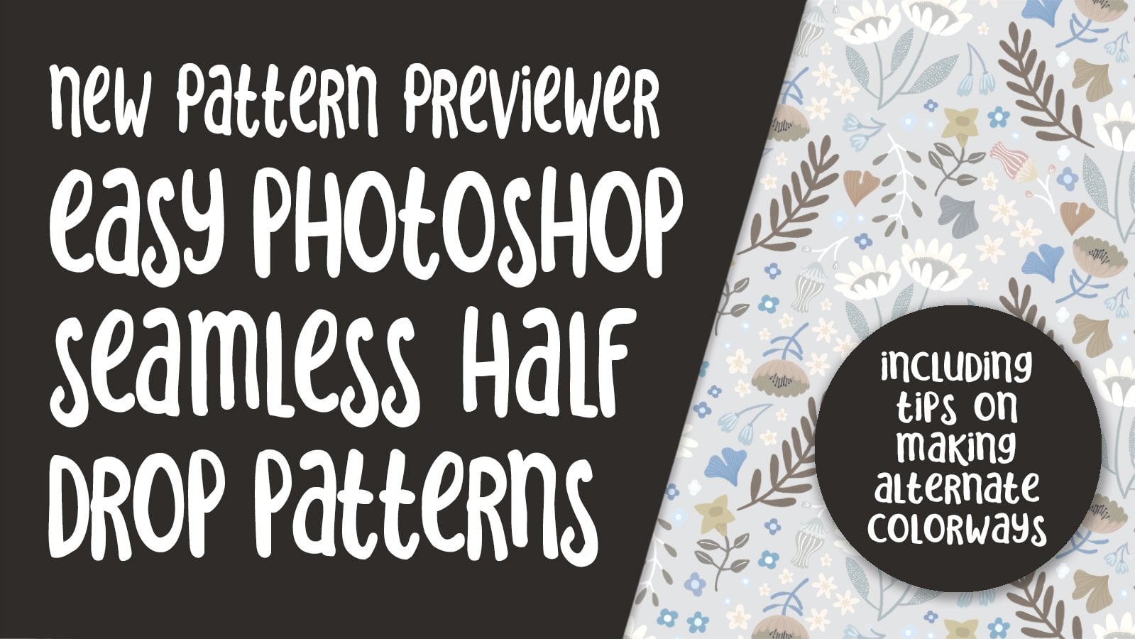
1. Intro to The New Pattern Previewer in Photoshop 2021: Hi guys and welcome. My name is dollar now screens and I'm coming to you from sunny, Manitoba, Canada. In today's class, we're going to be focusing on pattern design. I've drawn my motifs in Procreate. So we're going to start there. And then we're going to transfer using AirDrop to my desktop. And on my desktop, we're going to move into Photoshop because I've got a great new feature that I want to share with you if the new Pattern Preview Our, but it's more than just a preview or honestly, I just loved this new addition to Photoshop and it's literally just appeared in Photoshop 2021. I've been using it for a couple of months now and I think I've figured out all the ins and outs. I'm going to let you know all my tips and tricks in this class. You know how obsessed I am with pattern design. If you haven't done so already, please hit that follow button up there. I'd love to see you join me in my classes. But if you pick that follow button, then you're going to be informed of any of the new classes that I put out. As I put them out, I've got closest 70 classes and there's a wide range of topics. Are you ready to get started? All right. Let's get to it.
2. Motifs in Procreate and Exporting: Hi guys, welcome to Lesson 1. In lots of one here I'm going to be showing you my Procreate motifs. I may kind of a rough arrangement into a bit of a pattern. I'm going to export that pattern and I'm going to show you how to do that. We're going to import it onto my desktop and open it in Photoshop. Let's get started. So I'm here in Procreate. I've chosen Procreate because I just loved drawing it. I'd rather be drawing in Procreate or Adobe Fresco then actually on my computer, which is then I'm kinda stuck with Photoshop and the brushes there. And I just have really been enjoying the process of creating my motifs here in Procreate. So you can see that I've got a good variety of motifs here. Neither of the reasons I choose procreate is I love getting this hand done kind of a look to my motifs. So in this case, I've used the inker called dry ink. And it goes on beautifully. Honestly, I love how simple it is to draw my little motifs. I'm at my maximum number of layers here, so I have to piggyback onto another layer if I do want to do any drawing. So I'm going to sample this color here, this kind of darker teal color, NewCo little bit later. And I'm going to draw a couple more little flowers here. I like having a really good variety of motifs, especially size variety. Because when you are actually putting the patterns together in Photoshop, you're going to find that you're gonna need lots of little fillers. So I've got a bunch of different sizes here as you can see. So we've got a good variety. I've got all kinds of different shapes. So that's another thing that's important. I'm sampling the color really simply by just holding down on the color that I want. I'm going to reduce the brush size and then make another one of these. So I'm doing a really simple, almost like a four leaf clover shape here. If you want to get pure whites, double-click on your thought there and you end up with a pure white middle. So let's just say I'm happy with the amount of motifs and what I have here, as you can see here, I've got 14 layers because that was the maximum my width allowed. This motif here. I want to make some slight alterations to its shape. So this is one of the few things I'm going to be showing you in Procreate today before we move on into Photoshop. All right, so I'm going to go into my adjustments here and I'm going to go down to liquefy. And what I want to do is kinda squish the top closer and spread out the inside more just to kinda correct the shape here. So I've got my size at about 40 percent and I've got the push liquefy selected here. And you can see that what it'll do is it'll slightly pushed together wherever I need it to pay. So you see what's happening there, depending on the size that you have. Bigger you have it is the bigger the move will be that you make. Because I'm working on a fairly small motif, I need to keep it fairly small. And I think that's pretty good. I'm thinking I want to kind of round off the top a little bit here, so I'm going to reduce the size a little bit so that I can individually move those squished out when in a little bit more, then I'm gonna go a bit bigger again. And I'm going to just adjust the bottom here. So to me that's a more pleasing shape. I'm happy with that. So I could click into another tool here and that would be applied. So that's the before, that's the after. And I think that's a much more interesting shape. Now the other thing is that this color is not exactly what I want here. So another thing I could do is go into the hue, saturation and brightness adjustment here. This is one of the advantages of Procreate over Adobe Fresco. In Adobe Fresco, you don't have this particular set of controls. I'm sure it's going to be something that will come up at some point. So let's just do some experimenting here. We're just going to slide that hue slider along. And I think what I need to do is desaturate it and darken it a little bit. I don't want to darken it too much. But to me that's an improvement. So again, just clicking through another tool or just keep moving on with your design and then you'll be fine. It will apply the changes. So I am going to just tuck that one in here. And like I said, we're going to be doing adjustments in Photoshop so we don't need to perfect the pattern repeat here. So at this point, I've got all my layers are probably should go through the time of renaming them, but I don't wanna do that right now. And I'm ready to export. So now we go back into the gallery. Select. So we're going to select this one because that's the one I want to export. We're going to hit share. And I want to share it as a PSD file. So it goes through the process of preparing the file here. I'm going to hit AirDrop and I know I'm going right to my desktop and we're done. So that has exported to my desktop. And the next thing I'm gonna do is take you into Photoshop where we're going to import that layer document and start laying out our pattern tile. Alright, so I'll see you in the next lesson.
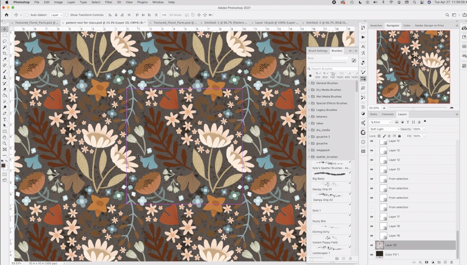
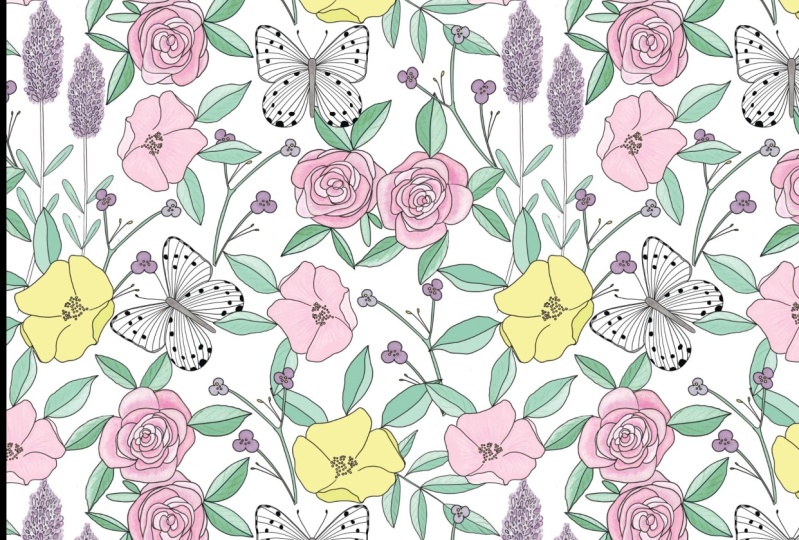
3. Photoshop Initial Set Up: Hi guys, welcome to Lesson 2. In Lesson 2 here we're going to be spending the whole time in Photoshop. I'm going to explain to you how that pattern preview or works. And we're going to import the pattern motifs and start arranging them. Let's get started. Okay, So I'm going to start with a document, exactly 10 by 10. So when I go to create a new document, I have this of course, as a preset because I use this all the time. 10 by 10 translates into 3000 pixels by 3000 pixels at 300 pixels per inch. So if I change this to inches, you'll see that 10 by 10, 300 pixels per inch. Now, I'm going to change this to CMYK. I may have to change it back to RGB. I'll explain more as we get into the nitty-gritty of creating the document. And I'm going to leave the color profile as is and hit Create. Now I've got the document I needs. As a matter of fact, I've got to let me close out one. And here we go with the 10 by 10 document. Now at the end of the last lesson, we transferred the floral parts document from Procreate on my iPad into my downloads folder here on my desktop. So I'm going to open that up and you'll see that I made a couple of little changes when I was off camera. I added a couple more of those little tiny sort of filler motifs. I think had created this second one here. And I added a little branch to this guy over here. Now, this is one of the things that I wanted to point out. It may or may not be happening to you in Photoshop 2021. I haven't found a solution to this. So by all means, if you know of one, please let me know. But my problem is the preview here. I don't like the solid black background on the preview of the thumbnail. I've checked a million forums. I've read as much as I could about it and I can't seem to find a solution other than changing it to a CMYK documents. So let's just change this one to CMYK as well. And you'll see that as soon as I do that I'm going to hit, don't merge here. Hit okay, and once it converts to the CMYK, you'll see that my image previews in my layers panel show up perfectly. So I'm not sure what's up with that. I'm not the only person having this problem for when I can see there has been a lot of searching for a solution to this. So I sort of played around with the layout here when I was in Procreate, I'm absolutely sure it's talking to work has my actual repeat, but I might as well start right here with this layout. So I'm going to grab all of these layers. So I used shift, I selected the top layer, scroll down, hit Shift on my keyboard that selected everything here. I'm going to put them all in one folder. And that just makes it easier for me to drag this folder onto my actual pattern documents. So as expected, we're not seeing any repeat here. And that's pretty much what you'd expect if you were importing into Photoshop. Photoshop will crop the image for you, and that's great. If that's what you want by us. We're creating a pattern, so we really want to be able to see this. Lying area here, I'm going to actually make my entire tile or my entire group, I should say, a little bit smaller so that we can see most of it in this image area. Okay, so I've just resized it slightly. I'll wait for that to transform. And then I'm gonna talk to you about this great new feature that I'm actually just loving. Since back in the Adobe textile designer stage and project Paris, there hasn't really been anything to help us automate the process of creating these sort of quick pattern repeats or pattern tiled files. If you remember, Adobe textile designer, we had these little features over here. We had the textile designer which allowed us to do the repeat on the pattern. We had the reviewer, and then we had the color ways. Now these were in development for quite a long time. I taught several courses on how to use them. Many, many artists love this whole plugin. Unfortunately, it was discontinued in November of 2020. So after that, really, the only thing available to us has been this new pattern preview, or I'm hoping it's kind of the beginning of this whole pattern repeat development thing that Adobe has going on. I've, I've crossed my fingers and I prayed to the software gods to give us Adobe textile designer back because I just loved it. We don't have it. You can see here that I was unable to load the plugin. So basically these icons are the fonts and I might as well just remove them from my toolbar. But that doesn't stop us from playing with this new pattern preview hour, which is, I would guess sort of the replacement for Adobe textile designer. So I have put it into my toolbar here. If you don't see it, go to the window and patterns and it will come up for you. This could be undocked or you can drag it back in wherever you want it on your workspace now to actually have the complete preview show here so you can tell what you're doing. You go to view and you'll see the pattern preview here. I've got a shortcut and I'll show you quickly how to do that. If this for some reason is grayed out, It's possible that when you set up your new document, you accidentally had artboards selected here. So it's really important to not have that because the pattern preview or does not work with art board. Okay, so I'll show you how to put in that keyboard shortcut. You can skip this step if you'd like. You're not sure about this, but I can tell you I've used it many times. So let's go here to keyboard shortcuts. We're gonna go to the View menu here. And scroll down until you see Pattern Preview and it's close to the end. I've put in my shortcut here. So I've done Command, Option Shift P, type that in there yours will be empty and say, okay, so now when I go to View and check it out, Pattern Preview has the shortcuts Command, Option Shift P. So now we've got the entire pattern in view. Because I haven't specified these as smart objects. This isn't working. It's cutting off my edges of my image here. So all of my motifs are cutoff. So what I'd have to do is go in individually, right-click and convert to smart object. As I go through and do that, you'll see that my motifs will all start to show on the outside. Of course, it's only going to show on the ones that are currently on the border. So like this one here, Convert to Smart Object in a minute, you'll see the whole thing show up. There you go. So because this is kind of annoying to have to go into the sub-menu here, I've created an action. And so I can just have this open and click on this Play button and go through it very quickly. So what you would do if you wanted to read this action, you would have to go here to create new, call it, Convert to Smart Object. Do that step of converting it to the smart object. And that was recording. So you see it show up on the list here, then stop recording. So you would have that now saved. So I think a cough is now in two spots, but whenever I can get rid of this one, so I'll just highlight it and trash it. And now I'll go through real quick and congruent these all. And this action just makes it that much faster. Now I'm curated the ones that are even in the middle of the tile because you just never know what some of these little fillers I may be wanting to use elsewhere on the documents. So it's just as a rule I go through and do them all. Now I just noticed that this one here is kinda sunflower looking one has gotten cut off. This has happened to me before. And pretty much what I always do here, just because I don't want to spend the time trying to figure out why it didn't work, I just eliminate it. Go to the document where I've saved my items. I'm going to drag that one back here to my pattern tests. And before I do any movement on it at all, I'll convert to smart object and let's see if that solves the issue. And it did. So I mean, I could spend hours trying to figure it out, but sometimes just replacing it is just as fast and you saved me the time of researching. So sometimes just having this document with all of your motifs on its separately is a lifesaver. So now it's all about just rearranging. And to make this a little bit easier on myself, one of the things I do is I put the auto select on up here and the control bar. And I like doing that at this point because then I can just simply grab whatever motif it is. I'm moving around without having to even look at the layers panel. This is one of the reasons I have. Become increasingly lazy about naming my layers. I used to be really adamant about that, especially when I was teaching high school students because for me to come in and swoop in and help them do something, it was really a lot easier for me if the layers were named. But yeah, for myself, I've kinda stopped doing it so diligently, especially when there's this many layers. I mean, the time it would take me to name all the layers hardly seems worth it. So I'm going to do probably a bit of a time-lapse here as I go through and work my pattern. And yeah, if there's anything significant to, I will definitely stop and explain it to you. Now, this little motif here was kind of 11th hour edition, and I'm not sure it's going to actually work. So I think I'm just going to turn that one off for simplify my process. You're a little bit and I CVs to have not been separated. And it would be a lot easier for me if they were. So I'm going have to revert to a rasterized layer. In this case, cut Command Shift V paste that in place and now it's separate. And then that one, both of those actually, I will convert to smart objects again. Now you see when I select one of the motifs, it does select the duplicate of edge or the repeat of it. And it causes this kind of a problem here. Do you see that where the item is fractured and have that happen? Just delete the layer, go into my other documents, grab the one that I want to make sure I'm on the right layer here. I think it's this one. Copy it. So I'm just copying the individual one since this one appears to be working, It's not fractured, paste it. And I'm going to transform it before I create a Smart Object with it. So I just kinda wanted to tuck it in this way here. And then I will create a smart object. I mean, in some cases that seems to work and it doesn't cut it off. But I have found that sometimes it's just easier to do it by copying and pasting from that original document. Remember at anytime you can zoom out to get a better view of your document. And if you do want to hide this, you can do that by because under View, Yeah, hide your extras here. So Command H. Now at this point, now that I've hidden my extras, I'm not going to see my controls on my individual items. So if that's an issue for you, then definitely just turned back on again humanity. So you can switch back and forth. It's up to you. If you ever wanted to duplicate one of your layers. Command J is the shortcuts. You'll get a duplicate immediately above, so your motif will be copied directly on top of the original. So basically, I'm going to go through and just perfect my pattern layout. I can do that off camera. And in the next lesson, we're going to start talking about our backgrounds. Alright, so I'll see you there.
4. Lesson 3 Backgrounds and Color Adjustments: Hi guys, welcome to lesson 3. So in less than three here I'm going to show you all about adding backgrounds that are going to be showing you a few of the other tricks that I've learned along the way. Let's get started. So this is how my pattern has ended up with a little bit of adjustment. I haven't done anything to major since the end of the last lesson, but now I'm kind of ready to test this pattern. Let me just hide that order again. And yeah, I'm okay with this. A few adjustments I could make. I think I'd like to change the color of one of these, but let's do a test first anyways. So what I would do here is open the patterns and it's really simple to add the pattern. You just literally click on that little plus sign at the bottom. And let's just call this pattern test1. And there it is. It's loaded with this one. I have no background at all. And I'm going to then add a background color. And it doesn't really matter what color we use right now. Let's just try a really dark green G for my bucket tool. And let's fill it up and add this one and we'll call it pattern chest to. Now I think what I'll do is make a new document doesn't really matter the size because I'm just going to be testing. What I usually do to do a pattern fill is to go to Layer, New Fill Layer. I like doing it this way because then you get a bunch of controls that you wouldn't normally have. So we'll just say okay to this will get to choose the pattern. Let's choose this 1 first. And what I like is that if I double-click on this once I've made the layer and I could have done it just before closing this panel. I could have put my new scale in there. And it does it instantly and it reflects on the whole layer. So that's the one that was no background. So let's try just filling this, not with this color, but let's try a different color. And we'll just fill. And while that is super, super ugly, Let's try a different color. Now you could do this for half an hour trying to figure out the color that you want. I'm gonna do this in a different way. I'm going to add a hue and saturation layer adjustment here. And then I will add my color. The beauty of this is you don't have to keep going in and out and trying to mix a color. You can do it right here and change the hue completely without leaving the comfort of this panel. So that shows you how nice it is to have the pattern fill having absolutely no background. Okay, so that had a transparent background just like a PNG image woods. And so what we can do pretty much anything we want underneath it because there's no color around with my motifs. So in a way that is a more powerful way to do this than just having the other. Swatch in here because I can't go in now and adjust the background of this swatch. So I really wanted to show you that. So even back on the document, we could go in and instead of having this background filled, we could do the exact same thing and add the adjustment layer and mix our colors right here. So I really think this is a better way to do it. The only thing is at times you may need that transparent background. So that's why I've created both of those swatches. So it's completely up to you at this point. If this was a color that I wanted, I could be in this panel. And again, just simply hit this sign to add this pattern. Now if I go back to my group here, just to let you know that as well as just hitting that plus sign, you can still go to Define Pattern here under the Edit menu if that's your preference. So I help one more method to change your background. So let's get rid of this adjustment layer and background. What you can do here is you can go under Layer, New Fill Layer and do a solid color hit. Okay? And you'll see that color fill layer has the same kind of adjustment as bad hue and saturation layer adjustment that I just showed you. So I just dragged it below my pattern and you can double-click on it. And this is another way that you can go through and decide on a different color, silver, just choose something here. I'm going to look pretty dark. And I'm going to show you one last thing, which is really cool with these smart objects. So let's just say this was what I ended up deciding on. What's really obvious, of course, about this one motif. Not really going to work because it's just way too dark. So let's go and I'm going to go to bat objects or that motif. So we've got an a here, I can double-click on it. It takes me into the smart object. And here I can actually make changes to this motif and save it. And it'll change right back in the other documents. So that's pretty neat. So let's just think what I'll do is just let me look back at bat. I think I like the little pods being this color. I think it's just this that I want to change. So let's try to Magic Wand selection here and see if we can just use Hue and Saturation. So command you will get you in this dialogue box and then less just lighten it up. Let's see if that works. It does, but I don't want this is going to be light enough. So maybe I'll try colorizing instead. And I also don't know what color are really looking for. So let's just say Okay here, just so I can show you, we'll hit Save and it will update in our pattern with that color. And actually I don't mind that that's not even the worst. So just for the purposes of this lesson, let's just say that that's the color I wanted. So I've done some pretty cool changes here. When I look at this really zoomed out. The only thing that's kinda bothering me is this really obvious line that's going through here. And I did think about changing this particular motif here. So in this case, rather than going into a smart object, Let's try the hue and saturation adjustment. Now you saw earlier that I already had this hue and saturation here and it's clipped to this selection. Let me just take it off so I can show you that entire process. So go down to your layer adjustments here and go to hue and saturation. And you'll notice that if I make changes, it's changing everything underneath this. And that's because that's the way these layer adjustments work. If you want it to specifically change this layer, only, then you need to clip it. I control click on it and create clipping mask. And then it's only going to adjust that particular layer. So I'm kind of glad that I'm zoomed out this far because I can get a better overall view of how that is working to solve or adjust the pattern flaw that I saw, which was that really dark line right across. So you can go with a really light color. Blue is actually not that bad all the way through hot blue here and the latent even more and see. And that could work. Slightly changing it to, you know, are really soft. Rusty orange might work. But anyway, I kind of like that blue, What do you think? Or you could something like that. So I'm going to have an HA about this for a couple of minutes. So of course I went way off and experimented with the entire color scheme. So this is kind of what I came up with. I wanted to show you that I had put adjustment layers on pretty much all of my layers here. Some of the flowers like these, sort of little tiny, they were originally kind of a peachy color. I put them into a group. And then the adjustment layer works with the group in much the same way. So it was clipped to the entire group. And therefore, I could go in and make adjustments just with that grouping like altogether. So that was trick. I wanted to show you the same thing with this blue one here. So I could go in and change it to fall at the same time. Alright, so that's something to think about. And what I had done off-camera was to create an action for adding that hue and saturation adjustment in the exact same way as I did for converting it to a smart object. These two actions I am including in the course materials. So if you don't want to go and make the actual yourself, you can import those two. Actually, this is a whole group here that I use or have used in other classes. So to import it, you'd go to the little fly out menu here and you would load the actions. And that's how you get them into Photoshop and then you can use them to the recolor. So this is a far cry from the colorways tool that we did have with Adobe textile designer. But at least it adds a little bit of freedom for changing the color. I still have the color fill as a color fill layer. You could easily change this to have been a solid color and have the hue and saturation adjustment just like with these layers. So you can go through and experiment. And really, there's a lot of really nice things that you can do to experiment with how your pattern looks. So you could go completely into a different hue here by just dragging this bar. And you can see why this is such a rabbit hole for me. Once I get into it, can really, really go off the deep end, experimenting and coming up with different color schemes. So I just want to show you that real quick before I am this lesson. And next lesson we'll talk about saving the individual pattern tile. And yeah, a couple more things. I'll see you there.
5. Alternate Imported Backgrounds: Guys, welcome with him for so in this lesson we're going to be bringing in some objects. I want to show you how to incorporate those into your pattern, will probably going to play a little bit with transparency as well. Let's get started. Yeah, so this is where I ended up with my design. I feel like I've pretty much dealt with that striping issue. I usually avoid doing grid repeats for that reason because I find that that is often an issue, but I think it's all right. This is definitely acceptable and something that I would submit for art licensing actually have to design a set of dishes, floral set of dishes. So this might be the starting point for that. I'm not sure. It never know. So I've got that dark color fill on it and I really like it. But there's one last thing that I wanted to show you. Now, of course, you know that this is a transparent pattern until we add a background to it. And I wanted to just experiment with adding a texture into the background. So this is a Canvas texture that I created in Procreate, either in Procreate or Fresco. I don't remember. There's a little bit of kinda weird pattern forming there, but I think it's going to be fine because it's behind such a busy pattern. And really what I want is just that textural feel to it. So whenever I want to design a perfect repeating tile from a texture, I do it in this way. I have a full class on this, so I'll give you a link to that so that you know which one it is. But basically what I view as I go into my filter down to Other and offset. And you see I have a shortcut for it there, Command Option Shift D, and this offsets so that the outside is now going to be a perfect match to what was there in the first place. And I'm just left with the seams here that I need to hide. So I see, Okay, here I use my rubber stamp to roll views. We set that fairly high and I just option click somewhere in the main part of the design. And I just go in and get rid of those obvious seen lines, actually collapsed it to the background layer. So Command E would do that. And now I'll continue with my stamping. You get rid of that line there. So I'm kind of sampling from different spots so that I'm getting sort of a random luck to it. Now I didn't have to import this by the way, I could have grabbed a brush and created background fill here. Let's just add some spatter or something to a here so I'll go into my brushes, grab want to Kyle's spatter brushes so I can add good texture, pretty much anything I want. The technique is still the same. Let me go with quite a bit darker here, that one. So basically you can continue to add whatever texture you want and then go to Filter Other Offset. Keep that at fifteen hundred and fifteen hundred. So because my document is 3000 by 3000, the 1500 pixels across and down are halfway. And that will give us that seem again in the middle. So you can see here, some of my spatter was cut off. Like I said, I have a full course on this, so I'm not going to spend too much time explaining this part of the process. But basically once you've got your seamless tile as you, nothing else kinda cut off there. So once you've got your seamless tile, you can select it, copy it, go back to your pattern that you're creating. I'm going to go as my original tab. I'm going to go just above my color field for the background plus my background color fill, I'm going to Paste and that has pasted it. And from my experience, it pastes it perfectly in the center. But if you just want to be absolutely sure, select it and select your color fill layer, and then just double-check with your alignment and it didn't move at all. So obviously it was perfectly aligned. So basically I had my dock there, my shortcut for docker ps command Option D and Command Option Shift D was my shortcut, so I had inadvertently made that appear. Okay, anyways, you can now use whatever blending modes or anything else you've got in your arsenal here too. Apply that pattern whichever way that you want. So it's completely up to you at this point. Like, I didn't mind multiply know you couldn't really see it there. But if I were to really enlarge, see my texture is in the background here. I think it's subtle, but it definitely adds a finishing touch. You could go to maybe something like overlay. And you can see that texture is now really visible there. Now of course, because I didn't plan this completely in with my color scheme, I would have to make quite a bit of an effort to make it work, but let's do something like this. So we've got that texture. I've got on soft light and at 36 percent and it looks quite nice. So if I wanted to save this to my patterns, then, now at this point, and you can see I had a test here. You can just hit the plus sign. Then let's call this pattern tests for. So if I've got an additional pattern saved, and that's just another way that you could add some interests to your patterns so we can hide that one. And the other thing you could do is just grab brushes and delete this month we'll use this document. By the way, this document was 10 by 10, 300 pixels per inch, which is what made it 3000 by 3000 wide. And that is what allowed us to do that offset at 1500 pixels, which gave us the repeating tile seem right in the middle that we can fix up. So here you could grab brushes to mature what brushes, but I'm using my right bracket to enlarge. Want to Kyle's brushes, again, that's a watercolor. And let's go down to his blenders. You could add texture brushes and nor some going over the edges will do that same technique down to filter offset, offset by the amount of pixels that makes it halfway. And then we can use the brushes here again. And let's use his blender is one that I really like. It's thrash lender. Here. Thrash blend. Don't judge. I'm just doing this to demonstrate. And you know, sometimes you do something. I was really quick and it looks amazing. I'm not sure if that's going to happen for me today, but Command Option Shift D Again, just to be sure, We've got a couple of seams here we want to work on definitely better one last time, and I think that's sufficient. Select all copy back to our original document and paste. And it's really cool because it does, and I've tested a million times. It does perfectly center it on that pattern tile. So like I said, you can double-check by selecting two of the layers, go into your move tool and using your alignment. And it never moves. So obviously for shop as being very good to us today and doing that for us. Again, work with your blend modes. Perhaps adjust your opacity. But again, we've got a pretty cool background. We've created it right here in Photoshop. And to add to your patterns, you simply hit that plus sign and you've got an additional pattern. So that's it for this lesson. And in the next lesson I'm going to show you how to both save your patterns as PAT files and how to create that single swatch that you might need for guilty sites like Spoonflower. Alright, so I'll see you in the next lesson.
6. Exporting and Testing: Guys, welcome to lesson 5. So this lesson is all about exporting your patterns and adjusting them once you apply them, we're going to be doing a test document here. Let's get started. Okay, so we're going to export our patterns first as pattern files. So PHP files, Photoshop, pattern files. I'll start by telling you a really sad story. I had. I don't know how many, probably 30 or 40 patterns saved here in Photoshop and I don't think it was in 2021, doesn't matter, but I had a whole bunch of them saved here and I thought that they were kind of lake permanent that I would not lose them. But at some point I had to redo my Photoshop. For some reason there's something glitching and I had to throw away my preferences in order to fix the problem. And in so doing, I ended up losing my patterns. So now as a rule, when I get through a set, something that I have designed, I export it to export all of the pattern tiles that I've created quite often it'll be like a collection here, you know, so I really need all of them to work and I don't want to have to go in and redo all of the painstaking work of making the pattern itself flawless. So there are a couple of reasons why you would want to do this. First of all is just for safekeeping. And second of all, it could be because you were selling the patterns. If you are exporting your patterns to create a collection of scrapbook papers, for example, you may want both files that you can go back to. Or if you're selling the actual pattern on a place like Creative Market and you want that PHP file. So whichever reason it is, in order to export your pattern, you just have to select it. And in a case like this, I'd probably select all of them. So I would click on one and then I would go to the end one and Shift click. And you can see it's selected all of these. And I would go to export the selected patterns. And it's going to automatically kinda take you into the spot where photoshops saves the files initially, and it's a very embedded folder. It's deepen your library. I personally prefer to save it into a folder that I call PHP files. This is just one of the ones I have, but here I've got this in one of my work folders and I'm going to just name it. And now I have it named. I already did a test here as Sonny sunflower. It's going to overwrite that when there are so many hit save. Nope, I didn't override it, so it's giving me a second copy of that file. What I would do here if I had lost all my files is I would go to Import patterns and there I would go to my PAT files and I would import so I don't know whichever that was the one this morning. So this is the one that would be the most recent and I would hit open. And they would be important like this in a folder. I could actually get rid of these. And I'd have this folder with all my different patterns. So that was something that I recommend that you do. Now the other thing that we haven't talked about is exporting the individual pattern repeat. So this file in a large file with a pattern is one of the ways that you can create a file for upload to one of your POD sites that you sell on. Let's say for instance, we go to this one because it's 24 inches by 18 inches, 300 DPI. The 70 to 100 pixel wide file is quite suitable for large items, let's say like shower curtains or tapestries, whatever you wanted that file for, let's just hit Create. So I'd be creating a file with the pattern repeating several times. It's not just the single pattern tile. This is a document with the full repeat showing over and over. I like putting in my 100 here by selecting a new pattern layer and filling it with the pattern. And I would choose whichever pattern is that I wanted. Let's say it was that last one and say, okay, well let's first of all think about the scale. So let's say this was for a shower curtain. That's probably quite a good scale there. Maybe could go a little bit smaller and hit Okay, and then you would export this file as is at this size, and it's got the repeat on there. Now if you were selling it on Spoonflower, Spoonflower itself requires the single pattern repeats, so they really just need, let's say from this middle of this sunflower, a square tile with just the one single repeat on it. And so it'll be tricky to figure this out. Now, I generally keep my patterns. I start them at 10 inches by 10 inches at 300 pixels per inch. So that's 3000 by 3000. So generally, I would be able to guess that. But there's times when I am doing, let's say a half-drop. And instead of being 10 by 10 is 10 by 20, I want to see what that actual repeat is and what I need to, or how I need to create it. Now, I can go to the single pattern tile here. And if I were to hover over it, you'll see the actual size is listed there. So in this case, of course, I know it is 3000 by 3000, but if I didn't know that, that would be the way I would determine that even says that it is a CMYK file, which is good to know. And so I know that I have to make a new document that's 3000 by 3000 and 300 pixels. Courage, which I have of course a preset for. And I'm going to hit Create. And in order to get the single pattern, a single repeat on there, I simply have to drag this in here. And this will be my single repeat. It is exactly 3000 by 3000. There is the single repeat there. You can even see if you look closely like the very tip of this one repeats down here. The edge of the sunflower repeats over there. So we know that that's exactly ten by ten, and then we would save it. We could flatten it at this point. So I could go to flatten image and save it. And a gala would go to wherever I am saving that current collection. And we probably have a folder here, Sahni sunflower, it would have its number and I would save that file. And I think for Spoonflower or PNG or JPEG is what they need. So I'm going to call it sunflower D pig. And I know that that is the exact size that I need for Spoonflower, check with your supplier or your POD as to whether they accept CMYK files or RGB files, the exact size that they need, the exact repeat. I'm just using Spoonflower as an example, but definitely check what is required. And you're gonna know that that's going to work for what you need. If you don't see that coming up, if you don't get the tool tip and that's what they're called. It's because you've got tooltips turned off. So go to the Tools Preferences panel. And it would be because you have these show Rich Tooltips turned off. If I keep them on and yeah, you just figure it out like that. And you'll be able to create your single pattern tile for Spoonflower. So that's it for this lesson. I'll meet you in the next one where we're going to have a little bit of a wrap up. All right. I'll see you there.
7. Outro and Wrap Up: Hi guys, Welcome to the wrap-up. I'm always so pleased when we get to this point. And we can take a look at our patterns or finished products, either on mock-ups or some other purpose. Thanks so much for hanging out for the whole class. If you haven't done so already, please hit that follow button up there. And I'd like to invite you to visit my shops. I have a society six shop and an Arctic. We're shop here in Canada. I have my own website shop, dot Dolores art dossier. I love to have you come and visit me here. I have a lot of free resources there for artists. And that's going to be an ever-expanding part of my site. Also be sure to check out my two Pinterest sites, dealers, art dealers and aspirin and teacher dollars now script. There I share a ton of artists resources and examples for you. Especially check out my surface pattern design site. There's lots for you to see there. Thanks so much for hanging out with me today and I'll see you soon.
 Delores Naskrent, Creative Explorer