Transcripts
1. Intro to Secret Formula Repeat Plaid and Twill Patterns: Hi guys and welcome. My name is Dolores now Scranton. I'm coming to you from sunny, Manitoba, Canada. So today I'm bringing you a really quick for shop class. Well, I guess some really quick, but it's fairly quick idea, let's just say this is a pattern that you can create actually very quickly once you know the technique, what am I talking about? Well clad course, that's why I'm wearing plaid today. Have you seen the proliferation of plaid lately? There's plaid everywhere. Honestly, I see it in home decor, I see it in close. I see it in artwork. So that's what we're going to focus on today is the creation of plants. I want to show you both regular plaid and applying with a twill. Don't know what that is. Well, we'll figure it out along way. The really cool thing about this is that we're going to be using techniques that will allow you to apply this to any base document that you create. So we're going to start with creating the base document. Then we're gonna go through and create some pattern tiles that we're going to be able to use to actually convert these base documents. It's a really interesting technique and your mind is going to be blown. I guarantee it. If this sounds like something that'll be interesting to you, then make sure you hit that follow button up there because I'm always coming up with new ideas for classes. If you're one of my followers, then you will get all the information as I release. And that's usually a new classes almost weekly. And then of course, freebies that go along with almost every class, at least recently, are going to start by taking a look at Plaid in general, the history of plaid, and of course examples. And then we're going to get right into it. Are you ready to get started? All right. Let's go.
2. The History of Plaid and Class Overview: Hi guys, welcome to lesson 1. Lesson 1 here, as I promised, we're going to be taking a look at examples on talk to you about the history of plaid. And I want to show you all kinds of new pods that I've seen out there. Let's get started. I wanted to give you a little bit of an overview of the history of plaid. Don't let anybody tell you it's an ordinary pattern. It's unmistakable checks can be found across cultures and classes. And there's much linked to Scottish history as early Americana. And they've been worn by everybody from surfers and punks to high-fashion models. Everywhere you look, these days you see land. To be precise, the pattern we know as plaid is actually called part. Now curtains are weaves of alternating bands, woman at right angles. While plan originally referred to the heavy woolen clothes that have that pattern. So Scots would use them as blankets or they would link them over their shoulders. It was when tartan cross the sea to the New World that plaid and tartan became synonymous. Now curtains actually originated even earlier than what we consider the earliest, which is Scotland in the 17 hundreds there actually found on mummies as far back as the eighth century BC. Now in Scotland, geographically, the weavers produced different patterns and specific associations with families and clans came much later. Back in the day. The Turkish shifted from being a Scottish family symbol to being a military symbol. And that was when the Jacobite uprisings against the English mark. So if you watch the show outlandish, you'll know exactly what this is all about when marching into the Scottish rebellion, for example, the Royal highly recommend more the black wash pattern. And that was not a pattern that was affiliated with any family or clan at the time. Unfortunately, the Highlanders and was crushed and believe it or not, the tartan fabric was banned in England until the law was eventually repealed. Imagine that fabric being banned completely by a country. Now with a Scottish immigration at the end of the 18th century came the popularization of clad in the US because of trade, explorers and settlers bartered pelts with natives for woven blankets from Scotland. The first one that are the one that kind of most recognized as the black and red one that we know today as Buffalo plan. Now it was called Buffalo plaid because the company that was making it in Pennsylvania, the guy owned a herd of buffalo and so he named the fabric after his pet Buffalo. It so successful or became so successful, that pattern is still part of the Wooldridge logo. Not enough. You guys remember Paul Bunyan? Paul Bunyan was turned into a folk hero by an ad man, known only through oral tradition at the time, bindings, tall tales were first transcribed by this ad man, both in writing and in pictures. The ad exact gave him heavy brown boots, blue jeans, and flannel shirts in that red and black plaid. And I remember visiting the statue and that was when my dad was in college, Bemidji, Minnesota. And they had a little theme park. And there's a statue still kind of an iconic memory for me. It wasn't till basically the 40s, 1940s that plaid cross gender lines for the first time. And that's what dependent on maize shirts for women. After that it was everywhere. It moved from wool to other textiles. And he find plaid not just on clothing, but consumer goods, car seats, Rafi papers, shoes, and even wallpaper. So what I wanna do is show you a bunch of examples that I love. And we'll talk about the different types of plaid. We're only going to be producing two types. And the first one being just the basic plan, and then the other one being a twill. Know a twill is a type of wheat. So if you look at it up close, is identified by its pattern of diagonal lines. So the twill weave is used to create really strong fabrics like Tweed and Aberdeen and BlueJeans, of course. Now you can see here by this illustration, the way it works. The twill weave is formed by passing the weft yarn under an over multiple warp yarns in an alternating sequence and that forms a diagonal ribs, kind of a pattern on the fabric surface. So I'm gonna be showing you how you can add that to your plaid. But we're basically going to be focusing on a plain weave. What I'm looking to produce this kind of a feminine plaid, we're gonna do some really modern colors. I like flag here, this pink. And another one that I really liked was this one. I love that contrasting colors were used in this blouse. Mean, if you just search how plaid and take a look at what the result there, you're going to find a lot of inspiration. This plow is here. I can actually remember having a blouse, not quite this style, but it had these kind of colors and I think this is something more worth what I'm going to be going for. I want to keep it really light and fresh. So that's what we're going to work on. And I'm hoping that by the end of this class you're going to find this technique to be so sweet and simple that you're going to be using clades, all your fabric collections as a coordinates r, h. Let's meet in the next lesson where we're going to really figure this out. I'll see you there.
3. Setting Up the Base Document: Hi guys, welcome to Lesson 2. So unless than two here we're going to be setting up our base document. Let's get started. So the first thing I want to do now that I am ready to start my plaid is to find a color scheme that I like. So I'm here in Pinterest, just taking a quick scroll through my color palettes to low. And I think I want to pick something like the one I showed you that reminded me of one from back in the day when I was a kid. So I think maybe this color scheme would work for it or this one here. I think I'm gonna go with this one. So I'm gonna make a screenshot. So Command Shift 4, grabbing that image is going to come up here in preview because that's what I have set as my default. I just copy that. And in Photoshop I'm just going to drop it in. So I have it here as reference for creating my colors. So here we're going to go into my color swatches. I'm going to make a new color group. And you can see here actually got a group that I made her color palette that I created for another project and it's almost what I want. I'm not sure maybe I would use that one, but let's go with this one here and start adding the swatches. I'm going to get my eye dropper nuts. I on my keyboard, yes. And I'm just going to click into the color area that I want. And I'm going to add that into my group. Okay, so I just hit that plus sign here and it added it. So we do the same thing here. You can name them if you want to go through the trouble. For that one, My Library keeps opening. And I caught my swatches here so I can throw this layer away. So I'm going to just hit Delete on it and I've got my colors here, so that's all that I need. Alright, so my document here is 400 by 400 pixels wide and 300 pixels per inch. I'm going to start by filling it with a background color and I'm going to hit option Delete to do that the fastest way. And now we can start selecting some additional areas for alternate colors. So I'm holding down my Shift key. I'm just kind of randomly selecting with the rectangular marquee. And I'm going to select the next color here. And again, I'm going to hit option Delete and it'll fill it with that. So for this first one does experiments by just doing it really quick. Don't be too particular about where you place your bars of color on this first one so that you can just kinda see how it's going to work. Alright, so again, Option Delete, slowly adding all my colors in here. I like having a variety of sizes by the way, so you can try that out, see how you like it. And I think I am only missing one color, which then benefit here and here. And this is the color. So we're going to hit you. So I'm going to do that one. Yeah, I'm going to Option Delete dots and I think this is going to work out well. So what we need now a duplicate of this. So I'm going to double-click on this to make it into a layer or eight. And then I'm going to hit Command J, which gives me a duplicate, and then Command T. And we're going to rotate this 190 degrees. At this point I'm going to hit save just to be sure as I've done that little bit of work and save that into my assets. And I'm going to call it base document one and hit Save. So believe it or not, we're ready for the next stage where we're going to actually create some of that weaving. Now in order to do that, we need some specialized pattern files that we're going to create, and we'll do that in the next lesson. The only don't want to say about this lesson, RPN, this lesson is that it's really important for you when you're first trying these sorts of techniques out to really experiments and think about the kind of color psychology I guess that's happening with your plaid. Now if you're working with a collection and you're trying to add coordinates, then you're going to pick colors according to what you've got in that set. A collection usually has very well executed color schemes. That's kind of what you're looking for when you're creating something like this. And you're going to learn as you do a few of these, what really makes a good plan and how to make it really striking and very different and very trendy. So I'll meet you in the next lesson where we're going to do those basic patterns that we need. Alright, I will see you there.
4. Creating the Patterns to Use for Conversions : Hi guys, welcome to lesson 3. So this is the lesson. We're going to set up those weird little patterns that we're going to be used for converting our documents into a plaid or applied in as well. Let's get started. So this next set of patterns that we're going to create our for using as pattern overlays. And it's going to seem really weird, but we're going to create one that is two pixels by two pixels. And there it is, right there. Can you see it? Neither can I. Okay, so I'm going to enlarge it. And now I didn't show you there that when you are creating it, it's very, very, very important that you make it transparent, okay, I've got my transparency grid off here, but this is transparent, I guarantee it. And now what I have here is actually two pixels wide and two pixels high. And that's really important for what we're doing. It divides evenly into the 400 pixel based document. So that's very important. And that's the formula that you basically need to know. As long as this will divide evenly into your base document, you're good to go. So if you had, let's say a 1500 by 1500 pixel document here, than you could do this little document, 15 by 15. I'm doing it just with the two pixels because it's just so easy to create. What I need to do next, which is out one pixel square. So I'm going to go into my rectangular marquee tool here. And up here, I'm going to set this to a fixed size of one pixel by one pixel. So that's going to allow me to select just a single pixel at a time. And what I wanna do is these two diagonal corners are opposite corners I want to fill and it doesn't matter what color at this point. So I'm going to choose this teal color and I'm going to just duplicate that and I'm just going to do the opposite corner as well. And I'm going to now make a pattern out of this. And I know you're wondering what the heck are we doing here, but just hang in there. I'll explain shortly. So here I'm going to add a new group. I'm going to call this plaid and quills. And I just have to hit this little plus sign here and the pattern will be added. I'm going to call this overlay one. And so we've got that in place as we need it. And we're going to do another documents. This time we're going to do a four for pixel square. Okay? So make sure again that it's on transparent and hit Create. And yes, it's the smallest document you have ever seen. I'm bringing it up to size here. And for this one we're going to be doing a different sort of a pattern. So it's important for me here to create this exactly. And I'm going to option drag for this one just to make it quick. So Option Drag and I'm going straight down and I'm doing the complete diagonal line here. If you've thought snapping on, you might find this a little bit tricky. That's what keeps happening to me here. So I'm going to turn off all the snapping. And in order to do that diagonal, I'm holding down my Command Option and Shift key. And this is exactly what I need for creating a twill pattern. So again here we're going to define the pattern. So I de-select everything I'm going to add. And this one I'm going to call Pattern Overlay, twill. And these standard little patterns that I've created here I can use whenever I do a 400 by 400 pixel based document. And again, I'll just remind you that you could do any size of document here, as long as these that you do, divide evenly into the same amount of pixels. So if you've got four here that divides evenly into 400. If you've got 15 here, that could be a 3000 pixel document. It just has to divide evenly into it. So now we've got exactly what we need to go ahead and create those two types of patterns. So in lesson 4, we're going to create the plan, and in Lesson 5, we're going to create the twill. So I'll see you in the next lesson.
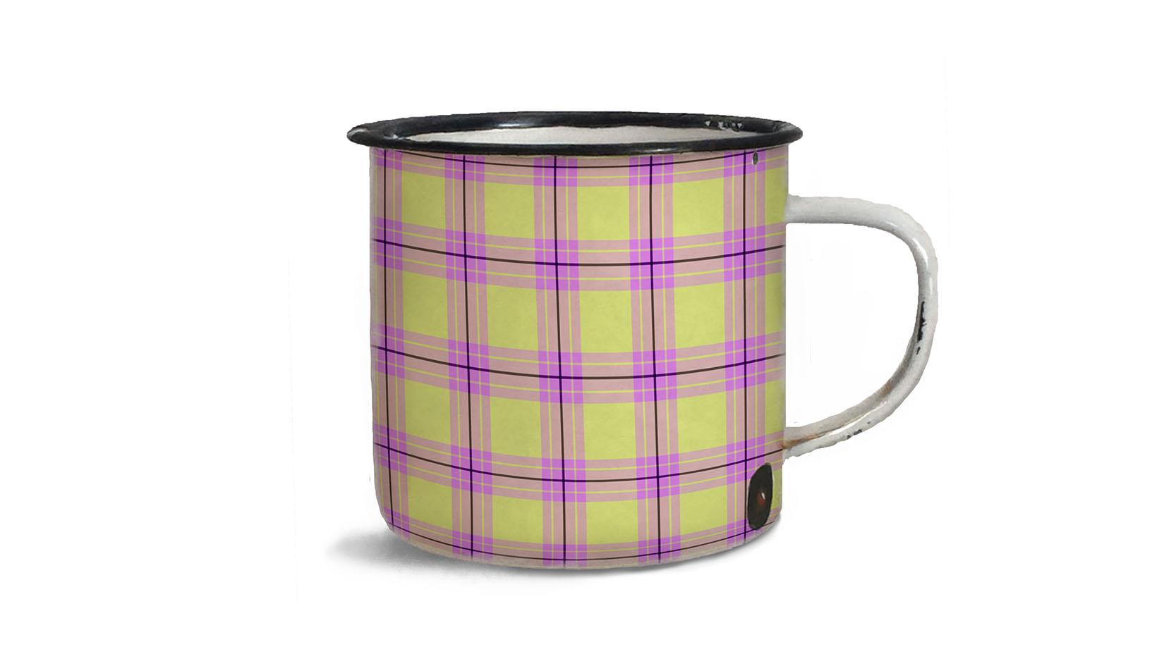
5. Pattern Overlay for Converting to Plaid: So in this lesson we're going to be doing the addition of that bad overlay. Let's get started. Okay, so I'm back to this base document that I created. And what I need to do now is to go to the bottom layer here. And the first one we're going to be creating is a just regular plaid pattern. So what we wanna do is go to the adjustment layers here. For layer adjustments, go to the pattern. And here we're going to load the first one that we created, which was the one for the plaid. So we'll just double-click and that's gonna come up here. I'm going to leave it at a 100 because I know that this is the size that I need. And I'm going to say, okay, so in order for this to work, what we need to do is clip this into this layer here. So this is what's going to create our weave. The fastest way to create a clipping mask is to option click. If not, you can click on the layer name here and control-click or right-click, left-click, whatever. I always control-click. And here you can create the clipping mask. I personally find it's just faster to do it like this and not have to go into flyout menu. And I miss my ta-da moment because here's our beautiful plaid that we've created. Isn't that just amazing how quick and easy that was? So this looks really great. I love how easy that wise, and I love how beautifully it turned out. Now to make it exactly like the pattern that I was looking at that I showed you that I liked from my past. I would like to make some adjustments to the color a little bit here. So I'm gonna go to you hue and saturation. So I'm adding a hue and saturation adjustment layer here. And because I don't have it clicked, it's going to affect everything that's below, which is exactly what I want. So I think I'm going to slightly adjusted to the pink side here, and I'm going to lighten it. If you see here, how once we have this BCE figured out and we've got it made into a plaid. We can do so many different things to adjust it here. So besides hue and saturation, you might want to go in and work with a gradient map. And what the gradient map does is it takes the light, dark medium pixels and converts them here. So this would be the darkest pixels in my image, and this would be the lightest pixels and I could replace them with different colors. So let's say I wanted to go to a blue color scheme. So everything that is dark in my image will be replaced by this blue and everything that's light in my image. Let's say we decide to do kind of a yellow. So that's another method that we could use. And we can add additional colors here, represents midtones and so on. Now I think this was tonally very consistent. What I mean by that is these tones that I had in my original layer. Let's just turn these off. These tones. There's nothing here that's much lighter or much darker. So I would have had to do adjustments here in the first place in order for that gradient map to work. But you can definitely go back here and make these changes in these layers as well. So I could go in here and all n, Let's say adjust my levels so that I've got a lot more contrast in here. I would go into this one as well. So let's turn this all back on again. And in this one, I would apply the same basic changes to my document. So it looks the same now I should have written it down or used an adjustment layer to do that. So if I went back and I used a levels adjustment layer here, if I was to move everything here below with this levels than the levels will affect everything below it. So you can see it's affecting both of these and creating that software plan. So a lot you can do once you've got this set up and definitely go in and do some experimenting with these layer adjustments because a really quick way to make some changes, especially when you are just experimenting at this point. So we've created our first plot here. I think it's really pretty. And remember that with these adjustment layers, you can go back at any point and make adjustments. So I can double-click on this and I can go through and make some adjustments. Like I could probably produce ten different color schemes here super easily just by messing around with these. And that reminds me a little bit of that skirt that I saw in the first lesson that I really liked. Definitely take the time here to experiment. If you don't want to lose what you've already got there, then make a duplicate. Select all of this, put it in a group. Duplicate the group. So Command J will duplicate the group, hide the original, and then you can make changes. So all of this stuff is part of that exploration and experimentation that you should be doing when you first learn a new technique. So in the next lesson we're going to take a look at producing a twill pattern. I'll see you there.
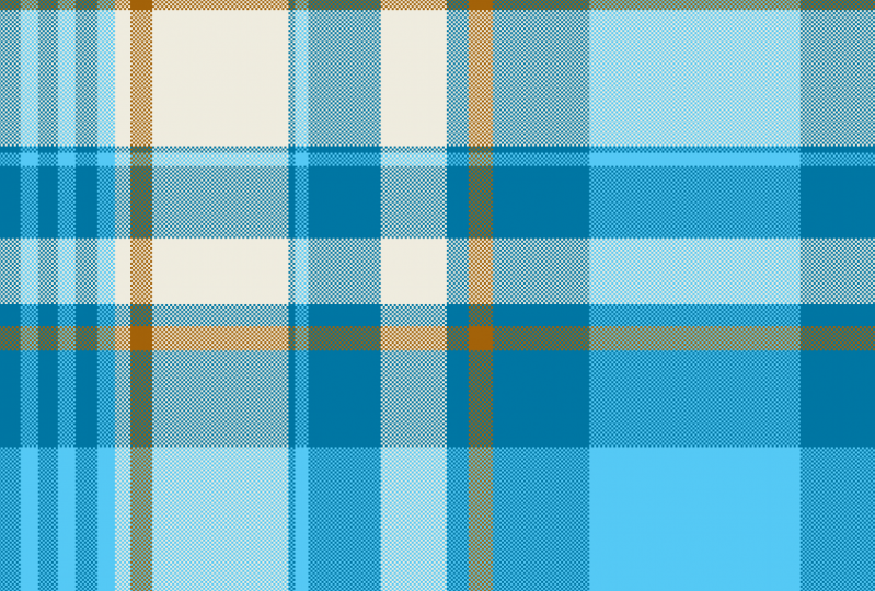
6. Adding Texture with the Twill Overlay : Hi guys, welcome to lesson 5. So in this lesson we're going to be doing the addition of that twill overlay. Let's get started. So you've probably already figured out how to do the twill patterns. What we need here, of course, is the pattern adjustment layer. All I've got that's wrong here is that this needs to be here and we need to clip it here. And just like that, we've got a gorgeous woven wheel pattern on our plan. So I love that. I just think it's gorgeous. We've got so much that we can do now with all of those adjustment layers. Now the one thing I didn't show you in the last lesson is how to add this now as a pattern, and it's really simple. You open up your pattern panel here and just click the plus sign and label it and hit. Okay, and now you have another option here for a pattern. I'm going to go back to this one here and just change it back to this so that I can also save this one as a pattern. Let's just hide these layers here. And now we can go and just test it out. Let's do a fill layer, which is a pattern, and choose this one and it worked perfectly. So a good way to test it would be to reduce the scale or enlargement. But you can see here that you've got a lot of flexibility there as well. If you're testing out that pattern. I mean, it's so quick, I can't believe how short these lessons are. A few like I have to keep on talking because the lesson was so short, I'm going to just go ahead and do alternate patterns so you can see my process. So I'm going to put these into their own folder. And I'm going to start from scratch here and make another pattern. And I think I'm going to experiment with another color scheme here. Let's go with a pastel, and I'm going to just grab a few of these colors to use. So I'm going to start with a yellow. I have to add a new layer here. And I'm going to go through the process exactly as I did before. Now one thing that's really pretty too is to have white. Remember to reset this to normal. I like having white in my class too. So I'm going to actually just select a couple of areas here to leave completely white and you can grab the bucket if you want. Or remember that shortcut, I find that that's faster than getting the bucket tool. Even if you use your shortcut, which is G, it is actually just faster to hit that all the leaves. Now I'm going to go into my color here and I'm going to mix some slightly lighter colors. Option delete. And I think I want to add a little bit of blue in here so we get this sort of complimentary scheme happening. So I'm going to grab a really light blue, bluish green. And I'm keeping this a little bit more subtle than the other ones I was doing. And go back to this yellow. I'm going to sample this yellow, I think or no, I think I can just grab almost like a BG color to put in here and be a tiny bit darker, tiny bit foliar. And there is my swatch that I want to work with. So in the next lesson, I'm going to show you a bunch of alternatives with color. I'll meet you there.
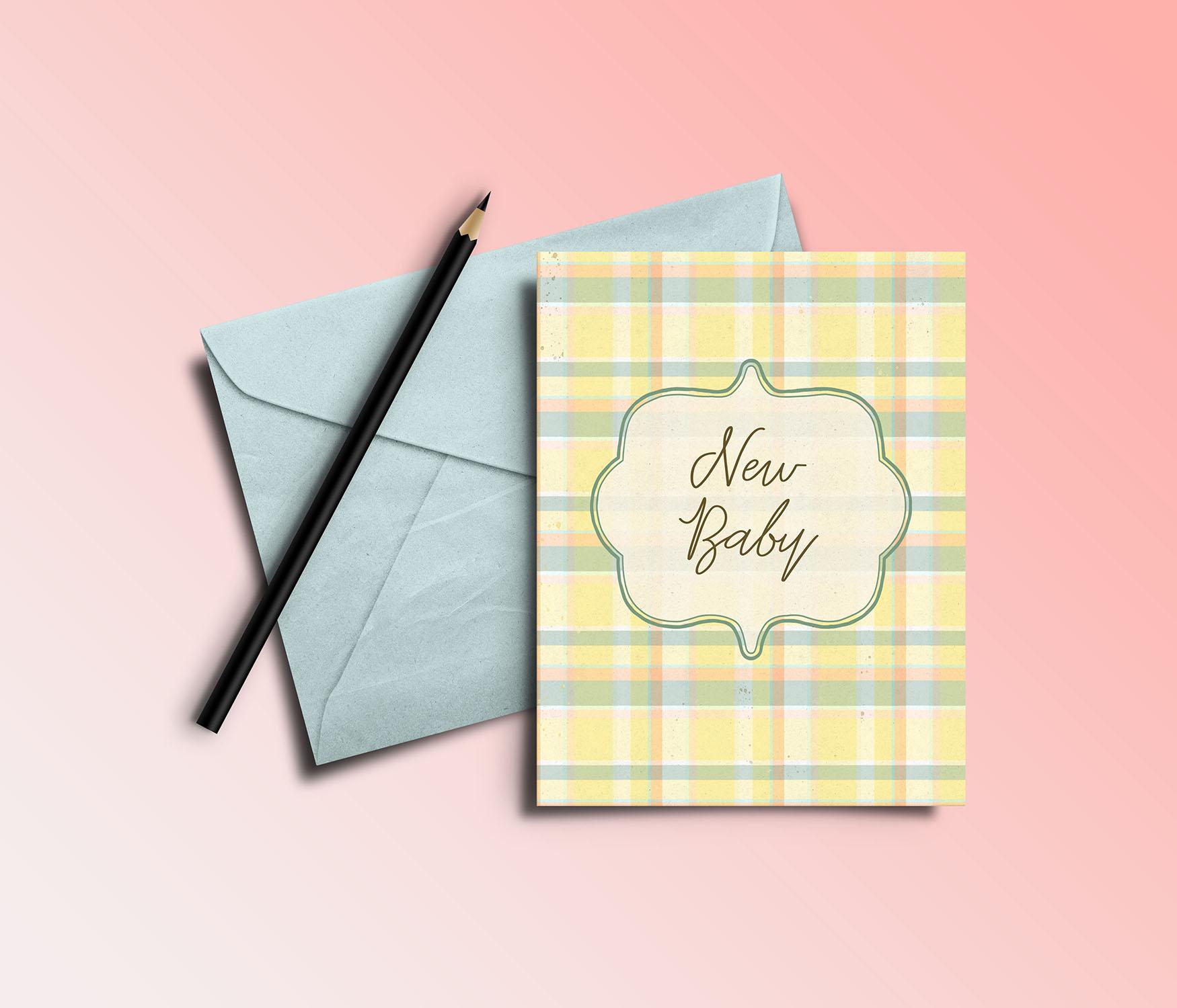
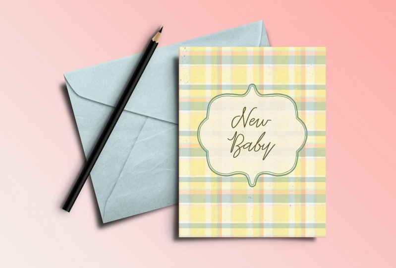
7. More Color Experiments: Hi guys, welcome to lesson 6. So again, in this lesson we're going to continue with a bit of color experimentation and we'll see what else I can come up with half I go through this lesson break, so I'm going to duplicate this as always, Command J and I'm going to rotate it 90 degrees now you can just drag to rotate or you can type in 90 here. It doesn't really matter. Ultimately, what you need is just for your pattern to be duplicated here and in position. Then we're going to add that adjustments for pattern. And I think I'll just go with the basic for now, drag that between the two layers. And then here we're going to make this into a clipping mask. And we've got instant plaid. Us feel like I should have today are a kind of a sound effect once something works out. So again, I want to talk to you a little bit about things that you can do to add variety here. So Let's save this as a pattern and I'm going to make a new document. So let's just say I was creating scrapbook paper. So scrapbook paper is generally 12 inches by 12 inches. And I'm going to do a nice high resolution, 300 pixels per inch. And I'm going to apply my plaid here. And I'm gonna do that using a New Fill Layer, Pattern fill layer, and choose the one that I just created. And I think here I'm going to enlarge the scale to about 200%. I think that would be pretty cute. On a scrapbook page, he imagined this one for maybe a BB or whatever. I mean, it's just so pretty you can use it for so many different things. We could add the hue and saturation adjustment if we wanted to, to BYU D saturate or lighten or even completely changed the color. So that's a lot like that plaid shirt that I had way back in the day, but go pretty just by adjusting the hue. We'll leave it pretty much where I had it here. But what I also want to do is to apply some sort of a pattern or texture to this. So already got our really subtle plaid or fabric woven locked. We've, whatever you wanna call it, I would like to add a little bit of watercolor spatter or some sort of effect like that. So I'm going to go into my brushes here and into my special effects brushes to see what we can come up with. So in Kyle's brushes, which you can download if you don't have. Here is spatter brush that we could add. So I'm going to make a new layer here. And just so that you can see this clearly, I'm going to add it in a deep color. Select my brush tool B on my keyboard. And of course we're going to enlarge the brush a fair bit. So It's going to drop in a little bit of spatter in a couple of different colors here. He's got several different ones so you can really mix and match. So I'm just adding a little bit of noise here and there. Now with that, you can also experiment with the way you blend it based on the layer blending mode here. So let's go through and just check out some of these to see how they would look. So if you wanted to be really subtle, you could use something like latent or screen, kind of like that screen overlay can work. It really depends on the look you're going for it. But I really think myself, I really liked that screen effect. And of course here you can also lighten or darken it using the opacity. So that might be a nice way to create a really nice textural pattern that you could use for, like I said, backgrounds for something like scrapbooking. Or if you are creating some kind of print document like a calendar with make a great border. I can see this with a really cute frame. I'm going to go to my downloads. I've got some really great frames saved in my Downloads folder. Let's make it easier to see. I'm going to change that to icons and let's pick out a really nice one here, like, kinda like this one here for select it and copy it. I'm going to use the place command by the way, you bring that in, but I'm just going to copy it in and it's a PNG so it's transparent, which is excellent. Now I can use a hue and saturation. I'm going to actually move this up because I'm going to add a hue and saturation adjustment specifically to that frame to apply kind of a softer color to it. I'm going to colorize the lightened and I'm going to go for kind of a desaturated green and soften it a little bit with lightness. And I like that. So there's the beginning of a cute little design. I'm going to use my magic wand to select the inside here. Now, I want to be able to overlap into here. So I'm going to expand my selection by a couple of pixels. I have a shortcut for that, but if you don't, you can go into blacked here, modify and expand. I'm going to make a new layer and fill that with a really subtle soft kind of a yellow. And because it's on its own layer, I can reduce the opacity. So I can have that plaid showing in the background kind of just subtly behind this man of color. And the select, I'm going to type in some text here, new baby and centric. And I'm going to pick a really cute fonts and again, change the colors. So see what else we've got here that we could use. Decrease the spacing between the lines. Let's call it letting. If you want to do it just with keyboard shortcuts, use your option key and the up arrow. And if you add the command key to that, it'll jump a little bit faster. So there's the accused little layout. You could use this for something like a card. You can easily adjust the proportion of your image to be the right scale. So you can have a portrait instead of just a square. But there are just a couple of quick ideas on how you can use that plaid. And I think this would be a really sweet little design. Okay, So I've got one last lesson for you where I'm going to show you how you can replicate an actual existing plaid media classic design that you need. So let's meet in that lesson.
8. Replicating a Classic Tartan Pattern: Guys, welcome to lesson 7. In this last lesson here I wanted to do another quick exercise. I want to show you what you would do if you wanted to duplicate a pledge. For example, if you had a customer who was asking for a specific Cloud or you wanted to try something different or get closer to what would be an authentic person patterns. So for this exercise, I'm going to just grab this one here because I quite like it will go into Photoshop and I'm just going to paste that image. Now when you look at a plaid like this, Repeat would be from this corner to this corner. Okay, so a lot of this that we have here we just don't need. So I'm going to just eliminate anything extra. So I'm selecting the area that I want, and then I'm selecting the inverse and just deleting it. So that is the actual pattern repeat that we would be creating. So let's just enlarge this to fit our square. And I've actually got this set as a 10 by 10 document because I wanted to show you that those little patterns, swatch overlays that we created will work for whatever size we create. So next I'm going to drag a few browns and Asia's that I can use into this color group that I've created. I'm going to delete this one because I accidentally added to there. I'm going to change the color slightly because I don't want to infringe on any copyrights, but I'm going to basically color it the same. So it's going to be cream, brown, Navy. And I think that's all I need at the moment. Maybe I'll lighten this brown a little bit. So I'll delete this one here. All right, I'm going to pull that back up again here. And we're going to start creating the basis swatch. So you know what, that, what we need is basically just the one direction because we can do the duplicates to do the opposite direction. So I think I'm going to start by doing the new layer. So Command G for the New Layer. Oops, we can delete that out of there. And I'm going to select first my cream color and Option Delete to fill with that. I'm going to temporarily lighten this so that I can see what I'm doing. Now we'll select this area, make this our foreground color. So I clicked on the swatch here, you can see thus the foreground color it shows up here. So Option Delete, we'll fill with that. Now I want to do another cream color here and here. Solely a way to ensure that you've got the same size would be to do the one. So we'll do that option to select that light beige and then Option Delete. And then let's just drag this one down. So I'm holding down my Command and Option key then dragging this duplicate of it down so that will make sure that that is accurate. And then let's draw the navy stripe in here. Choose Navy option Delete, and we've got our basic swatch. So now I can bring it back to full opacity. And it looks so simple, doesn't it? Now I will duplicate this. And then we want to rotate this and we want to go actually minus 90 degrees because we want this set of stripes to be here on the left-hand side. So I usually just go in here and do the minus 90. And let's eliminate this layer here. Now, we'll add our pattern fill layer, grab this one here and say, okay, we want that between the two layers. And then we want this to be clipped. So option and then click on that line between the layer and the pattern fill. And I know it's hard to believe, but we've just created this new class. So we're going to add this mask pattern 2, and let's do a test of it. I'm going to do 20 by 20 documents. Let's do a new fill layer pattern and we'll grab that plaid that we just created. And you can see it perfectly and beautifully created, the plan that we saw here in my browser. So definitely think about that kind of method for duplicating a type of clad. And remember that you can go back and add a hue and saturation adjustment layer. And it will affect everything that you've got there and you can easily create a new Cloud. Now I'm thinking for this one, I would try that other method that I was showing you earlier on with the gradient map. Because now I do have kind of a light and a dark and a medium tone there. So for this one, let's try replacing it with saving Navy and then the lightest color, which was the cream. Let's see if this is going to work. And it seems to have worked. So soft yellow here is replacing the base. The Navy is replacing the brown. And let's see if we can actually add a third color here. And we can sell. That creates a very pretty bad. I'm going to actually darken this one here. So now we can add this new color swatch in. And we've got another amazing pattern that we've created very, very easily. Let's go back to this document and you can see here I've added the pattern. I brought it in and it was a little bit light, so I added a levels adjustment to just deepen the colors a little bit. There's a really quick and easy way to match a classic tartan pattern. Okay, So I'll meet you in the last lesson. I do want to show you some mock-ups, so I will see you there.
9. It's a Wrap: So we've made it to the end. We've got some beautiful patterns to showcase. I like showing them on actual models who are wearing garments using that plaid. Or I like using them on home decor items that might use Plaid. Personally, I'm going to be using a bunch of these to do some Christmas artwork for a callout that I just received. Now if you haven't done so already, make sure you hit that follow button up there. That way you're informed of everything I do, all the new courses I post and of course any other information I put out there. I also would like to encourage you to check out my website that's at shop dot dollar or a dossier and add yourself to that mailing list there. Sometimes I do different mailings from here or from there. I'd also like to invite you to check out my stores. I've got one at Society 6, another one at Sawzall.com, which is probably my biggest one. And in Canada here at Art of where. And I think I mentioned throughout the class my Pinterest site. So check out Dolores art dealers, mask, parent and teacher Dolores now script, pose or two spots where I have a lot of resource material for you to take a look at. Make sure you check out my surface pattern design forward. I have applied category in there. So yeah, as long as you've hit that follow button, and if you have any comments or questions, make sure you post them in the discussion section. Or if you have time, leave me a review with a little bit of an anecdote. Those are always so fun to read. Thanks so much for hanging out with me again today and I will see you in my next class. Bye.
 Delores Naskrent, Creative Explorer