Transcripts
1. Intro S Curve Ogee and Quatrefoil Exploration: Hi guys. My name is Lawrence Mass Grant. I'll come to you from sunny, Manitoba, Canada. Today I'm bringing you a new course called S-curve OG and quantifoil exploration. Now that's a mouthful. This is a follow-up to my flip-flop OG Corps, in which we created a live transformation template to help us in creating our S curve patterns. So at the end of that class, I had a pretty nice looking S-curve OG. And I thought I wanted to do a little bit more work on developing it and just kinda making it more interesting. So this is what this course does. We're going to take that OMG and we're going to really improve it. I've also got a couple of other OG designs that I want to develop onscreen with you. And then I'm taking the same template and using it to create a quantifoil. We do lots of work throughout. You see my complete process. You see me make mistakes, correct them. And really it's all about creative problem solving on the fly, are really hoped that by the end of the process, you will have learned a lot. I know I certainly did. Are you ready to get started? All right. Let's get to it.
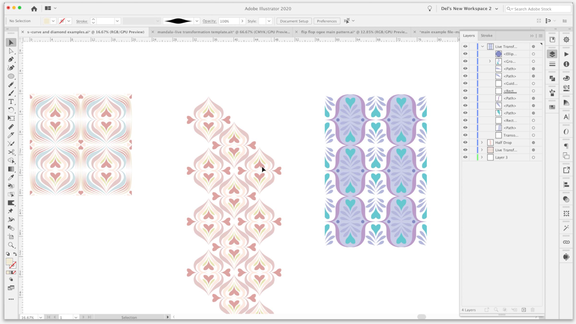
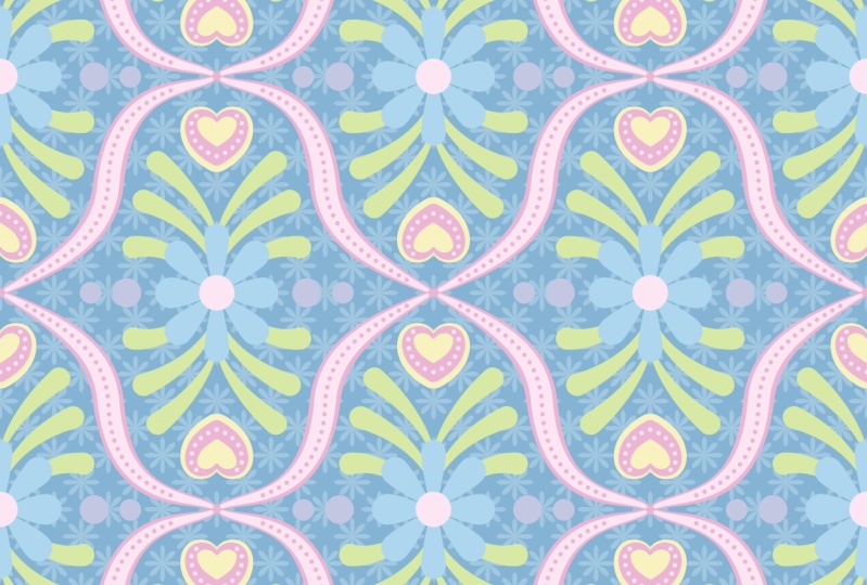
2. Lesson 1 Overview and Ideas: Hi guys, welcome to Lesson one. In this lesson I'm going to give you kind of an overview and review and we're gonna take a look at that, oh gee, that I started to develop in the other class. Alright, let's get started. If you're in this class today, it's probably because you just completed my other OG horse. And in there, we went through the process of creating the live transformation template. And at the very end, we were left with a really lovely S curve design. And we'll show you the one that I created in the end. And it is a little bit more detailed than what I went through blaine. So we originally did these two this was kind of a grid repeat because was that half drop. And then we had done this one. But in the example at the end of the class that I showed you, I had not done any of this additional buildup on the lines like the double layers. I didn't have this light blue in the background. I didn't have this outline on the heart and a few other things. And I was having so much fun with that off camera that I decided I should do another level to that class so that I can go into a little bit more detail explaining this technique and how I went about creating it. Also during the class, we had referred to a bunch of examples on Pinterest more than once. We went back to that. And then I wanted to, in that class show you how to go about creating these sort of different designs. And we just ran out of time in that class. That class was already an hour long. So this class is going to be that development. So I've got some here that I want to show you that we are going to try to work on some of the ideas anyways, these are all different versions of 0G patterns, just basically using the template in different ways. We're going to solve a bunch of design problems by going through and individually creating as many versions of these as we can within an hour. Okay, that's going to be our challenge. And then I want to talk to you a little bit about using the template to create a quantifoil, a quarter foil, as I reviewed in the last course, water foil stands for, for leaves, and it's a really traditional pattern. I'm sure looking at this, you can see that this is kinda thing you've seen a million times before on ceramic tile. We're gonna go into a little bit of detail on how to create those. So the first thing I want to do is review the one that I just showed you and how I went about creating it. So let me just start by breaking down what we did have here. So remember that we're only working here in this corner, which will lock that. That's our transformation, should be down at the bottom hand. Let me just show it to you in outline or preview. So you can see the area that we're working in. So you can see there that there is a lot of overlap over that S curve. And that's because I've got two layers applying. And then what you're also seeing is this section of color that I put in. So you can see that over here as a path which has the shape that I drew in. And this is the same idea. We're just working with this corner here. So it's really not that hard if I was to move this line, for example, for you to see, this is the line that I had there before and then I Laird it with a line over top for the line underneath was 1 and then the line on top is 0.7. So that gave me that little bit of what looks like a border. Remember that these are brushstrokes. So those have been created using that brush, their pain. So I did basically the same idea with this one here where I had this line 1.2 over top of this one, which was 1.3. And that gave us that really cute kind of outline around the heart. Now, this is the light blue. And I remember mentioning that at some point in the class as I wanted to experiment with that, basically as soon as the class was over, I ahead and did that. So this I probably could have done with my brushes as well. I ended up drawing a shape that I just made it kinda into a wedge. I did the full rotation, I think when I was experimenting. So I had taken this, I'm going to cut it and let's just play with another layer here. I'd put it in, use my Rotate tool. So R for rotates option clicked rate here, I did 30 degree copies of it. And if you did all the way around, you would get the full sort of a flower course. I did only the three that I needed. So just adding a little bit extra to these motifs, I think, made the whole design so much more rich looking. So we're gonna do a little bit of that. And I think in the first lesson, I just want to talk to you about the S-curve itself and how altering the S-curve can make a really big difference when you are creating a sort of motifs. Ok. All right, so I'll see you in lesson two.
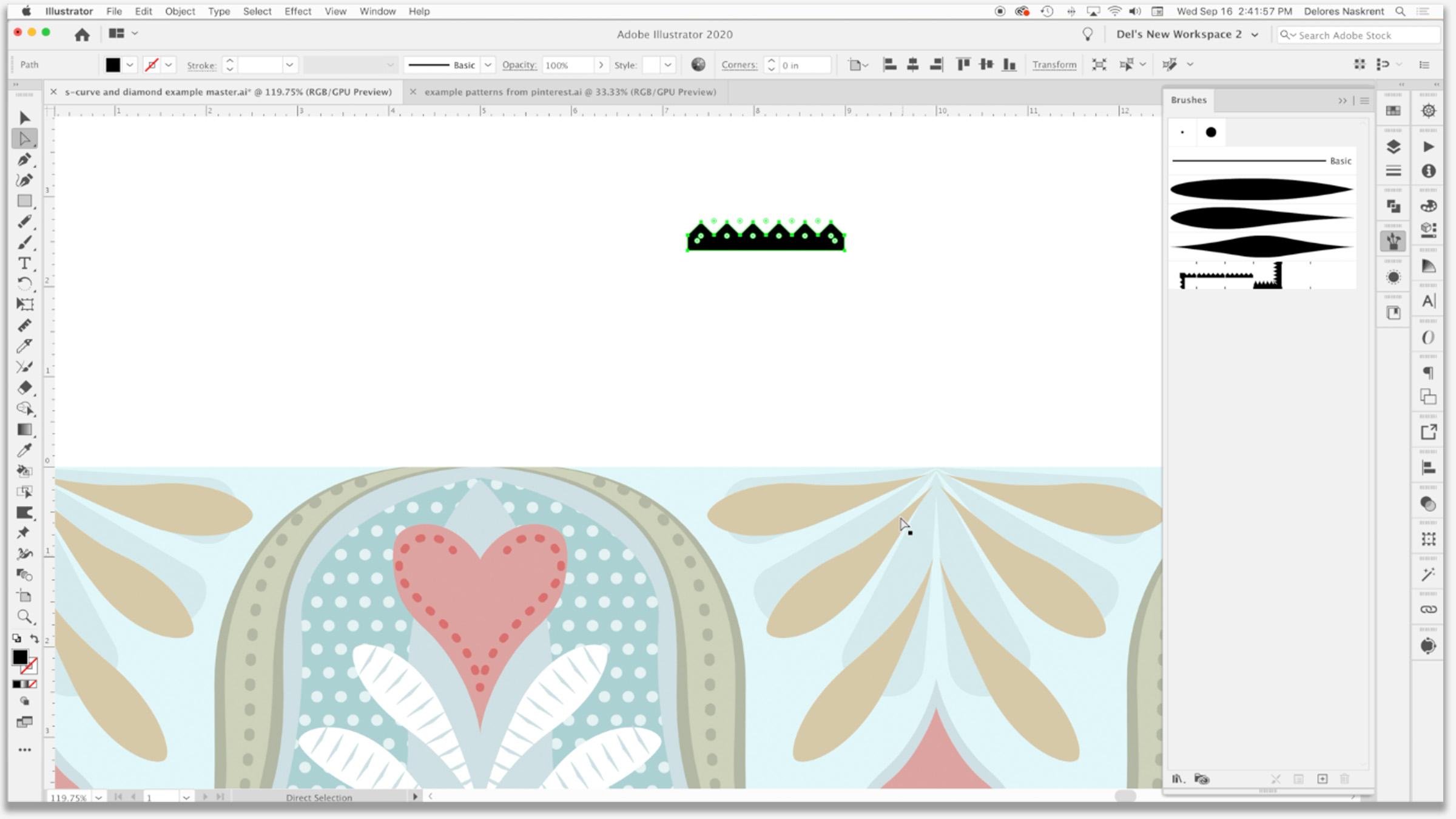
3. Altering lnitial S Curve and Basic Set Up: That would be a great way to start this lesson by just taking you into the use of my original S curve up to, to start a new document. And I just wanted to take you into the template documents. So I'm gonna do is I'm going to hit open here. I'm going to drive to where I store my templates for live transformation. This is where we had saved the S-curve. Remember that? So I'm going to double-click on it. We're hip open here, whichever way is your preference. And what you're gonna see here is that the template opens up, but what it is is an untitled document. This will save, whichever way I save it now it's not going to overwrite the original template. So this wine I could do Save As or save right now it's called untitled, and I can save it here into my assets for this class. I'm going to call it S curve one because I don't really know what I'm gonna be doing with it. And remember, I gave myself this little bit of an instruction or gets up as to what the curve was for. Not that it isn't obvious here because I actually left myself a brush line to work with just to be sure I can get rid of that now. And you can see here that if I go into preview mode here, command wine and you see that is the only thing on my template. So looking at the layers here, this is all that should be there. This is my transformation. We, I remember I had spelt this wrong in my last class. We need to add an F here. And you can see that there's literally only that one piece of art and that's this year. Now the guide can't remember what I had there, but I'm just gonna get rid of x. I don't think I need it to. And then this layer three and layer four here are just kinda open layer so that I can work with if I don't want something in the transformation. So if I decided to experiment with something, but I put it over here and I'm on this dry brush. If I'm on or within the transformation layer, then it's going to show up. But if I was to work on this other layer, it doesn't end up as part of the repeat. Ok, so it's just basically empty layer. There is a bill for almost anything else. But the first thing I want to show you here was the fact that this S curve has on the overall look of the pattern. So we had produced it by pulling straight to the right. So kind of a 90-degree dipole and then 90 degrees straight up. And we had placed this right in the middle. Originally I had a guideline or there, or a guideline. Let's just use the rulers to make a guide, a five-inch Mark. Show guys, we're going to go up and actually really big so I can really see my five-inch line. I'm gonna drag to that spot and let go. So I've got a perfect guide. Their demand semicolon is what shows and hides your guides. You can see that I'm just a little bit off with this because it's a bit of a curve here. And of course it's got the line thickness. I would have to curve it a little bit more this way, bring it down. But I just want to just really quickly show you changes that we can make just with the curve itself to affect the shape of it. So if you wanted to look back at those examples, you can see that there are different curvatures on each of these. You see that And changing it, literally just changing this one curve can change the appearance of our OG. So that's more like what we had seen, all these changes that you could make just within or just with changing that one single curve. And right now I've just got a brushstroke inherit this could just as easily be a pen stroke or a single line. It could be in any color, doesn't matter. So those were things for you to think about when you are composing your design. I thought it would be kinda fun to start with this kind of a design because it's going to be really quick and very easy using the brushes that we have must try to do something like this one here. So amongst the things that are happening here, you've got these lines that are all converging here. At the top and the bottom, you've got some blocks of color in behind. You see that there. So those would be solid shapes that you could draw. And then the alternate, the corner has just a solid shape in it. So let's aim for this, a particular design. In fact, what I'm gonna do is I'm going to copy just this design will go back into Illustrator. I'm gonna paste that in. Oops, paste it into one of these layers. So we have it there to refer to. Let's pick a really current color scheme. So the other day when we were working on the other class, I imported some color groups that I had already put together. I did that by going into my swatches palette down to user-defined, and I had 2021 helots. Let's open this colors 2021. I don't remember. These might be slightly different and actually they look the same. Let's put this one in here. So I'm going to click on this color group which will add it here. That might be a good one for us to use for this, I can take action. I'm going to make these persistent because that way they're going to come up for me anytime that I had been a new document here in 2021, I'm going to check one more time. You can open other swatch libraries, for example, these are just the preloaded ones that come as default with the illustrator. So you could do, you know, earth tone and pull up a binder. Or you could go to the actual color books like pound tone and bringing in a whole pound tone catalog. I don't, because it slows down my illustrator while I'm working in there. So I tried to be pretty specific with what I have. Now. I think we're just gonna stick with you. So let's work with mainly this pellet down here at the bottom. So we have that one brush that we created that's probably going to be pretty suitable for this. We're gonna go back to when it was more at a 90 degree angle. So I'm just finessing that curve to have it look a little bit more like this. I don't want to copy it outright. Someone else's spent a lot of time figuring out this pattern here. So we're gonna do our own version of it. And then you can see here that if I leave a space and ongoing to hide my art board, but you can see that if I leave a space here, I get that same effect as here, where I've got a space to put some of my other lines to help them converge there. So I think that's probably pretty close. I'm going to change this one a bit so that I don't have that weird thing happening there. Now at some point were possibly going to even create clipping mask if that will help us work more easily. But I think for now let's start with drawing that initial block of color that's in the back here. Thanks to both, start with, obviously we're working here in this corner. So I'm going to, I'm going to draw a five-by-five rectangle. So I'm option clicking, Get my dialog box where I can type in the measurements. Click OK, I want to align to art board. So make sure that's selected there and want to align it to the side. And I want to align it to the top. Currently it has a stroke. And so I'm going to get rid of that. And what I wanna do is copy it paste in front, which is if you look at it here, paste in place is Command Shift P, So Command Shift V. And I'm doing that because I want to turn this into a guide. So command five turns it into a guide. So if I was to show my guys that would have that and I still have the actual square that I can color. This is not the guide. Ok, this is the little square that I drew on top so that I'm going to fill with a base color. So I'm thinking exon your keyboard and they'll bring the fill to the forefront here. So I'm thinking if we're gonna go with this palette here at the bottom, I'll do that one in the light grey. Now you can see that that has covered the entire area. What we're gonna do is use the line that we have underneath that line to split that box into. So we'll have the two areas that we can color. I'm going to lock this less fat and what you don't want. We still have that clipping mask from last time, so I'm going to lock it to get to move it to the top. But that's great because actually everything that we do falls within the clipping mask will be cut off on the edges. But what I'm gonna do is select this layer and the path. And I'm gonna go to my Pathfinder palette and I'm going to divide. And I'm thinking before I do that, I'm going to duplicate that line. So I'm dragging bat layer. So I've got the duplicate underneath here, and now I've got the path and the rectangle selected. I'm gonna go to path finite. I'm just going to use divide. So now I should have two separate halves that I can build. A will select this corner here. And let's do that one, just the slightly grayer color. So we're off to a good start. We've got part of our design ready to go here. And in the next lesson, what I'm gonna do is talk to you about creating these lines, which we're probably going to do with one of the brushes we are, we'll create a new one, whatever makes it easier, arrays. And I will see you in the next lesson.
4. Brush Magic for Pattern Building: Hi guys, welcome to less than three. And less than three here we're really going to use the brushes to fully develop our pattern. So we're going to do a lot of layering and some fun stuff with just creating the brushes. Let's get started. Alright, so in this step, we're going to do some of the brush strokes to give us this type of motif that you see here, I'm going to start by eliminating a bunch of these swatches that I don't believe I'm going to use. Go all the way up to here and go to Delete swatches. I could have hit the garbage can at the bottom there as well. And yes, I do wanted to lead that selection, which I don't think I'm going to use this one either. Not going to use those for sure. I'll leave the rest for now, but let's choose this color. That'll give us a pretty good idea of whether the brushes that we have will work. And as you know in the last class, we did some work with these, let me call this one brushes, and we'll drag the brushes out so you can take a look at these. So we've got these basic shapes here. Now, those will make most of these. But one of the things I'm noticing with this particular wisely, we really use this brush for it. I'm gonna duplicate it. What we would need is more of a flat area in the middle. So I'm going to make alterations to this one. In the last class, I showed you how to start with an ellipse to get this kind of a shape. So maybe we should just do that from scratch. We'll just draw the ellipse. Let's fill it with black. What I did was use the convert selected anchor points for making these into a corner. You can do them by hitting Shift key on your keyboard as well. I'm going to add points here and here. We did this in the last class, as you recall, can actually eliminate the ones in the middle here, which we didn't do in the last class. And let's think about this shape and how that might work. Paul, This whole and out. I'm holding down the Shift key so it stays parallel. And I fix something like this might work a little bit better to give us that sort of flattened section in the middle of this particular shape. So to make it just a bit smaller and want to make sure that these two are aligned and these two are aligned to each other. And pick and Maybe I'll just slightly all these yen and I'm going to pull that into my, my brushes here aren't brush. Okay. Of course we wanted to be able to color it. So we're gonna do tense here and I'm going to say, OK, all the other settings I can leave as is, let's just get rid of these. Make sure we're in the live transformation layer. We're going to our first stroke basically from this point down because he here that we've got this bit of white gap and we've got that first bit of color from background, I would say so. I'm going to pull it kind of lower. And I think that shape of stroke is going to work just fine. So because we did tense, we can now go in to our color palette and make the selection, whoops, hit exon your keyboard to make sure that the stroke is in the front Chand. There we have our first stroke are our colors aren't exactly the same as this, but these are the colors that I have chosen based on color predictions that I made. And that's something that I did with a bunch of research. And you could check out. I have a chorus call, lucrative trend forecasting. And I've got one from 20-20 and one from 2021 if you wanted to check those out. And these are some of the color predictions that I made. We can make adjustments to any of these colors afterwards. But for now let's just work with what's here just to save some time. So I think that what we could do is increase the thickness of this line. So you can go to the strokes palate here. Or if you select the whole line, you'll see that it comes up here in the control bar. And you can experiment with the thickness. One is too big or too small too is too big. So let's try 1.5 and see how that looks. And I think that's pretty good. I think I'm gonna eliminate this point here, which is minus on my keyboard gave me that minus 6y with my pen tool. And I'm going to hit the keyboard so that I can adjust this. I find that the less points I have, the better. I do want a bit of a hook at the top here because HIV, the guides, I want to be able to come to a bit of a point up here. So you can see it's almost like the ends all get kinda squeezed together to go through that little openings or off to a great start with our brushstrokes. But I'm thinking that I wanted to change the shape here a bit more rather than the S-curve idea that I had at the beginning. I want to change this to be a more round inside bit. So I wanted to be more like this one over here. So I'm gonna time-lapse it as I make the changes necessary for that. I need to now also change this brush because I realized that what I need is for it to be papered on the one side and then actually wider here to connect to the reflection of itself to create these long main strokes. So let's take a look at that brush. We'll bring it out. I'm gonna work on my brushes layer so as to not disturb my transformation. And I think we can just basically cut this so that it has a blunt end. So I'm going to use the minus anchor point tools so that takes the point off. And then these are left as rounded points. So I'm going to select them both. And I'm going to use this corner point, corner convert. So I'm hoping that this will work well. We'll try it and see art brush tense, okay, so you can get rid of that. Make sure I'm back in my transformation layer and let's just see if we grab that brush and change it to this. And that much works. You can see that it would be all right. I can obviously make adjustments to it to make it work even better. And, and let's see if we can play with the line thickness a little bit. Now I'm not like he, how I'm getting these kind of bumps in my curve. So this may be something that we're going to have to do with the pen tool. We're going to have to do a little bit of experimenting to figure this one out. So again, I'm going to select the whole curve so that I can take a look at the stroke thickness. And yeah, I'm not liking this bumpiness and the curves so I can't make adequate adjustments. I may change my mind and consider using the pen tool instead. Just wanna take a look here. I want to make sure that that needed to go over the edge because I'm a little bit of a gap down here. If I'm not really liking, is my colors, I'm gonna make some slight adjustments here. Warming that pink cup a little bit. It's a new color, so I'm going to drag it. So I think I'm gonna make a new color group. I always convert process to global. And that puts my first swatch in here. I think for this I want to go with slight hint of green in it and we'll leave that for the time being. So lets try to point to, like I said, we don't want to copy directly. This is another artist's work. So we're trying to create something similar. Just added a point here so that I can create a little bit more of that ion shape that I want. And alright, so far so good. So let's switch to another color. What color two we put in here that might be equally as delicious. Let's try. Oops. I'm going to try working with the yellow and same brush this time, not quite as curved, but this is what I like about working with the live transformation is that I'm kind of seeing my whole repeat as I'm working here. Now, there's something happening here that we need to figure out. And I think it's just because I have two points at the end. Yeah. So I'll just take one out. And you can see that the background color is the color that's showing through in-between these two. I think I have just 1 to many, so I'm going to take that one. Actually, no, I'm not. I'm going to make this one a little bit more of a curve this way. And the cool thing about doing this with brushes rate now is that we're quickly filling in the space. One of the things we'll do later is we will expand appearance on these lines so that we can go in and make some fine tuned adjustments. Now let's zoom in real close up here. And you can see here that there's also something kinky happening. And it's because we have two points at the end. I'll delete the one and the nitrogen. Pull this one up and having joint absolutely perfectly. Now, I think there's something happening here with my clipping mask that's not working entirely correctly. So in the next lesson, what we'll do is take a look at the clipping Mao and make sure that it is exactly five by five and lined up where we need it to be in order for all of us to work and do not have these problems like gaps showing up and sheeps not lining up completely. Okay, so I will meet you in that next lesson. See you there.
5. Clipping Mask Adjustments and Honing the Pattern: Hi guys, welcome to lesson four. So in this lesson we're going to really try to kind of finish up this one pattern. We're going to use a clipping mask and we're gonna do our best to really finesse the pattern. Let's get started. Alright, so I wanted to spend a bit of time in this lesson figuring out this clipping mask because there's something not quite working with it here. I'm thinking rather than try to work with this one, I think I'm just going to eliminate it and we'll create another one. And that's probably better because if you have not been in the other courses, you may not have any idea what we're talking about. So let's just create one here. So I'm point to make a rectangle, five-by-five square says rectangle here, but clearly it's a square. I'm going to say, OK, that's exactly five inches by five inches. I want nothing, no strobe, no fail. And I wanna make sure that that's aligned to my art board in the upper left-hand corner because that's where I'm working. So I'll use these aligned tools. This aligns it to the left. This aligns it to the top. And as long as this is the very top rectangle in my transformation layer of targeted, the whole layer here, these two circles here, and that is what targets everything. And now I can just go to this flyout menu and make clipping mask. So let's lock that clipping mask so it doesn't move. Alright, so we've solved that little problem. I'm going to lock my transformation and my mask. And it's this guy. I've been using it at all. I think I'm just gonna get rid of that guide. So I don't think I'm using it. And let's continue to make our adjustments. Let's make another line. What color should we do this one, we've done that. Yellow is do this. And I'm gonna make a slimmer line here. And you can see, in my opinion anyways, thus, using of the brushes definitely speed up my process. So looking at what I've created here is quite similar. Adjustments could be made, no doubt. But I think as far as the brush strokes go, I think now I can expand and make some of the adjustments with the actual shapes themselves. Now let me just check that when brushstroke I want to make sure that that's in my clipping mask area and I didn't have to draw it the full length as you can see, let's just delete that. And I'm going to pull that one back up to the top. Now wanting to expand appearance on these three lines only, I want to make sure that nothing else has expanded. So I'm temporarily going to pull them out of that layer. Let's just make a new layer here. So when temporarily pull those into this layer, select all three, expand appearance on those three and then drag them back. I have run into the problem in the past where expanding appearance while in this group here will expand the transformation and the clipping mask, all kinds of stuff. So I just find it's just quicker and more foolproof If you can just drag it out temporarily and then drag it back in again, I drag that whole layer in. You can leave it in that layer or you can pull them out. And he's gonna pull them out. And then I'm going to simplify. So you could do them individually or together. Let's try to gather at first. That looks pretty good to me. What I really like is reducing down to the read of four points on each of them. You definitely need five points, two at the bottom, two in the middle, and one at the top. So the total is 21. I think I'm good with that. Now, these can be individually adjusted and of course, whatever I do in my adjustments will be reflected in my transformation. Ok, so this is a, this is fun, enjoy this part. This is where you can really finesse your design and do things like straighten up any curves that you didn't like. You can still make changes to the other parts if it's going to make it work better, I'm using my arrow key to the moon right now. It's not moving at increments fast enough for me. So Command K brings me into the Illustrator Preferences. I'm going to change that to or jump and liking it. So we can make a ton of changes here. Here's a point that I could absolutely eliminate, or maybe this one that we have got more control here with this curve. I could play with this all day, but I know that's not what you're here to see. So maybe off camera. I will do more changes, more alterations. We'll get started on one of the other alternate. So I wanted to show you, I will come back to this one at some point during this class. Alright, I'll see you in the next lesson.
6. Adding Detail to Original S Curve: Hi guys, welcome to lesson five. In this class, we're going to really add a lot of detail to that original S curve or Z that we did in the flip-flop pattern class. Let's get started. For this next lesson. I thought we would go back to this piece because I've added some other details here that I want to tell you about because they're super easy in a fun way to add some real dimension to your pattern. So the main thing I want to point out here is the use of these dashed lines for detail. Pretty much any line can have a dash. What I did here is I went into the strokes palate and that is actually an 8 line. And what I've done here is a one-point dash and a 22 Gauss, or the way that works. You see how there's alternate spots here to put the measurements. And you can just experiment with this until you get something that you like. So you can, you could make it thicker. Let's just do 2. And you can see that has made that dot quite a bit thicker. The gap could be reduced in size. We could to 1616. And what the alternate boxes here do is just make sure that your pattern is consistent. So this dash I had left blank and so it has just filled. What do you think? It should be based on? The gap before the gap, after it, changing it to two, you can see then makes it a consistent all the way around. You can also choose the shape that you want. So this can be pretty interesting depending on what you're looking for. I put this at a rounded dash because that's kind of what I was looking for. Now, even if you lengthen the line. So let's say we pull it and readjust it. It gets filled in exactly as per your instructions here or H. So I did the same idea here. To get a 6 line, put a two-point dash, and a put a twelv point gap. So if we wanted to do something a little bit different, where can we do something different here? Well, let's try one of these. So let's say one of these, you wanted to add a bit of detail to that, copy it and paste it right in France. So man c for copy command F pasted it in front. So if I move this one out of the way, you'll see that the other one is still underneath it. So the originalist there, what I'll do with this one is just reduce the thickness of it. And I think I'm going to color it in the light blue color. Oops, let's do the stroke. And then this I wanted dash. And I think that's going to give us a pretty cool effect. So we'll go into the strokes palate, make it a dashed line. And I think that's kind of an interesting images at the settings that are here. That's kind of an interesting look. Let's try a little. I have here of a dash. And you can tab but between these boxes here so we could keep it at three and maybe let's do six, go 3636. And then you can see that we've added some really nice detail. And as long as this is within my clipping mask, when we take a look at my layers here, probably seems to be okay there. I'm going to shorten it slightly because I want it to be just on the top part of the leaf. You can see that the curves on the line really effect how it looks as well. And you know what? I think I would go back to almost full width. And don't you think that's kind of a neat technique that's really given us a little bit of detail that we just didn't have their otherwise. So I like that. So that's one of the things that we can do to add some additional detail in here. And I did mention to you about the layering here, which is exactly what I just did in making the stroke that's on top, just a little bit thinner than the stroke that was underneath. And that gave us that kind of an outline around our heart here and make a new layer. And I'm gonna paste an example here for us to take a look at, because this one, both of these had ideas that I think we can incorporate here. So you can see along, this is very similar to what we've done here. The sizes are little bit different, but that's about it. And I'm thinking what I might want to try to do is something like this where we have a little bit of a fill in behind here, or at least some sections of fill. So we're gonna do that. And then I also want to show you how to make a line that is a little bit jagged like this. So we're gonna do that with a brush stroke as well. And I'm going to show you those two things in the upcoming lessons. But I want to add just a little bit of color in detail into this blue area. So I'm going to draw a couple of serious to fill. I'm using my pen tool this time and I'm just pulling. Let's see, we're gonna do here. I'm going to go all the way down. I'm pulling to create an area, ie a machete to go straight across. And I'm not quite sure how I'm gonna shape right on this side. So maybe I'll just for now something like this. I'm going to option click in that point so that I can change the handles. And now I've got this section that I'll be able to colorize a little bit differently, a little bit contrasting from that blue background. So if we were to choosing the blue, what we could do is double-click on it and slightly dark and Edge to make a difference, you can see the two contrasts right here. That would be a way to do it. Of course, you're going to reorder that, you know, go to in completely the wrong layer. So I'm going to drag it down in here so that it's in behind. And you can see that even just that slight change in color there makes a nice richness to that area. Let's go even a little bit darker. You see how cool that looks. So that's another option. And then you have to think about these lines that you've put over that particular stroke, whether you want to keep them the way they are. I think I'm going to adjust those and make them a little bit narrower. And then this area here I want to put an additional pattern into. So I'll do that in the next lesson. So I will see you there.
7. Polka Dots and Serrated Border Pattern Brush: So we're back with our original S-curve. We're going to add some polka dot detail. The background and disciplines have other needs south to make it really, really interesting when I'm thinking of doing is filling in this area here with a bit of a polka dot pattern, like you see down here on this one. I'm going to actually shorten this one a little bit. This area here is the one that I want to feel with folk it. Ok, so up here I'm going to actually draw a circle. You're not going to believe how easy this is. And let's go to that sphere layer that we have kicking around here. And we need the Ellipse tool, which is L on your keyboard. So we're going to draw that circle. I am going to actually give this one a bit of color. I want the blue, I'm going to fill this in with a blue polka dot, but I want it to be lighter in that background because we can do this light blue that we were using earlier. And believe it or not, this is how simple it is to create the polka dots, grab that one circle, double-click on it here, and open up your pattern options. And this is literally how easy it is. You can decide what kind of pattern you want, whether you want to drop or a brick, you can increase or decrease. Saying, I'm going to use my up and down arrows to do that. I would go maybe nine by nine just so that you can get the feel for what the patterns going to look like. And yeah, I'm not kidding, you bet is how easy it is incremented. Tighten it up just a little bit, and I'm happy with that kind of a layout. You can save a copy of the squash and call it polka dot shaft draw for whatever to help you remember, click OK. Your new Swatch has been added over here to the swatches panel and we can now use it to fill anything that we've got here. I want to duplicate this shape and in front. So Command F to paste in front. So you see I've got the original and now I've got this new one is the one I'm going to fill. And how cute is that and telling, Yeah, so if you want to scale the pattern within my friend, a shortcut Command Option D, which is transform each. If you don't have a shortcut, then you can go down here to transform each. What we wanna do is transform the pattern and not the object. And there it is at about 50%, experiment with this till you get the scale that you're looking for on the example one here gets not super dense, but it depends what you're looking for rate, I think I'm going to land at about 30% here, and I love it. I think that's so cute. One thing that you need to keep in mind is that you will not be able to create a pattern tile with a pattern field area unless you expand it. I will show you later on when we extract the pattern Tile, how to get around that. We tell them I'm going to add a little bit more detail to these on, I'm going to copy from an FPS in front stroke, those with the blue go to My strokes palate, dash the line. And it's actually coming up with philos setting that I had to take it down to about 0.5. But you can see here that we've added just a ton of interests to the main motif in this design is not just lovely. So we've done so many things so easily. This group of techniques. Now the next thing I want to show you was that serrated line, and we can do that here in this lesson. So what I'm gonna do is actually, I'm going to start with just the little squares or has to be a perfect square. We're going to fill that. I'm gonna do here is the spirit of all of these extra swatches. Now I'm going to fill this with what color do you think we should use? Let's just go with the dark green for now so you can kind of see, we're going to rotate this 45 degrees, so I'm going to bring it up to size here. Alright, and then what we're gonna do is duplicate it. So I'm holding down my Option key and my shift and command keys to make a duplicate, I'm going to let go just where it touches there. And let's make two or three. That's six. How about six? Let's make 66 and arrow here. And that's going to be the serrated edge of our line. Now we're going to add a nice big rectangle along the bottom. Same fill. And we just want to cover the edge should end right at the end of our triangle. We're going to select all of these, fall into the path, bind your palate and unite them. Oops, so that they're all in one. If you have a little bit of overhang like this, I wasn't super careful when I was drawing that rectangle. I'm just going to move that over manually, like having just like a hair. And I can see here that I didn't line up my triangles perfectly either. So I'm gonna leave that little bit of an overhang there. And what I wanna do is take this, make a brush out of it. So we're going to drag that into the brushes palette. Now, I'd get it in green. We could actually do it in black. Cooperative my black, oops. I'm going to reduce this down so that it's closer to the size that I would be using on my artwork here. So then I will drag this into my brushes palette yellow. And this time rather than art brush, I'm gonna choose Pattern brush. So if thinking about a pattern brush is that you are given the choices of how you want your inner and outer corners to be. I know for a fact that I'm not going to be having any corners on mine. I'm just going to choose one of the presets here and let's see here corner or this would not be what I would generally do if I was creating a pattern brush that I was going to be using a lot. I'm just using this for demonstration, so I'm not going to worry about those inside and outside corners. I explained this much more extensively in a couple of the other courses that I teach. Let me know if you have any questions about that. I'm going to choose tense here so that I can colorize it and I'm going to hit OK. So let's give that a little bit of a test run. So that looks like it's going to work for us. Okay. You may notice that there are a couple of other little changes that I've made here off camera. I had a system crash, so had to kinda and a little bit. So this might look a tiny bit different, but let's take, let's see which lines should we use. I'm going to make a new line and you'll be on my keyboard to select the brush tool. And I'm going to use a blue for this unless just give this a run along here. Okay, so there's two things here that we can adjust time thinking I want to flip so that the serrated kind of edge is on the outside. So I'll go back to my brush, double-click on it. And so I'm going to flip it across horizontally then, yes, I want to apply it to the stroke. And I'm going to see here how I want this to tuck into that clipping mask. So right now I've got it on a completely different layer. I'm going to drag it down below these green brush strokes and the clipping mask makes a nice tidy into it. I'm going to eliminate this point here so that I can get a smoother curve there. That was giving me a little bit of trouble. And I think I'm going to lighten that blue. Just touch, double-click on the color here. Let's try just a little bit more subtle. So you see that's really cool. I think that's add another bit of dimension to my pattern and make a couple more little adjustments here and there, thinking I'm going to grab this point here on both at Blue. And then the poker dot. Phil. I think I would prefer that sort of a look. And now that I'm looking at this, at this size, I'm going to make a couple of adjustments on bees just to tidy it up a little bit. I think I like that a little bit better. So that shows you just how easy it is to really add detail to your pattern using mainly brushes. And some pattern fails. Just a whole bunch of customization already. So in the next lesson, I think I'm going to quickly show you how to produce a quadrupole pattern using our template. See you there.
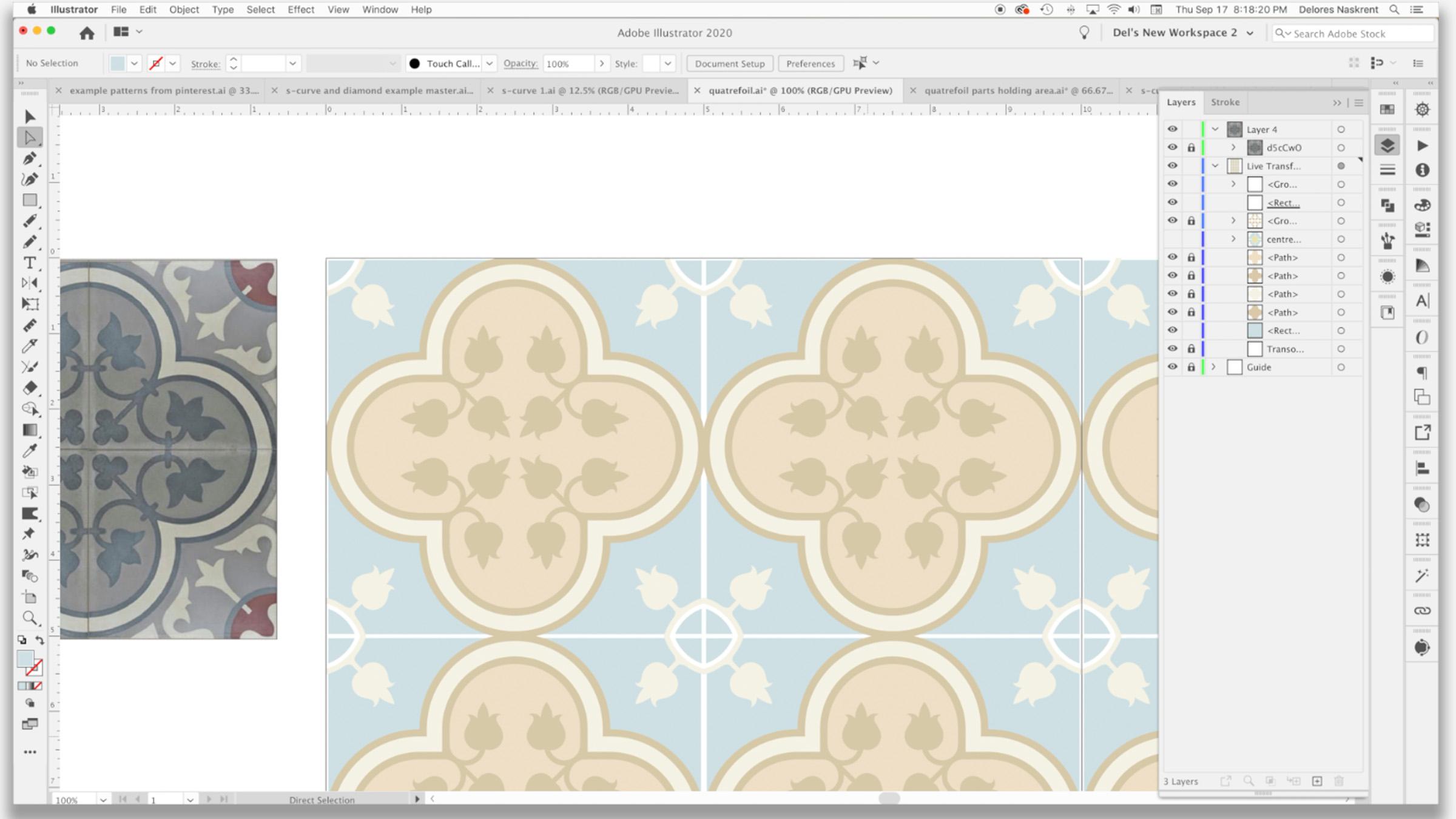
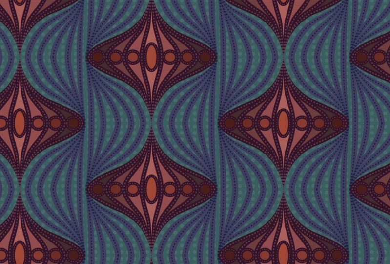
8. Quatrefoil Using Offset Path and More: So I just want to show you how to create a quantifoil pattern using our template. Let's get started. Be sure. Don't have to go far to see that this particular kind of pattern is still very much prevalent. Quarter foil is, like I mentioned in my previous course, very traditional pattern that has this four leaf kind of Aqaba layout to it. So it's very symmetrical, which lends itself really well to the kind of design that we can do with that transformation template. So I grabbed one of the patterns that I thought would be a really good inspiration for us. And pretty much what we're doing is we're creating just this little corner kind of apiece. So let me get back into Illustrator here. And you'll see this is my inspiration piece that we're going to go. We're not going to spend a whole ton of time just this one lesson explaining the quadrat foil and how I use the template because I plan on doing a follow-up course to this course. So yes, another trilogy in which I really explore the use of the template to do a quadrat foil patterns. So make sure you watch for that. So as you can see here, I've already started, I've got my initial circle. So we've got the same live transformation template. It's got the Hopi mask at the top and it's got the transformation against felt wrong and have to go back to my template document and change it because this is going to mean that every time I opened up my template, I'm gonna have to correct the spelling. So I started by creating this initial circle. And the easiest way to do that, of course, is the ellipse tool Mandela on your keyboard and mouse and click couldn't your measurements. Now positioning, you definitely want this to be exactly halfway down as this one was exactly halfway over there. Now design here has this kind of small border. Might shape is a little bit different just because you see in this one the circle is a bit smaller. So it comes in and has more of a curve on the inside. You could achieve that if you wanted to by making your circles just a little bit smaller than the five-year. So I can actually take all of these here, I should say both of these here and use my transform each command and reduce the size here, I that list you 80%. Actually, let's do 90%. I think that would be more than enough. In course. Let's just actually also move that pictures in the clipping path area. Again, we'd want to center this so you can use the, you want to center it vertically, but you want to line it up to the top. And this one, you want to center it horizontally, but you want to line it up to the size so you see how that gives us more of that little bit of a curve. And the other thing I wanna do is just go a tiny bit past the edge of my document here. So I'm going to use my keyboard increments to do that. And I think I'm going to change this to type any measurement in here. By the way, you can type it in millimeters even if it come out up inches, I'm going to do and millimeters as my move so that we've got a little bit of that overhang. And what that does is that gives us that same kind of edge as this one does here. And I'm going to actually combine both of these, so I'm dragging over them and I'm gonna go into my path, bind your palate and hits unite option. The other way is if they're both selected, you can use the shape builder tool and just drag over them and they would be connected. My next step is to create this outline like you see on the example. To do that, I like using offset path rather than just stroking the power. And you can find that under the object menu to path and then offset path. Now here you can. Type in whatever measurements you want to say. We want it to be two millimeters. Hit the Preview button to see it again, or to see what you're going to have. And you can see here that that's drawing on the outside of my circles who actually want is for it to draw on the inside. So I'm gonna actually put minus two and I think I want to go a little bit bigger. So minus 2.5, we think is going to be 2.5 millimeter. I think that will be about the thickness that I want. Actually me build even gold minus three millimeters. You can put whatever measurement you prefer to use here if you want to use points, as long as you indicate by putting in that spelling of millimeters, inches, or points, I'm sure you can do other measurements as well. I just like doing it millimeters. I kind of vacillate between millimeters and inches. In Canada, we mainly use inches for most of our measurement points are what I use when I'm doing things like rocks. And obviously whenever I'm working with tight millimeters, when I'm doing something like this. So I'm kind of into all three. So here I'm gonna say, okay, I've got that initial separation or line that I want there. Here. I'm gonna do that again. So this is why I have a shortcut so I can get into this quite easily. And here I'm going to do this wider space here. So let's try just guessing ten millimeters, a little bit too much, eight millimeters. And what I'm looking at here is also busy right here because I'm going to aim to end up with something kind of, I'm going to say OK, there is to make this a little bit easier. Let's colorize this a little bit lighter. So I'm going to go and lightening the color. So I've got two bases there now, I'm going to drag this one down here actually so that I've got it here to use this one's a little bit pinky. We'll make it just a little bit more neutral. And I'm going to now go back to this one here and my shortcut. And I think for this one, I'll do that 2.5 millimeters again. So the important thing is to remember to put that minus key before your measurement here so that it draws to the inside. If you wanted to draw to the outside, and of course you would not put the minus key there that's to the negative. Hit OK here. And I pretty much ready to move to the next stage. So now for this next step, what I wanna do is eliminate some of the stuff that I don't need here. I want this to actually come to a point and pretty much here. So I'm gonna make myself a five inch rectangle, square. And then I'm going to line that up. So I'm using the alignment tools here to line it up into the top left hand corner. The other can only do here just quickly is before I got bit that I need and want to change these two to be that lighter colors so we can see what's going on. Okay, so I'm going to select everything here. And what I wanna do is divide this. So I'm gonna go to the pathfinder used divide. I'm going to just go into Outline View here is just to make it easier. And let's just get rid of all this extra stuff that we don't need. We don't want this anymore. We don't want that. I don't need this. We're getting darn close. And whatever they wanna do here is just kinda bluntness or bring it to a point. So I think what I'll do is I will eliminate these points here that I'm left with. What will become a blend point here. So I'm just going to like these two and see if I can join them and j will join them. And, well, some big mess happened here. So let's figure out what's happening. Ok, so these points are now also not connected to anything. So let's go back into preview mode. And it really needs, you can see that that ends there. It's a double line so I can get rid of it. And actually I can see here that a lot of these are double lines. The appear a little bit heavier when you've got two stacked on top of each other. This is a single line and this is a double. So I think that we're good here is just that this needs to be that lighter, kind of a creamy beige color. We're back to exactly what we need, which is those sort of outlines segments. And so we're ready now to add our little flail delete. I should pronounce it properly since I am half French. To save time on camera here I created my Florida lead here in another layer. You can see what I did here. I used brushes to create the separate little leaves. And I think it's going to increase the size of this one and move this one so that it's overlapping. These aren't perfect by any means, but for demonstration purposes they'll be just fine. I'm going to select that whole layer, so I'll call it targeted here. I'm gonna go to object, Expand Appearance, and then expand again just to be sure, and then go to pathfinder and unite. And now I have my complete thirdly, which I can drag into my document or into my life transformation layer. So now I can lock that other layer with the example here and we'll work from here. So basically what this starter quantifoil pattern, there's often some form of leaves. Like I said, I created this as simply as possible using brushes. You'd, you'd probably take parts of this to create your floridly in the corner as well. And I'm just gonna do time-lapse where I show you how I go about connecting edge. When I was creating my original Florida Lee, I showed, take it a little bit more time to get it completely balanced, but you get the idea. And I'm not gonna spend too much more time on this because like I said, I'm going to be doing another class strictly on the design of interesting quantifoil patterns. So you get the idea of how the template births, remember that all we've done is created artwork in this corner here. So that's something that you could do a lot of practice and have a lot of fun developing. Also take a look in history. There are a lot of different types of quatro foil patterns. Here are patterns like this. You've got almost like a Caltech not going he's with the little spike that comes up in the corner is considered a barbed quatro foil. There's a lot to be learned about quantifoil. So that's why I'm going to be doing a completely different class on that. So make sure you watch for that. Alright, so I'm gonna meet you in the next lesson. In the next lesson, what we're gonna do is we're going to extract the patterns in it. At the end you will see me create a mockup. So I will see you there.
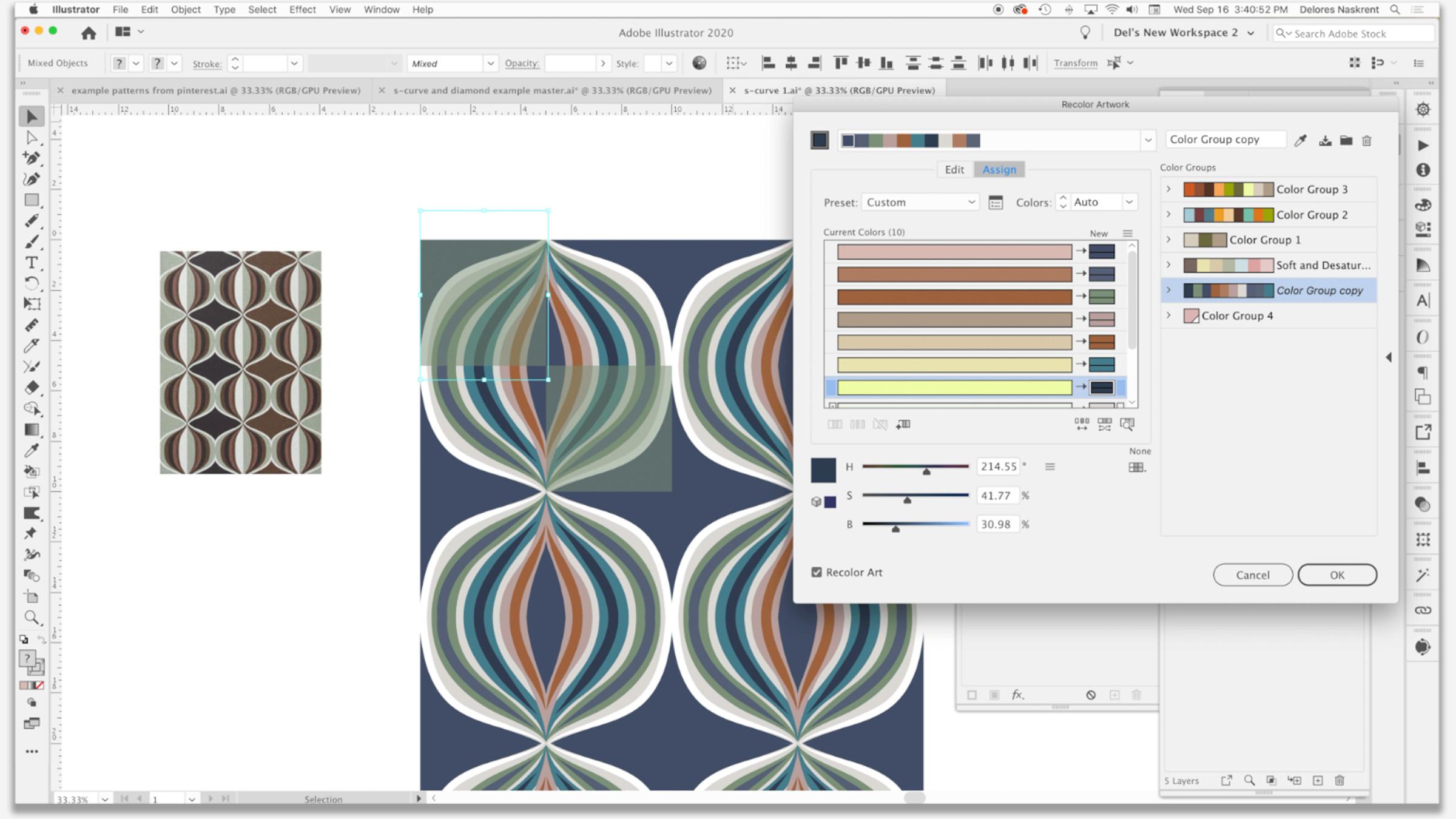
9. Extracting The Pattern and Color Fun: Hi guys, welcome to lesson eight. So unless IT eighth here we are going to extract are patterned tile finally. And then we do some fun stuff with color ways. And I'm going to show you my final two mock-ups. We ready? Alright, let's start. I've made some slight adjustments here. Nothing major. Just kinda lining things up a little bit better. I wanted this to be a full kind of a starburst and think I'm going to enlarge this a little bit. I'm adding an extra points on these to just be able to pull them beyond the beige, basically giving the same effect as I did with this double heart is what I had done with a couple of brushstrokes. These are different because I had drawn these actual shapes in behind. Two different ways to basically achieve the same thing. As you progress through your skills, you will decide what way you want to work or what, what is faster in that particular situation. But I think about 6% of the adjustments that I'm going to make. It actually really love how that looks now. And we're going to go into the layers. And what I always do and I strongly recommend is that you duplicate that live transformation because we're going to expand in the next step. And sometimes you want to go back and make changes, it happens. So what I do is I drag that full layer onto Create New Layer icon here at the bottom. So now we've got these two copies of that layer. I like to name this one not earn. And then what I'm gonna do is expand the appearance on everything here. So I'm using the target right here. So the double circle, and I'm going to go to objects and Expand Appearance. And then I'm gonna go back again and expand. And what this does is it expands the fill and the stroke. So I'm going to say okay here. And remember I mentioned earlier on that a pattern cannot be used to make a pattern. So that's one of the reasons why we're expanding everything here. Otherwise, illustrator won't allow us to make this into a patterns. I'm going to hit OK and I'm now ready to extract my pattern tile. I'm going to show my art board temporarily. I'm going to create within this pattern layer here, I'm going to create a rectangle, so it's actually a square. So it's ten by ten that I'm creating because that's the size I want to extract my pattern tile to be. I'm going to line it up to the art board. I want to make sure it's at the bottom in my layers palette here. And I'll also remove any fill. So it's basically a completely empty box and now we're ready to create the pattern tile. So again, I'm going to target the layer. Now it's caught that rectangle. That's what's going to define the pattern. Could a drag the whole thing into the Swatches palette. And you can see here it has created my swatch. So let's draw a rectangle and I'm going to fill it with my patterns watch. And you can see that has worked out beautifully. So I can scale the patterns so you can take a look at what that looks like. But you can see that created the perfect half drop repeat tile for me. So we're ready to go to export this or to create mock-ups whenever you plan to do for your project. I'm going to actually go back to the other pattern that we worked on because I want to do a little bit to that one as well. So I'm going to add a little bit of detail to this just to make it a little bit more interesting. And I think I might adjust the color palette for some added interest here I'm going to do something kind of different. I'm going to draw a rectangle and align it to the upper left hand corner of my art board. I'm going to reduce the transparency of it. So I've got it still selected here. I'm going to reduce it to about 15% or so. And then I'm going to actually do a completely different transformation on that particular one. So I've got it selected here. I'm going to go to the effects, distort and transform and to our handy-dandy transform here, what we're gonna do is we're going to move it five inches over and five inches down. All I need is for transform objects to be selected here, and I'm going to click one copy. What that does is it gives me two squares to add interest and my patterns. So it's not quite the same as our example here in this example was this insight bit that was created a little bit differently. I could do that if I wanted to by just selecting that original corner, this one here and changing it. But I want to give this one a try. It's just something I came up with and thought I wanted to just experiment and see how that would look when I do extract my pattern tile. And I also want to possibly change the palette here. So I'm going to use my recolor tool to do that. I've selected this corner and he grabbed the recolor tool here. Let's just have some fun here. I'm going to just experiment just using this random color changer. Let's take a look at that first. Ooh, that comes up with some pretty cool alternative. And let's experiment with some of these other color groups and see what we think. You can see that square is going to add a bit of interests there because it's kind of meeting some of the colors in the corners while still allowing color to show through from the original. So we for sure yet, it's very harmonious kinda of a pallet moves. Just so much fun. This one I love. It's kinda retro, really reminds me of the kind of thing you would have seen in the eighties. So my gosh, I could play with this particular technique all day long. I'm going to just a decision and say, okay here just so that we can move on to extracting our tile at this point, I could still make changes to any of these that I want. For example, I can grab that rectangle there, go into the Swatches palette, and right now it was kinda set a dark brown, but I could experiment by checking out some of these different colors. I could also further reduce the opacity or increase it. Obviously reduced his better in this case. Well, I don't even know. I'd really have to think about what I was going for here, but this is just fun experimenting. This is the best way to learn. You guys just play around with all the different things that are at your disposal here and decide. Find out first the kind of things that you can do and then go from there once you have the skill set. And just knowing that this is there is the best way to really move forward in your design practice. And I quite like that. I think that's quite lovely and we don't even really need to be looking at these other tiles here is we're going to do exactly what we did in the last lesson where we're just going to extract this corner. Ok? Now I'm going to make one more adjustment here because I see that one brush line is a little bit off. And which one is it gonna lock? So I can select, and I can see that that was this line here and pull that over just the touch and adjust it. And I think I'm happy with that. So let's close off all these pallets. And now we're going to do the same steps as we did in the last lesson. So we're going to go back to the layers. I want to duplicate these two. So I'm going to close them off for a sec. Sludge. We can just target them both here. So I've got them both selected here. And I'm going to drag them onto the tuple key icon, can hide and actually lock everything else just to be sure. This one I can actually get rid of now. And so these two I'm going to extract. So I want to expand appearance, do select everything here, go to object, Expand Appearance. And then I'm going to go to object again and expand. When you do the same thing with here, object, expand. That probably wasn't a 100% necessary kid. It was just a rectangle, but just to be on the safe side, I always do that. And then we're going to draw our ten by ten square, align it to the art board. I'm currently in this layer. So what I wanted to do is select everything in this layer and drag it into this one. Make sure my slightly transparent squares are on top. That rectangles at the bottom. Double-check to make sure it has no fill and stroke. And now I can select that entire thing by targeting it here and pull that whole pallet over here so I can see my swatches palette a little bit better, has realized that was not available because I had it locked. I'm going to drag the whole thing here into my swatches palette, and I have created my swatch. Let's draw a nice big rectangle over here and fill it with our pattern. And I am really pleased with that. That is a really nice little powder. And I could see this being rate one to build a collection around something completely different. Let's scale it a little bit mature. You hit the transform patterns. And yeah, I love it. Really, really fun. And I think I'm going to, for one last step, help myself. I'm going to do a little bit of playing around with this recolor tool and wow, oh my gosh, I'm very happy with this. I mean, what do you pick that it's just so cool. They're all awesome. You can see how easily you could develop collections around something like this, just based on these colors, you could have two completely different color waves with two complete sets of coordinates and have an awesome collection to offer up for licensing. So, you know, my last step is always to go in and create a couple of mock-ups. So that's what I'm gonna do now. As you've seen me probably do mockups in 20 of my courses. So I'm just going to cut to the chase and show you the mock-ups that I've created. So yeah, that's how they turned out. And I'm actually really happy with both of these. I can see myself definitely developing collection around them. This one turned out even better than I could have imagined. So this is one that I think I'm going to do a little bit more work on and further developed so that I can do a whole collection around them. So this just goes to show you how easy it is to create patterns and use your transformation templates that you set up to make your ETL process go a little bit faster and just more visually easy to deal with. Alright, I'll meet you in the wrap up. See you there.
10. Outro: Hey guys, you made it. We're at the end. I hope you learned a lot in this course. And I hope that this is something that really makes you stop and think so that you know exactly what to do when you're planning patterns in the future. This template, it has just been so valuable for me. I use it so much. I'm really hoping that's going to happen for you as well. If you have a minute, can you leave me a little anecdote about how you liked the class? Or maybe some comments in the discussion section. And I would really love it if you could post one of the patterns that you've created. I'm always so pleased to see when you guys are going through the process and you create something just fabulous. It's never what they expect and it's always just a real eye-opening experience for me. Make sure you check out all of my artist resources that I have on Pinterest, I have two sites, Dolores art Glarus now script and teacher dealers now script and feel free to check out my stores. I've got one on spousal about when our society 61 at red bubble here also in Canada at art of where. And I'm revamping my website right now. So Shop dot Dolores art dot ca, have a blog there and all kinds of other interesting goodies for you to see. Please join my mailing list. I'd love to see you there. All right. Take care. I'll see you soon.
 Delores Naskrent, Creative Explorer