Transcripts
1. Welcome!: Hi, I'm Holly Thomas, as well as teaching
on Skillshare, I am a bedding designer. I love florals and in particular
Scottish wild flowers. I live in a rural part of Scotland in the southeast
along the coast. We're surrounded by
woodland, crop fields, beautiful sunsets
over Belhaven Bay and what I call the golden hour
when the skies turn amber. Or a delicate peach or
pink in the winter. The Golden sunsets were definitely an inspiration
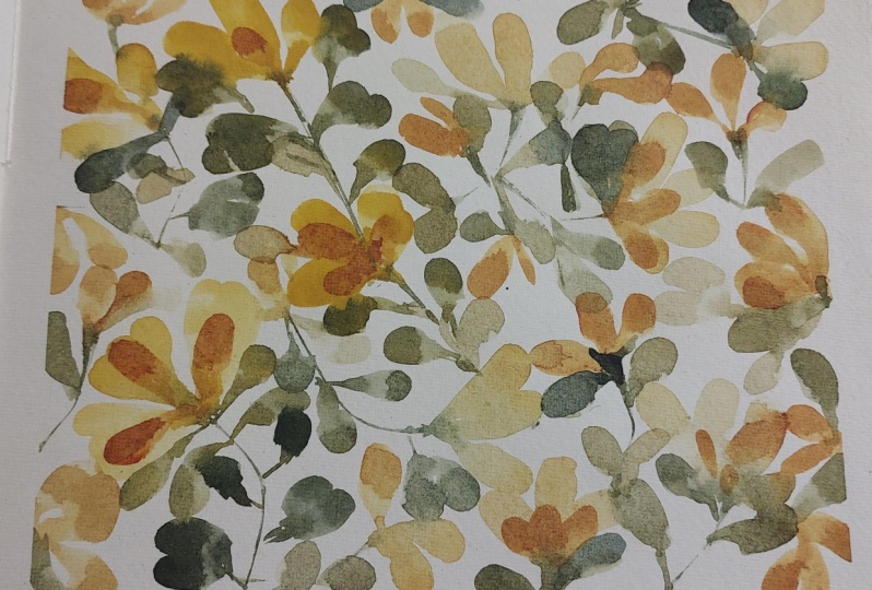
for this class. So welcome to the Golden Hour. Okay. Okay. I'm really excited to share
this class with you. We're going to be doing
this small study in our sketchbooks and exploring how we can create
flows and blooms. We're going to be
using just two colors. I'm using a flat brush, but I will take
you through how to use a fillbt and a round brush. I'll be showing you
how to mix greens and dark golds with blue
and quinacridone gold. But you could choose
your favorite green and your favorite
yellow for this class. We're going to do a quick warm up with some brush practice. I'll be using a flat brush. But if you don't have one, I'm showing you
here with a pillbt and here with a mop brush. You could also use
a round brush. We're going to explore how to use just the right
amount of water to pigment in order to create these lovely
flows and blooms. We're going to practice making these really cute stems by
printing with our brush. We'll start off by taping our page for our
main project and creating these lovely
little yellow flowers where the leaves flow
into the petals. I've developed this
class for beginners, but it's also for those
of you who like to do regular studies
in their sketchbook. And I always aim for
my classes to be informative, relaxing and fun. And as always, you're
very welcome to upload your project in our
projects and resources area. I really enjoy the community
side of skill share, and you're all so
supportive of each other, and I really enjoy that can't wait to see your work.
Let's get started.
2. Materials: So let me take you
through materials. I'm using my half inch flat
brush here from Jackson's. Or you could use a pillbert
or a mop or a round brush. I'm going to tape
off my study today, but you don't need to do that. I just like the crisp lines. And I'm using two colors, quinacridone gold, and
in Dan throw blue. And this is a gouache. You could definitely
use all gouache, all water color or all
ink for this project. I'm using Bockingford
hot press paper in this lovely sketch book,
and I really love it. It's very thick paper with
a lovely silky surface. I've got my little soap
dish here, clean water. I've also got a cloth
that will take a lot of water because we're going
to be using that today. So I've folded it
over a few times. So I'm just bringing back all of the materials we'll be using. And just to say here, you don't need to mix
a blue in a yellow. You could use a green
straight from the tube. I've got a undersea green here. So your favorite green and your favorite yellow doesn't have to be
quinacridone gold. So let's move on to the
next lesson together.
3. Colour Swatching: Let's just do some swatches
here with our blue and gold. So I'm just going to put
the Danthrme blue on one side and the quin
gold on the other. Now, of course, if you're
wanting to use just straight green from
a tube and a yellow, you don't need to go
through this process, but I wanted to show
you how it can bring harmony to a piece when you mix two colors to make a third. So some fresh water there, and I'm going to just
pull out some other blue. Starting with some
very neat blue. And then just pulling
that out with water. Then we're going to go
into our Quin gold. And Quin gold is
quite transparent, so you might need a
little bit more paint to get a feel for what it
looks like as a neat paint. So what we can do now is just to draw out
some little squares, and we're going to mix up some gradients between
the blue and the gold. So, on the left, we're going
to put in fairly neat blue. Clean off your brush, and
then we're just going to add a little bit of
the gold to the blue. Add a little bit more. So we kind of veering
towards the gold now. We want somewhere
in between the two. And then we want to go
in fairly heavily with gold with just a little green. And this makes that
lovely burnt orange. And then finally, on the right, we've got our quinacridone
gold in its neat form. And isn't it amazing how many gradients you can
get from just two colors, and this is just five squares. So, there we go, and let's
move on to our next lesson.
4. Brush Practise: So I'm just going to add
a little more quin gold. And I still have some in
Dan thro and blue there. So I'm picking up my
half inch flat brush. And first of all, we're going
to use the full brush here. Squeeze down a little
bit and then bring up and a very simple movement. And then we're going to pull
using the side of the brush. And we'll be using
this brush stroke to create smaller flowers
in our class project. Now we're going to
do a brush stroke, similar to the top line. We're going to pull
the brush through, start to twist round
and bring to a tip. Let's try that again. Do part to twist.
Pull up to the tip. Down twist. Then we're going to try a fillber brush just in case
you don't have a flat brush. I'm going to use it
in a very similar way to the flat brush. The full brush down
along and pull up. Just as we did on
the top line there. Then let's try that on
the side of the brush. So you can see we can get some similar shapes
to the flat brush. And finally, let's practice the twist movement up and
twist towards the end. Down, pull along and twist. If you don't have a
flat brush or filbert, you could always use a
mop brush or round brush. And using a slightly
different technique. Tip, belly of the
brush and again. Tip belly of the brush, pull along and again to a tip. Let's move on to flows,
blooms, and stems.
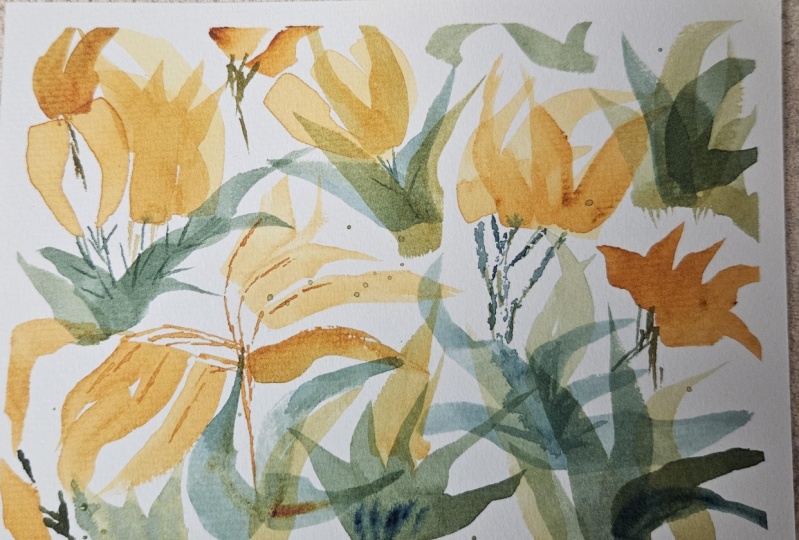
5. Flows, Blooms & Stems: So I'm going to mix up some
fresh quinacridone gold. I remember because Quin
gold is transparent, you will need to
use a lot more of it to get a kind
of a neat effect. Pull along the green, and you can see
already how dominant the gold is because
it's wanting to travel. Now, let me show you if
we use a lot of water, there's nothing innately
wrong with this. It's just for this project. We're looking to keep the
character of each color. So you can see it all kind
of blurs in together. So picking up the gold again. I want to show you
just how we can add the stem below this. And we can see there
that it just pools very slightly at the
bottom of the yellow, and that's because that's quite a dominant color and it's not allowing the
green to flow a lot. It's also because
we are managing the flow by not using
too much water. That's just what we're
going for in this piece. If I show you again
with a lot of water. There's a lot of water
swishing around and you can see that from the
large one at the top, right. So somewhere in between
is what we're aiming for. If you're using a
flat brush like me, I just want to show you how
you can make easy stems. It's really fun, and
it's also quite quirky. So picking up some green, I'm going to take the excess off because we want
control over this. We're using the
edge of the brush. And we're just printing
it onto the page. It's so simple. I
really love it. And we can do these
little side stems. Aren't they cute? I could
do this all day long. I absolutely love doing
these see how simple it is. If you don't have a flat brush, let me just show you this
really easy technique. Just a piece of
card or a piece of paper and you just print it
as you would with the brush. And it gives these
imperfect lines, which I really feel lend
themselves to this piece. If you wanted to, you could bend the paper to make curvy lines. As we've got these stems, why not add some
little leaves to it. I'm just making that a warm green leaning
towards the green gold, but still that mix between
the blue and gold. I could do a study with
these leaves alone. I think they're so cute. What we're doing there
is a smaller movement of the larger leaves that we're
doing in the main project. Push down and twist so earlier than you would
with the elongated leaves. A. You can see here that we've got
some little damp areas. It's not very wet now. It's partially dry. And if you drop in
water to those areas, you get a more controlled bloom, so you could always do that
as well in your main piece. So shall we move on to the
main project together? I think we shall.
Can't wait. Yes.
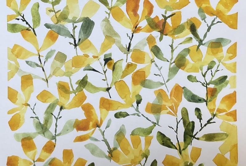
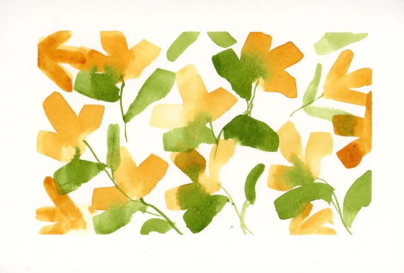
6. "The Golden Hour" Class Project: So I'm just going to start
by taping off the page. I'm using washing tape. That seems to do really well. Then I usually run my finger around so there's no leakage. So we've got our
two colors here. And I'm putting the
end blue on the far left and the quin
gold on the right. And that will give me space
in the middle to mix. First, I'm going to mix a green. I'm taking a bit of the blue
over, adding some gold. The great thing about these
two colors is that you can mix towards the blue
to make a teal color, or you can mix towards
the gold and make this lovely, warm, gentle green. I'm going to mix two
values of quin gold. I've added some water
to the right there, and I want the other
one to be a little th. So getting my brush ready, and I'm picking up some
of the watery Quin gold. And pulling out that first
petal just as we practiced. Allow the brush to fan
out and bring it up to a point with that slight
twist at the end. Adding the stem
just so that it can flow very slightly into
the base of the flower, pulling out two leaves, catching those petals so that there's a lovely
flow of color. Slightly thicker Quinld now. And I've just mixed a
warmer green there. And not all the leaves
need to touch the petals. But it's a joy to see how
it all flows together. So I'm just going to pull another petal out and just
catching that leaf above. So, let's continue allowing
the colors to mix together. I'm pulling in a flower here
from the side because I like the idea of the flowers not being contained
within the page. So I like them to just
spill out over the edges. But adding a little bit
more paint to the base of the flower so that the stem
feels connected to it. I'm just going over the stem. Otherwise, there would
be a big gap there, and I want to keep
the continuity going. Ran out of Quinn Gold, so I'm just mixing
up a green here. You can go back over
your work and just add little bits and pieces
as we go along. You can see that leaf
is a lot warmer and that's because it has more
green gold than the blue. That's going to flow
into two petals there, which looks really lovely. I'm mixing up a deeper gold there as we did in our swatches. So this is gold with a
little bit of the blue. A tiny touch only. And I'm going to put in
some smaller flowers. And I'm just going
to move my page around and add some
stems and some leaves. We're just going to
keep going until we've filled the whole space. And I'm going to do those
shorter petals again. And I'm continually just
mixing up what I need. I really want to get in
on that petal there, 'cause there's so much god. So now I'm just looking
around the page and seeing where there may be some spaces that need to be gently filled. So we're nearing the end now. And I'm just adding in
some bud like petals. Adding tiny little stems
and little leaves. It looks so cute. I've got one there.
Stem and leaf. Just a final finishing touches. And I think we're there. Yeah,
really pleased with that. I really love the choppiness of the petals using a
flat brush like this. It's so characterful. So let me just take
the tape off now. Ideally, you'd wait
until it was all dry, but I'm too impatient. Taping off your page like this, just allows you to see your
work as if it's framed. And the final reveal. I found this so relaxing.
I hope you did too.
7. Thank You!: Thanks so much for joining me. We've covered a few
things together, how to create our own palette
with just two colors, and learning about the
gradients in between. We've also practiced
how to use water and pigment to create lovely
soft flows and blooms. We've done a neat
trick by printing with our brushes to create stems. And here we have it. To colors, one brush, and one gorgeous yellow
golden floral study later. Don't forget to confind
me on Instagram and Facebook at
Holly Tomas Design. I look forward so much to
seeing you again. Bye for now.
 Holly Tomas Art, Watercolour | Gouache | Mixed Media | Scotland