Transcripts
1. Introduction: Hi, I'm Lori, and I am a fashion illustrator. I have loved fashion my whole life. I feel like fashion has that unique ability to really transport your mood and transport your feeling. It can make you feel more confident, more stylish, it can help you feel more comfortable in your own skin and I really love that about fashion. I have translated that love of fashion into illustration, and that has taken me places that I never thought I would go. I've worked with brands such as Neiman Marcus, and Nordstrom, and Pixi Beauty. In this class, I'm going to be sharing my process, how I sketch fashion illustration from stick figures all the way to those glamorous, beautiful textures, and colors that you see on the pages of the magazines. In this class, you're going to get to create one book from your favorite designer's collection and in the process, you are going to explore all sorts of illustration techniques, you are going to get to see designer collections from designers across the globe, and it's going to be a lot of fun, and it's going to be a lot of fashion. If you love fashion and you want to dabble in illustrating something incredible, I hope you take my class and I hope to see you in the next video.
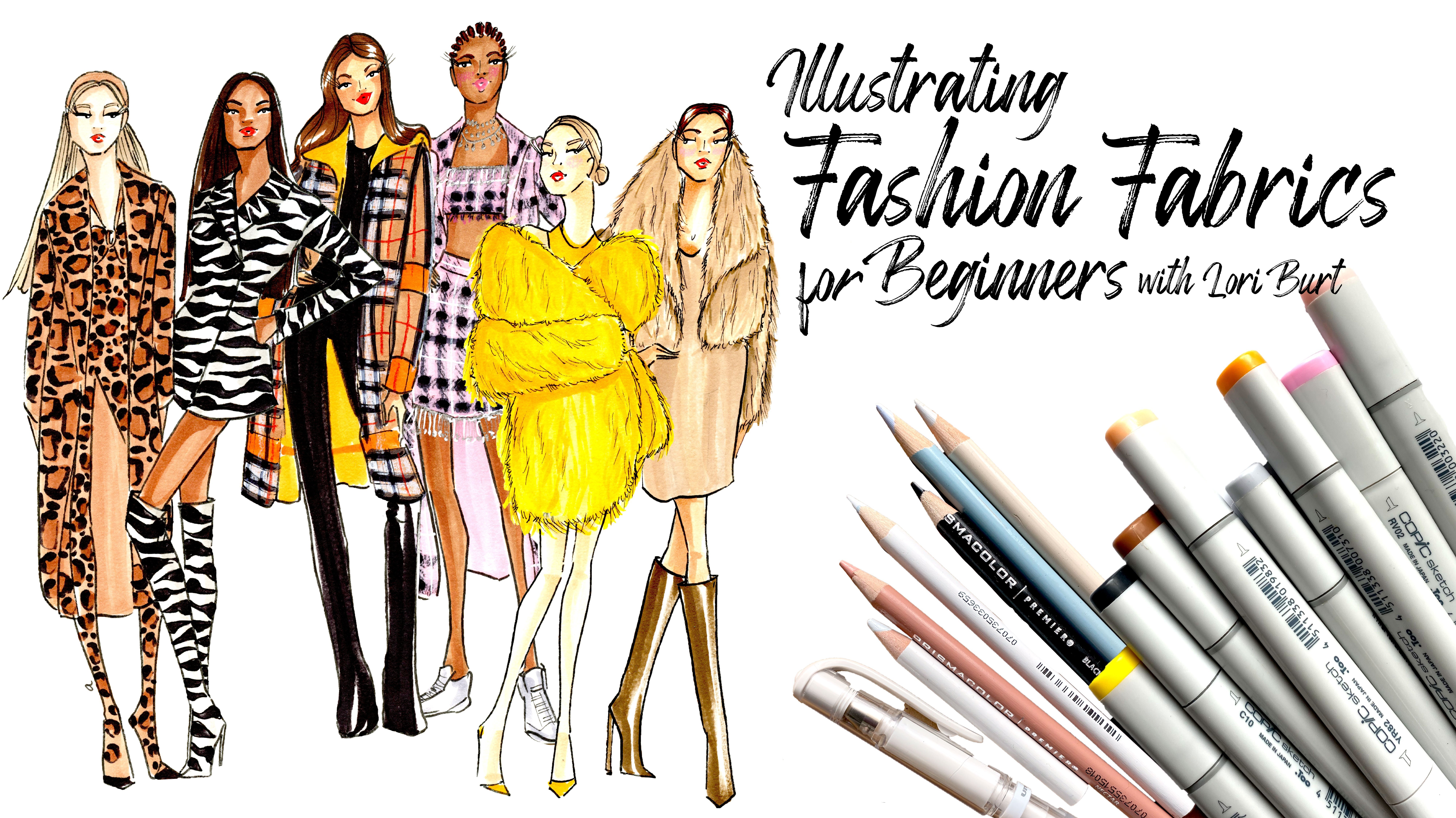
2. Supplies & Class Project: For the class project, you will illustrate one look from your favorite designer collection and you can find designer collections on vogue.com or you can search them up on Pinterest. You can do a Google search or you can go snag a magazine InStyle, Marie Claire, Vogue, any of those will work or you can just illustrate a look that really inspires you that you've found somewhere else. Feel free to get creative and illustrate what you want. But you will be illustrating one look and preferably from a designer collections. The supplies. The supplies you'll need for this class are pretty basic. Pencil, paper, pens, and markers. You really can add color in any way if you don't want to use markers, but I'm going to be demonstrating markers in this class because that's my preferred way of coloring my illustrations. For pencils, paper, pens, and markers, there really isn't a specific kind you need. I recommend using whatever you're most comfortable with, but I'm going to show you what I use so that you can see how I create my looks and the supplies that I like to use. As far as supplies go that I like to use that are my preference, I like to use to start with mixed media paper and there's lots of brands that offer this mixed media paper. It's a little bit thicker and it has a little bit of texture to it, which can add a lot of interest to your illustrations once you start putting down some color. I like the Canson brand, mainly just because I like the cover. But any mixed media paper is fun to use because of the texture that it has and the thickness. It will be great for different types of media, depending on what you choose to color your illustration with, whether it's marker, watercolor, or even colored pencil. It's going to be great. I start with the mixed media paper and then to begin with, I sketch out my illustration with a 2H Graphite pencil and I like the 2H because it goes on very light. It doesn't smudge or smear like some of the softer lead do and it erases a little bit easier as well. I really like a 2H or at least a harder lead to start my illustrations with. Then as far as pens go, I like to use the Microns. The Micron pens are archival ink and they're fast drying, which is great. They're really fast drying, but once they dry and you go back over it with an eraser, they don't smudge or smear. Not all pens are like that. You do want to be using one for this class that don't smear if once you go over them with an eraser and it does help to have some different sizes. I like to use the Micron 12, the Micron 8, and the Micron 05. Again, you don't have to use the Microns. There's lots of pens out there that will work. These ones I use because really, they're the most affordable. But there's also a Copic pen and there's a Prismacolor pen. Definitely make sure you get archival ink and fast drying. That's going to help once we start to finish up our illustration. Then once I sketch it out, go back over it with pen, I erase all of my pencil line and you can use any eraser whatsoever. I have lots of little pieces of eraser as well as this, this is called the SumoGrip, it's by Sakura and it's great because it just allows you to just go to town with your eraser and you can erase a lot in a very small amount of time. I think this is like my fourth one that I've gone through because they're fantastic, they're refillable. But I tend to just really use a lot of pressure with them. These are great. I highly recommend a SumoGrip because they're refillable and because they're so large. But really any eraser is going to work great for this project. Then as far as coloring goes, I like to use marker and the markers that I like to use are alcohol-based watercolor markers and I think it's really important if you're going to use markers to start with alcohol-based because the water-based markers tend to bleed and blend a lot differently and they saturate your paper a lot differently too than the alcohol-based. Alcohol-based, you have a little bit more control over, in my opinion, and they do tend to be a lot more opaque rather than really being a real watercolor field, but it's completely up to you. Use what you like, use what's going to match your vision best. I use all kinds of alcohol-based markers. I try new ones all the time because I'm just obsessed with art supplies really, but the Copic brand is great. I do have a lot of Copics. They're great because they're refillable. They have the brush tip as well as the chisel tip. This is the chisel tip and this is the brush tip and that's great for all different lines and different looks, different widths that you might want to get, and different textures. The Copics are great because they're refillable. The Prismacolors are great as well. They have the brush tip and then instead of the chisel, they've got a more of a pen tip on the other side and these are great because they're far more opaque than the Copic. You're getting really more of a marker color with the Prismacolors, but they are not refillable. They're less expensive than the Copic, but they are not refillable. There's a contrast there. Recently I've tried the Michaels Brown, the Artist's Loft, alcohol-based markers. They also have the brush tip on one side and then the chisel tip on the other and I've been really impressed with the ink in these markers. I really like using them. The only complaint that I have about the Artist's Loft is that the tops of them do not match the ink color as well as like the Copic and the Prismacolor do. But they're very affordable and they're really, I think they're great quality, so those are really fun to use as well. As far as any extra or additional supplies that you might want to use or look into that will be fun for this project specifically, is number one, colored pencils. Colored pencils are great to use over top of marker and I like to use them to add different textural details, whether it's lace or whether it's a thick sweater or denim. I also like to use it on the face to add a little bit of blush and add a little bit of definition to the eyes, and also to add my lip color. Because with the markers, depending on how large you sketch, if you use marker for the lip color, it can tend to bleed into the rest of the face. Colored pencils just going to give you that little bit of extra control in some of the very small fine details. The white is great to go over top, like I said, like with denim or different lace details, things like that. Those are fun to have as an extra to work with. Also, I wanted to mention these opaque pens. There's lots of different brands of these opaque pens. I also use this one. This is more of a felt tip and it's a white opaque marker and it's really great to really highlight, shine, and sequin. Then this one is extremely opaque. This is a ballpoint pen, but it's really like a paint pen and it's very opaque, so it can really add great detail as far as shine goes and highlights go. Then also they make all metallic pens. Sakura also does the Gelly Roll Metallic pens that are really super fun to use as well. But these are great details for like jewelry and bags and shoes that have those metallic details that you want to really highlight. You don't have to have these again for this project, but they're really fun to add and experiment with. Those are the supplies that I use.
3. What is Fashion Illustration?: All right, so I wanted to show some examples of fashion illustration before we jump into sketching. Just so you can get a sense of the variety of illustrations that's out there in this genre. There's a variety of illustrations in all genres, but a fashion illustration is no exception, so I just wanted to show you some really cool examples that inspire me. This is called the Sourcebook of Contemporary Fashion Design and I'm just going to open it up here, I've marked a few that I wanted to show you. This is a design house A&V from their 2007 collections. As you can see this designer really focuses mostly on silhouette. You can tell there's not a lot of detail in the faces, there's not a lot of detail really even in the garments itself, other than the shape around the body, the silhouette and you can get a sense too of the kind of material that they're using. But overall, the effect is really nice, really pretty, and you can definitely see what they're trying to communicate, so this is another one of their designers from the 2007-2008 collection. You can see that again, this designer is really focused on shape, but leaving out a lot of detail in other areas, but it still comes across very nice and you can tell what they're trying to communicate, so I really like those sketches. This next one, Ailanto is the design house and I wanted to show these because I think that these ones are just really cool, I like that it's almost childlike in the faces, they've got the same hair that they've sketched and they haven't added any skin tones here. They really have only added detail to the garments and the bags and it really focuses your attention. It really gets that fashion to pop up off the page and you can tell that this is probably a chunkier sweater, a sweater dress that's got some patterns on it and some really cool bags and overall the effect is really neat. The next one I wanted to show you is Betsey Johnson and Betsey Johnson is probably one of my favorite designers really of all time, she's just really super punk rock. If you're a child of the 80s and 90s like myself, then you are probably pretty familiar with Betsey Johnson. Although she's been around a lot longer, her style is just really punk rock, its bright colors, but it's also really feminine details too and I think it comes across in her illustrations beautifully. As you can see, she's got this neon, she calls it pretty acids, pales and punchy, these beautiful puff sleeves with heart details, a bustie underneath, and then she's just got these really loud punk rock colors, probably a netting detail rather than lace over that. I really like too that her figures are generally a little bit fuller-figured, which I really love too. This is another one that she did, again she's really communicating the stylus, punk rock, even in the hair and the necklace, she's even added a small tattoo to her illustration, which is cool and with very little details she's been able to communicate the netting or the tool and then this little bit of sparkle too, so just really fun. The next one I wanted to show you is Gilles Rosier, I think it's how you say it or Rosier, his illustrations, at least in this book are very minimalistic as well, but they're very polished. You can see he has a really good way of adding or communicating that kind of see-through or sheer detail on his garments. Again, there's just not much detail to the figure itself, the detail is really in garments and in the fashion and you can tell just what he's trying to communicate with these beautiful lines. Again, indicating some sheerness but again some structure as well, so just really beautiful and then not having to completely color in every part of the illustration also lends itself to a real chic kind of look. Then the next one I wanted to show you is Feraud. I love these illustrations, they're very editorial. The poses are really fun, they're really quirky. The illustrations themselves are really fun and quirky and yet you can really tell what he's trying to communicate with his fashion designs. You can tell that this is probably a tropical print, a floral print, same here, but he's not getting caught up in doing every little detail of the print. His poses too are pretty interesting and really communicate a sense of confidence, I think in his figures. Again, here he's communicating a print, but he's not worried about staying in the lines, he's not worried about really making sure that his details are accurate to what materials he's actually using or seeing. Again, here are some really fun ones, a lot of movement and again just that nod to a print or a pattern in his fabrics. Just you can tell all the details without it having to be completely perfect in the illustration itself. I hope that's given you some inspiration and some confidence to continue moving forward regardless of your skill level and really excited to jump in, so if you're excited like I am, grab your pencil, grab your paper and I will see you in the next video.
4. Walking Pose: Let's jump into sketching. I've got my paper, I've got my pencil, and I also have this resource page in front of me that I created for this class. This is a resource page that helps you understand the way that I sketch my fashion figures. A fashion figure, just so you know, is approximately 10 heads tall. Normally proportioned figure would be closer to seven or eight. But a fashion figure is approximately 10, 9-10. You're going to have longer legs and longer limbs. Keeping that in mind, I've created this resource page that maps out where I put things when I sketch things out. Your head is going to be between one and two, your torso is going to be between two and a quarter and four, your hips are going to be between four and five, and your thigh is going to be between five and seven, and then your calf is going to be between seven and nine. Your foot is actually going to hang off this number 9 line. The first pose I'm going to sketch out is the walking pose. It is the most common, I would say, in fashion figure illustration, that runway illustration, that runway model look, figure walking and facing you straight on. Let's go ahead and jump in. I start with my head and usually your head is going to be an oval shape or an egg shape. It's going to taper at the bottom and it's going to fill one of these full lines. You've got your head, not your egg. You've got your head first and then I usually sketch in the neck. The neck, I usually put going the opposite direction as the head. Just because I think it adds a little bit of interest, it's a little bit more natural looking. Then your shoulders are going to sit right perpendicular to your neck and your torso is going to come down to about here, and it's going to taper in at the waist. Basically you've got an upside-down triangle with the top cut off. I think that's called a trapezoid, but I could be wrong. Parallelogram, no, I don't know. We've got our shoulders and our waist that are going in opposite directions. Again, this is going to add to the feeling of it being a little bit more natural and it's going to add a little bit of movement to our figure. Then we've got our hips. Again, our hips are going to be between four and five because she's moving, because she's walking and it's not going to be exactly centered in each of these areas. But you've got your waist that's going in the opposite direction as your shoulders. Then here and here is where your hips are going to be. I usually denote that with just a little circle. Now this leg on the side where your hip is the highest, it's going to be the one supporting the weight of the body. That leg is going to have to come down and support. Meaning it's going to have to come down and be in the middle of your figure. You've got this leg, your knee is going to hit about here, your ankle is going to hit about here, and your foot is going to be right underneath that number 9. This other leg is going to be, just what I call the pirate leg. Actually sketch all of it. This leg is going to be pushed back. It's going to be the one that's going to be on its way moving forward, but not all the way forward yet. Really all you're going to mainly see or what you're going to mainly see is the thigh. I usually just map out where the hip and the knee are going to be. I'm going to move back up to the arms. This is where my shoulder's going to be. This arm is going to mirror the opposite leg. So it's also going to be tucked behind and that's all I really do for that arm. Your other arm, however, is going to be fully extended and fully in view. I usually mark it with a little circle for where the shoulder is going to be. Then your elbow is going to hit roughly where the top of your hip is. Maybe a little bit higher but just roughly where that top of the hip is and then your wrist is going to hit where the top of your thigh is, just below your hip joint here. Then I put a cross section in for the face just so I know where my eyes are going to be, where my nose is going to be. Eyes are going to sit in the middle of your head, exactly middle. What I'm going to do now is I'm going to do that exact same thing a few more times on this page to just get in some practice. I'm going to do the opposite direction on the next one. I've got my head, in that egg shape, put in that cross section, do my shoulders that are perpendicular to my neck, and then I've got my waist that's going in the opposite direction as my shoulders and then have that leg that's supporting that weight and then my pirate leg, there. Moving back up to the arms, elbow, arm and then this one's going to be tucked behind a bit. I'm going to do it again. Don't feel like you have to stay real rigid to where I've marked stuff out. Again, this is going to be really your style and practicing a bit and then really figuring out where you think things should lie will be great. Again, there's that pirate leg. I like this phase because it gives you a glimpse. It gives you a glimpse of what your figure can do, what your figure's going to look like, maybe what the personality is that you're going to be expressing in this look. Maybe you really create a lot of angles with your shoulders and your waist to create some more drama. I'm going to do one last one just to really finish out this page and get in a lot of practice, a lot of warm up. There's how I sketch out a walking pose for a fashion figure in stick figure form. That's how I start. I start all my sketches with stick figures.
5. Standing Pose & Side View: I'm going to show you now another pose. It's just a pretty typical standard standing pose that you see a lot in fashion illustration. Go ahead and jump in. I'm going to basically be doing the same thing. The only difference with this one is going to be one of the legs. That's the great thing about fashion. Well, one of the great things really about fashion illustration is that basically, this whole thing is the same. You're just really varying what the legs and what the arms are doing. I've got my head here, got my neck, my shoulders are going in the opposite direction as my waistline, and then this leg here, here's where my hip is going to start and this leg is going to be supporting my weight so it's going to go to the middle of my body and then this leg I'm just going to put kicked out to the side a bit. It's a little bit sassy, it could even be a little bit sporty. Then I'm also going to put her hand on her hip. Well, this is the waistline. Generally, I like my hands to be hitting about right right. I do a triangle to denote where the fingers are going to be, and then a skewed square for the hand, and then your links are still going to have to be the same as what they are for the walking pose. Got my upper arm here, my elbow is going to hit about here, and my wrist is going to hit about the top of the hips. These links are the same, they're just smashed because she's got her arm bent. Then here's where my other hand is going to be and it's just going to be hanging down to the side. I'm going to go ahead and sketch that a few more times, again, trying to flip them just to give myself a lot of good warm up and a lot of good points. [MUSIC] There's the standing pose. The last one I'm going to show you is how I draw the side view. The side view is really fun because at least for me, because as I sketch it, I think like, oh no, this is not going to work. This is not going well, and then I finish it and think, wow, it came together somehow. The way that I start off is with my head tilted back. That's how my head is going to be. You are only going to see one here. It's going to be kind of a three-quarter view of the head. Your head still going to be really an oval shape, but where your eyes and everything else lands is going to be more towards one side. If it's looking this way, my neck is going to be going the opposite direction. It seems a little bit extreme, but hang with me. Then I'm going to draw a little line across there for where the shoulders are. I'm going to draw a rectangle that looks virtually impossible to actually be a torso. I figured somebody is not going to bend that way and still be able to stand up. Here's where I usually think, I'm going to have to just scribble this one out because I'm going to work with that but I'm going to keep going. Again, this is where my hips are going to be between four and five. Once I sketch that in, I'm going to sketch a circle for where the top of my thigh is going to be and then where my leg is going to be. From there you can think, yeah, I can see that this isn't totally crazy. You can leave it like this and move on to the arm or you can decide to do something a little bit different with the leg, which I like to do, something like that just to add a little visual interest to make sure you get the view of both legs, but you can, like I said, just use the one hand she could be standing straight with her legs both for leg straight. Then here is where your shoulder is going to be right below that neck line. You don't want it back here because then that means that you probably are seeing more of the chest than what a true side view would be. For a true side view, you really want your shoulder right underneath your neck. Then you're going to bring your arm down about like this and because that torso is so angled, your elbow is going to come down just a little bit lower than what it normally would. Again, that's going to be the side view. I'm going to go ahead and sketch that one more time. [MUSIC] One other thing you'll want to add is right on this number 3 line or so you're going to add her bust line. You want to make sure and again, can vary depending on what your preference is, but you want to make sure you get that little bump in there. There is how I draw the side view for a fashion figure. Now that we've got these all sketched out on our pages, going to move to the next phase which is adding shape to our stick figures. Let's start with the first pose that we did. I will go ahead and start adding shape.
6. Adding Shape to Your Figure: So now that we've mapped out our stick figures, we are going to add shape next to our stick figures. I'm going to actually use a red pencil for this first one just so that you can see easily how I add the shape, where I add the shape that kind of thing. So normally I sketch out the shape over the figure before I start to really dive into the fashion aspect. So I'm going to go ahead and start with our walking poses and show you how I add the shape to the walking poses. So starting with this first shape here, I don't really need to add anything to the head at this point. I didn't like some ears or something just to have it there. Then you have a muscle that connects your neck to your shoulders and your shoulders actually are a little bit more slanted down like this than straight out like our stick figure shows here. So I first try on this little muscle here, and then a little bit of a bump here for the shoulder muscles. I start with the curve of your arm here and it pinches down in to where your elbow is. Then again out and pinched back down into where your wrist is. It reminds me of a bowling pin a little bit. You want this bowed region right here to be a little bit higher up, you don't want to it evenly, more like a smile. You really want it more like a bowling pin where the top here is wider than the bottom. So I've got my arm muscles here, again a triangle for the hand and then just a bunch of lines. You don't have to be too detailed with your hands. Your bust line is going to be about here. So next I pinch in my waist a little bit, follow those hip lines, and then for this outer leg, you have a little bit of a curve for your thigh and comes in at your knee. Then again with that idea of the bowling pin where you've got a thicker wider bow here than you do towards the base of your calf muscle. So then again, starting from the base of your hips here, you pinch in to where your knee is, bow out, and then in. So that's going to be what you're walking foot looks like or your foot that's out front. Then for the other leg that's pushed back behind the one that I think looks to begin with like a pirate leg. You could just draw a little peg there. But for that leg, really you're going to see mostly the knee. You're going to have a lot of shadow here, but you're going to see the knee. Then you're going to go up just a hair from the knee about right there, where that little mark is, and you're going to draw a line like that. Where this is that view of your calf muscle behind you and then going to get a full view of the foot. So that's what I do for the walking figure, you have that slant for the shin and then you have that full view of a foot. I always just do a heel at this point, pump with a pointy toe just because it's easy and it's pretty chic no matter what. Then going back up for this other arm, it's just tucked behind and then I put a little bit of a triangle here to denote where part of a hand might be being seen. Then if you wanted, you could sketch in where your face might be. I wouldn't spend too much time on your face because we're really focusing on the fashion in this class. Again, you can put in your hairline and you probably don't want to settle on a hairstyle at this point just because depending on your color and the upper portion of whatever fashion is being displayed, you may want to bring more attention to that and do more of an updo rather than having hair down. So you can think about it in your mind, but I wouldn't commit to anything at this point. So I'm actually going to pick up my number 2 pencil again and sketch in the rest of the shape for the rest of these stick figures. So here we go. Your shoulders are going to be ever so slightly wider, not so much where your joints are going to be, but just where your structure is, your shape is, and your curves are really going to be more in these areas and have more curved here. You're going to have more curve here, so it's really just adding a little bit of a little bit more curve to it all and this isn't quite as curvy as maybe I could go, but then you want to really pinch down to make it narrow here. So I going to outline that in red just so that you can see what may be a bit more of a curvy figure is going to look like. Still maintaining those proportions, wider here, pinched in here and then again up that hourglass shape. The standing pose and again, I'm going to use a colored pencil for that so that you can see it on this first one really good. So got our head. Essentially from here to here, it's almost the same as the walking pose. One major difference is the arms and with an arm that's bent this much or this angled, if you look at your own arm, you're going to have this little patch right here that creases. Then your muscle is going to be just ever so slightly curved, more curved on this end than it is on this end. Then your hand, you're going to see the little foot of your hand, this part right here. You're going to see that right here. Foot of your hand, I don't know about that. So then you've got your waistline and sometimes drawing in like where a swimsuit would hit can help you with defining where your crotch is going to be just because you do want your legs to be even in thickness. So in here, it's exactly the same as the walking pose and then this leg kicked out you're going to see more of the back of the leg than this front side of the leg. So from here, your calf is going to be a little bit more defined. The foot shape has always been really challenging to me so I would just suggest really studying how your foot looks at different angles and just remember where your big toe is. Because wherever your big toe is, it's going to be the longest part of where your foot is. So then here, at this point, this is where your thigh is going to start and you're going to see a little bit of a pinch in there with your knee and it's just going to really gradually come down to the top of the foot, so something like that. So I'm going to go ahead and sketch out the shape to the rest of these figures. So there's how I add shape to that basic standing pose. Then last but not least, one of my favorites, the side view. Again, I'm going to start with the red and I'm just going to show you how I add in that shape. So again, we've got our face that's a three-quarter view. You can denote your eyes about here, you're nose about here and your mouth here. Put that ear in and then have that bowling pin shape again with your lower arm. Then this torso is going to be relatively even all the way down. So your neck is actually going to come and curve back like that. Your neck sits a little bit forward and so I would illustrate it like that, and then our hips, for the leg it really is a straight shot. So straight shot to the knee and then your skin comes in a little bit and then your shin, and then the top of your foot, of course, I love to do a good heel, so that's just going to come directly down like this. Then you're going to have your calf muscle and it's going to pinch in right there at the ankle. All the way down, pinch in at the ankle and have heel shaped that way. So then with this other leg where it's behind this other leg, you have to be able to visualize through the body and know that that leg is going to start at the exact same place as this leg is going to start. So I like to draw an invisible line until I get to where you do see the leg and then from there, this is going to be a lot more rounded rather than indented here. The shin muscle goes in and then you've got that same crease that we talked about with your arm happening with a bend in your calf. So then you don't have to necessarily illustrate a foot there, just because you may or may not see enough of it for it to really be important in illustration. So I'm going to go ahead and illustrate the rest of these with my number 2 pencil and I encourage you to do the same. So the next step is really just dressing our figures. So let's gather up some inspiration, open up those magazines, scroll through Pinterest, and find some really glamorous outfits to sketch on these ladies.
7. Sketching: Florals & Quilting: I'm going to go ahead and demonstrate a couple of different things. I'm going to demonstrate some feathers and sequin with this look, I'm going to demonstrate some pattern and some quilting with this look, and I'm going to demonstrate some fur with this look. This first look, what I'm going to do is I'm going to start with my pencil, and I'm just going to sketch the clothing over, denoting the most important details with pencil. This first one is going to be a beautiful look from Chanel. It's got a very sparkly sequin top and then the bottom is really full with feathers and sparkle. I'm going to go ahead and get started. I always start at the top of the collar line. She's got this beautiful deep V that hits right under the bust line here, and then this gorgeous belt looks like it's probably a satin cover belt with a beautiful large buckle here. I'm going to go ahead and see if I can sketch, so you guys can see what I'm doing. Then for the shoulders, there's not a lot of puff but there's a tiny bit of a puff and then a long sleeves. It goes down to her wrist or so and it's a pretty slim putting sleeve. Over here where you have this bend, I just like to put a little bit of a squiggle there to remind me that there's going to be some wrinkling and to make sure not forget that. Then this part here is a little bit form-fitting until really right right here. Then it goes out into this beautiful big feathered sparkly skirt here. I'm not going to sketch that in with the pencil, will do that with the pen and with the marker. She's got these beautiful pearl Mary Jane pumps here. That's pretty much all I'm going to do with my pencil for the look, and then we'll go back in with our pen and add a little bit more detail to it. But the thing I want to mention that maybe I added that I haven't talked about yet is the collarbone lines. Sometimes it is nice to add just some collarbone lines here because then, again just add a little bit more shape to your body. If you want to add just like a basic hairline, it's always nice to go with a nice slicked-back style like that. Again, if you decide to do a face, just put in some markings here for their eyes and their nose, is a good time to do that with pencils. That's all I'm going to do for the pencil part of this Chanel look. The next thing I'm going to do is I'm going to go over this with my pen. I use this, my Crown so much. I end up wearing down the writing on them. This is a number 10 and I don't know if you can see that, but it's pretty thick. It's a very thick wide pen, and I use this to highlight the major lines. I usually start with the head and face. Again, I'm just going over my pencil. Don't feel like you have to connect every line. I mean, it's your preference, it's your style. But I find that if you're a little bit looser, you can let your eye fill in the lines and it can actually maybe look even a little bit more accurate. If you let your eye do the communication sometimes. I don't know if that really makes sense. She's got this long sleeve her, kind of thin, and then this beautiful deep V-neck. Just that little squiggle right there, says, hey, there's a little bit of a fold there, there's a little bit of a bad, a little bit of a nod to the bust line, not much. Maybe a little bit there. Your collarbone lines are actually going to come down into a V like that. If you choose to add that detail, and then, of course, a really beautiful belt. Do some belt lines or some buckle holes there, and then like this. The feathers, they don't really go up this way, but you can see that there's not really a well-defined line there. You can't really see that seam because of the feathers. I'm just going to leave it like that. Then something simple for the arm like that. With the structure of a feather, you've got that really thick vein in the middle and then some light fluffier, almost fur-like everywhere else. You want to vary your strokes. Generally, I wouldn't use a number 10 to do any light details like this, but where it's feathers and they have that thick vein. Some places I don't mind using something a little bit thicker and you can tell there's just a hint of a wrinkle in her skirt right there. Just putting some little squiggle lines there for that hint of a wrinkle. Then here I'm going to start a little bit above where the skirt line is, just to say, hey, you can see through this part a little bit. Do that beautiful pearl detail there, same with this side, just going to start the leg a little higher than the skirt. That's all I'm going to do with the number 10. I'm going to put the number 10 away and I'm going to grab my number 5. With my number 5, I'm going to start to do some of the more delicate details like lines in the hair, feathers, maybe even some more ruffles or wrinkles. You don't want to do too much because then when you add the ink on top of it, it can tend to get muddy if you have a lot of pen ink concentrated in one area. Just keep that in mind as you're adding. Sometimes I tend to go a little crazy with the hair. It's hard to stop myself sometimes with the hair. Let me do some details here for the eyes and of course those eyebrows and maybe a grumpy look. Then moving on to the feathers. Not going to do a lot of detail. Again, when you add that ink in or when we add the color to it, we can add even more of a nod to it being a feathered texture. But with my number 5, I'm just going to add more curved lines, so there's tend to really hanging and make more of a curve than regular fur, in my opinion. I'm going to do some of this and also varying your line length will help. As you can see, there's also these really pretty little, they look like sequins, but they're probably more like confetti paper or something that's reflective, they are just really, really pretty. I'm going to add some of those in there and then try not to overdo it. I do tend to go a little crazy with textures and then I regret it when I get the ink on it. Something like that, probably a few too many lines. See, I just can't help myself. Something like that. That's where I'm going to leave it with my pen.
8. Sketching: Feathers & Sequins: We're going to do a little bit more detail once we get into color for the feather area. Then we're going to really glam up this area for the sequence with color. I'm going to move on to the next look, which is this one here. This is going to be a Fendi look and this Fendi jacket is absolutely gorgeous. It's a quilted print and it's got some beautiful piping on it too. This is going to be a great way to practice some puffiness, but also some print and pattern. This beautiful jacket has this color that it's giant and it hangs. Again, I'm starting at the color and going to have it come down to roughly about here. It is a very bulky jacket, so I'm just going to take it from this shoulder and pull it out so that you're not really going to see much of the body shape when somebody is wearing this jacket. I'm going to have something like this and have it come down like this. Don't know if you can see that, but it almost arcs back like that. It's a very structured jacket. As you can see too, when you put your hand on your hip, that's going to pinch that fabric in. You're going to want to denote that with the fabric coming in where the hand is and then moving back out on the bottom of the hand. Then the arms are really thick or wide, I should say. Again, that squiggle just to help us remember that there's going to be some folds there. Then the arm actually comes all the way to the hand, actually covers most of the hand. I have something like that and then going to pull that arm out like that. As you can see in the photo, this front portion of the jacket covers this arm. This arm is already behind the figure anyway, so I'm just putting a small line out for that arm and the arms go pretty much down to the very bottom of the jacket. Then she's wearing a miniskirt here that, again, just hits at the bottom of that jacket, maybe just a little bit. I' m going to sketch in the waistline there. It's a pretty high waisted skirt. Then I'm going to do that. She's wearing a bikini top there just like that. This is pretty open. Then we work down the leg. She's wearing some huge sheer socks with this Mary Jane Peep-Toe pumps. Drawn too many lines on this leg, I can't follow what I want when I'm looking at. Here's the socks and the shoes. Then on her face, if you are doing faces, if you're going to choose to do at least a hairline, again, I'm going to keep it simple, just going to do that really nice part down the middle. Then some really cool funky wear glasses, which I would totally wear if they didn't cost $1,000,000. Then, of course, that grumpy smile that they love so much. There is our pencil sketch for the Fendi look. Again, with the pencil, I'm not adding the quilting details, I'm not adding any of the pattern detail, that all comes with the pen and with the color. The next thing I'm going to do is to get my number 10 out, that really fat thick pen. I'm going to start up here with the face. With the jacket because it is so thick, I don't mind really letting that number 10 thickness of this marker shine through. For this, the shoulders here, so you're going to have the arm showing like that. Again, it's just really a thick sleeve by curving around like that and that little squiggle helps you to see that there's some folding there and then her arm, something like that. Here is where that jacket pinches in and you could even add some details here like that to really show that there is that gather there from her arm. With the number 10, with the thicker pen, with these microns, if you vary your pressure, you can get some slight variations in line width. I really like that. Varying your line width is going to add interest to your whole sketch. Instead of using that same pressure the whole time, vary your pressure so that you do get those kinds of different widths as you sketch. Then her hairline a little bit, her ears. That's all I'm going to do with the number 10. I'm going to go ahead and switch to the number 5 and go ahead and do a few more details. I'm not really going for accuracy as much as just getting the shape generally down. For the Fendi look, for the quilted look, after we put the color down, that's when we're going to go back over with the pen and do some quilting detail, which I'll show you. Don't worry if we haven't included everything at this point. I promise we'll get to it.
9. Sketching: Fur : I'm going to put this one away and we're going to move to the last look, which is going to be a Yves Saint Laurent look. It's gorgeous and it is a full, I'm sure it's faux fur, mini dress. It's just really pretty. I'm going to go ahead and jump in and get started. I'm going to start at the top. She's got this beautiful, it looks like a four-leaf clover necklace here, and she's got a lot of necklaces. Then, of course, she's got this beautiful long earring. It is a sleeveless dress, so you're going to see this arm is going to be totally bare. I'm not going to draw in a lot of the fur with the pencil. Just like with the feathers over here, it's going to come mostly with the pen. But I want to try and get that shape mapped out. It is a short dress and then you can't see the shoes so I'm just going to stick with our Mary Jane trend that we've got going. Then for her hairline, she's got a really severe side part where her hair comes down like this in a beautiful cascade. Then go ahead, that's all I'm going to do with my pencil. I've denoted the lines that I want to make sure and remember. I grab my Number 10, sketching in that face. Again, I'm trying not to make that really solid line or make all my lines connect perfectly because it just helps if your eye can do some of the work and then I'm going to. The dress, it almost looks like it's been cut into layers a little bit, but I'm just going to really lightly take my Number 10 and go down in a couple of areas. I'm going to put my Number 10 away and I'm going to get my Number 5. That's where I'm going to do a little bit more of the fur detail, and the fur, it really consists of a lot of short small strokes where you really let up at the end of the stroke. With fur too, you're going to always have strands that are not going the way that most everything else is going. Make sure you put some that are going up or that are going to the side. It's going to add to the look of the texture. That's all I'm going to do. Again, we're going to add a little bit more detail, a little bit more texture with the color. I'm going to do a little bit more on the hair here. That is our fur look, and that's all I'm going to do with the pen at this point. The next stage is going to be to erase all of our pencil lines. The reason to that, I like doing it this way, doing the pencil sketching over with pen and then adding the color, is because when you take your eraser and you start to erase over your pencil and pen lines, it takes off that. I don't really know how to explain it, but that top layer of ink from your pen, and it makes it a lot easier to use your markers without the pen bleeding into the ink from your marker. Not all pens can do this, can be erased this way. Some pens like I know the paper mate flair, I love using the paper mate flair if I'm not going to erase at all. Because if you do erase with the paper mate flair, it just smears your ink lines regardless of what paper you're using. But if you look down here, you can see that I've pulled up some of that ink. Now when I go back over it with my marker, I won't be able to smudge that at all. Once you've got your marker, you can always go back over with your pen if there's areas that you really want the outline to stand out. There's our three looks. Now we get to move into the fun part of adding color. I'll see you in the next video.
10. Coloring: Feathers & Shine: Now that we've got our sketch all done and we've drawn over our pencil lines with our ink, we've erased all our pencil, now comes the fun part of putting down color onto our illustration. This is where you can get really, really bold, really creative, really put your spin on the fashion illustration aspect of it all and I am going to add color to my illustrations using markers. The first thing that I do is I do skin tones and one thing to remember is you want to use the lightest colors first and lay down all of your light colors first and then start layering on darker colors, your mid-tones, and your shadows. Because once you've got that dark ink on your paper, there's really no going back. We're going to start with this Chanel look. Like I said, I'm going to start with the skin tones. This one's called milky white, and it is a very light tone. It's a Copic marker. Again, that alcohol base is really what I like to use. The watercolor or the water-based markers are great, but I just can't seem to control them quite as well as the alcohol-based, so I prefer the alcohol-based. I'm just going over in. I'm not trained to fill in every little spot or every little detail, I'm trying to leave these spots where I'm not putting down ink and this is just going to give a nod to some highlights. One thing that you might want to keep in mind, although I don't think you necessarily have to, is where your light source is coming from. Generally, I like to picture my light source coming from the front or maybe the side a little bit. Leaving this side and any protruding areas, leaving them a little bit white, or just not covering them completely with ink is what I like to do. Also, it creates some contrast. Even if you're not considering your light source, if you fill in every little spot of your illustration, it's going to look really flat, and so leaving some spots that don't have ink, it's going to help you create contrast without having to consider color, I guess. The next thing I'm going to do is her dress and her dress is very sparkly and very sequined. I am going to leave a lot of her dress uncolored and I'll go back in and show you how that's going to work when we get to some other parts of her dress. I'm starting with something a little bit lighter, this is a cool gray number 3 and it's a Copic. Like I said, I'm not going to fill in every detail of her dress. I'm just thinking about where there might be some natural shadows no matter what, no matter where maybe the light source is. Under her belt, there's definitely going to be a little bit of some shadows and that's really all I'm going to do because there is a lot of sparkle on her dress. Next, I'm going to go down to the feathered part of her skirts and this I'm going to use, this is called pinkish vanilla, my Copic marker and I'm just going to follow some of my inclines. It's okay to cross over into parts of your illustration like sleeve and hand because that's what the feathers would naturally do as you're walking, they're moving and they're going everywhere. Don't be afraid to have some of those branch out a little bit into other parts of your illustration. I'm just trying to utilize the brush, the brush tip by using a flicking motion where there's a lot of pressure at the beginning of my stroke and then it tapers off. It's going to help create some difference in your line weight and sometimes if I get a little ink on the top of my brush, I'll just do that to clean it off a bit. Something like that for the skirt and then her shoes are also a metallic gray. I'm going to just take my C3 again and it's more of a mid-tone gray, but it's a pretty light gray. Then for her hair, I'm going to use a Prismacolor, this is called blond wood. This is my favorite color for blonde hair. It's a really nice tone for blonde, and do something like that. Then her belt too, her belt is just I feel like it's just a little bit different of a color. This one is called tea rose and I'm just going to again try and not color the whole belt, just a nod to the fact that it is a satin belt, so you are going to have a lot of shine on it. Maybe something like that. Then I'm going to go back into the top part of her dress with a darker gray and I'm going to really make some of those shadows pop. You can see how some of that shine is starting to show or be indicated. Now I'm going to go back into her skirt and her skirt definitely has some shadows too, but they're a lot wispier. This is called natural lipstick, it's a Copic marker as well. I'm just going to, just as if they were feathers themselves, I'll just utilize the brush to begin and do some of those wispy textures with this brush as well, something like that. Then I'm going to go back in with a really, really light, light pink. This is pale pink. I'm going to just cover over the skirt a little bit in the areas that have a lot of the feathers where you don't really see through it, something like that. Then if you notice on her skirt, she's got these little, they're almost like giant sequins. What I'm going to do is I'm going to take my dark gray, the C5, and I'm going to just color those in a little bit. Not real precisely, but just so that I know that, maybe put a couple extra in there, that I do need to go back and indicate that those are there and that they're shiny. They're going to be part of what we do with our shine. Now I'm going to go back into the skin tones and I'm going to create some shadows on her skin. Again, contrast is your friend. If you can create a little bit of contrast, that's going to really elevate your illustration and create a more dynamic look, more interesting look. I'm going to start here with her face. Like I said with the light source, I wouldn't worry too much about getting it exactly right because any contrast you get is going to be better than none, whether it's completely accurate or not. Where I like to picture my light source though is like I said, from the side and from the front. I do a little bit of a shadow on the hair, a little bit on the sides of the face because of course, our face is a round so wherever it recedes, it's going to be darker. Then naturally you always have a shadow right in the corner of your eyes and then a little bit under your nose and under your lip. That's all I'm going to do for the face. Then under your chin too, you always have a bit of a shadow under your chin and going to extend that shadow down a little bit like that. Now, this leg, because this is our walking pose, this leg is completely behind, so it will be in full shadow. You can go ahead and just color that whole thing in with your shadow tone. That's what the shadows are going to look like on the skin. Then for the hair, I like to go back in with a Prismacolor cinnamon toast for blonde hair and do a little bit of a shadow on the hairline, on the part line, and then whichever side is mostly in shadow. You can put a little bit, if you decide to do a face, you can put a little bit of color on the eyebrows too. The lip I usually do with colored pencil. I'm going to save that to the end. We have a little bit more shadow to do on the belt. I'm going to take my natural lipstick color again, same shade as I did down here, and put it on the belt, like that. Then to really, I guess up the ante on the shadows, I'm going to take it even darker gray. I can't find it, here, and I'm going to add a little bit more shadowing to the dress itself. This is actually a C7. Now we've got pretty much the basics down. The fun part of doing sequins, sparkle, and shine is really adding the white back in. What I do to add the white sparkles, I start with an opaque marker. This one is a Recollections opaque marker from, I just get this from Michaels. They're really inexpensive and they've got a really nice tip on them and I just start dotting. That's pretty much how I achieve the sparkly glamorous, sequin look. The other thing that you can do as an addition to that is this Uni-ball, this is a Signo Uni-ball pen and it is very, very opaque. If you want to use this to just add certain highlights in different areas that are super bright, sometimes I like to add that star shape to really let you know that the dress is really, really shine, so you can do that as well. I'm going to finish up with the face. I like to do a little bit of blush with my pencil. This is just a Prismacolor pencil. You can use any colored pencils. Then again, I like to use pencil on the lip too, just because sometimes with markers, if you're trying to do a really, really small area, it can tend to bleed a little bit into the surrounding colors, the surrounding marker. So I like to just use a colored pencil on some of the facial features because then I know it's going to stay in one place. That is really how I do sparkle and feathers. That's how I create that look, that texture. I just want to emphasize again, don't be afraid to really add contrast. Go back in with some darker colors to some of these areas where there's dark shadows and feel free to really explore with some contrast. Because contrasts like I've said, it's really going to level up your illustration. That is our Chanel look.
11. Coloring: Floral & Texture : The next look we're going to be coloring is the Fendi look. This one is really pretty floral pattern that's also quilted. Again, I'm just going to start with my skin tones and I'm going to start this one with a barley beige, it's what the color is. It's a little bit of a darker skin tone. Again, don't feel like you have to add color everywhere, leaving some white is going to help you communicate some of those highlights. There is our lightest skin tone color down. I'm going to do a dark hair on her, this is walnut. For the hair, you can't really see it so much on the blonde, but for brunettes, if you really utilize that brush tip, and just leave a white area where the widest part of their hair is, it's going to look like shine. It's going to look really nice. Next going into the floral prints. The floral print, I'm not going to be really accurate with the floral print because this is an illustration. This is meant to represent what I see this being, it's not a completely detailed and accurate representation. I'm just going to look at where these colors are on her jacket and on her outfit, and generally put them there as well. I got a really big pink flower on her jacket over here. That's what I'm going to do for the pink. Again, you can see it's not perfect, it's not super accurate, but the colors are where they need to be. Next, I'm going to go in with this Nile blue, and I'm going to put this Nile blue wherever I see this color on the jackets. I think it's supposed to be like a leaf in some areas and some areas, it's the middle of the flower, that's what I'm going to do for that Nile blue, and then the next color I'm going to do is this really dark green. This is pine tree green, and I'm going to go back in and do all of the leaves that I see. I'm just trying to keep to that idea of making sure that color gets where it needs to be, rather than being incredibly accurate with the shape. The next color I'm going to go in with is this lime. It's a lime green color, that's the next. I'm really just filling in here because I think the print on this is so big that you can't necessarily tell what all of the colors are doing. I'm just going to go back in here and add some lime green to certain areas. The last color I'm going to add is just a neutrally gray. This is actually called pale blue-gray, but I'm just going to go back in because the print is completely, it doesn't have any whitespace. Where it looks white, it's really a pale gray color. I'm just going to add this in everywhere. Again, I just want to say it's not exactly the same as what you see, it's not even close really. But you can tell that I'm obviously referencing that same look. That's really what I'm looking to do here. I'm not looking to be completely accurate. I just want that fun, bright floral pattern to shine through. As you can see on her bikini top and her miniskirt, she's got a lot of yellow and some green and some white. I'm just going to do this randomly, go through and add some of those colors. Then there's also a really bright green. Here and there with the leaf, something like that. Then I'm going to go over that with a little bit of a brown because there's some brown in it. I'm not even really trying to get the print accurate underneath because you can't see it really well anyway. I'm really just trying to let you know the colors and that it's a print and I think that's pretty well achieved. Again, don't feel like you have to get the print exactly right, you're just looking to make sure you include the right colors and generally the gist of what the pattern looks like. Then we move on to the socks. She's wearing these really cute sheer socks. This is a color called sand. I'm just going to add that here, again I'm trying not to fill in every little spot. I'm also going to put this color up here on her sunglasses because she's got some tan-colored sunglasses on the lenses. That's my first layer. Now I'm going to go back in with some shadows, and I'm not going to do a lot of shadows on the coat itself, but on her skin and on her socks and on her sunglasses. We're going to go back in and do a little bit there. I'm going to use this light suntan to go back in and do shadows on her face, and the sunglasses are going to make a lot of a shadow. My shadows are on this side up here and then on this side there more directed in the front. Don't feel like you have to be completely accurate with your shadows because at this point in the process you're just looking to get used to using some of these materials and get used to creating some of these shapes. Don't feel like, oh my gosh, I messed up down here, it doesn't look the same up there, it's totally fine. As long as there's contrast, you're going to get a really cool illustration. That's all I'm going to do for the skin tones. Her glasses, I'm going to go back in with a walnut color, same as her color hair, and then I'm going to go back in with a warm gray to her jacket because there are shadows, not real significant shadows, but there are shadows and you do want some of that contrast. I'm just going to put some shadows here. Now that we've got our pattern and our shadows laid down, the next thing to do is go back in with the pen. Whenever I have a floral print or even a plaid print or check, any kind of print, I put down the pattern with ink, and then go back in with a pen and really highlight that pattern. This is my number 5 Copic, and I'm just going to go back down and give nods to exactly what these areas are. There's this cool piping that goes all the way around the collar. You don't have to be super specific. When you go back in, you don't want a lot of black lines really muddying up your really pretty colors. But just enough to really say, oh, okay, so this is a floral pattern. You've got that nod to it being a floral pattern, you still got your shadows in place and intact, but people can clearly see that this is definitely a floral pattern. I'm going to go back in with a frost blue and go over her shoes. There are these really nice, light-colored shoes. Really nice. Now for the quilting, you can see that it's quilted in a way that's even got a pattern on it, but I'm not going to worry about doing the actual pattern of the quilting. I just want to make sure that I give a nod to the fact that it is quilted, it is puffy. I am going to take my number 5 again, I'm going to start at the collar and I'm just going to do some really scratchy strokes, like that. I'm just going to do this all the way down, and same with the sleeve. I'm going to go all the way down on the sleeve there, and then I'm going to do the sleeve here as well. Then I'm going to go and do it the exact opposite direction. I'm going to take my number 5, and again, I'm just trying to be a little bit scratchy with the pen, like that, and then back the other way on the other side, not being very precise, not worried about getting it exactly right either. It looks a little bit messy right now, but we are going to go back in now with a white pencil. I've got my white Prismacolor pencil. I usually keep five or six of these around because I use them a lot with a lot of different textures and patterns. I'm going to just go over those same lines with this white, and this is going to create that quilted texture. I lift my pencil up and turn it a little bit so that I'm always using a sharper edge. Go over to this side. Sometimes I will say it was probably a bad choice to do a quilted look on top of a pattern because you've got two different things competing with each other. You've got a pattern and a texture, and well, it's very lovely in person, and I would totally wear this coat. It is a little bit harder to illustrate. You can hopefully see that nod to the quilting look, and if you go back in either with your black or your white and in some of the darker areas just dot where your lines intersect, that can help reinforce that idea of creating a quilted look. That's all I'm going to do for the quilting on top of that. We've got pattern and quilting for the Fendi look. Last thing I'm going to do is her lips. You obviously can't see her cheeks. I'm just going to do that pink lips, and there you've got the Fendi look.
12. Coloring: Fur : We're going to finish up our looks with this beautiful Saint Laurent full fur dress. And hopefully, this will work. It's going to be a little bit hard to see because it is a white, an off-white eggshell color. But I think it'll work. The skin tone, I'm going to do a dark skin tone. This is a hazelnut and just going to, again, start with the face and neck, and I'm going to try and leave this side of her face without any ink so that you can tell, that that's where the light is coming from. I'm going to try and keep that consistent if I can remember through the whole illustration. You want to show that you can see the tops going up into the fur. You don't want to make that a real hard-line because, with that hemline, you're obviously going to be able to see part of the leg that's right underneath that hemline. With the darker colors, it's a lot easier to do that really pretty shiny effect where you utilize the brush tip and really just, create that shine by leaving some of the white. This is so drying out though, so I'm going to switch over to my umber, and it's a little bit redder but still really pretty. You can see if you just wisp, use a wispy stroke, you can get that nice natural-looking shine, and then don't forget her eyebrows if you did a face. I'm going to go back in with this dark bark and try and make sure her hair's all the same color all the way down. When your Copic start to dry out, the one good thing about it is that it creates some neat texture looks, especially for hair, but it's also a pain too. Her necklace is black and I am actually going to use a C10, cool gray 10, which isn't a full black. Once you use a black black, you really can't, there's no going lighter. Always start with something a little lighter and like black, and work your way to black. She's also wearing some black tights. Even though I've done the skin tone, I'm just going to, and if you do that wispy stroke, it creates that fur hemline, something like that. I'm just going to leave her shoes white, something like that. Then her necklace, some black on it as well. Now to start to create that fur texture, I am going to be using a warm gray to go all the way through it, even though it's more of an ivory color, the warm gray is what is the best match that I have. The warm gray, I'm going to start with warm gray one again, start with your lightest and go to your darkest, and you are going to have a shadow, or I'm going to have a shadow right here because this is going to be, our light sources here. Just fill that all the way in, and then I'm just going to go through, and hopefully, you can see that, just add some wispy brush strokes all the way through the entire dress. A lot like we did with the feathers, but it's going to be much shorter and shorter brushstrokes. I like to do them this way, even though the highlight is here, you want to show that it's the direction the fur is going. I like to do it out on that side as well. Next, I'm going to go in with my warm gray 3, which is just two steps up from my warm gray 1. In some of the areas that are going to be that little bit darker, trying to stick more towards the back of the dress and the front. Do a couple of darker points in here. Then I'm going to go up one more step, which is warm gray 5 and on this one, you are going to be able to really see. Just try to keep the brush strokes really small. Something like that, and then because this is an ivory color and the warm gray, although it works really well, it's not creating quite the color I want. I'm going to go back in with a pink [inaudible] and I'm just going to blend it all together. This is going to cause some of your ink strokes to potentially bleed a little bit, but it also adds a lot of colors. You just have to be careful and watch it as you go in and fill in those areas like that. There is how I would create a fur texture. Mainly with the fur textures, it's mostly in your ink strokes, your pen strokes. But then adding the layers of shadow to the fur is also going to really add the look of the fur. I'm also going to go back in with my white pencil and just add a line there so that you know which leg is in front, and then I'm also going to go back into the skin and do a little bit of shadowing there as well. I'm going to use, let's see, I'm going to use a light suntan if I can find it. Yes, so I'm going to use a light suntan to do the shadowing. This one is also running out of juice. But if you get to a point where some of your markers are running out, and you obviously don't want to run back to the store, you can put down what you have and then go back over with your lighter tone and help it blend a little bit here, and I am going to do the white Uni-ball and make sure that I have that white strap there. Maybe do a little bit of texture on her necklace with it. Something like that, and there you have it. That is a demonstration of fur pattern and texture and sequins and feathers. The other thing I'd like to do to just to finish everything up is go back over with a pen to any areas where you feel like the definition of the line needs to be refined a bit to really just make it look very like I said, nicely refined. Because when you erase a lot of times, you lose some of that real dark black, and for me, I like the really dark black. Also, sometimes your markers, if they spill over your lines a little bit, sometimes it's nice. I mean, not always, but sometimes it's nice to go back over those lines just to make sure and reinforce where the boundaries are. There you are.
13. Final Thoughts: You did it. Thank you so much for taking my class. I hope you've enjoyed seeing how my process works and I hope that you've found some tricks in illustrating fashion along the way. I hope that you've had a lot of fun and I really hope that you walk away from this class with some inspiration and excitement about illustration, about fashion, and about your skills in general. Again, thank you so much and I really hope to see you soon.