Transcripts
1. Introduction: There is something truly
magical about autumn. It's a season when
nature slows down, trading lush greens for glowing shades of gold,
orange, and crimson. The crisp air, the rusty
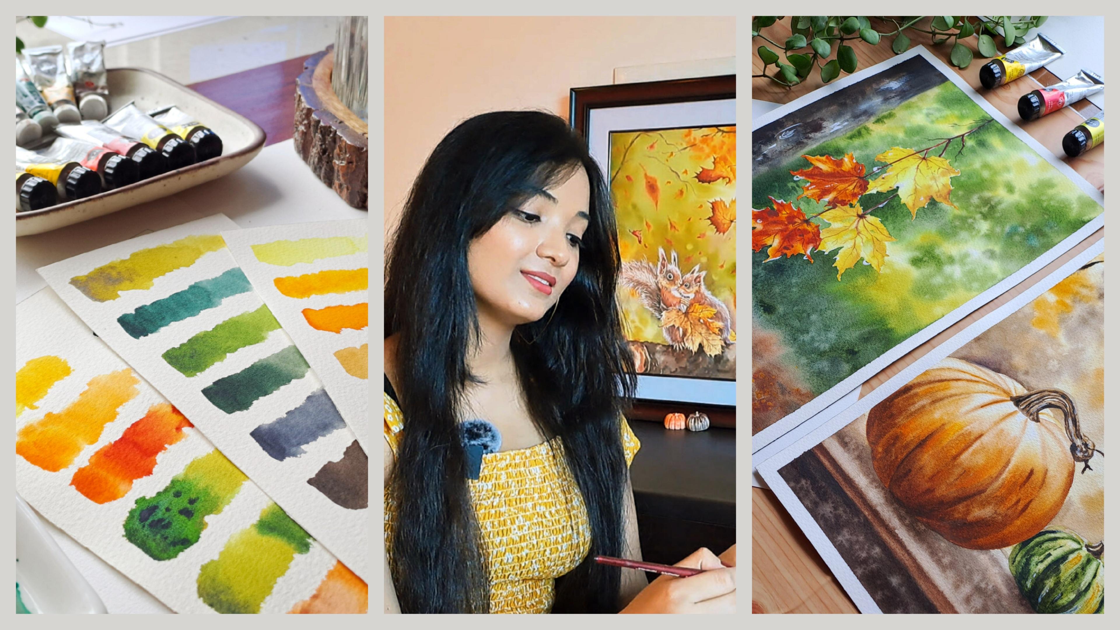
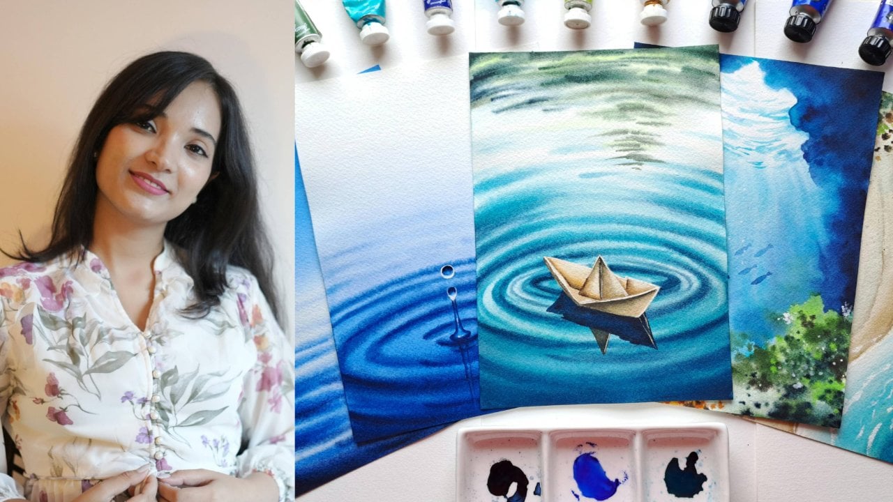
leaves beneath our feet, and the warm sunlight through the trees creates a sense of peace around us. Hey, everyone. This is Duthie, a watercolor
artist and an art educator. Welcome to my second
class, the Autumn Escape. Autumn is one of my
favorite seasons. Every year, I find
myself reaching towards watercolor to capture
those cozy feeling that comes with the season. The gorgeous yellows,
the oranges, the brown that comes
with the season really captures my mood. It makes me feel so, so amazing. Over the years, I have painted many autumn inspired paintings, each one teaching me something
new, something unique. Not just by choosing
the right colors, but also creating atmosphere, texture, light,
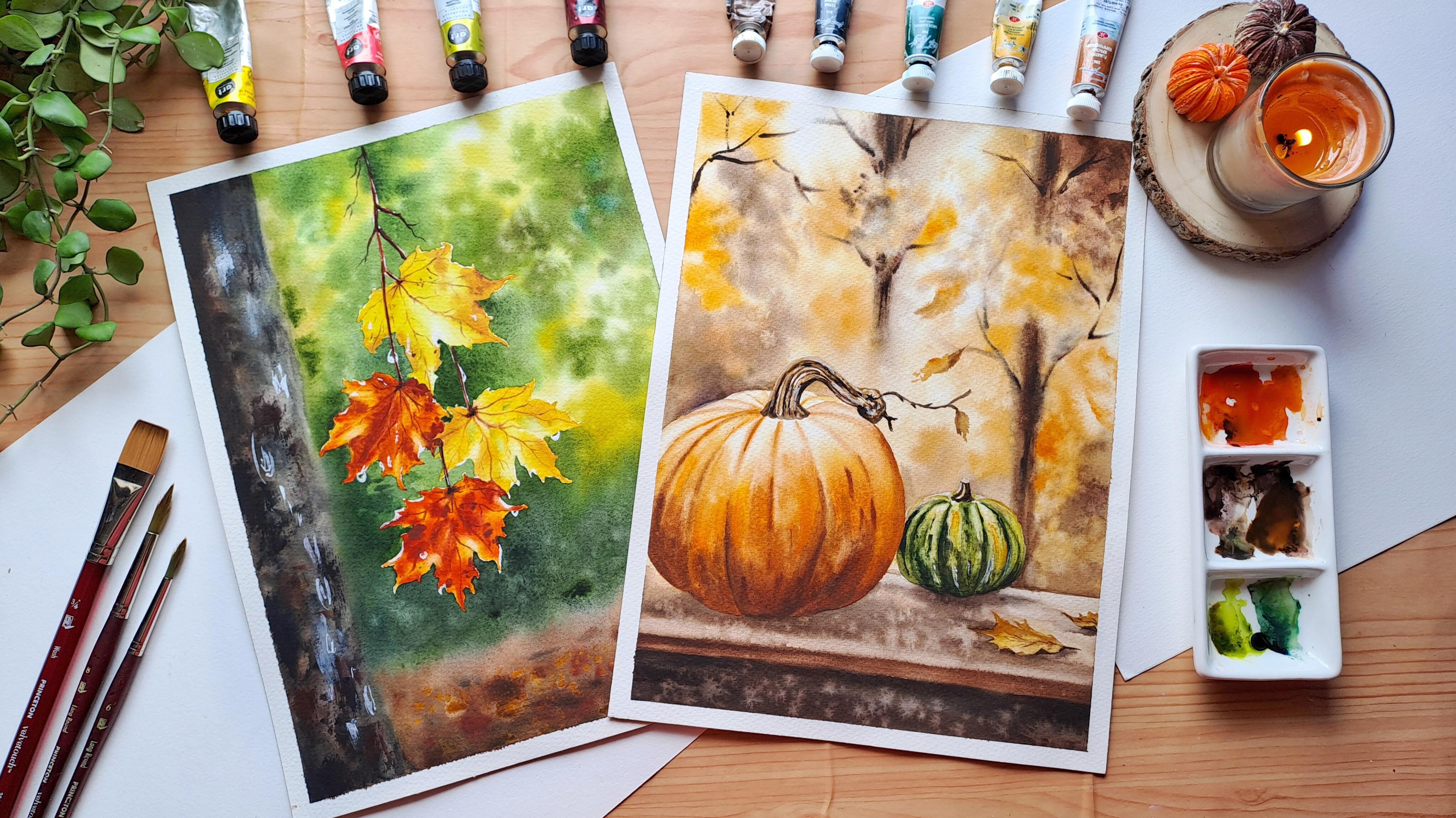
and little details that brings a painting to life. In this class, we'll create two autumn inspired
paintings together. We'll begin with a
closer painting of colorful autumn leaves and
then move on to a warm, atmospheric scene surrounded
by autumn foliage. I'll take you through each
painting step by step, sharing my favorite technique, color combinations, and
little tips along the way. I will be guiding you
through color choices, write paper and the
brushes that you'll be needing to make a glowing
watercolor autumn sm. This class is designed for intermediate
watercolor artists. But if you are a beginner who
enjoys a little challenge, don't let them stop
you from joining. So take your time, experiment, and most importantly,
enjoy the process. So grab your brushes and let's escape into
the autumn together. See you in the class. Bye bye.
2. Classproject + Overview: Thank you so much for
joining me in this class. This class we'll explore two different autumn
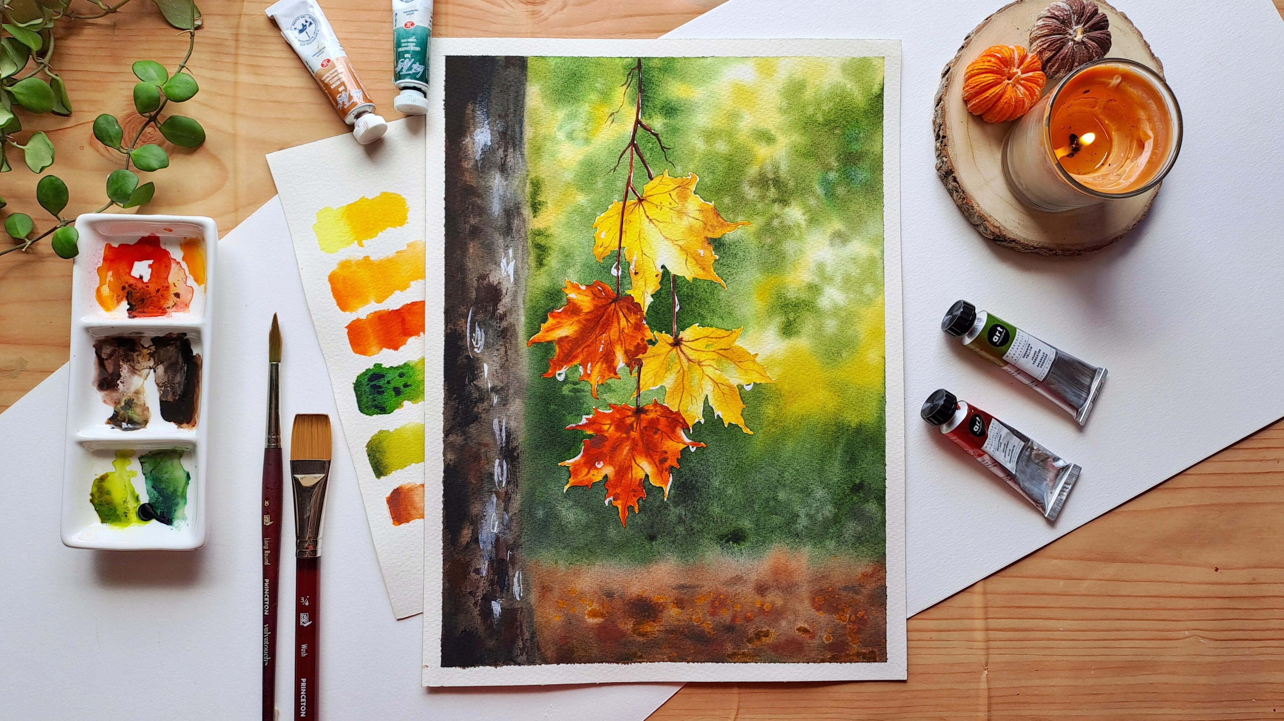
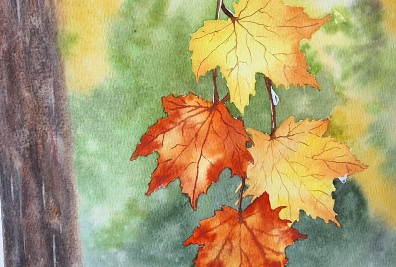
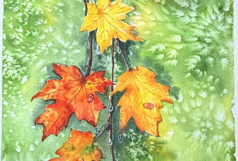
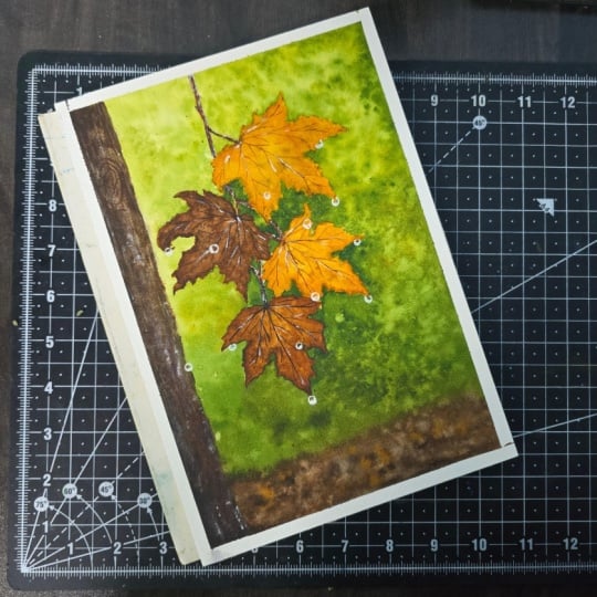
inspired paintings. The first project is a beautiful composition
of autumn leaves, where we will explore vibrant
autumn colors, leaf shapes, fine details, and the effect of water droplet in
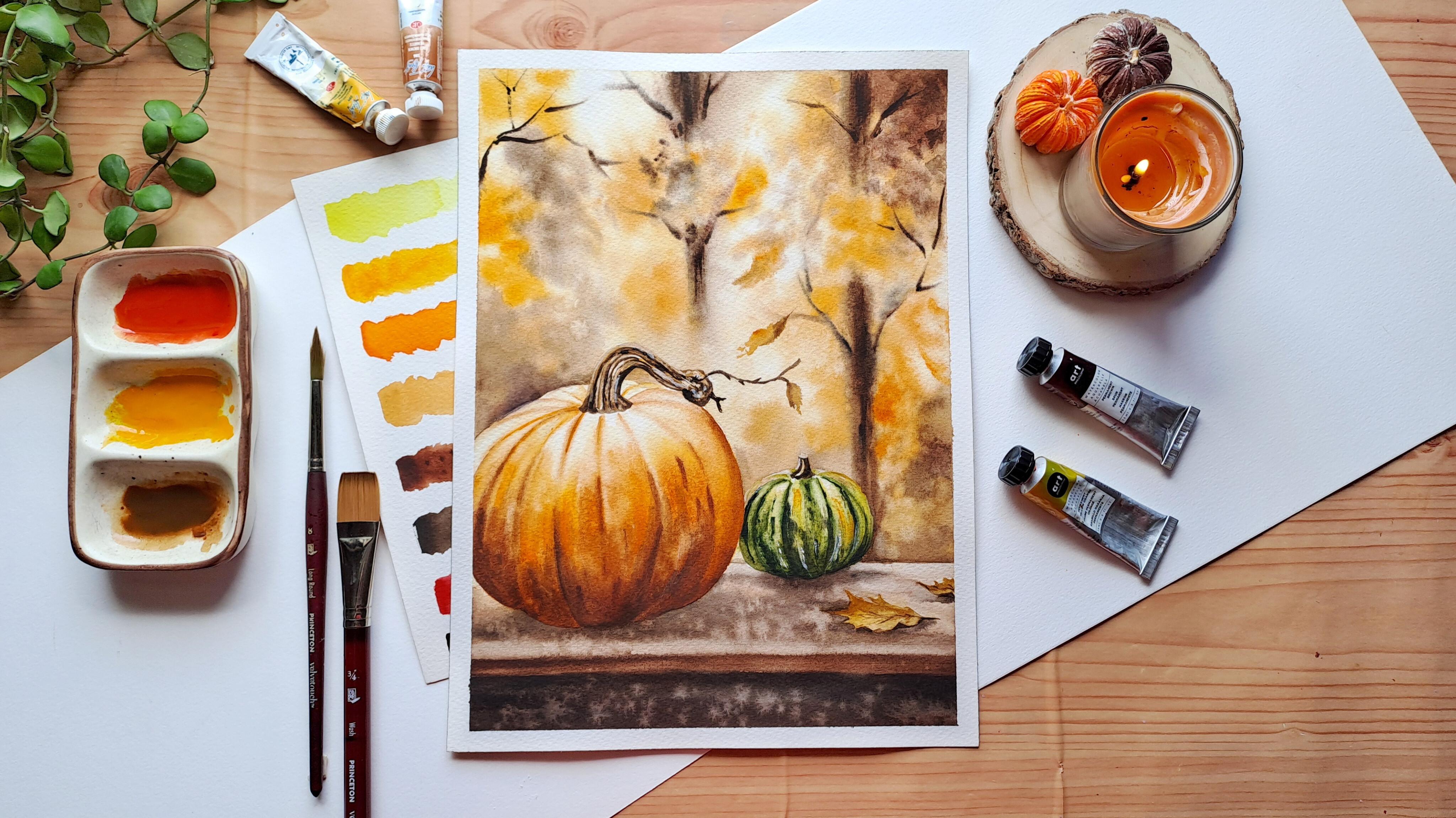
a very simple way. The second project is a warm
and cozy pumpkin scene where we'll focus on creating an
atmospheric autumn background, painting different
pumpkin textures and using light and shadows to
bring the scene to life. You can choose
both the paintings or choose the one that
inspires you the most. This class is divided
into several videos, each focusing on
different aspects. In the resource section, I have also added the
sketches of the paintings. Don't worry about
making it perfect. I would love to see your own interpretation and
creative choice. In the next video,
I'll walk you through all the materials you
will need for this class. See you there.
3. Materials Used: In this video,
I'll be mentioning all the supplies that you'll
be needing for this class. Since paper is the
most important thing here, I'll start with it. I have used my favorite paper, Saunders Waterfood from
St. Cuthbert's Mail. This is an amazing
watercolor paper. This is of 100 person
cotton having 300 asm. The size of the
paper is 12 by 9 ". It has fine grain and is lightly textured and is
also cold pressed. This paper pad is glued
from all the four sides, but we are going to take it
out and stick it on a board. You can go with any other watercolor paper of your choice, but make sure it's
100% cotton and 300 s. So that's all about the paper. I'm going to use
this acrylic board to stick the paper over it. It's quite sturdy. And for sticking the paper, I'll be using a
normal masking tape. I'll be taping the paper
from all the four sides. Now, coming to the watercolors
that I'm going to use, I have used
watercolor tubes from art philosophy and white
knights from NevskayaPaltro. I have also included a separate
class on color palette, where I'll be explaining
all the shades that I have used in this class
and their pigment numbers. To mix the colors, you
will need a palette. I have used here these
two ceramic palettes. You can use any other
palette you want, or just a kitchen plate
would just be fine. Now, coming to the brushes, I've mostly used these
three different brushes here throughout the class, but also kept another handy. The first brush here is my three quarter wash brush from Princeton brush
Velvet series. I'll be using it for applying
water onto the paper. You can use any bigger brush
or a mob brush for the same. The second brush
is a round brush in size eight from
the same brand. I've mostly used this brush
throughout my painting. Now, the size six
round brush from the same series and brand
for painting smaller areas. Now, coming to this brush, it's a half inch wash brush from Princeton brush Heritage Series. This is completely
optional as I have used it only for once
for a single painting. Now, the last brush is for applying masking
fluid onto the paper. This is an old brush. Never use your fine brushes for applying masking fluid or
else it will get ruined. Also, always put the brush into any dish soap before putting
it into the masking fluid. The next important thing
is white wash paint, to add some highlights. This one is from NewskaPatra. You can use any other
brand you have. I have used masking fluid
for the first painting here. This masking fluid is
from NewskiaPatra. Again, you can use any
other brand as well. Then we'll need
two jars of water, one for scraping off the
colors from the brushes, another one for when
we need clean water. Okay, spray bottle for
rewetting the areas. Cotton towel and tissue to wipe the excess water
from the brushes. And that's all the
materials for this class. In the next video,
I'll be mentioning and talking about the pigments.
So see you there.
4. Color Palette: Let's have a thorough look on the colors that I'm going
to be using in this class. Let's start with
the yellow first. So this is lemon yellow. This is from art philosophy. It's a cool, vibrant yellow. Okay. Now comes a beautiful
golden yellow shade in the name of permanent yellow
deep from art philosophy. The pigment number
says PY 53 and PY 55. You can also use gambose
yellow instead of this color or simply use a little orange mixing
with lemon yellow. I have used this colour to create the leaves
here in the foliage. The third color is a permanent yellow orange
from art philosophy, and the pigment number is PY 53, PY 55 and PO 73. You can use any other
orange you have. Our next shade is Naples yellow from the brand
white knights watercolor. The pigment number is PY 42, PY 35, PO 20 and PW four. It's a mix of yellow ochre, cadmium yellow, cadmium
orange and zinc white. Then comes red brown hematite. It's a granulating watercolor
from white knights. The pigment number
says PBR seven. It's a very warm, early brown. You can also use
burnt umber for this. Now the next shade
is Van ***** Brown. This is from white
Knights as well. It's a dark brown, and
the pigment number is PR one oh two and PBK eight. You can use any other dark
brown which you have. Now comes permanent thread. This is from art philosophy. It's a reddish orange, and the pigment
number is PR 112. You can use scarlet
thread as well. Okay, the next shade is permanent brown from
art philosophy, and the pigment
number is PBR 25. It's a very rich,
warm, mahogany color. You can also use bond
Siena instead of this. Alright, now we begin
with the greens. This is a greenish yellow
from art philosophy, and the pigment number
is PY 129 and PY 128. It's a bright, luminous yellow
with greenish undertone. You can also use lemon yellow mixed with a little halo green. I have created this
beautiful foliage by using the first
wash of this color. The next green is green
shadows from white knights. It's a granulating dark green. The pigment number is
PBK 11 and PG seven. You can also mix a
little paints gray in your halo green for
a substitute shade. Okay, so we're also
going to mix few colors. So this is a mix of greenish yellow and a
little green shadow. This way, we get a mossecrem. We'll be kneading it during
one of our paintings. This one is a mix of Van
**** brown and green shadow. It gives an olive hue. So this is Pains gray from
White Knight's watercolor. The pigment number is PBK seven, PB 15 and PV 23. This is a mix of pins gray
and red brown hematite. This provides a very
dark shade of brown. Now, this is a mix of naples
yellow, and Vandyks brown. I have used this color mix a
lot in the second painting. And the last mix
is of a permanent brown and paints gray
for adding some shadows. All right. That's
all for the colors. See you in the next class.
5. Project-1 Autumn Leaves Part- I: Let's start our first project. I have pre sketched
the maple leaves. I'm going to add the sketch
in the resource section. I have taped all four sides of the paper on the acrylic boot. Now, time to add
the masking fluid. We do not want the leaves to get drenched in colors
of the background. I'm taking an old brush
dipped in dish soap. I'm going to put
the masking fluid on the edge of the leaves. Don't want to waste a lot
of masking fluid here. Now, I'm gonna speed up this
area as it's just the same. Oh. You see the masking fluid
has already been dried up. And now we're gonna
wet the paper here. I'm taking up my Princeton three quarter wash
brush to wet the paper. Wet the paper evenly, leaving the leaves dry. I'm going to speed up this
area as it's just the same. We wet the paper evenly two, three times and let the
water soak in the paper. Now, it's time to
paint the background. I'm going to use my
size eight brush, dipping it into
greenish yellow color. The consistency of this
paint wouldn't be too watery, not too thick. A medium consistency
would go for this. Now, dropping in the color on the wet paper here and there, leaving some white
space in between. Leaving the white space in between makes it
look more brighter. Make sure the colour doesn't
go inside the leaves. Here, I'm adding a little
thicker consistency of paints to add some
depth into the foliage. I'm leaving the portion of the trunk of the tree
untouched at the moment. Now, I'm taking up some dark green shadow here and mixing it with
the greenish yellow. Also added a little
pins gray as well, and a little water, but make
sure it's not too watery. It needs to be thick. I'm adding a little reddish brown here. You can also add
sepia, a little water. Alright. I start using it
in the upper right corner. Give some really lighter
strokes over here. Allow the colours to bleed and mingle naturally
on the wet paper, rather than creating a
perfectly smooth wash. It's okay if it's looking
rough at this moment, but it'll look beautiful
after it gets dried up. Mixing a little more
darker green over here. And I'm using it over here around the leaves to
make it look stand out. Make sure this area
is a little darker. Since the paper is
wet at the moment, let the colors just
flow naturally. A adding some darker green here to make it look
bolder around the leaves. Just dropping in the
colors here and there. Now, I'm placing my masking
tape under the boat, so it has an angle downwards so that the water flows
to that direction. Taking some darker green here. Time to add some depth here. No taking up some red brown in the green to add some depth. You can also use sepia
instead of reddish brown. And So more shadows here. Using tar green with a mix of paints gray here and putting
it here in the bottom. Let the colors bleed
into one another, creating a blurry effect. Have you noticed that I'm not adding any more
water into the paints, B our paper is already wet, and now we need some
thicker pigments to add the depth in the
painting into the foliage. Adding some more shadows here. Look how beautiful it
has started to look. Now, I wash my brush very well and adding some splatters of clean water onto the wet paints. This technique pushes away the colors and it
creates texture.
6. Autumn Leaves Part- II: Now, it's time to
paint the ground. I've taken my red brown hematite for it and diluted
it with water. I'm wetting the
paper here a bit. It has dried up a little. I've taken my heritage
quarter brush for blending the color here. I'm tilting the board a little to let the colors
flow towards the up, and now picked up
some thicker paint. Now, mixing some
paints gray with this. Make sure it's not too watery. This is going to be
a darker brown now, adding it here, leaving
some empty spaces between. Washing my brush or taking up some paints gray and mixing
with the dark green. I need to add some
depth to the foliage, putting the color down here
where it touches the ground. The pigment here is quite thick. I'm taking direct the colors
without using any water. Okay, I think I have to
add some more colors here, so adding a little
greenish yellow over here. I felt like it was empty. Now, taking up my red brown here and starting to add some
texture in the ground. This is quite a thicker
consistency that I'm using. Also, occasionally, using the darker
brown here and there. Now, taking up some
fresh paint of golden yellow and adding
a tiny amount of water, giving some splatters here. Now, time to paint the trunk, wetting this area
with my wash brush, putting a thinner consistency of paint screy using my water
heritage wash brush. It's right. If the brown from
the ground gets mixed up, it will make it
look more natural. Now, mixing some red brown in this a little thicker consistency
and putting above here. Mixing the red brown into the paint screen and
putting it here. Don't paint the trunk as
one flat brown shape, use broken brush strokes and irregular patches to create the appearance of
a rough tree bark, wiping off the excess water that has been spreaded
on this paper now. Now, with my size eight brush, I start building up layers. I'm adding the colors in an irregular manner
here and there. See? I'm putting the thick
pigment here and there. This is just pains gray Because a real tree trunk
isn't made of flat colors, rather it has cracks, textures and mid tones
and lighted exposed area. So I'm taking up some
more raw paint scray here without using any water. Just some random
strokes here and there. So I'm washing off
my brush and taking some clean water to add some
splatters on the tree trunk. This will create texture. Okay, so I think we can
add some more colors here. I'm adding some
golden yellow over here in the foliage,
some more yellow. Now, taking up some
greenish yellow over here to give
a leafy finish. I'm not adding any
more water here. Just colours here and
there for a leafy finish. I'm going to lift
up some colors from the trunk to give an
uneven bark finish. Always clean your
brush after every lift up and wipe it
off with a tissue. Wait for the paper
to get dried up. Once it's completely dried up, we will remove the
masking fluid. I'm just using my
fingers to remove it. The time to paint the leaves. I'm taking up some clean water and wetting the
area of the leaf. Make sure that the water doesn't go outside
of the outline. I'm using my same size H
round brush over here. Now, I'm taking up some lemon
yellow, diluted with water. Make sure to make it a
little thin in consistency. Giving the first
layer of color on the leaf with a
very light stroke. Now I'm washing off my
brush and wiping it, taking up some
fresh lemon yellow, and mixing it with
golden yellow over here. Adding it from the
edge of the leaf. Make sure your
leaf is still wet. I'm not using water this time, hence the pigment
is quite thick. Adding the deeper shade at
every corner of the leaf. Taking up some naples yellow
over here and adding it over here in the bottom of the leaf to add some
more depth over here. And it will also create
a shadowy effect. Mixing some more naples yellow, along with lemon
yellow and putting the thick pigment over the leaf here to add some more
shadows here and there. Now, lifting up some
colors over here. This helps to catch the light. Now, time to add the
veins of the leaf. I have taken my size
zero round brush, and I'm using
reddish brown here. You can also use marsh brown
or burnt umber for this. We're making the vein just
here at the center first. The vents doesn't have to
be all uniform in shape. It can be irregular, some thin, some thick. That is totally fine. It will
make it look more natural. I see my leaf looks
a little flat here, so I'm going to add
some more naples yellow for some more depth here. I'm just marging
it with my finger. I love the natural texture
that it's providing. Okay, now we go to
our second leaf. I'm wetting the second leaf with clean water and we'll be using the same
sequence of colors. First, we're taking the lemon yellow and dropping
in the color here. Now, building up the layer with a mixture of golden yellow
and lemon yellow over here. Hopping the color from
the edge of the leaf. And blending it in Now, lifting up some color
from the crunches of the leaf and wiping
it off on my tissue. Always use a damp brush for it. Now, adding some golden
yellow from the edge again. This time, are
thicker paint here. I'm building up the
shadow over here. I've also mixed a
little naples yellow here for adding some
depth and the edges. Time to paint the veins using my size zero
round brush over here and applying red brown
just like the previous leaf.
7. Autumn Leaves Part- III: Now the third leaf wet the leaf. This is going to
be an orange leaf, wetting the area
of the leaf first. I'm adding golden yellow
for the first layer. This is in a thinner
consistency of pigment and adding some
orange at the edges. Keep some portions lighter to suggest light passing
through the leaves. The darker pigment around
the veins and towards certain edges gives the leaves their characteristic
autumn depth. Now, I start adding some medium consistency of
orange in my wet leaf from the edges and start
blending it in. Gradually building
up layers over here and creating depth
in the flat leaf. Oh Now, I'm taking some fresh paint
from my permanent red tube. You can also use scarlet red over here and mix
it with orange. Adding a little
bit of water here. Adding a little more
orange in the red. Okay, time to give
the shadows here. From the outer corner
of the leaves, I start pouring the color. D. I'm not covering the entire leaf so that the
light color doesn't go off. This prevents the leaves from becoming overly flat and also gives them a slightly damaged
autumn leaf appearance. I'm lifting up some colors from here so that we can show
the highlights of the leaf. Now, time to add the veins here. Just similar technique. Oh Time to paint the last leaf. This is also going to be darker. So wetting the paper
first around the leaf. Now, adding the
golden yellow first. Now building it up with orange. See, from the outer corner, I start adding the
oranges towards inside. I'm not adding water here because we need the
thicker paint over here. I'm not adding water over here because we need
the thicker paint here. Blending in the color. Okay. Now, we use the
permanent red mix with orange to add the shadows
and depth here and there. I'm using a little
red brown over here, some spots here and
there in the leaf to make it look more
weathered in appearance. Now, time to add the veins, just like the other leaves. But this time I'm using a
little pins gray mixed with red brown for the veins to
make it look a bit darker. We also painted the
branches with the seam, color red brown and a little paints gray
mix. That's it. Now, I want to add
some paint gray, some raw paints gray over the tree trunk to
make it look uneven. Just smudging in the raw colours without using any
water over here. Mixing a bit brown here
with the paints gray. Taking a little water
to blend in. That's it. Not too much. I see the water splatter has already created texture
over the trunk. See, See, it looks so nice now. Okay. So we'll be adding the details in
the next video then.
8. Autumn Leaves Part-IV: Now, time to add some details. I'll be taking some
white guash paint using my size age round brush. Adding some strokes here on the tree trunk and smudging the color
using just my fingers. It gives some natural textures. Just some raw white squash
over the trunk of the tree. Okay, now adding some
teeny tiny details here on the leaves with
the white guash paint. Do not use any water here. Just some white, small marks
scattered across the leaves. These highlights make the leaves look more natural and
slightly weathered, rather than perfectly flat. These highlights make the leaves look more natural and
slightly weathered, rather than perfectly flat. Oh Once all the details are finished, I add a little simple
raindrops using white wash. You don't have to paint complicated
realistic droplets over here. These are just normal
small raindrop shapes. Very simple. Nothing
complicated here. I try to keep it simple. See, it looks so pretty. And we're done here. Time to remove the masking tape. Now that my painting
is entirely dry, we'll peel off the tape. Always pull the tape that
faces away from the paper. See, I'm pulling it
away from the paper. Yes, just like that. Look how gorgeous it looks now. Okay. See you in the next class.
9. Project-2 Pumpkin Patch Part-I: Let's start our second painting. My paper is already tipped
from all four sides. I have already pre sketched it, and also going to add the
sketch in the resource section. Here I'm going to
paint the pumpkins first there the
focal point here. I'm going to wet
the large pumpkin first using my three
quarter brush. Taking up clean water
to wet the pumpkin. Make sure it stays
within the outline. Time for the first layer, I'm mixing a little golden yellow or permanent yellow deep, and a little naples yellow. Add some water, make it
a thinner consistency. Now, adding a light wash here, leaving some white untouched. This creates a warm, luminous base and allows the lighter areas of the pumpkin to glow through the
subsequent layers. I'm leaving the upper part
of the pumpkin untouched to create an illusion of
light coming from above. Now, taking up some thicker
permanent yellow deep and adding a little water and
start adding the second layer. Make sure the paper
is still wet, leaving some lighter shade
beneath to catch the glue. I see some watery paint
has been scattered here. No worries. Wiping it
off with a tissue. Now, I gradually build up
the layers with orange, concentrating it in the curve
section of the pumpkin. I'm not covering the entire
base evenly because I want some of the
golden yellow to remain visible from underneath. Washing my brush and adding a very thinner consistency of naples yellow here in the avove and lifting up some
colors from here with a clean brush to bring
out the highlights. M. Now, time for some
deeper shadows. I'm going to use
red brown hematite. You can use bond umber as well. The darker and warmer colors are useful in the groups
of the pumpkin, as it gives the pumpkin a
rounder and a fuller shape. So here I am adding the shadows to make it look a bit fuller. I have mixed a
little orange with the red brown
hematite and putting it here to add some depth. Removing the excess color from the top using a damp brush. Now, I'm making
some curve lines on the upper region of the pumpkin to make the folds visible. The color here is a thin coat of red brown mixed with
a bit of orange, building up some shadows
here with the same color. And I chose a reddish brown rather than a neutral brown because I want the
shadows to remain warm. So red brown hematite
is a granulating shade. It has early texture rather than producing a perfectly
smooth dark wash. So it helps in building up
the texture on the pumpkin. I follow the natural
curved section of the pumpkin rather than just
applying the color randomly. The orange becomes stronger towards the sides
and within some of the segments while
the golden yellow remains visible in
the lighter areas. This variation is important. So the center of each
section catches more light while the areas between the sections are
naturally darker. Putting some more thick
pigment of orange over here to give it some texture. Now, here I have added a
little van **** brown in the red brown hematite and
putting it right here, this gives the pumpkin
a more defined shape. I'm adding some clean water
splatter over here on the pumpkin to give
it a natural texture. Make sure that the
paper was still wet or else it wouldn't
push away the color. Adding some more details over
here with Van ****'s brown. Just some brown here and there for adding
some more texture. So it's done over here. We're going to paint the stem of the pumpkin in
the next video.
10. Pumpkin Patch Part-II: Now my pumpkin is dry, and we can see how
the water splatter has created texture here. Time to paint the stem here. Now, wetting it with clean
water with my round brush. I will be applying a very
light wash of naples yellow here and now blending
it with water. Now, I'm taking up
some Van **** brown and start building up the layer. This is of a medium
consistency, not too watery. Adding thin line
from the edge of the stem and blending in
with the tip of my brush. I'm painting the stem with
carved directional strokes, which gives the stem a
naturally rigged appearance. I'm washing off my brush, and with the damp brush, I'm just blending
the color here. I'm mixing some Naples
yellow with Van ***** brown and adding it in
the end of the stem. With the tip of my brush, I'm drawing curve lines
here with Van ***** brown. Now, adding some shadow here at the end of the stem
with the same ground. But do not cover
the entire portion as we do want the lighter
shade underneath. So we let some of the naples
yellow portion untouched. I'm just using raw
van ***** brown here with a dry brush technique. My paper is completely dry now, and I'm just smudging
the Vandyk brown here. But we are leaving some
of the lighter portion untouched to capture
the highlight. So our large pumpkin is done. Now time to paint
the smaller one. We will wet the
small pumpkin first. I'm using my size
six round brush. First, I'm giving a very
light wash of naples yellow. This is going to
be a watery paint. Leaving some empty space in between to catch
the highlight. For the smaller pumpkin, I wanted to create a
cooler green contrast. Adding some more
Naples over here. Just following the
natural curve. Now, for the second layer, we are going to be using a thicker consistency
of greenish yellow. For the smaller pumpkin, I wanted to create a
cooler green contrast here against a warm
orange pumpkin. This helps break down the
warm colour palette and also makes a large pumpkin stand out as the
main focal point. I start by adding it
with simple strokes, leaving some lighter
shades untouched. Once our base layer
is established, I start adding green shadows in the green yellow
and mix it well. This is quite a
thicker consistency. Dropping in the color by the tip of my size six round brush, leaving some gap so that the
light green remains visible. I follow the natural curve here rather than painting
straight vertical lines. The darker green is used in the grooves between the
lobes of the pumpkin, particularly because those areas naturally receive less light. Giving it a fuller shape by blending the color
with a damp oh. Adding more green shadows
over here for some texture. I'm sprinkling some
water on the pumpkin. It has been dried up a bit. Adding the same dark green
here for some depth. This gives the
pumpkin a round form. Towards the lower part, I'm adding thick pigment of
green shadows to add depth. Now, washing off my brush with the damp brush, I
blend the color. Now washing off my brush, and with the damp brush, I'm blending the seam color. I'm lifting up some
excess colors from you. I'm adding a little orange
over here on the pumpkin, one or two areas
for some textures. This paint is quite thick
as I didn't add any water. Now for the stem, I just use the dry van ***** brown here. It's a tiny stem. Now, we are going to be painting the two dry leaves.
They are very simple. First, we will wet
the leaves with the same size six round brush. Now I'm going to apply a thin layer of naples
yellow at first. Then from the edge,
I start adding very thinner consistency of Van ****'s Brown
for some shadows. I'm taking some more
van ***** brown here and adding some
shadows on the leaves. In the next video, we will
be painting our foreground.
11. Pumpkin Patch Part-III: Time to paint the base, wetting the area first
with clean water. I wanted to create a
soft earthy surface. I introduced light
wash of naples yellow across the area with
my size H round brush. The consistency of the
paint is very thin. Now, I mix some red
brown hematite with the naples yellow and
start building up shadows, but the paper is still wet. Taking some red brown and mixing a little water and
building up shadows here. I allow these colors to
spread and mingle naturally. Now, we need to add shadows
underneath the pumpkins, especially in the lower edges. So I'm mixing a little van
**** brown with my red brown. The pigment here
is not too watery. Don't make the shadow
a very hard outline. Instead, soften it outward so that it gradually disappears into the surrounding surface. Taking some raw van ****
brown to deepen the shadow. Because that's where the
light is most locked. As the shadow moves away,
it becomes lighter. I add some shadow under the fallen leaves with
the same color as well. Now, with some clean water, I add some splatters so that it gives some
natural textures. Now, with a damp brush, I'm lifting up some colors to
bring out some highlights. Adding the foreground edge now. At the bottom, I deepen the
color with Vandyks brown. Make sure the paper is still wet and the paint
is not too watery. Now, I'll mix some permanent
brown and van ***** brown together with a
slight amount of water. So the combination of red brown hematite and
permanent brown are especially useful
for this because it creates an earthly,
slightly grainy appearance. Adding the dark fan *****
brown with a mix of permanent brown at
the very bottom gives the painting a
sense of structure. And it also creates
a nice contrast with the lighter surface where
the pumpkins are sitting. I'm adding some
clean water splatter over here to get some texture. Adding some details
here on the leaves, adding some details
here on the leaves. I've mixed some orange
with naples yellow here and a very little
amount of water. Now, adding some andykes brown here to show the
folds of the leaf. The paint consistency
is thick here. Adding a mix of andykes
brown with naples yellow here at the edge of the leaf and adding
some small details. I'm adding a little more shadow here with a thinner
consistency of Andyk'prown. And now we let it to dry. Time to paint the background. We need to wet the background
first with clean water. I'm using my wash brush
to wet the background. I do this two, three times. I'm speeding up
this part of bit. I'm taking naples yellow, mixed some water,
and making it thin, but not too watery. Now, with my size H round brush, I start dropping the
color here and there. Leaving some white gaps between. Oh. Niples yellow is particularly important
here because it gives the background a warm,
muted golden atmosphere. Blending the colors here
somewhere deep, somewhere light. Adding a little water
into the paint. Now, I mix some orange
with maples halo and a little water and start
dropping in the colors. The springs in those
warm golden patches that suggest sunlit autumn
foliage in the distance. But keep some areas lighter. Make sure your
paper is still wet. Now, washing my brush and
taking some van dice brown, diluted some water in it. And I start dropping
it here and there. These are subtle shadows
between the trees. Now, taking some
thicker paint or Van **** brown and we need to paint the
tree trunk and branches. I apply it with loose, slightly irregular strokes, allowing some areas to
remain lighter and softer. Oh Adding some more orange here. I'm taking some red
brown hematite, diluted with water and
adding some patches here. Oh Now, time to add some branches. But the tip of my
size eight brush. I'm using van ***** brown. I start by adding the branches. Some branches remains visible while some fade into
the background. I'm adding some leafy texture here with thick Vandykes brown. Adding some more branches here? Now, washing my brush. I need to sprinkle some water
here on the background. It seemed to have dried up. Adding some more
naples yellow here. Be careful. The colour
shouldn't sip onto the pumpkin. Adding some van **** brown
here, diluted with water. All right. In the next video, we will be adding the
rest of the details. I
12. Pumpkin Patch Part-IV: Okay. Time to add some
more details here. I'm adding some
orange platters here. Some more platters over here, but this time, it's Van ****
brown, diluted with water. Okay, I'm adding some
more shadows with Van **** brown,
diluted with water. Add a little brown
and naples yellow mix here. And now smoging it. Adding a little bit
of orange over here. Okay. Let's add
some more bronches. I'm adding bronches here
with Van **** brown. This time, I didn't
take much water. It's a very thick paint. Adding a little
detail over here. Just some golden yellow and orange mixed,
diluted with water. It's a very loose kind
of leaf over here. My paper is almost dry. Adding some more
red brown hematite and Van ****'s brown
mix over here. Just some details a little bit. You can also skip this part if you do not want
to add more details. Some more branches. I'm going to add
some loose leaves here and there with the orange. Don't dilute too
much water in it. Now, taking some thick
pigment of Van **** prawn, and I'm going to
add some details on the stem of the
large pumpkin. Adding just a little
more detail over here in this pumpkin and a little on the leaves
with Vandykes brown. I'm taking some naples yellow, and Vandykes brown
and mixing with water and adding a
very tiny leaf here. Just one tiny leaf. Adding some teeny tiny
idles here on the pumpkin. A little watery paint on the pumpkin to give
some shadows over here. Don't do it too much or else it would ruin the white highlights. I'm using some fresh
paint from the tube. This is Van ****'s Brown. And it's done here. Time to remove the tape. Always remember to remove the
tape away from the paper. If you have enjoyed the
process, do give it a try. Thank you so much for
joining me. Bye bye.
13. Thank You For Joining!: And its aa. Congratulations
on finishing this class. I'm so happy to see you
joining all in my journey. I hope you enjoyed bringing these two autumn scenes to life. Throughout this class,
we explore how to create that beautiful
feeling of autumn from building warm glowing
colors and creating depth with soft foliage to
adding texture to tree, trunks, pumpkins,
and autumn leaves. I hope these paintings have
also encouraged you to experiment with your own autumn color palettes and compositions. You can take these
techniques and use them to create an entirely
different autumn scene. Would love to see your
finished paintings. If you enjoyed this class, please don't forget
to live a review. It helps our students to find my class and also
helps me as a teacher. Until then, happy paintings, see you in the next
class. Bye bye.
 Dyutisnata Chatterjee, Watercolor Artist