Transcripts
1. Introduction: Fall. There is something about it that makes you
want to slow down. Maybe it's just the
crispness in the air, the early tones all around us, or the beautiful
change in colors from fresh green slowly turning into warm yellows
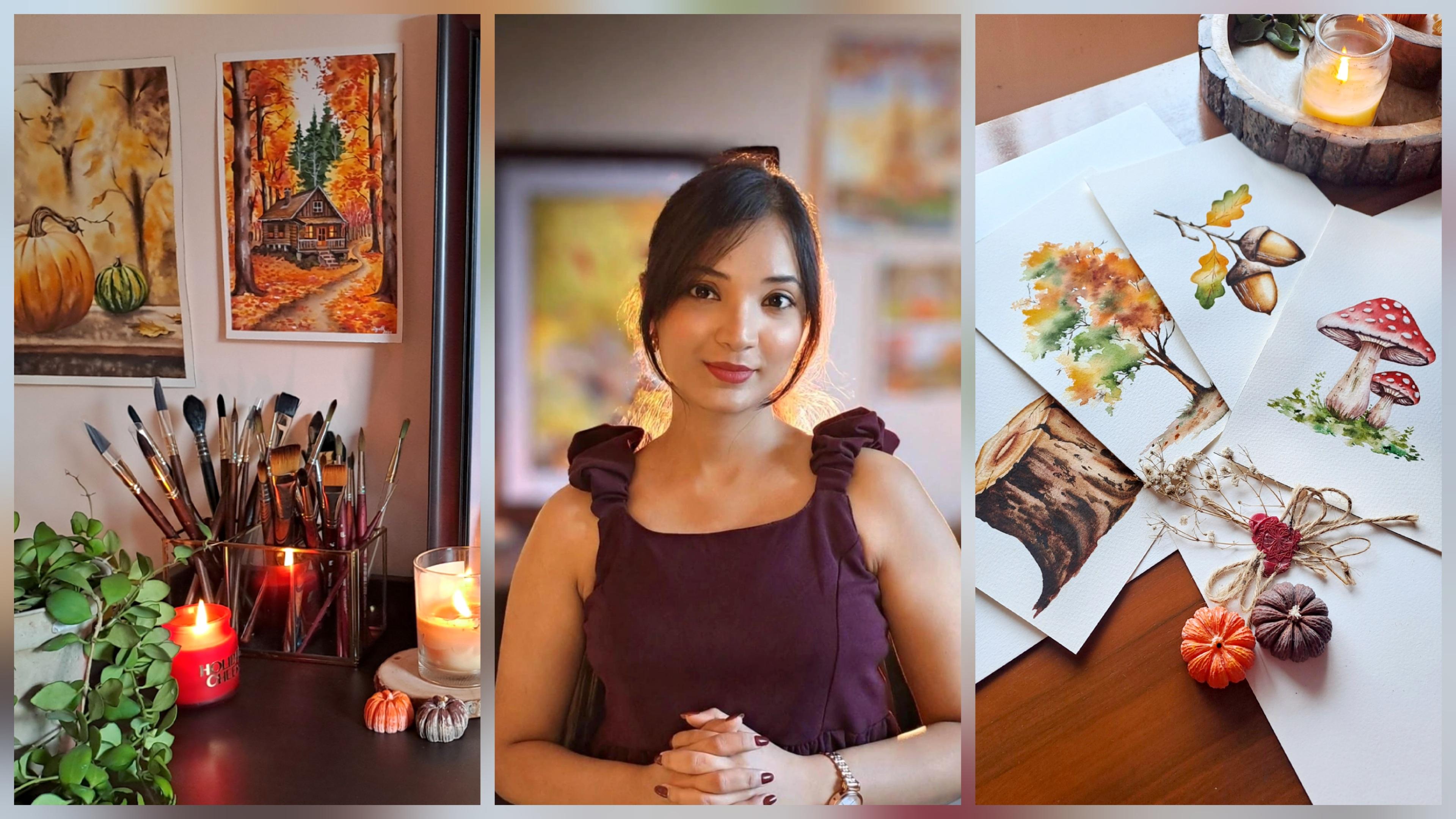
and the orange, deep reds and finally brown. Hi, I'm Duthi, a watercolor
artist and an art educator. Welcome to my watercolor
class. Fall in watercolor. This class is specially designed
for beginners and anyone who wants to enjoy watercolor without
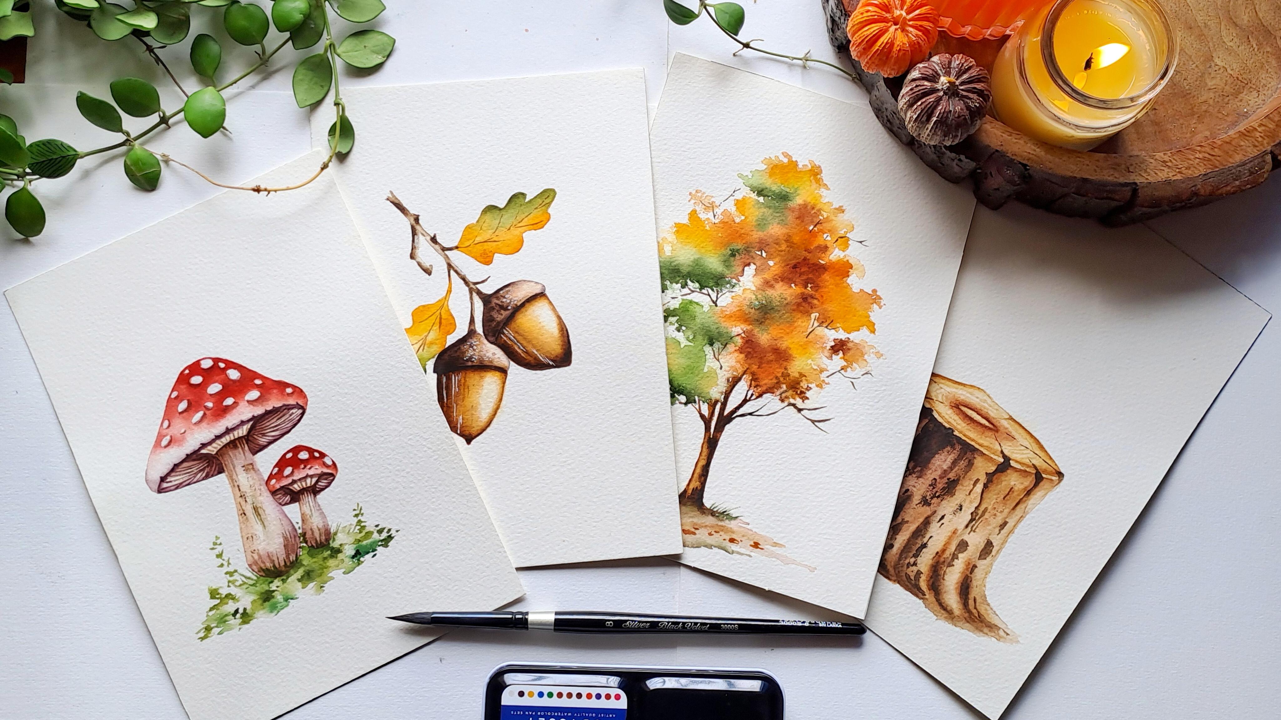
feeling overwhelmed. Together, we'll be painting four little fall
and spy paintings. I wanted to approach fall in a way that is simple,
relaxed, and approachable. Through these
paintings, we'll be exploring some of the fundamental
watercolor techniques, including simple washes,
layering, light, and shadows. I love how the change of colors makes even the smallest
things look so beautiful. You don't need to worry about
getting everything perfect. I'll be guiding
you through each. From sketch to the final
details so that you can focus on enjoying the process and building confidence
with your watercolors. Fall has taught us that
change can be so beautiful. A little mushroom
growing on the ground, an acorn, the changing
leaves or an old tree stump. A few simple elements can
tell the whole story. I will be walking you through all the materials and color
choices, so don't worry. I got you. If you haven't taken
my previous autumn class, the autumn escape,
I should tell you that it was designed as an
intermediate level class. So if you're looking for something a little
more challenging, I would definitely encourage
you to check out the class. So bring out your brushes, find yourself a cozy corner, and let's start painting. See you in the class. Bye bye.
2. Class Project + Overview: Welcome to my Skillshare
class, Fall in Watercolor. In this class, we
are going to paint four simple fall inspired
paintings together. I have kept each project
beginner friendly so that you enjoy painting
without much experience. We'll start with
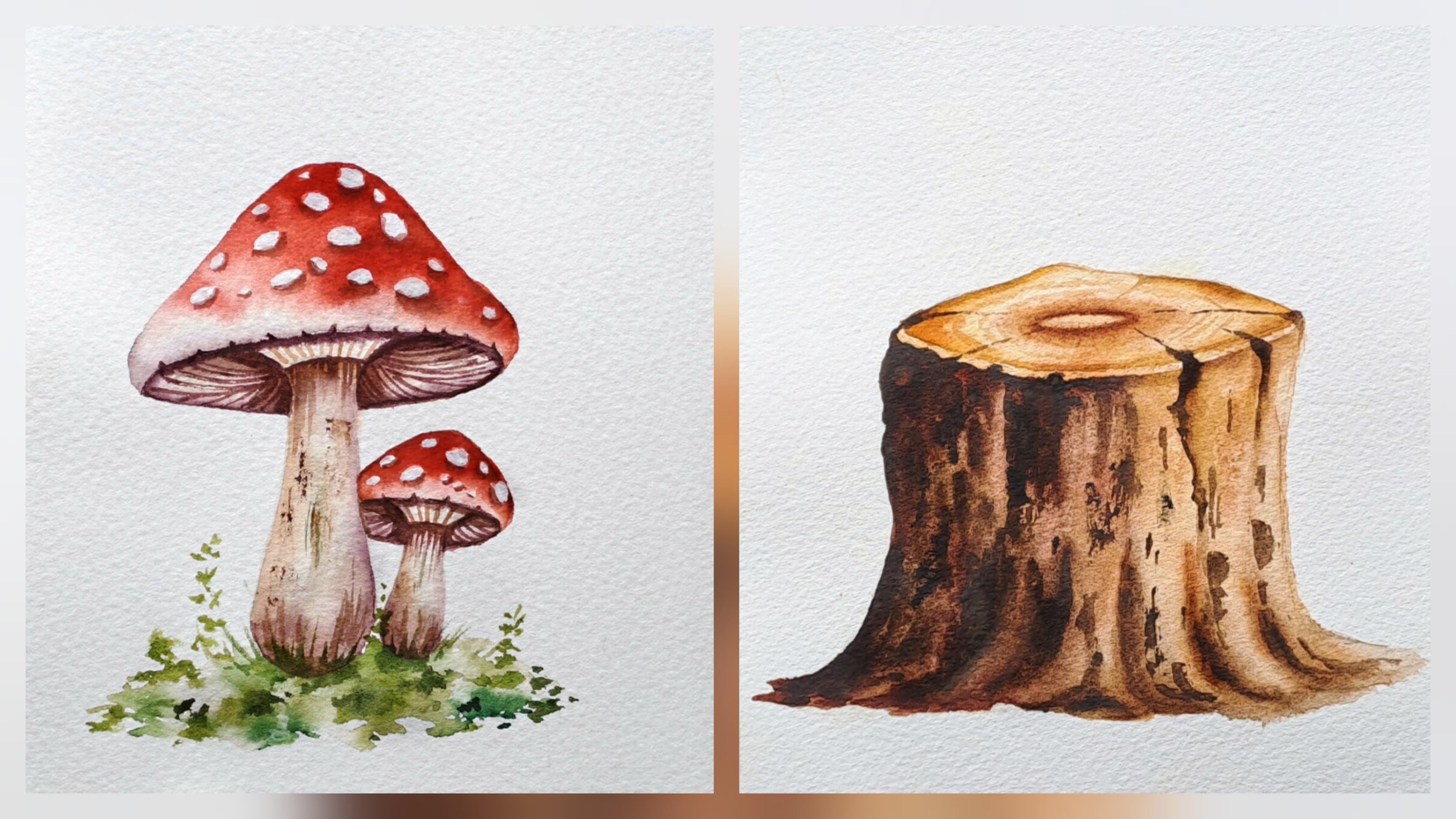
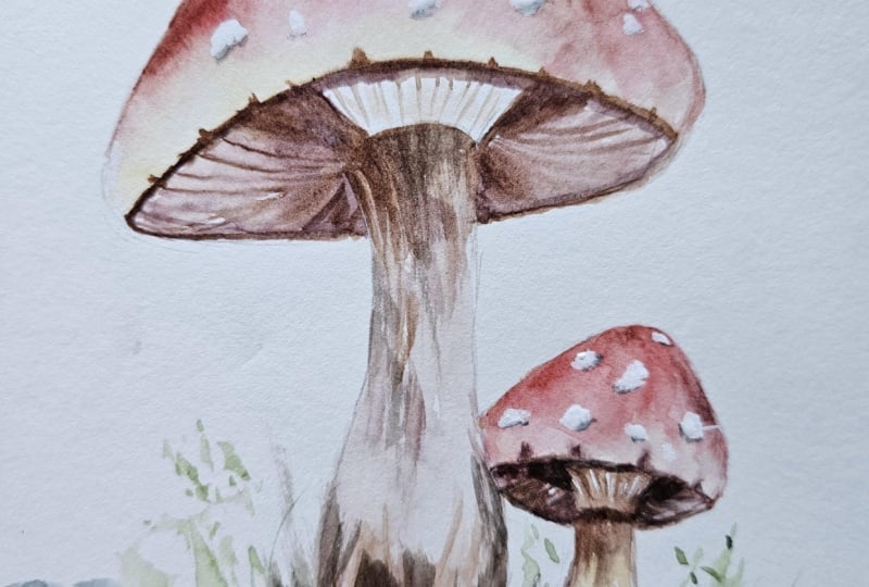
a bright mushroom playing with red
and early browns, then move on to a little
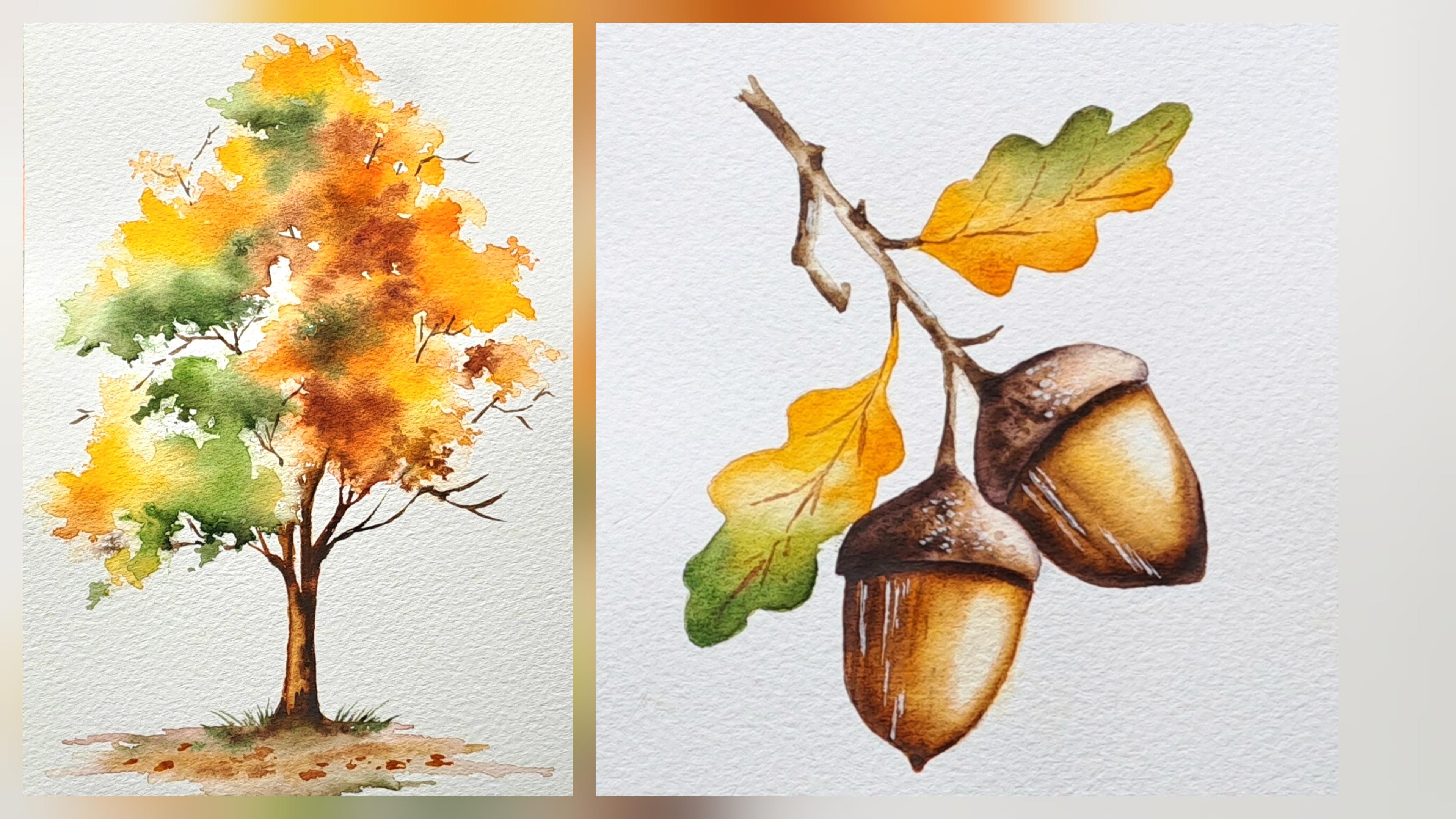
branch with leaves and acorns, focusing on smaller details and beautiful golden
color of fall. Then we'll paint an
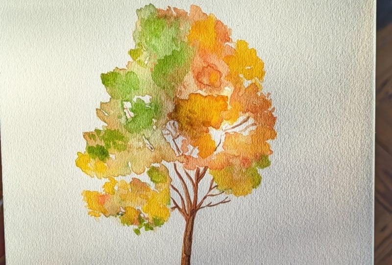
autumn tree where we will explore the beautiful
transition of colors. Then finally, a tree stump, exploring warm or the colors and simple ways of creating
the texture of wood. You can paint along
with all four projects, choose the one you
enjoy the most, and don't be afraid to add
your own colors and details. In the resource section, I have also added
the sketches of the paintings, so I got you. In the next video, I'll be
mentioning all the materials that you will be needing for this class. So see you there.
3. Materials Used: Let's walk you through all the materials you'll
be needing in this class. I'll start with the paper. This is from cut birth
meals on this water food. The size of the paper
is 12 into 9 ", but I'm going to cut the paper and use the smallest size here. This is of 300 Gasm
and one for TLB. This paper is 100 person
cotton and cold pressed. It has fine green. You might have also seen
me using it frequently. It's my favorite
watercolor paper. This is the size
of the paper I'm going to use. This is a five. I have just cut it
from the bigger block. You can use any other paper
brand of 100 person cotton. You can also use any size you want bigger or smaller
that would go. Okay, that's all
about the paper. I'm gonna be using
this acrylic boat to put the paper over it. It's quite sturdy. I'm going and I'm going to stick the
paper with this washi tape. Just the cornice, we do not need to tape all the four sides. For the watercolor, I'm going to use this palette
from art philosophy. It's an American brand. This is Odyssey palette. This is a versatile palette. I'm going to use this tin
palette or touched with to mix the colors instead of
using any other palette. This watercolor palette consists colors with names or different
cities or something. So I'm going to use
the general name of the shades to save
from confusion. Also, I would be mentioning
the alternatives of these colors as well in
the color palette video. Now, coming to the brushes, I have only used these
three brushes here. These are from silver
black velvet brushes. They're super soft. The first brush is
a size round brush. I've used this mainly for covering larger areas
and long strokes. Oh Then come size six round brush from
the same series. I've used it for the details
and for smaller areas. And the last one is a size four round brush
from the same brand again. This is a very thin
and pointy brush. I've used it only for tiny
and delicate details. Then we'll be needing
two jars of water, one for scraping of the
colors from the brushes, and another one for when
we need clean water. Then comes white gouache
paint to add some highlights. This is from NewskaiaPata. You can use any other
brand you want. A spray bottle to revet our paints or the
painting if needed. This one is optional. Cotton towel and tissues to wipe off the brushes or extra paint. And that's all. In
the next video, I'm going to walk you through the colors. So see you there.
4. Color Palette: Let's have a close look on the colors that I'm going
to use in this class. In this class, I have only
used this watercolor palette. This is Odyssey palette
from art philosophy. The name of the colors are
fantasy names over here, so I'm going to mention the
general names of the shade to avoid confusion.
Let's get started. So the first color
is warm yellow. This is a beautiful
golden yellow. You can also use cadmium
yellow instead of this. Okay, the next shade is a mix of red,
orange, and crimson. It gives a very
bright red shade. Oh This is a bright orange. I have used this mix of red and orange here in the mushroom cap. The next shade is a mix of
warm yellow and a warm brown. This gives a golden effect. Here in the acorns, I have achieved the golden
hue through this color. I have also used the same
mix over here as well. This is just a warm brown. You can also use born
amber instead of this. Okay, our next shade is a mix
of purple and warm brown. You can mix purple
and burn number two. Okay, this is a darker brown
with a purple undertone. You can mix purple
and sepia for this. I have mostly used this color here on the
gills of mushroom. Also, I have used it
here on the cap of the acorns for
achieving some texture. Another dark shade of brown. You can use Van
****'s brown, too. Okay. So the next shade is a mix of warm yellow and a
little hookers green. See, we get a lovely
greenish yellow here. This is Hookers Green. The next shade is a
mix of hookers green, yellow and a little brown. It gives us this perfect
earthy green shade. This is such an autumn green. Okay. That's all. See you in the next class.
5. Mushroom- Part: 1: Let's start of first painting, taking my paper here, and I'm gonna tape
the corner with washy tape so that it
stays on the spot. I have already pre
sketched the mushroom. I'm also going to add the
sketch in the resource section. Now, with my size
eight round brush, I wet the mushroom cap first. I'm mixing here red orange and a little crimson with a
little amount of water. You can also use scarlet and mix a little amount
of yellow in it. Okay. So I start with
a very light wash, dropping the color from the top and letting it flow naturally. Not going to put red at
the bottom of the cap of the mushroom removing
the excess water from my brush
through this tissue. Slowly blending the
color in the middle. Now I am washing my
brush with clean water. I'm taking some violet
and mixing it with brown. You can also take burnt umber, but make sure it's
not too watery. Now, with the tip of my brush, I start putting the color. With the tip of my brush, I start putting the color around the edge to make it
look round and fuller. Taking up some red orange here. And with this, we're
not adding much water. It's quite thick.
Building the layer here with deeper tone
on the mushroom cap. Now, I wet the
little mushroom cap and repeating the
same colors here. Now, with the clean water, I am going to wet this stem. I mix some warm
yellow with brown. You can also use cadmium
yellow and burnt umber and give a very light wash from the edge of the stem. I kept the first layer
quite pale and allow the white of the paper to
remain visible in some areas. Now I add the remaining
paint under the cap. Taking up some burnt tamber and violet with a tiny
amount of water. Now, I'm going to use
my Sizix round brush, and with the medium
consistency of paint, I apply it under the
cap around the edges, making the appearance round. I'm also making
some small crunches here to make it
look more natural. Now, I'm dropping in the same
color here at the center. Washing my brush and with the damp brush,
blending in the color. Taking a little brown here, and I apply it underneath the cap and blend it with water. Now, I repeat the same
process here with a smaller mushroom,
wetting it first, then dropping the
colors and blending it, wetting it first, and then dropping the colors
and blending it. Now, with the same
size six round brush and the color makes
of violet and brown, I'm making gills under the mushroom cap with
the tip of my brush. These are just thin lines curved underneath the cap
towards the outer edge. This represents the
gills of the mushroom. Make sure you will need
a pointy brush for this to make the
lines very thin. I'm not using any
extra color using the one that I already
have in my brush. Now, I repeat the
same on this side. Oh All right. Now in the next video, I'm going to be adding
details of this time.
6. Mushroom- Part:2: Time to add the details. I'm mixing this warm
yellow with brown, making it a medium consistency. And with the tip of
my size six brush, I make these lines on the stem. I also do the same here
on the smaller mushroom. Adding some more brown here. I wash my brush, and
with the dam brush, I just blend it to
avoid harsh lines. Now I mix some
purple with brown. The stem is already wet. So from the side, I
start adding color here to capture the shadow. I also add the same color
here in the bottom as well. I'm only putting
the color here in the edge so that the
white remains intact. Now, I'm adding this
warm yellow brown mix over here to add shadow. The pigment here is quite thin. I repeat the process here on the stem of the
smaller mushroom. Oh I'm adding some more shadow here in this site. Keep the center
relatively light. This gives the same a
rounded appearance. Now, I take some brown and
adding a bit of purple, adding some details here
for the tip of my brush, and also adding some
details here at the bottom. Make sure your paint
is not too watery. And now the smaller one. And now taking up some
brown without using water and adding some details
over here on the stem. This make it look more natural. Also make sure before adding the final details on the stem, the paper is dry. Okay, now I'm taking some warm
cadmium yellow and mixing a little bit of hookers cream and a very little
amount of water. I'm adding some drops
of water over here. Instead of painting a
detailed forest background, we are going to keep the
surroundings very loose. Now I start dropping the color here with the tip of my
size six round brush. Now adding some
darker green here. This is just a raw
hooker's green. Adding a little brown in this green to give
an early tone, following with some small
irregular brush strokes to add some grasses. This helps anchor
the mushroom to the ground instead of making them appear as
though they were floating. Just adding few
more details over here with my size
four round brush. This is a very thinner brush. It helps add those
very tiny details. Just adding some small
plants over here, very tiny. They look so delicate over here. Now, adding some darker green. Okay. So once everything is dry, we can add some white spots on the mushroom cap with
white wash paint. Don't make them all equal. The shapes and size can vary. D. Now, I'm taking some
brown mixing it with crimson and adding some shadow
underneath these spots. Make sure your paint is not too runny needs to have a
very medium consistency. And it's done. Look how cute
and beautiful it looks. All right. See you in
the next class. Oh.
7. Acorns- Part:1: Let's start our second painting. I've already taped my
paper on the board, just like the last painting. We're going to paint acons. It's a pre sketched one, and I'll be adding this sketch
in the resource section. I start by wetting the acorns
first with clean water. I leave the top of
the acon dry for now. I'm taking some warm yellow over here and diluted it with
a little amount of water. You can use cadmium yellow or
any golden yellow you have. I'm using my size
eight round brush. I start with a
very light wash of yellow over the body of acorn. I'm leaving some whiter portion untouched to capture the glow. Now, I'm taking some brown
and mixing it with yellow. You can also mix burn
tumbo with yellow as well. Now I start dropping the color from the
side of the acorn. I build these colors gradually
rather than applying a very dark color immediately that helps
capture the glow. I add some more yellows
in the brown now. Okay, I repeat the same process on the second acorn, as well, first by wetting it and
then by building up layers. I have not used any
direct brown over here. I have always mixed
some brown in the yellow and made it look very warm. Washing my brush. And with the damp brush, I'm blending the harshness of the colors to make
it look more smooth. B Time to paint the cap of the acorns, wetting the area
with clean water. I'm taking some brown
and mixing with purple and a little water. You can use sepia as well. I'm dropping it here, leaving some white portion untouched. Mm. Taking some thicker paint now, and I start building
up textures. Don't use any water now. Putting some dots over here
to make it look more natural. I'm also adding a little yellow over here to
make it look more warm. I repeat the same process
on this cap, as well. Now, my acorn has been dried up. I'll add some shadow and
textures on the body. I take up some darker brown, and I add some lines here
with the tip of my brush. You can use any brown
of your choice, beat burnt umber,
or Van **** brown. Same goes here. If you're
using Van **** sprout, I suggest you mix a little orange into it to
make it look more warm. You can also use
bon tumbo for this. Taking some more darker brown here and adding some
dry paint here to add some texture. Alright. In the next video, we'll be adding the oak leaves
and the branch.
8. Acorns- Part:2: Time to paint the leaves. We start by wetting the leaf
using size six round brush. I start with a light
wash of yellow. I'm using this warm yellow. You can also use cadmium
yellow for this. B taking up some more pigment here and adding some values from the edge of the leaf
with the same yellow. Adding some more
here in the edge. This adds shadow, same color,
but different consistency. Okay. I'm adding a
little hookers green in this yellow to get
a greenish tone. You can also use sap green. Make it a thin consistency, but do not make it too watery. I start by putting the colour
in the end of the leaf. Make sure the leaf is still wet. I don't try to make the
color completely even. Instead, I allow the colors to naturally blend
into one another. I'll repeat the same process
on this leaf as well. I leave certain areas lighter
and allow some color to remain concentrated
towards the edge and sections of the leaf. Now, I'm going to add the
second layer on the leaves. I'm mixing a little
orange and yellow. Putting it here as well. Now, with a clean brush, I'm gonna lift up the
colors from the middle of the leaves with a
tip of my brush. Keep a tissue handy
after ever D lift, wipe off the colors
from the brush. I'm taking up some more green here and mixing with yellow. Adding a little
shadow over here. I have mixed a little green and yellow along
with brown in it. Adding a little shadow
on these leaves. Now, time to paint the branches. I'm wetting the area first. Now, taking burnt umber here. I begin with a very
light wash at first, using my size six round brush. I've mixed a little
darker brown over here. You can also use Van **** brown. Taking some thicker pigment, and I'm starting to add it
from the side of the branches. This adds value and
depth on the branch. I'm adding some details
with the tip of my brush. These darker values help separate the different
parts of the branch. The branch here is intentionally irregular and slightly
crooked looking. As real branches have
bumps and bends, you don't have to
make it look perfect. Imperfection makes a painting
even more realistic. Now, since our leaves
have already dried up, we'll be adding the veins. I'm mixing some orange
with the brown. This needs a thicker
consistency. Now, with the tip of my brush, I'm painting the veins. The veins are not
completely straight. They follow the
natural structure of the leaf branching out
from the central vein. I'm using some raw darker
brown here on the cap of the acorns to add some texture and
smudging with my finger. I'll be adding some tiny details here with the white wash paint, adding some here on
adding some here on the cap, some tiny dots. So lines here on the acorn
body with the tip of my brush. And in sun, hope you like it. See you in the next class. H
9. Autumn Tree- Part:1: Let's start our third
painting. Taping it first. Now in this painting, we are not going to be
using any sketches. Rather, this is
going to be loose. So first, I'm going to stain the water so that it
helps you to see through. I'm just taking the color
and staining the water. Taking up my size six round brush and
with thetaint water, I start wetting the paper, not like a normal wash, but dropping the water
pointwise like a shape of tree. Can you see it? Okay. I start by using warm
yellow over here. You can use cadmium yellow or any other yellow mixed
with a little orange. This needs to be in a
medium consistency. We're not going to cover
the entire portion, leaving some white
gaps in between. The edge of the tree is uneven. That's all right. Trees don't really have perfectly
defined circular edges. Now, I'm taking red orange
and dropping over it. I allow the colors
to blend naturally. The idea is to create the
natural color variation. Do not cover the entire yellow
portion with the orange. I added a little brown in the
orange and dropping here. Remember, the color
should not be too watery. This allows to build
up the warmth. Now, using just the brown. This is a warm brown. You can also use born tamber. If you use a bit of
orange in sepia, you can also get this color. Now, time to introduce a green. I'm using a mix of yellow
and hookers green, and a very little
amount of brown in it. I start by dropping
it from the side. This mix of green
looks quite early. Make sure your
paper is still wet. Also adding it
here from the top. Let the colors blend
naturally into one another, but the green gradually
transitions into yellow and then orange
and deeper early tones. With the tip of my brush, I'm also creating some leafy
patterns near the edge. Make sure the foliage
is still wet. I'll be adding some
darker green here as well for adding some shadows. I've mixed brown
with hooker's green. See? I'm also adding some extra leaves
texture in the end. That way makes it
look more natural. Let's add some yellow
again beside the green. I'm also adding some
more darker green here for some shadows. Look how natural
it has built up. Adding some browns
for shadow as well. Once the foliage is
completely dried, we will be adding the
branches and the tree trunk.
10. Autumn Tree- Part:2: Now we will be adding the
tree trunks and branches. We'll be kneading dark brown. You can also use Van
**** brown here. I'm mixing warm cadmium
yellow and brown, and with a medium consistency, we'll start painting
the tree trunk with the tip of my
size six round brush. This is going to be
wet on dry paper. We start with a light wash. And now adding some branches. Start with thicker lines
close to the trunk and gradually make them thinner as they extend into the canopy. The branches shouldn't be
all perfectly straight. Now I start by adding
the darker brown to add depth and values
on the tree trunk. I'm lifting up some colors from the trunk to make
it look more natural. Now, we'll need to add more branches here in the
top portion of the tree. These are very tiny
and thinner branches. We'll paint the ground now. We'll be painting
the ground now. The ground should remain loose
and underneath the tree, adding a little clean
water over here. Now, I have diluted
some brown with water. With a very thin consistency, I start dropping the colors. Now, I'm adding some hookers
green with darker brown. We are using a very thin
consistency here as well, and putting them from the edge. Okay, now taking some
raw van ****'s brown and putting it at the point where the ground
touches the tree trunk. Now, to add some shadow, I am using some brown
and yellow mix here. I've kept the ground
very loose because I don't want it to
compete with the tree. Good Now, with my size four brush, I'm going to give some
teeny, tiny details, adding some tiny grasses here in the ground
with lighter brown. Now, adding some tiny
branches here and there. And we're done over here. Look how gorgeous it looks now. I hope you enjoyed it. See you in the next class. H,
11. Tree Stump- Part: 1: Let's start our painting. This is the last
project of this class. It's already pre sketched, and I'm going to add this
sketch in the resource section. In this class, we
are going to paint a little tree stump,
tape the paper. So let's get started
with the painting. We'll be wetting the tree stump first using my size round brush. I'm taking some warm yellow
and mixing it with brown. You can use burnt amber and mix of cadmium
yellow as well. I start with a very light wash. The consistency of the
paint is very thin here. H Now, time for the second wash. I'm grabbing the same
color combo of yellow and brown in a
medium consistency. And while the paper
is still damp, start building up layers, but leaving some lighter
shade untouched. This gives a golden
ochre colour and makes appearance of
freshly exposed wood. Right now, I'm letting the upper
portion untouched. We're going to paint that later. I'm adding some brown
here, the brown. See how I'm just putting it somewhere and keeping the
other portion just untouched. Oh lifting up some colors to make the lighter
portion visible. Always keep our tissue handy and after every white,
clean it with tissue. Now, we want the shadow
from the left side. Now I'm taking some purple and mixing it with born tamber. I start by dropping
it from the edge, leaving some portions untouched. As we want the previous
colors to remain visible. Now, since we want a shadow from the left side
of the tree stump, so it is where it's
going to be dark. We didn't immediately paint
with dark brown instead, we build up layers to
create depth in the wood. Now I'm taking the
born tumble with a very little amount of water
and start adding depth, leaving some spaces in between. I'm wearing the pressure
of my brush as I work. I'm wearing the pressure
of my brush as I work. When I press a little harder, I get a wider stroke, and when I use just the tip, I get a thinner line. This variation is what helps us create the rough
texture of the bark. While the bark is still wet, I'm putting born timber again with a deeper
consistency now. Notice how I am leaving
the upper portion here and stroking the color downwards
so that it flows downwards. This is quite a thick pigment
now blending in the color. I'm adding the same color
in the roots, as well. We are not using dark
brown everywhere. If everywhere was equally dark, we would lose the
sense of light. Instead, we're
keeping some areas lighter and gradually placing our darkest value in the deeper grooves
and around the base. Now I'm taking a
darker brown here. You can also use van dike brown. I'm using this to start
making the texture of bark. I haven't used any. I have used a very little
amount of water in it, trying to make it very
thick inconsistency. We do not want this
paint to smudge into we do not want this paint to smudge
into the trees stum. We just want to create
depth and shadow over here. I'm adding the same color down
here in the roots as well. Making the central
area slightly darker, where the roots emerge
from the trunk and allow the color to become
softer towards the outer edge. Blending the color a bit. We are keeping the writer
portion a bit light as we want to acknowledge the fact that the light is
coming from that site. And the more it goes
towards a writer site, it becomes darker
because of the shadow. Blending the colors here a bit. Now I'm lifting up some colors from here to bring
out the highlights. And finally, I add some fresh water sprinkle
to add some texture. We'll be adding the
details in the next video.
12. Tree Stump- Part:2: Now, our tree stump
has been dried up. We begin with the top
surface of the tree. This is going to be much
lighter than the bark. We start by wetting it. I'm using size six
round brochure. Taking some yellow mixed with born tamber in a
medium consistency. I start adding it from the
outer edge of the surface, which creates a
basic wooden color. I'm not applying the color
in the middle just yet. I'm giving another layer with the same colors in the
medium consistency. See, I'm leaving a
very thin white area untouched towards the bark. Now taking up some color and
putting here in the center, making a ring like shape. Lifting up some
colors from here. Now, I'm introducing
warm or brown here. Or you can just
use bon amber near the center scattering
a little bit. I'm lifting up some color from here to bring
out the highlights. Now, I'm putting
thicker bon tamber in the middle to show
the growth of the wood. Okay, let's add
some shadows with the same brown here in the
edge for creating some depth. Okay, I can see that the
edge where the top surface meets the bark needs a
little more definition. So I'm using dark brown here. You can use Van
**** brown as well. Okay, so now we'll be adding
some cracks in the bark. This is a very thick paint. I've used a very little
amount of water. Do not make it running at all. Now, with the tip of my
brush, I'm adding the crack. I'm also adding a
little burn tumber and blending it here to define it and make it
look more natural. Make sure the paper has
dried up completely. Okay. Adding some more details here on the bark
with dry dark brown. We don't need to describe every
single crack in the bark. We're choosing a
very few areas only. I'm adding a little detail here on the base as well
with the same color. Okay. Let's add some
more definition to the growth rings of the base. Adding some thin
strokes or rings here with the same mix
of yellow and brown. The color is very thin here. It could be irregular. All right, and it's done. I hope you liked it. We love
to see your take on it. Okay. Remember, the
important thing here is that we do not need to
paint every single detail. All right. So until then,
see you in the next class.
13. Thankyou For Watching!: And there we have it
FittleFll Inspite painting. Thank you so much for
joining me in this class. I'm so happy to see you all
painting along with me. I hope this class
helped you become a little more comfortable
with your brushes and paints, and most importantly, that you enjoyed the
process of painting. Started with simple mushrooms, then moved on to acorns
and then autumn tree. And finally, our
little tree stump. If you're a beginner, remember that you
don't have to get everything perfect on
your very first try. I would absolutely love
to see what you created. So if you painted
it along with me, don't forget to share your project in the
project gallery. If you like this class, give me a review over
here so that other people find the classes and also
helps me as a teacher. Thank you so much, Steve in
the next class. Bye bye.
 Dyutisnata Chatterjee, Watercolor Artist