Transcripts
1. Class introduction: Hi, I'm Sunita. I'm a calligrapher and a teacher. I teach workshops in the UK and leads calligraphy retreats. I'm an accredited teacher with the Calligraphy and Lettering Art Society in the UK. My favorite scripts is Italic. That's what we're going to learn in this class. It's a beautiful and elegant script, which is really versatile. You can use it for lots of things. We've got a project that we're going to do with it, which is to make an anniversary card for some friends. I'm looking forward to seeing you in this class, Let's dive in.
2. Project Intro: Welcome to the project lesson. We are going to make an anniversary card that's personalized for your friends. We're going to put flourishes on it and embossing to make it really special. We'll be using two different sizes of nips. One for the names and one for the greetings. A smaller one for the greeting. I'm going to show you how I get it perfectly centered on the card so that there isn't any error. I'll show you how I make a card blank just from an A4 sheet of card and fold it so that it fits into a DL size envelope. I hope you'll enjoy the project. It's really lovely to use calligraphy for making personalized gifts and presents, and cards. I'm really looking forward to seeing what you do, so do upload your project to the gallery.
3. Equipment and Materials: In this lesson, we're going to take a look at some of the things you will need for this class. The main tool is a broad edged pen. That's one that's cut off square at the end like all of these. There are lots of different types; brow, Speedball, Mitchell. But the key thing is a square nib and not pointed like this one. I would start with a bigger nib, at least two millimeters, to start with for your practice. Later for the project you might want a smaller one. This is a Pilot Parallel pen which has a cartridge, so it's really easy to use, but they don't come in lots of sizes, so you can find it a bit restricting. Other basic things like a protractor and a pencil, a brush, a ruler. My ruler has those divisions, which is really helpful, but you can use an ordinary ruler. Paper; I like this Croquis Canson paper, it comes in cream or extra white, and that's good for practice and projects. When I do the project, I use this paper and that's Arches Text Wove. But any paper will do. I use all that ink which I make from crystals, but you can buy ready prepared. But any non waterproof ink will be good. Winsor and Newton designed this gouache. I'm using turquoise blue in the project. I squeeze it onto a palette and add water to make it the consistency of single cream, and then I use a brush to pick some up and I apply it to the nib with the brush because you can't dip it in to the palette like that. I also use a Coliro watercolor, and that color is meteor, and that has a slight shine. I use that for the flourishes, but you could use any gouache if you like. Later in the project I use an embossing tool, but you could use an empty ballpoint pen for the same effect. I use a light box, and you can tape it to a window instead of using a light box. In the resources section, you will have this exemplar for the italic and for the capitals. I suggest that you get those out while you're watching the demonstration videos. Also in the resources section, I've written out these names for you so that you can see the spacing of the capitals and the small letters together. The project uses an A4 sheet of card which gets folded into thirds. I use this gadget, folding block, and so it's the threefold that I use, but it's just 10 centimeters. If you score 10 centimeters, you'll be able to make that same card. That then will fit in what's called a DL envelope. Finally, I use double-sided tape instead of glue.
4. Basic Italic exercises: Let's start with some basic exercises that will help us to get used to the pen and the pen angle that we need to keep at. You can see that I have it there at 45 degrees. What I'm doing now is making a ladder of five nibs of the pen. I've got the pen completely fair, and I've made this ladder. That's going to tell me how high I want my letters or, at this point, my exercise is. It's quite tricky to do it without smudging the ink. What I'm going to do is measure how high they are and it's 11 millimeters. I mark off 11 millimeters. I'll draw a line that doesn't go straight from the ladder because that could smudge the ink or you could wait for it to dry. Let's check the pen angle is 45 degrees and keep it at that angle. I'm making a downward stroke at a slight forward lean. That's about the most basic stroke you could practice. Now I'm adding another ladder of four of the nib widths, and that's my ascender height. So that's how high letters like H and B are going to go. But for now with our basic exercises, just a nice straight stroke, keeping that pen up 45 degrees. What about the letters that go below the line like G and Y? So I'm adding four of the nib widths to measure out how far they would go. But for now, just keeping to a nice straight stroke, keeping it steady and controlled. That's your first exercise. To develop that further, I'm adding what are called serifs. That's that little entry and exit stroke at the top and the bottom, don't make these too large. Just small and subtle. Now do that for the tallest stroke, it takes a lot of practice and control. It's really worth doing this before you start doing letters because these shapes are going to be used in the letters anyway. The benefit of doing this is to get used to the feel of the pen on the paper, the flow of the ink before your brain is trying to think about making a letter. I'm just making another ladder here for the next line, I could have just gone straight to 11 millimeters, which is what I knew it was going to be. Practice this a lot, get all of these basic strokes under your belt. As I say, the flow of the ink on paper out of the nib and getting sharp lines is all really important practice ready for when you start the letters. This is the third exercise, and what I've made here is, it's an n. But it's all about this arch and making that triangle and this asymmetric shape, which isn't too wide. The arch starts from two-thirds the way up the stem. So I'm going to show you one here, which is how not to do it. Can you see I started really high up and I haven't made that triangle? Also, the letter is a little bit wider so you see that's where it should branch from. That second n is actually a really nice letter, but not for an italic and it would be lovely on another script. Let's do a good one again. Starting from the bottom, pushing up, branching two-thirds of the way along, and creating that triangle. So these are the characteristics of all the arches in italic and that would be true of the h and the m because other letters have this arch in. This stroke is the beginning of a u, and we have to push up in that second part and then the downward stroke will be added for the u. So pushing up, keeping the pen at 45 degrees and then you can see how a u will be created. That should look like an n if you turn the page upside down, still got that triangle. Taking upside down, and it should be the same width, approximately as the n. So these are all important characteristics that we're looking for. A slight forward lean, a narrow letter, the branching arch, the triangle. We're moving on to the next set of exercises which is curved letters. Keeping the pen at 45 degrees, which is making this curve here, then the top of the curve, and you can see those two together. They're going to make an o when you put them together. That shape is going to come up in other letters, like an e and the c. With the o, you can see it's not too wide and it's slightly forward-leaning. That o, that governs the width of the other letters, it's a guide. I'm drawing one here that's too round, too wide just to show you what it shouldn't look like. Here's another correct o. Here's another shape that we'll be using for letters like a, d, and g. It again has that push to it, a bit like the letter u. We pushing up, and then the top and the downstroke will make an a. We'll see that again in the next video. Just making one last letter, it going off the camera but you know what we're doing now. We're making diagonal strokes now, the last exercise. Just checking if that pen angle is 45 degrees. What we're going to do for the left to right diagonal stroke is make the pen a little bit steeper. I've steepened it from the 45, to make that left to right stroke. Then you'll get a slightly narrow stroke. If you keep it at 45, the stroke will be a little bit too thick. Now back to the 45 to make some right to left strokes. When those two stripes are put together, they're going to make a v.
5. Letters: In this lesson, we are going to look at the letters now. We've done the warm up exercises and we're ready to approach these letters. We're not going to do them in the order A to Z, we're going to do them in groups of letters that have shapes in common, though you'll find that there aren't actually that many different shapes to learn. I hope you get them well with this lesson. I'd like to see any practice in the project gallery as well, that would be really good to see. You've done some warm up exercises, so now we're going to do some letters. Start with the straight letters, I, L, and T. We've done these shapes before. A straight letter with a small serif, don't overdo it, and a slight forward lean. I'm adding four nib widths for the height of the L and that will also be the height of letters like H and B. The next letter is going to be T. It starts at the top of the line and no higher. That might surprise you. You might be tempted to do it as tall as the L or halfway between. But keep it just at the top of the line. Now the crossbar, if I keep my pen at 45 degrees, I get quite a thick line. If I make the pen shallower, I can get a thinner, more elegant line. When you're doing the crossbar of the T, just change that angle of your pen, make it, not exactly zero, but move it in that direction so you get a more elegant crossbar. Now we're going to look at O, which we have the two strokes in the basic exercises, two curved strokes, and we're making sure that that O is not too wide. The next letter is a C and we're going to start with the same stroke as we started the O, but the second stroke is going to be flattened out at the top there. This is what not to do. Don't pull it around as if you're making an O. That top stroke is more elegant when it's when it's flattened. The E also has that same first stroke as the O and the C, and it's just then pulled round. Now don't make it too big. I'm showing you one there on how not to do it. Don't make that loop too big, or it's directing too far downwards. Keep it small and keep it almost horizontal. Now we're going to look at a shape we've looked at before, that characteristic arch that is in the N and we're looking at the branching two-thirds of the way up the stem and that little triangle that's formed by the branching arch. H has exactly the same formation, it just has a tall ascender, about four nib widths high as we've seen before. Small serif at the top, but no serif at the bottom of the first stroke and a small serif to exit. M has that same formation, it's like two Ns. Don't make that serif too big and look there, we have the two triangles as you have with the N. P is another letter that has the branch and the triangle. That one has come out slightly too wide, I would say. Now to compensate, I've made one that's slightly too narrow. I'm going to try again. That one's pretty good. That one's too narrow, in fact, the first one is a bit wide as well. We can see that b also has the same characteristic and that's why the letters all look like they are part of the same family. R also has this same characteristic with the triangle and the branching two-thirds of the way up the stem. We practiced this shape when we were doing the basic exercises where you have to push and then that's making the basis of a, d, q and g. Up top and then add the stem. Again, there's that triangle again, it's saying, this letter's part of the same family. The d is about four nib widths high, and the q is four nib widths below the bottom line. I'm just drawing an o so that you can see the width of those letters is similar to u. V has two diagonal strokes. When you put the axis of the v in, you can see it has the forward lean like the other letters. Remember from the last lesson that the first stroke, that left to right stroke, we steepen the pen angle a bit, make it more than 45 degrees. That's the same for that third stroke of the w, which is really two v next to each other. K also has a left to right diagonal stroke. You'll notice that subtly, I just steepen the pen angle for that third stroke, the left to right diagonal stroke. It just makes a slightly more elegant letter. The same with that first stroke of the x, slightly steeper than 45, and then back to 45 for the second stroke. I was being very careful there because it's easy to pull out the ink and make a big blob with an x. This version of the y also has a left to right diagonal stroke, so again, steepen that pen angle slightly. Here's a shape we practiced in the basic exercises. It was the beginning of the u. Characteristic triangle again, and if we turned it upside down, it should look like an n. Y has the same shape, and this is the second version of y that we've seen. You can choose which you like. I forgot when I was doing a, d and q, I forgot the g, but that's okay. It goes with the y as well because it has the same descender shape. You don't have to make it that long, you could make it look a bit shorter as well. It's just the remaining letters. With the f, that top stroke is flattened out like the c, and that crossbar, so we're not doing that, we're flattening it out. The crossbar, we're not making too thick like we did with the T. That f's got two mistakes, too thick crossbar, and then pulled down too much at the top. Let's do another nice f that has a nice elegant top and elegant crossbar. Notice I don't go too far back for the crossbar. The j is just that same stroke as you did on the y and the g. S can be a difficult letter, but keep in mind that forward lean. I'm going to attempt to draw a very unbalanced s here. That middle stroke is too diagonally downwards. The top space is bigger than the bottom space and it's causing a top-heavy letter. This one is a very nice s, but it's too fat, too wide for the Italic that we've got here. We want something that's more like the width of the o. That one's too wide. What letters have we got left? Just z, I think. The middle stroke of the z, I've changed the pen to zero degrees to get a nice thick line and then gone back to 45. I'll show you what happens if you just leave it at 45, we get that central line, that second line, is just too thin and the z looks too weak and that it doesn't belong with the other letters. Just to finish, a couple of ampersands. Then it's time for you to go away and practice. Before we can make some words, we'll need to talk about letter spacing and we'll do that in the next lesson. See you in the next lesson.
6. Spacing: In this lesson, we're going to talk about spacing of letters. I'm going to start by writing out two letters with straight sides, an n and an i. You might think that spacing is all about the horizontal distance between two letters. But actually, it's more about the area between the letters because when I now put a round letter next to a straight letter, you'll see that it's actually closer than the two straight letters. Now adding a round letter next to a round letter, you'll see they're even closer. It's about this area between the letters that we are visually trying to get the same. We call this optical spacing, and it's something to just practice and in time you'll get better at it and your eye will know. I'm showing you here some difficult letter combinations as far as spacing. An i from an f can leave a really big hole in the writing. Here's a solution. What you need to do is tuck the i underneath and make it a little bit closer where you actually want it to be. I'll do this again. I will show you. I can make it even closer still if that's what I want. Then you aren't leaving a big hole in the writing which will stand out when you look at the piece as a whole. A similar one is an r and i together. There are others, but these are the main ones that I see are problems. Too much space there, and that would be in that word. Again, now I just made the branch into the b, r just go a little bit higher. Maybe don't even need to dot the i there. That enables you to tuck that i in. So what about the spacing between words? Again, there are no hard and fast rules, but what I'm going to show you here is the two words separated by approximately the width of an o. Merge all the same in pencil, about an o's width. I personally find that a little bit too far away. It's up to you to decide what you think is right but starting with that as a guide. As with the f and the i and the o and the i, you don't want lots of holes in the writing. If you space the words too far apart then you can end up with these gaps that don't look right. As with the letter spacing, it comes with experience. Let's take a quick look at line spacing. We don't need it for our project. But in this historical manuscript, you can see that they've left two and a half times the height of the letters in between. That's to make room for those ascenders and descenders. That's word, letter, and line spacing.
7. Capital letters: In this lesson we are going to look at some capitals, because you will need some capitals to go with your names. Strictly speaking, capitals deserve a whole course all by themselves, because they are quite tricky. I'm going to especially be true, if the whole piece was written in capitals. However, I'm happy that for our purposes, where we're just making the greetings cards and we'll only need one or two capitals. Then we can just select the capital that we need for our project. I've made this video showing you each of the capitals. I'm keeping the pen at 45 degrees just as I did for the lowercase. In the project resources, you will have a photo of these capitals that you can refer to and you can come back to this video just to check how to make the one that you need for your project. The capitals are certainly put as high and they have a slight forward lean as to the lowercase and they're narrow as well. Don't make them too wide. If you have your capital at about seven [inaudible], your lowercase at about five, then we will have the right balance between capitals and the lowercase script. V has a left to right diagonal, and in the same way as we steepen the pen with the lowercase letters in V and W, then for the first and third stroke of W, make the pen a little bit steeper than 45, and with the X and Y left to right strokes as well. The principles are very similar.
8. Names: So that you can see the spacing of the lowercase letters and the combination with the capitals, I've written out this set of names for you. I've taken a photo of it and put it in the resources section, so you can print that out and refer to it. It's quite a useful exercise for you to do. If you'd like to upload that to the project gallery, that would be really nice to see what you've done, as a warm up to making your card. Go ahead and do that. Don't forget you'll find this in the resources section for your reference.
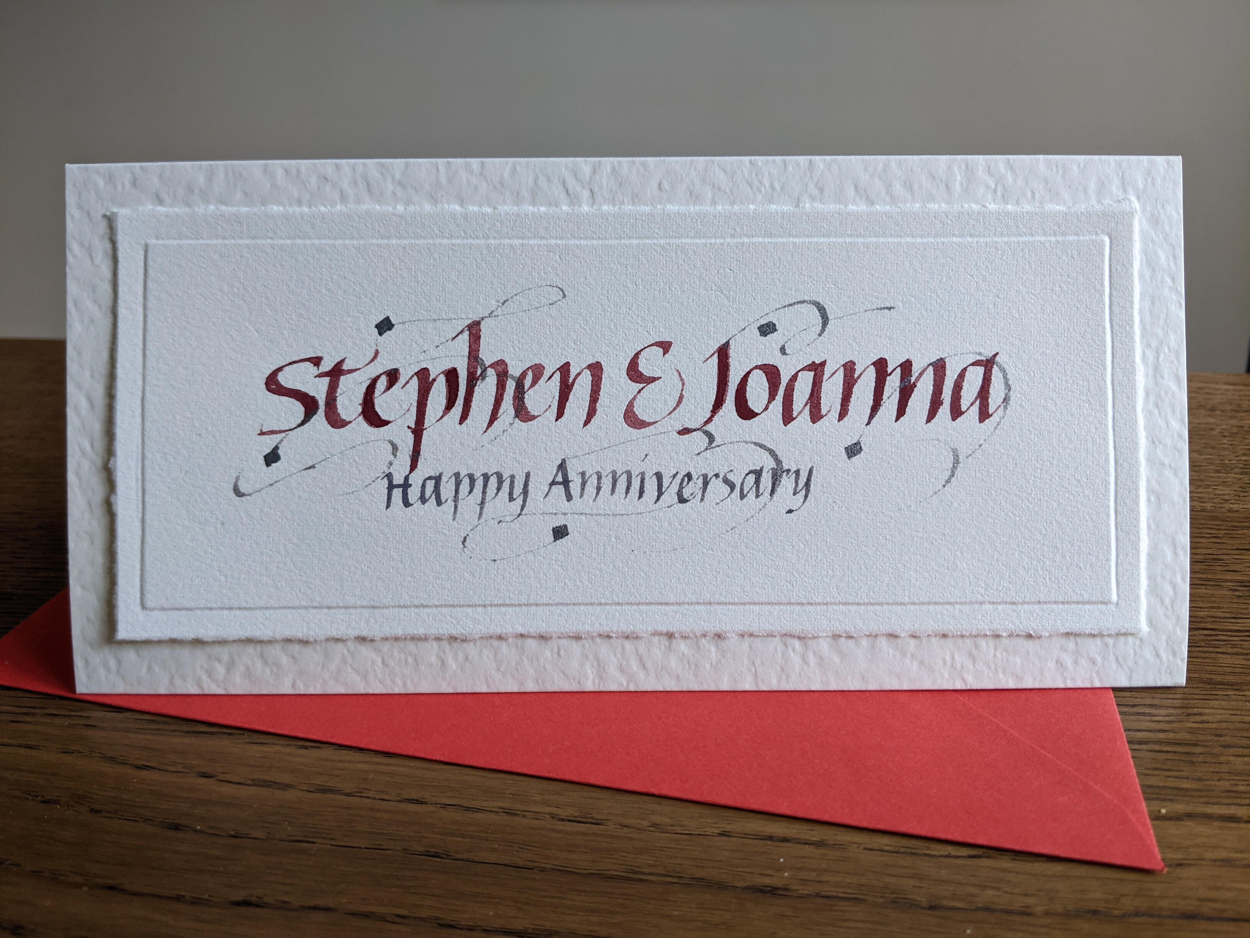
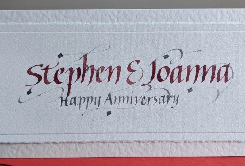
9. Anniversary Card: We're ready to make our anniversary card. This is speeded up. I'm not writing this fast. I'm writing the names in gouache, which I have diluted to the consistency of single cream, and I'm applying it to the nib with a brush. I've used a reasonably large nib for this first stage of writing the names. I've written happy anniversary in rough on this piece of scrap paper. I'm using it to center the greeting. I'm using a smaller nib, I've put the guide above the names and now I'm writing happy anniversary using that as a guide in a smaller nib. As you can see, I actually have not kept to the guide, but it's still good enough and it's still central. This is what we're aiming at. How much as these flourishes, we're going to practice them now. I'm using clear water colors in a color that's called Meteor. I'm just dragging out for wet ink and practicing the flourish in the air. That's a good idea, practice your flourishes before you do it on the card for real. Try lots of different directions, lots of different options. You can see the brush that I'm applying, the water color with the brush and that's the same way that I did the turquoise gouache. Now I'm going to do it on the card for real. I'm choosing to space out my little squares. It's easy to choose the first one and make it quite watery, so this ink to drag out, and then second one a little bit further away. Just try in the air before you actually put pens paper. I dragged out the ink there but it doesn't matter. Bit of the blue gouache got smudged, but it won't notice overall. Here is finished. I've done six altogether. I'm adding seventh one because it's nice to have odd numbers. There it is finished. I am using a light box and a piece of card with 16 centimeters by 6.75 centimeters. I'm using this to center the design. I'm just moving about until I'm happy. Now it's centered. Now I'm taking an embossing tool. I'm going around the edge and that's going to create a nice raised border. If you don't have a light box, you could use a window and take hold of this to window. If you don't have an embossing tool, you could use a biro that has all of its ink used up. A ballpoint pen will provide that ball tip that you need. You can see I'm going around it quite a few times, and that's the final result. That gives me a guide at which I can now tear the paper. I've got a half a centimeter border round the edge there, quite useful with this ruler. I can see it and all fold up. Now I'm going to take a piece of A4 card and I'm going to fold it in thirds. I have this nice guide. But if you don't have one, it's actually 10 centimeters approximately that you're going to score. I can score my line there at 10 centimeters. Really handy if you've got some tool like this. Then I can fold in the chief flaps. What I'm going to do is stick one of those down to make my card. You could cut it off if you prefer, but I like to stick it down. Just with a bit of double-sided tape, secure that side. Now I've got my card blank. This fits a DL size envelope. All I have to do now is stick that on. Again, I use double-sided tape because I find glue will potentially come through to the design on the front or make or cock all the paper. Double-sided tape position, and stick, and there you have it. That's the final project, and make sure you upload yours to the gallery because I can't wait to see what you've done. Take these principles and be creative.
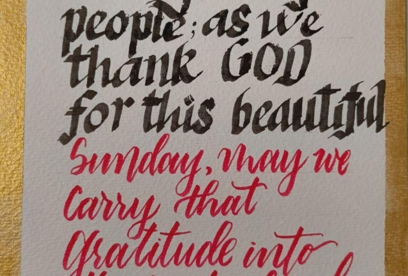
10. More ideas: What can you do next? I have some more ideas for you. Here is a birthday card. I think this project is actually simpler than the one that we've done. I've written Happy Birthday and the name of the person. I just want to point out a few things. Here, I have not written the name in a straight line. I've bounced up and down. That can be effective. Here it's very subtle. The D is slightly higher and then it comes down and down and then back up again. Don't overdo the bouncing, but have a go with that. Also, I have taken a colored pencil and I've filled in this kind of ribbon around the name to make that stand out. But notice that I haven't gotten right up to the letters that I've left a little white band, which just work slightly better having that white, it lifts it little bit more. I've also used a couple of pieces of contrasting card that lift the design. In this one, I chose the cards and then I felt that the overall design was a bit dark and that the white in the middle was too small. So I added this ribbon of writing around the edge in a white color to try and lift the cards. You could do that with a white gel pen and your own handwriting if you don't know that particular modern style of calligraphy. This card was a sympathy card for someone who had gone through a difficult time. Notice that I've used three different sizes of pen. The With is a different size of pen to the Love and these two also different. I think maybe four different sizes of pen and using the red to contrast with the black and the red border, I think is effective. I would just point out that I didn't just write that straight away. I had to do lots of trials and roughs in order to get the widths approximately the same so that it would actually work. Don't expect to just be able to write it first time. This birthday card, I wrote the name really in a large pen. It's on water color paper. So what's happened is that because it's a bit bumpy then as the pen has scattered over the surface of the paper, it's left these white bits. I think that's really added to the design. I like it. I then this time I've done the infills again, but not with a watercolor pencil this time, or just an ordinary pencil, but with watercolors and a small pointed brush. Again, I've left that white edge there. Then I've taken smaller nips to write the rest of the text, and also added more of that infilling there on the date. In this card, I've taken a Bible verse and I've written out the whole thing in a block. Again, I had to work out the interlinear spacing in rough and the lengths of all the lines in rough. Before I did it, I've used that tone effect like we did in the project. I've used some gold here, that would be for another class. I've also used some blending of goulash. Can you see it goes from green to the turquoise and back to green and back to turquoise. Again, that would be in another class, something to look out for in my future classes. This is another idea other than a card. It's just a simple bookmark, written a little quotes, and added some card behind it at a hole a ribbon and you've got a nice present for someone. I've got some here that I made for a retreat that I was leading for the participants. You can see how a hole in a ribbon really just lifts it and it makes a nice present, really good idea for weddings as well. Here's a quote, I've used two different sizes of nip and two different colors. The bottom part is the translation of the Latin. That's another idea, write out an important quote to you. Again, I had to do in rough in order to get this centered a bit like trying to get the Happy Anniversary centered in our project. Same sort that I used there. Another slightly longer quote, slight subtly different size in the middle and centered again so around a middle axis. As before, I had to do that and work it all out in advance. This is a book that I made. I'll show you the whole thing in the next slide. But something to point out here is that I tried to write justify. That's actually quite hard to do and again, worked out beforehand. But then when you actually do it in practice, it doesn't always work out exactly as you planned. This paper is interesting. It's got fibers. It's a source of handmade paper and they can catch in the nib. It does take a bit of care to write on that kind of paper. Here's the whole thing and it folds up into a long thin book and there's a little strip of paper that slips around the outside to keep it all together. Here's my last example. A Latin. In the beginning was the Word and the Word was with God translation. Here I have written the lines in the gold goulash, and then I wrote, when that dried afterwards I wrote between the lines. So that's something you could try rather than trying to write on a line that you've drawn. Draw some lines and write in-between. That gives this slightly dancing effect as well. Yeah, so try that. I hope that you've got some different ideas. Italic is very versatile. There's lots you can do with these advanced projects if you're more serious, if you keep practicing, develop rhythm and flow in the script, which only can come through writing lots and lots and lots. [inaudible] time to go away, be creative. I don't mind what you've tried, but I'd love to see it in the project gallery. It could be card or a little quote or a bookmark, any of these ideas. Yeah, your time, go and be creative.
11. Bonus Lesson: Historical analysis: I've added this extra lesson on the historical basis for italic because it is important to know that calligraphers have studied these manuscripts and learned the characteristics and/or seen characteristics that all of the different italic scripts have. If you do this, it's a good exercise because it will mean that you're not copying someone else's script, you're not copying me or another calligrapher, but you're putting those principles into practice. Then your italic could be your own scripts. It's a bonus lesson, but it's quite essential to do if you want to take this further. I hope you enjoy this lesson. Calligraphers base their scripts on historical manuscripts. Here's a beautiful italic script from 1545 by Bernardino Cattaneo. Look at all those lovely flourishes. It's a beautiful example. We're going to look at a blown-up version that will help us to see what the characteristics of italic are. I'm looking at the o, on the top line here. Looking at the width of that o and that is giving us a guide as to the rest of the letters. It's quite narrow and all of the other letters are based on that o. The n has this distinctive asymmetrical arch. That arch creates this little triangle. That can be seen in the u as well because it's got the upside down arch so saw that in the a and the d and in n. All of these letters have the same characteristics which mean that they belong in the same family. This is called the ascender. These are quite long, almost as long as the height of the basic letters. Ascenders and descenders and this distance, the interlinear spacing is quite large it's actually about 2 1/2 times the height of the letters and that's to make space for all of these ascenders and descenders. Another thing that we can see from this manuscript is that the letters are actually leaning forwards pretty consistently by a few degrees and you can do it an upright italic script. But generally, we lean forward just a little bit. Here's a second manuscript by Bembo, also written in 1543. We can see the similar lean, it's not the same name, his individual script. We're trying to create our own individual script by using the principles. You can see the actual size there at the bottom. It was actually very small. There It is as a block, it's beautiful.
12. Final thoughts: Thanks for joining this class. I hope that you have either learned Italic or improved your Italic, that you've understood the principles behind it that will enable you to get better results. I hope you've managed to make a project for friends, their anniversary, or any other type of card. Do upload any pictures to the project gallery. Thanks for joining the class, and I hope to see you in another class soon.
 Sunita Auger, Gloryletteringstudio