Transcripts
1. Intro Video: [MUSIC] Hi, guys. In this class, I am going to show
you how to create a succulent with four
different mediums. That is graphite, watercolors, acrylics, and digital. The reason I have chosen these four mediums
is because they all have a big part in
my everyday life. For instance, I use graphite pencil drawings
to get better at my drawing and
observational skills to sketch the stuff I'm going to paint and to actually
observe the world around me. I am creating most of
my illustrations with watercolors still because
it has its positives, and I just love
creating with it. Then with acrylics, I am painting
approximately one painting a month with acrylics
because I just can get rid of that painterly feeling when I have to finish
Canvas in my hands. With digital, it is just so trendy and popular
and practical. I started to paint
digitally few years ago, but I got my iPad
Pro this January, and I'm really into
digital illustration now. It was just so interesting
to translate everything I knew about the traditional
medium to digital medium. I really want to share my
knowledge with you guys. My name is Alexandra Gabor, and I am a professional
art teacher and artist and illustrator and
mother of dragons. No. Mother of two. What we are going to do in
this class is actually, I'm going to create and
paint this succulent. I'm going to draw
it with pencil. I am going to show you the easiest way to
recreate it really nicely. Then we are going
to do the same with watercolors and create a full watercolor
illustration piece. Then with acrylics, we are going to paint on Canvas. With digital, I'm not going
to use my illustration style, but rather to replicate the process I'm applying in this traditional
mediums into digital. This is the graphite drawing, and this is the
watercolor painting, the acrylic painting. This guy. No, this is not a photo.
This is a painting. Within each of
these videos that I dedicated to the medium
like the graphite part, the watercolor part,
and the acrylics part, I'm going to go through
several points in the process. From creating a general
sketch that we will use, through the entire process. How to get it to the
surface of the medium, like the sketching paper, watercolor paper, Canvas. Then I'm going to show you
the supplies you need, then I'm going to point out the key points in the process. Most of these artworks took me more than an hour to create. We are not going to [inaudible]. I'm going to speed paint
and note the key points. Then at the end, we are going to
have a big summary, which is the art battle. I'm going to compare
some things like, how much money do the supplies
cost for that medium? How much time did it take
for me to create a piece, and actually, how much that one piece cost me
in that medium? It will be just an
interesting info to do. Why is this all important
for you, you might ask. The answer is because you
might create in one medium, like you might just painted watercolors and never dab into digital or acrylics
or you never thought about creating value
studies in graphite. Maybe if you would just gas
an insight to these mediums, you would just enrich yourself. Not just with knowledge, but maybe motivation to do them, or to try them out, or let go of the fear
that you need to be exclusive for one medium
like you don't need to. Another big question is, who is this class for? I will just read it
up from my iPad. I created, does nice
[inaudible] for it. This class in grade for
every creative if you are a real beginner
in even drawing. In the graphite part, you will see how an
object is built up. You will learn what
is grayscale values, how to apply beginner
shading, true story. Then in other sections, you can see which medium
requires, which supplies, techniques, abilities,
and you can decide for you
which road to take. If you are already creating, let's say in watercolors, you will see how different is to work with acrylics on canvas, how to build up a
digital painting. If you are into digital media, it could be
beneficial for you to see how real paint works, and it could add to your
digital illustrations. Or if you are using
acrylics already, you might see my own process
and how I work with it, and maybe that will enrich you. [MUSIC] I think
everyone can find his own important and useful
information in the class. I think I just overdone
this intro video. [LAUGHTER] If you
are ready to see me creating these pieces, let's dive into it. Just a note. It was so demanding to
paint it four times that I will not paint a
succulent again in my life, but don't tell him. [MUSIC]
2. The General Sketch: [MUSIC] The general sketch. For the sake of time-saving, I'm going to create now a general sketch
about the subject and what I'm going to
use for it is my iPad. I could spend time to create a sketch by observing
the reference, which is now a real succulent and I totally
recommend you to do so but as I really
want everything to match and to save time, and to show you also
how I trace sketches, I'm going to do it like this. I make a photo of
the succulent on a black background
with the iPad. You can do this alternatively
with your phone or camera, then put the image
into your computer. Then I open up Procreate, which is a digital
painting program. Set the image less
opaque and simply draw the contour lines of the
leaves onto a new layer. [MUSIC] I don't
forget to include the shapes of the shadows and the shapes of the highlights as having these shapes
on the sketch, is essential when using a transparent medium like
graphite or watercolors. I also don't forget to
draw the pot as well as I really need the
circle to be precise, and I also note the cast
shadows of the leaves. When I'm done, I turn off the
reference photo and I have a nice clean sketch that I
will use in all four sections. Now, an alternative
for this could be just drawing onto a tracing paper
on your computer screen, or printing out the photo and
tracing it on your window, or drawing by observation. The point is to get
this sketch with all the shapes needed onto
a screen or onto a paper. I am including this
general sketch for you in the resources section
so that you can use it if you wish to follow
me with your medium.
3. Pencil Drawing: [MUSIC] Let's start
with pencil drawing. I would love to start
with explaining a bit more why I have chosen to include graphite as an
independent medium in this class. First of all, drawing is the most essential skill
in every creative sector. Now we skipped actually
the observational drawing, which is very important, and there are people who would call this tracing cheating, but keep in mind
that is their issue. If you are using your
own reference image and you have low
drawing abilities, but still would love to
have good proportions, you can trace outlines. Creating a sketch
is like introducing yourself to the subject
you are going to draw. Even after tracing, I already know the shapes
I'm going to create. I know approximately
where my shadows will be. If I have very
contrastive highlights, so it is very important in transparent mediums
like graphite and watercolors to know this. Because we have to work from
light to dark and we need to leave the white of the paper as the whitest white
in our drawing. Creating a gray scale
drawing before painting, let's you know your subject, even in the sense of color, you will know where
you will need to apply lighter or darker
colors, for instance. For drawing supplies, I have
a sketchbook from Fabriano, freebie pencil for Lindberg, and a 9B pencil for shading. Using a sketching paper is important because
it's texture helps the graphite to come down from the lead and enter
the paper texture, which adds to the
drawing experience. You can create a lot
nicer drawings with less effort with
quality materials. The way I'm going to
trace this general sketch onto my sketching
paper is simple. I will use the iPad as
a drawing light box. You can even purchase a
drawing light box for this specific reason on
Amazon from around $20. I will turn off all the
lights I have in the room, darken the window as well
and then I will be able to see through the paper and
trace the main outlines. I might also need to set the brightness of my
screen to the highest. [MUSIC] When I'm done with this, I just add the remaining
lines I didn't see well and correct the sketch
on my sketching paper. What I'm going to apply in this pencil drawing is the
reverse shading method. This is a shading technique I
love to teach for beginners because it gives more
control over the values. Basically, there are five values we are
going to apply here. There are a lot more, but five is enough
for beginner shading. You remember I said that
with transparent mediums, we need to work
from light to dark. That graphite is a
transparent medium in a sense that the paper can be seen through it and you need to keep the
white of the paper. There are white highlighter
pencils out there, but let's keep this simple. Now in the reverse
shading method, we start with the shadows
which are the darkest value. Then the lightest
value is the white of the paper and then we have
a mid-tone in the middle, which is the midway between our darker shadow and
the white of the paper. What we need to do now is to fill in the two midways between the mid-tone and
the shadow and the white of the paper
and the mid-tone. Now we have the five
values we will apply. Let's see how it
works in the drawing. With the reverse shading method, you start with the
darkest shadows. This is exactly what I'm doing. I start with a
darkest shapes and fill them with my darkest value, which I can get
from the 9B pencil. When I have this, the
only thing I need to do is to leave the
highlight shape of the white of the paper and fill the remaining part in
with the mid-tone. To get it to other values, I use the eraser to make the gradation between the white of the paper
and the mid-tone, and I use a pencil to make a nice gradation between the
mid-tone and the shadow. I try to work from area to area, so I apply this process
to all leaves separately. While drawing, I constantly observe the reference
picture I have taken. I have it displayed on
the iPad next to me, you just can't see it. What can help beginners with
getting the values better in the reference images is
setting its saturation down. Basically you will get a black and white image
you can use, however, it is a good idea to practice setting the saturation
higher and higher as you progress to practice seeing values in a colored
image as well. A pro-tip here is also to
use a simple office paper to cover up some finished areas so that you don't
smudge everything. To keep it nice and clean, and to have a place
to rest your hand on while drawing as
it can get tired, mainly in detail and big pieces. By fixing your hand, you also get more stability. I go round and round
in the succulent. The reason I started at the outer leaves is
that as you can't draw white and the upper layers of the leaves are brighter, you can make them pop by making these lower leaves darker. This way, you can make sure you will not make your
drawing too dark. That could happen if you
would go the other way. One rule in drawing is
not to draw out lines. Meaning that if you take a
look on any real object, you cannot see any line-work, only light, shadow and color. When you are drawing outlines, when you are drawing, you are actually just creating guidelines for applying
light, shadow, and color. This is why we should always draw these outlines
really light, and if you look at a succulent, you can notice that
the shaded leaves don't really have outlines now. It is because I include
them in the shading, mostly into the parts that are behind what I'm
actually drawing. In this case the leaves
they're a layer lower. [MUSIC] At the end, I
just go over the whole adjusting the values that
I might have gotten wrong, and the drawing is finished. Now let's continue to the watercolor medium and recreate this succulent with it.
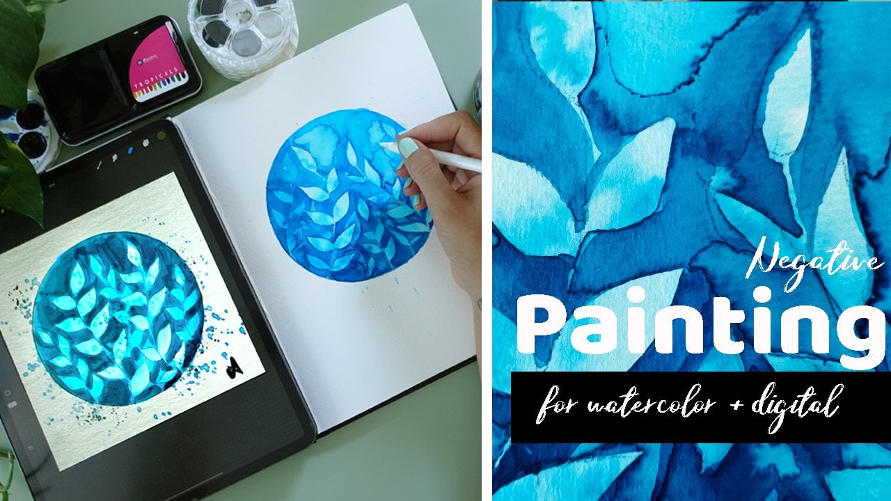
4. Watercolors: [MUSIC] Watercolor. At first, I would love to talk to you
about the watercolor medium. Watercolors are transparent
paints so you need to work again from
light to dark. Even though at first it may
sound like something easy, like kids are mostly
painting with watercolors, actually, watercolors count to the hardest painting techniques, as they can be really
tricky to master. You don't only
need to plan ahead the whole painting keeping in mind transparencies
and highlights, you also need to master
the water usage. The quality of supplies
make a huge difference. It is recommended to get at
least 300 grams cold pressed watercolor paper so that it can handle the amount
of water you use. For paints, there are mostly
two ways to get them, in half pans and tubes. My personal recommendation is to get a student
grade half pan set and upgrade some personal favorite colors
to artist-grade tubes. For brushes, the market
is again full of options. But to be honest, in this class I will be using the same middle-sized
round nylon brush for both watercolors
and acrylics. In general, round brushes are intended
for watercolors as they hold up more water
and you can more easily layer acrylic
paint with flat brushes. But I wouldn't make any
restrictions to brush usage. As I already mentioned, the key point in watercolor
painting is blending. Now, I need to get the general sketch onto
my watercolor paper. The way I'm going
to get it there is the exact same process I did
with the sketching paper. I will use the iPad as
a drawing lightbox. But as the watercolor
paper is thicker, it will be really hard
to see through it. I will need to get
only the main shapes, the pot, and the
outlines of the leaves. I also already
mentioned that you need to deal with
transparencies. We also discussed outlines
in the graphite part. Watercolors will not
cover up pencil marks. You might not need
to care about it. But if you want a clean
illustration and as you cannot erase pencil marks
below the watercolor painting, you might include this
part into the planning. What I am doing is that I'm erasing the traced
pencil sketch, but just so that I can see it and I redraw it with
a watercolor pencil. Its mark will blend into the
painting and will be seen. When I have a watercolor
pencil sketch, I add the remaining shapes by observing the reference image
and the general sketch. [MUSIC] The next step is optional. It is using masking fluid. As we need to highlight the remainder white
of the paper, it is a good idea to cover
them up with masking fluid. Masking fluid is basically gum arabic and it
is easy to peel off when the painting is
done and is completely dry. Now, you don't need to
use the masking fluid. You can just simply
be careful when painting and avoid painting
over these shapes. It is important mainly at
the first layers of paint. Another step is creating
a color palette. What colors will we need? If you take a look on this
image it is more vibrant than the actual plant which
doesn't really matter. What we will need is
dark green, light green, some yellow, and a
little bit of pink here. I don't know. What I have here, I will just show you as I'm
going to use the Winsor and Newton Cotman that I have. I have this chart I made
for my paints so that I can easily recognize what
colors am I going to use. I think I will use Hooker's
green light and sap green. They would fit the best. Maybe a little bit
of raw sienna at these parts and maybe a
little bit of gamboge hue, but it is really vibrant
and I don't want this to overwrite my greens. Maybe I will go for
the yellow walker. It is a bit more muted. There are different tools
out there which you can use. There is an app called RT. I will just show
it to you. You can download this from the Internet. You should add your image here so you can import an image. If you click on the colors
you have a color picker, it is actually designed
for colored pencils. If you click here where
is this polychromos. I just put this color picker anywhere and I can see
permanent green olives, so olive green, earth green, light green, then it's
chrome green opec, copper, raw umber. Yes, there's a raw umber
here at this part. You can just go over and see
what colors it gives you. Again, we are not going for hyperrealism or real I
don't know colorings. Our point is to go
through the process. Here is something that is black, burnt umber, Van **** brown. Can you see that? Here's
Van **** brown down here. I might use that because
I have it in my set. It is here. Burnt
umber, raw umber. It is really good to know
that these colors I have. I recommend you to get this app and when you want
to replicate an image, just go over and note the colors it gives you
and just try to match it. I had Venetian red, which looks similar to the
Indian red I have here. Make your charts and
just go over these. I will keep this app open and I will just go
back to that for reference. With watercolors, I will
not work from area to area, but from layer to layer. At first, I lay down the base greenish-yellowish
mixture with already keeping in mind the values
and constantly checking the colors on
the reference image. As I progress to outer leaves, I try to add more
greenish colors. [MUSIC] When I am done with this, I need this first layer
to dry completely. In the second layer, I darken the values by adding more concentrated
colors to the painting. I do this until I
reach a level when I can't go darker with
the colors I am using. [MUSIC] This is the time I'm
mixing my shadows. I am using a mixture
of Payne's gray and Van **** brown to
fill the darkest shadows. [MUSIC] As the background is black, and I want my succulent to pop, I paint the background with black concentrated
watercolors from Dr. Ph. Martin's. [MUSIC] I am almost finished. I need to wait until
everything is completely dry, then I'll remove the
masking fluid and soften the edges of these shapes with
light watered down paint. [MUSIC] I love to use white gel pen to add some more highlights that
I left out when masking. [MUSIC] It can give a bit of realism and
detail to the piece. At the end, you can varnish
your watercolor painting, but it is not
actually necessary. If you want to hang it, you can put it behind
conservation glass into a frame which will
protect your painting. But I mostly digitized my watercolors and
make prints from them. This was the process I follow when I'm painting
with watercolors. Now let's see the process of acrylic painting
in the next video.
5. Acrylics: [MUSIC] Acrylics. Let's start to talk
about paints in general. Every type of paint contains
pigments plus a binder. In watercolor, we
have pigments plus a water-soluble binder,
usually gum arabic. With acrylics, we
have pigments plus a synthetic binder that makes the paint waterproof
after drying. Acrylics dry quickly, which allows you to work
quickly to create layers and to paint
lighter colors over darker colors and to easily
get rid of your mistakes. Acrylic paints come in
three different versions. They can be transparent, semi-opaque, and opaque. It is usually noted
on the tubes, but the best is to make a chart. Anyhow, with watercolors, you had the white of
the paper constantly appear through the
transparent layers of color. Now, with acrylics, to have this white, you need to mix it
into your paint. Most of the time you wouldn't
paint a clean color, you paint tints,
tones, and shades. Tints are color plus white, tones are color plus gray, or white plus black and a
shade is color plus black. Apart from having
colored acrylic paints, it is recommended to have some extra tubes of
white and black. This additional white paint also makes your acrylic paints opaque which is great
when painting layers. The transparency of the
acrylic paint can be useful in the already mentioned indirect
painting method when you create an underpainting then layer the transparent
colors on the top of it. With acrylics, you paint on all different kinds of
surfaces like wood, glass, cardboard, canvas. In this class, I'm going to paint on canvas. Now, most of this pre-made
canvas are jostled, but they would always
use another layer of it. We again need the general sketch to appear on the canvas, but how do we do that? Generally, we are
going to trace again, but with a different method. At first, you need a tracing
paper or baking paper, or some thin waxed paper. You need to wax quality
because we want the graphite to stick
later to the canvas. Place the tracing paper
on the general sketch, copy it on the top with
a really soft pencil, then turn the
tracing paper over. On a clean sheet of
paper trace it again. [MUSIC] This way, you will
have the drawing on both sides of the paper, but you will be able to transfer an identical image
on the canvas. If we wanted to have
done it this way, we would have
mirrored the image, which sometimes matters,
sometimes don't. Now, I put the tracing paper on the canvas and simply
trace over it once again. [MUSIC] The graphite from the back of it will
stick to the canvas. This is the reason you
need to use a soft pencil, its graphite will
stick more easily. Now you have the
sketch on the canvas. Adjust it, fill in some missing lines,
do minor corrections. As we will paint
opaque paint over it, we will not need to take
care about the pencil marks, and we will not need the
shapes of the highlights and the shadows because
they will not help us. Anyways, I traced
them as well just to manifest their painting in
front of my eyes again. As for the supplies, I am using a basic set
of liquitex acrylics. All of these paints
are transparent, so I will use a lot of white. I haven't done a chart
with these paints yet, so I am doing it now to
choose the best colors. [MUSIC] From the greens, I'm again going to use
the hookers green and use the cadmium yellow
deep and yellow oxide which is close to
the yellow ocher. From the browns, I'm going to use burnt umber and then the quinacridone
magenta for the pink. With acrylics, I again
work from area to area, meaning that I will try to get the colors right as much as possible at the first
try on every leaf. However, I might need to move on for the next one a little bit because sometimes I need
more drying time to be able to make nicer
blend in color. When mixing colors, I start
with mixing yellow oxide with a little titany white and add a bit
of hooker's green. This makes this really
light yellowish-green color that start at the roots. Then when this
layer is a bit dry, I add the mixture
of hooker's green with little white to
make the darker greens. [MUSIC] Later when I have these layers dry, I can add just both
transparent colors on top to deepen some of
them or make blends. I also add pure white onto
at the top for highlights. Now, I don't have too
much of a strategy when painting as I can repaint and correct as
many times as I want. The only rule I tried to keep is not to paint leaves
that are next to each other right away because neighboring colors might mix
if they are not yet dry. For the darker leaves here I
create a dark underpainting, meaning I lay down a
transparent layer of brown, then paint over it with the green mixture with
a very little white. [MUSIC] I also add shadows to already
painted leaves with a mixture of brown, green, and a little white. At the end, I add some
more highlights with the white and then work on the outer shadows with pure
black, gray, and brown. [MUSIC] Then I paint the pot at some texture
with white into it and then paint around
it with pure black. Well, it is finished. I let it dry overnight. Actually, I painted this for a few days in several
shorter settings, but you need to let it dry for at least a day before
you varnish it. Just go to varnish and
acrylic painting as it will bring out the colors
and preserve it. This was the process I'm usually following for
acrylic painting. Let's see, how would I do the exact same thing in digital?
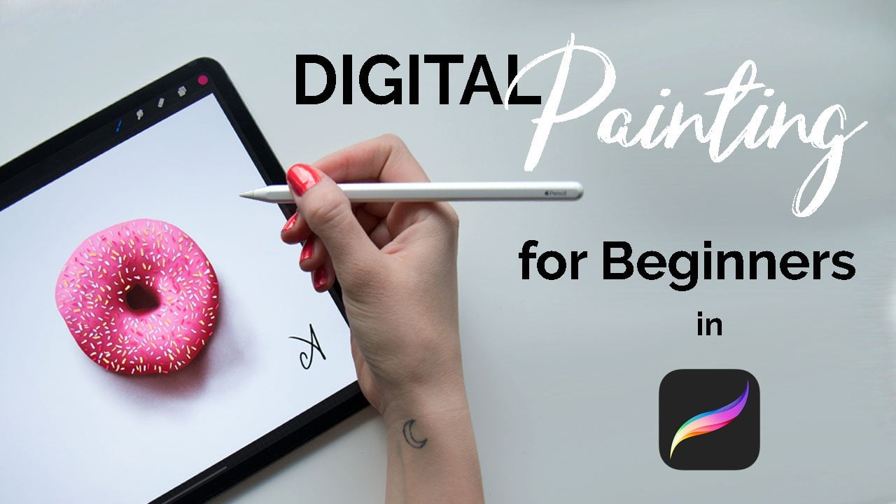
6. Digital: [MUSIC] Digital. Now you
might think why digital, if I could have done the same in oil color pencils or gouache. The reason is that because
all these mediums would have similar processes and I
don't really use them a lot. But what I do use and what
might be interesting for a traditional artist
is the digital medium. Painting digitally has
its long list of pros. Like you have all the
colors and brushes. You have a color picker
so you don't really need to figure out the
colors for yourself. You can redo and correct
as many times as you want and only by a few
taps on the screen. You can then print your artwork
as big as you want, etc. But it has its cons as well. Like you don't
necessarily end up with a physical painting if
you don't print it, all of these infinite options
might be overwhelming. Of course, you don't have the real tactile
experience while painting. This is the reason
I am not fully transitioning my
art to digital yet. It just feels so good to
work with real paint. But don't think now that painting digitally
is something easy. It also needs a lot
of skills to master. What I will be using
is a 12.9 inch iPad Pro with the
second-generation Apple pencil. As for the software, I'm using Procreate, which is a very popular creative program. This process would be similar in Photoshop with a
simple drawing tablet. But the reason I prefer
the iPad is because it is closer to the actual
drawing experience. What is great about
digital painting is that it is not a messy. You don't need any supplies, you have it all
inside the program. I'm setting a new screen sized canvas and insert both
the general sketch and reference photo into the
file on separate layers. The reason I'm inserting a reference photo is not
just for observation, but I will be constantly using
the color picker button, which when I hold down and
click somewhere in the image, it will pick the exact
same color for my brush. I have an option to create a custom palette before
I start painting by clicking on the color picker and placing the colors
on the palette. But to have a better workflow I will use the previous method. What you need to know about digital painting is that
you work in layers. In Procreate, you have
limited number of layers. You can check it in the
Canvas information. The bigger the Canvas, the lower the number
of layers you can use. But no, it is not an issue. I need now to work
from the top to the bottom so that I can
get all the pixels filled. Let me just show
you what I mean. Let's say I take a brush and
I paint something like this. You can see I have empty pixels because the brush
itself has some texture. It is not a bad thing because it will add texture
to the whole piece. But if I paint just around it, I will not have it covered. If I remove the
background layer, it will be seen through, and I don't want that. What I want now is to add
another layer below it. When I'm painting with
a different color, you see, I'm covering this up. This is the reason
we are going to work from top to bottom. I'm going to put different levels of leaves
on separate layers. I will work similarly
as with acrylic, so have layers painted in full detail then
moving to the next. Now about the brushes. I'm going to use two
different brushes. I like to call them
liner and shader. I bought these brushes on Creative Market named
Gouache Brush Pack. I will include the link
into the class PDF. The liner brush is fully opaque. It has some texture. I edited the brush itself a little bit and added
a bit of streamline, which means it is not reacting to all of
the movements I make, so I can make cleaner
lines with it. My strategy when painting
digitally is to block in a main color and then use
the gouache shader brush, which is a really
nice textured brush. I now lock the layer
I block the color in, meaning I will not
be able to draw outside the pixels I
already have painted. I take a lighter color and add a transparent layer over it, which will make a
really nice blend. Then I will repeat it with a darker color and
add a bit of shadow. Then get the original color and add a little bit from it
to the middle and voila, it is already a really
nice shaded leaf with a variety of color. These are the two brushes
I'm going to use. Let's get to painting. I create the first new
layer for the top leaves. Take my liner brush, hold my finger on the
[MUSIC] color picker, and I will just pick a color. [MUSIC] I draw the shape of the leaf with it it. [MUSIC] Fill it by dragging the picked up
color from the top. But I will go around it
once again to fill most of the remaining pixels the
textured brush left out. [MUSIC] Then using the color picker, I pick up colors
and place them with the shader brush and build up the color of
the leaf this way. I don't forget to alpha lock the layer every time when I'm adding color so that I only paint within the blocked shape. I'm going to speed this
up a lot as I'm going to just do the exact same
thing over the whole piece. I just want to point out that I tried to work on the leaves that are not exactly
next to each other. Similarly as I did
with acrylics, because even if I have delay
or logged too close shapes are not practical
as my brush will be seen on the shape I'm
not actually painting. [MUSIC] As I am progressing, I create new layers for the
lower layers of leaves. This is really great. I can rearrange
down as I want and I can move the reference image anywhere for a quicker work. [MUSIC] It looks so realistic. When the succulent is done, I place the port
below it by drawing a circle and another one on the top of it with
a lighter color. I use another
textured brush called concrete block to add a
realistic look to the pot. I also add domestic shadows and highlights and add
a black background. To To add this real
realistic look to it with the shader brush and adding a transparent
layer of white to create the real
grayish color around. Voila, we are finished. I think this is the
most realistic one, but mainly because I
used a bigger variety of colors that I could replicate
with the color picker. If I would have spent more time mixing all these shapes
with the acrylics, I could have reached
a similar effect. Anyhow, our goal was not to create hyper-realistic
paintings. Each medium has its character. My goal here in
this class was to show you all these
different processes and that you actually
really need to use your brain to plan ahead
and paint a piece. Let's just sum up
what happened in this class in the
next video. [MUSIC]
7. The Summary: [MUSIC] So here we
are at the end, all the projects are finished and now I would love
to take a look on some pretty interesting info and comparisons regarding
these mediums. So let's start
with the graphite, and let's start with
the supplies cost. For the supplies, we have
pencils and sketching paper. Looking at the
middle range prices, a set of good puzzles and 80 sheets sketchbook would
cost you around $30. For the time, it took me 51 minutes to
complete the drawing. But remember, it was done with beginner shading and
minimal details, so the time can be longer. What I wanted to add to
the graphite part is that, it is important to create
value studies like this to improve your skills
and train your observation. You can of course use
your pencil drawings as a final piece as well,
mainly portraiture. You would need to frame
it or either digitize it. So if I assume you would
use up the full set of pencils for the
whole 80 sheets, it will give us a cost for a single drawing of 0.37 cents. So the cost of one piece
would be $0.37 cents. This was about graphite. So now let's move
onto the watercolors. So the set I was using
is found at Winsor and Newton costs around $50, for 100 grams cold
press watercolor pad with 12 sheets is around $15, and a set of brown synthetic
brushes is again around $15. I don't count other supplies like the white gel
pen or masking fluid. Let's take them as optional. So it leaves us with
$80 for watercolors. For the time, it took me 1 hour
and 34 minutes clean painting time plus at around
25 minutes drying time. Let's say 2 hours to complete
the watercolor painting. What you can do with the
painting is to frame it, which will add to the
cost or digitize it, then use it for
various purposes. I would say you
use 10 percent of paints for the 12
sheets of paper, which will give us 60 stand
cost for a single painting. Keep in mind, this is a
very general calculation, not considering smaller pens
to paint other supplies, so the end cost could be
lower or even higher. Let's move on to acrylics. [NOISE] The set of paints I use
from liquid tax costs around $30 and the single 25 centimeter square Canvas cost around $9, and a cheap set of flat nylon
brushes cost around $15. Again, I don't count acrylic
varnish and just so. So the main cost for starting
acrylics would be $54. If I assumed a single
painting takes 5 percent from the 36
piece acrylic set, I will be left with $10 for
a single acrylic painting. It might sound a lot, but you have a ready
physical painting. You can hang on the
wall right away and it's value is a lot higher. This artwork is ready for
an exhibition for instance, or to right away put on the
wall with simple varnish. But you can still digitize it and use it for
various purposes. You can actually
paint with acrylics on all different
kinds of surfaces, not necessarily on Canvas. Popular is rude word, acrylic paper pads
costing at around 10 or $20 with several sheets, which will lower your cost. But I think having a painting
on Canvas is unreplaceable. For the time, it took me 2 hours
and 20 minutes to finish the
painting plus a day, at least, for full drying. It is true I have worked on
this piece for several days, for few shorter sittings. But let's just sum it
up into this timeframe. Now, let's go to the digital. This was surprising for me
as well and now in this we we'll have a lot
higher cost at first. The newest iPad Pro with the
Apple pencil cost at around $1,300 plus procreate costs $10. I would say you can create
an infinite amount of artworks which will lower the cost of a single
artwork to a minimum. But let's take an example, if you use the iPad for five years and make an
art work every week, so not even every
day, but every week. It gives us 265 artworks. That will make the cost of
a single artwork 20 cents. So we have the
winner for the cost. For the time, it took me 2 hours
and 15 minutes to finish the painting and I
didn't have the drying time. If we take in consideration
the drying time of acrylics, it has a lot quicker to finish a more realistic
looking painting with just same effort I did
with the acrylics. So that's it. Now you might ask, it is interesting, but what
to do with this information? I don't really have
a specific goal to convince anyone do anything, you don't need to be
exclusive to any technique. We need to be flexible. From my own experience, all these techniques
fit into my own life. Like, I love to create
graphite drawings while use studies
even just to draw a nice still life
and then frame it and put it onto the wall
or give it as a gift. It is necessary and
essential for all of my other work to have
their supplies and work with them to improve my
overall drawing and painting skills and actually
for relaxation. It is such a great feeling to do some graphite pencil
drawings just for relaxing. I still create most of my illustrations that end up as art prints with watercolors. Because it is fairly cheap, I can work with
it quickly and it is beautiful and cost effective, and I can digitize it and
use it for various purposes. I can print them on various products or
create art prints. Then original watercolor
paintings still has its value, so yeah, it is amazing. Then acrylics, it is just an irreplaceable
feeling to have a finished
painting on Canvas. I paint commissions and paintings for exhibition
with acrylics and even though it is more costly and it needs more time, but at the end of this process, you end up with a
beautiful painting which can go right on the wall and it is just more valuable than having
any painting on paper. So I wouldn't eliminate acrylic painting on
Canvas from my life ever. Then digital. I do editorial
illustrations digitally. It is just great that I have this infinite redo and
correction possibilities. It helps me to
explore more things, different angles, because
I'm not afraid at it, ruin my supplies like paper or wastepaper or waste
paint because I have infinite of them and
I can create more concept. Each of these techniques
have its unique character. I couldn't have done
that illustration with watercolors or
acrylics or pencil. It has its texture, it has its beauty, it has it's time effectiveness. I would say that I can create anything I want
without really fear, I can return to it
anytime and I have it here and it's just awesome. So all of these techniques have place in [NOISE] my heart, I wouldn't eliminate
any of them. There's money effectiveness, things like surprise
me as well too. It's just great to experiment, but it how much time I usually spend with a piece
which is similar, and the end cost of a piece, and the supplies et cetera. So I hope it is
beneficial for you to see these things
and the processes. Let's just move on to
the final thoughts and discuss your final
project in the next video.
8. Final Thoughts and Project Description: [MUSIC] I hope you could really take something
from this class. We've covered so much in it, like a few days of painting
with different mediums. Wow. Let's just sum up what
we have done in this class. We have painted
the same subject. It was a succulent with four different
mediums: graphite, watercolors, acrylics,
and digital. We've gone through the
whole process from creating a general sketch
then tracing that to the sketching paper, watercolor paper, Canvas. I guided you through
the whole process and the supplies and how to
use them, how to layer, how to approach a whole piece, how to approach the layers
we are painting with. Then at the end, we just took a few words about the comparisons of
these mediums and processes and how can you use them and process
them in the future? As a project, I would
love to ask you to recreate the succulent
with your medium. You don't need to
choose two or three, you can just choose
one and recreate it. I will include the
general sketch in the resources and I would really be happy to see a
gallery full of succulents, the same succulent with
different mediums. You can change the
colors if you want, you can change the
composition if you want, but I want it to be a
succulent in your median. If you will, maybe it could
be a beneficial for you as well to recreate it with two
different kinds of mediums. I'm sure you already have at least the pencil drawing
and the watercolors, so at least two of these, but you can add pencils, oils, I don't know, mixed media, crayons, I like the doors open. My other point is to start a discussion
about this topic, how do you approach
a final piece, our full painting
with your medium and what was your experience? Share with us. It would be really great to
read about these things. Now the usual, make sure to
follow me on social media, on Instagram, and Facebook. You can find me there
as The Artmother. Also, don't forget to follow me here on Skillshare to get notified when the
art classes will be out there and I'm
planning a lot. You can also take a look on the other classes
I have created. I have drawing courses,
watercolor courses, and planning so many more in all the other mediums
professional art. Lastly, it would be so great if you would
leave me a review. It helps the class rank higher so I will be able to reach
more people in the world, which is like, wow, great thing. But another thing, I really want to know what
you think about the class, how could I improve it
or did you like it? What was your experience when
you went through the class? If you learned a lot, what was the most beneficial? Please save your
time just a little bit for me to write a
few sentences about, what do you think,
because I really do care. Thank you for taking this class. Happy creating. [MUSIC]
 The Artmother, Professional Art Teacher and Artist