Transcripts
1. Introduction: Bet you didn't know that
you're this good at painting. Hello, I'm Anna Mason, and I've helped tens of
thousands of students to realize that they were already a better artist
than they believed. They just hadn't found the
right approach before. I've distilled my
watercolour method into a four step process that you can use time and again
once you've learnt it. I've been teaching students in my online school and community nature studio for over a decade. And because I break
down the steps and explain not just
what to do, but why, my students not only finish each class with a painting
they can feel proud of, but also having acquired new
skills and understanding. In this class, I'm going to
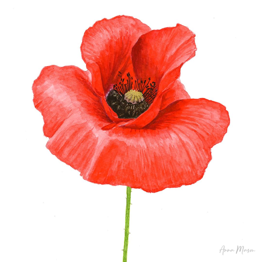
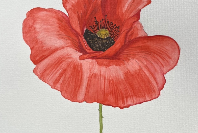
guide you step by step to paint this realistic three D
poppy flower in watercolor. You don't need any
prior experience to paint this with me.
I've got you covered. And a couple of hours from now, you can look at your poppy
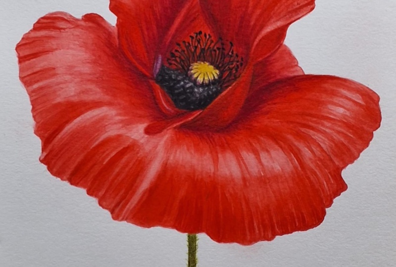
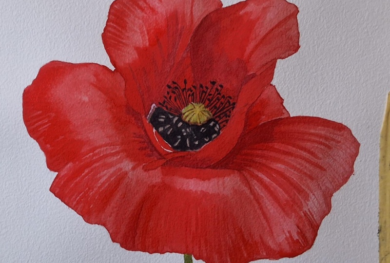
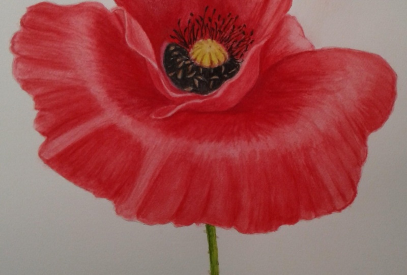
in amazement, thinking, I painted that, just like
these other students did. After making our
outline drawing, we'll begin the
painting by applying the lightest tones to each of the different color
areas within the flower, as well as isolating the
highlights on the petals, before going in with the
darkest tones and then bringing the petals together
with the mid tones. Then we'll paint the
flowers detailed center and the stem before making our all important
final adjustments. By the end, you'll have learnt my four step process and have a gorgeous painting of a flower that looks like it's
popping off the paper. It's a fun way to give your
painting skills a big boost, and I think you're
gonna love it. So join me now, and let's begin.
2. Getting set up & making the drawing: Hello. Welcome to this
tutorial with me, Anna Mason, where we're going
to paint together this beautiful red poppy flower. There's not too much
color variation in the Poppy's petals, which makes it an ideal
beginner subject. But the flower has
plenty of form, which we'll capture by painting the different tones
within the red color, as well as ensuring
that we paint our brush strokes
in the direction of form for each of the petals. I've enlarged the
flower significantly, which is going to make capturing all the detail much easier. Before we get started,
let's go through the equipment that you'll
need and how to get set up. With this class, you'll find a full list of the
resources I recommend you use plus links for where you can buy in a thing
you don't already have. You'll also find a
downloadable PDF which has the reference
photo in full color, a black and white version, and an outline drawing which
you can print and trace. You could choose to draw
your poppy free hand. If you do, try to get it as accurate to the reference
photo as possible, as this will really
help with painting it. I recommend tracing,
and for this, you're going to need
some tracing paper. You'll also need an HB
pencil and an eraser. For your painting, you'll
need watercolor paper at nine by 12 " or 23
by 31 centimeters. Smooth watercolor paper
called hot pressed, is the best for this style
if you can invest in some, as you can achieve
better detail on it. 100% cotton paper is
best for absorbency. I used a hot pressed
watercolor paper sketchbook. If you don't have
any, you can try painting your poppy
on cold press paper, which is rougher,
but be prepared that your results won't
be quite as accurate. You'll need some
brushes, and you can try using anything
you have already. Although for this
type of painting, I recommend short hair brushes
like the animation set. You'll need a water pot, and I find a small glass
jar works best for this so that you can see how
dirty the waters getting. You'll need a white palette
for mixing your paints on, and it needs to
be big enough for you to spread out
your paints when you're mixing them so that you can see how they'll
look on the paper. A China dinner plate works well. Then, of course,
you need paints, which I like to
squeeze out around the edge of my palette
and let them dry. You'll get the best results
using artist quality paints, which are graded as transparent. The make I use is
Windsor and Newton. Beware of student
quality paints. They don't contain
as much pigment, so you just won't
be able to achieve the same results that you can
with artist quality paints. You can find a
list of the colors that you're going to
need on this page. You may be able to substitute them for colors
you already have. And if you're unsure
about splashing out on any materials that you
don't have for this class, it's better to borrow from a friend or use what
you do have instead of buying inferior
quality kit which you may soon find that you're
going to need to upgrade. Once you've got your
equipment together, you'll need to
make your drawing. If you're tracing it and
it's been a while since you last traced something,
here's what to do. In the reference PDF, I've created a mirred version of the outline drawing
for easy tracing. Step one is to print that off. Step two is to place
your tracing paper over the top of the printed outline and then draw over the lines. Step three is to flip your tracing so that
it's the right way up, position it on your
watercolor paper and scribble over the lines. Hold the tracing
paper firmly down so that it doesn't move
whilst you're tracing. Lastly, step four is to compare your tracing to
the outline drawing, lightly add in any
lines you missed, and use your eraser to lighten any lines
that look too dark. We want the pencil to be faint. We'll be painting based on the color reference
photo in the PDF. So whilst you're
working, you want to be able to view it on
a screen nearby. If you're lucky enough to
have two screens available, I suggest having the
reference photo open on one screen and the
tutorial open on another. I use an iPad for viewing the reference photo as they
have the best color accuracy. If you don't have two screens, you'll just need to hop between the tutorial and reference
photo on the same device. So you'll now need to
gather your materials, make your drawing, and then
we'll get down to painting.
3. Petals - lightest tones: Let's begin by painting the lightest tones within
the red of the petals. There isn't a very wide tonal
range within the petals, as you can see more clearly when we turn the photo
black and white. The lightest parts within
the petals are found here. Whilst they're not super pale, we always want to be cautious
with watercolor because it's so tricky to lighten colours once you've
painted them. So for this mix, I'm going to work really watery and pale. I'm going to use my
size three brush. I may want to go up a brush when I'm working
on some larger areas, but I'm going to work
with scarlet lake. That's going to be our main base color throughout
all of this, because this is such
a great match to the very vibrant red that we can see in
the reference photo. And I'm going to
take it quite pale, quite watery. Let's
just test that out. So I'm obviously looking to match to those lightest tones. I'm going to just
test out down here. And when it is pale like that, it goes quite pink because it's obviously got the white
of the paper coming through. I think that's good
as an initial layer to put down to match
to those pale parts. So I'm going to just
start to apply it, and I'm going to
apply down here. Now, this is an area
of the highlight. But what I'm going
to do with this is also apply this into
the rest of the petal because this color
will be able to sit underneath the darker reds
that we will apply on top. It's not going to negatively
affect those colors. It's not going to interfere and visually mix on
the paper with them. So we can sit this underneath. And it means that there are other little gaps like in here, there are some little flex
through to a lighter shade. So it means if we've
got this underneath, we can leave little gaps
through as we layer up. Now, I'm using the
tip of the brush to make sure I'm working
within my pencil outline, and then I'm going in lines following the form
of the petals. So as I come up,
I'm straight here, and then I'm curving around. I've drawn in these kind
of lines to help me where I've got some darker
lines within the flower, where I can see some darker
creates. I've drawn them in. So that's helping me. But mainly I'm just looking
back and forth to the reference photo and really trying to follow
the direction of form. And it's looking for the veins, it's looking for any sort of
visual texture in the way of lines and just looking to make those markings
in that direction. So broadly, it's
basically long strokes up here and then
changing the angle. So here, we've got the petal. If you imagine it
was really here, the petal is folding
out in front, so those lines with the brush
can come down like this. When we get to the
edge, we have to work in the other direction to make sure we
get a crisp line. And by doing this, as well, what you're doing
is you're getting overlaps with your
paint as you refill and reload your brush and where the paint's already
dried and you get little overlap so you
get a darker line. That's fine. That's
actually going to start to create some of that
visual texture in the way of kind of veins. It's going to start
looking like veins, so it's really helping us
when we have those overlaps. So it's nothing to
worry about at all. You don't need to be aiming for a really smooth finish here. But then as we come round, so I'll just fill the
rest of this block in. So I just had to
remix a batch there. I don't tend to mix up
massive quantities of paint. That's just never my way. I just remix quite frequently, and you're never going to get
the consistency identical, and that just doesn't matter. Most of this is going to
have another layer on. These O highlights are
kind of in here somewhere. But for this stage, it
really doesn't matter. If you've got a
slight difference, there is variation within here, so just don't worry about it. Now, as I come up here, the lines are coming
out from the side. So if you were to really
imagine this is three D, this petals coming out
in this direction. So we're going to mirror
that with our brush strokes. And I'm going up
to the edge there. And here this comes down, but I'm just following
those directions. So it's the same
brush technique, but just following the curve.
And I'm putting it in here. It's much, much darker in here, but we will layer that up. This is a good base
coat to have down here. So I'm just going
to go ahead and do that to the rest of this petal. It's so much fun working with these vibrant color and just
starting to lay it down. And because we've got
the pencil drawing there that we can
be confident in, it's really quite relaxing. I feel it's almost a sort of coloring in process
at this stage. So really enjoyable to work
with this lovely color. And this process is
going to continue basically all the way
around with these petals. So for instance, up here, just really paying attention
to the way that this petal has almost a bend in it, so it goes like this. So I'm going to be
following that around. You have to I'm putting in a few strokes to kind
of show you that form. And I'm getting this
from looking at the little crinkles that we can see, and
they're quite subtle. So if you're new to this,
you may be thinking, Oh, I don't see what
she's talking about. But actually, if
you really look, you'll start to see those
crinkles and see those lines. And I've got a few of them drawn in there as a guide as well. So if I put those in
to sort of show you the direction of form and how
it changes on each petal, and then I'll go through
and block these in. And the only other
thing to mention really is that where we come up to, I've marked in here
a paler section, which is a sort of pinky color. I'm going to hold off
from working on that. So I'm going to go,
like, around that and then in the center, let me do the center first then. So there's a black area.
This is all black. We're going to paint this in shortly so we can map it out. But for now, I'm going to paint this red up to the center. I'm going over the
little stamens and anthers filaments and anthers.
I'm just painting those. We'll paint them in
later. But for now, I'm just getting this same mix down over those areas
that we know are red. So it's just everywhere that's red is going to get
this color for now. So that'll be in here, too, even though it gets
much darker in this portion of the petal,
we'll leave that for now. And then I want to just leave. There's just a few areas that
are lighter than this mix, whenever we're working
with watercolor, we want to be applying
our mix to areas that's this hue and tone or darker. So we hold off from applying
anywhere that's lighter. And I think within here,
there's just a couple of little places where it's
lighter. The colors lighter. So, for example, I think it's on the tip here of this petal, this little fold of petal. If I fill this in, I want
to just leave a little gap. Now, you might even
want to go down to a smaller brush because
with this larger brush, that's pulled and it's
making it a bit darker. But I think that's okay. But if you see here,
I'm just going to carefully leave
that little line. If you find that that's been too difficult and you've gone
over it, don't worry, it's not going to make
or break your painting, but it's Lee's little details and really looking for them and trying to incorporate them
that does enhance the realism. So I'm just going to try and
leave that little gap there. We'll have to paint something on it later because
it's not bright white. But we can work on
that in a later stage. Might be a lighter bit there, but probably not I think we can use this mix basically
everywhere else. It's maybe a little
bit lighter there. I'm just going to add a bit
more water to my mix for this little section in here just to ensure that it's
nice and pale. But then coming round here, yes, I'll just make it really clear for you where
the direction of form is by painting in these kind of stripes to show you first. I'm basically just doing, like, one brushstroke in a few
places just to enhance that And the great thing is working in this watery
layer to begin with, if you get your direction
form completely wrong, you'll be able to
correct it later when we work in a darker, thicker, darker layer when we layer up to create
the darker color. So it's all correctable when you're working in
watery layers like this. And then these are
coming out like this. It's actually really
quite tricky to see what's going on in
this particular bit. I think that's the
one petal there. This bit, if there was a direction of form to be painted, it would
be kind of like that, but I think we can get
away with painting that basically as one solid block. But even at this stage, see, I'm really like working
with those pencil lines and reinforcing them by painting up to them and not
going over them, so we can start to define those petal sections
with our paint. And over here, we've really got these lines that come
kind of up and curve. And then it gets more
kind of like that. It's hard to tell, but
that feels about right. So I'm going to go
in there and fill in the rest of this and we can just kind of speed
through that it's the same brush technique. A
4. Flower centre & stem - lightest tones: Next, let's paint
the flower center. We'll start with
the lightest part, the central part that's
called the stigma disc. And I'm going to use the
I'm going to go right down, I think, to a zero brush.
Make sure it's clean. And I'll start with a base of Windsor lemon because it's
quite a yellowish color. But that's way too
vibrant and it needs to be muted down and I think
almost a more red color. I'm concentrating
at this point on the sort of little lines. I can't remember
what they're called, but they go along
in these ridges. So I'm going to add to it a
little bit of my red neutral, which is the burnt sienna. And I find that when I'm working with these
very lightest colors, it's best to go on the side of bright perhaps a little bit brighter
than you think you need. Keep it watery, though, because we can always mute it down and darken it up later. So for these, I'm
just going to start. I'm going to apply
these little lines. Now we've got darker
parts to them down at the bottom, but I'm
just going to work. I've got pencil lines
to guide me a bit. We want to try and get
this reasonably accurate, but it's not going to be the
main focus of the painting. You know, the
glorious red petals are really going
to be the feature. So we don't need to
get the color spot on. I'm just going to add a touch of permanent sap green.
Keeping things water. I've just gone down to a treble
zero, actually, as well, because unless you've enlarged
this more than I have, it's still a little
bit challenging to work on these small areas. So I'm just filling
in the gaps between those lines, and ideally, I'd have wanted that
to completely dry off, but I think that's fine. They're not very
clearly defined. The red, by the way, has
dried off because I was working kind of around and I'm not working with much
paint. That's all dried off. So this isn't gonna
bleed into that red, and that is important
to make sure that your red is nice and dry
before you start this. Now, down at the bottom here, there's a more sort of
purple, almost pink color. So I'm just going to try a little bit of
quinaquadone violet, which feels too blue. I'm going to add to
it. I'm going to use a little bit of opera rose
to make it more pink. If you don't have that,
you could probably just add a bit of the
scarlet lake to it. It's not, as I say, not a really important
color for the painting. But it's nice to
have that little bright touch of brightness, which we can always
dampen down later. So I felt a bit too dark. I'm just going to
water that down. It's a very watery
and dilute color that we're looking for. And just paint that
to the bottom there. We've got these
darker bits on here, but we can work into that later. This is really just
to try and map out the lightest possible
colors within each area. This pink mix, I'm going to
use up in this area here, which was in this sort
of transition, well, this little area between the red of the petals
and this darker color. Now, this is really
dark in here, but I want to just pick out with a slightly lighter brown some of these little ana that
stand out against it. So let's use some burnt
sienna and some pains gray. Now, that pain's gray is really potent, so you
don't need very much. I'm just going to
mix those together. N a bit more of the burnt sienna to make more of a brown mix. And I think for that
first layer, that's fine. I mean, I might actually even pop just a little bit
of the scarlet lake and you could take it from
the palate there just to slightly warm
that up even more. As I said, it doesn't
need to be very accurate, but we really just want
the tone to be right, so keep it nice and
watery at this stage, and I'm just going to place
that sort of over these. I'll try and
actually, I was being a bit slapdash there because I was thinking I can negative paint around them
with the dark color. But of course, it'll
be easier to do that if I paint them
in the right places. So I'm just going to work within those bits of pencil I've got. But I'm keeping looking
and checking against the reference photo especially
if you've trace this, sometimes it won't be
perhaps quite right. But we just want to
get a few of these in in the rough sort of place. It doesn't need to be perfect. It's just to give an
idea of that kind of full poppy center
that we've got there. So now, all that remains in the flower center
is just to get a pale version of the black
color down in between. So let's just add in a bit more of the pain's
gray to that mixture, that brown mix I was just
using to create a more neutral it's sort of gray, basically, watered down black. Something like that, we'll come back and darken
up some more. Well, let's take it a bit dark. The reason I don't
want to go too dark is because
we're going to be working with these red
paints around this, and we don't want if we went straight in with a really
thick black in there, we might end up
making that bleed when we worked with some of
the red paint close to it. So let's keep it at this kind of really pale and
watery consistency, just to map it out so we're really clear what
colors go where. So that's probably a bit blue. Doesn't really matter because it's going to get painted over. So let's just work with that, and I'm just going to go in. I'm still with my treble zero. You could probably
go up a brush size, but because I've got to
pick out and go around those little antha I feel more comfortable
working with a small brush. If you go over
some, don't worry. You can always lift off with
some damp kitchen paper or just make another one in an area you haven't
yet gone over. So if you wanted to do that, you just paint around
one like that, do a little border,
and then work around it. That's easy enough to do. And again, if you get
overlaps like this, this little patch is
looking darker than the other areas I
had, doesn't matter. This really is just about
mapping out so that we can clearly see what
colors go where, and the painting
can feel like it's got some definition
going forward. So I'll just finish
that off working in this central area
with the same tip of the brush technique so
that I'm really placing this color exactly
where I want it. As you come up to that petal
in front that's all dry, just try and create a nice kind of horizontal it's
not quite but, you know, we're defining
that edge of that petal, so try and get a
neat edge there. I'm always resting my
hand on the paper. This is all dry, so I
can do that easily. The other thing to
say is, it might be tempting to want
to use this color on the little stamens up here because they are
this dark black color. But we've already
outlined them in pencils, so we can already see
those quite clearly. And I wouldn't want to do that with paint
because we're going to need to darken up that
red behind them so much that we would end
up making that color bleed. It would be very hard
to work around them. So we will add those in
once we're confident that the red of our
petals is looking right. Now let's paint in the lightest
colors within the stem, and I'm going to continue to use my treble
zero brush for that, although a zero would
probably work well, too. So we just want to create
a pale yellow green color. So I'm going to use my
permanent sap green, and that's my yellow for mixing greens into and plenty
of the Windsor lemon. Again, just it'll tend to dry a little bit less
vibrant than that, so that looks pretty vibrant,
but let's go for it. Now, in my drawing of the stem, I haven't added in all these
little kind of spiky bits, but we can do that later on. We'll probably
come back to this. Once we've darkened
up the flour, it'll be easier to see how
dark to take the stem. So this is just our first
initial layer. Here we go.
5. Petals - next lightest tones: We've got the paint
down everywhere now, but before we begin to
really darken up the petals, I'd like us to be
able to clearly identify whereabouts those lightest parts
of the petals are. We painted that light color
over the whole of the petals, so at this point,
we can't clearly identify where they should be. As a reminder, they're
in these areas here. So to be able to see
them going forward, let's now apply a second
layer of red to the petals everywhere except
these lightest areas, so painting around them. For this, we're going to
stay cautious and stick with the same sort of pale
red mix as before. We're going to go back
to the three brush. And just re wet that and add a little bit
more of the scarlet lakes. It's just pure scarlet lake. And I just test it, check it similar. So it's really pale. And working this way means that the transitions between the
darker color that we're about to paint and
the lighter one we've already painted can be reasonably smooth just by the fact that they're
not too sock. So I'm going to start
by working in here, and I'm just outlining
the highlight is in here in this
kind of curve. So it comes under like this.
We don't have anything. We don't have a
drawing to guide us, so we've got to really
carefully look. So I've had that little bit of sticking out petal that
I can see as a guide. The highlight comes under that. And down here. So obviously, where
we've got a bit of variation, for example, I had a lighter strip and
then a slightly darker strip, which is just a natural
variation of how I'd had my mixes and
how I'd painted before. We just want to try
and counter that by we want to be able to
see these highlights basically at the end
of this section. So here, I just want to make
sure like this strip that I leave is going to pop
out to me as lighter. So it might be that you
need to make the paint pool a little bit more and
be a little bit thicker if an area isn't standing
out quite enough. So here there's that highlight
kind of a long here, but it does get
much more subtle. So I think we can probably
apply this right into that. Just remix that a little bit. In fact, thinking
about it, it probably is okay to take it
just a bit darker. Let's try it a little
just a little bit darker. So coming up here, I've
got this big patch. And then it's just a
little bit darker there. I'm feeling nervous about
that being as dark. So you're just going to add
a little bit more water in. I was taking some over here and adding water to it
so I can keep it pale. So that was coming
up quite dark. Ultimately, it is
going to need to be this dark, but
for this stage, I just want us to try and map out those areas of
highlight a bit more. So it's settled this highlight, though. It really
isn't that bright. And probably I know from
doing this painting so much that not
even deliberately, but I know that I
will end up making those highlights stand
out a little bit more. That's just kind of
part of the process. And I think adding
that extra bit of contrast does end up making a more dynamic and
interesting painting. Our eyes tend to
enjoy some contrast. So all of this bit in here
can have another layer. We will have plenty
of opportunity to define these highlights
some more later, but this was really just
for those main ones, and I think that's particularly
this kind of line here, this bit here, and maybe some down here and
a little bit up here. We just want to
make sure that they are standing out a
little bit more to us. So I'm going to go
ahead now and just work around and leave gaps for those, but otherwise apply this
second layer of paint everywhere that I
feel is going to be ultimately darker than
this color as I apply it. Of course, this paper
is all totally dry, which makes applying
this really defined, not getting any bleeding
or moving of the paint. And it also means, I mean,
this centered also dried off, so there was no risk of these greens and yellows
bleeding into the red either. And another point to note is when you're working around
a little bit of highlight, you don't need to be trying to really smooth the transitions. So it's okay that they
are a bit blocky. We will smooth them at
the end if they need it. But generally speaking,
we'll darken up. Once we've darkened up as much
as we're going to need to, we usually find that in the
process of that layering, we're able to smooth those
out quite naturally, or they certainly don't stand out as much as
they do right now. It So really, at the end
of this stage, you just want to be able to identify those main highlights. They are subtle
highlights in this poppy, but it's just going to help
us going forward to be in a really great position to darken the petals lots more, which we are going to
do in the next part.
6. Petals - darkest tones: At this point in the painting, it's possible to keep
slowly building up pale layers of red paint
gradually to darken the petals. But in my experience, working
in this way can result in paintings that don't ever reach a realistic
depth of color. That's because if you do this, there's nothing really dark on the paper for you to
compare your paint with, and you end up with not taking
the colour dark enough. So to avoid this, I'm
going to have us work on the darkest tones
within the petals next. That's those areas in
shadow around the center, which have a much darker, more muted hue to them. For those, I'm going to
go down to my one brush and create a mix that is going to be my
darker red in the palette, which is permanent carmine. And then it's still
basically too vibrant, and I need it to
be more shadowy. So I'm going to add to it a little bit of
quinacridone violet. So you can see, I've got more paint in my mix than we had for
the previous mixes, but these are two
really dark paints. So it's still quite wet. It's just comes up really dark. So let's just test it out. It's probably a bit too purple. I might just add a little touch of burnt sienna
to that, as well. A bit more of the
permanent carmine. Bit more of the
quinacrodon violet. That looks about right. Let's test it because
it's very hard to tell. Let's test it in an area that's really
dark, so under here. So got our pencil
mark to guide us. That looks pretty
good. I suspect it'll need to come darker in my paintings than the
darkest tones you usually do once we've got
the red darkened up, but this is a good
starting point. So I'm using the smaller brush. I'm using the tip, and I'm
defining with a nice neat, crisp edge that
petal that's there, but I'm coming out in
these little lines, these little crease
lines that we can see that I have got
pencil to define, although I painted over that, so it's a bit harder to see now. So I'm keeping looking at
the reference photo and just trying to get a few of those in the right
kind of place. And just reloading there before that paint gets too dilute. And just following it, this process of painting in a realistic way
from a photo like this is just keep
looking back at a photo, follow that line along. How far does it
go? Does that line come all the way
to the edge there? No, it seemed to
stop about there. And then where I need
a smoother transition into the red color, I'm just going to slightly
feather that edge, and we can work into that naturally as we layer
up on top of it. But now we need to pick out all of the areas that
are this color. So it is good to have a nice
crisp point to your brush, which is why one or
smaller works here, because we're wanting to define the edges of these petals. And again, just
feathering that edge, that transition edge
there where it's going to go into the darker red color. There's plenty of this detail to pick out in this
particular bit under here. And, you know, it's
the same thing. So you're applying
this everywhere that's this hue and
tone or darker, holding off from any areas
that you think are lighter. So I'm not coming all the way up here with it because I
think that's lighter. We've got a line in here. Just defining that
petal edge there. Zooming in for a closer look. And I'm just going to
water this mix down. I've got a little bit
nervous as I come up here. I'm thinking, Is it
quite this dark? I'm not sure. So if you feel nervous at any point,
just water down a bit. The main thing is that
we are going in with something substantially darker than what we
were just working with, so it's going to work well to help us then work
on the midtones. I just added a little bit
more of the burnt sienna. I don't know. I
just felt it needed muting down a little bit more. So here, I'm going to just slightly stipple
with my brush. I feel like it's not a uniform, uh, Color, there's a
bit of texture to it. So just a bit of
a stipple there. But getting that defined edge and coming into this
area with the stamens. But it's a bit lighter
out in the base there, so not going all the way and
just working around here. Again, it's these lines. We're looking for
these shapes of color. There's a shape that comes here. Once you paint that in, it just helps with creating the form. And again, we've got
shapes of color up here. We've got this darker color kind of comes right up here to this purplish pink bit
that we painted before. And because I've watered down a bit, I'm just
going to take this. I feel like I can take this kind of all the way along here. Again, it's following
the direction of form, trying to get those lines
in the right angles. Locking this in.
Another line here. I don't have to be in
perfectly the right places, but you're just trying to get the angles right and get
it as close as you can. And then just picking out a
little bit more over here. We're gonna be coming
in and working on these areas a bit more, so I think that's
probably right for now. I'm just doing a sort
of quick checko. Have I missed any other bits. I think there's a
bit more over here. Perhaps a bit more here as well. Now I can already tell
straight away that these need to be darker because
it dries, that's the thing. That's the other factor we have to contend
with it's just that the paint does tend to
dry a little bit lighter. But that's actually fine because it means that you
can always darken up some. If it dried darker, it would be much
harder to manage. So I'm just adding a little
bit more there that really is a very dark bit in the same way that this
is really dark in here. So I'm just going back in with another layer there just
because I know that needs to be darker and it's going to help us as we start to
work on the midtones to just have that a
little bit stronger. Mm.
7. Petals - midtones: Now we can start to join those really dark tones with the lighter tones that
we've already painted. Let's begin by focusing
on the mid tones and specifically the areas
that are really vibrant, saturated red that you can
see here in these areas. So to mix this, we're going to go back
to the three brush. In fact, we might even go for
a five brush to start with. And I'm going to use
neat scarlet lake again, but I'm going to take it
thicker. Significantly thicker. But it's quite a light paint. So even though it's
a lot thicker, it's still not
ridiculously dark. So let's just try it out here. I think that's the kind
of color I'm looking for. I'm going to start
by applying that into sort of the transition area between the dark that I just painted and
the lighter ones. And I'm actually going to
apply that. It's dried. I'm going to apply it
right the way over it. So I'm going over those
darkest colors too. And it doesn't lift it off. If you do that gently, it just
kind of helps to blend it. So I'm just gonna water
it down a little bit. Let's try that out. Yeah,
something like that. So that feels a bit
more comfortable. We can always add another
layer with these. But let's just start
to work in then. So, for example, I want
to work that along here. But hold off of
this. There's like a second layer of
highlight almost in here. It wasn't bright enough for
us to isolate it before, but we're going to
isolate it now. We're not going to paint
this mix over that because this mix is darker than that. So again, when we're applying
this, we just think, I'm going to apply this
to everywhere that's this human tone or darker and hold off from
applying into any lighter areas. So with this kind
of consistency, we can work in here. Now, again, I still
want to be creating the visual texture that's quite papery and it's got
these little lines to it. So probably the three brush would be a bit
easier to do that, but it's quicker certainly to work with the
five brush here. But I'm using little lines
to work so that where I do get the overlaps and where I get a transition into lighter color, I've got lots of
little lines there. And again, always trying
to keep the angle right. So because this
mix is a bit more watery than that mix
I was using in here, I can just extend it out a
little bit further here. But I'm going to hold
off of working in here. I'm just going to remix some. Again, don't worry too much if your consistency
is not quite right, you'll soon be able
to adjust that. So again, working in
here and bringing it in and onto that darkest
tone color that we applied before and then just starting to apply out
and just trying to make a judgment of how far out we
feel we can go with this. I think this is all
really saturated. I can put this on
here. Might want to go down a brush size. And this is all really
saturated in here. But again, trying to just
get that direction of form as I apply and just using the tip to
create that feathered edge, going over that
dark tone as well. Coming right the way in here. I'm going to go right the
way in there as well, just getting some more. But you might want to go
down a brush size to make sure that you are really
careful around here. I've got a nice tip
to my brush, though, so resting my hand on the paper, I'm going to just
work around that. This feels like it's
really saturated, too, so I'm gonna
work onto that. Trying to get a
smooth finish there, which is why a 55 brush was
quite a good choice for that. But I am going to go down to my three now for a
bit more control. And I think you start to see make out a little bit
more from the drawing. I think it's slightly
lighter in there. I'm just going to work
into and over this. It just really helps
with that blending, this red layer on top
of those darkest tones. I feel like it's also
helping the hue. It gets a little bit more confusing as to whether I
need to take it up here. I'm not sure at this point. I feel like there's some
darker bits in here, but we can always
come back to this. I think at this stage,
what I want to do is basically be able
to start doing this connecting up a bit
more by watering my mix down so that it's still a bit darker than
the initial ones, but not much darker. So something like this. And now, Oh, I can't do it. I obviously want to
water it down more. So It's definitely closer
to the initial washers. Let's just go for it and
put it back to the kind of consistency we had initially. Yeah. And let's just work with this to start to connect
these up a bit more. So I'm feeling like all of this could do
with another layer. And, you know, this is all
drying off really nicely. So you can just go
over that transition. You know, this highlight area now feels like it's
standing out way too much, so I'm just going to go over it. But I'm going over
both the highlight and those darker areas around. So it's just going to slightly darken up the darker parts, too, and that blends it in. And if I continue to work with the three brush in little lines, then I'm also building up
that visual texture too. And actually, looking
at this, this is where we start to make
tonal adjustments. So at this point, I can
see that this area of highlight that I identified
is way too bright. I mean, I kind of always
knew it would be, but it's so much
easier to see now. So with this watery mix, same as our initial watery mix, we can go over that and just
knock it back at this point. Working in the direction
of form as always. So I'm just going to
continue to go round with this really pale mix darkening
up basically everywhere. And I'm going to go into
all of the transitions, too, and where I feel I need to, I can also apply this on top of the midtone mix
we just applied. So we're basically
going into kind of back to the lighter tones and making an adjustment
at this stage, which is much easier to do
now that we've darkened up darker the darkest tones and also those darker mid tones. By applying this mix all over those highlights and
basically everywhere, you are kind of
flattening the picture. So it starts to look
a little bit flatter, but that's just
temporary because we're going to need
to go and make adjustments next to
our darkest tones and our darker mid tones, and that will bring the
contrast levels back, and that will make it feel
more three D again less flat.
8. Petals - initial adjustments: Okay, so we're firmly into this tonal adjustment
phase of the painting now. And this is all about the
way in which tone and hub, but we're concentrating
on tone here. The way it's relative,
we perceive it as relative to the tones around
it within the picture. So now that I've darkened
up the highlights again, I can see that my darkest tones, the really dark ones, but also those darker mid tones, they're really jumping
out as needing darkening some more to be
brought back in balance, which is a real natural
part of the process. So for that, I'm
going to go down to one because I'm going to need to work
into these areas again. And I'm going to do
this gradually, though. This is the beauty of
working in layers like this. We need to make sure
that they're fully dry, but we can then do
a gradual darkening up by working with these sort of milky
consistency layers. Now, if you can see you need to make a drastic darkening up, then you take your mix
a little bit thicker. We're just working with
scarlet lake at this point, as we work on these sort
of darker mid tones. So it really just depends how much darker you
think you need to go. I'm going to take
it. So this mix is let me show you here. It's kind of a thicker one, and I'm just going to
go I want to go right into these areas some more
and just really darken. I'm going to do another round
of this with this mixture, concentrating in
these darker areas. And then I think what we're going to do after that is
darken up this cent some more, and that's going to
really help now. Look, I just got my wrist
in that paint there. So do be careful where
you're putting your hand. Obviously, I was just testing out colors here so
you could see them, but you probably want to
test them out further away, so there's less risk of that. So again, just always make
sure it's dry underneath. And then we're going to
do this next round of going and darkening up
with this same mixture. And if you're wanting to work on larger areas like up here, then it's fine to go
to a larger brush. But I'm just going
to use this one to work on these smaller
shapes in here. I'm just using this mix to add in a little
bit more detail. Some little lines,
I can see that I feel this kind of tone. So I'm just adding those in
trying to get the angles of them right to
continue to add form. So I'm just using the tip, just adding in that bit of extra detail because
this looks good tonally. This looks like the right kind of level of contrast
for these little veins. So just getting
into the stage of the painting where
we're actually starting to add a
bit more detail, as well as being very focused on getting the broader
shapes of tone, correct, of darker color. And here I was
just working on to that transition a
little bit more. So just making the
paint thicker along that transition between
the really dark colors in the center and the
less bright red or the less dark red coming out. So you can see, I'm just varying the consistency of
my mix now to sort of match the kind of
changes I want to make. So this is where, you know, it definitely gets a lot
easier with practice. But you start to see, Okay, over here, I want to add
I want it to be darker, but I don't want it to
be that much darker, like that mix I
was using before. So I'm just adjusting the
consistency and working pale. And, you know, if
you're less confident, then keep your mixes more pale. And you can always do
a couple more layers. But as you gain confidence, you want to have a couple of different consistency
mixes on the go, and then you can just use
whichever feels right for the area that you're working on that you've identified
needs to be a bit darker. So this is this
process where you're constantly looking back and
forth to the reference photo, particularly, you
know, you're honed in on the area that
you're working on and you're
looking for the bits that need darkening up. You're looking for
those shapes of color and how to reproduce them. I'm just focusing on the edges as well as some darker
ridges down here. Now, before I get too
taken up with detail, I think it's time to work
on that flower center. When we paint the dark black
area in the flower center, then we're going to
be able to judge how much darker the
petals might need to be. So we're gonna do that next.
9. Flower centre: The black parts to
the flower center are the darkest parts
of the whole painting, and they're really going
to bring it together. So we're going to
dive in by using our treble zero
brush because it's such a small and fiddly area. And we're going to mix up
a really rich dark black. So we're going to use
some burnt sienna. Now, if you want to treat
your brushes nicer than I do, you might want to use a
bigger brush to mix this up. I tend to be quite
rough with my brushes, and then just replace them lots, which is a bit lazy,
but there we are. And I'm just adding to it some of the quinacridone violet, and then I'm going to add some of the paints gray as well. Just trying to create
a really rich black. If you have a black paint in your palette,
you can use that. I tend to mix my own. I just find that you
can really get a more nuanced and a richer
color that way. So it's really dark. I mean, I'm just using kind of minimal water
with it, really. Super black will dry
a little bit lighter. But then going to go in. And basically, this area
in here is just so dark, but we do want to pick out again like we did before
some of these ana in here. So I'm going to go round and
just literally pick them out by sort of doing a circle around them and then filling
in around that. So let's just go through
and do this darkening up. In this area, it's a
little bit as it gets sort of closer up to this
section, this disc section. I feel like it's a bit
less uniform, the black. So I'm just trying to mark in the sorts of line shapes
that I see in there. Part of this painting
process is really to just kind of switch off the left brain part of you that wants to understand what's going on.
You don't need to. You just need to look
at the shapes of color and just try and get
them in the right places. So that's all I'm doing here. Using the tip of the brush for maxim control and making
sure I've steadied my hand. Now, those little ana
that I've gone around, they're really standing out, so I want to darken those up, but let's just finish
with this dark mix first. O. Now to darken those up let's water
this Mixture down and add a bit more of the
burnt sienna into it to make it more brown and just water down to a watery
kind of consistency. And it's already
drying off this black, so I'm just going over
it really lightly as a gentle glaze to just knock
those a little bit darker. Checking them. Some of them
are a little bit lighter, but I think they can all
benefit from some of this. Let's just water that down
for one or two of them. It Now, I'm itching to do
this darkening up of these stamens over here, but I just want to darken
this center part first. So for that, I'm
going to go back to the mixes I was using before, which was some of
the Windsor lemon, bit of permanent sap green. But I want it to be more muted. I'm going to use some of
this mix in actual fact. I think I'm going to
use this mix here, so adding basically a bit
of Windsor lemon and sap green to this mix here, which had the Pain's
gray burnt sienna and a bit of the
ganacrodon violet, but it's just using what I've
got here on the palette to just I think I'm putting it on, I'm feeling a bit
nervous 'cause it was pooling there
and going too dark. But I think I could water that
down a little bit just to darken this whole bit.
I think that's fine. And then I'm going to use some of that grayish
or blackish mix, and I'm adding it to the
mix that I had here, which had some permanent
carmine, keeping it watery. I'm just going to
use this to darken up that bottom part here. And I was just
slightly letting it. I mean, it wasn't
completely dry, so it was just slightly bleeding in to that transition
there. I think that's fine. And then keeping it slightly
brighter over here. Perhaps a bit of that
opera in only if you have it and a bit more
of the cacrodon violet, but just gonna need
to darken up this. I'm not going to go
right to the edge. I'm going to leave
there a little bit of a paler edge to that, but just darkening
that up there. And then perhaps some neat
opera, just really watery. Just going to go over that bit. So it's not standing
out too much. And then just back to
this black mixture, a bit more burnt
sienna in there. Just don't worry too much
about the hue of all this. You're just trying to get it
looking kind of dark enough. And I'm just going to work over some of these little lines that we've got here
that are darker. Just giving a bit
of extra shape. Again, if you get
the angles, right, which we've got there
in our pencil work, it's just going to help give this little section
a bit of form. And actually, I can see I needed to define
this a bit more. I'm going to go to
my red mixture. I just washed my brush, but I was just going
to use it to come in with this treble zero just define the
shape of it up here, which I'd kind of missed before. I don't think that's gonna
matter cause we'll have all those dark stamens in there, but just defining that more. And I just felt like it's losing a bit of
brightness in the center. I'm going to go in with
just neat Windsor lemon. Quite watery, but just
apply a little glaze. I do want it to feel
nice and vibrant. And now, I just want to go
back as it's drying off, go back into this black area
and just darken a bit more. In a few places. Now, you need to make an
assessment before we do the darkening
up of the stamen, you want to just check that the red in here is
feeling dark enough. And I think based on experience, I'm going to darken
up a little bit more. I'm just popping
that over there. So for that, let's
just go back to the three brush and
the neat scarlet lake, but take it quite
dark, quite thick. And I'm just going
to go back in here. I don't want to
be in a situation where I've darkened
all those stamens up, and then I'm thinking, Oh,
the red is too bright. So a little bit more in there. Just being careful around this obviously I've just
put that yellow one there. Okay, so I'm just going
to let that dry off. And I never like to waste
time while I'm doing that, so I'm going to
use a zero brush, while, that areas drying off. I'm just going to add a
bit more detail because I can see that I've neglected this little petal here because I was mostly working
with larger brushes. So I've kind of ignored it,
so I just want to come in here and just darken
these bits up a bit more. So we're getting into
the finer detail stages, which are always a lot of fun. And actually, I
can see I'm going to want to really
darken up in here, but this is the beauty of having done this darkening
up of the center. It's going to make the
darkening of the reds just a lot easier to achieve
and to spot what's needed. So just going back to
the gray mix here and just darkening a few of
these mth just a bit more. They still feel like they
were standing out too much. And just darkening
up that edge there. And now, I think that we are ready to add
in these anther. So this is just
really simply done. It's simple in terms
of the brush techiue. It's a bit fiddly because
we're working so small. But if you rest your hand on the paper and just use the very tip of the
brush just lightly, you can start to paint these in. So I'm just going to be
looking at my drawing. I don't need them to be perfect and exactly in the right place. But I'm going to try
and get the kind of right amount of them in, and I'm going to try and
get that sense of it being a bit random
and a bit patchy. So they're not
completely uniform. You always want to avoid trying to have
things look too uniform because then it just
feels like you weren't really observing it and
it doesn't look real. So I'm just going
to go ahead and paint all of these in now. So just keep your mix nice and thick when
you're doing this, because what you don't want
to do is have it so pale that you end up feeling like you need to re go over all of them. You are probably going
to want to go over a few more because it does dry
a little bit lighter. But yeah, keep trying to
keep it nice and thick. And then, whilst I've
still got this mix, I'm just going to darken up
where I can feel it needs it, and then just define the edge of this disc a little bit more.
10. Stem: Now let's work on
the stem so that the flour is feeling
almost complete. I'm just going to
rinse my brush off. Still going to work with
a tiny treble zero brush and just create a darker mix than what we
were using before. So I'll have some
permanent sap green and a little bit of
the Windsor lemon. And then I think I'm
just going to add a little touch of Payne's gray, just a tiny bit, just to sort of mute that color
down a little bit. And let's just test that out. That feels about right.
There's not a great deal. The photo is not in
focus on the stem. It's I probably should have
said before or mentioned before that basically the
photo is one of mine, and it's not the best quality, but it just goes to
show that actually, with a bit of artistic license, you can use your home snaps to create great paintings from. I just really liked the
composition and I really liked the way that this flower
had so much form, so that's why I really
wanted us to paint it. Now, I'm just applying
with short little lines. I'm trying to get a bit
of visual texture into the stem because it's
not completely uniform. And, of course, it's got
these little spikes on it, which these poppy stems do. So I'm just going to use some of the gray from the palette and just pop a couple
of these in I mean, they're they're not thorns. I don't want to make
them look like thorns. They're sort of hairs,
really, aren't they? So I'm just popping a couple
of those in then mixing, diluting that mix again, bit of this gray color in
and just popping a little bit more of that
in a few patches with just short
little brush strokes, just trying to create a bit
of that visual texture. I just want it to feel
dark enough, really, so I'm comparing
it to the petal, although I'm aware
that I'm gonna want to darken that
petal some more. So I'm actually going to
take this stem darker than perhaps the contrast against this paler petal
would have me do it. So I'm just going to take it
a little bit darker and then it'll balance it back out
when we darken the petal. I'm just letting that
next layer just sit on. Being a sketchbook, it's not
as absorbent this paper, so it's wanting to sort
of lift off a bit, so we just have to
be gentle as we apply another layer
to darken a bit. But if we have a bit of
patchiness, that's fine. As I say, it's not
a really uniform, smooth texture to this stem. So that's fine for now. Darkening that stem has got the flower looking
fairly complete, but the next stage is
always a lot of fun, so I'll see you in the next part to add the finishing details.
11. Tonal adjustments: In this part, we'll
take the flower from almost finished to having that extra level of
realism by spending time making tonal adjustments
and adding more details. It's really worth spending
some extra time on this stage. It's always surprising how long it takes to add these
finishing touches, but I always find
this is the stage that's the most relax. The main work of the
painting is done, and each of the
adjustments that you're now making are minor
in themselves. It's just that they all add
up to refine the result. So let's relax into
this stage together. We'll start by making
some tonal adjustments. All of our paintings will need a slightly different
adjustment at this stage. So just make sure that
you're always checking yours against the reference
photo looking for what areas of yours need
to be darkened rather than simply placing
paint exactly where I do. So having darkened
the flower center, when I look at my flower, I can feel that the
darkest tones in the petals and some of
these lighter tones in the petals definitely
need working on some more. So I'm going to go
in with, I think, my one brush and start
darkening those up. I'm actually well, actually,
I'm going to go in with I'm going to go right with the
treble zero initially. I'm going to use the dark mix
that was now, what was it? It was the permanent
carmine. It was a while ago. We used it, so it's
permanent carmine and a bit of the
Quinacridone Violet. And perhaps more of
the permanent carmine. I just want to go
in and actually start to add a little bit
more detail, as well. I can see that there were bits that I missed on
mine, like in here. Now, you might have added this when you were painting
yours before, but this is a great stage of the painting where you're
adding more detail. So I've added that line
and then I'm going to use some of the
Scarlet Lake mix, and I'm just going to try and blend it in a little
bit and darken up. Above, I think this whole
section can be darkened with that Scarlet Lake and
all the way along here. And in here some more. Just leaving that
little bit of pale but just taking
it a bit smaller. And likewise, you've got
some pale bits here. I'm just going to go over those. So then I'm going to use this darker mix to do a bit of extra darkening on some of these darkest tone areas
again with another layer. It's all completely dry now. And if I want it
to be less purple, I'll have more of the
permanent car mining, and I might even add
in a little bit of the scarlet lake to this so that it's a sort
of midway mix. That would be good, for example. Up here, it feels too purple, but a layer of this on top
of that would be good. Now, for some of these areas, I probably going to want to
go up a brush size or two, so perhaps I'll
use my one brush. But I'm just going to
go over mine then and just pick out with
another layer. Some of these areas that
I feel need darkening up. And you can have a look at yours for any areas on yours
that might need the same. And then as I've made the adjustment to
those darker tones, I want to work on the
lighter tone parts again. And so I'm going to use a more watery mix of
the Scarlet Lake. And then I'm going in to an area that I know I want
to be quite a lot darker, and then I can adjust this mix. I'm not going to take it
all the way over here. This is lighter, but I do
want to darken that bit, so I'm going to have an even
more watery mix on the go and just darken that but less. So I'm just going to go
round now and just work on these lighter tone areas. And while I'm doing it,
I'm using the one brush, and I'm just going to
be trying to make sure that the edges are quite
nice and neat, as well. They can get a bit raggedy, but if we just spend a bit of time neatening them
at this stage, too, I'm just glazing that
over with the lighter mix. And also adding in detail
as well at this point. So, for instance,
with this slightly thicker of the two mixes
with Scarlet Lake, I'm just going to be adding more little lines to try
and get this texture. This visual texture
looking right as I go. So I work with this thicker mix for a little while on mine. I'm just working to darken the edges as
well in a lot of places because you do often find that the very edge is
just a little bit darker, so trying to find that will
also help with realism. And then I'm going to go back to the three brush and work with the way a more watery version of Scarlet Lake to
just adjust some of these highlights a bit more as well or some of the lighter
areas a little bit more, where they're standing
out too much. S. I'm just using this
really watery mix to just soften this little
transition here. As I look at it, it's
feeling too harsh. So I can just use this
really watery mix to just go back and forth on that and just kind of work
into it a little bit. Always trying to work around those major
highlights, though. It's important that
we try and keep those because they really do help with giving the petals that form. At this stage, if you're
struggling to find any areas that you think
you might need to darken, it's always worth turning
your painting upside down, turning your reference
photo upside down, and just reassessing from
the upside down stage because it's amazing what fresh eyes that can
somehow give you. So at the moment,
I'm concentrating on the sort of larger areas. I'm doing a mental
stepping back from this and looking at the whole and
trying to look what areas? Overall, what bigger
patches need darkening. But I'm wanting also to
add some more detail. So that will be coming just
as soon as I feel like the bigger patches are darker,
where they need to be. So now, for that detail, I'm going to go down
to a zero brush. But I'm going to work
with the same watery, to milky Scarlet Lake and
just continue to add detail. So fine lines around
the edges and just neatening those
edges some more, which also just will darken them a bit,
which is what I want. So it's this next
level of detail now. Always darting back your eyes back and forth from
the reference photo. So you're really in the zone and looking at
what you're painting, looking to try and
match them up. Where needs to be darker? Where does a little
line shape need to be added and just trying
to get into that flow? It's something that
does get easier with practice and becomes second
nature and really relaxing. So I'm going to do this
to mine for a little bit, adding this next level of
line detail where I see it. And it's not just line detail as I really start to tune in
to this level of detail. So having been
looking at the whole, I'm now looking at the macro
for each little section, and I can see other
shapes of color, a smaller level of
shapes of color. And it's this kind of thing
that you start to tune into. So little broader
lines coming up here. There's actually more shape to the edge of the petal than I've even got, but that's okay. And just trying to get
that tonal balance right. And those little
details just add a lot. And then also paying
attention to transition. So here, the transition into
that bit of highlight feels too harsh, too much
of a hard line. So I'm just graduating that with just some
really watery paint, almost just water and
just working into that. And then looking here, that needs to be darkened
around this bit. This little bit of petal, which I think needs to be
taken a bit darker, too, probably needs outlining with a bit of dark detail as well, the darker color paint, which I can come
back to shortly. Just go back to that
paler mixture and keep making these really subtle
little adjustments, but they really do have an
overall quite major effect. This bit can have some pale
washo because it was just too bright there. Oh
12. Details and finishing touches: Now, I just want you to refine some of the edges a bit more, and I want you to just
darken them up a bit more, so I'm gonna actually use a
bit of the permanent carmine into some scarlet lake to create that just
slightly darker mix, and I'm going to use the treble zero to just really work along, add a bit of extra
texture to the edge. I don't want it to stand out
too much as a dark line, so I may have to soften that and get the transition
looking right after, but I think it is going to add that bit of extra
realism just to define the edge and add some more texture because it's so uneven when you really look. So I'll just do that
right the way around, but always looking at
the reference photo. I need to soften the edge. I'm just using some
water on the brush and just sort of pushing away towards the edge
I've just painted. So just basically
sort of pushing it and softening that transition by pushing into it
with the water. And then also using this darker mix that I'm working
on the edges to just add any little extra little
line details that I can see why that dark. D. And then having done that bit of darkening up, I'm going to go back
to the really dark mix with the acrodon violet and the pertinent carmine and
just with the tiny brush, picking out any darker details that I perhaps missed before in here and also layering up if you feel like your darks need to be a little bit darker. You can always add another
layer at this point, making sure that whatever's
underneath is definitely dry. And I said I'd come
back to this bit. I just wanted to really darken that up and almost outline it. It's got almost
an outline to it. It's always this
tonal adjustment. So with that done,
going back in, does this center look a
little bit too bright? I think it probably
does, although I want to be cautious
in darkening it, and you might not feel
confident to do this, but I'm just going to take
some gray from the palette. You could just use neat
pains gray or perhaps pop a little bit of the
Burnt Sienna into it. But just with a gray, and
not too much on my brush. I'm just gonna pop that over
to just darken a fraction. But I don't want to go too
much because I think in a way, I'd rather my photo had been
a little bit brighter there. So we can use that artistic license when
we're painting like this. I'm just gonna darken
a touch in there. So it's real final
detail stuff here. Just keep checking it over. Are there any little
bits of miss? Go and take a tea
break at this stage, come back with fresh
eyes after, you know, take 15 minutes away or something and come
back and look again, ideally from a bit
of a distance, compare to the reference photo, and you might find something new that you hadn't
noticed before. There's generally a lot more
detail than you first see. So I'm really tuning
into that at this stage. I'd almost ignored all of
that up until this point because I was
working on the tonal balance and the bigger shapes. But now in these end stages, that's where I let my eyes. I mean, this isn't a
conscious process, really, but this is where
my eyes start to really pick out a whole
other level of detail. Little lines here. And it's fun. You know, you don't
have to add these in. It's not going to, you know, you'll still have a really good looking poppy without them. But actually, I find it
a really fun part of the process to just see
if you can capture, you know, as much
as you can see. And then it's that final
assessing the hole again. Having done a bit
of extra detail, that might have darkened
up an area and you might suddenly find that
there's another bit that needs darkening. So just trying to take
in the hole as well. So for me, just at the end, I just want to take a really
thick black mix again. So pain's gray, burnt sienna, perhaps a bit of the
cacrodon violet and just add another layer. It always dries
that bit lighter, which is a little
frustrating when you're working on such
a dark black area, but I just wanted to make sure that felt as dark
as it should be, because it really
just kind of pulls the eye in there where
there's that dark contrast. Maybe just a little darkening of a couple of those
little ana in there. So over here as well,
this whole bit needs to really stand out against
that petal in front. And there seems to be almost a dark patch at the
bottom of some of those that just helps
highlight that disc in front. So I'm just gonna add
that in a little bit. With all those little extras
added and adjustments made, the poppy is finished. It's so exciting to create such a little beauty from a blank sheet of paper
in a couple of hours. I hope you've enjoyed it, too. Please do post your results online for me and the
community to see, and I'll see you for
another tutorial soon.
 Anna Mason, Artist & Educator