Transcripts
1. Class Overview: Hello, and welcome to my new
class. My name is arena. I'm an artist and
illustrator from the UK, and the owner of the
brand of By Ma Studio. I create my own
procreate brushes. Do free pro creatoras, and give away loads of freebies. Come and follow me on
my Instagram where I share the snippets
of my creative life. This class is the second part
of my texture magic series. And today, we're going to paint this lovely fan key still lif. I'm going to show you
how I find textures from my illustrations in
the everyday life. How to prepare your textures for the artworks and how to bring most of your textures
and your illustrations. And in the bonus lesson, we'll learn how to apply some paper cut effects
to your illustration. So grab your IP, grab your pencil, and
let's begin the class. A
2. Tools and Materials: In terms of tools and materials, what you will need
for this class? Well, first of all, you will
need your iPad or iPad Pro. I use an iPad Pro, 12.9 " diagonal, and you will need an apple pencil
compatible with your iPad. We'll be working on the
screen size canvas, so you won't need any
additional canvases. However, you will need sketch or as I call
it coloring page, which you can find in the
resources of this class. And once you've saved it, you will be able to add it
from your saved location. It's called still life sketch. You will also need the
color palette that I provide if you want to use the same colors as I
do during this class, and if you want to repeat
after me step by step, and the color palette
is called still life. It's also provided in the
resources section B this class. So download the palette. The textures will be using the class are provided by
me in the resource section. It's a pack of nature textures
and decorative textures. So you will be able to find
them here in this class. So zip them and save them
in your preferred location. There is also a
PDF texture guide. There in that guide, I've put all the information
that I use during this class about which texture
to use on which object, and there are blending modes, capacity values, and colors. So I hope you'll find this guide helpful and
make sure you refer to it if you feel confused or if there is something you need to
catch up during the class. In terms of the
brushes we'll use. This time in this class, we'll be using entirely
procreate default brushes, and I'm going to talk
you through them. So first of all, we'll
be using monoline brush, which is located in calligraphy, default brushes of
procreate monoline. With monoline brush,
we will be creating shapes that we will fill
with color during the class. Next brush, we're going to use is also procreate
de fold brush, and it's in the sketching
section of Procreate, and it's called six B pencil. It's a nice texture, thick. Pencil that I'll be
using for adding little details
decorative details on various objects
on my illustration. And finally, the default
brushes we're going to be using are my
favorite charcoals, and I'm not going to specify any particular
brush because they're all great and I encourage you
just to choose any of them. And we will be using
the charcoal brushes for adding color enhancement
to our illustration. See you in the next lesson.
3. Sources of Texture: My personal favorite source
of texture is nature. Settle veins on leaves. Patterns on the forest floor. Tiny blades of grass, fragile delicacy
of flower petals. Take a walk in a
forest, local woods, or a park, or even keep your eyes peeled every
time you are outdoors. Mother Nature offers endless varieties of
wonderful textures. I promise you'll find lots of treasures in nature
for your artworks. These are the nature
textures I picked for this class after my walk in
the Scottish countryside. Limestone, stone
decay, and tree bark. Another very easy
source of texture can be various interior
objects of your own home. Go for a tour around your house. Look closely at different furniture pieces, wall fittings. I particularly recommend paying close attention to
items of decor. They often have curious
and unique textures. Once you found an
interesting item, grab your phone and snap
a photo of its texture, either a close up or a
slightly further away, depending on the scale you're looking to use in
your illustration. Once you found an object
with interesting texture, I recommend that you take
a bit longer examining it. As texture, especially natural, can be very different on
different sides and surfaces. Pick the part you like best
and take a photo of it. And these are my little signs, Wooden apple, aster,
and sin vase. Next source of texture I
recommend is various fabrics. It's closely connected with the interior objects I
mentioned previously, but I thought it deserved
a separate mention. Curtains, sofas and
chairs upholstery, carpets, cushions, jumpers,
the varieties are endless. For example, these are the
samples I picked up in a local interior store while choosing a
sofa for my house. For this class, I photographed
one of the swatches together with some felt and then in fabric I use for embroidery. And finally, if you want a quicker option of
texture here and now, I recommend online
market places and stocks where you can purchase or download for free
various textures. The textures I'll use in this class have been
downloaded from unsplash.com Paper and wall. I'm also going to be using
some decorative textures. But I'll dwell on it
more in the next lesson.
4. Prepring Texture: So now I'm going to
show you how I've prepared my tree bark texture. What I'm going to
do, I'm going to add a screen size canvas. And I'm going to add my texture, which I saved as a file directly from my phone
after my nature walk, and I saved it on
my iCloud drive and I'm just dropping it on
the Canvas and procreate. In the resources
section, the textures, this tree bark texture comes already prepared
for your artwork. I've already worked on it, I made it black and white. I made it a little bit
more high resolution. Oh, however, I'm just going
to show you the process which you can apply to
the textures of your own, if you wish so if you want some interesting
texture to work with, the process will be similar. What I'm going to do?
I'm going to reduce the size a little
bit of this texture. See why I'm doing this. I'm just trying to
create a little bit of a seamless texture because if I keep this tree
bark, the weights. It's beautiful. It's got all these
interesting elements going on of different depth. However, for my
particular artwork, this is too scaled too big. I want to scale it
down a little bit, so I can play
around a little bit more and I can always
expand it if I want. What I'm going to
do, I'm just going to reduce the size of it and just going to
create a few copies. I'm going to switch
the visibility of the top three copies, and I'm going to
take the second one. I'm going to grab the move too. And what I'm going to do
trying to place the copy of my texture to match this like indents or the deep
elements of the bark. It doesn't have to be perfect. Obviously, there is
no way to match it perfectly because it's
a natural object. It's all unique. L every inch of it is
absolutely unique. But I quite like the way it is because you see more
or less it's matching, it's flowing, more
or less seamlessly. However, of course,
you can see the scene. Let's switch another copy on and what I'm going to
do because you can obviously see that this part is, more shaded than this part. If I place it here, there will be too
much of a contrast between this light part
and this dark part. What I'm going to do, I'm going
to flip it horizontal and maybe just change
the direction of it a little bit too
much the previous one. And finally, this copy. I would also flip it horizontal. But again, not to make it too repetitive because
you see it's going to, like, it's going to
create a pattern. Which is not critical. I've tried and tested at all. It still can work well. But I'm just I just want to share the method I
personally use with you. So I flipped it horizontally, and I'm also going to
flip it vertically using this little
options in the move too. And you see nicely
I create an I can create a nice flow of
this sort of like a vein. And I'm just going to
leave it like this. So you already have a full
canvas of the tree bark. Yet I still see the steams. And I'm going to try and mask. I don't really need the scope, I'm just going to delete it. You've create a few
copies just in case. So what I'm going to do next, I'm going to pinch the slayers together so it
create one solid texture. And I'm going to
grab select tool, and the option I'm going
to be using is free hand, but what also like a
very important tip here. See this option feather, I'm going to just slightly increase the amount of feather, let's say to 7%. Look what I'm going to do. If you're familiar
with photoshop, you probably know the clone
stamp tool or the patch tool. Basically what I'm
going to do is create a similar
thing with that. Using the selection tool, free hand feather
amount of seven. I'm going to select this piece of texture without the scene. I'm going to copy and paste it, so it creates you see if
you look at the layers, you can see that my
selection copied, so there is no
hole in its place. You take Now, being on that layer, take the move to and
just move your texture, trying your best to match this like the
veins of the tree bark, however, not trying
to make it perfect because I could take
you a long time and that's not necessary at all. And I'm going to go ahead
and pinch this together. I'm going to have
another re if I can see other sharp seams on my texture. I think maybe This one, like vertical one
because initially. I'm going to grab this
free hand select to. I'm going to set the amount of feather to 7% because
I'm quite happy with it. I'm going to maybe because
it's the light apart, so I'm going to select. This part. Copy and paste,
grab the move to, and move my selection
in the middle. And maybe flip it horizontal, just to mix it up a little bit. It's not by no
means, it's perfect. However, this is enough for us to use this texture
on our artwork. You won't see all this like harsh seams on your
illustrations. We made sure that the harshest ones are gone
and the other tiniest ones, they will not be
visible for an eye. So I'm going to
pinch it together. Next thing, what
I'm going to do. You will see going forward, and if you look at your textures that I provide in
the resort section, you will see that this
one is black and white, and the rest of them
are in full color. That's again like
another thing for you. So you can do whatever you
like with your textures, you can keep the color,
you can change the color. You can change the hue, you can add different
color tones. You can change the temperature
of the whole texture, for example, from yellowish to bluish depending on
your illustration. In this particular case, I'm going to show you one of the ways to work
with your texture. I'm going to turn it
to black and white and intensify a little bit.
What I'm going to do. Staying on this texture, I'm going to go to
adjustments section, and I'm going to choose the very first option on the menu hue
saturation brightness, and I'm going to reduce
saturation to none. You can see that it instantly
made it to black and white. I'm quite happy with that. Again, you can stop
at this stage, use the texture the way
it is, it's more subtle. But I also want to demonstrate how I often work
with some textures. I make them a little bit
more contrast more intense. There are many ways to do so, the way I do it. If you go back to
adjustments, staying on that, you don't need to create any
copies if you don't want to. But what you choose curves, and making sure that you're
on the gamma option. I'm just going to
play with the curves to create a little
bit more contrast. And that's it. I'm
quite happy with that. So, that's my texture ready
to use my illustration. What do you do next with it? I personally leave
it in my gallery. See, I've got different
files which I used to create my illustrations and I keep it in my gallery. Next time we need it, we just swipe with
three fingers. We copy it, we go on
our illustration. We swipe and we paste. And I'll show you
what to do with it. Alternatively, if
you're creating a collection of your
texture somewhere, which is also highly recommended because you can go back to them, reuse them over and over
again for different projects. You can obviously export it. You can press range icon. You can choose share
and save it as a GPE, for example, in your preferred location,
you can choose it. You can save it in
your photographs, you can choose it on
your Cloud storage, just whatever you prefer in your texture collection.
That's our tree bark. Another way of creating, preparing your texture is just to hand draw
a little pattern. This is precisely
what I've done here. I'm going to show
you, you don't need to dwell on anything
for too long. You create a new
canvas of square size. In my case, it's square, but again, it can be any size. It doesn't really matter. And I'm going to
grab six B pencil. I'm going to grab this
like charcoal color. And what I'm going to do, I'm going to draw very,
very simple florals. Just like this. I use this
pattern a lot in my artworks. I really like the simplistic
dis type flowers, doodly. I'm creating a variation
of different sizes of my flowers to add a
bit more interest. Maybe even the tiny one. H. What I'm going to do. I'm
going to duplicate this layer, grab the copy of it
and just play around positioning it to
create a pattern type. Guys disclaimer, this is not going to be a
seamless pattern. I'll create a separate
class on seamless patterns, if you would like to see that. But in this case, this is going to be
just a pattern to apply to our illustration. I can even play with the size of it a bit quite like that. And make just as many copies
of this layer as you wish. You can even fill the rest
of your canvaas with it. Just remember what's
important to remember. In procreate, once something is out of outside of the
borders of canvas, procreate is just
going to cut it. So always make
sure that you keep the copy of the original
piece that you keep copying, you know, the original
layer, the full one. So yeah. There is a pattern decorative
texture radium and you can create a little
bit marching together. You can create your
own with any shapes and sizes, sea shells, different like twigs,
branches, butterflies, whatever you wash leaves, or you can use my own
and how to use it. Precisely the same way as
you use the tree bark. I encourage you to save it as
PNG though because because it's just easier
if it doesn't have the solid color background to apply it to
different objects. However, you can save it as GPG. You can choose different
background colors or even the colors of
the pattern itself, like invert, for example. Yeah, so it's up to you. And, Or and that's if you want to save it for
your own texture coolction. But for this project, I'm just going to when it
comes to our illustration, I'm just going to swipe
with my three fingers. I'm going to copy it. And
once I'm on my illustration, I'm going to swipe
three fingers, and I'm going to paste it. They'll show you how to
deal with it. Later. Yeah, that's it.
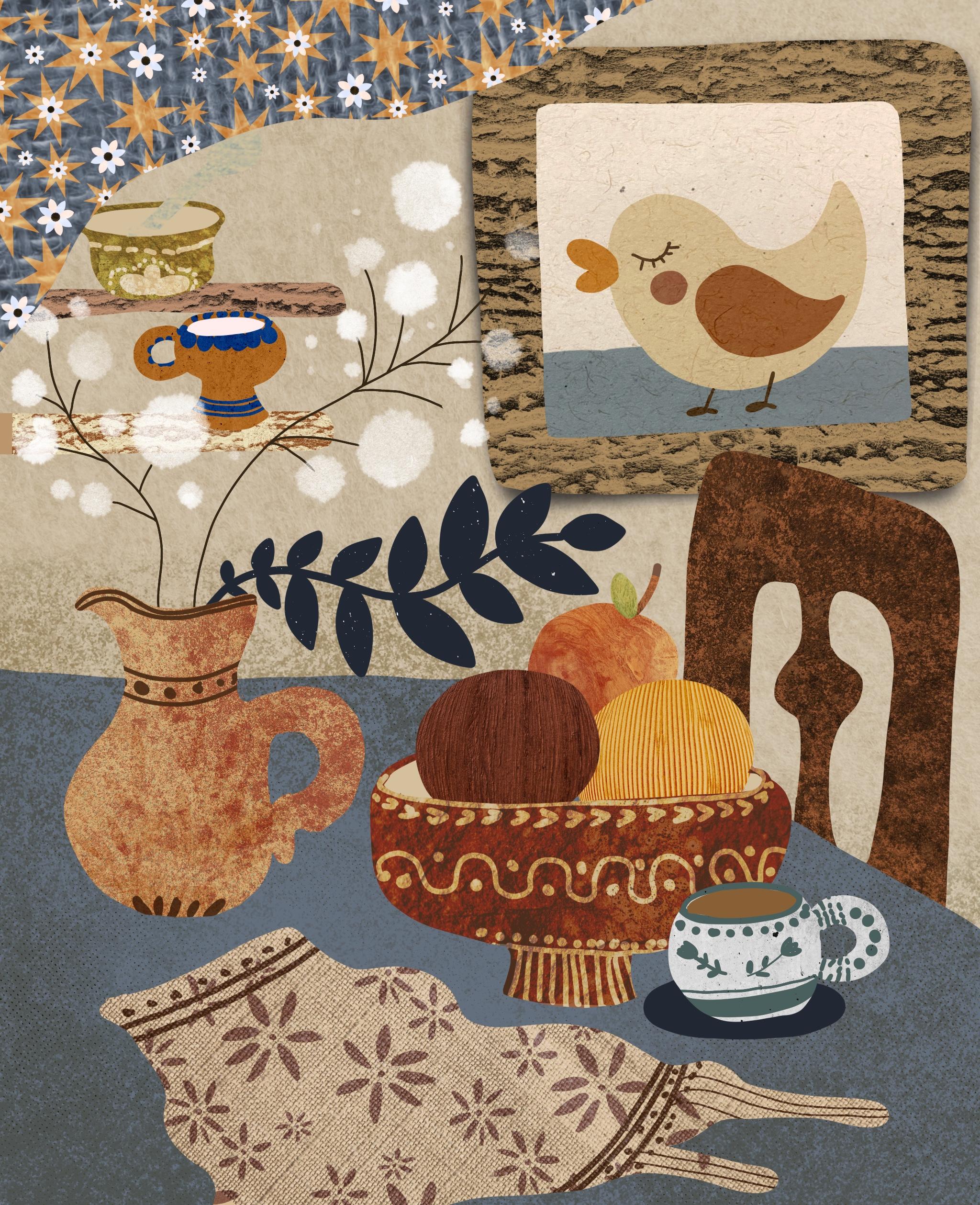
5. Setting the Base: So we're going to start
with creating a new canvas. It's going to be
screen size Canvas. First of all, we're going
to drop our sketch, our coloring page
that you can find, as I mentioned, in the resources
section of this class. What I'm going to do
right away because I will need the guidelines of the sketch despite the
fact that I'm intending to get rid of it later
once my picture, my whole entire illustration is ready at the moment I need it. What I'm going to do, I'm going to change the blend
mode to multiply. Reduce the capacity
a little bit, and I'm going to lock
this layer so I don't accidentally draw
or paint on it. I'm going to create a new
layer and put it in between my background and the sketch, and the sketch will
always stay on top. So I can use it as a guide. If you watched my previous
texture magic class, which is the landscape, you probably will
be familiar with the next step that
we're going to make because it's going
to be exactly the same. We're going to fill all our
shapes with colors one by one in the order of their
appearance on the canvas. I'm going to start first of all, with changing my
background color. I'm going to click and using
my still life palette. The color for my background, I'm going to choose is
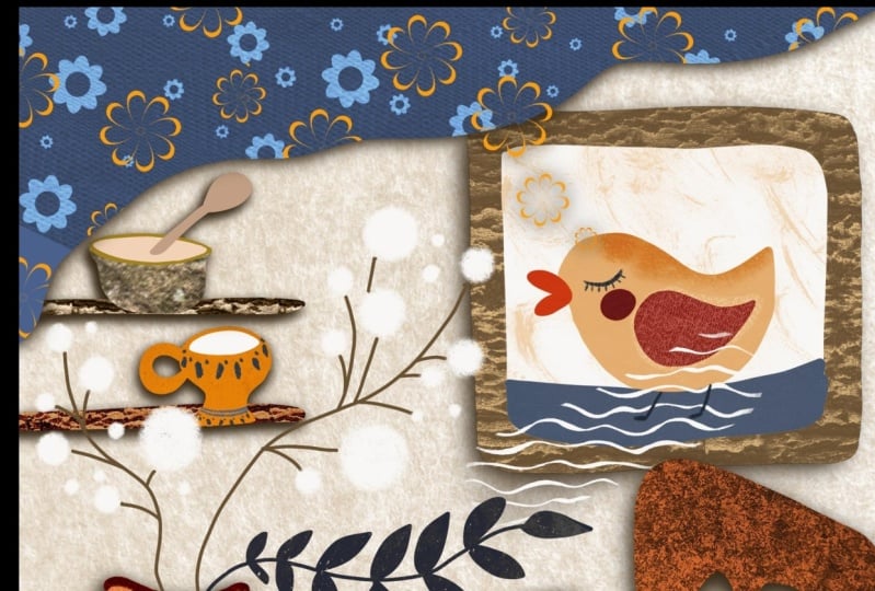
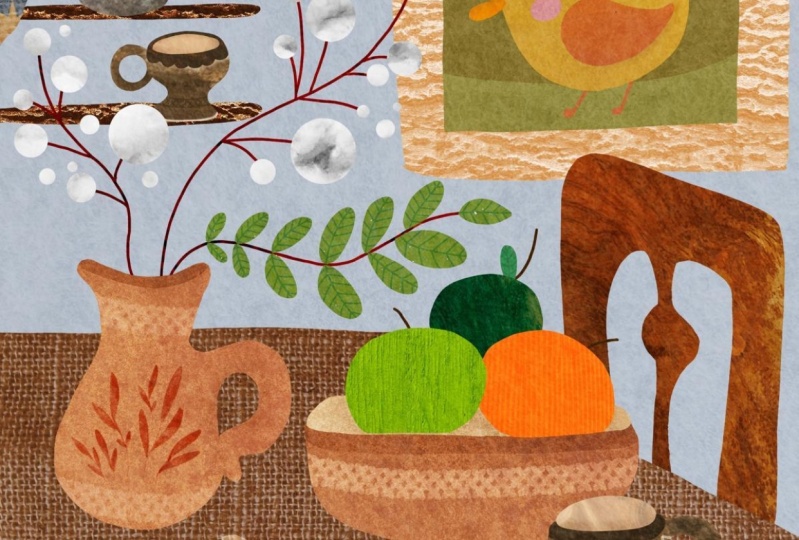
this grayish beige color. The very first shape I'm going to add is
this picture frame. What's important,
create every object or almost every object on a new
layer because we will be applying different textures
and what's more important, different blending modes
to almost each object. The very first object, as I said, it's
the picture frame. And the color, the
brush I'm going to use is in
calligraphy section, and it's going to be mono line. The color I'm going to use is this brown color,
greenish brown color. What I'm going to
do, I'm going to create using my mono line brush, I'm going to create the
outline of this picture frame. I'm not trying to stay
strictly in lines. And I'm just going to
drop the color in. That's the picture frame. Next object we're going to
create on a new layer is this picture insert with this floor or grassy
part and the doc that. On the new layer, using
my mono line brush, the color I'm going to use is this this color
like really light, and I'm going to do exactly
the same as previously. I'm going to outline
And the area. Make sure that the line is close together because otherwise the color will flood
the whole canvas. That's the picture insert. Now the rest what's in
the picture, the floor, the duck, we're going to
be creating as clipping masks on top of this
picture insert. I'm going to create a new layer. I'm going to add clipping mask and I'm going to
create duck's body. The color I'm going to use for my duck's body is
this yellowish color. I'm just going to create an outline and I'm going
to fill it with a color. Now, I'm going to create a new layer as a
clipping mask as well, and that will be my
floor on the picture. The color I'm going
to use is the s from the right in the
very bottom row bluish. Now I'm going to add
the details to my duck. I'm going to add the wing, the cheek, and the beak. Creating a new layer as
the clipping mask as well. All these little
things are being clipped to this picture insert. The color for my duck's wing, it's going to be this third from the left
on the very top, this brick color, and I'm
going to fill the wing. The cheek is going to be this pinkish color
in the corner. I'm creating it all on the same layer because you see these objects are not overlapping and they
are in parallel. The beak is going to be this light orange in the
very corner bottom row. So guys, that's the principle
I'm going to use to create the objects on my illustration to
prepare the base. I'm going to speed
it up for you, and I will slow
down when I want to dwell on certain
points particularly. Oh. No. Oh. Oh. I fill the, the base of our
illustration with colors, and these are the shapes that we're going to be
applying the texture on. But you can still
see that there are a little bit of
unfinished elements here, like for example, this
cup on the table. Missing the inside,
whatever to coffee and ser. Why I wanted to dwell upon this little thing
separately is simply because we are not going to be filling these details
with texture. What I'm going to
do, I'm going to create a new layer
and I'm going to try and keep it as
simple as possible. I'm going to drag the layer
underneath this cups. They see my cups are on the same layer because
they are quite far apart. On the new layer
underneath the cups, using the same monoline brush, I'm going to choose
this brownish color, which will represent milky
tea or milky coffee, and I'm just going
to add it to my cup. Let's switch the sketch off and see how
it's going to work. Just going to clean up
the edges a little bit. And I'm going to add the
saucer on the same layer, and the color of
the saucer will be this darkest navy blue. Now I'm looking what
else I need to do. I can see this bowl, fruits. There is some empty space
inside that needs filled. Somewhere in between the
bowl and the fruits, Now, in fact, I'm
going to create a new layer underneath my
very background fruit layer. On the color, I think I'll
use something lighter. I think I'll use even
like this lightest color, and I'm going to fill the inside of the
bowl, lighter color. I might clean up the bowls. I is just a tiny bed, but not dwelling on it too much. Definitely not spending longer
than a few seconds on it. Yes, that's the inside of our
bowl. What else can I see? I can see the bowl here, need some attention as well, so I need the inside
of this bowl. I'm going to create a new layer underneath this and I'm going to use the
slight basic color. I'm going to fail the inside
of my bowl with this color. Now I'm going to fill the spoon. I think it's going to be wooden type spoon despite the fact that there will be no wooden texture
overlapping it, but I'm still going to
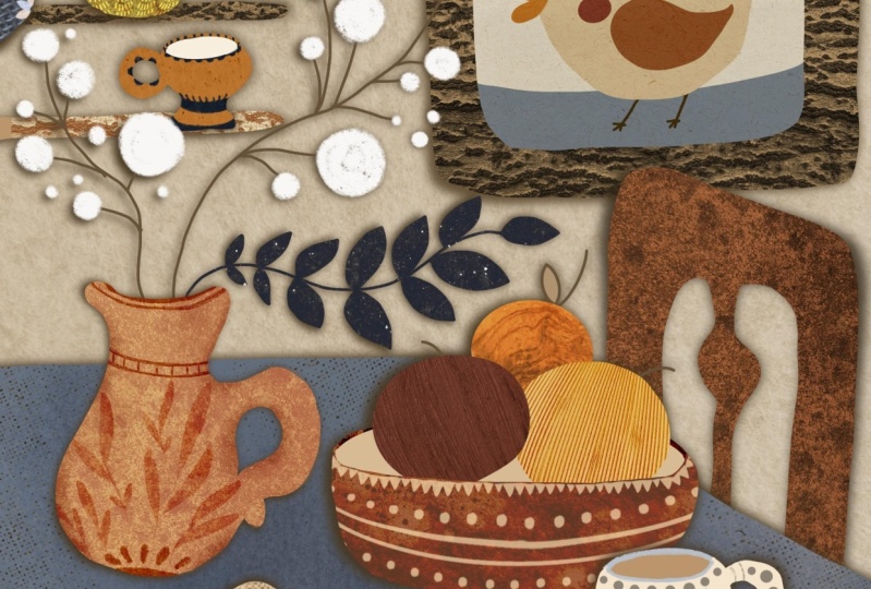
make it brownish type. I'm just going to fail. That's a wooden spoon. And the very last thing that's left here is the twigs with some pom pom type botanical,
dried flowers. What I'm going to do.
Underneath my jug layer because they will be
coming out of the jog, I'm going to create a new layer, blanker using the
monoline brush. The color I'm going to
use is this very dark. Brown that I used for
the picture frame, I'm going to reduce the size, and I'm just going to outline. Let's switch the
sketch of and see if they are there. They are there. Let's clean them up a little bit just to make sure they're
joined nicely together. Maybe some of the s. I could not dwell
on it too much. On the very new layer, I'm going to grab my charcoal willow charcoal bruh in default procreate
brushes charcoals. The color I'm going to use is the slightest color,
almost white. And I'm just going to fill
in this pomp poms with this like fluffy white shapes. L et's switch the texture off and I think it looks lovely. The duck is missing
feet and the eye, I can see now, you see. It's nice to switch
off sometimes. I'm going to create a new
layer on top of the duck, and I'm going to use a clipping mask,
though not necessary. I'm going to go back to my
calligraphy brush monoline. I'm going to use again
this dark brown color, and I'm just going to give
my duck this tiny little. Feet on the eye like
little eye lashes. Let's switch this sketch
off and see. Yeah. That's the base for our
illustration rating. In the next step, we're
going to fill these objects, the flat colored
objects with textures. Will play with different
blending modes, and we will also add some color enhancers and add a little bit of
decorative details. See you in the next part.
6. Applying Texture Part 1: Alright. In this
lesson, part one, we're going to start we're gonna fill our shapes with
different textures. And what I'm going
to do, I'm going to start with a very background. And Remember where you save the textures that are provided together
with this class, and you accordingly add them
from your saved location. Minus saved on the cloud. So the very first texture
I'm going to add is felt. This is going to be
my very first texture that I'm going to apply
to my illustration to the overall background. I'm going to stretch
it. And the first thing I'm going to do is change
the blending mode. In this case, my blending mode
is going to be soft light. See it applied on the
picture frame that I don't want that
because picture frame will have its own texture. That's why I'm
just going to drag the picture frame
above my felt texture. And I'm going to
maybe reduce capacity just maybe two to
about 60 odd percent. So the texture is
just barely visible, but still present, so it's
not flat. Let's compare. No texture. With textures. It starts already like shining from a new angle. So next texture we're
going to apply. The order we're going to be applying the textures
is basically the same order we've created our colored objects
on the canvas. So next texture I'm going to
apply to the picture frame. So what I'm going to do, I'm
going to create a new layer, and I'm going to create a
clipping mask as always. And I'm going to drop my
texture on this bland clay. And the texture I'm going to use here is the tree bark texture. So if you remember
that we've prepared this texture in one of
the previous lessons, you can always go back to your canvas where you've
prepared a texture. In this case, you swipe
with three fingers copy. And paste this texture
on our prepared layer. Or if you just prefer to
use the one that I provide, you simply go to your safe location and just
add your texture from there. So this texture is
black and white. I'm going to turn it like rotate it to make it more horizontal. And I'm going to
place it like this, like so on my picture frame. And of course, it's
black and white. The picture frame is brown, so I'm going to obviously
change the blending mode. And the blending mode for this, I'm going to try overly and
they might reduce the pacity, just a tiny bit, maybe to 79%. Yeah. Another wood and
two wooden elements and the specture is
these two shelves. And I'm going to apply
the same texture tree bark texture to them too. For this, and I'm going to duplicate the bar
tree bark layer. And I'm just going to
clip it as a mask to my um shelf layer. But in this case,
I think I'm just going to even
reduce the scale of it just to find see like
the nicest possible look. I would also like to pay your
attention how different, depending on the
color of your object, how different the texture looks with the same blending
mold, same texture. So you see this lighter color
shelf looks quite nice, so you might consider making a picture frame of the
same shade of brown, to make it slightly lighter. So it's up to you. Next object we're going to
fill is our picture insert. All the object a clipped as a
mask to our picture insert. So I suggest that maybe
if you're happy with it, if you are not planning
to alternate anything, just pinch it all together. So the insert is one layer
just to save the space and to not to have too
much confusion. Create a new layer
added as clipping mask, and the texture I'm going to drop here is
the paper texture. That I've downloaded
from Splash. I'm going to insert the file and the file is called paper. I'm going to reduce
the scale of it. Not too small, so you can still see this texture elements. And now I'm going to show you another trick that
I use sometimes. So you see this texture, this paper is basically
a very light color, a lightish grayish color. So what I'm going
to do to intensify this see a little
fibers on this paper. I think it's like type of a
coconut paper or something. What I'm going to do,
I'm going to invert. This paper texture. For that, you just click on, tap on it with your
pencil, and select invert. You can see that it immediately inverts itself into this very, very dark blue, almost black. But now we're going to
change the blending mode of it to difference. So you see it did make our picture insert
slightly darker, but it gives this a
nice papery effect, like almost like craft paper, and you can see this little
fibers of the paper. And I find that in this
particular case with this paper, It's the best way to
achieve this effect. I try different ways. I consider different
type of paper. I've used my own paper. But I like this. I wanted to show you
this tip, this approach, which also takes place very
often in my illustration, so I just wanted to
share it with you. So that's our picture
insert texturized. Next texture we're
going to apply is to this back of our chair. And the texture we're going
to apply is limestone. So I'm going to create
a clipping mask on top of the chair back, and I'm going to insert
my limestone texture. I'm going to probably
reduce the scale. Se. That's obviously the texture I photographed in the woods from one of my woodland walks. So I kind of like
this darker part, here, a lighter part here. So I've almost reduced the size of the texture
to the size of the chair. To to show this n light
transition and the blending mode. Here, I'm going to
change to multiply. N pacity, I'll keep 100%. So now it's kind of this ritual almost like rusty brown color. Next object I'm going to
fill is this tabletop. So when I was creating
this illustration, my idea was to create a farm house type still life,
like, table arrangement. And this is supposed to be table cloth made
of quite rough linen. So the texture I'm
going to use here is my own linen picture
that I photographed. And I've also I've provided two linen
textures for this class, one finer and one a
little bit rougher. So the final one
I prepared using the same method I
described to you in one of the previous
lessons of this class. So for this picture, I'm going to use
for the tabletop. I'm going to use
the finer texture. So I'm going to
create a new layer, clip it as a mask, and I'm going to insert a file and the file I'm
going to use is linen finer. I'm going to make it
scale it down even a little bit as just a tiny
bit more. Just like this. See, I skew it a little bit. I turned it, so it's not
like flat geometrically. And the blending mode I'm going to use here is darker color. What it did, Look. It just basically shows through the darker parts
parts of my texture, and I think it gives this
tabletop a really nice effect. Next object, I'm going to fill. So we filled our shelves. Next object I'm going
to fill is this fruit. Oh, guys, I just
realized I forgot to add one tiny
detail to this fruit. S to my fruits,
this little sticks. So I'm going to
correct my mistake. Happens. Nothing crucial,
nothing critical. I'm going to create a new layer. I can flatten it later, and I'm just going to add
this little sticks and using the greenish
color I'm even going to add this little leaf. To my apple or orange or
whatever fruit it is. Yeah. So quite happy with that. And the fors texture I'm going to apply to this
background fruit. I'm going to create a new layer. I'm going to clip it as a mask. And the texture I'm going to
use as wooden apple texture. So if you remember in one
of the previous lessons, I showed you that I
photographed wooden apple. And because I really
like that wooden effect, I'm just going to scale
it down as much as I can to fit it, and I'm just going to move
it around to see what's sort of like the prettiest
part, I can find. I think it's maybe this one. And also I'm going to
show you another trick. When I apply textures to sort
of like round the objects, it can be fruits, and can be different bowls. What I'm going to do?
I'm going to select. So if I take this tool
and I choose wrap, and I'm just going to pull this corners in and
this middle part out. So it creates this
more rounded effect. See when you just
wrap it like this. Gets a little bit more rounded. Particularly you can
notice it when it comes to stripes or certain patterns. But yeah, I'm quite
happy with this. And the blending mode I'm going to use is
going to be hard light. In my opinion, it add this
nice splash of orange color in the picture and brings
up this texture effect. Next one, this middle
fruit, and clipping mask. The texture I'm going
to use is resin vase. I'm also going to reduce the size of this texture
image as much as I can. I think I'll show you this rap effect on the
stripes because on stripes, it's kind of more obvious, so I'm going to choose
the rap option, and I'm going to bring
in the corners of the inserted image closer
to the center top center. And the bottom, as
well, bottom parts. Yeah. You can see now so before
the rap, after the rap. The blending mode
I'm going to use on this fruit is color burn. It also brings a nice
lighter orange color, which I quite like. It's a fruity color,
maybe it's a melon. Or maybe it's an apple or
an orange or something. And next, I'm going to fill
this fruit with texture, creating a clipping mask. I'm going to add the
texture called cost. And I'm going to reduce
the size of it again. So the nice texture shows, and I'm going to round it
because my fruit is round. So I'm going to
bring the corners to the center and the
middle size expand on the contrary and
the bottom corners to the center to create
this rounded defect. The blending mode
I'm going to use is multiply because I want
this fruit to be darker.
7. Applying Texture Part 2: Next objects, two objects, I'm going to fill with texture. A these two balls, one big ball on the table, and the other small
ball on the top shelf. On a new layer, add
this clipping mask, the texture I'm going
to use is stone decay. Let's take a moment to
appreciate the beauty of it. Look at this. It's
gorgeous, isn't it? So I'm just going to try maybe and play around with
the positioning of it. The scale of it. I quite like to leave this like decay f a bit on top and make it slightly
smoother in the bottom. That's the big
bowl on the table. And the blending mode, I'm going to change
to color burn. But you see it's quite intense, like, really dark red, and that's why I'm
going to reduce the opacity to around 57%. Maybe a little bit
more like 53%. And the same texture. I'm going to add to this bowl, but I'm going to use different blending mode
and different capacity. So what I'm going
to do, I'm going to duplicate the layer
on my bigger bowl, and I'm going to drag it across my picture to apply it
to the smaller bowl. Because the bowl is
quite small, small, I'm just going to reduce the size of my
texture drastically. You can see this nice effect. At the moment, it's
set to color burn. I don't like the color
burn effect here. I'm going to turn it to
change it to overlay, and I'm going to reduce I'll
keep the capacity to 53%. Maybe I'll clean up the edge
of my bowl a little bit, just a tiny bit here. And just reduce the
size a little bit. Yeah, to fit nicely. Yeah, I'm quite happy with that. That's a perfect
example for you to see how same texture
looks absolutely, not absolutely, but gives you different effects when you use it on differently
colored objects with different blending mode. That's the texture
to our bowl applied. So next two objects we're
going to fill is our tea cups. And again, I've
just noticed that I left this little cup empty. So I'm just going to go
to the same layer that I used for making saucer
and coffee in this cup. And let's just add maybe milk. I'm going to grab
this creamy color and just add added
inside my cup. Maybe it's milk on the on
the shelf or maybe sugar. Maybe somebody is
preparing to bake. So what I'm going to do, I'm going to create a new layer. I'm going to add
this clipping mask. And the texture I'm going to
use on this cup is one of the textures I downloaded from splash that I showed
you at the beginning, and it's called wall. And you see, like I I've chosen that texture
because it gives this nice stoneware
effect to our cup. So I'm just going to scale it down by reducing
the size of it. Blending mode I'm
going to use is the Exactly same texture I'm going to apply
to my smaller cup. I'm going to duplicate
this texture, the wall texture, and
I'm going to drag it to my small orange cup
on top of the shelf. And similar to what I
did with this bowl, I'm going to reduce
the size of it, maybe just rotate it ale bit. But instead of d mode, I'm going to I'm going
to use linear burn mode. With just capacity
reduced to 70. And now I'm going to apply the same texture to
my leaves for that, I'm going to duplicate
the one on the cup. I'm going to drag it across, and I'm going to
unclip it and bring it clip it to my
leaves layer this one. However, what I'm going to do. First of all, I'm going
to change it to normal. You can see it applied a
little bit not applied here, but that's not really
that critical. Stretch it a little bit. What I'm going to
do? I'm going to invert it same as we did
with the picture here. I'm going to tap on it.
I'm going to click invert. I quite like it
already as it is. I can change the
blending mode to screen. Yeah, I think that I'm
going to change it to lighten because lighten
mod keeps this dark, deep navy color while when we leave just inverted
texture, it's pure black. So we're just going to
leave it like this. Next texture, I'm
going to apply. Next object, I'm going to
texturize is this jog. I'm going to create
a clipping mask. The texture I'm going
to add is limestone again as the same texture we used on our
back of the chair. I'm going to reduce
the scale of it. You can always play around
and see if you flip it, I think I quite
like it like this. The blending mode it's
going to be overlay, and I'm going to
reduce the opacity to 42% to make this texture
really subtle in comparison. So you see on the
back of the chair, we left it like properly. Deep and dark. Here it's
going to be more subtle. Next. It's going to be the s
linen napkin on the table. Clipping mask of the new layer. And the texture we're
going to apply. If you remember that I told
you about the tabletop. We used finer linen here. Here we're going to
use rougher linen. So I'm going to insert a file, and the picture, the texture
I'm going to use is linen. So I'm going to d the linen
texture on my napkin. And I'm going to try
different blending mode. And the blending mode, I
think that brings the best of the texture up as hard light. However, I'm going to reduce
the opacity to maybe 53%, just to make it
slightly subtler. Because you see, so we
don't want the texture neither to clash nor to
blend into each other. Despite the fact that we
use the same texture here, different scale and
different blending mode gives you
different effects. And finally, I'm going to add
the texture to my curtain. So I'm going to create a
new layer clipping mask. And the texture I'm
going to add as ave. I'm going to add the final wave that we've created in one
of the previous lessons. Because I quite like it's
like almost patchwork effect. And I'm going to see, like if I play around with a
scale of it a little bit. Yeah, quite happy with that. And the blending mode I'm
going to use is hard light. And I'm going to reduce
the pacity to bring the blue color of my cotton up, so the pacity I'm going to
set is around maybe 55%. Yeah. That's our natural
textures are filled. In the next part, we're
going to add a little bit of decorative texture
to our objects.
8. Decorative Texture: As I said previously, we are almost done in terms
of our texture overlaying. However, I feel like
our illustration needs a little bit more sort
of like a playful touch, a little bit more
decorative details. So I would like to
start with adding decorative textures
to our objects. And first of all, I would like to work on this linen napkin. In one of the previous lessons in the texture
preparation lesson, I've explained to you how how you can create your own
hand drawn texture, and you can apply it on any object of your
illustrations going forward. So What I'm going to do here. Working on the napkin. That's what I'm going
to demonstrate to you. I'm going to create a new layer, and I think I'm going to keep it underneath the clip texture, so the layer is
clipped to our napkin, and it's still underneath
the texture applies overall. And the texture I'm going to drop is one of the
decorative texture, as you can find in the
resources, it's called daisies. Let's see. So I'm going
to play around and see. So I'm quite happy with this. So now it's not just lending
napkin lying on the table, but it's kind of like
flower, hunt painted napkin. And I'm going to
see if I can change blending mode to suited purpose. How When you just play with
different blending modes, it gives you as always
some lovely effect. It even changes the color
of your decorative texture. Those like the colors initially
like charcoal type color. But look how it changes
luminosity makes it brown. Saturation makes it
almost like blue. Divide makes it white and
Hard mix makes it really, really new and red. I hurts my eyes to watch
it, to look at it. I'm choosing vivid light because I like that this daisies, I'm going to reduce
capacity maybe to 74%. I like that the daisies
are matching the overall this tomy theme of our
picture of our illustration, so I'm just going to
keep it to vivid light. And what else I'm going
to do. I'm going to grab. So if I go to sketching group of default
procrate brushes, and I'm going to
grab six B pencil, which is one of my favorite
pencils to draw with. And the color I'm
going to use is this second from the left
on the very top row. And I'm going to create
a clipping mask again on top of this dass layer. And I'm just going to
draw literally like hand draw a few details. So that this little stripes. Maybe a little bit
of dorts here. Just to make this napkin, this linen towel tiny
bit more decorative. This little lines, more dots. Nothing to elaborate,
nothing too specific. And let's maybe try and play with different
blending mode. Yeah, I think I'll leave it at normal because it's kind of like matching the pattern
a little bit better. So I'm just going to
leave it like this. Um, Next, I would like
to work on this jug. So in this in this case, I'm going to create
a new layer on top of our limestone layer. I'm going to clip it as a mask. And what I'm going to do, the next decorative texture is going to be leaves.
So what's important? Your decorative texture
does not have to be always a pattern like pattern repeat. Nothing like that it can be just a picture that you create
and you just drop on top. So I've just dropped
my leaves on the jug, and I think I'm going to change the blending mode to line burn. Maybe reduce the
pacity to around 67%. Yeah, quite like,
I think it gives this jag this clay type effect. And I'm also going to
create a new layer. Use it as clipping mask. And I'm going to use
this dark brown color just to create with
the six B pencil. I'm just going to create this
little details on my jag. You can play around
with the pencil size, just to create
some nice details. I'm going to add
this little dots, similar to what I added to the linen napkin and maybe
some decorations here. Or I could get really carried away doing that
because I immediately feel like already adding some flowers in
between those leaves. But at the moment,
that's not the point. I don't want to dwell
on it too much. Let's see the blending mode if I can change it to something
more interesting. I think I'm going
to de linear light. Next, I'm going to
work on this cup. I'm going to also create some. I'm not going to
apply any texture. I'm just going to add a little bit of
decoration on top of it. So I'm going to
create a new layer as a clipping mask on
top of my cups layer. And the color I'm going to use is probably
something bluish. Maybe this lighter blue. No, I'm going to
even unclip it a little bit because I just I feel like creating maybe
this top round of it. Now I'm going to create
a new one, clip it, and the color I'm
going to use is like this grayish type of color. And I'm just going to create
some playful designs. Very simple. Like
sometimes you see on local potteries hand
painted ceramics crockery. Follow your artistic
flare experiment. So literally all I'm doing, I'm just drawing
different lines. And maybe I'll just add
a couple of flowers. It's very simple, nothing too sophisticated. Just like this. Let's see if some blending
mode is going to do it more justice. Line Burn. Yes, some of them
are quite nice, some of them are quite harsh. So I think I'm going to keep it to Lena Burn because it's kind of a little bit more in keeping with the rest of the theme. And while working on this cup, I thought I didn't like that super white insert of the ball, so I'm going to
quickly change it. You know, guys, I didn't
want to edit this lesson to perfection and to create the impression to provide
the impression for you. Everything I do like, works immediately
from the very start. I make mistakes. I change
my mind all the time, and that's okay. That's normal. Don't be afraid to experiment
because you see, like, looking at this insert, I can see that it's
way too white. So I'm just going to
change it to some Yeah. That's more organic,
you see, like this. I changed it to this beige
color insert of the vase. Just literally, instead
of light the color, I just dropped the
other color on. Next, I would like to
decorate this cup now. So going back to my cups, maybe create a new layer, maybe even as a clipping mask. And the color I'm
going to use is this almost darkest blue color. And I'm just going to increase the size of my brush and
just create this sort of, like, decorative elements. Okay. Next, I'm going to this bowl. Again, I'm not going to apply any decorative texture to it. I'm just going to create a
new layer as a clipping mask, and I'm just going to
grab some lighter color, maybe this maybe this one like the third one from
the right in the mile. And I'm just going to follow. Let's change the blending mode to I think something light. Well soft light. I think I'm going to
change it to hard light and reduce capacity to 71%. And what else I would like to do see going back to my bowl, grabbing the color
I used for it, using my monoline bruh
from calligraphy. Basically the brush I
used to create this bowl. I'm just going to add a
little bit of the edge. Now I'm going to
decorate this bowl, create a new layer clipping
mask with sketching. Six B pencil. I'm going
to use this page color, second one from the
left and the bottom. I'm just going to
create little lines, one a little bit smaller. Maybe little dots to
keep the theme going. And I think I'm just going to add some kind of
decoration in the bottom. And the same with
the table bowl, I'm just going to grab green color monoline brush because I feel like
a bit unfinished. I'm just going to add a bit. I'm going to e that part
that goes on the spoon. Yeah. Yeah, quite
happy with that. And finally, the
final object I would like to decorate
is this curtain. So we've already applied the
finer weave texture to it. And now I would like to apply another decorative
texture that I created especially for this
class, it's called stars. So I'm going to go
ahead and add it from the location
I saved the town. Yeah, to be honest, while
creating this texture, I was thinking maybe something floral would suit better here. But then I thought, why
not? Pointy stars, this. They add a little bit of this quirkiness to
the illustration. So I just decided to keep it. And maybe I'll just reduce
the scale of a tiny bit. So you guys, you
can use the one. I provide or maybe
you create your own. I'm not going to dwell on. I'm not going to dwell on
how to create the pattern, the seamless pattern
and procreate. I'll do it probably
in some other class. But you can use
patterns that you can buy in different market places
or you create your own. Let your imagination run wild. So I've just added this pattern that I
created called Stars, and I'm going to check what blending mode I
would like to use. And I think in my case, I'm going to use hard light, and I'm going to just tiny
bit, reduce the opacity. There you go. It's done. And again, I feel like
fixing something. I'm going to grab
my mono line brush. I'm going to grab the color that I used for the
curtain, which is this one. And I think I'm just
going to extend my curtain a little bit further because it
just looks a tiny bit. A tiny bit like
abandoned. Let's see. Yeah, I think it creates
a nice composition. And I'm just going to I'm
going to go ahead and stretch. Stretch the texture
a little bit. And the stars a
little bit. Yeah. I think that's better. And
we're all almost done. In the next part, I'm
going to show you how to enhance some of the details using different color
and blending modes.
9. Colour Enhancement: So as I said, I'm going to show you how to enhance a little bit of color
in this picture. So what's important
like disclaimer? I am already quite happy with the weight is because I
like this cut out effect. I like this flatness
of this illustration. If I'm definitely not
going to create lights and shades to achieve volume to achieve realistic
effect, nothing like that. I just thought that
some of the objects, they deserve just a tiny
bit more attention, tiny bit more definition, to make them just slightly stand out more on
our illustration. Not all of them, but some. So first of all, I would like
to add some enhancement, color enhancement
to this tabletop. So I'm going to go
to where my tabletop is and maybe underneath
the texture, I'm going to create a new layer, which adds itself automatically
as clipping mask. And I immediately going
to change it to multiply. That this is what I technique
I use most of the time. And I'm going to grab charcoal
to be compressed brush. And the color I'm
going to use is this darker gray
blue in the corner. I'm going to increase
the size of it, and I'm just going to reduce the opacity to around like 55%. And I'm going to
just try and add a little bit of darker
color here and there. Maybe even more opacity. So you see it adds
this texture overlay. Car in the bottom up press a
little bit harder to create slightly darker
effect to balance the composition of them
of my illustration. And I would like also to experiment with different
colors, not just blue. But for example, I'll grab
this orange bricky color and just add a bit more
here and there. And I'm going to
try, so I said that default by default is multiply, but it might benefit from using a different
blending mode. So let's just try and play around different
blending modes. You see color burn
is way too dark. And I don't want the effect
to be too overpowering. Look I quite like
screen because it brings out the texture
a little bit more. I think I'm going to leave it a screen and to
darken certain areas, which was my initial purpose, I'm going to create
a new layer as a clipping mask and
again, multiply. But this time, I'm going to
take six decompressed brush, and I'm going to use
this dark blue color that I initially tried to use. I'm going to reduce pacity
to maybe around 60% size. I'm just like, Oh, sig, it's quite intense. I'm going to reduce
pacity even to 40%. And I'm just going to literally intensify the edge is tiny bit and a little bit
in the middle where we've got the concentration
of our objects. That's it. I'm happy with this. Yeah, I'm happy with
this enhancement. Another object I would
like to slightly enhance it looks a little
bit flatter is the napkin. Again, just a tiny bit,
nothing too drastic. Actually, in this
particular case, I want it to be super subtle. I'm going to create
a new layer on top of the colored object. I'm going to change to
the blend to multiply. And I'm going to take to be compressed brush again
because it's subtler. I'm going to use this
yellowish page color, the fourth one from the
right in the middle row, and I'm going to reduce the
size, pacity probably around. Six, let's see how
it's going to work. I'm just going to
burn the edges. Just a tiny bit. Just a tiny bit. Nothing too drastic because I want to keep the
subtlety of it. So I'll show you without
without it and with it. Almost unnoticeable
effect, however, it brings the illustration, it brings the
object slightly up. Another part that seems
a bit flat is this part. So it's something added to it. On our picture insert. I'm going back to
my picture insert, and I'm going to add a clipping mask layer between this texture
and the picture insert, and I'm going to keep
it on normal mode. Let's see what I can
actually do here. I think I'm going to keep
using to be compressed. And the color I'm
going to try and use is something
very subtle as well. I think this Biji color, somewhere in the
middle of the top row. I'm going to increase the size, and I'm just going to try Yeah. I think this is
going to work best. Just add a little
bit here and there. And let's see what blending
mode we can use to give it a little
bit more interest. See, like multiply,
look how it gives this effect of some
older older paper. Just even add a little bit. Maybe I'll just grab
this orange brick. Add a bit here and there. I'm going to reduce
the opacity of this layer because
I think it comes up to intense to
around 60%. Yeah. I like that. Last object I would like to work on is this jog. Because it comes up
a little bit flat. I'm going to add a new layer
on top of the texture layer. I'm going to change the mood
to multiply because I'm almost 100% certain that I'm going to emphasize darker areas. The brush I'm going to
use is welo charcoal. And I'm just going
to burn the edges. Tiny bit. See separate
the jag handle from its body. Here and there. K Yeah. I think that's pretty much it. And yes, I think I'm going to
stop right here in terms of color enhancement because I most definitely want to keep
my illustration flat. And I don't want to
turn it into something where I try to achieve
realistic effect and volume. No, no, nothing like that. So I'm just going to
keep it like this. And guys, I would say the
illustration is ready. In the next lesson,
which is a bonus lesson, I'm going to show you
the paper cut effect that sometimes use
on my illustrations to give the collage feel
to your illustration. See you in the next lesson.
10. BONUS: Paper Cut Effect: I'm going to show you now
guys the paper cut effect that in this bulls lesson that I use sometimes in
my illustrations. So we finished working
on our illustration. It's nice, it's textured, it's enhanced. We
are happy with it. What I suggest I should do, I always do because I'm going to start flattening my object. I'm going to select my
final illustration, and I'm going to duplicate it. So the sort of like
all the changes, if we're going to go
back and make changes, they are all backed up
in our original one. But this one paper cut effect, I need to flatten it because I will just get lost
in all the layers. It's going to be
too hard for me to figure out what's
going on where. So I'm going to start
flattening my layers. Whenever it's possible, because sometimes with different
blending mode, you can to preserve the effect,
you can't flatten them. Okay, too much information. Let's move on. So first object I'm going to
flatten is my picture. So I'm going to select all the layers belonging to
this picture, which is frame, tree bark, a picture
of the duck, color enhancement, and the
paper texture of the duck. I'm going to group this layer, and I'm going to flatten it. So it flattened perfectly fine. If you are really
meticulous with your work, if you like to categorize, if you like keeping everything neat and tidy and in order, you can rename each layer, like, for example, this
one will be picture. Next is the chair. I'm going to group it.
I'm going to flatten it. It's literally the object
with the texture on top. We didn't do any any
color enhancement. Next one will be my table. That can create someone unusually fix let's
try and flatten it. No. It worked fine. I can rename it. Again, table. And so on. I'm not going to
rename every single layer, especially I don't
usually do that. So I'm going to flatten. All my objects. I think the fruits they will go in the same
group, flatten, teacups, flatten, leaves, flatten Jag flatten. Curtain. Flatten. So basically, so now all
our objects are flatten, I can even feel
better that we've got all this and reduced
to only few layers. I can unlock the
sketch layer, deleted. We don't need it anymore
definitely not on this one. And what I'm going to do. So if you think of
paper if you think that you've got a paper
canvas and you cut out paper objects with scissors, and you stick them on the paper. You can still see in most cases, that they're stuck
that they are, like separate from the collage. Which means that they cast a little bit of shadow
on your canvas. That's how you see that
they're slightly offset, they're slightly
raised from the paper. That's how how this effect
is created of collage, as opposed to the illustration, which you draw all on
the same flat layer. And that's precisely
what we're going to do in this class in
this bonus lesson. I'm going to create
a little bit of a shadow for each
flattened object. So first one I'm going to do is this picture frame
the whole picture. So what I'm gonna do? I'm going to show you the
technique, how I use it. I'm sure there is more
than one technique. I'm sure you might
know something else. But I'm going to show
you the one I use. I'm dragging it underneath the object layer that
I want to cast shadow. Then staying on
the object layer, I'm tapping it. I click select. What it does, it creates the selection of the
shape of this object. Now I'm going on the empty layer and using a dark brown color. I'm going to drag and drop it. So if we switch the
visibility of the top layer, we can see that we've got
this dark object underneath. The next step is staying
on this dark object. We need now to fluffy fy to make it shadow like.
What I'm going to do? I'm going to go to adjustments, and I'm going to
use gas and blur. I'm just going to drag my
pencil, and you can see, see the more I drag it along the bigger shadow
my shadow becomes. But I want it just a
tiny bit slightly. Fluff and what I'm going to do, I'm going to grab the move tool, and I'm just going to play around and see how
it's going to be. You can move it on one side. I, for example, if it's your paper collage and your
source of light is here, obviously, your object will cast shadow on the opposite
side of the source of light. However, what I use very often, I'm going to use
the wrap function, which we've used previously
to make the texture around. I'm just going to play around, just drag some corners out. So by the looks of it, I now see that I need it a
little bit more intense, so I'm just going to duplicate it and you see the effect is a little
bit more visible now. I want the effect to be subtle. You see, now it's added the
shadow around my object. And I'm going to group it
not to mix with other ones. Let's repeat the process
with this back of the chair. New layer, staying on the chair
object layer, tapping it. I'm choosing select. Now, going on the empty layer, I'm going to choose
even darker color because I had to intensify
this one before, and I'm just going to drop it. Let's check if it
worked. It did. It created additional
same shape object, but of darker color underneath. Going to the filter
to the adjustments, goes and blur, and I'm just going to blur the
shadow a little bit. I'm going to grab
the select tool, and I'm going to drag the
corners like this like so. Just to create this
cut out effect. And if you feel that it's
ale bit too intense, you can always reduce the
opacity of the layer. And one more time,
I'm going to show you and the rest I'm
going to speed up. Creating a new layer, dragging it underneath
the object. Staying on the object,
it's the table. We're going to create
shadow for select, B on the empty layer,
darker color dropped, Tgal the visibility of the table to make sure that the
layer is created, staying on the new layer
mode, adjustments, Gs and blur, dragging
the pencil along, taking the rap to, and playing around
with the positioning. That set shadow created. See sometimes you don't
even need to change the position of this shadow to play around with this shape. Its I see with this cup. I think it falls
nicely as it is, creating this paper
effect perfectly. M. That's it's done, guys. I obviously, I didn't create a shadow for each
and every object. I didn't do it for the leaves, for example, because sometimes, if you've ever created
a paper collage, sometimes most of the objects
you do stick on the paper. But you also sometimes add
some hand drawn elements. So I decided to leave and this fluffy pompoms as
hand drawn elements. So.
11. Final Thoughts: D. What I would like to say is that I strongly encourage you to source your textures for your artworks in your own
everyday life, in nature, in your own house,
in your own garden, in your own car, in
your own wardrobe, when you explore your clothes, because it's generally
a good habit of observing things
around you as an artist. And also, it's really
good for slowing down. And observing and seeing
the world around you. So instead of going to market places and
different platforms and sourcing your
textures there, make sure that you look around yourselves and
see what you can use. I'm sure you can find plenty. Thanks a lot for
doing this class. I hope you had fun. I'm really looking forward
to seeing your projects. Please make sure you upload them in the project section
of this class. All alternatively, just upload them on social media and don't forget to tag me on
Instagram and Facebook. D.
 Irina Young, Busy May Studio