Transcripts
1. Introduction: Spring is almost in the air, which makes it the perfect
time for some relaxed, feel good bird art. Watercolor has always
been a favorite medium, and digital watercolor is quickly becoming
just as popular. No prep, no mess and plenty of room for happy accidents
or easy fixes. That said, a lot of artists find digital watercolor a
bit confusing at first, since it doesn't behave exactly
like traditional paint. That's where the class comes in. Let's paint a digital
watercolor using Procreate. Hi, I'm Mina, the owner
of Busy May Studio. I've worked as a
commercial illustrator for over 12 years, and digital watercolor has always played a huge
role in my work. And if you're
familiar with my art, you probably know that
birds have always been one of my most
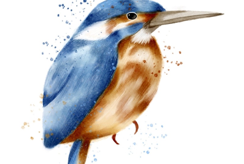
favorite subjects to paint. The Kingfisher is a
truly striking bird. Even the common variety
you'll find here in the UK with its unique
shape and vibrant colors, it's a perfect subject
for digital watercolor. In this class, I'll share
my favorite tips and techniques for making
digital watercolor look as authentic as possible. Once you've got these skills, you'll be able to paint any watercolor bird and
procreate with confidence. The brushes I'll be
using are from my procreate forgotten
dream watercolor set, and you'll get a mini taster
version completely free. This mini set has everything you need to paint our
beautiful Kingfisher. And if you like to take your digital watercolor even further, the full brush set is
available on Skillshare. I'll leave the link
in the description. And that's not all. In
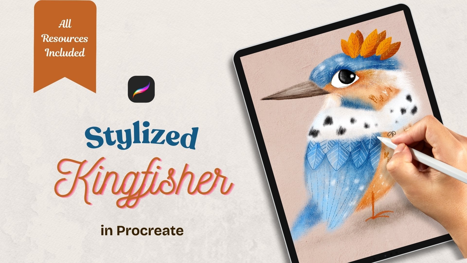
the next two classes, we'll paint the same Kingfisher
in two different styles, a stylized illustration
and the folk art piece. If you're still exploring your art style or just love
trying new approaches, the series is
definitely for you. And now let's grab our pads, our digital watercolor brushes, and paint this beautiful
bird in Procreate.
2. Class Project: For your class project, I would like you to paint any bird of your
choice and procreate using the digital
watercolor techniques we'll master in this class. Or if you feel that you still need to gain some confidence, just follow me step by step. To create this
adorable Kingfisher, please consider to applaud
your illustration in the discussion section
for us to admire your work and to draw
some inspiration from it.
3. Tools & Materials: This class you'll
need an iPad with Procreate installed on it
and a compatible pencil. You'll need the mini set
of watercolor brushes, the paper texture, and the
watercolor wash texture. And there is also
a small collection of Kin fisher references. All of the files
can be downloaded from the resources
section of this class.
4. Simplifying The Subject: Because I'm not aiming for a completely realistic painting
of a common Kingfisher, I don't need to
include every detail of the bird's anatomy. What matters most is keeping the defining features
that make it immediately recognizable
as a Kingfisher, not a robin or a
peacock, for example. So, what are the unique features that make Kingfisher
different from other birds? The shape and size of its head, it's kind of flat and
seems bigger than heads of most other birds
in relation to its body, a large beak in relation to
the head, and, of course, it's very distinct colors that definitely make
Kingfisher stand out. We'll talk about the color
palette in the next lesson. So let's have a look how we can break down our
kingfisher into simpler shapes and
see what we can do to simplify our drawing
or in other words, what details can we use to keep the drawing still
recognizable as a kingfisher. So, this is a picture I've chosen to use as a
loose reference. I'm not going to use in details, but I'm just going to try and show you how I break
down reference sometimes into simpler shapes and which features we're
going to preserve. So obviously, we're
going to keep an eye, which is a slightly
flatter ellipse and the top of the head, which is like a half circle. An elongated triangle for the beak divided
into two halves. We obviously going
to keep the wing, maybe some definition
of some feathers. And obviously, the body
itself of the bird, like an egg shaped oval and a little triangle
for the tail. And, of course,
like this tiny feet and let's see what we can do to make this
drawing even simpler. Is there any other shapes
that we can define. I think this under big area. I'm going to keep
because it's white and it's going to look
nice on our painting. I can see this kind of, like, triangular
shape, blue one, and this sort of, like, line behind the eye
of orange and white. And I keep looking
at this drawing. I'm not going to break down this area because it's way too complex for a loose
painting in watercolor. So that's definitely
going to get merged. So now I'm outlining a
simplified version of my bird. So I'm keeping obviously
the ellipse for the eye, this half circle for the head, this elongated area
behind the eye, the wing. And maybe this
little bit of blue, and I'm looking where I can merge to make it even simpler. So I think I'm just
going to merge this blue area with the wing
probably going forward. And, um, the orange area and the white
area here and I'm keeping this the chin piece, bit under the body. Obviously the feet and the
little triangle for the tail. And essentially, I
wouldn't call it a sketch, but I would call it
guidelines that we will definitely be using for our
loose watercolor painting and keep it for using in our next classes
for our sort of, like, stylized illustration
type of Kingfisher, and our folk art piece as well, will be using this guidelines. So yeah, and in the next lesson, we're going to talk
about the color palette.
5. Colour Palette: Axon Andexon. In this lesson, I'm going to show
you how to create a very simple color
palette for our painting, following only a few
very simple rules. If you look at the
photograph of this bird, you can see that
there are dozens of various color shades and
values, maybe even hundreds. But we don't need so many
for our loose painting. A limited color palette
is always a good idea. So let's have a look
at our reference and see what mean colors
are presented there. We can see that the
head, the wing, and the cheek can be described
as mostly green or blue. So that's our mean
color number one. The body, some of the face, and the feet are mostly
orange, red, yellow. There are shades of
brown in the beak. And that's our three
main colors found. We will also need pure
black for the eye and pure white for some
parts and some details. So we've defined our
main three colors. Before we move on to
creating our palette, we need to keep in
mind the next rule. We need three values of each color light,
medium, and dark. Here is what I mean. So you've
chosen your main colors. Now you need three
values of each. Whether you chosen
blue is cobalt, ultramarine or teal,
you pick a light, a medium, and a
dark version of it. Let's look at the first
way to pick the colors. Drop your favorite reference
to your procreate canvas. Make sure that all the
copyright is observed and hand pick the colors and
the values from the photo. You can see that here I'm
picking the light, medium, and dark values of teal then same with the orange color
and finally with the brown. I'm making swatches
directly on the canvas. And once I'm happy, I'm going to create
a new palette and transfer the
colors one by one. The second way you can
select your color is simply picking them from your classic
view procreate colors. Find the blue that you like. That will be your medium value. Then move up the spectrum
to find a lighter value. Then go down to the spectrum
to find a darker value. Repeat the same with the
orange and the brown. The final simple rule is that, while choosing your sheat, make sure you don't stray too far from the right side
of the color wheel. Otherwise, the result may look unpredictable and your
bird unrecognizable. A
6. Preparing Canvas: As I mentioned in the tools
and materials section, you will have canvases attached, JPG files attached in
your resources section, and I highly recommend using those textures because
they will give you the chance to have a very
realistic watercolor effect when you use the
watercolor brushes. So I'm going to show you the trick that you
can do yourself, even if you make
your own canvases, your own textures, the
principle will be the same. So I've created a new
canvas, a new artwork. It's a screen size, and I'm just going
to build my canvas. So what I'm going to
do, I'm going to add these two textures that I've
attached to this class. So I've done that, and you can see there are two textures now
added to my canvas. And what needs done, we need to make them
sort of disappear, but at the same time, they need to give us the effect of watercolor paper
of some sort. For that, I'm going to duplicate
the watercolor texture. So I've got two of them. So you see the stack here
is paper texture on top. First watercolor paper, second, watercolor paper,
both in the bottom. And what I'm going to do now, I'm going to change
the blending modes for those layers to give
me the effect I want. Preparing for this
class already I already came up with
the settings which are the paper texture is going to be changed the
blending mode to color burn, and the opacity is going
to stay on maximum. Next texture, the ones
directly underneath, the paper texture is
watercolor texture. And the first thing I'm going to do, I'm
going to tap on it, and I'm going to select invert so lights become darks,
darks become white. Like negative effect,
negative film effect. And I'm going to change the
blending mode to overlay here and I'm going to change the opacity to around 40% 41. And finally, the very bottom, watercolor texture, I'm
going to leave it as it is. It doesn't get inverted, and I'm going to change the blending mode
to color burn again. And the opacity is going to
be really low to 15 or so. For tin is fine. As you can see, the texture sort of magically disappeared. You don't know where
you can see them, but you can see the white canvas seemingly or any other
color of the canvas. But if you change the
color, you'll see them. But the point is that what I'm going to do,
I'm going to group them, and I'm going to create a new
layer and I'm going to drag this layer underneath
those textures. And let's see what's
going to happen. Let's grab our main brush that we'll be using for
painting our Kingfisher, and it's called press, blue color, and have a look. See, I created a stain, and let's see what
these textures do. First of all, let's
remove them off. You can still see the
watercolor effect, but it getting enhanced properly
with all those textures. You can switch them
off one by one and basically keep your
texture number. You can copy and
paste and work more, try to play with
different blending modes, whatever feels right for you
for your own illustration, or on the contrary, the opposite, you can
remove some, for example, you might think that you
don't need this bottom one underneath or you don't
need the paper texture, just keep the
watercolor texture. So it's up to you. I'm telling you about this trick
I used for creating my canvases exactly for the reason that you can
adjust it to your own taste, to your own preference, yourself when you create
your own artwork. However, you are free to use the one I've
prepared for you, as you can download it. It's the procreate file with already prepared
the textures. The way I find most suitable for this class for this
bird illustration. So feel free to use them, and I'll see you in
the next lesson.
7. Digital Watercolour Techniques: As you probably know, just like a digital art process is not
the same as traditional one. Painting with digital
watercolor is not quite the same as using
the traditional medium, though there are some
things uncommon. Let's have a look
at the set we are going to be using in our class. I recommend that before
you start your project, you get familiar with
all the brushes, try them in different colors, and with different pressure. The very first brush
we're going to use a lot is the cold press. It's our mint filler brush, which we'll use for
covering larger areas, as well as layering and glazing. It's quite a watery brush, and it's also
pressure sensitive, which means that the lighter you press your pencil against
your iPad screen, the lighter wash you'll get as a mark on your digital canvas. See, it gets very water diluted when I barely touch the screen
with the tip of my pencil. Here I apply much more pressure, which makes the same color instantly darker
and more saturated. For layering and glazing, the pressure should be
light to medium to make sure that the underneath
layers are still visible. Next brush is glazer detail. We'll be using it
for sharper strokes when we need to emphasize
something like feathers. It's quite a watery brush, rather intense, so often we'll
be reducing the opacity. Next, harder edge wet. It's a saturated wet brush, great for enhancing
darker areas, yet it's still transparent enough to see the
layers underneath. The masking brush, we'll be mostly using it as a razor
to clean up the edges. A very important
one, the blender. We'll be using the smudge
tool with this brush, and it basically
does what it says. It blends, either the color with water or different
colors with each other. It's quite a delicate brush. Sometimes you need to
go more than once over the same area if you want
to feather a harder edge. What's also important about the blender brush in conjunction with the
smudge tool is this. Let's have a look at the stain. With a blender, I work from the inside of the stain
towards the edge of it, which pushes the pin further, mixing it with digital water and making the pintera larger. And now I'm working with a blender from the
outside of the stain, pushing the digital
water into the paint, which dilutes the paint and makes the painted
area smaller. A similar thing happens
when you blend two colors. The color you push from inside the stain dominates the
other and vice versa. Sometimes to get
a desired effect, you need to work both ways
till you get a proper mix. Finally, there are two
additional brushes, the sketching pencil, a version of which
you can easily obtain from procreate
default brushes, but I've put it in
the set just so you can have everything
in the same location. And water dust, which
is here just for fun, it gives you watery
paint splashes. Once you've made yourself
familiar with the brushes, let's move on to
painting our Kingfisher.
8. Painting: Part 1: So we've prepared our
canvas for working. We've got the group of textures, which I actually recommend ing in case you start drawing on one of
these layers or something. And remember, this layer for our actual painting
is going to be underneath the stack of
textures, not above. But above the stack of textures, I'm going to create a
new layer and I'm going to paste our Sketch, which is not a proper
sketch, obviously, but that's going to be more
than enough for us to use as a guide for painting
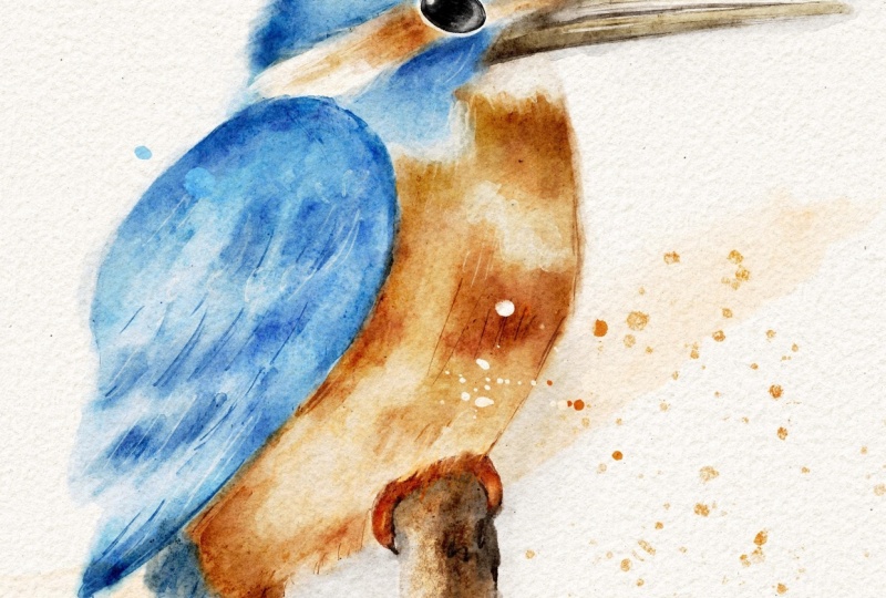
our common Kingfisher. And let's start painting. So I'm going to
reduce the opacity of the sketch layer to very, very low value, about 16, 15%. And I'm going to go
back to this layer underneath the texture stack. And the very first brush I'm going to use
is called press. That's our filler brush. We're going to be using it
for filling larger areas. And the color I'm going to use is this lightest blue color. Basically the lightest value. And I'm going to start filling the blue areas with a very, very light touch,
I'm going to start filling the blue areas
with this color. This brush is
pressure sensitive, which means that if I
press a little bit harder, it's going to be more saturate. And I'm going to fill
the entire blue area of my kink You see, I'm not very keen on this part. When you want to remove
the harsh edges, we're going to take the
blender in the smudge tool and I'm just going to get rid of these harsher lines leaving the area a little
bit more feathered, a little bit more washed. Now next step, I'm going
to keep same brush, cold press, same
lightest value of blue, and on the same layer, I'm going to add more color to make the darker areas
slightly more saturated. Just remember, it's like
traditional watercolor. You do everything nicely,
slowly and gradually, don't rush it if you want
the slower you do it, the more genuine watercolor effect you're going to achieve. I'm going to go through
this a little bit. Just remember to do the
strokes really, really subtly. If you find yourself pressing
a little bit too hard, you can hold your
pencil like this. Just like a little magic wand. I'm hardly pressing. If I want something a
little bit more saturated, I can obviously press
a little bit harder, but because the
color is so light, it's such a light wash, I'm not going to achieve this
hugely saturated effect, but we will use other
brushes for that. Now, let's fill the
orange part as well. I'm going to create a new layer. I'm going to maybe create it
underneath this blue layer, and for the same
brush called press, I'm going to choose
the lightest value of our orange and I'm going
to repeat the same steps. I'm going to fill
the orange areas with this lighter wash. Don't be afraid to mix
in some colors as long as your colors are close to your main color
on the color wheel. What I mean is this
is obviously orange, but if I would like to add a
little bit of reddish color, like the pinkish,
I could add some too that will add more interest. In this lesson in this class, I'm going to stick to more of the same colors just to
make it easier for you. But it's important that
you know that if you mix in some other colors
like for example, for shadows on orange, you can mix a little bit of purple or a little bit
of a bluish undertone. That will work nicely
as well as long as you don't rush it and you
do everything nice and slow. Okay, so I'm quite happy
with my orange layer. You can see that I left
some areas unpainted. This white area and this sort of beige
area also like whiter, we'll get to that
closer to the end of our painting because
these are in the two main areas
we're working on. Our next step is above
this blue layer, I'm going to create a new one, and this time, I'm going to
change the blending mode to multiply to enhance
the darker tones. That's the advantage of digital watercolor
over traditional. With the same cold press brush, I'm going to choose
my mid tone blue. And again, I'm going to do the very light touch glazing
and the darker areas. Again, emphasizing the areas that I think on my reference, sort of, need more attention. Need more attention. And look, I'm going to
reduce the opacity now, and now I'm going to
create a hint of feathers, really touch strokes, and I'm
going to immediately wash them out because I don't
want them to be so obvious. Just a little bit. Yeah, I'm quite happy with that. And now let's do the
same on our orange part. I'm going to create
a new layer above the orange layer and I'm going to change the
blending mode to multiply. And with the same
cold press brush, you can regulate your own
opacity the way you want. Like, I can even use them because the color
is quite delicate. I'm going to use I'm going to use probably
full opacity 100%, and just gentle touch.
9. Painting: Part 2: And right next step, I'm going to be adding
some details already. But remember, it's not
a realistic painting. I have absolutely
no intention or purpose to add every
tiny bit of a detail. I'm just going to add hints
of them hints of feathers, hints of shadow somewhere
hints of fluff, et cetera. So don't put yourself under restrictions and
remember to be kind to yourself and
to make it loose. So you can create a new layer, I probably will create
a new layer so I don't interfere with
the layers underneath, and I'm going to
change the blending to multiply because again, I want to emphasize
the darker areas and the brush this time I'm going
to use is glaser detail. And the color I'm
going to use is the medium blue for
the blue areas. And what I'm going to do, I'm going to start adding
details like for example, the feathers go this
way away from the eye. So what I'm going to do is like a hint of
something like that, and I will immediately
wash it a little bit away. I'm just going to start
adding that's nothing. That's the direction
of the feathers. I'm not drawing feathers. This is just a hint just to add some more
interest that something is actually going on and the
surface is not completely. Lot? Et's add some
hint of feathers. And I'm just gonna grab
my, um, smudge blender. I'm definitely gonna
smudge the sharper ends. And you see like you
almost don't see them. It's almost like you are using light gentle brush
strokes on the wet paper. And sometimes also,
I use this smudge to add with this tap
tap tap motions, which work great as well. Like tap tap tap. And let's do the same
with the orange part. I'm going to create a new layer, change the plentym to multiply. And with the mid tone of orange, I'm going to create
same effects. Now I'm going to repeat the same step like creating
these quigly lines, but with a different brush with harder edge width because
it's slightly more intense, it has slightly more texture, and I'm just going to
show you what I mean. So with the medium
value of orange, staying on the same layer, I'm just going to create
effects like this. I'm going to start
with the edges. It's quite an intense brush, maybe reduce the
opacity a little bit if you don't want it
to come across too harsh. And same with the blue
medium value my blue? And now at this stage, I suggest that we draw the e, the beak, and the rest
of the body part.
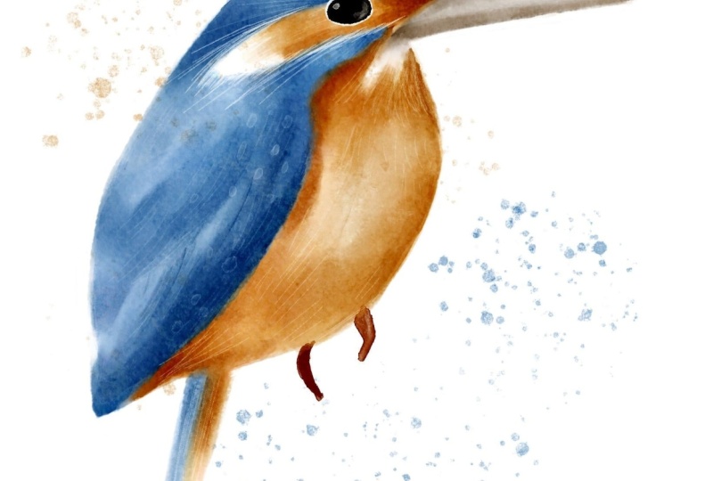
10. Painting: Part 3: It's actually really simple. For the eye, I'm going
to add a new layer, and with hard edge width, I'm going to select the black
color of a passage 100%. And I'm just going
to draw the I. When the ellips's just
a tiny bit. Wished. Not a perfect circle.
Something like this. And let's throw the beak on a new layer with
a cold press brush, I'm going to select
the lightest value of beach my brown color, and I'm going to fill it in. And I'm going to just
add some glazing layers. Don't worry about the edges. We will tie them in the end. But if you want to tie
under go for eraser, I've created masking brush, which kind of gives the
effect of the masking fluid, and for some reason,
I really like it. And I'm going to with
the same cold press, I'm going to select the
medium value of brown, and I'm just going to add some
darker areas on the beak. And finally, with the
harder edge weight, I'm going to select the
darkest brown, add a new air, change the blending
mode to multiply, and I'm going to add
the darkest areas. I'm just probably going
to reduce the opacity of the brush because
it's quite intense. I'm just going to
smudge the edge of I'll tidy a little
bit more in the end, so not going to dwell
too much on the beak. And let's put the
little feet in. I'll create a new layer. I'll probably put it
underneath and the very bottom because feet and with
a harder edge weight, I'm going to select maybe the
darkest value of my orange, but I'm going to just
push the slider a little bit to the red side because I think our birds eat a quite
more red than orange. I'm definitely not going
to dwell too much on that. I'm just going to just
very symbolic little feet. I'm just going to use the razor if I want to get rid of some
unnecessary details. Maybe smudge a
little top of them. And that's all I'm going to do. I definitely don't want to
dwell on the feed too much. And now, next thing
I'm going to do, I'm going to add some white. Another advantage of
digital watercolor. However, of course, you can
always use bleed proof white, white gouache, white acrylicon
real traditional painting. So I'm going to create a new
layer underneath the eye, and that's the very first
thing I want to do with harder edge wet with
a pure white color. I'm just going to outline
the area around the eye. Maybe it's too white, so I'm just going to reduce the size of it so it's kind of like a little outside
rim of the eye. Let's add some
highlight on the white. I'm going to create a new
layer on top of the eye, and I'm just going to add
a little bit of white. Going to smudge it,
something like that. I'm going to add a highlight. And different smaller
ones. Something like that. Alright, I'm quite
happy about my eye, and you can merge
the eye together. And now let's add
some lighter details. So I'm going to
create a new layer. And with the same hard edge with brush with a
reduced opacity in size, I'm going to start
adding lighter edges. So for example, this one is
sort of like a tufty part. I'm just going to add
oh some tufts here, I can see that my
sketch is interfering. I think maybe at this point, I can switch the sketch off, so it's out of the way. And with this strokes, I'm going to add some of the whiter areas just to create this kind of
fluffy feather effect. Next, I'm going to reduce the size a little
bit of the brush, and I'm just going to add some lighter areas
above the eye. A little bit here. I'm not gonna do it too much, but here and there, just to indicate some
fathering going on. And this part as well. I'm going to add a
little bit more color in a moment here, but I would like to
make this sort of like little chin beard part a
little bit more fluffy, a little bit more tufti. And I would like to add. You can also add with
the squiggly motions, a little bit of lighter areas, which I think work quite nicely. So if you increase the opacity of the brush a little bit and just create these
quigly motions like we did with darker colors, that's gonna work
quite nice, too. And I'm just gonna add a
little bit of feathers. Yeah. You can always
take the smug too, if you think some edges are a tiny bit harsh because
it's a watercolor. After all, you can always like, tap tap tap on them and
smdhe them a little bit, so they are not too harsh. And now, next thing is, I kind of would like to
add some of the white here kind of going on the
orange to soften a little bit. I'm just much it a tiny bit. I'm not going to overwork it. I'm quite happy with that, I would like to add a little
bit of color on this part. So I'll probably go on this on our very bottom
light orange layer. And with a cold press, I'm going to select the
lightest shade of brown. I'm just going to add
a little bit of color. Underneath because I can the one still the
impression that it's white, but I don't want it to be pure white like there is
nothing there at all, and I'm just going to
smudge a little bit.
11. Painting: Part 4: And now we've approached the final stage of our
painting of our Kingfisher. So next thing I would like to do I would like to add the
dark asteris of everything. So I'm going to start
with the blue probably. So I'm going to go on the layer. Remember, the one that we added the details on with the
multiplied winding mold. I'm going to choose
the harder edge with brush, and this time, I'm going to choose the
darkest value of my blue, and I'm going to add the very
dark asteris of my bird, but do not over do it. Because it just we don't want to lose this light and
dirty effect of watercolor. So I'm going to add
a tiny bit here. I'm gonna smart it. And I think I'm quite
happy with that. And I'm going to do the
same with the orange. So I'm going to go on the layer, the very top of our orange
layer with the multiply move. Again, I'm going to choose the darkest value of my orange, and I'm going to add
some accented areas. And now I'm going to
clean up some edges. I like this fluffiness
about this bird, but there are some as that
clearly need to be cleaned up. What I'm going to
do, I'm going to merge all the orange and
all the blue together, but still keep them
separately for now. Now I'm going to just slightly
tidy up the orange layer. I'm going to select the
eraser two masking brush and I'm going to just
go around the edge. Now, finally, I would like to merge all
the layers together. Again, if you are not sure
that it's your final work, make sure that you back them up, but I group them all, duplicate the group, and
switch one group of. I'm going to merge
everything together, maybe excluding the I and
on this layer I'm going to grab my water blender
and as a final step, I'm just going to blend some of the areas
like for example, I think this part of the beak
is a little bit too harsh. So I've just blended
and I'm going to blend this area a little
bit too harsh here. Blend the edge here. Here as well the border
is just tiny bit harsh for Om I lose
what a colour effect. A bit deal blending.
What I'm just going. And the very final touch. Almost very final touch. I'm going to create a new layer and I'm going to grab
the harder edge with, select the pure white color and I'm going to
reduce the opacity. I'm going to add this
little white spots that's quite typical
for Kingfisher, I can grab the smudge too if they're a
little bit too hard, just to put some hint of them. And and a little bit on the on the wings, and again, nothing
uniform, just some loose. Just a head. And here we go. This is our bird ready. If you want just to emphasize
that it's watercolor, you can always add additional layer and if you
use this water tus brush, which comes with your
mini taster set, you can just add
some watercolor. Blatters Just to make the
extra fancy, if you wish so. And maybe some orange. But that's obviously up to
you if you want to go for it. There you go.
12. Final Thoughts: Yeah, you've made it to the end. Well done, and I'm
looking forward to seeing your beautiful birds here on Skillshare or on social media. Don't forget to tag me. I hope you enjoyed and had some fun and remember
to come back for more. In the next two classes, I'll be painting the same bird, the Kingfisher in a
stylized illustration way and as a folk art piece. Thank you very much and
hope to see you soon.
 Irina Young, Busy May Studio