Transcripts
1. Class Introduction: Spring is in the air, and I'd love to invite
you to celebrate this beautiful season w illustrating a
charming Kingfisher. Yes, once again. Hello, and welcome to my new
class. My name is Irina. I'm a UK illustrator and the artist behind the
brand of Busy Mae Studio. Whether you joined my
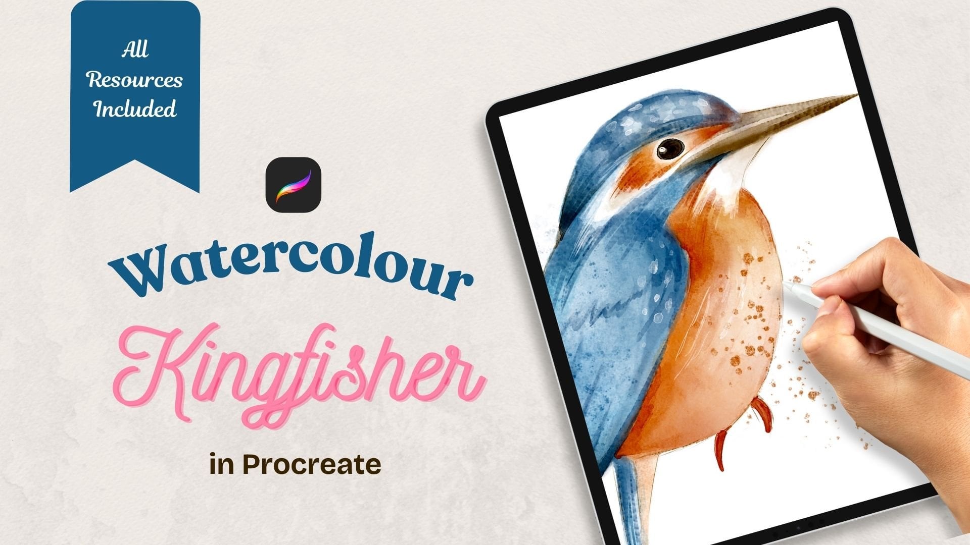
previous class where we painted the Kingfisher
and digital watercolor. Oh, this is your first time
drawing the bird with me. This class will explore a
completely different approach. This time will transform
the Kingfisher into a stylised character
full of personality. By the end of this class, you'll have a delightful
illustration ready to use for a children's storybook or for your own personal or
commercial projects. We'll start by adjusting a realistic sketch and turning it into the
base for our character. I'll guide you step
by step as we map out the main colors,
add unique details, and finish with some cute
accessories that will make our Kingfisher feel
truly royal and special. For this class, I'll be using my Scratchy Feely
Procreate brush set available in my
Skillshare shop. It's a set of specially
created brushes that you can use if you need to add more texture defects
to your illustrations. However, when you
enroll in this class, you'll receive a free
mini taster set, which includes
everything you need to create this
adorable character. This mini brush set, along with other
resources for this class, will be available for you
to download for free. Whether you are an
inspiring children's book Illustrator or simply exploring your own illustration style, I'm sure you'll find this class both useful and inspiring. It's packed with
helpful procreatives and plenty of
creative inspiration. Are you ready to tackle the
illustration of His Majesty, the King of the
Woodland fond with me? Then get your iPad ready, grab your pencil,
and let's begin.
2. Class Project: That's wonderful. For your class project, I would like you to illustrate a stylized version of
the bird of your choice. If you've already done the
watercolor fisher class, it would be ideal if you stylize the same
bird you've done in watercolor for most
striking comparison effect. Feel free to follow this
class step by step, which will be a great
practice for stylizing a bird for a children's book or for your own
personal project. Please consider uploading
your illustration here on the discussion
section or on social media, so we can admire your artwork and draw some inspiration from.
3. Tools and Materials: For this class, you will need an iPad or an iPad pro with
procreate installed on it. You will also need a
pencil, the brushes, featuring the
scratchy philly set, you've got a new
taster for free, which is more than
enough to create our lovely stylised
Kingfisher textures to create overlay, colour swatches, same as
from the previous class. And if you've not done the
watercolor Kingfisher class, there is the sketch of
a realistic Kingfisher, too, which we're going to
stylise in this class.
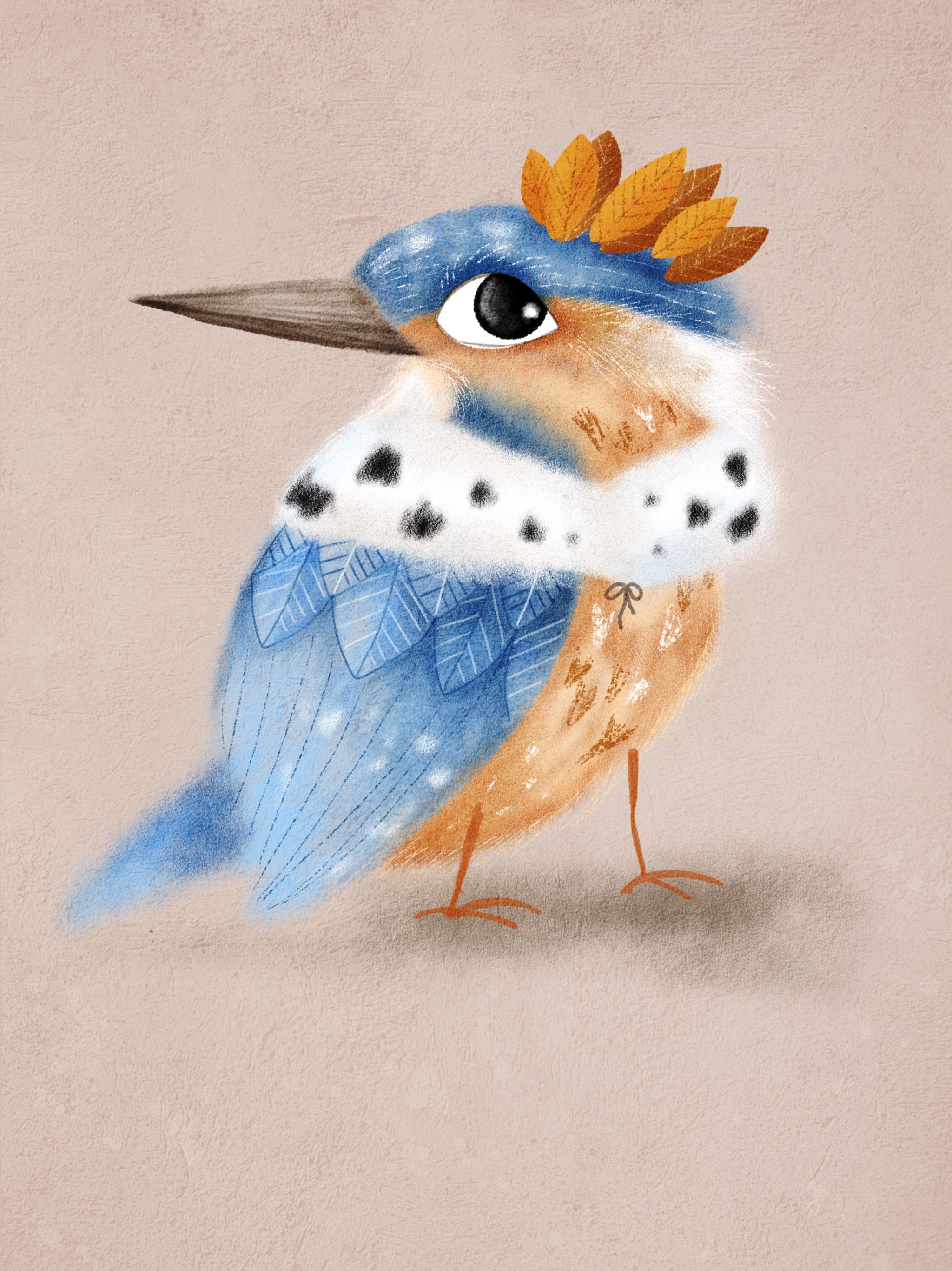
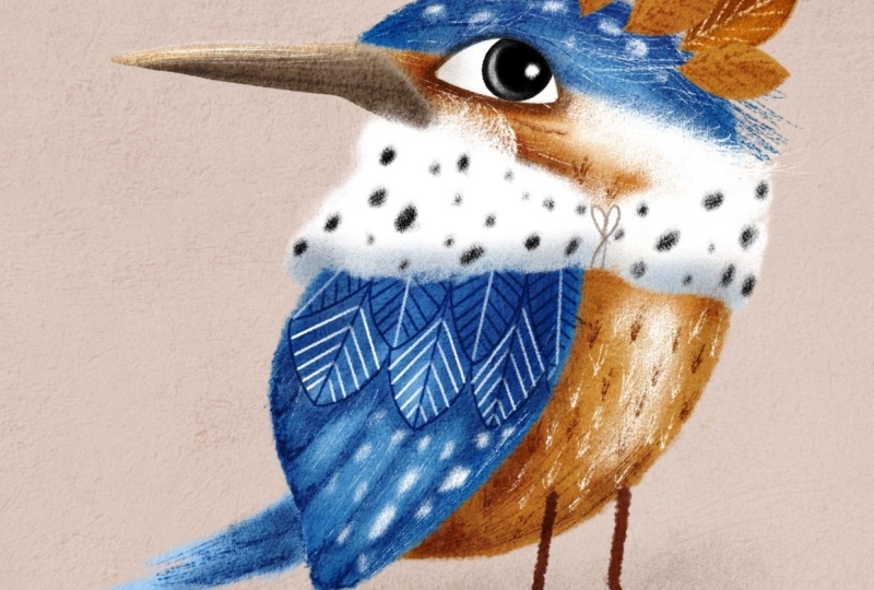
4. Kfs stylizing finished: So I've copied and
pasted the sketch of the skin feather from
the watercolor class. If you're not done that class, you can download the sketch
from the resources section. I'm looking at a very
realistic sketch of a kingfisher and asking
myself a question. What can I do to turn a realistic kingfisher
into its stylized version, preserving the features that
still make it recognizable. By the way, I talk about stylization in more details
in my whimsical bird class. So make sure you
go and check it. The very first thing I'd like to do is increase the head size. The exaggerated head will give my character more
cartoony and cute look. I would also like
to turn the head behind to give the bird
a bit more character, so I flip the head horizontally. You can erase the unwanted lines if they are interfering
with your vision. Next, I would like to reduce the size of the beak,
but only a touch, as the beak is one
of the main features that make the bird
recognizable as Kingfisher. To get even further away from the realistic
look of my bird, I would like to change the
shape of the wing slightly, making it more rounded. For that, I go to the adjustment menu and
select the liquefy too. With the push option selected, I start changing the
shape of the wing. After some consideration of
what else can be done to drift even further away from realistic look to stylized look, I decided to make my
kingfisher an actual king. It's a very serious role that comes with a lot
of responsibility. So now I'm going to try and reflect it in the
bird's character. Firstly, instead of sitting, my kingfisher will be walking, probably contemplating about some serious strategic
decisions to take. So I'm adding a pair
of longer legs. This changes the position
of the tail, as well. Instead of being directed down, it's gonna be behind the body. I'm also going to play around
with the shape of the eye, a great opportunity to give the character some
attitude as a king. Now, our stylized version of the Kingfisher is
pretty much ready. But in the last minute, I decided to emphasize
it as a king even more. So I'm adding some king style
accessories, a fur cloak, not too long, only a color type, just to make a point
and, of course, a crown. And our stylized kingfher
sketch is ready. I usually make the step of cleaning up my sketch
before colouring, but you can do it if it makes it easier to paint for
you going forward. Now we are ready
to start coloring.
5. Painting Main Colours: On. So we've created a sketch
of our stylised Kingfisher, and now we are ready to bring
him to life with color. I've created a
screen size canvas, and before I start coloring, I would like to do
some preparations. I add texture to most
of my illustrations, and this song will
be no exception. You can find the
two texture files in the resources
section to this class. First, I placed a texture
called cement on my canvas, and they change the
blending mod to soft light and reduce the
opacity to 55 58%. Next, I place the concrete
texture on top of the cement texture and
change the blending mode to color burn and reduce
the opacity to 43%. I put both textures
in a group and lock them so I don't accidentally
start drawing on them. Next thing, I change the
background color as I believe that it will benefit my illustration more than
a pure white option, making the colors pop. You can see the
value on the screen. Next, I'm reducing
the opacity of the sketch so that I
can barely see it. Now I create a new
layer and place it right between the background
and the texture group. And from now on, all the layers
will be built around it. I'm going to start with
the blue area of the bird, which is the top of the head, the wing, and the tail. For that, I pick the dry pastel brush and
the lightest blue colour. I'm making sure that
the opacity is 100%, and the size of the brush is comfortable for the size
of my illustration. Now, I would like to mix
in some mid tones of blue, so I start adding darker
color here and there. Mostly where shading
naturally occurs. If you feel that you need
to clean up some edges, I recommend to use the
contour brush as eraser. I would like to keep
my bird mostly floffy, so I'm only erasing the
inside of the wing, the bottom of the tail, and some blue off the face. Next, I create a new layer
underneath the blue part, and that will be the
orange part of the bird. With the same dry pastel brush, I pick the lightest
shade of orange and start covering the
orange area of the bird. I'm mixing in some
dark shades of orange to create a
nice colour variety. Now I'd like to add
some white areas. So on a new layer with the
same dry pastel brush, I select the pure
white colour and add some white areas
around the bird's head, gently mixing in
with the orange. For the beak, I select
a different brush, the contour brush, as I want the beak to have
much sharper edge. Using the medium value of brown, I fill the beak with a colour. I would like to mix
in some more colors. So I'm using the Alpha log on the beak layer to make sure that the colors don't
go beyond the beak. I pick the darkest
shade of brown, and with a dry pastel brush, I'm adding some darker colour
in the bottom of the beak. Now, with the lightest
shade of brown, I'm painting some
lighter area on top. And now back to
the contour brush, I would like to
add some lines to the beak using all
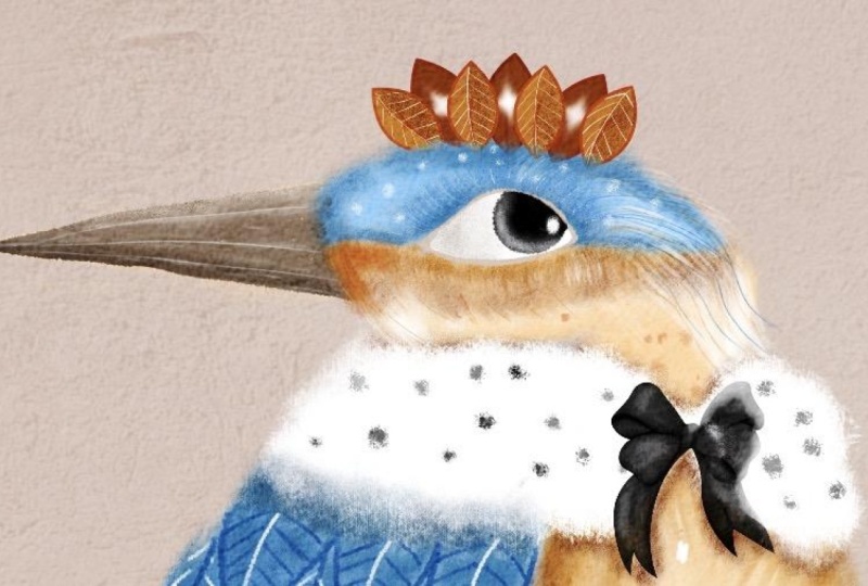
three values of brow. Finally, I need to add
some color to the eye. On the new layer with
a contour brush, I pick the pure white color. I pass it 100%. I'm filling the eye
white with a colour. On a new layer, clipped to
the previous one with a mask, I pick the pure black colour, Troy circle and fill
it with colour. So the color base of
the character is ready, and in the next lesson, we'll add some shading.
6. Shading: In this lesson, we keep
working on the colors. So let's add some shading. First, I'm going to work on the orange part of
the bird's body. So I add a new layer and clap it as a mask
to the orange part. I change the blending
mode to multiply. The brush I'm going to use for
shading is the gold spray. I pick the darker value of orange and reduce the
opacity of the brush. With light touch motions, I start adding the
shades to the body. I'm switching my
brush to dry pastel, as I'd like to make
some more vivid shades. I'm also adding some
shading to the body, creating the effect of
soft feather texture. Now let's move on
to the blue part. I add a new layer, clip it to the blue part, and change the blending
mode to multiply. With a gold spray brush and
the darker value of blue, I start adding shades where
they would most naturally C. Now I switch to the
dry pasta brush, pick the mid value of blue, and add some more
intense shading. I'm adding some lines on the wing representing
the longer feathers. Next, I'm going to add
some details on the eye. On a new layer, clapped as a mask with a dry pastel brush, I pick the pure white colour and reduce the opacity and
the size of the brush. With gentle moves, I add the white curved
line to the pupil, creating a glass effect. Now I increase opacity to 100%, slightly reduce the brush size, and add a little dot for
a highlight to the pupil. And the next lesson, we'll add some more details to evolve
our character even further.
7. Adding Details: I'm going to start
with working on details of the
wing and the body. Before anything else, I'd like to add the
legs to the bird. On a new layer, blending
mode multiply with a contour brush and the mid tone of orange,
I draw the legs. Nothing complex, two sticks. Now I'm going to
work on the wing, and I'd like to start with
adding some feathers. I create a new layer and
pick the contour brush. I reduce the size of the brush and pick the darkest
shade of blue. I start drawing
feathers on the wing. They're going to be
this kind of shape, quite big and exaggerated, arranged in two rows. Now I'm going to
add some details to the feathers with the
same contour brush. Switching between
blue and white, I'm adding these line details. With the eraser, I'm going to clean up the lines
on the feathers. Now, I feel like making the
feathers even more visible. So I go back to
the shading layer, select the dry pasta brush, and the medium value of blue. I add some extra shading. Next, I make a new layer, pick the scratch brush
and the pure white colour and start adding some scratchy
lines on the bird's head, which create a nice,
interesting texture. And some of the wing
and the tail as well. I'm drawing some white V
shaped individual feathers on the orange part of the body. Also adding some
scratches on the beak. Now I create a new layer, change the blending mode
to multiply and start adding some dark blue and
orange details with a in brush. To complete the details, I pick the dry
pastel brush and add these little fluffy
spots of white typical of the Kingfisher to
the head and to the wing. So now the details
have been added, let's work on the accessories.
8. Accessories: We can switch the sketch back on and let's start
with the fur cloak, which is going to
be very simple. But before we do that,
I suggest that we put all bird layers inside one group to get
them out of the way. I make a new layer and
pick the dry pastel brush. With pure white
and 100% opacity, I start filling the cloak
area with the color. I would like it to be a paque
so I duplicate the layer. Now with the same brush
and the pure black colour, I start adding the black details to make the cloak
look truly royal. I'm going to add a little bit of shading in the
bottom of the cloak, so I create the new layer, clip it as a mask, and change the blending
mode to multiply. With a gold spray brush
and the mid value of blue, I add some shading on the cloak. Now I switch to the mid value of brown and mix some
color in the shin. I pick the contour brush, and with the brown color, I add these little
ties to the cloak. Now let's work on the crown. After some consideration, I've decided that instead of a
typical standard crown, I'm going to give my Kingfisher a leafy crown to make him look like a true
nature inhabitant. On a new layer, using the Cantor brush and the
mid value of orange, I draw a leaf shape and
fill it with colour. I will need seven leaves, so I duplicate this layer six times to create
seven copies. The leaves are going
to be arranged in two rows, front and back. I'll start with the back throw. I switch off the
front four leaves and focus on working on
the three back ones. They will be slightly
larger than the front four, so I increase them in size. They'll also be darker, so I'm going to drop the darker
value of orange on them. Now, I adjust the
position of the leaves, making sure that
I'm happy before I merge all three of
them in one layer. Now I create a new layer,
clip it as a mask, and with a scratch brush and the lightest
value of orange, I start adding the line details. I add a new layer in between and change the
blending mode to multiply. With a dry pastel brush and
the darkest value of orange, I add some shading to one half of the leaves to
make them more interesting. Now I think the
shading is too dark, so I start playing around with different blending modes and
eventually opt for screen. Next, I'm going to work on the front row of the leaf crown. So I switch on the
four leaves layers and start arranging
their positioning and size till I'm happy. Then I merge them in one
layer for convenience. I create a new layer, clap ittasa mask and change the blending
mode to multiply. With a scratch brush and
the mid value of orange, I add the details
to the front limbs. I pick the dry pastel brush and add some shading
to the volume. And now our King's
accessories are ready.
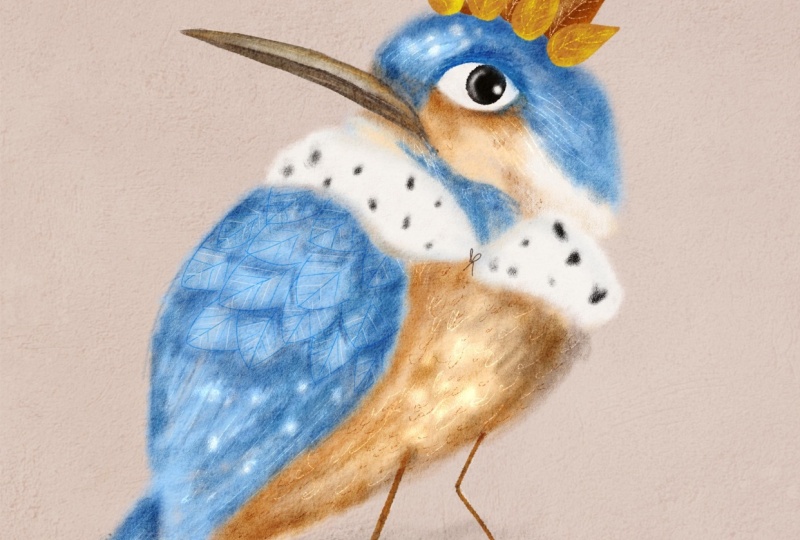
9. Finishing Touches: Our stylised illustration
is almost ready. To make it look complete, I would like to work on
some finishing touches. First, I would like to soften
the sharp edge of the beak. For that, I'll go back to the Big layer and
switch Alpha lock off. I pick the smudge tool, the dry pastel brush, and making sure that
opacity is set to 100%, and the brush size is reduced. I soften the front
edge of the beak, blending it to the
fluff of the head. Next, I would like to add some shading on top of the
head underneath the crown. For that, I'll go back to
the blue shading layer, and with the cold spray brush
and the mid value of blue, I paint some shading
under the crown. Next, I would like to set
the eye a little deeper. For that, I create a new
layer directly under the eye, change in blending
mode to multiply, and with a dry pastel brush
and the midshade of brown, I add some deeper
shading around the eye. I'm going to add some shading
on the white of the eye, so I create a new
layer on top of the eye and change the
blending mode to shade. I pick the gold spray
brush, reduce its opacity, and gently paint around
the white of the eye, making it more rounded. I would also like
to add some kind of ground so my Kingfisher is
not floating in the air. I create a new layer
under the feed layer, and with a dry pastal brush and the brown color,
I paint a ground. Finally, I would like to add some more texture to
the orange tummy. So I create a new layer
on top of the orange, clap it as a mask and
with a sea salt brush, and the mid value of orange. I'm adding some texture here and there with a tap,
tap, tap motion. There you go. The stylised
Kingfisher is ready. Oh.
10. Final Thoughts: Thank you so much for
joining this class. I hope you enjoyed
it and that you're happy with your newly
created stylised Kingfisher. If you decide to share your
artwork on social media, please kindly
consider tagging me. Next time, we'll
illustrate the same bird, but in an absolutely
different way, please follow me to make sure that you don't
miss any new classes. Hope to see you next time.
 Irina Young, Busy May Studio