Transcripts
1. Intro: When it comes to live
movies or comics, I noticed that there are two kinds of scenes
being played out. There are scenes
where people are moving about and doing things, and then there are
scenes where people are just talking, conversing
with each other. So these are some comic
pages that I've done, and we can see that they mainly consist of scenes
where there are people doing things and people talking,
people doing things. People talking, people doing
things, and people talking. And it just goes back
and forth like this. In my first two comic
classes on Skillshare, we have covered
people doing things. We have done a short sequence, and we have also done a one page story where there's a problem and the character
tries to solve the problem. So in this comic
class, we're going to cover scenes where
people are talking. Conversation scenes. Although it may seem quite simple and there's nothing
much to learn about it. Breaking it down
for this course, I found that there
are a few things to understand so that we can create a conversation
scene that is clear and easy for the reader
to understand and enjoy. So this is my third class in the telling stories
with Comics series. Hi, my name is Andrew, and I'm a freelance illustrator. From Singapore. I
like drawing comics, and I've been drawing
comics since I was a kid. These days, I draw
comics for fun, like I do Diary comics and I also do commissioned
comics for clients. I've authored two
graphic novels so far, Monsters Miracles
and Mayonnaise and the Ollie Comics Diary
of a first-time dad. So for this class,
we're going to start with different
approaches to drawing. We'll cover some
basics of panelling. We'll learn how to draw
different types of speech bubbles and
when to use them. And then we're going
to do a small exercise for our final project
where you will use those different types
of speech bubbles to create a simple
conversation scene. I decided that we'll do a mundane conversation
so that we don't stress ourselves to create
some masterpiece scene. And sometimes the most
mundane conversation scenes can be the most entertaining
when we look back at them. Sometimes when I do that, it releases me from performance
anxiety and allows me to create something
even more amusing than when I try to create
something amusing. So who is this comic class for? It's for beginners
who want to learn how to tell stories with comics. But although this is
a beginner class, I do recommend that you take
the first two comic classes first so that you can get warmed up with drawing people in different poses and with
simple backgrounds, which you'll need to use in the final project
in this class. What you'll need at
least a black pen. A mid-tone color pencil. Paper, it can be a sketchbook
or photocopy paper. In this class, I use
mainly photocopy paper. For optional materials, you can use your iPad,
the Procreate app. For the midtones, you can
replace it with watercolors, wash or anything that
you're familiar with. For the artwork, we
don't want to create anything too fancy,
because for this class, I want you guys to
focus on creating simple comics with clear
storytelling for now. And fancy artwork can come later after you have mastered
simple clear stories. So if you're ready to
learn about conversation scenes, let's get going.
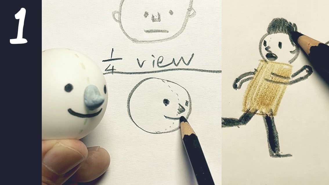
2. Drawing characters in a basic style: There are many
ways that we could draw our comic characters. And from looking at the projects submissions from the
last two classes, I could see that there is a
wide range of skill levels, and some of you could draw really professional looking
characters already. And some of you are just
starting out, which is great. So for this class,
you're welcome to try out any style approach to
drawing your characters, but I do want to make it
accessible to those who are just starting out in
their drawing journey. So if you feel that
you're still new at this, I do recommend this
most basic style. And I'm going to just make
some small variation to the previous style that I introduced in my
last two classes. So this will be my basic simple approach to
drawing people, which all of you could
try it out if you like. First, let's draw the body, pick any shape that would represent your
character's body. I think the most basic
shape would be a rectangle. And if we're drawing
a front view, we can add legs. And try to make the licks a bit thicker than just a single line, though a single line
can look kind of nice. And I want you to just color
the shape of the lick. So if it's a thicker lick, just color the shape. The reason for that
is that I want you to focus more on the shape
than the line because the shape is what actually defines the character
more clearly. After that, add the hid just think of it as
a little semicircle, or if you want to adjust it
to be a bit more squarish, taller, shorter, up to
you, or even wider. Then add the hands. Again,
it's just like a few Ws. If I go close up,
it would be like, no, no, no, actually,
not really. It would be like, like this. Maybe just three squiggles. Well, four squiggles can do too. Of course, I think not more than five squiggles
for five fingers. And then after that, just
add the shape of a hair. A things simple. So there's no need to add highlights or lines
within the hair. You can just color a shape. And of course, in
Asian countries, a lot of people have black hair, but if you come from a country where people
have blond hair, feel free to color it white
or another color and then add the features
eyes, nose mouth. If you want, you can
add eyebrows, too. But if you want to
keep it really simple, at least the eyes and the mouth. Noses are sometimes optional. From here, you could actually
add in other details. Like a belt, collar, stuff like that, up to you. And this would be the
side view. Same way. This time, the hand will
be inside the body. The hair, the ear, and
the side of the hair. I covered this in more
detail in the first class, but I think I modified how
I colored the characters, but more or less the same. We can be creative about this. If you miss the first class, I recommend that you check
out the first class to get acquainted with
drawing the characters from all different angles. But this would be the
most basic drawing style for drawing people
in this class.
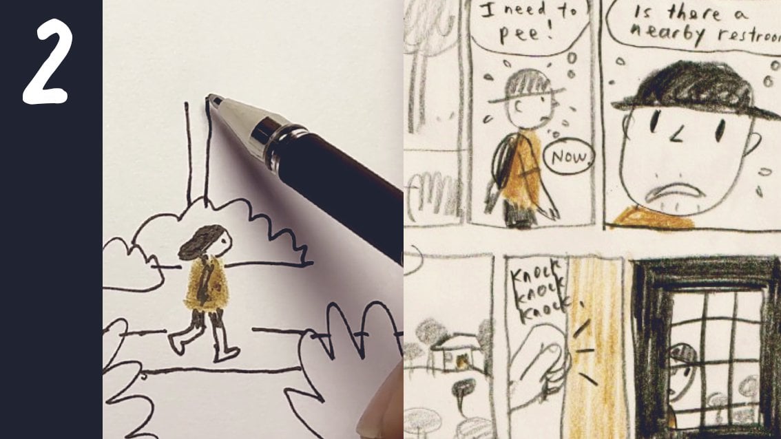
3. Spontaneous vs planned approach: Some of you might have
noticed that I drew this directly on paper without
any pre planning. And I would call this the
spontaneous way of drawing, where it's just directly from my head through my hands
directly onto the paper. This often results
in a very casual, slightly distorted figure, but distorted in a charming way. And oftentimes it has a bit
more energy and life to it. I could also do a more
complex character drawing with a nick
and other things. For example, I
could draw myself. Oh, I should add the nick. And with taller proportions
and with more details. And then I can color it in, too, and that will be fine. If you have more
experience in drawing, you could try a
more complex style. So these two are both
spontaneously drawn. So if I wanted to draw a more
careful version of this, I could start with
a rough penciling. I guess my rough
penciling would be similar to the
spontaneous drawing. So it would be a bit messy. And then when I do the inking, I just do it more carefully and correct anything I feel
needs to be corrected. I think most of you
already know this. I'm making myself
look extra buff. As you can see, the drawing
comes out a lot neater, and this would be what I
would do if I were drawing a serious comic for a
publication or for a client. But for my own pleasure, like for diary comics, I'm good with this because
it's a lot quicker, it's more fun, and I
find it more relaxing. Of course, I would erase
the pencils after that. Some people use a red pencil or a colored pencil and
then erase the red. This is an example
of my diary comics, and I do these spontaneously. And these were planned, as in I did the rough
penciling first, and then I inked
over with a dip pen. For those of you who love using the iPad
and drawing digitally, you could try it this
way, which is similar. This is how I would do it. On the first layer, I
would do my rough drawing. So it could be with
a color or black. I do like using a red color. So, for example, side view, and I could draw
this really roughly. So this would be in a
way, the spontaneous. And then to do the final, I call up another layer. I could lighten this
layer by selecting it, reducing the opacity, so
it gets really light, so it doesn't interfere
with my lines. I'm just using a
six B pencil here, and then I can do a Caffo trace. And correct the loose
lines as I go along. I notice there's a tendency for over perfection when it comes to using digital because it's possible to edit it
in so many ways. So even though it's digital, I do try to imagine or
treat it like it is natural media and refrain from undoing as
much as possible. Then removing the colored lines, just like erasing the pencils. And if I want to add a color
mid tone to color the shirt, I would call up another layer, set it to multiply, choose the color, choose
the brush, and color it. And since this layer
is set to multiply, the color just goes through the blacks and
it does not cover it. So this is how I would draw
if I were doing it digitally. So in this class, feel free to use any of these approaches. Whichever approach
that you choose to do, I want you to remember
to do one thing, and that is to add at
least one solid black area to one part of your character. For example, this character has the hair that is
pretty solid black, and I did that by
covering most of the white specs
within this area. This one doesn't have much
solid black areas at all, so I would increase
it somewhere, or I could even add Black
design on his shirt. Or if I want to, I can
make his pants black. This guy only has a mid tone, and hatching is a mid tone, too. There's no solid black
area. So let's add one. The solid black areas, it's a quick and easy way to build contrast
within the character, so they would stand out against a background
a lot better. In this comic that I drew, this is how I made the
important characters in each panel stand out. So which approach do you like better? The choice is yours.
4. Panelling basics: Okay. So to start with, here are a few things
about paneling. There is no need to use a ruler. Of course, if you want to, you could for me, I just like the hand drawn line where it's not
completely perfect. And I suppose it depends on what kind of story
that you're writing. If you're writing a
very serious story, perhaps a roulette line
would work better. But if it's a very
casual diary kind of comic, for example, then a loose hand drawn line, which is slightly crooked
here and there would actually help to make the
comic look more casual. So in my head, when
I'm drawing panels, I tend to divide the
pages in a few rows. For example, I could
divide this page into two rows or three rows. And then I'll start
drawing my panels. So this is the first row. I would draw a simple box. And the next box, I would
keep the space really small. I don't want to specify the
exact measurements because I think that can vary depending
on how big your paper is. But generally, you want
it to be really small. This creates a small pause
between these two panels. Just like sentences in a book, you'll see here that the spacing between these two words will be a lot smaller
than the spacing between this line and this line. So this spacing is really big. This spacing it's really small. So imagine that these two words are like two comic panels. So when I'm doing the
next row of panels, I would just leave a
slightly wider space. And the reason why we add a narrow spacing here
and a wider spacing here is so that we encourage the reader to read according
to our natural eye flow, just like when we read
a book with words, left to right, then down, then left to right,
and so forth. So it's the same way. Don't
make the spacings too wide, because when you
increase the spacing, the pause increases, too. If there's too much of a pause, that can interfere with
the pacing of your story. So don't make your
spacings too wide.
5. Panels and pacing: I found that we can
actually adjust the pacing or the
speed the reader reads through the panels
by controlling the size of the panels.
Let me show you how. For panels, there is
this element of time. So supposing if I wanted a scene to actually last
longer in the reader's mind, I could extend the panel
horizontally within the row bigger and if I felt that a scene
within the panel, I wanted it to feel a lot
quicker in the reader's mind, I would draw it shorter. And the reason for this
is because our eye flow moves from left and
travels to the right. So it takes longer for my
eye to travel from here to here and a lot quicker for my eye to travel
from here to here. If I want to slow down
the pacing slightly, I'll just increase the
size of the panels a bit. Sometimes I just want
a constant pacing throughout all my panels. So I make all the
panels the same size. This is one of my comics where I used a more constant pacing. As you can see, all the panels are pretty much the same size. This tends to work for more everyday mundane
scenes like these, and I think this kind of
arrangement would probably work better for
our final project. Doing a Mundane conversation. This is an example where
the panels are smaller, but they're all pretty much
the same size as well. And this is an example
where I wanted to vary the pacing a little bit. So this is a bit quicker, and I wanted to hold
this scene for longer. So this is how we can adjust
the pacing of our panels.
6. Designing the speech bubble: Let's start with the most
basic. Draw a bubble. Think of it like a
little balloon or a bag, and it can be any shape. So this is the bubble,
and then it would be attached to this
thing called the tail. And the tail would
be kind of slim. So there are students that draw really big tails like this, and this looks like
a nice green cone. So we don't need such a
big tail because we're not going to put
anything in this area. So there's a bubble
and a very slim tail, and where does the tail go? The tail is like a pointer, and where it always points, from what I notice, is that it always points at the mouth. Not the person's shoulder, not the person's stomach, unless perhaps the person had eaten something that could talk. What if the speech bubble
is behind the person? This is how I would do it. The tail would still point to the mouth or in the
direction of the mouth. As you can see, if I
extend the tail further, it would touch the both. If he continued speaking, it would still go
towards the mouth. For the basic bubble, different people use
different shapes. Rectangular, rectangular
with rounded corners, wrap around shape. So it's up to your preference. It is possible to have
the speech bubble cropped off so you could
use a bit more space. Speech bubbles can overlap
each other slightly. This is a smart way
to save on space. I still think it
communicates clearly, and it also reads clearly even if the
character's body part or hit moves into the space of the speech bubble or
if the speech bubble covers over a part of
the main character. If this does not
interfere with me seeing what his pose is, it's okay to cover over a
portion of his body. Oh
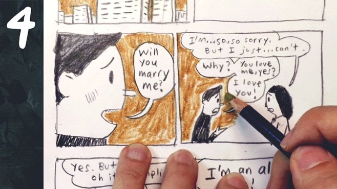
7. Types of speech bubbles and when to use them: We have the most basic one. And then we have the
double speech bubble, which is like a double
scoop ice cream. Now what is the reason for this? By doing it this way, we get a little pause between this
sentence and this sentence, and that can make this dialogue sound more natural because in our
everyday dialogue, we do have small pauses
between sentences. Without it, it will
just sound like, shall we have lunch
now, I'm hungry. Instead of, shall we have
lunch now? I'm hungry. So let's call this the
single speech bubble. Then there's the
double speech bubble. And then there's the
more complex one, which I'll call the
connected speech bubble. This is useful when
you have a lot of back and forth conversation
within one panel. Like when you don't have the
luxury of space and you need to complete a lot of
conversation within one panel. So we have two people talking, and we have this
person saying first. So we put it right on top, and then we leave a gap. And then we have
this person talking, and we put it below and we connect this bubble to
another bubble below it. And this one is connected
to this one below it. And the purpose for
this little connection or you could call it
a little bridge is so that we can have a
bigger space to tuck a speech bubble in between
these two speech bubbles. If you don't tuck it in, it would kind of
defeat the purpose. So I've seen some
students do it like this. Well, it might
work in some ways, but it won't be so clear. So as you can see, this actually follows the principle
of high flow, left, then right, down left, right, down left right,
down left right. I notice that the connected
bubble can also be used to create that pause
between two sentences. Or if you want to make
your bubbles flow in some unusual way, and there's actually
one more speech bubble which could be useful, and that is a speech
bubble without any tail. A speech bubble without
any tail is used when the character
is not in the panel. For example, we see a bunch
of cars driving on a bridge and because we don't have any tails pointing to
any of the cars or anywhere, it's like a scene where you
just hear two people talking. You just hear the
voice. Panels like this usually would
be accompanied by a panel where you could
actually clearly see who is continuing the
conversation like this. So we have the single bubble. The double bubble,
connected bubbles, and the no tail bubble. Putting the text in
practice drawing these out. M
8. Bubbles and eye flow: So now we have learned four different kinds of
speech bubbles, but there's still one more
really important thing to learn before we do
our final project. And I believe this will make
our conversation scenes a lot clearer when readers
read through them. It's a principle we have
covered in class two, but I think it'll be good
to cover it here, too. And I'm talking about the
principle of eye flow, where in the western world, our eye scans a page
from left, then right. Then we go down to
the next line of the next space and then
write again and so forth. Just like how we would read
a book in English, remember? We covered a bit of
that when we talked about the connected
speech bubble. This arrangement works
because of E flow. If we were to fill
up the bubbles here, this would make sense because we read from the
left part first. So want to play today. Question mark. And then we go
down to the next line here. I can't come here, go down to the next line, why, go down to the next
line, homework. If the spaces were
too far apart, eye flow would still kick in and readers might read it here, then down and here. Then they start a
new sequence here, left to right, and down, which would be off. So whether we like it or not,
readers are still going to read it according
to their e flow. So the best we can
do is to design speech bubbles that would
flow in line with e flow. When two people are talking and we want this
person to speak first, and then this person replies, we would do it like this
because according to IFlow, what happens on the left happens first and
then the right. So by placing it like this, we'll read this
first, and then this. And it would make sense. This is how we want
people to read it, and this is how majority of
the people will read it. So what if we want this
person to speak first and then this person but this person is on the
right by examining I flow, top comes before bottom. So if I did it like this,
do you think this works? I would say this is not bad because this one is on top
and this one is below, but there is a small
chance that people might read this first because
they would read from the left and then they would
think this is on the right. So to eliminate
that small chance that people read it wrongly, I would extend this bubble so that it's really above this one. So when they read from the
left and come from the top, they'll definitely
read this first, and then when they come down,
they'll read this next. Well, supposing it starts to get complicated with three
people talking this time, and we want to have this
person talking first, and then this person, and then this person
in that order. So how would you
arrange the speech bubbles according to I flow? I'll give you 5
seconds to think five, four, three, two, one. Have a solution in mind. So this is one way to do it. This person, I'll put it under because top
comes before bottom. I can do a little pause here, like a little double bubble. And then since top
comes before bottom, we can put it right at
the bottom. There you go. As you can see that
playing it safe, I pull this bubble across so that anybody
who reads it from the left will encounter this speech bubble first and
then just go down the flow. Got it. So when you're designing a panel
with speech bubbles, always keep e flow in mind, or else our conversation
scenes could end up being
confusing like this. After I fixed it,
so much better.
9. Thought bubbles: What about thought bubbles?
They're kind of similar. Some people like to draw a
thought bubble using a cloud. But I do find this
a bit too fancy, and I prefer something simpler. But you're free to choose
whichever you like. There are also some
comics that have a bubble that wraps
around the text, for example, I do find
it a little bit messy, especially when there is a
lot of background details. So this is still my
personal favorite. And you'll notice that I
didn't leave any gap for the tail because a thought
bubble doesn't use a tail. It uses little smaller bubbles. The bubbles tend to
go from big to small, though it does not need
to be strictly so. Instead of going to the mouth, it goes to the
person's forehead, because I believe
that's where we think. There are a few
variations to it, like some people would put
the first bubble here. And there could be many
variations that I could do, but I always remind myself
the main goal is clarity. So if I can make a
reader understand that this person is thinking
this, I have succeeded. So the main difference between a thought bubble
and a speech bubble is basically the tail, and so you could have a double thought bubble or a
connected bubble, could you? Perhaps this looks
a bit strange. So some people
tend to do it like this because this actually
seems to be more like a tale. So it's more like connected
by little smaller bubbles. Like I said, I wouldn't say that there is a right or wrong, but try different ways
and aim for clarity.
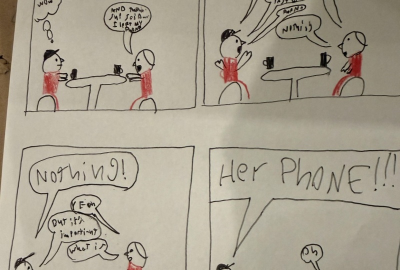
10. Final project: A mundane conversation scene: I believe the best way to
learn is to actually do it rather than just
absorbing knowledge. So this will be a final project. It's more of a small exercise, but I think it'll be fun to do. I would like you to draw
four boxes like this. Take note that between these
two boxes is a smaller gap, and between this
role and this role, it's a wider gap, just a bit wider. And that's to prevent people
from reading this way. We want people to read this way. And then I'd like you to draw
this same scene four times, two people facing each other with their mouth open because they're
going to be talking. You can be creative
about it or you can just follow what I have done. They're just sitting at a
table facing each other, and we're just using the
side view way of drawing. So we're just looking
at their side view. It's not important to
draw their legs because all the action is happening
where their heads are. So at least the top
half of their bodies. You notice that because
I drew this by hand and I didn't duplicate
this on the computer, every time I drew it, it is slightly different. And that kind of simulates
how things are in real life, because even though
two people are sitting across from each
other for a long time, there will be slight
movements and slight differences in
their expressions. So if you're going to
draw this digitally, I would still recommend drawing it four times rather than
just duplicating it. It's also good practice
for drawing characters, and it trains the muscle memory. Now, these are all
the variations of speech bubbles that we
have learned so far. I've just drawn it out neatly, and I'll put this in
the project section so you can download
this page if you like. So for this mini exercise, I want you to use at least two types of speech bubbles in this
scene that you'll draw. I don't think you'll
need to use this because the scenes we're drawing have our main
characters in it. If you like, you can include thought bubbles into the scene. But if you think
that's too complex, just focus on using just two
types of speech bubbles. As for what they're going
to be talking about, let's not overthink this
is just an exercise. It's not going to be
displayed in a museum, and you probably will
be throwing this away after the exercise. So just think of a really
boring, polite conversation, maybe a conversation
about the weather or what they're going to do that day or what they're going to order. And it does not need to
have a proper ending. We just want to practice using two kinds of speech
bubbles, at least. Since I'm asking you to do it, I'm going to have to
demonstrate it first. So I just thought
of this on the fly. Like I said, the key is not to overthink and to
just let it flow. I did not think of
everything at one go. I just thought about
one sentence at a time. And I have used one type, two types, and three
types of speech bubbles. I didn't use any thought
bubbles, but that's fine. We just want to practice
the different kinds of speech bubbles mainly. One thing I like about
this conversation is that there is a bit of conflict where one person wants something from
the other person, and the other person
is not giving it. So if you are feeling a
bit more adventurous, you could try to add some
conflict into the conversation. Just to repeat, a conflict is one person wants something and the other person
is resisting. If you think that's too complex, just keep it to
some really boring, mundane conversation
like really hot today. Yeah, it's really hot. I wish there was air conditioning here. Yeah, me too. The
weather has been really hot today. I
wish it were raining. I love those kind of weathers,
et cetera, et cetera. Alright? So go for it. Alright, I should add some
contrast to this lady here by adding some black area. That makes her stand out more, since she's one of the main
characters, and that's done. When you're done
with your comic, you can use a scanner to scan it or take a picture
with your iPhone, place your phone directly above your picture with good
lighting coming from an angle. Adjust it however you like
to make it clearer and then upload it onto the
Skillshare Project Gallery. This is where you
can share your comic with everyone else in the class, and I'll give you
feedback for your comics. Now, here is where there are two important things to note. The first upload will
just be your cover image. That means the
project thumbnail. After uploading that, type in a project title and add
a short description. And the next part is
really important. Scroll down to add more content, image, and then
upload your picture. This will be the actual
image that we'll all see, then publish it. So remember that there are two uploads that you have to do. So thank you for
joining this class, and I look forward
to seeing your work. Maybe I'll continue this
class with how to draw more dramatic composons.
So I'll see you again.
 Drewscape, www.drewscape.net