Transcripts
1. Intro: Welcome to comic class, too. In the first class,
we learn how to draw characters and how to put them in a sequence where they are interacting with an object. If you haven't taken
the first class, I recommend that you do so and then come back
to this class. In this class, we'll
learn how to create a complete story all
in one comic page. But before we do that, we need to learn a few more
essential things. We'll learn how to draw
simple backgrounds in three different ways, how to use contrast to help readers locate our
characters quickly, how to use cropping to
enhance storytelling, how to use e flow to help us compose our scenes
and how to use basic story structure to construct a simple,
complete story. And then for your final project, you'll use all you
have learned to put together a one page comic. So if you're ready,
let's get going.
2. Drawing simple backgrounds: So now we know how
to draw characters, but we can't just have
our characters hanging around against an
empty background. So now we're going
to learn how to draw simple backgrounds for us
to place our characters in. There are three types
of simple backgrounds I want to show you,
and this is the first. Most of the time, stories are about characters interacting
with each other. And what are some places where people interact with each other? One place I can think of
would be a park or a walkway. So what I've done here
is I have just cut out a few elements, like, the road, the bushes, some trees, stuff that you can find in a
park or a walkway outdoors. I think this will just
help me demonstrate how I'm going to lay out
this background. Keeping it really simple,
what I want to do is think of foreground,
midground, and background. So what I'm going to try to do is put something
in the forefront. For example, I'm going to put this bush in the foreground, something really
close to the reader. So now this bush is going
to be the closest to us, and in the midground
will be this path. Going to place it
behind the bush. So that will be
one layer behind. As you can see, the bush
covers a bit of the path. What I'm trying to
do is create depth. So right now, I'm
just going to put this bush perhaps here. And to create depth, I'll put this bush behind it. Okay? Like so. Stay down. Say down. In the background, this is going to be
like grass, I suppose. And I'm just going to
place these trees. Maybe I could even place them behind some of these bushes. So sometimes it helps to place some things
behind something. And that helps to create depth. So the more things I
layer one behind another, the more depth or the more
illusion of depth I create. This is pretty cool on its own. But of course, when
we're doing a comic, we're not really doing cutouts, though you could just
takes more time. But if I were to draw it out, I would play something
in front, like a bush, could do another bush here, and this will be the
foreground layer, and then I'll do a midground. And since this is a path, this is where our
character would walk on. So, just thinking of a
character, what should I do? And he's walking? I'll just do a side view, okay? So here I go. And, oh, yeah. The body and the pants. Well, the legs and the pants. Okay, let's just give
him pants cause if not, he'll look like he
doesn't have pants. And, okay, maybe a hair. Okay, let's just make this
a female. There we go. She's walking on the path. And then I'm going to
layer things behind. So this is the bush. We can place another bush here, or, like, you could place
the bush here, too. A tree could be here, behind the bush. A
tree could be here. And perhaps if we do
a tree further up, it will look like put it
slightly behind the other tree, it will look like it's
behind that tree. And if you just want
to add some texture, you can just add some repeated pattern
texture on the plants. Just repeated patterns. These are just curly
woolly lines and keeping it consistently
curly woolly. And there we go. Some
texture for the trees. And I can just do some grass, and that will be my
park or walkway scene. Here are other examples of
the layered background. I would say that this type
of background will give you a fairly realistic look
because in real life, things are layered this way. Now, this is the second simple background I want to show you. Draw this box here first. And we have this path
here and our character. And supposing if we wanted to depict something nearer to us, you could put it like this. So the general rule is that if you want things
to be nearer to you, you place it lower
in the picture, and things that
are further away, you place it further up. This is true when you see any landscape from
a higher elevation. What is far is actually
higher up in the scene and what is near is actually
lower down in the scene. So, for example, this
tree will be here. This house will be higher up, and maybe this house will be cropped off and even
higher up here. So, of course, this is a very, very simple way of drawing, but it will be effective
in communicating distance. Generally, when
we're doing comics, we just want to communicate a story as clearly as possible. So this method could
work if you feel that your background drawing
skills aren't that great yet, and you want to keep
it really simple, adding some texture. Here are other examples of the up and down principle
used in a background. As you can see, I
used this up and down principle in my first
drawing as well, and I combine it with
the layer principle. So you can combine these
two principles together. Now, this is the third
type of simple background. I call this a side view
background because it looks like I'm seeing the world
from a side view profile. Let's draw a cafe scene, since that's where
people interact, and it could come in handy
when you create stories. If you want to draw
a cafe, for example, it's just some chairs, table, and another chair, just like how kids draw. And we can also draw just
a horizon line there. If you would like,
you could draw a nice window to let
some natural light in. Let's draw the people in a
simple side view profile, too. The head the body. Suppose let's just make this body longer so it covers a bit of the leg. There we go. And then the arms go here, and maybe there's
a coffee cup here. Okay, let's make this somebody with long hair, and a mouth. Here, let's have
a hit side view. A person with here and
give him some paints. And this is where
if the color block doesn't really define
the body shape, clearly enough, I
would sometimes just add in line to
reinforce that shape. Simple enough,
doesn't look doable. And what about things
on the outside? Supposing if there are
buildings on the outside, but I don't want the buildings
to stand out too much. What I can do is I
could tilt the pen slightly and keep it
to a really thin line. Some buildings outside here. Maybe even a broken line because a broken line would
create less contrast. If I'm using a pencil, I could use a lot less pressure, and it'll give me a gray line. Gray against white
is less contrast, so it won't stand out so much. When you do backgrounds, do remember to leave some
space for any speech bubbles. For example, if you
do speech bubbles, there'll be space for
them to talk. Alright? But we'll cover
speech bubbles later. And here are more examples of
this side view background. I know it's like
a kid's drawing, but it is effective
for storytelling. If you want to
challenge yourself in learning how to draw more
complex backgrounds, do check out my other skill share course on how
to draw quicker, smaller and simpler, and then
come back to this course. I think that will give you
a pretty good foundation on how to draw backgrounds, which you can apply for comics.
3. Making characters stand out: Characters usually
carry the story. So if a reader cannot find
the characters very quickly, as in if the reader has to spend two or 3 seconds searching and looking for the key
characters in a scene, that can be frustrating. I would be frustrated, and that could slow down or
ruin the pacing of the story. So I find that it's
really important that my characters stand out clearly
against the background. That way, readers can
find them really quickly, and I do that by using contrast. Contrast basically
means difference. There are many things
we can contrast like size, color, texture. But here, let's focus on
tonal value contrast. Tonal value contrast
is basically the contrast between
light and dark. There can be many shades
between light and dark from white all
the way to black. And just in this bar, you
could find hundreds of shades. But when we are doing
simple drawings, we can just simplify them
into just four shades. Just white, a light mid
tone, dark tone, black. With our tools for this class, we can achieve this
light mid tone by coloring lightly with a
light colored pencil. If you use your phone camera, you can switch it to a
black and white filter, and you can remove the
colors and be able to see that this shade is
just a light gray. So a light mid tone. We can get a darker
mid tone by applying more pressure to the pencil
or we can use a darker color. For black, we want to keep it as
solid black as we can. So color like crazy. So now that we know how to
create these different values, how do we create contrast? To get the most contrast
between light and dark, we put solid black
next to white, the two ends of the spectrum. To create some contrast, we connect values that
are closer to each other, like white next to
a light mid tone. White next to a darker mid tone will give a bit more contrast. A dark mid tone next to a black will give a
bit less contrast. And if we want pretty
much no contrast, just place two values
that are very, very similar next to each other. White next to white, mid
toe next to mid tone, black next to black, you get the idea. So you got all that. So now, this is how we
use contrast to make our character stand out
clearly in each scene. After drawing out a scene, it might look
something like this, mostly a lot of outlines, and it isn't really clear which area of the scene
we should focus on. But if we add some
solid black areas to our main character here. Now, look away from
the picture for just a second and then look
at the picture again. Did your eyes immediately zoom in to where
the character is? Now, what if we added
some light mid tone to the trees around the area, but still being
careful to preserve the high contrast in this area. Now, close your eyes
and open it again. Do your eyes still zoom
into this area first? Yes, that's because, and I'm going to put
it as a principle, the more contrast an area has, the more attractive it
will be to our eyes. The trees do stand
out a bit more after I gave them
a light mid tone, but the character still
has the higher contrast. So that area still
stands out the most. So what if we added solid black to this big truck
here? What happens? The truck now becomes
a little more attractive to our eyes,
wouldn't you say? And a little more attractive
than the character, such that we look at the truck, and then we look at
the main character and then back at the truck
again. Why is this? This is the second
principle at work here. Increasing the size
of the area of contrast also increases the
attraction of that area. Now, if we wanted the truck to stand out the most, that's good. But supposing if we don't want the truck to
stand out so much, we can kill the contrast by putting mid tones
next to the black. Now, which area is
most attractive again, the area with the character? This scene actually looks
pretty good to me already, but supposing I feel that the trees now stand
out too much, what do I do? I can do this. I can reduce the contrast
around them, just like that. Oh, yes, since we're using
one color in our drawings, we can also use
color as contrast. So remember that contrast
is basically difference. If we want to make our
character stand out even more, we can give her a colored hat. Now, because this is the only
area that has the color, it is this area that stands
out the most. Got it? So here are some other
examples where I use contrast. You can see that I put the
highest contrast in this area, the black windows,
the black hair, the black pants, and I
put bigger amounts of the high contrast here because I want this
area to stand out. And for the rest of the items
which are less important, I put a lower contrast
or hardly any contrast, which is white next to white and a light mid
tone next to white. I say hardly any
contrast because there is this thin black line here and the black line does
provide a tiny bit of contrast between the white area here and the white area here. And that's what outlines do provide tiny bits of contrast. For this one, I put the highest
contrast here and here, because I want this guy
to stand out the most. And I also want the
dog to stand out, but in second place. So I did give him a mid tone with a mid tone against white, it's some contrast,
and therefore it creates a certain
amount of attraction. So therefore, these two areas
has the higher contrast, compared to here and here, these two areas
stand out the most, which is what we want because these two areas give the most information
about what's happening. To practice this, draw a small square preferably
without a ruler. We don't want to draw too big because comic panels
are really small, and so let's practice
drawing really small. As you can see, it's about
the size of my thumb. Add in one or two characters and a background
and practice using these two principles of contrast to make your character stand out against
the background.
4. Cropping (Example 1): So now we're going to
talk about cropping. Cropping is about
showing just enough, not too much, and
not too little. So it's about cutting out extra information that we
don't need in each panel and also making sure that there is enough information
in each panel. So readers are clear on
what we are trying to say. So here is the comic
sequence that I did earlier, and let's just fit
in some background. Let's make this a kitchen. I'm trying not to put
something in between them. Alright. So cabinets. Okay, maybe a fridge there. Okay, I have to do
that for all the rest. So we have our kitchen. Now a comic sequence
like this tells a pretty clear story,
and it actually works. But now let's see if we can use cropping to further
improve this comic. And this is how I would do. Let's move this up here. Alright, so the story is about
me going to the kitchen, getting a glass of water, picking it up, and drinking it. So I would start my new comic
with I would ask myself, does this cropping communicate enough at this moment in time? Does this look enough
like a kitchen? And I think the clues
are there, fridge, counter, tap, is there
anything else could add? I think it's enough. So I'm
going with this same crop. It opens the scene by telling
us where the character is. However, it doesn't tell
me what time it is, and I'll ask myself, is important to know
what time it is? Maybe for some stories,
that would be important. But if I did want to put a time, I could consider putting
a clock on the wall, but if that's not
obvious enough, I might just put like
9:00 A.M. In word form. Now for this second panel, I already know where
the character is because we already sit
it in this first panel. Therefore, it is not important to tell the reader where
the character is, again. So what's important
to communicate? I think what's important is
actually in this area here. That means I can do
a crop like this. What I want to show is the
guy picking up the cup, and I want to show his
arm, half his body. So let's see if I can do that. I want to show the table, too, because we want to say that he's picking it up from the table. So I'm going to crop
it just like that. Picking the cup up, the body. And with this close up, we can show a bit
of the expression. Is he just having a dead
pen look or a smiling look? Just a no expression look. Alright? So I've cut out all
the unnecessary details. I've cut out his legs
because his legs isn't communicating anything about
him picking up the cup, and I've cut out the background because we've already
said it here. Now for the third panel, we already know where
he is in the kitchen. We already know what
he was trying to do. We already know where he was taking the cup
from from the table. What is the important piece of information that the
reader needs to know now? I think it's just this, so we can do an
even tighter crop. Let's see how tight, can
we do it like this, maybe. In fact, actually, we
can go even tighter because we already know what the back of his head looks like, so we can even crop it closer. So let's do it like
this. Maybe like this, so we can even do it closer. Okay, so his How do you Okay, I guess if it's
full enough, it'll still be tilted this way. Will have his fingers, four fingers, and the thumb
will be behind the cup. Hands can be pretty
complicated to draw. So sometimes I try to look at my own hand and try to draw it as simply
as possible, see? If I'm holding a cup, it
would look like this. I'll see the forefingers, and I wouldn't be able to
see the thumb like that. Body, without the nick, since we're keeping it simple. Now, with this
level of close up, we can actually
show details that we wouldn't otherwise be able
to see with further crops. I need to make sure his cup. Reaches his lips, and the water level would
go here, right? I wanted to give him a smile. We can actually show smiles, but I don't think people
smile when they're drinking, so let's just avoid the smile. There is a bit of
a sleeve there. Okay, it's not perfect, but
I think you get the idea. Sometimes it's not
about perfection, but just drawing enough that
it communicates the story. And I think readers
can live with that. Alright. I think his
head isn't so elongated, so it's a bit like this. Okay, it's a bit closer. So I've cropped off
the back of his head. Anything else we need to show? There's nothing behind,
so think we're done. So if we look at
this entire comic, we can see that all these panels now work together as a team. This first panel tells us where. This one tells us
what he's doing and where he's
taking the cup from, and this one gives us
the small details. Maybe if he's I keep saying it's he,
but actually it's me. Actually, if I am drinking, maybe there are some
water dribbles that are dripping down because
this is such a close up. I can actually show this, but it would be difficult to
show it with this crowd. It's just too far away.
5. Cropping (Example 2): So remember the sequence, the
girl running to the tree. She's plucking a fruit, and then all the
fruits fell down. So how can we use
cropping to further enhance or improve this story? There are a few ways.
Let's try it out. Alright. First of all,
when it comes to comics, it's great that we can
have many panels to slowly tell our story in small
bits one bit at a time. So let's just look
at the first panel. Is it telling us enough
about where she is? I feel like there can
be more information, so if I were to redraw it, drawing it slightly smaller. So to tell where
she is, I could, of course, just
write where she is. For example, I could write she's in her garden or
she's at a park. But if I wanted to
show it visually, I would have to do
a further crop. As in, if we were
looking at the scene, we would have to stand further
back to see where she is. So where could she be? Mm. Are there other
trees around? Alright, perhaps you
want to say that this tree is on a hill. So let's do a really far shot, and the tree is really
small at first. And she's actually
running up the hill. Hopefully, it's not too small, so maybe it's good to
just draw a bit bigger. But I think for
demonstration purposes, this does communicate. I'm just gonna put these
small dashes to represent grass and perhaps
more rolling hills. Perhaps there are no
trees around at all, and this is a special tree. She's running up
the hill just for this tree. Perhaps
we could say that. So this scene tells
us where the tree is and where she is in
relation to the tree. And in the next panel, supposing if we have room for
as many panels as we like, I could actually do this scene. Slightly tighter crop.
I don't have to show the whole tree because this tree would look like this tree, and people will know
that this is there should be some there should
be enough similarities. So she's looking up. The grass appears in
just a small area, but we can see that
this connects to this. And if we want to
give a short piece of information between
this and this, we can actually do a tight crop where she's
actually just looking up. And because we already
know where she is, she's actually next to
the tree in this area. We can just jump to
a really close up. And the tight crop would communicate that she's
looking up at the tree. We could also show
her expression. Is it happy or sad? And I think let's show a
happy scene like aha scene. And you can also
use little symbols, whatever makes sense to
you, maybe like this. And you'll notice that I don't even have to put the
tree in this one because we already know where she is in
relation to the tree. So when she looks up, we know that she's looking at the tree. Now for the next one,
she grabs the fruit. Is this the best
crop to depict it? I think, yes. Let's go for it. Not as neat as my original, but she does jump up. Of course, if I want
to break this down, I could actually show the
sequence of her jumping up. But I didn't. You can choose
what you want to focus on. Now, what's the next
thing I want to focus on between here and here, if I want to expand
it even more and use different croppings,
what could I do? I could actually show her
about to eat the fruit. So she grabs the
fruit, which is here. And then if she was
about to eat the fruit, I think we can do a
tighter crop like this. Uh, she is about
to eat the fruit. And in this one, she is holding it
with this hand. So I have to make sure that she's holding it
with the same hand. Her eyes are maybe
maybe really happy. I'm about to eat the fruit. And how do we communicate
the last scene? I think we can use pretty
much the same crop because most of the information
that we need is all within this area. Maybe you can crop off
the top of the tree. So let's do it like this. I think I can still do
this very side view look. Actually, no, I think that we
should show the whole tree because we want to
communicate that the entire tree is now empty. Now, see that was
an important thing. If I cropped half of it off, there could be some fruits still above the tree
that we didn't show, and the impact of the ending might not
be as strong or funny. So there's some fruit still
falling off the tree. So I actually wish I
drew it a bit bigger, as you can see, it's a bit hard getting
the details there. Sharpening my pencil might help. It's important to see
her expression here, even from this faraway view. So that could have
been an in between thing where we could see her expression
a bit more clearly. But I didn't do that. So there's so many choices and
decisions to make. I wish we could see her
surprise expression here, but to enhance it, perhaps I could just do this little thing where it
kind of symbolizes surprise. So that's the story. So if
you want to compare it, this is what the
original looks like. And this is how it
looks like after I expanded it and played with some cropping to cut out extra stuff and to also include
additional information. So here is the range of
croppings I usually use. There is the far shot. In movies and film, it's called a White shot, but I'm a bit hesitant
to use the word white shot because white
shot might make people think that we need to do a
panel like this, a wide panel. But comic panels
can be any shape, even square or even so
usually I call it a far shot. Far shot is where we can
see person, entire body, and sometimes we can also
see where they are in relation to an object
or another person. This is the distance. I also use a medium shot. This is where portion of
the body is cropped off. The advantage of that is
that you actually can show what half of
the body is doing and you can do away
with other parts of the body that isn't
communicating anything important
at the moment. And it doesn't always
need to be the top half. It can also be the bottom half. If his pants had some tear or some gravy stains and it's
important to the story, we could just show
just the bottom half. Then there is the close ups. Close upshot is where we
can go really close up on details of a
person or an object. That's close up of the face. And when we go
close up like this, we can actually see the
expression really clearly. For example, if we just
give a slight smirk, we would be able to see that. Close ups can also be a
close up of an object. For example, if I'm
reaching for a cup, and supposing on the Mug
has the word star wars, we would be able to see that. And we could also see
maybe some of the liquid, whether what color it is. If there's space, we can show the steam coming out
from the liquid. If there's a ring on the finger, if it's important for the story, this is a good
shot to show that. So these three are
what I usually use. So if I were to sum it up, this tells the reader where
the characters are and where they are in relation to
other people and objects, this tells the reader what
the character is doing, sometimes how, and this one tells us things in more detail. If we want to go
one step further, for close ups, we can even
do extreme close ups. That means we can go
really, really close up. Can actually see his teeth. Maybe some of his teeth
has been knocked out. And if that's important
to the story, this will be a
useful shot to show that pimpo on the face luster, his nose running, all those really small details that we can't see in the other shots. Now, on the other extreme, we can show really
far away shots. We could actually pull back
the scene and maybe find out that they are actually
on a ship in the ocean. So just think of a
camera pulling back. And, of course, if you
go further extreme, you can also pull back
to the planet Earth. So these are the
different croppings that we could possibly play with to tell our stories more clearly and
more effectively.
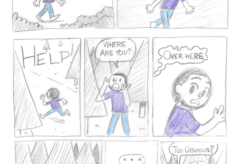
6. Eyeflow: At these panels
that I did earlier, do you think there's
a reason why I've placed the character here and the object that he's going to interact
with on the right? Same for this one,
character here and the object she's going
to interact with here. Is there a reason
why I did that? When I do a comic, I
want the reader to read in exactly the way that
I intended them to read so that they can
get the rhythm and the pacing and the full impact of what I want to
communicate in the story. So this is one of the
things that I pay attention to when I do a comic. Let's start with just text. Which word do you read first? Everyone or hello. I believe you read Hello, everyone. Why is that? That's because in the
English speaking world, we have trained our eyes
to read in this format, left to right, down,
left to right, down left to right,
and we will get to the bottom of the
page, we go up, Zoom, left to right, down, left to right, down, left to right,
and so forth. So in the same way, that's how readers would read our comics. We come in from the
left, come here, then go to the next object
and scan it down here. Then go up to the next panel, basically in this
eye flow motion. So if I had a bear scaring a person, how would
you read this? Because of our left
to right eye flow, most of us will
probably read Ah, this man's screaming first
and then see the bear. And so it would seem that the man was screaming
before the bear scared him, and the sequence would
seem slightly off. But if we were to
flip it like this, our eye flow would
come in from here. We would experience the bear
first and then the man. And for me, that would
make a lot more sense. Here are some examples where I have made use of this principle. I put the cause
on the left side, and then the effect or the
response on the right side. If it were flipped,
it would still work. For me, it just wouldn't
flow as smoothly. Here's another.
Loud noises here, the calls, and the response. A loud noise here, the response on the right. Going back to this panel, I wanted to say I was
walking towards the cup, rather than there's a cup, and I was walking towards it. That's why I placed myself on the left and the
cup on the right. Also, my character
was walking in the same direction,
our eye flows. So that also makes it smoother. I found that eye flow is really useful for scenes with
dialogue, as well. So when it comes to a scene like this, as a comic creator, I might think that I have put all the information I need to communicate this scene
right here in this panel. And in my own mind, I might read it. How are you? Fine. However,
because of eye flow, readers might probably read
it as fine. How are you? Remember the left
then right sequence, and that would be
in the wrong order. So how would we get
this guy to talk first and then this person
using eye flow? Let's just trace
it really quick. Want to make a guess
before I do it. Give you 5 seconds, five, four, three, two, one. Alright. Looking at
this e flow motion, besides using the
left and right, I can also use this
downward motion. So it's left right down, then left and right again. So what is up is seen first,
and then what's down. So I can do it this
way. How are you? And so my eye flow
would go like this. Zoom, Zoom, Zoom, Zoom,
something like that. Got it. So remember eye flow
when designing your comics.
7. Doing a complete short story: There are many approaches
to do a story, and many of them involve
using a story structure, something like a
skeletal structure where you build the story upon. But I used to stay clear of all that because I
always felt that using a story structure
would make my stories feel formulaic or
stiff or predictable. So when I first started
writing comics, I would just want to
write from what's inside of me and just be as
authentic as possible. Sometimes it would work,
sometimes really well, and many times it
just didn't work. I would have an idea.
I would start writing my stories and midway.
I'll be stuck. And no matter what I tried, I wouldn't be able to finish it. And so many of my early
stories were left unfinished. After several years
of doing that, I decided to just look through some of my more
successful comics, and I found that
those stories were actually in line with
story structures. I realized that they were
actually kind of a map on how we humans like to
tell or hear stories. So that made me more
open to using them. There are many kinds of
story structures out there, the save the cat story
structure by Blake Snyder, the 11 step story structure
by Jule Selbo and of course, there is the three step and the four step story
structures that you probably already
heard of if you took any storytelling classes. So now let's learn
to put together a one page comic story and using just a very basic,
simple story structure. This will enable
us to put together a complete story from
a start, middle, and end, kind of like
a plane taking off, flying, and then
having a nice landing. So here I put together a very basic story structure
in my own words, based on the few
story structures that I know of. There
are three parts. There's the problem in one part, and then the try and fail part. And lastly, the solution
or a non solution. We should be able to fit
all this within one page, but this will work in a
long form book as well. For this course, let's
just start with one page. I'm just going to
use an A four sheet of paper for the copy paper, and we're just going
to do the size so that we have lots
of room to play with. Now, let's do the
problem in one part. I think I'm just going to
use three panels here. Let's start off with
a person walking in the woods contrast,
making him look like me. And I think I'm just going to put where this place
is in the forest. That's because this crop
is kind of close up, and I won't be able to
fit that many trees in. So just from the
picture, it may be hard to tell that it's a forest. But if I write the
words here like this, and I just put just a few trees, it communicates a
forest very clearly, doing lots of overlaps, bushes, maybe a path,
some light shading. No stressing too much on
how it's going to turn out. Just treat it like
practice, okay? Grass. In the forest, he hears a sound, maybe a stump sound. I'm going to do a close up
so you can see his reaction. Wide eyes. And I'm
introducing the problem. So this is start of the problem, and there's a bear chasing him just make him
look dangerous. Did I make him too small? Maybe I did make him too small. That expression
looks scary enough. Remember our left
to right eye flow. So this happens first, and
then there's the reaction. Shadow, shadow. So with this, we can see
that this is the problem, and of course, we can
guess what his want is. To create a want, we have
taken away his safety. And therefore he will want
to get his safety back. Or you could say
that he wants to escape the bear. That
would be natural. You could see that I
didn't show the background here and I didn't show
the background here. That's just artistic license because you could say that sometimes when you're afraid
or when you're in shock, everything around
you disappears, and all you are just
focused on is threat. Also, we already
showed where he is. We kind of know the background
information here already. So when readers see this,
they will still instinctively feel that this background is still there, even if
you don't show it. So I'm just going to continue
with the try and fail part. So he's going to
try to run away. He's still looking back. My pens and the hat gives the contrast for the
character to stand out. Let's just put just the hands of the bear that work to show
that he has some distance. Ah, okay, maybe we
should just show the whole bear or no,
I see part of it. I'm doing a white shot
because you want to see more of the distance
between both of these guys. Through the trees. So
overlaps, some bushes. Sorry, that's a bit untidy. Loose doesn't mean it
needs to be untidy. Just give him a little droplets to show that he's panicking. Alright, so he's
trying to run away, so that's the try, so he's
gonna fail to escape. What I'm going to do is
make him trip over a rock, so maybe I'll put a rock there. And then I'm gonna choose what kind of
cropping to do that. I could do a file cropping, but that would mean drawing
all these details again, but the most important thing is actually him tripping
over the rock, right? So I think I can
do it like this. So he's tripped and he's in
the midst of falling forward. And now he has fallen. Let's put his legs up to shoulder to put him in a
more helpless position. Ooh. So tree trunks there. Okay, so he tries
and then he fails. When we do a fail, it gets more dramatic when we put
the character in a position where it
looks like there's no way he can get out now.
It's like a dead end. If you make the fail
a bit too easy, the tension won't be as high. So think of the
worst case scenario. Now let's come up
with a solution. We can either do a happy ending, a solution where he gets
away or he doesn't get away. So what are we
gonna do? I'm just going to do a very
close up because I want the bear
to just seem very ferociously close and the
teeth to be really big. The bear looks
like it's smiling. Just tilting the mouth a bit
lower does help, I guess. And maybe I'll give him
the eyebrow like this. The space for a roar. Roar. I wish I could
have it bigger. Looks like my solution is gonna have to come
right at the end. I think when it rolls, I think I want a corresponding reaction. Right now, he's
facing downwards, so I want him to be
facing the bear. And I think generally
people how would your hands be if you were
cowering from the bear, you try to protect
yourself with the hands. Well, actually not quite. And that's why I
wanted you to use a pencil because you could erase and be free to
make mistakes. Oh. Like that. And then he's like, Oh, wrong color pencil. Okay, he doesn't have his hat. And then we have to come up
with some ingenious solution, how to end it on a
satisfactory note. So what could the ending be? Will he be eaten or
will he be rescued? Sometimes either he tries
something totally different, shoots the bear with something, or he has a trap
door and he escapes, or there's some
unexpected twist, or maybe he makes
friends with the bear. Okay, but we only
have one space left. Of course, if you
want to do two pages to continue the story, you can, but it's a fun
challenge to try to fit everything within one page. And it's possible. I've
done it lots of times. Okay, let's just
do a twist here. He has fallen, it's gotten up. Somebody he knows
playing a prank on him. So this is a bear mask. Maybe just my daughter and
my wife if this was me, but this is a fictitious thing. And remember the small details
if he dropped his head. Make sure you drop the
head here and the path. Bush. Okay, so I remember
there was a tree there. There was another tree and another tree there,
another tree there. I'm just shading them
really lightly so that the main characters
have the most contrast. So there we have our twist. Is this a solution
or a non solution? I guess it's a solution because the bear itself
provided the solution. So he did get out of his problem and got his want, safety. So as a recap, if it's not clear from the crop where
the characters are, feel free to just mention
in a small caption above. But if you can
show it clearly in just the pictures, you
don't have to have this. So this is the problem and want. Make sure the want
is very clear. The person can also say the want if you want
to make it clearer. But if you think it's
clearly understood, there's no need to
belabel the point. Have the character try and fail. Make the failure as if
there was no way out. And that would increase
the tension of the story. You don't have to
think of the ending at the start of your comic. Just think of it when
you get to this part. I find that it's more fun, or you can even ask
somebody else who isn't so precious
about the comic to come up with a
ending for you. So, this is the ending. It's either a solution
or a non solution. I would just go with whatever
amuses you the best. Don't need to come up
with some brilliant, witty ending to please
the whole world. If it just makes you
chuckle, that's good enough.
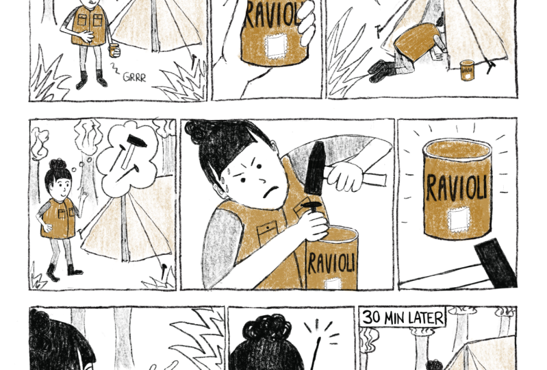
8. Final project: Create a 1-page comic: Alright, so did this look fun or did this
look challenging? I'll say that it's both
fun and challenging. So next, I'm going to introduce
you your final project, and you're going to do
a comic just like this. Use an A four sheet of paper. Simple photocopy paper will do pencil or pen if you
feel more confident. Color pencil, eraser. Next, do a one page
story in this format. Start in a similar way. I would suggest starting
in the same scenario, which is a person
walking in the forest. So if you like, draw
the same scene, but feel free to draw
another scene if you like. Like, if you want to
make this park instead or your neighborhood
or something, feel free to change it. Of course, use your own
characters in your story. Do a problem and want part. You can break it up into as
many panels as you want. Three, it's quite tight already, and you can make it overflow
to the next row if you like. Trying to come up with a
different problem from mine. I'm sure that there's so
many problems that could crop up from somebody
walking in the forest. For example, Make sure that
the want is very clear. If the pictures don't
show it clearly enough, he could be thinking what he wants or saying what he wants. This will be the try
and fail section where the character tries
to get what he wants, but fails miserably. Keep the background simple. There's no use to have super complicated angles
and everything, and it's hard to understand. But of course, for those of
you who are more experienced, feel free to try your more
advanced backgrounds. The main thing is clarity. Now, this is where I need
to figure out how to do a and I guess let's
make the door yellow, too, so that we can
have some continuity. Okay, so this is
to try and fail, but it hasn't failed yet, so I'm just going to continue one more frame at the next row. Okay, this is as fail as
I can make it right now. So now the last part is to
come up with a solution. I only have this space, so come up with a crazy
solution like this. So this would be how he
gets out of his problem. So have fun and come up
with your own solutions. Let them be crazy, amusing, and make yourself laugh. When you're done drawing,
just double check your work to make sure
that you have put enough contrast around the
most important areas of your comic so that
the reader's eye can immediately zoom into the most important
areas of your comic. Also, see if you have included
a nice mix of croppings, far shots, medium
shots, close ups. It's also important to
read through the story and see if anything can be
strengthened or enhanced. Like, I think I'll give
him sweat droplets, and now because I want the problem to feel
bigger and more intense. And although I showed the storm, it does feel kind of quiet, so I feel that this sound
will make it more dramatic. And I'll add this.
Symbols like that can add just a little bit more impact
and clarity to a scene. After that, take a picture of your phone or scan it
if you have a scanner. Please rotate it
to the right angle and upload it to the
Skillshare website. So I think for most of you, as you're about to
start your comic, you're going to be faced
with thoughts like, will I be able to do
a good enough comic? Will I be able to
impress people or make people laugh? Will
it be good enough? And I just want to
give you a license to come up with a most mundane, boring, imperfectly drawn comic. I just want you to focus on the main principles that we've been learning in this
course and just do it. One thing I want to
remind myself is that there's no such thing
as a perfect comic. As a reader, all I'm
searching for is a story that I can relate to or at
the least understand. I think that's what
all readers want. We don't really care
whether every line drawn is perfect or not. So have fun with your comic, and let's check it out
after you're done. So thanks for joining me in this course, and I
hope you had fun.
 Drewscape, www.drewscape.net