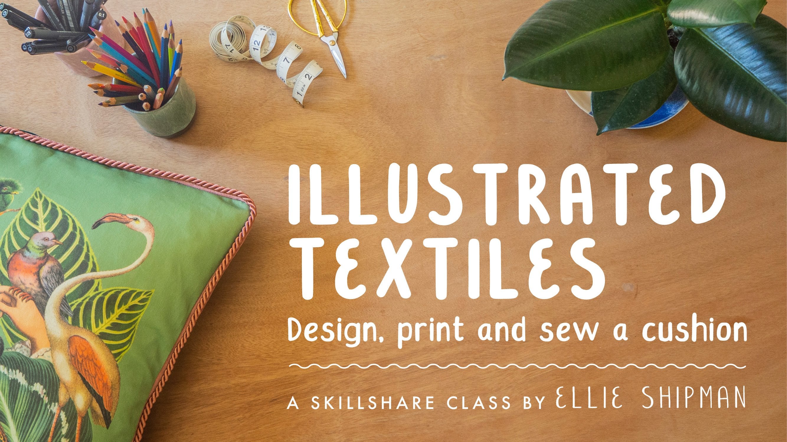
Transcripts
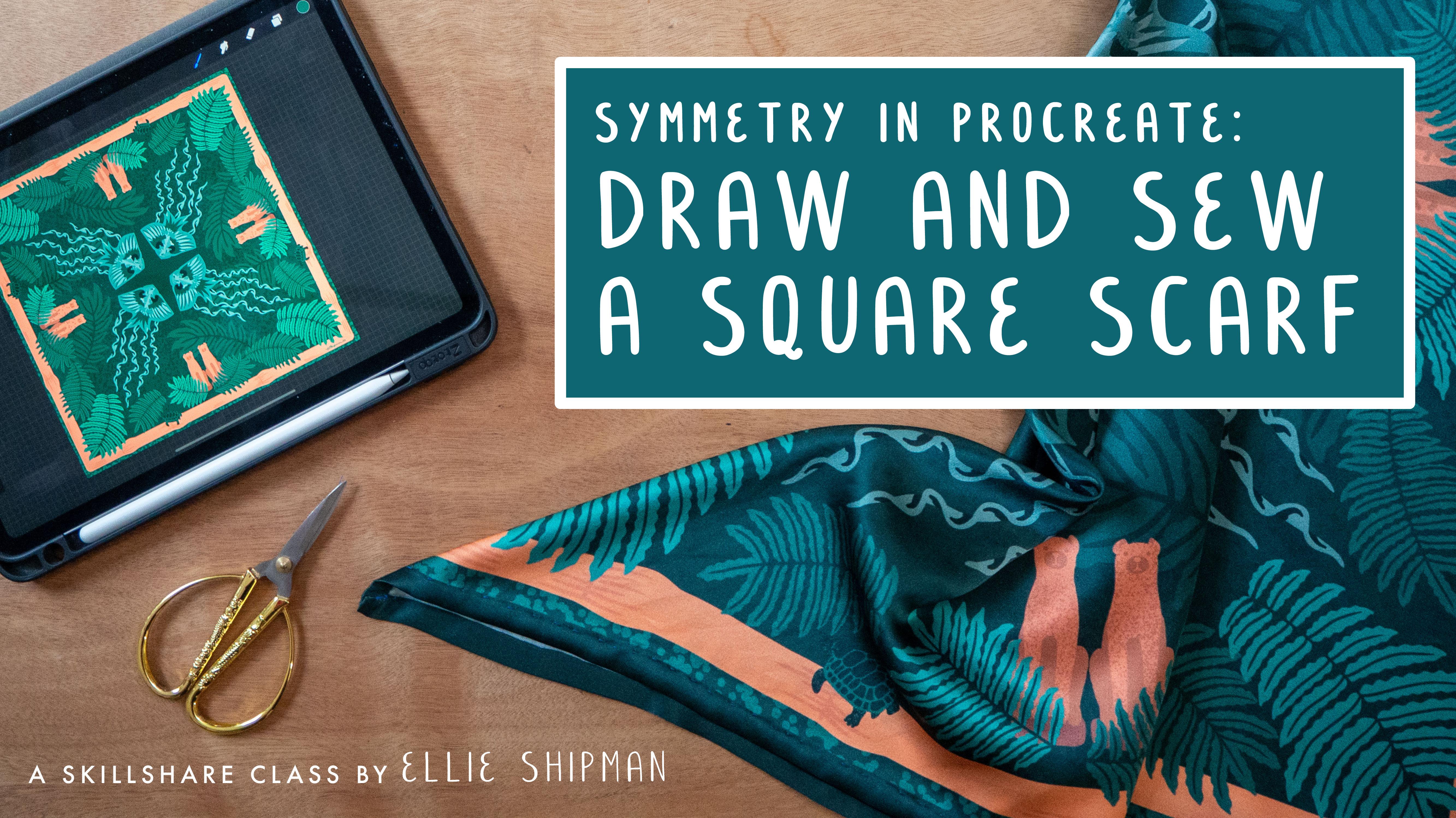
1. Class Project: Draw and Sew a Square Scarf: Hello, my name is Elie Shipman. I'm a participatory artist, illustrator, and patent designer with over 10 years experience working creatively with communities. Some things I like to make include exhibitions, public art, illustration, maps, and fabric design. I love traveling, and in 2019, I spent the year living in Vietnam. I took on new creative projects and spent the year learning about the incredible people, food, places, and culture. For this class, I want to bring my love of traveling and fabric design together and invite you to create a square scarf inspired by your travels using Procreate. Our creative journey will include using Pinterest for visual research, making a mood board for my own travel photos, designing and sketching tips, and using Procreate's drawing tools and assisted rotational symmetry. We will also learn how to make a digital mockup. Finally, we will send our designs to get printed in real life on fabric. I will receive the fabric and then try to create your own unique scarf inspired by our travels. You will learn a range of skills in this class, from drawing and workflow tips in Procreate to design an inspiration gathering, as well as creating mockups and sewing and printing fabric. This class is for anyone looking to improve their skills in Procreate and also explore the possibilities of digital fabric printing. All you need is an iPad and Procreate to get started. Have a read of the project description, check out where to upload your work, and download the project resources. Then let's get started.
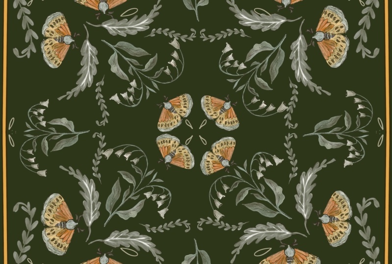
2. Finding Inspiration: In this lesson, we're going to be doing some visual research for our scarf design using Pinterest. To start off, let's create a unique Pinterest board for our scarf ideas. You can start searching for terms like silk scarves, vintage scarves, square scarves, to start getting some ideas. You can also search for brands like Hermes, Liberties, Karen Mabon, and Chanel, for example. According to the fashion blog CR, apparently, one Hermes scarf takes 18 months to complete and uses silk from 250 mulberry moth cocoons to make. We don't need to take that long on ours though, we're going to be using Procreate and a digital fabric printer, so we can skip the 18 month part. I've already made a Pinterest board for my ideas. I'll show you just to get your ideas flowing. I found some really beautiful designs. Remember, this class is going to be all about rotational and repeat symmetry. Keep an eye out for designs which might use motifs which can be reflected or rotated, bear that in mind as we do our research. You can see in this butterfly example here, there's a symmetry going across the four quadrants with one butterfly in the middle. You can also play around with breaking up the symmetry as well, which is quite an effective way to make something really bold and visual. You can see where they've just used borders in this vintage Hermes one. It's nice to compare vintage to modern examples to see how the styles have changed over the years, and what key classic techniques, and motifs, are still being used. This one, for example, with the lions. This is drawn by Textile Artist Emma Shipley, who's a really incredible illustrator. It's made by Aspinal of London. You can see again, she's got some repeated motifs, but they're actually not symmetrical. Some of them have repeated elements of them to give you the visuals of a repeat but making it still visually interesting. These original Hermes ones are really beautiful. Again, not using too much symmetry, they have a symmetrical border going around the outside, but the middle is more of an illustrative piece, which you could also use in your design if you prefer. They've also played around with detail coming off the borders and going over the edges to create a really organic and wild feeling of the design escaping the confines of the scarf. This is another nice Hermes example, where they've used elements of reflection through the center axis. You can see the swimmers reflect each side, but then, the main ones on the edges are different to again, bring that contrast and interest to the design. You should also think about how the scarf is going to be worn and which elements of it will be seen, for example, if it's tied in a triangle with the point going around your neck, or if it's tied as a headscarf, perhaps. Have a think about what you want on the corners and on the points of it, to keep that visual interest going, even when it's folded up. Once you've added your designs to your Pinterest board, make a note of the common themes which have come out for you, and these are things which you can bring into your scarf design as we go ahead. For mine, I think florals and these deep borders are really interesting. I also like the illustrative main element with a repeat reflection around the edge. The colors for mine, lots of blues and pastoral tones. Later on, we're going to be making a color palette from some photos, so we can play around with that as well. In this lesson, we have started to gather our visual research for our scarf design through making our own Pinterest board. We've made some notes of key ideas to take forward into the design phase. The final action for this session is to upload a screenshot of your favorite section of your Pinterest board into the project gallery, so we can all comment and share each other's ideas as we develop them. In the next lesson, we will gather firsthand inspiration from our own travel photos.
3. Making a Moodboard: In this lesson, we will create a moodboard in Procreate to start gathering our own travel photos as inspiration. These can be photos you might have taken on your own travels, somewhere that you might want to use as inspiration for your scarf design. If not, it could be somewhere that you'd like to go in future, so you might want to gather photos from the Internet and online. Remember these are only reference pictures, so you don't have to worry too much about copyright if you're not going to present this as your own work. But please, be aware of this and you might want to look for photos which are labeled for reuse and are copyright free. Last year, I had the chance to live in Vietnam for the year, where I took on lots of new creative projects and had the opportunity to just be immersed in a completely different culture for the year. It was really wonderful. These photos are some photos that I've taken of my travels in Vietnam, and it's what I'm going to use for my scarf inspiration. What I've done is created a new album on Google Photos, which is what I use, but you might want to create a new folder within the photos on your iPad and just start to collect the pictures there. Have a think about why this place was or could be significant for you? What kinds of sight, sounds, tastes, and textures can you remember from your travels in this place or would you like to experience in a future place? Try to visualize your favorite moments from this place as you build your moodboard. Once you've created your album, download your favorite photos onto your iPad, if you haven't created it using your iPad photos app. Here's my album of some different images from my travels in Vietnam. We've got all sorts of things like leaf textures, textile patterns, we've got really beautiful embroidery and shapes, these repeated motifs, flowers. I love the colors in this beach ball and some curious objects and ceramics here, and these lovely textures of these banana leaves, amongst other bits and bobs. We've opened up Procreate, now let's make a new Canvas. We can go to Custom Canvas, check it's on pixels, and go to 3,000 by 3,000. You can see that the DPI is 300, which is a good, nice, high resolution. We've got maximum layers of 55. But because we're not going to be drawing too much on this Canvas, I think that'll be fine. Let's go to the drawing guide and make a grid of 125 by 125 square. We'll go to the Spanner icon on Canvas, and then go down to Drawing Guide and turn it on, and go to Edit Drawing Guide. Now, I've already made this drawing guide the right size. The grid side should be 95 pixels. So you can just click on that and change it to anything you like, but for this, we're going to use 95, which makes a nice grid. You can also change the color of the guide if you prefer to have it more or less obvious. Now, we're going to start adding our photos into this moodboard. Again, let's go to the spanner symbol, click "Add" and insert a photo. We can go to Recents and find the images here. Let's start with these flowers. As you can see, it comes up across the whole Canvas. We just want to make it a little bit smaller and start making it a bit more neat. Drag and hold to make it a bit smaller. Snapping is set on, which means that we'll just snap to more or less, snap to the edges of these guides. You can zoom in and make sure it's more accurate if you'd like. That's better. But for the sake of a moodboard, we're really just gathering images. Usually, I would use InDesign to make a moodboard if I want the layout to be absolutely perfect, but for this task, we just need to put our images in one place for our own reference. Let's continue to insert small pictures. I definitely want this beach ball. Pinch to drag it in. Well, that's not bad. We'll make it a bit smaller. Just continue this until you've added as many pictures as you want. I love the colors in these little pigs. It goes quite nicely with the flowers here. I love these beautiful leaves. Let's keep adding. This little dog, it can come in. These dogs are everywhere in Vietnam. They're very typical breeders. Let's add this beautiful ceramic sculpture. [inaudible] love that. While you're adding your images to your mood board, think about getting a nice cross-section of textures, objects, maybe animals or people, and just points of interest to start inspiring your design. Let's see what else if we go here. These lovely leaves as well. Do you love a good leaf texture? Again, don't worry too much about the overlapping in the edges, that's very typical. Market scene, people selling from a bicycle. Let's put some nice purple taint in that as well. Maybe we can fit one more at the bottom, what else have we got? These veggies are quite nice. If like this you have an image wishes to bake, you can crop it out. All the images will come up on their own different layers. Make sure the one you want to crop is the one that's selected and then, go to the selection tool and pick rectangle. Let's draw a rectangle from this point up. I just want to get rid of that. I've just selected the top of the image here, and I'm just going to drag down with three fingers and click "Cut" and it would just cut it out. I actually want that to be a little bit smoother again. You're going to do the same thing again, cut that. You can also change the opacity if you want, so you can see behind it. Again, let me cut that, looks a bit better. Change opacity back up, and I think that would do. As you can see on my moodboard, all of my images are a little bit skew off to the right at the moment. I'm just going to select them by just dragging across, select all of them, and click "Group". Now I've got this whole group selected, so I can just reposition it be more centrally, maybe a little bit lower down as well. That's my photo selection, and I'm going to add a title, and then we're going to make a color palette. Let's go to the spanner, again, and add text, and I want to make this text along the side. I want it to be a feature of font, a little bit smaller, lower, and instead of text, to be moodboard, and let's change this to black. Now, this is a little bit big, so just click on that and make it a bit smaller. I think that looks fine. Once you've made your moodboard, we're now going to add a color palette from the photos that you've selected. Let's first draw a circle, which will be our little color swatch. I like to use the inking. I like to use Studio pen as a nice clean pen to draw a circle with. First, let's add a new layer. You've got layer 12 here. Make sure the Studio pen is selected, and then just draw a circle and click and hold to make an ellipse, and then edit shape and make a circle. Then let's fill that to just make it a nice filled flat shape. Now, we're just going to leave it blank for now and duplicated. You can just swipe to the side and duplicate each layer and just bring it across. My snapping is still on, so they're actually staying quite nicely aligned, and more. Of course, you could have any amount of colors, but I'd say start with five and try and have a nice light, mid and dark orange. Again, let's group this color palette. Let's name it because it's good practice to name our layers. Now we have these black swatches ready to go. I'm just going to start clicking and holding to make the color. That's not what I want. I'm actually going to flatten this color palette. Let's flatten the color palette and just keep it nice and easy. I love actually the whole color palette from this ball. I'm going to choose a few from here to start with, this peachy pink color and this bright pink. Very fun. I actually really like that color palette as is but let's make it a bit smaller. Maybe let's duplicate that and make another one. In the second one let's try and choose some different colors, the strongest nice greens. Again, try and choose some contrasting colors. That's purple color. I do like purple, and maybe that's okay for a nice mustard yellow as well. We've got two color palette swatches now. You can just do one if you want, I'm just getting over-excited. Once you've got that, we can make them into a proper color palette in Procreate. If you click the color in the top right hand corner and get down to palettes, and then let's make a new palette. Scroll this, Skillshare travel scarf, and it's default. Again, we can just click on that and put them straight in. I think I'm going to go with this color palette for my scarf because I just love these colors together and I actually took that photo in order to make a color palette from it. We'll stick with that for now. Once you've added your color swatch into the color palette on Procreate, we're going to add in some tone, submit in dark tones with these colors, just to give us a bit more of a range to play with when we're sketching. I've just clicked on this blue. Then if you click on the classic color option, it's really easy to just add light and dark, white or black along this scale. The color you can see has come up about halfway down this swatch. I'm going to just take it down a little bit darker and add one in underneath there and a little bit darker again, and that one underneath them. I'm going to click on the green and do the same thing. In each green, dark green the same with orange. Dark and darker pink. Darker and bright pink. Now you can see on this palette that I've got a really nice selection of colors. You can add also black and white if you want awesome highlight and low-light colors, which are separate from that palette. But I think I'm just going to stick to that for now. Let's see how we get out when we start sketching. I'm now going to export this. Go to the Spanner and click "Share" and export it as a JPEG. In this lesson, we made a moodboard from our own travel photos or from photos of somewhere we'd like to travel and we've also made a color palette and made a proper palette in Procreate, ready to start sketching. The action for this session is to upload your moodboard in the project gallery where we can give each other some feedback. I'd love to see how you're getting on and give you some help and guidance if you need it. Let me know if you have any questions. In the next lesson, we will start sketching our designs. See you then.
4. Sketching Icons: Now that we've done our research on Pinterest and created our mood board and color palette, we're ready to start sketching. In this lesson, we'll be sketching our icons and motifs for our scarf design from our mood board. In order to use our mood board as a reference, let's go back into the mood board on Procreate. Let's share it as a JPEG and save it to our iPad. Now what we can do is split the screen and use it as a reference image. Let's just swipe up from the bottom and click and hold your iPad photos then just drag it to the corner and you can see the mood board here. It's quite large, so it does take up quite a lot of room. I like to just make it a third rather than half the screen. Now we need to set up our drawing board for our scarf design sketches. Let us go to new Canvas, and we want quite a high [inaudible] again. Let's do 3,000 by 3,000 again, actually, I think that will be fine. Create. To start sketching, I'm sure you'll have your own techniques. I'll share some of mine which may or may not help, I'm hopefully they will. What I'd like to do is to start with sketching pencil. I like to use the 6B pencil. We've got our color palette here, and you might want to start sketching in the color palette, or you might want to just use a black or a gray to start sketching just to get the outlines. Let's zoom into one of these. I'm going to start sketching this woman. At the moment, don't worry about layout. We're just going to sketch one icon per layer and then we can move around later. Let's start sketching her. I'd like to just start with the main shapes and outlines. She's got quite round head here, quite big ear. She's also got, you can't quite see in this image, but she's got like two little buns of here in the back. She's hunched over to do circle for the shoulders and a little belly, elbow, arm comes out here. I'm just building up the volume as I go. I'm just always looking back at the image to get a nice reference. She's holding a little pot. She's also [inaudible] things. This is like her hip and knee, another knee and feet are behind [inaudible] can't really see them. [inaudible] just mark on eye, nose and mouth, halfway upside-down the head. You might want to stylize your sketching more than this, so I'm just using it as a reference. We can play around with the style a little bit later. She's smiling [inaudible]. I think that's fine as a quick sketch. Using quite a thick pencil on this as well, I'll [inaudible] For now I'm happy with that as just a basic reference of this image, this icon. Go to your layer, and let's name it ceramic woman. Let's make a new layer and sketch the layers. You should try this little dog. Very strange looking dog. Let's give him [inaudible]. He looks out of proportion actually. But again, let us try and give him a little basic shape. [inaudible] think about the muscle groups and the joints as you're drawing and the angles for the [inaudible] the sky is a little bit more tricky to draw than a nice rounded ceramic sculpture. This little [inaudible] strange creature. Think about the lines as well, like that line [inaudible] tail. It's like he's wagging. The photo is blurry [inaudible] wagging. I said he's, maybe it's a girl. Make sure that angle is all right. [inaudible] doesn't look too bad. It's creepy though from [inaudible] a little bit spindly. Again, that will do is basic shape and because it's on the same layer, I can just move that around. Let's try some of these really beautiful leaf shapes now. Let's name this layer a dog, it's a new one. Let's draw some of these really lovely shapes. Now, you can also use a bit of artistic license. You don't have to draw these things accurately or really precisely, it can just be a reference point to make some new shapes or practice a lot making. It really can be loose. No matter what you do, it's playful, it's an experiment, and it's going to be beautiful, so keep going. Let's make this. Now I'm going to draw them outright, I've decided. I just really like these wiggly leaf shapes. Again, let's start with the main structure; how they roughly go out. The main vein of the leaf is quite straight. Then we've got quite a wiggly line which is fun. I like that shape. Again, I'm not really using it as a direct reference, I'm just getting some great visuals from there. Again, it can be quite rough. These shapes are quite loose. But I think it looks quite cute, look like a scarf [inaudible] , I reckon. I'm just going to do that last one again. I'm quite drawing that. There we go. Let's call that leaf. Again, we've got a nice big one and of course we can rotate it and do all sorts with it. A late point. Let's make it a bit smaller now, move out the way, and now add another one. What else have we got? We've got these really sweet little flowers as a nice background texture, maybe it could be a border if we think back to the amaze ones and the other ones we've collected on our Pinterest research. Let's sketch those out. They're a very sweet little shape, and this is a huge pen, let's bring that down a bit, a little bit more 25, and again, the basic shape is of course like a little circle and we can use that as a reference point. It's very quick. Again, I'm not even counting the petals or anything like that, just doing a really quick suggestion of that. Let's make some nice big leaves. Again, you might want to add lateral cold edge. [inaudible] really have cold edges, but it's quite sweet I think. Let's add a few more without leaves. We can use that in our design later on. Some are slightly flatter so they can appear in some different angles. We've got some little lines on each one as well. We can add all the property until later on. But this is just to get them in position. I think that will do, flowers, and again, let's make it a bit smaller. Just move the other way. Now this is actually quite sweet, but I'd like to include some other images. You might want to add some more images as you go on in your mood board, that's totally fine. I added some more images earlier on in another mood board. This is another image that I collected earlier a little towards this. I think it'll be very sweet thing to include. Again, let's get those rough outlines. It's looking away. This little leg facing backwards. This is so cute, tortoises. Let's just get some rough references for the pattern, these rough shapes. These little textures on his legs, and even some little claws. Actually, you can see that he's very cute. Maybe it [inaudible] That's our little tortoise, rename him, add another layer, and see what else we got here. We've got these dogs, which are these really traditional guardians of doorways, and they're supposed to stop evil spirits getting into the home. That would be a really lovely thing to have in the design. Let's draw them. Now we going to have the other dog, so it might be a dog heavy. Again, let's start with the little head, nose out. It's funny though is a little bit wider than the image. Then we've got. [inaudible] straight legs, and it got fat legs. It should be rounder, and sound a little block, which they usually are. Just click and hold the eraser to erase with the same brush. I'm just going to get rid of these lines, so these numbers reference point later. Looks like it's got very long front legs. Let's just take off both. The lovely thing with this is that we can just reflect it as well. Funny how it's harder to draw something non-organic, much more structured. I'm not so good at that. Let's copy that, duplicate the layer, and just move it over, and let's flip it horizontally. Let's just leave it like that. I mean, they're fine together. Let's group that, and flatten them. That's two little dogs. Very sweet. Now the final thing I want to draw is a kite. Kites are really beautiful, and they are so stunning in Vietnam that people use more time, and they're often seen just being flown in public parks, and just along sides of roads, and they're just all over. They have these amazing, neon, stunning designs of popular animals, like the animals from the Lunar New Year. All sorts of things. I'm going to draw this from a rooster, so add another layer, and this will be the last sketch. It's going to make the dog a bit small, that way, and the flowers, it's a beauty. I'm going to draw this rooster for kite. Again, start with basic shapes. Again, what you could do, this is to reflect it because that's what we're doing today, the other side of it. Let's duplicate that and select it. I think that's quite nice actually. Then I'll group that and flatten them, and then continue drawing into them. Let's just do the middle of it now. Let's gets more room on the inside of this [inaudible] holding them, and then the rest of design is this. Then again, these really beautiful wings. I don't like these wings, that's better. Then I'll see these below feathers over the top of that layer, and it's actually the underneath of this rooster so it's got this big crawly feet. Just about to see on this picture. It looks like it's flying above about to attack its prey, which we all know roosters don't really do but I think this is quite a magical one. These other that were feather shaped, so it's really pretty. But you can leave the other side for when we start putting more detail into the design. But I will add some stringy bits, and again, we can add some more to this later. For now, it will just be like that. That would do, I think for now. Once you've sketched your elements out, we're going to arrange them in the bottom corner of the Canvas, and this will be the start of our repeat design. You might want to duplicate the Canvas to just save your original sketches elsewhere, which I think I'm going to do. Let's get back to the gallery and select duplicate the artwork, and let's name them Sketches, and let's name this Scarf Design. Let's open up the scarf design one. For this, we want to divide the Canvas into four quadrants. Again, let's go to the Canvas and Drawing Guides, and then Edit Drawing Guide. You want to just slide the grid size up to max, which means that we are just going to the four quadrants. You might want to change the color, I'm going to change it too, maybe pink and the thickness so you can see it a bit more. There we go. We can now get rid of the side for the time being. Now we've got our quadrant divided Canvas and we can start moving pieces around. Make sure your layers are named first, dogs. You need to leave some room for a border around your design, so bear that in mind as you start arranging your pieces. But some of the pieces might inform the border itself so let's just play around with this and see what happens. Now I really like this kite. That's one of the most important elements, I'm actually going to turn the other ones off for now. I'd like the kite to go at an angle into the middle of the design for the scarf. Let's arrange that to there, now I quite like the use of flowers as well. Again, let's make that smaller, maybe rotate it. I really like this big leaf but I quite like that coming out actually onto the corners. So again, you can really change around scale, and you can also duplicate it if you want more than one. Remember, we're going to sketch over these as well, so this doesn't have to be exactly how it will be laid out but it's a start. It's just nice to play around with some sketches to just get an idea of what it might be like. I mean, that's quite nice. Zigzag of them coming out, don't they? It's starting to overlap a little bit. Let me group these and duplicate the whole group. Again, I've got snapping on, which is quite helpful. Now I think what I might do with this is actually sketch over these with a similar style, so it's not quite so dominating a border. We might make that a bit smaller. Let's move these old flowers that I had already put in. Now I think the flowers and leaves are not going to work, so I think I'm not going to have the flowers actually. I do want the dogs though, let's bring them down. I quite like the dogs maybe marking the four quarters of the design as they are. Guard dogs of the doors. I think that would be quite nice. Let's repeat that, turn it on its side and put by the top here. What else have we got? We've got a little tortoise, and that might be something that's just quite nice to have creeping around. Maybe just hiding in the undergrowth down here. Now we've got leaves, we've got this other dog but I think that's too many dogs, and we've got the ceramic woman as well. Now the ceramic woman, she could be a guardian of another bit of the scarf perhaps. Although again, I think it's best to keep it simple, I'm going to take her out and just have the dogs. I think with the kite, I will use some more of those because I think that will already be where the design comes together. Let's duplicate that, and duplicate this. Again, let's flip it, that's a tricky one to flip. Again, labeling your layers is really important and something I am also not really that good at. Let's rename this Kite Low. This is one is Kite High, and that one is Kite Mid. Again, we're going to redraw this but this is just our initial design ideas. I think this is quite exciting. I think this is going to hopefully come together to be a really lovely repeat design. I'll give you a quick preview of what it will be like with the rotational symmetry turned on when we start sketching. But in the next session, we're going to be using rotational symmetry and learning a bit more about the tool in Procreate. This is using rotational symmetry and you can see that all over. The design starts to come to life. You can really start to see how it builds up and this is what we're going to be aiming for. You can see just from using these colors, how quickly the design can build up. We can start to see how the design might come together as a repeat but we'll talk about that in the next session. In the next session, we're going to be learning more about radial and rotational symmetry and finishing our illustrated motifs for our scarfs.
5. Exploring Symmetry: In this lesson, we will begin exploring Procreates rotational symmetry tools, and assisted drawing. This is a really fun way to play around with reflection and repeats through just sketching and seeing what comes out. I'll show you how to use each type of reflected or rotational symmetry, and then you can decide which ones you'd like to use in your final scarf design. I'll begin by showing you the different symmetry tools. You can download these as visual reminders in the resources tab and as a Procreate file if you'd like to. First, let's have a play around with the reflected symmetry tools. This is the file and you can see in the layers that I've labeled them with the type of symmetry that they are. This first one is reflective vertical symmetry, which means that the reflection axis goes vertically right down the middle of the page. I'll show you how to do this through Canvas, Drawing Guide, Edit Drawing Guide, and go to Symmetry and Options, and then we're going to go from the first one which is Vertical, Assisted Drawing and it's not rotational. This is just vertical symmetry, so it is just a reflection. Let's click "Done" and that's what I've already done for this, but I'll use a different color to show you how it works. I'll add another layer within it. When you add another layer, you need to make sure that assisted drawing is turned on. On the layer itself, click the layer and then make sure Drawing Assist is checked and it will just come up with a little word underneath a layer title that says assisted, so you know it's ready to go. This is easy to miss out though, I do it all the time. Then you can start see it come together. Let's making nice file. You can see that this axis is where the repeat comes out of. It is a simple vertical reflection. You have a play around with these, you can draw over what I've drawn already or you can make your own and set up your own symmetry demo file and just play around. It's really good fun to just see how shapes might be repeated and reflected, to see what comes out. With each one, I've drawn these little arrows which just show they come away from the axis of the reflection. You can just hopefully get a better idea of where the axes is from those. That's vertical reflection. Now, let's go on to vertical rotational symmetry. Again, let's go to Canvas, Edit Drawing Guide, symmetry options, and we're going to keep it on verticals, so the axis is still straight up and down but we're going to add this check button for rotational symmetry. Now, the design will reflect and one will be upside down. Lets click "Done". Add another layer into this section and make sure its drawing assist is on. Again, let's show you how it works. You can see that one is going up, one is going down. Again, it's just a really lovely way to make these really beautiful, intricate designs. Not that this one is. Just have a play around and see what comes out for you. Next is reflective horizontal. Similarly to before, but axis is now side to side. Let's go to Canvas, Edit Drawing Guide, symmetry options, and the next one is horizontal and turn rotational off. This is just a simple horizontal reflection. Click done. Again, let's add another little layer in here, so you can see what I'm doing, I make sure it's assisted. There you go. I see that it comes out really nicely from that central line. I've chosen leaves to draw here so that you can see if it's just a still image, how it reflects, because you can see which way round it should be. It's good fun. Let's turn that off. Now, this one is horizontal rotational. Again, edit the guide options and keep on Horizontal and add rotational. Similar to the other one, this now means that one is by to front. Let's see how that comes out. You can really see how that starts to make the design much more interesting and engaging. Now, quadrant. This one's really interesting. This is where we can really utilize this for our scarf design while we're drawing them. Again, Edit Drawing Guide, symmetry options, and click "Quadrant" and turn off rotational. This is just quadrant with the reflection on the vertical axis and on the horizontal axis. Click "Done". Add a layer and assist it. Then you can see the reflection goes down this axis and this axis, which is already quite a fun scarf design I reckon. The next one is quadrant rotational. This is where it rotates almost like a circle. It rotates around a center point. Again, Edit Drawing Guide, options, and keep it on Quadrant and check Rotational Symmetry, and Assisted Drawing. Add another layer, make sure it's assisted and then see what comes out. Again, you can immediately see how it shifts around the central point in this direction. Which is really good fun. You can go over the layers, so you can really start to see how a design might build up. The next one is radial. This adds another two axes onto the vertical and horizontal axis. Let's just see how that comes out. Symmetry Options and click "Radial" and take off rotational. This is just radial. Let's add another layer and assist it and see what happens here. Again, you can really see the design splits from these bottom points. All goes this way. Which again, you can see how that might build up into a scarf design. Something in the middle and it just builds up super quick. Very satisfying indeed. Lovely. Love it. The final option, you'll be pleased to hear there is a last one, is radial and rotational. This sticks with axis we've just got, but again, rotates around a center point in a cycle. Let me show you that. Options. Radial is checked and we add Rotational Symmetry and click "Done". Again, let's just add another layer, make sure it's assisted. You can see from this demo that they all go around like they're in a whirlpool. Again, you can really make some fun designs very simply. Now, you've had a go at drawing reflected and rotational symmetry. Let's go back to our sketches and our motif and start designing.
6. Finalising Design: I'm going to duplicate my original canvas with the designs in the corners, just because it's good practice to duplicate at each stage of a project so you can always go back and see what you're referencing if you've deleted something. Now, we need to make sure, if you haven't already, divide your canvas into quadrants. As a reminder, go to edit drawing guide.2D grid size is max. Then we're going to go to symmetry options, and quadrant is the symmetry I'm going to use, and also rotational. If you remember, that means it will reflect on two axes and go around a point as well. Now we need to make sure that each layer we start is assisted as well as we did in the demo. Just check layer 5, and it says assisted, and then we can start drawing. I'm going to start with these clays. Once you're happy with your shape, you can fill in by just dragging and filling, which is always very satisfying to do. Now I'm going to change the opacity so I can still see the design through it and add another layer. Make sure that's assisted as well. I'm going to choose a slightly darker tone to start doing some detail in this rooster. Now it's quite nice that the designed isn't all reflected perfectly as in the wings that are exactly the same. I think it gives it a bit more character, it shows that it has been hand-drawn. I also want some detail, so I'm going to use this bright pink to add. Just turn that down again, and I'm just going to make a smaller pen size, and then fill that in. it's looking nice, and see what color is a max, so it's quite bold. I might swap it around so the back is darker, and this is white. That's more detailed, so I turn off that layer for now. It's got some green because it's a rooster after all, and I'm actually going to make that clipping mask so the green doesn't go either. These tail feathers slowly around and fill it up. That's better. So when we recite, and then smacks up that. It's already looking quite roostery. Let's add the darkest tone. If you want to refer back to your photos, but sometimes it's quite nice to just draw from sketches, and add in details in your own mind. I think this also can help to hone your illustration style to just add your own character, and to call it visually when you feel like it's done. I'm just going to add a bit more detail on the wings here and then I think I'll move on to the other ones. Already you can start to see the rotational symmetry working. Basically you just take your time and start developing your sketches along these lines, and I'm going to do the same. Make sure you duplicate the document at key stages. This will also help you to flatten layers in the document you're currently working on to build up your design. I finished sketching this kite design hair. I'm just going to go to the gallery, select it and duplicate it. Then open up again the new version. Now I can take these layers for the kite and group them. I'm happy with those as native, so I'm going to flatten that group and remember it's saved in the other file as the individual layers. Let us do these leaves because that is a nice border. We've done the chickens, flying chickens. I'm just going to draw over these with this teal color. Again, let's make sure it's assisted, the layer is. It's always good to just double-check that it's assisted. I'm actually going to start in a darker teal. Mostly going to unlock this background layer, the sketch, and just take it down a little bit, the opacity. First off, I'm just going to draw the lines of these leaves because that acts as a guide when I'm doing the final details, I should say, not the final bit. Paint the other layer behind that, and make sure it's assisted. Just change the color. We can just drag and fill to make this [inaudible] leaf shape. I wanted to make some more of these leaves coming out from behind the one I've just made. So I'm going to start a new layer. Again, make sure it's assisted. Now this one's going to go around this little tortoise that we've drawn earlier. Again, it doesn't have to be perfectly over the sketch, because it's nice that they all look a little bit different. I'm just going to draw in the backgrounds of the others as well just so that I have it all together. We can start to see how the design is going to connect up. I like how that is laid out. I'm going to get rid of this background sketch now, because I've got the reference, and I'm just going to add on these background layers. I might just make another layer in a different color so I can use this mid-green to mix it up there. That is starting to connect up which is nice, it does feel a little bit gappy in places and I'm wondering about introducing another element to the border. What I was enjoying earlier was the designs coming off the border that was drawn on. I think I'd like to introduce that to my designs. I'm going to do a kind of bamboo edge to this design. We can see it's not quite joined out, which is why it just a burden to use that. see can already see it is kind of hanging over the edge and that's not very nice. I'd like to just put some detail into this bamboo edge. Make it a bit rougher now that we've got the main shape. All right, I think we're ready to export it. Let's make sure we've signed it as all good scarf designers do and then export. In this lesson, we explored rotational and reflective symmetry to finalize our scarf designs. When you're happy with your design, export it as a JPEG and upload it to the project gallery. I can't wait to see what you've made and give you some feedback. In the next lesson, we will explore hi-res version of our design and learn how to apply it to a digital mock up so we can see how a silk scarf might look in reality. See you there.
7. Making a Mock Up: Now that we've finished our scarf design. In this lesson, we're going to move over onto our laptops to learn how to apply it to a digital mockup. Digital mockups are great way to showcase your skills in your portfolio through applying designs to real life products and also sharing on social media. For this lesson, you will need access to a laptop, you'll need Photoshop, and you will also need to purchase a digital mockup. There are many mockups available online for free and you might be able to find a good one, but I'd recommend buying one because it's more accessible to use, and it's also something which is just a really high-quality. If you want to use a mockup in your professional portfolio, you need to buy a commercial license for it. This is about $18 depending on what kind of mockup you've opted for. The digital mockups you can use again and again, so in my view, I think it's really worth paying for. Let's head over onto creativemarket.com on our laptop, and let's have a look for some scarf mockups. There are many different digital asset websites. Creative Market is a really, really great one. As you can see, you've got laser of graphics fonts. You can browse by categories and you can even open your own shop if you wanted to. I'm just going to go up to the top and search silk scarf mockup. Let's see what comes up. You can see there's 99 results for this, so there's a lot of different options to choose from. The one that I've gone for is this one, Silk Scarf Mockup Set Edition 2, but you can have a browse and see what takes your fancy. Lots of them have options for scarves being tied in different ways, so maybe you have to think about how you'd like your scarf to be used and which one might be more appropriate. This hanging one is really nice, actually that looks good. Showcase the largest scarf design, one on a mannequin to show you the scale. There's just so many options. One with a person in it, scarf on a hand. I'll show you the one that I've gone for, which is this one. Once you click into the asset, you can see these different options, so as I mentioned, the commercial license is $18. You could also opt for a personal license if you're only using it for your own private portfolio and I think extended commercial is if you're a business wanting to use it for your company. Obviously, there's very straightforward ways of paying for it, but do you have a look through first to see these different options of how the scarves are tied in the mockups. It might be this one's a really great option, is really varied. I've used it loads for different pattern design projects, and it looks really realistic. You can zoom in, it has a really nice fabric texture to it as well. You can see it even includes like a little stitching around the hem of the scarf. It's really great quality, I think, and it's a little bit uneven just to make it look more natural. Once you've bought your mockup asset, download it, and then let's get started in Photoshop. Here we are in Photoshop. I've opened my mockup from the pack and there's loads of different options, and I've gone for this one which shows the fabric swelling a little bit, which just gives it some light and shadow and some different texture to really showcase the design and how it might look in reality. You can see in the layers panel that I've got here, that it's quite clearly marked in the folders, so the overlay layers, like the shadow and texture on it and it says, even in it, "Don't edit," so you know where to avoid, and then the design is usually clearly labeled in a layer as well. To add your design, you click inside the Smart Objects, double-click, and that opens a new tab. It will have its base design in here just to place holder, and what we want to do is drop in our scarf design. Let's go to get the scarf. Here is my scarf. I've saved it as a TIF file, but you can save it as a PNG or anything which is quite high resolution. Just going to drag it into that file. There it is, and I'll just hit "Return" to place the file. Now I can delete the background layer. It won't let you delete layers if there's only one, so you have to put your file in first before you can delete the background. Now what I recommend with a silk scarf design is to just make it a slightly smaller than the canvas size, even on the mockup, which just allows for more of a border around the design. To make it slightly smaller, I'm just dragging in from the corner and holding down Alt and Shift at the same time. This means holding down Alt, means it brings it into the center point, and holding Shift constraints the proportion, so it will stay square. Once it's a little bit in from the center, just hit "Return" to place the file again. Now I'm going to use the eyedropper tool to just take a little eye drop color from the center. I want this dark green to be my background, so I'm going to add another layer and drag it to the back and then use the fill paint bucket tool to just fill that layer. Already you can see that that gives it a nice deep border around the design. I'm happy with that. I'm going to save it with Command S, and you have to save the layer you've been working on before it can go it back into the mockup, so it'll update the smart objects as it's doing now. My laptop is a bit slow, and then it will go back into the mockup. There you have it. It's popped into the scarf mockup design, and now you can zoom in and have a look at how it's come out. You can see it's got a really nice sheen on the fabric here, you can just scroll around the design to see how it looks, so I just love that it has these edge stitches. It really looks very real I think, and I now can't wait to see it printed on actual fabric. You might want to change the background color. You might want to make it a bit more ready for social media, so you can see again in the layers that they have some different options like a neutral or custom colors. The custom color you can just double-click within, and choose a color, If you want. Like say, you can see the hex code there, or if you prefer, you could use the colored drop and select a color, and then you drop it into one of the other backgrounds. This background seems to have changed. I'm just going to delete that, add another layer that way. There's lots of options for playing around with the mockup and getting it just right. I will say quite I like to crop into the mockup, so I'm actually going to crop this, square 1:1. Again holding Alt, so the crops in to the middle, just going to bring it in a little bit and hit "Return". The thing to note is that the digital asset files are often quite large, high res files, so if you've got a little old laptop like mine, it might struggle a little bit, so beware of them. I have to delete a lot of files before making this go check class. Now that crop is happened, let's save it. You might want to rename the file, I haven't, in this case, just hit "Save". Then I would like to share this on social media, so I'm going to add my name, and they have a social media ready mockup. let's export this, go to file, export and save for web. You could do a quick export as a PNG if you wanted, but I quite like to seal the specs and before I export mine. You can see that the pixel size is massive, it's 5,000. I want it for social media, so I'm just going to do 2,000 by 2,000. You could do even less, actually like 180. We want a JPEG. Doing high, also find save it. There you have a scarf mockup ready for your portfolio or social media. Actions for this course are to upload your mockup in the project gallery for as all you too comment on. In the next lesson, we will get our design file ready to print, to send off to the fabric printers. See you then.
8. Uploading to Print: This is the exciting part. We get to actually send our design off to print for it to become a real life silk scarf. If you've ordered a swatch book from your fabric printers, now is the time to choose your fabric. Pull them out and have a look through. If you haven't done this, you can usually get a good idea from photos on the fabric printers' websites. Do have a browse of those as well, and I'll show you some now. Square scarves are typically silk, satin, or polyester. You really just want something that will have a nice drape to it, will be quite a floaty feeling, and will be able to be tied well. There are a lot of different digital fabric printing companies, so have a look at what's local to you in your country, in your city, and try to support a local retailer. Contrado, based in London, which is relatively near me, and they offer range of amazing fabrics, including lots of different silky options. I'm just going to show you a few of these, but feel free to use any that you like. I've just searched silk fabric and there's lots of different options here. You've got 100 percent silk satin, silk sensation, which perhaps is a mix, loads of different ones, georgette, organza which will be a little bit see-through. That'll be really beautiful, but might not hold the color so well, or the boldness of the design. I think silk satin would be quite nice to use. Let's see what that's made of. I think that is a 101 percent yes. This is a 100 percent genuine silk and it's a lightweight 85 GSM. Semi-transparent, it says with no elasticity. It gave on the bias which is typical of so you can feel it shifting if you pull it, but otherwise, yeah, very tall. Yes, it says it's very durable fabric, perfect for silk printing and it's UK made undelivered, so that sounds great. I think I'm going to print mine with this one and I'll just take you through the design process on this, which is very typical of lots of different fabric ordering sites. Let's click start design and see what comes up. Select the fabric. There are so many options. Real 100 percent silk satin, that's the one I want. Before we add all scarf design to the fabric ordering site, we need to prepare the file in Photoshop. Let's go back there. In Photoshop, open a new file, is going to be 75 by 75 centimeters, 300 pixels per inch which is fine and RGB, so let's create them. I'm going to drag in my turf. As you can see, the file is already quite large. Again, let's hold all in shifts to make it bigger. I want to allow around the edge for hemming. Remember that when you go to print that actually it will be folded in a couple of times around the edge. Let's actually make that a little bit smaller. Again, on the background, I'm going to do the same thing as with the mockup and select this dark color in the middle and then fill the background. I will just mean there's no white in the design. Great. Let's save that, that is looking good. Again, we need to export it ready to print. Let's go to export, say for web and now this is a really big file. My laptop is struggling again. Let's leave it as a massive files because we can handle and leave it as a JPEG, and click Save. That's ready to send to print out. Let's go back to here and add images. That select image, one we just made to print and open it. Select it and add one image to product. Lets go down to the real silk satin and I'm going to do custom dimensions. Centimeters, 75 by 75 and you can decide on the edging, so it can be uneven or folded in hand if you want or cut precisely on the line. Uneven is fine and I'm going to add my scarf design, select that and add it to the product. Let's go to preview and buy. Seem to have a look. Let's proceed to the basket. Once you're happy with your design and you've checked it for accuracy and resolution, then let's check out. My one is on a 100 percent silk. It comes to about 30 pounds, British pounds. If you want to print on a different fabric with a different budget, that's totally fine. You could print on cotton, which would be maybe like nine or 10 pounds per meter, or many other option. You have a little think and have a browser of some different fabrics to suit your budget. This lesson, we've finally uploaded our scarf design to send to print on real fabric. Very exciting. Now we just have to wait for our fabric to arrive and in the meantime, you can maybe start practicing doing some hemming and ready for finishing our final products. Why not share the printers that you chose in the project gallery? It'd be great to see different options for around the world on perhaps inspire some of your fellow students. In the next lesson, we will receive our fabric in the post and then we will hem it to finish our scarf. See you there.[MUSIC]
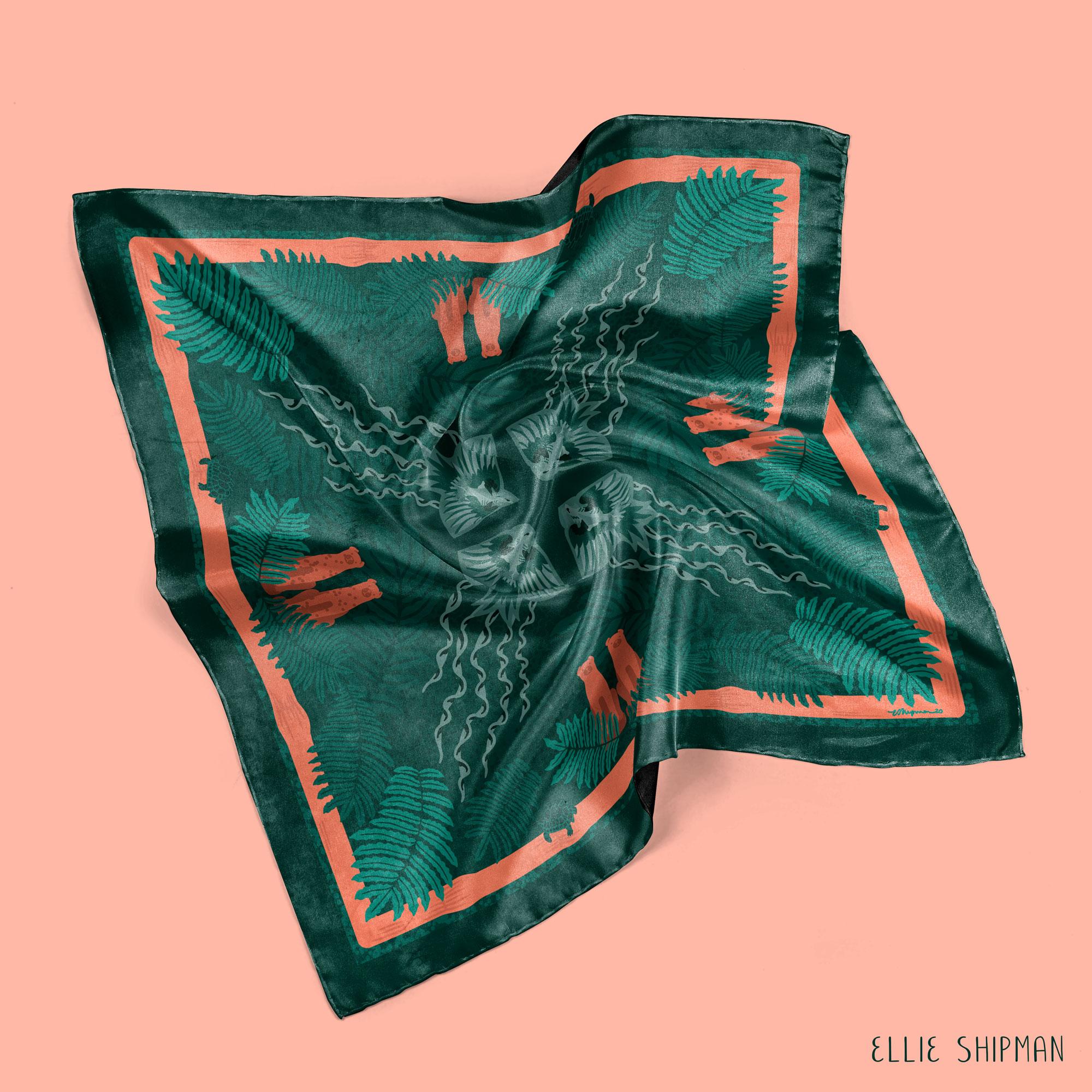
9. Hemming the Scarf: In this lesson, we're going to be unwrapping our printed fabric which has arrived in the post, I hope you're as excited as I am. As mentioned, I printed my fabric with Contrado, a London-based digital fabric printers so let's see how they did. It's looking good. Wow, look at this. Look at that. It moves so beautifully. It's so soft and smooth and it just moves in such a beautiful way, as you can see, it really flows. You can see as well that the design is really crisp and clear, and all the colors have come out in a really beautiful way as well. Now that we have our fabric, it's time to press it. As you can see, there are a few lines from where it's been folded in the post. We just want to press it so it's nice and flat, ready to hem. While you're preparing your work area, make sure to keep your fabric well out of the way so it doesn't get dripped on by the iron or anything like that. Now you can see how dirty the underneath of my iron is. Let's make sure the setting is on silk, there is actually a silk setting on my iron. Make sure it's quite a cool setting and test it on a corner of the fabric before you do the whole thing, just in case it's too hot. I can't believe I've got an iron out on Skillshare, suddenly feeling very domestic but it's what we need. When you're ironing, it's always good to iron on the wrong side, the back of the fabric, and I'm going to also cover it with a pillowcase to protect it even further. I'm just going to iron all the way around the fabric. Keep it nice and smooth. Just keep checking it as you go. That looks fine. As you can see from the edges, these had been rough cut so you can see the white on the edges where it hasn't been printed, which is typical of digital fabric printing because they only need to print the exact piece rather than print the whole roll of fabric, which is partly why it's more sustainable, because it uses less ink, which is great. It's also a helpful guide for cutting out the piece. What I'm going to do now is just follow the edges round and cut the white bit off. With cutting silk, you need to make sure that the scissors are very sharp and also very clean. I'm just going to test how they cut slightly away from the edge. No, these scissors are much better at cutting along the bottom. I think that's fine. Let's cut this edge. This is quite fiddly business. As you can see, the fabric frays an awful lot, so once you've cut it, you really want to start hemming it straight away so it doesn't fray too much more. You also want to make sure that your desk is clean and doesn't have anything sticky on it when you're working with your fabric. Now, we've cut the white edges off our piece of fabric. We can start to see how beautiful it looks as a scarf. Now it's time to hand hem our fabric. Now, depending on the fabric you've got, you might want to do this in a number of different ways. You could do a traditional hem where you just fold the edges once and then fold them again, and sew round on a sewing machine if you have cotton or a more durable fabric. But for very lightweight fabrics like silk or satin, or even polyester, hand hemming is best so that it doesn't ruckle or ruche the fabric. To hand hem this silk, I'm going to use a very thin needle, size 11 is recommended. I'm actually not sure what this size is, but size 11 is recommended from what I read about it. But mine is very, very thin, I think it's actually a beading needle so it's quite flexible as well. With your thread, you use 100 percent cotton or a silk thread if you're using silk, and it would just ensure that it matches the quality of the fabric. I'm going to double up my thread. Let's make it about the length of one side doubled over and then cut it off, and I'm going to tie a knot in the end. Now, thread can spiral and ruche up so what's quite good is to you hold it by its end and let the needle unwind itself, and you can even pull down and that just helps the thread not be so curly. I'm going to start from the bottom corner of my design, and we're going to turn it over so that we are working with the back. I'm going to press the edges of my scarf just to neaten up and enable that edge to stay even. Now we're going to start doing an invisible stitch all the way around, which means about a three mil length into the folded crease of the hem, and then a one mil, very short stitch in the actual main bit of the fabric. We're just going to repeat that so we're going three mil back in the fold. Now, after a few stitches, just turn it over and check that it looks okay and that looks fine to me, and then you can carry on. Make sure, with the corners, to fold the outer edge of the corner in and bring the edges together. Any loose threads, just tuck them in, or any fraying edges, just tuck them in as you go. I'm going to go into the corner point and catch the other piece of fabric there as well, and I'm just going to do a little stitch around both of them to secure those two in place. Now I'm going to do the same stitch up the edge of the corner. The same invisible stitch but slightly shorter stitches so about a millimeter each side. I'll do one more. [inaudible] a couple more times to finish. There, you can see a corner sewn with an invisible stitch along the edge. With that, the scarf is finished. There it is. In this lesson, we learned how to hand hem and finish our scarves.
10. Ways to Wear It: Finally, I'm going to show you some different ways of wearing your scarf. I'm sure you have lots of your own ideas, but this is how I like to wear mine. Let's try it out. First fold into a diagonal triangle, match the corners, now place the back edge along the back of your head, kick this fold over your head, and tie the two edges around the top. Like that. Now I'm going to fold this into the knot behind it, and then tie it again at the top, and I like to tuck the ends of the knot into the knot that we've just secured, and then tuck these ends as well. There you have your own head scarf. You can see the back of the design, coming down, and as we designed it with edges in mind and the center points in mind, we can now wear in loads and loads of different ways. I'll show you some more. Again with the scarf folded in triangle. You can just simply wear it around your neck with the pieces loose, or you can tie the pieces in a small knot underneath the triangle, and just have it as a loose scarf. Or you could fold it again in a triangle, fold the bottom up to make one long piece. Again, you can just wear it draped around, or tie it to the side, tie it in the center, or you could tie it around your head like this too. You could also wear it as wrist piece, again in a double knot as a wrist piece. You could also wear it, classic, Audrey Hepburn style. I'm sure you can think of many of your own ways as well. Enjoy wearing your beautiful scarf. We now have a finished product we can use to wear in a myriad of different ways. The action for this lesson is of course, upload a photo of your finished scarf, or even better, if you wearing it, into the project gallery. I cannot wait to see what you've created.
11. Well Done and Thanks!: Thank you so much for joining me on this lesson to design, and sew a square scarf in Procreate. I really hope you've enjoyed the lessons and thank you so much for coming with me on this creative journey. Remember to upload all your progress and images in the project gallery right from the start of your Pinterest research, your mood board, your first Motif sketches, your final design, put up mock-ups, and ultimately a photo of you with your beautiful scarf. Do leave a review on the projects. Let me know how you found it if there can be any improvements and please get in touch if you have any comments or questions and I'd be really happy to help. You can say hello to me on Instagram @ellieshipman, and I look forward to seeing what you've created. Thank you so much and happy creating.
 Ellie Shipman, Artist, illustrator and pattern designer