Transcripts
1. About this Class: Hi, I'm Ellie Shipman, an artist, illustrator
and pattern designer. I'm a top teacher
here on Skillshare, and I'm really
excited to show you my new class where I'm going to take you on a
journey to draw, print, uninstall,
your very own paper. You'll join me on
the beach where I'm going to be doing
some drawing out and about collecting natural objects and inspiration to
build our patterns. We're going to be using
some of these objects to create inky
marks and textures, drawing on our iPads
in Procreate as well. And then finally bringing
everything together to build our repeat
pattern in Illustrator. With our finished pattern, we're going to be
using control dough to print our wallpaper. Then finally, I'll show you a step-by-step guide on how to install it in your own home. Have you come with me on this
creative journey to draw, make, and print more paper. See you in the class.
2. Your Class Project: Welcome to this
class on designing, printing and installing
your very own wallpaper. I'm Ellie Shipman, an artist, illustrator and
pattern designer. And I'm going to be
taking you through a step-by-step process to
design your own wallpaper inspired by nature and
doing some drawing out and about my own creative practice. I design everything from public
art and installations in museums to wallpapers and
textiles for home furnishings. The class, we'll go
through a series of steps where I will
take you out and about with me along the
British seaside as I collect inspiration
from nature for my own design of
British seaweed. We're going to be
creating color palettes. We're going to be
collecting found objects to use to make inky textures,
to add to our path. And digitally, we're going to be drawing on our iPads
as well in Procreate. Finally, we'll collect
all of our designs together and build them
into a repeat pattern. In Illustrator. I'll show you how to
export and upload your pattern into print
on-demand site contralto, where you can digitally
print your own wallpaper. Will then receive our
wallpaper in the post. And I'll show you the
step-by-step process for actually installing
it in your home. This is an amazing way to
see your designs come to life and to change the look
and feel of your home. For this class, you will
need basic drawing tools. I just use black ink pens and watercolor paper for
drawing out and about. We will also use Procreate on our iPads and Adobe
Illustrator on our laptops. Once we get to the
wallpaper install section, I will give you a list
of materials that you can also find everything you
need in the class resources. I really hope you
can come and join me on this creative
journey to design, print, and hang
our own wallpaper. See you in the next lesson.
3. Research and Planning: In this lesson, we're
going to be doing some research and planning
for our wallpaper design. This will involve doing
some measuring in our homes to work out the best repeat tile size that we want to build. It will also involve looking at Pinterest and designing
a mood board in InDesign where we can gather our ideas and start the design
process for our pattern. I'm going to be installing my
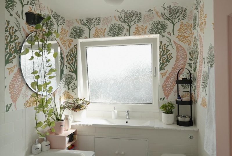
wallpaper in our bathroom. It's one of the few unpainted
rooms in our house. It's still completely white. And I've had in mind to design a seaweed inspired wallpaper
in there for awhile. I really want the feeling
of feeling like I'm under, under the sea and kinda floating around when I'm in the bar. So this is my idea for my
design and my starting point. I've mentioned up the wall and I'm going to use
those measurements to build my illustrator
title later on. I'll remind you of that
later in the sessions. Because I want to use
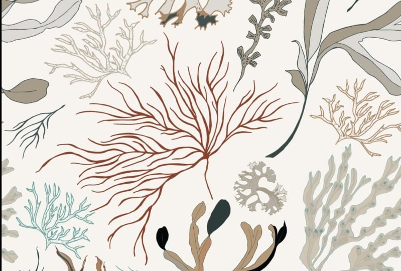
seaweed as my inspiration. I've started a Pinterest board looking at archival
images of seaweed. I'll show you where
I've got two. Here is my seaweed wallpaper
inspiration boards so far. And as you can see,
it's just got loads of different drawings and scans
and photos of seaweed. Some with some
vintage color studies should really beautiful
to see these kind of earthy tones of
the seaweeds and some detail of the different
shapes and textures. And then some more modern
images like these scans, which really beautiful
flat lays of the seaweed. And then some kind of botanical prints like this
kind of thing where it has a whole selection
of different species of seaweeds in one image. So much just show the shapes
and a really clear way. What I like to do
with my mood boards is to use Pinterest
as a starting point. Or you can use
Google image search and also look at archives. I've got the V&A wallpaper
archive open here as well. This is a really nice
way of just saying historical examples of wallpaper
from all over the world. You can read about the
history of wallpaper. You can look at
Collection Highlights. There's loads of really
interesting examples from contemporary artists
to mid-century to antique and amazing wall panels in different mediums
from all over the world. From the V&A website, you can have a look
at their collections as well and go into this search, the collections
open in a new tab. You can click with image, and then that shows all the ones that have an image attached. You can just see these
incredible early examples of wallpaper repeat patterns
and different styles, even just sections of them
is really interesting. So feel free to have a browse
and I'm sure there might be Archives locally to
your own countries, are museums that you know of, that you might want
to look at the archives of them as well. And then we're going to
start saving some of these images and dragging them into InDesign to
build our mood board. I'm going to go back
to Pinterest for now and save image as. And I've already started this little folder
of some images. Seaweed, shapes, click Save. I'm just going to repeat
that for a few of my favorites from
the Pinterest board, which I really feel will
bring quite a lot to the the design save
image here. I think. Now some of these images may be copyrighted or they
might be products, e.g. that one I just saved
as a product on Etsy. These mood boards are only for your own personal reference and shouldn't really be included in a portfolio just because
the images are not, yeah, not your own. So some of these. Okay. So let's see
what we've got there. In the class resources. I've created a template that you can use
if you'd like to. In InDesign, I will show you how to drag and
drop images into the moodboard template and
start to build a bit of a color palette and gather
some ideas for our design. So here's the
moodboard template. I've just made a copy
that I'm going to use her to keep that one blank. And I'm gonna go back to
the folder that I was just using, these seaweed images. And they're just
going to drag and drop them into these frames. And click on the
frame and click, right-click and go to fill
frame proportionately. That's actually a little
bit of a weird proportions. I'm gonna go to Fit
frame to content. Then just hold shift and
drag that down a little bit. And then just make this
one a bit smaller. Let's add a few more in here. I love this pink one. Again, you can, you can
zoom into them if you want. Hold the image and make it go a bit bigger, That's quite nice. A bit more of a
detail shot of that. Quite like that one. We've got some of these
archival images as well, which is quite an interesting combination with the seaweed. That one's a bit bigger.
So I'm just going to drag this box down. Again, Right-click fitting and fill frame
proportionately. Then bringing the seaweed
scan image in as well. Again, let's just
drag that one out. You can hold Shift
so that it stays along the line that
you're dragging it along. Then right-click, fit
frame to content, and let's just drag that up. I want to zoom in
a bit on this one. So I'm going to just
select the centerpiece. You'll get this brown
outline and then hold down Option and Shift to drag it proportionately
out. That's quite nice. Selection, quite
random selection, but it's still quite nice. I've made these little
black circles here as a preliminary color palette
just to gather some ideas. And I'm just going to
use the eyedropper tool. The shortcut is, I just
select some colors. You can skip between
eyedropper and the mouse with I and V. So V, to select that, and then I select a color
V by what's quite nice. So already you can see
that that really brings this Moodboard together with these color palettes selected. Now we can go to
View Screen Mode and preview to just say it
without the guides. And already I think
that's a really nice mood board and it kind of captures some of the
ideas I've gotten my head already for
the wallpaper design. I love the plain background, the white or off-white
background to really show the shapes of the
seaweed and almost have that botanical print feeling. I love the different
shapes being quite separate to almost look
like they're floating, but almost look like they're pinned or on a board somewhere. These archival looking colors
and the quiet muted colors, I think it'll be really
lovely in the design. I'm happy with my
mood board for now. So now it's your turn to have
a look through Pinterest, use Google image searches
and have a look at Museum archives or archives
that you might know of, that you can collect
wallpaper samples from, add them into the template in InDesign and feel
free to export it and upload it in the project
gallery so I can see your progress and give you
any feedback if you like. I'm going to export mine now, so I'm going to File Export. And I'm just going to export it as a JPEG and share it with you. You could export
it as a PDF if you want and then click Export. In this lesson, we've started to gather ideas for
wallpaper design. We've thought about
location and measured up to inform our repeat tile, which we'll use later on. We've made a Pinterest board for some inspiration
and gathered some images from archives and elsewhere into our
InDesign templates. We've got blade to
these templates to the project gallery, and now we're ready
to start drawing. In the next lesson, join me out and about in nature
as we start to collect some inspiration through natural objects for our design. See you in the next lesson.
4. Collecting Motifs in Nature: Today I'm here to
collect some seaweeds, to make some drawings as
inspiration for my wallpaper. I want to have a
look around and see what different
types of seaweed we can find as inspiration. Let's have a look. Look at this piece. Wow. Absolutely beautiful. There's amazing fronds,
the light coming through. It's absolutely stunning. Let me give you a
place to look like. The texture on it is
absolutely incredible. These different markings,
the shading that we could draw using some different techniques
will be really interesting. I think I'm going to save that piece is inspiration
to draw from. All right, Let's see
what else we can find. Doesn't look like much
out of the water, just completely comes alive. I think this isn't
long piece as well. Wow, this is a
different species. An underwater it
grows this way round. Yeah, it's always got like a
bark like stem, like a bat. There's really
quite thick leaves. Don't know if you can even
say leaves have a seaweed. Let's save that piece as well. Right? These bits,
quite a common piece. It's trying to untangle it
from the other bits in there. Even got some little
barnacles on it. And you can see
that it has these really serrated leaves switch. Once it's spread out, you
can start to see how it branches off these
different directions. And again, the other way round, upright as if it's growing
from the ocean floor. I think that'll be really
beautiful to draw. Wow, look at that.
Wow, that's amazing. Just dragged out
this other piece. And you can see the roots of this and how they've
attached themselves to these rocks as its anchor does not look so
otherworldly and beautiful. Absolutely stunning. And again, this will grow right way round. These beautiful frilly edges
and amazing routes that, yeah, look very otherworldly. I'll take my selections over
to Iraq and lay them out. And then we can have a look at which ones we're going to draw. I've collected all my seaweed
together and laid them out here on the rock so we can have a closer look at them. Like, well my handy little
magnifying glass to really get into the detail
and see what we can see. Let's have a look. Here's absolutely incredible
just to look at them. So close up. Something that we
just don't often do. I think in today's world is just take the time
to really observe. Once you've seen a
detail on something, you can't unsee it. I think it's just a
beautiful way to get the visual memory in your head
before you start drawing. I've got my little guide
here and I want to look up the names of these seaweeds
to see a bit more about them. So just opened it on this
page of green seaweeds, which these two are the same. These are the ones that I
said Looks like lettuce. And they are they're
called sea lettuce. So, um, I think I was on
the right track with that. From the bright green and
translucent sometimes with white patches where
schools have been released. I think this one is kelp, has got quite a broad central patch with
the fronds coming off where it's length one
to 4 m is absolutely huge. And you can get these amazing
kelp forests Under the Sea, which this is just
a tiny part of. I think right next to
it on the same page is this one which I think is
sugar kelp links to 3 m. So again, this is probably
about a one-meter length. So it really grows
extremely long. Distinctive and familiar
alga consisting of a single long belt like
front, which it certainly is. Let's have a look at this
one at the top here. This one, I'm certain is this, which is called for bellows. Interesting name says
a massive brown alga with a long uneven
stalk and abroad fan of strap like blades arising from a yellowish normally hold fast that looks as though
it is made of rubber. And that was that incredible
otherworldly bulgy piece that it's attached
to those rocks. Because you can see on
the drawing here as well. Really interesting. The last one is this one here. This is toothed rack. And you can see he looked
really closely and see these toothy edges. And a genuinely has a
distinct greenish tinge to the brown color and
irregularly branched, as we were saying,
it looks almost like a little tree
branching out there. I also noticed on this
with the magnifying glass. These small little
curls of white, they look like barnacles
are little shells. So I've never noticed
these before. But these tiny little
white spirals, but the tile tiny coiled
shells on seaweeds. And it says underwater
the green tentacles of the worms can be seen. Yeah, who knew they were actually little
worms hiding inside. Really incredible.
And all of that. I wouldn't have found out if I hadn't paid a bit more attention and giving it some
observation, observation time. We gathered all seaweed and
take a really close look at it to really get that
visual information in our minds is that kind of level of detail
that we can bring into our designs that make them really natural and
really beautiful. It's been really enjoyable to take inspiration from nature. In this section, I've just
loved gathering these samples, wading around and paddling. I'm pulling strange
and beautiful thing straight out of the sea. I hope you can apply that
to your own environment, whether it's outside
your house in the city, or whether it is in nature
near where you live. Remember, you can
use any kind of different samples
and it might be that you don't pick
them or take them. These bits of seaweed
I can put right back into C and I
haven't picked them, but it might be, Yeah, She used photography to
document them instead. Now that we've gathered
our nature specimens and had a really
close look at them and even identified
what they are. In the next section, we're going to actually start drawing. I'll see you in the next lesson.
5. Sketching Outside: Let's come and find a
comfortable spot to do some mindful drawing
out on location. We can gather together
the objects that we found from our out
and about wonders. Lay them out in a
comfortable place and settled down to do so. I'm going to put the tooth rack seaweeds on its own bit of paper just so I can see it a bit more clearly
and a bit closer. I'm trying to untangle
it a little bit as well. So sorry, nice way to observer. So laying out you
can really see what the little spotters book was talking about
with these branches branching out on
the serrated edges of the tooth edges. Okay. Alright. So let's get those basic
shapes down first. It's gonna get that main branch. As I'm drawing using the marker
is quite a thick nib pen. So I'm not looking for
really fine detail. I'm just looking to get the
main shapes of the seaweeds. And again, just to
observe how it, how it branches and
how it fans out. Now it doesn't have to be exact. You know, you've got your
own artistic license. You can be as detailed
or as loose as you want. But I find it's good to always look back every couple
of seconds, really. Looking back at the main
thing that you're drawing. They have so many little
different branches going off in all directions. It's actually quite
difficult to keep your eyes on track with it all. Now I think I have almost
the basic branches. This is a kind of
central branches. Now I just want to
thicken this outfit, so I'm just gonna go over this again. Color that in a bit. Now later on in the session, I know that I'm going
to digitize this. So again, we don't have
to be too specific. And we can smooth bits
out in Illustrator later and edit it and
adapt it as we go. But you might want to keep
these as your own prints, in which case you might want to spend a bit more time on it. Just smoothing out
the connection points between all these
different branches. And already that's
looking a bit more. Cbd is also much thicker at the base, then gets thinner and thinner as it goes towards the leaves. I'm just going to switch
to the other end and use this thicker side.
It's a bit easier. We can be better. It's such a pleasure
to draw from life and on location when you're
actually out in nature. It's socially mindful exercise to be aware of other
things around you, but in a distant way as your
focus is on your drawing. People talking and chatting and the waves and the distance. That's just such a nice sense
of peace and tranquility. I'm switching a bit. Nearly done all these
little branches and then I can start
on the leaves. Again, keep observing
and looking back on it every few moments. Okay, that's the
basic structure. Now I can go on. I might actually
start on the left because I'm smudging
it with my right hand. Just start making the
shapes of leaves. You might want to use a
different type of pen. You might want to use
an ink drawing pen. This marker pen is leaving quite a few extra texture marks, which actually I quite like, but you might want
something more smooth. Again, using a bit of
artistic license to draw it slightly more open than it is. Because I want in my final
wallpaper pattern to be able to see these kind of different leaves and to
not have them overlapping. And getting a bit too chunky. Still using the plant
as a reference. Because even if you're
stylizing it slightly or not drawing it
exactly from life. Even if you bring in some of the natural reference points, it will look more realistic
even as a stylized version. Cube ink flowing. You might also, if you want
to spend less time drawing, you might want to
just do the outline. And then in Illustrator, you can block, blocking
the, the main color. But it is quite peaceful
to color it in yourself. Once you've been looking
at something for awhile, you can also start to
use your own ad living. I know that the shapes of these leaves branch out into
sort of Y shape at the end. So I can just kind of add in
my own little sections of that on top of what
I've drawn already. It's also good to just to
continue to look back at your drawing and look
back at what you're drawing every now
and again as well. Just to check it's on track with what you expect. Twice. Why? Twice. Twice. Okay. I think I'm finished
with this one. As you can see, it's a little
bit rough around the edges, but I quite like that slightly
brushy texture to it. And again, we can
clean that up in Illustrator if you
want, see later on. Or we can leave it
a little bit rough. But as a kind of silhouette of this really lovely
piece of seaweed. We're done. I think. I'm going to just switch pens now into
the uni pen, brush pen. Just to get some finer detail to draw this strip of seaweed here. I'm actually going to draw
this in sections because I want it to be almost life-size. Wind's picking up a bit now. With this, I'm just
going to keep them marks quite loose and get a little bit more detail
in it than we had before. Can I want to try and
get the main shapes? But it is quite tricky. This is really complicated
and detailed shape. But let's not put too much
pressure on ourselves. Let's just capture what we see. Loose edges. And these kind of
frilly friends. These incredible marks. So pockmarks and bulges
all the way through. And again, just keep looking back at the piece
you're drawing. Every few seconds. Let it seems like a lot, but you'd be surprised at that extra detail that gives you this pen is really lovely
actually because you can sort of use the edge to make a longer flatter mark. And then the corner to do
a bit more of a, a detail. Just beautiful, observing
all these little lines and marks that you just wouldn't notice if you just walk
past it on the beach. It's got quite a jagged edge. Should I just want to
line up, connect up. And he's raised sections. Because these quite big bumps, okay. Marks on this seaweed
almost look like hieroglyphs or like
there's some kind of code or ancient language. So interesting, trying
to decipher them. Lovely to draw in a place where people are
coming to relax. Feels like you absorb
the vibe of everyone being in a peaceful,
happy state. On the holidays, playing and having a
nice time with family. It's really a nice
atmosphere to soak up. I'm going to try and do
the main outlines for this piece. We're here. Then I can fill in
the detail later. Can making sure
you're looking at the observed piece
as much as possible. But not being too specific. It is an organic shape and
that is quite forgiving. You have your own
style, you have your own artistic license. And really you can make
it look however you want. Holding the pen
slightly further away. The normal is a way to make your marks feel
a little bit looser. And to kind of give you a
hand a bit more freedom, not be so controlling
with the pen. I definitely find, I get
that sometimes when I've been drawing for a long time or Griffin depends you tightly
and actually it's quite a lot of pressure on your hands, on the pen, on the paper. And actually the drawing
can often look a bit, a bit tense itself. So I think this is
quite a nice way of keeping things a bit loose. I can see because I've laid out this seaweed on the paper. But I'm getting up
towards the top. And actually that's
quite a nice marker. These edges are just beautiful, so freely and so detailed. So much texture to them all. The light is coming
through them even though they're down on the paper here. Let's try and do the
other side. Now. We've got that main shape now
I can fill in the detail. Nice. Well. Blow away. When you have a lot of detail on a
complex shape like this, it's quite good to
look for patterns in the detail to help
you fill in the gaps. The moment I've noticed
these central bands going up the middle
of the CV piece. I'm just putting these in
to build that structure. And then I can fill
in the rest of the tiny detail afterwards. Now we have this central pieces. I can do these kind
of edge pieces, noticing they're kind
of similar shapes. The repeat these kind of wider circles with
circle within them. I've done this
drawing on A3 paper. But for ease of scanning and
digitizing your drawings, you might want to do
it on A4 or smaller. Twice. We have now come to the end of
our drawing session because it is just
starting to rain and I can start to see my ink is spreading on the paper in a way
that I didn't plan it. This drawing exercise
was all about observing the samples
that we've collected and using a couple of different
techniques with our pens to start mark making and
building upon my teeth. One is a really black, flat color design looking at
the silhouette of the shape. And the other is a
more detailed design looking at texture. You might want to use
different mediums, different materials,
and different pens to achieve some
different textures. But for this session,
because we're going to be digitizing our drawings, I would advise you to just do pen and paper and mark making. We are not looking to get
color on at the moment because they're gonna do that
in Illustrator later on. Next up, we're going
to use ink as a way to develop some texture
for our pattern. We're going to make
some of our own brushes using found objects and then make some inky
textures that we can start applying
to our drawings. See you in the next lesson.
6. Creating Textures using Ink: In this lesson, we're
going to be making inky textures for
our pattern design. I've gone out and
about and collected some natural objects
which I'm going to use as mark making tools. You might want to collect
things like sticks and feathers or seed pods, bits of weeds and flowers
from the wayside. And we're going to
be using these as our natural paint brushes. I've gathered
together the bits and pieces that I've found
are now going to be using black Indian ink and Rosa color paper to
make some marks. Later on, we will use
Adobe Illustrator to digitize and vectorize the marks that we've made from
scanning them in. But for now, just have a play, be mindful and relax as
you make your inky marks. Enjoy. These things are
all things which I've just picked up
by the roadside. And they might be
different for your area, for your different locations. It might be nice to
find things which are relevant to the pattern.
You're going to make. These rural, coastal
items which I found. And I'm going to
be using some ink, indian black ink, and making
some marks with them. First of all, let's grab
our Indian ink and pour it, a little bit of it
into a palette. We don't want to dip
our natural brushes right into the bottle as bits
and pieces might come off. And yes, they make
which we don't want. So just use a Tupperware or something has a little palette. Then let's get making. I'm going to start with
this little feather. She's a great kind of
natural brush and just dip it gently into the ink and
see what marks it makes. Beautiful already
has a real kind of calligraphy sort
of feeling to it, which is really lovely. We can kind of play with
different shapes and different ways that
you might drag the tool across the table, across the plane of paper is
actually really interesting as well to see how the ink kind of fades out over
time on the object. Because you can see it
goes from being quite, quite dark to a bit more
of a scratchy texture. And just use different parts
of the tool that you've got and enjoy playing
around with those as well. Might want to use thicker
lines and thinner lines. I'm thinking about the final
print that you're making, in my case, seaweed. And how maybe the, the marks that you're making might feed into
textures that you've seen on your natural objects as you've been collecting them. Going to try this
little snail shell now, use that as a bit
of a printing tool. Well, it's a bit harder
to make a mark from that. But I quite like the curved edge and then
the little blob shape. It does almost look
like little blobs on a, on a bit of seaweed as we
were looking at earlier. Or just drop the whole thing in. Sees that to our advantage now it's absolutely
covered in ink. When you're making
your inky marks, you might want to
just leave a bit of room around them just so that they're easier to divide later
on once we vectorize them. I'm going to try this pine cone. See if I can do some
kind of rolling with it as it's
almost like a little, little ink roller itself, which makes some really
nice textures there. Very satisfying to do. There it is little pine cone. You can see some of
the texture on that. Once you've used your objects, just put it to one
side on a bit of kitchen towel and have a go
with this very spiky leaf. See what kind of scratching
marks that might make us actually you've got
such a small surface area. It's quite difficult to
get a line out of that. It's fun. The different
objects require different techniques to
get the most out of it. I'll try this kind of
stippling effect instead. Again, put that to one side. Once you've done with
that, I quite often I found that actually
just these little twigs and sticks quite effective. Just dragging
through some lines, making quite bold shapes because it has quite a
large surface area. Once you're done with the page, just put it over to one
side and leave it to dry. Once you've got your new paper, just carry on playing. This is a little
bit of dried goals. I think that I found
in their hetero. Also when you're collecting
your bits and pieces, just make sure that
you're only collecting things which are dead or dried, which might have
fallen off something already and that
you're not picking anything protected or too rare. It's quite a scratchy
texture and that one just broke off
and fall right in. What makes quite a nice
Mark Actually now that it's a bit thicker. Again, trying to think about the seaweed shapes that
I'm collecting, but do think about the
shapes that you're collecting and what's
relevant for those. It's really nice to
do a selection of different marks with
the same kind of process because it just makes the final ones look a lot more natural when we start
digitizing them. Not really pleased with those. This is a little seed, seed head of a flower. Nice for some dotty, dotty marks. The other one. Again, leaving a bit of space between each little
patch of textures. Make it easier for
ourselves later on. Using them as a bit
of a drawing tool as well as quite fun. Just seeing what kind of
wiggly shapes you can make. Also love using found
objects because it's a way to make marks and shapes that you
wouldn't make with a pen or a traditional
drawing tool. So it really opens
up lots of avenues for creativity and
different expression. Again, once you fill the page, just put it to one
side and let it dry. You might want a
bigger desk then this coffee table
that I'm using, c, Well this little
lichen stick will create. I'm going to break off that
lichen and use that as a separate little sponge.
See what that does. It's quite nice having the kind of thicker and
thinner parts of it rarely makes a quite
interesting texture. This process is just
such a lovely thing to really take your time with
and just allow yourself to play and experiment and
just enjoy the process. Don't rush it. This one is a bit of a tree. This dry piece that really makes a nice kind of
scratchy textures. Let's move some of these out
of the way. Dry as well. As you can see, you can really
do as many as you like. No pressure tools
to do this money. But I'm just really enjoying
this creative process. As you build up this library
of textures and Mark's, think about what
you've got already and try and create things which
offers something new. Maybe using the tools
in different ways, making different lines
and textures with them. Wiggling or stippling,
making lines. And using more or less ink, as well as the kind of
experiments could also build up these layers of texture by going over marks
you've already done. So just keep playing this little stick. Sometimes it's interesting
to look for the most poor as part of a natural brush. By the end of the stick is
kind of more absorbent. So it makes it quite nice. Series of textures because
it really soaks up the ink. He's kinda rows are quite nice, sort of repeat
pattern in itself. This almost like a
half drop repeat. By just making these sort of staggered rows builds up a really nice pattern which
we can digitize and use. Okay, We're getting
through quite a lot of these little objects now. Let's try another stick and just use that as a kind of stumping tool. It's try these flower heads. There are cow, possibly something that grows all over
the south coast of England. I'm really is a kind of a weed, but they have very
beautiful flowers. Actually this curly,
curly texture is really interesting with the
different flower heads on it. Another one done. Let that dry. Just want to explore those possibilities of the cow parsley a bit more. Love the variation
that it brings and gives us really
organic looking texture. Almost looks like the
tendrils of a jellyfish. Something kind of
underwater theory, which goes with my
design concepts. So, um, yeah, loving
exploring this a bit wall. Again, just thinking
about the final pattern and doing some variety so that you can use these in different shapes later
on as we build the repeat, utilizing the paper as well. But giving a bit of space. Really lovely. I think this
is my favorite texture yet. Again, let's put
that aside to dry. So play with your inky marks for as long or as
little as you want to. Really take time to enjoy the process and be slow and
experimental with your mark. Making. These marks
we will digitize, but also they could be
used for other projects, for their own prints
or for textures in your other
Illustrator projects. Just using these
little grasses head to the splatter on the ink and
a bit more of a random way. Let's try this out. A little grass is
quite nice as well, but more of a sticky
kind of look. Now we've nearly used
up all of our objects. Now. These objects also, if you found some that you
particularly enjoy using, you could always save them, although there will
be a bit in key. You could wash them if
you wanted to or just save them and use the
same ink again later. Yes, he's little cow
possibly heads again. I think that is just about done. We've gone through all
of our found objects, and now we've got
a huge range of different textures and marks that we can use for our designs. In this lesson, we've gathered a whole range of natural
objects and had a really relaxing
and enjoyable time making inky textures from them. We're going to save these
textures and scan them in later on to vectorized
in Illustrator. But for now, join me in the next lesson where
we will be doing some drawing in Procreate to continue building our motifs. See you in the next lesson.
7. Sketching Inside with Procreate: In this lesson, we're going to be going into procreate and draw some motifs
for our wallpaper. I've started to draw a
few different motifs of seaweed that I've collected from some of the images that I've taken
from our site visits. Might want to use
your own photography or you might want to
use Google images. If you're unable
to get out onsite. It'd be really great though,
if you do use your own as it will really make
the person truly unique. So let's have a go at
doing some sketching. I've made a new canvas here, which is 4,000 by 5,000 pixels, which is a really
nice size to get some high resolution and a
bit of definition going. I'm going to bring up some of the seaweed images as a reference by just swiping up on the
bottom of the screen, dragging open, a bit tricky,
dragging open photos. And then holding it to the side. And finding the album
that I recently used to gather some of my
reference images. Now I like to use
a sketching pencil to start getting
the general shape. So let's go to the brushes, find the sketching, and I
use the sketching pencil. So let's select six
B. That's fine. And I'm just going to draw these motifs in black
because I'm going to re-color my design
in Illustrator when we bring all the motifs
into Illustrator. So let's have a look at
some images and see which seaweed we could draw a
few different types here. Now I think this one, this one will be a
really nice example. I laid it out on a
rock on the beach when I took this image so I
can kinda see the shape. And I want my wallpaper to
look like it's underwater. So I want the theory to be
floating and wafting around. So it'll be this orientation. So to start with,
let's just draw the generic overall shape of this seaweed and
see how we get on. Zoom out a little bit. So we've got loosely kinda
little section there. Section in there. Section there. Yeah. Then that one kind
of display is out there. Okay. So very, very
rough base layer. I'm going to just
change the opacity down a bit and then make a new layer, which will be our sketch. So let's just add
a bit of detail. But I'm not going
to be two specific. This isn't going to be a
photo-realistic drawing. It's really just about capturing the shape that you want
to see in your wallpaper. And because we're making
a repeat pattern, you might want your
motifs to be a little bit simplified and a
little bit stylized, just so that it doesn't get too blocky into over complicated. So let's just start sketching
these basic kind of branches and see how we get on. Love, how they kind of overlap. Then they kind of branch off these different
ways at the edges. Always remember to refer back to your main reference
image as you draw. Is really important to just keep looking
back and checking it literally every couple
of seconds, I'd recommend. Because it just keeps
your hand in and keeps that reference really at the
forefront of your drawing. Again, it doesn't matter if it doesn't look exactly like it. We're just using it as
a reference to give our drawing kind of the life and essence of what we're
trying to capture. So again, I'm just using
really sketchy, sketchy marks. Using the pencil
on its side gives these really kind of almost
like charcoal marks, which are quite good,
just forgetting the basic structure. And we're gonna go over this
with a pen and a minute. So let's just carry on here. Worrying too much
about the detail. Keeping a reference
and I look back at the overall shape
every now and again, just to make sure you're on track with how you'd
want it to look. With this shape as well, I'm not going to draw
how layered it is because I want the motif to have a bit more breathing
room in the design. So you can see that all these little tendrils and
things are very, very, um, you know, they're quite thick and quite overlapped by what mine to
have this kind of air in it. Okay, so now we've just done this really basic quick sketch and turn off the back layer, reduce the opacity of this top sketch and
add another layer. And then I'm going to go to inking and select
the studio pen. This is one of my
favorite pens for just a really smooth outline
and for drawing shapes, which are just very easy to
then get into Illustrator. Right? Let's begin with this. It's quite thick at the moment. I think that's fine for now. You might want to go back over some lines
and thicken them up. By going to start
by just going over the lines that we already
just drew in the pen. And then we can add a bit more detail and
depth to them in a minute. When we say these motifs
into Illustrator, we can also use a smooth tool
and smooth them out a bit. So again, got some options laser to
further refine your designs. Again, keep looking back
at the original image. You might also want
to take your iPad out and do some drawing
when you're on site, as we've just done in
the previous lesson. That's also a really nice way to capture some motifs
in your pattern. Drawing something as
complicated as seaweed or even flowers or other kind of natural shapes is a
really good exercise in looking at the kind
of overall shape you're trying to capture. And then how that shaped breaks down into its component parts, how they will overlap, and what you can do to
simplify them if you want or stylize them and draw them in your own way of doing like that. But once you've started really honing these
observation skills, it will also really help you develop your own drawing style. When you are drawing something
from your own imagination, you can't unsee the
different shapes that you've already drawn. So it will just really
help to bring a hint of realism to what you're
inventing or remembering. You can use it a little bit of artistic license as well and add little bits and make it yours. With this drawing, these motifs, I'm also not adding any texture because I want to add some
textures in Illustrator later. That'll be where I would kinda refine the drawings a bit more. Building out to be
quite a nice shape. I can fill that last bit. This section is
looking really big, so I'm just going to press and hold to erase with
the current brush, the studio pen and just
carve out some shapes. To just lighten this section. Switch back to the brush. Just build those little
branches back in. Once you've got the basic shape, you can start to kind
of add little bits of detail under extra little
observations if you'd like. Just little wiggles and little
bubbly bits of texture. Just give the shape a bit
of an extra dimension. So someone's give
a sense of some of these branches overlapping
in the background. Just connect that one, e.g. make it look like
it's running behind. Now I just want to smooth
out some of these joins. Just like a little bit more
CVD and a bit less bronchi will happen a lot. All these drawings already looking a bit
more smooth than watery. She's nice. So we're looking at that without
the background sketch, is looking like a
really nice motif that we can easily bring into Illustrator and add some texture
to for our final button. But as looking like a great motif that's really
clear, has some light, has some depth, and we can add some color to it and texture when we bring it
into Illustrator. I'm just going to do a
few more different motifs and you can draw along with me. And let's see what
we can come up with. Let's do a few more sketches to build up our collection of motifs ready to bring into
our pattern in Illustrator. I've just brought up
another reference image. So let's sketch that
and see how it goes. Let's go back to six B. Now this reference
image isn't great, but I just wanted to use it to remember the type of
seaweed that it was. So I'm just going to really use quite a lot of
artistic license here and see what
we saw we can make. So this is this kind of kelp. It's got these really
beautiful little bulbous pods on M and then these
quite stringy strands. And I wanted to just
capture the essence of that with a couple of different designs for I'm just really using quite a lot
of artistic license here. And we'll add a bit more
detail with a pen in a minute. I just want to get a few
different versions together. Ready for my pan building. But this one, I also
want to make it feel like it's really floating. And you know that
there's a direction, there's a current under the sea. Let's see how that
goes. So again, let's make that first
sketch layer less. You pay about 50 per
cent, add a new layer. And I'm going to
use the studio pen. You might want to use
technical pen as well. That's quite specific. Again, let's get
those main shapes. And first, she was drawing in Procreate and then
take it into Illustrator, is that we can make a vector-based pattern that
will be really scalable. And I want these seaweed
designs to be almost life-size. And these pieces are
about four-foot long. So they really build
up quite quickly. Widening that at the
bottom a little bit. It's going to make that
background sketch a bit less so I can see
what I'm doing. They really are
quite hairy things. It's quite nice if
you're able to use the same pen for
all your designs to just give it a bit of consistency with the
styling and textures. Really wafting in the sea, slice as well to just sketch a whole range
of different motifs. Because you never know
what you're going to need and what might look good. And not all of them
are going to make it into the final design,
but that's okay. You might be able to build
up some secondary designs, complimentary designs to it. Or you might want to use them as just nice light digital
prints as well. So let's add some of these
little potty textures. So they run all the
way along these lines. Slightly uneven way.
It's quite key. Again, I'm really not
being scientific at all. It's more about just capturing shapes that they've
brought for you. Just refer back to, I mean, zoom out on the on the
drawing you've been doing every now and again just to see what it
looks like as a whole, it's really important
to see that it's building up in
the way that you want. That's looking quite nice, satisfying when it
builds up quite quickly. With just a simple addition
of these little bubbles. And it already looks
much more like seaweed. Good time to swallow
ones at the end. It's a really very
calming activity to just draw this detail
onto something. Again, referring back
to the reference image, see that it has these kind
of like little sticky, almost like a branch
could have been some just going to add
that little bit of detail to the main
branch to just make it obviously slightly
more realistic. So she really nice quiet CBD already. Okay. Let's just undo the layer and
see what that looks like. I can't really quite nice. It will go well with
the other motifs that I've got building
up in my design. I'll do a couple more, these two different
sizes just to kind of give it some variety. Bring that layer back
again and carry on. Sounds, a little bubbles. You can see I'm getting
pretty quick now, as I've decided which elements of my reference photo
wants to bring into this. I'm not stopping to
look back on it too much because it's a repeat
of what I've just done. Studio pen works really
well for this as well, because it's just quite
round imprint of the nib. So you don't have to
color anything and it's just blocking it on. We can show to add that
detail this time as we go. Okay. Okay. Okay. That's the second one. Sure. You love Scottish and say, just want to thicken the stem of it a bit better. Okay, I think we're
looking really nice. Just do one more little one. And then we'll move on. All right, Last lot
of these bubbles. Okay. Alright, they have three
wispy little bits of seaweed. Ready for our motifs. And to transfer it
into Illustrator. Keep drawing your
motifs until you have about six or seven. You might want to do more
or less depending on how complicated you
want your design to be. I'm going to do a few more
and then let's transfer these images into
Illustrator and we can start to
build our pattern. See you in the next lesson.
8. Photography Walk for Colour Palettes: Today is all about color. We're going to be having
a little journey around this beautiful location to find some different
color combinations, and to create color
palettes from our photos. Your task for today's lesson is to take your camera
or your phone out into your local area and see how many different color
palettes you can record. We're going to be
taking inspiration from the different colors
in this location. Looking at nature, parts of the architecture,
parts of the beach, and also man-made things
like toys and games, which might have more
vibrant and distinct colors. So let's go and
have a play around. I love this contrast of
the yellow and the red if both faded with the C over time, then now this really beautiful paler version of
their old selves. And in contrast
with the black and white of this window frame, I think that's a lovely
color palette to start with. So let's take a photo. You might also want to
zoom into different parts of the scene that
you're developing your color palette from to
get some more nuanced tones. So the shadows, e.g. on this telephone box, produce a brighter and darker yellow. So you have a zoom
in and play around. Looking at the
colors in nature is also a really great
inspiration point. Nature often provides
these amazing contrast, as you can see in these
gorgeous flowers in the red and green and also the same
species but with a paler pink. So I'm going to take
photos of both and pay, perhaps combine them
into a palette. Let's see what's a nice example. When you're taking photos, you don't have to worry too much about composition or anything. It's really just
a reference point that we're going to
use for color picking. Feel free to snap away and
not be too precious about it. I love these orange flags
and the love supports because they are
really relevant to the seaside theme
of this pattern. It might be interesting for
us to go and explore around your local area and find things which are relevant
to what you're drawing. Let's take a photo, but it might also be interesting
to get back to where you got your source material from
for your pattern design. So I'm going back
to the seaweed I collected and having a look at the different contrasting
colors that it provides. Lovely to find other objects from your location which
might have different, different times and
pallets to them. So this has got
this gorgeous kind of creamy white, the blue, and then these kind
of like orangey Ras, which is a really nice
contrast to the blue. So I'm going to
document that as well. Great. It's also a really lovely
to make sure you get some neutral color
palette options as well. So don't go for all
the things which are the bright colorful things is
really nice to just look at these beautiful subtle shades and tones within
architecture, e.g. or within nature
and other things. So let's document that as well. It's also got some really
lovely textured in their day. These are so much fun. I love these absolute
chemical neon's, which I think would look
really interesting and contrasting to the natural
seaweed in my design. Let's get some decent, all
of those different shades. That rising. Really fun. This lesson was all about color. We took our cameras for
a walk and collected some really interesting
different color palettes. We're now going to take
those pallets back into our laptops and
procreate on color, pick from them to make the palettes for
our final pattern. See you in the next lesson.
9. Colour Palettes in Procreate: We've collected inspiration for color palettes out in
the world and now we can transfer it into Procreate
to color, pick our palette. I've opened up a blank canvas. This canvas is the Instagram
standard posts size, which is 1080 pixels
by 1350 pixels. You can also do a
high resolution one if you would prefer. I've got mine at 300 DPI. I've cited like this
so you could share your color palettes
and your work in progress to Instagram
if you prefer. But really you can
have your Canvas any orientation for this task. I'm going to insert a photo into this Canvas and
we're going to use that as inspiration for
this color palette. So let's go to the
spanner icon here, and we need to go to
Add and insert a photo. I've made an album called
Skillshare seaweed, which has all the
different images that I've taken as color inspiration. We're going to
select a couple and start building our color
palette from them. I really like this one. It's not really an
interesting image, but it has a lot of
different tonal colors. And it was from this theory
though is collecting. So I think it's really relevant for this pattern color palette. So let's select
that. And it comes. Now, I want to make, this just sits near
the top of the canvas. I'm going to bring out so it's the same size as
the whole thing. But then just move
it up a little bit. I want to leave a gap down here. For my palette. That tiny bit bigger. Okay, I'm going to use an ink brush to make
some little color palette splotches down here. I'm going to use this
brush called canal. And I'm going to just draw a few black splotches along
the bottom of the page here. As my color palette. I'm going to draw
them one per layer. I've done on the same
layer as the top. Let's just cut out and paste it so it's
on its own layer here. And let's add a
layer. Another one. You can do as many as you like. But I think about five
is what I'm after. Another one more. I've done these all in
black because we're going to use these
to color drop. I'll swatch into, I'm just
going to select them all. Just widen them a little bit. Let's go free form.
And that looks fine. Okay. I'm going to go back
to the first layer here, the first little splotch, and we can start
selecting on colors. So to do that, what I like to
do is just to tap and hold. And you can see this little
selector button comes up and you can just drag it until you get
a color that you like, but which will appear
in the top right, you color palette here. And then I just
drag it straight on to the little swatch here. It's actually not
filled entirely. So let's do that, right? So 100% if you drag
across to the right, and that's a really
beautiful color straight from the
actual seaweed itself. I'd like to choose
a mid tone color that would complement that. You might have to
be quite precise. Dragging it around.
That's quite nice. So I'll go to the second swatch, bring that in. Now. I would like a darker tone, but still in these kind of warm, almost maroon kind of colors. Let's go to the next
one. Drag that in. Looking really nice. Then let's find some from
these really vibrant greens. Let's go darker. You can see on the
bottom half of this circle shows the
last color you used. So you can actually see really clearly if it goes with it. And a really vibrant, almost lime green
for the last one. As you can see,
that's a really easy, quick way to make
a color palette exactly relevant
to your pattern. And we're going to use these to re-color our patterns
in Illustrator. Let's do a few more
examples to see and have a play around with some different color palettes. Once you've selected your
color palette in the image, you can also add it to
Procreate if you want, and then you can use it for
drawing or other projects. So let's go to Add,
create new palette. Let's call it seaweed button. And then you can just
simply hold and click, hold and click and click. And it will just add those colors straight
into the palette up here. You could also continue
doing that with other Tones in your image. You could actually do
that without putting it onto the image at all
if you wanted to. But it's just quite a
nice way to save them, as well as using them
on the image itself. So let's try and do a few
more different examples. Opened up my new palette here. And again, we're going
to insert a photo. So let's go to the spanner, add, find the right album. Let's try this one. Which is again another
image from nature. But it's something that
slightly different, but still on the same
location that I got my seaweed images from. She upside down, I think. Let me go. Let's
just bring that out. And I'd quite like to kind
of crop that down a bit. We're going to use the
Select All and a rectangle. Just crop this bottom half off, and then add a new layer. And then again, I'm going
to select black and use this inky brush to draw
some palette shapes. You could also do them on the same layer as
I've just done here. You just need to make
sure the selection tool doesn't color them all at once. So again, let's go zoom in so you can
see we're looking at, but this has a really lovely
different tone pink color. So as you can see, the
color threshold is 96.97, 0.6 per cent. It's just colored that one. So that's actually fine. We don't need to make
lots of new layers. If you prefer not
to. Drag that in. Let's get one of these
nice mustard tones. It's really lovely exercise looking at images
in depth as well. So just see how many colors in one simple image can zoom in to really get
the color that you want. Yellow. And then this Beatles
really interesting to mean the green almost
caches might choose a more natural one on
a darker tone as well. It's a really satisfying
and playful exercise. And these images are ready
to share on social media if you wanted to post part of
your process and feel free. As we talked about onsite, it's useful to have a range of different reference images with different kind of palette
color palettes to choose from, like neutrals, man-made items, natural items, that
kind of thing. This one is obviously
just a really, really neutral palette of
these pebbles from the beach. And I'm going to just select
the colors for that now. Let's just make
that a little bit. Let's see if we can just do like a nice tonal shift
from dark to light. These are just beautiful,
beautiful colors. Really blurry, blurry grays. Again, it shifts so much
within just one 1 st even. Let's get this kind
of sandy cover. And the kind of light white is really nice as
well, an off-white. So as you can see, it's just
really lovely exercise. Let's pull these into
a new palette as well. Again, tap and hold. And then you can just click
the color palette up here. Oh, good exercise. Once you've brought some
colors into these palettes, is to click into the color. Let's try this gray. And then at the bottom
here you can go. You can view the
color palette as some different options. Classic. The harmonies. You can find the hex
code, the values. So for this, I want to make a tone darker for each of these, just to give me some wiggle room to play around with when I
recall my pattern later, I've got the color selected and I'm just going
to slide black, obviously slightly down, and then tap in to make
it darker version of it. And I'm going to just
repeat that all along the row to just play with these tones and give some options if we need
shadow on a design e.g. or if you just want to
create a bit of depth, really needs to go
down by a few places. But already you
can see it really deepens the color palette and gives you a
lot more options. I mean, that's really lovely. Study these ones. You can hold and hold down and then delete the
swatch if you don't want them. Okay? So I'm really pleased
with that palette. I think they're really
natural tones that I've gathered from the site
that I've been on. And I'm going to use these as inspiration for my final
pattern design palette. Let's move on to the next
lesson where we will start assembling our pattern
in Illustrator. See you there.
10. Organising Motifs in Adobe Illustrator: Welcome back. In this lesson,
we're going to be starting our repeat
pattern design. We're going to use
that inky marks we've been creating on paper. We're going to scan them in or take photos with our phone and then translate them into
textures for Illustrator. We're going to use
these textures to give some real beautiful depth to our illustrated motifs
for our repeat pattern. Let's open up Illustrator
and get started. I like to use a 300 by 300 millimeter canvas as it's quite a good size
to apply to home wares, things like fabric, cushions and wallpaper for this example. Let's open up that
and get started. If you haven't got
it as a recent item on the right panel here, just go 2 mm and make sure
it's at 300 mm by 300. But really for this canvas, it doesn't matter
about the size. You can have it whatever size, but quite a decent resolution. We're going to keep it
in high raster effect at 300 ppi and CMYK color. So let's click Create. And now we have a nice square. I've got the inky
paper that I've made from our mark-making in
the previous lesson here. I've already scanned it, and I haven't included
that in this lesson because everyone's scanners
are quite different. But essentially if you
scan it in with black and white selected in quite
a high resolution, as high as your scanner will go. And you can, yeah, you can just select it in black and white and
then you'll have some nice scans ready-to-go
to put it into Illustrator. If you don't have a
scanner, don't panic. You can just take a photo
of your inky marks with your phone and drop the photo
straight into Illustrator. So those are my designs
from last time. And now we are ready to bring
the scans into Illustrator. First of all, I'm going
to save this document, so let's just save
that on my computer. And let's just call the
Skillshare seaweed scans. One. You can usually scan straight to the file format
that you want. So you can scan straight to
a PDF or JPEG or even PNG. I scan to a PDF because that's just like
my automatic setting. I'm just going to export these images as
individual jpegs. And the jpegs, then we can straight away pop
into Illustrator. So let's just go to File, Export to image jpeg. And let's just give it a name. Skillshare, seaweed scans one. And make sure the format
is JPEG that we want. But as you can see, it can
be all these other ones. And just click Save. And as you can see,
it makes all of the pages go straight to JPEG. So we're done with
Acrobat for now. We can go straight back to
Illustrator, find our folder. And as you can see,
I've already got these highlighted in green, the jpegs that we
just translated. And I'm going to
select all of those eight that I want and just drag and drop them
straight into Illustrator. So you can see it comes
across into Illustrator with this cross mark
over the image. And I'll just show you that
it has an embedded it yet. So let's just click Embed. And then we can move
that up the way. Sometimes it takes a moment
to separate them out. I think that's all of them
and that one double dot. So I like to just move
them out of the way of the canvas and see what we have. Now you can see we've got this whole art board and
work area on Illustrator, which has all of the inky
marks that we've collected. Now what I want to do is
use the image trace tool to separate these inky marks
into vectorized textures. So let's start with this
one here, zoom in a bit. Now a really simple
way of doing this is to use the Image Trace tool. And you can just see it in the
menu up here, Image Trace. And that's already done it with the recent
settings I've used, but I'll just undo
that and show you the settings in a
bit more detail. So let's first zoom
in a bit so you can see the textures
and that'll help you work out what level of detail you need with the
image trace settings. Seamless choice is usually
also in the folder, sorry, in the toolbar
over on the right. It might look different on
your Illustrator setup, you can always search for
it if you can't find it. So it's this little icon here. Now I'm going to use the preset
of black and white logo. Because I just want quite
a straightforward load of visual information
to be recorded. It doesn't have to
have any color. I want to view the tracing
result and Motors back and my now the threshold you
can slide up and down, which you should be able
to see on the preview. You can see it just shifting with the amount of information
that's taking it in. As you put the threshold lower, it takes in less information and higher it takes him more. So you can see them
getting thicker, darker marks the higher you go. So you can play
around with that and there'll be different with the amount of visual
information on each scan. So just play around
with it until you're happy with the medium. I think I'm gonna go
with that as 132. I've got the Advanced Menu
click down here as well. And I'm going to
check Ignore White. And that just means
because I only want the black information
to be recorded, we can click Ignore
White and then we won't have lots of
different Betty Bob. Why vectors to delete? So let's just click
Ignore White. And there we go. So once you're ready, you can click Expand, and it's converted
it into vectors. So that's now one big group. And you can click in
and select different, different bits within it. But what I like to
do is to ungroup it and then regroup it
with the different, the different textures
so they're all a bit more easily ready to use. So let's go right-click,
go to ungroup. And now those are
all individual bits. And I'm just going to drag and select each area and go
to Command G on a Mac. And then we can drag it
over and separate it out. And that just makes it
really easy to use later on. So let's select
someone's Command G and just move out
of the way. Again. Now you can hold
Shift and de-select. I'm going to bet that you can hold Shift down and select or deselect different elements. And that just helps to get a bit more detail
with your selection. And then you can group it again. The way these middle
ones Command G. And these lovely textures. Again, I'm going to
hold Shift and just select that as well,
and then Command J. So already you can see
we've got some really nice distinct marks over here. And bear in mind what kind of keeping the
front of your mind, your motifs that
you've been drawing. And have a think about
what kind of textures might be useful for those. So you might want some kind
of more rough textures. You might want
some bolder lines. Now you don't have to
select all of them. So I think that's
enough for now. Let's select some of these
chunky lines as well. I'm happy with that. I'm just going to delete those for now, but we can always
drag the image. And again, if we
wanted something, something else from it. Okay, so I'm going to click
Save to save as you go along. And already there's
a nice selection of different textures there. Now, I'm going to just
take you through one more. As you can see, we now have
a really lovely selection of different inky
marks which are now vectorized and ready
to apply our motifs. So let's bring in the
motifs. As a next step. I have the two motifs which
I drew by hand on paper, which I've also scanned. I'm going to do the same
thing and image trace those. So let's do that first
and just double-check. Ignore White is on. Okay. And expand. Just as we've done with our
scans of our ink marks, I'm going to bring in
the motifs I've drawn in Procreate and just
drop them into Illustrator as JPEG files. I'm just going to
select the jpegs of the motifs from procreate. And again, as we
did with the scans, just drag them straight
into Illustrator. And again, embed them. Let's just zoom out so you
can see what's going on. Just separate them out. We are now going to go again
one-by-one and image trace. Again, ignoring why. It's worth zooming in and just checking the detail of each one. Just because if you've drawn very different shapes of
different levels of detail, the image trace my blur, I'm sorry, Mike, smooth outlines which you don't
necessarily want smooth. So that looks good to me. Let's expand a bit of AB men going through this
first gathering of all your motifs and things. But once it's done, you can start having fun playing
around with your design. Okay, So we have
all of our motifs. I'm actually going to put
that one with the textures. We have our motifs on one side, all of our textures
on the other side. And now we can
start to bring them together to build our pattern. I'm going to save this in
one document so we have a working reference
point just before we start moving everything
around and editing things.
11. Building Your Repeat Pattern in Adobe Illustrator: I've measured the area. I want my wallpaper to be installed and I would
like my passenger go almost from the
bottom to the top of the top half of my bathroom. So that measurement is 125 cm. So I won't repeat to
be really quite long. And wallpaper standard roles
come in about 50 cm widths. So I'm going to set
up a new canvas to be the entire size to
see what looks good. So let's start a
new template print. And in millimeters that
is not width, width, I want 500 wide, it's 50 cm and
one-to-five height. So let's create that. Okay? So this is a really big canvas, so it will just give me
an idea of the scale of my motifs and helped me visualize it in the space
it's going to be in. With Illustrator. You don't have to
do the canvases to the exact size
that you want it. But I find it helps. If you're running on a
slightly older laptop, it might be a file
that's just too big. But as long as your, as long as your file is 300 DPI, then you should be
fine for resolution. I'm now going to take
all of my motifs and textures into
this new canvas. Just going to Command C to copy and Command V
to paste them in. Okay, I'm going to save
that on my computer as Skillshare will
paper version one. Okay. Right. To start with, I
just want to make a rectangle or wishes the
same size as my background. So 500s millimeter width
by one-to-five height. And you can just check that
it's aligned exactly with your art board by
checking the align tool, align to art board and just
centering it both directions. That looks good.
I'm just going to make this a lighter shade. It doesn't really matter about
the colors at the moment. We're going to
color it later on. So let's just do a kind of
pale beige at the beginning. I'm just going to
lock this just to keep it in one place by
going to command to. Right now we can chart. So drag our motifs in. These seaweed motifs are all a bit out of
scale at the moment. But I remember when
I was collecting the seaweed that they all had really quite
different sizes. So I want to just make them the sizes that I
remember them being. Some of the slightly
longer these ones with slightly longer. And so with these
so I'm just going to just holding Shift and dragging the corner of the selection box to just
make them a bit bigger. And already that
looks much better. These ones were
really quite small, so I'm just gonna make
that a little bit smaller. These are quite big, I think. So let's just make it
a bit more varied. Those two actually this
from the same drawing. That was also quite
big actually. Already that's looking
a bit more varied to make your natural
nature-inspired pattern. It's really important
to have that variety. Otherwise it looks a
bit too repetitive, especially once it's
in the repeat form. Now I'm going to just start dragging over some
of these icons. And I'm going to hold down. Just bring that to the front. I'm gonna hold down Option
as I drag them over, which we'll just make them hips. Now I want all of these
to be at the front, so I'm actually just going
to select all of them. Right-click, go to Arrange
and Bring to Front. And it just means it's
forward of the art board, of the canvas option drag
to just bring that over. And at the moment I'm just
going to put them almost at random on the art board here. Let's just move
them out of the way that lays out the way
of it more as well. So once you've got a
few into the art board, we just want to repeat them
across and from the top-down so that we know where
that overlaps are and how we can start
to fill in our design. So I'm just going to make these. Yeah, because I a little
bit smaller perhaps. But let's try them as
they'll select everything in the first instance
which is coming off the top of your art board. And go to right-click Transform. Move, transform and move. We want to, the
horizontal position to be zero and the
vertical to be 1250, which is the drop, the distance of our art board. And the distance will then
select the same thing. You can click on
Preview to see it. And we want to click copy to make some nice copies hanging
off the bottom there. You can see it's
already overlapping with my other motifs. I'm just going to move
those out of the way of it. Then again, you want to select
everything from one side. And actually it might move that slide and select everything hanging off the side. And again, right-click
Transform, Move. And then horizontal this time is we're going
horizontally. You want it to be
the width which is 500 mm and zero vertical. And again copy. You can see again we've got a
bit of overlap here. And actually I'm just going
to delete that for now. You can start to see
overlapping a tiny bit there, which case I'll move both. Once you've got these kind
of mathematically accurate, you have to move the same
motif at the top and bottom in exactly the same way in order for it to
repeat correctly. So I'm just going to select
them both and then use the arrow tools to
go up and down. And actually let's do the
same thing with this one. Just clicking on the arrow to just give it a bit more room. That's looking better. And then we can start filling in a bit. You fell all the way. Actually, I want that one pack. I'm just going to make another art board and play around with a slightly
different design. So let's go to Document Setup, Edit Artboards, and then
this new art board. Now you can select it. This moves slash copy artwork with artboard you can de-select. And then it would just move
the variable by itself, which is much easier. Okay? Alright, so again, Let's move this overlapping
one to the bottom. Zero horizontal,
one-to-five vertical copy. And we've got this overlapping
one to move horizontally. So again horizontal,
that'll be 5 mm. It's very vertical. And then copy. Now I might do this one without those longer pieces and just focus on these kind
of chunkier, smaller ones. Well, actually maybe make
them a bit smaller as well. Let's just drag them
all over there for now. Let's see how that works. Again, I want to
balance these lighter, lighter shapes with a
slightly darker chunky ones. You can also reflect
or rotate shapes. Reflecting that vertically. To give the designs
and other interests. Make it look a little
bit more natural. And again, let's move
this move to five. Copy and see how that works. The other way, Transform Move. Now if you're going
backwards, right to left, you can do -500 instead
of past 500.0 vertical. And again copy. I've got a bit of a clash here. You can make that a bit smaller. I might just delete
that for now. She might put on and move horizontal hundred company. Right now we can play around
with the middle section. Now I'm finding that
one a bit too straight, so I want to curve it a bit. I'm going to use the
warp tool Effect. Warp arc. Now let's see. Oh, OK, bend, want it to bend. Vertical. Don't want really
much distortion. There we go. That looks better. Maybe flag, that's better. That's much better
and just gives it a little bit of movement. Just take that down a
notch. I think like okay. Now you can see that you've
got the layer of the original or the outline of
where the original was. And I just wanted
to expand that to make it expand appearance, to make it sort of
flattened out. Again. Let's put that in the middle. It's just move these bits
out of the way for now. Again, it's just still not
quite what I'm looking for. Expand Appearance again. Then bring that down a bit. Now about wraps around the
other shape slightly better. Might actually have
some upside down. Because as we saw out and about, they do sort of float around and all sorts of different ways. Maybe slightly sideways. I think that does like to OD. Let's just bring that in Tibet. Select them both and again, use the arrow tools. I think this little endpoint
is a bit two-directional, so I'm just going
to use the eraser. And just erase out this section. And click here. And
I just want to use a smooth tool and just
smooth out that little edge. But in fact, I might even select some extra bits to just make it look like it's floating around a bit more. I think that'll be better. So again, I'm going to
use the eraser tool and just select some
little sections of this double-click and
Control X to cut it. Paste it here. Just want to move it around. It looks bit more lateral. Okay, Now I want both
these shapes to be one. Ungroup it from the original. So I'm just going to
select both these shapes and then go to the Pathfinder tool here
and click this one, Unite. And as you can see, that
makes it one whole shape. See I think that
looks a bit better. You can also use
that to bring in little elements from
these different, um, different motifs you've designed and just chop
and change bits around. So I might just chop
this down again with the eraser tool and just bring in some of these
different separate branches. Delete the bit so
you don't need, I'm just going to
smooth out the bottom. These little branches. Make it look a bit more natural. This one. Not long. Then they're really
there in shape. And let's bring that down. Again. In the wild, you do get all these different
little shapes floating about doing
their own thing. I think I might flip that reflect so that it fits
in there a bit more. It will retest lighting way. And again, we want to repeat
that on the other side. So let's go to Transform
and Move -500. And zero. Copy that
one slightly as well. Already this is looking
a lot more CBD, which is what I wanted. Let's move these
other little shapes much you're going to
make some copies. So we've got, again reference
points to the mall. I want to select
some from this one. These ones, especially when
I was collecting them, you can just see how beautiful
they were in the water. I'm really on land. You can already see how
incredible they were. So again, I'm just going
to duplicate that, holding the Option key down. And then just use the
eraser tool to just cost, cost up some little
sections often. Again, ungroup it and just smooth out the
bottom of these bits. Hips, smooth. That's its own little piece. That's already
looking much nicer. It's also a nice way to mix up the thicknesses
of the lines in your pattern and then just give it a bit
more visual interests. Yeah, that's already
looking a lot nicer. Makes it feel like
you're floating around under the sea a bit more, which is exactly what I wanted. Okay. Let's take some out
of this piece too, because that really
is quite chunky. Again, go to the eraser. If like with this pattern, you have quite a lot
of anchor points. You can go to Command H to
hide those anchor points, which just gives you a bit
more of an easy visual to look out when you're chopping
bits and pieces often. So let's grab that bit. And what else? Scrub, Control X, Control Paste. And be nice to grab
one with three on. I think that one's quite nice. Again, I'm just going to
smooth out the bottom. You can do Command H to bring
the anchor points back. As you can see what
you're doing a bit more. Female, bit smaller. Me that little of
these ones too. But not quite smooth already. I think they look fine.
Okay. Doesn't quite fill in the right position. This kind of make that a
bit smaller because it feels a bit too chunky still. And again, transform it. Move it to the bottom, leave. So is there a horizontal
one to five and hit Copy. And when it's down
at the bottom, we can see that it's just
touching the bottom of that. Should I really want? So I might just move that down a bit. Then I might just erase a little bit of fat
so it's not so close. Again, smooth it a tiny bit. That looks better. A bit less watch now. Okay. Okay. So this is building
out a bit more interesting. Drop-off as chop off
some of this one because that's quite nice for Monday. How should we haven't got
any of these and at yet, just bring off a few
little pieces of that. Again, let's hide
those anchor points. Is there a place I could go? Maybe that's reflected. Okay. I think it's been a bit more
with different interests. I think. And I want to warp the unexpanded parents. I'm actually going to replace. So I think that just
flows a little bit nicer. Let's move that over 100. There are vertical and copy
square root of that for now. And I want to bring this
piece back in for now. My gosh, they just use
these separate pieces. I think I do prefer the
whole piece being in there. Get another piece of hair. Okay. This is already looking a bit more with df dy, which is gray. I think now's a good
time to see how it looks as a repeat pattern. So I'm going to show you that process and then we
can start coloring them. Let's unlock the
background and I'm going to command copy. And I want to paste in back. And I want to make
that completely clear. So I click the Clear
No Fill box here. I'm then going to drag over the whole pattern and drag the whole lot into
the swatches panel. Now I'm going to just
draw a square to test it. And you can see that it's
popped up as the repeat. What is looking quite fun? So that's just a
transform and scale. The pattern itself to see how it looks as a repeat at
a different scale. As 60%. Let's try 50. Okay? I think that is
looking quite nice.
12. Colour Palettes in Adobe Illustrator: Now that we've laid out our basic structure
for our pattern, we can start to
bring in some color. Let's go back to Procreate, to grab our color palettes and drop them into Illustrator. I've got procreate opens up
here and our color palettes. And I'm just going to select
some of my favorites. It's gray and go to Share JPEG and export them
straight onto my laptop. So let's copy and
paste these and save them in a new folder. Scotia, seaweed color palettes. And again, I'm just going
to select them all and drag and drop them
straight into Illustrator. So you can see them pop up here. And I'm going to embed them. Well. And that just means they're
held directly in Illustrator, which is handy. Okay. Now I already have
a clear favorite, which is this one, where the colors have
actually been taken from the images of the seaweed
which I've drawn in my design. I think that'll be a
really lovely one to use. It's also colors which I already have some
of my bathroom. So I think it would
go really well with the location where it's
going to be installed. You might want to look
at your living area wherever you'd like to install your wallpaper if you
are going to print it and select some colors
from that area as well, that might form a really
nice color palette. Right? So let's just zoom into that and use the color picker tool. The eyedropper, which
is i, is a shortcut. And select that one
and go to swatches. Now about swatch, that one and carry that on. That one. That one. That one. The last one. It's important to note that
if you are going to print with wallpaper or any kind
of print on demand company, do check their
printing guidelines before you start designing. This will be really important to just set your color space, and this color space is an RGB. So I've just reset that as RGB. And as you color
pick your colors, you want to select
them as global, which will also mean that
they're available in different, different kinds of formats. So I'll just show you the color setup
document color mode, and you just want
to check it's on RGB for wallpaper printing. Right? So now we've got our
selection of colors, and I just want to
select all the new ones and then click that
to make a folder. And I'm going to
call them seaweed. Ok. Now we have a really nice folder ready with our colors in it. I'm actually just going to, let's just select these. I'm just going to put the
one another layer for now. Add another layer behind it. And we just lock that and I just don't need to see
it for now. That's fine. Okay. I'm just going to
duplicate the whole pattern. Now we have this
whole other setup and we can start coloring. So I'm just going to start
playing around with this. And actually the backgrounds
are really similar, kind of beige color. So let's start with
that as the background. Remember, once you've
built your pattern, you need to color
the same motifs, the same color, so the ones overlapping all needs
to be the same color. Let's select both layers and actually I'm going
to group them as I do that so that we can just click
on them a bit more easily. So let's just start playing
around and see how it looks. So let's drag that into swatches and see
what it looks like. Instead of this one. Wow, Okay. So I really want these
colors to look a little less extreme and actually
to be a bit more tonal. So I'm just going to
select this whole thing. Actually, let's just
scale the pattern to be backup to 100% 200. Okay? Okay, so let's go to the Color Range
recolor artwork tool. And we can see that we've already got all seaweed
palette selected here. So we can re-color it at
random using all the colors. Actually the dark
background is quite nice. I'm like click Okay,
and click knife. That dark background
is already looking a bit more interesting, I think. So perhaps we can use
that as some inspiration. Just going to duplicate
that and just make that a bit smaller as a reference for
the colors. Now let's see. Quite a nice tool is to actually reduce the
amount of colors. So I'm just gonna
go down to two. As you can see, it just makes these really lovely
tonal patterns using your color palette
as a starting point. But it's already looking
much nicer, I think. Even go down to one that she, the tones are a little
bit too similar. So I'm just going
to cancel that and re-color re-color this one with a dark background so we can drag it out
of the swatches panel. And I just want to select
the darker pink colors. I'm going to select
same fill color. And let's just select the pink. That is already looking
much nicer. I think. Let's make sure that
all of our patterns, swatches, IPS, have an Artboard. See how that x is quite pink. Again, that's re-color,
that go down to some tones. Let's go to three colors. Green is quite nice. I think again, it's
still a bit too bold, I want it a bit more so, so let's get down to one that was quite nice. Quite like that dark green. So let's click Okay for now and have a look at that dark green one. That's really nice. I think. I'm going to use this one as a base
to add some textures. Now, now that we
have this kind of tonal base and the structure
of the passengers there. I'm going to make a new
document and add some textures.
13. Adding Textures in Adobe Illustrator: Okay, So we're now working in this one document and we're
going to add some textures. So to start with,
let's select one of our icons and bring in some textures to
overlay on top of it. Seem in a bit. And let's make this texture is a
little bit smaller. So we've got this icon here. And I would just like to add some different textures around. Let's try these wavy ones. Again. Just going to select all of them and go to
Arrange, Bring to Front. And then press Option down and just drag on
top some of these ones. And then we can start
positioning them. And I want to position
them like loosely. Let's just lock that. So command to, to lock that in place. I want to position them loosely around the edges of the fronds. So it's just rotating around. There are so many different
ways you can do this, but I'm just going
to show you the way that I've worked out. But you might come up
with your own ideas. I'm sure. Hello. Can I save that? Now I
just want to drag over and group all of those
textures in one place. And then I'm going to
unlock the background. Actually, first, I'm going
to select these textures. I'm just going to just going to talk in them. It's going to select the
darker background color there. Just change the opacity
to 50 per cent. Then flatten that
transparency already. So those are really
subtle tonal change. Fact I might make it 70%. I'm going to paste the
shape from the back. I'm going to duplicate
it and paste it in place on the front. So we now have a sandwich
of the original shape with the texture and the
duplicate shape in exactly the same position. And then I'm going to go
to the Pathfinder tool and select Crop. And you want to make sure
that just the top shape and the texture is selected and then the top shape will
cut out the texture. There we have a
pattern piece motif with our texture
all ready to go. And you can see the
textures cast out. So you want to keep
that all combined. So let's group it, control G to C. This the link point up here
is going to delete that. Okay? So that is now
a motif ready to go. So again, I'm just
going to move my, my motifs which are ready up to the top here and click Save. And then work my way
through the design. Again, I'm going to
select my textures. Select the darker color. Um, this T 70%, again, object flatten
transparency. And again unlock
the back control C, edit, paste in
place on the front. And with that selected, select the texture layer, and then go to your pathfinder
tool and click Crop. And again, we've
got a nice pattern with these textures inside. I'm going to select all
and Command G to group it. Again. Let's move that up here. So that's actually a smaller
version of this one. So I can use that same motif
that I've already done. So let's move on to this one. Lock that background textures and select the darker color. 70%. You also don't
have to change the opacity or do this
flattening process. So you can just change
the color if you want. Again, let's copy that. We can relocate, actually. Paste in place. Then select both layers, pathfinder and then crop. Just double-check everything
is where you want it to be. Looking very nice. Ok. Unlock it and group it. And then move that whole
motif out of the way. Okay, Let's do this one Nice. I now have a selection of motifs with some
texture in them. And I'm going to rebuild
my pattern using those. So we've got the basic
structure of the pattern. Now. I'm just going to drag
and drop over the top. Just to be, as I go. Not really an exact science, but it gets the basics done. Okay, so that bottom one. And now again I can
transform move. And again, you might have
a faster way of doing this, which is more accurate. But this is the only way
I knew how to do it. That is already looking
a lot more interesting, has a lot more depth to it. Once you've added
textures to your motifs, Let's bring the whole
swatch back into the swatches panel
and see what it looks like as a repeat pattern. So just selected
this whole thing is drag it back into swatches. Let's just draw a nice
big shape square. Okay? That is already looking like a really nice
pattern that has a lot more depth and interests
than it previously did. I'm just going to try a
few different colorways to see what it looks like.
14. Final Recolour in Adobe Illustrator: I've collected the
color palettes that we've brought from our photos, from our onsite visits. But I really want
to make this really match the objects in my
bathroom or reading. I've actually gone into my
bathroom and taking a photo of a really beautiful
vars that I have there and some of the other
furnishings in the room. I'm going to use
that as a way to color pick for my final pattern. This is the vowel is
the mid-century vars that I really loved
that I want to use as the main inspiration for my
pattern and my color palette. Just going to zoom in here and create a palette from this. Let's just draw a few circles here and use the
eyedropper to color pick. Duplicate that circle. Color pick again. And again using the
eyedropper tool, which is I to color pick like that kind of
neutral base color. And actually I think this pink
should be a bit brighter. So I'm just going
to use it from that and then add another neutral. Let's go with a gray color. So already that feels quite a cohesive
color palette for me. So I'm just going to make it a group and call it bathroom. Now I can use that
to color my design. Because we have textures
in these patterns. You're going to need to go
into the textures themselves and regroup them
or use the groups that they might already
be in to color it. So I'll just skip through this process and show
you what I've done. If you have a complex group, you can select same
and fill color. And then all of the, all of the, all of the marks in
that color will be selected. Let's try that again. Select same fill
color. There we go. And then you can group them with Control G and color
all of them at once, which is much easier. Instead of doing that again, I'm just going to drag the
motif over to the other side. And using the same
method we used to build the pattern
Transform Move, there'll be -500 to go
left and then Copy. Now, I'm going to repeat
that now with all of the motifs and get the colors
exactly as I want them. Now some of my patterns
are transparent, so I've just flatten the
transparency of these. Then the colors come
up a lot clearer. Again, let's select Same and Fill Color and then group them. And then we can color them. Great. So just continue to color in your pattern
exactly as you want it. I'm just play around
as much as you'd like until you're happy
with your design. We're going to test out the pattern by dragging
it into the swatches. Seeing how it looks. Let's choose one of
our existing swatch. We can make a new one, actually. Make a box down here, and then test that swatch. That's not quite right. It's just need to revisit
the back board of that. Let's just make sure
that it's pasted it in black and it's transparent. I'm not sure why. Just going to delete
the swatches that I don't need anymore and move the previous samples all
the way and duplicate them. And now I can grab
the swatch I've just made from this
recolored panel. Just want to make the
background white as well. And then I'm just
going to select the whole law and
drag it back in. De-select these other
pieces is picked up. And that's the white
background version. Now we can play around with the recolor tool and you can zoom in to the swatch
that you want to change. Just check the repeat
is working for you. So make sure if you
do make any changes, you always update them
to the modern version, the most up-to-date version, and delete the others. So you can play
around just using this randomized color wheel and see what different
versions taken fancy. You can also add
different colors to this. Add different palettes. Try some palettes that you
are trying earlier as well. And just enjoy. Because okay, it will make
the new version for you. Let me go. And just duplicate. I find duplicating the original is always the easiest
way of doing it. I'm just going to move these
other ones out of the way. And just duplicate
this final version. Just going to carry
on playing with the color palette tool. And use these kind
of monotone colors to just have one tone. Again, like flip through and see what different variations
we can develop from that. So there you have
your final design in some different color options. And in the next class, we're going to be exporting our designs and getting them
ready to print on wallpaper.
15. Exporting for Print with Contrado: In this lesson, we're
going to explore our tile for our repeat pattern and upload it into contralto, where we're going to
print our wallpaper from. Let's get started and go
to Illustrator to begin. So here we are in Illustrator, where we've got our
different color palettes of the final design
or ready to go. Now this one with
the white background is the one that I'm going to use as my final. So what we want to do
is to export the tile, which is what we've
been building here, the actual swatch itself. I'm just going to explore
the art board itself. What we want to do, we can check which artboard is if you want
by going to Edit art board. And you can see the little
number at the top there. It's art board 12.
The third art board. Now I'm going to go to File, Export, File Export, export As. And on this little check box, Use Artboards and go to arrange. And it's doubled three, I think, which is the
first number there. Okay, So final
wallpaper, final tile. And then let's go to Explore. We want to keep the
resolution high on 300 ppi and are optimized, we should just come
up automatically. Background color is
transparent because there's, the background is already
on there in the white box. And then click,
Okay, I should go. It's quite a big board, so it might take a little while. Now let's just check that
that's come out properly. There it is. That's what we've just done. Okay, So now that's
exported into our files. Let's label it. I'm just going to put
that as a purple tag so I know which one is. Let's head on over
to control though, and we can upload
our design there. So this is a contract. It's contralto dot code at UK. There are print on-demand
sites where you can print fabric,
wallpaper, and products. You can browse their artists
collection if you want to print from other artists
or you can create your own. You can create this as
a one-off products. Or you can actually
open your own shop and sell through
contralto as well. So for now, let's go
to create your own, and we are making wallpaper. So it's in the drop-down
custom home where menu here. Let's create wallpaper. So you can see here there's mockups of what it
might look like. And the price is
discounted at the moment, so it's from just eight pounds. So Control D, We're
based in London and they do all of the manufacturing
in London as well, which is why I choose
them as I really appreciate their
sustainability credentials. But you could have
a browse and find a print on demand
service near you. But they also do
international shipping. So they are yes, usable all over the world. So let's go to this
customer paper printing. And you can have these different options
of the type of paper, standard self-adhesive,
or premium. As I said earlier,
if you are renting, you could use a self-adhesive
or a vine or wallpaper. So let's start the design
with this button here. And we are making
repeat pattern. So we're going to
upload the tile. But you could also do a single image if you
wanted to do a variety, variation on your design. Let's go to start design. So it just has this
simple Dropbox where you can upload the design. Let's find that purple
tag title and click Open. And it will start uploading. There we go. So you can already see
on the mockup that, that has uploaded very
nicely and is ready to go. It's the repeat,
basic repeat pattern, which means the tail is repeating horizontally
and vertically, which is what we've
designed it as. You can change the scale here. Two varieties of the
tile proportion. And you can also check these larger mockups to
see how it would look like in a room with
a door. For scale. There's a couple of
different options. There's Have a look. She's really, really useful to see how that might come up. So my, my, my bathroom, as I said, has tiles up
to the halfway point. And I wanted this
wallpaper to be the same scale as the
seaweed that I was drawing. So it really is
quite large scale. I'm going to go to this
size one which is 62 cm. And I'm going to choose
a standard wallpaper, which is 120 GSM. So it's quite a light thickness. But it's paste the
paper as well. So you'll need to get a table and paste the paper
when you install them. And then there's a
calculator here which you can use to work out
how much you'll need. So we can click on
that and you can basically put in the dimensions
of your wall section. The width of this section is about 2 m and the
height is one-to-five. Then you can see how much it would recommend
just one role. And actually if I wanted
to do the whole room, it'd be about 500 meter, sorry, 500 cm, 5 m. It'd be
for three meter rolls. So it calculates exactly what you'd need so you can
apply the changes. And then it adds up the roles
and gives you a title here. Because I'm just
going to wallpaper the end section of my bathroom, which has a large
window in the middle. I know that the drop that I need is is actually going to have a large section
costs out of it. So it won't be quite as
big as surface areas. I've put in the calculator. I've worked out that
I'm going to need a 25 meter rolls
of 62 by 5 m long, 60 cm by 5 m. Okay, So that comes to 99 pounds and I'm going to
proceed to cart. You can also save the design and come back to it
later if you prefer. And you can edit
it and change it as much as you want
before you press order. Once you've clicked. Next, it will take you to a little screen
where you can add other products if you want and browse what else is on offer. And they even have a little
mock-up of some of them. But I'm not going to add
anything else for now, as tempting as it is. So that's what
that's all come to. You get a wholesale discount. So that's total 85, 35. And then I'm going
to check out, okay. I also want to quickly
show you how you can sell your own
through control. So there's a little tab here
where you can start selling. And they do drop
shipping wholesale, selling your art, all
sorts of different things. And I'm just going to go to sell your own and
then create a store. And it takes you
through a little video and then you can
start selling here. I've gone through
that and I've set up my own little shop,
which is here. And it takes you through a step-by-step process to
upload your profile picture, your header, and add a
little bio about you. And then you can start building your collections and products. I've added my British
seaweed design in here. So if you desire, you're welcome to
order it yourself. But please do or do your
own and upload yours. And if you do set up a
shot with controlled, Oh, I'd love to see it and have
a look at your products. So please do send a link in the project gallery
from my account page. I'm going to go on the
left-hand menu to my stores. And then you can see the
backend of my store here. And I'll just show
you the process for designing the product
from this end. So you can click Design Product, and let's add a new product. Let's add some more wallpaper. Repeat pattern
wallpaper. And again, it's exactly the same process
as we did to, to order. So you can just upload
your image here. I'm going to choose one of
the other color palettes. So that's art board nine. So let's go to File
Export, Export As. Again, use art boards
and the range is nine, and it's wallpaper, pink. Now I'm actually going to label this the name British seaweed. Paper pink. Okay? And I'm going to make that
a JPEG. Click Export. So we want RGB
baseline optimized, high resolution and optimized. And then click Okay. And that should export it. There is, it's appeared
in our finder. So let's open that. And again it will upload. Again, show you the preview
and the mockup generator. She's looking really lovely actually, I love the monotone. Really nice to see it
against other colors. Okay? So again, let's make
this one a bit smaller. I think I still like the 50. And then click Add to stall. And then it takes you
to the page where you can add the product
details and description. So I'm going to
write the name of Bert British series and pink. And then a little description. Okay? You can also add tags. You can edit the price. So I'm just going
to up that a bit because I want this to
be a premium wallpaper. I'm going to put
up to 20 pounds. Okay. And that's fine. Okay. You can see it on other
mockups if you want. And then save changes. And it should approve
it and get it ready. Once a product is uploaded, you can go to View store. And then you'll see
both of your designs or have many of your designs
ready to buy in the store. I'm going to do that
with another couple of colorways and get those
all ready to be printed. And also it will be ordered
from by other people. So let's do that. I'm just uploading the
other color variations in the seaweed design. This is the green on the other. Again, it's really nice to see. Let's take the scale and
then add it to the store. Just seaweed. In green. You can carry on uploading as
many products as you want. And once you're ready, you can order your wallpaper is a good idea to
order a sample of your wallpaper to check
the paper thickness and quality before you send
off your main order. I have my sample here. So let's unwrap it
and have a look. Here it is. My sample. So I went with the
standard wallpaper and this already
feels really nice. Let's check out.
Alright, here it is. I'm so thrilled. I think that looks really
lovely. It feels great. It's really smooth, the resolutions fine,
really detailed. And you can really
see the textures from the inky marks that we've drawn together,
which I love. It's really nice to be able
to see the scale as well. This is about the right size for the seaweed that I wanted it
to be almost real life size. So yeah, I'm really,
really happy with that. Now that I've got that,
I'm happy to go ahead with my main order and let's wait for the
main roles to arrive. Can't wait. Once you've got your wallpaper sample or you're
confident in your design, you can click Order. In the next lesson, once a wallpaper has arrived, I am going to show you
a step-by-step process to actually install
it in our homes. I can't wait to see
your designs come to life on wallpaper and to actually install it in
our homes to really change the look and
feel of our spaces. See you in the next lesson.
16. Installing your Wallpaper: We are ready to
install a wallpaper. In this lesson, I will show
you a step-by-step guide to actually hanging the
wallpaper in all homes. Let's get started and I
will show you what to do. I've put materials lists in
the project description, so go and have a look there to get the checklist
and ready to go. All materials include
disparate levels, measuring tape and a
sponge, Stanley knife, wallpaper, adhesive on
wallpaper, brushes and rollers. You will need to make up
the pace and work out the quantities based on
the packet instructions. Give it a stir to get a
quite thick consistency, and then you're ready
to start pasting. Control DO have this
handy little QR code on the wallpaper rolls
when they arrive. So you can scan that
and you'll find step-by-step instructions
as a PDF to help you along. First, measure up your
wall and measure out your paper and allow 10 cm at the top and bottom
of this measurement. And then copy the first row. Make sure your walls
really prepared. My walls are just
whites and prime, so they're ready to go but still give them a little sponge down with a very
lightly damped sponge. And just make sure any nails or any little holes
are filled in and poly fills and completely
dry before you begin. Once you're ready,
put the rolls to one side to continue measuring
and cutting sections. Now we're ready
to start pasting. So use your wallpaper
pasting brush and a wallpaper table. Just any table. Easy
to access edges. So you can line it
will pay for strips up with the edge of the
table as the paste them. And then you are ready to make sure the
wallpaper is hungry. I guess the straight
edge, as you can see, I've got tiles as a
straight edge here, but I have
double-check them with the spirit level that
they're completely straight. If you don't have a straight
edge already in your room, make sure you measure one, market out with
the spirit level. And just mark a straight line all the way from the
top to the bottom of the room and use that as the guide for the
first hangover, the wallpaper and paste
the second, right. And you can fold up
the bottom as you go. This one's a little bit trickier because it's getting
rounded corner. So I've just cut it in
at the top slightly. And then I've used
this trimming tool to trim along the top edges. And just make sure it's nice
and neat as you go round. You enroll in a seamless
as you go as well, just to make sure they
really need to join up. If you do have an
underlying like this, think about how you'd like
the design to fold around. Whether you'd like it
to go right back to the edge of a window frame, e.g. or whether you'd like it
just to stay on the corner. Move any extra bits
and pieces like this. I'm hanging, hook and cut
a cross shape around it. And then you can kind of push the fixed or through and
then reattach it later. Placed up again and
fold up the bottom as you go to kinda I'm
just cutting in. As I go. I'm trimming off excess, just getting a round
those corners. Now because I have this excess
ball and I wanted all of my patterns be just at this focused end of my
bathroom around the window. I've actually cut a wobbly
line around the design. You can see on the
right-hand edge here. So it just means that
the design itself, like it's out into
the rest of them. I've cut out different
bits of seaweed from the design and pasted them on a separate pieces to
look like it's sort of, um, breaking apart a little bit. Now they're suddenly really
recommend if you have a white background
for your design and it's going
onto a white wall. Otherwise, you'll see the
edge in the background. But feel free to play around and use it as a kind of collage because it's really
fun to be a bit more experimental because
it's your own design. You can do whatever
you want with it. And the design is finished. And I've redressed the room. I'm really pleased with
how it's responded to the plants that
I've got in the room, the greenery and
how it reflects in the windows to make it look
like it has different scales. You can see that I've made it go in places up onto the ceiling. And then it goes with the colors from the vars
that I've colored pic and from the door and other things that I've already
painted in the bathroom. I'm really, really pleased
with this design process. That's exactly what I wanted and I hope you've
enjoyed watching it. It's been a real joy to create this wallpaper design with you. I hope you've enjoyed
the class as well. And I really look
forward to seeing your designs in the
project gallery. Please upload your
initial sketches, your mood board, any inky marks you've
been making as well. If you'd like to share those
ands, your initial designs. I'd love to see a link to your control auto shop
if you have set one up. And it would be really, really lovely if you can share any work in progress
as well as lacking, give me feedback and
advice along the way.
17. Well Done and Thanks!: Thank you so much for joining me on this creative journey to design a print and hang
your own wallpaper. I hope you found it as
enjoyable as I have to go from analog drawing to
being out in nature, making inky marks and textures,
drawing in Procreate, and finally to building a repeat pattern and
printing it through control. This course has been
so much fun to make, and I really hope you've gotten as much out of it as I have. Thank you again for joining
me on this creative journey and do leave a review and let me know what
you think of the cost. It would really be
much appreciated. Do check out my other
classes as well. If you love seeing your patterns come to live on the fabric, on chairs and all sorts
of different things. Come and get involved
in the other lessons. Thank you again. Soon.
 Ellie Shipman, Artist, illustrator and pattern designer