Transcripts
1. Welcome: Hi, my name is Ellie Shipman. I'm an artist, illustrator, and pattern designer. I'm very happy to be a top teacher here on Skillshare as I love encouraging others to be creative. In this class, I'm going to be showing you how to create a figurative pattern using people as inspiration. As a bonus, I'll also show you how to send your design to print on fabric, then upcycle a dining chair in your very own design. If you'd like to get inspired, learn new figurative illustration techniques, and discover the world of pattern design, then come and get involved.
2. Your Class Project: For this course project, you will learn how to illustrate a figurative pattern using people as inspiration. For the bonus module, you'll also learn how to send your design off to print on fabric and use it to upcycle a dining chair. We will learn the basics of drawing the human figure. We will sketch icons for our design in Procreate and then transfer them to Illustrator to build our technical repeat and re-color our artwork. You will learn and develop a range of skills in this class from sketching techniques to workflow in Procreate to how to create a technical repeat pattern in Illustrator. The bonus module will teach you how to send your design to print on fabric and apply it to a real life product. You'll be invited to upload key milestones to the project gallery for feedback and support from me. This could be from your initial ideas, life drawing exercises to your technical repeat pattern, and even a photo of your finished chair. This class is for anyone looking to develop the illustration skills using Procreate and Illustrator and to explore the possibilities of fabric design. For this class, you will need Procreate, and a drawing tool like the Apple Pencil or similar, and also access to Illustrator. Have a look at my class example project for an idea of key steps and milestones. Come and join me and we'll go in a creative journey to make patterns inspired by people. I'll see you in the class.
3. Pattern Research: In this lesson, we're going to be using Pinterest to explore people in pattern and find some inspiration for our design. To start with, let's open Pinterest and start searching. You might want to use search terms like people in pattern, women pattern or searching for the type of person you are looking for. Faces, for example, hands, bodies, that kind of thing. I'm just going to start a simple search of people pattern and see what comes up. You can see straight away that there's lots of different examples of patterns with people. It's really interesting to go through and make a note of the different examples and what you like or perhaps don't like about them. I've got lots of different types of patterns here. It's really interesting to see how people have made them. If they're more sketchy, more painterly, perhaps they're vector-based and more graphic. Just have a look at what style you like. I think the patterns with people that work the best are ones which are really dynamic, where the people are making interesting shapes, that tessellate in an interesting way. Examples of that are yoga inspired patterns, swimming or different sports. Let's have a look at this one for example. This is a very sweet pattern, which looks like a yoga inspired pattern with people in all sorts of different positions. You can see that this artist, Emily Isabella, has made the shapes of the people very dynamic, very pointy. They almost don't look like people, they're quite abstracted. But I think that works pretty well. I've set up a new board for people in pattern and I'm going to save this to that board now. There we go, let's save pattern. Let's get back to the search. This one's quite interesting. It's interesting to see the different perspectives of people as inspiration for your pattern. This one is people walking, but it's all from a bird's-eye view. It's looking at the heads from top-down. It's quite abstracted. It's in a more sketchy style, looks like a pen and ink drawing and that's been digitized. Again, I think it's a really interesting different type of example. Let's pin that to a board as well. Go back again. Some of the examples and more crunched together with lots of busy faces and people looking like they're on a bustling street, for example. Some of them are very spaced out. There's some which tessellate as well. I'm going to go to my board and show you some that I've already pinned. This is my Pinterest board that I've already started to gather some inspiring patterns for my design ideas. There's such a range of examples here, and I really love them all. It's worth just looking at ones which are very different to your normal style, perhaps it's quite similar to your styles that you can do something different when you start your design. It's really important not to take really direct inspiration and copy any of the styles, but just to use them as a way to see what's already out there and what you might bring this different. I love this one, this blue, quite painterly design. So look at that. This also is Francisco Hurtz, has designed this really beautiful pattern that looks quite abstract because they've just selected the hair as an element of the design to color in. From a distance, you might think it's just spotty or blotchy pattern, but when you look close up, you can see that it's actually outlines of people hugging and which is really beautiful design, I think. I mean, a classic one is Keith Haring. Keith Haring's design is a really bold cartoony graphic style typical of his work. He's added these wiggle lines, which is also what he's known for. To give the pattern quite a lot of dynamic movement, as these little people are piled on top of each other, this thing is really playful and fun. This pattern is really beautiful, example of something much more detailed, actually using facial expressions and lots of different accessories and clothes and not just looking at the body and this really quite cramped and crowded design, but I think it's cramped in a very beautiful way with all these different people in there. It might be something that you want to add more detail to and depending on what you'd like to proceed with your own style. This one's a really nice example because it gives the little figures, lot of space and an adds these starry skies and behind it to give it another dimension. You can imagine that without the stars behind and it might be quite a different looking pattern altogether. This is a really lovely example as well by bringing in another shape. It gives the pattern quite a grounding by bringing this bowl shape which is just a quite a playful element to add, I think. This wallpaper design is a lovely example of continuous line drawing, where they've just used one line to draw lots of different abstract faces are not been too worried about neatness or expressions, but just captured the key elements of the eyes, nose, mouth. It works really well in interiors as well. Now that we've had to look at Pinterest for some design inspiration. You might also want to look at some books and other sources. This book, Pattern Design, is an amazing sourcebook for all different patterns, it is edited by Elizabeth Wilhide. I'd really recommend it as just a brilliant resource for any pattern designer. There's a section in this book on the human figure, which I'm going to have a look at as some inspiration for figurative illustrations. There's some amazing examples here from the early 1900s and all different countries from Sweden to Russia, to India with lots of different types of influence and inspiration. I've said here you love this bachelor's wallpaper, which is from the USA in 1902 by Charles Dana Gibson. It features this beautiful array of women's faces drawn in the style of the era, but really tightly packed together on this repeat pattern. I think it looks very modern in the composition of it, although the styling is very old and looks like etchings, you can see some more classical influences as well from Texas and France from the early 19th century to this Greek procession and inspired by early Greek pottery. Also, you have French design. See if you can borrow some pattern books from your local library or perhaps invest in a couple to just help get you on your path to small inspiration. When you design your pattern it's worth thinking about what you'd envisage for it as an end product. Is it something you'd like to see on a wall, on a product like a bag or clothing? Or is it something that you'd like to just keep in your portfolio as a digital print or something that is just going to be viewed on screen. This is already imposed to when you think about scale when you're designing. Is that something that you'd like to be a really bold, big pattern? If so, we can scale up and down when we design it in Illustrator and see what it looks like. Create your own Pinterest board to start gathering ideas for your end design. Remember to make notes of what you like or perhaps dislike about different designs to give you ideas for your own. Remember to think about scale perspective, the flow of the design, and any additional elements like accessories for the people that you're drawing or different backgrounds like the starry sky we talked about a minute ago. Once you've made your notes and how to get out search on Pinterest join me in the next lesson and we're going to start drawing from photos. See you there.
4. Gathering Photos: Now that we've done some Pinterest research, we can start gathering some source photography to draw from. My pattern is going to be inspired by women dancing, because I think the different shapes provide a lot of dynamism and playfulness that I think would be really fun to draw from. I'm moving on to my iPad now to start gathering some photography and to save it to my iPad photos. I'll start with a search time of simply women dancing to see what might come up. Let's have a look. What I'm looking for here, a really dynamic and playful shapes that I think will lend themselves well to drawing and pattern design. I love these vintage examples, because I think the women look really fun and happy. The shape of their bodies together makes a really playful and dynamic design. I'm going to save that to my photos by just clicking on it and clicking "Add to Photos." From this photo, you can see that Google suggesting other images of vintage looking women dancing. I love this one on the beach, these women looking very dynamic indeed. Let's add that to photos as well. You'll also find chorus girl examples. This one's lovely of these women leaping into the air, so add that too. That one is really nice as well. Cartwheels. Once you've added a few photos to your iPad photo gallery, let's move on into Procreate and start sketching.
5. Sketching People 1: Continuous Line: Let's move on into Procreate and start sketching. Go into Procreate and open up a new canvas. I like to work at quite a high resolution just in case I want to print my sketches on something. Setup your canvas at 5,500 pixels by 4,000 pixels, and that should be a really nice high resolution. I want to use my images as reference in Procreate, but I don't want to bring them into the program. I'm just going to use the feature on the iPad to allow me to see both screens at once. We're going to explore some different drawing techniques to just loosen up and play around with some drawing styles. The first one is continuous line drawing. With continuous line drawing, all we really need to do is to look at the photo and not look at the canvas too intently, and to just let our hand flow across the page, capturing the main volume and the main shapes from the image. Continuous line drawing is a really nice way to just loosen up your hand and get into drawing. It's a great warm-up if you're life drawing, but it can also produce some really lovely results which you might use on your final pattern. Let's have a go. This first one has a really lovely example of these two women, making very nice dynamic shape between them. All right. Let's start [inaudible] from the head. Again just came around to get this, keep it as a volume and just a suggestion of the hands, limbs, and knee up. It's neat. I quite like that, although I haven't included the bottom of the feet, it's off the page. But I quite like how that looks just as it is with the finishing at the knees. Let's try another one. Is women leaping. Let's try that. Again, start with the head. That's her. You can see that it's not perfect by any means. It's very abstract. But it's just to loosen your hand so we can move on to some other drawing techniques and try some different styles. For this next drawing exercise, we're going to try drawing with our non-dominant hand. If you're right-handed like me, try drawing with your left hand. You might want to use different source images. I'm going to use the same ones just so that we can see the different style of drawing techniques as we go along. Now again, this is going to look quite loose, but it's also to help us loosen up, ready to draw in more detail later on. Let's see how I get on. I'm going to use the same ink pen, and just going to keep it really open. Now this one doesn't have to be continuous line, so you might want to draw some shapes. It's already looking a lot more of scratchy, which is quite different look from before. Again, don't worry too much about the details. It's just to get those basic shapes there and to help you start to look closely at the source images. I'm going to leave this one for now. It's really, really rough. But again, think about how it might look as a repeat pattern. These rough marks might actually look quite beautiful once they're designed up altogether. Have a play around with different drawings using your non-dominant hand and see what you can come up with.
6. Sketching People 2: Mark Making: For this one, I'm going to play around with mark-making. Now, I'm not going to look at actually capturing the figure in detail. I just want to get a sense of the movement of it and see what comes out with some different brushes. Let's have a play. I love is wavy hair and these marks of her dress. I'm just going to make a lockout, and we have a dress. Actually, I think those two shapes are more interesting, so I'm just going to delete the head because I don't want that anymore. Just cut out. You can still say that there's a relationship between these two shapes, even though they're just really abstracted. Let's try another couple of examples of that. Let's try these other two dresses. Underneath, and then this one. Let's have a look at them all together. I'm just going to add more sections to this one. Actually, these really lovely together as a series, I think just keeping the marks very simple. You see what things might come out if you just focus on one element of the design, perhaps all the hair, all the clothes, different limbs, that thing and see what comes out. You might want to try some different brushes just to get a general overview of the shape of each person as well in your drawing. I'm just going to use this brush. It's a quite textured brush, again to just get a general shape. Let's try one of these as well. Let us see what those look like in Illustrator, later on, but I'll leave it there for now.
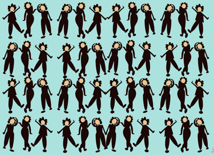
7. Sketching People 3: Volume & Silhouette: For this exercise, we're going to do some drawing from our photos again, but this time using shapes only. These could be quite gestural shapes, like swishes and lines or it could be just simple block shapes like circles, squares, and triangles. I'm going to try a couple of different techniques. First of all, I'm going to try a simple circles to just block out the main points on the human body. We've quite a thick pen here. Pandani. I'm just going to block in key shapes. Maybe small boobs, the hips, and the foot. On the other side, the head, shoulder, one boob, hips, and the knee, and ankle. We got that. It's interesting to see that you still get a relationship between the two groups of shapes, even though all the other detail is completely missed out, which I quite like. Let's just add a new layer and try something else. Again, to use the syrup pen now and just do some gestural lines just to demarcate the movement in the bodies through the limbs. Just going from the shoulder to the hand. Is inspiration. Then again, making sure to start at the joint, a V-shape just to give it that really nice flow. Even that simpler exercise has given us some really beautiful shapes which would look lovely in pattern I think. Let's try another one. Let's do the woman falling. This is very simple. Have a play around with these different techniques and see what kind of shapes you'd like to come up with. I'm going to put them all into one Canvas as well just so I can see them all in one place. Let's just scale them, move around a bit. All ready, I think that's looking quite interesting as a set of marks. Let's see what happens next. Finally, I'm going to start sketching using volume. This is my main technique I use when sketching people for my patterns. For this technique, I use mostly round shapes to really capture the volume of the figure before going over it with a studio pen and filling in at the flat color. Then we'll transfer that into Illustrator later. To start with, I just select 6B pencil, which I like to use for sketching and use the reference image to get going. Always start from the head as it's the key focal point. Again, we can move this around and change it as we go. The skull has the main shape of the skull and the draw. I like to bring it down a little from that. I mean, you can see where the eyes, nose, and mouth might be from there, but in my design, I'm going to ignore the facial features and just go with the figure itself. I like to draw a circle for all of the main joints connected together with lines just to keep it in perspective. You can see that her elbow is just above her head here. You can start to flesh out the volume in the shape once you get those joints in place. The hand, I like to keep quite simple. Again, no need for a lot of detail at this point. You can see from how she's bending where the spine might be. It's quite useful to just sketch that in and then go to the hips. Two cycles for them. You can see she's bending this way. The knees, cuff muscle, and then it goes down to the ankle and the bowl of the foot at the bottom. She's got heels on, so she got a little heel here as well. Then you can start to flesh out the edges of the shape as you go. Let's get the other knee in there. This leg is a bit more outstretched and just comes out a little bit. This arm is quite foreshortened. The hand coming out here. The hair. I'm not sure I'm going to put the hair on at this point. Hard to see with the clothes baggy over the shape of the shoulders. But you can still use the other image as a reference point. You can see the shoulder line on the woman on the right is in line with the eyes. It's in line with the eyes of the woman on the left. Then how the shoulder drops down. Again, her spine is twisting. It's a bit big. Let's get the elbow in. The hands flipping back. Again, the calf muscle. A little shoe and foot shape. Her other knee is directly behind this one. Let me put a little bit some hair in. Once you've got the base layer of your sketch, make a new layer, and then we're going to change the studio pen to trace over. Let's add a layer and then go to, I don't where is it, "Sketching", "Studio Pen". I like to just change the opacity of the sketch layer just to take it down a little bit so I can see what I'm doing a bit more clearly. Select the underneath layer, take it down a bit. You might want to rename it. Sketch. Then get to layer 2 and we can start adding some detail. I'm just simply going to trace over not too much detail but just the outline. Then add a bit of a kick for her clothing. Then drag the black over to make a nice flat silhouette. I'm going to do the other women on another layer just for ease. Again, we use this Studio pen. She's got a bit little baggy here. Shirt her up. Again, fill the shave. Then hide the sketch. This is the technique I've used to create the pattern collection that you see behind me. This is the process I usually use. I will show you how to transfer this into Illustrator.
8. Illustrator: Pattern: Now that we've drawn our icons in Procreate, it's time to transfer them over into Illustrator. To do this, I've just airdropped them from my iPad to my laptop, and now I'm going to open up Illustrator and make a new canvas. Let's go to "Create New". I want my canvas to be print and I'm going to make it quite big so that I can see what the pattern might look like to scale. I've actually made a canvas 600 by 400 millimeters so 60 by 40 centimeters. You can really get a sense of quite a large canvas and see how it looks, so let's create that. I'm now going to find my images from the Finder and select them all and just drop them right into Illustrator. I'm just going to click "Embed" for all of them. Let's move them out away so you can see what we've got. As you can see, there's quite a nice range of shapes and marks there already that we can play with in our pattern creation. The next thing we need to do is to image trace our designs so that we can get them vectorized and ready to use in Illustrator. Click on one of the images and go to the tab above, which is image trace. It might be on the side here. There are different presets and views. It is useful to get to black and white logo because they're all black and white and so we can recolor in Illustrator. Let's go to black and white logo. It will come up with a threshold automatic down here, but you can play around with going more or less. Which because it's just black and white, it won't make much of a difference. If you've sketched your image, for example, on paper, it might pick up shadow or texture in the paper. Let's go with a mid threshold is fine. You can preview it so you can zoom in, see what that looks like. That looks fine. You have a very slightly less so actually just to give a bit of a crisp edge. Let's expand that. This creates a white area and a black area. For the purposes of this, I want to ignore white. In the next one, I'll show you how to select that. Now let's ignore that white and delete it, tiny bit, and then click off. We've now got a simple black silhouette ready to use in our pattern. I'm just going to make that a bit smaller and then just move out the way. Let's repeat this with all of them. I go to image trace again. Now this one has quite a lot of different groups of symbols. What I'm going to do is right-click and ungroup it. Now you can see that the other rule, they are own separate. But I want to select the ones I know were drawn together. I'm just going to drag an area over them and do Command G to regroup them as a smaller set. Now again, just like all of this, a little smaller. Get out of the way. Let's go to image trace and black and white logo. Keep the threshold in the middle. We want this option down here to ignore white. This means that we won't have little patches of white in the kind of sketchiness of the design. Let's keep that box checked and make sure previous checked as well. See what comes up. Now we're starting to lose some detail of these slightly thinner lines. I'm just going to increase the threshold. I'll do again a little bit more. Learning further. That's better. You can start to see that the details starts coming back when you change the threshold. I'm happy with that, so let's click "Expand". Again, I'm going to ungroup it. I'm going to right-click and ungroup. Then just select the ones which I want together and go to Command G to regroup and just move them out of the way. To make them smaller, I'm just going to the edge of the bounding box here and holding down Shift to constrain the proportions. We can now see that we have all these different elements ready to be used in Illustrator they will vectorize and ready to go. I've decided I want my pattern to be a square tile repeat, so I'm just going to change the document to be 400 mils by 400 mils, so it's just nice and square. Let's just move these over as well. First of all, I'm going to draw a background square on my art board. I'm just going to go to the rectangle tool. The corner and just drag and drop it wherever. It should show you with these measurements that is 400 mil by 100 mil. Just to check it is directly aligned to the artboard. You can go to the align tool and just center both ways. Make sure it's aligned to artboard here. Also fine. Just going to change the color. Let's just give it. For now, I'm just going to lock the background layer Command 2. You can see the little lock symbol comes up. I correlate these wiggly patterns. I'm going to bring some of those over and see if we can embed them in the design. To start with, I'm going to make all of these Arrange, Bring to Front, to say that we can drag them over very easily on top of the layer we've just made. To start with, I'm just going to start placing the icons around the scram. Going over the edge very slightly and see how it looks. [inaudible] a bit bigger. Once you've arranged them down one side, I'm going to move and copy them over to the exact same position on the other side of our square tile. I'm just going to drag and select the ones overlapping the edge, right-click and go to Transform and Move. We know our tile is 400 by 400 millimeters. I'm going to put in the horizontal 400 to get 400 across and vertical 0. Distance is 400 across automatically. Make sure preview is on so you can see on the screen where they're going to end up, and then instead of clicking "Okay", we want to click "Copy". There you go, they end up nicely overlapped along the edge. We just want to move our references out of the way so we can see what we're working with. We're going to do the same thing for the top and bottom. I'm just going to select this one, right-click, and again Transform, Move. This time we want to go vertical. Horizontal is 0, vertical is 400. Well, and we want to again copy it, so that we can see it, it comes up at the bottom. Now we've still got some gaps to fill in there. I'm just going to move some icons in and see what we can do to fill them. It's going to make them a bit bigger, so move there, it's not quite good size. I'd like another copy of this falling woman down here. Maybe another one of this as well might reflect that. You go to Transform, Reflect and vertical and click "Okay". Just to give the design a bit more movement and a bit of difference. I'm just going to move these down. Once you've got some icons overlapping the edges, you want to do the same movements to both if you need to adjust anything. Make sure both are selected, and then I'm just going to use the upper down arrow key to just move them both down and across a little bit. That's a bit better. Now I'd like to see what this looks like as a repeat pattern before making some other adjustments. I'm going to unlock our background theme or to Command C to copy it. I want to paste it in the back, which is Command B, and I want to make sure that it doesn't have any fill. We're just going to click "None" for the fill. Then I'm going to select all of it including the background color and the background clear tile, and then drag it over into our Swatch panel. I'm just going to drag it into Swatches here. Now we can make a square or any shape actually. Go to the Swatch panel and click the pattern that we've just made, and it will fill the square with that pattern as a repeat. Because a square is quite a similar size, I want to scale down the pattern to just have a look at where the gaps might be. Again, I'm going to go to right-click Transform, Scale, and I want it to be uniform, let's say 65 percent. I don't want to transform the square itself, just the pattern inside the square. I'm going to uncheck transform Objects and preview this check, so you can start to see already what the pattern looks like as a repeat, and then click "Okay". There's our pattern so far. I think that looks quite fun and playful. There are a few gaps, but perhaps that's something that we could maybe leave-in, to give it quite a scattered look, or maybe we could even make it a bit more-gappy and take some detail out. A good trick for once you've made your pattern is that you can actually edit the swatch. You can go back into your Swatch panel and literally click and drag the swatch right out, and that is what we've just made, but a nice copy of them. I do quite like that as it is. To make changes to the pattern, I quite like to copy the artboard or copy of what we've been working on, again by holding Alt Down and Shift to keep it in line if you want to. Then you can just make adjustments as necessary. Move your icons around, you can move it to more space, change the size if you want. Let's try that. Again drag it back into the Swatches panel. Again, I'm going to copy our sample and then click the new design. You can see that has a bit more space, but actually, I quite like the original version of this, so I'm actually just going to delete this and delete the swatch as well. It's quite useful to keep your Swatch panel really tidy, otherwise, they can get quite overwhelming. We have lots of different versions. If you're playing with different things, so just keep the ones that you're really interested in exploring a bit further. Now, I'm going to make another pattern using some of the other icons you've made, just to play around a bit more. That's make a new square, the same as the last one. Forty or 400 by 400 millimeters and let's just change the color slightly. Now I quite like these dress patterns so I'm going to hold Alt to make a copy and move it down here, and I like these flying patterns as well. Same into this. Let's bring this to the front and right-click, arrange, bring to front, and then that can go right over our square. Let's see. I mean, this might be quite nice just as a simple stripy repeat. Hold Alt and Shift to bring that down. Again, selecting what's overlapping the edge, going to Transform, Move, and horizontal 400, vertical zero, and then "Copy". Let's move these out of the way. This is quite a stripy design. I'm going to try make these to join as a continuous stripe, by separating the shapes and bringing them in. So I'm just going to ungroup this one, and then bring in some of these shapes up here, and Reflect, just to make it look a little bit different. Reflect vertically. Again, Reflect, and that's quite nice, I think. Get rid of these. I'm actually going to get rid of these as well for now because I think they work better as a stripe. Let's look. The background with Command 2, select that line. I'm just going to Ungroup these two, and select everything again, and what I want to do is to even out the spacing between these shapes, so I'm going to go to Align, Distribute Spacing, and this Horizontal Distribute Space. That just gives it a bit more of an even breathing room between the icons here. I think that looks really nice as a stripe. I know that this and this are in the right place, so I can select to Command G to regroup it, and then Alt and Shift with it selected to drag it down. Drag it down again. I'd quite like this to be long a little bit. It might reflect that whole thing actually. Not scale. Again, just to bring some difference into the design. This row, too similar now. I think it's just those adjustments has made it look a bit more flowing. Again, I'm just going to move this down, Transform, Move, and we want a vertical 400 mls, there it is, and "Copy". Now, this has gone over the edge where we've already got our design, so I'm just going to make the shape of the background a bit longer. I'm going to make it 450-480, and lock that background and just delete what I've just moved. I'm going to regroup that and move it again. Now 480 is the new size of the square and "Copy". That's better. I'm going to distribute the lines again, so I'm just going to regroup each line by selecting ending Command G, and now I can select all of them and go to Align, Distribute Spacing, and this time I want a vertical distribution. That looks much better. Let's see how it works as a pattern. I'm going to unlock the background. Command C to copy it and Command B to paste it in the back, make it clear, and then highlight the whole thing and drag it over into swatches. I can see from my swatches panel that some of these are lining up, so I'm going to have to get back into this pattern individually and copy icons over more accurately. I'm going to select all of these and delete them. Select all from one side, and just check it by moving it again, 400 across, zero vertical, and "Copy". That looks better. Scale it to check, not the objects, well, does look much better. Now we have a couple of pattern examples, I'm going to show you one more where we're just going to use one icon to create the design. Again, I'm going to make a square, 400 by 400 millimeters using the rectangle tool. It comes up with the last pattern that we've used, so I'm just going to click a color instead. Let's change that to just something a bit more calm, and I'm going to use this icon, Alt and drag and then Arrange and Bring to Front. There's another way of making patterns on Illustrator, and this is quite a fun way of using a simple design to look at different repeats. So I'm going to select one icon and go to Object, scroll down to Pattern and click "Make". Immediately, it will show you a preview of what the object looks like repeated, and you can see the different options for the repeat on the box that pops up. This is a grid repeat, and you can see that there's repeated in rows and columns. You can use the drop down menu to look at different types of repeats, Brick by Row, Brick by Column, which means it oversets it by half. Hex by Column, which is a hexagonal repeat, and Hex by Row. I quite like the Brick by Column, and I'm just going to give the icon a bit more space. I'm going to size the tile to the art, and then give some space around it. Let's say 20 millimeters. Now it just gives it a bit more breathing room, which I think looks really nice actually. So I'm going to name the pattern, Women Dancing one, and click "Done". Just going to move that out of the way. With the square we've just made, we can go to our swatches panel where the pattern we've made will appear, and click him, and it will feel this way. Again, we can scale it to see what it looks like. Transform, Scale and uncheck objects, and you can see there's quite a lovely repeat with the movement of the arms, making it flow quite nicely.
9. Illustrator: Recolouring: Now we've made some patterns with some different examples, let's talk about color. We can recolor our patterns using Illustrators Recolor tool, but it's really good to color them by hand first and see how it looks. Then we can look at some different palettes. I'm using some color palettes that I've already created for my pattern collections, but you can obviously create your own color palettes. It's really straightforward. You can just click on the icon of the folder to create a new color group. Name it, and then you can actually just drag and drop colors into it. Then you can use the color picker to select some colors, and drag them into your palette. There's quite a nice range here. Again, to use this pattern in as an example to show you how to use different colors in your design. I've made some pallets from some colors that I've already used. Now I'm going to select the same of each icon, and simply select the color that I wanted to be. Let's say orange. Let's change the background by selecting that. Maybe pale. Select this to dark blue. The icons that you've designed in the middle can be any color, but the ones overlapping, either vertically or horizontally need to be the same color as they will meet once the tile is repeated. You want to repeat the same color to give the design some consistency if the icon is repeated. Let's see. Dark green, perhaps, and move up there. You can then once again select it all and drag it back into your Swatches panel. Let's make another square to test it out while you're copying that one, and click on them. As you can see, it's a really straightforward way of coloring your designs. Now we can play with the Recolor tool to see what it looks like with different combinations. To do this, I need to make a copy of the swatch we just made. It means I can see them both next to each other. The Recolor tool is this little wheel at the top of your screen, so I'm going to click that to "Recolor". You can see that it shows you the current colors of the design. I've got seven colors. You can either select other palettes that you've created or already have, or you can reorder the current colors. Let's start with reordering the current ones. This one here is endless fun, where you can randomly change the color. Let's click that and see how it looks. You can just see that it swaps out the background, foreground. That one is quite nice. Once you go past a certain combination, you can't go back to it. It's always worth clicking "Okay" when you see one that you like, and then starting again from the original. I like that dark blue. I'm going to select both of these to do some other options. Copy and paste them. I'm going to go from this one, recolor again. Let's see what it looks like. Some different colorways. The green background is quite nice, orange. As you can see, you can have a lot of fun re-coloring this and spend quite a long time on air. It's quite addictive. I'll just quickly show you how to use a different color palette. Let's come out of that for a second, go back to our Swatch panel. Any color palette already in our Swatch panel, you can use in the Recolor tool. You just need to make sure that they are selected, and then it will automatically come up in the Recolor tool. So you can see that it's already there. Let's try with a different group, a fewer colors. If there are a fewer colors, then it will combine colors. Change the pink and orange into these more simplified palettes. Let's go through that again. It's quite nice. You can also go to less colors, which makes it quite tonal, so let's select three colors. There's quite limited palette now. If you just go down to one color, it would just do tones of that color, which is quite nice way to simplify the design, and give it some depth as well. Let's click "Okay" and click "No". You don't want to save the swatch. Let's do one more. Let's try black and white. Again, reduce it to say three colors. It gets a bit washy-washy. That one's quite nice. If you've mixed in a lot of different colors into your design and want to see them in one palette, you can also select the design. I've selected this one. Go back into your Swatches panel and click "New Color Group" and go to Selected Artwork and Convert Process to Global. This means that the colors will be globally recognized, and we have lots of different color palettes. Let's click "Okay", and it will make you a nice new palette there. If you click on that, it will then appear in your Recolor tool, which is really useful if you want to use it for other patterns. Let's say this one. I want to recolor some of these in a similar way. Let's change the background to dark. We like this one. Again, you need to make sure the top and bottom and side-to-side of the designs of the icons are the same colors. Select them at the same time. You can also use the Eyedropper tool to select them if you want. You can select multiple at once. Click "I" for eyedropper. That's maybe a quicker way of doing it. Now that's colored by hand. Let's put into the Swatches panel. Again, we can use the Recolor tool to see what that looks like in some different colorways. See what comes up. That one is quite nice. Let's click "Okay". There you have it. A really simple way to recolor your designs in as many options as you like. See you in the next lesson.
10. Export for Social Media: Once you are happy with your designs, you might want to move them into a document ready to export and share on social media or unto your portfolio. I have created a template for sharing patterns through Instagram, and these art boards are the right size to share on Instagram and you can easily transport your designs here. I will show you how now. Go back to your working document and select the designs you want to share. Command C to copy. Go into the document template, which is in the project resources, and paste them. Let's just bring them in one place. Then you can simply click on one of the images. On the art board, go to the eye dropper tool and select your pattern. On the next one, slide your pattern there. On the next one and slide your pattern there. You can delete the ones you don't need. I am going to make one of these slightly smaller. Single, Double-click on it to transform. Oops, not shear. Transform and Scale and again uncheck objects. I would love to be quite small so let us see what it looks like at 35. Scale and 35. Let us try 45. Okay. Of course, you can add your own name and logo on this. I have also given you a little toolbox for the colors, just as a reference point if you need them again. You can edit those yourself. Once you are happy with your patterns dropped into the social media templates, you can export them. Let us go to file, export, export as. I am going to check to use art boards, several of them, and as a JPEG. Then you can just change the heading to be Women Dancing Skillshare 01 and Explore. Let us keep all the quality to maximum. We want all optimized as well. Now you can see them in your folder. There they are. In this lesson, we wrote together our icons that we drew in Procreate and made our technical repeat patterns in Illustrator. Now you have a range of patterns you can include in your portfolio, you can share on social media, and perhaps even print onto fabric. If you'd like to join the bonus module, I will show you how to print your pattern onto fabric and up-cycle a dining chair to make it your very own unique design. Remember to upload your designs in the project gallery, and please do feel free to ask any questions. I'd be really happy to help. Thank you so much for taking this class, I hope to see you again in another lesson soon.
11. Bonus: Up-cycle a Chair!: Thank you so much for taking my class, Patterns With People. I hope you've really enjoyed it and created a beautiful pattern that you can now use for all different projects. A bonus module for this class is going to be showing you how to upcycle a dining chair using your very own pattern printed on fabric. To find out how to print your pattern on fabric, you can have a look at some of my previous classes or go to a website like Contrado which is a UK based digital fabric printer or have a look at digital fabric printing in your own country to find something local to you. In this class, I want to show you some examples of how to use your fabric on different chairs. I'm going to show you just how to cover a simple drop seat dining chair using fabric that you have printed digitally. You'll need to take the base out of the dining chair and just unhook it using these little twisty tags. It might be something you have to hammer out. I've painted the frame of this chair using a chalk based furniture paint. We then get a high density foam pad, just cut into a square and some warding which you can get from any fabric also haberdashery shop. You'll then need some fabric scissors and a sharpie and staple gun and some staples. We're then going to take the base of the seat pad, put it onto the high density foam and just draw around it with the sharpie just to give us a little template. We're going to cut this out. I'm just going to use fabric scissors, it's quite quick. But you can also use a serrated knife like a bread knife which gets the foam cut a bit more accurately if you want to get those curves, trim it down to size. Once you've done that, you can put it onto your seat pad and then cover it in thin layer of warding. They just takes the sharp edges of the foam off, makes it a bit neater then flip it over. We just want to make sure that the little twisty bits that attach the base to the chair are given some room. Trim it down to size, making sure not to overlap those attachments and then you can start stapling. I'm going to staple all the way round, making sure to overlap with some pleats at the edges to just keep it as flat as possible and then trim off any excess, so that you have it nice and neat. We can then put our fabric over the top and smooth it out. You might want to iron the fabric before you do this. Flip the whole thing over again. Then we want to start by stapling at the top and bottom the seat pad and pulling it quite tightly over the top and bottom as you go. Just keep it nice and smooth. Then again side-to-side, pulling it quite tightly and making sure the fabric's laying really flat. I've not given myself very much excess with this square I've cut out, so you might want to give yourself a bit more overlap. With the corners again, pull them as tight as you can with the point of the fabric pointing towards the center of the base of the seat and then staple that round and then the opposite side. Again, pulling it as tight as you can and stapling in the center first and then pleating a little tuck in on each side. It can be a bit fiddly, as you can see. You can see that the staple gun I'm using is just like a light duty staple gun which isn't actually the best for wood, so you might want to use something a bit more heavy duty or even a pressurized staple gun which is the most effective kind for upholstery. But if it's just something you want to do at home, a light staple gun will do the job. Staple all the way round, trimming off any excess as you go. Then just check it smooth and there you have it. Now let's put it back into our chair. Not too bad at all. Make sure that the hooks or whatever fastenings you have are twisted back into the frame to keep the seat pad on. There you have your finished chair.
 Ellie Shipman, Artist, illustrator and pattern designer