Transcripts
1. Welcome!: Hi, guys. Welcome to my class. My name is Kela Lawrence,
but you can call me, Kate. I'm a self taught digital Illustrator based
on Long Island. This class is all about using
color and your imagination. We will be creating a surreal landscape bursting with color. I'll guide you through the steps to create your own piece. In this class, I hope
you learn how to break out of your shell and
experiment while having fun. I love creating
surreal landscapes with rich, vibrant colors.
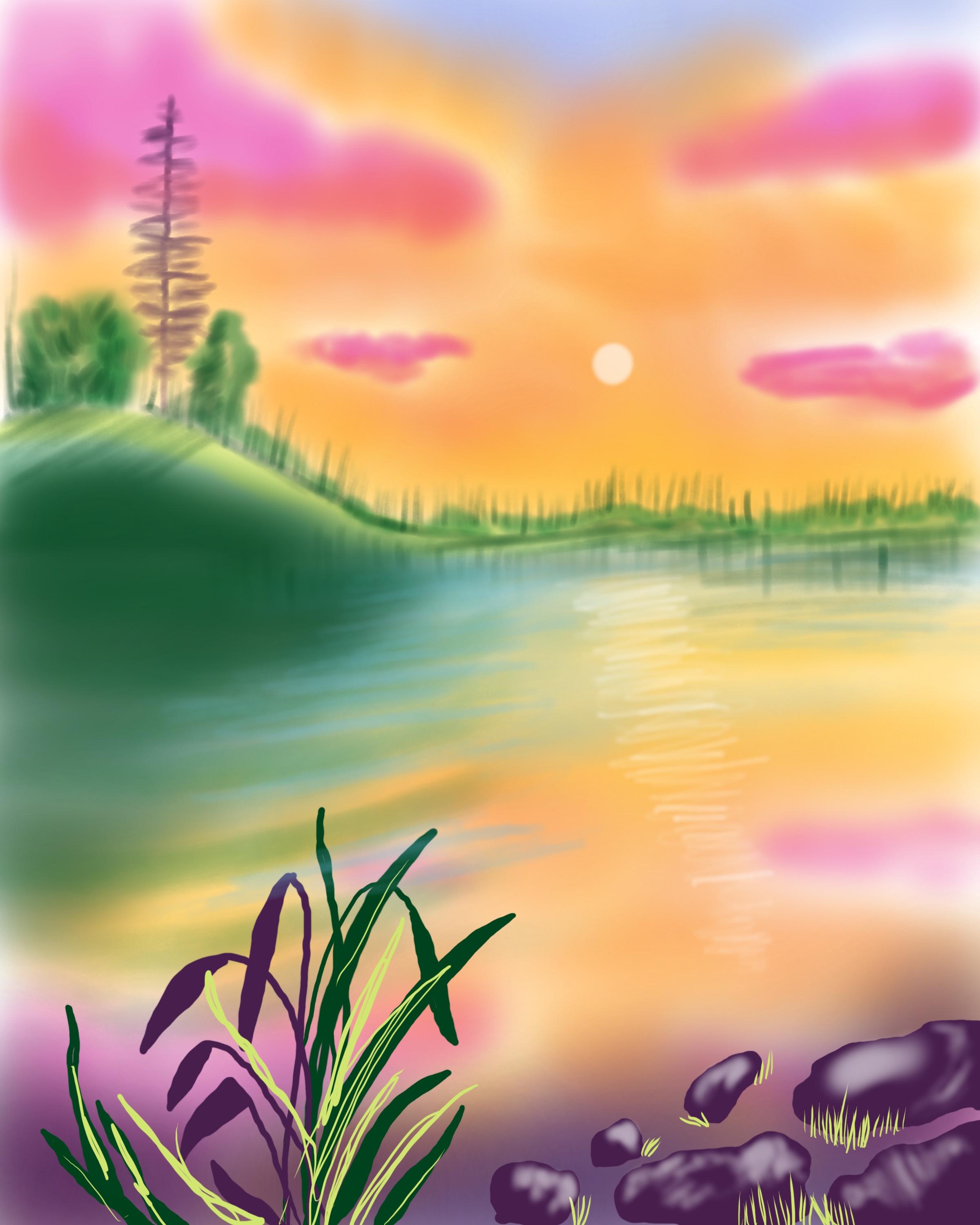
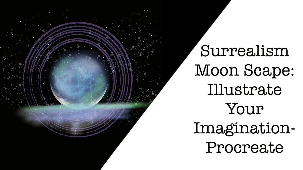
2. Class Project: A. Do you want to create
a surreal landscape, but don't know where to start? In this class, we illustrate a colorful composition utilizing bold colors to a
weaken the senses. I've broken down this piece
into six small lessons, so it's easy to follow along. This class is all
about how to make a landscape bursting with color. In this class, I teach step by step everything
you need to know, so it's perfect for
artists of any level. For our project resources, I've attached the
Canvas and sketch, as well as the
brushes we will be using today and our color
palette and reference photo. Together, we'll be creating
this surreal theme.
3. Setup: All right. So after you download and import the resources, this is our Canvas, and you're going to notice that if you
go to layers, it says sketch. This is what we're
going to be using. We're going to be
working between sketch and background color. And if we go to our brushes, you're going to notice
that the brush that you downloaded says
Sunrise over lake, and we have three
different brushes in here. We have the soft brush, case watercolor brush,
and technical pen. If we go to our colors, you're going to see all the
different colors that I've picked out for a
vibrant composition. They're my favorites
to use magentas, greens, and like an egg plant. We have all just
different fun colors.
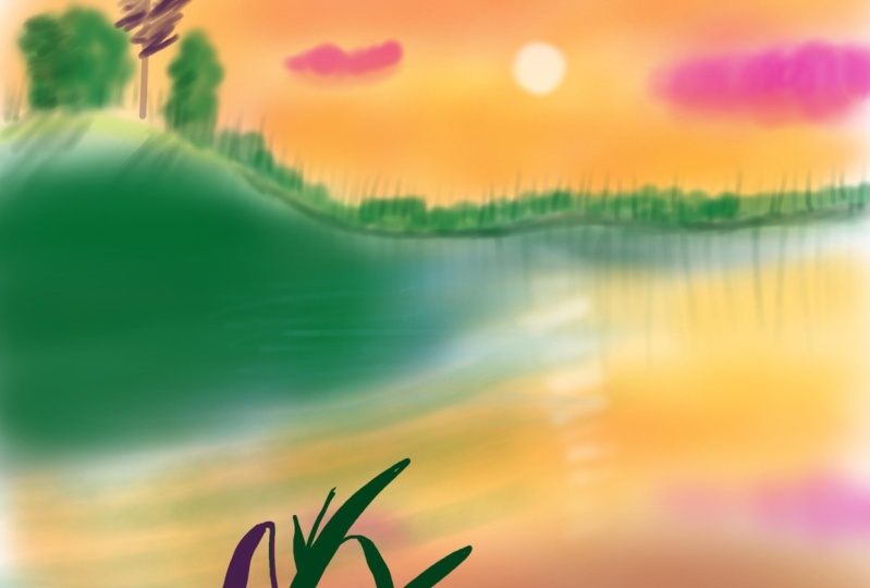
4. Sky & Reflection: A All right. Here's our Canvas and we
are ready to get started. If you go to your layers, you're going to
notice that a sketch, you're going to add a new layer, and we're going to drag
it underneath sketch. No get ready to rename it, it rename, and we're
going to call it sky. Perfect. Now, go to your colors, and you're going to grab the
first color which is yellow, and we're going to
go to our brushes, and grab soft brush. Now let's go to the
sizing and we're going to size it to about 14%, and opacity is about 49%. Now we're just going to
begin, going left to right, using a very light pressure, filling up the canvas, working around the clouds, but not afraid to overlap them. We're also going over
the trees a bit. That looks pretty good. And now we're just going to
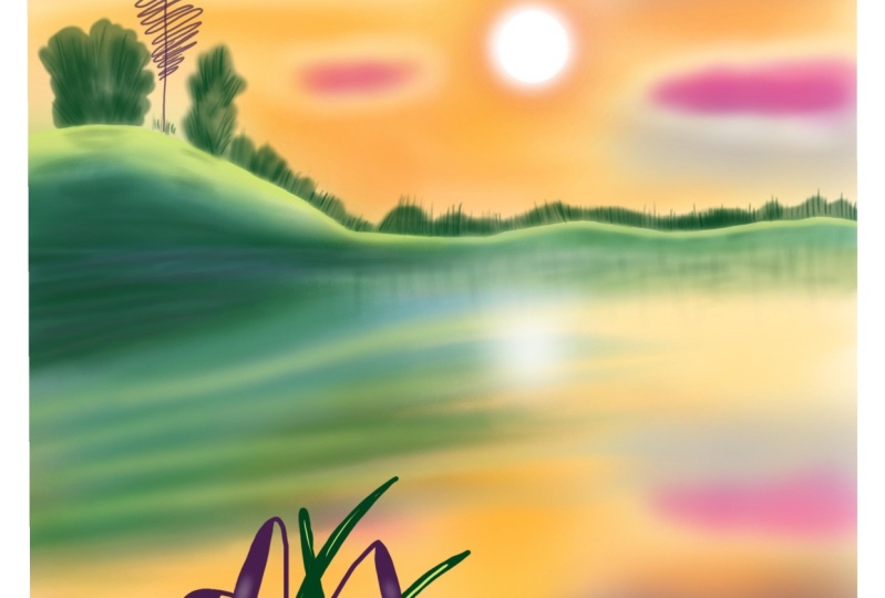
go to our reference photo. I forgot to open this
up. Hit Import image and select the provided
reference photo, which is the painting that
I did a couple days ago. We're just trying to
recreate it for this lesson. You can size it to whatever you'd like by
pinching and Zooming. Once you're set
up, we're going to start adding another color. All right, open your colors, and we're going to go to the orange color to the
third color in. We're going to size our
brush down to about 5%. Opacity is the same. You're just going to lay it around the bottom
portion of the sky. Again, going left to right and
using very light pressure. We're not pressing
hard here at all. It's shaping up. I really love this color. Next go into your color palette and pick out the second color, which is the pink and
size up to about 11%. We're just going to go on
top of what we did before. We're just gently building
color like we would if we were doing a water color painting. I'm going to add
some to the top. Next go to your colors, and select that magenta
color, that hot pink color. We're going to use
it for the clouds. I size my brush
down a bit to 11%, and I'm just going
in circular motions, not afraid to go
outside of the sketch. And we're just filling them in. Now, your clouds can be
as opaque as you'd like. If you want them
to be really dark, go ahead and apply
that pressure. Is doing the smaller clouds. Again, this class is
really more about getting comfortable using
these bright colors and making bold moves rather than spending time
on detail per se. Next, go and grab
that darker blue. And we're going to
use a size nine. We're still using
the soft brush, and we're going to add it
to the top of the sky. Just like that. Perfect. Let's go to our colors. I'm going to pick
out that orange again and just add
a little bit more. This is totally preference. However you want your sky, you imagine your sky to
look, that's how it. I'm going to add a
little yellow to the horizon just to
brighten that up a bit. Where our sunrise is happening. Now get ready for a trick. We're going to click on the sky layer and click duplicate. Once you've duplicate it, you can go to flip vertical
and it mirrors it. You could just drag it down
to the bottom of your canvas, and now we have a reflection. It's pretty cool. You can size it accordingly and drag it to where
you'd like it to be. When you're happy,
you just click off anywhere by touching
anything else. I'm also going to go to my Wan tool and go
to Gai and Blur, and I'm going to drag that
out just a little bit because I want to blur
out that reflection. So about 13%. Next, we're going to fill in that
little gap there.
5. Hill & Trees: Okay, so welcome the Lesson too. We are going to be
working on the hill here. So we're going to
go to our colors, and we're going to
grab our first green. It's very bright,
like a Kelly green, and let's rename the
reflection layer. So rename it reflection. I'm having technical
difficulties here. All right. After you've renamed it, we're going to add a new layer. Hit the plus sign at the
top right hand corner, and then we are going to rename this Green Hill. And trees. I'm just very specific
when I rename them so that way we don't
get disorganized. Zoom in and go to your brushes and
we're going to use the watercolor bruh,
Kit's watercolor. Actually, We're going to use a soft brush. Change of heart. Size that up to 8%
and opacity is 50%. Then we are just going to fill
in using a light pressure. I'm going back and forth. I'm going to size it down
a little bit more just so that way I can get in
these tight spaces, and we're just going to
lightly fill that in. Then later on, we're
going to go back in and add shadows and all
that fun stuff. All right. Looks pretty good. Next, go to your colors
and get the light green. And we're going to fill
in the top of this. I'm just going to drag in
one swooping motion all the way down to about the middle
and then just that's it. I'm going to do it
again to build up some color, stopping
in the middle. I think that looks pretty good. Let's go to our smudge tool. I'm using the soft
brush in airbrushing, and we're going to drag
it down to 68% opacity. I'm just smoothing out the dark green and
the light green. Nothing too crazy. It
looks pretty good. Let's go to our colors and
go back to the dark green. And we're going to start working on there like big bushes. Now, I'm making sure to pick up my pen so that way
I'm building color. So I'm like overlapping. I'm just going back and
forth, up and down, just creating different ture, different directions that the
branches would be going in. Then we're just going
to color in the rest. Very lightly. I'm moving my way all the way across to the right hand
side of the canvas, going up and down motions. Almost pretending like there
are trees, up and down. Okay. When you're done
with that, go to your layers and hit the
plus sine for new layer. Then rename, and we're
going to call this one. Dist in trees. Now grab your darkest green and then go to your brushes
and go to watercolor. Sizes down all the way
down to 9% opacity, drag that down to about 77%. Now, from bottom to top, I'm just making a
flicking motion over and over and over again, a variety of sizes. Zoom in, you get a better look. I'm trying to make my
reference box smaller. From the bottom to the top. Just a little flicking motion. We have some trees.
So distant trees. Im going all the way and
bringing the trees all the way to the end of the
canvas to the right. Almost as there are trees
fully eng all around us. Okay. When you're done with
your happy little trees, we are going to add a new layer. First, we're going to
pinch those two together, or you can do merge down. Add a new layer and
go to soft brush. Now we're going to fill in this big old white section
that we have here. On our dark green,
using our soft brush, we're just going to add some depth to the water and also to the little
hill that we have. I'm just going left to right, left or right or left,
right, right to left. You can make this as dark
or as light as you prefer. It's totally your call. I want this related to pop, so I'm making it a darker
than it would naturally be. Then also, you can do a
little reflection underneath. What we did before is trees, like a straight line across. Then we're going to
head to our yellow. We're going to
fill in this white gap with this bright yellow. Just to tie together.
6. Lake Details: A. Okay. The first thing we're going to do
is we are going to rename the last
layer that we made. We're going to head to layers and click on it and
then hit rename. And we're going to call
it reflection leak. Perfect. Just a war organized. Now, hit the plus sign
to make a new layer, then hit rename, we're
going to call this blue. Go to your colors and
pick out the light blue. Right Go to your brushes and
grab the watercolor brush. Now we're just going to
get the right size here. Let's do like 53% and
about 58% opacity. Then starting in the
center of the Canvas, I'm just going left to
right, back and forth. I'm just our lake come alive
a little bit with blue. Now, I'm using a
very light pressure. I'm pressing too hard. So if you want this to
be more opaque again, just press harder on the brush. Next, go to your layers, hit the plus sign, and
we're going to rename it. Green. Now go to your Kelly green, the first green we use. And I'm just making stripes
in the water almost. I'm bringing it to
starting from the left, going to the right, bringing it to about the middle of canvas. This is just going
to give our water a little bit of an effect that it's liquefied
and it's moving, and we have multiple tones going on here and I just think
it looks really fun.
7. Foreground: Alright, so this section, we're going to work on the foreground. So you're going to
add a new layer, and you're going to
rename it fore ground. When you're done
with that, you're going to go to your colors, and we're going to select
the darkest green. And then we're going to
go to technical pen. For this, you want to make
sure that the stroke connects. Basically that the line touches and then we're going to color fill by dragging and
dropping. How cool is that? Let's just size this
down to about 28%. We're going to make
a long stroke, then connect it at the bottom, make sure it's touching
and drag and drop. This is just a quick
tool to speed up your work process and
digital art is super fun. No, I'm just going through and I'm just tracing and filling. You can draw your own plan. It doesn't have to
look like mine. I just thought this
would be a fun little addition to add here. Also feel free to
just color in if you don't feel like dragging
and dropping in the color. Now I'm going to work on
the ones on the left. And honestly, the more
squarely the line, the more natural it looks. So don't worry if you can't
make a perfect straight line. It's better off
looking kind of w. Like that one didn't color fill, so I just decided to
color that one instead. Zoom in. Now we're going to go to the eggplant
color, the dark purple. On the left side, we're going to make all
of these purple. Just to give the that the left side of the
plant is getting Sun and it's green hue. We're almost done. I'm just filling this in, coloring in the bits
that don't fill in. It's really simple.
Anybody can do this. I feel like the crispness
of the grass in the front mixed with the background
being blurry is good. All right, let's
work on our rocks. So go to layers. Hit the plus sign, and re, and we're going to
call these rocks. All right. Now we're going to still
use the technical pen. And we are going to make these
one connecting line just like we did on the plans
so that way we can color fill them, just
to save some time. You can make your
rocks as big or as little as your heart desires. They would be bigger towards your physical body and smaller away that
they get from you. Just a little optical
illusion for you. All right. Once you're done, see, I didn't connect the line. Let's check. There's a gap. We're going to fix that.
And then drag and drop. And then do that to all
the rocks. Perfect. Zoom out, check it out. Think it's looking pretty good. Next, go to your
colors and go to your light green and add a new layer. We're going to call
this layer grass. Now, you can see in the
reference photo that I have some grass coming
out the sides of the rocks, like they're sticking
out of the water. The grass is overgrown
in the lake. Who knows what's down there. Anyways, I'm just drawing some lines that are overlapping, looking like they're
coming from underneath the rocks two on top of them. And we're doing this all with just a flicking
motion of the pen. I also like the contrast of the light green
against the purple. I feel like it makes
it pop. All right. Now, let's add some light
green to our plant. I'm going in between the leaves and also like a sketchy
highlight on top. I'm not going to draw any on
top of the purple though. Kind like in between. And that's the
foreground for you. It's looking pretty
good. It's shaping up. All right. Let's add a new layer and
rename it Highlights. Go to your colors
and grab your white. Go to brushes and
go to soft brush. Now let's size this
down to about 4% and opacity is about 65. Then on the top of the rocks, I'm, I'm going to size it down a little bit
for the little rocks. I'm just drawing on the
tip of them because I'm pretending the light is
coming from the top down. And I'm going to do
it on each rock. You'll also notice
that the highlight is giving the rock
like a texture, so it's making it look like it's got some dimension to
it, which is pretty cool. And I'm using a very
light pressure. I'm not pressing hard at all. Just finishing up
this last rock here. Taking a look and feel free to add highlights wherever else you
think they might be. I'm just doing a
very loose look. And our foreground
is complete. Oh.
8. Big Tree & Shadows: Alright, so for this section, we are going to be adding a
big tray to our background. So you're going to
go to your layers, and you're going
to add a new layer by hitting the plus sign, and then we're
going to rename it. Big tray. Then you're going to go to your colors and pick up a
eggplant color again. And we're going to size
down the brush to like 24. Opacity is 66. I'm not sure if this
brush size is too big, let's say, it's a
little too big. We're going to undo that
and make it a size nine. Just draw straight line down. Doesn't have to be perfect. Then I'm just doing
a zig zag motion, so I'm drawing a little
bit on the left, a little bit on the right,
and going back and forth. As we're getting
towards the bottom, I'm pressing a
little bit harder. I'm going to remove the sketch so we can see the tree better. And I'm just
starting at the top. I'm going to zoom in
on on our reference, we have a better idea of what
we're trying to achieve. I just basically go up and
down and do a zigzag pattern, adding in little
branches here and there. And your tree can look
however you imagine it to be just as long as it's not too colorful because
it is in the distance. We want to look
like it's far away. So not too bright. I'm adding some darkness to the bottom, where the shadows would be. Looks good. I'm pretty
happy with that. All right. Let's do
that on on a reference. Next, let's go to our
layers and hit plus nine for a new layer
and hit rename, and we're going to
call this shadows. Now I know we've already
done some shadows, but we're going to do
a little bit more. Let's go to your colors and
get that dark green again. Now we're going to use
the watercolor brush. Let's zoom in on the
bushes that we did before. I'm going to make
the size about 13% and the opacity is about 80%. Then I'm just working
my way around the bush, but I want the darkness to be on the left hand side because the sun is coming
from the right. I'm doing patches
here and there, but most of it will
be towards the left. And then underneath as well, we're going to do a
little casting shadow. And add a little
bit to the left of the tree, so it's darker. And then we're going to go to the next tree. Do
the same thing. Darker on the left,
lighter on the right, and some shadows underneath. Now I'm just filling
in where I think some dark shadows might be in this little valley
that we've created. I'm making a shadow
for the right tree. Just kind of on the
hill, like it would be. Okay. Now, whoops, undo that. Let's zoom in a little bit. And let's add a
little bit of shadow underneath these distant
trees that we made before. Just to give it a little depth. At this point, I'm removing my reference box because I don't really feel like
I need it anymore. We're pretty much done with this piece. We're getting there. I'm also bringing the
color down onto the water. If you don't want this look, then you can just skip the step, but that's totally up to you. And then I'm going to drag down, flick down to make shadows of the trees like
reflections in the water, of the trees that
we made before. I'm literally just doing one stroke down and then
moving to the next. And also try and make it
different sizes as well. Okay. So it's coming along. Next, go to your layers and hit the plus
sign for new layer, and we're going to
rename this as well. The sun. Now go to white, and we're going to
use our soft brush. And we're just going
to make a little sun right there in
between the clouds. Now, you can make your
sun as big as you'd like. I kind of want it to be tiny. Almost like it's creating
all of this colorful. I'm also dragging it
down onto the lake. So there's a reflection
on the lake as well. Going back and forth and it's getting smaller as it's
getting closer to us. So it's kind of
like with oxymoron, this tiny little sun, lots of colors, and a big reflection. All right. Now, let's let's go to the first
layer sky and hit duplicate just to
see what that does. That's a real big effect. So let's go to the opacity meter and side it down all the way to like 47%. That really has an
effect on this piece.
9. Finishing Touches: Alright, so you made it
to the end of the class. This is finishing touches. We are going to start
by adding a new layer, so go to your layers and hit the plus sign and hit rename. And we are going to
call this deep green. And then you're going
to go to your colors, pick that dark green and
using our soft brush. We're going to size it up to 9%. Approximately, and
opacity is 62. All right. Now, I just want this hill to be just too even more than it a. We are adding some
extra depth by adding some of this dark green on top of what
we've already done. You can bring this as
far down as you'd like. It depends on how
green you'd like your peat to be and how much
you want the hill to pop. Hit the plus sign
for a new layer, and we're going to
rename this light blue. Go to your colors,
grab that light blue, go to brushes and go
to Kate's watercolor. Opacity is 65%. Brush size is pretty small, and we're just adding in. I'm just feathering on
some more blue because it got lost in our layers. So just to make that contrast. I'm also bringing it up onto
the onto the green hill. Once you've done that, go to your colors and select the stem and color
next to the fuch. Make a new layer and
rename it Clouds. And then with the soft brush, Let's size it down 4%. We're just going to
add a little bit of a deeper color underneath the shadow underneath
the clouds as like a shadow to just make
them a little more moody. Then I'm just doing
a little one as well. Just a little bit. When you're done with that,
make one new layer and rename it purple mist. Grab that eggplant
color one last time and the soft brush. Let's size it up to about 14%, and opacity is 62%. Now at the bottom
of the canvas here, in circular motions, you're just going to make
a purple mist, and this is going to help frame the canvas and just give it a little bit
of an extra touch. Just so that the foreground
is a little bit darker. Then we're going to take that
layer and drag it all the way underneath foreground
and then drop. That's it. We're all done.
10. Thank You!: Congratulations. You
finished the class. I hope you enjoyed
creating and learning. I can't wait to see
what you all make. Make sure to upload your
finished lake scape to the project gallery. Here, I can provide feedback,
encouragement, and support. Thank you so much
for taking my class, and I hope I see you
again soon. Bye.
 Caitlin Lawrence, Illustrator