Transcripts
1. Welcome!: Hi, guys. Welcome to my class. My name is Kaitlin Lawrence,
but you can call me Kate. I'm a self taught Illustrator based on Long Island, New York. This class is all about
capturing the essence of winter. It's cold here. Using cool tones, we will
create a winter landscape. We will go over different
methods such as W on wet, W on damp and dry brushing. In this class, we will use a minimal color palette
and only three brushes, so it's easy to follow along. I'm a firm believer
that anybody can create and I can't wait
to see what you all make. Happy learning.
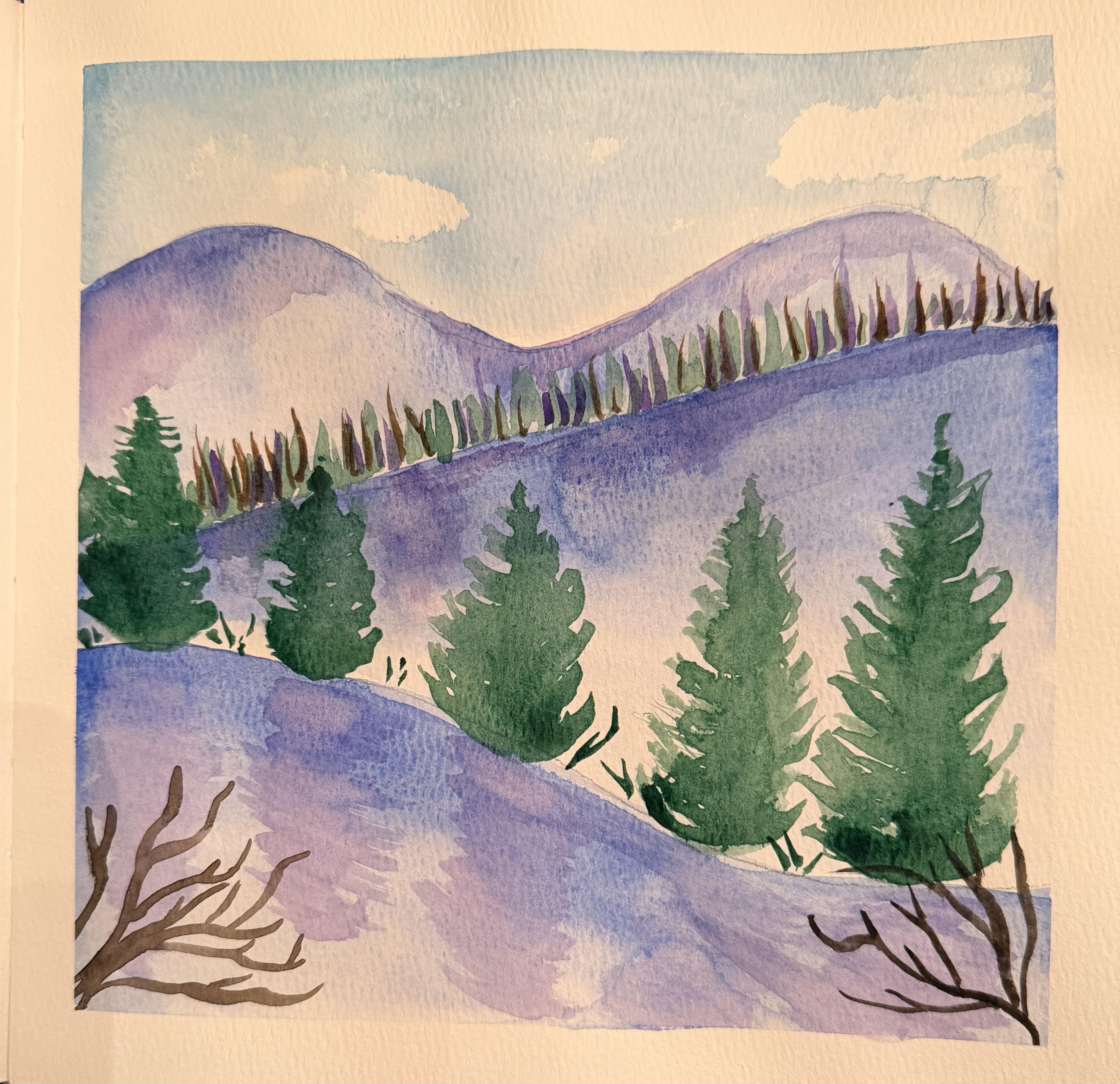
2. Class Project: Do you want to
capture the essence of winter but don't
know where to begin? In this class, we will learn my personal technique for illustrating a winter landscape. I've broken down
this project into small lessons so it's
easy to follow along. I teach step by
step how to paint a winter landscape while encouraging you to
take your own risks. For our project resources, I've attached my reference
painting that I've done prior.
3. Supplies & Setup!: Okay. To get started, we're going to be using
8.5 by 8.5 paper. It's 110 pounds and
it's cold pressed. We're also going to be
using three brushes. Our first is the size ten round. Our second is the
size one round, and our third is size
six bestie wedge brush. If you don't have this
brush, that's okay. You can always just
use around size six. Using a standard bick pencil. Washi tape. Scissors. And somewhere that
you can mix on. I'm using Windsor Newton's
compact travel case here. It comes with a little
storage area where I can mix, but you can always just
use whatever you have. And you're gonna need
some paper towels 'cause we're gonna
do some lifting. That's it. Alright,
let's get into it. So first, we're going to
lay down our washi tape. This is my favorite thing to use when I'm doing watercolor. I just like to peel it
and use different colors, and it's just fun. And when you're
done, it gives you these nice crisp edges
that everyone just loves. So you're just going to measure out how long your paper is, stick it down, and then grab your scissors and
just snip off the edges. And you're gonna repeat that
on all four sides. Mm hmm. Mm do the bottom one. And you just want to make
sure that it sticks down. You don't have any
bubbles or creases. I like that right there. I'm
just smoothing that out. So that way, it doesn't
lift from the paper, and we don't get any
runs underneath it. And I'm just gonna
finish it off. Perfect. Snip the edges.
4. The Color Palette: Welcome to the color palette. First color that
we're going to use is going to be cerulian blue hue, and it's going to be our sky. It's a beautiful
light blue color, and I am just adding a pretty
good amount to my palette. We are going to be
using a paper towel later on to lift to make clouds. So we want our sky to
be kind of vibrant. The next color that we're
using is ultramarine. And this is what we are going to mostly use for our mountains. Next up is purple Lake, and we're gonna mix
it with ultramarine. And we're trying to achieve
a pretty neutral purple. We're gonna use that for
some shadow work later on. Next up, we have Vidian hue. It's a beautiful, cool
green. I absolutely love it. And lastly, we have raw umber. That's it. And
5. The Sketch: Okay, welcome to the sketch. To begin, we're going to
start with our mountains. So we're leaving space
at the top for our sky, but I would say we're working about a quarter of a way down, and we're just making two
bumps, and that's it. And then we're continuing with a line going all the way back to the left hand side of
the page on an angle. And then we're leaving
a little space, and we're drawing another like hill, all the way to the right. That's pretty much it.
We're gonna add in some trees just so we know where they're gonna go
so we have a good idea. I'm gonna do five trees. And I'm working from smallest, from left to right, to biggest,
all the way to the right.
6. The Sky: Okay, to get started, we're going to be
working wet on wet. That's the first method or technique that we are going
to use for our painting. We're going to use
it for our sky. So get your ten round brush
and load it with water, clean water, and make sure
that your tape is sticking. Mine's being a little
silly right now. But just go ahead and just
push down on that tape, make sure that it's
got a good grid. And I am just working
my way around the mountaintops with
clean water right now. Then I'm going to go in
with our cerulean blue hue, and we are going to make
it nice and vibrant. So I'll grab that blue
when you're ready. And we're going to start at the top and work our way down. So we're adding
most of the pigment towards the top of the page. And then we're just kind
of allowing the brush and the water to kind of spread
around that blue hue. You do want it to be dark enough that when we
go in to lift clouds, you'll see the contrast. So go ahead and make
that sky nice and blue. And I'm just kind of
spreading it around, letting the water do its thing. Okay. I'm gonna add a little
bit more to the center here I want it to be like
we said, more vibrant. Alright, now we're gonna grab
our paper towel and you're gonna kind of crinkle it up into whatever shape
feels good for you, and then you're
just gonna blot and lift off that blue that
we just laid down. I like a really
cloudy sky, so Hmm. And just like that, we
have a beautiful sky. We're gonna let
this dry completely and then move on
to our next step.
7. Mountain Peaks: Alright, now that
the sky has dried, we can move on to our next step. We are going to be working
on the mountain peaks. So grabbing your ultramarine
and your big brush, your size ten round, you are going to load up that
brush with tons of paint. And we are just going
to start from the left. At the very tip, we're
going to kind of outline the peaks
because we want them to be darker than the
rest of the section here. So after you've
done that, you're going to go with clear water, clean water right underneath, and you're just
going to soften up that line 'cause you don't
want it to be too harsh. And we're just gonna fill
this little space here. I'm also adding a little bit
more in the where it dips. So that would be like a valley
or something like that. So it would be a lot darker
than the other sections. So I'm just adding a little bit more of the ultramarine blue. To the middle section there. It looks pretty good, Brian.
8. Middle Hill: Two Alright. After your mountain
peaks have dried, we are going to move on
to the next section. We are still using the same
color and the same brush. So if you need more, you can add more at this time. We're just using the
ultramarine blue. And it's about mid consistency. I would say it's
about half and half, half pea, half water. Now, starting on the left, we are going to basically do the same thing that
we did for the peaks. We are going to make
this darker outline towards the top, and then
we're going to fade it out. You also want to make sure that your mountain peaks are dry
because if they're not, then this color is gonna bleed into the layer
that you did before. So make sure it's dry. Alright, then after, you're just gonna go
in with clean water, go underneath the line, and just let watercolor
do its magic. We want this portion
to be darker than the one that
we did previously, so keep that in mind. Whenever you're
creating a piece, the foreground is
going to be darker. The midground is
going to be mid, and then the lightest
will be farthest away. And I'm just using
clean water here. I'm not adding more pigments. I'm just spreading it around. 'Cause I'm kind of going
for a snowy effect. Maybe these hills
are covered in snow. And you're gonna
bring it all the way down to the next line. Gonna let that dry? Alright, so before we move
on to the next section, I just want to add an
additional layer of ultramarine blue to
the tip of this hilt. I just feel like it got
a little washed out. So we're gonna make
it a little darker. And that'll help with the separation between the
mountain peaks and the hill. I'm just adding more of
that ultramarine blue. I'm just getting
any little areas that I might have missed
before. So white spots. Darkening it up a little
bit, adding some depth. Right now, I am
working damp on dam, so it's a little bit muddled.
9. Bottom Hill: Alright, so our middle
section is finally dried. It's a little bit choppy and not as dark as I
would like it to be. I would like there to be
a little bit more depth. So I am going to start off by adding another layer
of ultramarine, just to the very top of. If you like how
yours is looking, then you can just skip
this step and just wait for the next portion.
That's totally your call. I'm just tapping in where I want that darkness,
that depth of B. Okay. I'm more satisfied with that, so we're just gonna
get some more pain. And we're going to do the
last little hill here. Now, this is the closest to us, so we want this to have
the most vibrancy. We want it to be,
um, quite pigmented. So I'm using very
little water and more paint to get a
thicker consistency. Mm hmm. Mm hmm. And then
I'm just kind of blending it out using
some clean water. And if you'd like,
you can always tilt your page or your book,
whatever you're using. You can tilt it left,
right, up down, and that'll get a nice
a nice gradient look, so it's truly your call. I had that one
little spot running, so I'm just making sure that
that's spread out evenly. And then I'm just applying
more ultramarine. And this is really helping
our layers differentiate. Smoothing out those lines. I think it's looking
pretty good. Alright, we're gonna let
this dry completely. And then we'll be ready
for our next step.
10. Trees: Okay, so after
everything has dried, we are going to move
on to our next step, which is the trees. We are going to be using our bestie wedge
brush in size six. If you don't have
this, that's okay. You can always use
a smaller brush, like a three or, you know, just anything that
you feel comfortable with. We are going to be
using Vidian hue, so get that green ready. It's a beautiful
color. I love it. And I feel like it goes
great with this ultramarine. All right. So to begin, we are going to hold it
with the tip pointing down. So almost like at
a 95 degree angle, and you're just very lightly
going to make streaks up. So you're pulling
the paint brush from the bottom to the top. And we're just going to
make a little tree line going across this ridge here. You could very easily use the size one brush that we
were using that we have. We're just making the trees smaller as they get
farther away from us. And bigger towards us. Alright, I think that
looks pretty good. We are going to add
some more detail later, so have no fear. Alright, let's get some
more of that green. And we are going to
start on our big trees. First, we're going to
start on the biggest one. I feel like that'll be the
easiest way to learn it. So you're going to
draw a straight line up using the very
tip of the brush, and then I'm going left to right in almost like a U shape. Going all the way up the tree, getting smaller as
I reach the top. This is just one way. This is a stroke
that you can do. I feel like it gives a nice, full, like, evergreen
tree effect. It's pretty. Alright, while
the tree is still wet, I'm going to go in with
more of that color. But it's gonna be darker, so we're using less water here. I'm kind of doing it in the
middle of the tree where the the depth would be and
also towards the bottom. You can make your trees as
wide or as narrow as you like. Alright, let's work on
the next tree here. So again, I'm using just the tip to make this straight line up. And then going left to right in a U shape going all
the way up the tree. And then I'm just widening
it up as I go back down. And adding a little bit
more of that darkness. Method. How you make
these happy little trees. I am gonna make each tree shorter than the one
that I did before. Um, this is just my preference.
I think it looks cute. M And remember, we're painting nature, and everything in
nature is unique, so no tree two trees are
going to look alike. And that's totally okay. I'm doing this one a
little bit thicker, a little wider than the
other two that I did. And then I'm color dropping in some more of that
dark Vidian hue. Trying to make this one tiny. Just a couple brush
strokes here and there. And you have a tree. If you'd like your trees to go above the tree line,
that's totally okay. Go for it. They can be
touching. That's okay. This is our last tree? It's looking pretty good so far. Okay. So we're gonna let these all dry and move
on to our next step.
11. Shadows: In this section, we are going
to be working with shadows. So we are finally going
to be using our purple, which is purple lake and a little bit of ultramarine
blue mixed together. And I'm using my size one brush. We're starting on
the mountain peaks. On the left hand side, I am just spreading around a very minimal
amount of paint. I am dry brushing here. So I am dabbing off. I'm dipping into my paint, then I'm dabbing off
a little bit onto my paper towel and then going back and
forth on the paper. And I'm just giving it
a little bit of purple, almost like a glaze, really. Then we're gonna
work on the middle section of the mountain peaks. So we're using the same method. I just kind of spreading that purple around until
it runs out on your brush. M And this is just gonna add a
little bit more depth to what we've already laid down. Right now, your pieces should
definitely be coming along, and I'm so excited to
see what you all make. I'm grabbing a little
bit more the purple. And we're gonna add it
to the tree line that we did because maybe there's some darkness in there
in that little forest. I like to make my pieces unified by using the same
colors in repetition. I feel like it gives
a more classic look. Alright, so I'm just going to do some more dry brushing here. I'm gonna do a little bit
underneath the trees. It was a little too pigmented, so I used some water to, um, blend it out. And I'm just very
lightly going underneath the tree line with the purple. That's the beauty of using
a very small paintbrush, you can just get into these
little nooks and crannies. So it's no stress. If you want to lift up anything, if you want a little too dark, just grab that paper towel
and just dab it off. You can always reapply color. Alright. We're going to
switch over to our size ten. And we're still using
the same purple. I can't really see what I just did there, so I'm
gonna do it again. You have a better demonstration. So I'm dipping in the paint, blotting it off on
the paper towel, and then just using the
remainder of the paint that's on the brush
to make a shadow for the tray and just repeating
the process for each tray. Sometimes you'll
have enough paint on your brush to do two trees. Um, it just depends. Alright, we're gonna
do our last tree here. Shadow for the tree. I really like how this piece
is gumming together. It's very winter esque. Alright, we're gonna let
this dry and move on.
12. Finishing Touches!: Alright, guys, so you made
it to finishing touches. We're almost done. Alright.
So for this section, we are going to work
on the foreground. So we're going to use
our size one brush, and we are going to be using raw umber or a neutral
brown, cool brown. And we're just gonna
make some bare trees in the foreground here. So coming out of
the left hand side, I'm holding the
brush pretty much at 100 like 95 degree angle, and I'm just making squiggles, one long squiggle, and then another one coming out
of the left and to the right. Maybe a little branch here. And I'm kind of making
them point towards the trees so that way the eye goes in that direction
when you look at it. So I'm making some going up
and some going to the right. Very simple. Anybody
can do this. I'm just making it a
little thicker towards the bottom and maybe
another just going upwards. So your eyes go to
the mountain peaks. And you can add as few or as
little branches as you like. I'm pretty happy with that, so I think I'm going to
start on the next one. So the right hand side
towards the bottom. I'm just making flicking
motions with the paintbrush. And I'm making this one go over the tree that we
previously laid down. And these branches,
I'm making some go up and some go towards the left. That's really it.
They're very simple. And I'm wondering if I
should tie it all together. Let's see. I'm gonna
get more pink. And I'm just gonna do,
like, little wisps of, uh, the verdan cue I'm using. Just in between the trees, like, it's little pieces of grass
that's sticking up out of the snow or sticks to fill up some of
that negative space. And then I'm also using some of the brown just in the tree
line to make little trees, some bare trees that are
mixed in with the evergreens. And I think that just kind
of ties it all together. Into a nice winter landscape. Alright, we're
gonna let this dry, and then we're gonna
take off the tape and reveal our creation. Alright, so I let it dry. And we're just gonna
start peeling. Sometimes when you
lift your tape, you'll realize that
you have runs. It happens. Um, there's not really too much
you can do about it. So what happens to
the best of us. Alright, let's take a look
at our finished product. Nice and close. That's it. M
13. Thank You!: Congratulations. You
finished the class. I hope you enjoyed
creating and learning, and I can't wait to
see what you all make. Make sure to upload your finish landscape to
the Project Gallery. Here I can provide feedback,
encouragement and support. Thank you so much
for taking my class, and I hope to see
you again soon. Bye.
 Caitlin Lawrence, Illustrator