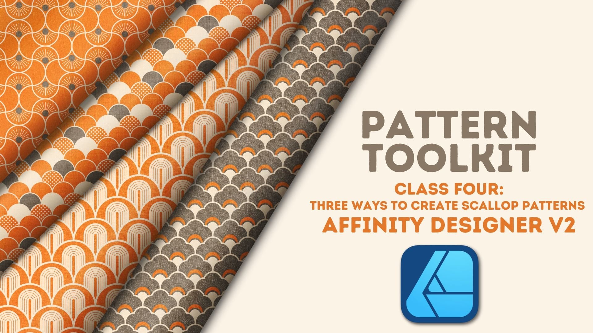
Transcripts
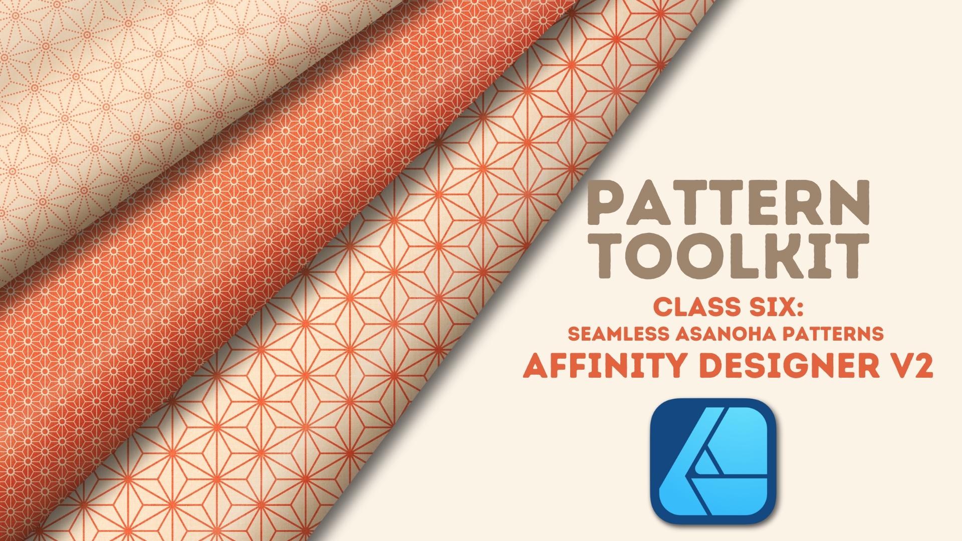
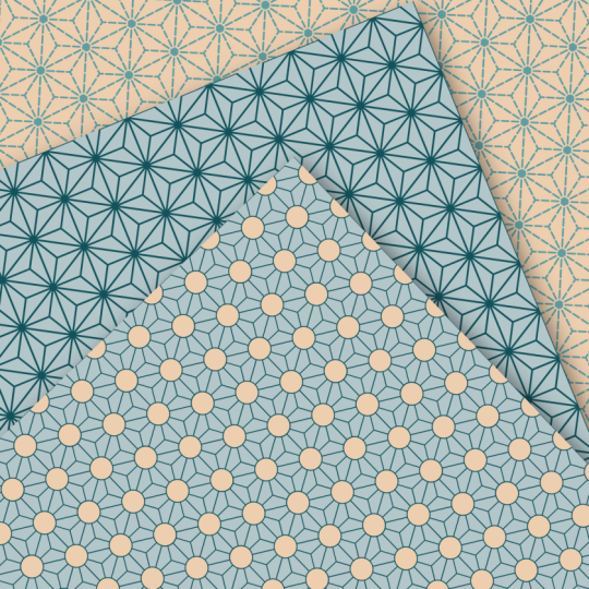
1. Welcome to Class!: Asanoha designs are beautiful
geometric patterns, deeply rooted in
Japanese tradition. With their star like structure and repeating diamond
based layout, they're one of the
most satisfying geometric designs to create. But thanks for their
close relationship to the asymmetrical hexagon,
not without frustration. If you've ever found
yourself wondering how to create this head scratching
interlocking pattern, I'll show you how to create
a seamless Asanoha design in less than 5 minutes by combining three simple shapes
in affinity designer. Welcome to class. Hi, everyone. I'm Tracy, an illustrator and designer from
the Chicago area, and welcome to the next class in the pattern toolkit series, where we dive into specific
motifs and turn them into fully functional patterns for your portfolio and print
on demand projects. In this class, we're
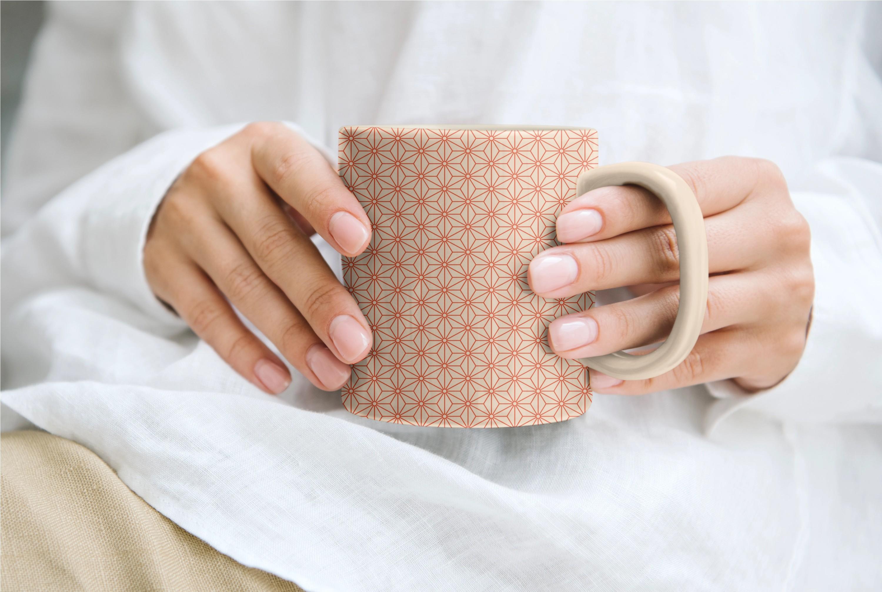
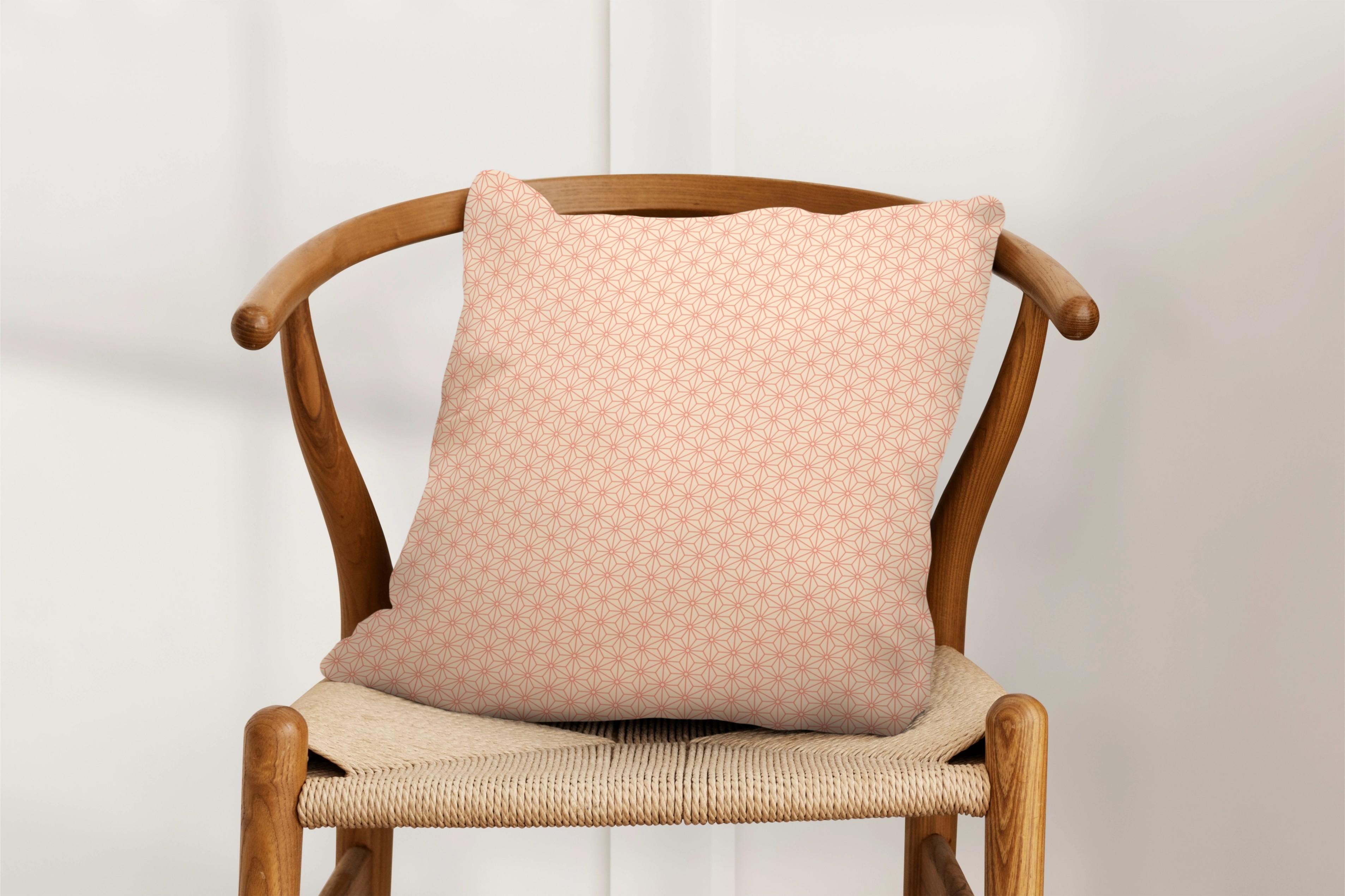
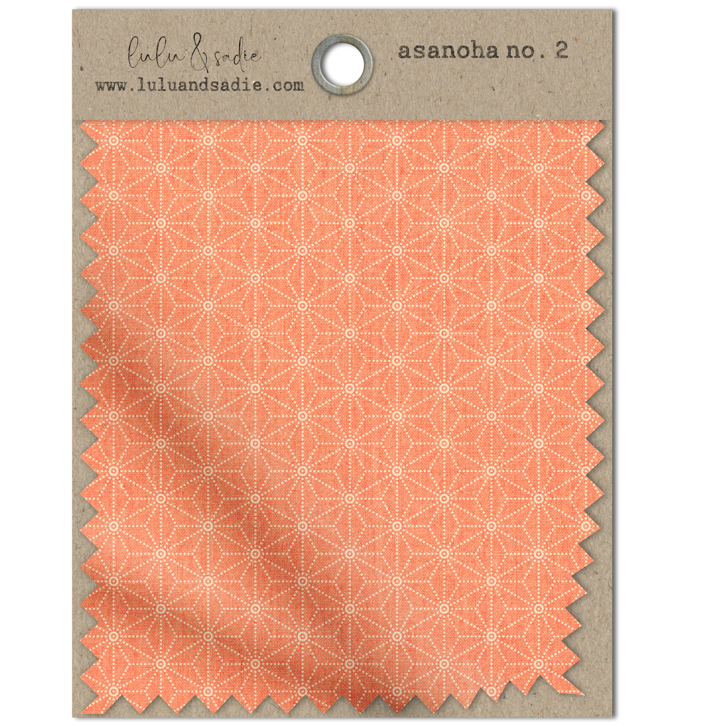
taking on the Asanoha a traditional Japanese motif
made from interlocking diamond shapes that form a
beautiful starburst design. It may look complex, but I'm
going to walk you step by step through my
process for creating and tiling the motif seamlessly. Tools that are already
built into designer. First, I'll show you
how to construct the basic Asinoha motif from scratch using three
simple vector shapes. Then I'll show you how to
tile the design quickly and painlessly with the help of designers advanced
grids and snapping. Finally, I'll show you
how to easily create a seamless square design by adjusting your ted motifs
by just a few pixels. And just like in other
pattern toolkit classes, we'll explore additional
workflows that will help you take your
creative process further. I'll show you how to
use the gradient tool to quickly scale your canvas up, as well as scale a large motif down all without losing quality. Plus, we'll look
at how to approach overlapping motifs
like the Asinoha. When making global
changes using symbols, I'll be working in the desktop version of designer version two. If you're following along
on the iPad version, you can easily do so as long as you know where
the tools are located. Now, I do want to note this
class is beginner friendly, but it does assume some
working knowledge of designer as well as
basic pattern logic. By the end of class, you'll
not only have a beautiful, seamless Asinoa designed
for your portfolio, you'll have also learned
practical techniques that can be used in future
projects in designer. Ready to unlock the secrets
of this mesmerizing motif? I'll see you in class. But
2. Class Project: The project for this
class is to create your own seamless Asinoa
pattern on a square canvas. I'd love to see what you create, and sharing your projects allows other students to see what they'll learn when
they take the class. When you're ready
to share, go to the projects and resources
section of the class. Click on the submit
Project button and follow the
prompts from there. If you have more than one
version of your design, feel free to post all of them. I can't wait to see
what you create.
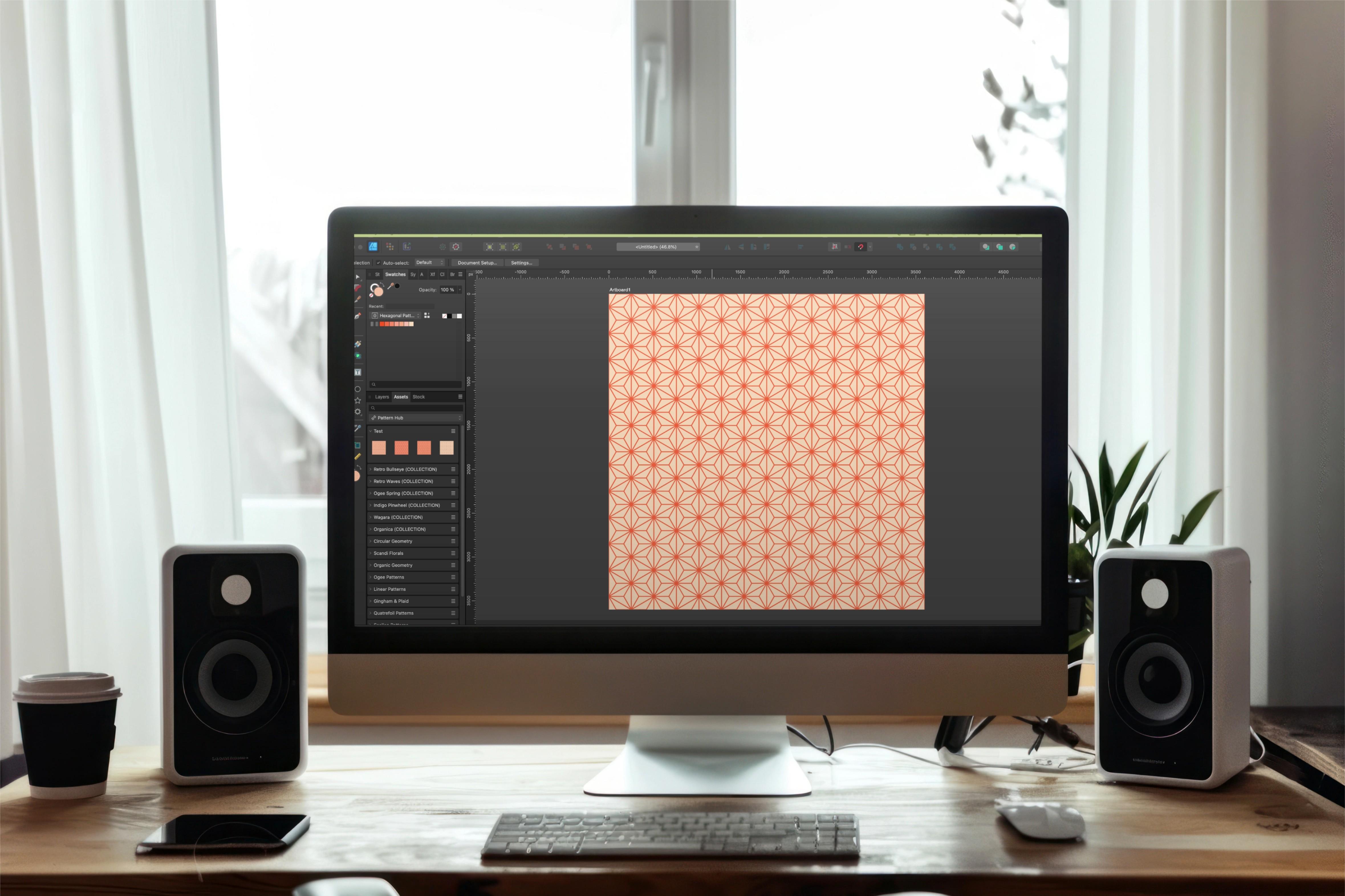
3. Setting Up the Canvas & Grids: Asa NoHa motifs are a variation
on a hexagonal shape, meaning they aren't by
nature symmetrical. And this can create
some frustration when you're trying to
tile them seamlessly, especially on a square canvas. In this lesson, we'll
take a look at how you can set the canvas up
with advanced grids and snapping to make creating the final pattern a
breeze. Let's get started. If you've already taken
my hexagon class, you know that because the
shapes are not symmetrical, they don't tile seamlessly
without a little help. Either you need to crop
your artboard into a rectangle if you want to
keep the original shape, or if you're okay with
altering the shape slightly, you need to squish or pull the motif from the sides
or top and bottom, depending on what
type of hexagon you're using, vertical
or horizontal. Because the motifs
we're creating here are a variation
of the hexagon, the same considerations
we took when creating those designs
need to be taken here. In this class, I'm
going to focus specifically on creating a seamless design on
a square canvas. So we'll create the design, center everything up, then alter the width of
our final motif. When altering the motif, we
want to do it in such a way that we don't stray too far
from the original shape. In other words, we're not
pulling or squashing so much that it ends up being
either too narrow or too wide. We want to make such a small
adjustment that visually the change is negligible
and not at all noticeable. To accomplish that,
we're going to use specific canvas and motif combinations that are
going to set it up, so we only have to alter the
motif by just a few pixels. Up on the screen and
in the class guide, you'll see ten combinations. On the left side
is the motif scale and on the right side,
the canvas size. Now I want to note for
the smaller canvas sizes, I'm not recommending that
you create a small canvas and upload that to a
print on demand site. As always, I
recommend you upload a larger canvas set
to at least 300 TPI, so you have as much
flexibility with that canvas and can
avoid pixelation. The smaller canvas
sizes in the list are intended to give you the
exact motif scale you want. And later in class, I'll show you how to take
that small tile and quickly create
a larger file for your final upload without
losing the scale. For the purposes of this class, I'm starting with a
3,600 pixel canvas, so I'll be creating
a 600 pixel motif. I'm going to set my canvas up at 300 DPI because I want
to use this for print, and my color format is RGB. This will work
with all the print on demand sites I work with, but you should set
your canvas up to whatever will work
best for your needs. With my canvas set up, I want to make sure I
have grids in place, and this is very important
for tiling this type of design because snapping
doesn't exist on a diagonal. So in order to successfully
tile these hexagonal shapes, we need to set up a grid that provides us something
to snap too. I'll go up to the top to view
and down to grid and Axis. I'll turn on Show grid. And this provides me
the automatic grid, which isn't what I want because there's no diagonals here. So I'll go over to Advanced. And under grid type, I'm going to choose triangular because I want to create
a vertical hexagon. If I zoom in, you can see that that gives me those verticals. I'm going to set
up my spacing to 300 because I need to
create a 600 pixel motif, and it's always going
to be half the size of the motif that
you want to create. With my Canvas and grid setup, I'm all set to create my design, starting in the next
lesson where we'll set up the hexagonal motif.
I'll see you there.
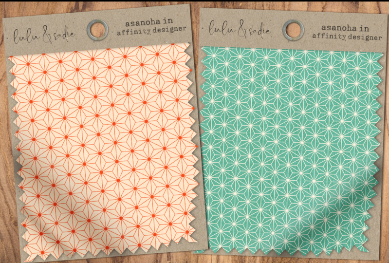
4. Creating the Asanoha Motif: While the finished Asinoa
design may look head trippingly complicated with
the appearance of overlapping star and
diamond formations, creating the
original motif takes only three shapes that are
already built into designer. Let's take a look.
Asinoa motifs are star formations that are encased in a vertical
or horizontal hexagon. When tiled, each row of star formations tucks itself into the gaps left
by the previous one. If you tile these correctly, the strokes towards
the outer edge of the hexagons are going to combine with those around them to create another
star formation. And this is why the
grid is so important. Any gaps between your motifs, no matter how slight are going to throw the
whole pattern off, and the grades is
going to assist with more difficult snapping, specifically on the diagonal. Now, while the overall
design may look complicated, the motif itself is created by combining three of
designers built in shapes, the vertical hexagon, a
star, and a double star. Before I begin
building my motif, I want to note
that my toolbar is customized to suit how I create. So yours will likely look
different than mine. If you want to
customize your toolbar, just go up to the top to view and down to customized tools. That's going to allow
you to reorder, remove, and add tools to create the layout that
works best for you. And I've included a
short tutorial on how to do this in the PDF
provided with class. I'm going to begin by creating the vertical hexagon because that's the outermost
layer that's going to encase the
other two shapes. So I'll select my polygon tool. I have a 25 pixel stroke set, and I've turned off
scale with object. I can always change
that later if I want. I have a red stroke and no fill. Zoom in here and
I'm going to hover over the center here
in command click and create a 600 by 600 pixel
polygon with six sides. Remember, I'm working on
a 3,600 pixel canvas, so I need to work with
a 600 pixel motif. So I'll click Okay.
With that in place, I'll add the star shape next. I use this pretty frequently, so I've broken it
out on my toolbar. I'm going to hover
over the center and command click
to add the star. Again, I want a 600 by 600 pixel motif with six
points, and I'll click Okay. Now, I need to change
the inner radius, which is comprised of
these four lines here on the top and the bottom so that they're
perfectly horizontal. If you have difficulty
eyeballing that, you can pull a guy
down from your rulers. And if your rulers
aren't showing, just go up to the top to view
and down to show rulers, or you can press Command or
Control R on your keyboard. I want to pull one down so that they intersect with
these two points here. So I'll grab one from the
top here and just drag down. And that should be 13 50. If you want to get it close and then just adjust it
using the guide sending, just hover over the
guide until you get this double line
and double click, and you can just change
the number there. So I'm going to zoom in here
and select my star shape. I'll go up to the top and start dragging this
inner radius up until the lines of those four strokes are over
the top of the other one. And it looks like 58%
is where I want to be. I want to get rid of my guide
by double clicking until that dialogue box comes up and then choosing to
remove all guides. Also turn it off with command
or control semicolon. My final shape is going
to be the double star, which is going to sit inside of this single star and hit all
of the points on the shape. I'll go to my group
of tools and my group of shapes here and
choose double star tool. Again, I'm going to hover in the center here
and command click. The width and height,
of course, are 600, just like the rest of the
shapes, and the points are six. I need to make sure the
inner radius is down to zero because I don't
want this formation. I want single strokes. Now, the point
radius is going to impact these that are sitting
outside of the shape. These, you can see
are just fine. They're hitting these points
because they're set to 600. Need to move these in
so they hit right here, which means that will match the inner radius of that star, which if you remember, was 58%. So I'm going to key in 58. And now I have my
final Asinoamtif. While I created a
vertical hexagon, you can quickly turn this into a horizontal one by
selecting all your shapes. I'm going to group this up. And with my move tool, I'm going to hover over
this handle until I get this curved double arrow, a hole down shift, and I'm just going to rotate it 30 degrees in either direction until I
get the horizontal hexagon. I need to adjust
my bounding box, so I'm either going to go
up to the top to select and first choose cycle selection box and then set selection box, or I can hit period on
my keyboard and then Command period to get the
bounding box upright. If you do use a
horizontal hexagon, just make sure that you
go up to your grids at the top and then
grid an axis and change this from triangular to horizontal triangular so that your snapping works correctly. I've brought this back
to a vertical hexagon, but I've left this grouped, and I'll tell you
why in a moment. For now, I want to change
the stroke settings on this. With the whole group selected, even though this says zero, I can go in here and
just choose ten. I'm going to change the
ten pixels for right now. I find that with this
particular motif, if the strokes are
a little too thick, once it's tiled, it's
really overwhelming. So I'm going to
start pretty thin and I can always
change it later. The easiest way to do that is
to turn this into a symbol, and that's why I left my
three shapes grouped. I were to add them as individual
shapes not grouped up, I would get three
separate symbols, and I really want my full
motif to be a single symbol. So with that group selected, I'm going to go up
to my symbols panel. If yours isn't open, just go to window and down to symbols, and I'll click Create. This is going to allow
me to make changes to my entire design once it's done, simply by changing
one of the motifs. Once that's done,
you're going to see a vertical line here, and I have a symbols group, and my original group
is inside of it. Coming up in the next lesson, we'll take the single
motif and tile it up seamlessly on a square
canvas. I'll see you there.
5. Tiling the Asanoha Motif Seamlessly: With our motif Freddy, we're all set to
complete the final tile. And this last one we'll go step by step through the
tiling process, including some final adjustments that need to be made to make these asymmetrical motifs tile seamlessly on a
symmetrical canvas. Let's get started.
If you look at my bounding box and compare
it to the transform studio, you'll see that my
height remains 600, but because hexagons
aren't symmetrical, the width is slightly
less than the height. Not only that, but it's an odd number with a decimal point, and that's definitely not
going to divide into 3,600. In order to make this tile seamlessly on this
square canvas, I'm going to have
to adjust the width of the hexagons once they're in place to snap them into
the balance of the canvas. And that's where the
particular canvas and motif size combinations
come into play. I don't want to end up with either a really narrow
or really wide motif. I want to tile this,
so I only have to push the two sides evenly
by just a few pixels, just enough to make
the design seamless, but so few pixels
that the change is negligible and
almost unnoticeable. If you've already taken
my hexagon class, you know that the key in
doing so is making sure that you start with a canvas
and motif combination, where the last motif
on the right side for a vertical hexagon
and the last one on the bottom left for
a horizontal hexagon are just about on the
canvas like this one here. Your grid is always
going to give you an indication that you have
the right combination. If the last hexagon looks like it's going to be further
off the canvas than this, you'll either have to stretch or squash it by well more
than a few pixels. Watch what happens when I select my artboard and I
change it to 4,000. You can see that this hexagon
is further off the canvas, which means I'm either
going to need to push in the right side until the motif is at the
edge of the canvas or pull it out so
that the motif, the middle of it
is along the edge. Either way, I'd have
to adjust it anywhere from 150 or more pixels, which is way more
than I want to. So I'm going to change
this back to 3,600 so I can easily fit my
600 pixel motif. I'll start by dragging this
up to the top left corner, and my goal here is to fill in my entire canvas
leaving no gaps. And with snapping on in the grid that should be pretty easy. I personally find it a
lot easier to manually duplicate and then
use Power duplicate to fill in my rows, rather than using the move duplicate dialog
box on the desktop. So I'm going to command
J to duplicate that. I'll hold down shift and drag, and then I'm going to command
or control J to power duplicate all the way across.
I'll select this one. And again, Commander
Control J to duplicate it and drag it down
into the left because, remember, I want
to leave no gaps. And this is where the grid
and snapping come in handy. You can see that
when I move that down, it's snapped into place, and I get those nice lines that tell me exactly where
I'm supposed to be. So I'll select that
and duplicate it. Then I'm going to power
duplicate to complete my row. Now, with these rows in place, you can begin to see where as the hexagons meet up
with one another, they begin to create an
additional star formation, and that's what gives it the
appearance of overlapping. Before I tie this
all the way down, I want to take those
two rows that I just placed and group each
of them individually. So for the top row,
I'm just going to drag across the top here, and you'll see I'm
selecting them as I go and I'll command or control
G to group them. And then for this bottom row, I can either do the same thing
or I can go to my layers. Click on the first one,
Shift, click on the last, and Command or Control G. Now, I do want to note
for that first row, to make things easier, under
tools, under settings, I have Select Object when intersects the selection
marquee checked on. That allows me to simply touch an object with a marquee
and it selects it. I don't have to drag across the entire shape for
it to be selected. And this is really
helpful in situations where objects are bumping
up against one another, and I need to be very
specific about what I select. Select both of my groups, and I'm going to shift Alt and drag to duplicate
and drag down, and then power duplicate
the rest of the way. Now, I have this group here
off the edge of the canvas, and I need to
delete that because I'm going to be
centering everything up. And if I leave that there, it's going to throw
my alignment off. So I've just gone ahead
and deleted that. I'm going to select all of
my groups and temporarily command or control
G to group them up so that I can center
them on the canvas. You can see that it's
offset quite a bit. So with a move tool,
I'll go up to the top, and I'm going to align
center and align middle. And then I'm going to
ungroup those with shift commander control G to bring them back to
the original groups. I'm also going to turn my grid off because it's a
little confusing, so I'll command apostrophe
to turn that off. Now, quick hintas
whenever you're working with vertical hexagons, the issues are always
going to be on the sides. When you're working
with horizontals, the issues are always going to be on the
top and the bottom. So with this center aligned, you can see that my top motifs are actually completed
by my bottom. So here's a bottom of a star and the top
of the star here. For this one, you can see that the diamond is cut in half, but here's the top here. So my top is just fine. The issue lies on the sides and therefore the corners
which don't match up, so I need to correct those. Want to adjust all of my motifs based on those that are in the
shorter groups here. If I were to squish everything in based on these larger groups, it's going to create a
very narrow hexagon. To adjust all of the motifs
based on one specific group, I'm going to use one of
the contextual tools for the move tool transform
objects separately. Now, in this case, the
objects are the groups, and if I make change to
one of the shorter ones, where I push this line evenly in on both sides until it snaps
to the edge of the canvas, it's going to adjust all
of them the same amount, and it'll end up with
a seamless design. Now, right now, it actually has one of the shorter
groups selected. You can see my
bounding boxes here. These are still selected, but
I don't have that handle. I want to show you
what happens if one of these longer ones
are selected and how you can designate which
one you want to work with. I start by selecting
one of the long ones, and then I grab all of them, it's going to designate one of the longer groups as
my target object. Again, I need it to be one
of these shorter ones. So I'm going to hold down Alt on my keyboard and click on
one of the shorter ones, and you can see I get that sort of double bounding
box around it. So now everything is going
to be based on this one. I'm going to hover
over the control points either on this
side or this side to, like, get that double arrow. Hold down command or control, and then I'm going to
drag in evenly from both sides until it
snaps to 3,600 pixels. You can see it there
in that box there. When I deselect my groups, you can see that
the left and right sides are now sitting on the canvas right down the
middle of the star formations, and they're going to complete
each other on either side. Also now that those are set, my corners are set as well, so I should complete a formation just by having matching corners. To test this, I'm going to select my artboard
and go to my assets. I have my pattern hub set up here with my test subcategory. And with the artboard selected, I'll go ahead and click
Add from selection. Once that's in place, I'll
go to my artboard tool, and I want to
insert an artboard. It's going to insert
another square one. I'll grab my gradient tool. Now, I don't have a background on this one, but
that's not a big deal. I can add one. And I'm just going to click on
there to add it. I'll hold down Shift and drag in and you can see that that's tiling just fine.
There are no issues. I can zoom in, and I can
move around and see that I have no thin strokes
where I shouldn't no gaps where I shouldn't everything
is looking good to go. With our design in place, let's take a look
at how we can make changes to this using
the symbols feature. That's coming up in
the next lesson, and I'll see you there.
6. Making Global Changes with Symbols: Symbols can make changing your final design
quick and painless. But when you're working with
a motif like an Asinoa that tiles in such a way that additional star
shapes are formed, you need to consider what
changes you're making and how to make them to ensure they carry
all the way through. Let's take a closer
look. I'll start by saying that with this motif, I tend to keep things
rather simple, not adding much in the
way of extra because it's already a
relatively busy pattern. For example, I could select
all of my motifs and my vector flood
fill tool and add a varying pattern of
light and dark shades. I just find that
you need to be very intentional with the
colors you select, including the stroke
you're using, because they start to
complete one another and form entirely different
shapes other than stars, which can read either as really
busy or just plain wrong. I also don't want to adjust
the size of the shapes within my hexagon because I would no longer have
an Assinoa pattern. I would also run the risk of no longer having
a seamless tile. But there are some
basic changes that I might make using symbols. The first thing
I'm going to do is go to my symbols panel and pull in a single symbol and
place it on the side here. By working on an
individual symbol, rather than one that's
already on the canvas, I know that I'm not
going to accidentally nudge it and create
issues with my tiling. And if it sits outside
of the artboard, like it is here in
my layer stack, I'll still be able to see it, even though it's
not clipped inside. Because all of my
motifs are symbols. A changes that I make to this one will automatically
be applied to all. In my layer stack,
I want to open up the symbols group and work directly on the shape
layers that are within it, not the symbol layer itself. So I'm going to
grab this polygon. Again, this is the
outermost shape. It's also the largest shape, and I'll go to my swatches, and I'm going to
add a fill to this. That's a quick way
of adding color to the background of your
design without having to pull in an entirely new shape like a rectangle and
add it to the back. I could also select all three of these shapes and
change the stroke. So maybe I'll try
out this pink color. I could also go to my
stroke panel and change it to 25 pixels like I
had originally intended. I'm going to bring
this back down to ten. Another option with my
strokes is that I can add a dash pattern by clicking
here. Let me zoom in. This tends to work
with a lower width, but I can always try
out higher ones. I'm just going to bring
this back to ten. And if I go down to the bottom here with these first two boxes, this one is going to allow me to change the length of the dash. If I bring it all
the way to zero, it's going to give me a circle, and I can change the distance between them with
this second one. And I actually quite like that. Additionally, I can add
shapes to my design. I just need to do
so in a way that carries them through
the entire pattern. So, for example, let's
say that I wanted to add what looks like a hole in
the center of my star here. I can add that using a symbol. I just need to remember
that the shapes ultimately combine to create
additional formations. So it's not always as simple as adding a single
ellipse in the center. Let me show you what I mean.
I'll select my ellipse tool, and I'm going to hover here
in the center and command click to add a 100
pixel ellipse. I want to change this
to a solid stroke, and I want to make sure
that, in this case, the fill is the same color as this background and my stroke is the same color as the rest. If I drag this into my symbol so that it applies it to
my design over here, if I zoom back out,
you can see that it's only applying it
to certain ones. And that's because
these formations are being created
by combining these. So I need to find a way
to add them to these. And the way to do that is to add this same ellipse at all
six points on my hexagon. And there's a really
quick and easy way to do that. Let me
zoom back in here. With the vertical
hexagon, remember, my height is still 600, so I can use that
to my advantage. I'm going to hit
Enter on my keyboard to bring up the move
duplicate dialog box, and to get the exact
point up here at the top, where I want this to be
duplicated and moved. I'm going to go to my vertical, and I'll key in -300. That's half of 600. Click on Duplicate,
and now I have my first ellipse in place. Now I'm going to use the
move duplicate box to rotate it and duplicate it
around the entire shape. To do that, I'm going
to go up to the top and turn on Enable
transform origin point. I just need to make sure I
have the correct one selected. So I'll select this shape. I want to drag this down to the center of my hexagon here. I'll hit Enter on my keyboard. Let me move this out of the way. And I'll go right to rotation. If you ever aren't sure of the exact degree
that you need to rotate something for
something like this, which is technically the
circumference you want to sit 360 divided by the
number that you won. So in this case, I
know that I need six because I have six points. So I'll do 360/6, and hit Tab. That's going to move my first
one to the exact point. I'll click on
Duplicate and I need a total of five copies,
so I'm left with six. I'll go ahead and click Okay. And if I back up,
you can see that my ellipse has now
been added to all of my shapes because I added this one to all of the points
on my original hexagon. So when you're adding shapes
to a motif like this, just make sure you're
thinking about how that single shape works
with the shapes around it, as you may need to add additional ones to
complete the pattern. It wouldn't have helped
for me to add it. In the very beginning
before I tiled it. I still would have needed
these along the edges. Now, once that's all in place, I can select the symbol
layer and delete that, and everything's
going to remain. It's really important, though, that you select the symbol
layer and not those within it. Otherwise, you're
going to delete everything on your board here. Go ahead and select my
artboard and go to my assets. I'm going to add this
to my test subcategory. And once that's in
place, I'll add a second artboard so
that I can test this. I'll grab my gradient tool and click on the
one I just added. Let me just move over here. And if I hold Shift Down, I can scale out, scale down, and
it looks perfect. One final thing that
I want to note, it's really important that
you save your final file either as an AF design file
or a template or both. Well, I do save my artboards
to my pattern hub. I do that with the intention of testing them or using
them as bitmap fills. I don't use it as a means
to save the original file. If you only save
your artboards as assets and run into an issue with the app
or worse your machine, you could potentially lose
all of your original files. But additionally,
there's an issue where multiple copies of
symbols saved within an artboard are
somehow duplicated and rendered useless when you pull the artboard back
in from the assets. If I wanted to pull one
of these back in and take advantage of my symbols to
make changes, I can't do that. No, I'm not certain if this is something that will be fixed, but the only way to ensure that your symbols work as
intended, in this case, a single instance duplicated multiple times
across the canvas is to save the file as an AF design file or
export it as a template. This is going to allow
you to reuse the symbols in the future to create
additional designs. Let's move into the next lesson where I'm going to show
you how you can quickly scale your mo teeth down
without having to start from the beginning using the gradient tool.
I'll see you there.
7. Scaling Larger Motifs with the Gradient Tool: While Spoonflower
and other print on demand sites have tools available to help you
scale your designs, there may be times like when you're creating
digital papers or brushes that you might want to have full control
over the process. In this lesson, I'm
going to show you how to use the grading
tool to take your designs with larger motifs and
quickly and efficiently create scale down versions without having to
start all over again. Let's take a look. This is my 3,600 pixel canvas that
I created previously, and I had set this
up at 300 DPI. DPI is very important here because we're going
to be working with the gradient tool and
therefore working with Bitmap fills,
which means pixels. So if you're not already in
a Canvas set to 300 DPI, either create a new one and pull your vector file into that, or go to the document setup at the top of the
canvas you're in, and under dimensions,
change your DPI to 300. My original design is created
with a 600 pixel motif, and I want to scale it
down on a square canvas to a 300 pixel motif as well
as a 150 pixel motif. I've intentionally selected
scales that divide evenly, not only into my original scale, but my 3,600 pixel
canvas as well, because I want to maintain
the seamless design. Now, I am going to mention
this process works well when scaling a motif down
but not scaling up. So I recommend creating
your original file at the largest scale motif you want and then
working down from there. I've already added two additional
3,600 pixel artboards, and just to avoid confusion
when I'm exporting them, I've changed the label on
each to reflect the scale. You can do that either
by double clicking on the artboard name in the
layers and changing it there. Or by clicking on the
layer above the artboard. Now, when I'm testing a design, I don't tend to add rectangle to my artboard,
but in this case, I do want to add rectangles
to both of these, because that's going to give
me an actual shape to scale up and down while maintaining
the seamless design. So I'm going to select
this second artboard, grab my rectangle tool, and I'm going to command
click to add an artboard. And I'm going to start
out at the large scale. I'm going to go 3,600. And then I'll use my alignment
tools to center this up. I don't need to start all over again to create the third one. I'm just going to command
or Control C to copy, select the artboard, and then Command or
Control V to paste. Now I'm going to use
the artboard I saved to my assets to fill these
with the gradient tool. But first, I want to
scale these down to the size that I need for
the skies I want to create. So for this first one, I
want a 300 pixel motif, which is half of 600. So I'll go to my
Transform panel, and the very first thing
I'm going to do is make sure that my anchor is
set to the top left. Like to work from corners down. And again, I try not to
do anything manually. That way, I know that I
can scale this up and down and maintain
the seamless design. So once that's done, I'm
going to go to the side here. And again, 300 goes
into 600 twice. So I'm going to
divide 3,600 by two. That's going to give me
an 1,800 pixel rectangle, and it's up in the
top left corner already because that's
where I set my anchor. I'll do the same
thing for this one. In this case, 150 pixels
divides into 604 times. So my anchors already set. I'll go to my width here, and I'm just going to
divide this by four. Next, I'll select
my gradient tool, and I'll go to my assets. And starting with
this second one, I'm going to click on
the asset that I added. I'll do the same
thing with this one. I'm just going to select
it and then click. Now, I need to scale both
of these up so that they're 3,600 pixels because that's what I ultimately
want to export. Before I do that,
I'm going to select the first rectangle
here and grab my gradientol and I want to bring your attention
up to the top here to scale with object. This works exactly like it
does in the Stroke Studio. If I were to keep
this checked and then go over to my Transform panel
and change this to 3,600, that's going to scale the
motif with the rectangle, so I'm right back
to where I started, and obviously, that's
not what I want. So I'll select my gradient tool. I'm going to turn off
Scale with Object. And this time, if I
change this to 3,600, the scale remains the same, but my canvas size is
now 3,600 pixels square. I'm going to do the same thing
with the third artboard. Now, Scale with Object
is per artboard, so I need to make
sure that I turn that off before I do that. I'll go ahead and
grab my move tool, and I'm just going
to key in 3,600. Now, again, I recommend creating the largest
scale motif that you want to work with and then
scaling down from there because it
doesn't really work in the opposite direction. In the final lesson
of this class, we'll take this process
a step further, and I'm going to show
you how you can use the gradient tool
to take a design on a smaller canvas and create
a larger file for export. I'll see you in the next video.
8. Scaling the Canvas With the Gradient Tool: While working in a smaller
canvas makes it easier to seamlessly tile a smaller
motif in square format, you need to make sure that
the canvas you ultimately export is large enough that you don't run
into quality issues. This lesson, I'm going to show you a quick and easy way to do that with the gradient
tool. Let's get started. And before I show you
how to scale the canvas, I want to talk about some
important considerations about setting up the canvas. The most important thing about this process is like
the last lesson, the final export should be
at least 300 DPI because you're working with bitmap
fills, which means pixels. Once I pull this in
using the gradient tool, it's no longer a vector, which means it's no longer
infinitely scalable. The second most important thing is that you need
to make sure that your original tile will evenly divide into the
canvas size that you choose. Otherwise, you're not going to end up with a seamless export. The original tile
is 1,200 pixels, and I want to export one
that's 3,600 pixels, so that will work just fine. With that selected, I'm going to go to my Transform panel, and I still have my anchor in the top left corner here
from the last lesson, so I'm going to keep it
there, and I'll key in 3,600. Next, I want to add a 1,200
pixel rectangle to this to match the same canvas
that I originally started with because I need
to get that scale first. So I'll grab my rectangle
tool and I'm going to command click and create a 1,200
by 1,200 pixel rectangle. Now, the fill doesn't matter because I'm
about to change it. I'll just add this
red, and I'm going to a line left and
then a line top. I'll select my gradient tool and I'm going to
go to my assets. I've already saved this here to my assets, so I'll click on it. Now, this is where it is no
longer a vector version. So my vector version is here. This is infinitely
scalable. This is not. Now, before I move on
from the gradient tool, I want to direct your
attention back up to the top because the same checkbox
is going to apply. This works the same way
as the last lesson. If I leave this checked and scale this up to 3,600 pixels, it's going to scale
the entire design. And, of course,
that's not what I want, so I'll turn that off. I'm going to grab my move tool, go back to my transform panel, making sure my anchor is
here in the top left. I'll key in 3,600. And now I have a
3,600 pixel artboard, but a 200 pixel motif, so it stayed exactly
the way that I want. It comes to exporting this, it works exactly the same way. I'll go up to File
and down to Export, and I want to make sure that
I'm choosing the right one. Remember, this one's
a bit too small. It's 300 DPI, but it's
only 1,200 pixels. So I want to make sure that
I'm selecting this one, and that's why it's
a really good idea to name your artboards. So I would just
select this one and then follow the
steps for export. Coming up next, we're
going to wrap up class with some final
thoughts. I'll see you there.
9. Final Thoughts: We're at the end of class, and I thank you for trusting me with your time
and creativity. I'd love to hear your
thoughts in the class, so please consider
leaving Review. Not only does it let me
know what I'm doing. Well, it also lets me know
where I might need to improve. And leaving review and
sharing a project not only help future students see what they'll learn when
they take the class, it can help more
students find the class. In addition to my
Skillshare channel, I also have a YouTube
channel where I share short form tutorials that complement my suite
of classes here. You'll find a link
to it in my profile, as well as in the PDF
provided with the class. Speaking of my profile, I have lots of classes in the
works here on Skillshare, including many more in the
Pattern toolkit series. Not already, be sure to
hit follow on my profile. So you'll always be
kept in the loop on what's coming and when new
classes are published. And finally, I
welcome you to join my free community for digital
creators, the Creator Cage. We're a group of creatives
of all skill levels with experience in a wide
range of digital applications. You can ask questions,
share your work, learn new tips or share your own all in a friendly, non
judgmental environment. You'll find more at
the Lincoln MPfile or again in the class guide. If you have any questions about what you've learned
here in class, please don't hesitate to
reach out to me either in the discussion below or at the email provided
in the class guide. Again, thank you so much
for joining me here in class and happy creating.
 Tracey Capone, Illustrator, Photographer & Designer