Transcripts
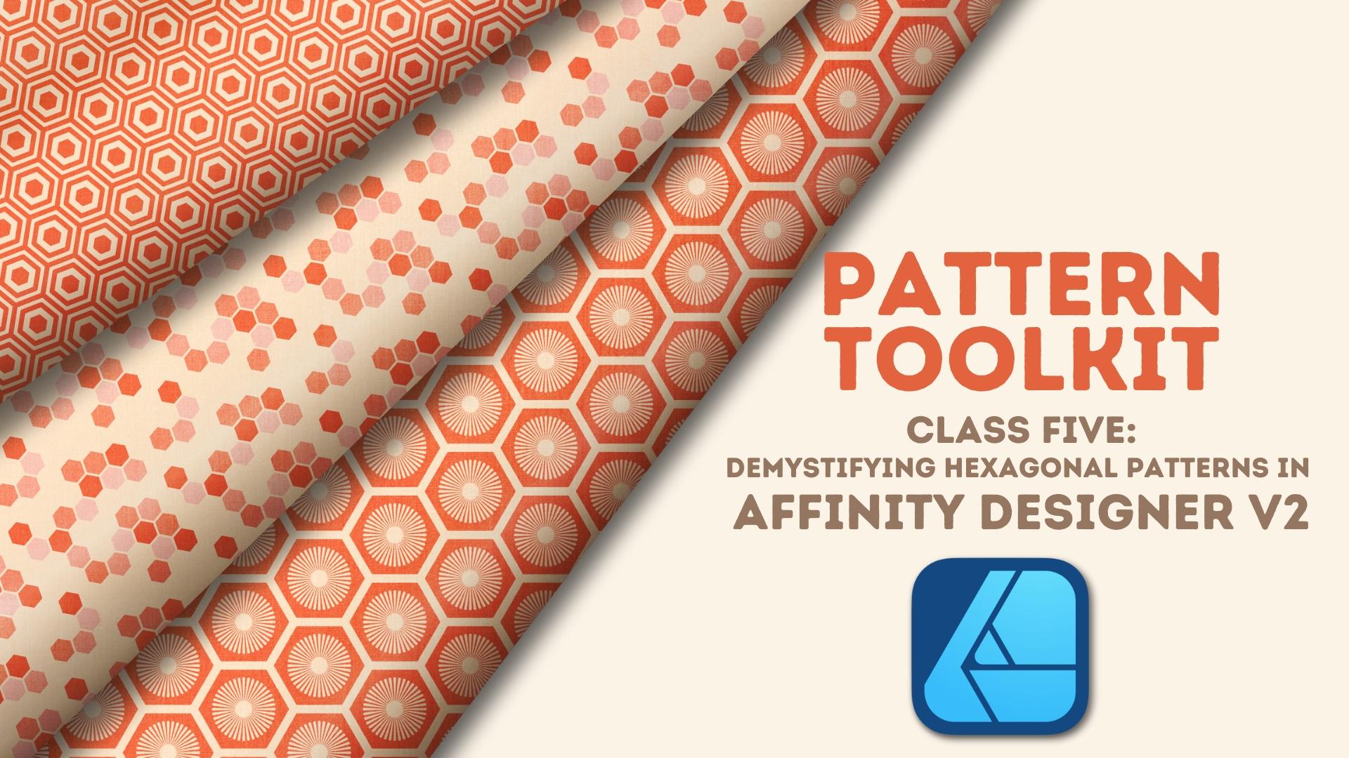
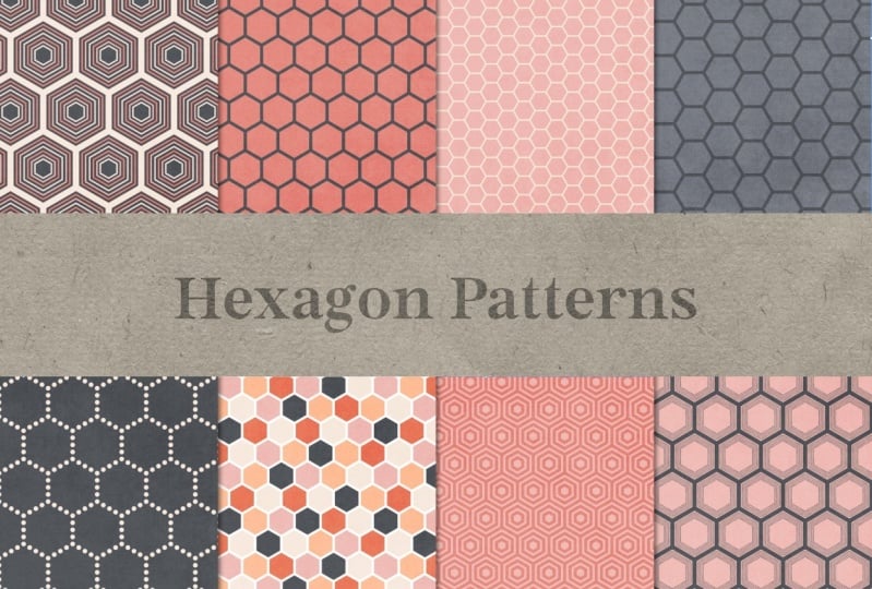
1. Welcome to Class!: Hexagons create some of the most popular and
fun geometric designs. But because of their
asymmetrical nature, they can be a bit baffling when it comes to tiling
them seamlessly. If you're like me
and you've found yourself scratching
your head because of misaligned or wonky
hexagons, welcome to class. Hey, everyone. I'm Tracy, an illustrator and designer
from the Chicago area, and welcome to the next class in my pattern toolkit series, where we focus on a
specific pattern or theme of patterns in a
variety of applications. In this class, we're going
to demystify the process of tiling both vertical
and horizontal hexagons in affinity designer. We'll create hexagonal designs with precision and confidence, and most importantly, no
complicated math is required. I'll guide you step
by step through two different approaches
to tiling your hexagons. First, I'll show you how to crop your artboard into a
rectangle to ensure your pattern tiles
perfectly without having to adjust the
original size of your motif. Next, I'll show you how by using specific Canvas
and motif combinations, you can adjust your hexagons by just a few pixels for a perfectly seamless
design on a square canvas. Great for when you're creating
digital papers or brushes. We're also going to explore
three powerful workflows. I'll show you how
to use the gradient tool to scale a canvas up without losing quality or
your original motif scale. I'll also show you how to create multiple smaller
scale motifs from a larger design without having
to start all over again. And finally, you'll learn
how to use symbols to make fast global changes to your designs simply by
changing one of your motifs. All three workflows allow you to work
efficiently to create multiple variations of your
designs in no time at all. I'll be using the
desktop version of designer Version two. Those of you on an iPad, you can still follow along with class as long as you know
where the tools are located. I do want to note, while this
class is beginner friendly, it does assume familiarity
with designer version two and the overall surface
pattern design process. Whether you're
creating designs for digital products or
print on demand, this class will
give you the tools and confidence to create clean, repeatable hexagon patterns
without all the guesswork. Are you ready to tile
up some hexagons? I'll see you in class.
2. The Class Project: The project for this
class is to create your own hexagonal
seamless designs. Try one or all the
approaches for both the vertical and
horizontal hexagons. Don't forget to give
symbols a try so that you can create different
designs in a flash. I'd love to see what you create, and sharing your projects allows other students to
see what they'll learn when they take the class. Taking a screenshot
of your design is the easiest way
to share your work, whether you're on a
desktop or an iPad. Once you're ready to share,
go to the projects and resources section of the class and click on the
Submit Project button. From there, you can
add a cover image as well as images of
your various designs. I can't wait to see
what you create. In the first lesson,
we're going to take a look at the trouble
with hexagon shapes and talk about why the shape
creates such a problem when creating seamless
designs. I'll see you there.
3. The Trouble With Hexagons: Because of their ankles and
non symmetrical dimensions, hexagons both vertical
and horizontal present a unique challenge when it
comes to tiling seamlessly, especially when you're
working on a square canvas. In this video,
we're going to take a closer look at the
two types of hexagons, why their asymmetry
creates an issue, and what you need to consider when tiling them.
Let's get started. Designer has a baked in polygon
shape that you can use to create a vertical hexagon
by adding six sides to it. From there, you
can simply rotate it to create the
horizontal hexagon. Let's start by looking
at the vertical one. While still in shape form, designer is going to read the shape as if it's symmetrical. But in order to do that, it adds a buffer to the two sides
so that the bounding box, not the shape itself
is symmetrical. When it's converted to a
curve, the buffer disappears, but you're left with a
truly asymmetrical shape because the width is
less than the height. Horizontal hexagons
work the same way. The dimensions are just flipped so that the height is
less than the width, but the same issues with
tiling still exist. When tiling geometric motifs, working symmetrically
is the key to making sure that you can tile
seamlessly with ease. Without that symmetry,
some manual manipulation of the canvas or even the
motif itself is involved. We're going to look at both
approaches in this class, but for now, let me show you why the buffer creates an issue. I have a 4,000 pixel
canvas and a 1,000 pixel vertical hexagon that I haven't converted to a curve, so the buffer still
exists on either side. Now, logically, this should
tile seamlessly because 1,000 goes into 4,000
evenly four times. But if I drag this to the edge, watch what happens when
I go to start tiling it. Snapping isn't snapping
to the bounding box, it's snapping to the
edge of the shape. While 1,000 pixels divides
evenly into 4,004 times, remember, it isn't
the shape that's 1,000 pixels square.
It's the bounding box. If I duplicate this and start to tile it across,
watch what happens. The first thing you're
going to notice is that the left edge of
every bounding box, which was hanging
off the edge on the first hexagon is going
to overlap the previous one. So if I power duplicate
this all the way across, it's giving me a total
of five hexagons, which is what I actually want. But with this one going
off at the very end, there's nothing on the
other side that's going to complete it because this one's
all the way on the canvas. If I start over again and move this so that it's right down
the middle of the hexagon, when I duplicate and
power duplicate across, that overlap still exists. And this time, I'm
going to get a total of six hexagons,
which I don't want. And this last one is almost all the way off
the canvas, again, with nothing to complete
it on the other side, so this wouldn't be seamless. Let's look at what
happens if I tile this with the bounding
box taken into account. So I'm going to hit Enter on my keyboard and key in 1,000. And that's going to create a gap between my shapes,
which I'm fine with. I'll go ahead and hit Duplicate, and I know that I need
a total of five shapes because this one has to be
completed on the other side. So I'll key in four for the number of copies
and click Okay. So this is great. This one completes this one
and vice versa. But let's zoom into the gap. The first thing I'm
going to do is take my measure tool and measure
between the two strokes. So if I go from this
line to this one, I get this 134. It's not an easy
number to work with. Moreover, because of that, this gap is not something
easy like 50 or 100. It's actually more like 52.7. Taking that into
account, watch what happens when I start
to tile vertically. So I'm going to hit nter again, and on the horizontal
alkane 500, which is half of my shape, and then on the vertical,
I'm going to key in 1,000, but subtract that 134 to
take that gap into account. Now, if I did that correctly, when I zoom in here, this gap
and this gap should match. So let me grab my measure tool, and I'll go line to line, and I should get 134. With that all set, I'll go
ahead and finish this row. So I don't need
to go vertically. I'm just going to
go horizontally, 1,000, and I need a total
of three duplicates. And then I'll grab
both of these rows. Now, this is where that 134 pixel difference is going
to create an issue. If I were to key in this height, 18 66, that's going to
take this much too far. So I would actually need
to key in 1,866 -134, and that gets me to
where I need to be. I'm going to complete my canvas with the number of
copies being two. In order for this
to tile seamlessly, three things need to happen. The top and the bottom shapes need to complete one another. Two side shapes need to
complete one another. And if there's anything in
the corner like these two, they need to match at all four corners to
create a single shape. In this case, only
one of those is true. The side shapes will actually
complete one another. Both hexagons are
directly across from one another and they're cut
off at the halfway point. So this would pair with this
to create a single hexagon. The problem lies with
the top and the bottom. In this case, the top row and the bottom row
aren't even aligned, so there's not a shape that's directly across from this
one that will complete it. Even if this one
was shifted over, this one's so far down on the hexagon that it wouldn't
actually complete this one. And then finally,
these two shapes, while they would
complete one another, there aren't matching shapes in the other two corners to
create a single hexagon. So this would not tile. Even if I converted
this shape to a curve before I
started tiling it, the only difference
would be that the bounding box no
longer creates a buffer. It actually subtract that
134 pixel difference, which would still create
a problem with tiling it, and I wouldn't get
a seamless design. The horizontal hexagon is going to have the
same problem as well. I'm not going to tile one here, but it would be the same issues simply flipped with
the width and height. In order to get the
hexagon tile seamlessly, I would either need
to adjust the shape of my artboard to
create a rectangle, or if I do need a square canvas, I need to manually adjust
the width or height of the vertical or
horizontal hexagon itself in order to tile
seamlessly on the square canvas. Now, one other thing
that I want to mention about hexagons and
why they create an issue with tiling is because snapping doesn't
work on an angle, at least not without a grid. Standard grids in designer aren't designed to
give us what we need, so we're going to have to set up one of the non standard ones, and we'll go into how to do
that in the next lesson. We're going to look at
both hexagon options throughout the next
several lessons, starting with a vertical hexagon
on a rectangular canvas. We'll also take a look at how to set designers non
standard grids, which along with
power duplicate and snapping can help us more
easily create our designs. I'll see you in the next lesson.
4. Vertical Hexagon on a Rectangular Canvas: We've looked at the issues
that the vertical hexagon creates when tiling on a
traditionally square canvas. In this lesson, we're
going to look at how to adjust the shape
of the yardboard to accommodate those issues, creating a seamlessly
tiled rectangle without having to adjust
the size of the hexagons. Let's take a look. I want to
create a 3,600 pixel square canvas set to 300 DPI with
the color format of RGB. Now, I do want to note, I've customized my toolbar
to suit how I create, so yours will probably
look different than mine. If you'd like to
customize your toolbar, go to view and down
to customized tools, that's going to allow you
to drag tools in and out as well as change their
order on the toolbar. You can also increase the number of columns down
here at the bottom. I've included a quick
tutorial on how to do this and the PDF I
provided with class. Now, before I create my hexagon, I want to set up the
grids on my Canvas. So I'll go back up to view
down to grid and Axis. I want to click on Show grid. This gives me the
automatic grid, which doesn't give me
any diagonal snapping. And remember, that's why
we're setting these grids up. So I'm going to go to Advanced, and under grid type, I want to choose triangular. If I zoom in, you can see that the triangles create
that vertical hexagon. I want to work relatively large because I can
always scale it down, but I find it a lot easier
and quicker to deal with larger scale motifs than to start with really tiny
shapes like these. So I'm going to set
my spacing to 300. That's going to give
me 600 pixel hexagons. Again, I can always
scale it down once the tiling is complete
and later in the class, I'll show you a really
quick way to do that. One quick note, if you're taking this class on the iPad
version of the app, there is an issue
where grid spacing only goes up to 256 pixels. You have two options. You can reduce the size of your motif, so the grid spacing can
be reduced below 256. So for example, you
could use 200 pixel spacing to create
a 400 pixel motif. Or if you have the desktop
version of the app, you can create a canvas with
the correct grid spacing, export it as a template, and then pull it into your iPad. The grid spacing you created on the desktop is
going to remain intact and will allow you
to create at a larger size. Before I create my hexagon, I'm going to make sure that
my ardboard isn't selected, and I'll set my fill and strobe. So for my fill, I'm going to
go with this lighter color, and I think I'll go with
this red for the stroke. I'll go to my stroke studio, and I want to set the width
of my stroke to 50 pixels. And I'm going to turn
off Scale with Object. That way, if I do scale it down, the stroke width will
remain the same. I'll select the polygon tool. Now, it is in a group. If you don't see
the polygon here, just go ahead and
click and hold, and you can see that
it's here in this group. I'm on the desktop
version of the app, which means I can command click. I've already created
a shape off camera, so it's already giving
me the right dimensions, but if it wasn't
would just change it here and make sure
it's six sides. Now, before I start tiling this, I want to turn it into a symbol. That's going to allow me
to make adjustments to one motif and have it
impact all of them, allowing me to make a number of different designs out of
one tile very quickly. With it selected,
I can either go to my symbols panel
and choose Create. If you don't see
the symbols panel, just go up to window at the top and make sure there's a checkmark
next to symbols. Or I can go to the layer menu
and down to create symbol. In both instances, you can
see that once I do that, there's a symbol group, and
inside that is my polygon. I've created an entire
lesson in this class on how to use the symbols to adjust your tiles once they're created. Ultimately, I want to fill this entire canvas
using this grid. It doesn't matter that it's
offset and not tiled evenly. My main goal is that I want
to leave no open spaces. When tiling hexagons
and using these grids, I find it a lot easier to
manually duplicate and then use power duplicate rather than using the move
duplicate dialog box. So I'm going to place
this up here at the top, and you can see that because
snapping and the grid is on, I get those nice
hash marks there. So I'll just shift Alt and drag to duplicate
and move it across. And again, I get
those nice lines. And then without deselecting, I'll command or Control J to power duplicate
all the way across. I'm going to duplicate this one, and this is where the
grid is really handy. It's going to allow me to
drag down on an angle, and it's going to
tell me when I'm in the right spot because
I get those lines. I'll shift, alt,
duplicate to drag, and then I'll power
duplicate across. Now I can select
both of those rows, and I'm going to shift
Alt and drag down, so I go straight down and then power duplicate
the rest of the way. Now, that's going to give me an extra row down here
at the bottom. And in the last lesson, I didn't remove that because I
wasn't worried about it. In this one, I do
want to remove it because I'm about to center
my shapes up on the canvas, and that's going to
throw off the alignment. So I'm just going to
use my Marquee tool to select those shapes,
and I'll hit Delete. I'm going to gather up
what's left on the canvas, and I'm going to command G to group them because
that's going to allow me to more easily align everything to the
center of the canvas. Don't need my grids,
so I'm going to hibitommand or
control apostrophe. And while I still have
the group selected, I'll go up to the
top here and choose a line center and a line middle. And then I'm going
to ungroup them. I find it a lot
easier to snap to the individual shapes
rather than a larger group. So I'll shift command G
to ungroup everything. Now, just taking a look at this, it looks like it should
tie off seamlessly, but it's not quite there. So from top to bottom,
it's actually fine. So this one here has something
directly across from it. And because these are both
cut off at the halfway point, they would actually successfully
complete one another. So top to bottom
is not the issue. The issue is actually
at the sides. Let me zoom in and show you why. For this row here, the hexagon is more than halfway
off the canvas, and that's the same
thing on the other side, which means these would
create a very narrow hexagon, obviously not what
I'm looking for. This one is almost all the way off on the stroke and
same with the other side. So this would create
a very thin stroke compared to everything else. So I'm going to have
a very big issue with the overall pattern. It's not going to be seamless. Ultimately, what I
want to do is get rid of these hexagons right here, and therefore half
of these hexagons. I have my rulers open, and I want to use them to
set up guides in a rectangular formation
that's going to allow me to more easily
crop my artboard. If your rulers are not open, you can either
command or control R, or you can go up to view
and down to show rulers. So I'm going to drag
from the side here, and the first one I
want to do is bring it right to this stroke
because remember, I want to cut these
off since no matter where I move on these hexagons, I'm not going to get
a shape that's going to give me a tilable hexagon. And then on the other side, I'm going to do the same thing. I'm going to snap to
this stroke right here. So ultimately, I want to crop my artboard in on
these two sides, and that's going to give
me a seamless rectangle. I want to make
sure that I select the artboard layer because that's what I'm going
to be cropping. And one thing I want to
note is that guides are attached to the upper left
corner of the canvas, and there's no way
of locking them. So if I start moving this in, you can see that my
guides are all moving. I recommend that if you have a guide on the right side,
start with that side. So it's going to snap right to that guide, and
then do the other. It's going to move, but you'll
still get that snapping. So I'm going to go ahead
and snap it right there. I'll turn my guides off with command or control semicolon. And if I step back, you
can see that again, these complete one another, but more importantly,
this one and this one are cut off at the
exact same point so I'll get the
right stroke width. These are cut off at the halfway point to
create a full hexagon, and then my four corners match up to complete a full hexagon. So this is now a seamless tile. If I select the artboard again and go up to my
transform studio, you can see that the width
has been reduced by a bit. But not so much that it's going
to create quality issues. My height is still
at 3,600 pixels, and more importantly,
my DPI is still 300. To test the tile, I've selected the artboard layer and I'm
going to add it to my assets. If you've taken
my other classes, you know that I have
this pattern hub setup, and I've set up a
subcategory called Test. I'll go ahead and click on the Burger menu and choose
Add from selection. Once it's added,
I'm going to add a second artboard in the
same size as this one. So I'll go ahead and click
on my artboard tool. The size should be
set to document, and I'm going to choose
Insert artboard. You can see it's the
same rectangle shape. With that second
artboard selected, I'll select my gradient tool
and click on that new asset. And if I hold Shift Down, if I scale down,
you can see there's no issues with thin strokes. I don't have any really
narrow hexagons. I can zoom in and
check everything, and it's all looking good. So this one is all set to go. I'm going to go in
and make changes using the symbol that I created, but I've done that in a
lesson later in class. So for now, I'll
call this one done. Having the ability to crop the Rdboard into a
rectangle is great. But there are times
when you might need a seamless hexagon design
and square format for say, digital papers or brushes. This takes a little extra
work, but in the next lesson, I'll show you the steps
you need to take to manually adjust your
hexagon shapes, allowing them to fit a square
canvas. I'll see you there.
5. Vertical Hexagon on a Square Canvas: Whether you're creating digital papers or seamless brushes, there are times when a square
format canvas is a must. In this lesson, we're
going to look at a workaround that allows
you to manually adjust the width of your hexagons by just a few pixels to create the square tile needed.
Let's take a look. This workaround takes advantage of the fact that hexagons, by nature, are not
really symmetrical. With the vertical hexagons, the height is always going to
be greater than the width. So there's a little bit
of leeway visually, allowing us to adjust the width, the shapes by a few
pixels to make the canvas seamless while still maintaining the visual of the
original shape. In other words, it's not too narrow or too wide
where it's obvious. That said, the
goal of this is to make as little
adjustment as possible. I'm talking just a few pixels. In this case, both
the canvas size and the motif size play
a great role here. We're going to start
out by taking a look at canvases that
won't quite work, so I can show you what I mean. And then I'm going
to show you the Canvas and motif combinations that will make your life
a whole lot easier. I have two canvases here. One with a 400 pixel motif
on a 3,600 pixel canvas, the other a 600 pixel motif
on a 2,400 pixel canvas. Of course, with any
other symmetrical motif, either of these
canvases would be just fine and easy to tile. But in this case, the
asymmetry of the hexagons is creating an offset that's more than just a
few pixels wide. Now, I am going to mention
the motifs on both of these canvases have already been centered horizontally
and vertically, and that offset still exists. In the case of the
400 pixel motif, you can see that the
top and bottom motif at the far right corners are cut
off far more than halfway, while the ones on the left side are almost all the
way on the canvas. To get these to tile correctly, I would either have to measure exactly how much these are off the canvas and match it on this side to pull it out to get them to
complete the shape, or I'd have to push this side in until it matches
the left side. Either way, I'm going to end
up with a hexagon that's either really
stretched or really squashed way more than I want. With the 600 pixel motif
here on this artboard, there's a lot more work
that would have to be done. My top and bottom rows are almost entirely
off the artboard, which means not only
would I have to change the width of my hexagons, I'd have to change the height. Along the sides, I'd need
to stretch the width of the hexagons to
snap to these strokes. Even cropping in my artboard in a smaller square isn't an
option because there's no scenario here
where I can map out a crop square that's
still seamless. In both cases, I'd have
to change the width of my hexagons 100-50
or more pixels, and that's just too much. I want the change to be
negligible, so it's unnoticeable. Let's take a look at some of the combinations that will work. For whatever reason
that I cannot explain, the best combinations
are those where the motif evenly divides
into the canvas six times. Up on the screen, you're
going to see a list of motif sizes on the left and
canvas sizes on the right. I've also included these in the class guide for
your reference. Now I want to stop
and note something. By no means am I saying
that you should create a 600 pixel canvas and export
that as your final tile. The point of this
workaround is to allow you to tile the exact scale
hexagon you want, 100 400, 800 in square format. And working with a specific size Canvas and
motif combination will allow you to
do that easily. Once your initial
seamless tile is created, you can then use that to create the larger tile
for final export. And I'm going to show you
a really quick way to do that right here in
designer later in class. Ultimately, you need to create the size canvas that
best suits your needs. Personally, I create canvases
that are no less than 3,600 pixels square and
always set to 300 DPI. Most of the print
on demand sites ask for astro files only, so creating larger files set to 300 DPI allows you
to avoid pixelation. Plus, larger canvas
sizes give you more options as to where and on what products
you can use them, whether it's a print
on demand company that has specific
size requirements or spoon flour who reduces the DPI when your file
is anything over 150. All that said, let's look at how you can use
these combinations to drill down to create the exact motif
scale that you want. I've gone ahead and set
up a 3,600 pixel square canvas along with a grid
with 300 pixel spacing. Now, in addition to
helping you snap your hexagons to
the right place, the grid's also going to give you a visual right up front, letting you know that your
combinations going to work. If the hexagon on the right side is almost
all the way on the canvas, you know that your combinations going to work well
and tile easily. Watch what happens
when I change this to 400. That changes. This has cut off a lot more, which means I would
either have to stretch everything to
the right more than I would like or squash everything to the
left a great deal. So I'm going to change this
back to 300 pixel spacing. I've gone ahead and created a 600 pixel hexagon
with a 50 pixel stroke. Now, I do want to mention the actual stroke width
doesn't matter. You can set it to
whatever you want. The one thing you do
need to make sure of is that the alignment
is always set to center. If you decide to change the stroke width once
everything is tiled, you won't get any gaps that way. These other two options
potentially create issues if you change it
after everything's tiled. Now, before I start
tiling this up, I want to turn it into a symbol. So I'll go up to my symbols
panel and click on Create. I'm going to start the same way that I did the last lesson. I'm just going to drag this
up to the top left here, and I'll power duplicate
all the way across. I'm going to duplicate this one, drag it down at an angle, and then power duplicate
across on this row. Now, this is where it
differs a little bit. I want to select this
row and group it up with a command or control G
individually from this one. So I'll go ahead and select
those command or control Gs. Now I have two groups here. I can select both of those, and then power duplicate
all the way down. Grouping those two rows
is going to help with a process later in the lesson. Once again, I want
to make sure that that row that's all the way off the canvas is deleted because I'm going
to center this up, and that's going to
create an issue. I'll turn off my grid with
Commander Control apostrophe, select all of my groups, and I'm going to temporarily
group those up so that I can align them on the
canvas to the center. I'm going to ungroup those with a shift command
or control G, and now I'm back to
where I started. Now, this looks exactly
like the last lesson, and that's because I've centered everything
up and you can see that this is more
than halfway off, and this one has the stroke almost all the way
cut off on both side. So it's the same situation
as the last lesson, but we're going to
handle it differently. Instead of adjusting
the artboard, I want to adjust the
motifs themselves. But remember, I want to do
it by as little movement as possible so that the visual of the hexagon doesn't
change by much. In order to make this seamless, I need to push these lines
that are hanging off in towards the canvas evenly on both sides until they
snapped the edge. But I want to do everything
based on the shorter ones. If I were to push everything in based on one of
these longer ones, I'm going to have to squish everything in a lot
more than I want to, and I'm going to end up
with very narrow hexagons. So I want to base everything, all of my movements on
this shorter row here. To adjust the width of
all my groups at once, I'm going to rely on one of
the contextual functions under the move tool called
Transform Objects separately. That's up here at the
top. I'll turn that on. What that's going to do
is allow me to designate one of the group rows
as my transform object, and I can specify it. In this case, you can see that this one is specifying
one of those longer ones. And remember, I don't want
to base anything on that. So in order to
tell designer that I'd rather use one of
these shorter rows, I'm going to hold
down Alt or Option on my keyboard and
click on one of those, and I get this more bolded
bounding box around that one. Making sure that snapping is on, I'm going to hold down
command or control on my keyboard and drag in from both sides until
everything snaps, and you can see that
box as width 3,600. So now, without having
to move very much, I have a seamless tile and all I had to do was kind of squish those hexagons in
just a little bit, so it's barely noticeable. Once again, I can add
this to my assets here. And as soon as that
selections in place, I can add it to this
second artboard so that I can test and make sure that this is working
the way that I want. So I'll go ahead and
click and add that. And if I scale down, you can see that I have no
issues with the tiling. There's no thin lines. There's nothing
missing, and I have a nice square canvas,
so I'm all set. Again, since these are symbols, I can make changes
to a single hexagon, and it's going to
automatically apply to all. We'll dive more into
that later in the class. Now that we've looked
at the two ways to tile a vertical hexagon, let's do the same for the
horizontal or flat top hexagon, starting with the next
lesson. I'll see you there.
6. Horizontal Hexagon on a Rectangular Canvas: For the most part, the
process for creating a seamless design from
a horizontal hexagon is the same as the vertical, but there are a few differences that you should be aware of. In this video,
we're going to take the horizontal
hexagon and create a seamless design by cropping our artboard into a
rectangle. Let's get started. Once again, I've set up a 3,600 pixel square canvas
set to 300 DPI. And just like with
the last two lessons, I want to start by
setting up my grid. So I'm in the advanced
grid, and this time, instead of the triangular, I want horizontal triangular. And if I zoom in, you
can see that that gives me horizontal hexagons. I'm going to change
my spacing to 300. And click Close. So I have a stroke set at 50 and scale
with objects turned off. I'm going to set my fill
to this light color, and I have red set as my strip. I'll select my polygon, and I'm going to Command click, which is going to create a
vertical hexagon to start. Now, the width and
height, they're fine, as are the sides, so I'm
going to click Okay. With my move tool, I want to rotate
this 30 degrees, either to the right
or to the left. So I'm going to hold down shift. I'm going to hover
over the bounding box until I get this double arrow, and I'll just rotate twice until it clicks
into negative 30. And that's going to give
me my horizontal hexagon. Now, you can see that my
bounding box is tilted, which is going to create an
issue when I go to tile this. So I want to fix that.
I can do that two ways. I can go up to the
top, and under Select, I can first choose cycle selection box and then
choose set selection box. Or the easier way
is to hit period on my keyboard and then
Command period to set it. For those of you who
are on the iPad, you can find those two
options under the arrow at the left side of
the contextual menu with the move tool selected. I'll go ahead up to layer
and turn this into a symbol. And I'm going to bring this
up to the top left again, just like I did the last time. But this time, instead of
tiling along the X axis, I'm going to move
down along the Y. So I'll duplicate my shape, hold down shift, keep it in line, and I'm
just going to snap. And then power duplicate
all the way down. I'll duplicate this one, drag it up diagonally
to the top, and then once again, power
duplicate all the way down. I can select both of my columns, Shift Alt and drag to duplicate, and then power duplicate
all the way across. And again, I want to select this last column and delete it so that I can
align without issue. I'm going to turn
my grid off with Command or Control apostrophe, select all of my shapes, and so that I can align
everything together, I'm going to command or
Control G to group up, and I'll align it vertically and horizontally and then ungroup everything with Shift command G. Now this is very similar to where we
were with the last one, but it's flipped because, again, this is a horizontal hexagon. So with the last one, everything was running along the sides, and that was what the issue was. In this case, the
same issues exist, but they're at the
top and the bottom. So if I zoom in here,
you can see that this stroke is almost
all the way cut off, which is going to create
a very thin stroke and not match the rest. And this one is more than
halfway off the canvas, as is the one on the bottom. So even though they match up, they're going to create
a very short hexagon that's not going to match
the size of the rest. So this time, instead of
cropping into the sides, I'm going to crop
down to this stroke here to get rid of these and
to cut these halfway off. And then I'm going to crop up to this stroke to get rid of these and cut these halfway off. So again, my rulers are open. I yours aren't on,
you can just do Command or Control R or
go up to the view menu. And I'm going to snap this to
the center of that stroke. I'll drag this one down
and snap it to that one. Now, again, your guides are tied to the top left corner
of your artboard. So I'm going to
select my artboard, and I want to start at the bottom so that
that doesn't move. I'll snap that into place. This one's going to move, but it'll still snap
where I want it. So I'll just drag that down
until it snaps. I'll back up. I'm going to turn
my guides off with command or control semicolon. And you can see I'm left at the same exact place I
was with the last one, but the canvas is flip. So now my rectangle is
wide rather than tall, but I have a seamless rectangle which I can now go
ahead and test. I've gone ahead and added
my artboard to my assets. I've added a second artboard in the same size with my
gradient tool engaged, and that second artboard
selected a click to add it. And if I scale down, you can
see everything looks great. I have no thin strokes from
those ones that were cut off, and I don't have any
short hexagons from those that were not that were more than
halfway off the canvas, so this looks good to go. With our rectangular
canvas complete, let's move into the final
hexagon pattern and look at tiling a seamless horizontal
hexagon on a square canvas. I'll see you in the next lesson.
7. Horizontal Hexagon on a Square Canvas: And our final pattern we'll
look at how to create a perfectly square seamless tile out of horizontal hexagons, taking the same canvas
and motif combinations into account as the
vertical hexagons. Let's get started. The same
considerations that exist for the vertical hexagon on
a square canvas exist here. They're just flipped for
a horizontal hexagon. If you want to
adjust the height of your hexagon by a
negligible amount, to keep it as close to
the original as possible, stick with the same motif and canvas combinations
as the vertical. You're going to start
from the top left corner just like previously, but this time you'll
tile down on the Y axis. And to make your final
adjustment easier, create groups as you go, but this time group up your vertical
columns instead of rows. For this lesson, I'm starting
with a smaller canvas that's set to 1,200
pixels at 300 DPI, and I'm going to create
a 200 pixel hexagon. I'm going to use
this to show you in the next lesson
how you can easily size the canvas up for export without losing the
scale of your motifs. I've created my
200 pixel hexagon, and I've reset the bounding box. I've also turned
it into a symbol, so I'm all set to tile it up. Once again, I'm going to
start at the top left here. I'll duplicate it, and then I'm going to
start tiling down. I'll take this one and duplicate
it and move it up into the right and then once again power duplicate
that column down. Just like with the vertical, I'm going to group these
up individually, so I'll select this column
and Command or Control G, and I'll do the same
thing with this one. Now I can take both groups and go ahead and tile
all the way across. I want to make sure
that that one that's all the way off the
canvas is deleted, again, so it doesn't
mess up my alignment, and I'm going to select all
of my remaining groups and temporarily group them up so that I can center
them up on the canvas. I'll ungroup them with
a Shift command G, and I can turn my grid off with a command or control apostrophe. Now, instead of going sideways, this time we're
going up and down, but just like previously, the same issues exist. This stroke is almost
all the way cut off, which is going to create
a very thin stroke. And these motifs are more than halfway off the canvas on
both the top and the bottom. So I'm going to get a much
shorter hexagon than this. So I need to push
everything down based on one of these shorter columns. Just like before, I want
to go up to the top and I want to choose transform
objects separately. And you can see that
it's automatically selecting one of those that have eight hexagons
and are longer. And again, I don't want to
base everything on that. So I'm going to hold
down Alter option and click on one of
these shorter ones. That's going to give me
a bolder bounding box. And if I hold down command and drag down with my move tool, it's going to snap to 1,200. So holding down command
is going to allow me to scale in evenly from both
the top and the bottom. If I deselect this
and step back, I now have a horizontal
hexagon pattern that's seamlessly
tiled on a square. So I could go ahead and
save this Rdboard to my assets and test everything
up, and I'm good to go. As this pattern is all set, let's move into the next lesson where I'm going to
show you how to take this smaller scale canvas
and quickly scale it up to an exportable size right here in designer.
I'll see you there.
8. Scaling Canvases Up with the Gradient Tool: While working in a smaller
cannas size makes it easier to seamlessly tile a smaller
motif in square format, you want to make
sure that the canvas you ultimately export
is large enough that you don't run
into quality issues with the print on demand
sites you work with. But how do you do
that without changing the scale of your
original motif? In this lesson, I'm going to show you a quick
and easy way to use the gradient tool to do just
that. Let's get started. Before I show you how
to scale your design, I first want to talk about
some important considerations about the canvas itself. Most important thing about
this process is that the canvas you export
is at least 300 DPI, because we're going
to be working with bitmtfls not vectors. So that means pixels
are involved. If you're not already in Canvas, that's set to 300 DPI, make sure that you
create a new one. The second most important thing is that you need
to make sure that your original tile will evenly divide into the canvas
size you choose. Otherwise, you're not going to end up with a seamless export. I'm going to show you the
correct approach first, and then I'll show
you what happens when you choose a canvas
size that doesn't work. Now, my original canvas from the last lesson was
already set to 300 DPI, so I've just gone ahead and
added a second artboard. I want this to be 3,600 pixels so that I can
submit it to spoon flour, as well as turn this
into digital paper. With it selected, I'm going to go up to the Transform panel. And the first thing I want
to do is make sure that my anchor point is in
the top left corner. I prefer to use anchors and
the alignment tools to move my tiles so that I
don't run the risk of manually moving them and
being off by a few pixels. Next, I'm going to change the
width and height to 3,600. With that in place, I
want to add a 1,200 pixel rectangle to match the size of the canvas I
originally started with. So I'll select the
rectangle tool, and I'm going to command, click on my Canvas and add
this 1,200 pixel rectangle, and then I'll align to
the left and to the top. Once again, I want
to make sure that my transform anchor is
at the top left corner. Now, the fill that I
use doesn't matter because I'm going to
select my gradient tool. And go to my assets
where I save this. Click on it, and you
can see it's added in the scale that I
originally started with. Now, remember this is no longer a vector
version of the tile. This is a bitmap fill, which means pixels are involved, and this is why it's
important that you start with a 300 pixel canvas or create a new canvas that's 300 API and pull in
your original Rdboard. Now, before I move on
from the gradient tool, I want to direct
your attention up to the contextual
menu at the top, specifically this checkbox
Scale with Object. This works the same
way Scale with Object works in the Stroke Studio. If I were to leave
this checked and scale the rectangle to span the
full 3,600 pixel artboard, the pattern is going to
scale with it and leave me with 600 pixel motifs, and
that's not what I want. I want them to stay
set at 200 pixels. So I'll go back up to the top and I'm going to turn this off. I'll select my tile
with my move tool, go up to the Transform panel, and I'm going to
change this to 3,600. And you can see that it's
spanning the canvas, but the scale of my
motifs stayed the same. And before we get
into exporting, let's take a look at what
happens when you use a canvas size that doesn't
work with the original. I've set up a 3,000
pixel canvas, which 1,200 doesn't
evenly divide into. I've followed the
same steps as before, where I added a 1,200 pixel rectangle and I filled
it with my pattern. So if I select this, I need to go back up to the top and turn off scale with object
that is per artboard. So if you are creating
multiple scales, you're going to need
to make sure that you turn that off each time. I'll select this
with my move tool, and I'm going to
go to the top here and change this to 3,000. Now if we step back and look, it almost looks like
it should tile fine. The sides work because they're halfway across each hexagon, so they would actually
complete each other. The problem is at the top and bottom and therefore
also the corners. These two don't even go
halfway across the hexagons, which means they're
going to create a very short squat hexagon. These are cut off
at almost the top or bottom of each one, and they're going to create
a weird double hexagon, which obviously isn't
what I'm looking for. So neither of these will
complete each other, and neither would
the four corners. Therefore, this is not seamless. So if you're in need of a
very specific canvas size, make sure that you consider
that when you're setting up your original tile
because it may not scale up to the size
that you want correctly. Unfortunately, it's
just the nature of dealing with a motif that
isn't actually symmetrical. When it comes to exporting, you need to make sure that you specify the correct Rdboard. If you plan to make a number of different scales within
the same canvas, I do recommend naming
your Rdboards to make it easier to determine
which one you're selecting. You can do that either by going to the layers and
double clicking. I'll change this to original. Or you can double click the
label over the artboard. So I'll name this 200 pixel
scale, 3,600 Pixel Canvas. Now, under File, I'll
go down to Export. And in area, I want to
make sure that I have that one selected because
this is my original tile. Now, if you want to double check your settings before you export, you can see the size of
my ardboard is here. And if I cancel
out of this and go up to the top to document setup, and then dimensions,
you can see the DPI is showing 300 there,
so I'm good to go. Coming up next, we'll look at how you can
take your designs with a larger motif and
quickly scale them down using the gradient
tool. I'll see you there.
9. Scaling Motifs Down with the Gradient Tool (Desktop Only): In this last then,
we're going to expand on the process
from the last one, and I'll show you
how you can use the gradient tool to
take a large motif and scale it down quickly without the need to start all over
again with a new tile. Let's take a look.
Spoonflower and other sites have means to scale your
designs down with their tools, but there may be times
when you want full control to scale your own for
say, digital papers. Just like scaling
the canvas size, you can easily scale your designs down using
the gradient tool as well. I mean the original rectangular
canvas where I created this larger scale
design set to 300 DPI. But if I wasn't, I would
just need to start a new canvas that's at
least 300 DPI because, gen, I'm working
with a bitmab fill. Now I do want to note, while I'm using a horizontal hexagon, the same process works
with the vertical ones. The dimensions are just flipped. It also works with a square canvas using the same process. My original artboard has
600 pixel motifs on a 3,600 by 3,117.7 pixel canvas. I've gone ahead and created
two additional artboards in the exact same size because I want to create two
additional scales, a medium one and a small. I need to make sure that
I choose scales that evenly divide into the
larger number on my canvas, in this case, 3,600. So I'll go with 300 for the medium scale and 150
for the small scale. I've already gone
ahead and changed the names of the artboards
to reflect the scales. And remember, you can do that either by double clicking in the layer panel or by double clicking on the
label above the artboard. I need to add a
rectangle to both of these just like I did
in the last lesson. But this time I'm
scaling down and not up, so I'm going to start
with a rectangle that's the size of my canvas. I'll select the second artboard, grab my rectangle tool
and I'm going to command click I've already
created one that size. I'm just click Okay, and
center this up on my canvas. I don't need to start all
over for the third one. I'm going to Commander Control
C to copy the rectangle. I'll click on the
150 pixel artboard and Commander
Control V to paste. Again, the fill
doesn't matter because I'm about to change that
with the gradient tool. I'm in my Assets panel. I'll select my gradient tool. I'm going to click on the
300 pixel artboard and then click on that
original asset, and I'm going to do
the same thing with the 150 pixel artboard. If you ever add a gradient
and it looks kind of wonky, go up to the top and
choose reset transform. Sometimes depending
on how you pull the rectangle in
or other factors, the Bitmap fill can be
placed kind of weird. But don't worry it's fixable. Now, in this case, mine is fine, but again, you always
have that option. For my medium scale artboard, I want my hexagons
to be 300 pixels, half the size of
my initial ones. I'll select the rectangle
that I just added. Go up to the top,
and under width, I'm going to divide this by two. You can see that because
Scale with Object was on in my gradient tool, it's brought it down
to 1,800 pixels wide and also scaled
down the motifs. Now, this is where it's
exactly like the last lesson. I'm going to go back
to the gradient tool, and this time, I'm
going to turn it off. I'll select this
with my move tool, go back to my Transform panel, and I need to bring this back
up to the original size. So I'll key in 3,600. So you can see I have the
full size of my canvas, but the scale of my
motif is now 300. If I grab my measure tool, I don't have anything to snap to because this
is a bitmap fill, but I can roughly measure this, and I should get close to 300. I'll follow the same process
for the 150 pixel Canvas. I've selected the rectangle. I'm going to go up to the width. And in this case, 150
divides into 604 times, so I'll divide this by four. I'll go back to
my gradient tool, turn off scale with object, and then bring the
width back up to 3,600. And now I have the full
size of the canvas, but the scale of the motif
is down to 150 pixels. Now, since these are
actually Bitmap fills, you don't need to add these to the Assets panel and then pull in a new artboard
to test them. You can actually just
grab the gradient tool and you can move them around and then Command or Control Z to bring them back. I recommend only doing one
task at a time and hitting Command or Control Z in between each one so that you don't
lose track of where you were. Because in this case,
you don't want to go up to the top and
hit Reset Transform, that's going to bring it back to the original 600 pixel scale, which is obviously
not what you want. When I'm ready to export, I can go up to File
at the top down to Export and then select which
artboard I want to export. Now, you do need to do
each one individually. Otherwise, you're
going to end up with one very large PNG or JPEG. Alternatively, you can go
to the Export persona, create slices out of each of the artboards and export them
individually all at once. Personally, if I'm
only working with two, I find it just as easy
to export from here. And our final lesson, we'll look at how you can
quickly make changes to your overall design by taking advantage of symbols.
I'll see you there.
10. Global Changes with Symbols: In this lesson, we're
going to take one of the symbols created from
an earlier motif and look at the various ways it
can be used to quickly change the overall design.
Let's get started. I reopened one of
my original files, which I had saved as
an AF design file, and I want to use
the original symbol to make changes to my design. Now, rather than targeting one of the symbols
that are already on the canvas at the risk
of accidentally nudging it, I prefer to go to my
symbols panel and just pull one in that I keep
outside of the artboard. That's going to
allow me to see it, even though it's
not on the canvas, because as a quick note, you cannot clip
or unclip objects to your canvas when you're
working with artboards, so this is a workaround to that. Once I've pulled it in,
I'm going to open it up, and I want to make sure that any changes that I'm making are to the hexagon itself and
not to the symbols layer. So some basic changes that I can make are going to my swatches, and I can flip the stroke and fill so that I have an inverse
version of my original. I can also change the fill
itself or the stroke. I can change the width of the stroke up here
in the stroke panel, so I'll change this to 25. And this is where
it's important that the original stroke was
set to center align. As I changed the width, I wanted to expand and
contract from the center of the stroke so that it doesn't throw off the alignment
of my pattern. The other two options
won't allow for that. I can also change the style of my stroke to something
like the dash pattern, so I'll go ahead and
click dash line style. I can change the width of this. I'm going to make
it higher or lower. I want to change it to
something like maybe 20. And if I go to the bottom here, let me just zoom in so you
can see what's happening. There are several
boxes at the bottom, and I'm going to focus
on the first two. That's the main dash pattern. These will allow you to make
other types of patterns. So this first box is
going to allow me to change the length of the dash. And if I bring it all
the way down to zero, it's going to make it a circle. And then this is
going to allow me to change the distance
between each one. If you ever find that you get sort of a funky pattern
when you use the dash, make sure that this is turned
on, balanced dash pattern. As soon as I turn that off,
you can see that I get this kind of strange line going. So I'm going to
turn that back on. I can also add objects to the symbol so that it
carries across the design. So I can go in and I can
duplicate my hexagon here, and I'll turn the fill off. I'm going to go to
my Transform panel, make sure that my anchor
is set to the center so that everything scales
in towards the center. And I'll change the width
or height to this to 400. And this is why I turned
off scale with object. I want to keep the
scale the same. I can power duplicate that
with the command or control J, and it doesn't change
the width and height. I'm going to change that to 200. And you can see I have an
entirely different design just by making a few changes
to the original one. If I want to remove anything, I can simply go to the
layer here and remove it. I'll go ahead and remove that. And I'm going to remove this
symbol. I no longer need it. Now, you need to make
sure that if you're going to pull one in and you
want to get rid of it, make sure you select
the symbol layer and not the inner layer. If I do that and delete, you can see it
deletes everything. So I'm going to select the
symbol layer and delete that. Another option is
to make changes to certain symbols
without impacting others by turning off the sync function in
the symbols panel. Now, if your symbols
panel isn't open, just go up to the top
and choose Window and make sure that there's a
check mark next to symbols. The top right here, I'm going to click
and turn this off. Now, that doesn't
remove the symbols. You can see they still exist. What that's doing is any
changes that I make while this is off are not going
to impact all motifs. So I can change individual ones, and everything else
is left alone. I'm going to use this to add changes to individual ones with the vector flood fill tool. So I'll select all
of my shapes here. I'm going to select the
vector flood fill tool. It's always important you
select the tool first and then change your swatch because
the first time you use it, it's always going to
give you a red color. Any subsequent time,
it's going to give you whatever last
fill you selected. Now, in this case, I'm
actually okay with that. I'm going to use a variety of shades of red to make
changes to this. So I'm just going
to randomly click around if you go to any of those that are
off the canvas like this, just make sure that you click to change the one directly
opposite it because, remember, they
complete one another. So maybe this one I'll
change, make a few more. I'm going to speed it up
and then come right back. Once I'm done, I'll go back to my symbols panel and
turn sink back on. If I go to one of the layers
where I change the fill, you can see I have this broken
orange line next to it, and if I hover over it, it tells me what I change. So in this case, unlinked
attributes fill. This is important
to note because anything that I
changed with Sync off cannot be changed using the original symbol
once I turn it back on. So if I pull this
instant back in, watch what happens when I go to my swatches panel and change
the fill of the hexagon. Those that I changed when
sync was turned off are not impacted by the
fill change because that's now considered
an unlinked attribute. Could change anything else. If I wanted to, I could
change the strokes, so I can make these pink. I'm
going to change that back. I kind of like the negative space that's created with this. But the point is you can
add, you can subtract, you can change anything that you hadn't touched
when sync was off. But anything that you
did change while it was is no longer changeable
with the symbol. Now, one final thing
that I want to note, it's really important that
you save your original file, meaning the one before you
make changes to the symbols as an AF design file
or a template or both. The reason I'm saying that
is while I save my assets to my pattern hub so that I can
use them as bitmap fills, I don't use this as a means
to save my original file. There's been occasions
where people have lost their entire assets panel, and in that case, you would no longer have your
original file. Beyond that, there's
an issue where multiple copies of
symbols saved within a single artboard are
somehow duplicated and then rendered useless if you pull it back in from
the Assets panel. I'm not certain if this is something that's
going to be fixed, but the only way to ensure your symbol work as
intended, in this case, a single instance duplicated
across your canvas multiple times is to save it as an AF design file and
then open it back up. This is going to allow you
to reuse the symbols in the future to create
additional designs. Coming up, we'll close
out the class with a few final thoughts.
I'll see you there.
11. Final Thoughts: We're at the end of class, and I thank you for trusting me with your time
and creativity. I hope you've enjoyed
learning more about creating hexagonal designs in
Affinity Designer. I'd love to hear your
thoughts on the class, so please consider leaving review as it lets me know
what I'm doing well, as well as where I
might need to improve. And leaving review and
sharing a project not only helps future students see what to learn when
they take the class, it helps more students
find the class. In addition to my
Skillshare channel, I also have a YouTube
channel where I share short form tutorials that
complement my classes here. You'll find a link
to it in my profile, as well as the PDF that
I provided with class. Speaking of my
profile, I have lots of classes in the works
here on Skillshare, including many more in the
Pattern toolkit series. So if you're not
already, be sure to hit the follow
button on my profile. So you're always kept
in the loop on what's coming up and when new
classes are published. And finally, I
welcome you to join my free community for digital Creators the Creator Clause. We're a group of creatives
of all skill levels with experience in a wide
range of digital applications. You can ask questions,
share your work, learn new tips or share your own all in a friendly, non
judgmental environment. You can find out
more at the Lincoln My profile or again
in the class guide. If you have any questions about what you've
learned here in class, please don't hesitate
to reach out to me, either in the discussion below
or at the email provided. Again, thank you so much for
joining me here in class and Happy Creating. And
 Tracey Capone, Illustrator, Photographer & Designer