Transcripts
1. Introduction: Have you always wondered
how working artists go about designing and getting
their art and products? Hi, I'm Indiretti. I'm an artist and
educator from Mumbai. I love to create vibrant botanical designs for
various products. I've had the pleasure
of turning my art into a career as successful
surface pattern designer. Seeing my work on
planners, sketchbooks, travel pouches, cushions, shoes, and much more has been
extremely satisfying. I'm always excited to
explore flora and fauna, whether I'm on a walk
or on a vacation. That's where I draw my
inspiration to pain. I find art a
wonderful way to tell a story at the core of my
process is composition. A good composition tells a story through how you
choose your subjects, arrange your elements,
and pick your colors. In this class, you
will illustrate a compelling composition
for the product design. We will cover my go
to Workflow from Ideation to finalizing the
artwork for the product. Throughout the process, you will learn how to design
with purpose, keeping the final
product in mind. Create balanced composition, considering the harmony between the hero and the
supporting elements. Choose limited
color palette that clearly conveys the mood
and theme of the artwork. And how to add depth and details by building
layers and guash. I have provided my sketch and working files so that you can
follow along the process. And also the class guide
book that gives you all the tips and tricks that you need to
create the project. For sketching, I'll be using
ipad and for digitizing, I'll be using Photoshop. I'll be using guash
for my design, but feel free to use any medium
you're comfortable with. This class is
perfect for bigness or anyone who finds the
blank paper intimidating. Or maybe you are an
experienced illustrator looking for that career shift. This class can give
you the process and the push you need to get
your work out there. With this workflow, you will
always know where to start and what is your next step in finalizing a product
that tells the story? So let's get designing, and I'll see you in
the next lesson, where we will talk about
your class project.
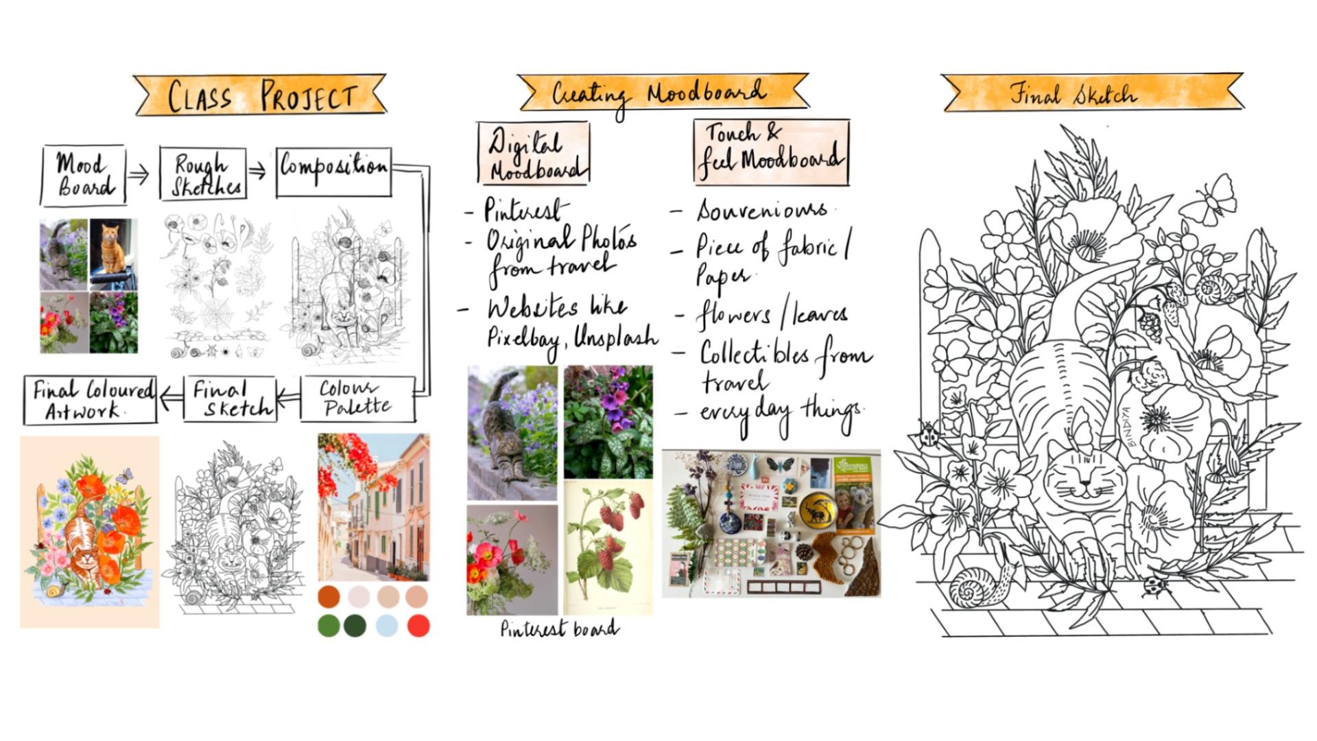
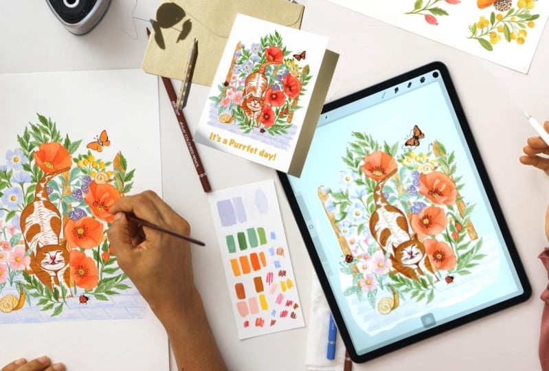
2. Class Project: Let's talk about
the class project. By end of this class, you will be able to create your own original
composition from scratch. Whether you use
paint and brush to create your artwork or
you paint digitally, I'm sure you can apply these lessons in your
creative process. If you had a chance to
look at my artwork, I love to paint
birds and animals. Since pets are such an
important part of our life, I thought cat in the back yard could be a good theme
for the project. As we go along, we
will be learning right from the basics of
the composition to finishing your artwork. I have tried to
break down the glass into digestible
bite size lessons. I invite you to follow along
and create your artwork. After we finish each lesson, I suggest you take
a pause and create. If required, revisit the lesson to ensure you extract
maximum amount of it. Throughout the
class, you will be sharing four deliverables
in the project gallery. As you document your process, you will be sharing
your mood board, final sketch, color palette, and the final design. I'll be happy to give
you my feedback. I'll be looking for how you apply a limited
color palette. Create cohesive composition with hero elements and
supporting elements, and create balance between
positive and negative space. Make sure you download
the guidebook from the resource section
and follow along with me. See you in the next lesson, where we will talk about
tools and materials.
3. Tools and Art Materials: Welcome to this lesson.
Let's talk about tools and art materials that you will need for
the class project. Over the time, I
have realized you don't need tons of
paints or brushes. As you start exploring
and painting, you tend to pick sudden brushes and paints more
often than others. I use round brushes like
number 124 and liner brushes. If you paint with gas, don't use expensive
watercolor brushes, since those are meant
to hold a lot of water. While painting with gouache, we use yogurt like consistency. Use your synthetic
brushes to blend. Since soft brushes may not
give you the best results, I mostly work on aphesis
paper or sketchbooks, so I don't need bigger
brushes for those. You can keep a flat brush handy if you're
painting bigger areas. I love to add finer details. For that, I use
my liner brushes. I'll be using gouache for
the current project though. This medium was used
by the artists like Henry Mets in his Vibrant
Abstracts in 1940s. But I feel this has gained popularity in the
last couple of years. Professional artists use guash because of its versatility. It can mimic watercolor as
well as acrylic paints. I'll be using various
brands like Sennelier, Brustro, and Vincent, and Utter. You can mix different
brands to make your own colors since we will not be using
too much water. Paper with 180 GSM or
above is good to go. I'll be using 300
GSM hot press paper because of its smooth
texture and easy to scan. Feel free to use
whichever brand you like. Other than this, you can use color pencils
to add details, fine liners, ink pens to add more interest
based on your style. I combine various
mediums as required. Print a paper or sketchbook
pencil eraser rag, and a water jar for
cleaning your brushes. I normally use
procreative sketch and transfer the image on paper. If you wish to use
paper and pencil, that's absolutely fine too. If you wish to
digitize your artwork, you will need Photoshop, a smartphone or scanner
to scan your artwork. Once you're ready with
your tools and materials. I'll see you in the next
lesson where we will define the purpose of our artwork before
we start working.
4. Knowing the Purpose of Your Artwork: Welcome back to this lesson. It could be overwhelming to
approach the blank piece of paper before you start
working on your artwork. It's important to understand
the purpose of your artwork. Knowing where your art is going to be used
can really help you to narrow down the options whenever you start
working on a design. It's good to ask
these questions. What's your end product? Where is this design
going to be used? Is it on the stationery fabric, home decor, greeting cards, calendar or T shirt? Is it going to be a repeat
pattern or a spot design? Is this collection for
a season like spring, winter, this collection for
a festival like Christmas, or is it going to be
Evergreen Design? Do you plan to add lettering
or text to your artwork? For example, in greeting
cards and posters, Do you have any
colors in your mind? For example, in my last planner, I was certain I wanted
to use black as a background or light color. In my Mac pipe planner, having some options
in your mind for the background color in the beginning can be
really life saving. It gives you that
freedom to choose the colors for the elements which will go well
with each other. Even if you don't have the
exact color in your mind, it's okay to have a rough
idea whether you want to go for a light background
or a dark background. If you're working for
a season or occasion, you already knew a few colors
that you would like to use. For example, if it's Christmas, I see a lot of reds,
greens, and whites. There are many colors
which are my go to colors. I tend to use them
irrespective of the theme. In the long run, they become the part of
your signature style. Or would you like
to have the color which is in trend example, Panton color of the
year, which is magenta. What's the theme
of your artwork? Some of my artwork are inspired
by my travel trips and I consciously take pictures or
collect items like tickets, souvenirs, matchbox or
local newspaper, anything. That is the essence
of that place, which I could use later. Other than that, I
love painting insects, so I tend to use a lot
of them in my artwork. You may not have all the
answers at this stage, but this step will give you a good sense of direction
so that you're not lost Once you have done this exercise and you're ready
with your building blocks, I'll see you in the next lesson where we will
create a mood boat.
5. Creating a Mood Board: Welcome back to this lesson. I hope you were able to narrow down the purpose
of your artwork. Now let's create the mood board. Why do we create a mood board? I feel creating a mood board
is like creating a map. It gives us the opportunity and the freedom to explore and
experiment with the things. Even before we get started, once I know the
purpose of my artwork, I'll start exploring the theme. Now here you need to
ask what inspires you or you love
to paint or draw? Is it the everyday things, or floral, or travel
theme, or birds? Some of my artwork are
based on my travel trips. If you follow trends, do some
research, what's working? I'm not that great at
following up with trends. Once you've short
listed the theme, list, down all the elements that
you wish to include in your artwork example
for today's project. Here is my list,
cat favorite pet. Big flowers like poppies, small flowers like periwinkle, insects like Lady Bug. There are various ways to make the mood boat touch
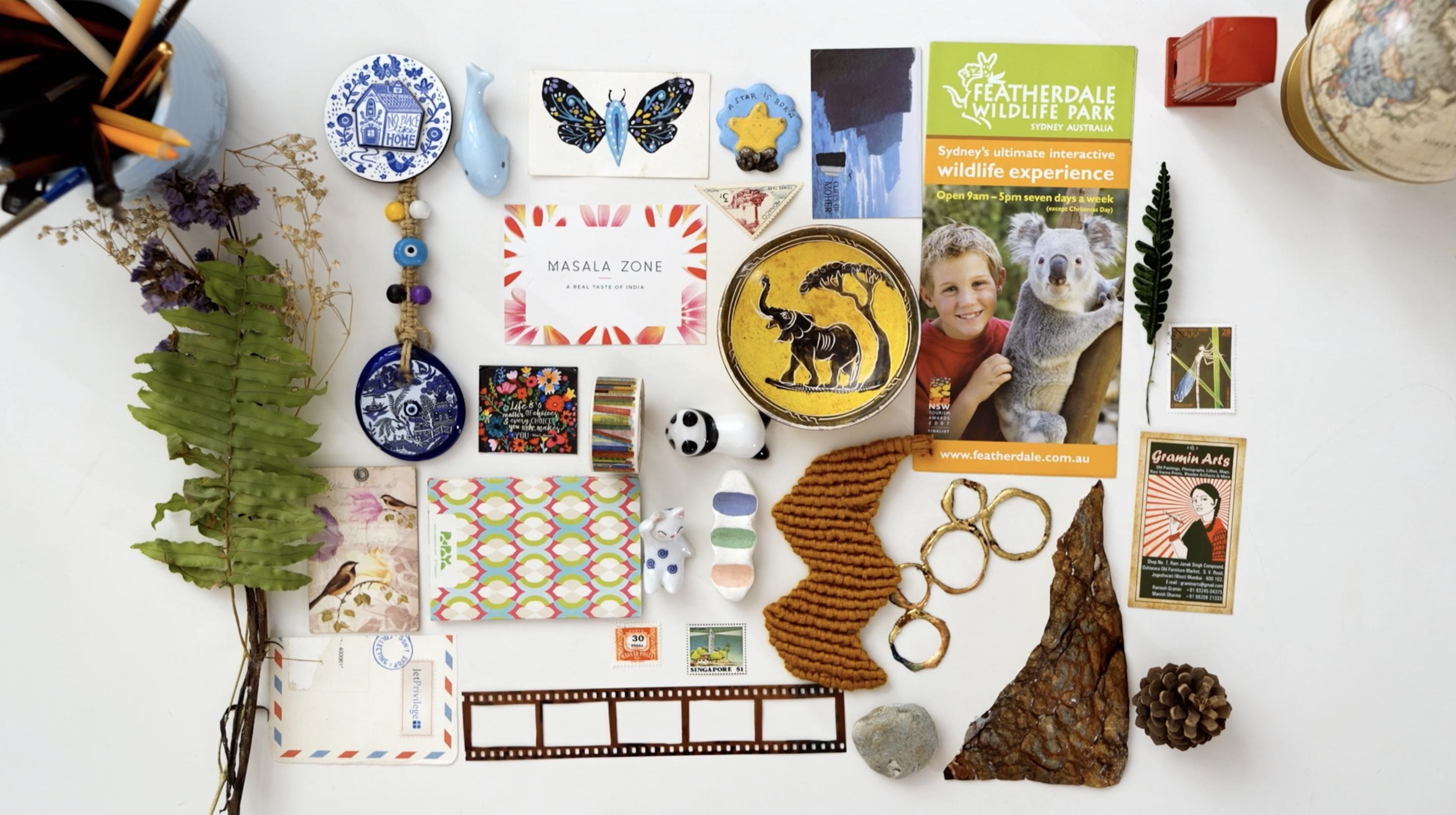
and feel mood boat. These could be collection of photographs, everyday things, treasure from the
trip flora from the walk piece of a fabric in which you like
the color or the texture. Dried flowers, leaves, stems, souvenirs stamps, et cetera. Digital mood board. When I'm
making a digital mood board, I look for color palette
as well as the elements. Booth colors. Have you seen a bouquet or a
piece of ceramic, or tile, or a scenery, or a dress and loved
it for the colors. This could be a wonderful reference for your
color palette. If I really like a color, I sometimes search flowers or element of that
particular color. For example, if I want to
include periwinkle color, why not add periwinkle
flowers elements? If you plan to paint
a animal or a flower, I'd suggest you search for
images from different angles, like top, front or site, because that really
adds interest. Look for images at various stages like bud
stage, blooming stage. Look for some
really close picks. If you'd like to add details, you can use your own
pictures or references from website like Pinterest
picks Away Splash. These are really
generous websites to provide tons
of free pictures. Even if I'm using a
reference picture, I pick few things
from one picture and a couple of things
for another and then combine it with
my imagination. You can make both or just one while making the mood board. Don't get carried away in
collecting too many ideas that may make you feel overwhelmed and make it difficult to start. Just have enough pictures, say three to four,
for each element, so that it gives you
a fair idea of shape, form, texture, and color. I find it really interesting and helpful to observe
flowers and leaves on my walk and closely look at them to understand scale colors, angles, texture, and symmetry. For the current project,
I had cat in my mind, but you can select any
pet that you like. I was looking at the
really cute face cats and I really like this one. The moment I saw
this, I thought this looks like a cute cat
laying in the back yard. I added backyard in my list, fence clouds, pebble floor in the background to
give look of a backyard. Let's look for some
floral references. Here you go. I have saved
enough images to get started. If I get stuck, I'll
come back for more. You can find the link to my Pinterest board in the guide book in the
resources section. Once you're ready
with the mood boards, I'll see you in the
next lesson where we will learn about composition
and storytelling. Do share your mood boards
in the project gallery? I'm really excited
to see how you gather your inspiration
and give you my feedback.
6. Storytelling: Hero and Filler Elements: Welcome back to this lesson. I hope your mood board is ready. Now let's apply this idea in making the artwork
I normally like to tell a story or place my elements in a larger
than life kind of a theme. So consider your composition,
just like a movie. Here you have a lead,
that's your hero element. Then you have other
important characters which have a strong
role to play. And next comes the
supporting characters and the background fillers. Thankfully, we don't have
villains in our composition. Let's start with the hero
element here, it's the cat. Let me show you an artwork
from my previous collection. In this collection,
I wanted us to remind how every day things
can bring joy and nostalgia. My Scooter was the
hero element here, supported by big flowers,
like poppy flowers. Then comes the other
supporting elements, which are smaller in scale. And last, the filler elements, which are tiny
flowers and leaves. For this class, I
have taken cat in the backyard as the theme here. Our kitty is the hero in the backyard
surrounded by nature. Once you have clarity
of the hero element, its size should be prominent. Colors have to be bright or of high contrast to make the
artwork more interesting. Sketch supporting elements in different angles so that
it gives variations. Leaves can be of various
sizes and shapes. Take your time to decide the
characters of your movie, and I'll see you in
the next class where we'll talk about the importance
of scale and balance.
7. Composition Scale and Balance: Welcome back to this lesson. I hope you have decided the
characters of your movie. Let's talk about
scale and balance. It's important to decide
the scale of your elements. If you make the size of
all the elements same, then you won't be able to tell which element is
the hero element and which is the
supporting element. By wearing the scale
of the elements, you define their importance
in the art piece. Sometimes you can use the same
element multiple times in your artwork just by varying
the size and colors. By doing so, they look
completely different. With less effort,
you can do more. I do this sometimes with
the filler elements. It's also interesting
to vary the size of the elements to show the
depth in the artwork. Like a flower in the front would look bigger than the
flower at the back, or vary the size of the
flowers on the branch. If you use scale correctly, it can give depth and
dimension to your artwork. Let's talk about balance. Negative space is
as important as the positive space as we
start adding elements. Sometimes we get
carried away and add too many elements or leave
too much empty space. Let me show you an example
of my previous artwork. My designs are mostly
indicate and layered. This is my original Mapi
artwork for the planner. When I scan the file, I realize it's not balanced. There is too much
negative space, it lacks depth,
layers, and interest. So I decided to add
certain elements digitally by using procreate. That's how you can combine
two mediums beautifully. In this case, I was able
to balance my artwork by adding filler elements and
layers in the background. You may not be able to do
too much at this stage, so be mindful from the beginning about
the scale and balance. I invite you to look at
the images you've saved. Think about the scale
and the size of the elements and the
layers you wish to create. I'll see you in the next lesson where we'll start sketching.
8. Sketching: Simplifying the Process: Welcome back to this lesson. I hope you have clarity about the composition from
the last lesson. In this lesson, let's
start sketching. In this illustration, we're not trying to make everything
look realistic, but at the same time you want to add enough details
so that we can highlight key features in terms of shape, form, and depth. It's up to you if
you want to keep it simple or add a lot of details. That's part of your
signature style. You could make them geometric
or use wonky shapes. Use your imagination.
Let's sketch elements of our project. I'll start with the
cat, our hero element. Do keep in mind, don't start sketching on the final
watercolor paper. It takes strlen error before
you finalize your sketch. Erasing multiple times can leave permanent pencil marks
or damage your paper. I suggest you use Sketchbooks, ipad or loose papers
for sketching animals. I prefer using grid lines. This gives me accuracy in terms
of placement of features, posture and proportion
of body parts. To make the grid lines
enable the drawing guide and edges the size of the
grid for animals as well. I break down the sketch
into basic shapes. As you can see, the
face is roundish, the body of the cat is oval, and limbs are
rectangular in shape. Based on the position
of the cat on the grid, you can count the squares
and sketch accordingly, adding some details to the face. I'm not trying to make
it look realistic, but it's important to have proper proportion and
posture of the cat. Right? Let's refine the
sketch a little bit. I think the cat looks proportionate to the
reference picture. Let's try a couple of
options of four pattern. While reading about the cats, I realize there are six
types of four patterns. Most common are tabby, which has strips, lines, and dots like the gray one
that we see in the picture, And bicoloran, tricolor,
as the name suggests. Here I've selected
a poppy flower, which has a side view and have petals in different angles. I'm using the basic shapes here, like for example, oval. Then I will make the center of the flower and arrange
the petals accordingly. It's interesting to show flowers in different
angles or stages. I'm sketching some
birds as well. I sketch a little extra elements
because while arranging, you never know which
one would look good. Let's sketch some more poppy flowers with different angles. I finished sketching
all the elements. Smaller, bunch of flowers,
berries, fillers, and some of the delight elements that I
would like to add, like snail and lady bugs. Before I start the
final artwork, I'll import all the
layers in a new file. Select the layers
you wish to import, drag them and come out of the file and drop
them in the new file. Now let's hide all other layers and just start with the cat. I want to place the cat
a little off center. We can change it later as
we build a composition. Make sure the size of
the cat is prominent. Now let's select
the second layer of elements are poppy
flowers, the big flowers. I'll place them around the cat. Try moving it around or
changing the shape of the elements or flipping
them to see what works. You can change things later if needed to balance
the composition. Don't be scared to try out different options now
adding some buds. If we need to change
something, we will come back. Now, moving to the third set of elements, the little flowers. Let's try and arrange them on
the other side of the cat. Here is the other
set of flowers, I think they fit in here. Let's add some leaves. As you can see, I'm
using the same stem of leaves multiple times by
wearing the size and angles. That's how you can save time and still have variations
do more in less time, let the elements overlap. That's how the composition
looks, layered. I know it looks messy. Now, don't worry, We will
clear the file at the end. This is the stage. You can play around with the
composition and try and arrange the elements in different angles
and see what works. Now let's see what all is left. Let's place this berry here. I think this place looks empty. We'll have to re, arrange the poppy flowers
and leaves a bit, adding the tiled floor
to add the base. Let's add another set of
smaller filler elements. I think it can be placed here now let's move
on to the next layer. Let's put the fence behind. I think this binds the
other elements together. I drew this spider and its web. Let's see if it works.
What do you think? I think it looks booky. Maybe a good theme
for Halloween. Not sure about this. Now,
let's see what else we have. Let me add my tiny creatures, the snails and the lady bugs. Can we place it here? These small things together. They bind the
composition together. I think it looks good. Let's define the sketch. Once you finish sketching and
combining all the elements, see if your sketch is balanced. Elements should
be distributed in such a way that they create
harmony and cohesiveness. It should not be heavy on
one side and on another. Take your time to add or delete elements till you're
happy. Here is the trick. Make the sketch
smaller and squint your eyes and see if
your sketch is balanced. Take your time to
finalize your sketch, and I'll see you in
the next lesson, where we will learn
an interesting method to transfer the sketch
on the watercolor paper. Do share your sketch in the project gallery and I'll be more than happy to
share my feedback.
9. Transferring the Sketch to the Paper: Welcome back to this lesson. I hope your sketch is ready
from the last lesson. In this lesson, let's transfer the sketch on the
final watercolor paper. If you're drawing on paper, then turn the paper
and on its back side, start making pencil
marks and cover the entire sketch once it's covered completely
with pencil marks. Now place the paper with pencil shading facing down
on the watercolor paper. I would recommend you stick the corners with the washi
tape so that it doesn't move. Now you need to draw again over the sketch to make sure
you don't miss anything. Lift one of the corners
to have a look. If you have a light
box, you can use that. Sometimes I use window
as a light box too. My favorite and most
efficient way of transferring the sketch is
using ipad as a lightbox. Duplicate the sketch
multiple times to make sure the lines
are dark enough. Now go to Settings,
Click on Accessibility, scroll down to Guided
Xs and Enable the same. If you want, you
can set a password. Now let's go back to Procreate
and open our sketch. Click the button on the
top of the ipad thrice. Now your screen is locked. Let's place the paper and stick it with the washi
tape at one side. This ensures the paper
is stuck to ipad and you can lift it from other side to see if you've traced everything. In my experience, you can
see better when it's dark. I normally trace it
during the nighttime. I hope you're ready with your
sketch to exit this mode, let's click the same
button thrice on top of the ipad, and you're done. Take your time to
finalize your sketch, and I'll see you in
the next listen, where we will do
some fun exercises to get comfortable with quash.
10. Gouache 101: Vibrancy and Consistency: Welcome back to this lesson. I hope your sketch is ready. In this lesson, let's
learn how to use guash. Before we start painting
on the final piece, I'll be using gouache
for this project. Feel free to use whichever medium you're comfortable with. You can paint it
digitally to apply the rules of
composition and just go ahead with any
medium of your choice. I love using gas for its
vibrancy and matt finish. It's so easy to create layers. It's a forgiving medium. You can paint light on
dark or dark on light. If it's used in
correct consistency, it can be activated with
water, unlike acrylic paints, and I really love the
results when I scan my file and it's easier to
clean the digital file. Let's do some fun
exercises to get comfortable with wash by
wearing the pressure. We can create variations. Less pressure for thin lines and more pressure
for thick lines. You can block the elements with single color or add shading while the base
color is still wet. You can use both or either of
the techniques as you wish. While adding water,
you need to make sure it's neither too
watery nor too thick. Let's try on the paper. I think this looks
too thick to me. As you can see the brush
strokes, let me add some water. I think I've added
too much water. Now, consistency has to
be smooth and opaque. You can use different size of brushes to get different effect. For example, here I'm
using a round brush, which has a very nice point. By putting a light pressure, you can easily
create thin lines. As you can see, with
the right consistency, your brush glides on the paper. Let this try for a few minutes, then we will try some shading
and details on top of it. I'm using my line
up brush to add veins of the leaves with
a darker sheet of color. I'm adding a bit
of a sheeting with the color pencils to
make it look different. You can use other mediums
as well like the ink pen. By wearing the pressure, you can vary the size of the
strokes from thin to thick. Less pressure for thin lines, more pressure for thick lines, and medium pressure
for medium size lines. Here is the tip. White is one of the most
used colors in gas. If you're mixing lighter shades, take white as the base and add other colors to
get the desired shade. If you do it other way around, you will end up wasting too much white or making too much color. Let's quickly summarize what
we learned in this lesson. We can use gash on wet, Add shading with the
base color is still wet. You can add details like veins of the leaves
on top of it. Once the base color is dry, you can use gas as wet. On dry, you can make leaves
with different shades of green to give variation
and add details on top. Once the base color is dry, vary the pressure to get the variation in
size of the leaves. As you can see here, shape of the leaves in these two
elements is very similar. But as the size is different,
they look different. Here, I have added a bit of a pencil shade on top of
it to give variation. By varying the pressure, you can get different
strokes by adding details, they look completely different. I invite you to experiment with colors and get
comfortable with quash. Once you're ready, I'll see
you in the next lesson, where we will select
our color part.
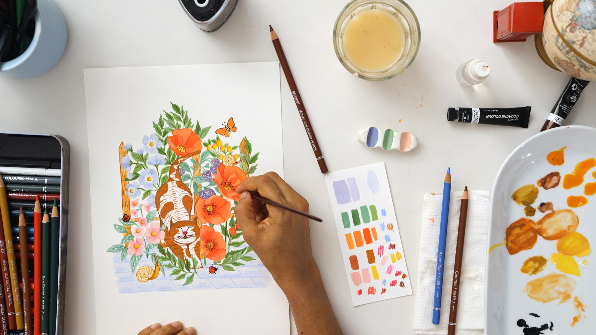
11. Limited Palette: Mixing and Swatching: Welcome back to this lesson. I hope you had fun experimenting with gas
in the last lesson. In this lesson, let's
select our color palette. Color palette can make
or break your artwork. A simple artwork can look extraordinary with the
right color palette. Professional artists use eight to ten colors
in their artwork. To make it easy for you
to choose these colors, let me share my process. I normally choose two to three main colors,
which are vibrant. Two to three greens. Since most of my artwork
is inspired by nature, three or more neutral colors. Do you remember we gathered color inspiration during
the mood board stage? It's time to use the inputs from those to create
a color palette. I really like the
colors of this image. Keeping in mind the
elements of our artwork. Let me swatch the
colors on the ipad. Orange, red for the poppies. It has this bright brown which I think will
look great on our cat. Pale blue for fillers
and pavement. Shades of green, neutral
colors like page for fillers. And I'm adding two more colors, periwinkle and pink
to the palette. Let's swatch colors on the paper to finalize a color palette. I would recommend
your own colors rather than using them
straight out of the tube. The way you mix your colors becomes part of your
signature style. Once you like the colors, I encourage you to swatch. Note down the colors and proportions you have
mixed to create them. This you can use it for your
future projects as well. Take your time to swatch your colors and finalize
your color palette. And I'll see you
in the next lesson where we will finally
start painting.
12. Color Plan - Color Blocking: Welcome back to this lesson. Since our sketch is
ready and we have decided our color palette,
let's start painting. We'll start by blocking
our colors first. How do we keep our
color palette limited? Once we pick one color, let's see which all elements can be painted with this color. Whenever I'm unsure
where to start, I start with the
shades of green. Since my artwork is
inspired by nature, it has lots of stems and leaves. This gives me a kick start. You can start with
something which is really obvious in your
artwork to make it easy. As you can see, I'm
wearing the shades of green color to
create variations. Also, as we see nature, new leaves are different
color than the older leaves. With this, your
painting will not look flat and it'll add
the effect of shadow. Let's add periwinkle
color to the flowers. I admit this color is
my recent favorite. I can't stop myself from adding this color to
all my paintings. As you can see, I have made sudden petals dark as
compared to others. This is to show the shadow
that falls on the flowers. Since we've got into the flow and we are comfortable
with painting, let's paint a hero element. For me, the most difficult
part is to start as I start sticking around for those
uncomfortable moments when I'm not getting it
right is the key for me. Once I'm in the
floor, that's where I start enjoying the
painting process the most. I suggest if you're
feeling stuck, start with something
obvious and easy. The cat in the reference
picture is green color. I decided to make it by color with orangey
brown and white fur. Wanted to use more
vibrant colors based on our composition
and color palette. Actually, this reminds me
of a cat in our building. This is a great way
to mix and match reference photographs
with your own photos or your imagination based on
the size of the element. Prepare the color as much as you need so that you don't
run out of the color. While painting for the cat, I don't think I need
too much color. This much quantity should work for the white
part of the cat. I'm going to retain the white of the paper instead of
painting on top of it. Now let's paint
the poppy flowers. Here I'm shading while the
base color is still wet. And I'll add more details in the next chapters with the liner brush and
the color pencils. Currently, we're just adding
the first coat of color. We're just blocking the colors. And as we go in
the next lessons, we will add shading and
details and texture. Moving on to the next element. Let's start with berries. While you start painting, you may feel like adding new color that was not part of your
original color palette. That's absolutely all right. Color palette is just a
guide to get us started. As we actually start painting, we feel certain color
will look better. Take that call here. Violet was not part
of the color palette, but berries will look
great in violet. Now it's time to
paint the leaves. If you paint the leaves with the same shade of
green as poppy leaves, they will just blend and you won't be able to
make a difference, make a different
shade of green so that it doesn't mix up
with the poppy leaves. Let's make it sage green. I'll continue adding
same shade of green in the other
filler elements as well. Later while adding the texture, we will add more details so
that it looks different. Now let's take the next color, as you may have observed the shape of the flowers
that I'm painting right now. And the pink flowers
is quite similar. But as we add
details and texture, in the next lessons, we will see how they look completely
different from each other. I completely forgot about
these tiny insects. I call them delight elements. Even if you don't add them, it's absolutely fine,
don't you think? When you're looking
at a painting and when you discover
such details, it creates a feeling of delight. That's why I love adding them. One thing to
remember, some colors are less opaque as
compared to others. In that case, let the base layer dry and then
apply the second coat. Take your time to add your
base colors to your artwork, and I'll see you in
the next lesson, where we will add
shading and details.
13. Adding Shading and Shadows - Layering: Welcome back to this lesson. I hope you had fun adding
base colors to your artwork. In this lesson, let's add some life to your artwork by
adding shading in details. Before you start adding details, make sure the base color
has tried properly. Otherwise, it's much
for adding details. I'm using my liner brush. I'm taking thick white
color straight out of the tube to add details to the petals of peripinkleflowers. You can see how this highlights the center of the flowers. I'll add double quote, wherever it is needed. Adding some highlights
to the berries. Playing with the lighter and
the darker shades of violet, I am adding darker details to the lighter elements and lighter details to
the darker elements. That's how you create the
interest and highlight them. Let's add details to a cat to give the
impression of the fur. Here I've decided to make
bicolor cat instead of tabby. Tabby are the ones with
stripes, lines, and dots. The gray ones that we
normally see in our society. Bicolor, as the name suggests, has fur of two colors. Here I've decided to use
white and orangey brown, adding outline to the facial
expression of the cat. Here, be patient while
adding the features. Let's add a smile to the face
of a cat. This looks good. This is the stage where I see the whole piece
coming alive. I'll take my time to add
details till I'm happy by adding shading in detail. You can add so much
depth to your artwork. Take your time to add shading in details and I'll see
you in the next lesson, where we will add final
details to our artwork.
14. Final Details and Textures: Welcome back to this. Listen, I hope you had fun adding depth to your artwork In the last
listen in this lesson, let's use color pencils and line up brushes to add final details. At this stage, I use lighter or darker
shade of colors to add final details
with my line up brushes. Let's use color pencils
to add texture. I don't use water
color pencils on top of G because it may such with the G if
base colors are still wet or if it comes
in contact with water. If I'm unsure, I swash the color on the rough paper
before I start coloring on. The final artwork at the center of the flower is darker as compared
to the petals. I'm adding darker shades with the pencil at the
center of the flower. For the leaves on this
branch, I'm adding dots. You can see the
shape of the leaves here are similar to the
leaves on the other branch, but by adding dots they
look so different. That's how you can wear either. Now let's add some details
to the poppy flowers. Keep the reference picture handy to see the details
you wish to add. Continue adding details to
the rest of the elements. As we start adding details, you can see how the whole
piece is coming to life. Let me add some depth to the periwinkle flowers
with the darker shade. I'll make the center
of the flower as compared to the
rest of the petal. Time to add some details to
our tiny creatures, snails. I feel these tiny creatures
add so much delight. I'm adding some wooden
texture to the fence, just giving the impression of the wood by adding darker lines. Belly button flowers
are my favorite. I love to add them as fillers, just using a darker shade
to highlight the flowers. Let's add shading to the
petals of the poppy flowers. Here I'm playing with
the different shades of red to accentuate
the flowers. Same thing I'm going
to do with the buds, now I'm adding veins to the leaves with different
shades of green. I'm wearing the shade of green. As for the base color, like if the base
color is sap green, or sea green, or sage green. Based on that, I'm choosing
the shade of green. Adding some details to, to bury here with the lighter shade of violet for the pavement. Adding the impression of
tiles with a darker blue. Just trying to keep it subtle. I don't want too
much attention here, but at the same time it
binds the whole painting. That's how use the
neutral colors. Poppy flowers are incomplete
without these statements. At the center, I normally
keep black color at the last. Let's apply the black color and see if we have
more details to add. Now it's time to add final
details to the face of a cat. Patient. While adding features, our eyes are normally
drawn to the face. First, I've selected
the cat with the eyes closed to
make it easy to paint and also to give
a lazy expression. Adding some details to the body so that it
doesn't look flat. Since it's a hero element, I will take some more time
to add details to the cat. This looks good to me. Take your time to add final details and I'll see
you in the next lesson, where we will finalize our
design for the product.
15. Taking a Break, Revisit the Piece: Welcome back to this.
Listen, I hope you had fun adding final details in your artwork in
the last listen, that's my favorite
part of the painting. In most cases, your artwork
should be ready by the stage. But I still encourage
you to take a break and come back and revisit your artwork with a
fresh perspective. Once I finish my artwork, or if I'm stuck at any stage, I step away from my
artwork for some time. A couple of times, I have
taken a decision in a hurry, only to regret it later. If you're confused or
unsure what to do next, then I suggest take a pause. This will give you a break and detach your mind
from the artwork. So when you come
back and revisit, you can view it with
a fresh perspective. Sometimes I feel it's just perfect and you don't
need to change anything. So go ahead, take a break and give a
fresh look to artwork. And I'll see you in
the next Listen. Where we will digitize our artwork for the
product design.
16. Finalising for Product Design: Welcome back to this lesson. I hope your artwork
is ready by now. In this class, let's learn how to digitize our artwork
for the product design. I'm planning to use this design for a T shirt and
for a greeting card. There are two ways to
digitize our artwork. Either you can take a photograph
using your smartphone in the natural light between
124 is the best time. Depending upon where you stay. Keep the phone parallel
to your artwork. See you are not
blocking the sun light. Look for the angles which
gives you least shadows later. You can edit in apps like
Snap Seat or Light Room. If you don't have Photoshop, I have absent scanner 600, I scan my files at 600 DPA
because while printing you can double the size of your artwork without losing
quality or getting pixilated. I clean my file in Photoshop. Let me share with you some of the tools I use to
prepare my design. First is the magic eraser, which magically raises
the background. You can set the tolerance
to around 20 to 25. You can play around
with the tolerance and see what works best for you. Let's edge just us in levels
to brighten up the artwork. If you want to completely
change the colors, you can play with the settings at this stage. If I want to make any changes or add any elements, I take the file to procreate, to make the final adjustments. Now my file is ready. Let's put this design
on the greeting card. Here is a template of ten by seven inch with the
fold at the center. Let's fill the right
side with the design. Don't fill it to the end, leave some room for
bleeding and cutting. You can put your name or
logo on the left side. Since this is a Everyday card, let's put a code on the bottom. Let's save this file either in G Pac or PNG format
and we are done.
17. Conclusion: So we have reached
the end of the class. I hope you enjoy this class. I'm happy I could
share my process, how I create my artwork right? From ideating, to
creating composition, to sketching, to
finalizing colors. Finally, painting
and digitizing. I'm sure after
taking this class, you can make your
own product design, which has your voice and style. There were so many things
I wanted to go in detail, but for this class, I wanted to cover my workflow
from start to end. And not make the class too
descriptive and long if there are any topics you want me
to cover in detail and have a separate class on that do share the same in
the comment section. I would love to create a class that you want
to learn from me. In the meantime, I'm eagerly waiting to
see what you create. I encourage you to share your process in the
project gallery. For feedback, I would love
to see your wood boards, your sketches, your
color palette, and your final painting. If you find this class helpful, do leave a review so that other students can
take benefit too. If you have any questions, ask me in the discussion section and I'll try my best
to answer those. Do follow me on Skillshare to get notified about
future classes. If you'd like to see more of my artwork and process videos, here are my social media
handles to follow. Don't forget to mention
the hashtag if you're sharing a work on Instagram so that I can shared
it on my stories. Until next time,
Happy designing.
 Bindiya Shetty, Engineer-turned-Illustrator