Transcripts
1. Intro: Hi, thank you so
much for joining! In this class, we're turning
our summer memories into small drawings, like little
souvenirs of the season, all together on one page. Before we start,
a quick heads up: This class is a
little different. It's actually a recording of a live session from
the Sardine Club, my drawing community that I really want to share with you. It's a bit more relaxed
than a usual class, and you'll see me drawing in real time with a few
detours along the way. You can recreate exactly what I draw or take your
own inspiration. So your summer holiday,
your hometown, or place you love, these are all really great options
for this project. Small motifs like this are also easy to start and
easy to add to later. So there's no need to make
one big perfect piece. We're going to use my
summer souvenir brushes and a color palette
and Procreate. These are optional.
They're just there to inspire you and
make things easier. Lastly, the session
is beginner friendly. You don't need to draw
perfectly or follow every step. Besides, Procreate makes it
really easy to experiment, so just have fun with it. So open Procreate, download your brushes
and color palette, and let's start the session.
2. About this project: Welcome. Thank you so
much for being here. So, what we're going to do
today is summer souvenirs. This is the theme of this month. This was inspired by my Mediterranean motifs
class on Skillshare, and I absolutely love doing a project and seeing the
results from that class. People came up with
these little motifs, not just of the Mediterranean,
which is where I am. I'm in Spain, so
that inspires me, but also from their
own holidays. Somebody shared this
amazing project of their holidays
in Italy and Paris, and I thought it'd be fun to focus on that a little bit more. Another thing that
is really useful is dividing up your canvas
in little motifs like this, and that makes the
whole drawing process I find a bit easier. In this session, specifically, the inspiration for me is
going to be this summer. I was mostly in Madrid apart
from being in Ireland. And so that's going to be
my inspiration for this. So feel free to either
draw along with me or change up the motifs a bit and pick something
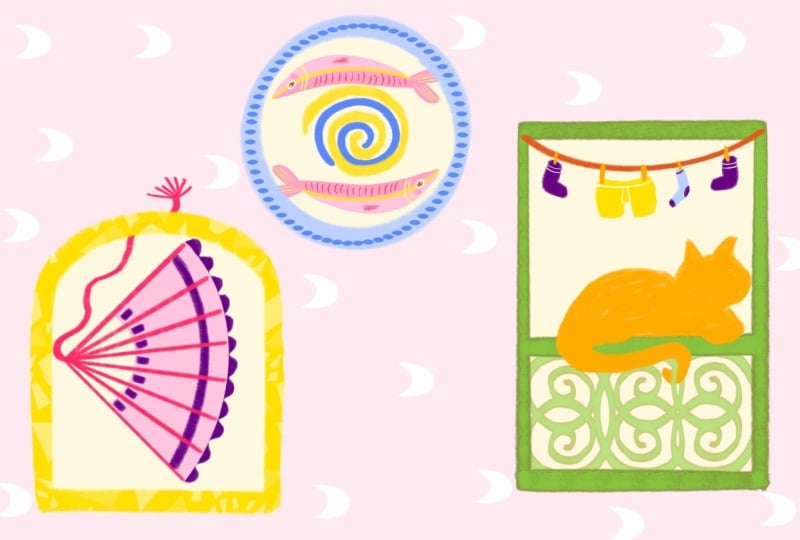
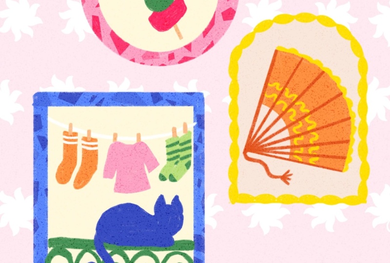
more personal. And so this is a little preview of what
we're doing today. And this was also inspired
by a Eurosummer sketch Club, drawing challenge
over the summer. And that was very much
about not motifs, but it was about taking a
specific Mediterranean topics as inspiration. And that also really
inspired me to, like, use my own photos and do something specifically
about Spain as well, and just taking your
own memories and your own inspiration to
put into motifs like this. So this is actually a little bit of what
we're doing today. But I think five
motifs takes a while. So let's start with three, and we'll see how it goes today. So make sure to get your
iPad ready, Apple pencil, and if you want the brushes
and the color palette, and then we can
get started soon.
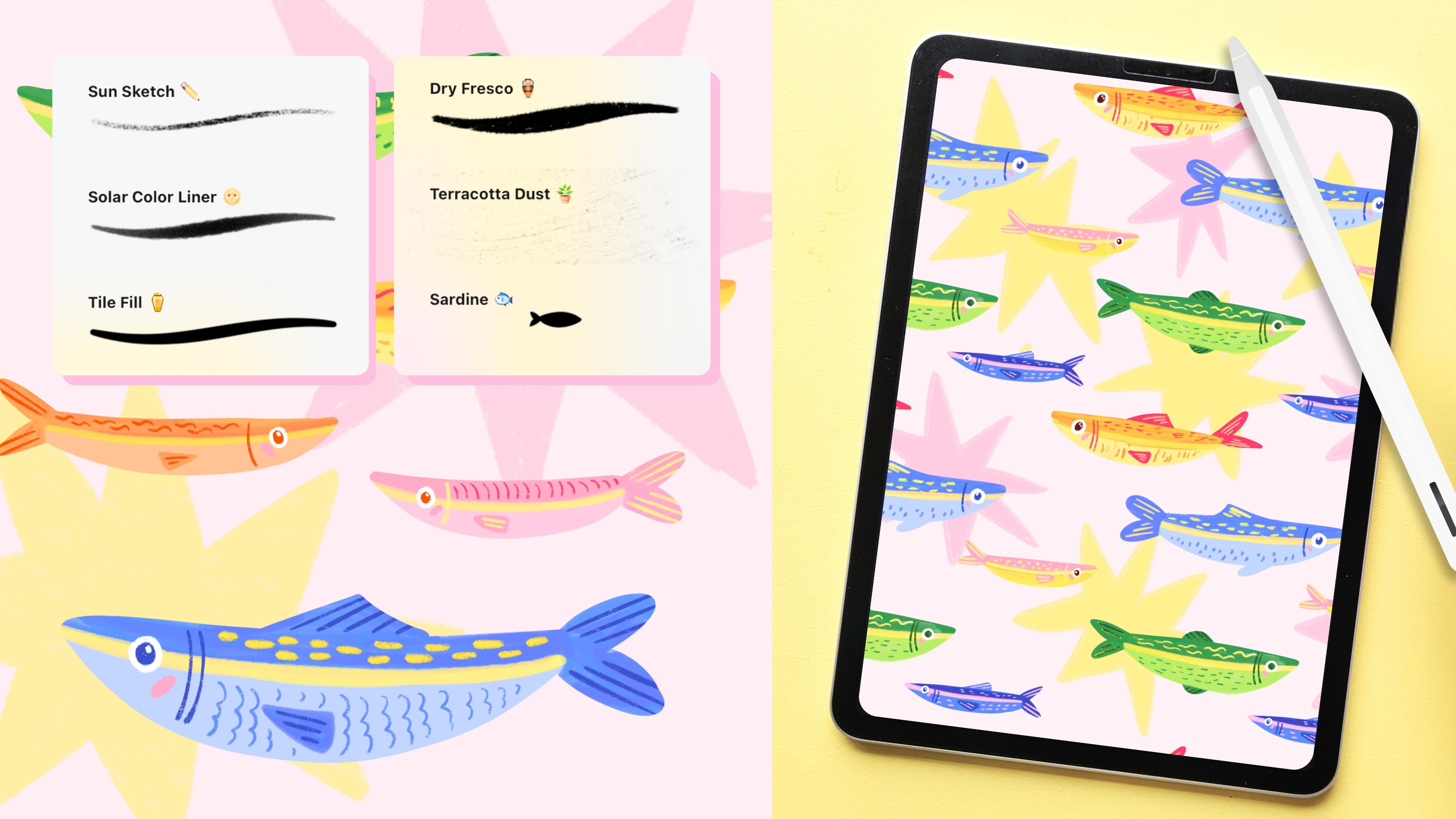
3. The Brushes: So let's start
with a new canvas. And I'm just going to
make this kind of small, and it's going to be sort of
like a four by five format. That's like the Instagram format because that's quite easy. So that's 2000 by 2,500 pixels. So if you're new to using the
resources from this month, this is the color palette. And this is exactly
the same color palette we used in August, as well, because I'm really liking
this color palette, and I find colors something that it just takes
a bit of practice. So I like just sticking
to colors that I know and just going with that don't have
to think about it. And also the
brushes, by the way. Basically, this first
one is for line work. And I also like that if you
make this brush a bit bigger, you get a little bit
more of that texture. And this one in
grain, by the way, matches the dry fresco brush. It's a very similar
kind of texture. And if you have the
Mediterranean Toolkit, that one is in there as well. So that one is very similar. And then the sandy grain is I would use this
mostly for some shading, but also like an overlay. So we're going to
actually use that today. We're going to make these
motifs and then put this on top to create this kind
of grainy texture, and that gives it a little
bit more of a handmade feel, especially if you don't
use anything else. The citrus wash is
similar as well, which is nice for backgrounds
and overlays again. And this rosso, I made
this a while back, and I just really wanted to share that. I just
thought it was fun. I don't really use
it that often, and I also don't know
where to use it, but it just felt like
a fun one to share. So it could be fun as, like, a background pattern as well. The dry mosaic ovals
is very similar to the mosaic ovals from the
Mediterranean Toolkit. But this one has a slightly
more textured grain so that it matches
this first brush. So if you're doing
everything in this, you can use that one for frames
and patterns and details, and it's not going
to be super smooth. It actually is going to match the texture of the first one. And then this is just
a little stamp that in the tatara I used to
place between the motifs, just as a little filler element, but it's also kind of fun as like a background
or something. So that's something
that we could use. And I think was it Leslie, who made the motifs and then used something as a background and I
thought that was so fun. It looked like a
little wallpaper. I thought it was beautiful. So yeah, that was amazing.
Really nice to see.
4. Motif I: Gilda: So we can get started with just putting the layout of
our frames on the page. And then we're not going
to sketch anything else, we're just going to
go straight into it. I'm just going to
use this first brush for those basic shapes. We've got one bigger
frame over here. So that's a rectangle and then a medium one over
here, which is like an arch. And lastly, another small one, which is just a circle. And yeah, I think that's fine. Just do this, yeah. I think we'll start with the small one. That one is easiest, and then
we'll work our way down. And as I said, feel free to
change up the motif itself. I'm going to do one that is
inspired by Madrid Spain, which is where I am
about my summer here. If you're new to
procreate again, feel free to just follow along, and then maybe afterwards, you can change this to make it a bit more
personal if you like. So that is completely up to you. I'm going to lock this
sketch layer because I just want to make sure I
don't draw on this at all. So swiping to the left
and then locking. And then I'm going
to a new layer. And I'm going to
start with green, and that's going to be
this medium tone of green. So what we're going to draw
here it's called a pincho, which is a kind of tapas. It's like a little stick with an olive and a pepper
and anchovies on it, and that is very
typical of here. So that is very much
part of my summer. It always has to be I have to have one at
least once a week, and it's the weekend now, so I definitely need
to get a pincho. So the easiest
shape to start with is simply the olive
in the middle. And then we can
add the pepper on top with a slightly
lighter green. So I'm going to use this
lightest tone of green. And by the way, I'm
actually going to use this sunburnt liner
for almost everything. This is, like I said, a liner with a bit of texture. If you prefer to
use something else, the Procreate
default library has crayons and group pencils that have a bit of
texture as well. So that will look
very similar if you want to use something like that. Liz, you're liking
the color palette. Oh, I'm glad. Thank
you. That was actually inspired by sardintins, which we did a session about
this in August, I think. And I showed you different
sardinins that I bought. There was one, which is a
very famous Spanish brand, Ortiz, and that has, like, very bright I don't have
one on my desk right now, very bright blue
and yellow and red. And that was the start
of that color palette. And then I think it was I
don't remember exactly. Maybe it was Jude
who bought a tin. She found it somewhere and
then made a sketch of that, and I was very, very
happy to see that. That's exactly what
inspired the color palette. I'm going to go back
to this medium tone of green to just add the
stem on top on the pepper. This could also be
red, by the way, this pepper is just that
the peppers you find on These kind of tapas on these sticks
are green and pickled. For another detail on the olive, let's use this red,
dark pink red. Like that. And then we're also going to add a little like anchovies
or like a pepper. Maybe you can add a
pepper in this case. And I'm going to just
add that underneath. I'm adding a lot of stuff on layers together because
I don't really care. But you can definitely put
stuff on separate layers and be more organized.
That would be great. So I'm just using this red, and then I'm adding a layer
underneath because I want to kind of add it
behind this olive. Like that, maybe. And my bed, I said that this is a pincho. This is called Ehlda, which is not important,
but I completely forgot. I messed up my tapas
names, which is terrible. So these are usually
eaten with, like, a little side with your
vermouth on the weekend, which is like a nice drink. It's just a bit
bitter. It's like a herb, liquor, I suppose, although a bit lighter,
a bit refreshing, and then next to that, you have a little
hill that like this. And then last thing we need
to add is a little stick. And that will actually hold
all of these together. But in this case, it's just
easier to add them behind it, and that will give the
illusion that they're on a little stick. So we can add another
layer underneath all of this and then use something
like an orange or something. So maybe the lightest
orange or beige. And let's see how that looks. This does not need
to fit perfectly inside your frame because we can just select those layers and then make sure that
everything fits. We'll do these motifs first
and then the frames after. Okay. The little pink thing, this one, like a
pepper, a bell pepper, or sort of a Is it bell pepper? Yeah, a bell pepper
that's like in oil. But you could also
replace by anchovies, which would be maybe a
bit more of our orange in the color palette or another
pepper or red pepper. It could also be cheese. So it depends whatever is kind
of easiest to draw. It's also just a little
pop of color in this case. But that's basically it.
This one's really easy. So I'm just turning
this into a group. You can also merge all of these layers,
whatever you prefer. And then later on we can
move them if needed.
5. Motif II: Fan: And then we can move on
to our second frame, and this one is going
to be something else quintessential Spanish, which is a fan. And I don't have any
of them here right now because I
always have them in my handbag because that's
where they need to be. Everyone in summer here always has a fan with them
because it is too hot, otherwise, and they have very
intricate details on them. In this case, we're going
to keep it kind of simple, but they're very fun
to draw, I think. So let's try that
out on a new layer. And I think maybe an
orange might be nice. But feel free to
try another color. These can come in
any color, really. I'll try this medium
tone of orange. And let's see how that goes. First thing we're going to
do is draw the basic shape and then put some
details on top. So the shape would be kind
of like this, like a curve. Kind of like that. It's
like a quarter of a circle. Or like a really big
pizza slice, rather. And what we'll do then
is draw this bit, and then we can erase this because we don't need
that part anymore. We really only need this bit, which is the fabric or the
wood panels of the fan. So we can color this bit in and then we'll erase this bit after. Yeah, for these motifs as well, it's easier to pick
stuff that are objects. Like, that's why I call
it souvenirs as well because to make it sort of like a rounds to be
a bit of journaling, where you have these memories that you try to put
on paper, right? But when you're just doing
a drawing like this, you cannot put every memory into something visual because
it's really difficult to follow or to draw everything. So it's easier to turn memories or like a
holiday into objects. And that makes it much easier to draw to do motifs like this. That was also kind of the goal of my Mediterranean motifs
class on Skillshare. To kind of show
people that making a massive pattern like
that is actually really easy because it is divided
in all these little motifs. The motifs themselves are really simple, and they
have to be simple. Otherwise, it's
like, too much work, and it's also too visually
stimulating, I guess. Like, you want to keep
them simple because altogether, they'll
tell a story. Like this fan by itself, it doesn't really mean anything, but together with the Gilda, which is the little
tapas over here, and the next frame
we're going to do, it actually makes sense, and it has you can kind of
understand the atmosphere. So if you take this this project and turn it into your own
motifs of your own city, your own holiday, your summer. Then think
about that as well. Try to keep those motifs themselves simple
because together, together in a canvas,
they can tell the story. Now we have the basic shape, and then we're going
to add our details on top on a new layer. And I'm going to use the
darkest orange for this. Whatever toe you
pick, try to get a slightly darker tone of that. And then we're just going to add kind of make my
brush a bit smaller. Add the handle,
which is like this. And then we just add
a few more like that. Now, it still very
much looks like maybe like a Japanese fan. I actually have one as a tattoo on my. I don't know
if you can see this. I have a fan right here, but this one is actually more
of a Japanese style fan. So let's add a sort
of a tassel to it. Don't know if I'm
saying that right. Like that. The helps already. And for some extra details
like some lace on the edges, there's usually
some lace on here. We can add a new color. I tried this
initially with pink. Maybe yellow could be nice, too. I don't know. Pink or yellow? Oh, I like it. Yeah, I'm going to
go with yellow. So I'm just going to add
Game lace is very intricate, so you won't be able
to show that exactly, but maybe just a little a
wavy pattern like this helps. And then to bring back
some of that same yellow, we can add some
over here as well. And let's do that underneath these lines because
these are kind of like the wood on
top of this fabric. So I'm just going to put
that on this orange layer. And this could maybe
just be some more lines. Some fans would have
entire scenes on them or maybe like very intricate
patterns and stuff. Especially with these motifs, I think it's best to keep them quite simple because
when you zoom out, you're not going to see a
whole lot of that detail. And if one motif is a lot
more detailed than the rest, then it will feel a
bit out of balance. So it's best to just not
add too much detail. And we're stylizing
it a bit, as well. So just keeping it simple. You can still see
that it's a fen. It's not my favorite,
but app to.
6. Motif III: Balcony: So we're going to go
to our last frame, and this one's going
to be a bit bigger. So something very
much like Madrid for me is the balconies
that are everywhere. Especially here in the city, people have these
little balconies and there's just
laundry everywhere, and they're usually beautifully tiled and beautiful
little details. And there are always
cats on every balcony, which is really, really cute.
So I absolutely love that. And I feel like a frame like this would already it
feels like a window, so I feel like it only makes
sense to turn that into a little balcony as if we're
looking out from a window. So we're going to start with the railing and then
put our cat on top. I think that makes most sense. So I turned this
fan into a group, but feel free to march that
or whatever you prefer. And then we can move
onto a new layer. And I think for this
balcony, let's use green. We already use some
green over here, so it would match quite nicely. So that's this medium green. And let's make it
like about a third of our frame around there. This could actually
be a little bit wider because our cat
needs to sit on top. And then over here, we can add a bit of the
detail of the balcony. And I'm using a reference for this that I
have on my screen because this took some time
to figure out how to do. I'll do it very slowly, and then you can try and follow. Just follow after
me what I'm doing. And if you're like, N,
Claire, absolutely not, feel free to do this
a bit more simple. But I figured, Yeah, let's we're up for a challenge. Let's do it. I'm trying to make this
symmetrical like that. Usually the top part of a balcony looks kind of like this, and then underneath, you
just have the simple bars. And yeah, like I said,
the balconies here. I'm not sure what the
history behind us is, but if you look up from the street and look
up to the balconies, the bottoms of those
little balconies, what I mean by balcony, by
the way, is really small. They're like, really,
really small. But if you look up, they
all have intricate, like, tiling, but it's a really fun little
detail for pedestrians. There's a whole artwork,
like underneath. I'm gonna try and
repeat that again. So it's kind of like
an S, actually. And again, Oh, this
one's a bit bigger. It's not perfect,
but that's okay. And it doesn't need
to fit perfectly. I'm just gonna I have
some more space, so I'm just gonna repeat
this 11 more time. This one has to connect. Like that. We're gonna put a
frame on top of this, so I mean, it doesn't
have to fit perfectly. And Another thing about drawing motifs like this is it makes it much easier to do
more intricate stuff like this because I don't think
I would ever attempt to draw something like
this on a big canvas. It's just psychological. Like, if it's in a little
frame, like, Oh, yeah, I can do a little one, like a teeny tiny cat,
I can draw that. But if it was on a massive
canvas, I'd be like, No, that's way too scary.
That's way too much. If you put them on
separate layers, could we duplicate?
Yeah, absolutely. If that makes it easier, because especially this
parts that we're repeating, you could very easily do that. In this case, I
don't mind too much. I like that they all
look a bit different. But if that makes it
easier, absolutely, draw one shape on a separate layer, and
then duplicate that. And then you can also use
these flip horizontal. And then you can mirror those
separate shapes as well. So next up, let's draw our cats. Let's do that on
a separate layer. This is actually to make
things a bit easier. It's gonna be a silhouette. I had to practice
this a bit because I'm not good at drawing cats, but doing it as a silhouette doesn't
make it a lot easier. So we're looking at the cat. It's sitting on the railing and it's looking out
over the balcony. So what we're seeing
is like the back, which is the silhouette. So let's do it like this. The shape is roughly Luckily, when a cat sits down, I hope the people with
cats here can agree. They kind of look
like big blobs. That makes it a little bit
easier. A cat loaf, yes. I'm thinking like
that. And then, most importantly,
the tail as well. And that can just kind of hang over like that with
a spiti maybe. And then we can just collar the cats in it Yeah, shortcuts make a lot
of sense, absolutely. I would say that this session, especially, I'm drawing stuff
that I usually don't draw. I'm not an expert, so
that's why I'm saying just feel free to do
things in an easier way. I'm just trying to
sometimes challenge myself and see what works. And if it doesn't fine, too. But Procreate luckily, has a lot of ways to make stuff
easier to draw, and that's very
helpful for sure. K. Last step on this frame is doing a line
of clothes of laundry. So let's start with the line, and then we can add a few
pieces of clothing on there. And at that point, if
you're a bit warmed up, feel free to change that up and try some different
pieces of clothing. I think the line should
probably be maybe white. So to be able to see that, let's turn off the
background color. After the frames and
everything are done, we're going to add some like
a background color on this, and then you'll be able to
actually see the white. So for now, let's
draw that over here. And then after we're done, we turn the background
color for now back on. So let's use white. And then on a new layer, I'm just going to draw the line like over there,
quite far at the top. And this is also a
nice way with, like, slightly smaller pieces to bring back some
more color that we used in these other motifs. So, for example, I want to add some socks on this
clothing line, and those could be maybe orange. I'm adding that I'm not stuck to the clothing line cause
we'll add some pins on top, and then they'll be connected. Your cat has a really
long tail. Cute. I'm honestly so excited mostly to see people's
cats after this, 'cause there's so much
personality you can add to a cat, even if it's just a
silhouette like this. Some socks, and then maybe I'll just do one
more, maybe, like, a t shirt or
something. Maybe pink. And this doesn't have
to be perfect at all. You can keep this
really simple because this is merely the background. And it's pretty clear that
this is like a clothing line, so it doesn't need a
lot of detail, either. And lastly, on a new layer, I'm going to just add a
couple of pins so there could be what color? Maybe the light orange. So this is our basic motifs. And then we'll do the frames and our background and then
finish up our piece.
7. Frames: Let's add our frames to this. So what I would say with
the colors of the frames is always to find a balance
between new colors, but also some colors that you already
used in your motifs. It will help to balance
out the whole piece. So because I at least
use a bit of pink here, I want to bring back some pink.
There's also some yellow. I'm going to use
yellow. And then also some green because we have green over here,
green over there. But honestly, color is something that I'm also
still studying upon, and there are so
many ways to do it. So feel free to experiment with different colored frames
and see what you like. So oh, wait. I'm going to turn this
into a group first. Let's go with first one
and then do the fan, and then last the cat frame. This one, I'm going to do pink. So that's this
middle tone of pink. And this frame is
just going to be a circle, keeping it simple. So to do this circle, you can just do it like this. I'm terrible at drawing circles, though, I have
absolutely no control. So easy thing to do is just
to use the quick shape tool. So draw your circle, hold it, and then also push down
a finger on your canvas, and then you have
a perfect circle. This menu is going to pop
up and that will give you even more options to
adjust your circle. But by the way, the gallery is not for only finished pieces. You can easily just share your sketches, work in progress. Stuff that you want
feedback on or stuff that you're halfway done with. This also does not
need to be finished. And again, it's also
more to show you options that you have with motifs because I know this
one is a bit personal. Maybe you like, I don't want
to pick the same theme, I want to do
something different. Go for it. I would love
to see your take on this. But I would say, if you want
to do motifs like this, three is a really
good starting point. It's not too much work, and
it's enough to tell a story, like, to have three
different things on there. I'm overworking it.
I'm gonna move on. I keep going back to this same one and it's
really not that complicated. Let's move on to the next one. This one is gonna
be yellow for me. Feel free to change it up. Actually, you know
what? I might? I think I might go for
blue, medium blue. So the easiest way to
do an arch like this is the bottom line
first like this. And then these straight
edges as well to the side, and then half circle last. And again, you could also do this with the quick shape tool. So if you draw this, hold it. And then over here you
have your options as well. That should be an arch, hold on. I think with this
one, it could just be a little bit smaller. And you could add more
detail to this by adding a different pattern to the outside of that frame
in the tutorial as well. I use the dry mosaic
ovals to create a frame. Definitely look that up because that technique would work with almost any other stamp
brush or a brush that has more intricate
an intricate shape. But yeah, that's definitely
something you could do. So you could turn your
frame into something like this. This has
to be straight. Like that, for example,
would also look really cool. That's what I created that for. That's the easiest way
to use it for frame. I'm still not sure
about the blue, but we'll see when we
finish all the frames. And then the last
one, I'm going to use this medium green because the color of a balcony
is also green. So I like that it's
all going to match, but you could also do
something else here. To make this one easier, I'm just gonna draw that
line and hold it to get a perfect straight line
because that's just easier. Now we can turn off
our sketch layer. And yeah, I think I'm not
sure about the bloom. I'm going to turn out to
alfock turn it to yellow. I think I might just do this. I'm very curious
to see what color combinations you all came up with and what
looks good together. Okay, that is the frames done. Now, we just have
a few more steps. So we're going to give
our frames a background, our whole canvas a background, add some texture, and add a little pattern
in the background as well.
8. Finishing Touches: So firstly, a background
to all of those frames. There's an easy way to do this. So let me show you the steps. Let's put all of these frames on one layer so to merge them, you can pinch, and then you have all of these
layers put together. Then I'm going to turn
that layer to a reference, so I just tap on that
layer, reference. And now you see you have
reference over here turned on. A new layer underneath. And then for the
background of the motifs, I'm going to use this light yellow beige, something light. I don't want it to
be too distracting. So one of these three colors would actually work
quite well for that. So now on that new layer
underneath the frames, you can color drop
and then fill that. And that's going to be because you're using this
as a reference, you're going to color in only those pieces on
a separate layer. This way, they're not
connected to those frames, the colors of those frames because you might want to
make changes to that later. Once you have this as well, you can move that all
the way to the bottom, so you'll see it
behind your motifs. And then just keep collar
dropping and collar drop. By you're using reference
layers like this, turn it back off
because otherwise, everything will be
connected or use that layer as a reference
for everything that you do. Then the background for this, I'm thinking to keep
it light as well. That's usually the way I do it, but feel free to turn
that into something else. I'm going to use this
very light pink. That's this color on the
left and the middle. And then for change,
we're going to use another brush from
the brush set, finally, something else. And it's going to be this stamp, this last one, this sun. And this is just an
example of a fun motif. And this is actually from
the Mediterranean Toolkit, which is in here, there is
a little series of stamps, and these ones you
can use as a pattern or like a filler element
between your frames. So on a new layer with white, instead of using the stem
brush like a tab like this, we can also draw
a line like that. And it's not perfect,
but in that line, you'll see that they
show up evenly spaced. So you're using it
actually like a brush. I'm going to just space
them out a little bit more. If you want them to be
perfectly straight, draw your line, hold it. And now you can make sure
that they're straight in one line and even spread
them out, as well. Can I tell reference parts? Yeah, so the reference layer
is I use it for my frame. So on this frame layer, I never name anything because
I'm too disorganized, but let me change it up. Frames, tap on that layer,
and then reference. That's usually the here
at the bottom, reference. Then on a new layer, you can draw or use color drop, and it will use that
as a reference. You're going to be
collar dropping inside the boundaries
of those frames. You could also do that
on the same layer. The difference is
with reference, you have that on a
separate layer and you can make changes to that without
being stuck to that layer. This is used a lot for, for example, comic drawing. Comic artists who would
have their line art would need to fill
in that line art, but you don't want it
all on the same layer, then you can make any changes. They would have that line
art on one layer, reference, and then color it in
like a coloring page, but make sure that everything
is on separate layers. When I started using that,
that's how I remembered it. It's like a coloring
page, basically. So this is a fun way to do
the background as well. And if you wanted
to color these in, a really easy way to do that
is by using color drop, and then tap right away
on continue filling, and then you can just tap all of these and just fill
them in like that. And it's not perfect, but yeah, like that kind of Okay, one last step about this. I mentioned this
in the beginning. My favorite way to add quick texture to something
is to add an overlay, and a lot of the brushes in my brush sets work
that way as well. I always explain this that the textures and that
they might feel very big, but it's because I made them
specifically for overlays. So in this month's
brushes, for example, these sandy grain
and citrus wash, both of these brushes are made for backgrounds
and overlays. So pick one of these both work
essentially the same way. I'm going to go with
this sandy grain one. And then add a layer
on top of everything. So on a new layer with
our texture brush, we're going to select
black in our colors, pure black and then set this brush to the
biggest size possible. And we're going to fill in
the entire canvas in one go. So fill the entire canvas
with your texture. And then we're going to use a blending mode to make sure we can actually use this texture because we don't want
it to look like this. But we're going to
use a blending mode. The reason we use black
is because that's going to have the most saturated
effect of the blending mode. Here you can see this
is now set to normal, but we can change that to a whole variety of
different blending modes. What I usually do is
overlay this one, so that if you scroll
down from normal, and this turns all
of those speckles that grain into
saturated colors. So you'll see that
when you zoom in, here you see that
grain that comes back. You have a lot of
different options. If you're using a citrus wash, for example, this one
is a lot more dense. It's a very dense texture. So it will turn
all of your colors quite saturated, quite dark. So you might want to use a
different blending mode. This is something you
can experiment with because there are
so many options, and they all do
different things. So some actually might lighten your colors or all your
layers underneath. Another one is divide. Here you have everything
turning into very white, very light speckles.
That's another option. This is something
you can definitely experiment with
and in the future, we'll definitely do a session
on this specifically, just textures in general. I can explain this a
bit more in detail. But yeah, once you have
your blending mode, you can play with the
opacity and make this more intense or less intense. Maybe around 50%. And
it's very subtle. But this is also
really fun to use. If you're not going to play around with textures too much, or you're going to
print this, it's going to make a big
difference, as well. So it's quite a
nice handmade feel that you can add to your design
using textures like that. And lastly, very last step, don't worry if you
haven't caught up. But I just want to make sure to get to that last step as well. Very important is
to sign your art. So let's do that also
on a separate layer. I would suggest doing it somewhere in between
your frames, maybe on the bottom right
or the bottom left. And I have my signature saved as a stamp brush to make
it a lot easier to add. If you don't know why this is a stamp brush
and how to make this and how to sign
your art in general, there is a recording of this. We did this in the
beginning of September. We did a whole session
on signing your art, why it's important,
where to put it, and how to turn all of your
signature, your watermark, your social media handle, turning all of that
into stamp brushes. Let me turn this back
on, and that's it. This is our motifs.
Completely done. We made it. Thanks everyone for
still being on the call. I know we went a
little over time. That seems to be my
thing sometimes. It just always takes
a little bit longer. I want to make sure not
to go too fast, as well. But yeah, this is our motifs. Thank you very much
for being here today. I'm going to be
on for just a bit longer in case you
have questions, in case you want
to finish this up. It's usually best to
do all at once because the problem is
sometimes when you leave or your clothes procreate, you tend not to finish things. I completely understand that, so feel free to finish this up. Thank you very much for
joining today. Thank you. I'm very much looking forward
to see what you make. And yeah, that's what
the gallery is for. So please share
all of your work. It's really nice to see what everyone does with
the same topic. And yeah, I'm excited to
see all of your work. So thank you very much
for being here today. Yeah, I'll see you around. Thanks again. Bye, everyone.
9. What's Next?: And that's the end of
our recorded session. Thank you so much for
drawing along with me. If you made something, please share it in the project gallery. I would love to see the results. You can share what you
made following along with me or your own version
with your own inspiration, and it doesn't need to
be finished either. A mood board or sketches
are totally fine, too. If you share it on Instagram,
make sure to tag me. I would love to see
it there as well. A few more things
before you leave. If you enjoyed the class, please leave a review
in the reviews tab. Let me know what you think
of this recorded format. I would love to do this again. If you have questions, you can leave those in
the discussions tab, and that's also where I'll leave useful links
and any updates. If you need more
help or you want to brainstorm your
next project together, I'm also available for one on one sessions right
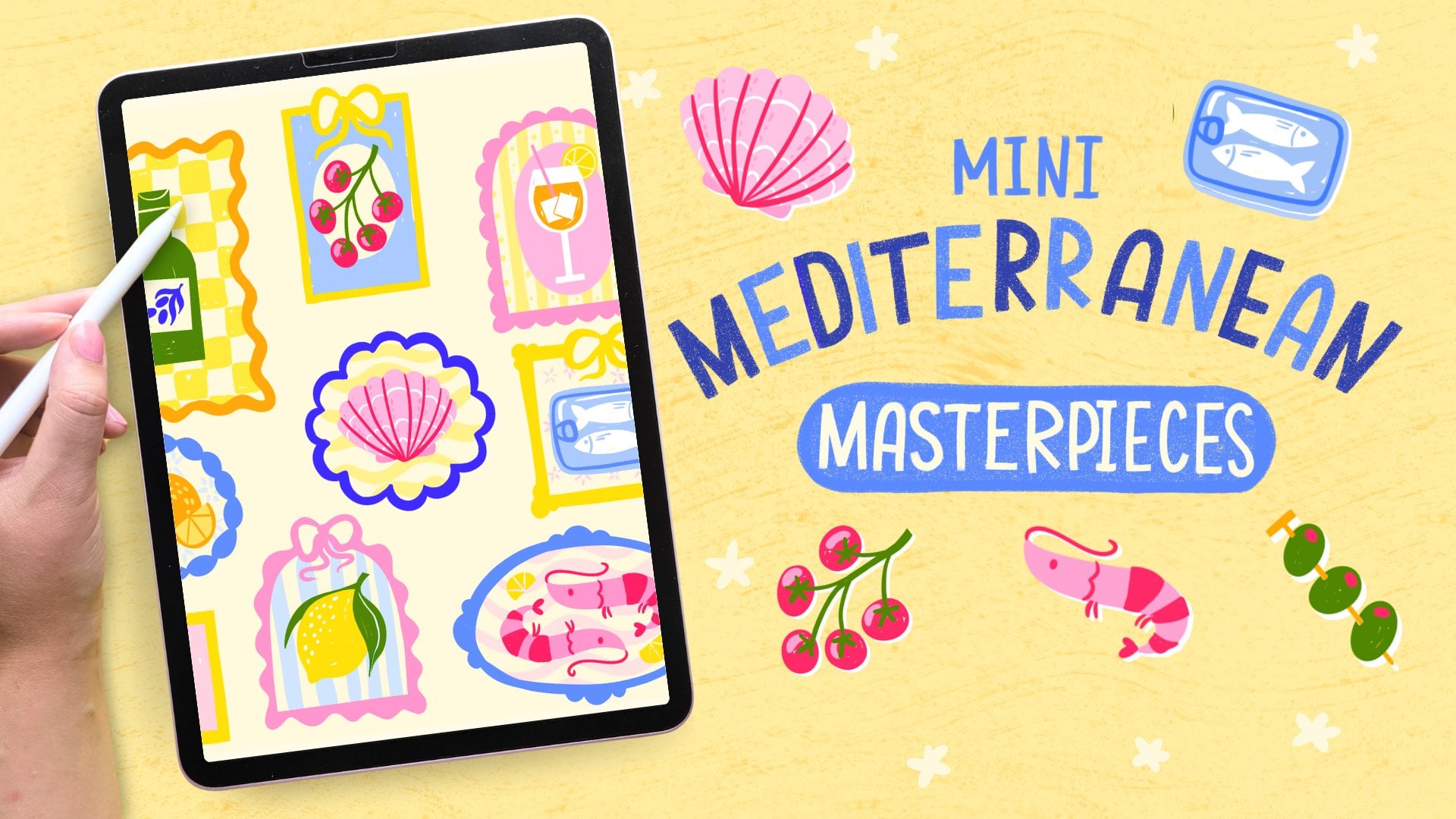
here on Skillshare. This live session grew out of my Mediterranean
masterpieces class. If you enjoy drawing
little motifs like this or you just want to continue the
Mediterranean theme, you might like that one too. If you enjoyed the
feel of this session, you're very welcome to join
us in the Sardine Club. We draw more than just
sardines, I promise, and it's free to join and the live sessions there are always free to attend as well. You can share the results from this class there too. We
would love to see it. Thanks again for joining me and I'll see you
in the next class.
 Claire Makes Things, Illustrator | Lettering Artist