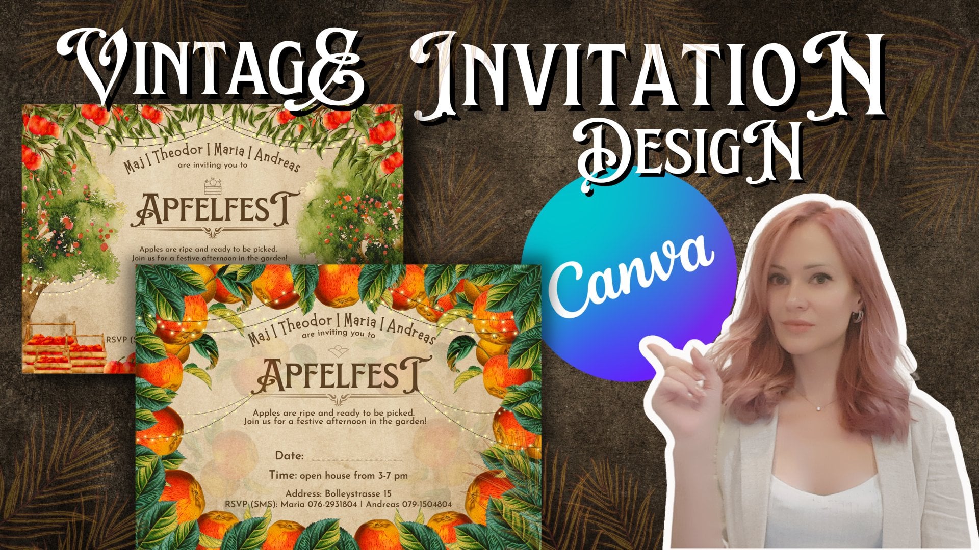
Transcripts
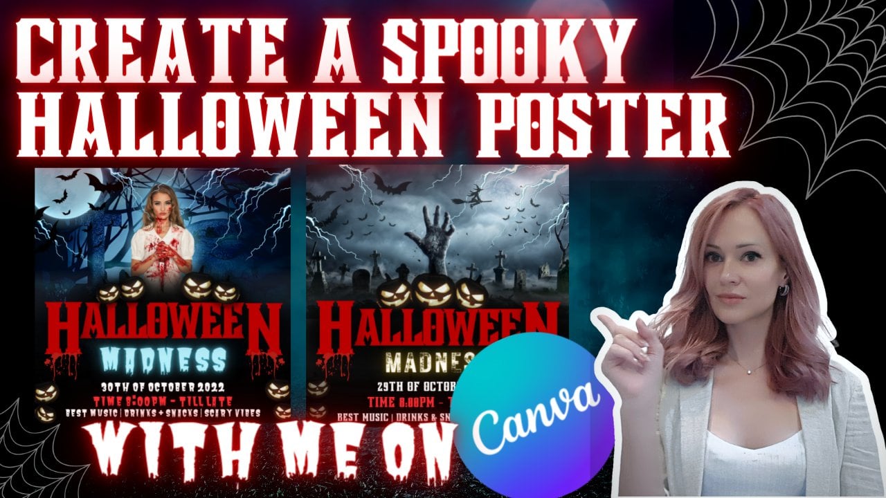
1. Introduction to class: So welcome to my class and
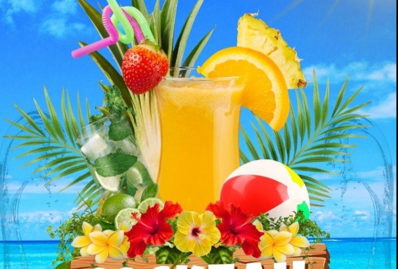
I'm going to show you how to create these tropical
pulled by the poster. And how to use all elements, shadows, and all the agents
that are used in this design. So we're going to create from
the beginning till the end. So stay with me till the end. And you will find all my
best tips by two grid. Best design in very easy way. So I'm going to show, you know, tips and tricks that has been recently added to groundwater
and how to use them. So stay with me till the end. And you will get all
this information.
2. 1 Choosing design size : If you already have an account, you should know how to login and all these things and
the period using Canva, you don't need to show
anymore how to create your account and then how to get in and start
doing your designs. So we are here at the main page. And before starting
your designs, for sure, you need to choose certain size or what
you're going to create. The design that I'm creating it or printouts usually that my clients are using
these certain design. It was requested to
be an A4 format. So over here is, you know, you can search for a
certain templates. This one just offers from
the carnival for you. Here. Other options of
different designs, the different templates you
can choose from the video, social media presentations,
whiteboards and so on, so on. So I'm starting by choosing
my blank design size. Of course, also
you can customize your design size as you wish. Here, I'm choosing custom size. You can choose your
design size by big cells, inches, millimeters,
and centimeters. So this one, we're not
going to do it now and it's the fastest way always to look for certain documents
that are placed here and the already has the
sizes down below. So even if you can match
your desired size. So as I said, we're starting
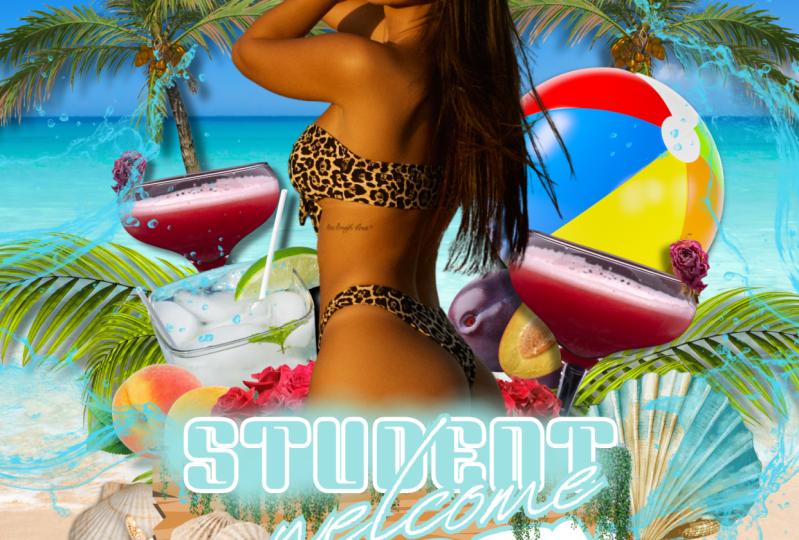
with A4 document size, pressing on it opening. And this will be our design. So over here, since we're
going to create full party, because I'm always naming
it and usually for whom? So just the Forster. And I'm starting
to slowly design. So we can point page. And what I will do, I will just add another page. And on this page I will insert my previous design so
it will be easier for you to see how we are
moving from what we're starting just
to double-check. So I have inserted my design
into the second page. So it will be easier
for you to follow up. See the changes. So what I'm starting
always on my blank page. Starting wrong. The background. Since design it's matching, has a lot of different layers. I'm always starting
from the main, from the back, the layers, and then putting on top. Because it's easier to
manage your elements. Um, otherwise they will be
hidden in the back end. You will have to drag
him the elements one by one just to move and
adjust other elements. So let's jump into another lesson where we
will start designing. And I think I would mean photos.
3. 2 Placing elements: So let's start from
the background. Background as you see. It's beach water. So we need to go over here
and search on the photos. Simply each. And I think you're seeing like just go on the water and set as
the background image. When you're jumping
out background. Because he attached
here two times, we can see all picture and move it around as you'd like
to adjust the focus. And from here, here you can see that color
is a bit different. We're going on edit
image like this. You can do short later on while designing and doing
the last touch ups. So we just increase the saturation a
bit more brightness to give that fresh look. So after playing
with some photos, started playing with Sam filters and adjust the brightness
and the contrast. We have our background. Now, what we need is these, all these over here, because in C, during the
time that they're further, further, further design
elements in our poster. So we will start that one's just looking for to use it again, you options and
placing code here. And as you can see, if you're looking as a photo
has some certain elements. You can see that they
are not real photos. Drawings. And for certain designs I
like to use real realistic. They look realistic, but
they are just the drawings. Well, this one is not. And it looks quite okay. But let's go with
our loved ones. The other ones, the same one
that we have in our design. So easiest way to find them, just go on elements and
then poor boundaries. And as I said, you will find a lot of drawings that are not realistic. So you just need to scroll to find the perfect
one for your this. This is the same
one that was using. So 3s chess, playing with and lemons and placing them around. You can always be some
later eyes can see there, add it a bit bigger. And let's see. The next thing. What we have over here, just cleaning up our
poster with the elements. So the next one that you
can see what here it deals. Now, let's find some cocktails. Cocktail e.g. these days, notice a lot of land, not realistic, just a drawings. So you just need
to scroll down and find something that's
bone match your design. So it was quite hard
to find it on 0. And the best way what
I'm doing, I'm going, if I'm looking for element
that it's realistic, I'm creating you
from the photos. So pure growing, choose from elements and
choose the portals. Then you will see all the photos or cocktails and you
can find it with the best suitable
color or background. You can cut it automatically. So let's look for a clock that it was used in
the whole design. I think it should be
somewhere over here. Sometimes takes time to
find the perfect photo or perfect design element
that suits you best. And I'm always
struggling with it here. So it's our cocktail
for those seats. Same cocktail that I
was using already here. You have your photon. And I'm choosing to cut
always the cocktails. Or I mean two
elements that I need with big difference of
the background, e.g. like this, you can see that there is different
colors and it will be easier to cut it
automatically. Here, e.g. also, the colors are
different from design and background blur so you
will get a good quality cut. So just placing on bottom
image and background remover. So here you already have your alignment and you can choose to apply.
Everything is good. So this is your amendments of the cocktail reduced
coordinates. And as you see this on
the coordinates bit more. So we're increasing saturation. One side on copying,
pasting, another side. Let's think a bit. Later on your rule. You
can just drag it more and they sit on the perfect
location as you prefer. The second one, you see palm. Palm leaves. Good against drawings,
not very realistic. Need to play around and
mine the idealistic one n. Recently what can introduce you and find all
these cuts options? Easier way. And it's not drawings like this. So you just need to go on your search and adjust your research by choosing
this new option, got out and the filters. So all realistic versions or that it was cut it from the pictures will
appear over here. And it will save
your time a lot. By just choosing elements. They are not Recorded. Can see, as you can see, I'm hearing inserted palm leaves and they're giving
me options though. Many kinds of grasses and other vegetables that it's
not close by, by families. But at least we have few
first options that are similar to our research
that we're looking for. This one poem leave another one. And we can choose our one. This one says it's
two different ones. I will not look for
totally the same. To waste your time and hope
it would be much faster. This one is a bit too
much transparent. So I'm going to
use palm leaf and just place it in a single letter location
heavily on our other design. And and we will live bit, turn it and just leave it there. Next we have what? Campbell lemons, I seen some sample items in some
online already here. So lime, greenery. The next one, he tours
or hear one more. And again, we're looking
through here using bytecodes, cut outs that will make
our life much easier. So we have our mosquito, which is quite similar to this. And everything just
seemed around. This market also explained.
4. 3 Other element tricks: So you can't be your
more heat or glass. It's a bit different
than this one. To keep with this less,
It's quite simple. But then our design, we can see that the monster
smaller and this one is a bit closer to the lemon problem. Just leave it for legislative. This one I'm meeting,
It's quite nice, but That's the same
what we're doing now, just cooking for thin elements. So the next one would
lemons, our bull. Bull. I think I was looking
at me like this. And you see that they're
giving in pink eye the balls. But on the bull. Hey, if we apply, it will be just the swimming pool ball. I'm going to choose to
throw its named properly. We can go on the photos and he's already here then we cut. I can just keep looking. So I ended up looking
for inflated beach ball. And it looks like our
research for giving more results and better results. This looks quite
similar like here. We can use that one. Save yours and my time. But as you see, it's not to grab items. Again, a drawing. Let's go on photos and
double check how it looks. And look for. When you're creating
your own design. Don't need to waste
so much time, Mike, I'm here trying to be
the same elements. You can use anything that
looks suitable for you. With the blue, I think
it will work required. Tensions as white background, it will be easier to remove it. Thinking in kink, hey, go door, inflated, beach ball. The filter. And you see this one is
more yellowish and sunny. And this looks a bit pale. So what I would do go chest adjust, saturation. It's okay for so you
can use this far. More adjustments. E.g. make it more warm. The clarity, giving
much difference for those moving campus at much smaller highlights. And HST this skill. But I think we needed more risk. That mutation and
make them model form this side and put the
woman just leave it as it is. Sometimes getting stuck. And instead of reducing one elements into
a single window, here back down to normal
size that you can see. So our ball, it's quiet. Okay. What other items we
have here is our Lady. And would this trying to find the perfect pit was
wasting a lot of time because the clients were asking for the certain model, certain design that
will match there. So for this time, we will be looking
from the photos. We need to cut it. Model would be on the beach with the swimming suit or
something similar. As you can see
that it's a lot of different options that
you could choose. But I needed certain
model, certain design. And as you see this
model over here, he has a big contrast compared
to all the colors around, so it looks really
nice and warm. You can use any kind
of lady that nine. Just cut the photo. Like me find ortho. So finally found the same lady. And as you can see, that is due always. We're moving our background
here with the face. I prefer not to use any other photos that are already cut because
that one's won't be quite popular already and not persons who have been
used at their designs. So I prepare to create
my site, my site. So our lady here, and you can see that it looks a bit different from
this because they did a lot of adjustments and different variations. So I will play with
the colors making and they will get you in a sec. So as you see, I gave here a bit match
the previous one. Here. This one looks more
better. Much better. So I gave her and
contrast more saturation. Look, more sunny, cloudy, more vibrant, a bit shadows,
and increase, right? I think it looks perfect. Using a belt. And placing here, I'm always trying to cut the
corners if it's possible, so it will be easier
to use other elements. So our lead II in place. And I think better than this. Let's continue with other
class and with other elements.
5. 4 placing text & effects : So the next items
that we're getting, our this wooden planks. So these wooden planks. And again, let's go elements. I think it's called like that. Not on the borders, but on the graphics. And you get this one, this one, and paste another one over here. Not to make it too similar, you can just reducing the
bit with different sizes. Different corners. Sells seashells. Again, just look for that thing. Something that you are
about to look for. Under graphics as
you're singing. It's drawings, most of them. And it's not what we're looking
for if we choose photos. The first few options you
can see there is cut out. And let's try to
see ketones only. There is more options over here. You can choose from here. This is the same
seashell over here. Just go ahead and place it. Increase or reduce the size. It has already quite nice. Shadowed. The next
one we have is the king until you find something that tire. Other idea I will
share with you. If you are looking
for something. Elements on photos can always press on top of here three dots. And you will find
more descriptions. Let's say this C shows a isolated the name
of this creation. This is target for
you that you can look for something different. And all the other keywords
that are attached over here. That's how you can find
them also. So e.g. if you're looking
for like this show, but it's not totally
what you need. Then you can try just different
keywords, star maybe. And then you will get
different options. And what I'm saying about
these filters that you can get ideas for your searches. Take these two. So we have two similar, but we can always
insert into better way. So you can place it here. And it looks, I think
even better than before. So now you have all
your text over here. So I will just
copy it from here. We can just copy your texts from anywhere that you have it. And when you're placing
your text straight away, just buy coffee tasting. It's placing your text in any one that it was used
already the last time. So you have one go ahead
with another ones. If you're copying as a text
and placing your design, it will go the same on. If you're going to place your
text without the copying, just typing, you just
need to go over here. And the textbox, simply type it here. When you hear one more
text box and just go ahead and just place it all the text on the design. And you see it looks
quite messy. So e.g. this part, font, luckiest guy. So let's just adjust the color. So, so color scheme. And since the font
and creating a bit, and I think it's not very clear, so you can make it a bit bigger. You can always play
with your keyboard. You just press it
and move it up. On the coordinate
axes you prefer. Just by you pixels. It's easier to
adjust the design. And if you want to
position it properly, just need to press center. That's all it again, center. So in the middle and what
you'd like to design, he placed according
to the poster lines. So he kept, and this part, student, they'll come and party. Let's just increase
a bit. All of them. And this side in this Word font was also like yes guys, so let's go and make it white. And the color was white, light blue, and white. So we're going on
this text element. Choosing our design name, our, sorry about our
font, name it here. Increasing the size
according to our wood. Then to make these fx and go on, affect the shadows
and choose, e.g. the brown creates
transparency because it will give rewards more dramatic look and look more professional. And you see this also. The wordings are
required sprint, so we need to adjust that. This one looks quite squeeze. Let's finish this part. To make the words wider. Go on spacing and the spacing and make
them a bit wider. Quiet. Okay, just
double-check in the center. Blank my P naught in the center here. Then save your time. Just press on the
element copy style and plays this roller on any one. Good 21. And it will
be totally everything. Will copy your ethics, your spacing, and your shadows, and the font color, everything. What was used on this copy to your letter element? So this.com was use briefing. Go find VO calm and polite hour. And you see that all leather, since it was big, it looks quite messy. We can make it by using
uppercase, lowercase. It will change it. Then color was quite low. Let's do it this blue. And the shadow was
lack of visibility. Just all these shadows. They're always working as attracting and lemons increasing visibility of this
certain elements. So now we have these letters and also just use design. This one's also chest using
by positioning center everything in the
proper places by idea. And that's what happens when you have some layer is behind, you cannot reach and
you need to move it. So this part a bit
annoying when you working. So always in the center and can here do you see that is two lines. And there is certain to take in the camp and just press it l letter on your keyboard
and your line will appear.
6. 5 Last elements: So as I said in the
previous lesson, this is the line. You just need to press L on your keyboard and it
will appears right away. And you see our lines over
here are a bit more thin. Oh, we just increase it. Go on this part. Let's line style line weight, reduced to four, I think so. We'll change the
color into black. Make it a bit longer to match your workings that
you want to cover. And just press thing
and on the same line, P style and respond to light. The same adjustments
will be applied to one. So we have our lines and let's double-check the
smaller than these ones. This one was used three features to reduce them up to three. Here, DR. now, what is missing? These flowers here
and green leaves. And Karen, we're going
on our elements side. And type being green leaks and sends was applied. Our goods cutouts. Be just choose something like I think it looks quite okay that one that
we have before, it's a bit bigger. But this is quite nice
because it's covered in gold. So this would then
be written nicely, but I prepared them
a bit more darker. So instead of, we will
reduce a bit brightness. Maybe increase the contrast. A bit more a situation. Okay, I can put the
Marissa Trish contrast maybe or just go buy adjustments again to
make it more different. I think this one
would suit already. Looks quite okay. Just move it a bit to make
more traumatic and send it backwards behind our text. Actually, I would prefer
to put a bit on the text. But let's leave it
for now as it does. Now, it's missing
some more flowers. And red ones. I think it's called Chinese Chinese Heroes. And again, we can
check the graphics. This is our Chinese zeros.
7. 6 Last element adjustments: So welcome to our last lesson
or this certain design. And I will make it a bit faster. So what we need to do
comparing to this design, you see that it looks, all these elements
looks very tidy and in their proper positions. And this one is
still a bit messy. So from now on I
will make it a bit faster moving these elements. So just stay with me. All right.
8. 7 Canva tip #1 video background remove: In this following lessons, I'm going to show you
the latest updates and tips and tricks that will meet your
designing life much easier. So the first one
that I'm showing you it as you move video background. So basically it's
working the same as as they remove
photo backgrounds. So what we can do, just need to upload your video or you can find it from here. Just from the videos. And select any kind of video. It shouldn't be
longer than 1 min. And just go on the
top edit video. And you will find this
option background remover. So he pressed from an IT and sometimes it's
working quite fast. It takes a bit of time. And you can view the video
with the removed background. And you just need
to send the videos. The background is white and there is no
other elements in front to make it work better. E.g. it's really nice when
you're creating your course or doing some different works. So now you can see that maybe this background over
here also as the video moving. And you can play
with the background. Like different photos, even
different backgrounds. Quiet, nice, even the placing, some elements that are moving like this one. And you just need to know
that since it's better, stage it. Be that perfect. But it's still working quite
nicely with some different, some better quality videos. And with the bedrooms
that are not so messy. Just to show you, I
select my old video. I just selected
one of my videos. And this is just example
with looks like. And as you can see, you can remove the background, other elements and some other backgrounds
and other moving, moving elements around and play with it. And then just to
double-check old video, the corner and look just to
check how it looks like. And you can see that background removed quite nicely and all
other elements is moving. These ones. You can make also movable. And to create basically totally new video chest with
your face or any video. So let's jump to other updates.
9. 8 Canva tip #2 pdf updates: So another exciting update
that kinda made PDF updates. And basically before they
had also the same option, but now they made
it more accurate. So what you should do, you just go on the
main page and on the right side here you can see the Cloud and you
press the Cloud upload. And you can select certain PDF file, e.g. this one. And it will be
generated as a new file. Has anyone design over here? Takes a bit of time until it's
uploading in the reading. So it takes a little bit
of time until Canva magic. So here we have our PDF. When you press on the file. All these for text and pictures. He will be generated in the
way that it will be movable. So basically, still not all of them
properly working, but you can see that you
can adjust main items, backgrounds, and other elements that it's in your
designer, just the text. Again and make it
on your own way. They used to have before
beta version of PDF files, editable files, they were
not so accurate sometimes. And this one looks
much, much better. They improved a lot with it. So here you can, you can do, you can
move each element, as I said, the word, the, change the font. And again, I'll saving or here, we can download it
as PNG, as PDF, again, as video,
any, any you prefer. And even the elements which are generated
by uploading PDFs. Not always can waste
giving option to change the option to change the
colors of each element. But with this PDF,
now, easy peasy, change the color of elements
which are in your PDF. And one more thing, and that it was not provided
but by gamma before. From one certain design, you can just simply go
on the grid, select e.g. this design from other file. I'm just select on the certain
design that you prefer. Copied and simply paste it into other into
your PDF design. Simply pressing. Copy paste. This
simple, elegant. And it makes me a little life and video because I'm
much, much easier. So let's jump now to listen.
10. 9 Canva tip #3 website builder: So the other new features
that I'm going to discuss, this Canvas site, and you
can create your own website. You just simply losing
you to kind of bump. And the official launch of the pool kind of
episodes, episodes feature. We can now turn our
PDF documents and our, our presentations into
simple responsive websites. And their responsiveness,
it looks like it seems that theory has
been improved recently. And we're getting
device previews now. So we previously had no
options with our own domains. But now, as you can see here, when you press,
publish a website, you can find you can chase Fourier domain, publish to convert domain
purchased new domain, or use your existing domain. That's put an example. Like this. You can
publish your site. Although the simple
Canva websites, they cannot represent
your brand well online, but I think it's a new update is Destic Board of Ed aid
of simple applications. And the biggest. And the best point
is that you don't need any coding skills. This and you can preview
already here your design, how it will look on the phone, how it will be
presented itself on the ones here you can adjust the pages, as you just said, also, there is a lot of templates
and that's when you can use and customize according
to your desired colors. Layouts. Simply work it
out as interest for you. And of course, no
website would give you a good overview of
your visitors if didn't provide you
with an analytics. So convert took
care of that too. So we're getting access
to website insights, which can help you
track views, clicks, and engagements
on your new page.
11. 10 Canva tip #4 text to image feature: Also the new feature that can watch us recently implemented. It sticks to image
and text to image. And it's not text-to-speech
or any simpler combination. We already know and use before. But with this new future, with the Canva editor, you can generate new ideas
just from your head, simply from your descriptions. So you just need to go on
the left side and find EPS. Over here. You can find option text to
image and press over here. And e.g. just type anything
that you can imagine. Let's say red rose in Gideon. And over here, down, you can choose your style. So it can be a
photo or a drawing, or 3D Painting, pattern
or concept art. So let's try concept. And let's see what it
will generate for us. And it takes a bit of time. Because it's basically AI generating from different
information from the Internet. What they have, what they
can find and combining different picture seem to one. It looks quite nice. As you can see. Can start again. You still have your
selection and more example. Let's do better. And to generate image again. And it really helps
with all your designs. Within few seconds. Sounds pretty cool. If you need some
creative pattern, you can have it to
rehear like this. You can play with
the different ones. Let's try this one to see
what they will provide. So since this feature is
it's brand new and still, still very much in
a bit the stage. But just like the video, I do expect that
it will get much better where the
time and improve it. Basically, these pictures
be totally unique. And you can create with your
wordings totally unique images that may surpass the need for a stock
image in the future. And also, it's also a great way to start
your own imagination and help you come up with new
ideas for your own designs. And I'm really curious where Canva will bring
this in the future. Let's make something new. Again. I'm e.g. they're giving you inspiration. So also like that I didn't go into buy through a city
with a depth of field. So longer the description, the better you can. They can create certain image. Let's see what it will
generate with the riding a bike fluidity
with the depth of field. You can see it's quiet, nice. One finds anyone. This picture is
because here generated by AI and not taking by any, any creators. Let's try with the Panda and photo what it will look like. I'm just curious to see. As you can see, it
looks really think. And even getting these ideas. Different panda, panda. Even with these words. By describing here part of the magical forest
city in the future. Generate a photo
where it's coast. Besides kind of way,
there is a lot of new features that we're working with, the
artificial intelligence. They can generate simple
pictures similar to these, but many of them. And they're not so clear. Like feature. It looks really good
quality and amazing. Then you know that it's not
doesn't belong to anyone. Use it as your own
design. This is amazing. Feature. Quality's
pretty amazing. I love to see where can
we will go with this. Okay, so let's go with more updates into
our next lessons.
12. 11 Canva tip #5 quick create: So one more great feature
that I implemented recently, it gouache create. So if you are on
multiple platforms, you'll note that his card to create boards for each other. And again, each of them, you need to adjust it. Size. Same why? Because each element that should be placed in the proper place. And I'm sure you can design also each one
designed one-by-one, and then use the resize button, but it's only for pro users. Also, the downside is that you have to do a lot of each time and adjust your
design accordingly. So it will look like this. The symbol letter looks
and it will look good. And your elements
will be placed in the right places also. So if you are creating
posts for Instagram, for before the Pinterest, for Twitter and Facebook. At the same time. We'll spend a lot of
time for each of it. So what can we
implemented recently? Hidden and the moment? Just need to go on the homepage. You'll see where I am now. Then go on social media. When you press social
media or hear, you can see the option of
Quick Create collection. So you just press on it and it will open the
window where you can select for which social media you will be
creating designs. So let's say Instagram, basic ones, Facebook,
LinkedIn, and Twitter. And just an option. Then let's continue. Just place your text. Something. Additional texts. Correct the mistakes because
I'm always making them. Let's see, image, logo. We'll get into a
little help you. It will give you the
option to choose from your liters uploads. And the what you have
created recently. Just choose any water and
the woman just show you. Then you can choose
the templates. The downside of this
is that you are providing templates that are already there and you cannot
customize them a lot. So with the time, I hope this will prove,
because it still is. And you see, you can see
even more certain elements. You can upload the pictures. It's automatically
adjusting the fonts to use different image
pellets, different colors. Then press finishing,
finding the right folder. While thinking. And hear your the basic ones. And then one-by-one. You can adjust them
on your own way. It makes for much faster and don't need to go
and adjust it manually. And then on top of each one you can create more easy peasy.
13. 12 Canva tip #6 draw with Canva: So the other trick that I'm going to share with you today, it's allowing to draw
freely on Canvas. So e.g. just a new page. Having new page, then you
need to go over here. The corner select More option. Option. You can
select from below. Then for marker, glowing
pen highlighter. And you can adjust the size and transparency and the color
of what you're drawing. So let's e.g. select
pinkish transparency and go with the glow pen. And you can draw it really. You just need to
press Done and shove your transparent
file that you can Jules on your designs
anywhere, do you like? Then after you can
edit your image, the different adjustments and
the shadows increase more glowing and just play with it. And since it's a new feature, it's still not available
on the phone's app. Only when you're using
on the computer.
14. 13 Canva tip #7 create tables : So the other feature that also was created
recently gone along while I'm speaking on delete this one's E tables and
everyone was drawing them. They know that it was
so uncomfortable. Place all deadlines
to create the table. To do it. Just go, go on the search. When you press search, all these features appear. And here it is, feature tables to press
on the tables and all the tables over
here to suppress it. Simply dragging from the corner, you can see that it's moving
according to one window. Totally all applicable more. And you can squeeze as you like. If you go over here. To select weird right click. You can see all these features. My size column to
connect more row, column Brian had a row after. You can add as much as you
want and add to row before. So it will be added over on
the top where you select it. Then you can add
the column before. You can see that
increasing for the line. So it's less, it's
already here. Plus here. You will add one more that
side or on this side. And these dots also you
can select where to place. Then you can merge the cells
also on one line and go back and select these two. And merge cells. Again. It's quite good feature. And this makes your life much
easier than it was before. The eNBs lines you
can drag it for. So here you have
different options to. Here you can select
the color changing. Then over here you can
select the borders. E.g. leave it doubt corners. Over here. You can
able spacings, dividing the cell spacing
so small and so on. So it makes your
life much easier. Unmatched cells. And again, we've seen Go back at this. You can change the
colors of each window. As you prepare one-by-one. Apply different effects. Even type inside the amazing
feature. Love it so much.
15. 14 Canva tip #1 photo adjustment tricks: So the last step that
I'm going to share, or even few of them, actually, it's related
with the photos. So Conoco has a lot of new features that
related photo editing. And if you're working your product sample
on the thumbnails for some basic photo adjustments that you need in your design. It, it became quite great. One that I can show you. Excuse me, to go on
image, that image. And the adjustments that
you have over here. It's already going on. If you haven't been working with Canada, was here a long time. Just for you who doesn't know. You can adjust the
colors from here. And when you're
opening the image, there is three basic adjustments and two filters over here. But if you need a wider
selection of adjustments, you can go on to adjust
and it's already here. You can select the Tinto. I'm portal saturation. Basically create
your own filter. So the next thing that
I want to show you, it's called face it, it just needs to
go on the back of editing Mitch Page or
just simply be to here. And you will find
it to use it and it will be automatically
applied to your fourth term. So the other thing
that you can do, also, what is quite new
with the carnival? It's paint effects. It's already here. So you can select any different kinds of paint effect and apply to your portal that will
look like a painting. So this is how it looks like. Just went up examples. You can press it on it and then adjust the sensitivity between
the photo and the filter. And you can just play around
with the different ones. So you can try any other one. We can just cancel this. And again, you can find
which one you prefer most. Like e.g. this one, again, you can go here and
uncheck it then intensity. And to make your
photos more playful. So this middle to cancel. Now, the other option that
I wanted to show you, if you're working with
thumbnails and similar designs, you can go on
background remover. It takes a bit of time. So you have your photo
without the background. And as I mentioned before, with some elements, we can raise it or restore
it some certain areas. This looks great,
okay, I will apply it. And next what you can do, group can apply shadows
to make it more dramatic. This one can apply for
any element. Also. So since the shadows
usually it's black, can go to here and
adjust the colors. And you will be able
to see the shadows. You can play with the offsets. Here you can choose from which
side the shadow should go. In this case, we
can go back leg. And again, there is any
many different options. The best that I prefer. I'm usually using for my own thumbnails is
the global option. Which allows you to make actually very nice outline around your photo and
make it more dramatic. So as you see there
is a white glow and the moment will choose
some different colors, so look more playful. And you can digest these colors according to your
designs, of course. So we have a glow. And to create an outline. I'm old, waste increasing
the same size. Then the reducing transparency
and deducing the bird. And here you have your outline. This, it's not so clear. You going totally, totally back with transparency, it won't be visible at all. So the best is to use to
live transparency grid. If you go with the blur, you will get still
thinking, give it. You will get very clear
line around your design. So you will get very clear line. And you can see this outline. Look great on your thumbnails. And you can apply it for
any other elements. Also.
16. Summary & Thank you: So, thank you so much
for joining my course, and I hope you enjoyed it. And you've got some
useful information. And don't forget to. Hello Me and you will get noticed when I will upload
new courses in which I'm going to speak more about
these thumbnails creations, also about each of
these design creations. And I will show you how to
create them from scratch. Any of these ones. Also, somewhat this also I'll be showing you in
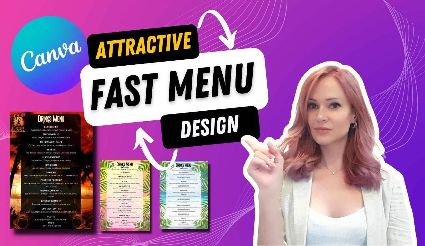
my lessons how to create engaging Menu Designs for your
business or your clients. And using just only Canada. I will be showing you how to create from scratch
the brand book. How to create different
fonts on Canva. The like these that you see
here, the playful once. And how to arrange them, how to find them, and to use on your on your business pages they
print on demand when your t-shirts, and so on, so on. Also, I will include the
classes in my account where you can create wedding invitations, birthday invitations, and you kind of invitations like these ones
accuracy already here. I will guide you from the
beginning till the end. How to create a certain design. And if you have any
questions or desire, designs that you would
like to know about, that you would like to learn. Just let me know in
the comments below. And I will be happy to
create them for you. Thank you, and I hope we see
you in the next courses.
 Diemante, Hospitality Expert, Digital Designer