Transcripts
1. Trailer: Hello, and welcome to my studio. I'm Alice Young, a graphic designer and calligrapher, coming to you from Vancouver Island, British Columbia, Canada. In this second class of the strong lines series, I focus on two key areas that beginning calligraphers are always very curious about, color and pen techniques. In the process of exploring this, we'll create an ornamental or floral motif. In the next class, we'll apply these same techniques to Gothic letter forms. But first, we're going to play with color while learning a variety of sophisticated calligraphic strokes. Much of what I'm sharing with you in this class can be considered advanced techniques. They are not necessarily easy for beginners, so it really is an intermediate or advanced class. However, I wanted to offer it early on in the series because it answers common questions, and will be an ongoing resource for colored inks and pen manipulation. Beginners will still benefit from participation, and the final project can consist of very simple strokes. This class is packed with tips, techniques, and demonstrations to answer your questions, challenge you, and guide you forward, whatever your level of calligraphy. My focus is on the pilot parallel pen, but much of the information, and especially the lessons regarding ink, will apply to other calligraphy pens as well. We'll start by building on the basic pen strokes that we learned in strong lines class 1. Then I'll show you my favorite color technique, and we'll look at working with various inks, including white and gold. Then we'll bring all that together in our class project. We're going to break a few rules along the way. We are going to get decorative, and we are going to get some ink on our fingers. I invite you to join me in this colorful class.
2. Your Project: The strokes we are learning in this class have all developed within the context of calligraphy, but they are a natural fit for creating florals and decorative or ornamental designs. Once you get a feel for a certain stroke, creating repetitive patterns like a floral or a mandala, can be the best way to retain the movement in your muscle memory. It can also be a relaxing, meditative, creative process, and you'll end up with your own unique design which can be used to brighten and personalize anything you choose. In Strong Lines class 1, we went through the process of selecting reference material and working with translucent papers to refine our designs. The same process applies in this class. The demonstrations in this class were designed to show a wide variety of approaches and styles you may want to consider, and, of course, you'll bring your own creative touch to it. Living in the Pacific Northwest, I'm surrounded by firms and you'll see that reflected in this class. What surrounds you that lends itself to these strokes? Your class project is to create your own organic ornament using the pilot parallel pen and at least two strokes we learn in class, and share it here on Skillshare. In the exercises and guides PDF, you'll find some basic guidelines that you can build on. Use your own culmination of strokes to create and embellish your design. Your choice of ink and colors are up to you. But this class is a great place to play with color like you did as a kid. Decoration is a bit like dancing. It is an expression of human joy and like dancing it is discouraged in many social situations. Many formal designers and calligraphers discourage decoration often with good reason as their goal is clear and practical communication. However, in this class we're isolating and exploring decorative strokes, and I'm inviting you to decorate for the sheer fun of it. So let your pen dance, and please share your results in our class.
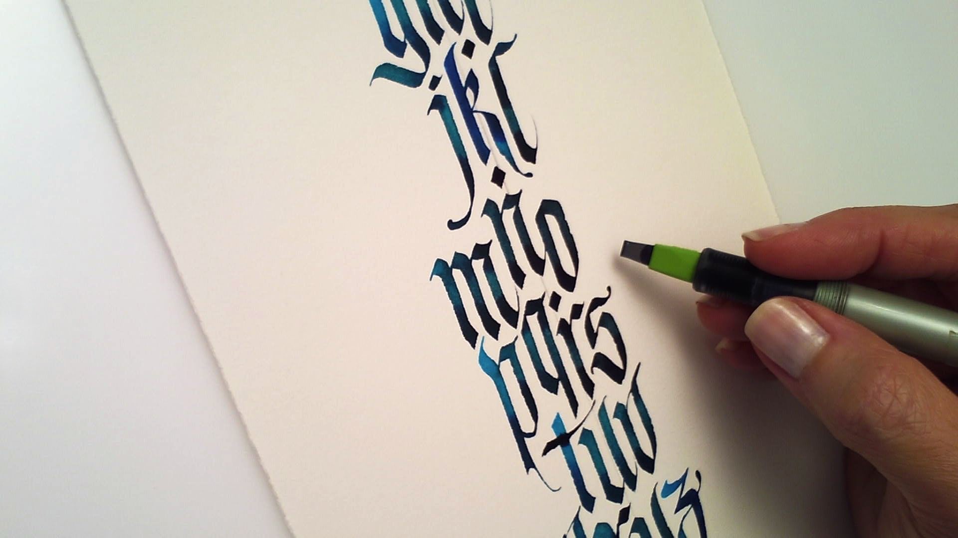
3. Introduction to Pen Manipulation: Hey, everyone. Thanks so much for joining me. In this unit, we'll be building on the exercises we did in class 1 and taking them up a notch. These techniques are commonly called pen manipulation. In strong lines class 1, the nibble of the pen stayed flat on the page with even pressure across the width of the nib as we worked. If you've done the exercises or have some experience with the pilot parallel pen, you will have started or perhaps mastered developing a rhythm to your strokes. You'll want to have a good degree of comfort with that before moving to this class, feel free to go back and brush up on the exercises in class 1 if you need to. Once you have a steady basic down stroke, think of it as your home base. You'll always return to it to establish stability and rhythm and leave it occasionally to have some fun. Pen manipulation is the deliberate twisting and rotation of the nib, resulting in more dynamic, lively strokes. Often, it involves rotating the nib off the left or right corner, but it is done mid-stroke and the pen keeps moving as you make the rotation. If you remember in class 1, I emphasized having the motion of the stroke come from your shoulder. Doing that frees your wrist and hand to make these new movements that we're adding in. These movements normally develop naturally as a calligrapher advances and adds speed to their writing. I'm taking the unusual approach of presenting them early in the lessons, breaking them down, and demonstrating them slowly so that you can incorporate them into your practice. In a way, I'm throwing you into the deep end, so don't be surprised if this doesn't come easily. I encourage you to cross-train, do some basic rhythmic exercises from class 1 and then throw in some of these more challenging manipulations, and go back and forth because ultimately, you want to be able to do both. If you haven't done so, please print the class notes and exercises and guides. As in class 1, I've set the exercises and guides up as both a light version which you can print on premium inkjet paper and work directly on and a darker version which you can use with translucent marker paper. Just before we start, a quick word about the calligraphic line. Calligraphy has such strong emotional impact because we instinctively read the energy behind each line. We subconsciously sense the energy of the lines creator. Weak lines will express exactly that, weakness and vulnerability, perhaps a sense of childlike play which can be charming and appropriate for some applications. Given the title of this class, strong lines, you'll probably be guessing we are focusing on, well, strong lines, but strength isn't brutish, not at all. Delicate lines can be incredibly strong. As you work through these exercises and make lines, consider the energy that you put into the stroke and how that will communicate to the viewer. Because we are working with organic shapes in this class, imagine giving your strokes a sense of aliveness and allowing the strokes to grow out of each other. You can also play with other energies. If you're having a bad day, feel free to take your pen and do a little calligraphic venting. That's outside the scope of this class, but I'll bet you felt a shift in your energy right there when I changed mine. That is the power of the line.
4. Pen Manipulations 1: Welcome to the exercises. We're going to build on the basic pen strokes we learned in strong lines, class 1, but because these movements are little more involved, I'll demonstrate each one of them here. I've printed the guides for class 2, exercise 1 on premium ink jet paper. I'm using black cohosh in my pen, but you can use any ink you have loaded up. Because my pen is dry, it takes a moment to get running again. A dip in water, a couple of shakes, and some small mark-making will help to re-establish your ink flow. Let's do an easy warm up by using our nib at a 45 degree angle and just creating some small diamonds moving down the left side of the page. Next, you'll pick your pen up, and with the right corner of the nib, return to your stroke and pulled the ink down to form a small natural-looking tail, like a comma. You can also pull the stroke to the left to form what I call an inverted comma. It's important to go back into your first stroke so the tail pulls out naturally, it shouldn't look like it was attached later, rather it should appear to grow out of the first stroke. Watch your ink, look for the slight pool of wet ink still in your first stroke and use that to pull out the tail. By doing this, you're ensuring your pen has plenty of ink available for the thin stroke. You literally help it out by dipping into the pool of wet ink in the diamond shape and pulling from there. For the second row, do the same motions, but keep your pen on the page as long as you can, so it becomes a back-and-forth rocking motion as you move from using the nib flat to using the nib on the right or left corner. Take a deep breath and try to relax. As you move down the page, you'll need to stop at some point but just move your page and carry on. Try to relax into this movement, keeping somewhere close to that center line, but just moving easily from the right corner to the center, to the left corner. For the third line, carry on with the same motion, but using your thumb and forefinger, twists the pen as you go. You'll get irregular shapes, that's no problem, but we're just getting a feel for moving down the page. The downward motion comes from the shoulder, our wrists are being used to twist and pull, and finally, our fingers are rotating the pen. In order for all this to work, don't lock your elbow or try to rest your hand heavily on your writing surface. We're just trying to get a feel for all the muscles we will be using in pen manipulation. Moving onto the straight lines, start with a flat pen angle and pulls straight down to approximately where the dotted line is and then put more pressure on the right side of your nib, tipping the left corner up ever so slightly as you continue the downward motion. Straight down and tip. Straight down and tip. Then carry on with the curves down and tip to your right, down and tip to your right. Notice the variation in the ragged edges that are created, more abrupt versus more gradual. Carry on through the curves. On the second row, we'll start with a 40 degree pen angle, which we lock in for the top part of the stroke, but this time near the dotted line, tip to the left, raising the right corner of the nib ever so slightly and gradually increase your pen angle, ending the stroke at approximately a 90-degree pen angle, so there's a little twist in there. You might find it easier to think about ending on a point. Over-analyzing pen angles can be a little bit confusing. Repeat this through the curves. Down and tip to the left. Down and tip to the left. Our next exercises are building on an exercise we did in class one. Let's revisit that in the first row. You'll remember we establish our pen angle on the thin edge, then we do a stroke for the top ending on a thin edge, a stroke for the bottom joining on the thin, and a final line ending done with the tip of your nib. You can use the right or left corner or both on that final stroke, whichever feels most natural to you. You can see on this one, I use both. Do the full row to remind your muscles how this all works. On the next row, well, you guessed it, we'll put more weight on the right side of the nib, lifting the left corner slightly off the page. We'll make that transition somewhere around the two o'clock point of the circle. Since we're on the nib already, simply complete the spiral in one stroke. We can finish off the stroke with a little tear drop shaped line ending. In the next row, do the same motion but shift the weight to the left side of your nib, lifting the right corner just to touch, and you'll be creating a classic calligraphy flourish that you'll probably recognize. Moving on to the next set of spirals, start with a flat pen angle at the top and take your stroke to the left, shifting your weight to the right somewhere around the eight o'clock point, and then finishing off the stroke with the point of your nib. For the final row, do the same movement but shift your weight to the left at that same eight o'clock point and carry through the stroke. Don't hesitate to go back and smooth out any lines you like. We're just practicing here and on fairly rough paper, but it's good to practice retouching too, because refining your work is a part of most important projects.
5. Pen Manipulations 2: Let's carry on with exercise 2. We'll start with a 50 degree pen angle and revisit the simple S-curve we did in class 1, keeping the whole nib surface on the paper. What works best here is to start with your guideline at the center of your pen nib and end the stroke with the left corner of your nib on the guideline. It's an easy movement; center of stroke, down, and bottom. Just getting your hand warmed up a little bit here. Just do that until the break at the center of the page. For the second half of the line, we'll do the same stroke, but this time I'm going to rotate the nib off the left corner. I'm exaggerating here, but lifting up on the right to end on the left corner. The motion here is a solid start, then a shift to the left, a lift on the right, and a rotation of the pen angle. Do that a few times and then add a little flick at the end. By flick, I mean a quick lift off at the end of the stroke. In this second row, we're repeating what we did in exercise 1, but instead of the little teardrop line ending which I've done on the first one, on consecutive spirals give a little flick at the end of the spiral for a more active ending. Try not to end abruptly, but continue your stroke in the air after you lift off. In the next row, we're revisiting a movement from class 1; a simple arc up to the right and pull back to the left. Do six of those to get used to the motion, then for the rest of the row, lengthen the top of the stroke. You can also play around with the angle at the right, sometimes going deep into the top-right corner and sometimes making it a more gradual, graceful curve. This is still warming us up for the next exercise. Now, repeat the same motion, but as you curve and begin to pull your pen back to the left, add weight to the left corner of your pen and lift off on the right, creating a natural swash shape. I'm slowing it down here and really exaggerating the movement, and I'm hoping you can see exactly how the pen is moving. It's a pull back, and a tip to the right. Pull back, tip to the right. Pull back, tip to the right. This is such a fun stroke to do. In the next row, we'll do the same thing. Just making the arc up to the swash longer. Touch your pen to water at this point if it feels dry or resistant on that long upstroke. It just needs to have lots of ink flowing to create that longer line. Play around with the ending a little bit. It can be a little more subtle and rounded, or it can be a little more pointed. Choose which you prefer and then try to keep it consistent. It is in those details that your work will become recognizable. Onto the elliptic shape. This is similar to the chain shape we did in class 1. Establish your pen angle at the top-left and pull down without changing the pen angle to a wide base. Then tip your pen to the left and push it up to finish the stroke with the left corner of the nib. Repeat that, changing your pen angle to match my shapes. Do that a few times, and when you feel ready, put that together in one motion. You can do this at a steady pace or you can try a slow, steady down-stroke and a faster upstroke. Wow. We are on the last exercise. Did you ever think you'd get here? We're going to start easily here with a basic S-curve, but on each line we're extending our strokes, and with more length, the strokes get more challenging. You may find it helps to stand up for this exercise, especially for that last long stroke. Again, doing that opens your body and allows your shoulder an easy range of motion. Another tip is to angle the paper so you are pulling the stroke towards the center of your body, and I like to give my pen a quick dip in water before the long stroke, which helps the pen glide more easily. Finish out the page with your own swashes. Just let go. Add curves if you like, but just let them rip. You deserve it. Let some ink splash. Have a good time. Relax into this. Great job.
6. Speed: This third exercise is optional, but highly recommended. Decide if you're ready for it and consider trying it even if you're not. If you have some degree of comfort with the exercises we've just done, I invite you to revisit them and add speed. Adding speed involves risk, of course, because your form can fall completely apart. If that happens, just be aware it's happening. Notice where it happens. Speed can also smooth out your strokes, decrease your wobble and give energy to your work. Notice where that happens too, notice how it feels. Add speed judiciously. Not every stroke needs to be fast. Important tip here is that speed should vary through out your forms. Often, a calligrapher gets very grounded, very quiet in the first part of the stroke and then releases that energy and dashes off a powerful line ending or flourish. There are two different energies involved: focus and release; or you could say discipline and freedom. To facilitate speed, use the smoothest paper you can. Canson Pro Layout marker paper works great. Use a fast flowing ink. Here's where you can use some of your Pilot mixable color. Then go back and practice what we did while adding speed. Take the s form at the top of exercise 2, speed it up and lengthen your stroke. This is such a fun and elegant stroke. It really helps to load up your pen with ink before making these strokes. Before a long stroke, it may help to touch the tip of your pen to water. Don't dip it. That's a little bit too much water, just touch it to water. Practice this with guides and without guides. Speed added to unstable lines will do nothing for them. So again, cross train by going back to strong verticals and horizontals and then add speed as you can backing off when your work becomes too messy, you are looking for that balance between control and freedom, where magic happens. If you are struggling with the stroke, don't abandon it. Instead, make a pattern with it, make friends with it. That's the best way to conquer it. Then don't be surprised to see your class project develop out of that one problematic stroke. Please share with the class and show us your progress.
7. Ink Overview: In this unit, we are going to focus on the various ink options for the pilot parallel pen. As mentioned, we are going to break a few rules, and the first one is the advice found on the printed insert that comes with the pen, which says to use only pilot mixable color and advises not to reuse your cartridges. I'm sure we all understand why the manufacturer would say this. But in reality, using only their inks, will seriously limit what you are able to do with their pens. The truth is that you can use many inks with great success in this pen. The trick is to treat them differently according to their various properties. I have created a chart to give an overview of the inks that I use most often. If you haven't done so already, please print the class notes found as an attachment in your class project's Window and you'll see the ink overview chart is on page 2. I've broken the inks into four main categories. There's the inks that I consider carefree, those that I use with care, those that I use with extreme caution, and a few common inks that should be avoided. In the following videos, we'll take a closer look at how to work within each of these categories, and I'll share my tips for working with them. You may have a bottle of ink you don't see listed on my chart, and your question is, can I use this ink? There is risk in breaking any rule and this is no exception. You'll want to proceed with caution. Here's a few suggestions to help you assess how appropriate your ink is, and where it might fall on my chart. First, open your ink and take a good look around the edge of the container. Is there a lot of dry crusty ink? Keep in mind that if it dry solidly in your container, it may well do the same in your pen. But some ink also reconstitutes easily, in which case the ink may be fine. I suggest using a cotton swab to get the driest crystal bits from the bottle opening. Testing water, does it create chunks or sediment or granular bits that won't dissolve or does it dissolve completely? If the water is free of particulate in under 30 seconds, it's a good indicator that the ink may work well. If there are small chunks of ink, well, you can imagine how that might impede ink flow in your pen. In this case, I would use the ink on the left and avoid the ink on the right. You'll also want to read the label or research online to determine where your ink might fall on my chart. These descriptions would be a clue that the ink belongs in the carefree category: suitable for fountain pens, dye-based, water-based, non-clogging. They may fall in the use with care category if they contain these descriptors: pigmented and I should note that inks can be heavily pigmented or lightly pigmented, and the more pigment, the more challenging they will be to work with, water-based, suitable for dip pens. They may fall in the use with caution category if they contain these descriptors: acrylic, heavily pigmented, metallic, iridescent. Here's some properties you would want to avoid: suitable for air brush, permanent, lacquer-based, shellac-based, enamel-based. Also, you want to avoid India ink, except those specially formulated for fountain pens, and Sumi ink, except the Moon Palace Sumi is used by many people, although I would avoid leaving them in the pen for any longer than it takes to complete a job. Referring back to my chart, notice as we move to the right on this chart, we get into inks that are just a bit trickier to work with. But as you advance, you'll naturally find yourself drifting to the right as you require inks that have different properties and more permanence. What do I mean by saying the ink is more challenging to use? Basically, it means you can expect to spend a bit more time ensuring your ink flow is good, prepping your pen, fussing with it, and cleaning it, usually with some stronger solvents than water. That can feel really overwhelming if you're just getting started with a pilot parallel pen. So I suggest finding a dye based ink that works for you, and sticking with that for awhile before moving on to other inks. When you do choose an ink, there are several ways you can refill the pen. One is to save your cartridges, rinse them as I showed in strong lines class 1, and refill them with a long neck pipette or mono jacked syringe. They're easy to refill. You just want to make sure the cartridge is clean and the metal ball is still in place enrolling smoothly. Page 3 of the class notes illustrates this. Another option for refilling is to fill the entire pen barrel with ink. This works if you're using only one ink for a long period of time. Somewhere online, it says that I recommend doing this, but actually I don't recommend it. It just has the potential to be very messy. However, it may work for you. Someone who took my classes worked on a cruise ship, and by filling the barrel, she had enough ink to last an entire cruise without worrying about ink refills. In that case, it makes perfect sense. Your third option is to use the pilot ink converter, which is listed as optional on our supply list. It doesn't hold as much ink as a cartridge, and I actually find mine quite awkward to fill. But if you are used to using this type of cartridge in a fountain pen, you may prefer this option. Join me in the next videos for a more in-depth look at working with various inks.
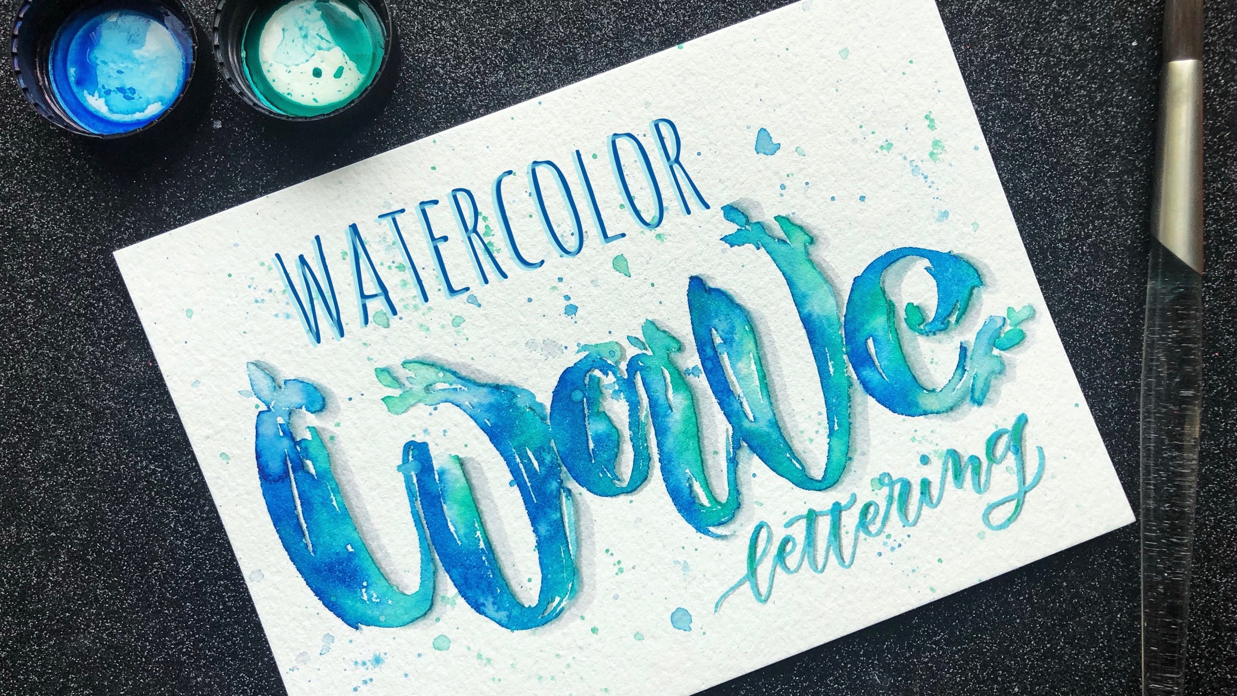
8. CarefreeColour: Let's get started by looking at some of the easiest and most fun inks to use. Non clogging dye based inks designed for fountain pens and available in really great colors. You can put them in the pen and leave them in indefinitely. Just cap your pen and they won't clog or dry. If you forget and leave the pen uncapped a quick rinse with water will soon have them running again. My favorites by far and I've tried a lot of inks are the J Herbin inks. They come in a great range of colors, have beautiful if slightly impractical bottles, and fabulous French names which I won't try to use in these videos because I'll probably mispronounce them. Of all of these, the quiet Ambre of Birmanie is my favorite, more on that later. I also titled this video carefree color because we'll be looking at some color blending techniques using an approach to color that is relaxed and free spirited. That is, it is not precisely controlled and the results are sometimes surprising. Personally, I love that way of working with ink. It's a bit like watercolor painting, and I find the results to be natural and lovely. If you prefer to be more precise, simply premix your colors and use them one per pen. Many of you may be familiar with the color mixing techniques suggested in the pen insert, but I'll go over it quickly here. Using pilot mixable color we'll load up two pens with two different inks. Here I have loaded one pen with a violet cartridge and one with blue. First, check that you have good ink flow in both pans, ensuring the ink is right up at the nib of the pen. Then rotate the pen nib so they are perpendicular to each other forming across and touch them together and hold vertically for a count of 5-10 seconds. Ink will flow quite quickly from the top pen to the bottom. I usually start by holding for a count of 10 and then adjust the time as necessary. When you start writing with the bottom pen, in this case blue, you'll get the color that came from the top pen, which gradually fades as the ink gets used. How quickly the color changes will be determined by the liquidity of the two inks as well as which one is the dominant color. The violet is the stronger color here, so it dominates the blue and takes quite awhile to run out. But eventually it does and we have a subtle, gradual, and very natural color blend. This technique will also work with other broad edged pens as long as you are using a high flow ink. My favorite technique is even more flexible and allows you to switch up colors quickly. I load one pen with a rather neutral color like Ambre of Birmanie. If I am working with cool colors, I might use the cloud gray. I load watercolor brushes with the other colors and have them off to the side, usually resting on chopstick holders. Watercolor brushes hold a lot of ink and just touching the pen to the brush will cause ink to flow into the pen. This allows you to load your pen with any accent color you like. I'm using a rather unusual color combination here, the moon dust purple, which is really deep or regime, it's almost black and an Indian orange. Both those colors blend beautifully with the Ambre of Birmanie and the result is a rich pallet of colors that are both dark and light. I've used them for Christmas cards and they blend beautifully into a recycled card stock for a really warm, rustic effect. Other brands of ink will give you similar effects, Ecoline and Dr. Martin's Hydrus are other inks you could use. Keep in mind that dye based inks are seldom archival or permanent, so they may fade if exposed to light. Use them for work that will be reproduced in print, and that's not a problem.
9. Walnut Ink: There's a humble little ink that totally deserves mention in this section, because it has such a great combination of properties. Walnut ink, has been a favorite of writers and calligraphers throughout the ages. It dates back to ancient Egypt. It is also great for a pointed pen and sketching, and was used by the likes of Leonardo da Vinci and Rembrandt. It is made from crushed walnut shells, and can be purchased as crystals. Mixing the crystals with distilled water, yields a sepia brown ink that will be richer if you add more crystals. Recipes vary. For a half cup distilled water, you can use anywhere from one teaspoon of crystals to one tablespoon. I like to mix it quite rich and thick using around the table spoon. It starts out looking a bit like tar, but in about half an hour the crystals will dissolve. Give it a good stir. The resulting ink is like fast and permanent and flows great. Many calligraphers add a touch of metallic while it is still wet, for a unique effect. More about that in the metallic video. If you want to move beyond basic black, but you're not keen to get into bright colors, take a good look at walnut ink.
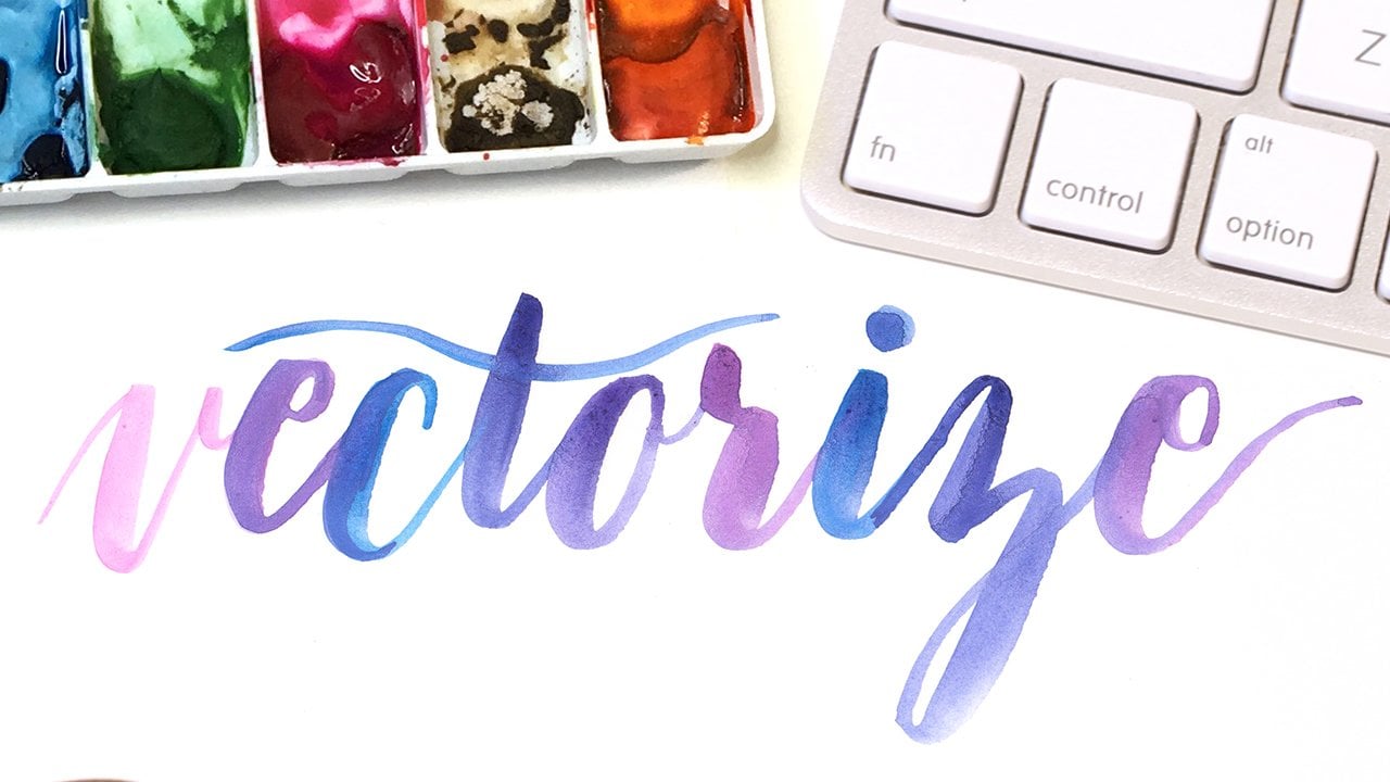
10. Watercolour & Gouache: Watercolor and gouache are two other great options for use in the pilot parallel pen. Both of these water-based paints work great, but they are pigmented, so I would classify them under use with care, and you mix them yourself. Just a little more preparation care are required to work with them. Let's look at watercolor first. It is a great option if you want color and don't want to purchase bottled colored ink. Or if you are someone who is already working with watercolors, you can mix any color you like and you'll get that beautiful softness and translucency unique to water color. You'll want to work on smooth hot press watercolored paper, and you'll notice right away that the surface of the paper affects how your pen reacts to it. With watercolor paper, even smooth paper you'll feel a certain resistance. You'll need to use a little more pressure and you'll probably find that slowing down slightly is necessary, but you'll be rewarded by super crisp blinds and the ability to add fine details. To mix your colors, you'll want very small containers with lids, so you have a little container deep enough to insert your pipette or syringe in to, just add distilled water to tube color and mix it really well. I mix my watercolor to approximately the thickness of whole milk, not too watery, but still very fluid, and then adjust it to my liking from there. Be prepared to do a little trial and error and test it with a brush if necessary, to make sure the color is strong enough. Once you get the ratio of paint to water to your own satisfaction, you might want to make a note of it, so you'll be able to mix it similarly if you run out. You want to mix up enough paint to last throughout your project, each cartridge holds just over a quarter teaspoon. For a small job, I usually mix up about one teaspoon of color. Pigments naturally have very different chemical properties, so you may find that proportions are quite different from one color to the next. You might even find some flow more easily than others in the pen, but the differences are minor, and I don't hesitate to feel my pens with a good-quality mixed watercolor. You can also dip your pen, it doesn't pick up a lot of watercolor, but it will give you an extra shot of coverage where you need it. Working this way, I usually have a watercolor brushes nearby and I will also load up the pen with those if the pen is running a bit weak or dry. The pen will be a little more hesitant than the carefree inks which flows so easily. Watercolor might take a little more coaxing at times, a dip in water, a shake, or a light squeeze on the cartridge will keep it flowing. Working with watercolors and keeping everything soft creates a really nice folk-art feel, but you can also choose to mix quite strong brilliant colors. This approach gives you a lot of control. If you bring watercolor skills to the table, even better, work with those here to creating great washes and a more painterly feel if you like. In the same family, gouache feels a little bit like the uncle of watercolor, a little older, a little heavier, but very well-respected. It is similar to watercolor, just more heavily pigmented. It's surprising that it works in the pilot parallel pen at all, but it does work and it gives rock solid result, and yet it is just a little more stubborn to work with. Be prepared to clean off your nib more often, the fine pigment sometimes builds up, and use your pen cleaner between the metal plates. But once it is flowing, it is really, really nice to work with. In fact, if the inks I recommend seem too flighty and fluid and bleeding drives you crazy, gouache could well be your medium of choice. Just as with watercolors, start by mixing it with distilled water to approximately the consistency of whole milk. Make sure it's whole milk, not skim milk. You need enough pigment to get a good strong color. Fill your pen and then be prepared to spend a few seconds coaxing the ink through the chambers in the nib holder. To do this, you need to apply pressures to the cartridge, but not enough to crack the cartridge. I usually wrap a bit of paper towel around it, so it softens the pressure slightly, and will also prevent a mass if the cartridge does crack. You'll be able to see the ink move down and you want to make sure it gets to the small hole, the little air chamber just before the nib. Then reassemble your pen, dip in water, and you should be good to go. Gouache will give you flat opaque color that flows a little more slowly, but very consistently in seldom lids. Both watercolor and gouache will dry in the pen if you leave the pen uncapped, but both should wash up easily with water. Still, I have never left gouache or watercolor in my pen for extended periods of time. After about a month, I usually clean the pen unless I'm using it regularly. Even with the pen capped, its contents may separate and solidify slightly. Give it a vigorous shake and the small metal ball inside the pen cartridge will mix it back up again. If the metal ball is silent, not rolling and dried solid, I usually just discard the cartridge. There's one final gouache that deserves mention here, schmincke, gold, pearl calligraphy gouache. I don't use a lot of gold, but I haven't used this one quite successfully. You can feel the pen with it and it works quite well, but my habit is to keep some on the side in a small container and feed the pen as necessary as well, just giving it a little heavier coverage as you see here. Again, I would not leave this ink in the pen for more than a few weeks or maybe a month, just long enough to complete the project. Join me in the next video for the ink that has completely transformed how I work.
11. Awesome Acrylics: Discovering one incredible ink changed my work so much. It deserves a drumroll. That ink is FW black acrylic artists ink. Technically, one should never put acrylic ink into fountain pens. But years ago when I was painting acrylic canvases and really wanted to letter on them. I discovered that this ink did work. Not only did it work, it worked great. It has allowed me to create works on canvas and more recently on wood. It totally opened up new possibilities to me as a calligrapher. However, not all acrylics do work and it's important not to confuse FW black with FW black pearlescent, which has totally different properties. Also proceed with caution with the other FW colors. Some like the marine blue work really well and others like the cool gray contain too much pigment, and won't flow in the pen. I have one of each pen size devoted to FW black. I rarely use the other FW colors as I am usually looking for a high contrast black and very graphic look as opposed to a soft layered look. If you let acrylic glittering dry completely, it's best to let it dry for a few days, even a week, if you can, you can then add layers of acrylic medium to build up textures and give your canvas a beautiful sheen. I use acrylic for my most serious work, but it can also be fine. It will work better than dye based inks and lead lasts on inexpensive card stocks, because it is waterproof, you can also create line art on watercolor paper. Let it dry overnight and add watercolor washes for a really fun casual color treatment. Working with acrylic has a different feel than working with dye based inks. It flows a little less quickly and does have a certain amount of very fine pigment. You need to fuss with the ink flow a little bit more. Squashes and long lines are trickier as the ink flow is a little slower. I've discovered that a drop or two of Golden's acrylic flow release, diluted as per manufacturer's instructions, can be added to acrylic ink to make it flow more easily. Acrylics will require some stronger cleaning power when your pen is not in use. I'll leave acrylic in my pen for up to a year if I'm using it regularly, but if not, it should be cleaned every few months. If a pen has dried or been left uncapped, I'll soak the nib unit overnight in a solution of half water and half Spray Nine, and give it a good scrab with a toothbrush or wire brush in the morning. Your nib holder may remain somewhat discolored, but it can still be used. With acrylic. You have the ability to create some long-lasting and impactful artwork.
12. Working with White: Working with white is exactly that, it's work. It is not for the faint of heart, and if you're a beginner and you want to use white, prepare to be frustrated, you'll spend a lot of time fussing with your pen. Yet when you get going, you may not want to stop, there is something about white on color, it's a little irresistible. By necessity, whites are quite heavily pigmented, so they simply don't flow as easily through the pen. If you want a really solid white, you'd actually need to put down a few layers of white to make it opaque. But if you don't mind a bit of transparency, which I think is actually quite nice, and you have some time, white is wonderful. An eternal optimist, I'm always trying out new white inks. If I see awaiting, I'll give it a try. But there are only two that I can recommend; Dr. Martin's Pen-White and Dr. Martin's Bleed Proof White. I've used both of them successfully, but I prefer Dr. Martin's Pen-White, which is slightly more opaque and slightly more water resistant when dry. Sadly, most acrylic whites don't work. Straight out of the bottle, both these inks are just slightly too thick to use. Ideally, the consistency of your writing should be approximately the texture of whipping cream. To complicate matters, the consistency sometimes varies from bottle to bottle. Still, I mix it in the cartridge, I use it directly from the bottle, and I fill a cartridge approximately two-thirds full with white and then top it up with distilled water. I adjust that if the ink seems especially thick in the bottle, then it needs a really good shake to allow the metal ball to mix the water and ink mixture. That metal ball is one of the best things about reusing the cartridges. Shaking the pen mixes ink, breaks up air bubbles and just generally improves ink flow. Then the coaxing begins, just dipping it in water is usually not enough. You can try that, I usually do, but you can see there's just a tiny bit of white coming through there. But it's still going to take some more work to get this pen running, so in that case, you want to undo the barrel of the pen and very carefully squeeze the cartridge. I want to watch and see the white ink show up in that little air hole right at the front, you can see the ink moving down. Here's the place where you don't want to break that cartridge, but you want to get enough pressure to have the ink show up there. Then you still need to keep working with a pen and a little bit to get it flowing, that probably means using your pen cleaner, you really have to be a bit of a white ink whisper here. Once it is flowing, you'll see that you need a few coats to create a fully opaque white. Once it is flowing, it really is quite lovely to work with. Although you can see I still tend to keep a brush on hand to add extra ink for long strokes or where I want more opacity. One advantage to white is that it will work well on a variety of papers surfaces because it has pigment, it doesn't tend to bleed. It does dry in the pen, so I keep white in my pen for a few weeks at the most. Then I wash it thoroughly with water. If you've let the pen get really dry, you might want to soak it overnight and some spray nine are fantastic, and then give it a good cleaning.
13. Magical Metallics: I seldom have the need for doing gold calligraphy. But I know it is popular, and there is something magical about metallics. I have used it quite successfully in the Pilot Parallel pen. However, I consider it high risk. I have also ruined pens by leaving gold in too long. It is an ink that I put in and use for a day or two, and then immediately wash out. Even better, I've discovered there's often no need to actually fill the pen with gold. I find it much easier to feed gold into my pens that are already filled with Amber of Burma. The amber ink acts as a carrier for the gold. It is similar in color and you can see when the gold is running out and it is time to refill. Then the metallic ink never even gets into the chambers of the pen. It enters the nib and then exits a short time later. A rinse of the nib unit when you're done and all will be well. I already mentioned this Schmincke gold pearl calligraphy [inaudible] in the [inaudible] video. That works really well, but fine tech metallic watercolors are even better. They are pan colors and you can mix small amounts of gold ink directly in their palette. They come in a range of pearl colors and are just a delight to work with. Incidentally, they are also ideal in pointed pins. Often I find gold is most impactful in small amounts and I like adding small gold dots to designs with a pointed pen. It's a great way to add a little bling to your work. Metallics also have a great affinity for walnut ink. There's something about that rich brown plus gold. Sometime ago, calligraphers began using watercolor brushes to drop a little metallic ink. Here, I'm using FW Pearlescent Silver Moss into wet walnut ink. The metallic ink spreads just a little, giving a soft metallic highlight. So enjoy your golds, your pearlescents, and iridescents. But make sure to wash up your pens really well in warm soapy water after the party.
14. Until Next Time!: Thank you so much for joining me in this class. I hope you've learned a lot and I really look forward to seeing the projects you post. If you have any questions, don't hesitate to leave me a comment. But we're still not done, here's what I'm working on for class number 3. Hope to see you again soon. Take care.
 Alice Young, Calligrapher & Designer