Transcripts
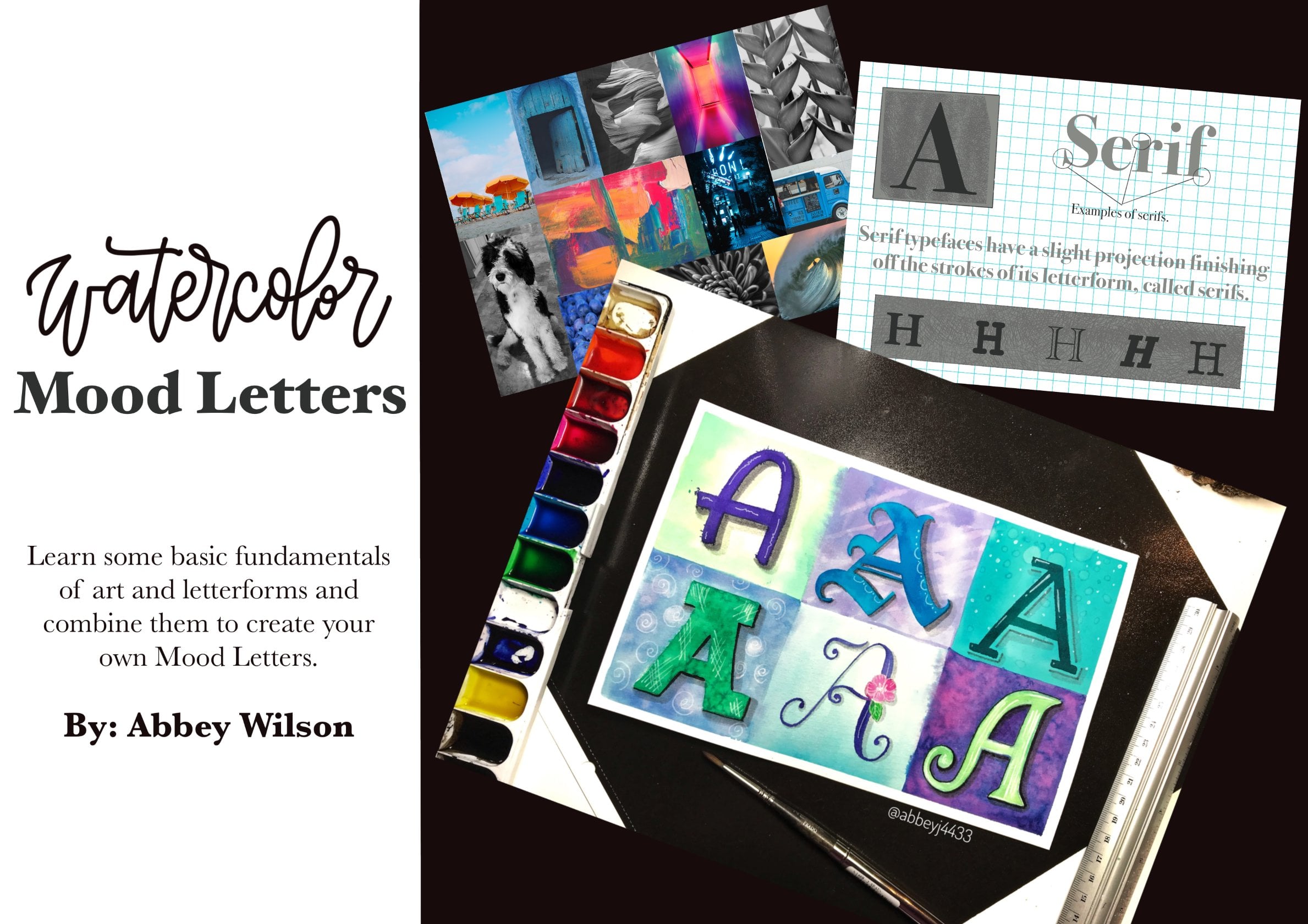
1. Introduction: Hi. I am so excited that you're here in happy that you're interested in learning how to pay watercolor babe lettering with me in this class. I will teach you my method to make watercolor wave lettering by demonstrating some basic watercolor techniques in practice strokes and then guide you through creating a word and a phrase. You can have a lot of fun in this class, whether or not you're a beginning watercolor artist or advanced. You don't have to have any lettering or calligraphy background. You can just learn from what I'm teaching you in the class. Although it's not an entire alphabet, I go over how to change basic lettering into waves. So as long as you're up for learning something new and having fun, then this is the class for you. But before we begin, I just wanted to introduce myself. My name is Abby Wilson. I have a bachelor's degree in visual art, and I haven't masters in teaching, and I talked for about eight years before I had my second daughter, and at that point I decided to stay at home, and now that I found skill share, I get to teach again through a different platform, but I still I'm excited to see your work because that's one of my favorite parts. When I share my creativity with someone else, I love to see what it is that they get from it and what it is that they produce. And I love others personalities coming through in their artwork. So please the end, share your project, upload it so that the world can see the cool stuff that you make.
2. Supplies: Okay, I'm gonna go ahead and give you a rundown of the supplies that I use in this class. You do not have to use the same exact ones that I have. I just want to throw out there what it is that I'll be using. So the paper that I'm using is this cancer and brand Excel watercolor paper. It's 100 £40.300 gram cold press. I really like this because it is fairly inexpensive. It's less than $8 at Wal Mart, and you get 30 sheets of it. So I don't feel like if I'm practicing that I am pruning really good paper or if I mess up , it's not a catastrophe, because it's not that expensive. So good quality. And that's what I'm gonna be using in this class. The paintbrushes that I use are gonna be a larger and a smaller round brush. It doesn't matter what size or brand you have. Obviously, this is a 12. This is a four these air, both Princeton brand, but anything that you have that you like, whatever it is that you feel comfortable with, you can use, um, for the paints. I'll be using royal talents Eagle. I'm brand liquid watercolors. They're some of my favorite paints, but you don't have to use that. If you don't have those, you could use thes type of pan paints. This is prima marketing tropicals palette. You could also use Crayola, um, watercolors. They don't have to be expensive fancy paints to make something really cool. So I'm gonna show you an example later of the three different kind of paint so that you can choose if you're wanting to see the differences. Um, I'll share that with you. The other stuff that I need while painting is water, I reuse my jars. So I have a dirty one and I have a clean water jars while I used to. And I'll explain that has I go. You'll need some type of paper tower rag and then for the finishing details and that the shading thes air, the pens that I'll be using. This one is a Tom. Both feud. It came in the colored pack. It's one of my favorites to make the detailed letter or the detailed shading on the letters . Um and then I'm going to use one or both of the Tom Bodo brush pens, this one's and 75 this one's and 95 but you can use any shade of those that you like, and then another detail that I added some white with a gel pen or this one's a unit ball. You could use a jelly roll, or you could use a white paper pen. It doesn't matter. Anything that would make a white detail would work, so that's a run down in the supplies, um, excited for the next steps.
3. Demo / Tips and Tricks: Okay, so I just want to show you a few tricks that I use when I'm making these watercolor letters . Um, I use a lot of wet on wet technique, and if you're not familiar with that, that just means that the paint is wet on the paper. And then I'm gonna tap some more wet into it, and you can see it bleed and blend and make some really cool things happen. So I'm going to start with my size 12. I've got my dirty water and I've got my clean water. I have the liquid paint. I'm also going to show you a very quick demonstration with the paints that I said that would also work like a pan paint or like the actual Crayola bar colors. So I have a wet brush. I'm gonna go ahead and put it into my blue lid and get some blue paint on my brush. Then I'm just gonna make a line streak. Doesn't have to be perfect. And as you can see, you can pull the paint down. And if you let go down there, the paint comes off into a pool. If you want to spread it out, you just kind of tap it around, so this is a neat technique. If you want the darker blue to be at the bottom and it's more translucent at the top, are transparent, you can also top in, so that's a wet on wet technique. You can get more paint and tap it and also notice, um, the paint while you can't really control it once it's mixed in with each other, I find that that's the beauty of watercolor. Once I learned to let go of the control, it's more fun. Eso You have to learn to just let go and let the paint and paper do it. But you do have this control. I just have dirty water, clean water when it dried off just a tad. This is the control. And speaking of so if you take your brush with water and you put it on the paper, you're giving that paint a boundary to flow into, so it's going to stop wherever the water stops. So you do have some control. You just don't have a ton of control. I noticed that's hard for some people to let go the control that they have when they're watercolor painting. So now I'm gonna go ahead and get the green and did the same thing I clean my brush off and I'm just gonna touch right where that water left off and you can see the blues gonna come all the way over to the green That's another fun thing about watercolors You never know for sure which pigments gonna take over I've noticed that yellow actually seems to dominate and goes over top of the other colors and pulls it with it blew overtakes the pink a lot So again I'm gonna show you what it's like if you just want to tap in some green into your blue And then I'm gonna leave that fuzzy there so you can see what it looks like when it dries. So that was all wet on wet. I'm gonna go ahead and clean my brush and I'm gonna do the exact same thing with the other paints. So I went to the dirty water to the clean water and I'm going into this blue pretty. This is like a deep ocean color here. It's like we're going into the deep waves for this lettering. So there's some blue gonna clean my brush. Dirty water, teen water. Sometimes I tap off just a little bit of water into my, um, napkin. Just so that it doesn't totally overtake the paint over here. Make giant pools. But you can see it only comes over where I touch it. And this runs Justus. Well, is the liquid paint. The only difference that I've noticed is when they dry. I feel like the liquid equal equal line paints are a little bit more vibrant than the others, but they run and bleed and make really cool things. Justus. Well, so I'm gonna go into this island color. I don't have quite enough water, so I'm just gonna pick up a little water in this Gonna hit that and you can see it blend and bleed into the other color. So I tapped in there again. Went on. What? I'm gonna go ahead and do the same thing now with regular Crayola watercolors. So clean my brush Start with the blue. And I also had some water laying in here so that it was nice. And what? Notice the's run nicely. You just have to make sure they're nice and wet. So there's the blue I'm gonna go ahead and just touch it. This is like the tropical, the tropical water. So we've got, you know, maybe that's the Atlantic Southern. Maybe Florida ish. This is the deep water, and now we're going to somewhere tropical. So this greens not exactly green, like an ocean. So I'm just gonna go ahead and mix here little blue into it, so it stays with that tropical palette we've got going on over there. So I'm gonna tap in, and I'm gonna take some blue, and I'm gonna tap it in here as well, just so that you see the different pics. Okay. Okay. I just want to show you a couple more tricks that I use. This is dry. This is tried. This one's a little bit wet. If you ever want to lift some paint off. Say you wanted that to have more of a transparent look. You just have ah, clean, slightly wet brush, and you can put your paintbrush on there and pull up some pain. You can do it again and pull up some more paint. So there's a little trick for lifting the pain off as well as using a paper towel to dab it dry so you can see that that also lifted off some pain. Um, and then the last little trick I wanted to show you Not that it's a trick, but this is a little wet on dry techniques. So this is dry. This month's try. You can see how when they drive, these cool things happen inside. You can see where they blended together and whether it's like the bleeds. Um, so I'm just gonna show you with this paint, Gonna take some blue paint here and I'm just gonna go over the top of it and you can see what it would look like if you were taking you're wet paint and putting it back over the dry. So I'm gonna go over it again with just some more water. And the more that you do that, the more that it blends with the background. But you can see makes this line through here. So if you ever want to use this technique to give some depth to your waves, you could do that so you can see the lines in there And then again, I'll show you this. Now that that's what it'll really lift off for their with the paintbrush or with the papers With my paper towel. I I always love my paper. Tell when I'm done with this lettering. Because these are my favorite colors. Isn't it pretty? Okay, so that's the tips and tricks. We're gonna do a few more things before we start the lettering, and then we're gonna make a project. I'm so excited.
4. Practice Strokes: okay for the practice strokes. The very beginning of this is going to be a little bit redundant, because I'm going to go over how to make pretty much the same exact strokes that we did in the last video with the tips and tricks. But we'll put it together. We'll do some curves after that, and then we'll do like a U shape and I'll talk about adding some splashes here and there and splattering. So again, the first step will be a little redundant, but we'll move on from there, so I'm just gonna make a nice line now. There's not much water involved in this way. The little lines. I got some water. I added it to it. So now you can see that it pulls up a little bit like a pool of color, and then I dip into the paint. Here I take my pain and I tap it in so that you can get this dark color. This is just practice. But this how I add in paint what On what technique? So I tap into my wet paint and then I'm gonna go ahead and clean my brush clean water, And so this is just water on my brush now, and I'm gonna pull it next to it and only hit it in a few places. And you can see how that liquid water cooler just runs right out of that 1st 1 Look at that . So that's the first step. And then I'm gonna get water, and I'm putting it into my green paint. Been thinning it up a little bit, and then I'm just gonna kind of touch that again. And you can see I wanted to bleed into each other at the top and at the bottom. Sometimes I touch a little in here and there, but you don't have to. It usually does the trick on its own. Then we need the same thing. I'm cleaning my brush out saying big brush, just water on it, and I'm gonna practice by pulling that down so that it just bleeds from one side to the other. And then I'm gonna take my repeat. I'm gonna to the same thing for 1/4 line. So you're just practicing watching that paint bleed from one side to the other and then But you don't gotta clean my brush again. And this time we're gonna dio a curved shape. So we're gonna just bring it up like this. And so it's kind of like a notion there or c? Not a notion, I guess. A waiver us. He cleaned out my brush clean water on it, and I'm just bringing it down through now. I'm gonna get some green and I'm gonna do the same thing. Touch that edge there on gonna leave some white space, Drop it on in there. I'm spending my brush again. And this time we're just gonna make a u shape. So gonna start with this and make it thin as I go up the other side. Gonna add some water to that? That's the more pain. Thinking it up a little bit tappin ins and blue. I'm gonna clean my brush again. You can hear the water, so it's a clean brush. And this time, instead of getting water to make that layer there, I'm just gonna go ahead and get the green. So that's gonna hit right next to the blue. I'm gonna leave that line in the middle so it makes like a turquoise the color. I touched it in there and the blue came into the green. I'm gonna clean the brush. This time. I'm gonna touch it with clean water that that's just clean water coming through there. Then you could make some splashes. So there's three practice steps. Practice strokes. So, as you can see, we're doing a straight one. A curved one, a U shape. Um, just play with the bleeding of the pain in between there. So it's going from one to the next to leave some white spaces in there to have a cool, negative space happening and add some splashes here and there. So with the splash to you can just add some water to it first. And let's say you want a little green splash. I'm gonna take a little blue and add to it. You could also splash in like this, which I will do at the very end of our project. I'm gonna take just a little bit of water on their another paintbrush, and I'm gonna tap right over talk and you'll see the difference when it hits wet paint. And when it hits dry paint, what happens? So as you can see over here, where the water goes inside of the mostly dry blue paint. It leaves this really cool effect. And as it goes into the wet paint, edges, blends right in as it did right there and again. There's those cool effects that happened. Almost. Looks like you put salt into it, but all you're doing is dropping water into it. So you get that really wet effect with that. Okay? So go ahead and practice, though, as the next step will be making letters in towards.
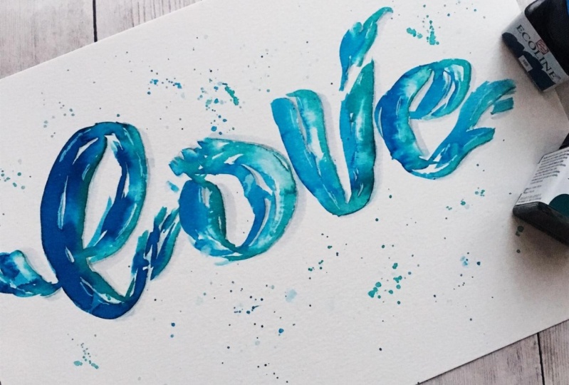
5. Lettering a Word: Love: Okay, So we're going to go ahead and get started here by connecting letters together to form a word. And most of the time, the first word that I letter is love. I'm not sure why, but that's one of the ones I'm going to stick with. So here we go. So I put some water on my brush just like I did the last time, adding it to the blue to make this nice liquid he blew over here. And I'm just gonna draw an ill. And here's the thing when you're doing, like, brush lettering or any type of like calligraphy, modern photography style. This side's gonna be fatter because it's the down stroke. The upstroke is thinner, but here's the case with ease. They don't connect. So I'm just loosely making my l shape. I added more if you're pigment to it. So I got some more blue. I tapped that into their tap a little into here, and I'm gonna loosely bring my l up. It doesn't have to be thick and thin. So if you notice I'm just kind of adding a little extra details to the letter. So I'm like fanning out the water here. I'm separating it here. This is like it's kind, almost splashing upward. So I'm gonna clean out the brush. This is where you can use a second size if you'd like. I'm gonna go ahead and show you how to use the second size. So I'm gonna set my size 12 down and I'm gonna kick up my size four. I'm wedding it doing the same thing this time I'm gonna go into the green. So I added water into my green paint. I'm gonna get a little bit more so that it flows nicely. And then I'm going to just let it hit at the top, leave some space there, let it hit the bottom. Now clean my brush, and I'm just gonna add some water to that. I'm gonna do the same thing on this side here, this couple hit or miss little lines so that it bleeds into the blue. Then I'm also gonna go back in here and add some green into the blue. That was already there. So blends Nice. So there's an l. This big fat l go back to my size 12. It's a water on it. We start with the blue paint to make it over is fun because it kind of looks like a wave I'm gonna make it splash clean out my brush And this time I'm just gonna use just water I'm gonna pull it down and I'm gonna add some splashes up because the waves going to splash this way in this way is it runs into itself There it's now I'm gonna get some green and just give a hint of green on the side Hint green on this side. Connect that there, Make it look more together. Now I'm gonna tap in some blue to give it a darker fact here and there. So with the wet on wet technique, I'm just gonna tap in some more rich color. Well, in that, I'm just gonna kind of mix on this green. So there's my oh, gonna do the same thing and notice I didn't even use the small brush with that one with the B m doing the same thing. Only this he's gonna splash this way. So clean brush. I'm gonna pull some water down. And over here this time I'm gonna get the green and I'm gonna come back into here. I'm gonna do the same on this side. Give it a few splashes up there and I'm gonna make any and I'm gonna make it like a wave at the end of it. So I'm gonna make the pigment darker. I'm gonna tap in some pure color. It's my already wet paint. Now I'm gonna do the top part of the E here. It's nice and wet, so I'm gonna clean the brush out clean brush Took a lot of blue with me So I'm gonna clean the brush again, this time going gently tap off some water So it's not quite is with now I'm gonna go into the green, bring my water into it So it's nice and runny and then I'm just gonna touch the edges of this like, let the water spray off of there and off the bottom here. So there's my e now to finish this awful. It's still pretty wet. I'm just taking plain water and I'm gonna tap it into that Makes those cool splattering effects that I'm gonna go ahead and get a little bit of blue on there. I'm gonna splatter some blue. I want my white letters clean my brush. I'm gonna do the same thing with the green so that I have some green splatters as well. Nice and wet. Sometimes I feel like I go overboard with the splashes, but, you know, I really like them. So throw them in. They're gonna give out a couple extra. What? And there somewhat there. Maybe a splatter. They're here. Okay, so that's the finished word, love. I'm gonna go ahead and let this dry so that we can come back for the finishing touches.
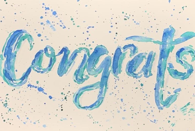
6. Adding Shadows and Details: Okay, Now that it is mostly dry, I'm gonna go ahead and show you how I add some details to make the water really pop off the page. So this is where I'm going to start with my darker feud. Um, this is the term, both feud. Like I said in the beginning, you don't have to use this exact fresh. You could also use paint with your paintbrush. You could use any type of gray marker that you have, or you could leave it how it iss It's up to you. But I just want to show you what I do. So I take this grape ed brush pin, and I just highlight I'm going to say that my late is coming from the left side over here. So my shadows all going to be on the right side of the splashes and the lettering. So I'm gonna leave that top alone, and I'm going to start right here on the right side, and I'm just gonna bring it down the entire right side all the way down. If there's a little bubble, I skip it, we go around it. I also do it on the inside of the lettering wherever that is. Africa ble. I'm gonna go over here just on the great wide and more towards the bottom than the top. And bring that right there. Okay? And then I'm gonna go finish up my morning. I'm gonna run it. There's still a few little wet spots over there, which is always a challenge for me to wait until it's totally dry. Okay, so then I'm going to go to this topple insane. If you ever leave a little mark like this, just you go and fill it back in up there where I left a little weight space that I don't need. Okay, so there's the L. I'm gonna do the same thing for the rest of it. - You pay once you have that done with this. And this is where I'll take one or the other of these. Whether I wanted to really stand out, I use a slightly darker one. This still isn't dark. This is an end 75. Um, and 65 is what I like best for actual lettering. But with this watercolor lettering, I tend to use one of the two later. This is the end 95. I'm for this one. I'm gonna go ahead and go with the 75. So then I'm just gonna go back over the bigger stuff, the main part of the letter, and give it like a second cash shadow. There again, I only do this over the main lettering. I don't go into the ridges and stuff with the bigger Dole brush pen. Oh, I see where skipped. Skip the spot with small one. What's got to check yourself? That is pretty much the embellishing with the shadows. Now, if there's any spot left over that you'd like to add some weight to, That's where I get out my gel pens and I go ahead and makes the marks. And this one I really don't see that many spaces where I feel like I need adds more, um, negative space with the white. So I'm just gonna show you what it would be like if you wanted to add extra. Say, for instance, you wanted to just give this a little bit of weight right here. You can have that in there. Maybe you want to extend this white down a little further. You could, and that's it for adding shadows and detailed touches. So here is the finished piece of wave fluttering
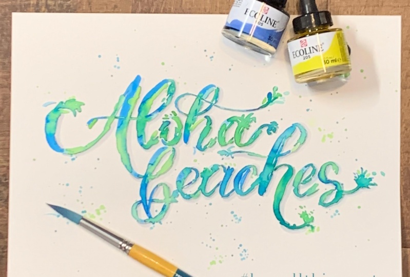
7. Two Word Phrase: Beach Vibes: okay for this next step, I'm gonna go ahead and do two different words in two different sizes using the smaller round brush in the larger round brush is I'm filming this. I'm gonna go heads, catch it very lightly first. Um, so I just give myself a very rough sketch. Okay, So that's gonna give him rough estimate of where I'm gonna be going. Someone to start with the round size for the word beach is gonna be smaller than the world vibes. So I'm gonna go ahead and start So that was watered down blue. And I'm gonna tap in some dark, darker blue. I leave those little jacket edges. I feel like that really gives it something. Okay, so there's my blue part of the be cleaning out my brush dry off a little bit of water from that. Clean the brush off as I pull that down there, do the same thing on this wider area where it would be a down stroke in calligraphy. I'm gonna go ahead and with cream splashes there. I'm gonna end up this area with a little bit of green just barely touching. There's maybe I'm gonna do that with the rest of these top letters. Then I'll get my size 12 brush to do vibes. I'm gonna use my So I was 12 through the big word vibes. Start with a nice big line over here and clean my brush. And I'm gonna leave room for me to pull bigger spot over the brush again. The splatter details. I'm gonna go ahead and do that. Just take my brush, getting a little water on. They're still at it out here. I put it into my dirty water and it's pretty blue. Oh, see, sometimes that happens. And if there's a little too much that goes into a prominent area that you don't want Teoh confusing for the eye to read, you can just kind of tap it off with your more, um, water on my goodness with your paper talk. So I'm gonna go ahead and use the feud again to do my detail lining and the sun is shining from the left, so everything's gonna be on the right hand side. I like to use a brush pens to do the shadowing because it's really nice that you can have that fine tip and, like, start off with a really fine line here. And then let me get fatter as you go down. So, like, really find lying. Then I bring it batter and I just feel like I have way more control with that than I would with a paintbrush. This is where I'm going to go in, and I'm gonna do this now so that I can shade it. But I'd like a little bit more white and hear some using my gel pen and magically add some negative space in there and then just continue shading on the right hand side for all the rest of the letters. - That is the finished product. So you can see that, um, the letters themselves have a lot of little details inside of them. You can see where they bleed and they've blended, and you can see the negative space that kind of creates that I catching quality to it. And those marks right here, where the water has splashed and created some really neat effects. So as you look around, you can see the different shapes in each letter. They're never going to be the same exact letter two times in a row. So as you were doing your project. Just think about creating your letters and adding these splashes and giving them some naked of space inside and fitting them into like a wavelike motion. So I am really looking forward to seeing your finished projects.
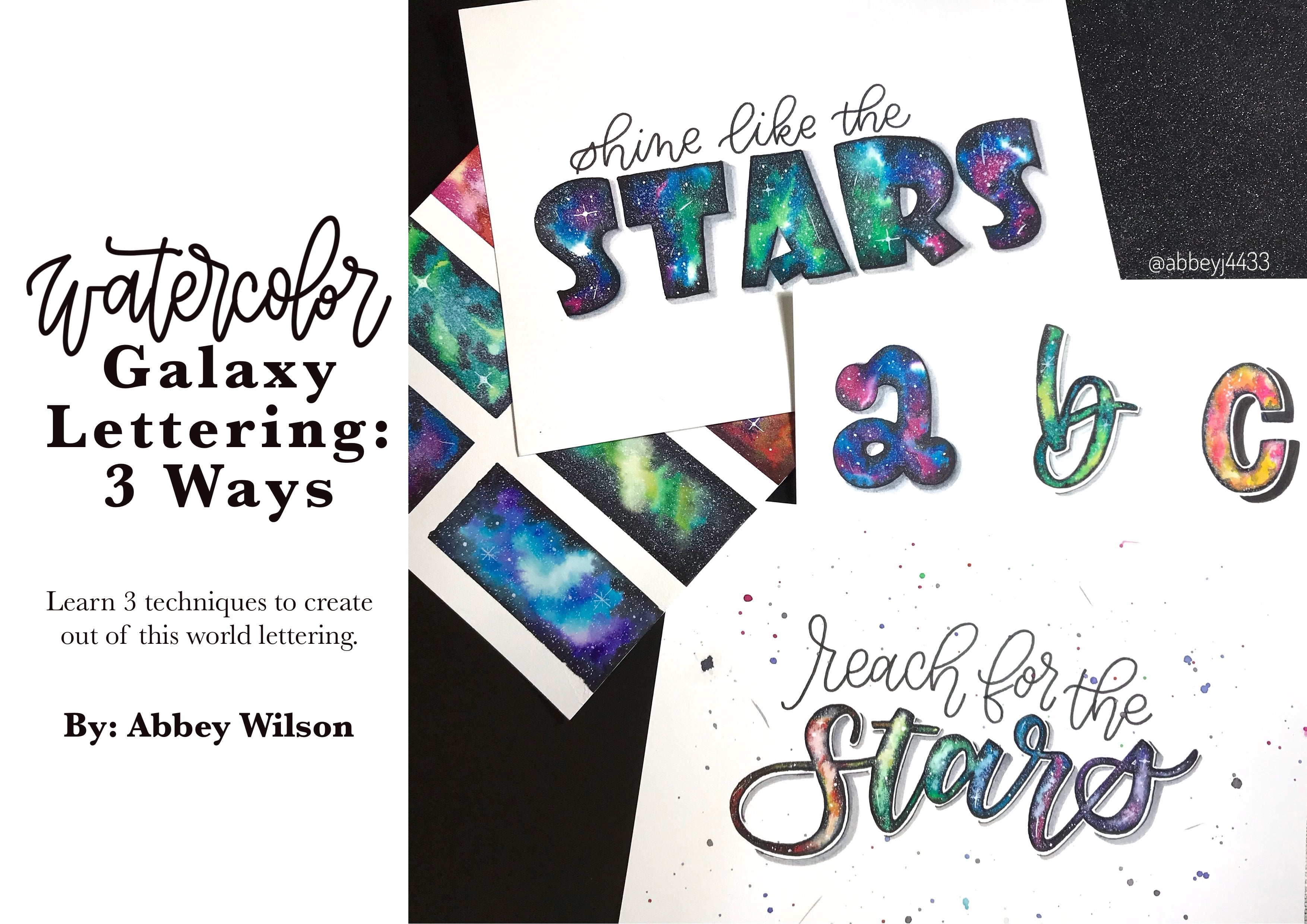
8. Project and Conclusion: Hi. Um, I just wanted to show you a couple things as you're thinking. About what project to Dio. Um, I know I didn't go over every single letter of the alphabet, so I just wanted to show you the technique that you can use to make any letter of the alphabet so you can use your individual lettering style. It doesn't have to be exactly like this. You obviously can tweak it to make it fit you. But if you notice I just want to touch on some key tips and points that I didn't necessarily say much about when I was making the actual project that I already shared. So as you can see, it's thes details. I think inside that, like, make these letters really stand out and the splashes that you create. So as you're working, be sure to in corporate those into your lettering. So if you have, like, a letter I haven't done which maybe is like a k, um would be similar to this, you could do a straight line down, just like in that will be X one that I have. It doesn't have to be curve at the top. So you can choose your elements of your letters as you like, and then just add the, um, techniques that I taught you to make it your unique lettering. So there's some example this to it connects to each other as it goes. This one has a banner in it and different lettering styles as well. So again you can do one word. You could do one letter. You can dio multiple styles of lettering inside of your composition. You can use different colors. They don't have to be just those ocean lettering This earth was for Earth Day last year. Actually, and you can see I used the earth tones to make the A and the T. And it's the same techniques that I used to make the wave letters. It's just that I use different colors so you don't even have to use that blue and green. You can use whatever you like. I also have this example. It is a slightly different type of wave lettering. There's no white lines inside the up strokes and down strokes. It's more like calligraphy, but it's the same method to create that. What fun, tight I ish look so you could also incorporate some illustration, if you'd like. In your final project, you can see I used smaller font and then my wave letters all in one with my well, fishies. So those are some examples in addition to the ones that I've shared with you already. So once again, I can't wait to see your final project. And I'm looking forward to it. Thank you so much for watching.
 Abbey Wilson, @abbeywilson.art | Artist | Teacher