Transcripts
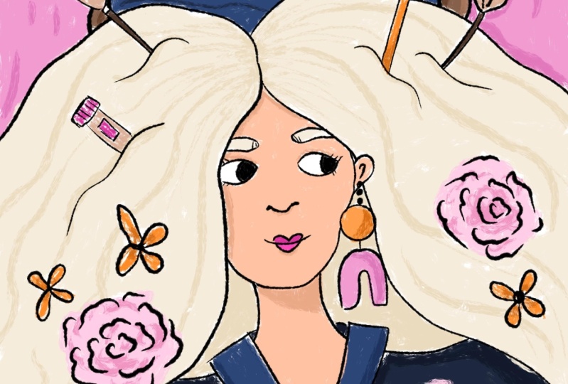
1. Introduction: Painting is an amazing
method to tell a story. My favorite way to tell
a story visually is by creating storytelling
portraits like this, this, and this. In this class I'll teach you step-by-step how to create
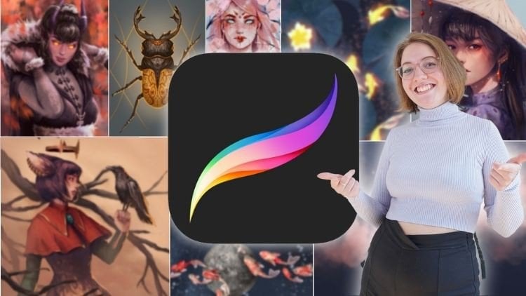
storytelling portraits. I'm Gabi Zuniga,
I'm an illustrator and graphic designer
of four years. I create drawings and
paintings that communicate a certain message or tell a
certain story for my clients. I use visual art and
design to communicate. My art does the talking for me. In this class, I'll
teach you how to overcome analysis
paralysis, aka, overthinking when you
draw and how to draw linework that's expressive
and full of personality. You'll use this linework
to create portraits. Our portraits will have
objects and colors that tell the story of the
subject of your portrait. At the core of what I
do as an illustrator and what this class is
about is stories on it. We'll learn how to
come up with an idea and you'll learn how to convey story of your
subject of your portrait, so that the audience
will be able to understand just
by looking at it. Colors, linework, objects, they all come together to tell the story of the subject
of your portrait. These skills apply not only to beginners creating portraits, but they also apply to any visual artwork
that you can create. You're here to create a
portrait, that whole story. I'm here to arm you with the
knowledge and techniques and the tips to create a
source on a portrait. As a freelance illustrator, I faced my own struggles with overthinking,
blocking my creativity. I've learned first hand how
to overcome overthinking, so that way I can just
enjoy the creative process. I'm going to share my
methods because I want you to feel energized and
ready to create too. Together, we'll be creating storytelling portraits in
no time. See you in class.
2. Orientation: I am so excited to get started. This lesson will give
you an overview of both the class and
our class project. The focus of this class is
to create our class project. Our class project is to create a portrait that uses
expressive linework, colors, and objects that tell the story of our
portrait subject. Our portrait subject is the character or a person who is the focus of our portrait. For this class, all you need
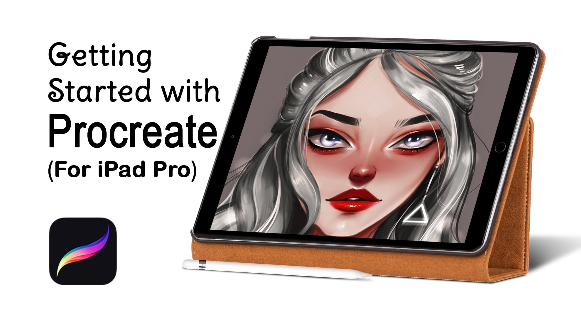
to get started is an iPad, a drawing app, and
a drawing stylus. What I use and what I
recommend is an iPad, Procreate for the iPad, and an Apple pencil. You also need to
think about who's going to be your
portrait subject. For example, if you're
creating a self-portrait, then your portrait
subject is yourself. Also, you want to think about the objects that will
show the background, the story, the history, the passions of your
portrait subject. For example, my portrait
subject is myself, and I love art, that's a huge part of my life, so I'm going to include art supplies as the
objects in my portrait. Before you move on
to the next lesson, you're going to
want to think about who your portrait subject is. You're going to want to gather reference pictures
or photos or video, even, of your portrait subject. If you're going to
create a self-portrait, you can also include a mirror
so you can draw yourself. You want to gather
reference pictures of the objects that you're
going to use to tell the story of your
portrait that showed either interests or passions
or hobbies or backgrounds. If you already have
objects in real life, then you can keep them nearby you so you can look at them while you're
drawing on your iPad. This is called
drawing from life. Follow along with me in class as we create our portrait
step by step. I'll go through this process
step by step along with you. I'll be creating this
portrait with you. I will also add cheat
sheets and resources and reference sheets in
the class resources to help you follow
along in class. Don't forget to share your final illustration
and your progress shots. I'll encourage you
throughout lessons to share your progress
at certain points. If you have any questions
or any more tips, please let me know,
I am happy to help. I'm also happy to
provide feedback and help you feel more comfortable drawing and telling a story. I believe in focusing
on telling a story over creating a perfect
drawing. That's it. I'm excited to get started on
our storytelling portraits. It all starts in
the next lesson.
3. Warm up: Expressive Linework Exercise: [MUSIC] Welcome to class. In this lesson, you're
going to learn how to warm up so we can get creating. Just like the best
athletes warm up, we got to warm up
too as artists. This exercise will
help your mind loosen up it will help you
relax into drawing. Sometimes I fall
into the trap of putting all this
pressure on myself to draw perfectly and
never make any mistakes, and warm ups like these help
alleviate that pressure. In this warm up, we're
going to practice the same lines that you're going to use when drawing your portrait later on in class. I like to call these
expressive lines. Checkout the expressive
line work cheat sheet and cross resources. To easily reference
different lines that I'm going to
show you in a second. I'm talking thick
lines, thin lines, lines with a messy texture
like pencils or charcoal. Linework that you use in
your drawing can have a personality all of its own. It's all in the
way that you draw them. I'm going to show you how. [MUSIC] Let's get
started in our iPad. You'll need your
iPad and I recommend the Apple pencil or some
drawn stylist to get started. You're going to create
a blank canvas in your drawing app and divide
it into four quarters. It doesn't have to be perfect. [MUSIC] We're going to draw different types of lines in each of these four quarters. Pro tip, keep in
mind a couple of words to focus on when
you're drawing these lines. I'll let you know which ones to focus on for each quarter. In the first quarter, we're going to start with
drawing lines that are even and normal in width. The default brush
in Procreate and most drawing apps is perfect. Usually the default
brush is a round brush. These lines aren't
particularly dramatic, they're not super intense. But they're good
for drawing things that aren't too dramatic, and really useful for
when you're drawing a portrait or an object that
has a lot of fine detail. In this quarter,
we're going to focus on using lines to draw shapes. Vertical lines feel tall. They feel like height, they feel like upward motion. Horizontal lines feel
stable and non energetic. Zigzag lines like these
have a lot of energy, a lot of movements, they
are dynamic like lightning. Curves like these. Curves feel like movement, and tight curves or
swirls like these, feel like quick movement. Let's say you have wide
swoops like these. They feel like swirl movement.
That's the first quarter. We have regular,
not too dramatic, not too intense lines. Let's go to our second quarter. The second quarter, we're using lines that are
delicate and full of energy. This is the personality or vibe that I want you to think of when you're
drawing these. Delicate and full of energy, you can use the line brush, but we're going
to make it small. I recommend using about
5-3 percent size. Let's practice thin
delicate lines. [MUSIC] Thin lines like these, convey a delicate airy
light or energetic vibe. Think airy light and energetic. [MUSIC] You going to see between
quarter 1 and quarter 2, there's a huge difference in
the personality in vibe that each type of line expresses. Now, let's move on
to third quarter. Now, we're going to draw
lines that are thick, and I recommend using a flat brush or a chisel
brush for this one. I'm going to go with the
flat brush in Procreate. I recommend going for
about 6-7 percent, this brush is
actually pretty big. [MUSIC] These are
thick, intense lines. Think, heavy, dramatic, intense. [MUSIC] You can see the different
personality in each one. We have the regular,
we have the thin, which is very delicate and
airy and lots of energy. We a have thick which is
intense, heavy and dramatic. In our fourth quarter, and I'm going to switch
back to the round brush, we're going to draw
some lines that are wibbly-wobbly and corky. You can use a brush
like the pencil brush. You can use a brush
like little pine, you can use a brush
like ink bleed. See all the scratchiness it
almost looks like a crayon, a piece of charcoal. [MUSIC] These lines
are not even, the width is different. Sometimes it gets thin, sometimes it gets thick. These are not perfect. You can use a brush like this, like an ink brush that
has lots of texture. You can use a brush like Inka. When I look at my brushes like these is not only
they have texture, but you're going to
go to thick, to thin, to thick to thin
to thick to thin. These wibbly-wobbly lines
are full of personality. They're not perfect,
they're not clean. Because the Apple pencil is pressure based if
you press it down, you're going to get a
thick line, if you lighten up on your pressure
you get a thin line. If you were to draw a portrait
with lines like these, it would be full of personality. It wouldn't be boring. These are my favorite
kinds of lines because they are not perfect. No two wibbly-wobbly
lines are the same because they're created using the natural movement of yours. Now that we're nice
and warmed up, we can learn how to plan our
portraits using thumbnails. I will see you in
the next class.
4. Creating Thumbnails and Sketching Ideas: On this lesson, we're creating quick little mini
drawings to plan out and try different
ideas for our portrait. These mini drawings
are called thumbnails. We're going to use these
thumbnails to try out different ideas
for our portraits. Thumbnails are quick, small
sketches that allow us to practice and plan what our future portrait
will look like. You'll see some examples of my past thumbnails on
the final result here. [MUSIC] Thumbnails are my favorite part of the art-making
process because there's no pressure
to be perfect. The possibilities are endless
and all our job is to explore and give ourselves a game plan for when we
create our final portrait. The biggest thing to
remember with thumbnails is that they do not
have to be perfect. In fact, I think they
shouldn't be perfect. You don't want to spend a
whole lot of time on them. Maybe a few minutes. Imagine working on
the final project. You spend hours working on it, making it perfect and
you decide that you want to change whole whole
bunch of things. [NOISE] You want to
change the layout, you want to change the
objects that you include in your portrait or even the person that you want to make
the portrait of. Imagine having to review
all of that work. That's a lot of work to redo. Instead of doing that, we could just make a bunch of different
thumbnails and try out different ideas in these
quick little mini drawings. Don't be afraid to draw multiple thumbnails and
to try different ideas, different objects,
different colors, different layouts of your
drawings in each one. [MUSIC] Let's get started with a blank document
in Procreate. [MUSIC] When I start
with my thumbnails, I like to write down words
that have anything to do with my idea or the project I'm
going to be working on. Our project is a
portrait that tells a story about the subject
and it's objects. With that in mind, I'm going to write
down portraits. What else am I going
to write down? I think I'm going to create
a portrait of myself. Don't forget our warm-up
exercise in the last lesson, where we talked about
different expressive lines. You can think about some of the personality
words that you used. I'm going to use
some wobbly lines. Wobbly lines feel
quirky and I'm quirky. I'm going to keep that in mind when I'm working
on my thumbnails. My personality is pretty. I'm very creative. I love artwork. I love flowers, I love food. I love to paint. These are some things that I
want to incorporate to sell the story of myself because I'm the subject
of my portrait. Now I'm going to
create a rectangle. A medium-size rectangle, it does not have to be
perfect. Don't forget. This is my first thumbnail. I'm going to quickly sketch
myself in the middle. Again, don't forget, it
doesn't have to be perfect. [MUSIC] I'm going to draw myself in this
sweater that I'm wearing, because it's my
favorite sweater. Don't worry if it's not perfect. These are just ideas. These are very
little rough drafts. Now I'm going to go tell a
story of my personality and my passions because this is a self-portrait using objects. In the first thumbnail, I'll try to add some art tools, like some pencils, even my iPad, add some flowers because
again, add both flowers. [MUSIC] I go back to my
list to reference things I can add to my portrait. Maybe I can add a little doughnut here
because I love food. I love doughnuts. Add some
detail on the sweater. Now let's say, I want to think about
color, so I'm warm. I'm going to use some warm
colors in my portrait. You can use the thumbnails
to plant out colors. Think about what color
you want to use. I'm pretty calm
most of the time. [LAUGHTER] Maybe I have some warm-colored flowers
are pink flowers, because that can
be a quirky color. [MUSIC] This is just a rough thumbnail. Keep in mind, the story of your portrait does not
have to be complex. This story can be just about the emotion or vibe of
the portrait subject. If your portrait subject
is calm as mellow, then maybe you'll add some blue colors to
your portrait subject. Maybe you'll add some
calm, neutral tones. I'm going to stop here
on this first thumbnail, and I'm going to start a new thumbnail with a
different set of objects. Maybe I'll even change my pose. Maybe I'll add some violas here, add some flowers next to me. Maybe I'll add this blotch of
this warm color right here. Maybe this one will
just be flowers. Maybe I'll add flowers that have symbolic meaning for creativity, joy because I find
joy in creating. The second thumbnail is all about flowers and
how they represent my personality and colors, how they convey my vibe. I add this bright pink for
a little bit of energy. This is another example
of how you can create a thumbnail to create a different
plan for your portrait. I rearrange the objects
and Number 1 and Number 2 from where they were
in Number 1 because I wanted to play around
with that a little bit. You could do the same thing. For this exercise, come up with three or four thumbnail drawings
of your future portrait. Come up with little plans
for ideas for your portrait. Remember to add objects that
showcase the personality, passion, or background of
your portrait subject. Maybe you can't think
a real life objects, try adding abstract
shape or colors. In this one, I have a
mix of real objects like flowers and abstract shapes of color like this
big orange blog. [MUSIC] Don't forget to upload your thumbnails to your
project section of the class. Don't forget, these aren't
meant to be perfect. All you have to do is
push yourself to come up with as many ideas as you can. In the next lesson, I'm going to give you
my tips on overcoming, overthinking, aka
analysis paralysis. [MUSIC]
5. Overcoming Analysis Paralysis aka Overthinking: In this lesson, we're going to discuss how
to overcome something that even I deal with as a
professional illustrator. Overthinking or
analysis paralysis. I'll give you the tips
and methods I use to overcome overthinking
or analysis paralysis. Let's say when you're
coming up with ideas, you're working on thumbnails. You just can't think of
any new ideas or you keep questioning and
second-guessing and overanalyzing every single
little creative decision, every line that you're drawing, you just can't move forward. They could feel
really frustrating. It's something that I
shoveled it sometimes, but I've had a ton of
practice and overcoming it. I'm going to give you the tips and methods that I use and you can apply these tips
to any creative task, or a mental task, or even outside of
drawing and painting. Tip number 1, is to
stop and take a breath. I know it's not fun to feel
like this, but usually, it's your body and your
mind telling you that it's time to take a break from working on your
creative project. I promise this
feeling will pass. When I used to really struggle
with overcoming this, I used to be really
hard on myself, I will beat myself up
for feeling this way, and reality it's just a normal
part of creative process. Our second tip is to take a break from your
creative project, from the artwork that
you're working on. If I have time, I will physically walk
away from my tablet or my computer even when I'm working on
professional projects. If you can and if you have time, take 10, 20 minutes, five minutes, even
an hour if you can and stop working
on your project. Even when I'm working on
our work for clients, I will take five,10,15 minutes away from my iPad and my drawing
tablet and computer, whenever tool I'm using. When your active mind
is taking a break, your subconscious mind
will activate and it'll keep working on solutions for the creative product
you're working on. It's really neat. Tip number 3, is to look for
creative inspiration. Look at something that
inspires you to create. What inspires me is seeing
visually beautiful things or visually striking things
like different types of art, design, architecture,
cinematography, home decor. I have tons of Pinterest
boards filled with all things that make me say, "wow, that's so neat, I want to create
new things too." What inspires you
might be different. It might be taking
a walk in nature, it might be seeing
movie that you love, playing video game that
you love, whatever it is, take a break and go
fill up on that thing, do that thing, experience that art or video game or movie. Take a break and get inspired. My fourth tip is to doodle. Our warm-up exercise is a
great example of doodling. Doodling is taking your
pencil, your Apple pencil, your iPad stylus, and drawing whatever
comes to mind, it doesn't have to be perfect. Doodling helps me stop overthinking and it
takes the pressure off of creating the
perfect piece of artwork. What you can do is open up
a new document on your iPad and Procreate and scribble
across the Canvas, draw whatever comes to mind. It doesn't matter
how little it makes sense or how it looks. All we're trying to do is get rid of that pressure to draw. When I do this, it allows me to come up
with new ideas and it reminds me that I
don't have to be so serious with creating. Before you move on
to the next lesson, try out one of these
methods even if you aren't experiencing
overthinking or analysis paralysis right now. That way you get some practice
in using these methods before overthinking heads and you have to use them
to keep creating.
6. Choosing Fun and Funky Colors: [MUSIC] Welcome to the
great wide world of color. One of my favorite
aspects of creating art, you need color to evoke certain emotions in ourselves and in the people
looking at our art. The concept that
color makes us feel certain things like
vibes, emotions, even personality
traits when we draw characters is referred
to as color psychology. I have created a handy
chart to help you. I've created a handy
color psychology chart to help you easily choose which colors evoke
certain emotions so you can help tell the story
of your portrait subject. We see the color red, the things that
makes us feel are passion, it's
attention-grabbing. If there's some aspects of
your subject, personality, or the story you
want to tell about them, use the color red. Now, there are many ways to create a color palette
for your portrait. I'm only going to show
you a few in this video. I'm going to give you
the building blocks of creating a color palette. Choose whichever one best fits the way that you like
to work and best fits the personality of your
portrait subject or the story that you're trying to tell of your portrait subject. [MUSIC] Now I'm
going to review how I choose colors for
my portraits based on what vibe or emotion I want
to express in the portrait. My portrait subject is myself, and I want to portray my warm, quirky, creative, friendly vibes in my portrait. Look at my color chart. Yellow orange is
warm and quirky. Some light pinks are
warm, bright yellow. I'm going to use
some warm browns as well because they're nice
and warm and welcoming, and that's my personality. I'll add some greens because
they are earthy and fresh. I will add that because
I am using flowers, I'll be able to add in
some of the leaves, I might add in some
pops of some pinks. Bright pink is a little
over the top and energetic. There are little bits
of my personality that are more energetic. [MUSIC] It's a warm, quirky color, little
bit of orange, peach. I'm referencing my color
psychology chart as I go. Some brown, some warm brown. It's very warm, welcoming, kind of
natural feeling palette. I'm going to add some pops of some bright oranges and some bright pinks to the
whole quirky aspects. When I pops, I mean, there's only going to
be small amounts of these very eye-catching
bright colors like these. Maybe add some blue. Again, this is just to
add some more interests and to break up all
of the kind of calm, natural feeling of the
rest of these colors. Here I've used colors psych to add color palettes based on my personality and what I
want the viewer to feel. These are some
examples of how you can build a color palette
using color psychology. Now let's go over some other ways you could build a palette. That's only one way of
using color psychology. You can also build
a color palette based on different
types of pallets. We're going to use our
color wheel for reference. A monochromatic color scheme is a color scheme chosen from one color from
the color wheel. Let's say you wanted an
orange color palette, orange monochromatic
color palettes. The color palette will
be made of orange, and then it will be made
of different tints and shades of orange and
different values. Value means how light
or dark a color is. This is very light. Very high-value orange. If I wanted a low-value orange, I would go very towards the
bottom of the color picker. Never get into a
very dark orange. You could see it turns
kind of brownish. Now, if you have a color
that has very saturated, it will be on the right
top of the color picker. You see how it's
very bright orange. If you have one
that's to the left, it starts to get more muted. You have a muted. It's not very orange,
it's more gray. This is an example of an orange that is very, very muted. This is an example of an
orange that is very intense. If I wanted a monochromatic
color scheme, I would start picking
oranges or light that are dark and that
have different. I would start picking oranges
that have high value, low value, medium value. I would start picking
oranges that are muted and that are very
intense and saturated. This right here is an example of a monochromatic
orange color palette, a complementary color palette. Now to create a
complementary palette, you have to pick
two colors that are opposite each other
on the color wheel. Let's say I wanted to do a complementary color
palette using orange, complemental orange is
on the opposite side of the color wheel,
which is blue. Wanted to have orange and
I'm going to have blue. I'm going to pick
the same thing like monochromatic of different
tints and different shades. We have muted oranges. We have darker oranges. You have saturated oranges
and we have light oranges. We're going to do the same
thing with the blue color. We're going to have dark blues, light blues like this
in our color palette. This is an example of a
complementary color scheme. You're using colors that
are opposite each of other on the color wheel and
you're also using tints, shades, less saturated, more saturated versions
of those colors. This is an example of a
complementary color palette. Now the last one is an
analogous color palette. Analogous is one of my
favorites because it is the easiest way to get into making your
own color palettes. Analogous is where
you use colors that are next to each
other in the color wheel. You could use red and
the color is next to red are purple and orange. Now I'm going to
start to use colors that are between each other. This is just one
example of how you can use an analogous
color scheme. Now, color palettes, you can create any
combination of colors in any one of the color palette
examples I just showed. You don't have to use
exactly the ones I did. You can use more lighter colors. If you use this, you can
add more darker oranges. I use lighter oranges. You'd add more lighter purples. I use kind of darker purples
or less saturated purples or more muted browns. The possibilities are
literally endless. I am just giving you some tips on how to
create and explore making your own color
palettes for your portrait. If you want to just stick
to color psychology, if you want to choose
colors based on what they make you
feel and what they make your viewer feel, then go with that. If you want to try
making color palettes like this, go with that. The choice is up to you. I'm just arming you with
different techniques to try out. [MUSIC]
7. Using the Portrait Toolbox to Draw Linework: [MUSIC] I've experimented with a bunch of different
drawing styles over the course of my career, but I get the most enjoyment
out of drawing with a simple, cartoonish style. What that means is that I take the features of the character or the subject that I
want to draw and I simplify them or
make them look more abstract than they
look in real life. I don't draw them in a
completely realistic way. I draw my portraits based on the shape that
they most closely resemble. For example, my
head is roundish. If I was going to
draw a self portrait, I'd usually start with a circle. Second includes circles,
ovals, triangles, squares. A pro tip I have, before we get started with drawing
our linework, is I like to pull up reference
of my portrait subject. That can be a picture
on your computer, or your phone, or your tablet. If you're drawing yourself, you can pull up a mirror. You want to have it close
to your drawing surface. I'll pull it up
on my screen so I can look at it while
drawing my portrait, or if I have a mirror, I'll keep the mirror close
to my iPad so I can look at it while I'm
drawing on my iPad. [MUSIC] The first part of my portrait
toolbox is the head shape. My head shape is pretty round. First, I'm going to
draw my head shape. My head shape is round. I'll draw my head
as a round circle. Next is my eyes. My eyes are whitish
and when I smile, they squint a little bit. [MUSIC] Next I'm going
to draw my nose, or three half circles, the middle one
being the largest. You can also draw a nose as triangle or part of a triangle. Next, I'm going
to draw my mouth. You can draw your
mouth as a flat line, as a frown, as a wide u. Don't forget the
shape of your lips. My mouth. My bottom lip is bigger than my top.
I'm going to draw. If you don't want
to draw lips, you just draw these lines. But if you want to add lips, think about which of your lips
is bigger. It's happening. If your bottom lip is bigger, draw in the bigger half here. You can keep it simple.
The last part of my toolbox is to draw ears. My ear's simple. It could
just be half circle. Now, a pro tip is you want the top of your ear to
start in the middle of your eyes and the bottom of
your ear to end at your nose. Getting back to our toolbox, next, I'm going
to add shoulders. I draw two lines
straight down for the neck and an upside
down U for the shoulders. Keep it simple because the focus here is on my face and then the objects that are
going to surround me. Details for the eyebrows. My eyebrows are thick. I'm going to make them
look exaggerated. Does this look exactly like
my real life eyebrows? Not exactly. They'd
be more like this, if I was going to draw
them realistically. But I want to emphasize the
soft features in my face, so I made these eyebrows
look thick but big circles. Next is more details. My hair. I have a short, curly hair that's
blonde, dark roots. I'm just going to
draw some curls. Next, I'm going to add jewelry. I have some piercings. I'm going to add. Here is the first batch of linework
for the portrait itself. In the next lesson, I'll go over how to add your objects and how to
refine your linework. [MUSIC]
8. Adding Objects to our Portrait: [MUSIC] This lesson we're going to get started with adding our objects to our portraits. I'm going to draw everything
on my portrait first. I already have my
portrait drawn. I just need to get
the objects drawn. Then after I get everything
drawn in the first draft, I'll worry about making
it look better later on. [MUSIC] Objects I'm going to add according to my
thumbnail are flowers, my favorite sweater, and
some of my art tools. The easiest way to
do this is to pull up some reference of my objects. Here I'm going to pull
up reference of flowers. Make sure I get these names of these flowers that
I want to use down, because I always forget. [MUSIC] I'm going to start
drawing my flowers. It doesn't have to be perfect. Next is my art
tools, so my iPad. Because the one I use
the most right now is my iPad and my Apple pencil and I'm looking at
them right now, I'll use that as
reference to draw them. [MUSIC] These are
acrylic gouache. I'm going to use these as
reference in my portrait. If drew all of my
paint tubes like this, they look boring, so I'm going to add some
that look like this, where they're a little curled
up to different angles. Now that all of my line
work is completed, I can focus on making
that line work look as good as I possibly can. It doesn't have to be perfect, but it's supposed to be the best you can possibly make it. That's what we're going to
focus on in our next lesson. Before we move on
to the next lesson, make sure you have the
first draft line work of your portrait
completely done.
9. Refining the Linework and Adding Details: [MUSIC] We are all ready to get started on
refining our line work. When I say refine the
linework of our portrait, I mean that we're going
to redraw or add details to parts of the portrait
that can look even better than they do right now. There's two ways to think
of refining your line work. You can redraw all of your linework that's
in your rough draft, you can erase and
redraw certain parts of your portion that you know you can draw a
little bit better, or maybe you can
add more detail to. Some of the lines in
your portrait so far, don't have that personality that you want to really show off from your portrait subject
and you don't have some of that really expressive,
exciting linework. Now is the time to draw your linework the best
that you possibly can, because this is the
last lesson we're going to use to focus on linework. After this, it's adding color and finishing up our portrait. Feel free to go back to our expressive
linework cheat sheet and in class resources to get a refresher on our different types of
expressive linework and how to achieve them. [MUSIC] I'm going to get started
on my refined linework. Let's say maybe I want to
change my mind on the brush, and I do to get that
nice wildly line, where it goes thick
to thin and it has all these texture,
we can use that one. I am redrawing most of my lines, because I want to make
them look a certain way. Do you have to redraw
everything? You don't. But you just want
to make sure that whatever you end up
with when you're done with this part
of the lesson, is the best linework
you can possibly make, because after this we're not coming up with
linework anymore, we're just going to work
on our final portrait on coloring the final portrait. [MUSIC] I'm correcting some of
the brush sketches, the refine mark that
I made of his peony. I'm making a little
bit more detail on about more accurate. [MUSIC] I'm going to move on
to these work kits. I want a work-it reference. Aspect of refining your drawings is trying the best that you can, that's the biggest thing I
focus on whenever I'm drawing. Just trying the best that I can, trying not to obsessed with
being absolutely perfect. But every stroke of
your Apple pencil, just trying to be the best
you can personally be. If you're not satisfied
with where you're at right now as an artists, as someone who draws, then all you're going
to do is just practice, and you will get
better with time. [MUSIC] I'm going to go
back to creating, drawing my tubes of
paint in my iPad. For the iPad, I have
some good references, it's literally iPad
[inaudible] right now. I recommend getting
your reference in front of you as
you're drawing. I'm going to draw with
this Apple Pencil. [MUSIC]
10. Adding Color to the Portrait: Now that we've refined
our line work, we can move on to adding
color to our portraits. Remember the color palettes
you tried out in lesson five, we're going to use one of
those palettes in this lesson. Don't be afraid to adjust your color palette from what you plan to make it fit better
for your final portrait. Our color palette
that we planned in lesson five is a plan, but we can always change a plan if it needs
to be changed. Just like we changed our
line worker that needs to be changed or thumbnails of
those need to be changed. Sometimes you'll
color your portrait, you'll use the colors
that you planned on using and if something
doesn't feel right, I suggest making small adjustments and if it
still doesn't work, make bigger
adjustments and don't feel like you have to keep
the same exact color. Let's add color
to this landmark, to our final portrait. I recommend using
a bigger brush. I'm going to move my brush
up to about 50 percent, 40 percent so that way it'll be faster when you're
actually coloring everything. I'm going to add a new
layer to my canvas. I'm going to call this color. Make sure it's
underneath my line work, and I'm going to add in my
thumbnails as a reference. I can just sample
the colors that are right there in my thumbnail and use them to color this
portrait much faster. I'm trying to remember
which one that I chose. One portrait by half or
when you're coloring your portraits is to add colors. If there's a color that you
want to feel most prominent, then try to add it around in different spots
in your portrait. The two colors I want to be most prominent in this portrait
are yellow and orange. A yellow here across
the portrait so it feels unified by the
aluminum orange. Don't forget, you can add to your color palette by adding
colors that are lighter, darker, less saturated, or more saturated than the
colors in your palette. I'm taking this yellow and I'm
creating a less saturated, lighter version of that
yellow to add to my hair, because my hair is a
bit lighter than that. Now I'm going to
show you with even more advanced technique to make your portraits pop, make me more colorful, and here is a little
bit of color theory. Whenever an object is
next to another object, let's say my face in this portrait is next
to these flowers, they are going to be influenced by each other's color
which means that this flower might reflect
a little bit of that brown from my face
onto this flower. It'll be really subtle. It's almost like
a big brown blob, but it'll be more like this. Here, the same thing. A little bit of orange, bring the opacity down to
around 30 percent, and I'm going to reflect it onto my face because if you
stand next to something, let's say in real life I was standing next
to this flower, that orange next
to my face would reflect onto the edge of
my face a little bit, but add as a little
bit more color. It makes your portrait a little
bit more interesting and it looks like these objects
are next to each other. It's also going to harmonize
the painting because we have colors that are around the painting
in different spots. These are all optional
things that you could use to make your painting
more believable, to make it a little more
interesting with colors pop and melt together even better. Before you move on
to the next lesson, be sure to add colors
to your portrait because in the next lesson, we will be finishing up our portraits, adding
final touches. I will see you in
the next lesson.
11. Adding Finishing Touches to Our Portrait: [MUSIC] In this lesson, we'll be adding finishing
touches to our portraits. The hardest thing about
being an artist is figuring out when you're finished
with a piece of artwork. You can technically work on
a piece of artwork forever, and it takes some practice to
know when you're finished. I'll review some of those tips that I have and the methods I use to know when I'm
finished with a piece of art. When I create a portrait
or a piece of artwork, let's say our portrait, I
decide to add final details. Is there anything that you can add that will make your
portrait even better? I look at my portrait and decide with anything
that I want to add, make certain parts of the
portrait more interesting. Maybe you could
add some sparkles to the eyes, for example, maybe you could add
a few more curls, if your hair is curly like mine. Maybe you can add a few more. If you have flowers, maybe you could add
some more details and wrinkles on the petals,
stuff like that. You'll be done with your
portrait when you are completely satisfied with how
well you can draw, and when you draw
on this portrait the best that you possibly can. [MUSIC] Now that we've added color to our portrait, let's add final details. Look at your portrait
and decide with anything that you want to add to make certain
parts of the portrait look even more interesting. For example, I'm going to add some sparkles to my linework. Actually, you know what?
I'm going to add it to a new layer. I'm using my textured brush for some textured
linework because it's quirky and that's
my personality. [MUSIC] Now by adding those details, I have made the viewer of my portrait their
eyes go straight to that detail in the middle. I've also used
some contrast with the white sparkles and
my dark brown eyes. This little bit of contrast and the extra detail is going
to create a focal point or an area where the viewer's
eye is naturally drawn to. Adding more detail
can bring attention to a certain part of the
drawing, so keep that in mind. I'm also going to
add some eyelashes. [MUSIC] Kind of exaggerate
how these lashes look. My lashes are not this
one in real life, I wish they were. But it's my self-portrait, I can make it look how
I want it to look. [MUSIC] I really want to push the expressive
linework in certain parts of my portrait. Once again, I'm going to
add even more personality in this expressive
linework of my hair. I'm going to change my
brush to ink bleed. Let me use another layer
for the sake of ease. I'm going to do this
in another layer just to make it
easier on myself, in case I don't like it. I can always delete
the layer afterwards. Turn the opacity down on refined linework so
I can draw over it. [MUSIC] I can't remember which brush is in that category, so I'm going to look
at my cheat sheet. Inka. Inka is the brush
that I want to use. Don't forget, if you want
this thick to thin linework, you press down on the
brush to get the thick, you ease up on the
pressure to get the thin. [MUSIC] Now I'm done
with redrawing the hair. I'm going to return the opacity on the refined
linework layer all the way up. I'm going to erase
what I just redrew, so just the old line
work for the hair. I'm going to erase that, so the new linework
is the only thing left to adjust my color
just a little bit. Linework changed. Now we have that nice, really expressive linework
right on my hair. What I might do is I might
redraw a few other spots. We have that little section
of really expressive, funky linework in other spots. Maybe some flowers, maybe my earrings, probably my lashes. Once again, I'm going to
bring my linework down opacity to around
50, 40 percent. I'm going to select
my hair redo layer. I'm going to select my redo
layer and I'm going to start to redraw using that
expressive linework. [MUSIC] The best thing about
expressive linework is that it's very experimental. There are certain parts
of my redrawn linework where actually like the
mix of this new scratchy, expressive linework and some of my less expressive linework. You can pick and choose how you adjust everything but you
redraw what you keep. When I look at
this portrait, I'm pretty happy with
how it's coming out. I just have one more thing
that I want to change. What I'm going to do is I'm
going to recolor my linework, you merge all of
my linework down. This is an optional thing, you don't have to do this. I like doing it. This is what's going to make me feel satisfied with
this portrait. You know that you're
done with a portrait when you feel satisfied with it, when you feel that you cannot, and your artistic
ability make it any better than it currently is. I'm going to emerge all my
linework onto one layer. I'm going to copy it, the top layer, so I have
a copy of my linework in case things go wrong and I want to go back to my
all black linework. On one of the copies, I'm going to hit Alpha lock. Now I can adjust the color of the linework,
only linework itself. Let's make this a
nice deep orange. Yeah, that's cool. I'm going to put this lighter
brownish linework where I want less of the attention and only the black
linework will be in the spots where I
want the eye to go. Only like maybe a
couple of the peonies, some of the paint tubes, and probably certain
areas of my face. Like I said, I'm
going to experiment, I'm going to try things out and if I don't like how it
looks, I'll just go back. [MUSIC] One of the reasons why I wanted to change the color of
this linework also was because I can't see any of
the linework in this iPad, so I'm going to choose
a lighter color. Yeah, there we go. I can
see it a little bit better. That's better. I will make the one on the outside
a little bit darker. [MUSIC] My thumbnail layer is accidentally the
same layer as my color, so I'm just going to
erase that easy-peasy. I'm going to add
these little pops of red just because I
think it looks cool. We want the passion and the
energy of the portrait. Last thing to do as an artist
is to sign your portrait. There we go, I'm all
done with my portrait. Before moving onto
the next lesson, be sure to completely finish. Once you're done, be sure to
upload your final portrait. Again, I will be
giving feedback and I would love to see
what you've created. [MUSIC]
12. Conclusion: Wow, we've gone on quite
the creative journey. We've explored how to
come up with ideas, how to overcome
analysis paralysis, and how to draw stylized
portraits in a storytelling way. These are all tools
you can use to tell a story in a visual
way using portraits, but they also apply to any
visual art that you can do. These techniques can apply to creating illustrations
for books, magazines, drawing
landscapes, and animals. Anytime you want to communicate a story using drawing
and painting. These are the biggest things
to remember when you're drawing is to, take a break, aim for telling a story
and not for being perfect, and don't forget to add
personality to your portraits. Don't forget to upload
your final portraits. My favorite part of
teaching is seeing how other artists tell stories. If you'd like to connect with
me and see my new artwork, you can follow me on Instagram. My handle is @gabizuniga.art. Thank you for following along and letting me show
you some things, teach you some things, and for going on this
artistic journey with me. Until next class, bye.
 Gabrielle Zuniga, Illustrator & Designer