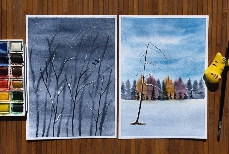
Transcripts
1. Hello, Welcome !: Do your watercolor paintings
start off beautifully, but somehow end up feeling
heavy or overworked? Or do you find yourself going back again and again trying
to fix small things, but it just keeps getting worse? If this sounds familiar,
you're not alone. Hi, everyone. Welcome
to this new class. I'm Sukrutha watercolor
artist and teacher, and I'm so glad you're here. Over the past few months, my life has changed quite a bit. I became a mom, and
with a four month old, my days look very different now. I don't have long,
uninterrupted hours to sit and paint like I used to. Most of the time, I only
get small pockets of time, and for a while, I found
that really challenging. I kept trying to paint
the way I always had, but it just didn't fit into
the time and energy I had. So I started simplifying. I began choosing
limited color palettes, breaking landscape
into fewer elements, and approaching each painting in a much more intentional way. And something
interesting happened. Not only did it fit
into my time better, but my paintings actually
started to feel more fresh, more balanced, and
more complete. And that's what led
me to this class. One of the biggest
challenges I see, especially in bigness
is overworking. I will also be
showing you some of my previous works
where you can clearly see how I have overworked entire landscapes and
completely ruined them. Overworking is essentially going back to the same area
again and again. For example, if I'm
painting the sky and it doesn't look the way I imagined or like in the
reference picture, I go back in with
the same color, say, blue, and keep layering
it repeatedly. And that's exactly what starts to ruin a
watercolor painting. In this class, instead of
trying to fix overworking, we will approach it
in a different way through simplification. I will teach you
how to break down landscapes into minimal
and essential elements, work with limited color
palettes for better harmony and approach paintings with more clarity from the beginning. And this naturally
avoids overworking because we are making fewer and more intentional decisions. Each pending is designed to be simple, calm,
and approachable. So you can focus
on understanding the process rather than
getting overwhelmed by it. Before every main project, there will be a short
practice session where we explore the
elements of the landscape, test out compositions
and try color choices. This helps you understand
what to include and what to leave out even before you
start the final painting, making the entire process much more clear and intentional. By the end of this
class, you will not only have a collection
of minimal landscapes, but also a clearer and
more confident way of approaching
watercolor painting. Especially if you
often find yourself doing too much and not
knowing when to stop. So if you're looking
for a simpler and more intentional
way of painting, this class is for you.
Let's get started.
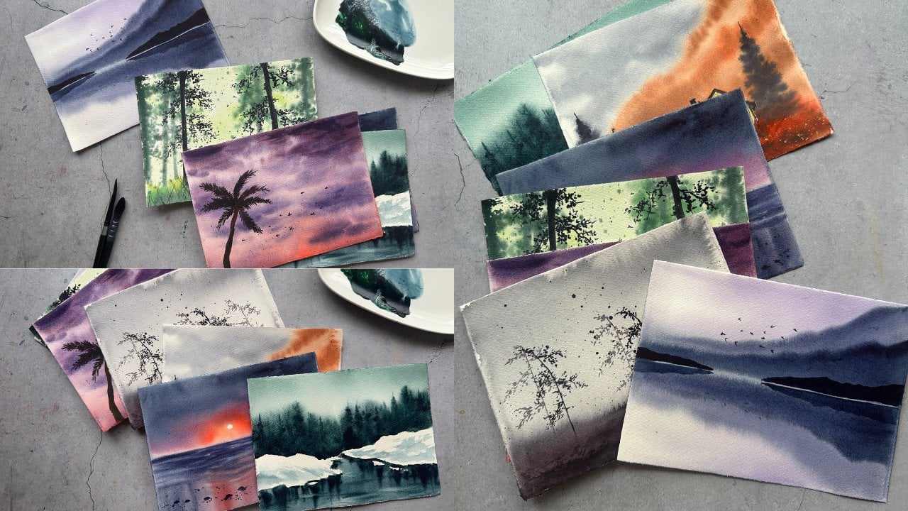
2. About Class & Class Projects: In this class, we will paint 20 minimalistic
landscapes designed to be a calm and
consistent daily practice. Each day focuses on one landscape project carefully chosen to help you
explore different moods, compositions and
atmospheric effects. All while keeping the process
simple and approachable. What makes this class
slightly different is how we approach each project. Before starting the
final painting, we will begin with
short practice session. In this step, we will break down the key elements of the
landscape, such as shapes, compositions and
color choices and explore them in a loose
and low pressure way. Once we move into
the main project, you will have more clarity and confidence in your approach. Each project is big enough friendly while still helping you build deeper understanding
of watercolor as a medium. By following the structure, practice first, and
then final painting, you will not only complete
each project more confidently, but also develop a more
thoughtful and intentional way of approaching any landscape in your future
watercolor practices. You can follow along with
one project each day or move at your own pace
depending on your schedule. If this feels like
something you'd enjoy, join me in the next video
where we will go over all the art supplies
that we'll be needing to get started. So
I'm gonna see you there.
3. Art Supplies : Hey, everyone. In this video, we will go over all
the art supplies. You will need to
complete this 20 days of minimalistic
landscapes class. Let's start with the colors. I have used watercolor
paints from several brands, including Winsor and Newton
professional artists grade, Senier, white
Knights, and Aquaton. You absolutely don't
need all of these. You can use any watercolor
paints that you already have. We will be discussing
the specific colors in more detail
before each project, so you can follow along easily. What Next, let's talk about brushes. I have mainly used just few brushes
throughout this class. The first is
Princeton flat brush, which I use mostly for washes, and these are silver black
velvet round brushes in sizes ten, six, and two. Size ten is great for painting backgrounds like
skies and water. And the smaller
brushes are useful for adding details. That's it. You don't need the
exact same brushes. If you have two round brushes, one larger and one smaller, you can comfortably complete
all the class projects. To the palette, I am
using a ceramic palette. You can use any
palette that you have plastic ceramic or
even a simple plate. Now for the paper, this
is very important. I'm using Fabriano 100% cotton, 300 GSM, cold-pressed paper. I bought these in rolls and
cut them into smaller sizes. I would strongly recommend using 100% cotton paper because we will be working with
wet on wet techniques, and this type of paper holds water much better and
gives you softer results. You also need a
pencil for sketching, two jars of clean water, and a paper towel for controlling
excess water and paint. Finally, to stick my paper, I am using this board, which is a simple cutting board I got off off from Amazon. You can use any board you
have an acrylic board, wooden board, anything sturdy
to tape your paper onto. So these are all the supplies we'll be using
throughout the class. Keep your materials ready. In the next video, we will begin with practice
session for Devon. I hope you guys are
ready for that. I know I am, so let's go. See you in the next video.
4. Class Project 1 - Practice Session: Hi, welcome to 20 days of minimalistic watercolor
landscapes and welcome to Dave. In today's practice,
let's go with a quiet winter scene.
Nothing too planned. I'm just exploring what I have practiced a few months ago. So I will start with
the colors first. I'm taking indigo from Winsoron Newton and Pines
Gray from white Knights. I'm going to swatch
this out first and also mix both of them together
to get a third shed. Mm. So now, we'll have three
tones to work with Indigo, Pines gray, and a
mix of the two. Habit of writing
the color names, even the mixes so
that I will remember them well while painting
with the main project. So I will take a pen or a pencil and I will
name these colors. And later we will begin
with our practice session. Before we begin the
practice session, I just want you to take
a moment to relax. There is no pressure here. This is not the final painting. We are simply exploding. It's completely okay
to make mistakes, and it's also okay if
everything goes smoothly. This space, this
practice session is just for trying things out, understanding how colors behave
and how our brush feels, and what we can create with
the materials that we have. So let's just enjoy the process. As you can see, I have wet a small area with my flat brush. And now I have taken my round brush and a very
light shade of Pines gray. And I'm just painting the background,
simple colours watch. Think of it as a colours watch, not a background,
so it'll be easy. So yeah, this is a gradient wash. And while
the paper is still wet, I have quickly changed my brush. This is a small round brush. With a mix of indigo
and pines gray, I am painting a few branches. Remember, these branches
will be in the background, so they have to be a bit blurry. That's why we are painting them while the paper is still wet. We will let this dry completely. This is dried, so we
are going back again with a slightly darker mix
and add a few more branches. These can be a bit more defined just to create that depth that we
are looking for. Let's not add too many. Just a few is enough. Mambo. Now, we will paint a bird
on one of these branches. But before that, I
will show you guys how to paint a bird with a
few simple breast strokes. This is very simple bird shape, so we will explore this more in the final
painting, of course. I'm going to show how to paint
this bird one more time, but this time on a branch. It's a very simple
exercise just to explore and get comfortable
before the main painting. I hope you enjoyed this and got a better understanding
of the process. Now let's move on to the main
class project where we will bring everything together into a beautiful snow
scene with a bird. So I hope you guys are
ready. Let's move on.
5. Class Project 1 - A Quiet Winter Visitor: Is, welcome to Day
one main project. Before we start,
I'm adding a bit of white quash to my palette, since we'll be painting
a winter scene, and we need it for the snow. You can also use white watercolor if
that's what you have. And if you notice a
little liquid coming out of this watercolor tube, this squash tube, that's usually gum Arabic and
it's completely normal. Now, it's time to
prepare our paper. First, decide the orientation
of your painting. I'm going with vertical
composition for this one. So I will tape down my paper using a masking
tape onto a board. You can use any tape
on any sturdy board that you have. No. Once that's done, let's wet
the paper with clean water. I'm using a Princeton
wash brush here, but you can use any brush. Even a round brush
works perfectly fine. In fact, most of the
times I wet the paper initially with
round brushes only. But since I have a wash
brush here, I'm using it. Make sure the paper
is evenly wet. Let's prepare the color. I'm taking a mix of indigo on pines gray, a good amount of it. Using a round brush, this is size ten brush. Let's begin applying the wash. Keep the paint light and gently guide the pigment downwards
across the paper. You don't need to pick
up more and more paint, move the existing pigment along. Also notice how I'm removing excess water and
paint from the edges. This helps prevent unwanted
backgrounds or blooms. I love blooms, but just
not for this landscape. The paper is still wet. Let's add the
background branches. Using pines gray and a
smaller round brush, add these branches very loosely. Since the paper is wet, they will naturally
soften and blur, which is exactly what we
want for the background. This days, you can also
gently adjust the shapes. If a branch feels too
thick or too dark, you can lightly lift some paint with clean and damp brush. Or if you want to
extend a branch, you can softly pull
the paint outward. Keep your strokes light
and minimal here. We don't want sharp or very
defined lines at the stats. Let the water do
most of the work and allow the shapes to
stay soft and organic. Now, I'm going to add
a small extra detail. Using a size two brush
and some white wash, I will gently
splatter some paint. Creates a soft snowy effect, and you can also add a few small dots to
suggest falling snow. Robbie Robbie Robbie. Right. Now, let's allow this
layer to dry completely. Once it's fully dry, we will come back and add more defined
branches wet on dry. So I'm going to see
you guys in a bit. Now that the paper
is completely dry, let's move on to the foreground. A darker mix of pines gray
and a smaller round brush. Let's add a few more branches. These will be more defined compared to the background ones. So use slightly
controlled strokes here. Contrast between soft
background branches and sharp foreground
branches will help create depth in the
painting. Keep it minimal. Just a few well placed
branches are enough. Let's add the bird. Place it gently on one of the branches, keeping the shape
simple and minimal. Focus more on the silhouette
rather than the details. That's enough to bring
the whole scene together. Next. Let's add some snow using white quash and add small touches of snow
resting on a few branches. This step, you have to
keep it very subtle, just enough to
suggest accumulation, and it's easy to go
overboard with snow, but this is a minimal landscape, so let's keep it that way. And finally, I will add a bit of splatter to create that soft falling snow
effect with white quash. That completes our
final landscape. Remove the tape once
the paper is dried. I hope this felt simple
and easy to follow, especially since we already explored this in the
practice session. This is the approach we will continue throughout the class, keeping things
minimal, intentional, and calm while still creating
something beautiful. Don't forget to
share your project in the project section below. I would love to see your work. If you enjoyed this class, please consider
leaving a review. I will see you
tomorrow with Day two. Stay tuned and thank you so
much for joining me today.
6. Class Project 2 - Practice Session: Today's class project, let's explore a soft
beach sunset scene. Et's start with the colors. I'm taking carmine from aquaton. You can also use quinacrone
rose if you have that. Next is dioxin purple
from the brand senneliar and danrine blue, you can substitute
this with ultramarine, cobalt blue, or
even Prussian blue. And this blue that I have danrine blue is from
the brand sennelar. And finally, indigo from
Windsor and Newton. Along with this, let's also
keep some white quash ready. We will need it for the waves and a bit of splatter later. But if you don't
have white quash, you can use white
watercolor as well. Let's quickly swatch the colors, starting with a very
light wash of carmine, then dioxin purple, followed by indanthrin
blue, and finally indigo. Now, let's try mixing a
few of these together, carmine, purple and blue. To see how they blend
into a soft sunset tone. This combination already
looks very calm and glowy, and this is exactly
what we want to create that soft glow for our
main class project. I'm gonna name these colors, and if you don't understand
my handwriting, I'm so sorry. My husband tells me all the time that my handwriting is very bad. And actually, his
handwriting is very good. I should have asked him
to write this down. Let's move on to a
small practice piece. Let's wet the paper first
using a wash brush, making sure the
surface is evenly wet, even for a practice session. Now, let's begin with carmine at the top and followed
it with dax in purple. You can see I'm using dich in purple on both
sides of the pink. Yes, that's what we want. And then bring in
with anrine blue. So yes, anrineblue as well on both sides of
the purple colour. This way, you will
protect that soft glow, which comes from
carmine on the horizon. Well, let's blend
all these colors together, keeping
everything smooth. You can see how these
colors naturally create a peaceful
sunset effect, right? So yeah, these are
perfect colors. If you ever want to go
for a peachy glow in the sky that we very rarely
see during sunset hours. That's actually my favorite.
I always look for it. So I actually sat down and mixed all these colors together to get exactly that color. I won't say I got the same, but this is very close. Is done. Now, let's
practice the beach. I will quickly sketch a simple shoreline and
a few wave shapes. Nothing too detailed
here, as you can see, just enough to guide us
where the wave will be. And for the darker
shore, I forgot to take. I'm very sorry
Pines gray as well. We need one extra color guys, and it's Pines gray
to paint the shore. I'm very sorry I should
have included this earlier. But yeah, if you
have Pines gray, you can use that, but
if you don't have, you can use black as well. No. Et's paint the waves
and the beach. Where the wave highlights are, let's leave space
or use white quash. I'm going to use whitewash. You can leave that
space as well, but that's going to
complicate the process. And in what pin, let's add a bit of blue
to define the form. So this is the pattern, white, blue and white again, which helps suggest the
movement of the waves. Let's keep this very simple. A few I am aiming to paint this entire beat scene with only a few brushstrokes. And yeah, just follow
what I'm showing here. This is very easy, but if you are painting which
for the first time, this is going to look
a bit difficult. But if you practice it, this is going to be
very simple, trust me. Now, from the horizon, that is from the
starting of the beach, I will start with blue and
Indigo, sorry, indigo color. Now adding this white
color and then blue color, the pattern that I
was telling you about to the wave structure. And finally, as you can see, it's already giving us a nice idea of the
beach scene with waves. Robbie. Rabbi. Rabbi. Robbie. Rabbi. In the blue and indigo, I'm going to paint a few horizontal lines here and there to indicate beach sorry, to indicate the
waves on the beach. And finally, white quash to add that foamy
water that you see, that'll be in white colour,
right? So we are adding that. If you don't have whitewash, you can use white watercolor, but it is going to look a
bit dull compared to guash. If that's okay with you, you can go ahead with watercolor. The shore will be
in darker color. That's why I have
Pines gray here, and I'm blending it
slightly with a carmine. And yeah, this is perfect
color to paint the beach. In sunset, the beach will be the shore will be a
bit darker in color, so that's why this color. And finally, with white, I'm going to add a few highlight areas and
a bit of splatter. In the final project, the splatter will be
in the final project. This will look great
in the main project. Let's just explore what we get with these colours
and composition. Yeah. Now let's move on to the main project. I'm
gonna see you there.
7. Class Project 2 - Soft Sunset By The Sea: Everyone, let's begin
with our Day to project. So we have already done
the practice session. I think we have
warmed up enough, so we are already, I guess. So let's begin. First, let's prepare our paper
for this painting. I'm going with a
horizontal orientation as it works well for a
landscape like a beat scene. Now I'm taping down the paper onto the board
using masking tape. Okay. Separate the landscape
into two parts, the sky area and the beach area, and I'm drawing a
line in the middle. Here, I'm going to add a strip of tape across in
the middle on this line. This will separate the
sky and the beach area. This way, we can
paint the sky freely without worrying
about the colors flowing into the lower section. Now, let's begin with the sky. First, I will wet the sky
area evenly with clean water. Make sure the surface
is nicely wet but not overly dripping
with the water. Just enough to let the
colors blend easily. We will begin adding the colors. Start with carmine
in the middle. So we have already done this
in our practice session. So I hope this main
project is easier. So I will begin with carmine mixed with a little
bit of dax in purple and then dax in purple on both sides of that
carmine color pink color, followed by blue on both sides. Remember, we have done this
in practice session, right? So this should be easier. I'm gonna darken it by adding indigo to
the inantrin blue, and I'm gonna add this color
on both sides of the paper. I mean, the sky area. See that peachy glow
right in the middle, just a very tiny bit of it, and that's exactly
what I was going for when I started this
soft sunset scene. So this is perfect. I'm going to remove all the
extra paint and water from around the
edges using a paper towel. This prevents the
backflow of the water. Yeah. And I'm going to
let it dry completely, and then we will begin
with the bit scene. If the sky area is
completely dry, let's carefully
remove the tape from the middle and we can start
working on the beach. First, I will wet the
beach area of the paper, and I'm using my wash brush to apply a very nice
even layer of water. Make sure the surface is evenly wet so the colors
blend smoothly. Bam Bam. Let's start laying
in the base colors using a very light
mix of colors, begin applying the color
across the beach area. At this stage, we are
not focusing on details. We are simply placing
colors where they belong. We are starting with
blue at the top. As we come down, we will
leave white spaces. We can come back in and
add white color later. And let's also add the
shoreline while we are at it. Use a very slight darker tone. I'm using Pines gray, place it along the edge to define the separation
between the land and water. We are keeping it
very soft for now. We will refine it later. Base layer is in place, Let's start building the waves. I will begin adding some
white into those areas we left earlier just to
establish the wave shapes. Now going back in with
a slightly darker blue, I will add a few
horizontal strokes starting from the horizon line. Strokes. These
horizontal strokes help suggest the
movement of water, so keep them very
light and minimal. We don't need too
many of these lines. As we practiced in
practice session, let's follow that
simple structure, white, blue and white
again to the wave form. So I'm adding a slightly
darker tone of blue in between white areas to give
that sense of moving wave. This step really helps
bring the waves to life. I'm going to take a
moment to adjust. If something feels too light, I will go back in and
deepen it slightly, if it feels too strong,
I will soften it. This part is more intuitive, just observing and
redefining as we go. It is still looking a bit flat, so I will go back in with
slightly darker blue again and add a few more
horizontal strokes. This adds a bit more
depth and variation. Now, using white cash, I will define the
waves a little more. I will add highlights
along the edges. This slightly strengthens
the white areas, and this also helps create that foamy texture we
see on the beach scenes. Abbiamo Robby. Well, let's add some
splatter using white cash. Add small dots across
the beach area, that wave area. Sorry. To suggest that
splashing of water, you can add as much as you like. It actually enhances the effect and makes the scene
look more dynamic. So you can literally let go here and paint as many
splatters as you wish. Mm. Mmm. Finally, let's
refine the shoreline slightly using white just to bring in everything together. And once you're happy with
how everything looks, you can remove the tape
if your paper is dried. Wow. I will give you one
more suggestion before removing the tape. If you want to enhance a depth
of the wave a little more, you can add some soft
shadows to the waves near the shoreline using a very slightly darker
pines gray color. Add subtle lines just
beneath the white areas. This helps create
that three D effect that we often see in
real beach scenes. Keep it very minimal, though, because too much darker colors just under the white will
look very unnatural. Robbie Robbie. Robbie. Robby Robbie. Ronnie. I'm really happy to see so many of you already
joining me from Day one. Tomorrow, we will be working on another beautiful project, so stay tuned and thank you
so much for joining me today. I'm going to see you tomorrow
with a brand new project. Ln a Mama
8. Class Project 3 - Practice Session: For today's practice, let's
explore a soft winter scene just to understand the colors and how the elements
come together. I will start with the colors. As usual, I'm taking the turquoise green from
Windsor and Newton, permanent orange from
the brand aquaton, dioxine purple from
the brand sennelier, and indigo from the brand,
Windsor and Newton. So along with this,
let's also keep some white quash ready for
the snow details later. Let's quickly swatch
these colors, and I'm also looking for a
brown tone for the tree. So instead of picking
a separate color, let's mix orange and indio
that we already have together. And let's
see what we get. Yes, this is a perfect color
that I was looking for. Now, the third color
is dioxin purple, and the fourth is indigo
color, of course. You can see the brown,
so I will just mix orange and indigo once again
to show you the exact shade. And, yeah, that is the brown
that I was talking about. It's perfect. Now that we
have our palette ready, let's move on to the
small practice session. Yeah, I forgot. I'm going
to name these colors first. This is very important
for me personally because I have to see the colors so that
I can mix them well. Even these little
colours watches, I always keep them with me, right on my table
so that whenever I have something similar in
my mind, any landscape, I'm just going to take
out these colors, and I'm going to quickly see if those are
the colors that I want, and I'll just I can easily
pick out the tubes. So this is very helpful for me. O. Put the paper first, just a nice even layer of water. And for the sky, I'm going
to keep it very minimal. I'm mixing a bit of turquoise
green with a touch of indigo to get a soft
muted blue tone. If you have a pastel
blue in your palette, you can use that as well. You can use sky blue
color if you have, or if you have cobalt blue, you can mix it with a
bit of white color. You'll get the similar color. Let's apply this color very lightly and leave some
white spaces in between. These white areas will
act as soft clouds, so we don't need to
paint everything. This is the perfect
sky for the winter, very soft and very simple. Now let's move on
to the background. I'm imagining soft, colorful
trees in the distance, not very defined, just
a blurry suggestion. Let's wet the area slightly again for the
background, of course. Now, starting with the
brown mix and then adding touches of indigo,
purple and turquoise. Let's keep everything
soft and blended. Purple and turquoise,
especially add a very nice variation and
interest in the background. And also, we are not painting
individual trees here, just suggesting them with colour and soft shapes because these trees will
be in the background. This is exactly what I have
in mind for the background, those dark tones with that
pop up color of indigo, sorry, turquoise and purple. So that's it. Now,
for the foreground, I'm going to be
adding a single tree. You can use the brown mix or even just indigo, if you prefer. Keep the shape
simple and natural. Finally, I'm gonna
be adding a bit of white gosh to suggest no
resting on the branch. This is our quick practice, just exploring the colours,
background, and composition. I hope this gives
you a clear idea. Now let's move on to
the main project. So I'm gonna see you
in the next video. Wow.
9. Class Project 3 - Soft Colors in a Silent Winter: Hi, everyone. I
hope you guys are ready for day three
main project. First, I have decided to go with the vertical composition
for this painting, so I will start by taping down my paper onto my board
using a masking tape. Now, I will make a
very simple sketch, a line to separate the
foreground and the background. This is nothing This is
not too detailed, right? Just a guiding line so we
understand the placement. There will be few changes from the practice session.
This is one of them. Now, let's begin with the sky. I will wet the sky area
evenly using clean water. As we practiced,
I'm going to take a mix of turquoise
with a bit of indigo. Let's apply this very lightly and leave some
white spaces in between. These white areas
will naturally act as clouds and we don't have to
paint everything, right? That's what we practiced, and that's what we're
going to follow. Wow. Well, there'll be a few changes from the practice session to the main project. This is another one. So we have painted the sky and background
separately, right. But for the main project, we'll paint them together. So while the paper is still wet, I will start painting
the background trees. So let's begin with
the brown mix, and then gradually add
indigo, purple and turquoise. Try to keep everything soft and blended, but
at the same time, simply build the
intensity that we needed. If any areas are
feeling too dull, you can gently go back
and deepen the color. For example, that's
what I'm going to do here at the brown spots. I'm going to add a bit of
orange to it to make them pop. Now, instead of leaving
it just a soft wash, you can slightly suggest
the shape of the trees. I'm going with pine
trees, of course. You can gently use upward strokes to
indicate pine like forms. Keep them loose. We don't want very sharp or
detailed trees here. Just enough to break that flat background and
give it a more structure. Wow. This already looks much closer to what I want. Now, I will allow this
layer to dry completely. Once it's dried, we'll come back and refine the background slightly to make the
trees a bit more defined. So I'm gonna see you
guys in a minute. Now that the paper
is completely dry, we will go back and refine
the background a little. I'm taking indigo and
using a smaller brush, I will start adding
a few pine trees. Just use light upward strokes and slightly pointed
tips at the top. This suggests the shape
of the pine tree. Keep it very minimal. We don't want to over define everything because this is
still background, right? Just a few trees here and there to bring some structure
to the background. If the background looks perfect, let's move on to the foreground. First, let's wet
the lower area of the paper using very
light shade of indigo. You can even use the
same tone as the sky. We will add a very soft wash. Keep the top portion
lighter, almost white, and gradually bring in a bit more color
toward the bottom. This creates a simple
effect of snow where the blue acts as soft
shadow of that snow. That's all we need here,
keeping it very minimal. Now, let's allow this
layer to dry completely. Once it's dried,
we will come back and paint that lone
tree in the foreground. So see you in a bit. Now that the foreground is
completely dry, let's add the main
element, the tree. I'm going to use indigo. I will also use brown, which is a mix of orange
and indigo to get a slightly warmer brown
tone to the three instead of just a
dark indigo color. Let's start with the trunk
and add a few loose branches. Since this is a winter scene, the tree is bare, so we don't
need to add any leaves. Just a few simple branches are enough to suggest the form. Keep it light and natural. Don't overwork this part.
That is very important. G. G. Using white wash, I'm
going to add some snow on the tree in a few areas,
not covering everything. This helps suggest
no accumulation and adds a nice contrast
to the dark tree. Let's blend the base of the tree slightly
into the foreground. This is a small but
important detail. This really helps ground
the tree into the scene. Robbie. Robbie Robbie. Finally, let's add a bit
of white splatter to suggest the falling snow. You can add as much or
as little as you like. It really enhances the
winter feel nonetheless. And that completes our
day three painting. Once everything is dry, you can gently remove the tape. One. One. One. And I hope you guys
enjoyed this project. If you are enjoying
the class so far, please consider
leaving a review. It really helps me and don't forget to share your work in
the project section below. I will see you
tomorrow at Day four. Thank you so much for
joining me today.
10. Class project 4 - Practice Session: For today's practice, let's explore a moody and
peaceful field scene, keeping everything simple and working with a limited palette. Let's start with the colors. I'm using Iantrine blue, indigo, pines gray, permanent
orange and sap green. These colours work
really well together to create that slightly dark
and atmospheric feel. Let's quickly take these colors onto the palette and
swatch them out, starting with the lighter tones. One. Mm. I will start with sap green, followed by permanent orange, Ianrine blue, indigo,
and finally, pine green. I'll just name them quickly, and then we can
begin the practice. C. Wow. Let's start by
wetting the paper. I'm using a flat brush to
apply an even layer of water. The main focus of this
scene is the sky, so let's take our
time with this part. I'm going for a moody sky, which means more clouds
and slightly darker tones. Let's begin with a very
light mix of blue. Now, instead of painting
the entire sky, let's leave a few white
spaces in between. These white areas will act as
the sky in the background, and the blue strokes that we
add will become the clouds. These blue strokes that
we're going to be adding one more time so that the
sky will become more moody. We're building this gradually. I'm going to add darker tones
in between with the blue. That is, I'm going to mix
it with a bit of indigo, and I'm going to keep the
strokes soft and flowing. I have placed the
darker tone colors. I will just use a damp brush and give the
shapes for these clouds. I think I'm okay with how
the sky has turned out here. I will begin with
the field scene at the bottom of the paper. Field will be a mix of sap green and orange, but more green and less orange. So you get that
muddy brown color when you mix these
two colors together. And this field will be at the bottom of the paper
because the main focus is the sky. Robbie. Rob So what you are seeing here is a mix
of light and dark areas. This contrast is what
creates that moody effect. Now let's move on to paint those small pine trees
at the horizon line. I'm using a smaller brush and a darker tone
that is indigo. I'm going to place
a very few strokes of the pines, vertical strokes. You don't have to, you know, paint very detailed trees here, keep them very small and subtle. They are far away. This already gives us a nice
composition, right? We will add more
details like birds and refine everything
in the main project. Oh, this is just to
understand the colours, the sky, and overall
feel of the scene. Now that we are done with
the practice session, we will move on to
the final painting. So I'm gonna see you
guys in the next video.
11. Class Project 4 - Under The Moody Sky: Hi, everyone. Let's begin with our day four
main class project. For this painting, I'm going with a horizontal composition. So as it works well for
a wide field scene, I will start by taping down
my paper onto the board. Now that is done, let's wet the paper
with clean water. I'm using my flat
brush for this, making sure the
surface is evenly wet. Mama Mam Also, gently remove any
excess water from the edges. This helps prevent
back runs or blooms, which we don't
want for this sky. Let's begin with the sky. I'm starting with a very light
wash of inanthrine blue. I'm going to keep it
very soft as the base. Now, I'm switching to the smaller round brush to get more control while
painting the clouds. So let's begin with the clouds. We will add gentle strokes, very light strokes while leaving
white spaces in between. Just like we have practiced, these white areas will
act as the sky behind, and the painted areas
will form the clouds. Let's build the
intensity of the clouds, I'm gradually
deepening the tones to create more moody effect. Since we are going
for a dramatic sky, don't hesitate to add more layers while the
paper is still wet. Let the clouds feel full
and slightly heavy. And by the way, I am using indigo and very little mix of danthrine blue to
paint these clouds. Looks good, but I want the
sky to be more dramatic. So I'm bringing in
indigo again and gently layer this darker color in between the
existing cloud shapes. On the areas where you want
more depth and contrast, this contrast between
the lighter spaces and darker clouds is what creates the strong and moody atmosphere. Keep building it
slowly and stop when it feels balanced
and not overworked. Mm. Mm. Mam. This looks good for me, so I will stop and
continue with the field. Now, while the
paper is still wet, let's move on to the field. Using sap green and orange, let's add the base for the land. You can choose whichever
the color to highlight. I'm keeping green as
the dominant tone, but you can use that orange and sap green mix to
create muddy brown. You can use that as well
to be the highlight color. C. Along the horizon line, let's add a few distant trees. Since the paper is still damp, they will appear soft
and slightly blurred, which gives a nice
sense of distance. And I'm using indigo color for this and a very small
detailing brush. I, D click on down trees are looking great except these two
here in the middle. I have to refine them once the paper is
dry because they are looking too blurry and you can already see how the
scene is coming together. I'm going to allow
this to dry and we will come back once it's dried. See you guys in a minute. That the paper is
completely dry, let's go back and refine
the trees a little. Using darker tone indigo, I will adjust the shapes of
these pine trees, these two, just making the tip
slightly sharper and adding a bit
more definition. Keep this subtle, we still
want them to feel distant. It's time to add the birds. I'm going with a
small flock here, just simple minimal
stroke to suggest moment. If you want a more moody feel, you can even add just
one or two birds. That creates a stronger sense of stillness in the painting. Everything is dry. I
will remove the tape, and that completes
our Day four project. I hope you enjoyed painting
this moody feel scene. I have really loved seeing
your project so far. And if you haven't
shared yours yet to post in the project
section below, I would be happy to
give you feedback. I will see you
tomorrow at day five. Thank you so much for painting along with me. M
12. Class project 5 - Practice Session: Today's class project, we are exploring a glowy galaxy scene, and we are practicing
for that now. Let's start with the colors. I'm using sap green, Indigo and Pines Grey. So the sap green is from Senier. Indigo is from Windsor Newton, and Pines Grey is
from White Knights. We will also use white
coach later for the stars, but for now, let's
focus on these three. Wow. Green on its own, is quite bright and also is not the right color
for our galaxy. So I'm going to mix it with indigo to get deeper,
darker green. This gives a nice
rich green tone, almost like emerald green. So yeah, that color, again, indigo, and then pines gray. You want to paint
any galaxy scene or any rich sky with lots of stars, you can use this
color combination. This is perfect and classic. So now I will name
these colours. I'm going to use a simple pen. Now, let's begin with
the practice session. Let's wet the paper
first. I'm using my flat brush to get
even layer of water. Let's start placing the colors, beginning with that dark green. I'm applying softly
on the paper, but let's leave a space in the middle that will be
our glowing galaxy band. Around this green, we will
start deepening the tones, adding indigo, and
then pines gray. Let's build the
contrast gradually. Now with a damp brush, let's try to blend
these colors gently while still preserving that
lighter area in the center. It doesn't have to
stay perfectly white, just enough to suggest the glow. See how the colors are coming together to create that
soft galaxy effect. Now for the foreground, let's quickly explore how
to paint pine trees. I'm going to use a smaller
round brush for this, and I would suggest
you guys do the same. Start with thin line
for the trunk and then use small zigzag strokes to build the shape of the tree. Think of it as a loose
triangular form, keep it simple and
keep it natural. It is a single pine tree. And now I will show you how I paint a group of pine trees, say two or three. So same method, paint a thin trunk and then move your brush in a at manner to
get that pine tree. And then just beside that, you know, you can combine
those two trees together. That's how you'll get
a group of trees and then follow the steps
that I've just mentioned. Yeah, I think this gives us a good idea
of the composition, the glowing sky, and the
trees in the foreground. We will explore this further in the main project and add details like stars to
complete the scene. Now let's move on to
the final painting. I'm gonna see you guys
in the next video.
13. Class Project 5 - Soft Glow Under The Stars: Everyone, let's begin with
our Day Pi class project. For this painting, I
have decided to go with a vertical orientation as it works beautifully
for a galaxy scene. I will start by taping down my paper using masking
tape onto my board. Once that's done, we will
begin with the painting. Let's take a wash brush and begin wetting
the paper evenly. Make sure the surface is nicely wet but not overly saturated. Try saying wash brush, wash brush, wash brush, Bush. I had so many bloopers
with these two words. Just try it out and let me know if you can say it as well. Once the paper is ready, let's mix sap green with indigo, and we get this deep emerald
rich green color right. That's my favorite green. Now let's start placing
this color onto the paper. I'm leaving a space in the middle that'll be
our glowing galaxy band. We will blend this
area softly in a bit. Once the paper is wet, we need to work a
little quickly here. Let's now add indigo
around the green and then deepen it
further using pine gray. You will notice how
the colors start blending naturally
because the paper is wet. Oh, I will be keeping
the foreground lighter for now since we'll be painting the
pine trees later. Now using a damp brush, I will gently blend the
green and blue areas. Try to soften the
transitions while still preserving that
lighter band in the center. Wow. Paper is still wet. Let's add a bit of white cash. Just small touches
here and there. These are not the final stars. Once this dries, these areas will create a soft glow effect, and later we'll add
stars on top of this. Its any backflow of water
or unwanted blooms. This is the time
to correct them. So I will quickly soften it by adding a slightly darker tone while the paper is still wet. Remember, once it dries, we can't change how
the paint has dried. So now is the time. Let's allow this
to dry completely. Once it's dry, we will come back and add the pine trees
in the foreground. So I'm gonna see you
guys in a minute. Now that the paper
is completely dry, let's move on to the foreground. I'm taking my smaller
round brush size six and using pines gray, I will start painting
the pine trees. In with the main
tree, I'm placing it slightly off center
towards my right side, and this will be the tallest
tree in the composition. Start with a thin vertical
line for the trunk and then begin adding small
strokes on either side. Use a gentle zigzag motion moving your brush from side
to side as you come down. Keep the top very
sharp, pointed, and gradually make the branches
wider as you move down. Take your time with
this tree since it becomes the focal point
of the foreground. Try to keep the strokes
loose and natural. It doesn't have to be
perfect, by the way. Now let's add a few
more trees around this. These will be smaller and
slightly varied in height. Wow. I changed to number two round brush, even smaller than number six. Also notice that I'm not placing
them in a straight line. Instead, I'm slightly
shifting their positions, some leaning a little
and some overlapping. This helps create that
feeling of a dense group of forest rather than
isolated trees. In my mind, I'm imagining
a cluster of pine trees, so allowing them to
feel a bit of a bit uneven and organic makes
the scene more natural. The trees are placed. Let's start filling
the foreground using pines gray and
a bit larger brush. I will cover the lower
portion of the paper. We don't need to paint every
single branch of every tree. In fact, leaving parts of
the tree incomplete and blending them into
the dark foreground actually looks more natural. You can think of it as painting only the
upper portions of the tree and letting the
rest merge into the shadow. C. C. The foreground is done. Let's move on to
the final details. I will start with some
splatter using white cash. This helps create that soft
scattered glow in the sky. Then using a smaller brush, let's add tiny dots
to indicate starts. You can add as many as you like. This really enhances
the galaxy effect. And that's it. Once
everything is dry, you can gently remove the tip. And Day five project
is now complete. I'm so happy to see so many
of you joining this class. We are already close to 50
students, which is amazing. I will see you
tomorrow at Day six. Another beautiful project. Thank you so much for
painting along with me. Robbie. Rami
14. Class project 6 - Practice Session: All right, let's begin with day six of our minimalistic
landscape journey. Today we are painting
a serene lake scene with soft calming reflections. Let's start with
the colors first. Is carmine, a
beautiful pink tone. If you don't have this, you
can use quin rose as well. Next is daxine purple from the sanelar and the
carmine was from aquaton. The third color is danthrine blue from the brand
senear and finally, pins gray from the
white knights. Colors always pair
perfectly well together. Pink, purples and blues
very reminiscent of a sunset palette No. I have to mix carmine
and purple and anrine blue together to get
a deep wine like shade. And this is the color
that we're going to be using instead of carmine. So dax in purple will
be using as it is, and Ianrine and Pine
Scray will be using. But for the carmine, we have to mix
these three colors together to get the
dark purplish tone. Et's name these colors now. Later, we will begin
with our practice. Mm hmm. Now let's practice. Start
by wetting the paper, begin with that pink mix
that we have mixed before. The carmine sorry, dag in
purple and anrineblue mix. And I'm going to be adding purple now on both sides
of this pink tone. So yeah, the purple color and followed
by anrineblue again, on both sides of the paper. Sorry, both sides
of the pink color. With a damp brush, I'm gonna blend all these
colors together now. Mm. This is a perfect sky
and the lake scene. We are not painting, separately, just a few ripples here and there to suggest that there
is a water over there. Now, while the
paper is still wet, we will add the
reflections. That's right. We are not going to
paint the subject first. We'll paint the reflections. So the reflections
has to be blurry. That's why it has to be
painted on wet paper. Now, while the
paper is still wet, I will paint a few
horizontal lines to suggest that there
are ripples over there. So this is it for the sky, the background, and
the reflections. We will paint
subjects wet on dry. With a very few simple bunch of pine trees for the subject. I'm not going to overcomplicate it with painting
different trees. Pine trees are perfect, so I
will paint those wet on dry. Now, I'm thinking
to paint mountain. But even without the mountain, this makes for a calm and
minimal scene, so I don't know. We'll just go to practice
the mountain scene, but we will see if we paint in the main
class project or not. And this is the practice. In the next session,
we will move on to paint the
final class project. So I'm going to see you guys.
15. Class project 6 - Quiet Reflections by the Lake: All right. Let's begin with
the main class project. I'm going with a horizontal orientation for this painting. It really helps to capture that wide calm
feeling of a lake. I'll quickly tape
down my paper on all four sides to keep it secure and to get clean edges
once we are done. Take your time with this step. A well taped surface makes the whole process much smoother. You're ready, we will
begin by wetting the paper evenly and move on to laying
our first layer of colors. We practiced earlier, we will begin by mixing carmine with anthrine blue and
diaxin purple to get that deep rich purple tone,
purple, pinkish tone. We will start with this color
in the center of the paper. Then on either side of it, we will add diaxen purple gently blending
into the middle. And finally, towards
the outer edges, we will bring in
our anrine blue. These transition
should be soft and shameless as the colours
flow into each other. We have laid down all the
colors, take a damp brush, remove the excess water, and gently start blending
from top to bottom. This will create a soft, even graded wash, exactly
what we are aiming for. The paper is still damp
in the bottom half. Start adding a few horizontal
strokes with blue. These simple lines will
suggest ripples in the water, and that's really all you need to create the
feel of the lake. While the paper is still wet, let's add the reflections, just like we practiced earlier. Use a darker mix of blue and pine gray and
gently paint them in. Keep them soft and
blurry and try to maintain a loose
triangular shape. That is done. Add a few more
horizontal strokes over them to blend them into the water and enhance
that lake effect. And once this is done, let's keep the paper for drying. And once the paper
is completely dried, we will paint the
rest of the painting, the subject and a few
birds here and there. So yeah, and we'll see you
guys in a few minutes. Am Wham Mam If the paper is completely dry, let's move on to the subject
above the reflections. We will be painting a
simple group of pine trees. As we discussed earlier, take a small round brush, tat with a thin trunk, and then move your brush in a zigzag motion to
build the foliage. Mm. Mm. Yeah, I have left a small gap between the subject
and the reflection, and it is very important to keep that distinction
between them. We will blend both
together later. We are painting two clusters
of pine trees here, aligning them with
the reflections that we have already added. It's very simple, right, and it doesn't have to be perfect. You can just let it go
and enjoy the process, but be in the moment as you
paint these pine trees. Since we have already
practiced this, it should feel easy
and not overwhelming. Once the trees are done, leave a small gap between
subject and the reflections, we will take a damp brush and gently swipe one
across that gap. This softens the
transition and creates a natural separation between the trees and the reflections. Finally, we will
add a few birds to complete the scene. Wow. Nally, I would love to add a few splatters of white paint, but this is totally up to you. This is my habit of
adding splatter with whatever paint that I want
while creating a painting. And finally, once the paper is completely dry, we
will remove the tape. That's it for today's
class project. Simple, easy, and so
calming to paint. I will see you tomorrow with a brand new project already one week in, I can't believe it. Tomorrow is Day seven. And yeah, thank you so
much for joining me today.
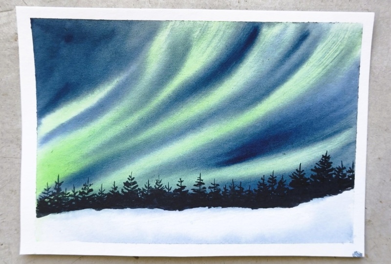
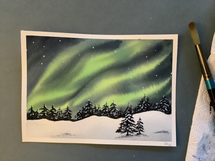
16. Class project 7 - Practice Session: This class project,
we are painting a beautiful Aurora scene with soft and glowing
bands in the sky. For that, we will
begin with the colors. Sorry, we will begin with
the practice session. And for practice, let's
start with the colours. I am taking cobalt charcos
green from Windsor and Newton, pines gray from white knight, primary yellow from senelia and indigo from a
Windsor and Newton. So here, the primary
yellow color is very important because we need that color to mix with turquoise color to get
that glowing aurora bands. So if you don't have
primary yellow, you can use naples yellow
as well or yellow ochre. And later, we will also use white quash or white
watercolor for the stars. Like I said, I'm mixing the most important
part of the color, turquoise green and yellow. This is what gives us that
luminous aurora effect, as you will see while
we are practicing. So this is indigo color, and if you don't have indigo, you can use Ianthrine blue
mixed with Pines gray as well. And finally, Pines gray. So these are the colors watches, and I will quickly
name the colors so then we can begin with
the practice session. Let's wet the paper evenly
using a wash brush. Wow. Let's start with aurora bands. Using a mix of toquais
green and primary yellow, let's play soft strokes
across the paper. Keep them flowing and slightly curved so they feel
natural and fluid. Let's bring in indigo, adding it around the bands on the sides and
also in between. This helps create contrast and makes the aurora
stand out more. Now, using a damp brush, let's gently blend
these colors together. Soften the edges and then let the colors merge
into each other. Even if the blending is
perfect here, that's okay. This is just a practice. The idea is to understand the flow and placement
of the colors. This paper is not 100% cotton. This is just a practice paper. So the colors may
look, you know, may not look as
blended as it would if we painted on the
100% cotton paper. For the foreground, let's
add a few pine trees, just simple shapes
using a smaller brush, keeping them minimal and soft. That's our practice piece. We will add stars later in the main project to
complete the scene. Now let's move on
to the next video where we will paint the
main class projects. So I'm going to see
you guys there.
17. Class project 7 - Silent Skies, Moving Lights: Evan, let's begin with our
day seven main project. For this painting, I'm going with a horizontal orientation. Since it works really well for a wide sky and gives us more space to paint the
flowing Aurora bands. Start by taping down my paper onto the board
using masking tape. Once that is done, we will
begin with the painting. We begin painting, let's
add a very simple sketch. When I say sketch, it's just a small line to separate the foreground from the sky. Nothing detailed, just
a light guided line. And once that's done, we will start with
painting the auroras. Let's begin by
wetting the paper. I'm using my wash brush
to apply clean water, but only in the sky area
above the line we just drew. Try not to wet the
lower section, that will be our foreground, and we will paint that later. Let's begin with auroras. I'm using a large
round brush size ten, so I can cover more
areas smoothly. Now, I'm mixing Taquais green with a bit
of primary yellow. This gives us a very luminous, almost neon like green, perfect for painting
the northern lights. Let's start placing
the aurora bands using flowing and
curved strokes. Think of it like a soft
shapes or reverse shapes. Let the moment feel
natural and fluid. Don't try to make
them too perfect. Each band can vary slightly
in width and the direction. Now, while the
paper is still wet, we need to work a bit quickly. Let's take indigo and start adding it around
the aurora bands. Add it at the top, bottom, and even in between
some of the bands. This contrast is what makes
the aurora stand out, so don't hesitate to go
a little darker here. Using a damp brush, let's gently start blending
these colors. Soften the edges of
the aurora bands and let the colors
merge into each other. As you blend, you
might lose a bit of brightness or sharpness
of the aurora shapes, and that's completely okay. In fact, the softness is what
makes it look more natural. You can always go
back in slightly and reintroduce a bit
of green if needed, but try to not
overwork at this date. Just keep it soft,
blended and flowing, and let the water do
most of the work. Already starts to look
like a glowing sky. Now we will let it settle a bit and we will move on to
painting the pine trees. Pine trees, I'm going to be painting while the paper
the sky area is still wet. So let's begin that. Let's move on to the foreground. Along the horizon line
that we sketched earlier, we will start adding
the pine trees. I'm using a smaller roundbrush for this and taking a dark tone. That is indigo here.
Sorry, pines gray. You have to take pines gray. You can even mix a little
bit of indigo with it. Let's begin placing
the trees one by one. Start with a thin vertical
line for the trunk, and then build the shape
using small control strokes. Use a gentle zigzag motion moving from side to
side as you come down. The top of the tree shape, sharp and pointed, and gradually widen the shape
as you move downward. Basically, think of it
as a triangle shape. You don't need to
rush this part. Take your time with each tree
and try to keep the strokes loose and natural. Oh. As we continue
adding more trees, it's important to
vary their sizes. Some trees can be taller, some shorter and some
slightly in between. Try not to keep them
all at the same height. Robby. So avoid placing them in a perfectly
straight line. You can slightly shift
their positions, bring some forward, keep
some a bit behind visually. This creates a more
natural and organic look. In nature, trees
are never uniform. They grow randomly, overlapping, leaning slightly and
forming these clusters. So we need to keep that
in the painting as well. That's what makes our
painting look more realistic. Clan Let's move on to the foreground. This is a very simple step. I will begin by gently
wetting the foreground area, being careful not to
touch the horizon line, so that we don't
disturb the trees. Using a very little
of indigonPine gray, let's add a soft wash.
Keep the top area lighter and gradually bring in more color toward the bottom. This helps suggest that the
ground is covered with snow and the darker tones act as
soft shadows on the snow. Now, we will move on
to the final details. I've just taken some white cash onto my palette and using it, let's add a bit of splatter. This will create the effect
of stars in the sky. If you don't have white cash, you can use white
watercolor as well. Once everything is completely dry, you can gently remove the tape. And that completes our
day seven painting. I hope you enjoyed this
beautiful Aurora scene. I will see you tomorrow
with Day eight. Another exciting project. Thank you so much
for joining me. I will see you guys tomorrow. Wo.
18. Class project 8 - Practice Session: Today's class project, we will be painting a galaxy scene, but this time we are combining it with a
winter landscape. I'm really excited
about this one because it brings together two
of my favorite subjects. Let's start with the colors. I'm taking carmine from aquaton, Turquoise green from
Windsor and Newton. This is cobalt
Turquoise green color, dioxin purple from sennelar, indigo from Windsor and Newton, and Pines gray from
white knights. So later, we will also use white cash to add stars
and final details. Lease watch these colors,
starting with carmine, and then TroquiGreen,
dags in purple, indigo, finally, pine Grey. I'll also name these
colors quickly, and then we can begin
with the practice. A Now, let's wet the paper evenly
using the wash brush. For this scene, I have
a simple idea in mind. We will place all
these colors onto the paper and let them blend slowly into each other to create that
rich galaxy effect. So I will start with carmine, and I will place each of these colors next to each other
and slightly overlapping. And also do not worry too much about perfection here.
Just focus on the flow. Once the colors are all placed, use a damp brush, and gently
blend these colors together. Let them mix naturally, creating soft transitions and also notice how the colors come together to form a
vibrant glowing sky. Now for the foreground, we
will later add pine trees. Since this is a winter scene, we will also leave some
space to suggest the snow. We will explore this more
in the main project. Fornw. This gives us a good understanding
of the colours and how they behave together. All right. That's our practice, and let's move on to
the main project now. So I will see you guys in the next video. One,
19. Class Project 8 - Winter Under A Powerful Sky: Hi, everyone. Let's begin with our day eight main project. For this painting,
I'm going with a vertical orientation
since the sky is the highlight here and we need more space to build
that galaxy effect. It also just feels right
for this composition. I will start by taping down my paper onto the board
using a masking tape. Before we begin painting, let's add a very simple sketch. Just draw a light line to separate the
foreground and the sky. Nothing detailed, just
a guide for placement. Let's begin by
wetting the paper. Using a wash brush, apply
clean water evenly, but only above the line
that we drew earlier. The lower section will
be our foreground, so let's leave that area
completely untouched for now. The paper is nicely wet. We can start placing the colors. Let's begin with carmine, apply gently onto the paper, allowing it to spread naturally. Spring in the
turquoise green now, place it next to the carmine. Letting the colors softly merge. You can already see
how vibrant and beautiful this combination
is starting to look. Next comes the dig in purple. Allow these colors to overlap slightly so we get those
natural transition. At this stage, don't worry
too much about perfection. Focus on placing the colors. How to create depth, let's bring in the indigo. I'm adding indigo mostly
around the edges of the paper on the sides
and towards the corners. This helps frame the painting and draws attention
towards the center. So the idea here is simple. Keep the middle area
lighter and more colorful and gradually
darken the edges. This contrast is what gives
us that galaxy effect. Using a damp brush, let's gently blend
everything together. Soften the transitions, let the colors flow
into each other. Take your time with this step. You can go back and forth, adjusting the colours as needed. If you feel an
area is too light, you can deepen it slightly. If it feels too strong, you can soften it with
a clean damp brush. Also notice how I have kept the area closer to the
foreground slightly lighter. This adds this actually helps to create a subtle glow and
adds depth to the painting. And yeah, keep
blending until you feel it start to resemble
the galaxy Skye. There is no fixed rule
here, observe and adjust. I Well, the paper is still wet. Let's add the first
layer of stars. I'm using white cash for this, but you can also use
white watercolor. Just play small dots
here and there. They are not the final stars, but they will spread
slightly on the wet surface, creating a soft
glow around them. This step is also a bit important, because it gives that luminous effect once the painting dries. Take your time here. This is actually very calming
and therapeutic process. Just enjoy placing the dots and watching them blend slowly
into the background. Let's move on to the foreground. At this stage, the paper
is still slightly damp. It's not completely wet
but not fully dry either. This is actually a good stage
to begin placing the trays. I have taken a
small round brush, and using a darker tone, pines gray, I will start
painting the pine trees. As you can see, when
I place the strokes, they are holding their shape, but the edges are
slightly soft and blurry. That's also what we want or it is safe to
paint the pine trees now, but we will come back in and
add a few details later. This tells us the paper
is at the rice strays, damp enough to give softness, but dry enough to hold the form. I have started placing these trees along
the horizon line. I'm starting with one
slightly taller tree, then adding a few smaller ones around it and following
that pattern. Let's move on to the foreground. This part is very simple. Using indigo, let's add a few soft strokes at
the bottom of the paper. Keep the top portion of
the foreground lighter, almost white, and gradually bring in the color
as we move down. Creates a very simple snow
effect where the white represents the snow
and the blue tones act as soft shadows. Let's go back and adjust
the tree slightly. You can add a few more
strokes to define their shapes just enough to
bring them out a bit more. By now, the paper is
almost completely dry, so let's move on
to the final step. A. Final step is using
white gauche. Let's splatter some paint
to create the stars. You can also add a few tiny dots by hand to make some
stars more prominent. This really brings the
whole galaxy together. So And that's it. Our Galaxy winter
landscape is now complete. This is honestly one of my favorite project in this class. I love how simple it is and yet how beautiful the
result turns out. I hope you enjoyed painting
this as much as I did. I will see you tomorrow with a brand new day
nine class project. Thank you so much
for joining me.
20. Class project 9 - Practice Session: For today's class project, we are exploring a lake
scene with reflections, using a limited palette and
soft blending techniques. Let's start with the colors. I am taking dioxin purple
from the brand Sennelier, Turquoise green light
from Windsor and Newton, Indigo from the brand, again, Windsor and Newton, and Pines Gray from the
brand, white knights. As always, we will begin
by swatching these colors. For watching, I will begin
with a turquoise green, dixinPurple, followed by Indigo, and finally Pines gray. I will quickly name them, and then we can
begin the practice. Tout. Let's wet the paper evenly using a wash brush. Let's begin with the lightest
color turquoise green. Place it gently in
the center area. On both sides of the
turquoise screen, let's add diaxin purple, allow the colors to
softly mate and blend. Next, let's bring in
indigo on the outer sides. This helps deepen the values and adds contrast to the sin. Now using a damp brush, let's gently blend
everything together. Keep the transition soft and let the colours
flow naturally. Now, while the
paper is still wet, let's add the reflections. This is important
because adding them now will keep them soft and
slightly blurred in the water. Using horizontal strokes,
let's add a few ripples. This helps create
that water effect and breaks the
reflection just enough. Now, let's allow
this dry completely. And then once the
paper is dried, we will move on to
painting the main subject. If the paper is dried, we will add a bunch
of pine trees along that reflection line. Keep them simple and
slightly varied in height, and just below them,
we will reinforce the reflection to
match the trees above. And that's our practice. We have explored the sky, the lake, the reflections,
and the subject. Now let's move on to
the main project where we will paint this
even more beautifully, because we will be using
the 100% cotton paper, which is a game changer. A
21. Class Project 9 - A Silent Lake of Colors: Everyone, let's begin with our day nine main class project. For this painting, I'm going with the horizontal orientation as it works beautifully for a calm lake scene
with reflections. I will start by taping down my paper onto the board
using masking tape. Well, let's wet the paper
evenly using a wash brush. Make sure the surface is nicely wet so the colors
can blend smoothly. A Now, let's start with turquoise
green color in the center, keeping it soft and light. Both sides of it, let's
add diaxin purple, and then towards the outer edge, let's bring in the indigo color. Him Using a damp brush, let's gently blend all
these colors together. Take your time with this step. We want a smooth and graded wash where the colors transition
naturally into each other. You can go back and go back
and forth a bit softening the edges and adjusting the tones until it
feels balanced to you. While the paper is still wet, let's move on to
the reflections. I am taking a darker
tone that is pine gray and placing the
vertical strokes along the horizon line. Also lift off a
bit of paint using a clean damp brush to
suggest subtle ripples. Keep everything soft and horizontal to maintain
that water effect. Now, let's allow this
layer to dry completely, and then we will come back
and paint the subject. That is above the reflections. Is dried, we can begin
painting the trees now. I will start placing a group of pine trees along
the horizon line. Take your time here and vary the sizes slightly
to keep it natural. Now, an important
detail to remember, the height of the
pine trees above should match the length
of the reflections below. This helps keep the composition
balanced and realistic. Also, I am leaving a very
thin gap between trees and their reflection that
small white line helps separate the two and
adds clarity to the scene. Robbie. Robbie. Robbie. Robbie using white paint, I will add a few soft
ripples on the water. Just a few horizontal strokes are enough to bring
the scene to life. And finally, let's add a bit of splatter for subtle
texture and detail. And this is optional. If you don't want to add
it, you can skip this step. And that's it. Once
everything is completely dry, you can gently remove the tape. And your day nine
project is now complete. This one has been such a calm and almost
magical feel to it. I hope you enjoyed
painting it with me, and I will see you guys
tomorrow with Day ten. Another beautiful project. Thank you so much for
joining me today. The
22. Class project 10 - Practice Session: Welcome to Day ten, and today we are going to paint
a serene sunset scene. And is intentionally
beginner friendly. I know some of the
previous projects felt a bit intermediate, so I wanted to include
something simple yet beautiful so everyone
can enjoy the process. Let's begin with the colors. Even though this is a project, we are using a slightly
wider palette because learning to blend
multiple colors is key when painting sunsets. Is primary yellow from Snelar
a bright, clean yellow. Next is permanent orange
from the brand aquatone. Then we have carmine
from the brand aquatone. And for contrast,
we will be using anthrine blue from the brand sanelar and then finally
to paint the foreground, we will be using Pines gray. And this pines gray is from
the brand white Knights. We'll quickly swatch
these colors so you can see how they look and
how they work together. That this watching is done, I will quickly
name these colors, and then we can move
on to the practice. By wetting your paper
evenly with clean water, a small tip when
painting sunsets, always begin with
the lightest colours and gradually build
the intensity. Now we will start with
the yellow in the center, followed by orange
on either side. We'll add carmine towards the top and gently
blend it downwards. We will use danthrine blue lightly to suggest
soft clouds in the sky. And finally, using a damp brush, we will blend everything together to create a
smooth transition. Or ground, we will keep it
simple with pine trees. An easy yet effective way
to complete the scene. Once that is done, we are
done with the practice. So in the next video, we will start with
the main projects, so I will see you guys there. Mm hmm.
23. Class Project 10 - Sunset Glow Landscape: I let's begin with our
day ten class project. We will start by taping down the paper securely
onto the board. I'm going with a vertical
orientation for this painting because the main focus here
is going to be the sky. The foreground will only take up about ten to 20
minutes of the space. So choosing a vertical
layout really helps emphasize that
beautiful sunset sky. Once the paper is taped, I will begin by wetting it
evenly using a wash brush. Make sure the water is spread uniformly
across the surface, not too much and not
too little either. So quickly cleaning the edges of the paper to avoid any
unwanted backflow, which can sometimes happen if excess water collects
along the borders. Now that the paper is nicely prepped, let's begin painting. We discussed earlier
when painting sunsets, it's always best to start
from light to dark. So I will begin with
primary yellow. This will act as the glowing
base for our sunset. Next, I will add orange, allowing it to softly
blend into the yellow. You can see how the warm tones starts to transition
beautifully. Then I'll bring in carmine
towards the top section. Let it blend slightly
downward into the orange. We don't want harsh lines here, just smooth natural transition. And for that, your
paper has to be wet. The darker transition,
so the darker contrast, I will take inanrine blue and add it mostly
towards the top. But instead of flat strokes, I'm creating a slightly
cloudy structure. This helps suggest darker clouds hovering over the sunset sky, adding depth and drama. All the colors are placed. I will take a damp brush, removing excess water and gently blend
everything together. This step is key to achieving that soft and shameless sky. I like the blue could
use a bit more present, so I will go ahead and add another layer to
enhance those clouds. One. I no, no, C I'm happy with this guy. Let's
move on to the foreground. My paper has already
started to dry, which is a perfect perfect
time to paint this step. I will use Pines gray and cover the bottom
portion of the paper. Of painting individual
trees one by one, I'm going to use a
quick vertical stroke to suggest a group
of pine trees. This is a very simple
and effective way to create a dense foreground
without too much detail. The smaller round brush, I will quickly add those vertical lines to
suggest that there are pine trees over there instead of just a flat pines gray wash. Once that base is done, I will switch to a
smaller round brush, add a couple of larger
trees on the left side. They aren't necessarily
pine trees, just simple tree forms to add a bit more interest and
variation to the composition. Two individual trees
on my left helps break the uniformity and adds a
focal point to the foreground. And with that, the
painting is complete. No G Wo Everything is fully dry. We can gently remove the tape and reveal
those clean edges. Always such a satisfying
moment this is. For day tens class project, simple, beginner friendly,
and very beautiful. I will see you tomorrow
with a brand new one. Thank you so much for
joining me today.
24. Class project 11 - Practice Session: Today's class project, let's
start a little differently. I had a few of you
ask if I could show the final painting first so you know exactly what
you'll be creating. I think that's a great
area, so here it is. Today we are painting a
misty mountain landscape. It's a very beginner friendly
and we'll be focusing on building soft layers to create the depth and misty effect
in today's class project. And let's start
with the practice. Before we attempt the practice, of course, we will be
starting with the colors. I'm using only two
colours sap green from senneliar and pines gray
from white knights. And we will also mix
these two together to get a deeper rich green
somewhere between the two. Let's quickly swatch this out, and then we'll move
on to the practice. I do. And now, let's begin
with the practice. I have started by
wetting the paper evenly using clean
water and a wash brush. Let's begin with the sky. Using a very light mix
of green and pines gray, I will softly add the
color to the top area. Keep this very subtle,
just a gentle base. Now let's move on
to the mountains. We will be painting
them in layers, which is a key to creating
that misty effect. Let's start with the
first layer using a very light tone of
green and pin gray. Paint your first mountain shape. Keep the edges soft and simple. Now, we will let
this dry completely. This step is very important. Once the first layer is dry, let's move on to
the second layer. This time, use a
slightly darker mix. You can add more pines gray
and a little less green. Place this mountain right
in front of the first one. Again, let this layer dry completely before
moving to the next one. W Now for the third layer, this
will be the darkest. So use more pines gray and very, very little of the sap green. Let's paint another
mountain in the foreground. You can see how each layer
adds depth to the painting. These lighter ones move back and the darker
ones come forward. You can also add a
few pine trees in the front mountain to
enhance the composition. This is basically the essence
of layering in watercolor. Paint one layer, let it dry
and then build the next. And also, how many layers you want to add is
completely up to you. You can keep it minimal
with two or three or build more depth with
multiple layers of mountains. It is our practice. Now let's move on to the class project, so I will see you guys
in the next video. A
25. Class Project 11 - Layers of Mist - A Quiet Mountain Scene: Hi, everyone. L et's begin with our Dale Levin main
class project. For this painting, I'm going with a vertical
orientation as it works beautifully for
layered mountains and gives us more
space to build depth. I will start by
placing my paper on the board and taping it
down using masking tape. Well, let's prepare the paper. Using a wash brush, I'm applying a clean
even layer of water. Take your time here, make sure
the surface is evenly wet. Also, don't forget to remove any excess water from the
edges using a paper towel. This helps preventing
back runs or blooms. Oh, before we begin painting, I will quickly clean
my round brush. If there is any
leftover pigment, it can affect the light
tones we are about to use. Now, let's start with the sky. I'm taking a very light mix
of pines gray and sap green. Let's apply this color softly, keeping it subtle and minimal. Mam. Mama While the paper is still wet, let's begin with the
first mountain layer using the same light mix, paint a soft mountain shape. You can gently drag the color downward to avoid leaving
any harsh white caps. Keep this layer very light and that will sit well
in the background. Now let's allow this
to dry completely. Once the paper is dry, we will move on to
the second layer. This time, let's make the color slightly darker by
adding more pine. Place this mountain in
front of the first one. You can already see how
the depth starts building. Again, let this layer dry fully. For the third layer, we will go even
darker here using a strong mix of pines
gray and sap green, but let there be
the highlight here. Paint another mountain
in the foreground. This layer will stand out more clearly than
the previous one. One point, you can decide how
many layers you want. I initially planned for three, but I can still see some empty
space in the foreground, so I'm going to add
one more layer. I'm gonna have to let
this one dry completely, and then we can add one
more layer of the mountain, which will be the final one. Re dried, let's start adding the final layer
of the mountain. This time, using mostly pines gray to get a much darker tone. This helps anchor the
entire composition. While this layer
is slightly damp, we can start adding
a few pine trees. They don't have to
be too detailed, just a simple shapes to add
interest and variation. This step adds a bit
more life to the scene. Now, after painting
the pine trees, we will allow this
to dry completely. Robbie. Robbie. Robbie. Robbie. Robbie. The paper is dried. We can add the final details. I'm adding a few
birds in the sky. You can keep it minimal or add a small flock
like I'm doing here. This helps bring moment and makes the scene
feel more alive. Matt Matt. That's it. Once
everything is fully dry, you can gently remove the tip. And your day 11 painting
is now complete. I hope you enjoyed
painting this soft, misty and bigner friendly
landscape with me. I will see you guys
tomorrow a day 12. Thank you so much
for joining. O.
26. Class project 12 - Practice Session: This class project,
we are painting a beautiful lake scene
with soft sunrise glow. This one is all about
colour blending and creating that gentle
light in the sky. Let's start with the colors. I'm using a naples
yellow from senelar, permanent orange from
the brand aquaton, French ermulion from
the brand Seneliar, dags in purple from the band Senelar and
antrine blue again, from the brand Senelar. M Let's quickly swatch these colors, starting with yellow
and then orange, red, purple, and finally blue. Mama Let's start with the practice now. I will start by wetting
the paper evenly, and I'm using my wash brush. Start painting naples
yellow in the circle, and that middle part
should be white. That is our sun, so it has to be the lightest shade possible. Then gradually add orange
around the naples yellow, and followed by red colour. And then add purple
color and finally, blue towards the edges. Now using a damp brush, let's gently blend all
these colors together. Try to keep a soft
glowing area in the center alone without
adding any color. That will be our sun,
like I've said before. This is how we create
that sunrise or sunset globe by building
colours around the light. Now let's move on
to the second part, the lake and the reflections. Wet the paper again
using the wash brush. When painting
reflections, always remember the subject
and its reflection should be roughly
the same in size and also leave a thin
white gap in between. This helps separate the two and makes it
look more natural. If you want, you can absorb
any pick in the nature, any picture, any photograph
from the nature, you will always
see that white gap between the top subject part and the bottom reflection part. One For the final practice, let's paint a tree
and its reflection. Use a darker tone for the tree. Here I'm using anthrine blue and a lighter and softer version of the same color
for the reflection. You can add more water to
the anthrine blue to make it lighter than the darker tone for the tree that we have used. No. That's our practice. We have covered the sky, the reflections and the subject, the tree, and its
reflection, as well. Now, in the next video, that is the main class project. We will combine all
these and paint understand I am so I will
see you guys in that video. Let's video.
27. Class project 12 - A Quiet Morning Reflection: Hi, everyone. Let's begin
with our t 12 main project. For this painting,
I'm going with a vertical orientation as it gives us enough space
to include the sky, the lake, the reflections,
and the tree. I will start by taping down my paper onto the board
using masking tape. Now, let's begin by
wetting the paper, using a wash brush. Apply a clean, even
layer of water. Take your time here, make sure
the surface is evenly wet, so the colors will
blend smoothly. I let's begin with the sky. We are going to create that
soft sunrise glow here. I will start by leaving a
white space in the center. This will be our
sun. Around this, let's begin adding
colors one by one, starting with naples yellow, then moving on to
orange, followed by red. Now, gradually bring in the
**** in purple and finally, a touch of blue
towards the edges. Now, using a damp brush, let's gently blend all of
these colors together. Soften the transitions and let the colors flow
into each other. Try to preserve
that light glow in the center as much as possible. Mmm. Take your time here. This is the most important
part of the painting. The smoother the blend, the more beautiful
the glow will look. Well, the paper is still wet, let's move on to
painting a few trees along the horizon line
and their reflections. I'm using a very light
blue tone for this. Since the paper is still wet, the shapes will naturally
soften and blur. So there is no need to go
into too much detail here. In fact, we want
this effect, soft, blurry background with trees and their reflections
merging into water. Place a few tree el shapes
to suggest that there are trees over there and gently pull that color downward
to create the reflections. And also, do you remember leaving that white space between subject and
the reflections? We're going to go with
that here as well. Keep everything
loose and minimal. This step is more
about suggesting the forms rather
than defining them. While the paper is still wet, I'll take the same blue
we used for the trees and reflections and add it towards
the bottom of the paper. This helps suggest the
water in the lake. Since this is a lake scene, we need to clearly
establish that base. Keep the stroke soft
and horizontal, so it naturally
looks like water. Let it blend gently with
the rest of the painting. And I'm going to keep
this for drying. Once this dries, we
can paint further. So I will see you guys in a bit. Mm. If the paper is completely dry, let's move on to the final step. We will start by painting
the tree and its reflection. I'm taking a blue tone, and using a smaller round brush, I'll place the tree
somewhere around the middle of the lower
section of the paper. This will be a simple tree, just a few dried branches, so we don't need to
add any leaves here. Add a thin line
for the trunk and then add a few branches
extending outward. Keep the strokes
light and natural. You don't have to
overthink the shape here. Just let your hand move freely. This looks great.
I'm going to paint one more of the tree here. This one This tree
will be smaller. Tree will be even more smaller than the one we
have painted just now. Very, Let's move on to the reflection. Take a lighter version
of the same blue and paint the reflection
just below the tree. Keep in mind the same
principle we practiced. The reflection should roughly
match the size of the tree. And don't forget to
leave a small gap in between the thin white line helps separate the subject
and its reflection. It makes it look more natural. Moment to observe your painting. If you feel like adding
a few more branches or adjusting reflection
slightly, you can do that. I think my reflection looks a bit darker than I wanted to, so I'm going to just remove some paint using a paper towel. Paint a few ripples using
the same blue colour, and we will let this dry completely now.
We're almost done. I I I The paper is fully dry, you can gently remove
the masking tape, and that completes
our day 12 painting, a soft glowing sky with a calm lake and
simple foreground. I hope you enjoyed
painting this with me. I will see you
tomorrow with day 13. Another beautiful project. Thank you so much for
joining me today. Mo.
28. Class project 13 - Practice Session: This class project,
we are painting a winter lake scene
with soft blurry trees, keeping everything
minimal and simple. Let's start with the colors. I'm using sap green from sanela and indigo from
Windsor and Newton. And we will also mix these two colors to get
a deeper, darker green. So basically, we are having three colors here
on our palette. And of course, at the end, I will be using white
gouache, as well. Let's quickly swatch
these colors out, starting with sap green,
followed by Indigo. And a mix of both. I will name them quickly, and then we can begin
with our practice. Mm. We will begin the practice with a small sketch, just a line. We will be starting with the background trees here
on that horizon line. It's supposed to
be horizon line. And also, I will quickly
sketch the lake as well. Mount. Mm Mount. Wet the paper just
above that line that we had just drawn
with clean water. This is quite similar
to what we have done before painting trees
in a soft blurry way. We have done that in class
project two or three, I'm not sure, but we have practiced this but
with different colors. Using a mix of green tones, sap green, Daka mix, and indigo, let's
place these colors on the wet paper and let
them blend naturally. We are not painting
individual trees here, just suggesting them
with soft shapes. I will quickly paint
the lake as well. So here, there is the lake is supposed to be in blue color because
this is winter scene. And using indigo, we will paint the lake area and gently add reflections just below
the horizon line of those trees that we
have painted above. Keep the strokes soft and horizontal so it
feels like water. Since everything is wet, the reflections will stay
soft and slightly blurred, which is exactly
what we want anyway. One Final step in the main class project, I'll be adding a bit of white splatter using white
quash to suggest no. But for now, this is it. This is our practice. We have explored the background, the lake, the reflections. Now we are ready to move on
to the main class project. So I will see you guys
in the next video.
29. Class project 13 - A Silent Lake, A Gentle Winter: Everyone, let's begin with
our day 13 class project. I will start by taping down my paper onto the board
using masking tape. Let's move on to the sketch. We will begin with
the horizon line. I'm placing it slightly above the center a little towards
the top of the paper. From here, let's sketch
the lake as well. It's very simple shape, almost like a soft escave just a few flowing
lines to indicate the direction and
movement of water. Take your time with this step. Getting the perspective
right here really helps the entire
painting come together. Now let's begin painting. I will start by wetting only the area above
the horizon line. We will focus on the sky first. Using a light blue tone, let's add a few soft strokes, leaving some white
spaces in between. This will act as
light in the sky. Now let's deepen the top
area slightly by adding a few darker strokes
to create clouds. Keep the lower part lighter so we maintain that soft glow. While the paper is still wet, let's move on to the
trees along the horizon. Using a mix of
greens and indigo, let's add soft
blurry tree shapes. You can vary the tones, some lighter, some darker
to create the interest. The paper is wet, the
shapes will naturally blur, which is exactly what we
want for the background. H Now, let's move on to the lake. First, I will wet the lake
area using clean water, make sure the surface is evenly wet so the colors flow smoothly. Using indigo, let's begin
painting with water. Start from the horizon line and gently bring the
colors downward. Keep your strokes horizontal. This is very important to
create the water effect. Yes. I'm going to add those horizontal
strokes again, but with a dark color now. Let's start adding
the reflections. Using same indigo, place a few vertical and horizontal boat strokes
just below the trees. Then gently pull them downward, using a damp brush. This creates a soft
reflection effect. Keep it slightly
broken and uneven, making it look more natural. Now, let's add a few ripples using a lighter tone
or a damp brush, add thin horizontal lines. These lines help suggest
moment in the water. You can also lift a bit of paint to create
subtle highlights, but I'm not doing
that now because, you know, adding these ripples in the water is quite enough. Take your time here, this
part is very calming. Just observe and
add strokes slowly. I I Along the edges of the lake, I'm adding a few soft
touches of light blue. This helps suggest the
snow and its shadow. Even though the area is white, these soft shadows bring
depth to the scene. Now, I will allow everything
to dry completely. Once paper is dried, we can move on to paint
the final details. The paper is dry now. Using white cash, let's add some splatter to
suggest falling snow. Let's refine the area between the trees and the reflections. That thin white line
is very important. It represents the separation between the land and the water. I will gently enhance it using whitewash to make
it more visible. This small detail makes a big difference
in the final look. Now, once everything
is fully dry, you can gently remove
the masking tape, and that completes our
day 13 class project, a soft winter lake scene with calm reflections
and subtle details. I hope you enjoyed
painting this with me. I will see you
tomorrow a day 14. Another beautiful project. Thank you so much
for joining me.
30. Class project 14 - Practice Session: For today's practice,
we are painting a serene scene with
soft reflection. We are keeping
everything minimal, but this project has
some special quality. This is going to be
atmospheric or moody, you can say, which is
my favorite genre. So let's begin. So we will
start with the colors. I'm using this unique
color called shadow green, and this is from
the brand aquaton. If you don't have this color, you can easily mix it. Just combine sap
green with a bit of pins gray or even
a touch of indigo. You will get a similar tone. It's quite close to
an olive green shade, and then pines gray from
the brand white knights. At least watch these colors, starting with Shadow Green, followed by Pines Gray. Now, I'm mixing another shade, which is a mix of both shadow
green and Pines gray colors to get a deeper
and darker green. This will be very useful
for us, you know, to create that
atmospheric effect. I usually use dark greens
to create moody landscapes. I will quickly
name these colors, and then we can begin
with the practice. Start by wetting
the paper evenly. Now, using the dark green mix, I will begin placing
the color from the top, and then I will stop
around the middle. Next, I will repeat the
same from the bottom, bringing the color upward. If blend these, you will
notice something important. The top and bottom remain darker while the
middle stays lighter. This lighter area in
the center creates a beautiful atmospheric
effect and helps draw focus. While the paper is still wet, let's quickly suggest the scene. I will add a simple
mountain shape and then gently pull the color downward
to create that reflection. I'm satisfied with
how this turned out. I'm gonna let the
paper dry completely. Of the paper is dry, we will add a few pine
trees and their reflection. You can add the reflections of these pine trees
wet on wet as well. But I think that I
should have done that. That's what we'll be
doing in class project. See, this is why
it is important to sketch a thumbnail or
a practice session, so you will know what to do, and you will also
know what not to do. So you can, you know, you don't have you don't repeat your mistakes in
the class project. It's our practice that gives us a clear idea on how to
paint a final painting. Now let's move on to
the main class project.
31. Class project 14 - Shades of Stillness: Hi, everyone, let's begin
with our day 14 main project. I think I have said day
13 in practice session. I'm so sorry about
that. This is day 14. I will start by taping down my paper on all four
sides using masking tape. This step is important
to keep the paper flat and to get clean
edges at the end. Also, for this painting, I'm going with a horizontal
orientation as it works beautifully for a
wide lake scene and helps us highlight
the reflections. Let's begin preparing the paper. Using a wash brush, I will apply a clean, even layer of water. Take your time here, make sure
the surface is evenly wet. Mm. Mm. So I will remove any
excess water from around the edges
using a paper towel. This helps prevent
backruns or blooms. Now let's move on to
mixing the colors. I'm using a mix of shadow
green and pines gray. The idea here is to keep
the composition simple. We'll have darker tones
at the bottom and top and bottom and a
lighter area in the middle. I will start by placing
the darker color at the top and then repeat
the same at the bottom. Leave the middle
section lighter. This is what creates that
soft atmospheric glow. Now, using a damp brush, I will gently blend
the transitions. Again, I will remove any excess paint or
water from the edges. This is especially
helpful in this kind of painting where we
want smooth plants. Let's move on to
the main elements. While the paper is still wet, I will start painting a
simple fountain shape, keep it minimal and soft. Using the same color, I will create its reflection
just below. Remember the subject and its reflection should
roughly match in size. Clearly, there should
be suppression between reflection and the
subject above. So I will also gently lift a little bit of paint in
between using a clean brush. That thin line that thin
light line is very important. It adds realism and clarity. Now, here is a small
change from the practice. While the paper is still wet, I'm going to add the reflections of the pine trees right away. This helps create a soft
and more natural look. Since the surface is wet, the reflections
will blur slightly, which adds to that moody effect. I'm just placing a
few vertical strokes and gently pulling
them downward. Now, while we are at it, let's also add a few ripples using a lighter tone
or a damp brush, add soft horizontal lines. These small details help bring the water to life.
Take your time here. This part is very calming. And now let's allow the
paper to dry completely. Once it's dried, we will come back and add pine trees
to complete the scene. Now that the paper
is completely dry, let's move on to the final step. We will start by adding the pine trees over the
reflections we painted earlier. Using pine gray and a smaller
round brush for this, as you paint the trees, make sure to match them
with the reflections below. The size, the placement, and general shape should align with what we
have already painted. Painting pine trees,
I have a tip, start with a thin trunk and then build the tree
using smaller strokes. Keep the top pointed and let the branches widen
slightly as you move down. Take your time with this step, even though the
trees are simple. This is where the scene
starts to come together. So make sure to preserve that thin white space between the trees
and the reflections. We have created that earlier, and it's an important detail that adds realism
to the painting. Now, let's add a
few final touches. We're almost done with
painting the pine trees. I will paint a few
small birds in the sky to bring a bit
of life and movement. And then using Pines gray, I will splatter some paint. This adds subtle texture and enhances the
mood of the scene. Once everything is fully dry, you can gently remove
the masking tape, and that completes our day 13, sorry, day 14 class
project, a calm, serene lake scene with soft reflections and
a moody atmosphere. I hope you enjoyed
painting this with me. I will see you guys tomorrow with another beautiful project. Thank you so much for
joining me today.
32. Class Project 15 - Practice Session: For today's class project, we are going to paint a soft, moody landscape using
just two colors, keeping everything
simple and atmospheric. Let's start with the colors. I'm using indigo
from Windsor and Newton and Pines Gray
from white Knights. We will also be
using whiteqh later. For a few final details, you can use white
watercolor as well. Let's quickly swatch
these colors, starting with indigo and
then pines gray. Okay. Name them quickly.
Then we can begin. We'll start with our practice
by wetting the paper evenly using a wash brush. Wow. Oh, using indigo, I will begin applying
the color from top and then repeat the
same from the bottom. In the middle, I won't
add any direct color. Instead, I will gently drag
the paint towards the center. Helps create that soft light atmospheric
effect in the middle. It's the same technique
that we exploded yesterday. While the paper is still wet, let's add a few trees. Since this is wet on wet, the shapes will appear
soft and blurry. For you. While the paper is still slightly wet, I will add one or
more larger trees. It's very easy to overdo this
step, so try to hold back. Let's detail works better
here as the colors will naturally spread
since the paper is wet. Allow the paper to
dry completely. The paper is dried now, so we will add a few sharper
trees using a darker tone. It could be indigo or pine gray. I will take my small round brush and I will add a
couple of pine trees. I think I'm going
to add one here in the middle and then a
smaller tree on my left. And one more tree over
here on the far left. Finally, we will add a bit of splatter to
complete the scene. Also, since this is
25% cotton paper, you might notice
some hard edges. But when we paint the final
project on 100% cotton paper, everything will
look much softer. And that's our
practice. Now let's move on to the main
class project. I'm going to see you
guys in the next video.
33. Class Project 15 - Monochrome Mist: Hi, everyone. Let's begin with
our Day 15 class project. For this painting,
I'm going with a horizontal orientation as it works beautifully for a
wide minimal landscape. I will start by taping down my paper onto the board
using masking tape. This helps keep the paper flat and gives us clean
edges at the end. Well, let's prepare the surface. Using a wash brush, I will apply a clean
even layer of water. Take your time here,
make sure the paper is evenly wet so the colors
will blend smoothly. One. I'm removing the excess water at the edges to prevent any
back flows or back runs. Well, let's begin
with the painting. I'm using a mix of
indigo and pine gray. I will start by
applying the color at the top of the paper and then repeat the
same at the bottom. In the middle, I won't
apply any direct color. Instead, I will
drag the paint from both top and bottom
towards the center. This creates a soft lighter
area in the middle, which gives us that beautiful
atmospheric effect. Take a moment here to
adjust the tones if needed. If the edges feel too tight, sorry, too light, you can
deepen them slightly. If the center feels too dark, you can lift a bit of a paint. While the paper is still wet, let's begin adding the trees. Using a smaller brush, I will place a few
vertical strokes to suggest pine trees. Since the paper is wet, the shapes will naturally
soften and blur. Worry about the details here. In fact, we want that softness
to create depth and mood. Keep the trees minimal,
just a few strokes are enough to
suggest a landscape. I'm going to do
an optional step. I lightly splatter some clean
water onto the surface. This creates subtle textures and add a bit of
variation to the wash, but this step is
completely optional. You can skip it if you
prefer a cleaner look. Now, let's allow the
paper to dry completely. Though the paper
is completely dry, let's move on to
refining the trees. I will start by suggesting a few branches on the larger shapes we
painted wet on wet. Just a few light strokes, don't overwork this step. The idea is only to bring
a little definition, not to completely
redraw the tree. King darker tone to paint
the main trees now. You can use indigo
or Pines gray. Let's start with the
first one on my left, I'll paint a slightly
taller tree here, just a bit larger
than the blurry one that we have painted
on my right. This helps create depth and
makes the tree stand out. Now for the second
one, I'll be painting a smaller tree just beside
the one that we have painted. Next will be around a bit taller than the one that we have
painted wet on wet. I'll paste it close by so they
feel connected as a group. I will paint two more trees both on each side of this wet on wet tree that
we have just painted. Mm. How these trees frame the softer
background shapes. This balance is what makes
the painting feel complete. Take your time with these trees, start with a thin trunk and build the shape
using small strokes. Keep the top part sharp and let the branches
widen as you move down. Now let's step back and observe. You can adjust if you
want the shapes and all, but try to keep it simple. Now for the final touch, I will be using white
gash and splatter paint to create soft snowy effect. Now, let's allow everything
to dry completely. The paper is fully dry, you can gently remove
the masking tape, and that completes
our painting a soft, moody monochrome landscape with a beautiful balance of
blurred and defined trees. Hope you enjoyed
painting this with me. I will see you
tomorrow with day 16. Another beautiful project.
Thank you so much.
34. Class Project 16 - Practice Session: For today's project,
we are creating a moody landscape with a glowing sun using a
very limited palette. Start with the colors. I'm
using daxin purple from the brand sinela and Pines gray from the
brand white knights. But instead of using
them separately, we will mix them together to create a deeper, darker purple. Let's quickly swatch this mix. You can see how rich and
intense this tone has become. I will name it quickly,
and then we can begin. Now, let's move on
to the practice. I will start by wetting the paper evenly
using a wash brush. Now, using a dark purple mix, I will paint around a
circular shape off center. Let's leave that circle
untouched. This will be our sun. For this project, we will
treat it as a glowing sun, but it can also
feel like a moon. Now, let's deepen
the surrounding area using the same color. While the paper is still wet, let's add a few mountain shapes, keep them soft and minimal. Since this is wet on wet, they will naturally blur. Now, let's add some branches. Using a smaller brush, I will paint a few
loose strokes. Since the paper is still wet, these branches will stay soft
and sit in the background. So we will add a few
foreground branches as well once the paper is dried. But since this is
a practice piece, I will not be painting
I will not be waiting until this paper dries so that we can
paint the foreground. I'll just show them how I paint here on the
separate piece. The foreground branches are wet on dry or
painted wet on dry. They will be sharper
and more defined. This contrast between
soft and sharp elements is what creates depth
in this painting. And that's a concept
for today's project. Now let's move on to
the main class project. So I'm gonna see you guys
in the next video. One.
35. Class Project 16 A Quiet Glow In Dark: Hi, everyone. Let's begin
with our day 16 main project. For this painting,
I'm going with a horizontal orientation as it gives us more space to spread the composition and highlight
the glow in the sky. I will start by
taping down my paper on all four sides
using masking tape. This helps keep
the paper flat and also gives us clean
edges at the end. Let's prepare the paper
using a wash brush, I will apply a clean, even layer of water. Take your time here, make sure
the surface is evenly wet. Oh, I will remove
any excess water from the edges using
a paper towel. This step helps prevent unwanted
backgrounds and blooms. Well, let's begin painting. I'm taking my larger
round brush and mixing dixin purple with pines gray to create a deep rich
tone of purple. Now I will start by defining the circular shape in the
center. This will be our sun. W. I will paint around it carefully leaving
that area untouched. Once the circle is established, I will begin
covering the rest of the paper with this
dark purple mix. Work around the circle gently to paintain
that glowing effect. While the paper is still wet, let's move on to the mountains. Using the same color,
I will suggest a few soft mountain shapes.
This is wet on wet. The edges will blur naturally. That's exactly what we want. A soft atmospheric background. The circle loses its shape slightly because this is wet on wet and the water tend to move into that untouched
area sometimes. But you can correct it
just like I'm doing here. I'm using a paper towel wrapped around my
finger to lift off a bit of paint and bring
back the clean rounded edge. T's add the branches. I will switch to a
smaller round brush and using the same color, begin placing a few
loose branches. The strokes light and natural. Since the paper is still wet, these branches will soften
and sit in the background. One. Also add a few small leaf like shapes to make the
branches feel more organic. A I will lightly splatter some of the
same dark color. This adds subtle texture and
breaks the smoothness of the wash. Take a moment here to adjust the
shapes if needed. If any branch feels too strong, you can soften it slightly. Now, let's allow the
paper to dry completely. Once it's dried, we
will come back and add the foreground branches
using wet on dry technique. The paper is completely dry. Let's move on to the final step. We will start by adding a
few foreground branches. Using the same dark purple mix
and a smaller round brush. Since this is wet on dry, these branches will appear
sharper and more defined. I'm going to keep
it very minimal. Just one or two
branches are enough. I'll place one branch here
and another one over here. This helps balance
the composition without overcrowding the scene. Start with a thin line
for a main branch and then extend a few smaller
branches if you want. But I'm going to just go
with only one single line. Keep the strokes
loose and natural. I'm going to add a
few small leaves to these branches,
just tiny touches. We don't need too
much detail here. Final touch, I will lightly splatter some paint
using the same color. This step is optional, but it adds a bit of texture
and interest. And now let's allow
everything to dry completely. Once the paper is dry, you can gently remove
the masking tape. That completes our
painting, a beautiful, moody landscape with a glowing
sun and layered depth. I hope you enjoyed
painting this with me. I will see you tomorrow
with another class project. Thank you so much
for joining me.
36. Class Project 17 - Practice Session: Today's class project,
we are painting a moody lake scene with a slightly different
color palette. Let's start with the colors. I am using orange from aquatone, primary yellow from sennelar, turquoise green from Windsor
and Newton and indigo, again, from Windsor and Newton. Is it slightly
different color palette because I have rarely
used these color mixes, the yellows oranges,
and turquoise greens. I have only used this once, if I remember correctly, for painting oceanscapes for one of the classes
here on Skillshare. So that was what three years, four years ago, and I'm using this color
palette again now. Now, I'm swatching these
colors, orange yellow, but we are not going to be using orange and
yellow separately. We're going to mix the color
and mix these two colors and create a brighter
orange color. So I think this color
became a bit lighter. So to bring in the contrast, I will be adding one more color to our palette
that is burnt sienna. Now, born Siena is from
the brand aquaton. This will act as a darker contrast to that
brighter orange color. And next, we are going to swatch Turquoise green and
followed by Indigo. This combination of
warm and cool tones is what creates
that moody effect. I will quickly
name these colors, and then we can begin
with the practice. My Let's start by wetting the paper evenly
using a wash brush. For this scene, you can begin with either the sky or the land. Both will work since
the paper is wet. Start with the warm tones. Using the mix of
orange and yellow, I will lay down the base. Now, to create contrast, I will add burned Sienna
at the bottom of it. So this is basically the land, and then that burned sienna is the shadow part of that land. Above and below this area, I will introduce ul tones, turquoise green and indigo. We move downwards
towards the paper, the lake area will
be slightly darker, so I will add more indigo here to suggest depth and
shadows in the water. Now, while the
paper is still wet, I will also add the sky
area using turquoise color. Add a few trees above the land. You can add this wet
on wet or wet on dry. It's completely up to you. I'm using indigo, and
I will paint soft, minimal pine tree shapes. And immediately
after painting that, we're going to paint the
reflections as well. But for reflections, you
have to keep your paper wet. So I have to act quickly here because
my paper is drying up, so I'll take a bit
of indigo and just drag the color downwards
to create the reflections. Keep the strokes loose and soft, we are just suggesting
the forms here. Let's add a few ripples. Using horizontal strokes, we can bring a sense of
moment in the water. And that's our practice. We have explored the colors, the blending, and
the reflections. Now let's move on to
the main class project. I will see you guys
in the next video.
37. Class Project 17 - A Quiet Lake in Contrast: Hi, everyone. Let's begin with our taste 17 class project. For this painting, I'm going
with a vertical orientation so we can clearly highlight the lake reflections
and the land. Start by taping down my paper on all four sides
using masking tape. This keeps the paper flat and gives us clean edges at the end. One et's prepare the paper. Using a wash brush, I will apply a clean
even layer of water. Make sure the surface is evenly wet as the colors
splend smoothly. I will also remove
any excess water from the edges using a
paper towel to avoid patterns or blooms. What? Now, let's begin painting. Since the paper is wet, you can start with either
the sky or the land. I will begin with the
sky and lake area. Using turquoise green, I will
lay down the color softly. As we move downward, I will gradually deepen
the tone using indigo. This helps create
depth in the water. You will notice that
I'm leaving a space in the middle without
adding any paint. This area is reserved
for the land. You see, there is a lot of water mixed with paint
around the edges. I'll quickly remove it
using paper towel again, to avoid back runs. In a mix of orange and yellow, I will start filling
that middle section. To create contrast, I will add burned Siena towards the
lower part of the land. I will deepen it slightly
using a touch of indigo. You can already see how the warm and cool tones
balance each other. The paper is still wet. Let's now add a few details. Using indigo, I will paint
soft triples in the water, keep the strokes
horizontal and minimal. I will also suggest reflections of trees just below the horizon. These are just soft
vertical strokes that we will define later. You can also add a
few ripples around these reflections to make
them feel more natural. Allow everything
to dry completely. Once the paper is dry, we will move on to
the final details. X. Taking a smaller round brush, and my paper is dried. So using indigo, I will paint a few pine
trees as subject. As you paint, make sure the trees align with
their reflections below. The size, shape, and placement should match for a
realistic effect. Add around four to five trees, keeping them varied in height to make the composition
feel natural. Robby. Robby. Rabbi. Robby. Omni. Robbie. I, Now, let's add a few
finishing touches. I will paint a couple of birds in the sky
to add movement. I will lightly splatter some
indigo paint for texture. Take a moment to
absorb your painting. If needed, you can
make small adjustment, but try to keep
everything minimal. Once the paper is fully dry, you can gently remove
the masking tape. And that completes our painting a simple moody lake scene with beautiful contrast
and reflections. I hope you enjoyed
painting this with me. I will see you tomorrow
with another class project. Thank you so much for
joining me today. Mm.
38. Class Project 18 Practice Session: This class project,
we are painting a serene sunset sky with
rich and glowing colors. Let's start with the colors. I am using primary yellow
from the brand inelia, golden deep orange
from white knights, and permanent orange
from aquaton. We have two oranges here. One is lighter and softer and the other is deeper
and more intense. This contrast will help
us build a sunset glow. Next is next time using dax in purple from the brand
sanelar and Ianrine blue, again, from the brand sennelar. Let's quickly swatch
these colors. You can see the
difference between two oranges when
we swatch these. One is lighter. The other is a bit more darker. Color is dags in purple, and finally we are
swatching in Danerinblue. I'm gonna quickly
name these colors, and then we can begin
with the practice. Let's move on to the practice. I will start by wetting the paper evenly
using clean water. Now we will go from
light to dark, starting with yellow
in the center, then moving on to
golden deep orange, followed by permanent orange. We'll bring in the purple and finally blue towards the edges. The idea here is to keep
the center glowing and gradually darker
around the sides. Since this is 25% cotton paper, the blending may not be smooth, but this gives us a clear
idea of the color placement. Now for the foreground, I will be adding pine trees later. So this is essentially the
base for our sunset scene. Oh, I feel like we need a slightly stronger dark
tone, especially the blue. So I will bring in
indigo from Windsor and Reuton to enhance
the contrast. This will help us
define the sky and also work well for the trees
in the foreground. That's our practice. Now we have a clear understanding of how the colors will
work together. Let's move on to the
next main class project. So I'm gonna see you
guys in the next video.
39. Class Project 18 A Quiet Glow Behind The Pines: Hi everyone. Let's begin
with Day 18 class project. For this painting,
I'm going with a horizontal orientation so we can beautifully
highlight the sunset guy. I will start by taping down my paper on all four
sides using masking tape, and then we can begin
preparing the paper. Using a wash brush, I
will apply a clean water. Take your time here, make sure
the surface is evenly wet, as the colors will
blend smoothly. Now let's begin with the sky. We will work from light to dark. At with yellow,
mix slightly with golden deep orange and place it in the center to create
that glowing area. Next, I will move to
permanent orange, blending it softly
into the yellow. The darker tones, I will
mix darks in purple, anthrine blue and indigo to
create a rich deep blue tone. I will begin adding this color towards the
edges of the paper. Wow Using a damp brush, let's gently blend all of
these colors together, soften the transitions while preserving that
glow in the center. At this stage, I will also switch to a smaller round brush. Using that same darker mix, I will start adding a
few thin cloud shapes around the glowing area, keep them soft and subtle. You can build the
intensity slowly adding a bit more darker color near the edges to
enhance the contrast. Feel the edges are too light. You can deepen them slightly. Take a moment here to
adjust the blending. This is the most
important part of the painting a smooth
and glowing sky. Let's allow this layer
to dry completely. Once it's dried, we will come back and add the
foreground details. I'll see you guys in a minute. Wow. Paper has dried completely, let's move on to the foreground. For this part, we will be painting a cluster
of pine trees. I'm using indigo and a
smaller round brush for this. Start with a very thin
vertical line to define the trunk and then build the tree using small
quick strokes. Move your brush in a
slightly zigzag motion to create that natural
pine tree shape, keep the top sharp
and narrow and gradually widen the
strokes as you come down. A Instead of keeping all the trees the
same, let's vary them. Some trees can be
taller, some shorter, some can lean slightly to the left and others to the right. This variation is
very important. In nature, trees are
never perfectly uniform. They grow in
different directions and at different heights. So we try to keep that
strokes natural as well. You continue, you can overlap
a few trees slightly. This creates depth and makes
the forest feel denser. Also vary the spacing. Some areas can have trees closer together while others
can be slightly open. A To add more character, I will paint a few
bare branches. These are simple, just a
few thin irregular lines. They break the uniformity of the pine trees and make the
scene more interesting. One Take a moment to observe
your painting. If you feel like
adjusting any tree shapes or adding a few more strokes,
you can do that now. Now, let's add a few
birds in the sky, simple small strokes to
bring the sense of movement. And now, once everything
is fully dry, you can gently remove
the masking tip, and that completes
our day 18 painting a glowing sunset ky paved with a bold,
natural foreground. I hope you enjoyed
painting this with me. I will see you tomorrow with another beautiful class project. Thank you so much for
joining me today.
40. Class Project 19 - Practice Session: Today's practice, we are painting a serene
winter cabin scene. This is very charming
and beautiful project. Let's start with the colors. I'm using permanent orange
and burnt sienna from the brand aquaton and Pines gray from the
brand white Knights. Let's quickly swatch
these colors, starting with orange, followed by Burnt Sienna and pines gray. I will also name them quickly, and then we can begin
with the practice. No no Now, let's move on
to the practice. I will start by wetting
the paper evenly. For the sky, I will
use pines gray. I will place a darker
tone at the top and gently pull the
color downward. Instead of adding more paint, I'll just track the pigment
down to create soft gradient. The paper is still
wet. Let's add the background pine trees. They will be soft and blurry since they sit behind the cabin. Now, let's focus on the cabin. This is the key element
of the painting. I will begin with
a light sketch. Keep this very simple. At with a basic rectangle
for the main body of the cabin and add a
slanted roof on top. Make sure the roof extends slightly beyond the
walls of the both sides. You can also add
a small extension for the second
section if you like, but keep everything minimal. Go into too much detail here, simple shapes are enough. Also, pay attention
to the perspective. The lines don't have
to be perfectly strip. They should feel balanced. Remember, this is a snowy scene, so the roof area will be
left white to suggest snow. Now let's begin
painting the cabin. Start with orange
as the base color, then slowly build depth
using burned Siena. Add darker tones on one
side to suggest shadows. Keep the stroke soft
and controlled. Now for the foreground, using a very light tone
of Pine's Grave, we will add soft
shadows on the snow, keep it minimal and subtle.
And that's our practice. We have covered the
sky background trees, and how to sketch
and paint the cabin. Now we are ready to move
on to the main project. So let's go. I'm
going to see you guys in the next video. Yeah.
41. Class Project 19 - A Quiet Cabin In Winter: Hi, everyone. Let's begin with
our Day 19 class project. For this painting,
I'm going with a horizontal orientation as it gives us more space to place the cabin and build the
landscape around it. I will start taping
down my paper on all four sides
using masking tape, and let's move on to the most
important part, the sketch. Begin by placing the cabin slightly off center
towards my right. This makes the composition more interesting instead of
placing right in the middle. Start with the roof first,
draw a simple slanted shape. This is the most important
element because it'll be covered in snow and act as a
highlight of the painting. Sure, the roof extends slightly
outward beyond the walls. This adds a more natural look. Now, under the roof, draw a basic rectangle for
the body of the cabin. Next, add the side wall and
to give it a bit of depth. Just a simple angle
line is enough. We don't need
perfect perspective, but it should feel balanced. I'm here. If
something feels off, don't hesitate to erase Andreta. It's completely normal to adjust the sketch multiple times
until it feels right. Focus on the proportions, the roof should be slightly
wider than the body. The cabin should
not be too tall. Keep everything
simple and readable. You can also lightly
indicate a door or a window, but I'm not going to do that
for today's class project. Once you are satisfied
with the cabin, we will draw a light line to separate the foreground
and background. This helps us understand where the snow ends and
where the trees begin. Now, I will start by wetting only the background area,
the sky, and the trees. We will leave the cabin
and foreground dry. Using Pines gray, I
will begin painting the sky darker at the top and gradually lighter
as we come down. Mm. Well, the paper is still wet. Let's move on to painting
the background trees. This step is very important because it sets the mood
of the entire scene. I'm using Pines gray and a
smaller round brush for this. The paper is still wet. The paint will spread slightly, and that's exactly what we want. We are not painting
sharp wreaths here, but rather soft
distant pine trees. I will start by placing a few vertical strokes
along the horizon line. Just touch the tip of your brush and let the paint
naturally spread. Don't try to control
it too much. Ly, I will begin shaping these strokes into
pine tree forms. Use light downward strokes on both sides of the central
line to suggest the branches. But keep everything very loose. You don't need to define
each tree perfectly. Trees can be taller,
some shorter, let a few merge into each other. This creates that
natural forest fill. Also, vary the spacing. Don't place them too even
don't place them too evenly. Keep some areas dense
and some slightly open. I will go back in and adjust
a few pine tree shapes. You can also tilt a
few trees slightly, or don't have to stand straight. That small variation adds a lot of character. Oh. Once we are happy
with the background, let's move on to the foreground. Using a very light
tone of pines gray, I will add soft
shadows at the bottom. Keep it darker at the base and
lighter as we move upward. One Let's allow everything
to dry completely. Once it's dry, we will come back and paint the main
subject, the cabin. Now that the paper
is completely dry, let's move on to the
main subject, the cabin. I will start by taking permanent orange and carefully filling in the
body of the cabin. Make sure to avoid
the roof area. We will keep that
white to suggest sn. Apply the colour evenly keeping your strokes controlled
and within the sketch. A dada dada. With depth, I will start
adding burnt sienna. Focus on the side of the cabin that will act as
the shadow side. I will also mix in a little bit of pine scray to deepen
the tone further. This creates such a rich
and more natural shadow and gives the cabin
a sense of form. Bend these colors
softly while they are still slightly damp
to avoid harsh edges. Refine the roof
using white wash, I will gently adjust
the shape of the roof. This helps clean
up any edges and enhances the snowy effect. Now I will also add a small chimney on the top
of the roof. Keep it simple. Just a small rectangular
shape is enough. I will also add a subtle shadow to give it a bit of dimension. O. Now, for the final touch, using white gauche,
I will splatter some paint to create a
soft snowfall effect. This brings the
entire winter scene together and adds a
beautiful finishing touch. Now let everything
dry completely. Once the paper is dry, you can gently remove
the masking tape. That completes our Day
19 painting, a calm, cozy winter cabin, set against
a soft, snowy landscape. It's been so wonderful
painting with you through these past days. I will see you tomorrow for the final project
of this series. Thank you so much for
joining me today.
42. Class Project 20 - Practice Session: Welcome to today's
class project, the final one in our 20 days
of minimalistic landscapes. I'm really excited to
paint this with you. Let's begin with the colors. I'm using indigo
from Windsor and Newton and sap
green from Senier. With this, we will mix both colors together to create
a deeper, darker green. So basically, we use
this dark green color. I'm going to swatch these
colors out now so you will know what colours I'll
be working with. One. This is the dark green
that I was talking about. If you have emerald green, you can use that
instead of, you know, mixing these two sap
green and indigo colors. You can directly
use emerald green. To darken it, you can also use
it with a bit of pin gray. So basically, our
landscape will be painted mostly with this color, which is a mix of
indigo and sap green. Now let's move on
to the practice. The first thing is we will learn how to paint
a gradient sky. I will start from the
top with a darker tone and gently drag the paint downward without
adding more pigment. This creates a smooth gradient
wash, dark at the top, lighter towards the bottom, and that is our sky. Now let's move on
to the mountains. We will be painting
layered mountains. Start with the
lightest layer first. Once it dries, add a second layer with a
slightly darker tone. Then like this, continue
building layers. Each layer should be darker
than the previous one. This creates depth and gives the illusion that the closer
mountains are darker. You can paint two, three, or even four layers. It's completely up to you. Personally, I am
thinking to go for four mountain layers in
my final class project. For this practice, I will be showing you
with three layers. The final element, the birds. Using a smaller brush
and a darker tone, I will add a simple bird shape. Keep these shapes minimal, small strokes to
suggest movement, and that's our practice. We have covered the gradient sky layered mountains
and simple details. Now we are ready to move on to the final class
project. Let's begin. I will see you guys
in the next video. A
43. Class Project 20 - Layers of Stillness: Everyone, let's begin with our final class project
in this series. I will start by taping down my paper on all four
sides using masking tape. This keeps the paper flat
and gives us those clean, crisp edges at the end. Let's prepare the paper
using a wash brush, I will apply a clean
even layer of water. Take your time here, make sure
the surface is evenly wet because this will
directly affect how smooth your
gradient turns out. Now let's begin with the sky. I'm taking very light
mix of indigo and green. Starting from the
top, I will apply the colour gently and then
slowly drag it downward. I'm not adding any
extra pigment here, just using whatever is on the brush to create
that soft transition. This gives us a smooth
gradient darker at the top and lighter
towards the bottom. Mama Let's move on to the mountains. We will begin with
the first layer. This should be the lightest. Using very diluted mix
of indigon sap green. I will paint a soft
mountain shape while the paper is still wet. Keep the edges
simple and flowing. Don't overwork the shape. Layer represents the
farthest mountain, so it should it should
stay very light. Now, let's allow this
to dry completely. Once the paper is dry, we will move on to
the next layer. Now I'm taking a slightly
darker mix of Indigo and green. I will paint the second mountain overlapping the
first one slightly. A Using a thin round brush, I will suggest a few pine
trees on this layer. Just simple vertical strokes. We are not adding too
much detail here. This helps create depth and
give texture to the mountain. Now, let's allow this
layer to dry completely. Mama Now, moving on to the third layer, this one will be darker. I will increase the pigment and paint another
mountain shape. Again, I will add a few
pine tree indications. Notice how each layer is getting darker and slightly
more defined. That's what creates
the sense of depth. Robby. Rabbi. Mommy ami. Mommy. Mommy. Do. I'm going with another layer of
mountain total four, like I said in practice session. For the final layer,
I'm using darkest mix. This is the closest to mountain, so it should stand out the most. Keep the shape
slightly sharper and add a few more tree
details if needed. While everything is drying, let's add a few birds. Using a small brush
and a dark tone, I will paint simple
bird shapes in the sky. Keep them minimal, add a few strokes or enough
to add life to the scene. Now, take a moment. At first, I thought to
go with only one bird, but now I'm thinking
to go with three. So let's see where this will go. The Oh, three, it is. Now take a moment to step back
and observe your painting. If you feel like
adjusting anything, you can do that, but
try not to overwork it. Once the paper is
completely dry, you can gently remove
the masking tape, and that completes our 20 days of minimalistic landscapes. It's been such a
beautiful journey painting these
landscapes with you. I truly hope this series helped you simplify
your process, let go of overworking, and find more calm and
confidence in your painting. Thank you so much
for joining me. I will see you guys
in my next class.
 Sukrutha Jagirdhar, Watercolor Artist I Creative Entrepreneur