Transcripts
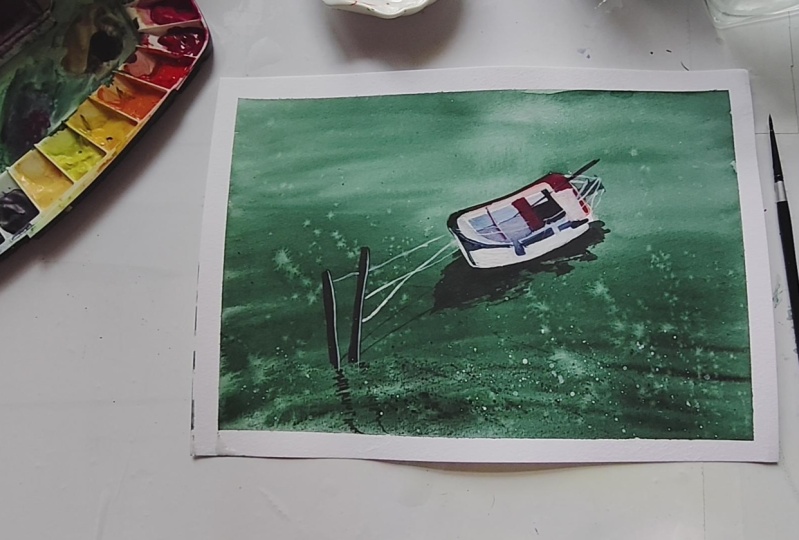
1. Hello, Welcome !: Hi, everyone. Welcome to my new class sailing
beyond Basics, painting water, boat
and reflections. I'm Sauda watercolor artist and teacher here on Skillshare. I have been painting since 2015 and teaching watercolor
online since 2019. Over the years, I
have had the joy of guiding thousands of students
on their creative journeys. My classes usually focus on moody atmospheric landscape painted with limited palettes. My aim is to help you paint with more confidence while also
enjoying the process. This class is designed for watercolor artists who
already know the basics of watercolor but want to
challenge themselves with a slightly
advanced subject. Boats and water may look
intimidating at first, but with the right approach, they can be incredibly fun
and rewarding to paint. Here's what we'll be learning
together in this class. We will begin by going over the art
supplies you will need, the colors we'll be using and how to choose and
prep your paper. I will also show you how to make a simple sketch for your
boat and water scene. Next, we will move on
to painting the water, breaking it down step by step. We will start by painting the base wash of water
in the first layer, and then add a second layer to build depth, ripples
and movement. From there, we will
focus on reflections, how to simplify them and how to keep them soft and diffused. Then we will study and
paint the boat itself, breaking it down its
structure into simple shape, building it up gradually with light and dark layers and
keeping the proportions right. Finally, we will
bring everything together by adding
the final details. By the end of this class,
you will not only be able to paint boats and
reflection with more clarity, you will also gain a deeper
understanding on how to paint and simplify these
type of landscapes. Don't worry if you make
mistakes along the way. That's part of the
learning process, and I'll be here guiding
you step by step anyway. If you join me in my previous
class 20 days of boats, this one is designed as a
next step in your journey. In that class, we
explore painting different types of boats
in simple daily exercises. In this class, we are going
to take it a little further, combining boats with water, reflection, and more advanced
watercolor techniques. So if you are ready to develop your watercolor
skills and explore the beauty of painting boats, reflections and water,
grab your brushes, your paints, and your paper. Let's go. I'm gonna see you
guys in the first lesson.
2. About the Class : This class is all about taking your watercolor
skills beyond the basics and exploring one of the most rewarding
subjects to paint. That is bods, water,
and reflection. Together, we will break
down what may feel like a complex scene into simple
and manageable steps. You will start by
learning how to choose the colors and how to prep your paper and make
a clean sketch. Then we will move on to
painting water in two stages. That is first, we're going
to build the water with basic layer and then adding depth and ripples
in the second layer. After that, we will practice capturing soft
reflections, and finally, we will paint the boat itself with structure,
character, and balance. We will wrap up with the finishing touches that
make your painting complete. This class is perfect for watercolor artists
who already know the basics and want to challenge themselves with more
advanced techniques. By the end, you
will not only have a beautiful painting
of a boat on water, but also the confidence to apply these skills to any
watercolor landscape. So I hope you guys are interested in painting today's
class project with me. If you are, then let's move on to the next
video where we will discuss all the
art supplies that we're going to need. So I'm
going to see you there.
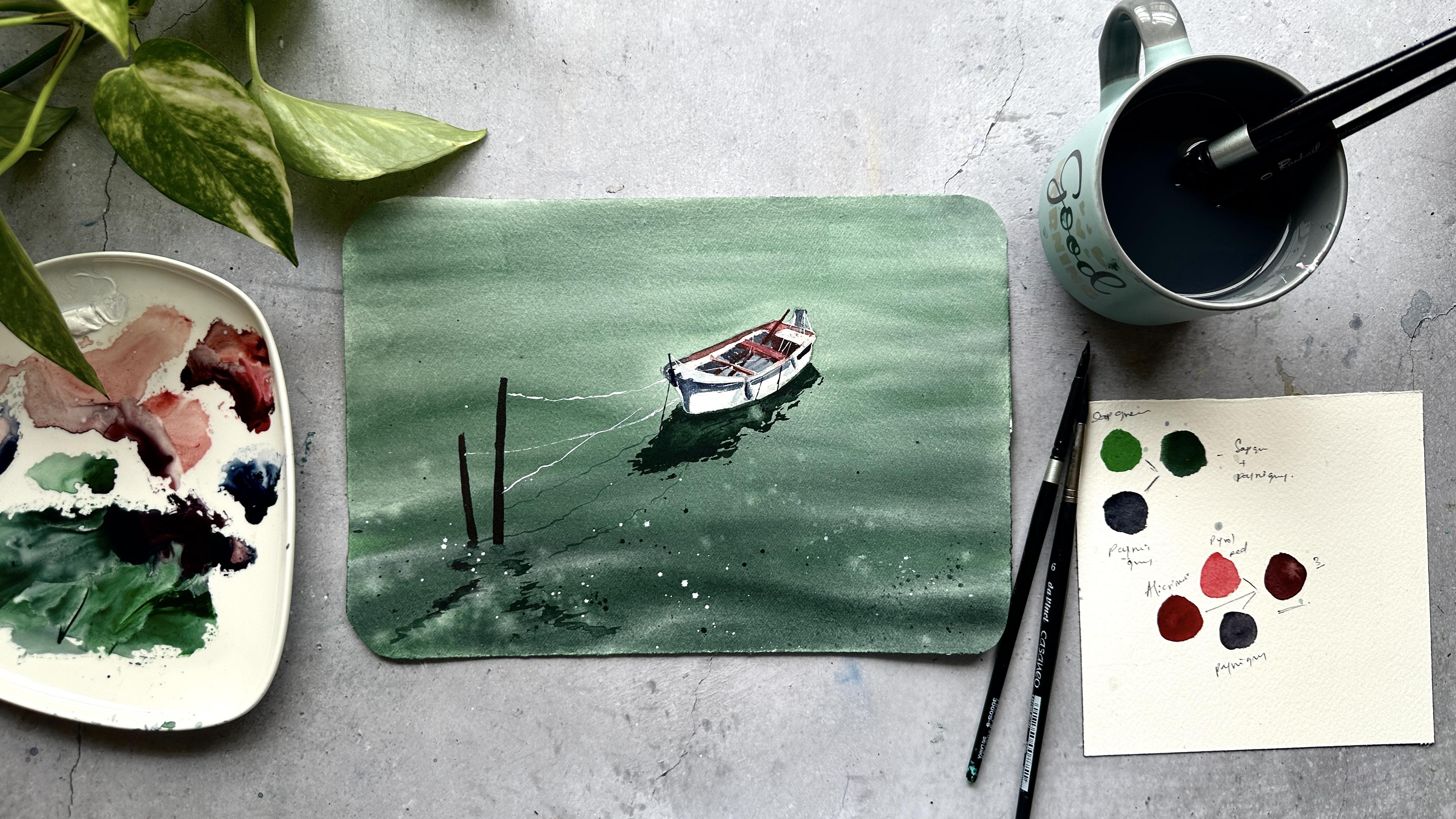
3. Art Supplies: For this class, you don't need an extensive collection
of art supplies. Just a few essential
watercolor supplies will be enough to paint, modes, water, and
reflections with ease. Here's what I recommend. Coming to paper, 100% cotton, watercolor paper, 300 GSM, coal prusse what I suggest. This is fabriano paper. We used only three brushes. Out of these three, I have used two of
those very extensively, and those are silver
black velvet, number 14, and silver black
velvet, number six brushes. These are round brushes,
so alternatively, you will need two round brushes, and one should be larger
and one should be smaller. And the third brush is DaVinci. It's a rigor brush to
paint sharper details. We'll discuss colors
separately in the next video. But the brands of the
paints that I used are aquaton anneliar
and white knights, only these three
brands that I've used. So that is all about the colors. And some essential supplies
are Watercolor palette and a pencil for a light sketch
and a jar full of water. And a tissue, or a cloth for blotting excess paint and
lifting the highlights, and of course, a masking tape. These are all the
essential supplies that you're going to be needing. And yeah, that is all about the art supplies
that we're going to need. These are all simple and basic, and I guess every one of
us will be having these. So let's get into the next video where we will discuss
about the colors. I forgot to mention the
most important art supply that is a board to
stick your paper to. So this is an acrylic board
that I bought from Amazon. You can find it in
any stationary shops or you can find online as well. So yeah, I'm going
to see you guys in the next video. A
4. Colors Used: Let's discuss about the colors that we're going to use
in today's class project. The first color is hookers
green from the brand senneliar and the second color is Pines gray from the
brand aquatone. I'm going to use a mix
of these two colors, the hookers green and Pines
gray to paint the water. And the third color is indigo. I'm going to use this
one to paint the boat. And the fourth and fifth colors are parole red and
Alizarin crimson. Parole red is from the brand aquaton and Alsarin Crimson is from
the brand sennelier. And of course, the indigo is from the brand white Knights. I will swatch these colors out for you guys
so that you will see the exact shades that
I'm going to be using. If you don't have these
particular colors, you can always use the colors that are
similar to this shade. For example, you can use
sap green in place of hookers green and black in
the place of Pines Grey, any blue in place of indigo, and, of course, everyone will
be having the red color. So this is Hookers green. It's a bright green color, but we're going to be using a mix of hookers
green and Pines gray. Then you will get this
dark greenish color. So I use this color
to paint the water. So as you can see, the water
will be usually blue color, right, but I was going
for a moody palette. So that's why I have
chosen this color. I label these colors out. So Pines Gray and hookers green gives us this dark green color. It's very doubtful at this point that I would
be using indigo or not, so I did not swatch it out, but you guys know how the
indigo would look right. So this is pyrole red. I'm going to be using a mix of pyrolered and Alysa and
crimson to paint the boat. What is a very
complicated structure to paint in this
particular landscape. So I think I'm going to be using all of these colors
to paint the boat. That is pearl right,
Alizarin crimson, indigo, and Pines gray
as well, except green. So I'm going to swatch
Pines gray here as well. So this is our color
palette for today. I have already mentioned the alternate colors
that you can use. So yeah, in the next video, we will discuss about prepping and sketching
the paper. So let's go. I'm going to see you guys
in the next video. Y
5. Prep & Sketch: Very first step before we start painting is to
prepare our paper. Watercolor paper
plays a huge role in how your painting
will turn out, and prepping it properly makes the whole process
much smoother for us. Here, I'm using my fabriano, 300 GSM, 100% cotton paper. And I'm using a board
to stick my paper on. And this is the method that I'm using to stick my
paper to the board. This is a bit different
than taping down the edges. So this method helps me to keep my paper
wet for a long time. If you want to go for a traditional taping around the edges method,
that's fine too. All right, let's move
on to the sketch. We're going to keep this
really simple, the boat. Nothing else for now. No
extra details or background, the main shape that
we need for painting. We'll guide you as a sketch, so feel free to follow
along with me in real time. If you'd rather not
sketch right now or if you prefer to trace and
start painting directly, you will also find the final sketch image available in the
resources section below. You're painting with
me here in real time. There are a few things
that I want you guys to keep in mind while
sketching a boat. Not just for this landscape
that we are painting now, but for also your
future boat paintings. First thing to get right is the angle of the boat and also the front
shape of the boat. That is all. Those are the two things that you
need to keep in mind. The rest of the boat
will follow along with you and also
rest of the painting, the water and
reflections as well. Idea today is to have a clean and clear outline that will act as the foundation
for our watercolor layers, and also don't worry
about the perfection. Just capture the overall shape
and structure of the boat. And also keep your
the pencil lines very light so that it won't be a distraction while
we are painting later. I meant to say, when we
paint with the light colors, it's not attractive that the
pencil lines would show up. So keep your pencil sketch
very light now itself. Personally, I have struggled
a lot to get the angle of the boat correctly while I was learning my
boat landscapes. So yeah, even while selecting
the reference pictures, you have to be very careful with the angle that
you are choosing. Also, if you're a
complete beginner to boat landscapes or
the sketch sketching, I would suggest you
guys to go ahead and trace the drawing that
I'm painting right now. You can find the image in
the resources section below, like I've said before, because this
particular boat angle would take a little bit of time and would give you a
lot of frustration because it's not easy
based on my experience. So yeah. I will also go ahead and paint, I mean, and sketch
the reflection because I just want to see if I got the
angle of the boat right. So if you want, you can also
sketch the reflection now. It's not going to matter because we are going to be
painting the water, so the reflection sketch
won't be visible anyway. It's just for my reference. Okay, now our paper is all set and we have got a simple
sketch of the board ready. Remember, the sketch
doesn't need to be perfect. It's just a guide to help us place everything
in the right spot. What really matters is the
painting process that we're going to be diving into
next. I'm so excited. And yeah, so with our paper
prepped and sketch in place, we are ready to move on to
the fun part. Let's go. I'm gonna see you guys
in the next video. And
6. Water Part 1 - First Wash: Right, now that we
have our sketch ready, let's start painting the
first layer of the water. I've kept my masking
tape under the board. It helps me with the
flow of the water. We're going to begin by
gently wetting the paper. For this, I'm going
to use a clean brush. I recommend using a medium
or large round brush. I have taken a flat brush here, but I have quickly changed
it because it did not suit the type of direction that I was going for and slowly and evenly wet the
area where the water will. Do not wet the boat because we're going to
be painting that later. Try not to overwork this step. Just a smooth even layer
of the water is enough. You don't want puddles and you also don't want dry
patches either. We have already prepared the
color mix for the water. We'll be using a mix of hookers green and
pines gray for this. This combination gives us a beautiful muted tone that
naturally feels moody, and it's perfect for
me to paint the water because you guys know that I always go for moody landscapes. Now, with your brush loaded, begin at the top edge
of the water area. Here, we will start light, gently drop in the color, letting it softly blend
into the wet surface. Keep your brush
strokes horizontal. This will really help you suggest the calmness and
the direction of the water. Not wet the boat area
at any circumstance. You have to keep it dry. And as you work
your way downwards, gradually deepen the color. A little bit more
pigment to your mix and make your brush
strokes slightly stronger. And this gradual
shift from light at the top to darker at the bottom creates a
sense of reflection. And if you observe any
reference picture, this is how you see it. The pigment or the color
will be very light at the top and darker
at the bottom. Take your time with this layer because the first layer acts as a foundation for
the rest of the painting. This layer sets the mood
for the entire piece. So take it very gently. I'm going to take more pigment, and I will start
adding the waves. You just have to
flick your brush in waves to create this.
Of course, waves. It's very simple, but
only thing that you need here is your
paper has to be wet. If it dries up, the
waves that you're painting here leaves the
dry marks like patches, and that won't be looking
smooth or realistic. Move slowly and do not
forget to enjoy the process. And you can notice
how the waves are settling into the paper just
because the paper is wet. This is a long process. You have to keep adding these horizontal lines until you feel satisfied
with the result. For me, I have taken more
time than needed to paint this because I seem to not have found that right
spot with the waves. So you're going to see me
paint for a long time. And this is exactly what I meant when I say,
take your time. Paint and paint until you feel content with what
you have created. This is good, but I don't
think this is enough for us to paint the water
because as you know, watercolor dries up a
few shades lighter, and we're going to have to paint the same process once
again in the next video. And I'm going to just splatter some clean water just to
give that extra texture, and I'm going to remove a bit of paint that is on the board. And I'm going to see you guys in the next video where we're going to paint the same
thing again. See you there. I forgot to mention,
you have to keep the layer one, two dry. And only when it is dried up, we can move on to
painting the layer two. See you guys in a bit.
7. Water Part 2 - Deepening The Tones: Now that our first layer
is completely dry, it's time to move on
to the second layer. This layer is really about building the depth in the water. Think of it as reinforcing
what we have already painted. The first layer gave us this
soft and light foundation. Now we're going to just
enhance it a bit more. And it's going to begin by re wetting the
paper once again. And for this, I'm using
my larger round brush. It's silver black
velvet number 14. And yeah, leave out the boat area and rewet
the paper very gently. Using the same color
mix as before, hookers green with pines gray. If your mix has dried
on the palette, just reactivate with a
little bit of water. You can also make it
slightly more pigmented this time since we are going
for a deeper tone. Start again at the top, just like we have
done in layer one. Keep your brush
strokes horizontal, and let's begin
painting the layer two. You will notice immediately how the second layer brings more
character to the water. As you move downward, gradually darken the paint even more. The goal here is to
create a soft gradient, lighter at the top and
darker at the bottom. This shift adds more depth and makes the surface of the
water look more natural as you can already see
how just a little bit of paint can change the entire
structure of the water. Again, like I've
said in Layer one, this is how you see even in
your reference pictures. To add more character
to the water. So my paper is wet as well. So I will try to add more
horizontal lines with my brush, just like I have done in Lan. Until I feel like this green
paint is looking like water, I will continue to add or
change these horizontal lines. Also, do not forget to add wavy structures
onto your paper. This is the time
because in a bit, the paper will dry up. So let's hurry up and move your brush in a wavy pattern so that
you'll get the waves. And also, water is
never one flat tone. It's always changing. It always shifts
with reflections, light, and some movement. And we are trying to create
just that onto our paper. Your time, take as much of the time as you
need with this step, work slowly, and also do not forget to enjoy
the process as well. Mm. I will add a bit of light to these waves.
It's very simple. I'm going to remove all
the paint from my brush, and with a damp brush, I'm going to remove some of the paint on top of each wave. This is very
interesting technique to create the light
in a very easier way. Looking good right.
And at this point, I felt like my green paint
is looking more like water. So yeah, I'm going to splatter some water onto my paper to
add that extra character. And this is it. This is the layer two. And I'm going to keep
this for drying. And once the paper is dried up, we're going to paint
the reflection part in the next video. So I'm going to see
you guys there.
8. Reflections Of The Boat: Now that we have
the water painted, it's time to add the
reflections of the boat. This is such an
important step because reflections are what
really connect the boat to the water and make the
whole scene feel natural. To begin, make sure your water
layer is completely dry. If it's even slightly damp, the reflections will spread too much and they will
lose the shape. For the reflections,
I will be using the same colors that we have
used to paint the water. Load your brush with
the hookah screen and pine screen mix and place your strokes directly
beneath the boat. You can refer to the sketch that we have drawn
of the reflections, but I can't see it now because we have added two
layers of green paint. So, yeah. Short
horizontal strokes to pull the color downward, and also try not to drag the brush in
one continuous line. Instead, break it up a little. That slight unevenness
will actually mimic the way reflections naturally shift and distort
on water surface. You can see the reflections
look a bit softer to the subject above because you want the reflections to feel connected to the
water around them. Obviously, the
reflections will not hold the shape of the subject above. Again, I'm adding a few
more uneven lines around the reflection to give that
natural distorted shape. As always, I'm gonna
splatter some dark paint, and I'm covering the boat area because we haven't
painted that one yet. I will try to add
a few details to the reflection to make
it a bit more realistic, as much realistic as
possible, I mean, and also keep your
reflection slightly darker closer to the boat and lighter as it
stretches downward. This makes the
painting look more balanced and also do not
overthink or overwork this step. Reflections are never perfectly straight or mirror like
in water landscapes. A little irregularity actually makes them more believable. So if you are happy with what
you have painted so far, you're done with
the reflections. We're going to let the
area dry completely, and we will move on to painting the boat
itself in the next video. So I'm going to see
you guys there.
9. Boat part 1 - Structure: Alright, let's begin
painting the boat. You know, the boat
has only two colors we have discussed
in colors video. So I'm going to use
a mix of parole red, lazarin crimson, and
indigo for this, and somewhere a little bit
of pines gray as well. So first, I'm going to take a
very light shade of indigo. I will add this color to
the body of the boat. You have to be very
subtle with this color. Do not add darkened indigo here. We need very, very light shade because we're going to be
painting over this later. This is just for our
reference about the shape of the boat so that we can paint better with different
colors later. I will take the mix of Alzarin
crimson and Pyrrole red, and I'm going to add very light shade of
this color again to the side of the Mm hmm. I'll add a few things
to the boat now. I mean, I'm going to
sketch a few things. So just take a pencil and
follow what I'm drawing here. M add the very light shade of red over here as well. The painting of this boat is just as building up one
layer after the other and, of course, adding the light and shadows so that the boat
will look realistic. And I'm going to add
a bit darker version of indigo color here as well. The light shade of indigo at the at my right
side of the boat. So keep adding until the boat the sketch of this
boat looks like a real boat. We are done with
adding light colors. We have established
the foundation of preliminary boat painting. So now let's start adding
the darker shades. I'm going to start with the red. Goodbye, the blue colour. I'm going to darken
the red color as well. This is us adding
the shadows here. So first, we have added
the lighter areas, and now we are adding the
shadows to that lighter areas. I'm going to add
the darker shade of indigo over here as well. Our boat is looking like a boat, I suppose, at least 80%. So yeah, I'm going to add
indigo over here as well. Comes the interesting parts. We are going to add
darker shade of red to indicate the shadows. So, see, instantly, our boat is looking
like a three D structure. That is the power of
adding light and shadows. I'm going to paint a
paddle over here as well, and the shadow of the paddles. So for the paddles, I'm going to be using red
color and for the shadows, I'm going to be using indigo. Adjust the shape of the boat here using the
color of the reflection. Just I wanted to make sure the line is straight
at the bottom. Details in the reflections, just to make it just to
give it more character. And that is all
for boat part one. In Part two, we're going to
paint a few more things. So I'm going to see
you guys over there.
10. Boat Part 2 - Details & Finishing: We are almost done painting
our landscape of the day, just a few details,
and we are good to go. First, I'm going
to take a scale, and I'm going to draw a few
things here in the water, and I'm going to
add the reflections of those things as well so that the boats landscape
look even more realistic. So let's go. No, those wooden planks that
boats are tied to. That's what we are
painting today. And for this, I'm
using only Pines gray. With the same color that we have painted the
reflection of the boat, we're going to paint
the reflection of these wooden planks, as well. Now comes the hero of all the colors that
we have used so far. This is white gouache. You can use white
watercolor as well. So I'm going to take that color a little bit on my palette, and we will start painting a few things with
this white color. That we are painting now with white colour should
be very thin. So for that, we're going to have to
change the brush here. That's what I will do as well. I will take Dawnhi rigor brush so that the tip of the
brush would be very sharp. And yeah, if you want to change the
brush, now is the time. If you have made any mistakes by adding too much color
where it shouldn't be, you can cover up using
this white color. That's what I'm doing here. That's why I call
this white color as the hero of all the
colors that we have used. I'll also start painting
these structures that are hanging from the boat
with indigo color. It's going to take
a while to get the shadow on the light
perspective right. Now, with the darker sap
green and pine cream mix, I'm going to add the
reflection of these ropes, as well. That's very important. Going to splatter some white
paint in the water as well. So this is it about painting
the boat and reflections. In the next video,
we'll see if there are any final details that
we have to go through. So we're almost done. Just a little bit is remaining. I'm going to see you
guys in the next video.
11. Final Details: You can see this is
a very short video, so we have only a few
final details to add. So I'm going to first add
the shadow to this paddle, and I'm going to be using
dark or red color for this. Few ropes here and there
using the white color. And a few ropes with a darker indigo color and the reflections
of those as well. That is it for our boat
landscape for today. I'm going to remove
the paper from the board because my
paper has dried up. But yours if yours is still wet, you can leave the paper for a few minutes and remove
it from your board. And I'm going to also
cut the edges around the edges of the paper just
to give that extra nice look. But that's completely
your choice. You can skip this
step if you want. You can see our
boat landscape is completely ready and
looking so good. So I hope you guys enjoyed painting this one with me today. In the next video, we
will talk a little bit more about this landscape. So I'm going to see
you guys there.
12. Conclusion : Thank you so much for
joining me in this class, sailing beyond basics,
painting boats, water reflections in watercolor. I hope you guys
enjoyed exploring these advanced techniques
from painting water in layers to capturing those
beautiful reflections and finally bringing the
boat to life with details. Oh, it's your turn.
I would love for you guys to create
your own boat and water scene as the class project and share it in the
project section below. Don't worry about
the perfection. Each painting is a step
up in your journey. I'd be so happy to
see your progress. And if you find
this class helpful, please consider
leaving a review. It really helps other
students discover the class, and it means a lot
to me as a teacher. Thank you again for painting
with me until next time. Happy painting.
 Sukrutha Jagirdhar, Watercolor Artist I Creative Entrepreneur