Transcripts
1. Hello, Welcome !: What if you could improve
your watercolor skills simply by painting calm
ocean waves again and again without getting
overwhelmed by complicated techniques and
detailed compositions. Welcome to this class. Painting ocean waves
in watercolor, seven beginner
friendly projects. Hi, I'm Sakuta, watercolor
artist and teacher. I've been painting with watercolors for so many
years now, I think, more than ten years, and I gravitate more towards calming
and simple landscapes. And one thing I do believe is that painting simple landscapes consistently will improve
your watercolor skills much more than trying to
chase complicated techniques. That is exactly what
this class is about. This class will officially begin today and continue till June 14. Instead of uploading
projects every single day, a new class project will be
uploaded every alternate day, giving you enough
time to relax, paint, practice, and catch
up comfortably without feeling overwhelmed. Throughout this
class, we will paint seven beginner friendly
ocean waves landscapes inspired by calming
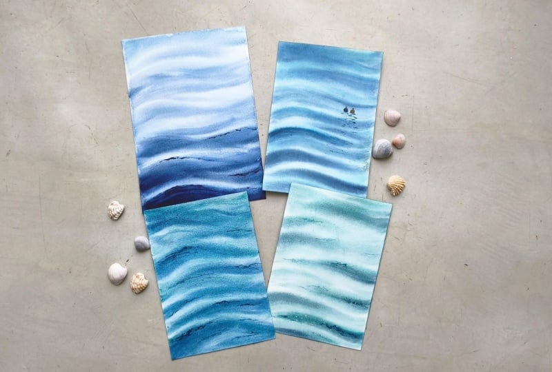
sea textures, soft movement, flowing water, and beautiful blue tones. Now, before we begin, I want to mention
something very important. All the projects in this series may look slightly similar, and that is completely
intentional. This is not a class
where every single day introduces a dramatically different composition
or technique. Instead, this class
is designed more like a guided watercolor practice
session because honestly, repetition is one of the best ways to build
confidence in watercolor. This class is perfect
for absolute beginners, anyone who feels
intimidated by watercolor, or any artist looking for a
calm daily painting routine, or anyone who simply loves painting oceans and
water textures. You do not need prior
experience to join this class. I will guide you step by
step through each project. By the end of this class, you will have seven completed ocean
paintings with you and much better understanding
on how watercolur behaves while painting
water and waves. Most importantly, I hope this
class helps you slow down, enjoy the process and fall in love with
watercolur a little more. So gather your supplies, prepare your favorite
shades of blue. Let's begin this peaceful
ocean journey together. And
2. Art Supplies : Before we begin with our
first class project, let's quickly go through all the art supplies you
will need for this class. Let's start with the paper. For all the projects
in this class, I'll be using 100% cotton, cold pressed watercolor
paper from Fabriano. This is 300 JSM paper, which means it can
handle multiple layers of water and paint without
buckling too much. I usually purchase these
papers in rolls and then cut them down to whatever size that I need
for a particular project. Next, let's talk about paints. Before each class project, I will discuss the
exact colors we will be using for that
particular painting, so you don't have to worry about memorizing them right now. For this lesson, I
simply wanted to show you the brands
that I use more often. The watercolor brands
you will see me using throughout this class
include white knight, Sena, Aquaton,
Windsor and Newton. These are all artist
create watercolors, but feel free to use whatever
paints you already have. The technique will work
regardless of the brand. Now, let's move on
to the brushes. I like to keep my brush
selection very simple, and for most of my paintings, I use just four brushes. The first is a wash
brush from Princeton, which I mainly use for applying larger washes
of water and paint. The remaining three
are silver back velvet round brushes
in different sizes, size ten, six, and two. These brushes are incredibly
versatile and allow me to paint everything
from broad washes to fine details and texture. Next, you will need a board
to tape your paper onto. The board I use is actually a simple vegetable cutting board that I purchased from Amazon. It's light weight, sturdy and works perfectly for
watercolor painting. To secure the paper
to the board, I will be using masking tape. This helps keeps the paper in place while painting
and also gives nice clean edges if you are taping down
on all four sides. But for this project, I
will be just sticking my paper onto it onto the board instead of just
applying it around the edges. Apart from that, you will
need a ceramic palette, a jar of clean water, and a few paper towels or tissues for controlling
excess water. And that's it. These are all the supplies you will need throughout this class. Don't worry if you don't have the exact same
brands or materials. Use what you have and focus
on enjoying the process.
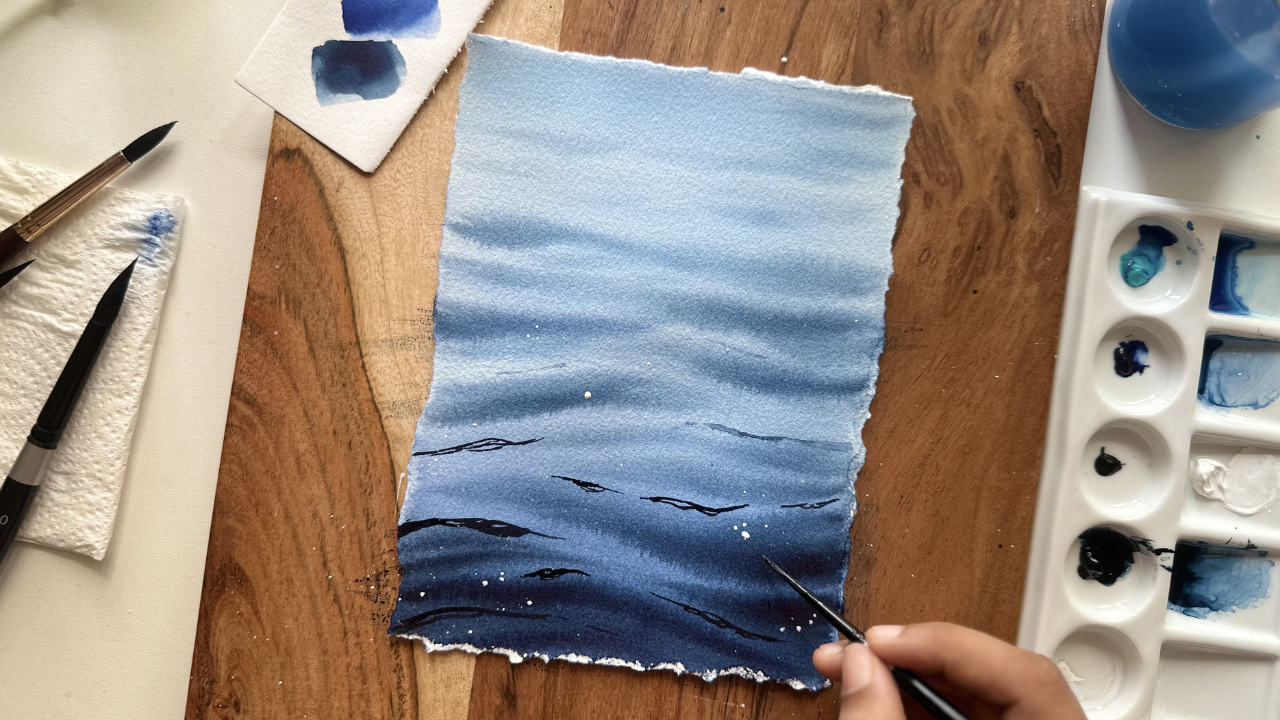
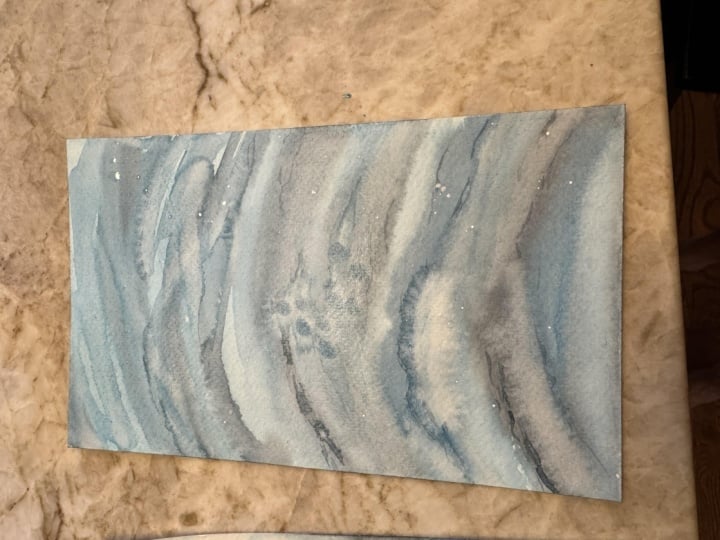
3. Day 1 - Whispering Waves: Let's begin with our first class project, whispering waves. Before we start painting, let's quickly look at the colors we'll be using for
today's project. The first color is
cobalt Turquoise light from Windsor and Newton. If you don't have
this exact shade, feel free to use
any Turquoise or Turquoise green watercolor
from your palette. The second color is indanthrine
blue from Sennelier, and finally, we'll be using indigo from
Windsor and Newton. These are the only three colors we'll need for today's painting. At the very end, I
will also be using a little white cash to create
some soft highlights later. But we're going to only swatch these colors these three
colors before we begin. First, I will watch
Cobalt Turquoise slight, next Inanta in blue,
and finally Indigo. This is our color palette
for today's project, and now we are ready
to begin painting. I will start by wetting the entire paper using
my Princeton wash brush. Make sure the water is applied
evenly across the surface. Once the paper is wet, I will use a tissue to remove any excess water collecting
around the edges. Now we can begin painting. The first layer should
be very light and soft. I will create a mixture of cobalt turquoise
light and anthrine blue and begin painting gentle horizontal strokes
across the paper. And I'm using my silver black velvet number ten
round brush for this. Although these are
horizontal strokes, notice that they aren't
perfectly straight. They have a slight wave
like moment to them. Try to follow the general
direction of my brush strokes, but don't worry about making your painting look
exactly like mine. A similar flow and structure
is more than enough. The first layer is in place. I will quickly change my brush. This is silver black
velvet number six, smaller round brush before we were using number ten brush. I will begin darkening the mixture by adding
a little indigo. Using this daka value, I will start building
the deeper wave shapes, especially towards
the foreground. The upper portion
of the painting will remain relatively light while the foreground gradually becomes darker to create depth. I think I'm going to darken the foreground
waves a little bit because they are
looking quite similar to the ones that are about
the horizontal wavy shapes. Like I said before,
the foreground should be a bit darker. The middle part is quite empty. So I'm going to just fill out a few waves over there as
well, using the same color. A few light strokes
at the top, as well. We don't want to create two dark waves over
there on the top. Just the foreground
should be darker, like I've mentioned before. Now, a little darker
at the foreground, you have to just follow your
intuition at this point. And now while the
paper is still damp, I will lift out a few
areas using a clean brush. This helps create
subtle highlights and illusion of light catching
the surface of the water. So you're happy with
the first layer. Allow the painting
to dry completely. Now that the paper is dried, I will switch to my
silver black velvet size six round brush and
take some indigo. This is the same brush
that we have used before, so I will just take
the same brush. I'm sorry, I meant switch. I meant the same brush. This step is where we will add a few shadow details
and darker accents. Be careful here because
it is very easy to over this painting
at this point. Less is definitely more. I will only add a
few marks where necessary to enhance the
movement and depth of the water. Finally, I will splatter a little
whiteqh to create tiny reflections and glimmers of light across the surface. And that is it.
Our first project, Whispering Waves
is now complete. If you are enjoying
the class so far, I would really appreciate it
if you could leave a review. It helps the class reach more students and support
my work as a teacher. Since today is June 1, the next project will
be released on June 3. Remember, we will be
painting together every alternate day
throughout this series. Thank you so much for
joining me today. I truly appreciate you spending your time
painting with me. I will see you guys in the
next class project until then, happy painting and take care.
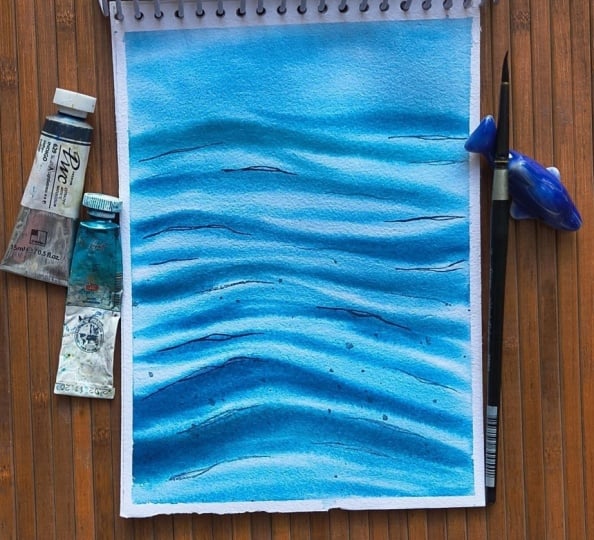
4. Day 2 - Rolling Waters: Let's begin with our
second class project. It's called Rolling Waters. As always, we will start by
selecting the colors first. Today's project, I'll
be using Azure blue, Turquoise blue and indigo, all from the brand
white knights. I already have Azure
blue on my palette, so I'll just activate
it with a little water. Next, I'll take Turquoise
blue, followed by indigo. Let's quickly swatch
these colors so you have a better idea of the palette that we'll be
working with today. First is Azure blue. Next is Turquoise blue,
and finally, indigo. This simple three color palette is all we'll need for
today's painting. Now, let's begin by
thoroughly wetting the paper. I'll be using my Princeton
washbush to apply an even layer of clean water
across the entire surface. Once the paper is evenly wet, I will switch to my silver black velvet size ten round brush. We will now begin
with a gradient wash using a mixture of azure
blue and talcuaise blue. Starting from the
top of the paper, I will gently bring the wash
down toward the bottom, creating a smooth
transition of the color. The paper is still wet, I will use the
same color mixture to begin painting
soft wave shapes. Remember that waves
are rarely stripe. Instead of painting
rigid horizontal lines, try moving your brush in gentle semicircular motions to create a natural wave pattern. These days, keep everything
very light and subtle. Think of this as
foundation layer. We will be adding more
waves in the next layer. Now I will switch to my silver black velvet
number six round brush a little smaller than
the one we had before. By adding a little indigo to the azure blue and
turquoise blue mixture, I will create a darker value and begin building another
layer of the waves. Work your way from
bottom toward the top, adding wave shapes wherever
you feel they are needed. There is no strict reference
image for this project, so feel free to place the waves naturally
and intuitively. Just make sure your paper is wet while you are
adding the waves. Once the wave structure
is established, I will selectively
darken a few areas to create more depth and variation
throughout the painting. Yeah. After that, I will remove
any excess water or paint collecting
around the edges of the paper using
a paper towel. As you can see, the edges
have so much of paint, I mean, around the paper. So we have to clean it to avoid any backgrounds or blooms, since we did not, you
know, tape down our paper. If you tape down your paper, it's still my advice to, you know, clean the edges. Oh, we will allow the
painting to dry completely. Okay. My paper is dry now. I will take indigo and
my silver back velvet, size six brush and begin adding a few subtle reflection
and darker accents. This step should be
approached with a light hand. It's very easy to
overdo these details, so focus only on adding a few carefully placed marks to enhance the
movement of the water. As you can see, my background
remains quite light while the darker ascents help create the contrast and depth
in the foreground. If any area becomes
darker than interdent, you can easily lighten it
while the paper is still damp by gently dabbing it
with a clean tissue paper. As you can see, that's
what I'm doing here. I think the indigo was a little too strong
for the background, so I'll just dab a little
paint off a little. This only works while
the paint is wet. And that is it. Our
second project, Rolling Waters is now complete. Hope you enjoyed painting this calming ocean
study with me. Thank you so much for
joining me today, and I will see you in
the next class project.
5. Day 3 - Ocean Breeze: Hi, welcome to Class
Project three. Let's begin by selecting our
colors for today's painting. We'll be using a very
limited palette today, consisting of just two colors, Azure blue and Indigo, both from the brand
white knights. I will quickly swatch these
colors so you can get a better idea of the shades
we'll be working with. Once our colours are ready, we will move on to
preparing the paper. Next step is very important. So take your time with it. Using a clean brush
and clean water, thoroughly wet the entire
surface of the paper. Don't trush this process, and evenly wet surface
will help us achieve the soft transition we are looking for in today's painting. So make sure to remove any excess water that collects around the edges of the paper. One thing worth mentioning
is that I'm not taping down all four sides of my
paper for this project. I mean, for this entire class. During the summer
months here in India, the weather gets extremely hot, and I found that leaving
the edges untaped helps the paper stay wet slightly longer compared to
fully taping down. Of course, if you prefer
working with taped edges, feel free to continue
using your usual method. Once the paper is ready, I will begin by applying azure
blue from top to bottom, creating a smooth and even
wash across the surface. After establishing the wash, I will switch to a smaller
round brush and begin painting soft wave shapes
directly into the wet surface. You'll want to work a little faster during these days because these soft wave textures depend on the paper
remaining wet. Once the paper starts drying, the edges will
become sharper and you will lose that
beautiful soft effect. Next, I will take a slightly darker mixture of
Azure blue and begin adding a few darker wave shapes in the foreground area to create a little more
depth and movement. I'm happy with the first layer. I will clean my
excess paint from the edges and allow the
painting to dry completely. After the paper has dried, we will move on to
painting something slightly different from
our previous projects. To add a bit more
visual interest, I will paint a few
floating objects on the water along
with their reflection. I wanted this project to feel a little different
from the first two. So this small
addition helps create a simple focal point while still keeping the
painting big in friendly. To object, I have used
just indigo color. But for the second one, I wanted to add a bright orange shade, and that shade is from
white knights, as well. This warm colour creates a
beautiful contrast to that already present blue colour. A smaller round brush, I'll then paint the
reflection underneath using, of course, indigo color. As I continue working, I will make a few adjustments
to the reflections. Shelly, they looked a little
too neat and structure. Reflections on moving
water usually appear slightly broken and
also quite irregular. So softening and disturbing those shapes helps create
a more natural look. Since everything is complete, I will remove the
paper from the board. That is it for today's
class project. I hope you enjoyed
painting this simple, relaxing ocean scene with me and experimenting with
reflections for the first time in this series. Thank you so much for
joining me today, and I will see you guys in my next class project. M
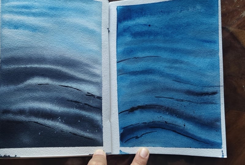
6. Day 4 - Shades Of Sea: Hi, everyone. Welcome
to Class Project four. Let's begin by selecting our
colors for today's painting. Initially, I picked out four
colors for this project, Cobalt Turquoise Light and Indigo from Windsor and Newton, sap green from SNeliar and
Azure blue from White Knights. However, as I started
experimenting with the palette, I realized that I
wanted the colors in today's painting to remain completely transparent
and luminous. Since cobalt turquoise light contains a little
bit of opacity, I have decided not to use
it for today's project. So for our final palette
will consist of azure blue, sap green, and indigo. Azure blue from white knights, sap green from Sennelier and
indigo from white knights. Rather than using
these colors directly, we will be mixing them to create new beautiful ocean
inspired shades. Let's quickly swatch them. First, I will mix azure blue and swatch it. So this is clear blue color
that we're going to be using. And then I will
mix Azure blue and sap green to create a fresh
tropical blue green color. And finally, I will
mix Azure blue and indigo to create our
darkest value for the painting. These are all the colors that we will need for today's project. Now let's begin. I will start by wetting the
paper thoroughly using clean water and print
with my Princeton wash brush. Make sure the surface is evenly wet before moving on
to the next step. For the first wash, I will
take the mixture of sap green and azure blue and begin
applying it across the paper. And I'm using my silver black velvet number ten
round brush for this. While the surface is still wet, I will use the same brush to start suggesting wave shapes
throughout the painting. At this taste, I'm not
following any strict reference. I'm simply allowing
the composition to develop naturally as I paint. Initially, I decided
to place most of the wave patterns near the top and bottom
sections of the paper, leaving a lighter version, lighter area through the middle. As I continued painting, I realized that the
central white gap wasn't really working
for the composition, so gradually filled the space with additional waves and color, creating a more cohesive flow
throughout the painting. Once the basic wave
structure was established, I added slightly darker mixtures to introduce a bit of
depth and variation. This forms the foundation
for today's ocean study. Says, I spent a little more time building additional
wave patterns throughout the
painting rather than stopping after just
a few strokes. I continue layering waves
for a couple of minutes, allowing the composition
to develop naturally. You will notice that some waves overlap while the others
remain quite subtle. This variation helps
create the illusion of movement and prevents
the painting from looking too repetitive. As I continue painting, I'm constantly
adjusting the spacing, size, and direction
of the views. You can only do this while
the paper is still wet, so take advantage of these days. Some areas receive
more detail while others are intentionally
left softer, especially at the top part
of the paper and less defined because you don't
see much over there. When you see the
painting, your focus will naturally go towards the
bottom, the foreground part. So yeah, don't worry about placing every wave
perfectly, either. The beauty of ocean studies like this is that there is a lot
of freedom to experiment. If you feel an area looks too empty or add a few
more wave shapes. If it feels too busy, simply stop and let the
watercolor do its thing. Dtinue building
layers until you're happy with the overall moment
and rhythm of the water. Remember, there is no right
or wrong placement here. The goal is simply to create an interesting
pattern of flowing waves and enjoy the
painting process. Once you are satisfied
with the wave structure, allow the painting
to dry completely before moving on to
the final details. Now that the paper is fully dry, I have switched from my
silver black velvet size ten brush to my size
six round brush. Using a mix of Azure
blue and indigo, I will begin adding a few
subtle reflections, wet on dry. Since the wave patterns are scattered throughout
the painting, these reflections should
remain very minimal. A few carefully placed
strokes are more than enough. Especially careful
during this step because it's very easy to
overwork the painting. The goal is simply to enhance the existing wave shapes
rather than repaint them. Continue working, you
will notice that I'm adding quite a few reflections
throughout the painting. Even though these
reflections are subtle, they play a very important role in creating depth and
movement in the water. I've said that keep it minimal. But here, I think I'm not
following my own advice. And as you guys know, if you have been
following me for long, you would know that
I have a trouble with stopping myself. I don't know when to stop, and most of the times I ruin
my paintings just like this. For some reason, even though I have overworked
the reflection part, this painting worked
out quite well. So I would suggest you guys to, you know, go ahead, follow your
intuition, especially while painting the reflections. Some people like it very
minimal, some don't. So it's completely up to you. Again, one more thing
I want to mention is that I'm not painting
continuous lines here. Instead, I'm using
broken shapes and small marks that follow the
direction of the waves. This helps the reflection
blend naturally into the water rather than stand
out as separate element. Some reflections are darker
and some more defined, especially in areas where I want to create a
little more contrast. Others are barely visible and serve only to suggest
movement on the surface. To finish the project, I will also add a
few splatters of white quash to create highlights and settle
water sparkle. Once everything is
completely dry, I will remove the
paper from the board. You may notice a bloom formed
at the top of my painting. Personally, that doesn't
bother me too much anymore. After years of painting
with watercolor, I have learned to
embrace some of these happy accidents
and unexpected textures. However, if a bloom appears in your painting and you
don't like the effect, feel free to repaint the area and start
over if you need it. Watercolor is all about experimentation and learning
what works for you. And that is it for
today's class project. Thank you so much for
joining me today. I hope you enjoyed creating this tropical ocean
inspired study. I will see you guys in
my next class project.
7. Day 5 - Gentle Tides : Hi, guys, welcome to
Class Project five. Let's begin by selecting our
colors for today's painting. The first color is
cobalt turquoise light from Windsor and Newton. The second color is
Idanrinblue from Senelia. And finally, I will be using Indigo from the
brand White Knights. These three colors make up our palette for today's project. Let's quickly swatch
them before we begin. First, cobalt turquois light. Next is Ianthrineblue,
and finally, Indigo. That's it for our color palette. Now, let's start by
thoroughly wetting the paper using clean water and my
Princeton wash brush. As always, I will make sure
to remove any excess water that collects around the edges of the paper before moving on. For the first layer, I will create a mixture of inanthrine blue and a touch
of cobalt turquoise light. Using my silver black
velvet round brush, I will begin with a
reverse gradient wash. This means the top portion of the painting will
remain lighter while the colour gradually becomes darker as we move
toward the bottom. Take your time with
this step and try to achieve a smooth transition
between the values. Once the wash is complete, I will again remove
any excess paint or water around the edges
using a paper towel. Now, I will switch to my
silver black velvet 66 brush. To the same mixture, I will
add a little itigo to create a darker value and begin
painting the wave patterns. The placement of these waves
is completely up to you. There is no strict
reference image that we are following today. So feel free to interpret
the water in your own way. This project,
though, I'm creating a simple horizontal lines
with gentle wave like curves. I usually begin from one
side of the paper and paint a few waves and then move to the opposite side and
repeat the process. By alternating between
the left and right sides, the pattern feels a little more natural and
less repetitive. As I continue, I will vary the length and
spacing of the waves. Some strokes are longer, some are shorter, and a
few overlap slightly. These small variations
helps create the illusion of movement
across the water surface. Spend a few more minutes
gradually building these layers, adding more waves
whenever I feel the composition needs
additional interest or depth. There is no need to count the waves or place
them perfectly. Simply observe the
painting as it develops and trust
your instincts. Since I'm happy with the
overall wave structure, I will allow the painting
to dry completely. That the paper has dried, I will take indigo and my silver black velvet size six brush and begin
adding reflections. This step should be done carefully because
reflections can quickly become overpowering
if we add too many of them. I'm using small
controlled strokes and placing them only where I feel they will strengthen
the compositions. Some reflections
are slightly darker while others remain
soft and subtle. This variation helps maintain a natural appearance and create a sense of
depth in the water. Finally, I will take some
white wash and splatter a few highlights across the surface to suggest the
light catching the waves. That is it. Our fifth class
project is now complete. Thank you so much for
joining me for Day five. I hope you enjoyed
painting along with me, and I can't wait to see
you again for day six. Until then, happy
painting and take care.
8. Day 6 - Emerald Tides: Ribon. Let's start with
today's class project six. Today's project is a particularly interesting
one because we will be mixing two colors to create a beautiful
ocean inspired palette. I mean, not two colors, but the final project
will have two shades, uh to paint the ocean waters. We haven't done that
in previous projects. Let's begin by
selecting our colors. The first color is Iantrine
blue from Sennelier. Second is hookers
green from sanela. And finally, I'll be using
indigo from white knights. Hookers green is the key
color in today's project. If you don't have hookers green, you can substitute it
with viridian green. Another option is to
mix a little sap green with turquoise blue to
achieve a similar shade. Any of these alternatives will work beautifully
for this painting. Let's quickly swatch the colors. First Hookers green, next
Ianthrin and finally Indigo. As you can see, when
Hooker's green is mixed with a little
bit of anthrine blue, it creates a beautiful
oceanic shade. I'm really excited to use this mixture in today's project. Let's begin by wetting
the paper thoroughly using Princeton wash
brush and clean water. Once the paper is evenly wet, I will switch to my silver
black velvet size ten brush. I will begin by applying inanthrine blue at the
top portion of the paper. As I move toward the middle, I will gradually
introduce hookers green. The goal here is to create a smooth variegated wash where both colours blend
naturally into one another. Take your time with the state and allow the colours to mix
softly on the paper. One of my favorite things
about watercolor is watching this beautiful
transition happen very naturally. Once the initial
wash is in place, I will remove any excess water from around the
edges of the paper. I will switch to my silver
black velvet size six brush using a mixture of hooker screen and a little bit of indigo, I will begin painting
the wave patterns. I know we have painted waves in several of
the previous projects, so the process should
feel familiar. I will continue using
the same approach, building the waves with
loose horizontal strokes that gently curve and
flow across the water. As always, there is no exact placement that
needs to be followed. Feel free to add aws wherever
they feel natural to you. I spend a few minutes slowly
building the composition, adding layers of aws, varying their size
and intensity. Some remain soft
while others are slightly darker to create
depth and movement. Once I'm satisfied with
the wave structure, I will remove any excess
water from around the edges and allow the
painting to dry completely. The paper has dried,
you may notice a slight pain flow in one of the middle wave section.
That's perfectly okay. Watercolor often surprises us with little unexpected effects, and in this case, we can easily incorporate it into
a final painting. For the reflections, I will create a mixture of
hookers green and indigo, use my smaller round brush to add details wherever I
feel they are needed. These refractions
help define the views and add a little bit more
dimension to the water. I will work slowly
and selectively, focusing only on areas that
need additional contrast. The reflections are complete. I'll splatter a little white
wash across the painting to create the effect of light reflecting on the water surface. Everything has dried completely, I will remove the paper from the board, and there we have it. Today's class project
is now complete. I hope you enjoyed painting this vibrant ocean
scene with me tomorrow. We'll be working on our
final class project. I'm very excited for you to
see what I have planned. Thank you so much for
joining me today. I will see you in
my next project.
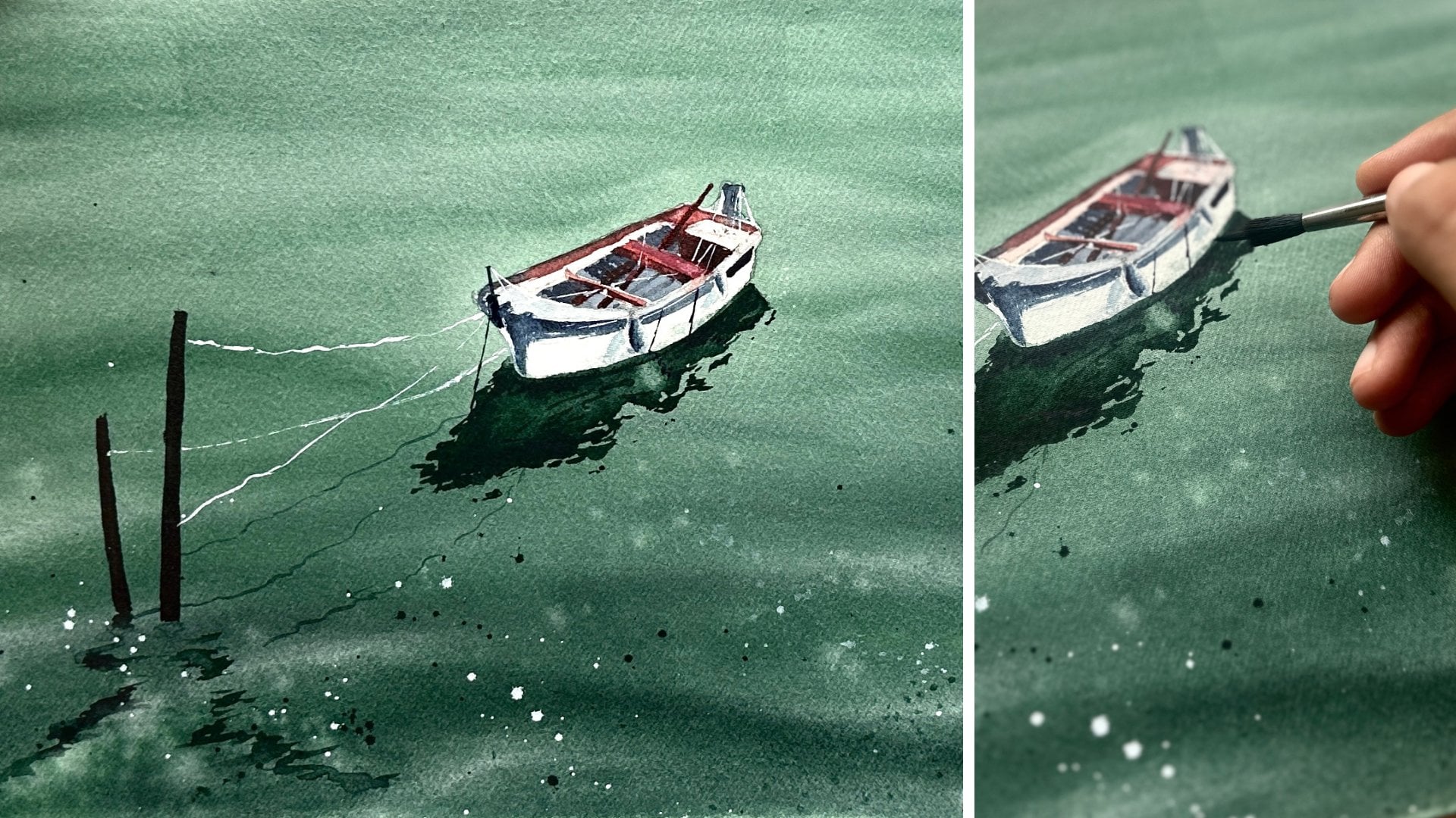
9. Day 7 - Reflections At Sea: Welcome to the final class
project, Reflections at Sea. For our last project
in this series, I wanted to paint something
a little different. Throughout the class, we have focused mainly on ocean waters, wave patterns, reflections,
and color studies. But for today's project, we will introduce a simple
boat and its reflection to bring together many
of the techniques we have practiced over the
past seven projects. Don't worry, though,
this is still a very beginner
friendly project, and we will keep everything
nice and simple. I will begin with a light
pencil sketch of the boat. Nothing too detailed,
just enough to establish the
shape and placement. I will also lightly sketch
the reflection underneath, so we have a guide
to follow later. Since the sketch is complete, let's look at the colors
we will be using. The first color is hookers
green from Senela, second is Ianthrinblue,
from Senelar and finally, Indigo from white Knights. Let's quickly swatch
these colors. First hookers green, next Ianthrinblue,
and finally, Indigo. As you have probably noticed, we are using a similar
palette to terday's project. I absolutely love
the combination of hookers green and Ianthrine
blue for painting water. Together, they create such beautiful oceanic
tones that feel rich, vibrant, and full of depth. Now, let us begin painting. I will start by wetting the entire paper
except at itself. The reflection area will
remain wet as well, because we'll be painting
directly into it. Once the paper is evenly wet, I will take my round brush
and begin with hooker screen. Gradually, I will introduce
inanthrine blue into the wash and allow the two colours to blend
naturally on the paper. At this taste, the
painting almost resembles the Northern lights with all the beautiful blue and green
transition happening. Oh Continue softening the blends until I'm happy with the
overall background and then remove any excess water from around the
edges of the paper. Once that is done, I will allow everything
to dry completely. Now that the paper is dry, we can start working
on the boat. I will begin by painting the outer edges of the
boat using indigo, starting with the top and
bottom orders to help define the overall structure
before adding any details. This project involves multiple layers. I will occasionally
use a hair dryer to speed up the drying
process between stages. Once the basic shape is established, I will continue adding a few simple details
using only indigo. Keeping the boat monochromatic helps maintain the focus on the beautiful water and the colors of the
water surrounding it. Quickly add the shadows to it to these objects that are
hanging off the boats. I know they look a
little, not realistic, but I will keep adding layers to it so that until it
makes perfect sense to me. You will notice me adding a few numbers on
the boat as well. These numbers don't really have any special meaning except
for the number seven, which happens to be
my birthday number, and felt like a
little fun detail to include in our final project. If you want, you can add in
your bird in dates as well. The boat is almost complete. Let's move on to
the reflections. Further reflection, I will use a mixture of hookers
green and Ianrine blue, along with a few touches of indigo where I want
stronger contrast. In painting reflections, try not to make them
look too perfect. Slight irregularities
and soft edges help them feel much
more natural in water. Slowly build the
reflection layer, adjusting shapes and
values as needed until I'm happy with how
everything looks together. At this stage, I like to pause and assess the
painting as a whole. If any areas need
additional contrast or a few finishing touches, I'll make those adjustments now. W This project, I feel quite happy
with the results, so I'll keep the
details minimal and let the simplicity of the
composion speak for itself. The painting is completely dry. I will remove it from the board. And with that, we have completed
our final class project. Thank you so much for joining
me throughout this journey of painting seven beginner
friendly ocean projects. I truly hope these lessons
help you gain confidence with watercolor and inspire you to explore painting water
in your own style. I appreciate every single one of you painting
along with me, sharing your projects, and
being part of this class. We'll see you very soon in another watercolor
adventure until then happy painting
and Take care.
 Sukrutha Jagirdhar, Watercolor Artist I Creative Entrepreneur