Transcripts
1. INTRODUCTION: Hi everyone, My name
is Mia and today I will be guiding you
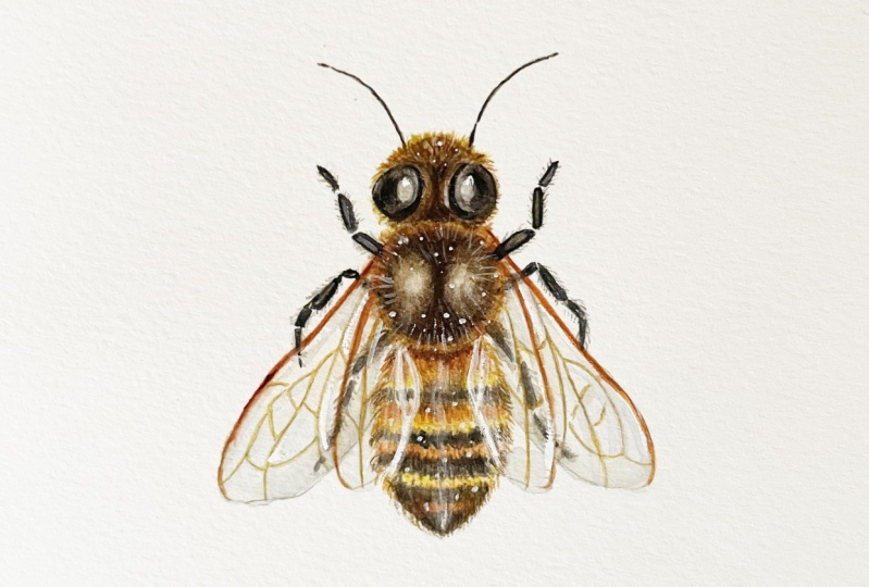
through today's class. Today we're going to be
painting a honeybee. This is something that I
painted for beekeeper, friend of mine, a
few months back. And I posted it on Instagram. And I'll see you guys
if you wanted to see this as my next
Skillshare class, and more than 90% of you did. So here it is. For the original
painting though, the wings are my
knee where opened. Whereas in this class, I decided to make the change
and close up the wings. This means that there will
be more overlapping of features which I kind of wanted
to challenge myself with. It does make it a
little bit more tricky. But hopefully through
the steps and the process that I showed
you in this class, it will still be comprehensive for you guys to be too long too, since this is a very small
n detailed painting, I would recommend this to be for intermediate
students because you do have to have
a good understanding of brush control. This means understanding
paint consistencies as well as brush loads. But if you're a beginner and you would like to
give this a go, hopefully through the steps
that I take you slowly, it will still be
comprehensive for you guys to follow along to. I'm more than happy to
walk you through it. And you do have the option
of enlarging the outline. So it's a bit easier for you to paint on the larger surface. In this class, I will begin
by taking you through the supplies that I
use for this painting. Then I will be taking you
through the sketching portion. So I will show you
how I break down each shape and simplify
it for the painting. With this said though,
I completely understand if you want to jump
straight into painting, I personally enjoy the painting process more than the children. So I will have the outline
available for you guys to download in the projects
and resources section. For this particular painting, I will have three outlines
for you to download. One outline will have all of the features combined together. This includes the
overlapping features and the other two will have
the separate features. So the wings without
the details of the veins and the other one will have the detail
of the things. You will also have access to the reference images that I personally use to
complete this painting. But of course, you can customize your
painting and look for other reference
images if you need more than what I have
given you today. After I finish the sketch, I'll take you through my
painting process layer by layer. This will be shown in detail and I will take you
through how I create the thin layers
in order to build the forum and how I adjust
the light and details. Just as a disclaimer, if you've never taken
any of my classes, I tend to cut if my hand is either an active or off the
camera in terms of my edit, this means that either just cleaning my brush on the
side out of the frame or if I'm just not doing
anything because I'm thinking or trying to make
a decision for my painting. This means that I will be painting faster
than normal speed, but I just find that this is Ashley more efficient way of digesting the information
in terms of a painting, since it's more visually continuous and it's just
more efficient this way. So if you've never taken
any of my classes before, I would recommend for you
to watch the full class. Just so you understand the flow of things than when
you're ready to paint along for you to
watch the lessons for painting along and just
pausing in-between each step so there's no rush. And you can paint
at your own pace. If this sounds like something you guys are
interested in trying, I hope you guys enjoyed
this class and let's begin.
2. SUPPLIES: Before we begin,
let me just go for the list of tools
that I'll be using. Firstly, the paper
that I'm going to be painting on a Strathmore 500, which is also hot pressed, and the size is 14 cm by 19 cm. I would suggest
for you to use hot pressed for this
particular painting. It has a lot of
tiny little details and it's much easier to paint on the small details
on a smoother surface. Next, for the brushes, I'll be using to small brushes. The first one is by
George born artist brush. This is a size two and the
series is g1o1 0 or g 1010. This is a synthetic brush. You can also use other brands that you're comfortable with. Just make sure that
they're fairly new and still has the sharp tip. My next one is my trusty
very small brush. This is a size zero by Winsor Newton sector
golden number two. This is mixed hair, but you can also use a small synthetic brush if that's what's
available to you. Right next to me here is a tissue important to watercolor painting
because this will help you control the load
on your brush to make sure that small areas doesn't puddle up as you apply the paint. You can also use a paper towel. Just make sure that this
is right next to you because it's as important
as your brushes. Next is a clean jar minus a
pretty good size because I only use one jar for my water so I don't have
to keep changing it. But some people
also use 21 jar for their dirty water
to clean the brush and the other one for
their clean water. Nexus, my palette and
paint for the palate. And this is just a cheap
plastic palette from ISO. In terms of the paint, I will go over the colors and the brands in detail
a bit later on. In terms of the palette, I would recommend for you to use a white colored palettes
so it's a bit easier to see the colors that
you've mixed on top minus just a bit stained
here, so somebody yellow. You can also use a
porcelain palette for the drawing tools here
I'll be using a ruler just to create a straight
line in the middle for a grid to make sure that the painting
is in the middle. I will also be using an HB mechanical pencil
by Pentel sharp, sharply, and also a good eraser. As for the colors, this is Sean brilliant,
dark by shipping. You gamboge by Daniel Smith. Graph high-grade
by Daniel Smith. Lamp black by Daniel Smith. Burnt amber by Holbein, Crimson lake by Holbein, re afraid by Holbein and
cobalt blue hue by Holbein. Also be using bleed
proof white by Dr. Ph Martin's. So those are all
of the supplies. I'll just leave you a
written list in case you want to take a screenshot and get all of
your things ready.
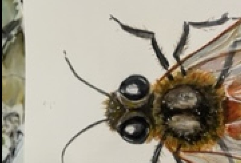
3. SKETCHING: Let's get to sketching. The first thing I'm
going to do is to eyeball or measure the
central points vertically. I find that this
will help me draw it out and then more
evenly on both sides. I also drew out small lines
at the top and the bottom indicating where the painting
is going to begin and end. And this will also
indicate more or less the size of the
painting itself. I don't really
know much about B, so I had to do a
bit of research. And this is the anatomy that I'm going to
be working with. At this point. I'm just going to
figure out the size. So I'm going to draw
the head with eyes, the thorax, as well
as the abdomen. I'll be using this as well as several other
reference images. And there'll be
available for you to download in the projects
and resources section. Let's go back to the sketch. As you can see, I'm holding my pencil quite high
up in this way. I can draw really
lightly and loosely. The lights are actually
quite scratchy, but as long as
they're light enough, it's going to be
very easy to erase. So after drawing up the head, thorax and abdomen, I can tell that I've already made
mistake with the scaling. So I know that I'm going to
need to shift this upwards. Hopefully from this
example you can see that even if I've drawn out the grid line of where I'm trying to indicate
the top and the bottom. The size of those
basic shapes still matters because when those
shapes are put together, it will determine the overall
size of the painting. Here as I'm shifting all
of those shapes upwards, I'm also going to
make them slightly smaller in terms of
scale for the head, I have simplified the shape into a rounded triangular shape. The thorax is more or less a circle divided into two
ovals on the right and left. And the bottom abdomen
is sort of like an eye shape with the top
being a bit more rounded. This was the only
reference picture that I found with clear
shapes for the eyes. So that was my
initial reference. But later as I painted on, I decided to change the shape to be a little
bit more rounded. And I find that this gives a bit more of a friendly
face to the B. As you can see, I'm
doing a lot of erasing and I just try to
clean up the lines, making sure I liked
the proportion and making sure that the left and the right side is fairly even. This is actually the
second attempt of the painting for this
class that I've made. For the first one, I give a bit more space
in-between the head, the thorax and abdomen. So the overall length
is a bit longer. And I find that the B looks a bit more
unfriendly this week. You can also play around with the distance and how rounded or oval you want each of
those features to be. In terms of the antenna
and the arms or the legs, you can try to play around with the position or
where they're facing. For me personally, I just tried to make it even on both sides. And I also took the
creative liberty of making them thinner than
what it naturally is. Because I find that during
thin lines will just add to the delicate
touch of the painting. But this is
completely up to you. You can ofcourse
interpreted as you like. For me personally, I just
tried to pay attention to each section of the arms making sure that you have the
right amount of joints. And that's pretty much it. The next thing I'm going
to draw are the wings. You can draw them opened up. But for me I'm
just going to draw them rested at the
back of the beak. Here. I'm just trying
to simplify the shapes, making sure it's
even on the left and right by drawing out this
triangle as guideline. This is also where I
decided to fix the shape of ISO here I'm just going
to make them a bit more rounded on the
left and right side, if you guys recall, there were around
97% of you who voted for this class to be made from my Instagram
poll awhile back. And in that version
of the painting, I know that the wings of
my honey bees were open. So if you like that
version a bit more, you can always customize your painting to
open up the wings. This one is a little bit
more tricky to paint. So I wanted to take
on the challenge since there's more overlapping
of the body and the wings. Before sketch out the
individual wings. What you can see me doing here, my eraser around and trying
to clean up the lines. So by tapping, I'm trying to make the lines that
I drew out earlier a bit lighter and then draw
a cleaner line on top. At this point, I just
want to make sure that the lines or the
shape of the thorax as well as the abdomen
is fairly clean this way when I draw on
the wings on top, I can be very sure of
those individual shapes, so I have a clear
outline to paint on. There are two parts
to the wings. The four wing is
a bit larger and the hind wing is a bit
smaller at the back. And I just want
to make sure that both sides are
more or less even. While doing this,
I also tried to clean up the lines
as I did before. You can do it by tapping the
lines that you initially draw and realigning to
create cleaner pencil marks. And this way it's much
easier to paint on. I'm just going to continue to raise and clean out the lines. This is also when you can
actually fix the proportion. Before we start to paint on it. Here, I realized that
the wings are a bit off, so I'm just going
to try to redraw it and even redraw the grid or the guideline again to make sure that It's the right
length on both sides. It doesn't have to
be perfect though, because our eyes will
help us adjust visually. But you just want
to make sure that it's as even as you
can make it to be. Meanwhile, I'm just going to
keep cleaning up the lines. I forgot to also mention that the length of the antenna
as well as the legs, also play a role in creating a friendlier looking B
as two more fierce one. So make sure you
play around with that if you decide
to draw your own. Here's just an
example of my draft. As you can see, this one
looks pretty vicious because of the
shape of the eyes, the way the antenna
is being painted, and also how long the legs are. Another way of making
your bill of cuter is also from the length or
the distance of the head, thorax and also the abdomen. By making them either a bit
flatter or closer together, it can make them look
more cute and chubby. So this is the example of my first be that I painted
because the head, as well as the abdomen is
really close to the thorax. This makes it look like
it's shorter and rounder. If you decide to create
your own outline, feel free to play
around with the scale depending on the type of b
that you're trying to paint. Lastly, I'm going to erase
the rest of the guidelines. Then I also want to draw
out very lightly that extra details like on the thorax as well as the
highlight on the eyes. And this little section of the wings which
overlapping the abdomen. Because this will help me avoid painting on
those specific areas.
4. BASE COLOUR: We're finally ready to paint. I am just going to paint the
base color in this lesson. And I'm going to start by using a thin consistency
of graphite gray. I'm going to first
paint the eyes. And I'm going to leave
out a little bit of space where I've drawn out the
area of the highlight. I'm going to repeat this
on the right-hand side. So basically filling
in the space while leaving the area
of the highlights. Hopefully from here
you can see how light or watery my paint
is on my palette. For this whole painting, I'm going to build very thin layers in order to create the
three-dimensional form. Once I'm done with
a flat colors, I'm also going to line
where the eye sockets are. So I'm going to do this on both sides and just
creating a thin line. Then I'm going to go back in
with a clean, damp brush, which means I cleaned out
the pigments on my brush. I make sure my brush is
slightly damp or wet in order to pick up some of the paint which is already on the paper. This will result in a very, very light color,
as you can see, while the surface is still damp, I'm going to add a little bit more
colors still in a very light consistency. And I'm going to
paint at the bottom as well as the top
of the eye socket while leaving the area next to the eyes as the
initial base color. And from this, you
can now start to see more of a
three-dimensional form. I'm also going to layer on a light consistency of
the graphite gray at the center next to
the highlight of the eyes to make them
look a bit more rounded. Next I'm going to
paint the thorax and I'm going to use
the same technique. So starting out with a very thin consistency of graphite gray while leaving out the two ovals on top of the thorax while the surface is still wet of
the graphite gray, I also added in a little
bit of burnt umber to know the color is turning more into a dark brown or dark brown. After this, I'm going to pick up a light consistency of new gamboge and mix
it with a brown. I want to make sure that the load is quite
watery and light. And I'm going to use this slightly tinted
damp brush to pick up the color around the
thorax to soften the edges, creating this blurry
yellow outer ring. Once I'm done, I use a clean damp brush
to pull the colors around the oval inwards to
fill in the rest of the space. Then, while the surface
is still a bit damp, I use a really light
consistency of graphite gray and I tried to.it around to create a slightly uneven
texture while leaving a bit of highlight in the
middle of each of the ovals. As a slight note, when you're
working on a damp surface, you want to make sure that
it's not paddling wet and that is just evenly damping. So next, I use the
dark brown mix from graphite gray and
burnt umber to paint. Dots surrounding the thorax. Then just softening the edges again using a clean damp brush. Hopefully you, from here you
can start to see the form and the volume of the
thorax and the head. So at this point I just want to exaggerate the form by
adding darker values and also higher saturation in terms of color,
little by little. So I don't accidentally overdo it for the base
color of the painting. So as an example here, I feel like I've lost the
ovals in the middle after I've layered on the paint
on the damp surface. So I'm just layering a very thin consistency on
top to bring up the shapes. Again, this will depend on
the stage of your painting. You might also want
to fix other areas as well in order to make
those very small changes. You do want to work with very light consistencies
at all time. I'm going to leave
the thorax for now and just leave it to dry. Meanwhile, I'm going to
work on the abdomen. For the base color
of the abdomen, I use a mix of John, Brilliant, dark
with new gamboge. And again, I'm using
a light consistency to paint the abdomen evenly. At this point, I'm not
going to paint the areas covered by the wings
because I'm going to paint those areas
separately in order to create the translucent effect
for the wings. Later on. Here I'm adding crimson
lake to the dark brown mix. And I'm going to use
this to paint underneath the thorax while the surface
of the abdomen is still wet. Then I'm going to follow it
up by painting the stripes on the abdomen using a thick
consistency of new gamboge. You may notice that the
first two straps looks a bit more textured as the
surface was still damp, whereas the last
stripe is thinner as the area of the abdomen was dry. You can actually control
this further by using a clean damp brush
to pull and blur out some of the edges
around those stripes. Now going back to the painting, I used a medium consistency
to a light consistency of graphite gray to
paint the black stripes. Since this is still
the base color, I'm just using a thin medium
consistency of graphite gray and the stripes doesn't really follow
a certain pattern. I just played around with it since after looking at
a few reference images, I felt like the areas of the stripes actually
vary between every B. So you can take a bit
of creative liberty at this point and just play around with the design of the stripes. You want to make sure that the lines are slightly
curved though because this will help create the cross contour lines
across the abdomen, giving the illusion of volume and roundness
to the abdomen. Lastly, I'm also going to work on the abdomen behind the wings. I'm basically just using the same colors
as I used before, but in a lighter consistency. And I also tried to
continue on with stripes that I've
previously painted before. In terms of the placement, I left out a bit of white negative space in
between each section, depending on the
design of the wings. I'm not sure if you can actually see it through my light sketch. But as I mentioned before, I will have the outline
available for you to download. So hopefully you can
also use the outline as reference if you decide to
draw the up on yourself. So I'm going to do the same
thing on the left side, painting the base color
using the mics off John Brilliant with new gamboge and a very light consistency. And as you can see, I also left out some white negative space
in between those sections. Then I'm going to
fill it in with a thicker consistency of new
gamboge and graphite gray. In order to connect the stripes. I'm painting the areas
under the wings a little bit lighter than
the rest of the abdomen. But if you're painting it
using the same consistency, don't worry too much
because we will add more detail as well
as increased costs or saturation values and so on for the middle of
the abdomen later on. So we'll have more contrast and the areas that
we painted earlier, we'll look a bit
more translucent in comparison to the middle of the abdomen by the
end of this painting. Once I'm done, I decided
to go back to the thorax because the colors have all lighten up once
it's completely dry. So I added more of
the yellow ring and then soften the edges
using a clean damp brush. And I'm working towards
the center now, adding a bit more
graphite gray in a light consistency to
redefine the ovals.
5. REDEFINITION AND BASE OF LEGS: In this lesson, I'm going
to define those features again and also paint the
base color of the legs. So I'm starting
out this time with a thicker consistency
of graphite gray. And I'm going to add the
center of the eyes again. Then using a clean damp brush, I'm going to soften the edges. I also want to align the inner part of the eye
where the eye socket is. This way, it'll make
the eyes look like it's sunk and deeper
into the eye socket, giving it a bit more depth. Now that the eyes look
a bit more defined, I'm going to move on to
the eye socket itself. I use the dark brown mix
from burnt umber with graphite gray to realign the eye socket again,
just like before, I'm going to soften
the edges using a clean damp brush and leave out the highest part of the
eye socket near the eyes. I'm going to keep
building the depth. So while surface is
still a little bit damp, I added more graphite grade
to realign the eye socket. And then again, softening
parts of the edges, especially at the
top and the bottom, between the eye sockets. Throughout the whole painting. As you can see, starting from even
the base color, I'm using my colors
very delicately and I'm painting on really thin
layers on top of each other. And whenever I am using
a wet on wet technique, which means I'm painting
on a wet surface. I always made sure that the
surface is not paddling wet, but just slightly damp. This way the paint
won't travel too fast and they're still
within my control, especially when we
are painting on very small areas. For the legs. I'm just going to
use a medium to thin consistency
of graphite gray. I'm basically just
going to outline whatever I've already drawn out. The only difference is whenever I'm painting the legs
underneath the wings, I would make sure to
leave a little bit of negative space between
the section of the wings. I also had the
reference image right next to me as I'm
painting the legs, making sure that the joints are more or less where
I want them to be. F mentioned this in the previous lesson
where I was sketching. I know that in terms of anatomy from the reference
images that I've gotten, the legs are actually
a little bit thicker, especially near the
thorax and the abdomen. But I decided to make mine
a bit thinner because I feel like this would
make the painting look a bit more delicate. I'm aware of making this change. And if you don't
like how this looks, you can always make
yours a bit more realistic by making
parts of the limbs, especially the ones closer
to the body a bit thicker. You can also play around
with the placement of the legs to give it a bit more character as if it's in the middle
of moving somewhere. But in terms of style, I was looking for more of a
scientific type of painting, which is why I decided
to make the left and the right side
as, even as I can. Let's say I'm done painting the base of the legs
and the antenna. I've set it to go back to
head to define it further, still using a very
thin consistency. This is something that
I'm going to keep going back and forth to with all of the elements
off the body and the head. Just to find the right balance between the rest
of the painting. Since I already know the eyes
are going to be very dark. This is where I
started to add lamp black and a thin consistency. And then I'm just going
to soften the edges as well as line the
area near the socket. Lamp black can be a
bit tricky to use. So even when I'm using a
thin consistency here, it looks quite pigmented. But once it's dry, it will actually lighten more to a gray color because I've used a lot of water
in my mixture. Now that I'm going into
a bit more detail, I want the outline
of the ice near the eye socket to be a
bit thinner and lighter. This is why I
decided to switch to my small brush in order to have more control to create
those thin lines.
6. HAIR TEXTURE ON HEAD: Next I'm going to start
adding the details on the head by painting the hairs. So I'm starting out with a mix of gamboge with the dark brown. And I'm going to just flip
my brush outwards and upwards to start creating hair textures using
my small brush, I want the color mixture
to be mostly yellow. And as they get
towards the edges, I actually soften the lines
using a slightly damp brush. This will just make
the texture of the hair look a bit
softer and a bit more fluffy instead of it looking like a sharp and pointy. Once I'm done with
a yellow base, which I painted more or less around the top
area of the head. I'm going to go back in with
the same color mixture, this time with added brown, so the value is slightly darker. I'm going to paint
the same thing, which is more of the hair
textures by flicking my brush. I want to also make the length of the hairs around the
edges a bit different. So some are sticking out
some arbitrary order. Then softening the
edges again to create the illusion of density. So the layer that I'm
adding now hasn't been more graphite gray
into the mix to create a darker value and placing the darker values
in-between the eye sockets. So those areas have
a bit more depth. And as I'm trying to build the form to make it
more three-dimensional. I will just use
Ranier version of that color to create a value
that is slightly lighter. I'm painting around the
eye socket while leaving the middle as the base color. Or you can even use
an even lighter value to cover it up and also make the transition look
a bit smoother. Lastly, I'm also going to add hairs at the back of the head. I'm going to use the
same technique as before by just painting uneven length of lines using the
yellow and brown mix and then softening the edges
using a clean damp brush.
7. HAIR TEXTURE ON THORAX: Now that I've painted a bit
more detail on the head, I'm going to try to
balance out the thorax by increasing the saturation of what I've painted
earlier as the base. So here I'm using the dark brown mix and
also a bit more of that graphite grade to define the dark body or the
thorax of the B. And of course still using the same technique as
before by softening the edges in order to create a soft highlight
for those two ovals. Here I'm going to start taking the yellows from my palette, which is a mix option, brilliant and new gamboge, but it also has a bit of
that brown mix into it. And I'm just painting
on the hairs very loosely with
my large brush. I just want the edges to be a little bit more
uneven at this point. And I will always go back and forth to the body and the for, depending on which
area is dry or damp. So after the thorax has dried, I'm adding a bit more
of the graphite gray and also brown to
further redefine it. As you can see as I
get to the top layers, instead of painting it evenly, I tried to do this tapping
motion in order to create a bit of a
textured surface. In terms of the consistency, I'm still using a very
light consistency to paint every layer, especially when it comes
to the highlights. With this being said though, really like consistency doesn't mean a watery or heavy load. In fact, the load on my
brushes always very light. So it's still within
my control in terms of how fast the paint
will flow through. Next year, I'm painting
on the actual hares. For this, I use a
thick consistency of new gamboge with a bit of crimson lake and burnt umber to make the yellow
bit more orangey. And I use my small
brush in order to create thin lines for the firm. I want to make sure
that at this point the hair isn't
looking too dense. So I left out a bit of space next to each
of the Harrison, try to make them as
random as possible. And once the center is dried, I decided to add
on bit more layer with the graphite gray
to darken it further. Then I picked up a
bit of that yellow in a very thin consistency is
still using the large brush to smudge the hairs that I've already painted earlier to make it look a bit more fluffy. This is where I start to use a slightly thicker
consistency and I also start using lamp black to redefine
the center of the thorax. Just like before, I
want to make sure that the edges are quiet, soft. So here I added the slightly darker brown
mix from earlier to soften the edges so you can't really distinguish
where the hairline or the first starts. And I'm just going to
keep doing this until I'm happy with the saturation
for the thorax. And I feel like it
has a better balance with the details on the
head with a lamp black. I also use the tapping
motion again so I don't lose the texture of the thorax and
make it look a bit uneven. But just like usual, as I get towards the center of the ovals, I start using a slightly
thinner consistency in order to create more
of a blurry highlight. Now I'm picking up
the orangey yellow to paint the four
again, as you can see, I'm just going back and forth working on little
sections at a time. This time, I also made sure my brush load was a bit more dry and it comes
to a fine point. So I can start creating
more of the free texture. Next I'm going to switch
to my smaller brush again. I'm taking a bit more
of that burnt umber and crimson lake mix to
the new gamboge. So now the color is a bit more orangey brown instead
of orangey yellow. I made sure that
my brush comes to a very fine point by
using a dry brush load. This way I can start to create really fine
lines for the hares. And I also tried to make
sure that the length is uneven so the edges
look a bit more fluffy. Lastly, I use a bit
of Sean brilliant, which is a semi-opaque
and color to paint on some negative hair lines to give more space in between the orangey brown hairs
that I painted earlier. I tried to not overdo this. I just want the hair
to look less dense. And because this is semi opaque, I also want to take
the chance to add some hairs passing through
the black area of the thorax.
8. HAIR TEXTURE ON ABDOMEN: Let's move on to the abdomen. I started out by
using the yellow to paint the top
part of the abdomen. This is just to wet the area. Then I'm going to follow this
up with a darker yellow, which has more new
gamboge in the mix. And as I get towards the top, I would add an even darker color by adding the Crimson Lake
and the burnt umber mix. As I get closer towards
the hairs of the thorax, I use the darker value. I also tried to separate
those two areas by creating uneven lines sort of negatively behind the hairs that I've already
painted earlier. I'm going to leave
that to dry now and move on to the darker section. For this, I just use graphite gray and I use the
tip of my brush using a very light or dry brush load in order to keep the
points off my brush. And I just paint lines following the curves to create
the hairy texture. Because I'm using a
really light load, the colors should dry
up almost instantly. This is why you
don't have to wait in between each section. So after I painted
the darker area, I want straight in with the dark yellow or
the new gamboge. And then back to the graphite
gray again and so on until I fill in the base
color of the abdomen. At this point, I didn't
know if I wanted this fingers underneath
the abdomen to be visible. So here I just filled it in with a mix of burnt umber
and graphite gray. Here, I felt like the yellows were too dark for my liking, so I decided to
lighten some areas using a thick consistency
of John Brilliant. Next I'm going to work on the abdomen areas
behind the wings. I'm just going to
continue on with the darker brown that
I've painted earlier, making sure that it connects, but still leaving a
white negative space in between the sections
of those wings. Next, I'm going to accentuate
the details of the hares. So starting with
the yellow areas, I switch to my small brush. I like to alternate between the darker yellow with a
bit of that crimson lake and burnt umber mixed into the new gamboge with a
lighter John Brilliant. I'm going to add a
bit more detail to the darker stripes as well. I use a mix of graphite gray
with a bit of lamp black, so it's still not overly dark. And I'm painting these hairy line textures on the left and the right side while
leaving the center as the previous base color,
which is lighter. By doing this, it will create
the illusion of volume. So just like the eyes, the head, as well as the thorax, the center of the abdomen will have a very subtle highlights. After I've covered
up the whole area, I also want to make the hairs
look a bit more uneven, just like the head
and the thorax. So here I'm just adding additional length to
some of the hairs. The dark area, as well
as the yellow area. But for the yellow area, I added more of a
brownish yellow color. So those additional here
stand out a bit more. Here. I'm also going to add details to the abdomen behind the wings. But I use a thinner consistency, so it looks lighter in comparison to the
uncovered abdomen. I'm going to apply the
details on both sides. I'm using my small brush here
and making sure that I'm painting with a
light consistency and a fairly dry brush load. After adding on the details, if certain areas look
a bit too defined, I'm going to blur it out
using a clean damp brush, so it has a softer blend. After that, I'm
going to go back to the main abdomen and work
to increase the values. So here I start using lamp black instead of the
graphite gray mix. And for the yellow area, I would use the darker yellow or more of that brownish,
yellow, orange. By increasing the
value on the sides, you will give the abdomen
a bit more volume. And this will make it look more rounded instead of
it looking flat. Now that I'm fairly happy with the volume that I've created, I also want to separate the
abdomen from the thorax. So here I'm adding that
dark brown mix from earlier to create a slight
shadow underneath the thorax. As an additional touch, I decided to add a bit of graphite gray to suggest some of the legs peeking through underneath the hairy
part of the thorax.
9. SKETCH: VEINS ON WINGS: We're finally ready
to beat the wings. But before we start, I'm just going to restock
the paint on my palette. I still have a lot of brown
or burnt umber on my palette. So here I'm just going to darken it by adding
graphite grade. Then at the bottom, I added some crimson lake and
also new gamboge. When I'm mixing the
colors on my palette, I never mix them completely. Instead, I have a
few different tones that I can just go back
to whenever I need them. I'm going to first paint the structure of the
wings or the frames. Here I use an orangey
brown mix from earlier, and I'm just using a
medium consistency here to line and the top part of the form x, I'm going to add a bit of dimensionality by
using the dark brown to paint the top part of where I fly and the
frame of the wings. I've also made a mistake
on the left-hand side. It's actually okay
to just go over the legs since they are
placed under the wings. So I'm just going to make
that correction now. I'm also going to do the
same for the hind wings. Whenever you're trying
to outline long lines, you can always stop
anywhere if you feel like your wrist will
be uncontrollable. And then find the
right position for your wrist to continue the line again without feeling rushed or pressure to just
continue on the line. Also do this at your own
pace because some people might paint a bit
faster or a bit slower, but there's really
no need to rush. The next thing I'm
going to do is to sketch the design
of the wings. I use this reference image
and I try to draw it on with my mechanical
pencil again and very lightly on both sides. I'm not very good at replicating
mirror images in a way. But to simplify it, I tried to look at each
section one-by-one. And instead of finishing
one whole wing on one side, I tried to do per
section on both sides. I find that it's a
bit easier to break down the shapes by
doing it this way. And I don't get as confused
for the design of the wings. If you find it a bit difficult to try to follow
your own references, especially if it's from a real photo because
they're not as distinct. You can also use the outline that's available for you guys to download in the project section and use that as
reference instead. Remember that the
wings are transparent, so don't forget to add a line
to continue the fore wing, behind the hind wing. I know it's a bit confusing to get all the lines perfectly. So at some point, It's also okay to just
make your own design. I've mentioned this in the
introduction of my class, but I just want to
remind you guys, you can also download this outline which has a
separate layer for the wings. And you can use
this as reference.
10. DETAILS OF WINGS: Before you start this lesson, you want to make sure that
the drawing of the design is nice and clear and the
lines are also very clean. In this lesson, I'm
just going to start out by painting the base
color of the wings. For the bottom
part of the wings, I used a light consistency
of gray, of gray. And towards the top, I
used a mixed option, brilliant with a bit of graphite gray to make the
yellow bit more muted, I'm going to connect the
two colors together, creating a really
light, subtle gradient. I want the top part of the wings to have a
slightly darker value. As I'm painting this, I like to separate the
forming and the hind wing. I'm painting before wings
first and I'm going to wait for them to dry before
painting on the hind wings. To paint the hind wing, I tried to use an even
lighter consistency. So I'm mainly just pick up
whatever was already in that area with clean water
and try to pull it downwards. Here I'm going to add
the dark brown color and just painting it to
outline parts of the wing on top
of the abdomen to create a bit of shadow and
to separate those features. The next thing that I'm going
to do is just to outline the design that I've
already drawn out earlier. I do want to make sure that the base color is
completely dry though, or else the paint
that you are applying will start to bloom out
in terms of the color, I use a slightly
darker yellow for the top part of the design
and for the lower parts. I add a bit of John Brilliant into the mix to create
a lighter yellow. In terms of the
line of the veins, I do want to make sure
that the stroke as much lighter and thinner
in comparison to the frame of the wings
that we painted earlier. So you do want to make sure that the load on your brush is either very light
or even almost dry. The paint will flow
out very slowly, uncontrollably and you won't
get any accidental puddles. Just like the frame
of the wings, I decided to add a bit of a darker yellow for the
top part of the veins. So here I'm just outlining
certain areas to give a bit more dimensionality to the wings when you're
painting on the veins. Please don't forget that one
of the lines is actually a continuation of the
edge of the fore wing. So please don't outline it
with this yellow color. Instead, just leave
it as the pencil mark as I did for the left
side of the wing. But anyway, I'm just going
to continue on to outline those veins or the sign of the wings for the
right-hand side. Once I'm done, the next
thing I'm going to try to do is try to create the glossy
surface of the wings. For this, I use a
mix of gray of gray with a tiny bit of
cobalt blue hue. This will create a
very soft pastel blue. And I'm going to place this
under the veins in a very, very light consistency to act as subtle shadows in painting
this on per section. And I'm going to apply it to both of the wings on
the left and right. If some of the I just
looked a bit harsh, you can always soften
it using a clean, damp brush, which is
what I'm doing here. Just like the other features, it's best to start with a very light consistency
and slowly build it up. Rather than painting something
that's a bit too dark, which is why you will see
me going over certain areas over and over again until
I'm happy with a value. While I was painting
this, I felt like this area looks empty, so I ended up adding one extra
curve line on both sides. The next color that I'm
going to add to the wings is this really soft pinkish
purple pastel color. For this, I added a tiny bit of crimson lake
and to the previous mixture. I'm going to add this to the
top part of each section, again, creating a slight shadow, but also giving a
bit more interests as we're introducing
different hues. You don't have to
worry too much about the accuracy of
placement for these use. The main goal here
for me is just to have those three different hues. From the blue, the
pinkish purple, and also the yellowish tone from the base color and
each of the veins. And also at any point
if you feel like the Hughes aren't vibrant
or saturated enough, you can add a bit more of the blues are the
Crimson Lake and to the mixture and
layer it on slowly. Here I wanted to define the
bottom of the wings a bit more in order to separate the fore wing and the hind wing, and also separating
those layers. So I added more gray of gray
just at the bottom section. I want to also add more of the shift in value from the top to the
bottom of the wings. So I added the mixture of John Brilliant and
new gamboge just for the top section and then slowly softening it with a
clean damp brush. Lastly, for this lesson, since I've painted
on those hues, now I feel like I need to increase the value for
some of the veins. So I'm going back in with
the dark yellow mix to GRI outlined certain areas of the veins just to make
it stand out a bit more.
11. HAIR ON LEGS: In this lesson, I'll be
realigning the antenna. This is from a mixture of
lamp black and graphite gray. And I'm also going to paint
the details for the legs. I'm going to use
the same mixture from graphite great
and lamp black. And I'm using a medium
consistency this time, So the value is darker
than the base color. But I'm going to do
is just to outline each of those sections
while leaving a little bit of the
base colors still picking through the center
of each of those sections. This will create a slight
highlight and the outline will act as shadows giving
the legs more volume. I'm only going to
specifically work on the legs which are not
covered by the wings. So I'm just going to continue
on to finish the rest. For the legs
underneath the wings, I'm just going to add a
bit of shadow right under the thorax using a light to medium consistency
of graphite gray. Going back to the
middle legs again, here I'm using the
same mixture to paint in between
the wing section. I intentionally used
a lighter consistency and also painted in between the veins and the frame of the wings in order to make that area look a bit
more transparent. For the hairs, I use the orangey brown
color on my palette, but you can always
adjust the tonality. I just don't want the
hairs to be too dark. Since I want the hair
to look kind of subtle, I painted this fairly
lightly with a dry brush, making sure it's as thin
as I can make it to be. Next point, I tried to also
limit the amount off here that I paint on it because I find that if I
please too much, especially if the
line is but too thick or it's a bit
too rough looking, the overall painting or the B itself might look a bit
intimidating and scary. I also want to add this hairy
texture to the bottom legs. I used more or less
the same color. I think I also added a bit
more graphite gray in the mix, but it's in a much
lighter consistency. However, after painting this, I realized that the hairs
look a bit too rough, especially through the wings. So I ended up using a clean, damp brush to blur out
some of the rough here.
12. FINAL ADJUSTMENT AND FINISHING: Let's keep adjusting and
finish up this painting. You can also add the hues
to the wings as well. So here I felt like making
it look a bit more colorful. So I added more of a pinkish
purple pastel color. And I'm just going to glaze it over certain areas of the wings. You can also do this
with the other hues, which I'm going to do with the cobalt blue hue
and cry of gray mix. It's just a bit easier
to adjust it this way as everything else is
more or less finished. So I'm just painting on really thin layers until I'm happy with the overall balance. After adding these two hues, I also decided to
add the yellow hue. So I'm just going to take a very light yellow mix to paint on the rest of the areas
that is still a bit grayish. Of course at this point is just about taste and
your own intuition. This will also differ from painting to painting
because you might have placed the colors a little
bit thicker than what I'm doing here, or vice versa. But I'm just going
to keep balancing the whole painting until I'm
happy with the final result. Forget to also erase the pencil outline to make
your painting look cleaner. This is why you do have
to make sure that you also fill in the wings. So when the pencil
marks completely gone, you can still see the
exact edges of the wings, even if they look translucent. Here, I decided to add some
orangey brands to the hairs and I'm just glazing over the lines that
I've already painted. This is like consistency, so it's quite transparent
and when it dries, you can still see the texture
that I painted underneath. I just want to give
an extra warmth to this painting instead of it
looking too cold and yellow. Of course, if certain areas are starting to look too flat, I'm just going to
also later on more of the strands using the
opaque light yellow. I feel like this is almost done. I just want to make sure that the darker values are as
dark as I can make it to be. So I'm just going to finish
off with a bit of lamp black, still using my small
brush just to get certain details and edges
to be as dark as possible. I think I'm almost
done. I'm just going to continue on with this. But I just wanted to
mention when you're finishing up your painting
and doing the final details. To do this slowly and sometimes to have
look at your painting from far away because
this is when you can get really too
caught up with details, which is what I tend to do. And then you end up
overworking your painting. So just be mindful of that. Paint slowly and look at your painting from
a longer distance.
13. CLOSING AND CLASS PROJECT: Congratulations on
completing this class. I hope you guys enjoyed it
despite the different change in subject matter compared to what I'm used to painting here. For the class project, I
would love for you to paint along to the steps that I
have shown you in this class. But you do have the option of, of course, customizing
your painting. In this class, I
decided to create something with a scientific
illustrative style. But from what I've seen of what you've posted in
my previous projects. It doesn't really matter
what type of style I pick. You guys seem to just
have your own way of painting and interesting
and fun for me to look at. So once you're done
with your painting, please don't forget to post
it in the project section so you can share it with me
and other students as well. If you guys enjoyed what you've
seen today in this class, I do have a YouTube channel
called onion anywhere I post neatly
watercolor tutorials. They're a bit shorter than my
Skillshare classes though. So please join me there or if you would like to
see more art by me, can also follow me
on my Instagram. Ig underscoring Yang Yang. So if you're still here, thank you so much for sticking right to the end of this class. I wish you the best of
luck for your projects. I can't wait to see it
in the project section. And hopefully I'll
see you again soon.
 Nianiani, Watercolorist and Graphic Designer