Transcripts
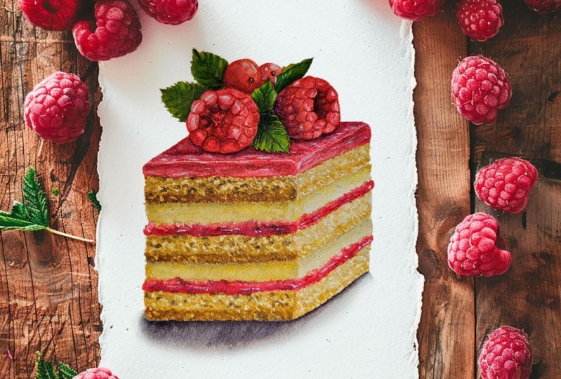
1. Introduction: Hi everyone, My name is Yan. Today, I'll be showing you how I paint the slice off
raspberry cake. In this class, I will
start off by showing you the supplies that I'll be using to complete this painting. Then I'll show you the
reference image that I chose and my thought process
behind why I chose it. Then I will show you how
I sketch out the outline. And then of course, the
step-by-step painting process, including how I mix my
colors and how I create. Like all my other classes, I will be providing you with
the outline off my drawing in case you want
to jump straight into painting and
you can download it. Just for this particular
class though, I will be providing
you with two outlines. One outline has the detail of the hollow area
off the raspberry, whereas the other one doesn't. I know that when you're tracing, it can get a little
bit confusing when there's a lot of detail. And you can use whichever one you're comfortable with working. In terms of the tracing
or the transfer, you can use any method
that you're used to. For this particular painting, I have chosen a
square cake slice. This is so it's much easier for beginners to paint along to, since you don't have
to worry so much about the cross contour lines
to create a round volume. But if you're not new to watercolors and you're not
new to food illustration. You can also customize this
painting because I find that cylindrical shape or even the traditional
wedge kick slice, would look nice with
this type of painting. The trickiest part
of this painting I would have to say
are the raspberries. But I will be explaining my
thought process on how I create the form off
the raspberries and how I layer on the color
to create that form. But if you want, you can also customize the garnish or
the fruits that you want to include in this painting
and paint on whatever you've had experienced with and you find
comfortable painting. So just because of the
raspberries alone, I would classify this class
for intermediate students. However, I find that the
rest of the painting itself, like the cake and
the other garnishes, are actually a good starting
point for people who would like to start painting food
illustration realistically. But if you're new to
food illustration and you would like
to give this a go. I would welcome you to try since I will be
trying my best to guide you through
step-by-step along the way for you to
complete this painting. If this is the first class
that you've taken off mine. Just as a disclaimer, I would like to mention that I speed through or
skip through parts of the painting if
my hand is either inactive or off the camera. This way it's a bit easier
for you to process the steps. But when you are painting along, I will be painting
and a faster speed. So I usually tell my students to watch the class or the
lesson prior to painting along, just so you know what to expect when you are ready
to paint along, to pause in-between
each step so there's no rush and you can paint
to add your own pace. However, a student
of mine mentioned earlier that she likes to watch my class and 0.5 speed and this is an option that's available on Skillshare. She finds that at that speed, she's able to paint
comfortably right next to me. So find the option that
you're most comfortable with so you can work
comfortably at your own pace. So if you're interested in this painting and you would
like to paint along with me. Feel free to join me in
this class and let's begin.
2. List of Supplies: In this lesson,
I'll be going over the supplies I'll be
using in this class. Firstly, let me go over the
paper that we'll be using. This is Strathmore 500. This is 300 GSM in
terms of thickness. And it's hot press, which means it has
a smooth surface. For this specific painting, I've cut down this paper
into 18 cm by 14 cm. The height is 18 cm and
the width is 14 cm. I'm going to use
the other half of my paper for scrap paper where I can test out the colors before I
put it on my painting, is preferable to do this
with the same paper. This way, the paint will
react the same way. Of course, you can pop this
down into a smaller piece or use a scrap paper that is the same that you're going
to use for the painting. For me, I'm just going
to use this big one, but I'm going to reuse it
for other paintings as well. So don't throw it away if you
still have a lot of space. Moving on to the brushes, I'll be using these tools.
3. Reference and Base Sketch: Before I start to sketch, let me just show you
the reference image that inspired me to paint this. I took the overall idea of the layers of the
cake because I like the color combination
of the deep red with a light color of the
cluster cream and cake. However, I didn't really want to copy straight
out from the image. So I made my own interpretation for the shapes of the
cake filling garnish, as well as the colors that
I chose for this painting. I also wanted to turn this into a strawberry
cake initially, but I felt like
I've done a lot of strawberry kicks in the
past, though I do miss it. So I started the raspberry
garnish instead and added some red currants
for extra texture and height to the garnish. Let's begin to sketch for
this particular painting, I intentionally made the
shape of the cake simple. This way, the values would
be simpler to paint as well. So here I'm just starting out by drawing the
lines of the cube. As you can see, I'm erasing a lot trying to figure
out the size as well as how I can angle it and center
it at the same time, I personally find
it a bit easier to draw the vertical lines first. This way I can somewhat visualize the height
along the way. And notice how I'm
holding my pencil at the top as I sketch instead
of the middle or the bottom. This is so my lines
are a bit more loose and I can also draw
with less pressure. Initially, when I was
sketching this out, I wasn't quite sure of the height I want
the cake to have. So I made this flat one in the beginning and I realized that I didn't
really like it, so I decided to
extend all the lines downwards whenever I
make mistakes like this, as well as when I was
trying to just figure out the center point of this
drawing at the beginning, you'll notice that I don't
erase the wrong line first. This is something that
I trained myself to do and sometimes
forget to do this. But it's actually really
useful because I find that whenever I erased
the wrong lines first, I have the tendency of redrawing that exact same line close to the place or maybe even
on the exact same space. So if I don't erase the mistake, I use the mistake as an extra guideline
instead to at least know the area to avoid
drawing on or to use it to measure certain
spaces a little bit better. Here you'll see me
drawing on the filling. Just like the reference image, I like to create a
clustered layer as well as the jelly
or a jam layer. So here, as you can
see, lacking in height. So I'm just going to extend
the sheep downwards to make the last piece of cake cohesive with the
rest of the layers. As you can see, the angle, as well as the
lines of the cake, is slightly different
to the original image. And this is completely
up to you as long as you understand the basic
form of the cake, which is fairly simple,
it's just a cube. You can actually angle it
however you would like to. You can also see that the jam or jelly layers
are a bit thicker. This is, so I can add a bit more detail to the
painting because I want them to look a bit more
transparent and glowy for the final painting. For the raspberries,
I intentionally made mine a little
bit more plump. So it looks cuter and puff year. I know that real raspberries
are not really this plump, but since it isn't illustration, you can adjust it however you would like to
according to your style. Hopefully from this you
can see how I interpret pictures that I use as inspiration to still make
the painting my own. So hopefully you can do
the same as long as you understand the basic form of the object you're painting here, I tried to simplify the
shape of the raspberry. Hopefully this is a bit
clearer for you to see. Notice the separate phases
of the raspberries, which will come in handy
as we paint it later on. At the top of the raspberries, as I mentioned before, I want to make the garnish
look a bit taller. So I decided to add red
currents because they're also fairly simple to
paint for the red cards, I just drew a couple of circles. You can add as many as
you would like to or even add blueberries and
strawberries for your garnish. And after that, I just
wanted to fill the rest of the space with leaves for
a little bit of green, since there's going to be
a lot of Fred's from the current and the
raspberry already. As you can see, I'm erasing and adjusting the placement as I go until I like the overall balance
and the composition. Once I'm happy with the
placement of the garnish, this is when I'll
start sketching the detail of the texture
for the raspberries. You will see me sectioning out the top part of the raspberry. And while I do this, I want to make sure that
those spaces are fairly even all throughout and not
too long and thin. So it gives more of
a puffy texture. And I want to connect
the sections and words so we can add on the
details as we paint later on. This doesn't have
to be so accurate because this part will be
mostly in shadow anyway. Also notice how I finish
off the sections. It was all just a circle before, which is sectioned out
into smaller areas. But don't forget to add on the curve lines
around the edges or the outline because
this will add on to the puffy affect the curvier. Each section is the
puffier. It'll look. Since the second
one is a side view, you'll see a bit more of
the texture from the sides. As you can see, I'm drawing
it out per section, following the section
that I drew out earlier and aligning
them mostly together. I kinda drew them out
like corn kernels, but not as flat. Since I drew the
outline very lightly, it's easy for me to take
off scratchy pencil marks. I don't have to put too
much pressure, rub it off. Instead, I just tap it using my eraser to lighten the
line and redraw it cleanly. I'm also going to
do the same thing for the lines on the cake. I'm tapping my eraser
to take off or lighten the pencil marks
at the moment and the cake look like a
really clean cube. And that's not exactly realistic since Kc
would have the texture, and that is actually the fun
thing to paint it later on. So here I'm just
drawing on really light jagged lines to represent
the cake texture. As I mentioned in
the previous lesson, I will have this outline available in the projects
and resources section. So you don't actually
have to draw this out if you want to get
straight to painting. Just be sure to trace
it very lightly onto your watercolor paper using
your preferred method. So the pencil marks won't show through the
painting later on.
4. Cake Base: Let's begin to paint. The first mixture that
I'm going to make is from titanium gold ocher with
John, Brilliant dark. And I want to create this really light
creamy color for the light area of the cake
on the right-hand side. To paint on the
texture of the cake. I want to use the tip of my brush and I tap
it really lightly. I also use a really
light load on my brush. So each area that I'm painting here dries off quite quickly. I tried to jump from place
to place and then go back to the specific area that
I've already painted earlier. So if that part has dried, I'm painting on top of it again, creating an uneven texture. You can try to practice this on the scrap piece of paper that you have before applying it
on your actual painting. And you can take
your time doing this until you feel comfortable
with creating this texture. Once you're comfortable, you can apply it to your own painting. And as you can see, I'm just coloring it and placing that exact same texture on the right-hand side
of the cake layers. The most important
thing to create this texture is the
load on your brush. Make sure your brush comes
to a very fine point. In this way, each
area that you're painting or tapping
your brush on, it'll dry off really quickly. I'm also using quite
a light consistency as you can see here. This is so I can layer on more color if I
feel the need to. But I don't want to overwork this part since
this is going to be the lighter area in comparison to the left side of the cake. Like I always mentioned, as so much easier
for you to Layer and pile on more colors on top while you're
using watercolors. This is why if you're
unsure about certain area, It's always best to work with much lighter consistency
and build on it in comparison to painting too
much and then having to take it off because There's a limit to how much you can take
off with watercolors. So it's always best to work in a lighter consistency
to avoid that mistake. Now moving on to the left
side of the cake layers, I'm going to use a mix of titanium gold ocher
with tiny bit of sepia to create a slightly
muted, darker cream color. I'm also going to use a
thin consistency to paint on the exact same texture using the same
motion on my brush, the color difference
will be quite subtle, which is why when
you're trying it out, try to paint it right next to the trial that you painted
earlier with a lighter color. When it comes to color mixing, you can always adjust the ratio depending on the
tone that you're looking for. And yours might look a little bit different to mine
since we're always trying to work in relation with whatever we've
already painted earlier. You might also notice that
when I mix my colors, I never mix them completely. This way I have easy access
for the different tones and I find that this brings out a bit more life
to the painting. If you're using the exact
same color mixtures all the time for a
textured flat surface, it might end up making your
painting look even flatter. However, it's okay
to do this for a base coat that you
can still build on. But it's something
to keep in mind. You're trying to create somewhat of a realistic illustration. I forgot to also mentioned
earlier that it's okay to leave out some
white negative space. You don't have to cover
them all straight away. However, this one
that I just painted, it looks a little bit
harsh for the base coat. So here I went back
in with a clean, damp brush after the whole
surface has completely dried. And I just try to blur and smudge everything together
to soften the texture. There's just a
tendency of making a flat surface instead
of it being textured. If you cover the whole
area straight away, since what paints will just
blend with each other. This is why sometimes I intentionally leave out
that white negative space that you can always
bring back and tone down later on with
a clean, damp brush. I'm just going to keep
doing this until I cover all three
layers off the cake. You can continue on to paint with me or move on
to the next lesson.
5. Cake Crust: In this lesson, I'll paint
on the thin layer of cake crust on top and the bottom of each
layer of the cake. For the color mixture, I'm going to be using
titanium gold ocher with sienna and a little bit of sepia to darken
the color slightly. And as you can see,
the darker brown is on the left versus on
the right-hand side, I have a lot of
titanium gold ocher. This way I have access
to both color mixtures. And I can also mix
the two together depending on the tone
that I'm looking for. To paint on the crust, I'm using a really light load on my brush so the paint doesn't put a lock and a medium
consistency off the color. I tried to make the line as jagged as I can make it to be. And I also tried
to make the line imperfect to give it more
of a realistic look. Once I finished
painting on the line, then I go back in with a clean, damp brush and
soften one side of the crust so there's a better blend to the
base texture of the cake. Notice that along the way, sometimes I like to add a bit
more sepia or a little bit more Quincy and and depending on the tone of brown
that I'm looking for, this is something that
you can experiment with depending on the look
that you're going for. The darker the crust,
the more burnt or the more contrast
is going to have, the lighter it is, the more
golden brown it looks. So this just depends
completely on your taste. As you can see for
the top layer here, I use more Quinn sienna and
the titanium gold ocher, which is why the color is a
bit more yellow and golden. And this is something that
you can play around with. The subtle differences won't actually make too
much of a difference. So I don't mind
playing around and experimenting on my
actual painting. You can even make one line
which has more sepia and another part of the
exact same line have more Quincy Anna,
if you would like to. So as you can see, this one
has a lot of Quincy Anna, but I bought in a
slightly darker brown in some areas as well. Whenever you're unsure of a
certain method or technique, you can always go back
to your scrap piece of paper to try out the
method beforehand. If you've already painted the texture of the
cake as trial, you can even try to paint on this color mixture on
top of that texture that you painted earlier to have a better understanding of the color relation and
what you're looking for. You can also try the
blending technique using your clean damp
brush to soften one side, just like on the
actual painting. Then once you get a better
feeling and understanding, you can be more comfortable painting it onto
your final painting. If you're a beginner, it's best to do this so
you don't have to feel intimidated and he can
practice at your own pace. It's always best to be patient
and work slowly to get a better feeling
and understanding when you're trying to
learn something new. If you're fairly
new to watercolors, be aware that they tend to dry, paler or lighter in comparison to what
they look like on wet. So after the crust dried off, you can see that some areas
settled and flattened. So I like to go back and
using the same color and mixture to layer on the darkest
parts of the crust again, to give it a bit more detail. Here, I can see that
the edge coming together and needs to have
more contrast and value. So I'm using the same
mix as the cross before, but with a lot of titanium
gold ocher in the mix, which is probably around
90% of the maximum, 95%. And I'm using a
light consistency to layer on more of the texture
on the right-hand side. For the darker side
of the cake layers, making sure that I blend
it nicely with the rest of the base color using
a clean, damp brush. Moving on to the lighter part of the cake for the k cross, you can see that I'm still
using the same color mixture, but this time it has
very little CPR. And mostly when sienna with a
lot of titanium gold ocher, I'm using a medium
consistency to paint on the crust the same way as I did for the darker
part of the cake. You may notice that I've
been using more or less the same color mixture and vastly different ratios to
create different tones. There are really no rules
when it comes to the ratio. Everything works in
relation to each other. A lot of times it's about
your own visual awareness. And the more you paint, the more sensitive you become two colors and how they
react to each other. It's something that I personally
still work on myself. And it's something
that will keep getting better the
more you paint, as long as you're being aware of the choices
you're making. Getting back to the
painting after I've painted the individual lines, then I go back in with a clean, damp brush to soften
one part of the edge. It's a bit easier
to blend this one because the colors are lighter. Once the paint dries and
the areas have flattened, I then go back in with a medium consistency to add
on a little bit more detail. Lastly here using the
same color mixture again, you'll see me rid of finding and cleaning out some of the edges. Whenever you finish one
step of a painting, I always recommend for you
to look at the painting as a whole again and
not just get caught up in certain areas
of your painting. This way you can
balance everything out and clean up certain areas.
6. Dark Cake Texture: In this lesson, I'll be painting on the additional texture. I'm just going to add
sepia to the previous mix, which had Quincy Anna
and titanium gold ocher. Here. I just want to
try it out the c, and I felt like the brown was
a bit too muted and dark, so I decided to add
more Quinn sienna. I'm using a medium
consistency of this color in a very
light load on my brush. And I'm trying to apply it just by using the
tip of my brush. And I tried to scatter them in different shapes and sizes. Sometimes I make larger specs, sometimes I add dots. As you can see, the color lays flat without a paddling up. This is because of the
light load on my brush. If yours is pedaling up, you might want to take
off the excess paint on your brush by dabbing
it off onto your tissue. Just like in the
previous lessons, you can see that I don't mix my colors
completely this way. I have access to
different tones. And here I have picked up
more of the color which has more sepia or a darker tone. So I can vary the textures
that I'm painting on. Sometimes I like to add
the darker brown on top of the larger holes
that I've already painted. This way it gives more depth to the host
that you painted earlier. After that, I'm going to clean
my brush and use a clean, damp brush to soften parts
of the texture so they don't look overly defined because this can make the cake look
a little bit dry. So just try to find the right
balance for your own taste. Make sure to also limit the amount of texture
you paint on. Don't paint too
many larger ones, but instead mix it with
a lot of tiny dots and a thin consistency so the
texture is become more subtle. I personally love to eat, which is why I love
painting food. So when you're painting, tried to apply the
things that you like to eat and projected
onto your painting. Personally, I find
that cakes with finer cramps tend to be softer. So I tried to not overwork
the larger cramps. And I like to always think about whether what
you're painting or what I'm painting is like a soft chiffon cake
or dense butter cake. And then try to apply
those representation of certain cakes or food
onto your painting. At the top, I found that the
Brown was a bit too muted and doesn't bring up the
brightness of the overall Kc. For this second layer here, I decided to add Quince Yana and titanium gold ocher to make the colors a bit more
golden and softer. These are just very
subtle changes and it won't affect too
much of your painting. So you can always make
adjustments along the way. When it comes to painting, there's no specific
rules of what you should paint first is just whatever
is comfortable for you. Here, I felt like I have enough textures
painted on already. So I soften the edges of parts of the texture that I've already painted using a
clean, damp brush. However, after
that, I felt like I need to add on more
of the texture, soften parts of the
other textures again. And I even use whatever
I picked up to soften those edges and place
it onto the painting again, as finer textures, feel free to always go back and forth
when you're painting, even if you feel
like you've finished painting a certain
area beforehand. Here you'll even see me painting on parts of the crust again, which was supposed to be
in the previous lesson. But the key is to always
look at your painting as a whole instead
of getting caught up in one specific
area all the time. Because there's always
a chance of causing imbalance when you don't pay attention to the whole picture. Now that I've painted all
three layers off the crimes, you can stop here if that's
what you're looking for. But I want to define some
of the larger cramps only. I'm going back to the
same mixture of CPR, Quinn sienna and
titanium gold ocher. But this time I added a
bit more Quinn sienna and CPR into the mixture so the
tone is slightly darker. I use this color to paint
on a certain small area of the larger holes to deepen the holes and create more depth. But try to not overwork
this because there's a chance of making
the cake look to dry. If you accidentally
put on too much paint, you can always take it off by dabbing the excess
paint off with tissue. Now of course, you can
use your clean damp brush to soften and blur out certain edges to
make them look less defined.
7. Cake Texture Light: In this lesson, I'll be
painting the texture for the light part of the
kick on the right-hand side. I first begin by using a mix of titanium gold ocher with John
Brilliant dark as the base. Then I add the
previous mix of quinn, sienna and sepia just to
darken the mixture slightly, the color may seem quite
light in comparison to what we used earlier for the
dark part off the texture. But color is always
work in relativity. Here as I'm switching, you can see that it's
dark enough for me to put on the light
area of the cake. The mixture sort of looks like a yellow ocher with
more of a pastel tone. And I'm going to apply
this in a medium to light consistency in
the same way as how I painted the left
side of the cake. However, I'm going to
paint on less texture on this area because the detail
is usually not as prominent. Unlike areas as you
can study from photos, as it's slightly blown
out with lower contrast. With this in mind, I will also intentionally paint less
textures with less definition. I'm painting the textures in a similar manner as you can see. I'm spacing them out
a little bit more. And after that, I'm
going to go back in with a clean damp brush to reactivate and soften
some of the blend. As you're reactivating and
blending some of the colors, your brush will naturally pick up some of those pigments
at the same time. But it's going to be very light. What I'm going to do is to
use whatever I pick up on my brush and use it to paint dots for extra fine textures. If he's still need
to add more of those extra fine textures. But you don't have any
load left on your brush. Of course, you can use the exact same color
mixture as before, but just in a very
light consistency. And of course, as
you're applying, it makes sure to use
a very light load on your brush so those
textures doesn't puddle up. I'm just going to keep
repeating this method until I cover all the
layers of the cake. If you feel like you have a
good understanding of it, you can move on to the
next lesson or watch the rest of the lesson to see how much texture I add
for the overall cake, especially for the right side of the cake in comparison
to the left side. So you can compare and
try to apply something similar for your own painting
if you would like to. Okay.
8. Custard and Jam: I'm fairly happy with
the cake texture. So now I'm going to
move on to paint the custard as well as the jam. I'm going to start out by
painting the clustered first. I use the same base color mix as the light part of the cake, which is from titanium, gold, ocher and John,
Brilliant dark. But I don't want the
color to be overly similar to separate
those sections. So I decided to mute the color slightly by adding gray of gray. The color difference
will be very subtle. But the crust that we've
painted at the top and the bottom of each layer of cake will help
separate those areas. I also use a very light
consistency and I painted really flatly in comparison to how we painted the textures
earlier for the cake. Well, the surface of
the cluster cream is still a bit damp. Sometimes I like to repaint a bit off the crust
for the cake layers, which touches the wet edge
off the custard cream. So there's a slight
wet on wet effects, which makes a very subtle blend off the crust to the custard. This is only very light though, and I just find
that this will make the overall painting just look a little bit more delicate. Next, I want to
paint on the jam. I'm going to use a
mix of Windsor red, which is a primary
red with Quinn red, which is a bit more rosy. I intentionally want to
paint this on a wet surface, but I didn't think of it before. So I actually rewarded the area of the clustered as
well as the jam. So as I'm applying
the color of the jam, you will see a slight move and
the paint's going upwards. The movement is very
slow and subtle. If you wet the surface with
too much water though, the paint will travel too far. So make sure to only
dampen the surface. And very likely if you want
to go the what Andre route, you can also do that. At the bottom here
you can see the edges are a bit cleaner than I just use a clean damp brush to
soften parts of the edges. Moving onto the left
side of the cake, I want the color of the
custard cream to be slightly darker and meet
it since it's in shadow. So I use a mix of
titanium gold ocher with a tiny bit of sepia to mute it and also a
bit of gray of gray. Just like before I'm applying
the paint horizontally using the side of my brush
to cover a lot of area. And I make sure to be very
careful with the edges. I don't want to make the color
of the customer to flat. So I'm going back in with the exact same
color mixture and I tried to make this area
a little bit streaky, especially where the
coronary come together. After I finished painting
the clustered and then I use a clean damp brush to dampen the surface where the
jam is going to be placed. Then I go back and using the same red mixture to
paint on the wet surface. As you can see, I'm trying to make the jam
look a bit uneven. Some areas are a bit thicker, some are a bit thinner. And I also made the lines a
bit wobbly in certain areas. While I'm painting
the bottom layer, you can see a white
space between the jam and the custard
cream at the top. So I'm just going to
go back over that area again to fill in the whitespace. And of course I'm going
to apply the red color the same way for the
bottom layer as well. If the color is not traveling as far as you would
like them to. Here you'll see me going back in with a
clean, damp brush, poor and blend certain areas
of the gym to the posterior. I'm also going to
slightly blur out the edges where the jam
is touching the cake. Just to loosen up the
painting slightly. If parts of the red is
a bit too light though, I would just add on a bit more paint and then
soften the blend downwards. Here I want to separate
the two sides further. So I'm going back in with
the same red mixture and a slightly thicker
consistency just on the right-hand side of
this part of the jam, as well as the middle part of the jam on the right-hand
side of the cake, while leaving the left and
the right as the base color. You may wonder why
I use the same red for both the left side
and the right side. Well now I'm going to
add the darker red. For this. I'm going to use the
same base mixture for the base layer of the jab. This time though, I'm
going to darken it by adding crimson lake and
sepia into the mixture. Just like any other time, I never mix the
colors completely. So here you'll see me using
a slightly darker red. But now I'm layering on
more of the red with more crimson lake and CPR in the mixture to make
it even darker. I'm going to apply this to
the middle part of the jam, the left and the right side. It looks like it's lighter and this will give
a glowing effect. By layering on more for the red. I can see that some
of the edges are a little bit too
defined for my liking. So here I'm going back in with a clean damp brush
and just to blur out and mess up some of the
edges for certain areas, you can pull it a bit
further than others. I just find by doing this, it loosens the painting to
not make it look so stiff.
9. Cake Adjustments: In this lesson, I'll be looking at the cake that I've painted so far along with the jam
and the custard cream. Just to balance out everything, if I feel like I need to
adjust certain areas. Here, I'm creating
a mix of titanium, gold ocher with Quincy and
a little bit of sepia, but mostly Quincy
on it to make sure that the brown is a
little bit warmer. And I'm going to use
this color to layer on parts of the crust
that I painted earlier. On the left side, I
felt like most of the brands and look a little
bit too muted and dark, and it makes the cake look less appetizing and a bit
burnt on the cross. So here I'm layering
on the warmer mix just to give more
of a golden look. I also felt at the same
time that the textures on the left side of the
cake still looks a bit too defined for my liking. So I use the clean damp
brush just to smudge the edges of the textures
that I've painted so far. Then I realized that the overall color also
looks a bit dull. So here I'm placing on
a thin consistency of titanium gold ocher for the
cake layers on the left side. And I'm applying it very lightly by tapping my brush
and still trying to create an uneven surface
while covering parts of the detail that I've
painted earlier so it doesn't look too defined. I feel like I need to darken the clustered layer on the
left side of the cake. But since I don't want to
mute the color further, I just use a mixture of John Brilliant dark with
titanium gold ocher. And I'm applying it horizontally and trying to
create a streaky texture. I'm going to apply a
thinner consistency on the top part of the custard cream on
the right-hand side, where it's connected to the
crust off the cake, right? Also layered on a bit of that warmer color for
parts of the crust, just to smudge it slightly
with the custard. Then lastly, for the jam to give it more of a
three-dimensional look, I decided to use the dark
red to paint it right under the clustered at
the top part of the jam. And this will create a slight shadow where the
custard is touching the jam. I'm only doing this in certain areas though to
make it look more natural. As for the right hand side, I don't really want to put
much of this dark red. Instead, I want to use a light consistency for
the lighter part of the jam and a thicker
consistency of the Winsor red and Quinn
red for the shadows.
10. Jelly Icing: In this lesson, I'm
going to be painting the jelly layer on
top of the cage. And for this, I want to use
the same color as the jam, but I don't want
it to look as dark considering the jelly
is right at the top, whereas the jam as covered mostly by the custard
and the cake, I'm going to start out with
the same red color mixture, which is from Winsor
red and Quinn red. And I'm going to paint the
sides of the jelly first. As I'm painting the left side, notice how I directed my
brush horizontally so the tip is facing the left
and this way I can just pull my brush across. And once it reaches the corner, I just want to round it off. It's okay if the
paint looks tricky. In fact, that is what I
want it to look like. So it's not completely flat, but it's a bit textured instead. Here I'm creating a darker red using the same mix as before, which is from Winsor,
Red Queen, red, crimson lake, and the tiniest
bit of sepia this time. I'm going to apply
this to the top part of the area that I've
painted earlier. Just like before, I don't want the edges to look too sharp, so I'm just going to soften
it using a clean damp brush. The reason why I've
coordinate one of the edge is because
I want to leave out a bit off white
negative space in-between the corners. So here I'm actually just
going to draw it out to make it a bit easier on myself so
I know which area to avoid. So again here I just
want to run the coronary using the same red. This time I use a slightly
thinner consistency to make sure that the value is slightly lighter than
the left-hand side. Well, the surface is still damp. I picked up a bit
more pigment and I just want to make the surface
look a bit more streaky. Next here I'm going to
mix crimson lake with mineral violet and a
very light consistency to create this reddish purple. I'm using this to paint
the top part of the jelly. And this is to create
the light glare effect, which is reflected at
the top of the jelly. As you can see, I'm using
a really light load on my brush as well as a
very thin consistency. And I tried to paint
it horizontally across while leaving out
some white negative space. Next, I use the base red color, which I'm mixed into the
slightly darker red. And I'm still using a thin
and watery consistency here, still trying to paint
horizontally across while leaving out small negative space in this time in different areas. Parts of lighter purple
color shows through. This part I felt like the initial basal layer of the light purple
is completely dry. I'm using a slightly
thicker consistency of that red to paint
horizontal lines. While painting this though, I felt like there was too much contrast and the
edges look a bit too sharp. So I use a clean, damp brush to soften the edges and smudge parts of the color. Here on the right-hand side, I used the previous red base, which is from Winsor red
and Quinn read to paint some areas while leaving
out some negative spaces. So you can still see a bit of the base
color peeking through. On the right-hand side, I felt like the jelly was
protruding too much, so I ended up taking
off the excess using tissue to make
that area but lighter. Still using the same red. I'm also going to paint
in the left side. And for this, I still left out a little bit of negative
space from the base color. I also added a slightly darker red at the very top of the jam. I'm also going to do this
on the right-hand side, especially along the top
part of the site face. And what this addition
of contrast will do is to separate all the faces. Welcome back to the
top part of the jelly. Now I'm using the same red
to add horizontal lines. This is to add a slight
unevenness to the surface, but I left out a large
area as the base color and this will give the glossy
effect along the corners. I decided to also add really thin lines for added
detail to the reflection. Everything after this
is just finer details. If the paint that you've
applied earlier faded too much, you can always add a slightly
thicker consistency on top, just on smaller areas. After this, I'm going to look at the whole painting again. And I felt like the
corner coming together of the cake looks like it's blending too
much with each other. So I want to make the edges a bit more defined and uneven.
11. Raspberry Base: In this lesson, I'm
going to be painting the raspberries as the base
color of the raspberry. I'm going to use the
same mix as the jam, which is from Quinn
read and Winsor red. When I sketch this out,
I didn't know what these little sections
interest-free school. So I went ahead and search
the anatomy of raspberry. Apparently these
little small sections are called droplets. So that's what I'm going to be referring to for
this whole lesson. So here I use a
medium consistency of the mix to outline
each of the droplets. Then I'm going to go back and using the same mixture again in a medium consistency to fill the whitespace on the bottom
half off the raspberry. I also reshaped some of the white negative space that I left out so they
don't look as big. After this, I'm going to
create a dark red mix, which is from CPM mineral
Violet and both of the reds. I'm going to use this
color to paint and the droplets inside
of the raspberry. And this time I'm
not going to leave any white negative space because I want this area
to be in shadow. So I'm filling the whole
droplet one by one. I'm going to add another layer. But because the paint
is still fairly wet, I want to leave out a bit of white negative space in between. It will somewhat
blurred out together, but those white negative spaces
will still be good enough to indicate the little
droplets at this point. As for the rest of the space, I'm just going to use
the base red mixture. Now this hollow areas quite wet, so I'm just going to
make sure I dry it off completely so I can
layer on more detail. Once it's dry, I'm going to
work on the hollow area. Again, I added more off
the dark red mixture. I'm using a thick
consistency this time to fill it in the
exact same way. While doing this, I want to make sure I have clear edges in between the outer part off the raspberry and
the hollow inside. After this, instead of making another layer using
the dark red instead, I'm just going to fill it
in with the lighter red. And I'm just going to let
the colors somewhat blend together while also clearing
out the edges again. Now I'm going to redefine
the triplets and by using a medium consistency
of the base red, I tried to just suction
them out together by first creating a line in
between those sections. Then I tried to fill in the
top and the bottom while leaving out the middle
with the base color. This way, the base color will create a really
subtle highlight, and this will make each of the triplets look
more plump and juicy. Once I'm done, I'm going to use the same base red mix again. And this time I'm
going to fill in the droplets at the side
of the raspberries. And for this one
I'm just going to fill in the whole area, but I tried to
leave out a bit of white negative space in between. For the droplets at the top, I tried to leave out
what negative space at the center of each triplets to create a bit of
gloss or highlight. After this, I want to find the sections again using
the dark red mixtures. So I do want to make sure
that the area that I've painted earlier is mostly dry. Lastly, for this raspberry, I'm going to paint the bottom section
using the dark red mix. And this is just
a dark and where the raspberry is
touching the cage. I'm going to move on to the
next raspberry for this one, I'm going to work from the back. So I'm starting with a dark red mix and I'm
just filling in each of the triplets while leaving out a bit of negative
space in-between. I'm going to leave
that area to dry now and reload my brush
with the lighter red. I'm going to paint the outer
portion of the droplets. I'm going to outline every
single one of them while leaving a bit of white
negative space at the center, I'm only outlining whatever is facing the right
hand side though, the triplet area which
are facing the side. I'm just going to
fill it in like the rest that I
painted at the back. I'm not sure if what
I'm painting here is clear enough for you to see, but it's actually
the side part of the droplets that I painted
facing the right-hand side, which has the highlights
there, the same one. They're not separate, but
this is just the side view. After that, I'm going
to follow it up by painting the hollow
area of the raspberry. I'm painting the
shadow differently to the first raspberry
along the edges. I use a thick consistency
of the base red mix. Then I follow it up with the dark red mixture
for the deeper area. After this, I want
to paint the rest of the droplets for this raspberry. I just use the
same base red mix. And here I'm painting underneath the droplets
that I've already painted. But I'm also going to
fill in the rest of the droplets by painting
them per section and leaving out really
thin negative spaces in-between to keep
those triplets separated from each other. Once I filled all
the triplets and I'm going to use the same
base red mix again to layer on more detail by painting underneath
and the triplets that I've already
painted earlier. I'm also going to
fix the area of the highlights of the raspberry facing to the right hand side. And also layer on
a bit more shadow underneath the first raspberry
that I painted earlier.
12. Red Currant Base: Next we're going to paint
the right currents. This is going to also be read, but I'm going to change
the tone of red this time. I'm going to use
a mix of Windsor red with a little
bit of Hansa yellow, so the red is warmer. Let's start out by
painting the base color. I'm going to use the mixture and a medium to
thin consistency. I have first outlined
the red current so I can trap the paint
in and it's a bit easier to fill in the
rest of the color while filling in the rest of
the current though, I do want to leave out a bit
off white negative space on the top left
corner as highlights. You can also leave
out more white negative space if
you would like to, to make it look more glossy. You can dry off the first card, or you can also go straight in and treat the second
current in the same way, but leave out a
little bit of space in-between to keep those areas
separated from each other. The paint shouldn't
be pedaling up. But if it is, I would
try it off completely first before painting
on the second layer. Mine is not too wet, is just slightly damped still, so I'm just going to layer on the exact same color and a thicker consistency
while doing this, I'm also leaving out a bit of negative space to show the white area that
I left out earlier, as well as some of the
base color peeking through whenever you leave out
some white negative space, no matter what your painting, please follow the cross
contour lines to help with the round form or whatever form your
painting of the object. If you feel like you
paint it too much here, you can always take off
a little bit of paint. I just reactivated
the area using a clean damp brush
and then I pick up the reactivated
paint using tissue. After that, I'm
just going to use the same method to paint
the second red car.
13. Leaves: Next I want to paint the leaves, but because I don't have any
space left on my palette, I'm just going to clear
out a section using a wet tissue so I can mix up
paint and a different hue. Main green color that
I'm going to use here is hooker screen by Cotman. And I want to start with
a light green tones. So I added Hansa yellow
and to the hooker screen. If you don't have
this color though, you can use different
types of green as well. I'm pretty sure it will
go well with the reds. I don't want the light
green to be overly yellow. So here I decided to add a bit more Hooker's green
and the ratio, this is completely
up to you though, it depends on the tone of
green that you're looking for. I'm just going to
start out by using this color mixture to paint
the base for all the leaves. I want to paint a couple of
leaves at the same time. Because I'm going to use the wet on wet technique where I'm going to add the darker green on the wet surface that
I've already painted. And this is why I don't want to work on
too many leaves at the same time
because you'll risk certain areas
drying off already. The mixture of a darker
green is exactly the same. I'm just adding
more Hooker's green and the ratio to
darken the tone. Since the next three
leaves are larger. And I can also see more of
the front face of the leaf. I'm going to start out with a lighter consistency
so I can build up on the layers more to add
a bit more detail in comparison to the previous
leaves that I painted earlier. Like a lot of my older
desert paintings, I like to use mint
leaves as the garnish. For mint leaves. I want to make the edges a
little bit jagged, which is what I'm doing here with the tip of my paintbrush. While the surface is still damp, I'm going to use a slightly
thicker consistency of the exact same color to
paint on a bit of detail. I'm going to paint the midrib as well as the veins of the leaves, but I'm not going to connect
it straightaway to the edge. Instead, I want to
define the edge by outlining it
to make sure that the jacket lines are a little
bit more visible after I finish outlining and
painting some of the veins, that's when I'll start
connecting them all together. It doesn't matter
if some lines are a bit thicker and
some are thinner. I'm going to do the same
for the rest of the leaves. You can also approach this a
different way by trying to paint the individual veins thickly and then
connecting it to the side. So one by one, It's
completely up to you which method you'd
like to try out. This method will give
you need or lines. However, I'm not sure if that's something that you
want to look for. You might want
something that looks a little bit more
loose, unnatural. I'm going to layer on
more green this time I added more Hooker's
green and the ratio. And again, I'm going to start
out by painting the midrib. Then here I start placing
the shadows as well as the veins. As I'm painting. If I feel like any edges
look a bit too sharp, I would just soften them
to loosen the placement of colors at the same time using a clean damp brush
at the same time. If feel like you overwork an area and would like to
take off the excess paint. You can always
reactivate the paint using a clean damp brush and then pick up the excess
reactivated pigments using tissue. Got it. Initially, when I painted this, I actually really liked the dark leaves from
the reference image. So I'm going to fill layer
on a slightly darker green on top of this to paint
on the shadows this time. And for the darker green, I use CPM mixed
with hookers green. After re-watching this,
as I'm voiceover, I did realize that I don't
really like the dark green anymore because
I found that it looks more bulky this way. Add a lighter green. We'll just make the
overall composition look a little bit
more light and fresh. This is just my opinion though. I didn't actually mind the dark green when I was in the
middle of painting. But sometimes my opinions
can change along the way. And it's completely up to you what route you would like to take when it comes to the color of the leaves
and your painting. Hopefully from this
demonstration though, you can get a better idea of
how I layer on the colors. As I get to the darker color, I cover less and less areas so I can still see the layers
that I painted underneath. If you prefer a lighter
color for your leaves, you can still use the same
technique that I'm using here. But I wouldn't add the final
dark green mix at the end. And I would paint and
the previous layers with a lighter consistency so you
have less contrast in value. But since I've already
painted it using this green, I'm just going to finish it off. Lastly, I use this
dark green mix to just redefine some
of the edges again. And also makes sure that the
tip looks nice and clean.
14. Red Currant Details: In this lesson, I'm going to
go back to the red cards. I'm now going to use the
same dark red mixture, which is from all of the reds plus mineral
Violet and CPR. This time though I'm going to
add a little bit off Hansa yellow to make sure that
the dark red is warm, which is the same tone as
the red current stem cells. I'm just going to add a
little bit of this color at the bottom of each
of the red currents. That's pretty much it. I then just want to soften
the edges using a clean, damp brush to make sure the
edges are not too harsh. Since the reds are quite dark for the ends off the currents, I'm going to just use a very thick consistency of sepia and just use
a small circle. You can place this anywhere you would like to on the red cards.
15. Raspberry Detail: Now that I've finished painting all the elements for
this slice of cake, I want to make sure that all the details are
bounced all throughout. Here. I'm going to go
back to the raspberries again just to redefine
some of the details, I'm just using the same risk
that I've already used in the previous lessons to
paint the raspberries. But since everything
is completely dry now, even if you're using
the same color, the color will still show on top of the colors
that I used earlier. Here I'm just going to
redefine the droplets again by painting the darker color at the bottom as well as
some of the lighter ones. But for the lighter
areas of the droplets, I made sure that the
details are a bit finer. For the outer part
of the raspberries, I tend to just use the red mixed from Winsor
red and Quinn read and a slightly thicker
consistency so the values are still a bit darker than the previous layers. As for the droplets inside
off the raspberries, since it has been painted
with a darker red, I'm going to use a
thick consistency of the dark red mixture, which is from Winsor Red Queen read CPR and mineral Violet. Initially I just outlined the individual droplets
inside off the raspberries. And then I just darken some areas if the lines look
a little bit too defined, like on this first raspberry, then I'm going to fix some
of the outer parts of the raspberry again using the
Winsor red and Quinn red, just to make sure that the triplets look
more juicy and round. To do this, I add a bit of
shadow at the bottom portion. And if the colors end up
blending together again, I would just redefine the
sections of the droplets again using a slightly thicker
consistency of darker red. I'm also going to
do the same thing for the second
raspberry as well. For the area of the raspberry which is closest to the leaves, I don't really want to redefine
the droplets too much. Instead, I just fill the color off the triplets completely. Then I tried to add a bit more detail as I get
to the right hand side. After that, since a huge area
off the raspberry sweats, I just want to make sure that
everything is completely dry first before
layering on more colors. Just like the first raspberry, I don't want the highlights
to be overly defined for the bottom part of
the second raspberry. So here I'm just using a clean damp brush to soften all the edge and pull
the colors inwards. So those white areas are now a little bit pinkish instead
of completely white. However, I'm going to leave the white highlights for the top section of
this raspberry. I brought down the highlights. Now, the raspberry
look a little bit flat because it's lacking
and the contrast. So I'm going to
go back in with a dark red to define some
of the droplets again, especially at the bottom
of the raspberry, just use the same
dark red mixture but in slightly
thicker consistency. And I'm also going to apply
this on top of the leaf, where the raspberry is covering a little bit of that
leaf area as well, has on top of the jelly as a slight shadow
from the Raspberry. There's a little
bit of space under the red current
that is left white. So for that I'm
just going to use the dark red current mixture, which is from basically
the same dark red mix as the raspberry plus
a bit of Hansa yellow. However, if you still have the same dark red mixture
from the previous lesson, you just want to make sure
that the value is very dark. So use the dark red mixture
and a very thick consistency. That's pretty much it. I just wanted to show you
the full process though. So here I'm still
trying to layer on the details little by little. Since colors always fade
after it has dried, I want to wait and make
sure that when it is dry, it's at the amount of detail. I want it to have.
16. Leaf Adjustments: This lesson is optional, but I just had to look at the whole painting
again and I realized that I didn't like the amount of detail I've painted
for the leaves. Here, I'm using a
clean, damp brush to just reactivate and blur
out all the details. However, for one of the leaves, I've taken off a
bit too much paint, so it's too light for my liking. So here I just want
to slightly dry it off even though the surface
is still slightly damp. And paint on more details. I don't want to work
on a dry surface. If not the details or the edges
would be too sharp again, and your eyes would be
drawn into the leafs instead of the other
details of this painting. Adjustments like there
should only be made if you feel like you need
to make the adjustments. However, if you feel like you'd like the amount
of detail you have, you can completely skip
this step of the painting. I just wanted to include
this in this class so you know what to do if
something like this happen. And for you to feel
comfortable to always go back to certain areas that you've
already painted earlier.
17. Cast Shadow: You can leave the painting here. But personally, I always
like to add a cast shadow underneath and the foods that I paint so it doesn't look
like it's floating. For the cast shadow, I'm
going to use a mixture of moon glow with sepia. And I'm first using a
very thin consistency, just indicate the
placement first. I also soften the edges by
using a clean damp brush. I want to bring a bit of
the cast shadow towards the back so the whole composition
doesn't look too long. And then I'm going
to go back in with a thicker consistency to paint on top of the damp surface, especially right
underneath the cage. As the paint slowly travels, I want to make
sure it's directed diagonally as the placement
of the cast shadow. So here I'm just helping move
the paint using my brush. Since I want the shadow on the right hand side
to be painted thinly, I want to paint on a dry surface so the paint
doesn't travel anywhere else. Then I just manually soften the edges using a
clean, damp brush. After that, I just want to
dry everything off so I can slowly builds on the layers to create more
contrast and value. Once the surface is dry, I'm going to layer on
and the same mixture and a slightly
thicker consistency. And I make sure to place them
right underneath the cake. I bring it across until I
touched the right-hand side. And I want to soften the
edges again using a clean, damp brush. That's
pretty much it. I'm just going to
slowly build it up layer by layer by
trying and then adding another layer of paint until I reach the value
that I'm looking for. For me, I think it took around
three coats for this one, but this depends
on the consistency of your paint as you are
applying each layer. And I just want
to make sure that the value closest to the
cake is the darkest and slowly correlates
to the color of the paper as it's further away. This means each time I
layer on more paint, I tried to apply it to
a thinner area close to the cake to slowly
build up the gradient.
18. Highlights: Finally, we get to add
on the highlights. I'm going to use a thick
consistency of bleed proof white just to add extra highlights
and gloss to certain areas. It's up to you which
areas you want to add. The bleed proof white too. I'm just going to keep
mine fairly simple. I don't want to overwork this. And as I add on the
bleed proof white, if I just look a little
bit too sharp and it looks like it's
sticking out too much. I would just soften the edges
using a clean, damp brush. In this way, the white
would be lightened and mixed with whatever
color is surrounding it. You just want to make sure every time you add the
highlights to follow the cross contour lines of
each subject you're painting. This way. It will also
enhance the form. That's all I'm going
to do with the fruits. I know raspberries are
not very glossy fruits, so I'm not going to
do too much next. I just wanted to add a bit of highlights to the jam as well, since it is only a
thin layer of jam, I made sure that the
highlights are also very fine. So I use the tip of
my brush to make sure the lines are as thin
as I can make it. I made it also weakly, so it follows the natural
consistency of the jam. If your brush is frayed though, you can always switch to your smaller brush
to paint this on. Personally, I feel like
some of the whites are about out of place
and spit too strong. And I feel like the edges
should be softened. So here I go back
in with a clean, damp brush and make the
edges a little bit blurry. I'm happy with how
this looks so far, so I'm going to add a bit
more white and certain areas. This time I'm going
to add little dots just for extra
sparkles on the jam. Lastly, I'm going to go
back to the red cards. I forgot that I've added
the little CPR and dots. And I want this to pop out more so I'm going to add a
bit of white around it. And also in the middle, it was a little bit too thick, so I went over it again with sepia to make the white
look a bit finer.
19. Sugar Dusting (Optional): Lastly, I'm going
to add a bit of sugar dusting to the cake. This is completely optional. I just felt like it was
appropriate for the season. However, if you like the look
before I added the sugar, doesn't you can also
leave it at that. For the sugar dusting though, if you want to go
ahead with it here, I switched to my small brush because it's easier
to paint on that without having to worry about
the pressure off my brush. And I first use a mix of
bleed proof white with whatever the base color of the object that
you're painting is. As an example, I use the red current mixture
with a bit of bleed proof white to paint some
of the dusting underneath. Then I would go over it again in certain areas at the top
using the bleed proof white. This would help make the dusting look less flat because
you always have a risk of making your
paintings look flat if you add on too much white
without any values at all, be careful to not overwork
this also, if not, you might lose the details
that you've painted earlier. I personally like to
place this on top of areas which are facing upwards, or think of areas which
might catch more sugar. I always try to keep this in
mind and paint on the sugar dusting slowly so I don't
accidentally placed too much on in shadow areas like
the sugar dusting on top of this dark
green from the leaf. I'm going to first soften this layer just to make sure it blends with the
background color. So the sugar does think
also looks quite dark. But to not make it out of
place sometimes I like to also clean up the edges
using the dark green mix. Again, the area is a bit wet, so now I'm just going to
leave it to dry and move on to paint more sugar
dusting and other areas. Once the surface is dry, I'm going to go back in with
a medium consistency of the white so I
don't accidentally overwork it again. This way. The white, it looks like
it's also in shadow, so it doesn't look like it's glaring and
flattening the image. Before we finished
the class off though, I do want to mention
if you paint on this part and you feel
like you didn't like it, as long as you haven't
painted too much, you can always take
off the excess white using a clean damp
brush just to reactivate it. While the paint is reactivated, you can take it off with tissue, but it will leave a little bit off standing
from the whites. So you do have to paint over certain areas
that you've erased. If you didn't end
up liking it is always possible
to bring it back. You just have to relay
or some of the colors. That's pretty much it
for this final step, I'm just going to keep painting on the sugar dusting until I'm happy with the amount that I'm placing on top of the cage.
20. Closing and Class Project: Congratulations and
completing this class. I hope you guys enjoyed
watching my process of how I complete this square
or us free kick slice. For the class project, I
would love for you to paint along with me using the method that I showed
you in this class. If you're feeling extra creative or urine
advanced students and you would like a
little bit more challenge. Feel free to change
up and customize your painting by
maybe changing up the cake slice or add on or switch the
garnishes that I use. Today, I'll be very
excited to see the works that you
create with this one. So once you're done
with your painting, please don't forget to post it in the project section so I can take a look at it
along with other students. You can also leave
out your thoughts of this class and ask for feedback, which I'll be very happy
to give if you guys enjoyed this class or found
this class informative, I would really appreciate it. If you leave a like or review. This way, it really helps the algorithm to share
my class to more people. And I can also keep making more classes that you
guys enjoy watching. If you guys would like to
see more tutorials by me, you can follow me on
my YouTube channel in the onion knew where
I post weekly videos, mostly watercolor tutorials, which are shorter than
the Skillshare classes. Or if you would like to see
more art by ni can also follow me on my Instagram at
IG underscoring young Yanni. Finally, I would like
to thank you for watching and sticking right
till the end of this class. I can't wait to see your
work in the project section. And I'll see you
in the next class. Bye.
 Nianiani, Watercolorist and Graphic Designer