Transcripts
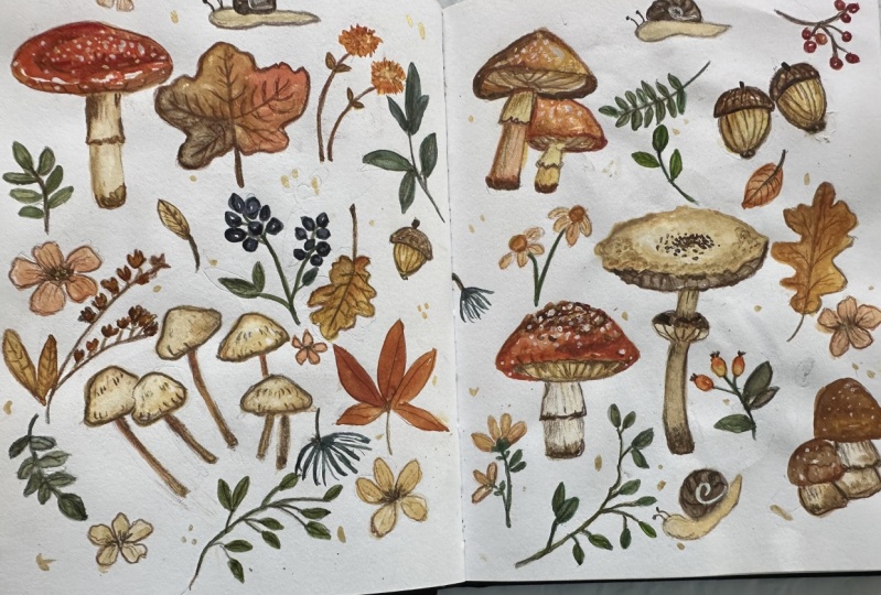
1. Introduction: Hi everyone. My name
is Nia and I will be taking you through
today's class where I'll be painting an autumn
doodle which has many autumn elements
such as mushrooms, autumn leaves, dried
flowers, nails, and so on. This is a super easy and
fun class for all levels. Come join me if you're
interested in drawing and painting along in this class, I'll be taking you
through right from the very beginning of
my planning stage. Sketching, drawing the outline painting
with water colors. I will be adding details using colored pencils and adding some optional gold
shimmers for fun. This doodle is very flexible since I will be showing
you how I plan things out. You can also add on your own elements if you would like to make customizations, or you can also
apply this method to other theme doodles as well. But just like usual, if you guys would
like to recreate the exact same doodle
as what I made here, I will also have the outline available for you
guys to download in the projects and
resources section if you've never taken
any of my classes. Just as a disclaimer, I'd
like to mention that I ever slightly speed up the painting
process to class going. I also skim through
parts of the painting if my hand is either inactive
or off the camera, this is usually when I'm
thinking things through. If you're planning to
paint along with me, please watch the lesson or the full class prior
to painting along, just so you know the
flow of things this way. When you are ready
to paint along, you can paint at your own pace. You can pause in
between each step. This way you won't feel rushed. Like I mentioned at the
beginning of this introduction, this class is catered
for all levels. It's just one of those easy and fun projects anyone can do. You can even play around
with the styles and different color
combination using the same method that I've
shown you this class. If this sounds like
fun for you guys, please come join me in this
class and let's begin.
2. Supplies: Firstly, let's go
over the supplies. This is the sketchbook that
I'm going to be using. For the sketchbook,
I use the paper Canson Montval 200 GSM and
it's a cellulose paper. This is actually a sketchbook
that I made myself. And I do have a
skill share class on this if you're interested
in making it yourself. But of course you can also
doodle the autumn leaves according to the aspect ratio of your individual sketchbooks. Before I draw out the outline, I'm going to show you
guys my ideation process or how I drop down
all of my ideas into my sketchbook very quickly for the elements that I want to include or at least the things that I had in mind at that time. For that, I'm going to
be using the sketchbook. But of course, you can even just use scrap paper for this. For this painting, I'm going
to be using two brushes. The larger green one
is by George Jorn, and this is a size
two round brush. The other one is by Express. And it's a size zero
synthetic brush. Both of these are
synthetic brushes. It doesn't really matter
what brand you have. You just have to make
sure that the size will suit the size of the painting
that you're going to do. These brushes just
happened to be easily available when
I was looking online, but they basically act like
any other synthetic brushes. The green one is fairly old and the tip is not even
that sharp anymore. But it's fine for this doodle. I know that these
brands might be a bit difficult to find depending
on where you live. A more common brand for synthetic brushes
are Lyra or Reefs. They basically will react in the same way as these
brushes I have. You'll also need a clean jar of water or you can also use two. If you don't want to keep
changing your water personally, I'm fine using one for
the two jar method. The first jar of
water is basically to clean your brush
from the paint. The second jar is for you to use to reactivate your paint. This way that one jar
will stay nice and clean so you don't have to
keep changing your water. I might not show the tissue much in the frame of my videos, but I always have tissue
right next to me as I paint. It's as important
as the jar of water the tissue is for me to take
access paint off my brush. This is key to
control brush load, especially when I'm using
a palette that I don't use often it's still beads
for the palette, I'm just using this
plastic one from. So as you can see, it's fairly new or I just
don't use it that often. The paint still beats.
But that's fine because I can control the brush load
with my tissue still. My only recommendation
for palette is to use something that is light
in color, preferably white. You can see the color
that you're mixing. To draw out the outline, I'm going to be using my Pentel Sharplet
mechanical pencil. The filling is HB or two? B. Either one is fine and
I'm using a pentel eraser, but you can use any brand
that you have on hand. Moving on to the colors
for my watercolors, I'll be using term verde
byline, indigo by Schmincke, Chinese white byhlebine
yellow ochre by Holbine CPA Byline Quincena by Daniel Smith Nugamboh
by Daniel Smith, Vermilion Byhlbine and
Crimson Lake Byhlbine. I'll also be using Bleep proof
white by Dr. H Martins I'm going to be using
colored pencils to add some details later on. This is a watercolor
colored pencil, but you can use ordinary
color pencils as well. Since this is just
a hobby grade, cheap water color color pencils, it just has numbers instead
of names for the colors. And this is the brand that
I I'm just showing you the colors that I used in case you want to use the
exact same ones, but you can choose according to your taste or according to the
set that you have on hand. Lastly, for some optional
accent schimmer, I'm going to be using my
fine tech gold palette. Those are all the supplies. I'll also have it listed
down here in case you want to take a screenshot
and get everything ready.
3. Ideation: Before I start to paint, let's do a little bit
of brainstorming. Since I have a large
space to fill, I want this to be autumn theme. I'm going to write
down some ideas or elements that I'd like to
include in the doodle. I just find that this
process helps take away the intimidation of drawing
or painting on a blank page. It can be applied to other
paintings or doodles as well. After writing down
some of the elements, I'm going to sketch out
a few of these elements, especially the leaves
and the mushrooms. Since I have a lot of ideas
for the shapes this way, I'm just creating a
library that I can always go back to as
I'm doodling later on. This doesn't mean that
the types of leaves or mushrooms can only be the ones that I've sketched out here. Of course, as I draw
the outline later, if any ideas come up, I can always draw them out and
include them in my layout. But sometimes when I
am making outlines, we are already making so much decisions when
it comes to the layout, composition, size,
and things like that. Having this library just take away a little bit of
that thinking process. We can pick and choose the
shapes from this library here. This also serves
as slight practice to draw certain shapes. If you're feeling
a bit uninspired, you can also search on Google or Pinras for specific
shapes or elements. You can collect them here
together in the sketch or this library and
practice drawing. It's easier when you're drawing
out the outline later on. This way you can
minimize erasing, since I'm sketching
according to each element, like just a row of leaves
or a row of mushrooms. Instead of scattering
different elements just by sketching it out, it also gives me
a bit more ideas. Sometimes as I'm
drawing certain leaf, I get the idea of, say, trying similar leaf, but in a different branching
system, or vice versa. Or you can also
play with the size, length of leaves, and
things like that. You can also include
different ideas from what you see around you. If you'd like to
take nature walks, you can take photos
for reference and include certain
things in your doodle, which I'm actually
going to do for one of the mushrooms that I saw, an interesting mushroom
as I was taking one of my afternoon walks
around my neighborhood. Since I want most of my elements to be the autumn
leaves and the mushrooms, I'm only going to add a few
flowers and berries and maybe some small snails
as fillers and accents. This is specifically for some
small or awkward ******. I'm just going to
sketch a few of them. But of course, if you want the flowers or berries
or any other elements to be equally distributed as the rest of the mushrooms
and the leaves, you can also include
more ideas here.
4. Sketching the Outline: I feel like I'm
quite comfortable to start drawing the outline here. I'm starting with a maple leaf, which I feel is very
iconic for an autumn leaf. I'm going to start with
the larger elements first that I'm going to distribute across the double page spread. I feel like they're going to be mostly the leaves
and the mushrooms, but you can also
see along the way, if you want to enlarge some of the other elements,
that's also fine. I'm going to draw them out
very lightly and loosely. First, just to drop the elements down without caring too much
about the details. This way, I can easily remove and move certain
elements if I need to. To draw lightly, it helps to hold your pencil further back. This way you're not focusing too much pressure on
the tip of the pencil, and you also have more space for larger movements
on your wrist. For this doodle, I
want the elements to look a little bit
more cute and plump, which is why I made the mushroom caps a
little bit more rounded. I also soften the edges
of the maple leaf. After drawing these out, I feel like the mushrooms will take a bit more
effort to draw. And it'll also take
a bit more space that might be awkward
to leave out. I'm going to draw out the
larger mushrooms first. I like to play with how
they're clumped together. Some of them come in a whole
bunch for smaller mushrooms, and some of them come as a couple and also single
ones at the same time. I'm also going to
play around with the viewpoint or the angle
for some of the mushrooms. You can see a bit
more of the gills underneath the mushrooms. Also play around with the
feature of the mushroom peps, some of them, I'm
going to make them shiny as I paint later on. For others I'm going
to add a little bit of scaling for some
of these mushrooms. I have a mushroom type in mind, not that I know the
exact names of them, but you can also make
up your own shapes. I personally like
to play around with the distortion of the mushrooms
as well as they grow out. Some of the caps might look a little bit
slanted or weird, or you can also look for
pictures as reference. If you're running out of
ideas for these mushrooms. I personally like
to scatter them around the double
page spread this way. I have them evenly distributed depending on the style
that you're going for. You can make the
mushrooms a little bit more detailed than others or
you can simplify the shapes. Since I feel like I have a
good amount of mushrooms for now and it's fairly
evenly spread out, I'm going to add on some leaves which frames and wiggles its
way around the mushrooms. I'm going to start with
the simple leaves, which I'm going to sketch on
either side of the spread. Going back to the left side, I feel like I need to
pair this leaf with an oak leaf to frame the
mushrooms here nicely. After that, I felt
like I need to add another mushroom at the top. I'm going to draw a smaller one that is a little bit
distorted as well, and I just find that this
is a fun little addition. Next I'm going to
draw a couple of acorns on the right
side of the spread. And I'm also going
to draw one at the bottom left
side of the spread. I'm going to make these
fairly large since I feel they're actually quite
iconic for an autumn doodle. Simplify these shapes, I
start with an oval first, depending on the shape of the acorn that you're looking for. And then I just add on the caps for the top part and a
little bit of the stem. At this point, looking
at all the elements, I feel like it will
need a bit more colors. I'm just going to
classify the berries as parts of the autumn leaves, since they're going
to be branching out in the same way as
the leaves will. But these will add a bit more
color to the composition. I'm drawing them fairly large. I personally like to play
with the size and shape of the berries and how
they're going to branch out. Just like the other elements, I'm going to them across the
double page spread here. I'm just going to draw out a different type of maple leaf. Since I feel like
the empty space is getting a little bit
smaller and tighter, I'm going to start adding other elements like
the flowers and such, especially in awkward corners. I'm also going to do the
same with the leaves, since I can play around with how they curve around
some awkward ******. Feel free to repeat
certain elements like what I'm doing with the flowers
and some of the leaves. As long as you spread them across the page and
they're quite far, it will still look
fine and you can still play with different colors as you're painting
them later on. For some of the
really small space, I'm going to just
add the snail as a little filler to fill
in a little corner. I'm just going to
basically fill in the rest of the space using
the same method as before. There's a space in the middle. And I'm going to draw across both of the page
on the left and right. And I just feel like this
connects the doodle together, making it one whole doodle
instead of separate pages.
5. Cleaning and Repositioning Outline: Once I filled in the
double page spread, I'm going to clean out some of the outlines that I can to make sure that the outlines are
clean and less scratchy. To do this, I like to erase small areas and then
realign those areas again, making sure that the
lines are cleaner. You can also do this with a needable eraser
by tapping some of the more scratchy
areas and going over the lines again neatly
for some of the leaves. If I initially draw the outline smoother and I want to
make the edges textured, I'd like to use the
previous outline, a slight guideline, and just draw the pointy
edges around it. You can also use this
opportunity to reposition or re, size some of the elements
to make sure that the space between the elements work
nicely for the left side. Here as an example, I felt like the initial
flower that I drew out was a little bit too big in comparison to the
other elements. Since I don't want this
flower to stand out too much, I decided to make the size
of the flower smaller and add another element next to it to fill in the extra space. Because I've added a new flower, I felt like the
spacing was a bit too close to the previous
berries next to it. Here, I'm just going to
shift the branch of berries and I also decided to make the individual
berries slightly larger that I feel like the
outline is clean enough for me to paint on
with water colors. I'm going to move on to
painting in the next lesson.
6. Painting Mushrooms 1: Okay, so we're finally
ready to paint. I'm going to start by
painting in the mushrooms. Since I want to add quite a bit of detail
to the mushrooms, I'm going to divide
it into two lessons. In this lesson, I'm going to be painting the mushrooms
on the left. I'm starting with a
mix of Quincana with new gam boh to paint the base color of the
first mushroom cap. I started by using a
medium consistency. I also left out a tiny bit of space for the high lights
on the right hand side. Then as the surface
is still a bit damp, I'm going to add a bit of Pa to the previous mixture and
just tap in the color on the left side and letting the color somewhat
mingle with each other since that mushroom
cap is fairly wet. After I've added
the second color, I'm going to move on to paint
the second mushroom cap. For this, I used the same mix of Nigam Bog with Quinciana, but this time I added a bit
more quincena in the mixture. The color is a bit brighter. Just like before, I
left out a little bit of white negative space
for the highlights, and you do want
to make sure that the previous mushroom
is not too wet. The color won't blend
into each other. For the area that's touching, I'm going to leave
those two dry for now and move on to the next one. For this, I just
added Vermilion to the previous mixture to mute
the vermilion slightly. I'm starting by painting the bottom edges for the
top part of the cap. I decided to add a bit of crimson lake to the
previous mixture. This makes the red a bit
more rich and deeper. I also left out a bit
of white negative space following the curve of
the mushroom cap again. Once I'm done, I'm just
going to leave it dry and move on to the clump of
mushroom at the bottom. For this, I want the color to be a soft, neutral brown color. I used a mix of yellow
ochre with Chinese white and a touch of sepia to
darken the tone of the brown. I used a lot of white here because I want the
color to be fairly opaque and for the texture to be fairly thick and
pigmented this way, the edges stay a bit cleaner against the
white of the paper. I used a fairly thick
consistency here, but the color won't be too
dark because of the white. And I also left out a bit
of negative space around the right hand side of the mushroom cap for
a bit of highlight, just like the other
mushroom caps, so it looks shiny. And I'm just going
to do the same thing for the rest of
the mushroom caps. After painting on all
the small mushroom caps, I felt like the color
look a bit too flat here. I used the clean, damp brush to reactivate a little bit
of that thick paint. I used the sheet to take off
the reactivated pigment. But I'm only going to do
this for some of them. For a bit of variation here, I'm just cleaning out the
edge Since I've taken off too much and I want to keep
those two caps separated. After that, I'm going to
add a bit of shadow by adding a touch of CP into
the previous mixture. I'm going to apply the color at the bottom of
the mushroom caps. After that, I use the clean dam brush to soften the edges. Since these mushroom caps
are more or less dry, I'm going to move
on to the stems. For this, I'm using the
same mixture as the caps, but this time I added a bit of red that I already
had on my palette. The color is still
soft and creamy, but the tone is
slightly different. I'm going to apply the
slightly darker tone for the top part of the stem. And then I'm going to go
back in with a clean, damp brush to pull the paint downward so the bottom is
slightly lighter than the top. After this, I'm going to go
back to the red cap mushroom. I'm going to use
the same base color as the previous mushroom, which from Chinese white
yellow ochre and a bit of CPA to paint the bottom part of the gills, that's
slightly showing. Then I'm going to
go back in using a slightly thicker consistency
of the same mixture. This time the color
is slightly darker. This probably has a
bit more of the CPA in the mix and a bit of
the red from earlier. I'm using this color to paint
the left side of the ring, the bottom, and also the
left side of the stem. Then I use the clean, damp
brush to pull the paint. As I'm pulling the paint, you can see that
my brush strokes are directed vertically,
more or less. We can also create
a subtle texture for the ring of the
mushroom and the stem. I'm also going to use
the same color here for the gills of the
orange cap mushrooms. For the stems, I'm going
to use the same color. This time I added a bit of the red that's already
on my palette. Just like before, I'm starting with the left side of the stem. Then I use the clean damp
brush to pull the rest of the color so the right
side is slightly lighter. And I'm also directing my
brush strokes vertically. This also applies for the
ring of the mushroom as well, but this time the color mixture has a bit more yellow ochre. I feel like the color of
these mushroom caps are a bit faded and I want to
bring up the saturation. I used the red mixture that
was already on my palate, which has million as
the dominant color. I added a bit of CPA to create
this reddish brown color. I'm going to use it to paint the bottom part of the mushroom
cap as well as the left. Then I added a bit of new gamboh with a
bit of quincena to lighten the brown to
paint the rest of the mushroom cap while leaving
a bit of negative space. The base color still shows
through as the highlights. I'm also going to use
the same color mixture for the second mushroom, but without the dark
brown this time. Now moving on to the last
mushroom on the left spread. I want the cap to be red again because I just love
red capped mushrooms. So I'm using the red that I
already have on my palate. But I added a bit of new gamboge to make the
tone a bit more orange. Applying this to the sides. As I get to the top or the
center of the mushroom cap, I deepen the red by adding crimson lake,
just like before. For the gills in the stem, I'm using the same creamy color, starting with a slightly
thinner consistency. And I'm just going to
paint it all over. Then I'm going to go back
in with added CPA and a bit of that reddish brown
that's already on my palette. I'm only applying a little bit to the bottom part of the cap. I'm also going to do the same for the orangey cap mushroom. And then pulling the rest of the color to the right
hand side using a clean, damp brush create a
softer transition. I'm also going to do the same for the orange capped mushrooms. I'm going to use the same dark brown to paint the
bottom part of the mushroom stems to
depict a bit of dirt. And I also soften it using
a clean, damp brush. But this time I'm using a tapping motion to get a
different type of texture.
7. Painting Mushrooms 2: I'm more or less going to use similar mixtures for the
rest of the mushrooms. On this right side
of the spread here, I'm using a creamy
brown mixture, which is a mix of yellow ochre, a little bit of CPA,
and Chinese white. This time I'm going to use a light consistency to
paint the base color of these umbrella mushrooms As you can probably tell
from the mushrooms before, you can always suggest the tone. If you want it to be more
of a soft reddish brown. Instead, you can red mixture or any of the other
hues to adjust the tone slightly just like
the previous clump of mushroom since the color
looks a little bit flat. I'm also going to take off a little bit of this
paint this time. I don't need to
reactivate it because the base color is
still fairly damp. So I'm just going to
use tissue to take off a little bit of color
that I've already painted on for the inside of
these mushrooms. I want to use the same color, but I wanted to be a bit darker, so I added a bit
of the dark brown, which has mostly
CPA in the mixture. But I want to avoid
painting on the top part of the stem since the edges of the caps of these
mushrooms are freely, it might be a bit
difficult to paint. But I'm not too worried
about getting the edges too neat because I'm
going to outline them with colored
pencils later on. Before painting on the stems, I do want to make
sure that whatever surrounding it is
more or less dry. I want the stems to
be lighter and for the color to be a bit more similar to the mushroom
caps themselves. Here, I'm just using a medium to light consistency of the
same colors as before. Just like the other mushrooms, I want the bottom of the stem to have a little bit
of a darker tone. I just added a bit of the
dark band that I already had on my palate and
I soften the blend. Now onto the next mushroom, I'm going to treat
this the same way as I did the other red mushrooms. But this time, since I have some scaling details on
top of the mushroom cap, I'm going to just leave it
as white negative space or the white of the
paper for the color. I'm using this muted orange, red mix as before, from million as the
dominant color. The gambos. To lighten it anobit of the quincena to mute the color slightly,
just like before. For the top part, I
added crimson lake into the mixture for
a richer, deeper red. As for some of the
scales which are not surrounded by the red
of the mushroom cap, I'm just going to use a relief. Inconsistency of the
creamy brown mixture, just like the
previous mushrooms. I'm going to leave
the cap to dry and move on to the
next mushroom cap. I'm using the creamy
brown color again, but this time I'm
using a heavier load. The surface stays wet
a little bit longer. And the color is also lighter in value because I want to go back in with a darker brown from a mix of CPA and yellow ochre. And I'm just going to dot
this around the edges of the mushroom caps while the
surface is still a bit damp. Mushroom is actually based
on one of the mushrooms that I saw when I was taking
one of my afternoon walks. And I just love the color
combination of the browns. And I thought that it
was interesting that the ring is growing
the other way around, probably because of
its growth stage. Since I'm running out
of the creamy color, I'm just going to add white to the CPA and yellow ochre mix. I already had on my palette to paint the outer
part of the ring. Since I am re using a lot of the color mixtures they
already have on my palette, I want to let you know that what matters is not the exact
percentage of the ratio, but you can measure the tones
from the visual aspect. If you feel like
the browns need to be a bit more red is
she would add more red. If you want it to be
a bit more muted, you can add more CPA and so on. As for the stem here, I use the dark brown that
already had on my palette, which has the dominant
colors of CPA, with a bit of yellow ochre
In terms of the application, just like the other
stems before, I'd like to place the initial dark brown
for the darker area at the bottom of the
mushroom and also the stem that is surrounded
by the ring of the mushroom. And then I use the
clean, damp brush to blend and pull the rest of
the color upwards vertically. I'm using the same dark
brown here to paint on the lines or the
details of the gills. After the lines have dried up a little
bit, I use a clean, damp brush to pull and spread the color while the surface
is still a bit damp. I'm going to add CPA
to the browns they already had on my pelt and
mix it with a creamy brown. Then I'm going to line
the top part of the gild that is right underneath
the mushroom cap. While the surface is
still a bit damp, the edges stays nice and dark to create a clear separation
between those two features. As for the detail of the scales, I added a little bit of yellow ochre to the
previous dark brown mix. I'm just going to
paint on some dots, making sure that the cluster
is tighter together in the center and the
dots getting further away as it gets
closer to the edges. Once the stems are
completely dry, I'm going to paint
on the inside of the ring using the same
color mixture as the stem, which is from yellow
ochre and CPA. Moving on to the next mushroom, I'm starting with yellow ochre to paint the bottom
part of the cap. Then I'm going to follow this
up using a reddish brown from a mix of quincena and CPA. With a bit of the red mixture that I already had
on my palette. I just want to roughly blend darker brown with the
yellow ochre at the bottom. I want to do the same for the
smaller mushroom as well. As you can see, because I've accidentally mixed the yellow
ochre with a darker brown, I needed some new Gambooh to
lighten the color slightly. This is what I meant before, by just using your
visual cues to find the right color mixture that
you want for your painting. Since these mushroom
caps are fairly wet, I'm going to leave them to dry. Meanwhile, I'm going to move
back to the red mushroom and paint on the gills as well as the stems using the same
creamy brown mixture, which is from Chinese
white yellow ochre. And a little bit of CPA. For this one, I'm going to
show you a different way of approaching coloring in
the stems and the gills. I'm starting using
a light consistency of the creamy brown mixture. The value is nice and
light for the base color. Then I'm going to
leave that to dry, so I'm going to move on to paint the shadows
underneath the scales. Here, I'm just working
with the colors that I already had
on my palette. So I'm using the dark
brown and the reds there, mixing it together to create this darker brown
or reddish brown. After that, the gills
as well as the stem, should be more or less dry. Here, I'm just taking any of the browns using a
light consistency. The color is a little
bit lighter in value, just painting on the
texture of the gills as well as the shadow
underneath the ring, as well as underneath the gills. And of course, softening
it with a clean, damp brush, just like the
rest of the mushrooms. I'm also going to add some dirt at the
bottom of the stem. Here I'm using a darker brown
with a bit more added CPA. I'm just dotting it in while the surface is still a bit
damp from the lighter color. With these two
different approaches, you can paint your mushrooms
however you want to. As long as it comes to the result that
you're looking for, I'm just going to treat the
last mushroom the same way.
8. Acorns: I'm fairly happy with
the mushrooms for now. In this lesson, I'm going to
move on to paint the acorn. I'm starting with a mix of
yellow ochre, Chinese white, and a touch of new gam bush to create a yellowy, creamy color. Since I felt like the yellow was a little bit too
bright or saturated, I decided to mute the color with a bit of the
back browns that I already had on my palate
from the mushrooms previously. I just took a little bit of that to mute the color slightly. Then I'm going to paint
the base color for the, or the bottom part
of these acorns. I'm using a fairly
thick consistency here, but after I've painted
on the base color, I'm going to dab
off a little bit of the damp color using tissue, so the surface
becomes a little bit uneven while the surface of the base color is
still a little bit damp, I'm going to use a mix of CPA and quincena to
create a darker brown. This probably has a little bit
of the base color as well, since my brush wasn't
particularly clean and I'm just dotting the
bottom part of the acorn. And then I clean my brush so
there are no more pigments. This way I can soften the blend. For the top part of the
acorn or the capsule. I'm going to use the same
mixture from earlier, which is CPA and quincena, but this time it has a bit less contamination
from the base color. The brown is darker and I'm just going to spread this
color all over that area. Going to use the same color
mixture for the stems, but I took the part from my palette which has a bit
more of the darker brown. The stem is slightly
darker than the scale. I'm just going to
repeat the steps for the second pair of acorns, starting with the previous
base color mixture, which has Chinese white, yellow ochre and a
bit of new gam booch. Then I'm going to take
off some of the color to make the surface a
bit uneven here. I felt like the color
was a bit too light, though I went in
with a little bit of yellow ochre to darken the
left side of the acorn. Then I use the darker brown
mix to paint the bottom, while the surface is
still a bit damp. If the surface is too dry and your paint is not
spreading too much, you can use a clean, damp brush to help move
the paint again. For the scale of these acorns, I decided to darken the brown
for a bit of variation. I added more CPA in the ratio, but this still has a little
bit of the quincena. This one is a little
bit tricky since the scale of the acorn
is touching each other, but I still want to keep
those shapes separated. I try to paint in
a way where I wait for an area to dry first before painting
on the next scale.
9. Red and Brown Leaves: While we're painting
the brown things, I'm going to move on to paint the brown and the red leaves. I'm starting with
yellow ochre to paint the base color
of the oak leaf. And I'm just going to
spread this all over. When I'm painting larger
****** like this, I would use a
heavier brush load. This way I don't have to
keep reloading my brush. And the surface can stay a
bit more damp for longer, which means the
paint will be more evenly distributed while
the surface is still wet. I'm going to use the brown mixture that I used earlier for the
scale of the acorn, which is from a mix
of CPA and quincena. And I'm just going
to dot this around some of the edges of
the leaves randomly. I'm also going to try to move the paint if it's not
traveling the way I want to, to create a softer transition. I'm also going to
do the same thing for the second oak leaf. Next, I'm going to paint
the large maple leaf. I'm starting with the same
yellow ochre as before, but I'm not going to
spread it all over. Instead, while the
surface is still damp, I'm going to add on
other tones of brown. I used a bit of CPA here, but you can use any tone
of brown that you'd like. Something that's a
bit more reddish or a bit more yellow
would also work. You can also add a bit of
green if you would like to. After adding on the CPA on
the right hand side here, I added some quincana as well. Moving along to the
next maple leaf, this time is the
Japanese maple leaf, and I want this to be
reddish brown color instead. Here I used a mix of quincena with vermilion to make
it a bit more reddish. I also added a touch of CPA
to mute the color slightly, and also new game to make the color a bit more
saturated and bright. For the last maple leaf, I'm going to use the
same color as before, but this time I added
even more new Gmbh. The initial color is
a bit more orange, but I'm also going to alternate with the reddish
brown from earlier. As you can see, I'm painting
the individual leaves, but I want them to
come together in the middle because this is
supposed to be one leaf. I'm just approaching it this way so the leaf doesn't
become too bulky. Since I want this to
have a lighter touch while the surface is still damp, Feel free to add
in other tones of browns as well if you want
some variation in color. For the last leaf, I just
used the same mixture, but I added more new gamboge and a little bit of
ver million this time.
10. Flowers: In this lesson, I'm going
to be painting the flowers. I'm starting with cam
bush with a touch of vermilion to create a
deep orange, yellow. And I'm just going
to paint this on as the base color of
this round flower. And I also want the
edges to be a little bit uneven while the surface
is still a bit damp. I'm going to follow this up with the reddish brown that
I already had on my palette. Or you can also
use vermilion with a little bit of
CPA and quinciena. This color, I'm just going
to apply it to the bottom of the flowers and this will just give a bit more form
and volume to the flowers. Next, I'm going to paint
the single flowers. For this, I want the color to
be fairly light and creamy. I first use a bit of Chinese white with the yellow ochre that I already had
on my palette. Since I want the color to
be a bit more pinkish, I added a bit of crimson lake
and also a touch of CPA. I'm going to paint the
petals using a medium to th, inconsistency, but
at this point, I don't want the edge
of the petals to touch. You can see that there's a
bit of space in the middle. I'm going to follow this up using a darker
version of this color. So I'm just going to pick up a little bit of the
dark brown that I already had on my palette
and mix it with this pink. Since the surface of the
petals are still fairly damp, I just want to.it in the
dark brown won't spread too fast for the next single
flower on the right spread, I'm going to use the same
color as the previous base, but this time I added a bit
more yellow ochre and a touch of the orange red that I
already had on my palette. So there's a slight
change in tone. I'm applying it the same way
by leaving the center empty. And I'm going to
follow this up with a darker brown just like before. I'm going to let the
brown spread naturally. If the paint is traveling
too fast though, you can always take the
excess off using a dry brush. I'm going to move on
to the next flower. As you can see, I'm
erasing the outline, just like the previous flower. Since I want the color to
be nice and light this way, the pencil marks won't show
through for this flower. I'm also going to use
the same creamy color. You can change up the tone
however you'd like to. I just use the exact same one. Then as the center
of this flower, I just used new Gam Bosch
mixed with a little bit of brown that I had on my palette to mute
the color slightly. You can also use New Gambooche as this if you want
a brighter tone. Moving on to the
smaller filler flowers, I'm just going to use the
same creamy pink color. I also forgot to
paint one flower next to the mushroom
on the left there, but I'm going to go back
to it at some point.
11. Green Leaves: Since we've painted a lot
of the brown features, I'm going to add a bit
of green for the leaves. I'm going to keep the simple
by only using three colors, which are terra verde, indigo, and also CPA. I'm just going to play with the ratio of these three colors, whether you use them individually
or mix them together. For the first fern that
I'm painting here, I'm only using verde by itself. But I play around with
the consistency to create different values for each of those individual leaves. At this point, I also
wasn't sure whether I want to paint on the stems using my watercolors
or colored pencils. So I'm leaving them
blank for now. For the next bunch of leaves, I first use a mix of tear
very with a bit of intigo. Then I ended up adding a touch off CPA to mute
the color further, just like the previous
bunch of leaves. I'm going to play with the ratio as well
as the consistency. So some of the leaves
are lighter and some are a bit darker with
a thicker consistency. Feel free to also play
around with the ratio. Some of the mixtures might have more indigo with a Terra verte, whereas some might have
a bit more of the CPA. See how the color reacts to each other and just play
around, have fun. This is also a really
great practice for color mixing for some
of the lighter leaves. If the surface is still
a little bit damp, I like to sometimes.in
a touch of a darker version of the color or just a thicker
consistency of the color, this will just create
a nice soft gradient from the lighter to
the darker value. Since the leaf bunch
here is fairly large, I'm going to paint
on the stem using a thick consistency of the
three colors mixed together. Since there's another one
of these types of leaves, I'm just going to paint
them on the same way. On the left here, there's a smaller
version of these leaves, so I'm just going to use the
same colors to paint it on. It might be a bit difficult
to use the larger brush, so you can switch to the smaller one if it's a bit
easier to control. After painting this one,
I decided to go back to the previous leaf
because after it has dried, I feel like the colors
faded too much. So I'm just going
to go over some of the leaves using the
same color mixture. After that, I'm going to
paint on the tiny leaves, on top of the mushrooms. I felt like as I was painting this that there
were too many leaves. I'm going to leave the
last row since it was a little bit too close to the previous leaf in
terms of the composition. And I'm just going to
erase it later on. Moving on to the next one, I decided to use a darker color. It's still the same mixture, but I used a bit more indigo and also CPA in the mixture
to create a darker value. You probably noticed
by now that the tones of creams that I've been using are similar all throughout, even though I create
variations of it, that's because I feel
like the tone of green goes well with
the autumn theme. And the darker, cooler
blues complements the reds and the browns that I've been using for
the other elements. But if you would like to include other greens, that's also okay. For this particular one, I also decided to
paint on the stems. This is so I can decide later on whether I like the
look of it painted on or for it to be drawn out with my color pencils
at the end of it. I actually painted
on probably all or most of the stems on this composition because
I quite like the thicker stems instead
of the thin stems. If I were to draw them out. But this is
completely up to you, you can make your own choice depending on the look
that you're going for. By the way, for this next leaf, as you can probably tell, I used mostly terra Verde
in the mixture even though my brush was still contaminated
with the previous color. So it's a little bit
darker for this one, I also decided to use
more terra verde for a lighter green towards the bottom. I decided to add a bit more CPA for a bit of color variation, and the value is
also a touch darker. As for the stem, I added even more CPA and I also
use a thicker consistency. The value is much darker
for the thin lines, while painting on the stems, I like to continue to the bottom of some of
the lighter leaves. The darker values are
just going to flow naturally into some of
those lighter leaves. If it's still slightly damp, there's still a bit of space
near the mushroom here. So I decided to freehand
a couple more leaves.
12. Berries and Fillers: In this lesson, I'm going to
be painting the berries and also some of the fillers
and some individual leaves. For this first berry, I used a mix of indigo
with a touch of CPA to darken the
blue even more. I'm just going to paint on
the individual berries while leaving a touch of negative
space for the highlights. Preferably, when I
leave the highlights, I want the highlights
to follow the curve of the berry to help
enhance the round form. Since the space of the
berries are quite small, you can switch to
your small brush if it's a bit easier to control. For the leaves of these berries, I'm going to use these three
colors still with ter verte being the dominant color mixed with a touch of indigo and CPA. For the stem, I use
the same three colors, but I use the thicker
consistency to create a darker value painting
on thin stems. It helps to use a thicker consistency and a
lighter or drier brush load. This way is much easier to
control the lines to make it thin without the water or
the paint flowing too fast. Moving on to the
next set of berries. I want these berries to be red. This time, I don't want the red to be too bright.
I mute it down. This is from a mix of
vermilion crimson lake and also a touch of the
broward he had on my palette, which most probably has a bit of quincena and CPA just like
the previous berries. I want to also leave
a little bit of white negative space
for the highlights. I'm just going to
leave these to dry for now and move on
to the next berries. I started with a medium to thick consistency
of new cam bush to paint the bottom
of the berries. Then I'm going to
use the red that I used for the previous berries
to paint the top part. While the surface is still wet, I'm also going to.in
a thicker consistency of the red at the very
top of each berries, I felt like there was
a bit too much paint and water for each
individual berries. I ended up taking some of the color off using a dry brush. For the top of these berries, I added a bit of brown from Quinciana and Spa to
the previous red. I just painted on three
small lines per berry. As for the leaves, I added ter verde to the
previous red mixture. And I'm going to play with the ratio to create different
variations of the color. For this leaf, I added
a bit more ter verde. And the ratio, it looks
more green than brown. For the bottom of each
of those berries, I use the same color mixture. And I'm just going to
create a triangular shape. And I'm going to continue
it down to paint the stem. I'm still going to
use the same color, but this time I'm
going to paint it on these round
leaves right here. You can see that the colors
here are a bit more brown. I felt like the first
leave was a bit too muted. And I want to brighten the brown by adding
a bit more red. So I just tapped it in. Then I added more verde. In the ratio to paint the stems for the smaller
leaves underneath, I used a mix of terra de
with a lot of indigo. So you can see that the
color is even more cooler. As for the stems,
I'm going to use the same color mixture for some of the single
small loose leaves. I'm just going to use
the reddish brown. This was from the red and
a little bit of vermilion, but it has more of
the red mixture in the ratio for the next flowers. I'm going to make
these dried flowers. I'm still using the
previous red mixture, but I added more CPA to
create an even darker value. I'm just going to use this
mix to paint on the flowers. I basically did around two to four brush strokes to create each flower
in different sizes, making sure that they face
in different directions. As for the leaves,
I decided to add on some yellow ochre into
the previous mixture. I'm going to leave
them to dry for now and use the same reddish, dark brown mix to paint these tiny leaves on the round flowers and also
the loose leaf that I. Moving along next,
I'm going to be painting the pine
lease for this. I just use de, with indigo. And I'm using a thick
consistency and a light to dry brush load
to create these thin lines fanning out for the stems. I use the thick consistency
mix of CPA and quincena. I created a triangular form for the receptacle and then
I added on the stem. Next, I'm going to paint the
flower that I missed here. I used Chinese white
with a little bit of CPA and yellow ochre painting
the individual petals. Then while the
surface is still wet, I'm going to continue
downwards with a mix of ter verde and yellow ochre to paint the receptacle
and also the stems. Since there's still a little bit of space next to the mushroom, I decided to add a bit more
detail with some leaves. Now moving on to the
snails as the fillers, I'm just going to use a medium consistency of
Pia to paint the shell. I'm just going to spread it around using quite
a watery load. The surface becomes
a little bit uneven for the body of the snail. I'm just going to use a mix of Chinese white and yellow ochre. When you're painting
on the body. You want to make sure that the
shell is more or less dry. Since those two elements
are touching each other. This way, those two colors
won't bleed into each other.
13. White Highlights and Mushroom Scales: Since I've painted mostly
all the elements by now, I'm going to start
adding on details. In this lesson I'm going to use bleed proof white
to add little dots for the scales of the mushrooms that I didn't leave out
as negative space before. For this one, I made
sure that the dots, as the scales are painted
closer to the middle. I try to also vary some of the size and the
shapes as well, so it's a bit more randomized. As I get towards the edges, I made them a bit
more distance apart. As for some of the highlights, I'm going to add on a bit of random dots around the edges. So for the highlights,
I made the shapes more circular and just a pure dot instead of
those random shapes. I'm also going to
apply the same thing for this next red mushroom. For this next one, I don't really want
to paint on scales. Instead I'm adding on
some highlights and also some dots to depict
some mushroom spores. And I just find that
these random dots add a more magical touch
to the whole composition. I'm only going to add a little
bit as you're doing this. Please be mindful because it's
very easy to overwork and overdo the white
dots for this one. I want the mushroom cap to be a bit more matt in
terms of texture. So I'm just going to add the white dots as the spores
without the highlights, since I didn't leave out any negative space for the
highlights of these berries, I'm just going to paint it
on with the bleeproof white. Since I've painted the shell of the snails with
a dark value color, I decided to outline the swirl in the middle of the shell with the blue
proof white as well. Lastly, for these berries, I decided to add some finer
highlights as little dots.
14. Stems and Details: In this lesson, I'm going to be painting the details here. I'm starting with some shadows underneath the ring
of the mushrooms. I'm using a mix of CPA
with a bit of quincena. I'm using a medium to thick
consistency depending on the value that you're going for to paint
underneath the rings, and this will just give a little bit more of a lift
to those areas. I'm also going to add shadows, as well as details for the gills of the
mushrooms as well. To paint on the gills, I try
to use a lighter consistency because I can always layer on a bit more if I
need to later on, but I don't want the gills
to stand out too much. And I'm just going back and forth to different elements to see which areas I need to
add on the details here. As an example, I'm going to
move on to paint the stems. Even though I still need to add on more details
to the mushrooms, I'm just using the browns they
already had on my palette. It doesn't really matter what
colors you choose for this. I'm also going to use the same reddish brown
and a lighter consistency to paint more flowers
behind the ones that I've already painted to give a
little bit more depths. I'm also going to paint some of the details of the
stems for the leaves. Just like before, I just picked any browne that I have left. It's not going to matter. And it's not going to bother the composition much because
it's only a tiny area. I would preferably use a thicker consistency just
so the stem still stands out in terms of the mid rib as well as
the veins of the leaves. Though I'm going to just
draw them on with pencil because I know I can
get finer lines here. I also used a light
consistency of brown to paint underneath the bulbs of the flowers for a
little bit more dimension. Remember, when you're
painting on thinner lines, please be mindful of the
brush load that you're using. Make sure that the load on your brush is not
gripping or puddling wet. Instead, for it to be
more or less dry or a light load so you can
create really fine lines. If you're having trouble
with the load of your brush, don't forget to use
the tissue right next to you to dab off
the excess paint for the eyes of these nails. I'm just going to use CPA. I'm not sure if they're supposed
to be lighter in color, but I'm just going
to stick with these for some of the stamps that
I've already painted on. If I feel I need them to
be a little bit darker, I would just go over them again. Here I'm using browns
or dark greens to go over those lines and make sure that they stand
out a bit more. Once I'm done, I'm
going to erase the extra pencil marks
just to cleaner Look, when you're erasing though, make sure everything is
completely dry so you don't risk smudging or
damaging the paper. By the way, don't worry if
you left out any details. You can always go back
to them later on. Like here, I accidentally left out the stem for
these tiny leaves, so I'm just going
to paint it on. This is fine to do in any later stage of
your painting as well.
15. Line Work with Coloured Pencils: In this lesson, I'm
going to be drawing on the extra details
such as textures and also the leaf
veins and mid ribs. This is a really
fun part because it really brings the
painting to life. As you can see, I just have
four different brown colors. And make sure that
these pencils are always sharp because I
want really clean lines, I try to use the
color that I feel is suitable for the area
of the painting. As an example, since I
want to create the texture for the mushroom
stems and I don't want the texture to
stand out too much, I started with a lighter brown, then I use a darker brown
around the sides to enhance some of the darker areas as well as parts of the outline. I also like to play
around with the pressure. This way I can create shading while I'm
drawing on the details. Now, Moving on to the scales, here I also have a
dark reddish brown. I decided to use
this color to paint the darker areas to help enhance the well for
the mushroom cap. I also added on some textures
following the curvature of the mushrooms to give it a little bit more volume
and thickness to the cap. And this is more or less
the method that I'm going to apply to the rest of
the red mushrooms as well. Now moving on to the maple leaf, this is where I start drawing on the mid ribs as well as the
veins for the mid ribs. I put more pressure
on my pencil. The lines are a little
bit thicker and darker. As for the veins, I try to
lessen my pressure and just draw it on lightly so it
becomes finer details. For the belly of the snail, I use my light yellow
ochre looking color for the bottom just to
give it a darker shade. As for the shell, I try to create a little pattern
using the darkest brown. I also line the bottom
of the belly using this color as well as the
body between the shell. Just to give it a
bit more definition for these round flowers, I decided to just add on lines that is directed
outwards radially. And I'm going to try to fill in the whole space to
create a bit of texture. The stems are
looking a bit light. I decided to darken the top parts of the stem
using the darkest brown. I'm also going to do the same with the stems of these berries. I'm also going to draw on the details of the
leaves using the most muted brown as
well stride flowers. Since I haven't drawn out the extra stems for
the extra flowers, I decided to just draw it on
using this colored pencil. For the single leaves
and the smaller leaves. I'm going to treat them basically
the same way by drawing the mid rib as well as the veins for a little
bit of variation. You can also play with
the angle and also whether you want the veins to be a bit more
curved or straight. As for the single flowers, I decided to draw
on a little bit of fine texture to each petal. By drawing on lines, I also decided to outline the petals using
the reddish brown. Now moving on to this
cluster of mushrooms, I decided to add on a bit of a darker brown underneath
each of the mushroom caps, as well as the top part and
the bottom part of the stems. As you can see for
this oak leaf, I decided to play around with the veins by
making them a bit more curvy and actually a little bit wavy for
some parts of it. I also decided to add on
finer veins branching out. As you can see, my
pencil is getting dull, so I'm going to
sharpen it again. This is just to enhance
the quality off lines. After drawing on the veins. I also went back in to go over certain areas of the
details with the reddish brown. Now moving on to the
next maple leaf. Since the base color is
more or less orange, orange, brown, I decided to pair it up with
the reddish brown. I'm just doing
this by intuition. If I feel like the colors
will match each other, I'll just pick the
particular color for the color pencils. But if you would like to
include other colors as well, you can also do that
and experiment with your own outlines and details
for some of the doodles. If you feel like you need to define certain outlines,
you can also do that. I'm just going to
look at mine as a whole and see if it needs
any extra outlines. But you don't have to do it
if you don't want to either. If it's not the style
that you're going for. Again, just like the
other green leaves, I'd like to use the
dart muted brown. That looks like CPA. But if you have some
dark muted greens that will also work great
in your composition. I personally just want to
keep the colors limited which is why I just choose the
browns that I picked for the mushrooms where the Showing. I'm going to draw on the kills so I can make
the lines a little bit C, it looks a bit more detailed. For this, I'm using
the midtone that I feel works for the
details of the gills. For the stems, I'm going
to treat it the same way as the previous mushrooms by adding on the darkest values for the bottom and also
a bit of the outline. Since the base color
look texture here, I'm just going to leave
it for now and not add the lighter brown for the texture of the
stems and the ring again with this
red mushroom that has a well in the
middle of the cap. I'm just going to
treat it the same way. Here I'm adding the texture
following the curvature of the mushroom cap to
make sure it looks a little bit more rounded
and it has more volume. I also added the
reddish brown and the darker brown for the
bottom part of the well, making sure that it looks deeper than the rest of
the mushroom cap. I also added an outline underneath the cap to
separate it from the gill. This also makes the mushroom cap look a little bit thicker. As for the gills as
well as the stem, I'm just going to
treat it the same way. You can alternate
the brown colors that you would like to as well. For a bit of variation for these leaves, I
felt like the color or the value of the greens were
a little bit too light. I'm going to outline
those light leaves. However, this is just
a personal preference. If you don't mind the value to be lighter,
that's also fine. I just personally feel I need
to enhance and clear out the outline for
all of the snails. I'm going to treat
it the same way. I'm using my darkest brown here. I'm just making curve
lines to create a pattern for the shell and also use the lightest brown to paint underneath
the body of the snail. I'm going back to these
mushrooms and I'm just adding on some darker
outlines at the bottom. This is just to make the
caps look a little bit thicker for all of the
light colored flowers, I'm going to treat them the
same way as the single one. So here I'm outlining using
the reddish brown and I'm also adding on lines for the
texture of the flower petals for some of the single leaf. Sometimes if the base
color is too light, I'm going to give an
outline just like the swan. And I also made a bit of textured outline to make the
edges a little bit jacked for these mushrooms. I'm only going to
add details for the texture of the stems
as well as the ring. I'm using my darkest
brown to create lines and give it a bit of shading
for some of the shadows, but I'm going to leave
the caps for these ones. Since this oak leaf
is fairly large. I'm going to add a bit more
detail to the leaf itself. After drawing on the main
mid rib and the veins, I'm going to draw
finer ones as well. For the finer
veins, I try to put less pressure so the lines become lighter and more subtle. For these round leaves, I decided to do something a
bit different with the veins. I tried to make the
lines out just to give a bit of variation since most of the
leaves look similar. At this point, for
these thin mushrooms, I decided to create more
of an umbrella texture. I'm just drawing out lines following the curve
of the mushroom caps. You can make the lines closer
together or further apart depending on how wavy or curve you want the bottom
of the caps to be. After that, I'm just going to outline the stems as well as the curves under the caps to
make the outline clearer. Moving on to this mushroom here, Instead of the midtone brown, I used my darkest brown
to create the gills. This is because the base color was quite dark to begin with. As I'm drawing on the gills, I tried to also follow the curves around the
edges of the mushroom cap. I also ended up
outlining them to give a clean look for
the mushroom cap. I use my light brown
or mine brown and create little twirls to give a bit of texture around
the edges of the cap. As for the stems and the rings, I'm going to treat
them the same way. I'm creating lots
of vertical lines. Playing with the
pressure to create a little bit more depth
and form to the stem. I also treated the
ring the same way, even though this
one is upside down. I gave a little outline
along the top of the ring, and then I followed it with more lines directed to the stem, for the scales on top
of the mushroom cap. I decided to use my darkest
brown line, some of them, and this will just make them look like it's
popping out slightly. As for the acorn, I'm going
to use my light brown to darken the bottom
for the nut part. I'm basically coloring it in, but I'm following the
curvature of the acorn, putting more pressure on the left and less
pressure on the right. There's a little bit
more form and dimension. Once I'm done with
the light brown, I use my darkest brown to add more lines
following the curves. Again, as for the cup
on top of the acorn, I underlined it using
a lot of pressure for the bottom part to create a shadow using
my darkest brown. Then I'm going to
outline and also give a bit of texture by first following the
curvature of the cups, then adding another line in the other direction to create a little bit of
a checkered texture. I made sure to also create curved lines for the
edges of the cup to give it a bit more volume compared to the
nuts of the acorn. I'm also going to do the
same with these acorns here, but instead of using the darkest brown to create
the additional lines, I decided to stick with the lightest brown instead
for a bit of variation.
16. Final Adjustments: In this lesson, I'll be making final adjustments
and things that have missed along the way or felt
like I need to further add. This includes outline
shading with pencils, extra textures, highlights, and even to paint over
certain areas. Again, with this mushroom, I still wasn't sure whether I
want to add extra textures, so I just outlined the mushroom and also add
assum shading to the stem. But I just moved on while
I figure things out. For the maple leaf here, I felt like cleaning
out the outlines. So I'm just going over that
again with a reddish brown. As for these berries, I felt like the colors faded too much and it
also flattened out. I'm just using a
thick consistency of indigo here to paint
shadows underneath. And this will just add more
volume to the berries. After that, if I
feel like the edges of the shadows are
a bit too rough, I'm just going to
go back over them. Using a clean, damp
brush to soften the blend for the
smaller leaves. I wasn't sure
whether I wanted to include as many details
as the larger ones, so I just drew out the midrib instead of the full detail of the veins and such. But here I just decided
to add the veins as well. And I just made sure
that my pencil is very sharp in order for the lines
to be clear enough to see. After this, I'm
going to go back to the light mushrooms and I
decided to add textures since this mushroom
looks awfully empty compared to the other
elements in this composition. Here I'm just
drawing dashed lines following the curvature of the mushroom cap and
I just feel like this adds a bit more
character to these mushrooms. So that was the
main major change for the rest of the elements, I'm just going to look
over again and see which areas needs an extra
outline or extra details. Like the leaf that
I accidentally left empty here Like usual, the final adjustment will always depend on the stage of your doodle and the style
that you're going for. This is just to make sure that everything's up
to your standard. You might need to
do more adjustments or less than what
I'm doing here, depending on the decisions that you made for the
previous stages.
17. Optional Shimmer: This is an optional lesson. What I'm going to
do here is to add gold shimmers to some
of the elements, as well as just some
dots for accents. You don't have to do
this if you already like how your doodle and
your composition looks, I just find that this
is a nice way to finish up the painting and to
bring everything together. Also, to fill in any
additional ******, you can create circular dots. But for mine, I decided
to make short strokes. I like to play with the
thickness and also the size. I'm just going to do this for some of the empty
****** without forcing myself to paint on
a certain area for the sake of getting
an even distribution. If you would like
to do this though, of course you can
play with the size to make it easier to
fill in those ******. After adding the
main, larger ones, I decided to just add little sparkles by
creating smaller dots. This time I'm creating
circular dots. Instead of those strokes, I find that these
little dots add a little sparkle or a magical touch to
the whole painting. I'm also going to
add small dots on some elements like some
of the mushroom caps, flowers, acorns, and so on. You can also do
this to the leaves, but I don't really want
to paint over too much of the doodles since it will lose some of the details that
we've worked so hard on. You can also use a
thinner consistency instead of this opaque thick
consistency that I'm using. This way, the shimmers will be more subtle and transparent.
18. Closing and Class Project: Congratulations for
completing this class. I hope you guys enjoyed
watching the process right from the final stage sketching to painting for
the class project. I would love for you to paint your very own autumn
theme doodle. You can take the route of using the downloadable
outline that you can get in the projects
and resources section. Or you can also create your own custom autumn doodle
with different elements and even experiment with different styles using the same I've shown
you in this class. Once you're done
with your projects, please don't forget to post
it in the project section. This way you can share it with me as well as other students, so we can have a big
collection of bottom doodles. If you guys enjoy this class, I would really appreciate it. If you guys need a review, this would boost the
class to be seen by more people so
everyone can join in. It also helps me to make more classes that is
catered to your liking. If you would like
to see more art by me or more tutorials by me, you can follow me on
my Youtube channel. Any where I post weekly art tutorials,
mostly water color. If you would like to see
more paintings by me. You can also follow me
on my instgram at IG. Underscore any for this
class if you're still here. Thank you so much for watching
right to the very end. I hope you guys enjoy
painting along with me. Best of luck for your project and I hope to see you
in the next class. By
 Nianiani, Watercolorist and Graphic Designer