Transcripts
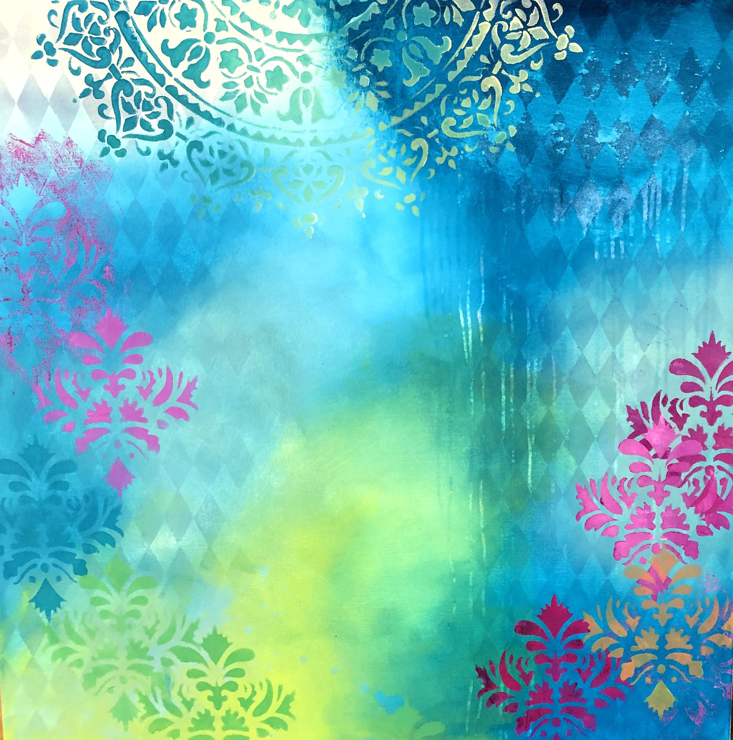
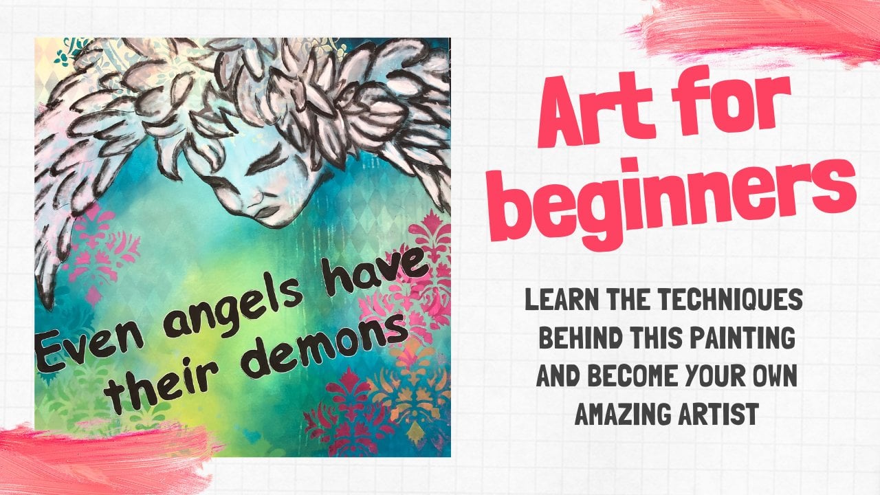
1. Introduction of the course - sign up :-): And exciting painting starts with unexciting background. Therefore, in the previous course and showed how to make a halogen pattern in the background. In this course, we must work further with the colors and our background, creating life and effects that our viewers can explore in this course, which is an extension of creating amazing painting. Starting with the background, we will start working with the colors, numbered various effects. We work with color codes that can work together without turning kindergarten Brown. And we work with contrast colors. When our background is complete, we're ready for a motive. Next course in the series. In this course, you will learn to put colors together without it getting messy and kindergarten brown to work in contrast, colors to work with beautiful transitions between the colors. To make amazing runners, to make reverse runners, to make reverse bladder effects. To work in many layers to give your color life if they have become a little undefined, to make senses with several colors and then several layers and a lot of other things. You will be able to create a real nice background on your own that you can lead a project or motif onto. To create this, you will need a canvas painting your favorite colors plus black and white, stencils or bubble wrap or anything else you can print with kitchen sponges, a cloud like an old sheet, and a water spray. That's ONE, then you're well on your way. I hope to see you in there. Please follow me here on Skillshare so you don't miss out on the next course in the series where we work with the motif and please share your projects for inspiration for others. Okay, let's get started.
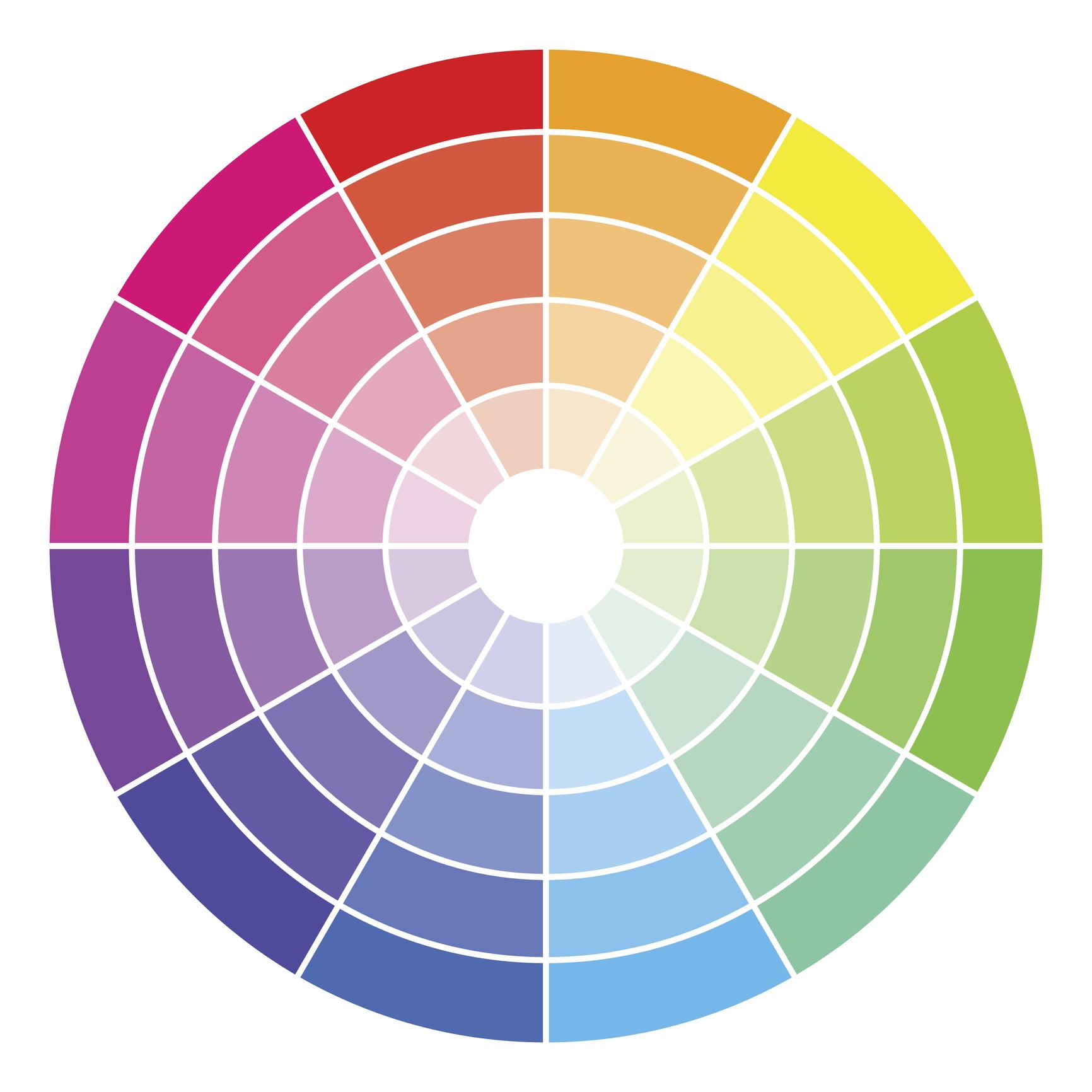
2. Choose your color scheme: Now I have found a lot of different colors and I would recommend when choosing your colors, to choose three to four different ones. You can choose many beautiful colors, but you just have to think about what you mix together, wet and wet on the Canvas. These colors, for example, cannot work together, then it will all turn kindergarten Brown when we mix the colors together on our Canvas. That's not cool. Therefore, it's a really good idea to choose some colors that match in tone, such as green, blue, yellow, red, yellow and orange and pink, purple, blue, yellow, et cetera. Maybe settle for black and white. That's nice too. The colors must be able to be worked into each other so that they match. Later, we can come up with complimentary colors only when it's dry. For example, I really have a lot of different green tones. There are many tones, somewhat more yellow in than others. Some with more blue in than others. On the canvas, for example, we can mix our green colors with yellow and blue, or blue colors, red, blue and white, and a little yellow. You can play with it and try out which colors you like the best. But you should never use the three primary colors when you're mixing them this way. Yellow, red, and blue. It will never be good. It will turn brown. So always work in matching tones. Now I choose a color code or four colors, as well as complimentary color. I will use later a good idea to choose both light and dark colors so that there is contrast and the colors. And you can get light and dark areas. It helps to create depth in your painting. I also use some white to lighten and create more tones. When I paint, I use these kitchens bunches. They are super good for mixing colors. And because the achievement I can throw them away afterwards. If you asked them, they become soft, start to fluff and you will use a lot of unnecessary water. Do not buy them too cheap though, as they will easily fall apart. And then you have remnants of it sitting everywhere in the painting. And when you start painting, do not press so hard that you smash the sponge. You have to use the entire surface. By the way, make sure you have plenty of kitchens punches. We use a lot both for each color but also from mixing afterwards. Another thing is that you need to have enough paint on the sponge for the colors to work together wet and wet. If it gets too dry, put some water on this bunch with a water spray. You can also spray a little water over the canvas before you start painting, then it's a little damp from the start, but we'll also dilute the paint. I always have a water spray nearby because the paint can dry very quickly, especially if you live in a very hot place. When you mix two colors together on the canvas, you need a third sponge to mix it with. That way we get the most beautiful transitions between the colors. Okay, now, I think we're ready to go. Let's get started with the colors.
3. Mixing the colors for beautiful transitions: So now we come to the fun part, but also the slightly harder part. Now we need to get some callers on the background, and we need to work the colors together in a nice way with soft transitions, uh, start by laying some blobs of paint in different places. I'm not systematic about it. However, I choose some slightly bright areas also where I would like to be able to see my halocline pattern through. Be careful not to overdo it. As the lactones also have a lot of my painting them and therefore also have an opaque effect on your Harley Quinn Patton. My paint blobs are not very big. I would rather make more of them. You do not have to make as many color changes. You can start with two or three colors until you have the technique in your hands. You can always shine later. I also live White and several places to turn the paint like that. Then I start, we should prefer to do it all at once as the transitions do not become so soft and neat. If the paint has time to dry too much, start by working in small circles with the first color. Then I start the next color with the same sponge, but I could have taken a clean one. It was a mistake. I would recommend a sponge for each color. Now I'll start working towards the white color. It goes fast and it can be a challenge. The dry sponge and make gentle circular motions so that the colors are mixed together. I do not press at all and let the sponge do its job. Now I'll continue over here. The paint is really thick here, so I give it some water with my water spray. Now it has to go a little bit fast. In a little while, we have to make runners and the paint's still has to be moist to get the best effect. Again, I use the new drives bunch in the transition, show that the colors mix nicely into each other. If you get too much colon and your Harley Quinn Patton is hard to see. You can just take a cloth expression water on and wipe it off again. You can play with it back and forth, paint on and paint off. Now I take my Turkish bunch again and I continue working here. Then I take my yellows punch and work on that a little bit. This part can be difficult. I will admit many people find difficult, particularly easy, and gave it a try. This is only the first time you try it. So give yourself the chance to get to know your paint, your sponge, and your canvas. What happens when you get some water on? What happens if you put more or less paint on and so on. Allow yourself to make mistakes and painted over wide if you fail the first time, and then try again to not be too harsh on yourself if you do not succeed the first time. Unfortunately, I have experienced students in my courses who were too hard on themselves and who did not have the patients to fail and try again, you'll get it under control after a few tries. So just hang in there. Now I'm a little bit challenging because the paint is drying all around and therefore, I have to moisten it a little bit, but only a little. It should just be enough to keep my paint open. And minus two, I can keep working with it. The next thing we need to do is make runners. While the paint is still meisten can dissolve. It must not hard and I'll see you in the next video.
4. Making it run and having fun: Now we have to make the runners, I want something dark to run down into the light or something like that to run down into the dark. That's your choice. You can choose for yourself, whether you like the one or the other. When you're making runners, it's a good idea to place your Canvas on the easel or hanging on the wall. You can also just hold it by hand when you spray the water on. I have chosen the color of the dark petroleum, which I have also used in the background. I put a little on my sponge and then I start working it into the background. Make sure the paint is not too thick, lubricated thinly so the water can dissolve it. It does not dissolve if the layer is too thick. So make sure it's a very thin layer of paint. I could have made it even thinner, but it works. The effect we're making now we cannot achieve if the paint is patent completely, everything must be fresh and only dry on the surface. The water dissolve the paint, which we then wipe away with a cloth. Maybe you have tried to make runners before without much success. Maybe it just became something strange, water down, something that did not look like anything. That's because we have to spray water on twice. The pigment in the paint must solve so that it runs down. As you can see here. There's virtually no color on the water that runs down. It's an indifferent effect at this stage, the secret behind beautiful, effective runners is to let the water sit for awhile and the soft paint and then spray again. I spray now again. And now you can see that the color stops to run down. It requires a paint with pigment in not the cheap color, which consists more or fillers than of pigments. With them you cannot get a great resorts. Sprang and you think you have a beautiful runner. If the paint I had not been so thick, they could have become even more dark and the contrast would have become even clearer. Now I take my canvas to my table. You do not have to do that. You can stand with it upright. I just think it's easier to lie down. Then I put a club on that sucks up my paint. It's just an old sheet at Orange smaller pieces. Just let the water work for a minute or two before layering your cloth on it, press only gently until you can see that the current is getting streaks of colors. Now see what happens. My paint gets pulled off and I get a reverse effect. Instead of the blue runner's, the paint is now personally washed off by background. That way, you can both leave some of the blue runner's alone and at the same time watch some of the others away. So you have both effects side-by-side. This is what I call a reverse effect. Isn't it cool? Now I watched a little more of my paint away so that the blue cloud does not seem so dominance. What I really like about this effect is that when people look at my painting, when it's done, then look at it and think, how did she make that effect? This is what we want to achieve with these layers on layers effect. Remember that if you have some dark areas that are two dominant, then you can always lighten it later with paint or with an effect from a stencil. So do not worry too much about it at this time. I'll see you in the next video.
5. Lifting the colors for more life: Okay, so now it has been allowed to dry it a little bit. Some of the colors have become a bit dull and undefined as they are mixed together. We just have to fix that. We do this by giving them a thin layer of color so that they are brought back to life. We want clear and beautiful colors. The way I do this is to take my sponge, spray some water on it. You can also spray some water on the Canvas instead or both. Then you take a bit of the color you want to give some life. I think this color is lifeless and some of that Turkish might also need a lift. Then I take a bit of the color, I want to give some life. Then I applied and see the difference that makes for the color. It becomes very clear and beautiful. Again, it gives more depth to the colors than there was before. If you get too much on, you can always watch some of it off again with a little bit of water and your cloth. Yeah, I will take the green one. But be aware if there is a lot of white and the color because then it will cover your Halakhic pattern too much. Therefore, I get more water on and then I wipe some of the paint off with my clade. That way I can also make nutrients nations between the colors looking very nice again, over here, I want to make a bold color change. Therefore, I take this yellow-green color, sprays of water on and painted on. It does not look so good right now. But with a little more water, I pull it out a little more and then it gets nicer in the transitions. Again, I wipe a little with the cloth. I like to get the paint on and partially wipe it off again. It gives a very nice effect and it's incredible. What happens? Remember that if you get transitions that are very dominant, you can always hide them later with substantial effects. So don't worry about that part right now.
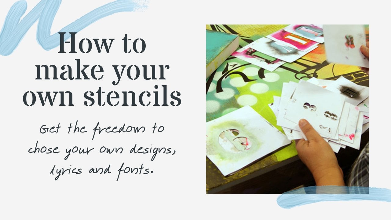
6. Playing with more effects: Okay, Now let's play a little more with the background and now have one color line on the top and another at the bottom. That's because I just lifted the color with the new coat of paint. Therefore, we can now make a new effect with water, what are called reverse bladder effect. I do the same as with the runners. I put the water on, let it sit for a while and the soft paint and then eye socket up again with my cloth. I take a small handful of water and throw it on my Canvas. You can also dip your fingers in water and just make small drops. Then it just has to sit until I can see that the color starts to dissolve. The drug changes the color. It turns a little milky white at the edge. Then I laid the club on and I press gently. Then I pull the chap color off, so the bottom color comes out. Imagine these are two contrasting colors, then the effect would be even greater. However, like that you only since it is also very cool, you can try both on a practice Canvas. It's important when making this effect that the bottom color is completely dry before you apply the new thin layer of color so that it's not dissolved by the water if necessary, wait until the next day. Now I want to start making more great effects. I want to bring something light into the dark and something dark into the light. I will use this dense and for that, I use my Mandela's Denzel, for example. I would like to come a fly's the powerful transition I have here. And I do that by making a pattern over it. As I told you earlier, it used to work in the same class before I introduce the contrast colors and do this so that it does not become too confusing in the end, if we have too many contrast colors all over, it gets very messy to look at. But as long as you work in the same tones, you can do a Latin your background, without it becoming a big miss to look at. I use large Mandela's Denzel here so I get a large area. It can be any pattern stencil. If you do not have a large one, you can do repetitions with a smaller one. I want to use two colors. I get a nice color change in my pattern. I want to create a reverse effect with these colors already used in the background. I use an old piece of cardboard when I dab as the sponge must be semi dry so that my paint does not say much and run on the my stencil. I use a little masking tape so that my stencil does not move, then I do not have to worry about that. When our work this way, I always make sure that most of my paint on the sponge is dried off again so that the spongy semi dry. Otherwise it can very easily run until the underside of my stencil, then the pattern does not get sharp. And when you move your stencil to the next place, there is paint underneath, which then again destroys your next pattern. Now I get some paint on my sponge, white most of it off on my cardboard. And then I start working in small circles with my sponge. Along the way, I make my color change by taking a little more of the next color of the sponge, a little more, and eventually it completely Turkish. This way you can create a lot of fun effects. Color changes is fantastic when working with denser. And show you more about that later. If there's paint on the underside, wash and dry your stencil or wait until the paint is dry before you use it again? My stencil has been used many times and I do not watch them. It has therefore become very thick, which can make it a little bit difficult to get the completely sharp edges in my pattern. Is that not cool? I just love it.
7. Contrast colors and working in layers: Hello again. Now there's a lot of paint on my stencil and let it dry before use it again as otherwise, it will leave imprints of paint all over the place. I think my print looks pretty good. And now I want to make several different ones with my Damascus Denzin as I think it looks very great with my Mandela's Denison. I'm looking for the oriental look. Remember you can use whatever students and you have. Now, I want to work with contrast and gets him live kicked into the background. Contrast is good. It does not have to be much. Tripping spots would also give a very good effect. I choose here to make my pattern in the background colors. I have pre-selected my contrast colors, as I will use them in a little while. It only takes a small change in the background colors to make a very visible result. I like that my passions are over the edge so they don't just hang there and dangling the open-air, you will find that I make clusters of patterns on top of each other and also in different colors. I often find that my students twist and turn their patterns in all directions. That makes it very confusing to look at, to try to lay a pattern in the same direction, preferably with several different colors. It gives more calm even though a lot is happening in the background. So hold your pattern in the same direction and get them over the edge and not working a little more with my background colors. Here it is the yellow mixed with the little Turkish and make different color transitions. But you do not have to do that if you want pure colors, like to make the patterns on top of each other, as it always give coherence. It also gives a rustic look, which I'm quite fond off. Now I want to get started with my contrast colors. I have chosen a magenta and a neon pink to lift the color. But because both colors are not opaque, they will not be properly expressed. Therefore, I'm mixing titanium white in my first layer as it will cover. Afterwards, I laid a right color on top. Then the color is expressed clearly and distinctly. Then I like pink on the top. I'm too impatient to let it dry. But the paint dries very quickly as we're working very thin layers. So you can do it all at the same time. And otherwise you can easily take the stem cell off and let it dry and then lie in the same place again.
8. The last finishing touches : Now our continued to make mortar mosques tensors, a blend and mix the colors for more life. It gets really nice that way in some places and mix a little plug-in, so it gets a little bit darker on the edges. And pretty crazy about this color shifts and now make it on top of the other, but in a slightly lighter color, again, to create life and depth. You can do this as many times as you want. Just remember to make the colors lighter or darker for contrast. Remember to check for wet paint on the back of your stencil before you apply it again. Wipe it off if there is anything left or let it dry before continuing. Another thing you can also do is to do a reverse print because there's a lot of paint on the sensor. You can then turn it upside down and take a piece of paper and press the paint off. Then it leaves a print of what is outside the pattern. That's a reverse effect. This print was not so good as the paint was already too dry. So let's just try it again at that more paint on my stencil so it is wet enough. You can take advantage of this and create something really cool. People will look at your painting and think, how did she do that? Or he. Now I'm looking at my painting and I'm looking at what areas I would like to preserve. Where do I think something exciting is happening? What I do not want to do more about. I want to preserve what is happening here, and I also want to preserve this corner. So I'm doing my reverse print down here in the other corner. That way I also get to pull my contrast color around the other side for more coherence. It helps to balance my painting, make sure the paint is wet and now Layers density with the paint side down, rubber on the paper until you or show you I've been all over it and so that all the paint is coming off. Check to see if you've done it enough and then lift your pencil off when you're satisfied. I could have had even more paint on so that my print was far more distinct. And now lay a lightest pencil on top. So I have both effects on the same place. They complement each other well and makes it more exciting to explore. I do not want to make any more effects on my painting now. I do not want to because I have to have a motif on. And in the next course, I will show you how to work with your motive and what options you have. So follow my profile here on Skillshare, so you do not miss the upcoming videos I post, which will take it even further in your new artistic development. I hope you've been inspired and I look forward to seeing your projects, which I hope you will share for inspiration for others. I would also very much like you to share review on the course that would make me really happy. In the end, I just have a corner here that I do not think work so well. So I'll just make one more print button, a range of yellow colors for additional contrast and life. And to cover my quirky reverse print, look at your picture and decide when enough is enough. Remember, less is more. I certainly do not think there should be more on my painting now. I'm satisfied. Thank you for now and see you in the next course where we will work with the choice of motif.
 MilleMajArt, Danish artist teaching modern art :-)