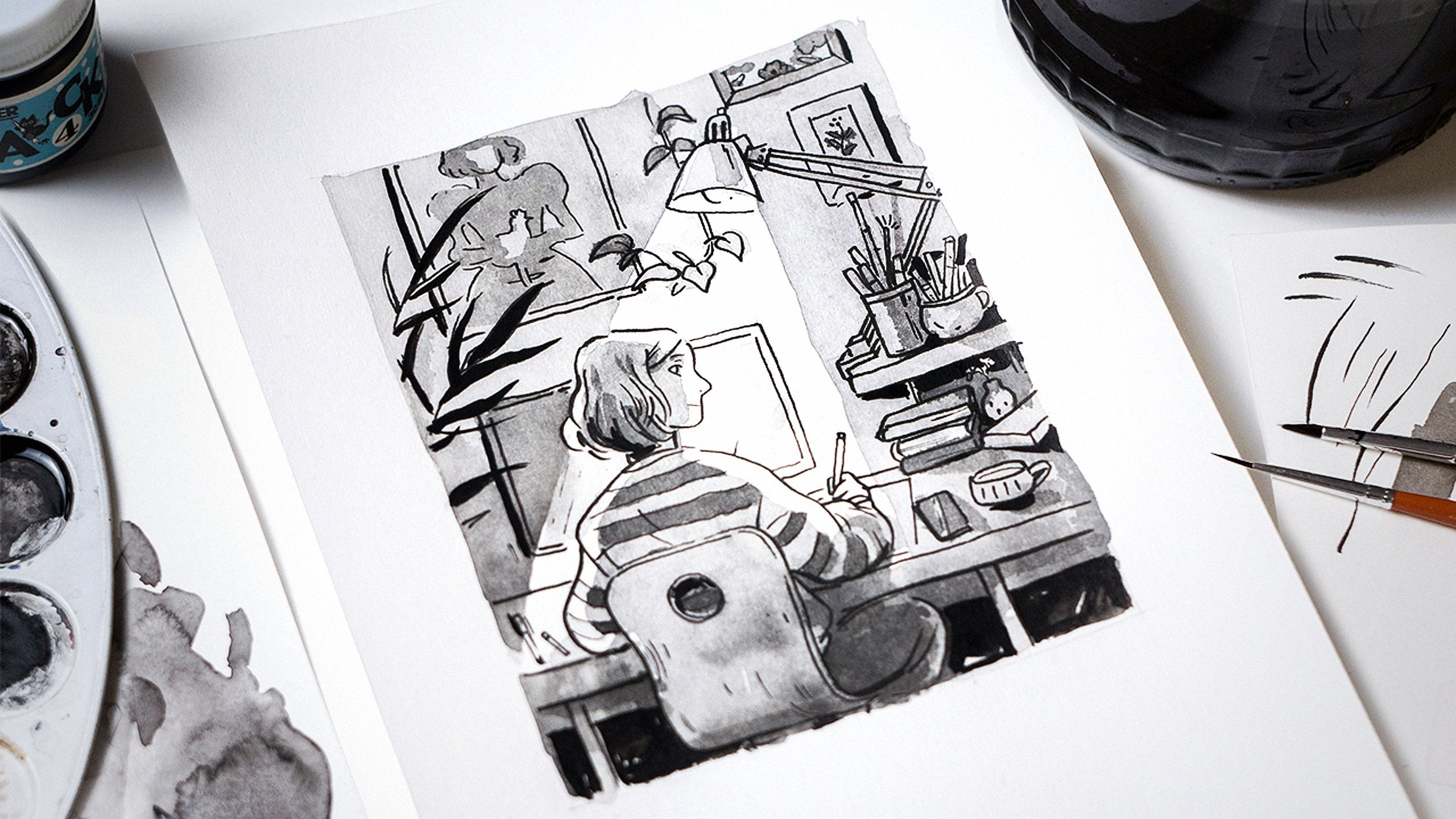
Transcripts
1. Introduction: Do you find yourself drawing in square
format more and more often? I most certainly do. Like most illustrators, I post on Instagram
to promote my work. It naturally affects the way
I come up with new ideas. Composition is one of the most important things
that makes a great artwork. You can have a
beautiful subject, mastery in technique, or
an important message, but in the end, composing
your art in a meaningful way will hold your piece together and elevate
it to the next level. Learning about basic
principles can help you express your idea and please
the eye of your audience. That's what I'm
here to help with. I'm Barbara Bernat, professional illustrator,
and graphic designer. I work in Halisten. My design studio we established eight years
ago with my friends. I publish works in many
different fields like packaging, branding, and children's books. I would describe my
illustration style dynamic. Movement and storytelling in strong compositions is something I rely on a lot in my work. In order to use composition
as a powerful tool, you first need to comprehend
the fundamental laws. That's what this
class is all about. We will dive into composing
in square format to make sure your work looks great in your portfolio and
social media feed. The lessons are building up from theory to the most common
types of composition, to practice, and finishing
an illustration. You can learn about
harmony and tension, static and dynamic arrangements, leading the eye of
the viewer with some specific tips
for square format. Then we are diving into some exercises
using basic shapes. To make it more fun, we're composing a still life with tropical fruits and drinks. In the end, we
will select one of the thumbnails to be polished
into a finished piece. I hope you will like this class. It's my third one
here on Skillshare. I can't wait to share my
experiences with you.
2. Why the Square?: Welcome to my class. Before we dive into theory, I would like to talk a
bit more in-depth about why I chose this
very specific topic. It's hard to deny that thinking in squares
has become a trend. They are optimal for both vertical and
horizontal digital screens. They look good on your
social media platforms, your portfolio page, and even as a declaration
on your wall. I have experienced this myself when I start sketching
just for fun, I open up, Procreate
or Photoshop and start with a square canvas. I don't really have
to dig deep to know why Instagram has become
a great influence and even a motivator for
me and many artists. There are lots of fun challenges and opportunities to
build a community, decide using it for
your self-promotion. When you use specific
platforms regularly, it's a good thing to
consider and optimize your images for the format
you share most often. Some compositions just don't look as good in a square format. So when you are
creating something new to upload to Instagram, it's best to think ahead. I'm not saying you
should optimize everything for one
platform only, not at all. You should always keep
your creative freedom but it's also good to be aware where your art will
reach your audience. Now, let's see how the square format is different
from more common ones. The main rules of composition apply to every
ratio, even squares, but the composition
itself can be more in focus in a square. Why is that? The square is a harmonious, completely even
in perfect shape. Neither side is longer
than the other. When you look at
it, your eyes won't automatically be led to
a specific direction, but more in a circular
observant way. The landscape proportions
lead your eye to move horizontally while the portraits
do so vertically. The square does neither. It really depends
on the content. There's less empty space around your subject when it
comes to a square. You don't need to fill that with different
supporting elements. The harmony of the square
will emphasize the shapes, geometry, and details
which appear inside. The same-length sides drive your attention towards
the center immediately, which makes it easy to create strong symmetrical
compositions. There's more
experimental space for extreme compositions
and cropping and creating visual
tension too since this frame is the
smallest possible layout. That's what we're
going to dive into. See the next lesson
for the process and the class assignment.
3. Preparation and Class Project: For this class, we won't
need specific tools. Something you normally use
for sketching is fine. We will draw a bunch of
thumbnails and then choose one, and finalize it in your
preferred technique. Before we start drawing, I will explain some
of the basic rules of composition in
the theory section. Then during the exercise, we can start exploring the different rules for
composing a picture. I will use markers and paper
for some thumbnailing, but you can use
anything you feel like. For these complex theme, I wanted to simplify the
practice as much as possible, so we will draw some
still life composition with different basic elements. I'm going to sketch
multiple examples for each category I'm mentioning
in the upcoming lessons. To make it more fun than
drawing blank shapes, I will compose some tropical
fruits and the glass. Of course, you can go
with any object or topic which you
are familiar with, and it is easy for you to draw. This way, we can concentrate
on the composition alone, but it will be easier to
associate with colors, perspective, and
textures are secondary. We are focusing on
shapes and lines only. After having some fun with the different composition ideas, we will select one and finish it with the
technique of your choice. I will use Procreate
to complete mine. This exercises, together, the thumbnails and
the final composition will give the class project. But before practice, let's
start with the foundations.
4. Theory 1 - Basic Terms: This and the next lesson will be pure theory with
helpful examples and tips. Composition is basically placing and arranging your
elements in a given space. When you create a picture, you have some intention with it. Whether it's about making an aesthetically pleasing
image or telling a story. You want your viewer
to experience something that you express
through your work. To be able to do that, there are some basic rules
you need to be aware of. Before we can jump into creating
different compositions, I'm going to explain the most important
terms. Focal point. Focal point is the main
subject of your image, the one you want to bring
your viewers' attention to. Every artwork has at least one. Some can have more but there shouldn't be too many
at the same time. To create one, you can use different methods
like right placement, converging lines,
contrast, or isolation. Rule of thirds, and
the golden ratio. Speaking of a focal point, there are a few guides which can help determine
where to place it. The rule of thirds
is simply dividing both sides of your frame
into three equal parts, which creates a grid. The intersection of these lines, are good places for
your focal points. The golden ratio
is quite similar. It's only based on
Fibonacci's ratio, which often appears in nature, so it's pleasing to the eye. These grids can also help you determine the division
of visual weight. A common application of
this rule is to have your subject occupy either one-third or two-thirds
of the image. Negative space. Negative space is the area
surrounding your subject. The ratio of negative
space and positive space, aka your area of interest will determine
the mood of your picture. The positive space will
hold the visual weight, the parts asking for attention, and the negative will balance
and enhance this effect. Balance. Each element you place in your picture
has a visual weight. If you put some weight on
one side of the image, you should balance it out with something on
the other side. It gives the whole image
the sense of being right and not
heavier on one side. It's not about making
everything the same size. You have a wide range of
contrast you can use. They're symmetrical and
asymmetrical balance. The main point is not to leave
your composition uneven. Contrast. The contrast of
an image can mean tones, colors, but also the shape and the size of your
included subject. The more contrast, the more dynamic your
composition will be. Dynamics. A composition can be static or dynamic
on a wide scale. The more symmetrical
and stable looking a compensation is,
the more static. Asymmetry, diagonal lines, and triangles make the
composition more dynamic. This is because they subconsciously
suggest instability. Static compositions
are more factual, while dynamic ones are
more about storytelling. Movement. Besides drawing
attention to your subject, movement is also important. You can create the
illusion of movement in your image with dynamic
lines and shapes. Or you can guide the viewer in a certain way when they see your piece following
a specific route you planted there for them. You can achieve it in
many different ways like placing multiple
focal points, creating contrast, using
guiding lines or diagonals. Cropping. You can either contain a full shape in
the image or crop it. Depending on your goal, cropping can leave the
focus from a subject and put it on the subject
being fully included. Cropping is especially
important with square format since it's
a very tight layout. Framing. You can use elements of your composition to create a smaller frame
within your canvas. This tool can help drawing attention to
the subject within the frame or tell a bit about the context
of the frame seen. These are only some of the main aspects to consider
in your composition. But knowing these
important factors, you can make your
planning much easier. In the next lesson, we will look into some
composition types.
5. Theory 2 - Types of Composition: [MUSIC] To make these
concepts easier to grasp, I'm going to show
a few examples of my own artworks composed
in square format. If you think about composition, you can make different groups
according to many factors. I'm going to divide them into three groups for simplification. But in reality, it's a
much more complex model. The aspect I have
made the groups along is the dominant guiding
line of the image. Tying shapes. Let's examine the most
basic shapes you can use. The circle, the square,
and the triangle. This is a group of
compensations where you use a shape to tie your
subjects together. They guide your eyes in
a certain direction, they can be literal
or implied shapes. Circle. The first one
is my go-to choice for a square format when I want to make a harmonious piece. It's a central circle. I like to think of it as the
holy grail of compositions. This way your subject is
organized very harmoniously. The different elements
have a nice flow as your attention is
driven around the circle, you can absorb it
in a calming way. Just like this dragon, you can follow its
infinite shape. The circle is also
an organic shape. It doesn't have sharp angles or pointy ends which
enhances the calmness. You can achieve
different effects with different sizes of
circles in your frame, as the proportion of the subject and the negative
space around edges. Square. A square within
a square composition, drives the eye towards
the center of the image. Instead of flow and fluidity, it gives the feeling of being more static
constructed presence. If you like to fill out your
frame in every direction, this can be your top pick. You can emphasize
the inner geometry of your subject this way. If you look at this girl, for example the
first thing you'll notice is the details the
perpendicular lines give, like the sushi, the arm, or the stripes of the sweater. It can also give a depth to your subject if you want
to express dimension. Triangle. A triangle
is considered to be aesthetically pleasing due
to its natural asymmetry. As the negative space is
more obvious on the top, your attention will most likely go to the peak
of the triangle, giving a good place
for your focal point. That's why it's a good
composition for portraits. The face can be in focus easily. It still gives a feeling of
structure and stability, the fundament of the triangle being more heavy than the top. But overall, the
asymmetry brings a little bit more excitement
and tension in the game. They can feel the
square format pretty well so it's a nice combination. Guiding lines. Lines refer to the most
dominant direction appearing in your artwork. A vertical or a horizontal line for a composition
can be useful if you want to work with
a bigger scale of subject and show
more environment. It shows the viewer the direction they
need to travel along to find the
focus of the image. It can work with landscapes, but figures as well. For an iconic image, you can place your
line in the middle, but for a more
natural composition, it's better to be off-center. A variation of line
can be an L shape, which guides the eye in the right angle with a
change of direction. Cross or X. You can apply perpendicular
lines to make your eye move in two different directions to bring in some tension. You can use this type of composition if you want
an iconic element, literally putting
your subject in a cross which dominates
the whole image. Another variation
of it can be an X, where the lines cross
each other diagonally. Diagonal. A diagonal axis can elevate the movement
in your composition. It's more dynamic since it creates unevenness
and instability. A diagonal composition is also a great choice for a square as it traverses the
opposite corners, filling out the whole frame. It's one of my favorite
dynamic compositions. "S" Bend. When you determinately put an S curve in your composition, you make the eye
walk along the path. It's most common
in landscapes as roads or rivers can
have this effect. It's a more natural
organic curve so it suggests calmness
rather than tension. This type, just like the rest, can also be direct
or more implied. Radiating lines or V. When you are drawing an
illustration of an environment, you often want to show the depth by drawing
in perspective. For this, you have to
use a vanishing point. All the lines of
the elements are going to run into
that single point. It can also serve as the
focal point of your image. This type is more complex, more about storytelling. Complex compositions. The previous groups
were easy to define, but not everything
you draw can be put in such definite categories. Sometimes you want
to go more complex, experimental, or abstract, which is totally fine. If I had to define the
rest of the categories, I would maybe call them complex. A combination of simple
compositions is when more than one shape or line applies to your
image like this one. The characters draw
out a triangle, but the fire and the water
beams are forming a circle. An abstract composition
can be more chaotic. Angles and uneven
spacing between objects causes your eyes
to move back and forth. This physical movement creates a busy always changing image. It gives the feeling of many things happening
all at once. Rules are here to help you, but of course breaking
them is also an option, especially because
composition is so hard to boil
down to categories. There are many factors that affect the outcome of an image. After knowing some of the rules, I still suggest you experiment
and try different things. Nothing is set in stone. Now, let's see how all this
theory works in action.
6. Practice 1 - Tying Shapes: [MUSIC] The best way to incorporate
theory in your work is to test how it actually
looks like in practice. So let's do that. It's much easier than
it sounds, I promise. You can either watch
or draw along with me. You can come up
with your own ideas for the compositions, mine are merely
for demonstration. Take your sketchbook or paper
and the tool you like to use for sketching and draw
a small collection of the basic shapes, circle, square, triangle,
semicircle, and a line. Now, add the matching
shaped fruits. The circle can be
a lemon or orange or a cherry for a smaller one. The square will be our
glass for the cocktail. You can use a taller
glass for a rectangle if that's what the
composition is demanding. The triangle can be a slice of
watermelon or a strawberry. The semicircle is a lemon slice, in my case, or for a bit more
organic shape, a banana. The last one is a line. A line can be very important
part of our compositions. In our case, I use
a straw or a fork. I also threw in a pineapple because it can both serve
as a vertical object. But the silhouette is still
very organic and irregular. It will be your Joker. We have our neat
collection here. You can add more if
anything comes to mind. We won't be using each of
them for every thumbnail, but it's good to have a nice
variation of components. Keep this at your side, so when you are composing, you know what to build from. Let's start with our
first group, the shapes. Placing your object
in the middle, in a circle is a very harmonious
and simple composition. It looks nice and organic. In the first one,
the proportion of positive and negative
space is about the same, which adds to the harmony. But let's see what happens
when I change it up. When I increase the
negative space, you can feel the lemon
is looking a bit lost. But if I reduce it, the lemon will look huge. The tension is bigger
in both cases. So if you want to
bring in storytelling, the negative-positive ratio
is definitely a good start. This applies to
every composition, as it is a universal rule. You can also use
implied circles. You don't need to
actually draw one. If you compose bent shapes, their outline can
imply a circle. You can pre-draw a circle and start building
up from there. You don't even need every
line to be circular. If some shapes imply
the circle enough, the compensation will
have that nice flow. Square in the square
will definitely be a more static, less
organic composition. If you put the square-shaped
glass in the middle, it will not be too
interesting in itself. Everything is central around
the same proportions. But if you move the glass
a bit towards the button and add a few details inside, it brings some more
excitement in the game. You can also move
off-center horizontally, which brings your subject closer to the rule of
thirds I mentioned, which you can apply with
any type of composition. If you feel the image is
too heavy on one side, you can always balance it with a smaller object
on the other side. Now, if you really want to
keep the central arrangement, you can draw a bigger square and fill it with
smaller objects. The square still contains them, but the inner geometry
and details come alive. You can also arrange separate
objects to imply a square. In this case, use right angles. Triangle is a more
dynamic shape. It's still stable at the base. But because of its asymmetry, it's a more exciting shape. If you turn it all around, you still have a
harmonic effect. But as the triangle is standing on an unstable balancing
point, the tension grows. If you want to
draw a still life, triangle is an outstanding
composition type to use. An odd number of
elements also look good. You can try it with
three objects. The hero can be at the
peak of the triangle, and the other two
can complement it. You don't need to draw the objects close
together like I did here. You can separate
one or all of them. The imaginary triangle
will still be a triangle. You can have an asymmetrical
triangle as a base, it will also work. The triangle is one
of the most exciting and pleasing compositions, and it's a really good
pick for square format. [MUSIC]
7. Practice 2 - Guiding Lines: [MUSIC] In the second group, we have the guiding lines. These are not always as
apparent as tie-in shapes, but definitely as important. The vertical and horizontal
arrangements have more significance when you are drawing on a bigger
scale, like landscape. But I will try to translate
them to steal lines. In this one, the vertical
line is the most important, but with a square composition, it has a few issues as too much space can
remain on each side. The same goes for
the horizontal one. It's not too pleasing
for a square. You can achieve
better results if you compose it a bit
more off-center. The L line is a
composition where the guiding of the eye
changes direction. For example, if you
place two objects on the same horizon where one is tall and the
other is small, your eye will follow
the eye line. This one can look
pleasant in a square. The diagonal can either express
movement or instability. This lemon slice is
pointing upwards. The most dominant
direction is the diagonal. It's harmonious in terms of
positive and negative space, but the diagonal suggests
growth in this case. It can also be unstable
if the guiding lines of your subjects all
point in that direction. Like here, you can tell that
this glass is in movement. If the general direction of your subject
suggests a diagonal, that's also an option in this category and
still has dynamism. If you want to combine
multiple objects, at least some of them should point in that general direction. I haven't mentioned
cropping yet, but of course, it can work. If the direction is in diagonal, it can be a good option. Cropping works with
most categories too. The cross is basically
the combination of the horizontal and
vertical line composition. If you want it to be dominant, you can emphasize the
horizon line, for example, or give contrasting colors
to the foreground and the background with a
vertical glass in the middle. I finally remembered
the pineapple. I should have drawn it more. It's such a fun subject. It's a vertical shape and I
made it cross with a fork, but the strong horizon
will still work. The X is a variation
of the diagonal, but here, we have a perpendicular secondary
shape, like a fork, here. You can't ignore it. It's a strong line. It's not a simple diagonal
composition, it's an X. To think of a new one, I'm just drawing in the X first and see what
comes to mind. The banana from the
previous example and maybe I can complete it with a watermelon slice
in the opposite direction. To show the difference between the cross and the diagonals, I first drew this melon
with a slicing knife. If I rotate it, it becomes a simple
cross-composition. You can see the difference
between the two. The second one looks more static and there's more
action in the first. This one is a composition form for your eye to wander
around the path, it's such as calmness. It's a natural line
like rivers and roads. That's what they are
usually used for. For a still life, the only
thing I can think of, of course, is coffee
with a band of steam. Another way to create it can
be with negative space when your fruits are cropped and the route between them
is more prominent. These might not be
the best examples, but as you can see, this is quite a distinct
one among the categories. These types suggest
more perspective. The first one is a V. It's not too different
from the triangle. Here the fruits are cropped, running out of the frame, but the glass where the lines are gathering
is still included. You can work with
negative space here too just like with any other. A vanishing point composition can be something like a vase, the flowers all branched
out from one point, their stems creating the
impression of radiating lines. If you want to add
in some perspective, this composition
is a good choice. I'm drawing a very
close-up lemon slice and in the vanishing
point, a glass. You can see it's
much further behind. I will have the radiating
effect with a fork, too. The position in space is much
more important in this one. It almost has a story, like a slice of lemon
is sneaking up on the unsuspecting glass,
something like that. You can express so much if you put your subjects
in perspective. These are some examples of
the many to create a simple, strong composition with
a few main elements. Now we can move on to
more complex ideas.
8. Practice 3 - Complex Compositions: After trying some of the basics, it's time to create
even more asymmetric, abstract, or even this
harmonious compositions. Now that we know the rules, it's time to break them
and experiment further. I'd like to emphasize
some aspects that can make your composition this
harmonious or dynamic. Asymmetry, putting
some more weight in one side of your composition. Cropping, not fully including
some or any subject. Complexity, using more elements, more complex shapes, multiple
composition guides at once. Tension, using positive
and negative space, drawing near the edge of
your frame, changing angles. Now during this exercise, I won't be concentrating
on shapes themselves. I'm just drawing
what I feel like. Try to crop every object in this one, it looks imbalanced. So I draw in a few more
things to feel my frame. It's hard to define
this composition style, but the quantity and lines of the shapes complete
each other nicely. This composition
is determined by the dominant lines I'm
drawing my subject in. Now, I'm trying to
draw in some lines first and see what
it can build up to. This third one is
playing with contrast. I'm trying to see what's the biggest contrast
I can achieve. Cropping helps here too. This one is a fun one, but I think it's just
a diagonal composition with a few more additions. You can try some more
extreme cropping, the pineapple is a
good subject for this. This is a nice close-up of
the details and the shapes. The square really brings out the interesting inner angles but if you want to
simplify it in the end, it's a crop triangle
and the circle. In general, I could
say that all of these compositions
can be traced back to one of the previously
mentioned simple compositions or some combination of them. More unconventional angles,
more extreme crops, that's the general idea. These thumbnails
look so exciting. I can't wait to work
further with them. In the next lesson, I'm going
to show how you can use and develop one of the
sketches for your final piece.
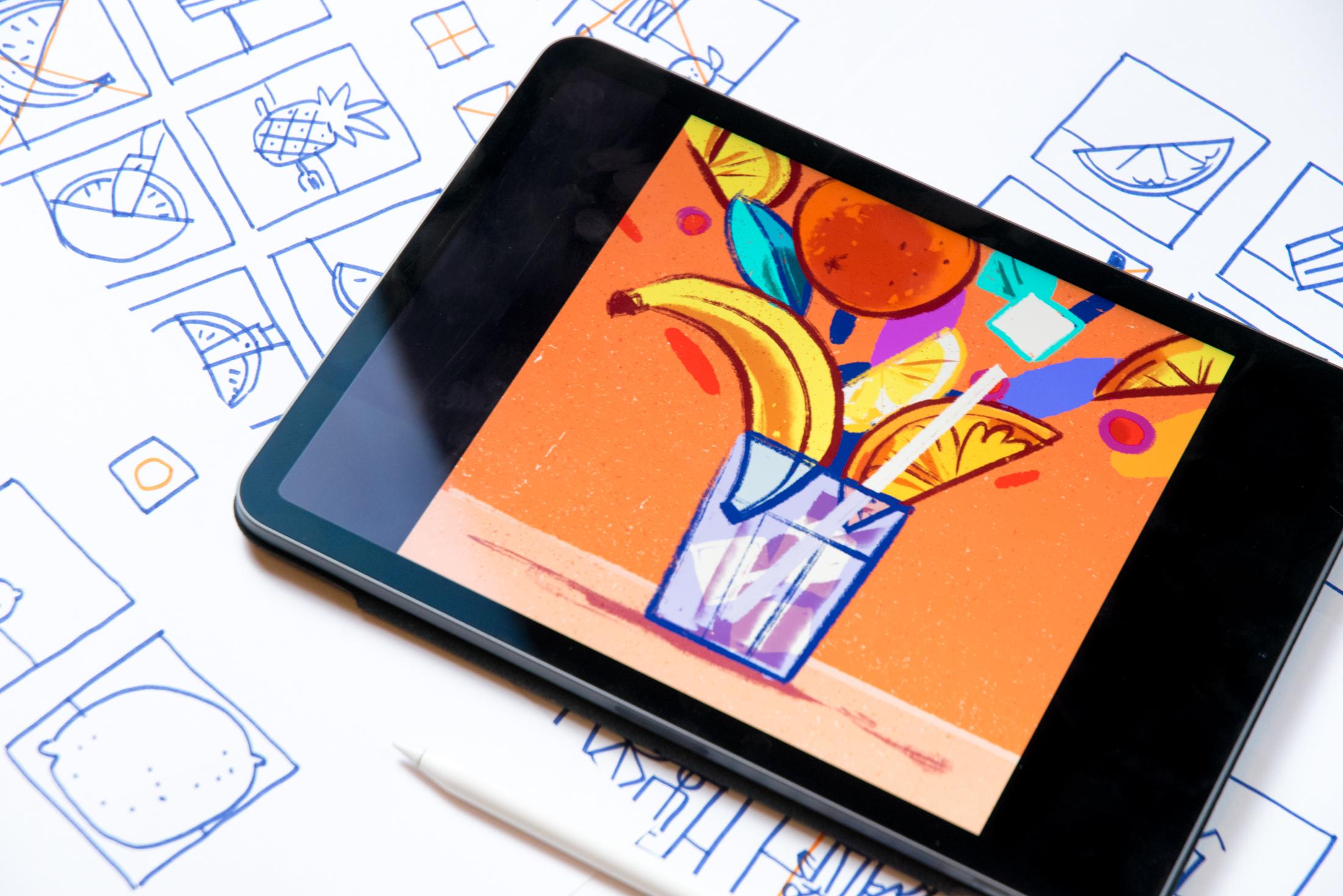
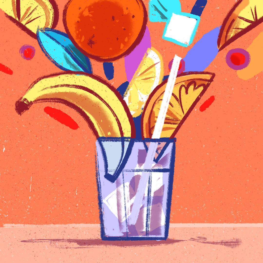
9. Class Project: [MUSIC] Now, I have quite the selection of sketches, all I have to do is pick one to finalize into an illustration. I have a few that I quite like. The ones that are exciting to me are the triangle
compositions, but I also really like
this cropped one. But in the end I will
be going with this one, because the idea seems fun and I like
dynamic compositions. I haven't drawn something
like that before so I will see what happens. To start off, I open a
square canvas in Procreate, being careful, the
resolution is good enough if I decide
to do prints later. I take a photo of the thumbnail [NOISE] and adjust it to the right size, then lower the opacity. At this point, you can adjust
your sketch if you need to before drawing
something final. I think this banana needs
a little size adjustment, it has a better contrast
with a lemon slice. I like a symmetry too, I'm enlarging it just a bit. After that, I'm going
in with the line work. I don't want to go super
realistic with this one, I want a sketchy looking
fun composition, i chose a dry inking brush,
which reflects that. I usually don't draw
such geometric shapes. To balance that, this
textured brush seems perfect. Now I'm outlining everything, trying to keep my shapes neat. At this point, I'm
already adding in some details where
it seems fitting. The lines for the
details can be thinner, like here in the lemon. At this point, I already see the thumbnail is quite vague about the rest
of the drawing, I need to figure out
how to continue. I think this composition
needs a bit of roundness and more heaviness
in this upper area so I draw an orange there. This sharp shape will be a
leaf to shape things up. In the other corner, another slice will do. In this gap in the middle, adding some squares
seemed like a nice idea. This way the rectangle
of the glass will have a visual pair
or reflection there. It's time to see this
without the sketch. It looks quite all right. I'm correcting this bit, which I didn't like and it was also too similar to the
one in the other corner. I think I'm just adding
a few more details here. The little berry to lighten
this straight line here. I think this looks fine, I'm coming in with colors. I created a palette
especially for this class, which would be too
vivid for me otherwise. But remember, the whole exercise is about getting out
of your comfort zone. If you like this palette, you can download it
from the resources. I like to keep the colored
surfaces rough as well. I use a different
textured brush to fill the background and leave some white parts
to shine through. You can see that as I
add more and more color, the whole thing is changing
and some things that weren't as emphasized before
become more highlighted. That's the power of
color in composition. It can change the whole
thing in an instant. It can be a good way to
select a focal point. I feel that these ice cubes
are too much up here. You can see that they
are bright white. Your attention goes there. What I can do is change the
color of the one behind. I also like to play around with the color
of the line art, the glass got a cold color, The fruits a warm one. I can lighten the lines to push something in
the background too. I like to operate with
shadows in my illustrations, I'm doing it now as well, with the third brush. It's a more watery, very variable Sumi e-brush. I usually go over the whole
thing with one purple, grayish color, which I have
saved in the swatches. But of course, it doesn't
look good on all surfaces. I changed it on the orange
for a more harmonious look. I'm still not quite
happy with it, I'm going with a warmer tone. It's all right to change
anything at any point, if you feel that it
adds to your buck. I'm using the original
purple shadow on the glass because it
matches its cold tone. Now, I feel like I'm
nearly finished, I erased some parts of the
shadows to add detail. I feel that the top is
not quite dynamic yet, and a bit empty, I'm drawing some splashes
of color in there. I want to lean on the
bursting effect even more. As you can see, the
composition is still the same, but these additional elements all seem to guide to one point. Instead of V or a triangle, the shapes follow
the radiating lines. It's okay to modify the
two at whatever point. You're drawing can change so
much depending on details, anything you feel
that strengthens your composition and concept, can come in later as
a change or addition. Now I feel it has become
quite busy, which I like. I'm adding some textures to the background as
a finishing touch. The white ice cube still seems a bit too harsh and
grabbing the attention, I'm adding another bright
white detail to balance that. I think I need a line
in my composition, a white straw will look good. It's quite a harsh line, which gives a nice tension
with the rest of the fruits. Now I think it's done. A small thumbnail turned into an illustration
of your own. All that's left is to
share it on Instagram.
10. Final Toughts: Thank you so much for joining me and making it to the
end of this class. I'm proud of you. I hope you had fun and learned useful things about the
theory of composition. All this information
might be a lot, but remember to practice and try out everything in
small sketches first. It will help you so much
with your process and eventually you'll be composing beautiful images
without any guidance. You can download the color
palettes I've used for my drawing to both
Procreate and Photoshop. You'll find it in
the resource section with the list of the tools. If you have any
questions or ideas, I encourage you to post a
discussion here in the class. I'm always open to share further tips and answer
upcoming questions. I would love to hear your
thoughts about this course. Feel free to leave a review to help my work
here on Skillshare. Don't forget to upload and
share your class project, not only the finished drawing, but your sketches as well since they are the
heart of your practice. I'm super excited
to see them all. Thank you again for joining me. See you next time. Bye.
 Barbara Bernat, Illustrator