Transcripts
1. Splashes Of Colour | Introduction To Free Flowing Watercolours: Welcome to splashes of color, secrets of free-flowing watercolors, where you will learn how to take you artwork to the next level by creating free flowing watercolors. My name is Alice, wanna pull, and I will be your tutor for this course. My first love has always been art and art in fighting for 17 years. Currently I'm a full time Artist and an out dude. I have designed a score. Anyone that wants to be unique and creative and piety own loose watercolors star. By the end of this course, you'll be able to identify ways to pint loose and free. You will lend to pine without any restrictions. You will learn to paint with a limited sketch on those sketch at all. I will be showing you what's important when you create free flowing water occurs. Not only will I show you my painting promises, but I will also show you techniques and ways to create you own free watercolors star. You will also find with me and see how watercolors flat. But most of all is to have fun and enjoy your watercolour. And ideal person for this course is the artist that wants to loosen up his painting style, or even the beginner artist that wants to establish his own style. These no requirements for this school that only that you've come with an open mind. Feel free to look through the course description, and I can't wait for you to enroll in my course.
2. Secrets To Creating Free Flowing Watercolours.: In this lesson, you will learn the secrets to create loose watercolors. As artists, we need to be unique and original. This means we must use all restrictions and have fun when we play, it must use our imagination. We are all different and you must find a way of binding. We will you say to yourself, wow, this is an excellent painting. When you complete a painting, for this reason, I could tell you how to paint, but I can show you my wall way of painting. One of the restrictions that prevent us from doing a loose watercolor is normally the pencil sketch. If that pencil sketch is to detail, it allows us to paint within the lines. And although we do the proper proportions and the guidelines way to paint, it restricts our creativity. It eliminates our imagination and freedom to explore a new scholars to create unique bindings. Watercolor is a free flowing medium and we must not control watercolors. We must rather little watercolors control, and later colors flow freely. We must explore and investigate new possibilities of painting and develop our own unique style. We must also not fear failure and use this to learn. With lots of practice, we will become more confident and beta painters, we must have the right mindset when we start by t minuss watercolors.
3. Steps in Creating Loose Watercolours: The first step is to observe the object which we want to paint. We must look carefully at the detail the object, and the colors of the object or image that we want to find. What detail of the object is necessary to bind and what can we leave out? Rather than look at what we can leave out then to see what you want to add to your painting. As artists, we are free to make that choice. Again, only put in what's vital for the success of L painting. Decide on the composition or how you would like to change the composition to be more visually appealing. This means changing some of the objects or moving them around in the painting. Look at the colors of the object and decide what colors you want to paint. And also look at the effects of the light on your object. You don't have to pay and what you see, but interpret. What you want to see. You must be creative and original and not copy the subject. These colors can deviate completely from the reference image. If it will result in a stunning combination of colors, that choices of colors we used will be dominated by our preference. When it comes to color, we can decide on a vibrant Heikki shades or soft muted shades. What if our preferences, I normally try to create an image in my mind's eye of what the result of MAD IT would look like or what I would want it to look like. I prefer to use a combination of high key and soft shades. I prefer to work with clean pigments and prefer to lick a column mix on the pipeline rather than mixing it in my palate. When it comes to my color choices, my decision must add to the beauty of my team. Try to not use brown or black in vibrant paintings as this will detract from the light of the painting. It doesn't mean you don't have to use brown and black. But when it comes to high cave painting, tried to avoid it. And this is how I would go about choosing my colors for my subject. Before I start my painting, I will place my tubes of color I want to use next to the reference image. I will choose combinations of collective produce exciting contrast of colors to match the creative image I have in my mind's eye. I will use my imagination to create unique results. To make the penny more interesting, I would use a combination of soft, hard, and also lost edges. I will allow the pigment to mix on the pipe for my happy excellence where if a happens, I will also leave white spots of the pipe, which I call breathing out. I will also make unusual marks of color, like Iran's sprinkle spots and water marks to make the orbit more interesting and unusual. But most of all we must enjoy painting the artwork and it must be fun.
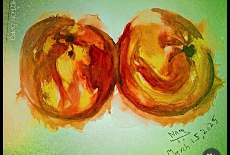
4. Exercise 1 | Painting Nectarines - Part 1.: This is an exercise on how to use color. We will be finding these nectarines and we'll use a free flow of color. Ok, this is a photo I took of some nectarines. The image will be included in your images that you can download for this exercise. Now, what we'll use in this exercise is first of all, we'll use a piece of a 140 pound or 300 grams watercolor paper. We will use four colors. I'm going to use a cadmium red. I'm going to use, connected them gold. I'm going to use Winsor Newton ones are orange, and I'm going to use a lesson, comes in Permanent Alizarin, crimson or Moon and Winsor Newton, all these colors are Winsor Newton might be a good idea when you start exercise like this is to lay out your colors or Sharjah colors in the tubes before you start. And I've placed out some colors of these tubes and I will be mixing them just now. To start this demonstration for this exercise, I will be using a number six brush and then a number ten Winsor Newton brush. I'm not going to use very small brushes cause we're going to use in the free flow of Calas. I will also be using a spray bottle for spraying the water. And to start off, we'll take some cadmium red ketamine 3D and mixed quite as strong value of that. And we're going to start shaping our nectarines who start with the top one year while getting the shape of the nectarine. And I need some more color and need a very strong color, which are going to get the shape of the nectarine, prevotella. Quieter water on the canvas or it flows. We want to use three free flowing. So this is good. And we'll try and just broadly cover the shape of the neck. Terry will start with the first nutri. Okay, then I'm going to get scared me and red, I'm going to talk a little bit of orange in it. And so while it's great, we dropped our cosine and we this side and usable user better water to just lit the candles flow and just make the shape of the you need some water. Surprise for mood already. Secondly, victory in must go as k. So now we've got quite a lot of water. We can drop some more Colleen. First washing is dropping lots of cholera in to try and establish your yo nectarines, the shape of the nectarines. Second one is got more orange on the top here. So drop a bit of orange India. Engage stronger mix of orange. Interruption or engineer. And we can split the paint as we go along and be mindful of the shape that we, we painting shapes takes a more regia and edible rate. Ie shaped by it on this side is strong and can read. And this is a first wash, shall we? It can slow. We don't need to be precise with this first wash. If k is h, first wash, we need, I think what we can do now is here and they want to lift a little bit of color, some color the awol and it's still wait, just a little column you saw idea again. And while it's go with reconstruction, more Colleen, rarely exercised to, to work with color, to see how colors flow when we use column. And when you do this exercise, you'll be amazed how are you enjoy to see the different colors flowing into each other. So what we're basically doing Yj is missing color on, on PIPA, mixin color on a very limited data. The amount of detail that we use is normally a preference. It's a function of your preference of what you want to use. And I like quite strong colors. Just yell users edit to Florida and market. And I think we can bring in a little bit of lesson comes and reaches a cooler color. The bottom here to indicate a little bit of shadow. And see are the colors flower. And this is just the first washer. We don't have to be too precise for the first class. What I want basically tried to establish this a splash of Canada's. I think we can even add some more colors. And pretty much any two colors reviews three colors actually, cause we've used Alizarin crimson as well. I need some stronger Orange County you to drop in orange. Orange here. It's amazing how that colors flow into each other. And what I wanna do is lifted lucrative career, splendid career. Okay, now what I think what we need to do next is let this dry completely and then will go for a second. Washington's to some more details. We can maybe lift a little bit of color. And for lifting color, I'm using this type of sponge, which is very good for lifting color. Even if the colors totally dry and easily slots to comment on the quality and the for the steam. And maybe just a set of size k, right? I think what we need now is to let this dry completely.
5. Exercise 1 | Painting Nectarines - Part 2.: This is the second part of our exercise, painting the nectarines in a free flowing fashion. In this second part, we will use fringe outer Marine for our shadow areas. Like semicircular brush marks with cadmium red deep to outline the h of the nectarines. They have in mind that the ages is beautifully shaped. In this image of the nectarines, we add some more color of ketamine rate. And then we use a little bit of water to skews a little bit of the color. Here, I've added some strange autumn Marina and at the bottom to indicate a little bit of shadow. And at the top for her like I've used water to make a little bit of a highlight and then I'm spraying a little bit of water to get our pigments to flow beta. Now I'm working on the other side of the second nectarine to make the ages more prominent. I'm using fringe ultimately in a gain as this side has got some shadows in it. I had some fringe ultimately in for the shadows. And then I use a spray bottle again to make the pigment flow into each other. Applying bright colors to the pipe or can be a glorious feeling. This is still the first wash that we're working on. We use a little bit of ultramarine blue to lie in the steam of the tree, working with color that merges into each other when we drop it in, is one of the most beautiful outcomes of watercolor. Seeing the pigment flow and interact with other Shaich is just magical. We're working to create the roundness of the estuarine with more cat rate. We drop in a little bit of fringe, ultramarine, again, for the shadows we only using these few colors. We use a little bit of orange next to the cat rate to let him merge the shape and form this beautiful colors. We work a little bit more on the stage and make it more prominent. And dropping some more rate. What we must do, we must keep on painting the nectarines, but we must concentrate on painting the shapes. We are not painting a subject, we are painting shapes, always buying shapes. And that includes colors, shapes. In a loose way of painting worklist, leaving water moms at the heart of the beauty of Oracle. So don't be afraid to leave for a mom's later watercolor flow and create happy accidents and let each magic work. Lots of practice is very important if you want to succeed in any new skill. And that is also the case with watercolors. Instead of trying to control a watercolors, let the workers flour and create incredible paintings. As with these liquid range that we are painting, create connections between the objects. In other words, the two nectarines. This will definitely improve the are. We remove a bit of color with a sponge. It's especial sponge and it can move. It removes the Callaway easily, removable literal, and may also make some highlights.
6. Exercise 1 | Painting Nectarines - Part 3.: We are back with this third part of the exercise, finding the nectarines. Yoke binding that you binding in this exercise doesn't have to be exactly like my binding. So you have to stop the video from time to time so that you can assess your binding and carry on with the binding and then watch the video again. I have speed up the video a little bit. So it would be important for you to stop the video from time to time. We are now starting to shape the second nature rain. With using kidney and rate. I have added some ultramarine blue for the shadows between the two nectarines. When we look at the water flow or the amount of water that we use, a member that we will lose and you cannot control the water color. So sometimes you will just have to lead carlos flood. Kindness tells the story of your artwork and it can be very inspiring, which you find on your bypass that you going to use. So you can see how the bytes are going to match up. We can also now add a little bit to the stem of the sick and make terrain with alternating blue. I've added some more orange. We need to study the colors of our subject before we start handy side. What are we going to use or we're going to use the same colors as in the reference image or of the subject? Or are we going to be very creative and try and create our own ballot for the spine team. We've also soften and spread the colours at the bottom of the lift nectarine by using some water. We have also strengthen the shadows at the bottom of the lift negativity. Let's talk a bit about color. I tend to go for the exciting vibe in shades of color, any joy to see how it flows. I also prefer working with tubes of color rather than the pens. The tubes of color will give you a more vibrant color because there's more pigment. If you use the pins, you have to wake it very much. Oh, you have to wake it quite a lot to get the same terminal value. In this exercise, we've used a very limited palette. The advantage of using a limited palette like this is that it gives us gala or money.
7. Exercise 2 | Painting a Sunflower - Part 1.: In this lesson, we will do an exercise to choose the colors and the shapes for a painting. When we use colors directly from the tube, they are bright and beautiful. My way of painting allows me to use tube colors that mix easily on the pipeline. I will occasionally use a Carolyn inks and acrylic paints with my watercolors, I find pen colors are a little bit of diluted for my wife. However, it's a question of choice. We will now do an exercise to choose the colors and shapes we want you to use in your painting. Taste your colors for your painting as follows. Analyze your reference image and decide on the colors that you want to buy. And remember, we want to create simple but effective artwork, if possible, place the tubes on your reference image to get a better idea of your chosen cameras, we will use need pigments to taste these colors. Take a heavy load of pigment and little water and place it on your paper. This will result in blobs are vibrant pigment in, take some water and drag the pigment over the lake. Since then dry. Once there are these colours will look pilot then the original application demonstrate didn't novice painters Mike is to keep on adding layer after layer to get adore could turn at a certain point, the colors will lose the vibrancy and become dull. After this exercise, you will have a good idea of the colors and the shapes you want to use in your pining. Till now, let's talk about water. From my way of painting. I use lots of water and loved the way the watercolor flowers, you must establish how much water you comfortable to use. Some artists use much less water than others. It depends on your painting process. The more water you used and this control you have over the bitmen flag. This is unlearning process of discovery to see what your use for water 0s in the way you paying. In our exercise that follow, we will paint a simple sunflower and use heavy pigments aided by some water, we will use a number ten brush. A colours we will use will be cadmium yellow, kinetic them gold, ultramarine blue, and windsor orange.
8. Exercise 2 | Painting a Sunflower - Part 2.: This is the second part of painting, the sunflower exercise. We start right in the middle of the painting with painting the center of the sunflower, we use ketamine and a yellow to start off with. The pigment is quite a mix which we use directly on the paper. And we start doing the center of the sunflower. We clean our brush and take some Windsor orange to add to this mix. You'll be amazed to see how the two colors will flow into each other. We, we drop in some more yellow, cadmium yellow and add to the middle of the center of the sunflower. We extend that impacts some vernacular them gold, which we're going to add just to give you a little bit of variation in color and a little bit of darker pigment. It just drops some in and let them flow some more at the top and at the bottom. The next step would be to try and add even some more darker colors. I think what I'm going to do is we just pull out the cadmium yellow, but notice the white pi two, we live in a center of the sunflower. I'm now mixing some fringe otter marine, which we will drop into just to give a little bit of shadow and Mike, the shadows flow into the rest of the watercolors. We drop in some more connected them gold. To make this painting quite amazing. We leaving white spots everywhere. We then drops and more fringe, ultramarine for, for some shadows. We missing a Calla. So we drop some more orange. We now dropping the ketamine reading. I want some variation in Canada from yellow to orange to red. And then obviously the shadows that we also find the in-between beginning NIJ, nice variation now and the colors are starting to flow to each other. This is amazing to see how the colors flow into one another. This is what a loose water kind of painting is all about. I think we will start on the pickles were using ketamine yellow. I don't want to be too precise. Notice the whitespace. I'm leaving around the same time. This is to let it dry a little bit to pigment, and then I will touch the synthesizer. The currents can flow into the petals. There you see I touch, just lit the carlos flower petals. This gives us a nice flow of colors and adds to the overall painting at the end. I'm leaving white spots every week because I want to be, have a painting which is hasn't got concise, hard lines. As I go along with this painting, I will use a lot of water to fuse the pine turbid and make it more atmospheric. So you can see the I'm adding a little bit of water. They just to make it looks like a much lighter terminal value at the pixels by using lots more water, I'm using plain water there and use the color as I've already pointed and drawing it.
9. Exercise 2 | Painting a Sunflower - Part 3.: So this is a process whereby we will just carry on drawing out some colors to form the sunflower. This is still the first wash. You must remember when we get to the second wash, then we might add a little bit of more detail at this point with the first was, it's all about establishing the basis of a atmospheric watercolor. Paintings TO failure width. So we can paint any way on the pint and let the pine flow in. It's not if it gets a little bit dry, we'll use a spray bottle and spray a little bit of water. Now, I'm adding some more water and they spraying on some water to make the kind of stream flow more. I want more flow of colors because this is what this exercise is all about. Now use a sponge to lift some kind of way. I think I'm want to lift some color and make it more atmospheric. You'll see this type of sponge loves color tremendously. Even if the whole painting is dry, you can still use it to lift some kinda taking some MOOC, connected them gold. And I'm mixing it with fringe ultimately into and give us a little bit of greenish color, which I'm going to use for a little bit of a steam. I'm taking a lot of water and I'm telling you to spray some more to on this side it flows down and it forms the stem of sunflower. Add some more that. So this is basically just loose. We establishing the base of the flower. You see often the first wash painting doesn't look all that exciting and the colors are vibrant and that's what we want. I'm listening some more color. I want the end of the sunflower to be very light, adding a little bit of orange as well to the petals now starts looking like a sum. It is a sunflower after all. Getting the colors to flower. So off this praying. But we can see that colors are starting to flow.
10. Exercise 2 | Painting a Sunflower - Part 4.: This is the final part of the sunflower painting exercise. Add more Windsor orange to the petals and shaping the petals further. Any new skill can be mastered overtime at what's needed is a lot of practice and commitment. The perfect combination is derived positive attitude to be willing to learn and a fashion to carry on despite of finance. What we need to do is capture the essence and the mood of our painting. This can be achieved, but we must be clear in their mind in the paintings finished, most of this will carry on for far too long and add more detail and more detail until the painting is actually too detailed. Do not bind all the detail. Besides what's really important about your subject. Sometimes a good idea is to sit out by only trying to bind half of your painting. Leaves some of the painting. It is very difficult to do as most people want a complete picture. However, the viewer's eye must complete part of the picture. So painting only half of your subject can aid the viewer in completing the painting in his own mind. And just capture the essence of yourself. How do we do this? Well, we study the subject. We must be in love with our subject and try to simplify. Use color to sit the atmosphere and mood of my painting. What is the difference between a audits at Bain surrealism and artist that doesn't lose watercolor painting. The office that binds realism will add as much detail as possible to achieve these results. The author says it starts painting without a preliminary sketch or a very limited sketch, falls back on the watercolor itself and all the techniques and the flow of the water to achieve a successful result. These type of paintings can result in unique and creative paintings was atmospheric washes that can bring the painting to life.
11. Paint With Me Class Project | Field Of Poppies - Part 1.: You are the master of your own painting process. In this project, we will create a painting with splashes of free-flowing color. What you will learn is how to let go of control in creating a painting. This can be a frightening concept for many artists, and especially if you're working with watercolors. So let us see how you can make watercolor flow and move as you design and create what you want to. You can paint your own subject of choice, or you can use mine and do the same as what I've done. We start with a normal piece of watercolor paper, preferably a 140 pounds or 300 grams. The hippie, the pipette, the better the color will flow onto the surface. Do a quick preliminary sketch of your subject just to the outline so you don't have to put in too much detail. We start with laying in the background around the church, with Payne's gray leaving the church building White. You can use any color you desire for your own background of your subject that you painting. Then using a mob brush or a very large brush, add a generous amount of pigment in water, spread it out for the background and see how it magically flows. It's amazing that we can, just, in a few minutes, we can learn so much about watercolors by just experimenting with him. I'm ease, as in this painting, to be an original artist, how we use color must be also be original and unique. Drops them pure water droplets onto the width paint to create interesting marks, a variety of different patterns in the sky. Now let's start on the Middleground and add a heavy mixture of raw Sienna in front of the church. Also add a little bit next to the church, could indicate bushes drop some more heavy mixture of Payne's gray around the church polling year will come in boldly with a mixture of getting ready for the immediate foreground, lit the cardinal flow downwards, drop some more carried and water in to create this magical flow of Canada's, yeah, at some more rosy Anna for the middle ground, play some more water for ease of flow. Tried to capture the mood and the essence of your subject with the choices of your color and the shapes of the colors that you use. Also try to use as much water as possible that makes you comfortable. By the way, I have my iso at about 30 degree angle. This is to ease the pigment flow. However, you can have your iso egg your preferred gradient angle, as some people prefer the easel to be at almost 70, 80% CR the Payne's gray and the raw Sienna mix and create a greenish color as Payne's gray is actually a dark blue color, mixing with the rosy henna, which is the yellow base, gives us a green color. Add a little orange and some more rosy Anna add some Rosie not to the sky, as well as to the roof of the church. Now lifted painting with support at a much more steeper angle so that you can control the direction that the pigment flows. Controlling the direction of the flow across the pipe will result in a painting. There is absolutely fantastic. At this point, the painting looks a little bit disjointed. Now, if we will eventually bring it all together as we let the watercolor control and not trying to control the water color at a later stage in a painting, we will work a little bit more controlled with smaller brushes to bring in some detail that will give us the painting that final look that we want.
12. Paint With Me Class Project | Field Of Poppies - Part 2.: This is the second part of paint with me, the field of puppies. What we will need in this lesson is sum or salt and curly drawing in. The salt technique is easy to do and the results can be surprisingly wonderful. Salt is a FUN, experimental tool to use when doing a free flowing water colour painting painter, free-flowing water color with lots of water. I allowed it to dry until the moisture sheen, the surface of the fiber was just beginning to disappear. But you can vary this to get different effects, which talks about using acrylic inks with watercolor, you can use any acrylic ink, but artist quality is always the best. I have used a dialogue drawing inks, you can make the acrylic inks behave like water colors by just adding some water, acrylic inks have a fluid consistency that both like traditional watercolors and due to the permanent nature of acrylics, you can vote him without dissolving the Lias. Acrylic drawing inks is high-quality acrylic products that can be further diluted with water for illustration and fine art applications while the paint is still moist, I use some larger brass for lifting the color for the road. It is suitable for use of watercolors, illustrative purposes, a brush as well as Brush pins and duping pins. I now add some read acrylic drawing ink for the foreground, the Incans got outstanding calibre aliens and transparency. I spray lots of water to make the keep the church moving white by tabbing with tissue. The water is diluted the inks to a large extent. If I now add some yellow and blue inks to the right side of the foreground to form some greenish color indicating some graphs.
13. Paint With Me Class Project | Field Of Poppies - Part 3.: This is the third part of bandwidth mean the field of poppers. The previous washes now completely dry and we will start on the detail of the painting. We start with a dark mix of Payne's gray and a little fringe. Ultimately, on the tower of the Church. Will look down on the terror of the roof and add the shadow side using a small brush for the detail. Surely add little more pigment for the shadow side of the Windows. User larger brush to start on the roof of the church. I used the same column meets a very good tone to create interest that do this small brush to do the other week died. It makes the side door and I will use get me in the rate to Mike the door stand out. Also read it. Don't add more pigment to the shadow side of the door. Add some more shadows to the church wall and dropped in more Payne's gray and fringe ultimately mix. I use a mix of cadre by ins gray and fringe ultimately to bind the face. Lift some color from the fields, and add shadows. Using the same mix as the fins we start working on the foreground, three, indicate the small branches with a small brush. Spray some water on the branches to lead the pigment flow. Now, AIG and indication of lease with the same leaks, but add a little caffeine read, radiated tonal value so that we get some interesting down or variations. See how the magic, the expediency of watercolors shine Fu, add a few shadows and the defense area. Finish this part three by adding a bit of black acrylic ink to the bottom of the tree.
 Arie Swanepoel