Transcripts
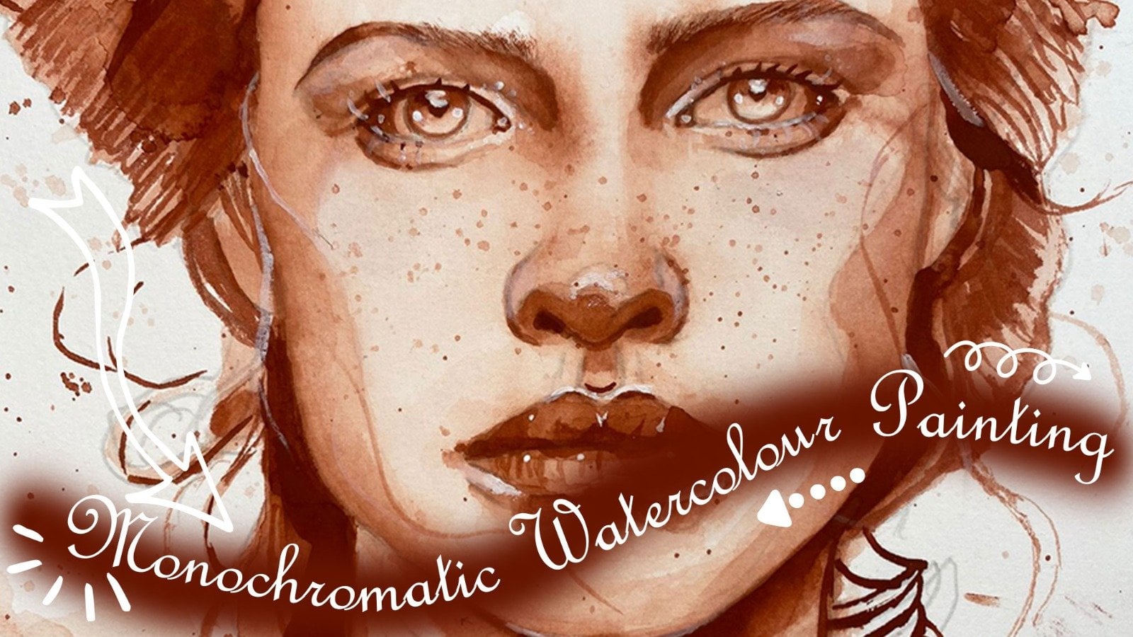
1. Course Overview: Welcome to the direct approach our watercolor corks. Wally will learn to take your art to the next level by learning the direct approach to watercolor painting. This is a loose watercolor painting technique. My name is artist Juana poor and I will be your tutor for this course. My first love has always been art and I've been painting for almost 20 years. Currently. I'm a full-time artist and a R2. I have designed this course for anyone who wants to learn to direct approach to watercolor painting, which is a technique to loosen your watercolors and be creative and unique in your painting style. By the end of this course, you will be able to identify and implement the direct approach to watercolor painting. You will learn how to paint from a limited sketch or sometimes no sketchy at all. You will learn how to be creative and unique results. I will be showing you what's important when it comes to direct approach to watercolor painting. Not only will I show you my painting process, but rook with you step-by-step and show you the secrets of the direct approach to watercolor painting. You will paint with me in your project, zebras migrated. But most of all, we are going to have fun in this course. To ideal person for this course is an artist that wants to learn the direct approach and loosen up his own watercolor painting style. That beginner or the beginner who wants to establish his own blue star. There is no requirements necessary for to enroll in this course, except that you come with an open mind. Feel free to look through the course description and I look forward for you to enroll in my course.
2. The Direct Approach - What is The Direct Approach: This lesson is about the direct approach to watercolor painting compared to the more traditional, conventional watercolor painting methods in which images bolder by overlaying one wash onto another wash. And traditionally working from light to dark. The principle of the direct approach is to get it right the first time. This minimizes the need for over painting and therefore reduces the likelihood that you would overwork your watercolor. It also helps with the watercolor medium, transparency, vibrancy, and make it fresh and lively. Watercolor is an amazing medium. The greatest asset is its immediacy and its transparency. How the color is applied is the answer to its vibrancy and the magic that can only be achieved with watercolors. Applying the colors were directness in one go next to each other, or leaving the colors by dropping in color to flow into each other, is the magic of watercolors. Once the color is laid down, you should resist the temptation to reattach or go back in and change it further adjusted. However, while it's still wet, you can still drop some color in. And I do it all the time, especially if I'm painting a loose painting. Once then the columns must be allowed to blend, run into each other, or naturally allow it to blend as it dries. In other words, the watercolor should be allowed to do It's part with at you trying to control it. The amount of pigment and water is the magic ingredient, are wet or dry. The mix must be only comes with experience. This can be done by experimenting how much water and how much pigment you need nine weeks to get your desired effects. I further requirement is the relative lightness or darkness. In other words, the tonality of the pigments of your colors before you apply it. It must also be a weight at watercolors dries, lighter than you must make provision for that. The direct approach also allow you to loosen up your painting style. What exactly is loosening, upload, binding scar. It refers to the depiction of your subjects in an understated manner. Elements are only suggested rather than painting it in meticulous detail. Therefore, use objects needs to be reduced to the essentials and painted with descriptive brush trunks lying there on a specific brushstroke in the right place at the right time is what is required. This myth there are painting does not imply sloppiness or inaccuracy. However, it requires considerable control to lay your colors in there right place at the right time, only in one go. We must rather produce impressions of your subject rather than find in photographic detail and least the way that you want to buy into your subject. But in loosening up, we need to just painting patients of what we see. And it's simplified version of our subject.
3. The Direct Approach - Continuous Line Drawing: Hi, In this lesson, I want to share with you a very simple and easy drawing exercise that will improve your observational skills and assist when you do the initial drawing for a loose watercolor painting. The material that we will use in this exercise is a three B pencil and a piece of 300 grams or a 180 pounds watercolor paper. When using the Direct routes and painting loose, we want to start off with a very limited drawing, which only highlights the contours and changes in tonal values. Remember, we're going to paint shapes. The technique is known as continuous line drawing. What he is continuous line drawing. With a continuous line drawing, your goal is to create a drawing or subject using only one line, solid line breaks once you put your drawing tomb or pain so onto the surface of the paper. You should pay for. Try to depict the contour lines without picking up your pencil. When doing so in one continuous, unbroken line. To subscribe your subject, you're going to use one continuous broken line to describe the subject. And by doing so, you're going to force yourself to think about all the lines that you see on the subject areas of contrast. In other words, the shapes, the different shapes in your reference drawing. The technique is different from a blind contour drawing, where you would not look at your paper but only at the reference image. We will look at a reference image. And now Piper from time to time, to peak, the contours, all the tonal value changes and forces you to look closely at the shapes in your reference image. Remember once again, we painting shapes and not objects. This is a great drawing exercise as we want to use a very limited drawing to find clues. If your drawing is to detail, you will find it very difficult to go outside the lines and find a news story that guide the year during the lace newsstand creative you're painting would be you want to try to move your hand at the same speed as your mind in perceiving the contours of the subject. I'm going to start here just defining the outlines, the basic contours of the image. It is fine to go over the top of the lines you've already created or to go back and add some more detail. But all of this without lifting your pencil from the paper. This is almost like creating a wire structure or why sculpture of your subject. This is an exercise that is designed to train your brain to see as an artist, to improve our observational skills when making our initial drawing for our loose painting. Do a loose painting in a direct approach. I normally do a drawing to start, which is based on a contour drawing, but I do lift my pencil from time to time. In other words, my own method that I use corresponds to a limited detailed drawing.
4. The Direct Approach - Loosening Up: My style of painting can be classified as a loose style. Painting. Loose is not easy and most of this complaint if T paintings are too tight, hi, In this lesson we are going to learn about painting loops. I prefer to paint defined lines with lots of detail. It is fine. If you prefer to paint photographic, that's your style, then that's fine. However, the technique of painting loose is well-suited to watercolor medium in view of its transparency and its luminosity. The aim of the loops approach is to produce paintings with vibrancy and also vitality. We need our paintings to be so vibrant that it speaks to the viewer. The painting should always be alive and it may seem that it wants to jump off the paper. There are ways to accomplish this. Painting loose is about capturing impressions of the essence of your subject, rather than painting the reality of the scene before you. Now I'm going to give you quite a few tips on how to paint loose. Tip number 1. Let go of control of the watercolor and let the watercolor cold drawn. If you take control and tried to control your watercolors, your paintings will not be loose and you would always create too much detail. But piloting the water cannot flow does not mean that you must find sloppy or it must not represent your subject. Tip number 2. Rather, paint impressions of your subject. Although you would still paint what you see, it will be a direct and simplified version. Simplicity is the secret to creating a loose understated by making it sound easy, but it's not, as Brian were always tell you to paint within the lines and put in more detail. This brings me to my next step. Your preliminary pencil sketch should be the contours of the major shape. And without much data, have done many bindings without sketching at all. And just start with my brushes and sketch with my brushes. Tip number four, it's all in the brushstrokes. I'm well-placed. Brushstrokes can leave him the impressions of your shapes and say much more than painting the actual detail. Tip number 5. Choose a larger brush to let go of control and hold the brush away from the bristles as far back as possible so that you can really make your strokes. Tip number 6, let the paint flow. Use wet on dry weight on weight was enough water to let the paint flow. This comes with experience. Painting week is mix two other weak areas and lit the pigment blend and bleed into each other. Tip number 7, embrace drip, spatter and flowing outside the shapes. This is great for your loose binding star. Tip number 8, leave enough white of the paper and leave out parts of the subject. Pen, towel, subject, some shapes you can leave out. The mind will complete the shapes and that's what makes it reactive. And vibrant painting also create breathing holes which will allow your painting to be viable. And what is breathing out? Breathing nose is small, little white spots that you leave on your paper while you don't fill the whole paper with paint, and also vary the value of your paint, the value tons of your pint. So in other words, let the paint be of different terms. Tip number nine, essential that the negative shapes, the main essential shapes of any sub j is the positive shapes. And negative shapes are the shapes in-between every ion the positive shapes, it helps sometimes the paint outside these positive shapes and negative shapes. Tip number ten, make use of ages. Make use of the control of ages to generate expressions in your painting. Use odd H's to direct the viewer's eye to the focal point. And a combination of lost in soft edges for the less important areas. Tip Number live, and make use of a limited palette. A limited palette can go a long way to painting loose. Remember that technique of painting loose takes time to practice and can be perfected only by experience. So the answer is practice, practice, practice. And the results will be with only if.
5. Direct Approach - Water and Pigment: Water and pigment. The question often arises, how much water must I use when painting leaves? I will try to answer this question in this lesson. In a direct loose watercolor painting, water is extremely important. There are two factors that is important, namely, the ratio of paint to water, which determines the strength of your color mixes. And how when the pipe is, which determines how the colors will flow. Important. Wrote the first name Piedmont. Always add your pigment to the water and practice this and get used to this because that is the way to get the best mixes. I've seen many students use a sausage of color from a tube, the pool of water around it. You will struggle to get the right consistency in your mix. When mixing, put some water into a well and your palate. Then start adding pigment. Make sure that it mixes completely. Using a scrap piece of watercolor paper. This the strength of your color. And either add water if it's too strong and pigment, if it's not strong enough. Let's now test the ratio of pigment to water. Too much water and a washes would be totally flat. This is sometimes neither painting. What you want to achieve. Just the right amount of water would provide bright colors. With necessity. If the pigment in my brush is too strong, the pigment to a lack luminosity. Our width must have pipe or B. This is a factor of the painting technique. For dry brush, the paper must be totally dry. This will result in sharp edges. Remember we said the sharp edges you will use to bring the viewer's eye into the focal point. Out ages, we'll draw the attention of the viewer and can be used as a center of trust. With direct approach to painting, the piper will be dry when you start, naught is added to the pigment to achieve the desired results. For a loose technique and atmospheric results, The paper must be very weak, which will allow the paint to flow. Once you have added a lot of water to the paper, you can wait a few minutes, which will then allow the soft edges without the pigment spreading too much. He must learn to judge the right moment to start painting, which comes with experience. This is the most effective time to do your washes depending on the results you desire.
6. Direct Approach - Tonal Values: Tonal values are very important when it comes to creating paintings. To create exceptional paintings, the artist needs to have the correct tonal values. Many beginner artists to not understand tonal values and produce paintings that consists of only the mapValues. This leads to uninspiring flat paintings lacking energy and vibrancy. The human eyes capable seeing influent range of tons from white to black or from the lightest to darkest. So what is tonal values? Tonal values in a painting are all the areas of darks and lights and a values in-between the painting. Each color that you take from a tube or a full load of pigment on your brush have a specific tonal value. As we add water to the mix, the pigment to water ratio becomes less and a tonal values becomes lighter. To easily see the turnover of a color, we need to turn it into a grayscale. This image demonstrates the tonal values of a tube color, as well as when you add water to the pigment. It also showed a grayscale of the color. The normal way of looking at tonal values is a scale from 0 to 10, with 0 being the white and 10 being the black. In watercolors, the highest light is normally the white of the paper. And a darkest dark values can be achieved by adding pigment. One of my personal tips kick into the habit of seeing your subject in terms of tonal values. Even if you have to take that image and make a greyscale copy of it. I use a greyscale copy many times and paint from the grayscale copies. When looking at a reference image or a scene, tried to see the lightest light, the middle values and the darkest darks. Look for sunlight areas and shadows. Identify these areas and look at the shapes and also the shapes of your reference image. To spot the lightest like and the darkest dark value. That more difficult to spot the in-between values. The most effective way to see town while you're painting is to squint your eyes as this will make it easier to see the relationship between lights and darks. First, look at the extreme values of lights and darks. In opening your eyes a little and closing limb, little. You will be able to identify the middle values. This will require some judgment and practice. The contrast of light and shade is, in, in other words, tonal values help us to perceive objects in three-dimension. Shadows also helps to create the illusion of tape and distinguished the object from its background. Without a good range of tonal values at binding would be a flat and uninteresting, and we'll add vibrance. However, not all scenes have a wide range of tonal values. For example, a rhino must be seen. As long as you can see the tonal values of the lightest, like a middle values and the darkest dark tones. You have a word.
7. Direct Approach - All About Color: In this lesson, we will look at using color in a loose painting style. Economy list, the author's frame. A basic understanding of the color wheel and color relationships can lead to more creative ticks. Let's first look at the primary canons. These are the colors that can't be mixed by adding other colors together, namely yellow, red, and blue. By mixing pairs of the primary colors, we get the secondary colors. We can create a huge number of Canada's this way. For example, by steadily adding little bit of cobalt blue to any yellow, we can produce a full range of greens from pile yellow-green to deep blue green. Tertiary colors are those colors that lie between the primary and the secondary colors. And then neon neutrals. A neutral color is essentially a gray color, which is created by mixing two complimentary colors together. What is complementary colors? Complementary colors are colors on the opposite side. The color wheel, for example, blue and orange. They have basically four characteristics of color. The first one is u. U is just another word for the actual color itself, namely red, blue, green, yellow, et cetera. The second characteristic of color is determined. Tone is the lightness or darkness of a color compared to a grayscale with the way white is the 0 and black is affected, then these color temperature, eye color can be either warm or cool. The one side of the color wheel is perceived to be war. Namely that creates two yellows. The other side, cool, namely the greens and the blues. When I warm color and a cuckold is mixed together. If the mix as more of the warm Canada, the mix will be warmed and vice versa. As a general rule, warm colors will seem to advance to the front of your painting and cool colors recede to the back. Think of a landscape with the mountains in the distance will have a bluish or purple color. Wheel is chromophore 13. Grammar refers to the color intensity or the amount of saturation of a color. A color like cadmium red would have a really high chroma, wear a yellow ocher, or any of the neutral colors have a very low chroma. I now want to discuss the energy of a limited palette. Mosque of my painting shoes. I limited palette. I'm a huge fan of a limited palette. A very productive way to learn about colors is to start with only a few colors. Monochrome watercolor studies, in other words, only one color on normally limited to a ranging only the terminal values you call too much. Then just varying the terminal values. I2 cannot spell it. Would really the chroma or current density and the temperature warm or cool. Just these two colors will offer a wide range of possibilities, resulting in variations in turn, chroma and temperature. Colors on the opposite of the color wheel, namely the complimentary or near complimentary colors, will allow many of these variations. Neutrals are one of the tools that an artist can use when placing neutrals makes to a primary colors, it would make the primary color really shine. Neutrons are essentially Grice, but rather see them as a range of grays. From warm to cool grays. When mixing grids there are more luminous than Christ from the tube. We can mix any gray by taking any primary color or any color for that matter, and mix it with a complimentary, meaning, the color and the opposite of the Calloway. For example, orange and blue, red and green, yellow and vile. These colors tends to cancel each other and create a mid gray color. The darkest neutrals, almost a black, but again, displaying more energy than a black from the tube or mixed by using a lesson, ZIM and viridian and just the fetch of burnt sienna. This is just the VD, basically solid color, which can be a 0 study on each.
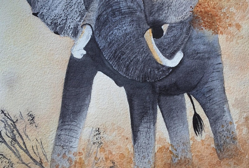
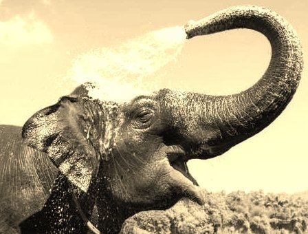
8. Direct Approach - Elephant Exercise Part 1: I this separate Guinness exercise in two parts to practice the use of a limited ballot. And by only using two colors. And ideas that we will use in this exercise is a large brush and number 6, mop brush or any other large and brush which you've got. A smaller brush number 3 round. For more of the detail. Use a piece of 300 grams. Watercolor paper, more or less 40 centimeters by centimeters, or 16 inches by 12 inches. Use a limited palette of only two colors. You can use any two colors, preferably one warm color and blue color. I have used yellow ocher, which is a warm color, and Payne's gray, which is normally a cool color. Use the pencil drawing that you completed in one of the period previous exercises. We are painting with a direct approach. So we start with laying in dark color of the shadows under the right year of the elephant. The direct approach is to do it right the first time. So we need to get our tonal values right? Forget about painting the object, but rather concentrate on painting only the shapes that you see. This is the answer to success. Now load your brush with a warm color. In my painting it will be the yellow ocher. Then using a little water on your brush, drag the colors to give their lighted towns of the Payne's gray and yellow ocher. The colors will now mix on the paper. As you complete the right ear, remember to leave a little white spots, which will leave a vibrant spark would be your painting. Look carefully to leave more pigment. Really want a darker value? Concentrate on eternal values of your image. Elite the pigment flow and add yellow ocher for a lighter tone on the back of the elephant. Now again, for the darker areas, some Payne's Gray makes sure that the two colors touch implies his credit I blamed and mix on the paper. You can now proceed with painting the elephant. Only buying shapes, dark and light shapes. We use a limited palette, has, this is the best way to learn about colors. You don't have a lot of choices. You've got less choices to make. The greatest advantage of a limited palette. Instead, it creates kilometer. What we want to do in this exercise is to try and capture the essence of our subject by using tonal values. Avoid bending all the detail and decide what's important and what is not. Dropping some more pigment into weak areas from tantric try, tried to video tonal values in all the areas rather than faint, a flat one. Go north. Work your way down from the top of the elephant to the bottom. And now again, important doublet a big wind flow by using more water. We have now completed the first wash of the direct method of painting.
9. Direct Approach - Elephant Exercise Part 2: I hope you enjoyed the first part of this exercise. Let the first wash dry completely. And once dry, we will proceed with the final part of this lesson. In this lesson, we will reinstate the tonal values. You can stop the video from time to time. To catch up with the painting. We will use a small brush and number three brush for the detail and stenting of the terminal values. Hello. As we proceed throughout the painting by darkening the tonal values. Most beginners are having trouble to think of values and color as shapes. What they do is identify the objects first and then start laying in colors and values. You take the painting you painting, and turn it upside down. You will then see the arrangement of abstract shapes of darks and lights. Even if you can't totally recognize the object, we must learn to see values. In other words, patterns formed by light and shadow. This must be done first before we start laying in color. Colors are negotiable and a matter of choice. While values are not. For. This exercise demonstrates that even by using only two colors, if the value shapes are correctly placed, it properly clear represents how object, which is the elephant in. Our main concern should be about values and shapes with me pain. It's clear what could go wrong in this exercise. Perhaps your shapes are in the wrong place. Maybe the shapes are not correctly drawn as you focused on drawing the object. For example, elephant in our case, rather than the shapes of lights and shadows, your value shapes might be too light and a painting looks washed out. This is a common mistake made by beginners. It is vital that your shapes, they have the correct values. Many painters think that succeeds him. Painting is dependent on colors they use. Who you all make that mistake. The opposite is true. The lace colors you use, the more color harmony you will have in your painting.
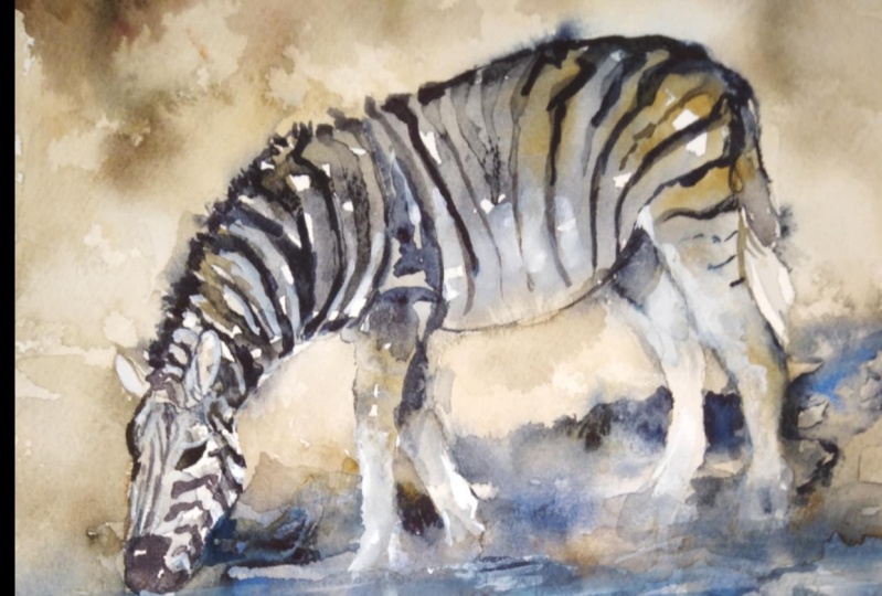
10. Direct Approach - Zebras Migrating Part 1: Welcome to this first part of pint with me, zebras migrating. We will be painting a wildlife scene with Cyprus migrating on the vast plains of Africa. The technique we will use is the direct approach to painting. My objective is for us to create a painting in a loose style and with a very limited palette. This is to create harmony. Now painting. This image has an excellent composition and color tonal range. This Spain with me, project is for the intermediate to the advanced artist, but the beginner can also bind the long as you will gain valuable experience. This is a speedup video. As the painting process normally takes very long. How ever you can stop the video from time to time to catch up the mess. Zebra migration occurs twice a year as the herd of zebras move with the seasons and the rainfall in search of fresh grazing land. So let's start painting. The material that we will use are as follows. Use a C3b or five B pencil or a similar soft pencil for your drawing. Use a small number three brush for the detail and a bigger brush, or a mop brush number 6 for the rest of the painting. Use 300 grams watercolor PIPA. Use the base paper that you can afford. The size of the pipe is your own choice. We will use a limited palette of Payne's gray in the co, ultramarine blue, cobalt blue, burnt sienna, or raw amber, and Chinese white for some of the highlights. Will also use water and tissue pipette to lift some color. Use the drawing provided in a reference images or draw your own. We are going to paint loose end. That means we're only going to buy chips and not the object. To prepare your drawing for this, we want to only draw the basic outlines to get our composition right and not all the details in the reference image. I did not, even though the stripes of the zebras, as I will paint it in, in the painting process. We start with the snout of the nearest zebra with pines gray. We lay the color in quite heavily as to create a dark tonal value. The characteristics of a direct approach is to start with a dark values. In contrast to the traditional method, we, you would work from light to dark and layer every wash. I use a number 6 brush. Notice how I leave little white spots, which adds to the vibrancy of the painting. Is now start adding some of the darker stripes. Look at the shape closely. When adding these stripes. We need to read and use these stripes accurately for our composition to work. Thank you. I put some variation into my already painted pigment by adding some clear water and drag the pigment. The success of this painting, the pins all on the Y2 you leave in the painting. I fill up some areas adding water and let the pigment flow concentrate on the tonal values and the form of the shapes. Up to this point, we've only used Payne's gray drop in some darker shadow areas Underwater with also with Payne's gray, add some raw umber for the darker stripes and drop in some Payne's gray, I cannot stress enough how important it is to get your shapes correct. The direct method is achieved by attempting to paint accurate color values and shapes. In the first stage of your painting premises. Cr, we lay in the shapes with the accurate color and tonal values. They'll direct method saves a great deal of time and let the binding glow with fishnets. Adjustments will be made in some areas before the painting is complete. As an example, we will strengthen some tonal values before the end of our painting. Remember watercolor always dries lighter than the weight being met. I will also attempt to place dark values next to light values and warm colors next to cool colors. We need to have this contrast.
11. Direct Approach - Zebras Migrating Part 2: This is the second part of faint with me. The zebras migrating. Try and stop the video from time to time to catch up with your painting. I use simplicity to penned complexity. What I mean by this is that unlike in the different shapes next to each other. And it looks very simple. Once the paintings finished and the highlights are in an old value shapes, are they? It gives you the impression of complexity. Thanks. Painting animals is a joyful experience, especially in watercolor. There are five keys to bring the animals to live. First of all, it's a good drawing. Our basic drawing will just be the outlines and we will use the direct method to lay in the colors and pulled up our image that way could color temperature, cool colors next to warm colors. I limited palette in the direct method, limited palette is very important. It will give you in the, in the vibrant painting with lots of buying power, money. And then obviously we must have a very good composition and a center of interest. In Part 1, we started off with a loose drawing. Getting the composition of the drawing right is vital in Micah. Good penalty. I've decided beforehand a temperature and a pellet that I would use for this painting. Notice the distinct values that are used in unequal proportions in the painting. Between cool and warm colors. The medium of watercolor can create wonderful and free and exhilarating effects. In the hands of most art history kit. Disappointing results. When we lose. We are creative and weekly height. But the reverse appears to be the case that when the team to get things absolutely right, often lead to predictable siphoned an exciting results. What we want to do is be out this who wants to bind to a greater freedom would examine the current working practices and decide whether or not you want to change that. Here is some of my suggestions. When we look at detail, a watercolor which is freely painted, is unlikely to show excessive detail. Indeed, many loosely packed your workers show no real detail at all. Therefore, you have to look at this reference image that you find King and decide what am I going to leave in the painting and what I'm going to not buy it. You will notice as we go through the painting or from the drawing that we did, the zebras at the back. I didn't include in your painting. This was done on purpose to give me more simplicity and to add to the composition of the painting. The brush size that I use in this painting is very important to smaller brush will give me too much detail. And larger brush would give me more freedom and let the paint flow and a much more creative painting. The painting city that are using this painting use a range of painting terms of dilution of concentration. I begin to find in a dark color with the stripes. And then using some water rushes, I dilute the color and full-color way to create less tonal values in some places are even exaggerate the trust of tongue that you see in the reference image. How did I use water and find in this painting, when an area of point is light down, I dropped some water into the color when these at the point of starting to dry and this will let my colors flow. This leaves me with very interesting watermarks and it contributes to a sense of looseness. I also use the method of dropping paint into trying to create an uneven tonal values of my piety.
12. Direct Approach - Zebras Migrating Part 3: What does it take to paint wildlife? It takes a special talent and not a little dedication. If we are to capture the unique qualities of animals and birds in the natural ceramics. But it's much to be gained from painting the delightful diversity of wildlife in other animals. One of the secrets of watercolor painting is knowing how much water to use. This only comes with experience. Once you get the feel for the right combination of water color, you have control of your media. 0. That's what we think we have. The control of. Watercolor is subjective. In other words, watercolor has control of its own. The water pigment flows. You can't control the pigment and painting loose is to let this control just go and let the watercolors control. What can we say of watercolor as a medium, this medium as a delicacy and conspiracy that makes it perfect, capturing subtle nuances of light and color in nature or in wildlife. Because the paint is transparent, the white reflection surface of the paper shines through the colors and gives them that unique luminosity. A fluid nature of watercolors makes it less predictable than the other painting mediums. But this is more than compensates for the range of exciting and beautiful effects can create, sometimes more by accident then design. These elements can make water color, fastness, rating medium, as well as an exciting and challenging one. However, arm to the right equipment and a basic understanding, our pigments, water pipe interact. You can stay one step ahead of the game. If you look at our painting of the zebras migrating, we have left little white spots that leg, the white PIP3. Many inexperienced or a color or make the mistake of trying to cover every part of the paper with paint. In fact, with watercolor, this is neither necessary nor desirable. The light reflective surface of the watercolor pipe provides a uniquely brilliant white which can be used to great effect, adding sparkle to your color, allowing the pine to breathe. That's why we call it breathing out. In our wildlife painting, we continue lying in the stripes as a dark tonal value. We use some Payne's gray for the dark tonal values. And also I mix of raw umber and Payne's Gray and also mix of burnt sienna and pines gray to lay in some of the light that tunnel stripes. The easiest way to preserve the white from the zebra stripes. To paint around them. Day by preserving the white of the paper with a brilliant light reflective properties. Saving highlights in this way requires careful planning because if not always possible, to retrieve the pristine white of the piper one's, a color's been inadvertently apply. How do I achieve a sense of light in the spine tip? This is one of the most challenging IMs in any painting is to create a necessary light. This easily achieved princely by controlling the distribution of the tonal values, the lights and the dogs, rather than from use of color, since it is light and shade that enables you to see the shapes of different things and to determine space, distance, and atmosphere. What about color and light? Can I influence the way light is perceived in a painting? But its effect is essentially supported, acting as an addition to the main diagonal structure of the image. We are attracted by paintings, by the color harmonies. It is understandable that we are sometimes mistaken persuaded to believe that callees, the principle influence of light in a piping, the directness of watercolor is ideally suited to the production of dramatic lighting effects. Strong liking also generates well-defined expressive shadows. And the treatment can help you to intensify the illusion of light. This concludes part 3 of the painting exercise, bind to me and I hope you enjoyed it.
13. Direct Approach - Zebras Migrating Part 4: This is the fourth part of paint with me, zebras migrating. In this video, we will proceed with our painting and continue laying shapes. We start off by laying in the shapes of the third Zebra by using, once again, Payne's gray, quite a heavy mix. In our painting highlights on the zebras were lifted in value and allowed to remain as white bypass. Paint pours lied in cutting around these highlight to describe the remainder of the form with additional dogs included as before to edge shading. The inclusion of darker storage which also forms the boundaries of our highlights. Might these highlights even appear? Light tab. The shape and direction of shadows can also be used to define form and space within your painting. Here's some interesting tips about painting with watercolors. Light doesn't shine without dark as large shapes only seen large when they place needs to smaller shapes. Creating our ammonias relationship of opposites, bright, new future, light, dark, positive, negative is a painting balancing act. Applying this idea helps us create more harmony and impact in our work. We lay in some stripes of the third zebra. And as the sun shines on to the stripes, we use a mix of Payne's gray and burnt sienna to lighten up a little bit of a lighter tunnel valuate a sunshine. We continue with the full face of the zebra. And then we also do the ears and eyes up to the snout or the zebra. Unity. Lh talk about unity in this painting. He, unity is the basic building blocks of any visual composition. Each what Mike's I painting, harmonious, integrated. Oh, there are many ways to achieve unity. Placing elements close together using repetitions like the stripes on the zebras. Continuing a line and area or each of a pattern using my credit, or using a dominant color or even texture, line, size, shape, or value. How an artist unifies a painting is a highly personal, a sticky choice. I found that using value to unify this watercolor painting, our three grabber with this complex wildlife painting. Value is the stretch or the holes my painting together and it's the first paint I put down on paper. We continue to do the stripes of the third zebra and do the whole eight of the zebra. And then we also do the snout of this April or in Payne's gray, and also a mix of burnt sienna. After we have done the dark colors of all the stripes, we dropping some clear water so as to get the lighter tones between the stripes on the side, shadow side of this apra. I also spray some water with the water bottle on to the stripes and partially dried. Just some of the pigment would flow down. I then proceed with laying in the dog brown stripes by using burnt sienna and on the back of the zebra, That is the sun catching the zebra on that side. And it highlights that brownish of some of the stripes, which is quite a nice contrast with the, with the Payne's gray and will give us a really nice effect. Over time. My style as gradually transitioned from being detailed to most suggestive, then change to as I became more interested in capturing the essence of my subject. Push your creative boundaries by trying new methods and new ways of paint. I don't just want to copy an image or subject. I want to be creative and try new things. Never a state to change the color, the shape, or the size of anything. When I'm painting, things are never set in stone. Some advice. I believe consistent painting hours is what is needed to become a very good painter. That is more important than the materials and artist uses. After I have completed these stripes, I again use some water and also some Payne's gray over the stripes to make the pigment flow and gave us a nice tonal variation on the stripes M between the stripe. This is also to indicate the shadow side on the debt side of this apra. I'm now also Nain, light wash of currency, a naught and a little bit of Payne's gray for the Walter to indicate some muddy water tap. This concludes this part of the painting, and I hope you've really enjoyed it.
14. Direct Approach - Zebras Migrating Part 5: Hi, This is Part 5 of zebras migrating paint with me. We will carry on laying in the shapes and different colors to bind to zebras negative and positive values. The first direct wash that we apply this now totally dry and we will know bold on this wash to strengthen our tonal values and our colors and shapes. We use Payne's gray and work on the dark area of the ears of the Zebra. We didn't use some water to fuse some of the color and let them blend into each other. I need more contrast on the face of the zebra. For this, I take a flat brush and a dry brush and lift some color out to make some of these stripes a little bit lighting. I start working on the main of the zebras. And for this I'll use Payne's gray and then I'll take some burnt sienna and mix it with the Payne's gray. And in some areas I want it to be quite light and IU, I will use just burnt sienna. Using the burnt sienna for the main will give my painting white a good contrast in colors. I needed another color in the painting. So the burnt sienna works perfectly with the Payne's gray and the white. Watercolor is my passion. I love the way it handles whether I'm painting on wet or dry paper. And I loved the transparency and the quirkiness of the workers. I find the areas that are to become a shapes and undefined them one by one as I go along by negative painting around them, as indicated with the stripes of the zebras. There was plenty of careful planning in building this composition. The way that painting was constructed in portrait mode and placing the zebras was all carefully planned. The portrait mode indicates the rash of the zebras in this migrating frenzy of them are going to lay in further color to stain thermite tonal values on the stripes on a zebra, I'm going to use burnt sienna and a little bit of Payne's gray brown mix it up. I want the stripes of the first zebra to stand out with the burnt sienna. Clarity of shaped like and dog, positive and negative should be your main concern. The figures of the zebras were connected to three sides of our painting to strengthen the composition by enqueue objects right in the middle of your painting, but connect them to the sides of the painting. This gives you a stronger composition. I use different tonal values to separate my shapes one from the other. Think of the zebra figures in terms of one light L1 shadow value along with darker values for the negative shapes. The more you get into the painting, the more you have to observe the painting and less the subject do. It's the end. When you get into the small forms, you will only use the subject for information and inspiration. By the lightened shadow. The composition is a design of light and dark shapes. The shapes can see in the physical boundaries for what you see in reality. As a general rule, soften one side of the form. Keep all your values in tune with your painting. Even though it may be seeing darker on the subject. Remember, watercolor dries lighter, use hard and soft edges to give sense of form. When doing each area started a point where you want the most or the most interest. After you place paint adjust value by dropping in additional bank. If the value is too light and water if the value is too strong and you want to lighten it. Let's talk about the center of interest in your painting. In our painting, the center of interest is the face of the zebra closest to us. Sometimes finishing the focal area first helps determine the finished needed for the rest of the painting. Evaluating as much from the binding edge, from the actual C value. In our case, what we did, yeah, we worked on our painting and not finishing the focal 0.1, try to get the color value right with the first was the second wash is only to add more shadow shapes, articulative dark shapes first, then correct column value, winding up with the softening of whatever ages calls for it. When painting this watercolor, I focused mainly open obtaining use, tonality and colors, using only the brush day for the objects in the composition must be carefully and accurately positioned. In a painting like the spots, drops, pleasures, and drying edges don't spell disaster for me. In my opinion, they are the ones that bring the painting to life. My expressive style of painting, which has a high water to paint ratio, can be a disadvantage as it has letting the paint dry naturally takes a long time.
15. Direct Approach - Zebras Migrating Part 6: Hi, This is part six of our series paintings, zebras migrating. In this part 6, we will be working on the details of the zebras will add in some highlights by using Chinese white. We need to emphasize the islands. This painting of ours is a contrast between the dark stripes of the zebras, the white of the zebras, and then also the blue water and sparkles. White on the water. You can follow me now to add your own knowledge, deal painting. Stop the video from time to time. Said that you can catch up and see how I am doing the highlights and add that to your own painting. The highlights are added with a small brush. The technique we use is the dry brush technique, so we use very little water and a white straight from the tube. Look carefully at your reference image and place the highlights way you think they must be placed. Proceed with the rest of the highlights. I think the tonal values on the second zebra is too light. So I'm going to add some more Payne's gray to make the tonal values a little bit dark. Cell death. The second zebra fits in with the fuzzy. We want unity now painting each very important that a painting is a unit on its own, and that the shapes combined with each other continued to darken some tonal values on the wrist of the piety. Okay. All right. Okay. Hey, add some more volume to the line of the second Zebra. We add this volume by using burnt sienna and then we mix in some Payne's gray. This concludes Part 6 of this series. I hope you've enjoyed painting with me and that you're satisfied that your banking represents the reference image. This is not the end. This is a journey. And painting in watercolor. The more you buying, the more inspirational your paintings will become. He doesn't need to be representative of mind banking or a copy of my. Be bold and creative and create your artwork.
16. Direct Approach - Zebras Migrating Part 7: This is the final part of zebras migrating. You can continue working on the detail of the second and the third zebra. Let us recap in less loss part. First of all, the materials, you don't need a lot of equipment to paint well. So B-cell linked events simplify your materials to a few really good quality items. I used a very limited palette of fairly good quality Winsor and Newton tube colors. I use Payne's gray, cobalt blue, burnt sienna In Chinese white. I find tube colors the most practical because I can top up with fresh pigment at the start of each painting session. It gives me a constant access to moist, workable paint. Let's consider the quality of the brushes that we use. My requirement for brushes are that test should be capable of holding a reasonable amount of paint and water from a good point, a and B, stringy and NADPH to return to the normal natural shape during use quality of pipe or would we use I use cold press paper which is not so rough and also not smooth. Hot press paper is quite smooth. My preferences, arches or even Fabriano paper take quite expensive papers. They will accept my method of painting without grumbling. They also give something back, keeping colors fresh and vibrant without sinking these papers. Greatest assets is that they are so resistant to re-weighting and alterations that they forced me to be more positive in my approach. It helps a lot with the direct approach of watercolor painting. The white of the watercolor paper that you masseuse must be at least a 140 pounds or 300 grams. Using the AV or white of the paper will help you that the pipette doesn't grow girl and the annual pint would be vibrant and their colors would be really nice. To recap the sketching we did. We did a very limited sketch cuz remember we paint the direct approach. For the direct approach, we, as we can recall, we need to have minimum of detail in our sketch. We just need to get our composition right and where everything is placed. And then also just indicating our shapes that we're going to pan. We used directness. How color is applied in watercolors is the main factor of entertaining each freezes and appeal. Applying the medium with directness simply means laying in areas of Callen precisely in one girl, either as a single carrier or combination of colors placed next to each other. Part of the direct approach is loosening up your painting. The aim is to lead the immediacy and the spontaneity of the medium can through to produce lively images. It refers to a way of depicting subjects in an understated manner so as to simplify your subject rather than portrayed in meticulous detail. For paintings to display energy and flare, they have to conveys something of essence of the spirit of the subject. This means they need to be more than just mere photographs and turn is crucial in creating this illusion. We looked at toned. And how important tone is. When we bind subjects like these. Light and shade or tone is dependent upon light. And in essence, it is used to depict all the planes over object except for the pods had received the full intensity of light being artificial light or the sunshine. The areas on a form that receives full light will be the lightest areas. Areas that receive only a glancing light will be slightly darker tone, and areas that face away from the light and therefore receives no light will be the darkest darks in turn, all the terms. We'll also be called a cast shadow. How did we use expressions with edges? The control of ages is a powerful way to generate expressions in a painting, the separateness of shapes and form is described by the edges, which can be used as a convenient means of emphasizing, suppressing or unifying Ticulate areas or features. In other words, this is all about shapes. The edges of your shapes is identified by the ages in your painting. Be yardage, a last stage, or soft edge or any type of edge will be the way you identify your shapes. In the spine took me series. We also had a look at a limited palette. Part of the direct approach is to also use a limited palette. It gives us color harmony. We also looked at heightening the impact of design. In our painting of the migrating zebras. Design refers to the way elements are put together with in a picture. It can include lines, shapes, tones, color, contrast and textures. The essence of good design is simplicity, which leads to a painting in which the subject is stated in a clear and concise way. How these elements in our zebra painting relate to one another creates the movement of the zebras as they migrate. Both design and movement are dynamic quantities that can be manipulated to produce great impact. We also looked at establishing a focus in our painting. The focus in our binding was way, there is the greatest tonal change and where they some terminal hard edges. And in our case it was mostly on the aid of several number 1. Now finally, to sum up, we looked at the simplicity of our basic drawing. We looked at planning the painting, the format of the painting, the viewpoint, and the focal point. We also looked at what is the direct approach and how do we use the direct approach. We looked at a limited palette. Then we looked at painting shapes and a terminal values or shapes. We also looked at preserving the UC and using white pigment. And then we also looked at choosing and mixing our colors. I hope you enjoyed this series of paint with me. Zebras migrating. Thank you.
 Arie Swanepoel